Transcripts
1. Introduction - Overview of techniques and visual examples of what you will be learning: Hi, everyone. Welcome to
this Iris painting class, and today we are going to learn how to paint
watercolor irises, and we're going to be taking some inspiration from
some of my old work. So I'm going to be
talking you through how to paint in this style in this very
loose, playful style. And how to get
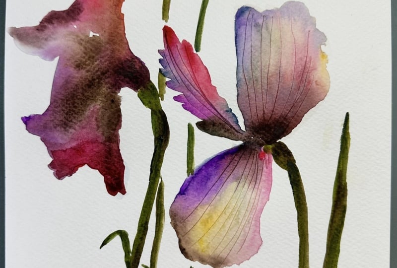
details like this. And I'm going to be sharing with you how to get water
control so that you are applying the paint in
a way where you can get soft edges like this and
harsh edges like this. We're going to be talking about
how to get details within your petals like this and how to let the
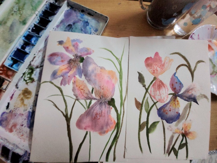
colors mix on the page. So here are some examples. I'll just show you of some
of my practice paintings. And we're also
going to be looking at the flower itself,
the flower form, and the different stages of the flower in
its growth cycle. So we're going to be painting
them as buds and then here as kind of midway
through growing, and then when they're
fully bloomed like this. So I just wanted
to share with you some ideas for inspiration. I'm probably going
to be using this as composition for
today's painting, and we're going to be working
with powdered pigments that create this kind
of dotty effect. We're going to be working
with liquid watercolour. And yeah, it's going
to be really fun. You're going to be
working with quite vibrant colors as well, and also just letting
the water flow. So I'll be sharing
with you how to do.
2. Lesson 1 - How to capture the essence, exploring the Iris floral form: Okay, let's start off with actually understanding
this flower, and I'm going to be talking
to you about floral form. So I have just done some very rough sketches
of the iris flower. It's one of my favorite
flowers to paint. And I've tried to get
different silhouettes and different shapes and really examine how the foliage is how, you know, it's long stalks more than leaves
with this flower. Sometimes the flower
can be quite flat and spread its petals out
in this kind of wide way. And then sometimes it
just has this kind of very, um, typical silhouette. The iris flower, the way I think of the petals
from an Irish flower is it's very much like a
flowy ball gown dress. And it has those kind of, like, details in the middle. And I'll be showing
you how to paint these using powdered pigment
and a cocktail stick. So I've just done some
loose sketches for you to understand the floral
form and you know, it would be nice if
it could help you create your own original art rather than copying
the tutorial exactly. It might help you look
at these looking at these sketches to create something that's
original to you. So I like to do this just to kind of get
in the flow of things. And I will be kind
of looking back at these sketches
when I'm painting, just to kind of, you know, decide on composition,
and maybe if I wanted to add a small bud
here or there, it's just something for me to kind of take inspiration from. So, just think of this flower
as something that kind of opens outwards and has
these kind of long petals, and then all the detail
is in the middle here. So it's not round as such. It's more kind of
long drapy petals that kind of flow down. And that's something that it's quite a joy to paint
iris flowers with watercolour because
the colors of this flower are really
vibrant as well. So yes, the whole idea of this painting tutorial
is to help you capture the essence
of a flower and not paint every single petal.
3. Lesson 2 - What colours to use in the class: Okay, so we're going to be
doing a bit of color mixing, and we're going to get the colors that I would
normally use to paint irises. And they're all going to be
ecobline liquid watercolors. So I've got green
here, which is 600. And I'm going to be mixing
a little hint of brown or sepia in some
of the colors just to soften them and give them
that kind of earthy feel. I'm also going to be using 361, which is, light rose. Okay. I put that here. Okay, so I've just added
507 ultramarine violet, and I will be adding a hint of sepia to that because it
is very, very vibrant. I've also got some magenta 337. This is a little darker
than that light rose. I've got apricot, which is 258. I've also got some bronze green, which is 657, and I like to have different greens when I'm painting the foliage. So a couple of different ones. I sometimes have I
change things up from liquids and I start using tubes when I'm painting foliage, just to give it a
different feel. I've got doctor P
H Martins here, hyacinth blue, which
is very, very vibrant. And I think I might be adding a little bit of sepia to that
just to soften it a bit. I've got lemon yellow 205, just to keep things
light and bright. And I will be
adding a little bit of sepia to that, as well. Okay, I think I have
everything I need, and I'll be sharing with you, how I mix colors in the palette just to
soften them slightly. And I'm just going to talk
you through these pigments, so these are the
ones that I use, and you get different colors, and they are just
watercolor pigments that come in a powdered form and they give you the
most beautiful texture. And I feel like it's the closest that you
will get to creating the details within the
inside of the iris flower. So I've got oyster
red and sandstone, and I've just made a little
hole in the top there just to control how much
powder comes out. And then you will need
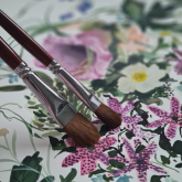
a cocktail stick, and I have my quarter inch
dagger and my 12 round here.
4. Lesson 3 - How to mix colours to make the flower look more natural and realistic. Watercolour paper : So I'm just going to test out the colors as they are
without any mixing first, and then I will add in
a little bit of CPA into some of the colors and just try and get the
colors that I'm wanting. I'm just cleaning my brush. Okay. I'm going to go in
with the lightest first. Okay. That feels a
little too bright. And what I'm going to do
is just get a hint of sepia in here that I can start putting into
some of the other colors. So I'm just using my brush
and You don't want a lot. I literally just put the
tip of my brush in there, and that's enough to
soften that yellow. That seems that feels
a little bit more earthy and less vibrant. Okay, so we've got
this light rose. Which I think I'm
just going to leave. And this orange, I
feel like needs, it's a apricot, I think. I'm going to leave
that as it is. I've got magenta here, so I feel like this magenta, just to add a little bit of
contrast to the painting, I'm going to add a little bit more sepia into the magenta. And I think maybe
a little bit more. So I'm just dipping
my brush and mixing. Okay. Um, to give the magenta a
little bit more vibrancy, I'm going to add a bit
of this vermilion. I love mixing
vermilion with magenta just because it's
such a strong color. And at the moment, with
that magenta and the brown, it looks a little bit dull. But, um, this is where
you get a strong color, but also a slightly
darker color. I'm just going to add a little
bit more magenta to that. Okay. I'm happy with that. And then this one, I feel is a bit too. I'm wondering if maybe
we need to have Okay. Int more brown in that. You don't need a lot. It's just enough to soften the color. Because with
watercolor, it's very easy for your flowers to
look very unrealistic. And if you're wanting to go for a realistic
feel to your work, then you need to be
able to soften color. And I usually do that
by adding Cepio. And I think this
is fine for now. And then you've got just
the CPR on its own. I'm not sure if I will be using this much, to
be honest with you, but I just like to
have it available, just to kind of help me. It helps me to kind of figure
things out with color. And then this one is
the hyacinth blue. Now, that is very, very vibrant, and I'm wondering if maybe
a little dab of that Okay. That's kind of muted
it down a little bit. Um, I'm just going to get this color, but in a I'm going to
be mixing this color, but I'm going to mix it with a bit of purple so we
get a purply pink. So I'm just going
to dip my brush. And make sure I wash my brush between because we don't
want to dilute the colors. The thing about irises are that they come in a
rainbow of colors. And this is why I
love to paint them. Maybe just a hint more Okay, so we've got a color that sits between the
purples and the pinks. I might need a bit
more of this color. And when you're mixing colors, you need to think
about color harmony. I've had to kind of think
about colors that maybe just are sticking out a little bit and how to
connect those colors. Okay. Um, I'm going to add, I think, a little
hint of CPA deep, which is from the Ecoline. I don't know if we've got
very much of that left. And I use this to darken
other colors as well. Okay, so I think and I'll just show you how that
looks on the page. It's quite dark. It's nearly like chocolate brown,
Espresso brown. So I will be using this to darken some of the other
colors as I go along. The paper that we're using
today is Fabriano Artistico. It's one of the best papers that I can recommend to all
watercolor artists. Of the time when people are
starting with watercolour, um, they're saying that, you know, they have this idea in their head and it
doesn't work out, and it's usually because of
the paper they're using. And Fabriano Artistico
is known to be really, really just it does
what you want. And the results are the
closest you're going to get to what you imagine
when you're using this paper. So that's what we're
going to be using today.
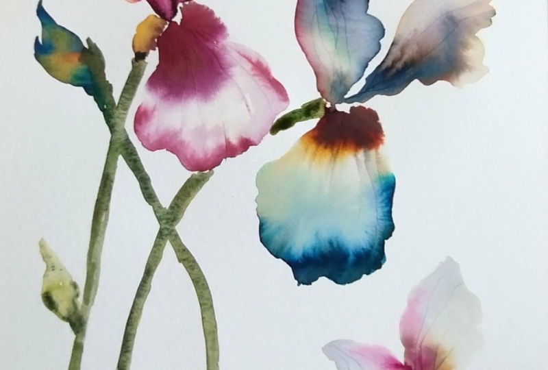
5. Lesson 4 - Dropping the colour and letting is spread, Using powder pigment.: Okay, so I am using this
painting as a inspiration, and I'm just thinking
about painting the flowers in different
stages of their growth cycle. So we've got a bud here, and we have something
that's just about to bloom, and then these two that
are in full bloom. And I'm also thinking
about the foliage and the stalks and stems and just also the
detail here as well, and how we can get that. So this is the composition
I'm basing our painting on. Okay, so first of all, I'm just going to get a
shape using clear water. My water is a little bit muddy and it's fine because
it's very diluted. And hopefully, that means
that you are able to see where I'm blocking
out with clear water. So I'm just moving my brush
and I'm just trying to get the basic shape of the iris and I'm
moving my brush up and down to get the
edges of the petal. And then I am dabbing my brush and I'm just
going to go in with a bit of this magenta mixed in with vermilion
and I'm just going to drop the color in it will want to spread. I'm going to go in a
little bit darker now. I'm using the CPA deep just
a little bit on the brush, and going in on top. Then I'm going to go
in with a bit of light rose and you're just needing
the smallest amount. The way to control
how much paint it goes onto your page and
how you can stop it from spreading is by using the
smallest amount of paint on your brush and I'm
literally just dipping my brush in with the
smallest amount. Okay. Then I'm
going to go in with my cocktail stick and
hopefully you can see, just scoring petals. It just gives the lovely
really lovely texture, and it makes it
feel very lifelike. Now, um, I can I'm feeling as
if the petal is drying up. So what I'm going to
do is I'm going to add a little bit
of the sandstone, and I'm just going to do
maybe one tap and two. And I don't know if
you can see that, but already, that has given the petal a
really nice texture. The thing about applying this powder to the page
is it's about timing. The more water there
is on the page, the more it will just spread
and behave like paint. And the less water is
or as it's drying, you're going to get this
really, really lovely texture. I don't know if
you can see that. Okay, so this is the first
bit of my iris flower. Okay. Then going in again
with a clear water wet brush, and I'm just going to this time, I'm going to go in with
a little bit more water. I'm using the side of my brush. This time, I'm just adding a little bit more
water to this petal. I'm trying to keep the colors
feeling quite similar. So maybe a bit of
apricot in the middle. If you notice some
of the colors, they spread out really
much better than others and a bit of light rose. I'm going to add a little
hint of this mauve color. It's always this sepia
Biji brown orange in the middle. I found. Then I'm going to go
in with my toothpick and I don't know if
you can see that. So I'm letting the
colors mix on the page. I'm adding bits of
brown and sepia. And this is a little
bit more wet, so it gives you a chance
to see what happens if I just tap and I've used
oyster red this time. And I think that I love what's
happening at the moment. It's like there's some that are just looking like
dot and then there's some that are moving in to a watercolor flow of some kind. And it's really nice to see the change that happens when you're
using these pigments. So I'm going to just
leave that as it is, and then we're going
to add a stem here. But whilst that's
doing its thing, I'm going to be
maybe adding maybe a more purply iris flower here. So this time around,
6. Lesson 5 - Colour harmony, harsh edges and faded edges: I'm going to maybe and just letting the
color absorb and flow. Ben a bit of sepia
in the middle. And these purple iris always
have an orange middle. So I'm just being
really loose about it. And I'm just spreading the colors so they kind
of merge together. A little hint of dark in
the middle there, I think. Again, going in my cocktail
stick and scoring. So I'm going to do maybe
a different shape. I just have a look
at my drawings. Okay, so if we and I'm going to connect and
let the color just flow. Sometimes it's nice to
just see what happens when you connect two bodies of water where one has paint
and the other doesn't. I'm going to go in
with my hyacinth blue. I'm just doing dots
just to give it a different feel and I pinky purple color. This is where color
harmony comes into place. This pinky purple has
some in here as well, so it ties the two
flowers together. That's what you need to be
thinking about when you're painting and doing your
watercolor florals. Is some of the colors
in another flower, where it might just be a hint. I ties in with another
flower on the page. I'm going to go in with a bit of sepia and I'm just
literally just a dab. And I'm just going to
maybe just do a few dots. Because I used oyster red here, I'm going to use sandstone
and this I haven't done, so I'm going to see what
happens if I do that. Then this is slightly more wet so that's going to have
a different feel to it. And so far we've touched on harsh edges where you've
dropped color onto the page. And it's given this
kind of, like, a harsh edge where the
water has not touched. And now we're going to
look at faded edges. So And I think with the faded edge, water, if your water in your
container is really clear, then you will see a
very, very faded edge, which is similar to this. So this is a very faded edge, and I think that's
because the water in the container was very clear and you can't
really see even I mean, you can't even see the
line there so much. But here, you'll
probably be able to see it because my container is pigmented with all
different water paint. So I've just dropped clear water in into that. And I'm going to add a
hint of sepia to this. I'm just doing dots
because I know all that color will merge. And I'm not painting here. So if I had clear water, you would see that this would
be almost invisible line. And then I'm going to go
in with my toothpick and So sandstone.
7. Lesson 6 - Last flower, foliage and finishing touches: Okay, so I'm doing
the sand flower now, which is just about to bloom or in the
process of blooming. If I just take my dagger brush and start dropping
in some colour, I'm going for the light rose just to give some harmony to the painting,
so we've got pink here. We're going for pinkie. I'm going in with my 12 round, and I think I'm going to
go with this apricot. And because we use
the oyster red here, I'm going to do the same. And then whilst that's drying, I'm going to do a more of
a purple bud down here. I'm just going in with
clear water. And then I notice we haven't
used any green yet, so I'm going to go
in with the green. And now, I completely forgot to add the brown into the green because
it's quite vibrant. The green is, so I'm just
going to do that now. I'm using CPA deep better. Iris stems are really thick. They're usually quite
straight as well. They're quite tall flowers. They have this kind of opening where the flower is
attached to the stem. It's quite a wide I'm nearly finished. I'm going to be adding
some detail to the stems. This flower, this particular
bud is now dying off, it's going to have a brown tip.
8. Lesson 7 - Extension part 1 - blocking out loose playful Iris shapes: As a small extension
for this class, I wanted to do another video and try and replicate
these paintings, just to show the variety of different possibilities
of painting irises. The thing that these
paintings show more of is that I'm letting
the color mix on the page and letting all the colors kind
of bleed together. And as I have the same
colors on my color palette, I thought it would
be an idea just to see if I can recreate these. So in the other videos, you've kind of got an
idea more on technique, and this would be like
a small extension. Okay, so The thing about this is that
you need to I think about shapes and silhouettes. And I am going to start off with a really big big
petal shape here, and I'm just going
in with some water. And this painting is meant
to be very quick and playful and it's just something for you to feel like you
are able to loosen up. I'm just getting a bit of all the different
colors and mixing them on the wet surface. I'm using the lightest
amount of paint on my brush. If you feel like maybe
it's gone too dark, you just add more water
and it will lighten up. I'm going in with
my cocktail stick. And then I'm going
to go in again. The trick to get this
really light color on the page is just
water it down. And here I'm just mixing
the colors on the page. I'm just getting a
little bit of the sepia. I'm adding some dark some CPA to to the inside of the flower. And then again, I'm going to go in. And these Iris
petals have jaggedy, kind of very flamboyant petals. So I'm trying to show
that here and I'm letting the colors kind of merge with
what I've already painted. I've gone in with some CP deep just to give a
little bit of contrast. Sometimes you can drag some of that color into lighter
parts of the petal. I've just added some
powdered pigment. Okay, so now maybe focus
on some smaller shapes. And I'm just being really loose and playful with my brush. I'm holding my brush
right at the very tip. And I'm just thinking about
the silhouette of the flower. It doesn't have to be perfect. As long as it gives
off this kind of long, long, you know, quite
dramatic iris shape.
9. Lesson 8 - Extension part 2 Painting foliage and finishing touches : I felt like that pink
was a little bit strong, so I've just added a
little bit of water. I'm just going in. I'm letting the colors all just
mixed together. Doing this quite quickly. You might want to
use this tutorial to help you loosen up. You might want to use this as something that you
actually want to try out. But it's a really nice
therapeutic way of painting. You're not actually trying too hard to make it
look like anything. You're just painting shapes. I'm going I'm always making
sure that the middle of the flower is slightly darker in some way,
shape, or form. Again, I'm using
my cocktail stick and I'm dragging the color. I don't know if
you can see that. Then going in with
my powdered pigment. Then we're going to where the stem meets the flower, there's a little hint of yellow. So I'm just going to
add a little bit of yellow in there and And then it's always quite thick where
the flower meets the stem and the stems
are always thick as well. So Okay These leaves are some of
them are very thin and tall. So you use the tip of your brush like this
and you do it that way. And then if you want
to do the thick ones, you use the brush on its side. It's nice that some
leaves kind of overlap. So if we just There you go. You can see how varied the paintings can look a
little bit more structured. And I think this was more
focused on technique. And then here is
a little bit more playful and a little
bit more relaxed and loose and just letting the um the colors merge in together. And if you wanted, you can
wait till the painting is dry. And then I went over
with my dagger brush, which is this one, and I
just did some very loose, very thin lines using
the tip of my brush, just in the middle,
here and here. So I hope you found
that helpful, and I hope this has been a good extension for you
to kind of keep painting.
 Sophie C, null