Transcripts
1. Introduction - What you will learn: Welcome to this beginner
intermediate watercolor class. In this lesson,
we'll paint a soft, expressive floral bouquet
using simple color mixing, water control, and
loose brush rugs. I'll guide you step by step
through choosing colors, testing washes, and building
each layer with confidence. By the end, you'll create your own finished
floral painting with movement and light.
2. Lesson 1 - Inspiration and the basics of flower painting: Hello, and welcome. Thank you so much for being
here. I'm so grateful. I'm really looking forward
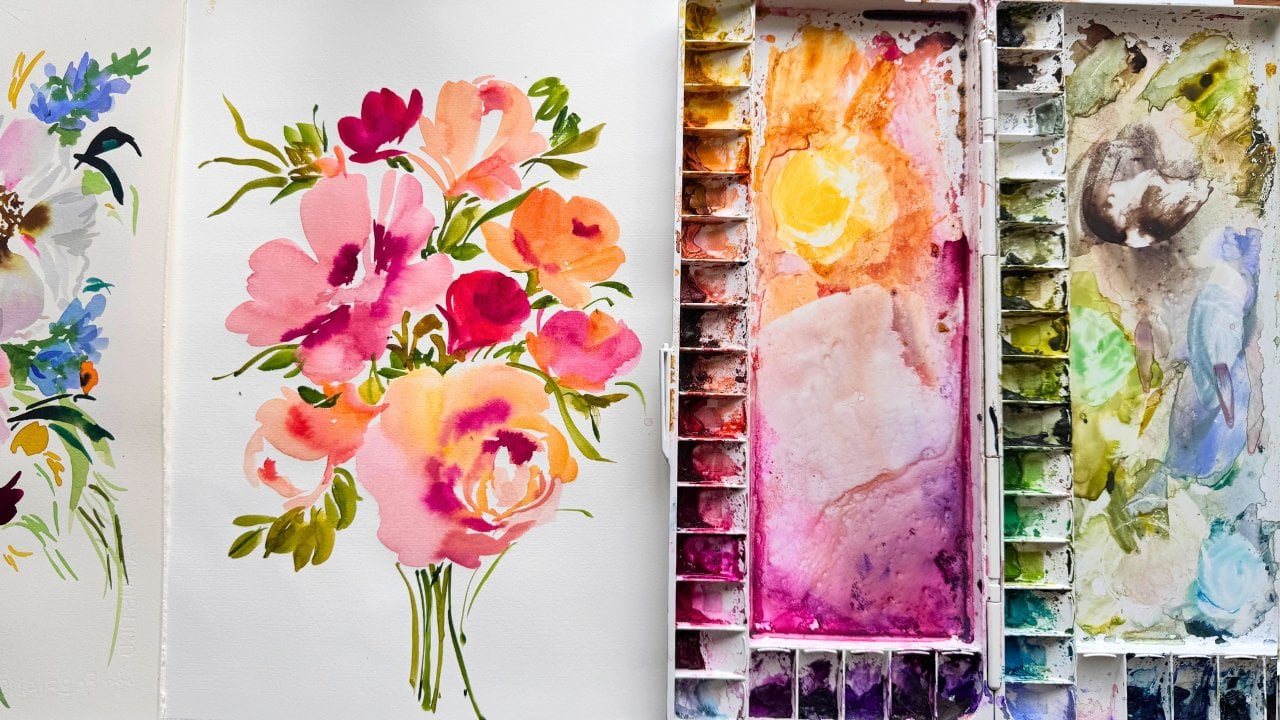
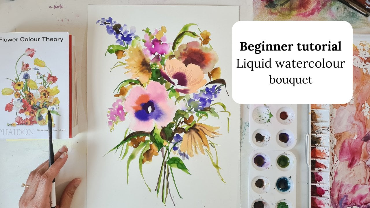
to painting with you, and this is the bouquet that we are going to
have a good painting. So I've just done some
warm up painting, and this is just
what I do before I start the proper piece. And it's just for me to get
used to the floor shapes and just get an idea about what kind of marks
I'd like to make. And I just want to talk you
through the roses here. So, the thing that turns
the blobs of paint and the marks into a pretty rose is if you imagine the
rose has three circles. This is the outer circle. Then you have the middle,
and then you have a very small circle inside. And it's always the
middle circle and the inside that I add
darker colors too, especially the
inside of the rose, that's always going
to be the darkest. And then here it will
be slightly lighter. And then this outer circle
here will be very, very light. That's how your brain starts to imagine those marks
and becoming a flower. So I've done a similar
kind of thing here. And again, you're
looking at bowl shapes. So that inside of the rose is
always going to be darker, and that's the thing that helps your brain determine
that it's a flower. Again, so I'm not painting
the entire flower. I've just left some pieces
to the imagination, but I've just dropped some
dark color in the middle, and it just gives an
impression of a flower. And this is a little bit more of a playful version
where I'm just sort of dabbing my brush to create
the petals and then adding the dark here
and in the middle, just to show bowl
shape of the flour. So again, I've done
something similar here, and That's quite an
interesting kind of shape. So just leaving a lot
to the imagination and just dropping that color
just in the middle there. And that's all you
need sometimes. And then here I'm
just looking at silhouettes and the
shape of a rosebud. And here I'm looking at dog
roses and actually how they look so lovely when
they're open and full and trying to
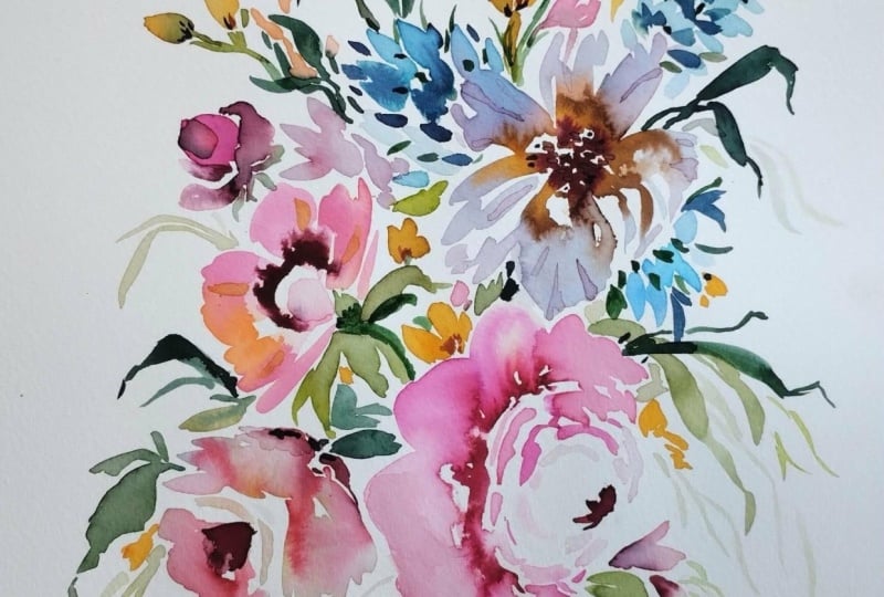
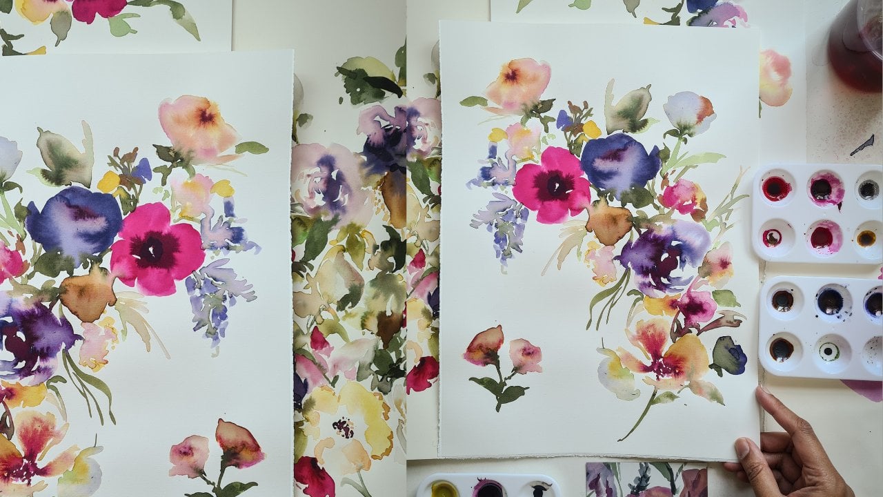
capture the essence of, you know, the lightness of them and the floatiness of them. So this is all very, very rough. This is the composition that we're going to be inspired by. I did this just as a rough, kind of loose experiment, and I really liked the way the composition turned
out and the colors. But we are going to alter it slightly to make this kind of more softer in color and softer in terms of how the
paint is applied on the paper. So you're not going to
have so many harsh edges. Let me give you an example. So I've done this rose here, and it looks like it has the same kind of
feel in terms of harshness with the edges. And then I've used a slightly different technique which I'm going
to show you here. And the colors here
are very soft, and also the edges of the
flower are very soft as well. So that's the technique that we're going to be working with. And I'll give you an
example of how this looks in some of my
other paintings. So you can see there's some really nice soft
things happening here almost kind of fading
into the background. And this is the same technique
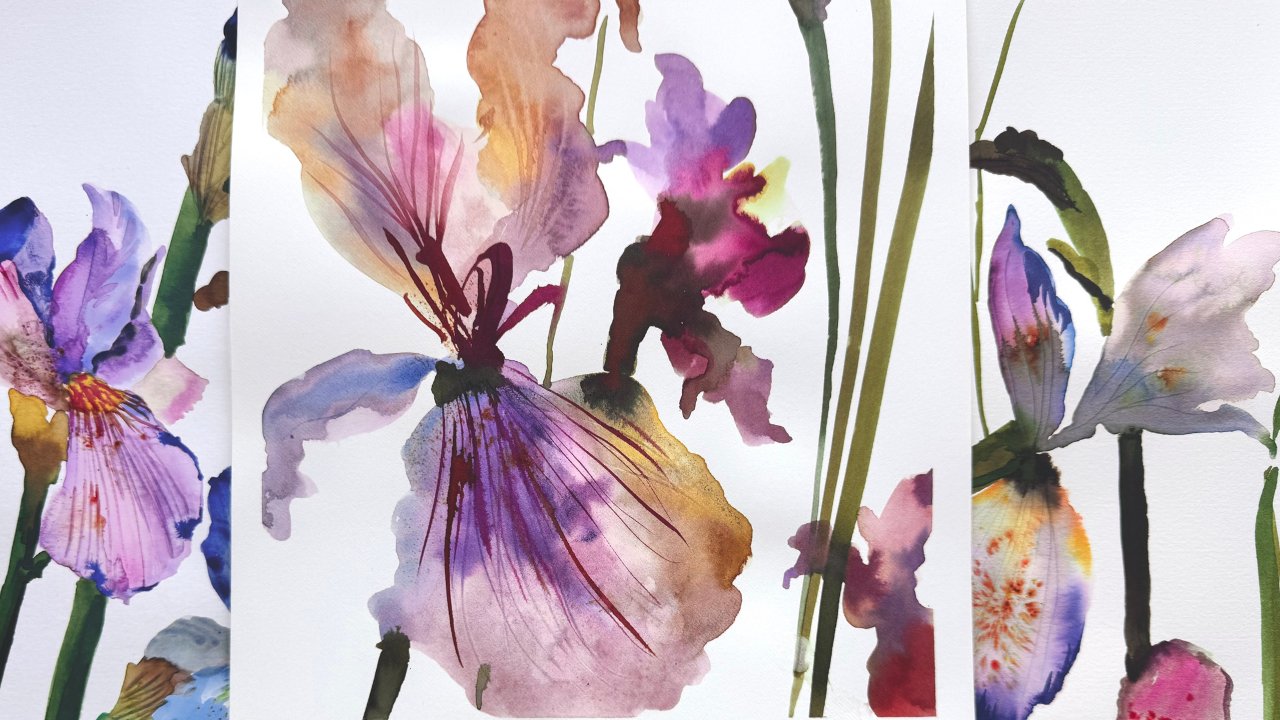
that I'll be showing you with the tutorial today. And here's an example of
another painting I did. And I'm looking at
silhouettes as well, but I'm also loving the
soft feel of these flowers. So that's what we're going
to be working on today. The only thing I would
say is just relax and enjoy and try and have
fun with the process.
3. Lesson 2 - Materials & colour mixing: So in terms of paper, the best paper to use
for this and any kind of watercolor really is fabriano
artistico and hot press, which is very smooth, and it has a smooth surface. The really nice thing
about this paper is that it holds water so well. And I think I tried
so many papers, and I always just end
up coming to this one. So I would recommend
this fabriano artistico. And if you wanted to get it slightly cheaper
and with better value, then you can get packs of 20
that come as loose sheets. And they come of, I think, 38 by 28 centimeters. And because that's not a
standard size for a picture, they are much cheaper. So it's really good for
just practicing on as well. Which is really great value. So I'll be using a white
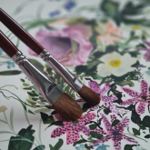
sable Filbert brush here, which is a 1 ", a 12 round white sable and a six round
white sable for details. If you are in America, then you probably
will be able to get your hands on these
white sable brushes. But if you're not, then I
have some alternatives here, and they are sable brushes, they do exactly the same thing, but they are just slightly
different in size, and I'll provide the links to these brushes on my website. So you will need these
Ecoline watercolors, and there is a set that
comes as a ten, I think. But I've bought a few extras that come outside of the set. So the set is really good. I always find myself using all
the colors within the set. Then the colors that
I've bought that are outside of the set are 258 apricot 381 pastal red. 580, pastel blue. 657 bronze green. Six, pastel green 440 sepia deep And the only other one outside of the Ecoline brand is this magenta by
doctor PH Martins. And so this is the
color that we use. I always find myself
gravitating to this just because I love its vibrancy. And we're going to try and get two different
tones from this, and I'll show you how I mix
all my paints coming up. Okay, so when it comes
down to mixing colors, I'm going to show you
how many drops I add of each and how much I put
in these palettes here. I bought these from Amazon. I'm just going to start
off with the apricot. And some of these
are just going to go straight into the wells
without any kind of mixing. Now, if you don't
want to buy these extra and you just
want to work with the colors in the
set, you can do that. And you'll obviously
get different colors, but it's a different kind of
effect you'll be going for. And it will also have
a different mood and it'll be something personal
and unique to you. So you can just stick to the colors from the
set if you want it. That was apricot, and I'm
going to just go in with pastel red because the wells are quite deep and just putting
about three squirts in each. I'm going to go for light rose. And still blue. Now, this blue is really bright. So I just put a
drop of this gray. The gray comes in the set. Just, two drops came out
there, but it should be fine. Then I've got the magenta. And I'm going to add the
vermilion to the magenta. One. Just one. I'm going to add some sepia
deep to that as well. One I'm going to have a bit of this
purple or ultramarine. I'm going to add that there. Bit of yellow. This is the
lemon yellow from the set. And then moving on to some
of the darker colors. So deep sepia. And this one is from the set. It's a green should be enough. I'm going to add
a hint of black. So I'm using doctor PH
Martins in black here, but you should have a
black in your set as well. I'm just using this
'cause I've runout. Two drops, and pastor green. And there's a tiny drop of
Sepia in there already. So it's mixed in with
the pastor green, and I'm completely
fine with them. I'll probably change
that later on. I've also got Okay, so I've got got some
bronze green here. And I'm going to use a bit of this sky blue and create
a really nice he color. So I'm taking the
green from the set. One, two, three, four, five a bit of sepia, and I'm also mixing that in one one drop of black. Two drops.
4. Lesson 3 - Testing colours & mixing a floral palett: So this is the apricot. Really soft pastel red. I always love the vibrancy
of this light rose. I've got ultramarine. And when I'm testing
my colors up, I always start with the
lighter ones first, just so that I don't just so that I don't
muddy up my colors. So this lemon yellow feels
a little bit bright. I'm just gonna get a hint
of the sepia on my brush, mix it in and that should
tone down that yellow. Maybe tad. So I'm wanting that
really nice golden color as well, like an ochre. So again, bit of the deep sepia. So I'm just gonna add a bit of the deep sepia this yellow. Hint yellow. And I'm just gonna one
drop light orange. Quite happy with that. And then let's try
this pastor blue. To make it more real
life to make it so to just make it a
little bit more softer, I've just added a tiny
bit of sepia to that. And I'm happy with that color. And let's try this dark one. So it's not quite as
dark as I would like. But if you compare it
to this light rose, it's like the next
kind of color up. So I'm going to
grow even darker. And again, I'm going
to use magenta. Sepia deep, one, two, three, and maybe
two or three drops. One, two, drops of glack. So we're looking for really, really dark burgundy color, and that's perfect.Rly
happy with that. So this one was the
green from the set, and I added a bit
of sepia to that, and I'm quite happy
with that as it is. This is the pastor green. Yep, happy with that. This is the bronze green. And it's nice to see the
different tones of green. So I've got dark,
mid and light tone. And And that's a very dark
teal kind of green. So looking at colors here, I feel like we need a color
between this blue and purple. So I'm just going to my brush in the ultramarine one drop. So I've just added one drop
of pastel blue to that. Maybe another drop. Yep, happy with that. So it was a dab of
this ultramarine with two or three drops of pastel blue to get
the color in between. Now, if you have a
look at these colors, there's all different
tones of pinks and reds. And I've looked at
creating light colours, mid colours and dark colors, and I've done the
same with the green. So you can see
we've got lights on all the colors and mid tones, and then very dark
tones as well. So I'm just going to have
a bit of gray in here. And we just need
14 drops of gray. And I'm just going to
use my spray bottle. We want the gray to be really
watered down, really soft. Perfect. So that was the last
color I'm gonna be using. I'm really pleased with that.
5. Lesson 4 - Begin with Wet on wet technique: Okay, so the first thing
I'm going to start off with is I'm just going
to wet my brush, and I've got colored
water in there, just so you can
see on the camera. But you would have a
clean jar of clean water. And goings just start off with making rose shape. And I'm just literally just
painting with clean water. And then I'm going
to my filbert, make sure it's got
enough water on. Get those petals in. F. And then I'm going to just drop
in some color, and I'm not going to
think too much about it. Drop the color in. Let it flow. If the color doesn't
float as much, you haven't got enough water on your page, that's how you know. So you just get your brush and just add a little
bit more water. And you kind of just
want the colour to just sprint the way
that you can see. A And if you notice I'm using
that light rose, which is a mid tone, and I'm just going round to get this bowl
shape happening. And then I'm going to go
with this next color up, which is the magenta, but it's not the darkest one. I just drop a bit of color
and just let it spread. So we made three different
tones of the pink. We had the light rose, magenta
with a hint of deep sepia. And then we went even darker with some black with
the magenta as well. So so far, I've only
used light rose and the magenta with sepia. And I love what's
happening here. So you just want to
leave that alone. Maybe drop of water. When you drop water in part
where there is already paint, the paint will just
spread even more, and you'll get some really
interesting things happen. So just play around with that. And just going to go with a bit more plain
water and just go in and get some more detail. And I really like the
way that's turned out. So I'm going to move
on and I'm just going to a little leaf there, and I'm still
painting with water. Drop in a bit of
this pastor green. It just gives that little
hint of brightness. Maybe going a bit darker. And so what you will
keep doing is just painting with water and
dropping the color in.
6. Lesson 5- How to paint a Dog Rose & Side facing flower: And then I'm going to go
in with a bit of gray. And this time, I will
be painting with pink. So I'm just going to
create some and I've just touched the tip of that
rose to get a little bit of bleed within the next flower, just to kind of let it
blend a little bit more. I And you can see them just using the tip of my brush just to
kind of give a hint of the outside of the flower and to leave some
parts to the imagination. I'm going to go in with
a bit of yellow inside. And if that touches the
grape and it bleeds out, that's completely fine and
being really relaxed about it. Going to go in with
a bit of sepia. I'm going to go in again. I'm going to go in again
with my smaller brush and just get a bit of detail. A Then I'm going to move on to I'm going to start off with some apricot and a hint of tra red. Bit of a light rose. With this fiilber brush, it's so lovely to do the petals. You just need one or two strokes just to get the shape, right? I'm just going to
add a few dashes. A I'm going to go in with more light
rose just on the inside. And already, that's starting
to look like a flower. So if you see I've
just left a space here to give the impression of the petal that's
closest to you. I'm going to go in with
a bit more a gena color. Just let that dry. Then once it's dry, we can just maybe go in
with a bit of detail. Maybe a tad of deep
sepia and very inside. Y. A bit of this golden
color, actually, as well. Then a drop or just
a little hint, the very dark magenta. You just need one dab. I'm going to leave this to dry completely before I
do anything else.
7. Lesson 6- Filler Flowers and Foliage : And then I'm going to just get
a bit of the bronze green. And I feel like we need
a teal green as well. So very, very kind of
loosely quick dashes. And then I'm going to go in
with my clean water again. And maybe Just kind of very delicately
create a V shape. And make sure that this V
isn't touching anything else, and there's a nice
sharp point to this V. Everything else is fine. It's just this little point here that you need to keep away. So think of it like
almost like drawing. Drawing with paint. So I've just kind of done a
downward facing rose here. And the fun part now is
just adding drops of paint. So I'm going to go in white. I'm just going to drop a bit more light rose
a bit more enter. I passed. Apricot I'm going to go in with more magenta here. Because that bottom part of
that rose is always darker. I love what's happening there, so I'm just going to
leave that as it is. Go in with a bit of this dark green and start
connecting those colors up. Then I'm going to
go in with a bit of blue because I think
we're missing some blue and just really
casually using my 12 round. Just make some marks. Loose expressive marks. I always think that every painting needs to have
a blue flower in there. I don't know why. It's just
the way I like it, I guess. I'm just going to
add some down here. Just to balance it out. Going in with green now. And just stem. Not being too precious. My smaller brush. I'm just gonna go in and get some longish leaves. And when you're doing leaves, it's nice to have a bit of
fast strokes happening. So I'm going to go in with
the dark green and just connect all those bits
of blue petals together. Just being really relaxed
and playful about it, not worrying too much.
8. Lesson 7- Adding colour to give painting harmony: So I feel like the bouquet
is missing some yellow. So I'm going to go in. So dashes. Yellow here. And yellow. I'm going to get a bit
of this bronze green and just like the two colors up. I just I'm not taking
it all the way down because if I wanted
to put a flower there, then it would just
get in the way. I'm going to go in with a
bit of deep magenta now. So end of my field brush. I'm just going to use my
sixth round, go really nice. Wein't happening there. Leave that to dry. Um, I think we need a bit of apricot. So I'm going straight
in with the paint now, not painting with the water. I don't know if you can remember that shape that I showed you earlier. Similar to that. Drop of I think, golden brown. You just need the
smallest amount. And the green. I'm gonna use the
pastor green now. Just a bit of foliage happening. And just keeping
it really light. So I'm going to go in gonna go in my ultramarine again and just make some dashes over
what we already have. That just adds a really
nice extra layer. To the delphiniums. Then I'm going to just
go in with a bit of this mid tone magenta. Just make this a bit darker because we want
this flower to stand out. Notice that I'm just doing the bowl shape and maybe
just a hint in the middle. You can use a slightly damp
brush to just bleed that out. This is dry now. So I'm just going
to go in with a bit of apricot and not
a lot of paint. Just try and dilute
it as much as I can. We want a really
light color here. So just fan that out, and then I'm going
to spread that color with just clear water, making sure I don't
touch the edge. That gives a really nice
kind of depth to the flower.
9. Lesson 8 - Final Details & Finishing Touches: And this is not
completely dry yet, but we can work with it. So I'm going to go in with
my Oka and a bit of enter to give the impression for rosebud going in with the green. I feel like we need a bit of contrast on this
side now as well. So I'm just going to do
a very kind of loose, abstract shape, just
a hint a flower here. I'm just going to go in a bit of gina the inside of these. So I didn't realize
that my phone had stopped recording and
I carried on painting, but I wanted to show
you what I've added. I've added a few
dashes of yellow here, and I used my very
small round brush just to get some details. And the details here are
a really nice contrast to some of the bigger blobs of paint and the bigger flowers. I also use some
quick dashing marks to get some more foliage in. And I use a teal green here. And here. I'm just going
to finish this off by connecting all these
pieces together. Going in there. You feel like going to
add a bit more yellow. Green. Aprico. And sometimes, you know, you are just thinking
about filling in spaces with dashes that appear
to look like flowers. I feel like I'm quite
happy with that. Just going to go with
my pastal green here. I feel like some space here, I feel like I need to fill. I'm not filling it with anything not filling
it with anything big, but even these lines. I think I'm happy with that. And there you have it. So, I hope that you
found this really fun and relaxing and I hope you've picked up a few new
things along the way. So I'm just gonna so I
always end up doing this. Whenever I finish the painting, I give it some time to
let it sit with me, and then I decide if
it needs anything, and I've just seen that this dog rose here could
do with a bit of detail. I'm not doing it everywhere. And this one here as well. Yeah. There you have it.
 Sophie C, null