Transcripts
1. Introduction and Supplies: Hello to you. Welcome back to class. We have something
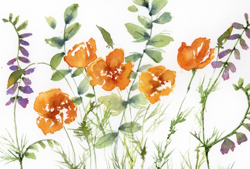
super fun today. Poppies, poppies are one of
my most favorite flowers. There is so much variety and there are so many ways
to interpret them. And I am just, I'm just brimming
with excitement to show you some different ways to approach them and how to keep them loose yet super
expressive and playful. And I think we're just going
to have so much fun today. We're gonna be doing a couple of different Varieties of puppies. We're going to start
with a California poppy, kinda warm ourselves up. It's a little bit
more simple in shape, but don't let its
simplicity mislead you. They can be at somewhat of a tricky flower to navigate
because they are so simple and we can't
rely necessarily on so much color to be the thing that adds
interests and brings depth. So we're going to figure out how to move
around that flower, create those cute
little stem ease, and just really
bring it to life. Then after we've gotten
familiar with that, that shape and form, then we'll move on to
an Icelandic poppy, possibly a Shirley poppy. And we're just going to look at different ways to shape
them, approach them. I think that's really what a class should be about
is not just saying, Hey, this is the way to paint these, but saying, Hey, there are
so many ways to paint these. Which one do you like best? Which one resonates with you
and myself as your teacher, I get to show you those
different varieties and let you decide
what you like. So just quickly going
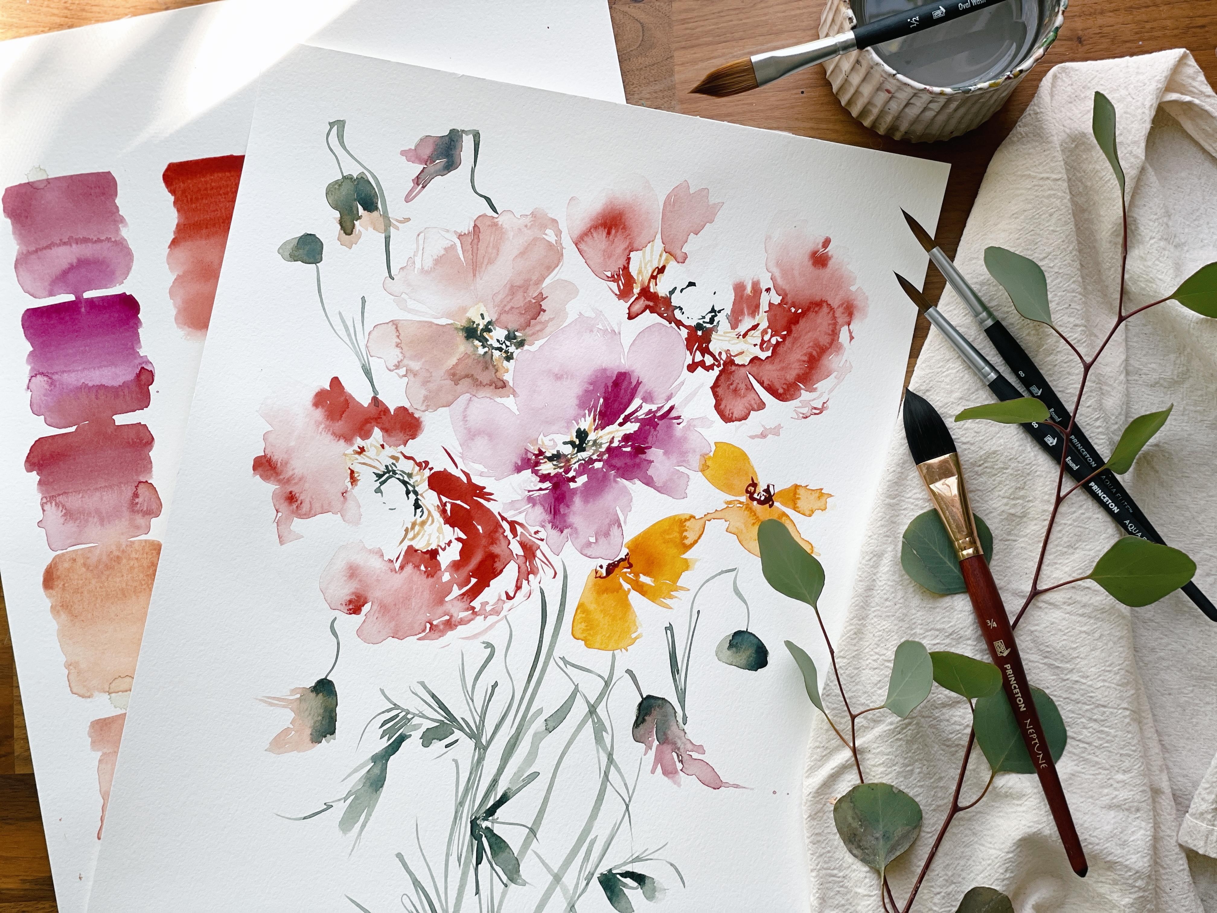
over our supplies. Nothing new here, nothing out of the
ordinary that we haven't used with the
exception that we will be using our filbert brush. I'd like you to
have two of them, three at the most, but probably to in somewhere between a
size four to an eight. So I'm not going to be specific because it really
doesn't matter. This is a four and
then this is an eight. I know they look like there's a huge difference between them, but in fact they do pretty much the same thing and can make
the same pedal stroke. But if you're more comfortable
with one over the other, then I advise you
to use that one. So 468 and the filbert doesn't
have to be this brand. However, I am using
the Princeton, Umbria, love, love,
love this brand. And then we will also be using our tried and true
Princeton brushes. Brushes. I have both the Aqua Elite
here and the heritage. These are round in
a variety of sizes, from six to ten. I like you to have multiples
if you know that from taking my previous classes,
a couple of sixes, couple of, a couple of tens, or just a mixture of all
of those because we'd like to use multiple
brushes at the same time. Just breakout what you have
and keep it off to the side. We may not use everything
I like to kind of keep while I plan these classes, I like to sort of
keep things open for just the spontaneity aspect. It makes it more of a joy for
me to teach you that way. And I think it brings in
just like fresh creativity. So I'm also going to
have my iPad out. If you would like
to follow along. You may want to download a few reference pictures and keep them on some
sort of device next to you so that you can
reference this is from Pinterest board and
I have this board marked as private and you can
go to my page on Pinterest, I'm Rosalie going
papery and follow me. And then you can follow
this board and I'm just attaching flowers to it that
I perhaps will be teaching. Not everything in there will be what we've learned
or what we're learning. But you'll find the images that I'm using for
this class in there. Or you're welcome to use
your own images as well, so completely up to you. But it is nice to
have a reference. I'll be working from a
reference and several of them, and guiding you along as we
explore with shape and form. We will also be using
our Canson paper. As always, I'm gonna
be using the 12 by 18 inch pad gives
us lots of room. And just a really nice
green to this paper. But I've also, you'll see in the class syllabus that there
are acceptable substitutes. So go ahead and take
a look at that. There are plenty of different
brands in both brushes, paints, and paper that are going to work just
as fabulous for you. You don't need to have the exact same thing that I'm using. So this is the paper
will be using. You'll also need
a pallet or two. I like to have a tiny one
for my classes so that I can keep it in the frame and
you can see what I'm doing. But I also have this one off to the side that
I'll be pulling from a couple of
different solid plates, pallets or giant palette that
has lots of mixing room. Other than that, you'll need a paper towel to blot off on. And you will also need a cup
of water, perhaps a pencil. If you want to write down what your color
combinations are, you can see, I've already started to do
that a little bit. We have a new gamboge
plus pyrrole orange. We'll get into that
more in the next slide. But it's nice to just make
notes as we go along. So you remember and don't have to hold all of
that in your brain. So anyway, that is
our supply list. We are going to jump
into how to create the shape of a California
poppy in the next video. So gather your supplies, get yourself something
good to drink, and let's get started.
2. Swatching The Palette: A little note before we begin, it is an incredibly
windy day where I'm at, where I'm filming in my studio. You can even hear it
and probably will hear it howling in the background. I have shades and light set up. However, when I use the iPad, there is a huge reflection ring from my life that
I liked to avoid. So beginning starting off, I'm not going to use the additional overhead light just because we have
plenty of natural light. It's a gorgeous sunny day, but the wind is blowing and so clouds are shifting
over the sun. Yada, yada, you'll
see it kind of getting a little darker and
then getting a little wider. But overall, the light
is really great. As we move through the
class and the Sun passes, I will be turning on
the light to make sure that everything
is seen in visible. But I didn't want to
just kind of let you know what was going on. So in case you hear strange
wolves in the background, I do not keep them as pets. So let's go ahead and
start by mixing up the colors that
we're going to be using for our
California poppies. You can kind of see I have
some colors right here. The first mixture
we're going to use is the new gamboge from Daniel Smith and the pyrrole
orange from my merry blew. Now, like I already said, please do not feel as though you have to use
these exact colors. This is a yellow and an orange. If you have a yellow and an
orange, it will suffice. Obviously, the level of integrity will change depending on what sort of
brand you're using. If you're using student grade is not gonna be as fine quality. You're not gonna
get as rich colors and your results
will be different. But so long as you are
using artists grade, there won't be a
huge difference. So I don't, you
don't have to get these exact colors to enjoy
the benefits of the class. You can use an orange and a yellow or you can
mix up a red and a yellow and to make orange and then use a different
yellow Indian yellow, yellow, deep green, gold, Naples yellow or yellow ocher. There's so many
different yellows and as long as it's just different enough,
That's fantastic. With my classes,
I'm not looking to perfect the exact same
color of the flower. And in fact, with watercolor, you have to take certain
liberties because should you use the same
colors in pigment, you're gonna get a very
one-dimensional results. So I like to kind of take liberties and play
with my colors. And although it
will be very close, we will not aim for exactness because there's just no fun
or room for play in that. So let's go ahead and
put a little bit of the pyrrole orange
on our palate. The new gamboge. I'm gonna take my
number ten round brush just because I like it for mixing color and
I'm just going to wet a pile right here
off to the side. Then add a little bit
of orange to it and I'm gonna mix it to cough
syrup consistency. If you've taken
my other classes, we talk all about water
ratios and consistency. So if this is sounding
unfamiliar to you, go ahead and start with
those earlier classes, they're going to be a lot, lot, There's gonna be lots of
information guiding you and preparing you for what is probably considered more
of an intermediate class. So if you look here, we have something extremely close to our California poppy. And I've mixed it up in cough syrup consistency
so we can kind of see how deep we can
get that color. Although if we were to add
more of the pyrrole orange, It's going to get orange year. And we can even increase
that and make it deeper. I'm kind of going for a
mid-range orangey yellow. But let's go ahead
and just kinda see what that looks like on paper. Dip into the water and see
what that's gonna look like as the color moves
off of my brush. So there we have it
at its darkest moving through how it's going
to look when it's light. We can even carry
that through just to see what it's gonna look like with just a little
bit of water on the brush. And we can dip back in, add a little orange, come here at the top and
see what is possible. Should we decide to
just increase that? So you have kind of three
levels of color here. I like to call the first one
cough syrup consistency. And then the next one
is brought consistency. And then the last one is
your lightest consistency. It's mostly water with a little bit of pigment
left on your brush. You can go ahead and jot down
that color mix if you like, the pyrrole orange
plus new gamboge. I'm going to rinse off my brush and we'll mix up our next color. Also just going to put a
little bit over here so we can see what it looks
like at the lightest. So you can see there's a
lot of color potential within this single mix. We do that a lot in my classes. These don't even look
like the same color, so we'll be using
that to our advantage as we work with watercolor
and creating the shape. Next color mix
we're going to use is going to be quinacridone, burnt scarlet, and green gold. The quinacridone is Daniel Smith and the green gold
is my merry blew. Rinsing off my brush. My water is already
quite orange. That will kind of aid me as I stay in the color family here. In the quinacridone,
birds scarlet, and adding in the green gold to make it a little
bit more orangey. We have something that's
just a little bit darker. Lighten it up just a bit. We'll mix it at cough syrup
consistency to start. Do we have something that
looks about like that? Swatch that out? Basically just another
version of orange. But these colors will
interact with each other as we play with wet into wet. And you'll be able to see
those small distinctions. That's that. And then we will a little bit, It's just the water on the brush just to get an idea of what
it's gonna look like. Then we're also
going to swatch out new gamboge on its own because it's a really nice yellow
that will also use as well. There you have our
working palette for the outside of the poppy. When we get into the
inside of the poppy, we're gonna be going back into the quinacridone burnt scarlet. Adding the more of
the dramatic center and really working with beautiful wet into
wet consistency. So it will swatch
that out as well. Go ahead and write all of
these colors down if you need to. Out of the frame a bit. There we have it. Working family of colors. The next video we'll be working on form and how to approach everything and just
really get a good handle on what is all going to look
like as it comes together.
3. Sketching The Poppies With Our Brush : Something that really helps me when I am just
getting familiar with a flower is to not necessarily like sketch
out the shape with a pencil, but do so with my brush
so I get my colors ready, and then I take a good
look at the shape. I sort of recognize common shapes like
we've done in the past. Ovals, circles,
squares, triangles, things that my brain
can easily latch onto and then apply
while painting. That allows me to kind
of relax and lean into the painting rather than trying to get every
ruffle correct, every shape, every
direction and position. I tend to get
overworked paintings when I approach things that way. So what I like to do is I take my brush and I get
a little bit of paint on it. And I'll look at this
and I'll say, okay, this sort of has a
bowl-like shape to it. Maybe cup like saucer. I get that idea in
my head and then I'll take my brush
and off to the side. I'll just do
something like this. Just noting the general
shape of things. Then we have a
center right about here that I just note down. Then what I'll do is I'll take my brush and kind of doing some of those back
petals as well. Then fill in where I see the Petals either
overlapping or separating. This is just one way to
approach the observation, the sketching part
of the process. We're gonna do more of this. I just wanted to walk you through as I was
talking about it. And it's not an exact
likeness at all, but it just gives
my brain like okay, so this is the shape
that we're playing with. And then when I'm in the moment and I'm
working through it, I have much more
knowledge, confidence, approaching what it looks
like as I look back and forth between what is real and what is imagined
when I'm creating. The first thing I just want
you to do if you're gonna do it off screen is to just gather
some reference pictures. I have a whole bunch and that's my second recommendation is
don't just look at one image. I have these ones saved. I have these which I don't even think these
are real flowers is probably these are
probably fake flowers. Then I have this ones
where it's more head on. So we're coming again and seeing that bowl-shaped fan shape. I see a lot of fan shape
with puppies as well. Just sort of storing
that knowledge off to the side so that I
can use it later on. When we're doing more
complicated things like layering or increasing the color value wet into wet, those
kind of things. Go back to this original image and let's go ahead
and just kind of walk through that process of looking and sketching
out together. Any color is going to be fine. I had the little bit of the
gamboge and orange pyrrole, orange on my brush. This paper is so great
because you can do these little sketches and then fill it in and
it's still wet. You can see here if I
wanted to do wet into wet, you still have plenty
of time to do that. But we don't really need to concern ourselves with that yet. We're just looking at shape. All right, so let's pull
that off to the side again. Let's have a look at this
one that's more on its side, then the one above. I'm gonna take my brush
and I'm just going to look and just notice
some ruffles here, some ruffles, their
petal that comes out here, a little bit here. Coming up here, up here, and curving down here. Again, this is just
kind of giving me an idea of what
I'm working with. I'm going to fill it in
where I see separation. When we're in the moment, we may choose to lead all of these petals run
together and later on create some
details and whatnot. But this is just a great way to kind of capture shape
petal coming out here. I try not to get too detailed because then I start painting. And this is not supposed
to be painting. This is supposed to be
understanding, sketching, exploration, not editing myself, not saying like, Oh, that should definitely
look different. So. Give yourself room and permission to do that
without being like, oh, that's terrible.
That looks horrible. I am no idea what I'm doing. That is what this
stage is all about. It should be about
you not knowing what you're doing
and just kind of letting your brush
gives you an idea. We have that one. Let's go ahead and do
this front flower here, very bold, kind of
odd shaped here. And that's going to look
a little bit funky. When we're first
painting with puppies, they can be tricky in
that way because they don't have a lot of petals to offer distinction
and separation. They don't necessarily have a really dark center
the way that roses due to provide that that depth, that look of like okay, this is, these are petals are close and inside and then these
puddles or outside. It takes a little bit of
work to get the puppy there. And although we'll use
color value to our benefit, just grasping the shape is important for this
flower specifically. I'm just going to take my brush just like I want you to
just hold it like this just loosely and I'm not saying
you have to hold it with this position because I
learned how to hold my brush. What is quote
unquote improperly. Lot of people hold
their brush like this. Then still more people hold
it with the two fingers. I've seen people do really weird things that we
won't even go into. But this is my preferred stance and I'm just going
to kind of let it rest between my fingers here. That wind howling, just
kinda ruffling things. Do some of that back pedal. Move on to the
side a little bit. Coming out over here. Where the petal kind of
sneaks in a little bit. Then just kinda call it
color in what I have here. Now, a lot of times I
really liked my sketches. They're kind of fun and pretty
in their own unique way. There's gonna be a lot of details that we're
not going to capture. Where I'll just
show you here where the petal would kind of
do one of these things. You can kind of see like okay, that's the outside petal, this is the inside puddle. And that's more of a
detailed approach. And then we would
have this petal and then we would take color. And we run it along here
to create something that looks a lot darker
for these loose puppies. I really don't enjoy that. I like to just pick
up the details where I can without making
things way too structured. Mostly just using water here, a little bit of
pigment on my brush. And pulling down. Just getting the
outline of these pretty little ruffles is
sometimes enough. You can go in and
put the ruffles back in if you lost
it a little bit. So spooky, I don't
know if you guys can hear all of that howling, but it sounds like we're in the middle of
a bitter storm here, but it's like 52 degrees
California winter. I know a lot of the other
lot of other countries and states are hurting right
now with snow and rain. I don't like to brag about our cold days that involve
us putting on a card again. We pay for it though. Like I said, I don't try and
add to much more in there, but just to get an idea. Then later on we would add some much deeper colors in here to fill in and color
value and all that. But we'll stop there because
we're just exploring. All right, let's go ahead
and do a different image. And let's go ahead. We're a bit smaller. Or at least they
look smaller to me, different variety of
California poppy. They're not quite as triangular as some of the other ones, like these ones are
very, very triangular. We'll cover those as well. But I wanted to move
from similar shapes. These are similar to this one. These ones are still
roughly and fan like. Let's go with this
little one right here. Make sure the cameras
focused on it. And I'm gonna start with
that outside petal. And then I'm gonna
take my brush and do the petal that's furthest away. You can see this shape
is just kind of blah. There isn't a whole lot of
light movement of petals here. And that's why I always say, don't let this
flower deceive you into thinking it's
a simple flower. Because honestly, in reality, the more simple the flower, the harder it can be to
connect with it and help your audience to connect with where certain
things are happening. So don't, don't be
complacent and think, oh, well this is so easy
because it takes a little mindfulness to just continue watching
and observing. So we have a separation here. Obviously we have a pedal here, petal here, then we
have two petals, and then this one, and
there's dark things happening over here that we won't
quite capture yet. But that is the
gist of that shape. Can add in a little
bit more depth here. Just to kind of get an idea
of how it's gonna work. Little bit more detailed here. You can already begin to
see how we're gonna pull in different colors to begin to make something that's
really beautiful. Let's go ahead and
do another one. I feel like I know it's repeat, copy paste, repeat,
but there are different flowers
and they're just, this is all just bolstering your brain to think
of form and shape. And it all comes in extreme handy because your muscles are growing even if you
don't always feel it. I'm gonna go with
this one right here. It's a little teeny tiny one. And you can see that bring
you a little bit closer. It's got just a hint
of a petal here and then to larger petals and then
a bit of the other petal. Let's go ahead and
do that over here. It starts with just
a little line. And then we have
pretty wide pedal, some ruffles in there. Then one more. Then we have a bit of the other
petal kinda showing here. Then through here we have the darkness that
will be happening. Make sure we're focused on that. Looking at a couple
more positions. Let's do one. Let's see, We've done one facing that way. Let's do another one
facing this way, really on its side here. So coming down with
that back pedal, this is my problem
trying to get the iPad in the frame as well as
the actual painting. I'm gonna move this off
to the side just for a little bit here
so I can make sure that you're getting the
actual painting happening. Pull you out a little bit. There we go. Pulling it down. Just a little bit
of a petal here. Just kind of shaping
it really loosely. Just using the tip of my brush, get some of that back pedal. Then filling it in. Here. You can see there's
really no like defined shape or
structure here is just sort of a loose
groundwork to get us familiar. I don't want you
feeling like, oh, that doesn't look like anything
because we'll get there. Alright, let's go
ahead and we're gonna do one facing this way. This time. We start with that back
petal and then we have a petal that kind of
ruffles down this way. Nice long one comes out here. Then we have another
long one that just kind of curves a little bit here. There you go. We'll, we'll play with
brushstrokes and using the belly and the tip
of the brush to create more finer aspects and
more broad aspects too. Then the last thing I
want to show you is just a look at these ones that are a
little bit more triangular. So let's approach one of
those just real briefly. I think I liked the
roughly fan ones. I think those give us a
little bit more room to play, but I want to be comprehensive and everything
that I showed you. So we have a petal that just
sweeps up and then down. And then we have a
very dramatic sort of V-shape here, saucer cup. Then we have petals
that shoot up. And another one comes out here. And obviously these
are filled in as well. Then you have little
details down here that kind of help give the flower
shape and structure. Then one more of those. We have one that kind of starts
here and then shoots up, then comes down. Those sides smaller. This side is much larger. Petals that sort of
ruffle and overlap. More ruffles down here. Then obviously you would have the stem and
everything connecting it can kind of get an idea of just the way to
approach these. So if you haven't
already take your brush, use your reference
pictures and just start doing some very loose tip of the toe shapes to get an idea of what it's all
going to look like together. And they can even be
as simple as that. They don't even need
to be filled in. I do that for like a
light in depth reference, but just something to give your brain, something
to latch onto. This I said, like I said, is going to come in great handy. And now we will approach
the puppies with a little bit more confidence and work on some of
the finer aspects.
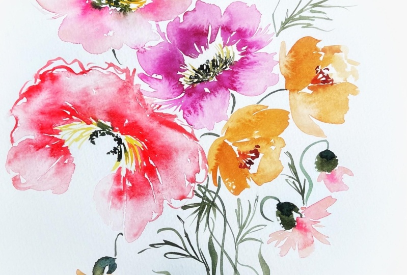
4. Painting The California Poppies: I've went ahead and
fresh and up my palette, meaning I have my pirate
orange and new gamboge right here in a broth consistency. If we want it to be
cough syrup consistency, all we have to do is
just thicken it up here towards the top. And then I also have it in
broth consistency here, little bit more
heavier on the yellow. I like to play
with that as well. Meaning I'd like to have
more orange in this one, more yellow in this
one just to give them enough difference so that when they interact
with each other in the water and the paper, it's not all like I said,
so one-dimensional. And then we also have just straight new gamboge
off to the side. So we'll be using all of these. And then we're also going to
be using that Quinacridone, Burnt scarlet to
fill in the middle, even though it's not necessarily prominent in the actual poppies that we're gonna be looking at. It's one of those liberties that I like to take just to kind of give
a little bit more drama. If you look at some
of the puppies, there is definitely a
significant darker aspect to the middle of them. A lot of them simply just
have the the yellow center. You'll see I've gone
ahead and turn on my light because it's
getting a little bit dark and I just
want to make sure you can see everything clearly. But go ahead and get your
war reference image up. If you are just sort of
looking for color, obviously, I'll be following along with a different image unless you do want to have
the same image up. This is the one
that I'll be using. We're gonna do the same thing we did last time where we're just taking a look at the shape, but we're also going
to begin to fill in more of the details
of the flower. We're also going
to be introducing our filbert, filbert brush here. This is a number four. I have taught a class
with the filbert brush. If you're not familiar with
how to wield this around, you may want to freshen up or take a look at that
class where I talked about how to move it around is obviously looks much different
than the pointed round. It has a flat tip and
it's more oval in shape, so we'll get a
different effect here. But in actuality it's not
all that different from this brush except
for the fact that we can make some really
fine lines with fun. But for overall shape, it works very similarly
to a round brush. I'm gonna go ahead and I'm
gonna put a little bit of the mixture on
the brush here, the pyrrole orange
and the new gamboge. I'm also going to load up my round brush with
the same thing. I'm going to start
off the same way, just starting out
with some ruffles. Just to get the basic
shape of things. Then I'm going to
use my filbert brush this time to fill in. I'm going to leave room in the center because we
want to make sure that we have the capability of adding in some darker aspects here, I'm using the
filbert brush to add some jagged edges
to the side here, maintaining the integrity
of the ruffled edges. And I'm turning it,
rotating it to get some finer aspects
like you see here, creating a little bit more
of a triangle shape and then rotating it so it's
flat to create more of those oval
and round shapes. Same thing that you can
do with a pointed brush. Just a little bit of
a different effect. Now I'm going to take
my round brush head into the cough
syrup consistency. I'm just going to begin to
add in some little markings. Nothing to structured. Just enough. I'm using the toe of the
brush to gently swoop in the bottom of the poppy. You'll see that it's
going to very quickly run into the color
and almost blend. And we're gonna do
this several times. I've left a little gap here where there's some
back pedal action and I'm going to swoop in here and
add in a little bit more. This will be one of the darker areas I'm really
going to lay in here, heading back into the pyrrole, orange and new gamboge
to pick up more. Want to make sure to get this
while everything is still pretty wet and head back in. To fill in that center, we're still going to
leave some center because that's where
we're gonna put. The yellow. But I want
to make sure we have some significant
bleeds happening here. Really lean into that orange now, cough syrup consistency. Just kind of rubbing
your brush through it to pick up as much of
that orange as possible. And once more, run back in
the bottom of those petals. It's okay if they're
touching as long as there's some separation
between the petals. That's fantastic. And I'm just poking, I'm just gently kind of looking to create something
that resembles a center that has whitespace,
that has differentation. Nothing that, I don't want,
anything too stagnant. The outer petals
I'm going to leave faint so that the inside carries the most drama and it guides your eye from
the inside out. We could very easily, and if you look at puppies, there are some shadows and shading that happens
along the outside. But like I said, your risks losing the eye here if
there's too much going on. So if you have your
burnt scarlet, I'm going to invite you to roll your brush through
there as well. Cough syrup consistency. Using my round. We're going to add yet
another layer here. Kinda starting with a
center here in the middle. And then just gradually
pulling it out. What we can do is take another
brush using a six round. Just sort of messy
things up a bit. Making sure not to lose
everything in the process. Just carrying a
little bit further out, adding some details. There you have it. Our very first poppy. We're gonna do that again. We're basically
just going to hit Repeat and we're going to be doing different shapes and positions and really
just get familiar with how to approach it. So we'll start the same way. I'm going to rinse
off that brush that has the spurred scarlet on it. Or if you have to
number ten brushes, you can have one
devoted strictly to the scarlet because we're working in the
same color family. Normally I would say have
two different brushes, but because it's the
same color family, I can just rinse off
in between and then reload my brush with
the pyrrole orange and new gamboge really
didn't need to pick up any of that straight
new gamboge. However, it's plugged
into my palette here. So I am going to put a
little more off to the side. And maybe with this flower, we will add a little bit more of that color just on its own. Just to give it a little
bit different look. Of course, I'm dribbling
here as I always do. That actually kinda looks like a pretty little
beginning of a flower. I always try and see
possibility in my mistake. I was painting yesterday. It was kind of drab day and
made an accidental stroke. And my husband was
there and he laughed. I said, and that's why being
a professional is helpful. And he laughed at me and I don't usually toot my own
horn like that, but I remember that
feeling when I was just beginning when something
like that would happen, I'd make this gargantuan stroke across the page and
just be like mortified, like it's ruined, my
paintings ruined. And now I can move through
it and say, Oh, well, we're gonna turn that
into something and it's definitely a milestone to
take home to that point. So had to share that
little story with you. Okay, refreshing my brush. And I'm going to lean into the new gamboge a
little bit more, some more of like a
miracle old color, but more on the yellow side. Let's go ahead and
start the same way. Start with the bottom
ruffle of this petal. Comes up just roughly
things out here. And then this petal comes down, sort of curves
towards the middle. Then we have our
outward petals here. Outer petals, excuse
me, not outward. Little bit of space there. And then we're going
to do the same thing we did with our filbert brush. Putting it in my new
gamboge with a hint of orange in there and just
begin filling things in. Towards the middle here is where we're gonna
have our center. So I'm gonna steer away
from there and just re-engage the petals
that I've started. Leaving whitespace. Pulling the brush down, coming up on its side, rotating that brush to get
more of the edge that I want, the more edge like and
then filling it in using the front side of the
brush, turning it flat. Again, this paper
is very forgiving. So as long as you're
using enough water, we don't have to worry so
much about drawing up on us. Come back in here. We have the shape. This kind of connects
behind here. Just making sure all
those little pockets are nice and filled in a little bit of
color through here. And then I'm gonna go
ahead and step into the pyrrole orange to add
in some of the details. That's all right. I had a little bit
more loaded on my brush than I wanted,
but that's okay. I kind of love
when that happens, there's still separation, but the two petals sort
of Mingle and mix. Using my number ten round, just coming in to add
little bit of detail here. Do the same thing through here. Through here. Give this petal a little bit
more structured by providing a barrier, but still leaving areas where
the petal itself is faint. And if we're feeling
like it's too dark, what we can do is take
our filbert brush, wipe off most of the
paint by putting it in water and then brushing
it off on a paper towel. And then we can always lift a little bit
of the color out. That's an easy trick. If you're feeling like you
went too dark with things. I don't think we did, but I just wanted to show you
that while we're working, you have to remember too, that watercolors dry two to
three times lighter, so that's going to
be even fainter. And you can already see here, we used quite a bit of
paint here and it's still just drawing very light. Heading back in with
that pyrrole orange in cough syrup consistency
for a second time. Adding some finer aspects here. Bringing the shape together
will have things merge here. Take our filbert brush
and just guided along. While everything's
nice and wet tap into that burden scarlet. Begin to approach the center. You get to decide as how much of that burden
scarlet you want in there. It can be just a little bit, you can make it much
dominate much of the middle or just make it sort
of an accessory. I mean, the potential here to
play with the wet into wet. It's very tempting. I just want to kind
of keep running my brush through
seeing what happens. But at some point we got to
stop and let it rest and be. All right. I'm gonna go
through one a little bit quicker this time just so you can kind of see how I would
do it if I were painting. The more we slow down for me, the more I overthink it. I like to paint quick. I wanted to just
show you what things look like as I'm moving along. Alright, I'm going to pick up a little bit of Indian yellow, which we had on our
original palette. That's the color I'm going
to use for this next puppy. I have this bowl-shaped here. Then these ruffles
that come out. We have one that's just a
little bit more closed. Then I'm gonna go ahead and
pull in the pyrrole orange. I'm going to use my
filbert brush now. Same thing, using
the Indian yellow to just kind of fill
in a little bit more. The flower pedal action here. Straightening that out a bit. Little bit. If the pyrrole orange
here into the ruffles, there we have something
that's quite loose. And adding a little bit more of that pyrrole orange in here will be the center. So I'm going to leave that open. We're going to wrap up
this video so that we can just kinda keep things
concise little bites. And then we'll move
on to buds and then adding beautiful little
stems and leaves.
5. Painting California Poppy Buds and Stems: Okay, So we're gonna
focus on doing a couple more smaller puppies as we would work our way
up in a cluster. If we were to be like
putting these in a bouquet, will do some smaller ones. And then we'll also do some
buds which are really fun. They're very alien shape, which I think is kind of
interesting and unique. So same mix here, pyrrole, orange and new gamboge, kinda all rolling together here and using different
consistencies. This will be a
broth consistency. I'm just going to use my filbert brush to
shape it out this time, starting with a petal up here, coming down, going
to fill that in. And then picking up
just a little bit of water side here and then do
the same thing over here. Just to kind of get
the general shape. And then some back
pedal action here. Then I'll use my number
ten brush to fill in with a little bit more color here in the pyrrole
orange and cough syrup. Since we don't really have
a middle in this flower, we can take a few more
liberties with where we add the color. I'm going to add a little
bit here on the top and merging and then bring it down. Same thing over here. Then I'm gonna do the same
thing right over here. I'm going to start with the
outer petals this time. Just shaping it like we
did before. Filling it in. You can add a little
bit more ruffle. Do it that way as well. Picking up just a
little bit of water, come in here and shape the
front part of the flower. There we go. I'm going to add a little
bit up there as well, but mostly happening down here to show where the
middle of that flower is. Let it emerge a little bit. Then we'll dip into
the burnt Scarlet. If you need to let your
paint rest for a little bit, That's always an option too. Sometimes if things are too wet, You're not going to quite
get that reaction and response it you're hoping
to get from watercolor. Those are a little bit
of a smaller bloom. Next we're going to move
on to creating the buds, which are really fun. Like I said, they're
very alien in shape. They kinda go a little
something like this. You take your
brush, I'm gonna be using number eight here. And it starts here at the top. And you just drag
it down to here. And this is a little
bit, it's a little bit more square in nature. I'm using sap, green
and indigo here. This is our green mixture. You'll see that in
the class syllabus. I put it in the
video instructions and it just has this very
like conical shape to it. And then it has
this little sort of round disc around the edge
that I'm just going to sort of like intimate towards not
really flush it out anyway. And then another little
counterpart down here. Then a really cute
little swoopy stem. You'll probably need to practice your stem action
if you tend to be heavy-handed and make really,
really thick strokes. That's why I'm using
my round brush really coming up on the tip here and inviting movement
into the shape of it. Kind of curving outward and then inward and
then back outward. So let's go ahead
and do another one. Bend this one a little bit, start over here,
then bring it back. Neither very
interesting looking. I wouldn't go so far as to say
it's my favorite bud ever, but it definitely, you definitely know what
it is when you see it. There's just some
little ruffling that happens along the edge
here that we can kind of, like I said, intimate towards and just moving some
stuff out of the way. Let's go ahead and do the
same thing over here. Bringing that stem
all the way down. Go ahead and connect
this one as well. What we can do here is dip into that indigo and sap green to create a cough
syrup consistency. And add a little bit of color. And create some detail here. Put a shadow, a little bit of detail, nothing to structured. Then the last one
we're gonna do, it's gonna have a little bit
of orange poking through, so we're going to
bend it this way. Then I'm gonna
take my brush with the pyrrole orange and
just nudge it into there. Do the same thing
on the other side. Coming down here. We will continue the stem
all the way through. Back down here. I like to bring all of
the stems into like a gathered position just to kind of make it feel like
it's all rooted together, but that's not
absolutely necessary. Then I'm gonna do one kinda
crossing over to just kinda give some
movement to the bud. I'm gonna dip into the sap
green and just kinda do a swirly little stem
here. Start here. I'm going to start at
the base and swoop out. I'll do it a little bit
more orange and this one to put a little bit of the blue, indigo and sap green
together and cough syrup consistency and
come back down here. Little bit of roughly. This
is just our practice piece, so I'm not really too
concerned about that. When we do our class project, we'll put it all together in a really pretty little bouquet. But this just gives you an
idea how the puppies are formed and shaped and how
they might flow together. You are welcome here to add
as much detail as you like, keeping things really light and loose or you can
make things darker. Sky's the limit. I always say that I just don't want you to
feel like you have to stop when I stop or keep
going when I keep going. So if you feel like you've
reached a point where you like how everything's looking. By all means. Take those liberties. We're going to cap it off
here and then we'll come back to do stems. More of like the
the shooting stems, not necessarily like
the main focal stem, but the stems I sort of shoot
out from the ground and then also the beautiful leaves
that accompany the puppy.
6. Stems And Leaves: The leaves accompanying
the puppy, or really feminine and delicate. And there is so
much fun to add to this flower just
because I feel like it ties it all together. And just a really expressive
way with larger leaves. While there's room for detail
with these little sprouts, shooting leaves, they're just
so playful on their own. They really don't need much
to just jump off the page. So I'm gonna be
using two brushes. I'll be using number eight
round and a number ten round. And I have indigo and sap
green loaded on my eight, and I have just sap
green loaded on my ten. And they're both at
about broth consistency. And that way I can add a
certain color and then immediately be able to blend it with another
color so that there's just beautiful
things happening on the page as we move along. If you want to just
use one color, of course you're more
than welcome to. But I find that having
multiple colors, especially when
working with leaves, really helps to just
aid in adding interest. So let's go ahead and start. I had fresh piece
of paper just so we can kind of see
what they look like on their own and then
we will add them to our puppy Practice page. So go ahead. If you haven't already
to dip into that sap green and then the sap
green and indigo mixture. I'm gonna start with just
a really thin line here. It's not as thin as
we're going to get, but it's just
something to sort of serve as the base of the stem. And then we're
going to just start making these little offshoots. They should be slightly thinner. Then the original stem. I like for my branches to have
a lot of movement in them. So you really want to encourage movement by shaping the
branch accordingly. Now you have a really
good place to start and we can begin
adding the leaves. They just happen like that in really small little
gestural strokes. Don't worry about
overlapping here. Going to face different
directions as well. Some coming down,
some coming up, some that are just very thin. I really like to be super
loose with my leaves. I'm gonna go ahead and dip into that indigo and
just start adding a little bit of color variation. Just using the toe of my brush. To create these sort
of spiky feminine. Leaves here. Interchanging. Some heavier
strokes where I add more pressure to the toe
of the brush and then also heading back in for using
just the toe of the brush. Basically you're
just kinda doing this throughout
the entire thing, making some longer,
some point here. Really just having a lot of fun. Playing. These leaves
should be fun. They shouldn't feel like you have to work too
hard to achieve them. We could, even if we wanted
to pull that down and connect it for some really
fun little movement here and just continued
to get wider and wider. We know what the poppies
when you see them, they're all kind
of just clenched and bunched together and there's no real understanding of where exactly they
are even coming from. You just see them in
union with the flowers. We could do it a bud
here if we wanted to. Bringing that down, then
adding some leaves to it. We don't have to
be so heavy-handed on all of the parts
of the leaves, we can leave some more minimal to create some breadth
and some rest. Then I'll use the
indigo just to kind of pop some other
colors in here. There you have it,
those are our leaves. It's hard to even
call them leaves. They're really just
more like stems. And they're really fun. And I think that as you add them or as we add them to
the actual poppy, you'll find that it just
adds so much interests. So let's go ahead and do that. I'm just gonna do a little bit here
because we're going to do a lot when we do our main project and we create a piece using the
kinds of puppies. So I'm just going to kind
of bare minimum here, just to show you how it's going to all start to come together. Just using the toe of my brush to create some
sort of focal moments. Sort of dragging
the brush around, using the toe can create some stems coming
from the bud as well. Just to give it a little
bit more movement. Then we'll start
adding in beliefs. My indigo here. Like I said, I like to paint fast because
if I slow it down so much, then I start to overthink
it and focus on every little part rather than seeing the painting
for what it is. Do a little leaf branch here, down here for our low. But Poppy. And then
I'm gonna go ahead and attach the base using the sap green and the Indigo. And bringing it down to connect. Just thickening up the
stems a little bit, moving through the bouquet. I don't really ever like to formally attach
things too tightly, but just kinda give
the illusion that things are emanating from
a certain direction. There you have our cute
little dainty leaves. And then the next step is going to be adding
a little bit of the yellow into
the center to kind of help bring it altogether.
7. California Poppy Centers: Like I said, at the very
center of these puppies, is a yellow sort of sprouting stamen that kind of ties it all together because it's
lighter in color. Unless we were using something
more opaque like gouache, it's really not going to
show up for our purposes, but what we can do, and what we have done is we've left whitespace and
we've kept things intentionally open to create a just a little bit more
fine inner workings too, to just give it one
more level and layer. So I've mixed up some
Naples yellow and I'm just really getting it saturated
on my brush here. I want it at its
thickest consistency, which I always call
horseradish consistency. And it's basically as much
of the colors you can get on your brush at
its darkest form. Highest color value. Then we're gonna
go and just very loosely add in some yellow. It's going to be quite subtle. I'll bring you in
to see because we have so many other bolder
aspects happening. The flower. I'm just going to take
my brush and just sort of loosely play around with adding a
little bit more detail. You can see where I'm going
over the darker areas. The yellow is really
standing out. And then also where
things are lighter, the yellow is
standing out because it's very thickest form. You can kind of see how
everything ties together. I'll do a little bit up
here just to kind of indicate that there is
a center somewhere, somewhere deep, deep,
deep down in there. Again, this is just using
the tip of the brush to very loosely indicate that there
is something happening. It's not taking the
brush and doing really slow methodical
structured strokes. Just not the approach
that we're using here. So I'm going to bring
you in a little bit closer to see you can see the subtlety of those marks. Just see how really
lovely they are. Not everything has to be super bold and dramatic
to have an effect. So I think what we've done
here is really pretty. And it serves, it serves
the flower overall. And we're gonna play a
lot more with drama and tones as we create the
Icelandic poppies. But this is just a
great starter place. And I feel like we've
learned so much covered so much in just this
amount of time. And I'm excited to move forward and show
you the next part.
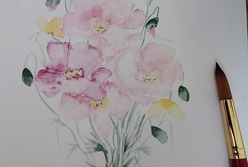
8. Creating The Icelandic Poppy Palette: We are now ready to move into the second
portion of our class, which is a study of
Icelandic poppies. These are one of my
favorite flowers. They are so beautiful
in the way that they just sort of
ruffle and lay out. And although their structure can be a little bit tricky to capture and do so
in a way that feels like natural and organic
without overworking the flower, we're going to look at how to approach these flowers so
that they feel loose and expressive and gestural
without having the need to keep touching it to make it look exactly like what
we see in nature. So we're just going to
draw from inspiration. Before we get to the
painting part though, let's go ahead and
build up our palette. We're going to have a
few working colors here. So you're going to
want to clear off some space on your palette. I have to. The two working palettes
that I'm using, this one and this one about
this much space and that's about how much you'll need
will have probably like four colors that
we're working with. And want to keep them
somewhat separate so that we can have the blending
action happening on the paper. So I'm gonna put this off
to the side for now as we begin to begin our palette. If you need to rinse out
your water cup, if it's, if it's orange from
our previous lesson, then you may want
to do that now. Brings off those
brushes as well. Okay, So the first color we're going to put on our palette is a bit of the casino violet. And then we're also going to put a little bit of the
primary blue burnt sienna. Go ahead and grab your brush. I'm gonna be using
a number ten round. Bring out some of that color. We're going to mix this to
cough syrup consistency. Dip into that burnt
sienna to create this really vibrant
pink. A little bit more. Want to have enough of
it so that we can do some really beautiful bleeds. And also these flowers
are quite large, so we want to make sure
we have enough to cover this space right about there. And then adding in a
little bit more water. We're ready to swatch out
and see what that's gonna look like on paper. There we have combination if
you need to write that down, the Xeno violet plus
the burnt sienna. And then we're also
going to do off to the side just the
Virginia violet. It's such a pretty
color on its own. Very vivid magenta. It's going to work great with this other color as we blend. Your swatches still wet, you can blend it into
that next one to kind of get a feel for what's going to happen when these
two colors begin to merge. This is sort of a tip and trick that I like to
do when I'm painting professionally to make sure that the colors that I've chosen
are going to interact quarterly lovingly and not create colors that I'm not hoping to achieve
while painting. I typically tend to know if the colors are
going to work or not, but it is nice to
see them on paper. We're also, I'm
going to switch to my other palette just to make sure I have enough room here. Going to take that
Virgina violet from the initial pallet.
Put it over here. We're gonna make sort of
a peachy coral as well. As you can see. We have lots of
working colors here. And we want to have the
same range of possibility. Although we may not
get to all of them or use them all with
the same frequency. I like to be able to pull
from different colors. Also going to dip in
here to the new gamboge. Just start adding
it into my color. We can see it turning more of
a coral with hints of few. New gamboge was quite dry, so it's taking a little
bit of re-wetting to get it to where I want it. Pick up a little bit
more of that. Violet. Now we're about there. Make sure it's fully
saturated on my brush. Let's go ahead and
plug in a new color. Can see these colors are working quite
harmoniously together. Really beautiful effect. Our fourth color, we're
going to use Naples yellow. If you don't have
that on your palette, go ahead and put that somewhere
so you can access it. I'm using the Daniel
Smith version, but I've seen it be pretty
consistent among most brands. Really going to go heavy here on the Naples yellow because I
just want a very faint pink. This will be the initial pink that we launch into
and then we'll use these richer
colors for our bleeds. Remember that we can use them at different consistencies to
create a whole different look. I'm going to pick up a
little bit of violet. Now we have a peachy,
peachy coral. That's going to work great. This swatching out process
is not always necessary, but I like to do it for
students so that they can see just how it's all
going to lay on the page. Then we can add a
little bit more water here just to kind of see
what it's gonna look like. Super pale. If you feel like it's a little bit more on the pH side and you
wanted a bit more pink. All you have to do
is go into that Virgina violet
mixed that mixture so that it's a
little bit pinker. Really, it's up to you. I don't want you
to feel completely married to these colors. If you like something different. There you have just a
little bit more pink. Changes the field. A lot of this is
going to happen. The painting itself,
because we'll be using these
colors and they'll, they'll show up because
they'll blend together. But you can see we've used, Let's see, reviews for colors. And we already have
five different colors. And then there's
the potential for another at least five
colors using water ratio. Let's put that off to the side. Then the very last
color that we'll use. I see this beautiful red poppy
poking out from the back. So I'm going to draw from that. I'm going to use a little bit of Daniel Smith organic vermilion. This is nice because it's
just one color on its own. I love it straight
out of the two. Got some orangey qualities
to it that we can tone down with a bit of sepia. Or you can even use the
quinacridone, burnt scarlet. I'm going to use a little
bit of the burnt sienna. I like it as is and you
can leave it as is, but I'm going to turn it
just a bit more brown. Just because I think that Brown is gonna go
better with the pinks. The red when it's mixing with the yellows is going to
turn things quite orange. And I would like to
avoid that sense. These puppies are more
on the pink side. Let's see what it will look
like at broth consistency. There we have our
working palette. Obviously there are
more color capability. So if you want to
continue on your own to explore color and come
up with different mixes, please, by all means, these colors all worked
beautifully together and you can find
something that you love. Next step is we're going to
be painting the puppies. However, if you would
like to pause the video and do the lesson that we did prior to the California poppies where we just played
with the paint, the paint brush, and
sort of sketched out everything to get a feel for just the shape and
structure of them. Please feel free to do
that now and just sort of warm up before we
head into the page. I'm not gonna do that just
because I already showed you that process
and how to do it. But if you would like to, you can take this and just use your paintbrush to
just start loosely outlining what that might
look like and just fill up a page with the general shape and structure of the puppies. If not, you can follow me into the next video and
we'll get started.
9. Practicing Painting Shape and Structure Part 1: Go ahead and clear off a
little room on your palette. We are going to be mixing
the center of the poppy, which we're going to begin with. So we're gonna need those
colors immediately. So what you are seeing on my palette is a little
bit of the sap green. I'm going to bring
that down here. We're gonna use this in cough syrup consistency so
you can mix it pretty thick. My sap green is a little
on the drier side. Probably time for me
to get a new one. But it still works. Just make sure you
take the time. I always, I've stressed
this in previous classes, so I don't tend to do so
now because most people are carrying on from
those initial classes. But please, as a reminder, take the time to create your working piles,
the correct consistency. It will save you time on
the backend, I promise you, the mistakes are not necessarily something that I really let enter my brain as I'm painting. But I feel like this is a huge time-saver and
expedient as far as just getting a the colors
where I want them and not having to feel
rushed and anxious while I'm in the
painting process. I'm also using a little
bit of the indigo here just to darken it a
bit this turquoise, although not necessarily
an actuality. The actual poppy is so pretty, I think it's gonna
go fantastically with these pinks,
pink and turquoise. A beautiful color
combination which I invite you to
explore on your own. When the time is right. Now I have that about
where I want it. I'm going to leave
that right about here. Again, cough syrup consistency. I'm going to load that up on
my number six round brush and put that off to the side. I picked up a little glob along the way that off if
you ever see that, take the time to
get that off there, they tend to get very, I don't know what the right word just chunky, sticky. Alright. The next thing we will do is the same thing
with the Naples yellow. So pick up your Naples yellow and put a little bit of
that on your palette. Again, I'm going to use
a number six brush. This is the Aqua Elite, which I find has a bit more
of a significant point to it. Just able to do a lot more
flicking motions with it. The heritage is
great and especially when it's kind of
like a little tip, the heritage brand is one
of my absolute favorites. And as they come out of
their little plastic casing, they are so fine and you can get really thin
strokes with it. But over time it tends to, the bristle tend to
just get a little bit more lax and they're not quite as glued together
as they were initially, the aqua Alito found
hold up a little bit more and does stay pointy. So that's just my experience. We want the Naples
yellow to be quite thick because it is
such a fair color. So take the time to
really get it there. We're going to start
with a really loose, expressive Center. Nothing to exactly
what we're doing, what we're aiming
for here is just to flesh out the center
of the flower. Because poppies are
really all about openness and just this free
flowing petals structure. And so the way that we need to respect the integrity
of that flowers to make sure that we leave
enough room for that center to
habits moment if we, if we, if we start
with the petals, the tendency is to bring
them in real close because we're trying to grasp the structure of that flower. And then we don't have quite as much space to do
what we want in the middle. So I go back and forth between whether I start with
petals or center first, it depends on the flower. I'm not saying one way or the
other is the correct way. I'm just saying that I find that in this case
for this flower, it works out for me
to do it this way. You're gonna take your
brush and we're going to use the toe of the
brush to just sort of flick around and create something that is
kind of circular, oval, nothing to exact. Just a basic understanding of what the middle this
flower might look like. Then you are going to
take your brush that's already loaded with the
sap, green and indigo. And we're just going to sort
of add in a middle here. You can let it run in to your
yellow a bit if you like. You can keep it separate. That is going to dry up for
a little bit, which is fine. And then we're going to
pull out our palette. We're going to load
up another brush. Go ahead and grab your filbert. We're going to load it
with the Xeno violet. And actually I need
to put a little bit more on my palate. So if you feel like
your pile is low, you may want to do the same. And also a bit more
of the Naples yellow, like I said, with these flowers, they're on the larger side. So we want to make
sure we have enough enough of the paint to keep
moving through the lesson. Also, if you have any
leftover paint on your filbert brush and
have not rinse it out yet. This is your reminder. I had a little bit of green
sitting on mine, so I'm quickly just removing it. Going to take my Naples yellow and just add a hint of
the pink back in there. Then I'm gonna take my number ten round
brush with just water. I'm going to start creating
an outline of the petal. Something very loose,
but just to give me an idea of where things
are gonna happen. So this is just a
little bit of water and whatever paints kind
of sitting in my cup. And I'm just going to kind
of start flipping it around. Just using the toe of my
brush to create the shape. Then with my filbert brush, I'm gonna go along the
edge of my petal here. I'm going to drop in some color.
10. Practicing and Painting Shape And Structure Part 2: I'm going to continue to
work around the poppy, just adding a little
bit of water. I'm really just using the
toe of the brush to just get the shape of
the flower down, kind of like we did with
our California poppies. You can bring it to touch. Then we're going to take a round brush loaded with the Virginia violet
and the burnt sienna. We're going to begin
dropping it in to create some bleeds. Guide that down. It's a little bit drier. I had to pause the video for a moment because my
little one needed me. Always a mom first. I'm going to re-wet that area and begin to drop in that color. And do the same over here. We're really going
to focus on not overworking this
flower and making it. Trying to achieve what it
looks like in real life. Unless you're focusing
on botanical style. I feel like this tends to
just be creativity killer. Take the toe of
your brush and just begin to add some details. Darkening the areas
that are wet. Dipping into the casino
violet just on its own. Now. I'm gonna pour a little bit of that color into our center, giving it a moment
to just sort of work its magic and not
rush the process. Then I'm gonna wait to
see what's happening. But eventually what I want to do is as these
petals are drying, I want to start
working up some of this darker color into the
petal to create sort of the, the look of the stripes
that you see in the Icelandic poppies and
the wrinkles that you see. We won't do anything
that's too wild, but I'm gonna take
the toe of my brush and just began to work
up some of that paint. If it's too wet, really nothing's gonna happen. So we want to make
sure it's in-between that place of wet and dry. I'm gonna come down
here again and just add a little bit more
detail using the toe of the brush and blend that
in a bit with the center. Really now just playing
with these two colors, The Virgina violet on
its own and the Rozanna violet with the burnt sienna. Gonna take the toe of
the brush width for Xeno violet and
just begin to work up some detail markings. If you notice anything
is too heavy, too intense, you can always take your brush and just
soften things off again. Sort of starting from scratch. I'm going to blend my color
into the center here. You can see that it's
all working beautifully together as we figured out
it would on our palette. I'm going to leave a
little bit of whitespace. Whitespace is power
in watercolor. You don't want to leave too
much white-space because then you destroy
the illusion and it becomes negative space that otherwise best
used with pigment. But enough whitespace
so that people are understanding that
there's an idea of light shifting where things are separated can see this area
is not fully complete. It's just the idea that
there are some petals happening over here without
really drawing them out. Then I'm going to take my
Naples yellow and plug a little bit more color
back into the center here. Can see that some
really pretty bleeds are already happening. We're going to let that happen. I'm also going to begin to plug in some of that dotting effect. I'm gonna take my number
six brush and just begin to plug in
some loose dots. If you would like more
of those detailed lines, you can continue to do
what we've been doing, which is to put in paint, darker paint down here, and then begin to work it up
to the middle of the petal. I kinda like words out right now I'll see you as things dry. The only thing I'd like to do
is to intensify this pedal. I like to have a pedal
that's darker than the rest. That's this one. So I'm going to plug in a
little bit more color here. Then use my other
brush to work it in. We have to remember
that watercolor is going to dry two or
three times lighter. Then I'm going to pull up the color using the
toe of the brush. I can soften that off by using my brush that has
just a little bit of water to smooth things out. You can see that there's a
lot happening in this poppy. We have the sap green and the
indigo, the Naples yellow. And then we used
initially our Naples yellow with a bit of the
Rozanna violet for our petals. And then we began loading in The Virgina violet
and burnt sepia, and then the Virgina
violet on its own. And really just
working this flower in stages as the media is wet. So it's a lot of just
kind of moving the paper, excuse me, moving
the water around, moving the pigment around, and being mindful of
what's happening, taking your time and adding those little
details along the way. And not sort of pigeon holing yourself into this
really dark flower initially, although it is a striking
and dramatic flower needed for watercolor anyway, it needs to happen slowly and
be worked up to that point. Going to take the
toe of my brush again and just kind of flush out some details over here. Almost as though there's some back pedal action happening, some ruffles. Then I can pull that color
down into the flower. Really the potential
here to keep going and to keep exploring
is limitless. You could rewet this media and then add in adult
or darker color if you wanted to pull down
some of those stripes from the top of the flower,
I like it as is. I think it's turning
out really beautifully and as it dries, it's
going to fade a bit. So I'm gonna be
content to stop here, but obviously on your own, I encourage you to just explore, take it, take it too far. I know a lot of artists
struggle with that. I don't want to take it too far, but you really don't know what to far is until
you've gotten there. So give yourself permission to take one of these
puppies too far. This is just practice. We're not working on our
class project yet. And see what it's gonna
look like and then be like, okay, I need to rein it in, pull it back here and you'll be able to figure out what your
tendencies are that way. Like I tend to be
heavy handed when I do this or I don't leave enough whitespace
initially when I'm, when I'm fleshing
out the flower. So those things are really
important for you to know as, as an artist, we're going
to move into another puppy. We're gonna do a really light
mixture here to begin with, kind of like what we
see in this flower, a very pale, very pale poverty. And like I already said, these flowers are saved
on my Pinterest page. You can go to the
Skillshare class and see all of the reference
images that I'm using. I probably should have
done that a long time ago, but I'm gonna start doing it
now for all of our classes. That way, you'll have the
images that I'm using. People take screenshots
and whatnot and networks, but this is hopefully going
to be really handy as well. Let's go ahead and dig
into our Naples yellow. We're going to begin
once more to be flipping this around
and we're going to aim for a poppy that's
coming out in this direction. So although these are
our practice puppies, we want to sort of get familiar with the way that they're going to lay
on the page together. So let's try and group them together in a way that
feels bouquet ish, if that makes sense. We're going to let
some of these pop this action happen together. This blending of colors. Once more began to just
sort of flip your brush around to ground out a center. Don't be afraid to go
big with the center. It's always going to shrink
up when you pull the color. That's another really big tip. People get afraid to create
sort of dramatic starts. Go ahead and plug in. Your center. Can take your brush and do a little mixing action here as well, if you'd like. Then we're going to
take our filbert brush with the Naples yellow and violet
and just a really, really pale, pale
broth version of it. So if that color is
highly pigmented, want you to go ahead and
pull it out a little bit further to create something
that's a little lighter. We're going to blend
it in to this poppy. Using the side of
the brush and flat. We're going to begin
to just sort of curve and carve our way around. We can use the other brush if you're a little more
comfortable with that. So make sure your other brushes clean and then you can use
this brush if you'd rather, because you get more
finer response. We're just going to begin
to pull out the shape here. And then you can use
the brush to fill in the leaves some negative
space here to indicate light. Then once I have a shape
that I'm happy with, I'm going to dip
back into that color and intensify it to
cough syrup consistency. And then I can begin to
drop it in at the edges. You can pull that
color down through the petal and then
soften it off. Or you can leave it as is. If you like that look
of just the water flowing into the
petal, which I do. You can just leave it as is. You may need to re-wet
certain areas if you didn't quite get them wet
enough on the first try. Just taking the tip of my brush, moving it around, adding in
some of those detailed marks. But again, like I said, I
don't want to overwhelm the flower so much so
that I can't go back. I'm going to take
it the cough syrup consistency just began to work in some of the
color. The middle. I'm not going to use any of the pink because I
want there to be some difference between
these two flowers. I will darken up this edge that they appear to be sort of
rolling into each other. And then we can take the tip of our brush once more
and add some of those details along the edges. Darkening up areas where we want it to be a little bit
more of the dramatic side. I'm not going to
pull into the center so much as I did with this one. The key with
watercolor and flowers is making your flowers
a little bit different, not just copy and paste. It takes some different,
take some liberties to do some different things. I am going to come
into the flower, the center with
the Naples yellow. And just begin to add those loose dots like we
have on our other flower. You can pull that
into the petal. Pull that through. Again, like I said, you can keep going with
this flower if you feel like there needs
to be more happening. Not necessary, but you can. Then I'm going to stop the video here because we're running up to about 20 minutes and I think
that's a good chunk of time. And then it'll be
we'll come back in with our third puppy.
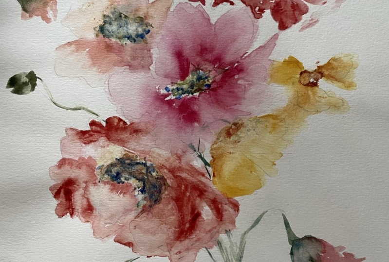
11. Red Icelandic Poppy: As I've already
shown you before, I really love this
dramatic red poppy poking out from
the cluster here. So we're gonna go for it. We're going to be we're
gonna go big or go home. That's what I'm
calling this pop. You go big or go home. And so we're going to use that beautiful organic
vermilion mixture with the burnt sienna. And we're going to
just take a moment to look at the structure
and shape of it, because obviously it's
not quite as open as the other flowers is more
of kind of peeking out. And since we are going
to eventually move into a project where we're grouping all of the flowers
that we're learning together. I think it's good
that we're using that knowledge now to sort
of pull it all together. So go ahead and grab your filbert brush and your number round or your
number ten round brush. If you're organic, 4 million
pile needs to be refreshed. Go ahead and do that now, dipping into the
water, into the paint. We're really going
to go dramatic here. We're going to start with the paint and then we're
going to add water. If your water cup is
looking like it's kind of murky and not super clean. I want you to take a
moment to rinse it out because we're going
to want that water to be somewhat clear so that we can do
what we want to do. I'm going to angle the page
here just a little bit. The way I see it
happening is there's a pedal here that's just
sort of folding over. So I'm going to mimic that. Dragging my brush along, creating that first petal. Then it comes down here, but I'm not going to connect it because then I will
lose the shape and I'm just going to sort of gesture. Then I'm gonna take my filbert brush and I'm just going to add a little bit of water
into these two areas and carefully nudge the edge of that petal using the ten brush. Pulling it into. Thanks, don't have to completely lineup in touch here either. I think a lot of
artists feel like, oh, well it needs to look
like it's completely overlapping or under lapping and so you can leave room here. We can always fill this area
in with stems and leaves. And it's important that
we give our flowers room. We're gonna do the
same thing using our number ten brush to
create the next petal, which I see is mimicking this one but
just a little bit bigger. So we're gonna start with
the side here, pull it down. We're going to work our way
up and then come down again. Not going to be exact. I'm going to take the
filbert running along the edge and pull it
into that top flower. I'm gonna take a little
liberty here and just add a little embellishment
on the side, just to kind of give it a
little bit of a playful nature. Then lastly, dip into that burnt sienna and
really loaded up on your brush along with the organic vermilion we want to pedal that's a
little bit darker. Take the time to make sure
that the right consistency. Now we're going to pull up a flower above our
initial puppy. Just taking the brush
and agitating that edge. I know it has a very
disconnected feel to it, but the way that we
alleviate that is by adding stems and leaves that
pull it altogether. Also going to add a little bit. We're here just to kind of give the illusion that there's something happening
down here as well. There's no center
to this flower. We're not going to give it one, but am just going to pull
in a little bit more color here to show that this is the darkest area where
things are folding. There we have it. Obviously there are so many
different possibilities with colors and the
way to shape them. But I wanted to give
you a solid look at an open face flower, one that's sort of on its side and then another one
that's really just sort of peeking out to
give you an idea of wait, wait all comes
together in a bouquet. We're gonna do
something similar when we're doing our class project. Grouping both
California poppies and the Icelandic poppies together
in a way that we would do, the way that we would
do it in a bouquet. Let's go ahead and
rinse off our brushes, rinse out our water cup, and we're going to come
back in and we're going to practice our stems and
our buds together.
12. Iclandic Poppy Stems and Buds: It already makes sure
those brushes are clean. That cup of water is
cleaned because we're gonna be leaping into our greens now on you're also going to want to clear a little
room on your palette. So I'm gonna take
mine paper towel and just sort of create
a little space here. Don't want your pinks and
greens running it together. If you would rather mix them up on a completely
different palette, you can do that as well. Just make sure that there is some dry space between colors if you're working
on one giant palette. All right, so another reference picture for you that I wanted to show as we work with the buds. You'll see that the stems and
the buds really have such, such a lovely little personality and character
I loved the way that they just come over and droop down almost as though
they're feeling melancholy. Little pity for themselves. But they're so sweet
and I think they add so much interest to those
full expressive bloom. So we're really going
to draw that out and have a lot of
fun with that shape. Let's begin to mix up the
sap green and the Indigo. Gonna need quite a bit of it. So feel free to just take time. I always like to show
at least one segment where I really take my time to just get everything
where I want it to be so that you can see what
it's supposed to look like. One of the comments
that I received initially from students
was that a lot of other teachers just skip
what they would deem as basic or already learned. And although I
would like I said, would consider this an
intermediate class where we know strokes and water
ratios and all of that. I do still like to
walk people through as thoroughly as possible so you can always fast forward
through these parts if they seem a little
redundant to you. Alright, so here we have a really beautiful green
cough syrup consistency. We can also bring out
another pile here, add a little water to it
for broth consistency. We're going to start
with the stems. We're going to take
the Tobler brush. We're just going to kind
of pull through in an area where we feel like the
stem would be gathered. And I wanted to
stress here that this is not about exactness, this is not about
getting it perfect. This is just about eluding
into what might be there. So I'm gonna take my stem and I'm just going
to kind of pull it down into the right and then angle it back
towards the left. Sometimes I need to
do it a couple of times and I actually
really liked the looseness of
an imperfect stem. I'm gonna do the
same thing here. And looking at this
flower on its side here, it tells me that the stem is coming this way,
it's happening. It's connected back here behind the petal and
then coming down. So I'm going to respect the
integrity of that shape. And I'm just going to pull
stem down right about here. And then I'm gonna do
the same thing up here, looking at where this flower is positioned and where
it might come out. I'm gonna pull it down
right about there. You can see I have
three working stems. None of them are exact. It's just the impression of where they might be
laying in real life. Let's go ahead and
we're going to use filbert brush to create the
poppy bud head. But head. Did you agree with that? But head is definitely not the most eloquent term
I've come up with while teaching a floral class. We're just going to bypass that. And also at some point, my phone to starting
to shut down. We had that happen in the
last class when there was an emergency alert and the
phone just sort of shut off. I don't know. Technical difficulties seemed
to just follow me around. So we actually have a little bit more work
here than we made. Fortunately, it was just
after we created these stems. I'm gonna do this several
more times so you can see it. But we have a little
bit of progress here that was not captured on film. No big deal. We're gonna do it again and again because it
is such a fun process and I'll walk you through
basically what happened here is I'm using my filbert brush in the broth consistency and
I created the bud shape. I'm going to leave
that one alone because I just want it to appear as though it hasn't
quite opened up yet. It's still tight-knit close
this one on the other hand, I did the same thing
all this time. I popped in a little
bit of violet into the edges and let
it blend in and then also pulled out a bit of
the petals so that it would seem as though it is
just starting to ripen. So let's go ahead and we're
gonna do that several more times and pick up
your filbert brush. In the broth consistency. Let's go over to
this side and we're going to plug in another. Another bud and we're going to angle it sort of
coming this way. The thing about these flowers is that they have so
much movement in them and really think it's
worth taking a moment to incorporate that
into the painting. So we're gonna start with
sort of a flat line here. And then we're going to
shape the poppy head. Just pulling in two strokes at the center using the
flat side of the brush. I'm going to let that
dry up for a moment. Do another. I'm gonna pull it down. Actually, I think will
come a little bit lower. Let us do the same
thing. Only this time. Let's come up a little bit. Make it a little bit bigger. Now we're going to use
our brush to pull out and drop in some of
the colors using your Virgina violet
and burnt sepia. Let's plug in here. Let's pull out a little bit of color using the brush to just sort of flick
into the wet media. Same thing we did over
here that wasn't captured. Just touching the edge of that bud and letting
it run into it. We're gonna do it one more time. And this time we're
going to leave a little slice in the middle
so that the bud really appears to be coming
from the middle as though the bud is exploding. Will create the first half, and then we're going to
create the second half. Let's go ahead and use a different color since we
have multiple copies here. Let's use that Naples yellow. And for Xeno violet mixture. I'm gonna plug a little bit
of that onto my palette. This paper stays
nice and wet so I really don't have
to worry so much. If you have paper that
dries up quicker, you want to have this
done in advance. I'm going to plug in the color
right here in the middle. Just using the tip of
my brush to pull out that color in case you wanted to see
it one more time just because we missed a couple, I'm gonna do a few
more over here. 1.5. The other half. Again plugging in that
Naples yellow and violet. You always can while
things are wet, go back in and add another layer of color
in a higher color value. So you could use it at
cough syrup consistency and getting more
dramatic effect. I'm gonna go for just
something really light and airy here and
leave it on its own. Now let's use our
number ten brush. We're going to pull
out some stems. We're gonna do the same
thing we did while creating the stems
to our flowers. And just be mindful of where
the stems might be laying. Number ten, brush in
cough syrup consistency. Remember these flowers
have a really, these stems have a really
beautiful arch to them. So we're going to kind
of try and mimic that. Start here at the top. We're just going
to pull it down, run it through, give it a
nice little curve here. At the end. I am going to go
through here and just darken up a little
bit of this area. It's still wet. Just kind of make it a
little more imperfect. Do the same thing over here. Just because we don't have
anything happening there, just to give it a
little bit more dramatic, drama and variety. Same thing with the stem, just kind of angling it so that it's coming up and then down. This one, it clearly looks
as though it's coming from either this direction or this direction and
coming back through here. So we're gonna come up here and pull it
through the bottom. You may need to practice this separately on a different
page to get a feel for. The rhythm and the way
to come up and then come down while staying on
the toe of the brush. There is the possibility
that things are going to get really thick and chunky
as you're coming through. And so I would advise just off to the side on
another piece of paper just sort of running through
that motion of up and down, up and then down. It's okay if there's
little gaps, you can always run
over them again. The idea is to come up and down. And it can be thick and areas, but you don't want it to be
thinking all of the areas. That motion will
really help get a feel for how the brush
glides on the paper. Same thing coming
here at the bottom. And then pulling it through. Here we have a nice
angle going to come, pull that through
and connect it here. This one, we're gonna give
a nice little curly stem. Some of them really do have such a fun little
curvy line to them. So feel free to use
both that structure, the up and the down, and then also more of a curvy. Can always go back
and connect things. You can always start
with the stem as well. If that's easier to you, then I definitely recommend it. Darken up this area here. Figure out what's gonna be
most comfortable for you. For me, I like to
know where the buds are before I attach the stems, but you could always
start with the stems and then use your filbert
brush to come in, plugin little poppy heads. That sounds much better
than bud heads by the way. You can go that route as well. And then head in with your
brush and finish it off. Pick up your brush
loaded with color, and then come in the back way and do it like that as well. If you want to
experiment with that, That's a good way to
do it to just depends on what look that you like best. We have a lot happening
on our page here, which actually brings
me to another point. You'll see a lot of this sort of loose splatter action happening
in floral artists work. It's more abstract and it's such a beautiful little
effect that I thought. Why not? Let's just
add a little bit. It already happened
here on my page. It goes so nicely with the nature and the
mood of this painting. Let's go ahead and learn
how to do that together. We're gonna do that in a different video and
add a little bit, excuse me, a little bit more of those loose splatters and then also fill in with a
couple of leaves.
13. Creating Loose Splatters and Leaves: This is a really fun and
beautiful technique. It's something that
I actually use quite a bit when I began my adventures as a watercolor
is I was really into super, super loose abstract florals. And although there's not much of that work posted on my
Instagram or anywhere else. That's where my
Foundation began. That's what I've come back to. If you followed
my career at all, I was really intrigued
by botanical study for awhile and learned how to use that sort of
print precise technique. But my heart really
is with these loose, very gestural florals and I found myself pulled back
here over the years. So this is a technique that I think you'll
find if you have not already familiar with it or perhaps have learned it in a different way
that I'm gonna show you that you might want
to use in your artwork. So the first thing
you're gonna need to do is take a paper towel and wherever you do not want
your splatters to appear, you're going to cover that area. So if you don't
want your splatters running into your
main flowers here, you would simply lay the
paper towel over this area. I would say that
when splattering, there's a circumference area of splatter zone of
about six inches. So that's about roughly the
length of this paper towel. I've had it go past that if I'm getting really wild
and in the moment, but typically I can keep the
area is somewhat restricted. It doesn't, doesn't
venture over. The next step is going to be
loading up your brush with a really large amount of water and pigment in the
cough syrup consistency. So I'm going to use that
versus Reno violet. And depending on how large
you want your splatters, that should be, the size that you should
correlate that with the size of the brush. If I want splatters that are
somewhat medium to small, I'm going to use my
number six brush if I wanted some gargantuan
spotters say I'm working with like an 18
by 24 canvas or 24 by 30. I'm gonna use this bigger brush so that they don't appear as though they're just
random dots or mistakes. I want them to I
want them to look as though they are implemented into the piece organically, but also intentionally,
if that makes sense, go ahead and really run your
brush through this mixture. You're going to want to
dip into your water. That it is more
saturated than usual. You want it to be almost
dripping but not dripping. So it's really
finding that ratio between wet but not dripping. Then you're going to take the brush and you're
going to brace the brush with the side of your hand here and you're going to gently
tap it against your hands. Sometimes I just use a finger. Sometimes I use the
whole the whole fist. It just depends on
how it's coming out. So let's go ahead and move
up here so you can see. And I'm going to aim for an area of Louis
splatters already. In the area that
I've used so far. You can see I have
some really pretty splattering work happening here, some larger ones and then some smaller ones and then a little bit of action
happening up here. Nothing going to close
into my painting. Let's do the same
thing over here. We'll go a little higher up. I'm not really concerned if
they go into my my buds, but I didn't want to keep
them out of my big florals. One more time. Taking our finger,
tapping it gently. And there you have a
really pretty effect that looks as though it's meant to work into the painting. Super, super beautiful. I love the look of it. You may see more of
this in the future for me as I continue to really explore and create florals that are expressive
and gestural. But I found that sometimes I
get a little carried away. And then the whole piece is just one giant
splatter pieces, which is so fun but
can hinder the mood. Alright, so I'm going to
rinse off my brush here. If you wanted your
splatters to be a little bit looser and wetter. You could use more water
and you could also use clean water if you don't
want them so dark. You see I really got
a gorgeous range of splatters here with
largest and then medium, and then some really
tiny ones up here that you have to sort
of zoom in to see. It adds a lot of interest to
the painting and adjust sort of makes it feel just so wild. Alright, let's go
into our leaves. I'm gonna show you one
little inspiration picture of the leaves so that you can
see what I'm drawing from. But it's basically a
larger version of what we created when we were creating
our California poppies. So it's sort of piggy in nature except the leaves
are just a little bit bigger, so you still have that
separation leaves that are so small. Let's zoom it out a little bit. Leaves that have a lot of
movement and motion in them. And they sort of aim
upwards and outwards, but they're not quite as STEMI, as the California poppy was. Alright, so let's head back into our sap green and
indigo mixture. You can use either
your ten brush or your number six
or eight brush, whatever it is that
you're working with, I'm going to use my ten brush. Most of the leaf
action that happens with the Icelandic poppies
is down towards the bottom. I didn't see a whole lot of leaf action sprouting up
at the top of the flower. So I would say take a look
at what you have and really just figure out what the
area needs to be filled in. And this is where you,
as the artist can take liberties and not
have to do things exactly the way
that it's seen and shown on or in real life. I'm going to pretend as
though there is a stem and some leaves coming
out this way crossing over the stems that
I've already painted. So I'm gonna take
my brush and just begin carving out some shapes. Rinsing off a little bit. Then we'll do the
same thing over here. Just using the toe of the brush to create
some leaves coming up under this flower will
do the same thing here. I'm gonna sort of
bend this branch here to give it some
movement already. Then I can fill in
with those shapes. Using both the toe and
the belly of the brush. Changing my pressure. Let's do a couple of
leaves down here. Don't have to be
attached to anything. We have a really loose
structure here that is very amenable to keeping
things gestural. Obviously, you can decide to keep going with your leaves
or to stop right there. It's really up to you. I love this painting as it is, and don't feel like it needs to be super burdened
with a lot of leaves. But I'm gonna go in one more
time with broth consistency. And just add one more. Right at the top. You could add some
more over here, which you could also do is on your buds begin to add
a little bit of leaf. And obviously this is going
to be a little bit smaller. But you can add
more of that twigs, sticky feel that we had when we were doing
our California poppies. Using the toe of
the brush to create some really pretty greenery. There you have it. This is our practice puppy page. That looks mighty
fine if you ask me. So we're gonna be
doing a lot more of this in our class project. We'll be doing a grouping of the puppies together along
with the California poppies to really create such a fresh,
cheerful, animated bouquet. So this concludes our practice
portion of the class. And please either join me as we do our class
project or you can take a break and come back
and do it the next day. Either way, I will see
you in the next video.
14. Class Project Part 1: I've turned my paper
portrait way so that we can obviously get that
length, that puppies, I'm having the stem and
just being able to as expressively create those really fun and
curvy long lines. So if you want to do the
same, that'd be great. If not, you can always
do it landscape as well. You'll just have to mine that there won't be as
much room for the stems. We'll begin by picking
up our number six brush and loading it with the Naples yellow to cough
syrup consistency. Then also take your
number eight brush and mix it into the Xeno
violet at broth consistency. Begin with the center
of the flower. As far as composition, I really do prefer to approach my largest flowers first and work from
the center out. I've shared this in other classes and just when talking with the
community as well, I feel like it's a
little bit easier to start in the middle and
then work your way out. Then you don't run the
risk of coming up against the edges of the paper and
losing the flow of the piece. One of the things people comment upon is my flow in my pieces. And that's something that
really has to be paid attention to and remain vigilant throughout the
painting process in order to get the right bend and
sway of moving pieces. We'll start here. Same way we
did in our previous lesson. Just flicking the toe
of the brush around. Then we'll take our other brush, dip it into the water, and then mix it back into the verse. You know, violet will begin creating the petals. Using the toe of the brush
to sweep up along the edges, to drop into the
middle of the flower. Just working around the flower, getting the right
positioning and shape. Then we can use another brush and mix the
casino violet to cough syrup consistency to drop
in near the bottom here. Again, just using the toe of the brush to run up
along the edges. You can continue to
shape your poppy. Using the toe of the brush. Loaded with the present
violet and broth consistency. You may need to go into
your flower a few times to really get those dark
colors you're hoping for. I'm also going to
take another brush, dip into the sap green, indigo and create the
middle of the center. Now, everything's still
pretty nice and wet. But if you want to
have this done prior to beginning of the class, the class project,
that might be helpful. To remember, you can
always take the brush and guide the paint along. You want to make sure you're
leaving some negative space, some white to indicate
that there is light and separation
between the petals. Can add some detailed marks. Now if you'd like to
run the brush through the petals and add some fine
lines like we did before. Remember you can always use your brush to soften
off and to blend. I'm going to begin
again with a new puppy. Rinse off my brush a little bit. And I'm going to mix together
the verse, you know, violet and Naples, yellow. To get a really
nice peach color, the same color we used
in our previous lesson. We'll start again using our six brush with
the Naples yellow and cough syrup consistency. Let's go ahead and
tuck this flower right behind this one. Careful of where you're
placing your hand. You don't want to dip
into your wet paint here. You can use your eight brush
with just water on it. It'll have a little
bit of a pink tint to it, but not much. We're going to use the water
to pull out the yellow. Now I have a nice watery base and we're gonna head
in with the color now. The color will fill in
the areas that we've wet. Then we can use our brush
to do the rest of the work, using the toe of the brush
to guide the paint around. Using the toe of
the brush to pull up the wet part of the media. For a few little details. Now I'm gonna head in with
a darker consistency. So mixing more of the violet with the Naples yellow to
get a darker consistency. Now's a good time to
probably pop in that green. So grab your sap,
green and indigo. We're going to let that run
into the wet media here. We can guide that alone here. Using the tip of our brush
to just nudge the area.
15. Class Project Part 2: Well, as you can see, there's been a little
bit more progress then was captured on film. I am connected to
a power source of quarters are our
decided to tap out. Right, as I was painting,
it never fails. There's always something
never to fear. I'm gonna do the
exact same poppy just facing a
different direction. But I'm going to use all the same methods that I used here. And we're going to create the
exact same thing right up here and continue with
our floral cluster. So sorry about that. We did finish with this one. That was the very final
part of that second copy, but obviously all of
that never made it into the video and we're connected. My phone is charged, so it's not going to be reliable
on a power source. So let's begin again. We're going to use
the organic vermilion and the quinacridone,
burnt scarlet. We're going to mix that to
cough syrup consistency. So that's a little
bit more red than it is brown, like shown here. And I'll load my number
ten brush right here. Cough syrup consistency, pulling from the quinacridone,
burnt scarlet. I'm going to mix up a
really generous pile of that color that I have
a lot to work from. We'll start with the center, using a very full Center to get just a different
sort of feel, as same as this one, but different fields
from the first to go ahead and take your number
six brush loaded with the Naples yellow and
cough syrup consistency. We're gonna do the
same thing we did. We're just going to move
it up here this time. I'm going to start using the toe of the brush
to really flip around and get a nice,
generous center here. I'm not going to
close it off here. I'm gonna keep it nice and
open just like we did here. To create just a different
feel for this poppy. I am going to go ahead and load my number six brush with
the indigo and sap green. And I'm gonna plug
in the center here. I'm gonna do the same
thing we did down below, which is to create
some dotting marks. Then it's an open circle. Just using the tip of my brush
to move around the flower. Again, just keeping
things really open to create a
different field here. Now I'm going to use
my number eight brush. And I'm going to take
just a little bit of the red hue that's
here in my water. You can see I'm just going to start carving out the
general shape of the poppy. Just scribbling
with my brush here. Coming in to the
yellow a little bit. Just taking the water here, diving into the green just
to mix things up a bit. Then I'm going to
take my brush loaded with the organic vermilion and quinacridone, burnt scarlet. And I'm gonna start
to plug in and we're gonna watch the magic
happen together. This is probably one of my favorite favorite
techniques and styles. Just letting the water
do most of the work. Taking the toe of the brush
and just guiding it along. Then what we can
always do is use that other brush to sort
of help the color flow. If things are drying
a little bit. Just using the toe of the brush. Not going to close it off here, but keep things nice and open. Just using a little
bit of the water here and plugging in a little bit more
of the dark colors. So essentially this was the
same technique used here. There's a little bit more
red coming out here, which we can do if
we wanted to add some sort of underlying petals. Just taken just using
the toe of the brush and just sort of flicking along
the outside of the petal. We can take that brush, cough syrup consistency,
and head in one more time if we like
to darken things up. Leaving some areas a lot softer. Just to give the overall feel
of the poppy some balance. We can use a little water
to wet in the middle and then plugging it just a
little bit more color here. And there you have
it. A beautiful, beautiful giant red poppy. I am going to pause here
so that we can load up our palette to add a
few California poppies. And then we'll do our buds as well with some stems and leaves. And then that will
wrap up our projects. So clean off your palette or
grabbed the palette you were using for your
California poppies, all those beautiful oranges, and we will come back
in just a few minutes.
16. Class Project Part 3: Okay, So I have my palette
mixed off to the side. We're gonna be using pyrrole, orange, new gamboge,
and Naples yellow. I'm gonna take my filbert brush loaded with Naples yellow. Pyrrole, orange. Really soft mixture,
and add inches too, a few puppies right
here on this side. Take my brush that's
loaded with pyrrole, orange and new gamboge and add in just a bit
of a center here. Do the same thing. Beside it. Mostly using water and a little bit of the paint got
coughs or consistency. It just sort of shaping
the petals out as I move along with the pyrrole orange. And the Indian yellow. Can even add a little bit more using the toe of
your brush here. I'm gonna leave space up
here for some of our buds. That way we have
plenty of room to really do some beautiful
stem and leaf. Actually down here. Taking my paper towel and then just make some
space on the palate, rinse off my brushes. My water still
looking pretty clean. So I think it'll do the job. Not pulling too much green. Excuse me, read it to my green, so I'm gonna go ahead
and start mixing up. Get that to a nice cough
syrup consistency. And we'll head in with our
brush to do some buds. Pulling from both colors, you can see nice cough
syrup consistency. I'm going to use my
filbert brush to create the outside of the poppy. But keeping in mind that I want some movement
within this piece, let that dry for
just a little bit. It's pretty wet. I'm gonna do the same
thing down here. Using my filbert brush to just
sort of move things along. Create a nice shape. Do some smaller puppies
that are mostly just circles that are a little bit more
narrow at the base. We'll do one on
this side as well, using the side of
the filbert brush. Now I'm going to take my brush and pick
up a little bit of violet and Naples yellow
and start plugging it in. Touching the wet media
with the toe of the brush. Use the Naples yellow. Now. Do the same thing. Just sort of flicking
the brush around. I'm going to darken up
the puppy base here. Using the indigo and sap green
cough syrup consistency. Also, while I'm here, I'm going to pick
up a little bit burnt scarlet and plug it into these puppies that
are still quite wet. Finish off the center here. Using the toe of the brush. Again, continuing to mix up
the sap green and the indigo, going to begin to
pull the steps down. Now remember, we want to
use the toe of the brush, even pressure for some
nicest swirly stems. Okay, if they run into
your poppies a little bit, we're going to start
pulling down stems where we might think they might be
setting up here on the puppies. This stem, I imagined it would
be coming down right here. This one would probably
be coming out this way. Then we'll gather
it back over here. This middle one, we're going to pull right through
the middle here, leaving a little bit of
room at the bottom here, just so that the stems don't run into the bottom of the page. Again, using the toe
of the brush to pull that curly stem
through to the end. Now that we have
everything connected, Let's go ahead and start adding
some beautiful greenery. We're going to use the
toe of the brush to create some leaves
really loose in nature. Kind of getting things
bending and flowing. Just using the brush. To move around the page. I'm using light pressure, alternating using the
toe of the brush, coming at a 90 degree
angle and then angle, and then bending it to the side to create
a thicker stroke. Picking up a little bit
more paint as I move along, darkening up some areas, creating some
pretty leaves here. We can continue to
create more if we like, creating a little bit
more movement by pulling the brush stroke up and
then bringing it back down. Continuing to work
around the page, filling up this space, being mindful of the edges not wanting to run up against them. Coming back into the
Indigo and sap green, darkening things
up areas that we want to be a little bit
more of that bleed. There we have it. I'm gonna pull you out so
you can see the whole thing. I hope you have enjoyed
this. It really do. I know we had some
minor snack foods. Hopefully it didn't
catch you up too much. I feel like we covered
so much material. It really is my pleasure to continue sharing
different styles, different approach, a
different techniques. I really hope that I've
expanded just your, your insight as far
as how to approach watercolors and
using the techniques that we've applied today. I had so much fun
teaching you and please, please don't forget to post your class
projects in the forum. And also taught me on Instagram, I love seeing your classwork, wishing you a wonderful day, and I will see you next time.
 Cara Rosalie Olsen, Floral Designer + Watercolor Instructor