Transcripts
1. Introduction: There's nothing more
soothing than watching watercolors blend and
bleed into each other. And my right. Come join me in this class where I
teach how to paint wispy loose florals by mastering the play
of water and paint. Hi, I'm, I'm an artist, illustrator and art educator. My Instagram account,
appetite to gas meter, started as a way of documenting things I
learned along the way, but it's soon grew into a resourceful place for
like-minded enthusiasts. For me, knowing that
there are people who are passionate about my inches
says I am means everything. I'm always looking out to add new characteristics to my art. From deeply detailed florals to express a flowery
style, I love it all. One of the unique
properties of watercolor is its ability to blend and
bleed into each other. We will take this quality of
watercolor to paint wispy, loose florals full of depth. In this class, you will learn how to use
the brush and paper to guide the
watercolors to blend and bleed beautifully
into each other. We will also practice painting various flowers that can
paint it in a flowy style. Then we will understand how
to plan your composition. And finally, we will
put it all together to make an aesthetic
with floral artwork. This class is suitable for beginners will enjoy
the step-by-step approach, and experienced artists can enjoy this new
style of painting. So let's get started.
2. Class Orientation: For the final project, we will be painting this aesthetic floral
compositions of eliminates. I have chosen this project
because it will help you implement all the learnings
from lessons earlier. Both the water and
paint control, as well as the thought
process that goes behind painting, aesthetic,
floral composition. For the class project, we will be building up and
steps throughout the class. I would request you to try all the flowers before you
go into the class project. It will really help you practice your skills and master
those bold, wispy petals. I will share more details on the materials in my next lesson. So let's jump right in.
3. Materials: Before we get into
the painting lessons, Let's talk a little bit about the materials we use
throughout the class. We will be using this
cold press paper. I like using Canson cold
pressed 300 GSM paper. This is really good for practice and very budget friendly. It is not very grainy, It's not too rough, and I think that works
fine for my paintings. So I like to add some details, not too much, but a little
bit of details in the end. This kind of paper with less
texture really works well. So look for a cold press
paper which is not too rough. It will look
something like this. You can still see the grains, but it's not very rough. Rough paper might look
something like this. As you can see, it's
quite rough and you can see the
texture very clearly. While this one is slightly less textured and it works well
for this kind of painting. So if you'd like
adding slight details, I would suggest
you get the paper which is not too textured. So 300 GSM is the minimum that you
require for this class. We will be using a lot
of water and anything less than 300 GSM will not work very well
with so much water. So that's for the paper. Now coming to the brushes. For the brushes, I will be
mainly using two brushes, which are size eight. You can, even if you
have a mop brush, you can even use a mop brush. So the idea of keeping
two brushes is usually I use one brush
to lay down the water and the brush to
add the paint so that I don't have to keep washing the brush
with the paint. So keep two brushes. If you have three different
brushes, That's fine. There is no particular
size as such, but a big brush, size eight or size ten would do. This. One is a size six mop brush, so it looks much bigger. It is size six mop brush, or even a mop brush
of size six would do. Then if you like adding
details at the end, you can have
something like this. It's one of my favorite brushes. It's Princeton heritage
short liner brush, size 100. And I use this in the end to add slide details, not too many. This one is not a very
detailed way of painting. For paints, I
prefer using tubes. I use this Winsor
and Newton colors. You can use any brand as such. But I think that
the tubes generally more vibrant than
the pants pans. You need to activate
it a bit more to get that same
amount of vibrancy. So if you don't have to, you can still use your pants. But if you're not able to
get the same vibrancy, then I would suggest you get at least the basic colors in
tubes to see if that helps. So that's for the materials. You also need a paper towel or a simple towel to dab your
brush and a jar of water. And if you're using
tubes and you may also require palette like this. So I use a ceramic palette, you can use a ceramic
plate or plastic plate. Anything is fine. So that's for the materials. I'll see you in the next
lesson where we will be talking about the
basic techniques. In the next lesson, we will learn how
to control water and paint to create
beautiful textures. I'll see you there.
4. Basics: In this lesson, we will
learn how to control water and paint to create
beautiful textures. It's gonna be a lot of ones that get your brush and paint out. Alright, before we
start painting flowers, I wanted to talk a little bit about the beautiful
textures that you can make with the paint and water playing with each other. So let's practice these
different stages. Stage one is when the
paper is really wet and this is the effect
that you get in stage one. Stage two is when the
paper is slightly dry, it is still wet but not too wet. And that's when you can
start adding a few strokes. So in this, I'm using the brush strokes to get
a few different effects. And in this kind, you can drop water to get
this beautiful texture of the water and paint when you
draw water in this stage. The last stage is the wet on dry stage in which your
paper is completely dry. Then you can add a
beautiful more details using your detailing brush. In this stage, in the
wet-on-dry stage. So let's get to the
practice stage. I'm using my practice sheet. So this is not the final sheet. Of course, I'm using my Canson XL watercolor
paper practice sheet. Get too off your brushes. So I'm using these
28 size eight brush. One is full of water and
the other one is to drop the paint so that I don't have to keep washing the brushes. Then I'm using my small brushes. This is a size two round brush and this is short liner
brush size than zero. This is for the
wet on dry states, and this is for the
semi dry stage, which is the stage two. To add some details. If you don't have the
short line or you can even use the tip of your brush
to get that effect. I'm also keeping a
mop brush with me. You have a more precise,
you can even do the same thing with a mop brush. So we'll try it out
with this as well. But it really doesn't matter
what brush you're using. It should just be
a nice big brush which holds enough water. So let's get the
water brush ready. How much water is always
the tricky part in this. I would say usually two layers of water is what we
need for stage one. So what I'm doing is
dipping my brush in the water and removing
any excess water. My brush is really wet and
I'm just going to drop it to get enough
water on my paper. And just to be on
the safer side, you get the best of x when there's enough
water on the paper, I'm going to just take one more layer of water
and drop it on the paper. I'm making the
shape of the petal. You can make any shape you like. It can be just a simple, round or square as well. Once your paper is wet with two layers of water,
take the other brush, which is your paint brush, and make a nice watery
consistency of your paint. So I'm activating my color, which is on my palette. This is a woman. And you need a nice amount of paint in this because there's lots
of water on the paper. Good amount of paint
will be required, otherwise it will
dry up very light. So the paper is
now nice and wet. And I'm going to just drop this with the tip of my brush at the edge of this petal
shape that I have painted. And you can see how the paint is beautifully flowing
with the water. And this is the
beautiful effect that we want to get that wispy field to our petals and don't move the brush
too much at this stage, you're just dropping the
paint in the areas you want the darker tones to be. And this is the stage
where you just let it be, let it dry before we go
on to the second stage. You can also mix two colors at this stage when the
paper is really wet. So while this is drying, we can try out the second style where
we dropped two colors. So this is the style
that I'm talking about. So let's do the same thing. I am again taking my brush, which is really wet, and I'm dropping some
water on my paper. And I'll just drop
a little extra this time again because it's always good to have
slightly extra water then less water because we want the paint to
flow on the paper. Then I'm going to take my brush again and drop the
vermilion hue on one side and let it
nicely flow in the water. And I'm taking my second brush. This time I'm taking
the mop brush and dropping the yellow. So I'll just
activate the yellow. I'll draw the yellow on the
other side of the petal. And then I want it
to fit nicely flow. So make sure you have nice
wet consistency of the paint. You can see this
beautiful marbling effect with the water and the paint. This is what we want, so don't move your brush
again too much. Just drop the color where
you want it to mix with the red or the woman
who, and let it be. So this is a beautiful
marbling effect that V1. So in this type of painting, it's always a bit
unpredictable how the end product would look like, but we can always
make it work for us. I'm still waiting for
the second stage. So how do you know if your
radicals taken stage is basically the water
will not be flowing. So right now I can still
see some puddles of water. This is not what we want. We just want a damp paper. Now, I'm taking my small brush. This small brush is wet, but it doesn't have any water
in it or any paint in it. So it's just a wet brush, it has a wet bristles. So what I'm gonna do now in
the second stage is just pull the paint with this wet brush to get
beautiful strokes. If you want to add
slightly more detail, just keep making sure
you wipe your brush with any excess paint that
it must have picked up. And this will give this beautiful effect
of wins to your petals. Again, wipe your brush,
clean your brush, and just pull the paint
to get this wispy. Look. Basically you're just picking up any excess paint in
areas and you're just giving that wins or
mood texture to your wetter. You can see there
are some textures. Now, let's do the same
thing for this petal is, well, this one has dried too. It's damp now. I'm just going to pull it again
to get some more texture. In fact, I'm really
loving this way the paint has mixed
with the red. If you want, you can
just keep it like that if you want that
kind of texture. But if you want
some wins to show, you can use this method in which you're just
using a damp brush. Make sure you keep cleaning the brush of any painted
must have picked up. And this textures
while it is drying, There's one more
thing you can do. You can take your water brush again and drop a bit of water. In this stage when it's ****, to get a little more
different textures to your paintings. So here I've dropped some
water and you can see the water is spreading
into the paper. When it dries up. You will
see this area will be whiter and then it'll have a
nice darker outline to it. And this gives a nice
beautiful texture to a lot of watercolor artists
who may not like this, but I really like having
that in my flowers. It gives a very unique
look to your flowers. If you're able to get
this practice with the paint and the
paper that you have, if you're able to get this
texture in the second stage, that's great as well. Alright, now we'll
wait for it to dry completely before we reach the last stage where we do the wet on dry technique. Alright, the paper has dried completely and you can see
where I dropped the water. There's a beautiful
texture there and all the veins are visible the way the brush
strokes were there. But you might want to
add more details to it. So it's possible
that you want to add some darker tones
to this in the end. I'm gonna be using red in this. And it's just wet
on dry technique where the paper is dry and
you're using a wet paint, I'm using my short liner brush. So in this technique, there are times when I would probably want this
area to be darker. So I'll just add those darker shadows using
my wet-on-dry technique, using my liner brush. This is completely
optional if you like the way it was
looking previously, without any details,
that's perfectly fine. It's an optional
personal preference. I like adding details as
you might already know. And that's why I am just, I love this last stage
where I can just put more details into areas which probably might have dried
lighter than I expected. So that's it. This is the last
and final stage. So in this lesson, you have
learned how to control the water and the paint to
create beautiful textures. Keep practicing. Every paint has different way of behaving
with the water and paper. Every paper will have a different way of
handling the water. So it might need a
little bit of practice. Before you move on
to painting flowers, I will request you to fill
up this whole page with the beautiful petals
and see how your paint, water, and paper behave with each other to create
different textures. I hope you enjoyed this
lesson where we painted this beautiful texture
is by learning how to control water and paint. In the next lesson, we are going to practice
what we've learned by painting a beautiful Himalayan
iris. I'll see you there.
5. Practice: Iris: Are you ready to
paint some flowers to practice what we
have learned earlier. In this lesson, we
are going to paint a beautiful Himalayan iris. Alright, now I hope you are comfortable after
the last lesson, how the paint, water, and paper behave
with each other. We're going to
practice a few flowers now using the learnings
from a previous lesson, I'm again using the same paper. So get your paper ready in this, we're going to paint an iris. I have this brush for the water, the water brush with me. For freehand flowers. One thing to note is to find
the centers so that you don't make a flower which
is not symmetrical. So even though I don't draw, but I do mark my centers so
that everything that I made, the petals which are coming
out from the center. So in this reference picture that I have attached in
the resources as well, I didn't mark the center here. This is where I want
roughly my bet is to start from once you've
marked your center, Let's start with
the first party. So the first petal is
going up and I'm going to just draw water in the
shape of the petal. So this is the first petal
and just dropping some water, let me have some
colored water so you can see what I'm
doing on the camera. You can just use plain water. You don't have to
use colored water. And I'm just dropping it in the shape of the
petal approximately. So the reference picture
is just for reference. I always say this, don't try to make it
exactly the same. It becomes very stressful
and not enjoyable. After that, I'm using
two layers of water. Like I said, I want
it to be pretty wet. I want the paint to be able
to flow on this very nicely. When it is wet, I'm dropping my violet color. I have marked all the colors for each flower that I've used
in the class resources. You can have a look at that. I'm just dropping
this violet color which I have activated. It's wet but not too wet. I want a really dark tone. You can see the petal is darker at the bottom and
lighter on top. So I'm going to drop
it darker here. I'm going to let it flow on
its own towards the top. I want it to be very flowy. And if you think
that it's too light, just take more
paint and drop it. Because there's so much
water on the paper, it might end up
looking a bit light. This I'm using to
color technique. So I'm going to wash my
brush and pick up some of the red violet to put it on top because you can see
it's lighter on top and it has like a
pinkish tinge to it. I'm going to just
put that on top. I'm going to wait
for this to reach a second stage where
it's semi dry, wet, the paper is dry but
the water is not flowing. So while I wait for that, I can paint the other petals. So again, take your water
brush from the center. You see the next budget is
starting somewhere from here. It's something like this. Let me take some colored water
for you to be able to see. Again. Put two less. It's always easier to make something smaller and
make it bigger later. So I'm very careful with
the size of the petals. If it looks that is not
in proportion later, you can always make it bigger. So again, same way, I'm
going to drop the violet, the tip of this and let it flow beautifully
towards the center. Get that free flowing
look to this petal. Don't have to
control it too much. I wanted to move on its own. The top has a bit of yellow, so I'm going to
drop yellow there. Again, activate your yellow and drop it here and the top
and let it flow on its own. Again, this is really wet, so it's going to flow and any details you add
will not be visible. So you just wait for it to dry before you add any more details. So let's wait for that to dry as well while it's still wet. So I'm going to
make another petri. This petal is something
similar to this. Let me again use
some colored water. And it goes from here like this. Perfectly okay for
you to mix paint. It's a very loose
and easy style. So it's fine. Just drop them. Here. This has a lot of water already
and the yellow is already flowing so you don't have to drop any more yellow to this. I just have to drop the violet. So I'll just drop this
flow towards the center. Alright, now I see that the
top is in the second stage, so I think I can start adding
certain details to it. Either you can take
your short liner or any other small
brush that you have. And I'm just pulling the paint from the bottom towards the top to get
some textures to it. Don't do it too much. You don't want too much of this texture to
takeover or spread the paint towards the top of
the petal where it's light. So be careful when you do this. That's why use a
small brush and use very light strokes to
just get these wins. The rest of the petals are still drying and I'm just loving how this yellow and violet
has mixed over here and I'm going to keep it like that while the rest of
the petals are drying, let's make the other parts
of the flower so I can see a few petals coming
from here on top. So I'm just adding some water
again, similar concept. There's a bud right in front, which we are
completely ignoring, by the way, that's
a part of a flower, but I will not be
painting it in this. Listen. And while it's wet,
I'm going to drop. I'm using my water brush
my mistake, but it's fine. I'm just dropping
some violet on drop. This is a very light light behind and just slightly
light color of violet. Let's make a similar
paint petal here. There are two more
petals in front, which go this way. It's your choice whether
you want to make it or not. If you think it's going to take away from the
beauty of this flower, you can always skip it. I think I am going to skip it and I'm going to go ahead and add more details to
the rest of the petals which are drying up now. So again, take your
short line of it, doesn't have any paint and this one is in the
semi dry stage. So just pull the paint
to get some textures. It's basically picking
up your paint from the paper to add these
whiter tones to it. This one is still ring, but this one has
dried up so you can add some textures here as well. Alright, now let's
do the stem of this. So again, take your
water brush and add a stem and the shape of the bell that you see
at the bottom of this. And since we are trying to make a very
loose style to this, I'm going to just make a
stem which is not straight. I want it to be IV fluids, so I'm just making
something like this. And then take your green
color and your paintbrush. I'm taking sap green. And I'll drop it at
the bottom first. And the top, you can drop
some of the red violet has a pinkish tone and let
it blend with the green. Pretty. So now the petals have
dried up completely. And I liked the textures that the water and the
paint has created. But I want to add more details. That's just a
personal preference. So again, taking my
chart liner brush, and this is the wet on dry
technique, the stage three. So I'm going to take this
and add some details to, especially this petal which
has the veins pretty visible. So I'm just adding these
veins as I see it. If you want to learn more about how to practice with
the short liner brush, you can view my previous class, which I had posted about the painting flowers
for beginners. In which I have a
beautiful practice for practicing with
your short liner brush. So have a look at that. If you feel it's too harsh, we can always make it softer. Brush, wet brush. But I don't want to
hide the texture that the water and the
paint has created. So don't add too
much detail as well. And don't move your
brush too much, you might lose the
beautiful textures. So be careful about that. I'm going to add
some more details. Even at the stem. Stem has dried up a bit late, so I'm using some
of my sap green to add these veins are details. And you can add some
details here on the place where the
petal is turning. Something like this. Here it is. I always say there's
no one really knows the reference picture
that you used. And the flowers are in so many different
shapes and sizes. So it's completely
up to you how you want the end product
will look like, as long as it's enjoyable, go ahead and add as much
detail as you want to this. So this is the Himalayan iris. I hope you enjoyed
painting this. Let's practice more flowers to get better with this
style of painting. I'll see you in the next lesson. I hope you had fun painting this beautiful Himalayan iris. In the next lesson, we're going to paint
beautiful Iceland poppy. Further practice how
to control water and paint to create
beautiful textures. I'll see you there.
6. Practice: Poppy: In the last lesson, we painted a beautiful
Himalayan edges. In this lesson, we
are going to follow the practice that painting
this isoline poppy. Poppy is one of my
favorite subjects to paint since it has such beautiful
wispy large batteries, I'm sure you're
going to have fun. So again, the same concepts apply before we start painting. We are going to
mark our centers. So I'm just dropping
a little bit of yellow to mark the
center of this poppy. The reference picture
is in the resources, so you can have a look
at that. In this puppy. It's always good to
start with the colors which are lighter first
and then darker later. So usually in watercolors, the yellow would be
considered a lighter shade. Then a woman who it's easier to lay vermilion hue
on top of yellow, but it's more difficult to lay yellow on top of vermilion hue. So what we're gonna do is do the yellow parts first of this flower, which
is the center. And then we're going
to move ahead and do the vermilion hue, which is the petals
later. So let's start. I'm already marked the
center and I'm going to just use the yellow to mark some
of my statements as well. I'm just dropping small dots. While the paint is wet. I'm going to just pull it with my brush to create these
lines, beautiful lines. So I'm using my
short liner brush. It just has water on my brush. There is no paint paint, pulling the existing paint on the paper to
create these lines. All right, so this
is the first thing we paint, which is the center. Now, let's go ahead and practice our petals using the same
techniques we learned earlier. So again, I'm taking my water brush and I'm
going to lay the paint. The shape of the petal. At the top. You can see I just painted with the colored water so you can see it in the camera as well. It's pretty much
similar to the petals that we practiced, the shape. So I'm going to use, let it blend with yellow. It gives a beautiful
look as well. Now I'm going to
use my color brush to drop the vermilion hue. I'm dropping it found top and letting it flow
towards the center. This area is a bit darker. Right now. I just dropped
the vermilion hue. Then you're going to make it
darker by dropping the red. This is the primary red
that I have on my palette. And I'm dropping that here. Right now the petal
is really wet, so we're going to let it be
and we're going to start painting the rest of the flower. Let's paint this petal again. Same style. Just dropped to less water. Let it be in the
shape of the petal. And I'm keeping some gap here with the other petal
because it's really wet. A small gap that they don't
blend into each other. We can always blend them later. It'll become a really big blog. And again, I'm just dropping
some were millennial. And don't move your
brush too much. Just drop it, let
it flow on its own. And let it have this
marbling effect that gives a very
beautiful effect too, and let it dry on its own. Now let's do the next petal. I'm going to skip
this area because this pedal is a bit
tricky and I want to just finish the
rest of them first. So I'm going to just
make the other petty. And again, deep a
little bit of gap. Then drop your millennial. And the last petal. This petal is a bit tricky
because it is overlapping. So I'm going to let everything dry before I go into that petal. So while the things are drying, let's start doing
the second stage. So I see that this petal is already quite dry and
I'm going to start pulling the paint with my wet brush to get the beautiful
wispy petals meetings. Misdemeanors, you can always
make it blend now with this small brush so that you don't miss out on
some of the details. Again, this petty is almost dry, so I'm going to I'm going to add some details with my wet brush. Just pull the paint. It says beautifully
dried with a texture. I want to keep that
texture so I will not touch that area too much. Here. The marbling
effect is beautiful. So you have to just play along with what you get on the paper. I'm sure you and I will have a very different
and result of this. But it'll all be beautiful. That's the beauty of
this style of painting. I just wash my brush and
use water to these strokes. Alright, while the
petals are drying, let's start adding
some more details like the darker shadows so I can see between each petal there
are darker shadows. For the darker shadows, I'm going to be using a mix of blue and red to get a
little bit of purple tinge. And I'm going to drop
it with my paintbrush. The shadows. This is like a purplish shade. I'm just going to blend it. Forget that shadow. Let's do that for
the other one was when we were talking, I happen to move the paper
and since the paper was wet, you can see some of the
paint has just moved on top but you shouldn't move
your paper while it's wet. It's a good learning
from this lesson, I guess from me. So minus states. So yeah, just be careful. Let it dry and then
move your papers. So now my paper is dry, even though I have this
live stream going on top, you can ignore that. And on wet, on dry, I'm going to add this
final petal detail. So this petri, I'm going to
first just add the outline. Goes something like this. And then I'm going
to add the center. The center is kind of
coming towards this petal, so I'll just mark that. And here I'm going to add
the back of the petal, which is slightly darker. So I'm using the red color to mount the back of this petal. So I want to make it bigger. Like I said, it's always easier to make the
petals bigger, but difficult to
make it smaller. So now let this dry and we'll add more details
to this petri later. But since the other
petals are dry, we can start adding
details to that. So again, take your red color and if you feel it
should be darker, you can always have BlueMix to this led to make
it slightly darker shade. And start adding this
beautiful holes or shadows to this petal with some
lovely strokes. With your chart liner brush or the tip of your brush if you don't have a short liner brush. And like I said before, I have this entire
lesson dedicated to learning how to master the strokes with
short liner brush. In my class, which is watercolor
florals for beginners. You can have look at that
if you are interested in mastering your strokes
with the short liner brush. So this gives a
beautiful depth level of debt to your loose floral. Lastly, if you feel
that the yellow is not enough and you
want to add more, you can always go ahead
and add more yellow. By I would actually
suggest you can use different shade of yellow ocher if you want to
add more details to this. Alright? And the final
step is to add your stem. I'm going to use my sap green
to add a beautiful stem. So just start from the center
and go down like this. Whose hand? Laminae. So this is
your final piece. I hope you enjoyed
painting this puppy and practicing all the techniques that we have learned so far. I'll see you in the next
lesson where we paint one more flower. Great. I hope you had fun painting
this beautiful puppies. I can't wait to see
what you've created. Do post your creations
in the project gallery. I would love to see
what you have made. In the next lesson,
we are going to paint a simple Cosmos flower.
I'll see you there.
7. Practice: Cosmos: Alright, in this
lesson we're going to paint this beautiful cosmos. I loved this different
perspective of the flower. And I'm sure you're going to
enjoy painting loose flower. This flower is going
to be very simple. And I'm going to use a different angle of the flower reference
that we're using. The reference of the
flower is from the bottom. And it looks like
you're painting the bottom of the flower when
you're looking up at it. And it's a really beautiful different angles of the flower. And you're going to
have fun, like always, mark the center of your flower. I'm going to use this little
green to mark the center. Then take your water
brush and drop the color. Colored water, not
the color yet. In the shape of the petal. This petal is really beautiful
and very delicate looking. All the references
that I have chosen has very delicate looking petals. And they work the best for
this kind of lose wispy look. And I'm just dropping water. And like I said earlier, the water has to be clean. I'm just dropping color. What does lead? You can see it. Then take your red violet
color in your paintbrush. And just a little bit in this, it's quite delicate and it's right on the edge of this petal. So I'm just going to drop it
right there. Let it flow. You can drop it like this, just in the shape of the petal. While it is work, we let it be and
then we come back to it when it dries
up a bit too. So that's the second
stage of this pedigree. So again, drop the paint
in the shape of the petal. Very delicate petals. Then drop the paint. Dropping it in the shape that I see in the reference picture. Again, let's make
the next petal. This petal is barely visible, so it's like half a
bottle that you can see. Then again, drop
the paint lightly. In this case, there's
very little paint. Most of the petiole is actually very white or lighter color. It's just the edge of the
petal which has color in it. So be very gentle with this. Let's gained one more petal here. Just drop it. And the edge. While this is drying, let's paint the
rest of the petals. So there's a big petal here. Let me take some colored
water so you can see it. And this one is simple flower. It doesn't have a lot of paint. It has only on the edges. I'm just dropping it in
the edge and letting the water take
away the paint for the rest of the flowers
or less of the petals. So again, the last petal here, just the last pattern
which is like behind this. It doesn't have too much detail, but I'm just going to
put some color to add some detail of the pairings. So let it dry. And most of these petals
have dried because this time it's not super wet. I didn't want too much water. So what we're gonna
do is take this. We're going to skip
the second stage in this and go directly
to the last stage. So I'm going to just add more details of
these veins that I see. So just pull this the dry paper, short liner brush and add these beautiful details of the wings that you
see in this flower. I chose this because
it's slightly different. In this, I'm going to skip
the second stage completely. I'm going to go directly
to the last stage. This wet-on-dry technique is the time when you actually
put the edge clearly as well. This flower has a
very dark edge to it. Draw this edge while you
are doing the wet on dry at this stage,
the third stage. So one question you
might have is how do you decide whether you want to
skip the second stage are not. Actually the second stage can be optional in a lot of cases. But if you want this beautiful wanes which are not very visible in this flower, the veins are very visible, so very light textured wins. In that kind of
flowers you might want to keep the second stage. And that gives you the
opportunity to pick up any extra paint
on your paper and add those light textured
wanes to your flower. So in this flower petal
itself is very delicate, but the veins are very defined. So you can go directly
to the third stage, which is the wet on
dry stage for painting these wispy flowers. Alright. The last part is to
add the stem details. So let's take the sap
green and that detail. Just going to lightly
add these beautiful, delicate leaves or I don't
know what you call these. And while that is drying, you add a stem, just a fluid stem to this. I'm going to take a
slightly darker green now, this is olive green. To add these darker leaves. This is it, this is your
Cosmos which is ready. I hope you had fun painting
this beautiful simple flower, which has a really
lovely detail to it. Now in the next lesson we're going to talk a little bit about how to compose your aesthetic
floral compositions. There are a few things that
we should keep in mind when we're planning
our floral artwork. The next lesson we'll
cover all those aspects.
8. Floral Compositions: Before we move on to
our class project, I wanted to talk a
bit about how to plan aesthetic
floral compositions. There are a few things
that we should keep in mind when we're planning
a floral compositions. And this lesson
will cover it all. Alright, there are two
concepts to keep in mind when you're planning
your floral compositions. The first concept is to show as many different life stages
of a flower as you can. So in this composition, I have this full blue
flower which is here. Then I have a half plume here. And I have some buds
which are showing up as well in different
stages of their bloom. So in this, the bud is almost closed and they are kind of
showing some of the petals. So try to have this kind of a composition
where you are able to show the different
life stages of the flower, your composition. The second concept to keep in mind is the different angles. To give a little bit more
depth to this competition. E.g. in this one flower
is facing towards us. So this is the front
view of the flower. But I wanted to give a 3D
depth to this composition. So I have some flower which is facing perhaps the
back of the paper. So I'm seeing the backside
of the flower on top. So it feels like it's falling on the other side of this paper. Again, this bird is
facing towards us. It's falling forward. So it gives another dimension
to your composition. Again, when you're looking or
painting your composition, try to have different angles. So one flower is coming
towards the left, the other one is going right, and it fills up the
entire page beautifully. One tip is to paint
your main flower away from the center so it can be a little away
from the center. In this case, this main
flower is towards the left. And I have used
different other life stages of the flower to fill
up the rest of the page. But great fillers. If you're painting the same
flower in our class project, we will be focusing on painting just one flower type in
different life stages. But the learning that
you get from this class, you can also use it to paint a beautiful bouquet of
various different flowers. Together. With this learning, we will go into a class project. With all this
knowledge and skills that you have acquired
in the last few lessons, are you ready to do
your class project?
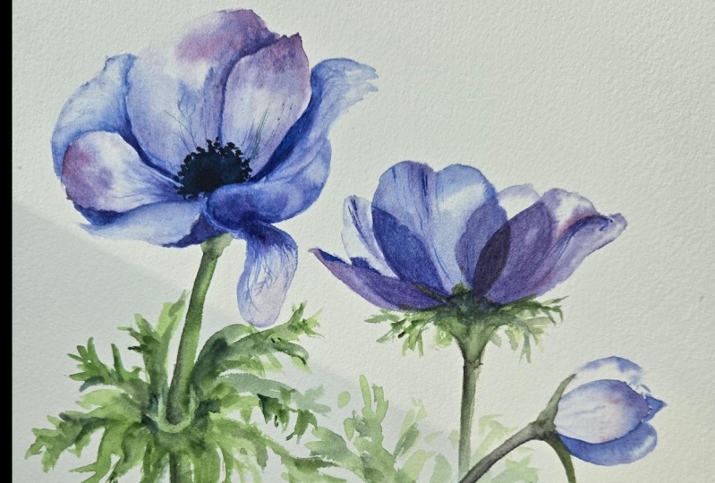
9. Class Project: Main Flower: Hey, are you ready to
paint your class project? The class project is
divided into two parts. In the first part, we will
be painting the main flower, and in the second part, we will paint the flowers around this main
flower and the bud. For the class project, we will be dividing
it into two parts. In the first part, you
can paint along with me this beautiful
purple and money. And in the second part, I will give you a few
reference images and you can choose which one you
want to paint on your own. Let's begin with
the first flower, the main big flower. Like always. Begin. We will mark the center. In this case, since
it's a purplish tinge, I'm going to mark the center
with the purple color and the center is
quite dark as it is. So we don't have to
worry about that. It's not like the puppy that we've painted with
the light center. The dark center can
be added later. I, I'm trying to see how
to place the big flower. One option is to place it
right here on the top, but I don't want it
to be in the center. So let's start with the top. If you want. If you have a different
idea of how you want to compose your final artwork, you can place the flower
anywhere else you like. I'm going to place it here and
I'll just mark the center. This is just a rough Center from where all my petals
will come out. Like always. I start
with the water brush. I'm going to put a nice
big water puddle here. For the top petal. We want to give it this
nice, wispy, flowy look. We're going to dress, dropped some of the
violet right at the edge where it's the darkest. And let it flow to the
rest of the petals. Let's do that for
the other petals. The next petal I go to is
the one which is yours. Again. Try to make the petals which are closest to the center first. And then as the petals dry, you can go outside and add more batteries to this anemone. This would be the
trickiest flower of all the flowers
that we've painted. And hence I saved
it for the end. So you should have
enough doctors now. And it is dark is chair. So I'll drop this
dark violet here. And on top I'm going
to draw a drop, a mix of violet and opera pink. And I want it to blend nicely. I'm going to let it be. While it blends. Let's paint the other petals
which are not touching. So this is the next petal, which I see is on its own. This petal has a tone as well, so I'm going to
ignore the tone and just mark the outline
first with the water. And the tongue can
be added later with a darker color during the third stage
when it dries up. I'm just marking the water. Let me just add it with colored
water so you can see it. And then drop some of the paint. The darkest area list. Great. Let's wait for it to dry. I like the way this water
and paint and mixing here, so it's a really
beautiful effect, will try to use it. Then I'm going to
mark this petal. Again. This has a tone. And Alexander done
for now and just mark the end, the edges, sorry. Then drop the well-lit in
the darkest area like this. Let it blend. And I'm going
to let this dry a little bit. Before I add more of the petals, I don't want it all to
mix into each other. So after making this pattern, I will just wait for it to dry. Okay, this petal is in
the semi dry state, so I'm going to
start adding with the brush so it doesn't
have any paint on it. I'm just pulling it to add these wins in the direction that I see it in the
reference picture. So all the petals almost dry. We can start adding the layer of petals which are outside now. So again, take your water brush. Let's start from the top here. I see. Let me get dirty colors so that you can see
what I'm doing. I see here I'm still trying to maintain a gap
between the petals so that they don't blend because they're not fully dry for me yet. If it's dry for you,
it should be okay. But be careful when you're
doing the second layer. And let's drop some
paint here on top, which is the darkest area. Let it flow with the water. To create a beautiful blend. I'll stop there for that. And then I'm going to start adding the battery
which is here. This one's going
outside a little bit. And again, try to be careful of your
petals are still wet, maintain a gap between them. And then drop some paint. Your paintbrush on
the darkest areas and let it flow nicely
blend with the water. Read beautiful. I really
loved the effect of this color and water that
is happening right now. I'm going to let it dry
completely before we go ahead and add the
one which is in front, that petri needs to be
added right in the end because I don't want it
to become a big blob. So let's wait for it to dry
and then come back to this. Alright, all the
petals have dried. So let's start with
the last petal, which is facing you. Again. You just drop the water in
the shape of the petal. First. Don't worry
about the terms. I'm just dropping it
like this roughly. And there is some
detail here as well. And I'm going to draw
the paint as well now. Starting from here and
at the bottom as well. Okay. So this is, this is
the first layer. We have also combined the
second stage for some of the petals where we added
the wet brush detail. We can do that for more
bedrooms if you wish. And if you like the effect of the water and the
paint blending, then be careful in these petals. Try not to add too many, too many brushstrokes
so that you can see the beautiful blend
in the background. So now we're going
to wait for this to completely dry and go to the third stage where
we add more details to this and make it a
little bit more defined. Alright, grab your small brush or any brush with a nice tip. I have my short liner
brush ready with me. I'm going to use a mix of violet and opera pink to
add some details. For this petal, e.g. I want to add these liens. Then mob this edge. Like I said, we do
this at the end, the dry states, so I just
mark the petals edge here. And this is the back of the
petal that we see here. And the front is very light, so we market leader. So let's just paint the back
first with some details. Let's mark the edge of
this petal as well. Even this petal has a
little bit of Tonia. I'm going to just draw it
with my brush actually, if that's all you have
to do when it's dry, I'm just drawing
this edge to market. This is the back of the
petal which is the darkest. I'm just dropping
some dark shadows. Yeah. Let's do that for
this petal as well. This petal as well as done. So I'm going to just
mark that with my brush, draw it, and then drop
the darker color. While the petals are drying, we can start adding the center. I'm using indigo for the Center, for you to get a darker
shade of this center, you can mix violet
with the blue. If you don't have indigo. I'm using my short liner
brush to add small stamens. And after this step, we will be done. But you want to add more flowers to the rest
of this illustration. Go ahead and make
your own piece. It should be unique. It should be you see what kind of flowers
you like to paint. If you want to paint
a different flower, go ahead and paint
different flower. If you want to paint the same references that I have attached, you can use that. If you want to click
your own references, then you can use those as well. The idea is to fill up this page with what
you have learned. Either the same flower
or different flower. Alright, the last part
is to add the stem. So I'm taking a small brush. Then I'm taking this sap green and I'm mixing
it with my violet. I want to dirty sap green. And I'm mocking the stem
just from the center. Go right down very roughly. That's all for the main flower. I'll see you in the next
part of this class project, where I will be painting
the rest of this artwork. All right, Now let's
continue adding more details and flowers to this floral compositions
in this second part of our class project.
10. Class Project Continued: Now let's continue adding more details and flowers to this floral compositions
in this second part of our class project. Now coming to the flower, which is filling up
this entire page. I will be adding buds. I mentioned there are two
things to keep in mind, the different life
stages of a flower. So I tried to add
different life stages, buds and a half plume, or leads to this illustration. And the second thing to note is to add different dimensions. So see if you can add buds which are in a
different direction. Maybe something which
is falling forward, something which is
falling backward, a different perspective to it. So that gives a really
beautiful complete look to your floral illustration. But I would love to see
what you paint on your own. So try to paint on your own before you watch
the second part. All right, So this is
the final thing that I created for my loose and money. I'm really looking forward to seeing what you have created. So do post your final projects
in the project gallery. If you notice, in my artwork, I tried to incorporate the
different life stages, including of anemone
which is almost dying. I've included a half blue. I've added some leaves and I'm sure there's much more
I can do to this. So I'm looking forward to
seeing what you have made. I hope you had fun creating
this class project. Do post it in the
project gallery so we can all have a
look and get inspired.
11. Final Thoughts: Congratulations on
finishing the class. We started out by learning about the materials and practicing how to control water than paint to create
beautiful textures. Then we went on to paint three beautiful flowers,
the Himalayan iris, the Iceland puppy, and this beautiful cosmos to practice
our skills further. And finally, we
learned how to plan your floral compositions to give it an aesthetic cohesive look. In the end, we created
this beautiful piece, putting all our
learnings together. If there is one thing that I hope you take away
from this class, then is the importance
of how to control your water and paint to master
these beautiful textures, these skills get
better with practice. So keep practicing
and keep improving. I would love to see
what you've created. So upload all the three
practice flowers as well as your final class project in the project gallery
and inspire results. And if you like the class
than do leave a review, it really means a lot. Finally, follow me
on Skillshare as well as Instagram to get
future class updates. Thanks again, I'll
see you next time.
 Kanchan Kaul, Artist and Illustrator