Transcripts
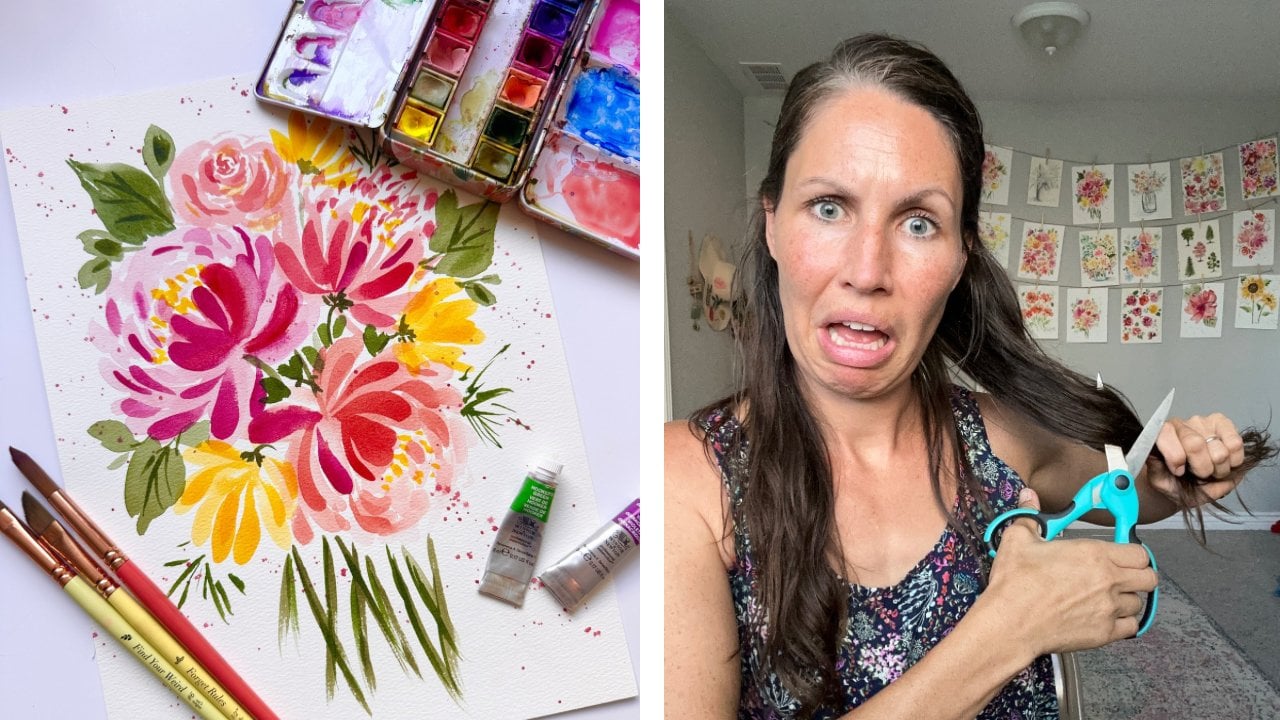
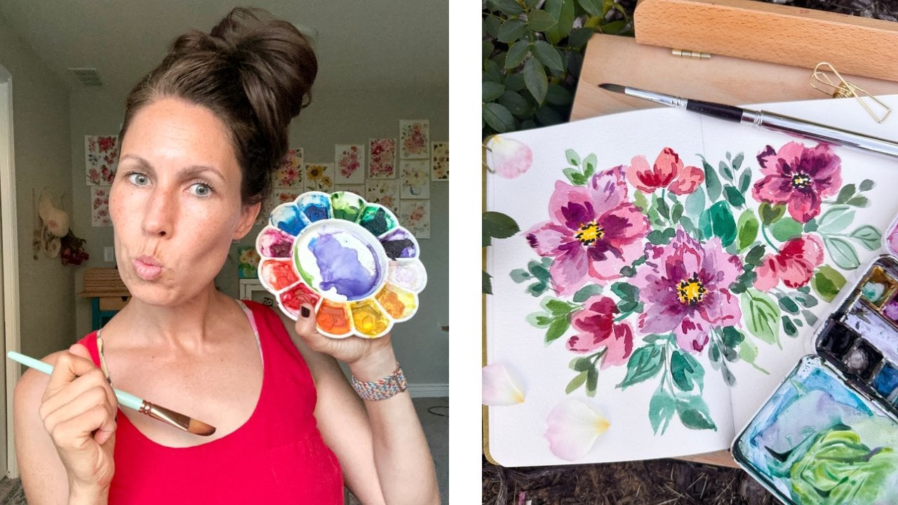
1. Introduction: Hi friends. Do you
love watercolor? But maybe you're trying to
paint things perfectly. Do you feel afraid to waste supplies and possibly even
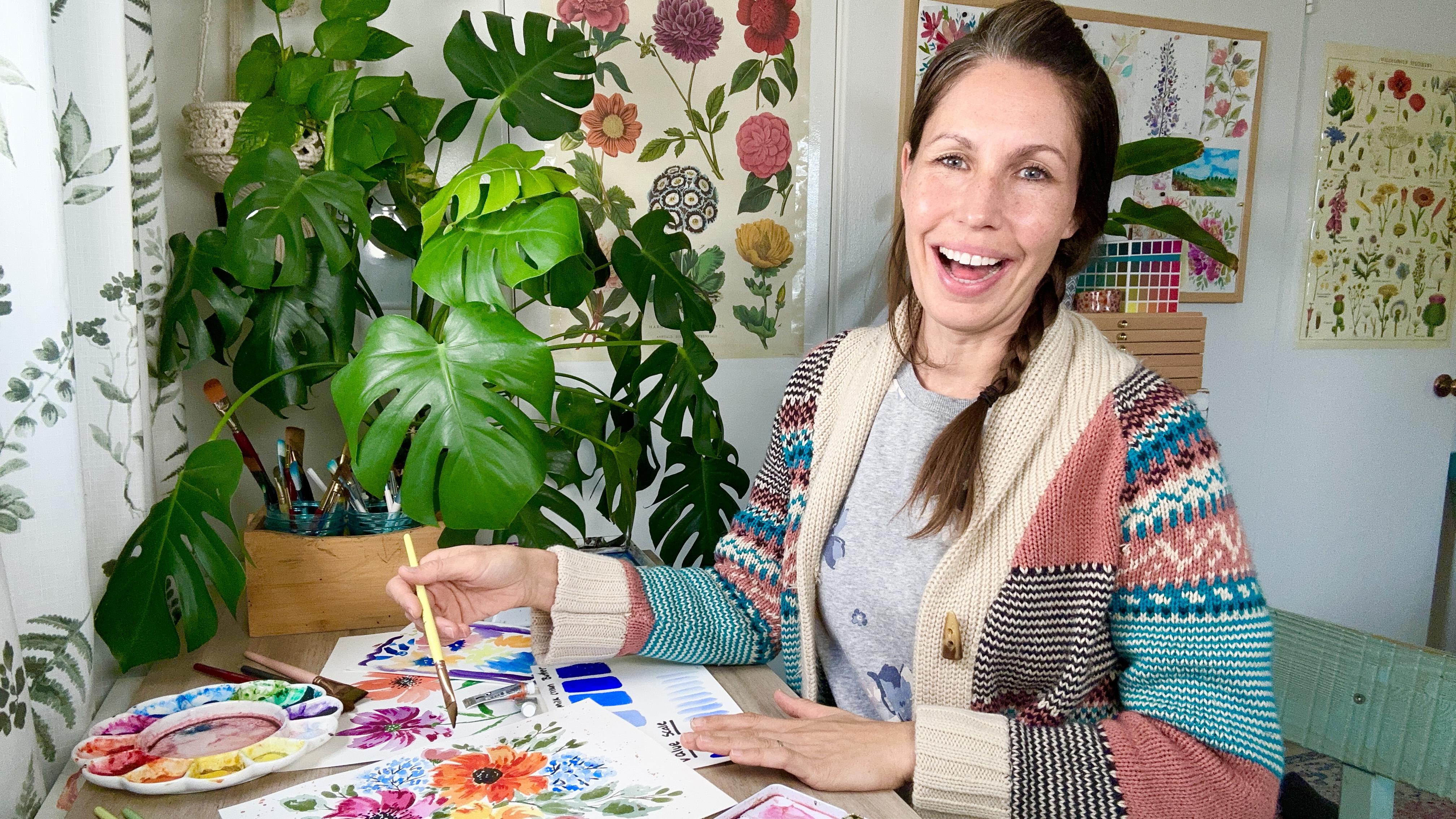
make a disappointing painting? Then this class is for you. Hi, I'm Tammy K,
and I am an artist. I'm an art teacher and also a mental health
therapist based in Arizona. My biggest passion is painting loose florals with lots of
color and lots of personality. So when I first got
into watercolor, I noticed that when
I sat down to paint, my body would get
really anxious. I would tense up, my thoughts would be negative. The biggest thing was that
I was afraid to waste the supplies that I had used
my hard earned money to buy. Also, I was afraid of
making something ugly. Maybe you can relate
to this, I don't know. Well, I began
teaching online and I soon noticed that most of my students also had
problems letting go when they were
painting with watercolor. We were all obsessed with
this idea of perfectionism. That we need to do
everything a certain way. And because of that, it was taking the joy away
from our experience. So I combined my mental
health experience with my painting experience to try to figure out ways to
help calm the body, calm the brain, and
allow us to let go, get rid of perfectionism and just play and
enjoy the process. So in this class, we're
going to learn about how to make loose watercolor florals in a way that helps you let go. But first we're going to start
by asking the question of why we need to actually let go of perfectionism
in the first place. And then we'll do a series of practice exercises to
help you learn to let go. While you're painting, you'll
learn how to loosen up with loose florals as you practice and focus on each brush stroke. We're going to learn
how to breathe and relax our bodies as we're focusing on water
control and paint consistency. We're also going to learn how to change our narrative and find joy as we play with floral and leaf shapes
and complementary colors. And finally, we're going
to learn how to put all these skills together
to create a beautiful, playful and fun
floral composition. So if you are a beginner
water colorist, then this is a good class
for you to cover the basics. But if you are also an experienced artist that may have lost the joy over
time in your art, this is also a good
class for you. By the end of this class, my hope for you is that
you will have learned ways to find joy
in that journey, in the process of creating art, not just in the end results.
So let's get to it.
2. Your Project: Our final project is going to be a loose watercolor
floral composition, where we build on the skills that we start to
learn throughout the lessons in terms
of the series of exercises we'll be doing to build up to our final project. The first one is going to be
learning how to let go of expectations as we
create an ugly painting. The second thing will be
to work on deep breathing, which helps us relax as we talk about paint consistency
and water control. Then we're going to be
talking about how to relax our body tension as we start
to play with brush strokes, floral shapes, leaf shapes. And then finally, we're going to be thinking about
changing the narrative in our head as we paint one object
in three different ways. When it comes to our
final project details, we're going to start with
choosing our reference photo, whether it's from
a book or online, or maybe a picture that
you took yourself. And then we're going to talk a little bit about composition as we think about our
larger focal florals. After that, we're going to
add details by putting in our filler florals in our composition to fill
up those white spaces. Then after that, we want to
start adding in our stems. We want to add in our
centers to our florals and also our leaves to balance
the whole composition out. Next, we're going to
go ahead and start layering some more paint so that we can start building up our composition with
texture and with shadow. And then the final piece for a final project is
adding in some splatter. If you've never done
that in a painting, it's really fun, really easy, and it makes it look magical. So there are basically
two things I'll be looking for when I check out your final compositions that you upload to scale share. First of all, we're not
judging this for good or bad. What we're doing is we're
completing a project. And what I really want to know is what was your
experience like? Did you enjoy the process? Were you able to let go of perfectionism? Let
me know your story. When you upload a photo of your project, I
want to hear it. So next we're going
to be talking about the supplies that you will
need for this project.
3. Supplies Needed: Today we're going to be talking about what supplies you'll
need for this project, and also budget
supplies as well. If you feel like you
don't have a big budget, it doesn't matter. You
can use what you have. The most important
thing is that you're practicing and you're
trying things out. So let's get to those supplies. When it comes to our supplies, there's so many
things out there, but I just want to show you some of the simple
options that you can. You could choose a palette
that already comes with paint. This one has these
little pans that you can actually pop out if you want to, just like that. And then you can
replace these with other little pans or add
paint back in if you wanted. But you don't have to worry
about filling your palette. This one is a larger space. I love all the mixing area
really makes it convenient. I keep my warm
colors separate with my cools over on the other side just so that I'm not
getting muddy colors. We'll talk more about
that in a future segment. Another option is to grab
either a palette like this, it's a ceramic one, and then fill tubes of
paint in if you want. Or you could purchase a metal palette or
something else, or plastic. But what's great about this is that it's much more affordable. I do believe you
get more paint for the price, which is nice. Then when we talk about paper, we have this 100%
watercolor paper that I usually use
in the videos. This is a nine by 12 and you can use that
for this project, but if you'd like to go
more budget friendly, Canson is a pretty
good paper source and you can get this on Amazon. Just easy to be able to paint
in love that ring binder. If you want to go
really budget friendly, I would go and pick up the
inspired watercolor pad. And it's got 50 sheets. There's nothing in
this one right now, and it's very affordable. So if you want to just
practice and don't want to worry about
wasting supplies, it's a good option for you. So then we've got brushes here. So there's all kinds of
brushes you can get for me. What's really important
is getting a brush that has a really nice tip.
Nice point on the end. If I were to wet this with water here and then we're
to re mold it, which is what I would
do after I wash them. Has a nice point. The
sizes that I like to use, I've got a number two round, number eight round,
and a number 12 round. So we'll probably use this for our florals and
our leaves today. I always make sure I have
a paper towel for dab. If I dab into some
paint or some water, and then I have too much
liquid on my brush, I just want to dab
it on my paper towel that I'm not dripping
all over my paper. That's really handy for
me. I have a black pen. This is a micron, it doesn't bleed if you put water
color over the top, but you can use whatever
black pen you have. Lastly, it's important to
have some type of reference. For example, this is just the reference
we're using today. But I do like to
have a reference book and it just gives me inspiration and excitement for what I'm going to paint next. Of course, before we go
on to the next thing, if I didn't mention water cups and what would I be doing here? I've got two options here
for you guys to see. I used to paint with one glass and then I just upgraded
to two. And here's why. If I were to do an example,
what I like to do, some people will have one where once your paint
brush is dirty, super dirty from painting, you will clean it off in there. And then once it's mostly clean, you'll dip into clean
water and start painting. That's one way to do it,
but I prefer to keep my warm colors and my
cool colors separate. I also have this
lovely duo here, which is great because I have so much water in here,
so I'm never running out. So let's say we do our
warms over here and then we do our cool
colors over here. We've got those
lovely colors here. We don't ever get
this muddiness, but if we were to mix
both of them together, so blue in there with the red. Now I've got purple,
which is cool, but let's add in
some orange too. And all of a sudden
our water is starting to muddy up because we're
mixing those warming cools. Just keeping them separate
is a really helpful tip. So I hope you understand that whatever supplies
you have, use those. If you have a budget to build up one really nice quality
thing at a time, do that. When I started painting, I had zero budget, so don't
let it stress you out. One of the most stressful things when it comes to
art is sitting in front of a nice sized
$3 piece of paper, being paralyzed because
you don't want to waste the supplies or mess up. I
don't want that for you. That's part of that
perfectionism thing that we're trying to let go of. Just use what you've got
and don't worry about it. So the next thing we're going
to do is start to learn about why we need to let go
of perfectionism in our art.
4. Why Let Go of Perfectionism?: Why do we need to let go of this perfectionism in our art? I want to share a few ideas
with you that might resonate. First of all, perfectionism just sucks the joy out of creating. It has a special ability to keep you from liking any of the
things you're creating. The second thing is that
encourages body tension. If you are sitting there tense, your muscles are stressed, your body is not relaxed. You're not going to think
clearly and you're not going to produce the art that
you really love and enjoy. The third reason is perfectionism discourages
you from trying again, if you keep feeling like
you're failing in your art. Because every time you sit down to create the
perfect piece, it doesn't come
out the right way. You're going to feel upset, disappointed, like a failure. And finally, we often learn through perfectionism
that we are not artistic, which is a message we might have been told by someone else. Don't believe those lies. Here are the reasons why letting go of perfectionism is going to help
you in your art. When we let go, we experience
a dopamine effect, where this happy hormone just goes into our
brain and produces this effect of contentment
and excitement. And it encourages us to continue to do the painting
process in the future. Painting also helps
to calm our brain and our body so that we can
enjoy the experience, not having the tension, not
having the frustration that we might have when our narrative is not
in the right place. In the next video, we're
going to warm up for our painting exercises with
a small exercise that's gon, to help you let go of your
unrealistic expectations.
5. Warm Up: Letting Go of Expectations: When I say we're going to
make an ugly painting, some of you might be like,
well that makes no sense. Why are we going to
call art work ugly? So the idea behind this is that when you let go of
all your expectations, it allows your brain to relax, slow down and say, whatever happens, happens,
I accept the end result. And that's the first
step of being able to just be and just
enjoy the process. Also, using your
non dominant hand, which is this hand for me, causes you to
concentrate so much on just trying to move the brush and get it to do what you want. Then it's going to keep you
from being stressed out in here about your end result and what you want
things to look like. And that's why we're going to try making an ugly
painting today. I am a left handed person. Never. So I'm going to
use my left hand today. Was that confusing? I
always use my right hand. I've only done this
probably a couple of times painted with my left hand
guys, it is challenging, but it's a really great way
to let go of expectations because I guess I
need to probably set this up a little
bit differently. Let's have this go over here
so I can do some dabbing. If you let go of what you
think is going to happen, you can be okay with
what does happen, okay for you if you want
to do flowers like I am. If you want to do an
abstract painting, you can do that as well. But the whole point is that you're not worried
about the end results. You're just being there
in the moment trying to just practice how's
it going for you? Does it feel strange? Just be aware of those feelings and
thoughts that are coming into your head. Like right now, my
brain is trying to tell me that I need
to do a good job. Because even though this is supposed to be an ugly painting, I still have this expectation of myself that it needs
to somehow look good. This is just me being
open with you guys and being aware of where my
brain tries to hijack me. You can just think
about how does it feel to create these
marks on your paper. Does it feel foreign? Does it feel relaxing? You certainly don't need
to copy what I'm doing, but just make up your own. At the end of this,
at least for me, the couple of times
I've done this, I felt very relaxed. And it surprised me because
I didn't expect that. I expected more
stress than anything. Check in with yourself, how
are you feeling right now? Start reminding yourself
that this is supposed to be fun and it should not
be stressful for you. It's just making marks
on paper. Just playing. We're trying to learn
to let go and play, just like we did as kids. Just a few more marks. Just being aware of
if you paint fast, it leaves less time for
your brain to start hijacking and taking over
with negative thoughts. I'm going to reach around here, I'm going to grab a final color, I think for my centers. And just stipple in
the middle, that's it. Remind yourself, this
is supposed to be fun. We're letting go and
whatever happens happens. So I hope that this painting experience was a good
one for you that helped you to let go of some of your negative expectations. And just enjoy the
process creating this ugly painting and not worrying about
the end results. So in the next video, we're
goning to learn about how to use deep breathing
to help us relax, as well as learn about water control and paint
consistency in our paintings.
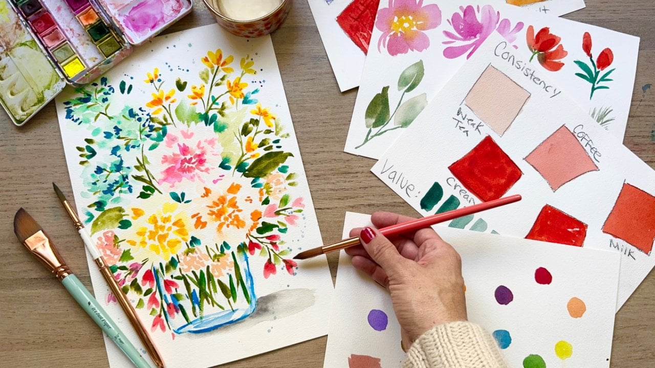
6. Deep Breathing: Water Control & Paint Consistency: As we begin to work on some of these watercolor exercises. Next, I want you to keep in
mind these three points. First of all, when we are doing deep breathing to help relax it, calms our nervous system, which helps to calm down our muscles and create a really good experience
where we can learn and grow. It also allows you to focus on your work and not the stressors around you or in your brain. The third thing that
it just keeps you from stressing out so that your
experience will be joyful, the process will be fun, and you can create
more interesting art when you're doing your
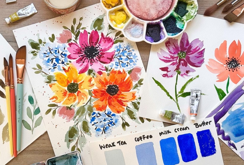
paint consistency, you want to write
this at the top. Water on this side. As you have more water on this side,
your paint is thinner. As you add more paint to it, it's obviously going to be
thicker then it's weak. Tea, coffee, milk,
cream and butter. I'm going to explain
what this is. I'm going to use my
number eight round brush. Let's see how we're
doing. Just a little bit of pigment on there. Still we are going
to grab are blue, so I'm going to
grab this one here. Now what I want to do is to create a consistency
that is really light. It's just barely tinted. Has a little bit of paint.
That's our weak tea. It's the lightest amount
that we could ever have. This is what I'm
looking for here. It's very transparent. It moves a lot because
there's a lot of liquid. We're going to paint this
in our weak tea area here. Just make a nice
rectangular shape. You can see the
transparency is there. I would use this or
coffee for basic wash, probably mostly this one. Just a bit of paint and you can see through it to the
paper there. All right. The next one is we're
going to do some coffee. I'm going to take a
little bit more paint, we just add to it until we have a
consistency that we want. Of course, we're going to
see a lot more pigment. It's going to be a lot darker. I would say that this one
is probably about a coffee. It's a little bit thicker
than your weak tea. And it's a little bit darker, but it's still really thin. And I would say you
could use this for a basic wash. Look at how much vibrancy we're
getting out of this already. That's amazing, just by
adding a little bit in. These would be those
basic washes of color. Maybe your sky, those first initial colors
for your petals. Very transparent, really what
water color is all about. Now we're going to make a consistency that
is called milk. It still flows, but it's
getting a lot thicker, a lot darker, and
a lot more opaque. It's just taking some
time to figure it out. This is starting, It still
moves on my palette, not as much, but I would say this is a really good
consistency for milk. We're going to go ahead
and paint that in. That's the consistency
where I would start to maybe utilize it
for my second layer. If I'm making florals. After I've done that
really light base wash, then I'm going to come back
in with some more dark color. Either this or a cream
is what I tend to use. Look at that beautiful color. Like I said, it still
moves a little bit on your ballot,
but not very much. Now, I need more water so I
can grab some more paint. What we're going to
do here, the cream is going to be very thick, but thin enough that we can spread it, if that makes sense. And cream is going to
be my other choice for florals when I'm doing those really lovely shadows
that we'll be doing later, and texture, I really
want a thick paint, but I don't want it too thick, that it's not going to spread like butter is not going
to spread very well. If we look at this, we're seeing it's really not
moving on our palette. We've got some gorgeous
bright color here. I'm excited to paint this
on really gorgeous color. Very much more opaque than
any of the others, obviously. Yeah, I can't really see
through it too much. Still a bit. It is
water color after all, but if I made it any thicker, it wouldn't spread
butter is the last one. I'm going to just wet my
brush a little bit more. I'm just going to
dab around here. I'm really taking on as
much paint as possible. I'm even going to dab
some of that liquid off now that I can feel
that really spreading. Let's try to paint
with this, All right? So this is our
butter. And you can see I'm getting a
lot of dry brushing. The paint is skipping
around here. Yes, it's a really hard
job to try to cover all of this because it's
just too thick to spread. Well, I would use this for, if I say I wanted some
texture in a mountain. If I was doing a landscape, or in the ground, or on the
actual hills themselves. But in general, I don't
usually use butter. Now, this is the time where
I want to encourage you just to breathe if you haven't been breathing
through this practice, reminding you to keep
breathing so that you keep calm and relax
and you just let go. As you're painting
with me today, I painted weak tea
off on its own, just as an example of I can
see how these look like. They're in the blue family.
In the same family. But this one is so light. It almost looks like
it's a light aqua color. And it's just interesting how
a little bit extra pigment, all of a sudden bumps it into this matching
family right here. The last thing we're
doing is a value scale. We're taking what I would
call cream once again, we're going to just
make a mark on our paper with the thickest
paint that we can paint with. Then all you're going to
do is dip in the water, squeeze you off your brush,
and make another mark. You can see already it's
starting to lighten up a lot and just keep doing that. What we're doing is showing
when you're trying to figure out water control
and how much water use. Hopefully knowing
these two scales will give you an idea of as
you keep adding water. In this example, you
keep getting lighter. Since we don't use
white and water color, you can get a lighter value. Value is just a lightness
and the darkness of a color. As you keep taking off
paint and added water, you're going to get
lighter and lighter until eventually you're
going to have clear water. This water is pretty
dark already. We're still going to have
some type of pigment, but just as a practice to see how light can
your colors go, it's a very interesting
thing and it just gives a little insight
into what you can do so that you can play
with consistency and value in your paintings
to make them interesting. So I hope that you enjoy doing the watercolor value scale as well as the paint
consistency scale. I think that these exercises are really helpful and you're going to use them over and over when you're
creating your art. So in the next video, you will be learning how
to recognize body tension, being able to calm
down and release it, as well as brat strokes
and floral shapes.
7. Releasing Tension: Brush Strokes & Floral Shapes: As we are practicing
brush strokes and we are going to look at
different floral shapes, I want you to keep
in mind the idea of body tension and be able
to relax your body. When you have tension. Your
shoulders might be tight, your neck, your stomach. I want you to think
about just releasing that tension and
experiencing calm so that you can move forward
with your painting and not feel like there's all this anxiety stuck in your body. When we start to look at our brush and notice the
movements that we're creating, it helps to keep
our focus of the negative as well as allows
us to naturally relax. And I'll encourage you through the exercise to check
in with your body, to make sure you are
relaxing so that you can experience this activity in a wonderful and healthy way. Well, I'm going to take
this number 12 round brush and I'm just grabbing
whatever's on my palette. There's a lot of watery paint. The classic flower, of course, where it'd be just
swooping up like this, using the shape of the brush and then saving some space for the middle and you can just start stemming off from there. And then swooping, right? You can go from the outside to the inside or you can just do
these really quick strokes. You can go from the
inside to the outside. Just make a flower that's
really fun and loose and easy. There's not a lot to that one. We grab some other colors. You can make a flower
this color, right? Or you can add it in to something else and make
a different color. Let's try some red. See what
happens? A creamy red there. You can do some going like this, pressing down and
lifting up, right? That's not too complicated. You could also do
a C curve shape. There's a C curve and
there's a C curve, and then you fill
it in the middle, which could make up one of those classic flowers that
has maybe five or six petals. Instead of using the
shape of the brush, you are painting in that
shape with the two C curves. And I'll do another
one right here. We're reserving the middle so we can add in a
nice middle later. Then I'll dip in the water, squeeze off some of that paint. As I'm doing this, I'm going to remember we're supposed
to be practicing now, relaxing our body, which entails just
noticing tension first. If you don't recognize
the tension, then you don't know that it's there really, you
can just ignore it. But just wonder why
you're so stress. If you're holding tension in
your shoulders or your neck, just go ahead and
try to relax that. Right now, you stretch
out your neck. Can even just do some little
brush strokes here just to fill in those empty
spaces a little bit. That's a way you
can do a flower. You can even do like
a side facing floral, which is you're not
going to see the middle. You'll just see maybe two or
three petals just like that. It's all just curving down to the base of this
flower right here. As we are going to transition to a smaller brush number eight
round and we're thinking about how we're going to do our leaves and I'm going to
mix up some of our colors. We're going to think about
relaxing whatever parts of our body upset or
angry right now. Also, breathing is
going to really help to relax those muscles. I've got this teal,
it's a very watery mix, very light, and then I've
got this sappy green color. If I grab some of red, I'm going to make more
of a brownish green. Which is a fun,
final alternative to have as we're relaxing our body, we're enjoying and
we're letting go. We're just being, we can also paint these
in certain ways. For example, we can
use the belly of the brush just like
I like to do this, I'm going to actually do
it over here so my wrist isn't covering up
what you can see. Then we're just
going to press down the belly and then
press, grab more paint. And you can even squeeze you off some of it so it's lighter. Then like a fern, we will take our
number two that's using the shape of the brush to do the work for you,
which I love to do. Then when you have a
really nice thin brush, you can start to
connect the stems. I feel like the one thing
that keeps my leaves from looking realistic is just having a really
thick, chunky stem. If I have a thin one like this, I'm starting to see more
of that realistic look, if that's what you're going for. It doesn't really matter though. Let's do another one with this bigger brush and
a different color. If I want it to be
a little darker, I can grab that and change
up the value a little bit, then take off some of that, creating a lighter value. Then right here,
connecting all together, we've got some pretty
little leaf combinations just using the
belly of the brush, which to me, I love to use this. I love to use larger leaves too. And just make a
nice combination. Going back to the number
12 and that sappy green, I'm going to do those
C curve shapes. We're going to do a C curve
shape and lift off slow. Let's try that again. Then
we could do a little stem. Then you've got a leaf, take off some paint. We could
try that again. Maybe at an angle we can do
a wide curve, wide curve. If you lift off slow, you're
going to have more of a pointing leaf fill in the center and a
little bit of a stem. Now if you wanted, you
could do a thinner one, you don't bow out as far, a little bit, maybe
longer, just like that. Or you could just
do on one side just pressing down the belly and then starting
to lift up slowly. Now you have a
different type of leaf. Now if you wanted
to do a series of these larger leaves,
which can be fun, we can just go ahead and
do that on this side here, pressing down, curving out
to the side, lifting up. Now this is such a
relaxing exercise. I'm going to do
several of these and then connect them with a stem. Sometimes I like to leave
a little white space. I think that just
makes it interesting. Pressing down the belly, lifting up leaves, can
feel very challenging. And I think that they are until you get the proficiency
like everything. But when you practice, you're going to start
to understand with your muscle memory
how exactly you need to make those marks and how you can experience some
proficiency with that. It is really about practice, like pretty much everything. The other way I wanted to teach you real quick as I'm
adding some red to this is just
dragging your brush. Say you're adding a leaf
somewhere and then you want to do a little scrubbing motion. You can do that. This is maybe one of my favorite
ways to make a leaf. Then now you've got this
really interesting mark, you're just scrubbing along. These are some thicker ones,
taking off some paint. I might do one that's
a little bit thinner. You can just add in some
little marks, let it flow. I just have so much fun practicing your floral
shapes and your leaves. So we finished up
our brushstrokes, our floral shapes, and
on to the next video, which is going to be talking about the negative narrative, the story in our head that affects how we feel
and what we do. And if we can challenge that, we're also going to be able to loosen up and enjoy our
painting experience. In this next video, we're
also going to be talking about painting one object,
three different ways. In this case, it's florals,
so let's get to it.
8. Changing Your Narrative: One Object Three Different Ways: I want you guys to keep in mind this idea of the
negative narrative and how it creeps in and it changes what we feel
and what we do. Instead of having a
negative mindset, think in your head, this
is supposed to be fun. This is practice or one narrative that
really speaks to you, that's going to help you to get your focus in
the right place. Focusing on one or two
things that you like about your painting can really help you to be in the right space. Because we're going to paint
one object three times. It does help create a
sense of proficiency and you feel like you're starting to understand how to
paint that object. All right, so we're
going to paint our three flowers with a
number 12 round brush. I'm just going to dip into,
let's do some purple. And I'm just going to
mixing some stuff together. Whatever I have on here, I'd like it to be a little
bit more reddish purple. Just adding a little
bit of that in there. We're just going to do
a simple loose flower. I might leave a little space in the middle for
that center part. I like to dip and squeeze
you off some of the water and just create some
value difference here. First, some of these
and then we're just arcing them
around like that. When you do your florals
and your petals, you can start from the
middle and go out. Or you can go from the
out, work your way in. It just depends on what
kind of a look you want. I'm going to take off
some of the paint, I'm just swooping in. But it doesn't matter
how your flower looks, just needs to look
unique to you. So there's our first one there. Rinsing that brush,
I'm going to grab this lovely orangy red color. I love it. And that's
going to go in the cool. I always forget sometimes.
Where's my cool? Where's my warm? Or I just
start dipping everywhere. Same thing, from pressing outward and then I
like to swoop it. Swooping out, we can swoop in. This is just a curve shape, just like that, very simple
dipping into the wrong one. It's okay, we're not
looking for perfect. As you're doing this, be very
aware of your narrative. What is the store in
your head right now? Are you telling
yourself this is fun? Are you telling yourself
this is stressful? Are you worried
because your flower doesn't look like my flower? Which, to that I would say it doesn't matter,
but I understand. Sometimes it feels like it does matter to us and I get it. Let's do one more, let's do
red. Same type of thing. We're doing this flower three different ways in the
fact that we will be changing up how the
final results are, the decorations, the details. All right, I'm going to dip
in here reminding yourself, this is supposed to be fun. This is fun. With
every brush stroke, you are getting better, okay? If you can remember that, you're going to be
in a good space. A little petal right
there. I've got my three florals here. Some of them are
Walk, that's okay. But what we're going to do
now is add in our stems. I've got a really skinny
number two round brush. I'm dipping right into my green. For this one, we're just going
to go straight down stem. It's okay if it bleeds here, we're letting go of
what we want it to be and it may not be what we thought or we
wanted, and that's okay. We're going to do a little stem right there and then
press down at the belly. And we're doing, look at that. We got a nice dry
brush. Look there. Another one here. Those are our leaves dipping in for
more water, more paint. And we'll do another
on this time we're starting from
the outside in just pressing down to the belly and you don't get
a really big mark. And then really thin,
just to connect it, you've got your first floral. I'm going to grab some of this turquoise teal
color and mix it in. I'm going to add more
of a squiggly stem. This one is going to have
a little bit thicker leaf. I'm going to press down,
make a S curve shape, and then I'm going to
press down the other side, make a S curve shape
and lift off slowly. You'll get a nice
point. Then you can leave some of
that white space, which is really pretty. Let's do the same
thing on this side. A nice little stem
C curve shape, pressing down at the
belly of the brush, lifting up slowly if you can, we'll do the other
side the same way. Pressing, lifting up slowly, you can leave a little
of that white space which I think looks pretty, the color looks pretty similar. I guess this one is
a little bit more blue, but that's okay. We're going to take some red. Remember our
complimentary colors. Mix it with a green. Now we
have a very dark green color. So we're going to do
this one this way, and then we're going to
do some thicker leaves. I'm going to grab my who. Sometimes that happens,
remind yourself it's okay. No worries. All right,
it's a little stem. And then we're going to
press down the belly for a very thick leaf,
very light color. And let's do another
one over here. Sea curve shape, a little bit of a point fill in that center, just like So Now as
these are drying, I'm going to take my smaller
brush, my detail brush. I'm going to clean out
the paint. All right. Then we're going to take a darker color to
complement this one. I'm just going to literally grab from this scrubbing around, getting some paint out. I'm going to start by adding
in some little details, just little tiny brush
strokes for that center. Then I'm going to just
press the belly of the brush and bring some
of those accents out. Right now, I'm using a very thick amount of
paint, like a cream. Actually, it moves a
little bit with my brush. It's not too thick like a
butter where I can't spread it. But it's not to
move the palette. That paint is not moving
around, it's not a milk. What I like to do
is just swoop in, maybe get some dry brush marks. Just start to accent this flow. Now I'm adding more water, so it's a little
bit more like milk. I just want to create some
lines. These are our shadows. Our texture on our flower. Now we're going from flat flat to fabulous flat.
We have dimension. Now an interest if you want, you can do several colors. If you are sing lined,
that can make it fun. But look at how pretty this
floral is starting to look. Now that we've added
in some more color, it just makes it
fancy. All right? So that one is getting the three dimensional
treatment, this one is not. But we're going to make
the center pretty, so we're going to
grab some black. So we're going to do some
stippling for our center. Just these tiny little marks? Yeah. Okay. And I've got black off screen in
a different palette. I can't fit all the colors
I need in this one. Just the most vibrant
and beautiful. And then we're just going to
do some cute little lines, create a very fancy
center for this one. The other one has the fancy
markings on the petals, and this one has
the fancy center. Just painting
something three ways is going to create a sense of proficiency for
you if you weren't really sure about the
object you were painting. Now that you've almost done
it three different times, you're going to start to
see things differently and feel like maybe you've got this. This is something that's
becoming easy for you. I'm just going to do
some stipling for this one in the green just to make her look
a little different, still fancy, without
the little lines and the dots on the outside. Just a little stippling
there for the center. Then for this last
one, it is dry. So you're going to take
your pen and we're going to start for this one making
some little tiny lines. This is something, again, you're just going
to intuitively do. Maybe it's like a little
starburst, sunburst, whatever. Then we are going to start tracing some of those lines to create really fancy petals. If you're not painting
fast, that's okay. If you're painting slower
or really fast, it's okay. If you're not used to painting
fast, just slow it down. If you need to pause or just watch and then try
it again later, the practice is going to only
help you feel better about your final products
and the fact that you're just playing and
enjoying and letting go. Because perfectionism
is going to go away. It's got to. So I hope that painting the same object
three ways was helpful. And then maybe you will learn some things even
about your art style, what you appreciate,
what you love. In the next video, we're
going to talk a bit about finding joy
in our artwork. Not just staying calm and
having positive thoughts, but finding that excitement and that pleasure in our
painting experience. And we're also gonna be talking about playing with
vibrant colors.
9. Finding Joy: Complimentary Colors & Vibrancy: So today as we are painting with complimentary colors
and color vibrancy, and I'm showing you
some color mixing on how to keep your
colors vibrant. I want you to keep in mind
this idea of finding joy. And this is the part
where we have arrived at the section where
I most am excited. Because I want you guys to experience the happiness
that comes from really letting go of that
perfectionistic mindset and just enjoying the process no matter how things
are resulting, no matter what
comes out of that. So I'm really excited to get into some basic color
mixing with you. Let's get into some exercises. Okay, so I wanted
to talk to you guys a little bit about
color color mixing, a little bit of
color theory today. When we are thinking
about our colors, we look at our palette. Typically, our colors are pretty vibrant and they just
come in bright colors. And we get to mute them
down, mix them together. But I want you guys just
to keep in mind something that is really good to
consider when you are mixing. We've got primary colors, red, yellow, and blue. I mean, who doesn't
know that, right? When we mix different
colors together, we get a secondary color. Red and yellow make an orange. And then we have red and blue
make a violet or purple. We have blue and
yellow make a green. We want to get
even more into it. We can talk about
tertiary colors, which means when you take your primary and the secondary
that you've created, you mix those and you get
red orange here over here. You take your primary
and secondary over here, and you're going to
get yellow, green, a primary and a secondary that you've created, blue violet. What happens if you
were to mix together? Because there's so
many combinations. What if you mixed red, yellow, and blue together? Let me show you what
happens if you do that. So I'm just going to
take a random red, I'm going to mix it here. Then I'm going to
a random yellow. Grab some of that
and mix that in. All of a sudden we've got
a nice orange, right? That's great. Okay, we've got a nice
little brick orange. What happens if we mix
some blue in there? All of a sudden we create mud. Isn't that lovely? That might be a really pretty blue color if you wanted
something like that. But all of a sudden,
we've lost our vibrancy. We've lost that Paz. We've, these three colors
that are gorgeous, red and blue, our yellow color. We've taken these beautiful, vibrant colors that
are naturally bright. And all of a sudden we have
created something that, well, it's not
what we're looking for when it comes to vibrancy. And it might work
in another realm. Or if you're trying to
do a muted palette, that could be a pretty color but not that bright color
that we're talking about. Now let's talk about
complementary colors. Complementary colors
are two colors that are opposite
on the color wheel, it always includes a
primary and a secondary. For example, red and green.
Let's do that right now. Red is so gorgeous. We're thinking Christmas colors, right then we've got a green. When you put them
next to each other, they absolutely look gorgeous. They pop and they work
really well together. But if you were to
then take a cleanih damp brush and you started
to mix those together, all of a sudden you're going to get this
really dark color in the middle because
they are muting each other and they are
creating a muddy color. Let's try the next pair.
Let's go with blue. A little bit more water there. Blue, absolutely
bright and gorgeous. Then we're going to go with the upset on the color
wheel, which is orange. I'm going to grab some orange here and those look
pretty nice together. This one's a little muted
because I think there was a little blue on my
brush plus my water. It's getting a little insane, but leanih brush, let's
try to mix together. You're getting, again,
a very muted color right there, all of a sudden. Let's go ahead and do that
with this one right here too, You're seeing a
very muted version of what we had before of two
really brilliant colors. Let's do the last two. So we have purple right there, and then we have yellow trying
that to taint the yellow. Yellow is very much
changed or tainted, or affected by other colors. We'll add that right there. And then we are just going to
rinse it as much as we can, dab it, and then try to
mix these two together. And you're going
to see once again that really dull muddish color. They're all similar,
actually, when white, you want to mix
complementary colors together with a
complimentary color. Well, for example, if
you want to just tone it down and do like a little bit of a muted color, for example, red. You've got a really
bright red here. If I were to clean that up, then grab just a
little bit of green. Let's just see if
a little bit of green might do
something interesting. I've added green to this
red. Need a little bit more. You're seeing it's going
to start to tone down just a little bit more like
a burgundy color where it was really bright before
and now all of a sudden that's a nice red if you're wanting to go for
a darker color. This is the original here just a little bit,
mutes it down, and creates a nice color that you can use in a different
type of color palette. Let's try it with purple. We'll grab some purple here. Gorgeous color. We'll see how much we can actually
see. Here's the original. Once your water gets
dirty like this, it's hard to clean,
clean your brushes. Then we're just going to
take a little bit of yellow and see how that
might change things. All right, let's just
see that's muted. It's nice, still purple, but much more toned down, maybe for a different type of project that you
might be working on. Let's do orange. I'm grabbing the
orange here and see what changes as we add this
really nice vibrant color. Let's add our strip of
original here, then clean it. And then the complimentary
color would be blue. Just a little bit of blue. Just to augment that
orange tone it down. When I'm thinking of tone
down colors like this, I'm thinking of a fall
palette, for example, and how you want some of
your colors just to be muted and less intense
and less vibrant. That's a way that you can
avoid some things that could take away that vibrancy. And sometimes you like
a muted palette and sometimes that is your style
and that's okay as well. So isn't that fun? Doing a
little color mixing gives us a little bit more proficiency
and more options. So we can kind of know what can we do with our
colors to create even a muted palette versus a bright palette versus
something somewhere in between. So next we're going
to talk about reference photos and
how to choose them, and I'm going to show you
my favorite book, examples.
10. Choosing Your Reference Photo: Okay, so now we're
going to talk a little bit about what I use
for reference photos. And I have three floral reference books that
I absolutely love. And I don't tend
to copy the photo, although you could,
as long as you give the original artist credit. But I like to use it as a way to help me build
the composition, really takes the guesswork out of it and makes it so easy. So let's go thumb
through a few of these and check them out. These are my three favorites, and I'm going to show
you this one first. It's just so large
and in charge. So one thing I love
about it is that it helps me to paint really big. If I want to paint
something really large, if I start with a small photo, I typically will paint it
the size of that photo. So when I see this kind of, I mean it's way
larger than life, but I find myself inspired
to paint that big. And so you can grab a
big piece of paper. The biggest one I have
right now is a ten by 15, which is large for me, but it's so much fun. This book is vibrant. It has lots of single flowers, and it tells you about them as well as some gorgeous
arrangements. And of course, I mark
where I'd like to paint so that I get inspired
for the next paint session. I love the next two a lot. So this is the first book, as far as I understand,
that they created. And I love this because it gives you single flowers
that you can paint, single types of flowers, and they're ordered
in terms of color. So like reds, oranges,
yellows, different groupings. And so you can not
only pick your color, but then you can
pick the type of flower that you feel like
painting in that day. And it's just really nice to change up what
you're painting. If you're like, I want
to work on sweet peas, you can focus on sweet peas. I want to work on
Forget Me Nots. And it's really nice
to be able to focus on one single type and
one color at a time. Then their other book is called
The Flower Color Theory. I've got it all marked up and saving places
that I want to paint. So these are all about bouquets and they're just
really gorgeous. They're just not conventional. I love the asymmetry makes
it very interesting. Lots of color, lots of texture, lots of variety in
these bouquets. So this is another
one that really inspires me when
I want to paint. Of course, you can take your own reference
photos if you want to, or you can print off
a photo like I did here and just kind to go with whatever
makes sense for you. Well, I hoped you enjoyed seeing some of my
favorite books. And next we're going to
start on a big project. We're going to work
on the focal florals, our blooms for our
composition today. As well as remind ourselves
to deep breathe and relax.
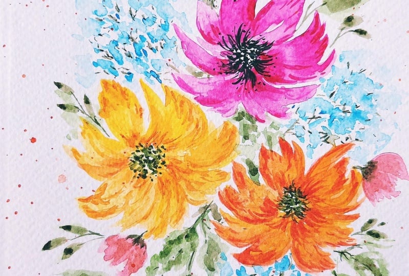
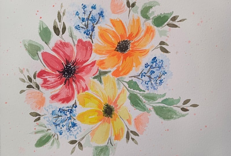
11. Base Layer: Focal Florals: When you're first starting
out with your composition, you're going to want to choose two or three focal
florals that are large, that are going to take up a lot of the space in
your composition. We also want to keep in mind
this idea of rule of thirds. What that means is you
will have on your paper, if you were to divide it up into two lines this way and
two lines this way, you would have nine squares. That square in the direct
middle is a place to avoid because if you put your focal point
smackdb in the middle, it is stagnant, just sits there, it doesn't have
the same interest. Then if you were to
put something a little off centered and adding several in there in those odd
numbers is just going to create more interest in
your whole composition. I'm also going to
be reminding you to just take a deep breath and relax throughout the
painting just to start practicing that
self care piece. All right, so I've
got a spray bottle. As we're starting to work
on our final project, we're just going to spray
down our watercolor paints, get the nice and juicy, so we can begin painting. I'm going to start
with my largest brush, which is a number 12 round, as we talked about before. Here's our reference photo
that we'll be using today. I am not copying this and
it's probably going to look a lot different
then this photo. But what I want you
guys to do is just make it your own and
that's the whole point. And I've got a pencil. You
don't have to do this. I just thought it
might be nice to mark where we want
our centers to be. I'm just going to reserve
some space right there. And then maybe over here
a bit for a balloon, and then for a third one, I'd probably place
it about here. Then when we're
doing our balloons, we're thinking about
this space here, this space here, and
this space here. We're not directly
in the middle. And as we are beginning
our composition, I want you to take a
moment to breathe. I'm going to do it too,
and keep breathing. We tend to hold our breath
when we're anxious, reminding yourself that you are going to be relaxed
with this experience. And so we just want to have a nice peaceful demeanor because we're letting
go of perfect, right? I'm going to grab some pink. I'm just grabbing that, look
at how vibrant that is. Because we're talking about mood and color and how
color affects those moods. We're going to go bold. I'm not going to meet this down,
at least not this one. I'm going to start pointing my brush towards the
center of the flower, and I'm just going to
pull out some petals, petal shapes and really
nice thick petals. Like I said before, if you want, you can just start
putting your petals this way from the outside
to the inside dip, squeeze you off
some of that paint. And we're going to
start adding in some more petals that
are just starting to float and arc around
towards that top. I'm going to put one over here. Loose florals really
do help you loosen up. And I think experience, I don't know, experience
life a different way. It probably sounds
a little funny, but hear me out when you're
painting loose florals, you're just trying to
keep your body loose. Breathing as I feel like
I'm holding my breath. You're trying to
be in that moment, creating these really
pretty flowy petals. These brush strokes are not
too difficult, I would say. I think anyone can do them. I'm just going to grab some of that butter paint that
we've talked about, consistency, and just add in a little bit more
pink as I see fit. They feel difficult because we don't always is wet
and wet when you're taking wet paint
and adding it into already wet paint or a puddle of water or
water on your page. All right, let's go
ahead and do a yellow. I want to make sure my
brushes are really clean. I'm going to grab this is the
cadmium, yellow and yellow. It doesn't really take
much to get tainted. If I were to put some
of the pink from here, it was on my brush already. It's going to start making
orange pretty quickly. Also, you need a lot of it
to have a really bold color. Okay, I've got a petal there
now we're swishing this way. Just think about
how relaxing it is, a dip squeegee to put
these petals on the paper. If you're going to go
from the outside in, you're going to notice
more of a pointy petal. Versus if you start
from the inside out, you might get more of a
rounded look just depending on the brush that you're
using. Take more paint off. What I'm trying to
do is make sure that my petals are fairly touching. I don't want a lot
of white space, and I want everything to
be a nice tight bloom. And I'm going to
grab some orange. I might want it to be peachy. So I do have a whole bunch
of colors on my palette, which does really help
me to kind of mix things together and create colors that are not on my
palette already. Remember to breathe. Remember
to relax through breathing. So I'm putting a petal on there. All right? That's a big one. Squeeze you off the side. Let's do another one here. I'm very aware of that. I'm trying not to
be perfect here. Now, I do know that my
brain is trying to, let's darken this
up a little bit. My brain is trying
really hard and saying, is everything even, does
everything look right? We have now a darker
orange, which is fun. You really have to fight that. Which we'll talk more
about the narrative later. But for now, our job is just
to relax and try to enjoy. I just swiped off
some of that paint and I just wanted to extend
my petals a little bit. I wanted them to be
a little bit longer, so we're kind of in the middle. This one has this much
space, This one has much. And we'll talk about adding
in the fillers later to be able to balance out everything
we On what right here. Okay, so we have our blooms, which has been our first
part of our project. And we're going to
start adding in the next pieces as we're
formulating our loose florals. The next thing we're going
to do is start adding in our filler florals, the little, tiny ones that start to complement and accent
the larger florals.
12. Adding Filler Florals: For this section, we're going to painting some filler florals. And those are those tiny
little florals that connect really nicely
to the larger blooms. Just filling in the white space, especially if you have
more than you need. We're also going to
practice recognizing the body tension that we have so we can relax
it and let it go. Now I'm going to take my
number eight round brush and we're going to do
those filler florals. I'm going to grab this kind
of cobalt blue color here, which I really love
as I'm mixing it up. I want you guys to think
about body tension. Another way to relax your body. If you have any
tension anywhere, just try to relax
at your shoulders, your neck, and we're
going to start stippling. What I want to do is to create a nice zig zag with
our composition. I'm going to put some
here, and then over here, and then over here
we're just going to stipple little bits
of blue florals, maybe agapanthus
or something else, but these are to
fill in that space. Now we're going
to dip the brush, squeeze you off the side dab, and keep adding in a few more. Some people hold tension in their neck or in their stomach, or in their shoulders. And if you recognize that, go ahead and just give a nice deep breath
and just like relax that part of your body because it is not helping us to
let perfectionism go. We're just taking some cleanish
water on a damp brush. So I just dab it on the paper
towel and I like to spread out that color so we have
some different values, lighter and darker
pieces to this, we're going to do
the same thing, grabbing some more
of the blue paint and starting to stipple. Just putting in those little
brush strokes of color. We will add some stems in
between as well later. But as you can see,
we're starting to zig zag through a little
bit with the blue. Okay, one more round. And I'm going down here
versus right here, because I want to
leave space for some longer leaves and I do
want that zig zag effect. I'd like to add in some smaller, just a side facing
floral right here. Technically, maybe
not a filler in the traditional sense
of like these guys, but they're so much smaller, they're not your focals. And I just wanted to add a little bit because we
are filling in the space, doing some little C
curve shapes just to fill in some of that space. You could start with
a line and then you can curve around C curve. As you can see, all those petals are starting to
connect together. And then you can
do a little bit of a stem here to connect
everything as well. Later on in our next video, we are going to be a practicing, challenging our
negative narratives that we've already
learned about. And we're going to be
painting our foliage, our middles for our
flowers and our stems.
13. Foliage, Stems & Floral Centers: For this video,
we're going to start connecting stems to our flowers. The little tiny stems that
connect to each little bloom, and then the main stem as well as we're going to start
adding in our foliage. I'm really excited about putting these pieces together
for your greens. You could do like a sap green. I'm going to turn this around so you can see what I'm mixing up. I've got all kinds of
things on my palette here. But if we have a sap
green, we can do that. Of course, it's a
little bit more yellow than a sap. That's okay. We could grab some more
of that green over here, and then we can add in
the complimentary color as we've already learned. Then all of a sudden we have a nice darker green sage green. Let's use this bright red here. If I start small and add it in, it looks pretty
good. It's a lot. A little bit more
red, can't hurt. Then we can take our
teal, which I love. I'm not saying we're
going to use all of these, but it's an option. You can take that,
rinse your brush, and add in a red
to tone that down. Now we have more of a
lighter grayish green color. Again, with the reference photo, I'm using it very lightly, as you can see or roughly, but it's for composition. And then also just
to spur ideas. For example, we have these
larger fillers here and here. It's emulating that I want to add in some
greens like this. Within that I still
have my round brush. You could use a dagger
if you wanted to. I'm just going to start adding in some scrubby marks
just like that. Then I want to add
in another one, right here for this. I'm just dragging
out that shape. I know that I want it to hang
down a bit in this corner. I'm just scrubbing that brush along and then we can add
some more if we want to. What I want to do now is take my number two and connect those together with a lovely stem
one right there as well. And then I might do another one. I think over here as
you are painting, be aware of the narrative. That's what we're
practicing now. What's the story, the thought in your head as
you are painting? I'm going to add another one. Just another little
guy floating around. And then I want to add
something up here too, probably that same color. So, we're just going
to still do that. Dabby, Abby Dab, are you thinking this is turning out
Well, I like my painting. I feel so artistic today. Or might you be thinking, I don't like how
this is turning out. This doesn't feel right, but I also want you to
think about what it feels like when you think
those thoughts. Okay. So now I want to change up
the color a little bit. I'm going to grab this one, A dirty green, sage green. I'd like to add in some
more brush stroke shapes. I'm just going to
use the belly of the brush and press down like that and create a
little fern situation. I'm going to put a few
right here just to elongate this area and just
to have some darker marks. And then going to do the
same thing over here. Check in with yourself
at this point, how are you feeling? What's the thought in your head about how this is turning out? You know, do you
like what you see? It's important just to check in and be aware of that if
you have any thoughts. All right, so now we're going to take our number two round brush, and there's not a
lot of paint left. I'm going to grab some more. It doesn't really matter
what color it is, but I'm going to
add that red again just a little bit
to tone it down. It's okay if it's more
brown, it's all good. We're just going to
take some small marks here and connect those together. 123, There's something so
relaxing about doing the stems. I love it. The more wobbly and wonky they
are, the better. Here we go. Then this guy
right here and right there, and just connecting those, however that makes sense. All right, so it's starting
to come together here. We don't want to forget
about these guys, I'm just going to do a
little V shape and all of a sudden those are
connected quite nicely. I do want to add a
little bit more stem to some of these leaves
a little bit darker, even though we could
do that later, But some of them that
don't have a stem, we definitely want
to add a little bit. I would like to
add a little bit. Now for example,
this guy, this one. I'm actually going to
do a little V shape, which I think is pretty,
just connect it under there. Easy, simple. I want
to do this too. Since I'm doing this, I'm just going to do
this for everybody. Then nobody will feel left out, everybody will feel good. All right. A little bit there. I'm going to grab some brown for attaching my tiny
fillers to each other. I don't want to stress
about it too much, I'm just going to make a
stem that's coming out from kind of the base of
where that flower would be. And I'll start kind of having a main stem that's
really sketchy. Kind of like, you know, they're little sticks, right? Little sticks or stems. But I feel like they
look like sticks because I'm using brown. So I'm having a good time. I hope you guys are as well. Always check in with
your mental state, your narrative, and my stems are getting a lot fatter
now, for whatever reason. But I'm okay with that. Our centers are the next thing
we need to do. I'm going to grab some black
paint here and I'm going to do that classic stipling like we did
for our orange flower. Painted the same flower three
times. Stipple, stipple. You're just making
these gentle motions. Brush strokes, little dots. And I'm trying to cover
up the white space too. You can keep that in mind
if you want to do that. You can use whatever
colors you want. Whatever makes sense. Then I'm just going to add in those, what I like to call eyelashes, the stamen parts of the flower. Just really bringing
that center together. If you were to ask
me what kind of flower this is, I wouldn't know. These little dots
just randomly there, making the center fancy
for this little flower. And stippling a little bit more because there's a lot of white there that I don't really want. I don't want to take away the
whole white of the center. Just have a little bit there.
And that's looking nice. All right, so for this
guy, I want to do green. I'm going to grab
that sap green color and I'm going to mix it with
what I have on my palette. Just to tone it down a tad, we're going to do kind
of a circle stipple. Stipple. Stippling is kind of my favorite,
if I'm being honest. I love to do the stipple trick and making sure we have
a nice wide center with this gorgeous yellow bloom. That's it for the
centers of our florals. So I hope that you enjoyed painting our foliage
and our stems and all those things that you
were able to challenge your negative narrative if it creeped up in your painting. The next thing we're
going to do in the next video is we're
going to try to find joy in that process and remind
ourselves of that as we're painting and as we're
adding texture and shadows.
14. Adding Shadow & Texture: When we add in various
shadows and textures, we are really bringing
our painting to life. We've got the first layer down, but your painting is
going to look pretty flat until you start
adding in these details. So we're going to be using thicker consistencies of paint. And I tend to use
smaller brushes as well. That really helps me to get those fine details
in because we're not doing the second layer on all of the layers
that we already placed. The idea is to accent to
what we already have. I like to use either a milk
or a cream consistency. What I have here is more cream. It's really thick, but it's spreadable and it's
not going to move. Now, I won't always
use that consistency. I can add more water
and make it less thick. Just a little bit of marking, just to accent what
is already there. I'm saying this is a
little thick for me, so I'm just going to add water. Sometimes you just play by ear and figure out
what makes sense. I'm just doing these little
marks on the petals, Sometimes adding
them on the ends, and sometimes bring
it over here. I could take a clean,
damp brush and I can spread it out a little
bit, the whole point. And I'm going to
grab some of this now and move it
around a little bit. Maybe milk is a better
way to go for this color. For this one I'm just doing
little scrubby marks. Okay? What I'm hoping to do is create some dimension
and shadow. But through asymmetry, I'm not trying to make
everything match. Now, it's a pretty dark flower, so it doesn't really
need a lot of accent. Here we have some petals that are darker and some
that are lighter. But we're just adding
in some flavor to this, making it more interesting. For the yellow one, I
think what I want to do is add in a little
bit of orange. And because yellow, if
you add yellow to it, yellow like more concentrated, you're still not going to
see it show up very much. Let's try this reddish orange as well, which kind
of matches that. We're just going to have
fun with it a few here. And then you can even do like just a little
bit of blending out. Maybe one of the petals has some darker marks
than the others. I'd just like to
keep it random too. So nothing is matching too much, but there's a nice flow. It's artistic and fun. Just a little bit of paint. We're not being
too picky about it and we're being
very loose holding the brush quite loosely as well, just to get that effect. This is, of course,
adding some shadows to create that lovely
dimension for this piece. Because the leaves
needed as well. I do need to put some
stems in on these. So I'm just going to
spread my green paint, create a little stem,
the connecting point, and then the stem
that comes off of that so that these are anchored. Nothing too complicated. Just quick brush strokes here. If you take a look and you
feel like everything is great, we're going to go
to one last thing. So the last part of our painting is going
to be adding splatter. And if you don't know
what that is, I'm going to show you how to do it. It's very simple. We're also going to be practicing
completely letting go.
15. Letting Go with Splatter: Adding splatter to a painting is wonderful because it
gives a sense of whimsy. When I'm doing florals
and I do splatter, I tend to think of it as like little bits of
pollen all around. The great thing about it is that we're practicing
letting go, because with splatter you can't really control where
it's going to end up. I'm going to take my
number eight round brush, get a lot of water on there. I'm going to grab this orange, nice and watery mix. We're just going to
simply tap our brush with the other finger and if it's too much splatter off
first a little bit, just tap around the florals. You can twist and turn
the brush so that it doesn't go in just
like one straight line, but it moves around. Magic in the happening. Go guys, we're letting the paint go wherever
it decides to go. To grab a little bit more, I like to tap with one finger too. Sometimes people like
that. There you go. I hope you let go
of all your fear, all your perfectionism, and all your worries today,
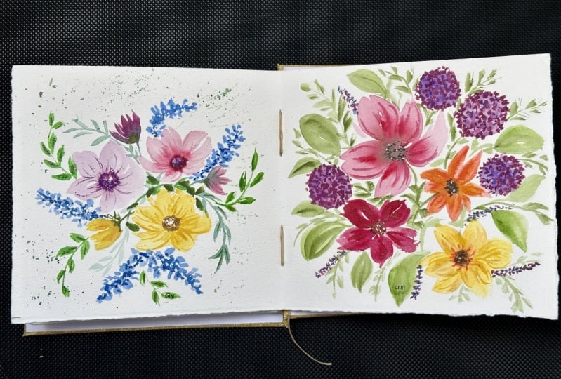
at least in art. So friends, we have finally completed our whole composition. I hope this process
was good for you, that you learned
some basic skills, or was a refresher
for you that you learned some interesting ways to create loose watercolor florals. But most importantly, that you learned to let go of
perfectionism in your art. Now the next little
section will be about how do we
continue this process. Just a reminder or a summary of what to do
when we're feeling stuck, and that perfectionism
starts to creep into our brain again. N
16. How to Keep Going?: How do you keep
going? Anxiety has a really funny way of just creeping in when
it goes unchecked. That is something
that we have to address and figure out ongoing, how to continue this journey
of joy and just being. Here are some tips when
you sit down to paint, kind of a summary of
what we've just learned. The things that you
can do to continue to let go of perfectionism in
your art in a very simple way. First of all, check
your narrative. What is the story in your head? What is your brain
telling you about you as an artist or your
creative abilities? Remind yourself, this is
supposed to be fun and it's just practice with every brush joke.
You're getting better. Number two is to breathe
and just enjoy the process. Because if you don't,
you will tense up. You will hate the process
and it's going to discourage you from continuing
to paint in the future. And the last thing is to observe two to three things that you
enjoy about your painting. You may not like how it
turned out in the end, but through that
process, if anything, a color, the composition, the style with
which you painted, you can find a few things that you like which
will encourage you to keep painting and to keep enjoying and
to keep letting go.
17. Final Thoughts: You've made it. I'm so
proud of you for finishing this class and being
able to learn how to let go and not worry
about perfect. So some of the things
we've learned in this class would be to
change the narrative, to be able to find more joy
in our painting experience. We've also learned
self care strategies just to help us be more
mindful and present. We've learned how to recognize body tension and use deep breathing just
to relax our bodies. And finally, we've
learned a series of watercolor techniques to layer and build on everything for our final
floral composition. So what I hope for
you is that you leave this experience feeling happier. Feeling lighter as you paint
and you create your artwork. I also hope that you
have learned ways to let go of your perfectionism
and your anxiety, not only in art making, but also in other
aspects of your life. And when we let go of this unrealistic
expectation for ourselves, we let go of pain, we let go of frustration, and we allow joy
to set in easier. So remember to upload
your final project to the project gallery so we can all celebrate you
and leave feedback. I also encourage you to
share it on social media. And when you do tag
me Tammy K Art, so that I can see it as well as other people can find
the class a lot easier. Thank you so much for being here and for painting with me. Happy painting,
happy mental health. And I'll see you soon
in the next class.
 Tammy Kaye, Artist and Mental Health Therapist