Transcripts
1. Introduction: Hello, everyone.
My name is Paul. I've been a Skillshare
teacher for seven years now. Here on Skillshare, I teach traditional watercolor as
well as digital painting. Today, the focus is
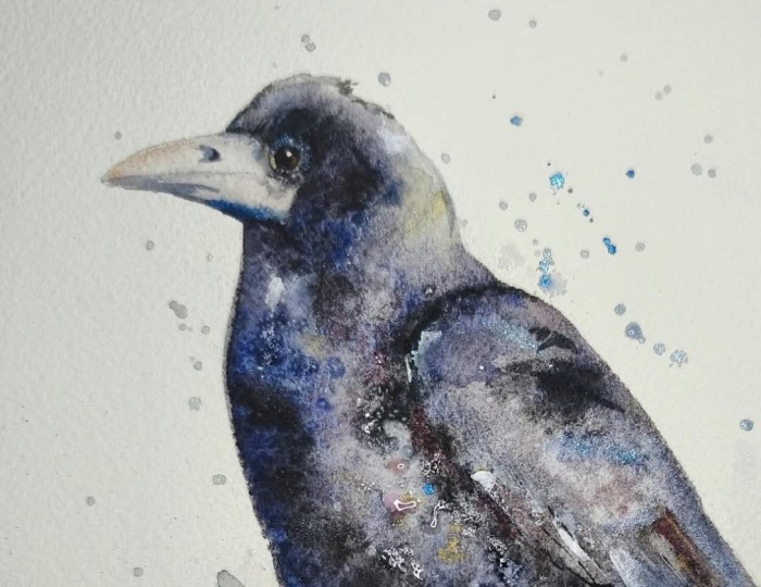
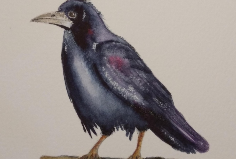
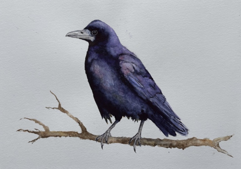
on painting a rook. This is a watercolor rook, and a rook is much
like a crow or a raven for those of you that
are not familiar with them. The difference is
they have a little white here around their beak as opposed to the traditional
black. Fluffy stuff. I usually like to recommend my classes for all
levels because I really believe that anybody can do anything if they
put their mind to it. However, this class is
a bit more complicated. So I'm going to say
intermediate this time. There's a lot of
valuable information and tips packed into
this painting class. We cover a lot of details
like learning how to paint variations in the value that define these areas while
still keeping it loose. My style of painting is
loose, borderline abstract. And I need to be able to
convey the subject while maintaining that looseness or abstractness, however
you want to call it. So that is generally the
focus of this painting. We are learning to paint a
subject that looks real, but also has that abstract, loose watercolor feel to it. Where we see things like
the water marks here, we've got some blossoms here. It's painted very loose, starts off very big, very wet, lots of water, lots of pigment. We're letting the water
do a lot of the work. Then we move on to
the finer details like the eye, the beak, the feet, the branch, the wings, blah, blah.
Then you got a rook. It's greatly appreciated
if you can upload your finished painting into the projects and
resources section. This shows other people that,
Hey, I can do this too. It helps inspire people and it allows me to
give you feedback. Also, if you like this painting and you want to follow along, follow me here on Skillshare. If you don't mind,
please leave a review. It really helps me going
forward on what to paint, how to paint it, what people
like, what they don't like. Makes a big difference and
I really appreciate it. As with all my paintings and
classes here on Skillshare, I have included the
reference photo. I have included an outline for
you to draw or trace from, as well as the high
resolution version of the finished painting for you to use as an additional
reference, all for free. If you enjoy learning
about watercolor, I really suggest
you head on over to my website, paulcheney.ca. It is a massive watercolor
reference library. There are reference images. There are tools that you
can use to create palettes. There's everything you want to know about how to
make your own paint, paper, everything about pigments, everything
about brushes. Everything to do with
watercolor. Check it out. I hope you enjoy
painting this as much as I did. Let me
know what you think. I can't wait to
see what you made.
2. Painting the first wash: Okay, so we've got our trusty mop hair
brush here by DaVinci, and we got our painting
taped down on the board. Well, our yet to be painting
or soon to be painting is taped down with
green painter's tape to make sure that it dries flat. And here's a little
look behind the scenes into what I do when
I'm testing colors. I take these little
off cuts here, and in this case, I decide decide what is the
best purple to use? What is the best underlay color to use to get that
shine to show through. It turns out quinacridone
or sorry, not quinacridone, carbazole violet is the
best choice in this case. Now it is important to
make sure you've got marked out where
the light areas and dark areas are because
this is a lot of similar color with
lights and darks, essentially, or different and where I want the dark areas. Now, I did not use a water
soluble pencil here. In this case, I'm
actually making marks here with the
back of my brush, which is just a little
feature that it has. But in this case, I used
a regular pencil so that the lines don't dissolve
when I paint over them. Now for the first layer, we are going to put water on. We're going to put
lots of water on, and then we're going to
put lots of pigment in. We're going to start off
light with a light wash, and then we are going to start adding in
the darker values. So I'm being careful to not
get in around the eye here. Like, I want to make
sure that I don't paint the eye here. So I'm going in nice and tight
and close to those areas, but I'm also being aware of the parts that I
don't want to paint. You'll start to see more once the color comes into play here. Now, keep in mind,
this is a mop brush. It does hold a lot of water. It is literally a mop. So you're picking up water and I'm putting lots
of water on here. I don't want my painting to dry. I want the colors to
mix and bleed together. Okay, let's get some
color in there. Let's start with the basics,
the carbazole violet. And we'll get that dabbed in. We'll get some, you know,
spreading around here. And ultramarine blue, and I'm just going to start
mixing these colors in together because it's
not one solid color. One solid color makes it boring. It was all just a purple bird, then it would look like a
big blob of purple bird. And by letting the
water do the work, when we add in the other colors, they blend by themselves. You don't have to mix
them. See, here we go. We've got some ultramarine blue. I'm mixing it in with the violet here just to give it
a different color. Now, don't feel you have to use the exact
same colors that I do. Use whatever blue you have, you can throw in some magentas, which you'll see I do soon. You can throw in other
things. Here I'm grabbing some shadow violet. Like it's just very
granular paint. It's like a grayish
kind of color, and use it to sort of mark out and define some of
these dark areas here. Now, we also have the
different, feather textures. We have different
things going on here. These aren't solid
blobs of paint. So we want lots of variation. We want some differentiation. We want to see the
lights and darks of those little patches
on the feathers. Okay, now, I've got my little small number two brush here and I've got solid indigo, which is a very,
very dark color. It's also a staining color. So if you don't
want to use this, mix up some burnt sienna or burnt umber and
ultramarine blue. Those will both those mixes you'll be able to
lift them and remove them. I'm pretty confident
what I'm doing. I've done this a few times now. So I'm going to go ahead
and use indigo to try. Now what I'm doing
is I'm mapping out and marking out these
darker areas here. Of course, the paint is going to bleed into
the other colors. It's not going to be a seamless
line, which I don't want. So I'm just sort of mapping
out these areas in here, putting in the darks
where they should be. Once I've got some of
the darks on here, I'm just using some clean
water and the brush, and I'm just pulling
them around now. I'm just sort of directing them where I want to go
because they're not all, again, the values
are very different. They're not all the same value. I mean, in some cases here, it gets pretty dark, but I'm just using these to pull around,
like, into the water. So I'm sort of
saying, Okay, water, here's some paint, you know, do your thing with it, right? I'm directing it. I'm just kind of giving a little
bit of a nudge. Put a little bit on, and then add some water and
then direct it around. I'm going to go back
to my mop brush here. I'm literally using it as a mop. I'm directing the paints
and the water kind of in the direction that I want to go to make the shapes of the wing. Zooming in a little bit here so you can see
what's going on. You can see I've
added an extra light here that's really showing, like, how much water is on here. I think it's hard sometimes
to see that to see, like, exactly how much
waters on the page here. So I'm using my small
number two brush here. I got lots of indigo,
and I'm just coming in and getting really tight
around that eye where, where it meets the
white area there. We've got some dark areas
around the head here. We're going to put
in some pigment, and I'm basically dabbing
in solid pigment. This is off the palett. So the palette is wet. Like the pigments, I wet
them before I start, I let them sit for a little bit. And essentially,
this is no different than taking paint
out of the tube. You have more control this way. You You can get
just as saturated. You can see how
saturated the pigments are, but you get more control. I just switch my brush here to a sable hair brush that has a finer point to get in really tight to
these details here. It also has more lifting power for areas that I
want to lift up. Now, I did mentioned earlier, we are going to get a little
crazy with the colors. So here, I've got some
quinacridone magenta, those crazy quinacrodones. And I'm just plopping
in some colors here where I see that magenta
in the top of the wing. Now, I'm going to starting to find that wing a
little bit more. I want to see where
these areas are, like, where the separations
and the feathers are, like, where these I'm going to call them lines for lack
of a better word, even though they're
not really lines, but we've got some dark areas
and light areas in here. And I've got highly
saturated indigo on my number two brush, and I'm essentially just drawing in where I've got the
pencil lines underneath. And those are showing me where the wing kind of
separates from the body. And it's again,
because we've got one mono kind of color here. I mean, we do have lots
of colors in the bird. But at first glance,
it does look like, Hey, that bird's
purple and black. It's hard to differentiate
these things. It's, you know, using one
color and variations of that tone or value
to define that. So basically what
I've done, again, the same thing that
I've been doing the whole time is I start
with saturated pigment, and then I'm moving it
around with clean water. This is still all
the same color here. We're still using indigo. Try not to overwork this. Get your paint on
and leave it on. Let the water mix around
and do its thing. Speaking of water, let's grab our larger brush here and
we're going to start and pull some of the
pigments down in here to this dark shadow area. Now, I'm not being too
careful about color here. You see, I just kind of
pulled the purple down. You could have just
put the water on, even if there wasn't
anything here because this is a very dark area. And speaking of very dark areas, let's get back to indigo here. That's the color that
I'm using for the dark. And I'm going to grab
some strong pigments, and I'm just marking out where the light areas are and where
the dark areas are here. But now you can see how
saturated that indigo is, and I'm just dabbing it along, putting it in to try and
fill this area here. We're going to come
back and hit this a few times with this as, you know, we're trying
to blend that area here. So I'm kind of, Well, I want
to be careful, you know, I went too far, and now I'm dabbing it out with
my clean brush. Now, that's not correcting it and that's not
overworking it. I'm trying to use the
dabbing as, like, a way to create those light
and dark areas there. And I go back and
forth a few times. You know, it's a hard
thing to get right. Sometimes when
you're dealing with large dark areas and
very subtle shadows, it's almost like a dance. You know, you go you
put the paint on, and you're thinking,
Okay, I'm going to move it back a little bit. You're trying to find
that cutoff area. Like, where does it start?
Where does it stop? Here I'm just defining the wing shape a little bit
while I've got the paint on. You can see the background
starting to dry now. These lines are
getting pretty solid, and that's okay because they will eventually all
blend in together. And if you watched
my classes before, you'll note I can
jump around a little bit when doing complex
paintings like this. Just areas that I think, Okay, I'm going to let that
dry for a bit and see. Now I'm going to
move up here under stake here where I cut off the but too much
paint right here. I'm trying to I'm distracting
myself because I'm painting not how I normally would because there
was a camera in front of me. So I'm trying to paint
around the camera, keep my head out of the picture. So anyways, I went back to using the little cloth there
to dab out a little bit. That's okay, cause I
want that shimmer space to remain. I need that in there. So I'm going to go back in here, and I'm just going to dab
out these little areas, and I quite like the
textures that it makes, as well, so it's working. But like everyone else, I
can tend to overdo things, and I'm like, Oh, this is fun, dab, dab, dab, dab, dab. And then I look back
and think, I probably shouldn't have dabbed so
much. But I don't know. I think it kind of
works in this case, actually, so I'm
sticking with it. Sometimes people do this
with saran wrap and things like that to get those
textures, which would work. I find it's too hard. It's too consistent,
which makes it look fake. So use it sparingly. If you're going to do
this dabbing thing here, use it sparingly because
when the paint is still wet, you'll see here, it does
take up a lot of paint. Like there, it made it
almost paper white, right? So which we don't want, we want that under shimmer and now that I'm going to
start dabbing in water, it's going to create some
funny looking textures, which is okay if you want.
3. Building on the first layer: Okay, let's take a look and
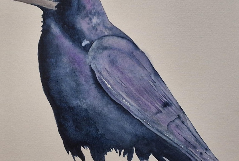
see how our rook has dried. So we've got some definition
here where the belly is, but if we look at our
reference picture, we can see that that is
it's still very light, but we're starting
to define that area. And now at this
stage, what we want to do is we want to
build on the painting, but we don't want to lose
some of these interesting, like, marks that
we have. I don't. Now, if you wanted a
photo realistic painting, well, then all these
would be for mute. But the way in this style
that we're painting today, it's more loose,
it's more abstract. So we want to make sure
that we're getting the areas correct that
are the values correct. But we also want
to maintain that natural watercolor look where we've got the watercolor marks. We've got some really
interesting areas here where the
pigments have dried, and you can see there's blossoms and different
things like. I'm just going to mark
out some areas with my water soluble
pencil that will dry so that I can kind of,
you know, further define. So what I'm saying
here is, Okay, here's where the top of the wing is, for example, and I need to put some dark value in there. So
I'm just going to mark that. Again, I'm using a
water soluble pencil, so this will all disappear, any marks that I
put on the paper. You do want to be
careful here that you're not damaging the paper by
pressing too hard on it. I'm just using a heavier pencil. This is a four B
that will allow me to put these on without having
to worry about, you know, I get some darker
marks on top of a dark pigment without
pressing too hard. Okay. So now what we
want to do is we want to sort of further define those shapes
that we marked out. I'm using a number two
sable hair brush here, and what I'm doing
is I'm very gently adding water into those areas. So right now, we're focusing on the dark area
underneath the eye. And I'm very gently
adding water here. So I'm not pushing
the pigments around. I'm not lifting the paint. And now I'm going
to take some of the carbazole violet and
indigo, mix them together. In a really, really dark color. And I'm just dabbing
those pigments in now. So what this is doing
is it's allowing the water to gently carry
those pigments across the page and dry on top of what's already there
without leaving more marks without making it too without adding
too many layers. I'm essentially adding
to the first layer, really, versus putting
on another layer. I mean, you are putting
on another layer, but you're doing
it in a way that doesn't build up
the paint too much, and it doesn't I
shouldn't say it doesn't build up the paint because that is
what you're doing. It doesn't it doesn't
make it look overworked. Once I get those pigments on, now I'm just going to add some clean water, just enough, right? So you noticed I dabbed off my brush there, so I
wasn't dripping wet. And now I'm just using
what I've put on and I'm just pulling it
down with the water. And it's important to remember
there is a purpose here. We're not just doing this
for the sake of doing it. Remember, I had marked
out these lines with my water soluble pencil, and now I'm just sort
of defining them further with the actual dark pigment,
where the dark values are. And we're going to continue this process throughout the bird, and we're going to do
this several times. So right now I'm just sort
of mapping things out, making sure I know
where the dark values are that I can control to move them around and get them into
the areas that I want. I'm basically now doing wet on wet painting where I'm trying
to have softer gradations. Remember, if you look at the reference photo
here of our rook, you can see that there are it looks like at first glance that
there are hard lines, but there are no
real painting here. We're painting those
shadows and light areas. So we want an abstract
painting that looks loose, but we also want it to
define that it is a rook. We want it to look like a rook. You want to be able
to identify it. And the key way to
do that is to paint the dark values where
the dark values are and the light values
where the light values are, or in some cases, leave
them paper white if it is, like, a white area on a subject. As you're going
through your painting and you're following along
doing what I'm doing, remember, you don't
you don't need to do exactly every brushstroke,
everything that I'm doing. The key to learning this is by, you know, listening
to what I'm saying, get an idea of what I'm doing. Look at, you know, okay, so
he's putting some water on, and then he's
spreading it around, and he's defining the values
and light and dark areas. Essentially, that's the gist
of what we're doing here. So look at your reference
picture and look at the areas where it is
lighter, where it is darker. So right here, where
I'm doing right now is this dark area over the eye. But then there's this
really bright shimmer that sort of defines the
turning point of the head. But then on top of that,
there's another shadow. So really what you're
doing is you're building a painting when
you're doing this, okay? You're using water
to do the work, as always, in this
style of painting. Again, that's really
important to say. So if you said, I want to
paint photo realistically, well, yes, you could adapt some of these
principles to that. But generally, this is for loose watercolor painting here. So we're putting on
larger stroke areas. So we do have a dark area. We do have light areas. But we're letting the water
do most of the work in here, and we're just
adding in pigments where it's darker and not adding them or trying to stop them from going
where it's lighter. Our first layer was
our under color, which is our purple sheen, which is that area that we're kind of dabbing
around right now. And now we're adding
in the darker values to make the shadows. And so we'll just, you
know, finish this up. We'll smooth this out a little bit so we don't have too
hard of a line here. We're gonna let this
dry. We'll come back and we'll get onto the
4. Stregnthening the details and adding colour: So it's always fun to
come back and take a look at see how our
painting has dried. Forgive the bouncing.
I hit my camera. We've got our shimmer
area up at the top. We've got our additional
pigment that we've added in here to sort of start to work on that shadow area.
It's still a bit damp. We've defined the
wing. Now we need to define this area under
the chin a little bit more. I don't think we went up, sorry, under the
beak, not the chin. I don't think we
went dark enough. Then we need to focus on the chest and the
back of the wing. We need to define those areas. You can see in the
back of the wing, it's much darker
than what we have. I'm also just going to
pull this area back here, this shadow area back just
a little bit further. I don't think I went far
enough the last time, so I'm just going to pull that
back a little bit further. And now we'll get started
on that chest area there. So, as I said, look at the back of the wing.
Look how dark it is. It's essentially just a
solid block of dark color. But then the chest gradually
comes out of that, but it still has some
highlights in it, as well. That makes it a pretty tricky shadow area. So we're
going to achieve that. We're going to by defining
the really dark areas here. So basically, I'm doing the
same thing I did before. I'm gently adding water. I could be using a bigger brush. I'm just being lazy
here and, you know, use the biggest brush that
you can control properly. That's generally
the rule of thumb. In my case, I'm just
using what I had here. It does have a fine point on it, and it's sitting right here. So it's what I'm using. But generally,
it's best practice is use the largest
brush you can control. Anyways, what we're trying to do is make the
dark area dark, but we also want to bring out
that chest area gradually. It's not a sudden cutoff. At the same time,
we want to keep those little highlight
areas on the chest. We're going to do that.
We're going to add in some more color as well. We're going to add in
some more magenta. If you don't have magenta, just use water down red. You can mix a little bit
of blue and red together. Try to use the colors you
have on your palette. If you run into a challenge where you don't have a color and someone in any tutorial
you're following says, I'm using this color,
this color, this color. If you end up running out and buying every color of paint that every person has
on their palette, you're going to be broke. So try to mix your colors, try to learn to mix the colors. Keep it simple, right? If
you don't have to have the exact same color or shade
or hue that I'm using here, it's more about the values. That's what's important,
and the values are the lightness or
darkness of said color. And as I said, we're going
to add in some more color. I'm adding a little
bit of back lit area here with this yellow ochre, and then I'm grabbing
some magenta, and I'm dabbing it
into those wet areas that I had created earlier. So as you can see now, we've got a darker value, not enough yet on the back wing. On the bottom area, you can
see, it's still too light. But just, you know, we're going along carefully because it's a gradual that chest just kind of comes out of that
dark area gradually. And it's got lots of colours. It's got lots of highlights, and it's got lots of
dark areas in there. So there's some strong
shadows going on here. So it's a very good
exercise to practice. So we're just going to add
in some warmer colors. We're going to add
in some magenta, just trying to, you know, show that what's going on
in the reference photo. We've got our other
colors in there now. We've got some variation
in the hue or the color. Now we're just going
to continue trying to define that gradual shadow area. It is tricky, so I'm
just taking my time, making sure that I do it right. If you find you go too far and you get some
areas where, oh, I have too much
pigment in there, while it's still wet, grab a
clean cloth and dab it out. Those little dabs help make
those little highlights. Don't overwork this. I cannot stress that enough. I always do. That's
why I'm laughing. And just continue on until you feel that
you've got what you feel is a right amount of shadow and the right amount
of light areas in there. I still have oh to define
where those shadows are. Take your time doing this. You know, you don't
want to end up overworking it and
going back and forth. The whole dabbing pigment off, I should clarify that, you know, it's not a fail
safe safeguard, right? As you're putting
down these pigments, they start to stain. They start, you know,
the more you do it, the more the paper
gets overworked, that's how your painting
ends up looking overworked. There is a lot going
on in this painting, even though it's
very simple with, you know, essentially
just a couple of colors. But it is very easy to
overwork a painting like this. Don't be afraid. If you
do, just do it again. This is the kind of
painting that you're going to want to
do multiple times. Let's get it to where
you want to get it. Try not to overwork it, and let it dry. Step away.
5. Defining the wing and starting the feet: Okay, now we're
going to continue on doing the same thing we
did in the last chapter. We're adding more definition
and detail to the wing. We're using the
same process here. So I've added some water to the kind of arch at
the top of the wing, where we've got a
very thin shadow area that you can see on
the reference photo. So what I've done is I've
added some water there, and now on the top
of that water, I'm putting in some
concentrated pigment. I'm going to let it
bleed down naturally. I'm just trying to just
outlining the shapes right now. Now, if we look
further down the wing, there is a similar little bump or line or shadow area there, and we need to increase
the value there. So, again, we're adding
in some clean water and dabbing in some
concentrated pigment. We're going to do the exact
same thing down here on some of the individual I call them lines,
like feather lines. It's where the feathers kind
of separate and come apart. There's usually a shadow, followed by a midtone area, and then a highlight at the top. So right now, we're just
putting in the shadow. Now, I'm going to bring up
some of the values in here. This area of the wing
is far too light. If you look at the
reference photo, you'll see it's much darker. So, again, we're
building the painting, we're adding in the
values where they are, trying to leave the
highlight areas and the shadow areas as
much as possible. Keep in mind, this is a
representation of a painting. This isn't a
photorealistic painting. And if you try to make it one, it will fail as an
abstract, loose painting. The same way as if you try to
make a realistic painting, look abstract and loose. You got to pick a lane
and stick with it. So it's very
difficult sometimes. And one of the hardest parts
in this type of painting is deciding or keeping with the
decision that you've made, I'm going to make an
abstract painting. As soon as you have
pencil lines and other things that
you're painting inside of are following along, and even this reference picture, for example, you start to think, Oh, what about this
tiny little line here, and what about this
tiny little line there, and all those things start
to work against you. So you'll see I'm
kind of dabbing in darks and trying to
leave some light areas, you know, lifting
out some areas, trying to leave some, you know, I'm not necessarily
painting all the lines. I'm just trying to say there are light darks in this area, kind of in these shapes. And that's kind of
how you have to think about this to make these
kind of paintings. Another thing that
I'm keeping in mind is I like the empty spots, the white spaces,
the water marks, and I don't want to take those away when I'm trying
to add in details. So I'm being mindful. That's going through my
mind what I'm doing this, and I'm being mindful of these, trying to leave those
marks as much as possible. One of the key features
of this rook is this magenta purply kind of shimmer that
it's got going on, and we're not going
to make this shimmer with traditional
watercolor paints. You could probably use some shimmer style paints
if you wanted. I personally think they're
tacky and don't like them. So essentially, I'm dabbing in some magenta in here that I've put in some
clean water first, and then I've dabbed
in some magenta. And I'm just kind of
trying to bleed it around and bring up
the values where they need to be so that it looks more real without overdoing it. And, you know, I do a
pretty good job of it here. Could I do better? Of course. Every time you do
this, you get better. And here's what I
mean by putting in some of those suggestive marks, showing that there are
different levels of wing here. I've let the paint
dry enough that this doesn't just bleed
off into oblivion, and the marks are
somewhat realistic. While we're letting that paint
sort itself out and dry, we're going to mix
up some colors to start the feet and legs. So I've got some
ultramarine blue here. I'm adding in burnt umber. And this makes a blue, a brownie gray or a bluey gray, depending on how much of each
you mix inside of it here. I'm going to pull in
some of the magenta and purple in a bit to make
it all kind of blend. If you look at the feet,
they're kind of a dark gray with a reddish under value. Don't overthink it when
we're painting these. Right now, so I'm putting
in just a neutral, kind of lighter gray at the
base, just filling it all in. When we look at the
reference photo, we've got essentially, we've
got a dark area at the top. We've got a dark
area on the left, we've got some highlights
coming in from the right, and that's essentially
what we're going to paint. So think of it not in terms of, like, a really
complicated looking foot, but rather a line with
dark on one side, kind of light in the
middle and dark on the other side or in
some cases, light. So we look at the right foot, it's lighter than the left foot. That's really all
we're looking at here. So there you see, I left out the kind of lighter
area in the middle, and I'm just painting around it. Just keep it very simple. We're going to come back at
the end of the painting, and we're going to
highlight some areas with gouache and different other effects that'll
show you then. But for now, just
get your base layer on and add in the shadow
value if you can control it. Now, this is an area
where you don't want to use too much
water because you can see how stark the shadow is
versus the highlight area. If I had a lot of water there, that shadow area would bleed in, and I would lose
that highlight. I
6. Starting the beak and defining the eye: Now we are starting on
the eye and the beak. When I'm doing tight areas like this that I want
to look really good, I like to go over with
a pencil and just make sure that I can see
exactly where I'm putting what? And that's what I'm
doing here now. I'm just sort of redefining
some of the areas. Sometimes I don't put
them down dark enough or they get erased when I'm
erasing stuff and sketching. Um, so what's important here is there's a brown
area in the center. We've got this very thin, and that's pretty key, the thin white line
around the eyeball. A lot of times I see
in people's paintings, they make these far too large, and that is generally a
result of being too cautious, being afraid to fill it in. So instead of being
courageous and saying, I'm going to do this and get
it as tight as possible, people leave these
large white areas which make it look unrealistic. We've also got the area on
the beak that's kind of like this very gnarly looking skin that's at the back of the
beak underneath the eye. We're going to add in some
sea salt to get that texture. For the beak color, I'm taking the gray
that I've made with the ultramarine blue
and burnt umber, and I've just diluted
it with a lot of water. We're just kind of
dabbing or blobbing it in. It's very patchy. It's very light at the top. There are some darker
areas in there. I'm not going to
overthink this too much. You know, even here, I'm being
too careful with my brush. I should just slap this on, put some sea salt on,
and forget about it. The sea salt pulls the pigments toward each other or
towards the salt, which leaves a ring around them. So if I said sea salt, you can use any salt
for that matter. And in this case,
because they're so fine, a finer grain salt would
probably be better. It just so happens
that my little tube of salt happens to have
coarse sea salt in it. Another thing I'm going to do is wet the area here against where we've got the dark
purple pigment just so that that kind of
bleeds in a little bit. And here you can see my
trusty container of salt. I clearly do not want that much. Okay, now we're going
to take some of that ultramarine blue and burnt
sienna making our gray, and we're going to put some on the top and the
bottom of the beak. I'm holding my brush like this because I can't get as close as I normally do because I have
a big camera in the way. And again, for perspective, this is a number two brush. The painting is 11 by 14 ". This brush does have a fine tip. It also holds a fair amount of pigment and water
being real sable. So now I've just got
some clean water, and I'm just
spreading this around to soften up those lines. And we will have
to come back and add in more. This is
just a base layer. Now we're going to
move on to putting the darker shadow
area underneath. Now, another critical area is the dark line on the inside
and the outside of the eye. So if we look, there
is this white line. Most birds have it.
It's very fine. I'm eating very fine.
And most people make it either too big
or don't include it. So I'm just being
careful to sort of define exactly where that is. I've got saturated pigment on
the very tip of the brush, and I'm just being very careful going around and outlining that. Just dab it in, draw it on, take your time, go
very slowly with this. There's no rush.
There's don't worry about the water drying or
not drying, get it on. Once you've got it
sort of defined, you can see here look how large the white space is on mine. But now I can go in and slowly start to
make that smaller. So I'm just tightening it
up and tightening it up and tightening it up and making that smaller and smaller and smaller.
7. Finishing the beak, eye, feet and starting the branch: Okay, now we're going to
take some quinacridone gold. If you don't have
quinacridone gold, you can use burnt sienna. If you don't have burnt sienna, use burnt umber, just a
brown orange, reddish color. And we're putting that
down here on the bottom. If you look very closely
at the reference photo, the bottom of the eye
is a brown color. We're going to put some
darker colors over top, so I am fine using a very
bright color like this. It just helps it show
through a bit later. It's very subtle. You can even leave this part
out if you want. If you're nervous about
painting such a small thing, go ahead and paint the
entire thing dark. I'm just going through the
steps that I like to go through when I'm painting a very detailed eye
to show you here. The next thing I'm going
to do is I'm going to take some of the dark
color, which, again, is burnt sienna and
ultramarine blue, very saturated, and it
with a very fine brush, and I just dabbed it
in on the bottom. And we can continue all the
way around the eyeball. And even though my brush
has a very fine point, I still found I had to
switch to my liner brush. It is a very small space. I don't want to make
a mistake here. I'm trying to make this as tight and accurate as possible. You can look at this
type of painting, not really as painting,
almost as sketching. You're almost drawing this in. Don't worry about making a wash. Don't worry about
anything like that here. In this case, here, you're trying to make a
hard solid line. Use the finest brush
that you can to do this. You're making small details. Now that I've got that on,
I'm going to pull some of the pigment inwards
using a damp brush. And once you get it
how you like it, you can start to dab in with some clean water and
shrink that area around. The little white
highlight area there, it's a very soft, gradual
transition. Don't overwork it. And once you're done
that, we will add some more details to the beak and the eye and then
move on to the feet. Now, we're taking
our liner brush here with some concentrated
pigment, again, just the same dark value, and we're very carefully putting that dark line along
the beak there. I Okay, now we're going
to add another layer or, I guess, increase the value
on the bottom of the beak. If we look at RB versus
the reference photo, you can see there's a dark
area on the bottom there. These are kind of the
things that define that three dimensional shape. Quite often, when people say, What's wrong with my painting? Can you look at it
and help me fix it? Generally, it's just being
too afraid to go too dark. And when we're
doing this type of painting using the
wet on wet technique, it's easy to build it up. So you can go on baby steps. If you think, Oh, I don't
want to make it too dark, I'm worried about making it
too dark, you can do this, which we put in
some clean water, and then we've added
the pigment on there, and we're letting
that water again, do the work, bleeding
that pigment around. A Now, I know it seems
like we're jumping around here a lot, in
a way, we kind of are. But what we're doing is
what I'm doing anyways, in this painting is I'm
letting the areas that I've worked on dry and then just focusing
on another area. In this case, what we're doing
now is we're tightening up that very thin line
that we talked about and just
shrinking it down. I probably went a
little bit too far, but we can always
dab it in again with some guash or gelpen
later if we want. Personally, I like the sort of darker over the eyelid look. And by now, the beak
is dry enough that I can put in another
section here, which is the little
nostril, we'll call it. So I just sort of marked it with my pencil where
I want it to be. Now I'm grabbing some
highly saturated pigment and just dabbing it in
where I outlined it. And here I'm going to
use my liner brush to extend some of those details, some
of the finer details. So this is just very carefully. What I've got on here
is just a damp brush, and I'm picking up the pigment from the nostril and
I'm just kind of shifting it around almost
drawing in these sections. You can see like I'm using my brush like a
pencil and sketching. Now let's get back
to those feet. So I've got my regular
dark color here. I'm extending that shadow
area underneath where the leg meets the furry part,
I guess, we'll call it. And now I'm going to add
in some burnt umber here, some brown color because there is sort of a reddy
brown color in there. And that'll if you
look on the palette, we're getting pretty
close to what that leg color looks like. So I've just mixed some
ultramarine, sorry, some of the dark color, which is ultramarine
blue and burnt sienna, and I've added in
some burnt umber. Now I'm just painting in
the browny red sections on the and I'm trying to leave the highlights as much as
possible where they show up. I'm not too concerned
about this because I can come back later and put these in with a fine liner
brush using some guash. So if I get them, great, if I don't not going to
worry too much about it. I'm also going to try and put in some of the lines on the feet that are already there. I don't want to go over
top of those too much. So right now, what
I'm doing is just sort of outlining this, trying to get the values
right, and the colors right. I don't want to go
too crazy on this because the rest of the bird
is very loose and abstract. So obviously, we
don't want the feet to be the main focal point. But I also want
them to look real. So it's a very fine balance. Play around with it until
you're happy with what you get. A And now I'm going to go back to that
fine liner brush for some of the finer details like
where the joints are, where the little feet
joints are in there. So I'm almost drawing these in. If you had a very fine
detail ink drawing marker, you could use that here
as well, if you like. I have this brush and I
have the paint mixed, so I'm going to go
ahead and use this. Okay, let's get on
to that branch. One of the biggest
mistakes people make with the branches
and things like that are leaving too big of a gap around the toes and
underneath the feet. They're round.
They're shadow areas. If you look at the
reference photo, it's a fairly evenly lit one. It's darker on the bottom
and lighter on the top. There's also shadows
underneath where the feet are. So it's a very bright picture. I like to put a little
bit more shadow underneath the bird itself. I'm imagining the light is kind of coming from
the top where it is. So therefore, we're going
to have the shadow area. I'll be darker at the
bottom of the branch, just like it is in
the reference photo. So here I've got
some yellow ochre mixed with burnt umber
very heavily diluted. And then I've come back
with our dark color, the brown version of it. And I'm just using the finer brush here and
putting in some more pig. Now I'm going back
to my sable brush and just filling in some
of those areas with again, this is pretty much yellow ochre with a tiny little bit of burnt umber mixed into it just to keep it from
being too yellow. And I'm just very
simply dabbing this in. Remember, I already
wet the paper here, so I'm just filling
in those areas. Then I can come back in
and put the shadow areas, the darker pigments in between the feet underneath the branch again to make it even darker. Okay. Have fun with this.
Don't overthink it. I'm basically putting
in some lines showing, like, you know, texture
in the branch here. You can add in some
different colors. If you were to really
zoom in on that branch, you would see all kinds
of colors in there. So don't be afraid of it. I
mean, they're all in there. There's reds, there's yellows, there's brown, there's
blues, there's blacks. Most important thing
is the value that it's dark where it should be dark and light where it
should be light. Use whatever brush you're
comfortable with here. I go back and forth between
the larger sable hair brush, the pointy, smaller sable hair
brush, and my liner brush. Here I've got the more
concentrated pigment, and I'm using the liner
brush just to get in between and underneath
those feet to put the shadows where they
need to be without wrecking the feet. I
8. Adding the final details: Okay, let's get on to
some final details. I've got some guash here and a few other tools that
we're going to use to add some highlights to the feet areas and maybe
a few other areas. So with my liner brush, and I can come in here and
take some guash and dab it into some of these
finer areas where some of the shinier
bits on the feet are. Those areas I want to be able
to have some highlights. There's also this area up in here where I've got the beak, and feathers and
things like I've also got a trusty white
charcoal pencil here, so I can use that to add in
some highlights as well, basically shining up some
of these areas in here. So you'll see how it
goes on over top. It's not as opaque as guash, and I don't really
want it to be. I'm just trying to get some
of that shimmer back in here. It gets a little muddied up
in some of these finer areas. Now, keep in mind when you're
using things like gouache, it's not meant to
fix your painting. It's a part of the painting. It's just saying, Okay, I
know this area is here. I'm not going to worry
about it so much. I just need a little spark, a little shine, a little
reflection. That's all it is. You don't want to start
painting entire white areas in this because it will quickly not be a watercolor painting.
 Paul Cheney, Teaching watercolour and digital painting