Transcripts
1. Introduction: Hello, everyone. Welcome to the painting class.
My name is Shiba. I'm an artist, a YouTuber, and a passionate watercolrist. In today's session,
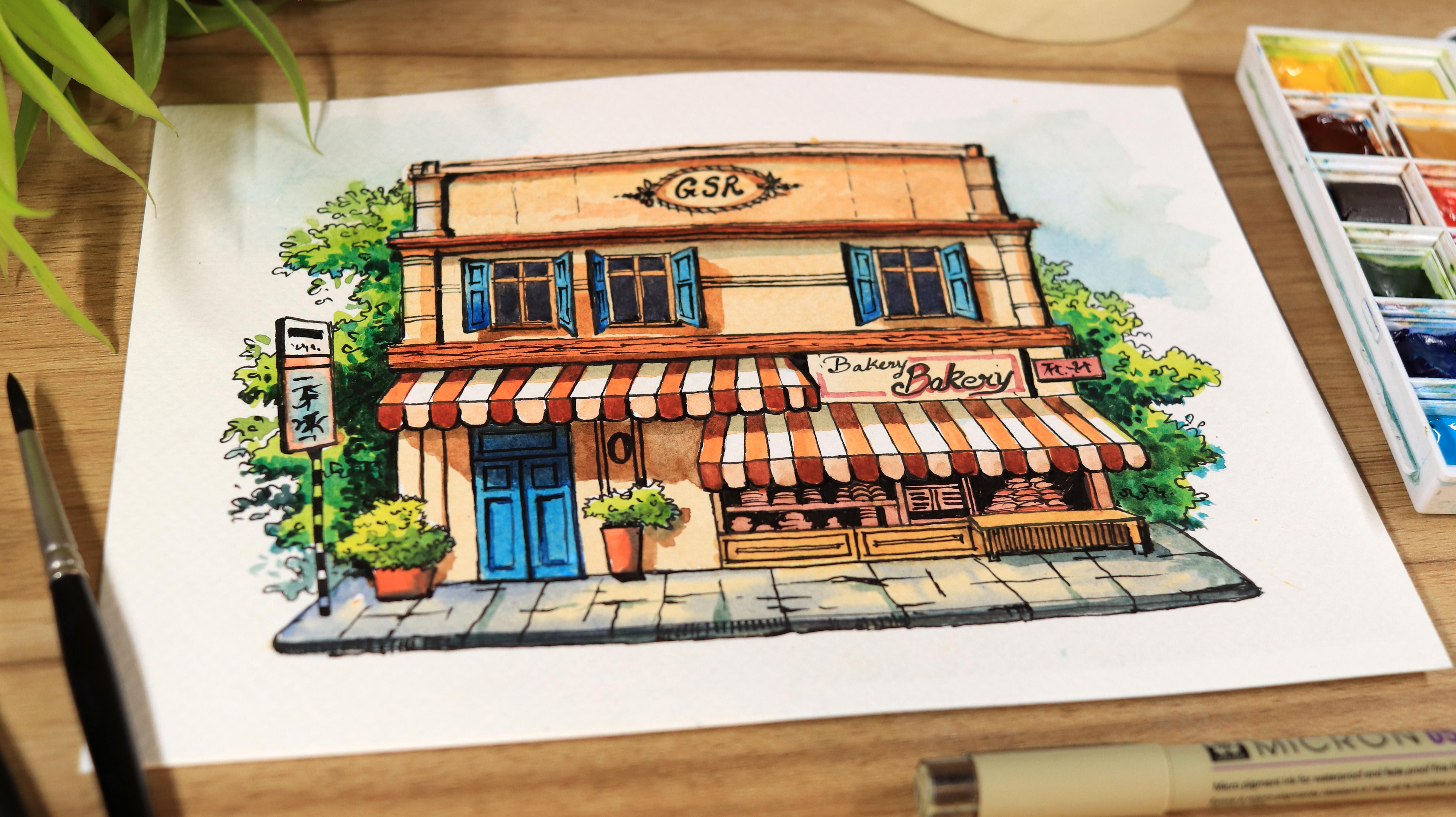
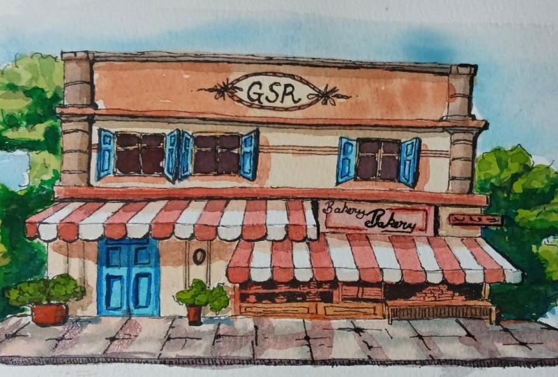
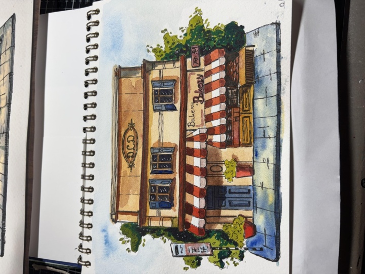
we will be creating a beautiful Bakery shop
using watercolor and ink. In this class, I will
walk you through all the materials
you will need to create this stunning landscape. I will also explain the
watercolor techniques in detail and
provide you step by step instructions so
that you are well acquainted with both the
materials and the process. I'm excited to guide you through the process and share
my techniques with you. By the end of this
class, you will know exactly what colours to use at each stage
of the painting. I have a deep passion for watercolor, particularly
for painting, rural landscapes, seascapes, bords and animals,
and much more. I strive to keep my
painting vibrant, rich in color and full of life, which you will find today in my watercolor painting class. This class is beginner friendly, so even if you are
new to watercolor, you will be able to create this beautiful
painting by the end of this class. No need to worry. I've made sure to explain
every step clearly throughout the painting process to enhance your
watercolor knowledge. I'm so happy that you
have chosen this class, and I'm very excited to
share my passion with you. Now, let's jump into
the next section where we will be
taking a look at the materials we
will need to create this beautiful painting,
and I see you there.
2. Materials Required: Hey, everyone. Welcome back. In this part, we are diving into the materials you
will need to bring this watercolor painting to life. Let's start
with the paper. I'm using a Kenson
watercolor paper, 300 GSM cold pressed. These comes in pre cut out
sheets of A five size, which makes them super convenient
and easy to work with. Moving on to the watercolors, I'm using a Windsor and
Newton watercolor set, which comes in 12
vibrant sheets. It's a big enough friendly set, but has the potential
and capability of creating realistic
and detailed artwork. I've also added
an extra sheet to the set that is
cobalt turquoise, which I'm using in
place of white. Now, this particular sheet
is from white knights. That's all for the colors. Now let's talk
about the brushes. Here I'm using Senylo
brushes for this painting. A few of them are the mob
brushes for broader strokes, and the rest are round brushes, great for detailing and control. Of course, you don't need exact same
brushes to get started. Feel free to use any brushes
you have in your hand. For the pen sketch, I'm using a Shakura micron
pen, which is 05. This pen is
absolutely beautiful, then flows smoothly
without any bleeding, so it's super easy to use
and perfect for bigness. For the rough sketch,
I will be using a mechanical pencil from Pentl. It has 0.7 MM lead which gives just the right balance between precision and softness. And to clean up any
extra pencil marks, I will be using a
kneaded eraser. To tape down my paper, I'm using a half inch masking tape, but if you don't have a
masking tape on hand, you can use a washi
tape as well. Watercolor painting isn't
possible without water, right? So I have got a tub of
water to clean and rinse my brushes and to speed
things up between the layers, I'm using a hair dryer
to dry my painting. I'm also keeping a cotton
cloth handy to wipe off any excess paint from
the brushes whenever needed. It helps keep things
neat and controlled. So, friends, that is
all about the materials I will be using for
this painting class. Now let's move on to
the next part where we will start with the basic
sketch of the painting.
3. Let's Start Sketching: Hello, everyone, and welcome to the very first lesson of our
watercolor painting class. I'm so excited to paint
together with you. Before we start, let's apply masking tape on all the four sides of the
watercolur paper. Using masking tape is
important because it keeps the paper steady and
gives us a clean water. So we will not be painting
near the edges today, but the tape will
help our final piece to look more neat
and well finished. Here I'm using a half
inch masking tape. If you prefer, you can also use a 1 " masking tape as well. Now that our masking
tape is in place, we are ready to
begin the sketch. Here I'm using the
pencil to draw a light basic sketch
of the Bcr scene. For the sketch, I'm using a mechanical pencil
with lead 0.7. I like it because it gives a very clean line and
doesn't need sharpening. First, I will draw a vertical line to place the structure. After that, I will add
a horizontal line to divide the building and then
set off the basic layout. Here I'm building
the structure from the top and adding
divisions whenever needed. I'm just placing the
main shapes first, keeping the lines
light and simple. While sketching, it is
important not to rush because we are creating the basic foundation
of the drawing, and these simple straight
lines might look small, but they are actually forming the base for the
whole structure. As you can see, I'm
not pressing too hard with a pencil while
drawing the basic shapes. If the lines are too dark, they become harder
to erase later, especially when you
go over with the pen. So keep your pencil
pressure light and gentle. Here I'm using a simple
horizontal and vertical lines to draw these rectangles. Now, these lines are creating the main divisions
of the building. Now let's add some
horizontal lines to give the structure
a sense of volume. Basically, I'm starting
to add details, as you can see, to bring
the building to life. If you like, you
can use a scale to draw the structure more
quickly and accurately. But here I'm working more with an eye relying on estimation
rather than a scale. Now, let's use a needed eraser
to clean up the sketch. We will remove extra
lines to avoid confusion and make our
structure look neat and clean. Now that our basic
structure is ready, I'm drawing the base
of the building. This is basically the ground or the side plinth that
the building stands on. As I draw the best,
I'm shaping it like a trapezm wider at the front
and narrower at the back. So this helps to create a sense of perspective
in the painting. Now I'm double
checking the structure and refining the corners to make the certain
parts of the building look a little wider
and more balanced. Now let's divide the structure in half with a vertical line. This will split the base of the Bakery shop
into two sections. On one side, we will draw the
door and on the other side, we will create the open area where the Bakery
items are displayed. But before that, let's draw the plastic trampoline
in front of the shop. So it protects the item from direct sunlight and also
creates natural shadows. Here I'm drawing the trampoline
in a trapezm shape wider at the front and narrower at the back to
give a sense of depth. Now, let's draw the holding
board for the shop. I'm starting with the
straight line continuing from the base line of the
tarp on the left side. Now, let's draw another
tap on the right side. This part will be the display
area for the bakery items. While drawing this,
it is important to keep the perspective in mind. Now, this line is in the
middle of the building, so it should appear
straight to our eyes. That means it
shouldn't be too wide. Now, it should lean slightly
towards the left but stay fairly narrow to
look more natural. You might have
noticed that I drew the base of the turf
with a double line. This shows the area where the
turf falls and hangs down, giving a sense of
depth and movement. Now let's draw the
vertical lines to mark the doors
of the building. We will also add a small pot on the left side for
some extra details. Now, let's draw a
vertical line to divide the right side
into two halves. One side will hold the main
Bakery items for display, and on the other side, we
will add some smaller items. This will help to create a frame for all the
bakery products. Now let's draw a small
bench on the right side. For this, we will
extend the frame outward a little,
as you can see. B I was about to
draw the window, but I raise them for now. First, we will draw the pillars on the sides of the building, and then we will mark the
space for the windows. You can see that
the middle portion, I'm making the pillars
a little wider. For the upper portion,
the pillars are drawn thinner to keep the
proportions balanced. Here I'm adding a small
decorative detail, so it is not a major
part of the structure, but it adds charms and makes the building
look more interesting. Now in the middle, I'm
drawing a small oval shape. This is where we will
add some letters to draw the Bakery branding. Basically the shop name, similar to the holding board. Now that we are done with the basic structure
of the sign board, now let's move on to
drawing the windows. Before drawing the
full window structure, I'm making the window area
with straight vertical lines. Now, this will help and make
sure that the windows are evenly placed with
same width and height. Here I'm drawing three windows. I start with a vertical line to measure the space between them, and then I will add
horizontal lines to complete each rectangle. You can see I'm working slowly making each line as
straight as I can. Now this is important
because later when we will go over
the structure with pen, it will be much easier for us to follow and keep
everything lined. Now that we have the
basic window structure. Now let's give it some volume by adding another set of lines. Now, this will give the
window a proper structure, just like the real one, where the frames and divisions
are clearly visible. Now, let's add panel
to the windows. I'm drawing these in a similar
way, but only halfway. So we show one panel on
each side of the window. Watch how I'm drawing
these panels. So if you want to show
the windows half open, draw these panels
following the perspective. Now, the part which is closer to earth should look
slightly bigger, and the part which
is attached to the window should
be a bit smaller. Now, this creates a
realistic sense of depth. You can see how the panel on the third window are
different from the second. On the second window, the
panel is only half open, which shows it more
like a trapism shape. On the third window, the
panel is fully closed, so it keeps a more
rectangular shape. Now, let's quickly
add a pole with a sign board on the left
side of the building. So we have completed
the basic structure of the building and all other
elements with pencil. In the next part, we
will go over it with pen and clean up all
the pencil lines.
4. Sketching with Pen: Hello, everyone, and welcome to the second part
of this class. In this lesson, we will start drawing the structure
with a pen. We will go over the pencil
sketch that we have created earlier and slowly build
into details with ink. Here I'm starting the pen work from the upper part
of the drawing, and then we will continue
moving downward step by step. I'm not just tracing the
pencil lines with pen, but I'm also adding
some extra details directly with pen,
as you can see. For the pen work, I'm using a Shakura micron
05 fine liner pen. Now, it gives a clean, sharp lines, and it is
great for detailing. You can see that for some
part of the structure. I'm drawing double lines. Now, this add volume and also give a sense of thickness
to the elements. While drawing with
pen, your lines might not always come
out perfectly straight, and sometimes they may overlap. So that's completely normal
because in a pen sketch, these little
imperfections actually add beauty and character. So they make the
artwork feel more natural and lively rather
than stiff and perfect. Now, let's draw the
oval shape with the pen and start adding
some details to it. You can see I have
drawn these lines and made them double
to add volume. I also added two small
flower shapes on both side to give it
a decorative touch. To extend the flower shapes, I have added a few
extra pen strokes on both sides just to make them look longer and
more decorative. Now, let's draw the pillars. I'm using a repeated
pen strokes, running the pen
two to three times over the same line
to make it darker. I'm also adding a
few horizontal lines to give the pillars some
structure and texture. Now, let's draw the other pillar using the same technique. Now, let's start
drawing the window. Here I'm using the
same technique, drawing the double
lines to add volume, which gives the window
a solid structure look. While drawing the windows, we will also add the wooden
frame that we usually see in the middle
forming a plus shape. After that, we will add the panel using the pen
following the same technique. Now let's draw the other
panel on the right, which has more of
a trapism shape. Now let's quickly draw the second window using
the same technique. We will repeat the
same style for the panels and for
the inner structure. Now moving on to
the third window, we will use the same
techniques again. I try to build the structure using double pen
lines to add volume. You can also add
your own variations. It's completely up to you. If you want to make it look
more like your own style, feel free to make the
changes to the details. At this stage, I'm not just
drawing the structure. I'm also thinking about how to make the painting
look more beautiful. So suddenly I had an idea to add some horizontal lines
next to the windows. Now, this adds more charm and a sense of structural
volume to the building. You can see how
these small lines and details are adding
beauty to the painting. So it also shows how important
these tiny lines can be. They can completely change the overall look and
feel of the artwork. Here I'm drawing a
horizontal wooden plank that divides the
building in half. This adds a vintage
touch and makes the Bakery shop looks even
more charming and attractive. Draw this, I'm using a
repeated pen strokes to make the line thicker. Now this adds a
sense of depth and also enhances the beauty
of the pen drawing. Now, let's add a few more
pen strokes to complete the structure before
we move on to drawing the shops trampoline. Now, let's quickly
draw the shops dark. We'll follow the pencil
outline and keep in the same trapism shape that we drew earlier,
as you can see. While drawing the
base of the tarp, we will make it a little curved, a continuous U shaped. Now, this helps it
look more natural, just like the real
trampolines we see. You can see I'm
working slowly step by step to draw these U shapes. Keep following along like this until the whole
shape is complete. You can see how working
in small careful steps helps us complete the structure more accurately and quickly. It is important to go slow, especially with pen because mistakes are harder to
fix compared to pencil. Now to draw this tap, I am using the same
technique I used earlier. I'm drawing the U shape slowly steadily to
avoid mistakes. Let's complete it step by step. When it comes to pen and
watercolor painting, most of the time, artists they draw
directly with pen first, and then they add watercolor. But to make this
lesson approachable, I've used the
pencil lines first. Now, this helps you to work more carefully and in
a structural way. Also, it avoids mistakes and
keeps the painting clean. You can see that I have
completed both the tabs. Now, this straight line
marks the horizon where the tap folds and bends
as it hangs down. Now, let's draw a line
for the hooding board. We will also add a
small board beside it. We'll also write the
bakery name later, but right now, we will be just creating the
basic structure. To make the painting
look more lively, we will add some trees
around the building. I'm also drawing
the leaves directly with pen because their
shapes are natural. So we don't need some
perfect outlines, so we can draw them
freely with pen. Now let's move on to drawing the door of this
charming bakery. I'm starting with some
straight vertical lines, as you can see. Let's quickly draw the door and place the pot on the right side. Now I'm adding some leafy
details to this small pot, using the pen directly to give the plant a natural lively look. Now, let's sketch
some random pen lines to add a little extra charm, making our bakery shop look even more beautiful and lively. It's time to finish
up the door by adding some extra boxy
and rectangular sheaves, just like the details we
see on the real doors. You can see I'm adding some vertical
rectangular shapes here, making them a bit larger
than the ones on the top, just like the pattern we
usually see on the real doors. Now let's add a horizontal rectangle at the
top of the door. So here you can see I'm using more pen lines than I
did with the pencil. Now the pencil was just to
lay out the basic structure, but if we rely too much
on in the first place, the final design can end up
looking more heavy and messy. So it is better to fill
in and design later so that our painting looks
more cleaner and detailed. Now, let's add a
few more lines to build up the structure
of the Bakery front, giving it more shape and detail. Now I'm drawing
this shop's shelves by adding some straight
horizontal lines, as you can see. Let's draw the baseline of the shop where it
meets the ground. Now I'm adding a pole and a
sign board on the left side. Let's draw the base of the
shop in a trapesm shape. I'm simply going over
the pencil outline with the pen to
make it stand out. So while drawing the base, I'm using double lines at the front to give
some thickness, showing the pavement or the ground on which the
shop is standing on. Now let's draw the
trees on the left. I'm using the same
Shakura micron 05 pen to sketch the outer edges
of the tree leaves. While drawing the tree leaves, feel free to get creative and
let your pen flow anywhere. The more playful and
spontaneous you are, the more natural and lively
the trees will look. Now, let's add a few more tree
leaves on the right side. You can see I'm using a zig
zag motion while drawing. This adds a creative and
natural touch to the trees. While drawing, it is
important to occasionally take a step back and
look at your painting. Sometimes we have already added enough details
without realizing it. And if we keep going,
we might end up adding things that
aren't really important. So it is important time to time, take a step back and
look at your painting. Now, let's add some
straight lines to the tap. After that, we will go
over with watercolor to make each stroke stand out and give the drawing more depth. While drawing the lines
on the trampoline, we need to pay attention
to perspective. As we move away from the center, some lines should be slightly inclined instead of
perfectly straight, because in real
life, those lines naturally appears at an angle. You can see here I am angling these lines as I
move towards the right, following the
natural perspective. Similarly, as I move
towards the left, my lines gradually
angle that way, helping to create a
sense of perspective. Now, let's add the name. You can just write
some words to give the Bakery shop its
own little branding. Here I'm just writing GSR, just random letters to give the shop a bit of
identity or a brand name. Of course, you can write
anything you like to make your Bakery feel more
creative and personal. Similarly on the signboard, I'm writing the same, putting bakery on the banner. You can of course write
any name you like, even a famous ones to make
it more personalized. Now I'm making the
letters a bit thicker by going over them with
a pen a few times. You can also try using different pens to make it
look more fun and creative. I hope you enjoyed this part. Our banner name is almost done. In the next part, we will
start adding watercolors. And later, if needed, we will
go back with the pen to add a few more details and make the whole structure look even more beautiful and polished. Now let's move to the next
lesson and I see you there.
5. Working on the First Layer of Watercolor Paints: Hello, everyone. Welcome to the third part of
this video class. In this session, we
will be painting the entire sketch and applying
our first layer of colors. So let's get started. Before we begin painting, let's first erase any
extra pencil lines. Since we have already
outlined everything with pen, so we don't need those
pencil marks anymore. So go ahead and gently remove them before starting
with the watercolor. Here I'm using a round
brush number 12. If you want, you can use any brush that is
similar in size, something that
allows you to work comfortably in a narrower
and detailed area. Here I'm starting by applying a light wash of water
across the subject, covering only the building
area, not the entire sketch. Now, this will help to prepare the surface for our first
layer of watercolor. For the first layer, I'm using burn sienna mixed
with yellow ochre. I'm also adding a plenty of water to keep the
mixture light and diluted because this is the first layer and we
want it a little soft. Using this color mixture, we will cover most
of the building. And for the areas
where we want to make the color tone
a little more dark, we can increase the pigment, which helped to create
a depth in those areas. You can see here that
I'm using a wash of yellow ocher mixed
with burn sienna, which creates a warm tone. I choose this color because we are painting a bakery shop, and these warm early
sheets helps to create a familiar
cozy atmosphere, something that we really
see on the bakery shops. You must have noticed that
I'm not applying any paint to the trampoline area because
I want to keep it white. Now the natural
color of the paper will act as highlights
for the tap. Other than that, in the
sections below the tap, I will continue with
the same color mixture. Now let's go ahead and
paint the display area of the shop using the
same mixture of yellow ocher and burn sienna. We'll continue building
the first layer with the same warm tone. You can see that I've also
painted the sign board, the banner of the shop, using the same color mixture. I want the base stone of the sign board to match
this warm shade as well. So everything feels cohesive. Now, let's mix some cadmium yellow with sap green to create a light wash of green for the tree leaves
behind the building. And we will also use
this soft mix to paint the foliage
for our first layer. Here I'm using the
same round brush size 12 to paint the foliage,
as you can see. You will notice that
while painting, I'm mostly using a
very tip of the brush. Now, this helps us to place
the paint precisely where I want it instead of
creating border strokes. Now, try gently rolling the tip of the brush
on the palette first. This will give you
the sharp point before applying the paint. Here you can see that the
paint I'm using is very light, and at the same time, I'm making slight changes to the
color in certain areas. This helps to create
some variations and depth in the painting. As you can see here that I
have added a little bit of cadmium yellow so that the
green becomes less prominent. This will allow me to
paint some of the plants with slightly different shades adding more variation
to the foliage. Now that we have finished
painting the trees, let's move on to painting the trampoline and
add its shadows. To paint the shadows of the tap, I'm using the mixture of burnt sienna mixed
with yellow ocher. Here I'm trying to keep
the mixture a little light and transparent by
adding water to it. You can see that I've added a simple straight line to indicate the shadows on the tap. I'm using just one
colour tone here. And since this is a light wash, the other tones and details
can be layered in later. You can see that I'm using a thin round brush with a sharp
tip to add these shadows. Now, the fine point helps create a straight line and also gives us more control
while painting. Now, let's add a bit of more burnt sienna to
darken the mixture, and we will use it on the building pillars
to make the shadows. Now here I'm using
the tip of the brush to paint the shadows on
the top of the building. The line I'm extending
here represent the shadow created by the structure and
design of the building. Now, let's add a
few more shadows on the right side
of the building. Just like before,
I'm also adding a horizontal line across
the building to indicate the shadows created by the parts of the structure
that jet outward. We will apply the shadows wherever the building
structure creates depth, like under the ledges
across protruding elements and areas that
naturally receive less light. While painting the windows, you can see I'm covering the entire window with brown
paint to make it dark. Don't worry about the details. We will add those
to the glass later. You can see I'm also adding a dark colored tone around
the outside of the window. This will help
create the shadows cast by the window panels, giving some more depth
and realism to the scene. If you want to make
the shadows darker, simply add some
more burn sienna. But to make them
even more darker, you can add a little bit of ultramarine blue
to the mixture. You can see that the
shadows in this area has a reddish brown tone because
the amount of burn sienna is more and You can definitely switch to a
narrower brush if you're currently using one,
which is too wide. Now, since we are adding shadows
in small detailed areas, a thinner brush will
give you more control. Here I'm darkening
the existing color slightly to create a more
prominent shadow in this area. Now let's paint this
third window using same mixture of burn sienna
mixed with cadmium yellow. You may have noticed that
the overall painting leans towards a little cartoon style rather than a strict realism. Now, that's because
I want the piece to feel more like a
creative illustration. It's time to paint
the wooden structure using cadmium red mixed
with burnt sienna. This is a wooden plank that runs across the
front of the shop. You can see that I've applied this paint evenly across
the wooden structure. We will add some fine
details to it later. Now, let's create a dark tone by mixing burn sienna
with ultramarine blue. I'm using this dark
mixture of burn sienna and ultramarine blue
on all the areas at the base below the
tab to show that these parts receive
less sunlight and are naturally darker. While applying this paint, I'm also covering the doors. They will eventually be of a different color,
but that's fine. Once this layer rise, we will paint the door
in their actual color. Now let's move on to
painting the shop front, including the racks
and the bench. To add some variation to the scene, I'm using a little crimson
red diluted with water, and I'm applying it directly to the surface, as you can see. Now let's mix crimson
red with burn sienna and apply it to add some
more depth and warmth. We have finished
adding the shadows. Let's introduce some
lighter tones at the base. We will be using a few different
shades to achieve this. Let's mix cadmium yellow with yellow ochre and also a
touch of crimson red. This will create a warm
reddish yellow tone, which we will apply at the
base of the show front to give a wooden area a
little vibrant tone. For this, I'm using
the same thin brush around size six to apply
the color precisely. Now let's clean the brush and
apply water at the base of the building to prepare
for painting the footpath. You can see I'm applying
the same wash of paint, a mix of cadmium
yellow, yellow ochre, and crimson red to give a
light tone to the footpath. Now, let's apply a light
wash of ultramarine blue to add a cooler
tone to the footpath, making it more
visually appealing. You can see that the
paints are blending smoothly because the
layer is still wet. And since we have
applied water first, it keeps the surface moist
for a bit of longer time, allowing the colours
to merge naturally. Also make sure to wash your brush thoroughly
whenever you switch colors. Now, this prevents
the color from becoming muddy and also keeps
the paint bright and fresh. Now let's mix some crimson
red with cadmium red and add a touch of cadmium yellow to shift the mixture
towards the orange tone. Now I'm preparing this color to paint the stripes
on the trampoline. Now, this adds visual
interest and makes the painting look more vibrant
and appealing to the eyes. You can see that our overall
painting leans towards a warmer tone as we are
mainly using crimson, cadmium red and yellows. If you feel the painting is leaning towards a warmer tone, you can definitely adjust the color for these darker
areas of the trampoline. For example, as I'm using here, the orange color, you can use green blue depending
on your preference. At this stage, take your time. Don't rush, focus on your drawing queer
fully and precisely. So we have finished
painting the first tap. Now let's move on to painting the second
one on the right side. Right now, I'm just laying down the first layer of
color on these stripes. Once this is is done, we will add the shadows. You can see that I'm working slowly and carefully
without rushing. The more attention you will
give to these details, the better your
painting will look. So we have finished painting the orange stripes on the tap, and now we will prepare
the paint for the shadows. But before that, let's
clean the palette. For the windows, I will be using cobal turquoise
from white knights, along with a little bit
of ultramarine blue. But before that, let's
clean the palette. Now, let's mix some
cobalt turquoise with ultramarine blue. While painting, try to
mix equal parts like 50% cobalt turquoise and
50% ultramarine blue. Now, this blend will give you
a nice balanced blue color. Right now, I'm applying the first layer of
color to the door. We will use the same color
tone for the windows later. Once this layer is dry, we will add shadows and
final details on the top. Now let's paint window
panels using the same color, which is cobal turquoise
mixed with ultramarine blue. Now, let's quickly paint all the window panels
using this paint. Here I'm using a thin
round brush for this. So, friend, this is all
about for this part. In the next session, we
will start working on these shadows and building some more depth in the
painting, and I see you there.
6. Working on Shadows Part 1: Hello, everyone. Welcome to the fourth part of
this video session. In this session, we will be focusing on adding the shadows. So let's get started. Here I'm starting by adding
shadows to the tree leaves. For this, let's
mix viridian green and add a little bit of intense
blue to deepen the tone. I'm also adding a little bit of burn sienna to warm up
the mixture slightly, giving the shadows a
little more natural feel. It's time to add a little
more viridian green because the mixture is looking
too blue at the moment. Now let's add viridian, which will help shift the
color towards a greener tone. Here I'm applying this
viridian colour tone to the areas of the foliage
that falls into the shadow. It is important to
follow the direction of the light so that the shadows
are position thoughtfully. For painting the tree leaves, you can use a thin brush
like the one I'm using now. Since we are painting the
smaller shaped leaves, so it is better to work
with a narrower round brush as it gives more control and
precision for finer details. While painting the shadows, use smaller strokes
in the lighter areas, and for the larger
shadow sections, apply broader strokes of paint. And towards the edges
of these bigger strokes gradually transition
into smaller shapes to blend them smoothly. Now, let's add some more shadows to the trees on the right side. If you want to add variation to the tree leaves and shadows, you can mix a little bit
of more ultramarine blue. Now, this will darken the mixture and give
you a deeper tone. That is for the shadows
on the tree leaves. Once this layer dries, we can go back and add
some more details. But before that, let's move on and add some shadows
to the other areas. Now I'm adding shadows using the mixture of burn
sienna and intense blue, also known as thalo blue. We will apply this
at the base of the wooden plank to
create depth and shadow. Let's mix burn sienna with cadmium red to
create this shade. We will use this to
paint the shadows. While painting these structures and shadows take your time, there is no need to complete
a stroke in one go. You can work in
smaller control steps for better precision. Now, let's add shadows to the sculpted signboard
of the shop. Now I'm adding
some brush strokes using the mixture of burn
sienna and cadmium red. I'm applying them in
a random pattern to create texture on the
walls of the Bakery shop. It's time to paint
the shadows using the mixture of cadmium
red and burn sienna. To paint the shadows on the stripes of
the trampoline, I will be using a dark
mixture of burn sienna. You can see I've ended up mixing several paints and the
mixture became too dark. So that's why I've removed
the excess pigments, and now I'm preparing
a fresh one. Let's mix cadmium red with intense blue and a very
light touch of crimson red. Now, this creates a dark
mixture that we will use to paint the shadows on
the stripes of the tarp. You can see that I'm
painting the tarp only up to the point where the shadow
should be and no further. So this keeps the shadows
aligned perfectly with the paint that we
have already applied. You can see how beautifully
and precisely we have finished painting the first
shadows on the first tarp. Now let's add shadows to the part of the tarp
that hangs below. We will use the same
paint mixture that is cadmium red mixed
with intense blue with a touch of crimson to paint the shadows on the other
tarp, which is on the right. You can see how beautifully the color are coming together. Now let's finish up by applying this paint to other few areas. You can always step
back and check if all the colors are
in the right place. If any area looks too
light or too dark, you can easily adjust
it with more paint. Here I've mixed a bit of more paint because the
previous batch was finished, so I've used the same set of colours to
create the mixture. Now I'm adding a light
wash of burn sienna to the bright white areas to indicate that these parts
are also in shadow. Now, let's add shadows to the portion of the
taf which is hanging. It's time to add
some intense blue with crimson red to
create a dark color. We will use this mixture to paint the glass in the window. While painting the window glass, we need to work carefully. Here I'm leaving the wooden
frame areas untouched, so we will only paint the
small glass pans between them. You can see I'm using a very
small round brush size too. It is important to
use a thin brush here because the areas
are quite small, and a finer brush
gives a better control for painting the window
glasses, as you can see. You can see that the mixture is dark as it contains
intense blue, also known as thalo blue, and a bit of crimson red. So the overall tone leans towards blue as
I've intentionally added a small amount of crimson red to keep
the glass look bluish. Oh. You can see that I've completed
the first window, the wooden panels between the glass pans are
clearly visible. So it's important to work
slowly in this part. When it comes to pen and
ink watercolor painting, there are two main approaches. You can either draw with a pen first and then add
watercolor or you can paint with the
watercolor first and then add the pen
outline afterwards. So both method works, but here I've chosen the
first one because it is more structured and makes the process easier to
follow and understand. Painting these windows
take time, as you can see. It is actually a detailed
process, even for me as well. Now, these areas are quite small and working slowly
and carefully with the brush helps to maintain the precision and
avoid mistakes, which helps ensure getting a
cleaner result at the end. So, friends, we have almost
done painting the windows. That is all about for this
part in the next session, we will focus on adding shadows to the other areas
and I see you there.
7. Working on Shadows Part 2: Hello, everyone. Welcome to the fifth part of
this painting class. In this part, we will continue
working on the shadows. This is simply an extension of the previous lessons since we are still focusing
on the shadows. As you can see, I've started with the previously mixed color, which is cadmium red
mixed with burn sienna, and I'm gently applying it
at the top of the building. Let's apply shadows to the door and the
blue window panels. We will be painting
their shadows. So let's go ahead
and mix the colors. For the shadows, I
have mixed a bit of ultramarine blue into the intense blue
already on the palette. Now, this blue was
already there, so I have just added a
touch of ultramarine blue, and now we will
apply this mixture. While applying this mixture, make sure to place it only
where the shadows falls on the window so that its
beauty is maintained. Now let's paint the
grooves of the window using the same color that
was used for the shadows. As you can see, I'm not
only painting the shadows. I'm also adding
the window design by using those shadow lines. Here I have increased the amount of blue on the window to deepen the shadows because the earlier
layer was not that dark. So I have added a little more
to increase the saturation. Now let's use a burn sienna to draw the design
on the building, specifically the area
that are in shadow. I've also added a small touch of blue to darken the
born Sienna mixture. This will help me to add variation to the shadows
wherever needed. You can see how
beautifully I have drawn the shadows of the plants. I'm also deepening the shadows a little by using this mixture. Here I tried to add
a touch of blue, but the paint was too light. So I just picked it
up, as you can see, and then left it as is Now, let's mix burn sienna
with intense blue, also known as halo blue to
create a dark, warm mixture. We will use this to paint the tree leaves
and their shadows. You can see that I'm using this dark colour mixture to paint the tree
leaves that receive very little sunlight and they naturally look little
darker than the other leaves. Now, which helps
create depth and brings the bakery
shop front to life. Now, after painting these
darker color leaves, you will notice that the tree starts to look separated
from the building. This also helps draw our focus
more to the main subject, which is the bakery shop. You must have noticed
that I'm painting these shadows at the base
of each bunch of leaves. Now, this shows that the
sunlight is coming from above. So we have painted the
shadows on the opposite side. Now, let's paint another
bunch of trees on the right. Here I'm using a
thin brush because I want to make the leaves
fine and detailed. So you should use
a thin brush, too. You must have noticed that
I'm not using black here, even though the
color is very dark. Now in watercolor painting, it is better to avoid black and use burn sienna mixed
with any dark color. Now, this will help you to
maintain the transparency. That's why most of
the great artists, they avoid black
and use burn sienna mixed with blue to keep the
paint vibrant and beautiful. Now, let's mix some burn Siena with a touch
of intense blue. We will use this
mixture to paint the shadows and
add their details. You can see I'm using this burnt sienna and
intense blue mixture to paint the shadows of the
tarp following its shape. Now let's add shadows
below the parts of the shop that is
protruding outward. It's time to mix
ultramarine blue with a little bit of cobalt
turquis blue and intense blue to create a dark blue misure which we will use to paint the
window panels shadows. You can see I'm also using
a bit of water to blend this darker misure into the light color already
applied on the window panels. You must have noticed that while painting the
window panels, I'm applying this color at the base and then blending
it upward with water. Now to paint these shadows, I have used burn sienna
and applying it at the base of the windows to
make them even more darker. Time to add details like the products on the
display at the shop front. For this, I will be drawing
the bakery items on the shop racks using
Shakura Micron pen oh five. Here I'm using a negative
painting technique. I'm painting the
background with black while leaving the product items untouched, as you can see. Basically, you can see
I'm drawing the bread, cakes, and other items, and I'm separating
them with pen lines to show that these are the
real products on display. Here you could also add colors
to show different items, but I'm leaving
them as is because the Bakery products
are naturally cros to brown and red tones, so the base works perfectly. You can see how I have
added the shop shelves and the products are easily
identifiable on them. Here I'm using a negative
painting technique. While painting this,
take your time because we are working
in a very narrower area. So go slow and just follow
along as I'm doing. This will help you a lot. As you know, Shakura
micron pens, they come in different
sizes and nips. So there's no strict
rule about which to use. If you want to have
a final lines, you can definitely
choose a smaller size and adjust them depending
on the requirement. Now, let's add a few
more pen strokes to create the shelves and
highlight the bakery items. If you need help or want to see the actual
shapes of the item, you can download
the image I have attached to the project section. It shows all the
details I have added. You must have noticed that I'm quite random while
painting the items. This is all about the pen workk. You can be creative as you want, or you can even add
different items to your painting as
per your requirement. While painting, I'm also adding vertical horizontal strokes
to create the shells. You can see I'm painting
the entire background of the shop black to show
that it is in daylight, and the inside of the shop
is darker and less bright. Now, let's add a few
more designs and shapes to make the painting look more
appealing and interesting. It's time to add
details to the door. For this, I'm using
a micron pen. Other rectangles and
squares on the door needs to be placed carefully to make it look like the actual door. I pen and ink drawing, we get crisp edges, and we can also use this to clearly mark the
shapes and the designs. Now, let's paint the pots. For this, I'm using cadmium red directly to create
some brighter areas. To create the
shadows on the pot, we can mix a little bit of
intense blue with cadmium red. And Now, let's add a thick pen line to separate the bakery
shop from the footpath, making it bold and clear. Let's use the mixture
of burn sienna and intense blue to paint the shadows of the bench placed outside of
the shop front. Here I've applied
a single wash of paint below the bench
to create its shadow. You can see how I have
added this light wash of burn sienna mixture at the
base to create the shadows. Now let's paint the details to the pavement on which the
building is standing. I want to create
a three D effect. So here I'm just using intense blue with a
touch of burn sienna and applying it to
the areas where I want the pavement to
appear little raised. Now, let's add a
few more shadows. Here I'm using a light wash
of burn sienna mixed with intense blue with more water
so that it appears soft. Now add some cadmium red to warm up the mixture
before applying it. I'm taking a little bit
of sap green and mixing it with intense blue already
there on the palette. Now, this gives us a
slight muted green, which we will use to
paint the tree leaves just outside the pen
boundaries we created earlier. It's time to add a light
wash of blue to the sky. So I'm taking a little bit
of cobalt turquoise and then applying it using
a light wash of water. I'm also adding a
touch of intense blue, but keeping it
very light since I don't want the sky to
stand out too much. You can see that the sky looks
very pale blue because I have used a very less pigment and diluted it with more water. Now let's paint the signboard. For this, I will be
using a touch of blue, along with a light wash of
cadmium red to create it. First, I'm applying a light
wash of blue wherever needed. And then we will
add a text to make it look more like
a real signboard. Now let's add a touch of
cadmium red to outline the signboard just to give a little bit
of visual interest. Here I'm using a pen to add some more details to the
leaves on the plant. In the next part, we will be adding some more details to make the painting look even more beautiful and lively,
and I see you there.
8. Enhancing Watercolor Details and Structures: Hi, everyone. Welcome back. In this part, we
will be working on the details and refining the overall structure
of the painting. I'm using crimson red to outline the letters of the word bakery on the banner of this shop. For this, I'm using around
brush number two, which is a narrow brush, and this is very helpful
for adding colors to sharp detailed areas
like these alphabets. Now, let's bring in some
delicate details using the Shakura micron
pen to enhance the design and to make the painting stand
out beautifully. Now let's add in a
few more details at the base of the flower pot, as well as on the pole of the sign board to give them even more depth
and character. Here I'm painting the pole in a striped pattern similar to zebra crossing stripes,
as you can see. Now let's move on
to the sign board. Here I'm going a bit free and spontaneous
with the design, adding some pen lines to build textures and
subtle details. Mm. Just writing some text on the signboard,
nothing specific. I'm just keeping the letters
very loose and random, simply creating the
essence of alphabets to give it a natural
handwritten feel. Once we are done, we will take a look and see if
the shadows need any additional pen workk and we will refine
them accordingly. Here you can see I'm refining
the pen lines and adding sharper strokes at the top to define the upper
portion of the shop. In some areas, I'm laying the pen lines a
few more times to deepen the shadows and making those sections appear
darker and more defined. Now, let's add some pen
lines at the base of the protruding part of the building to give them even
more depth and structure. You must have noticed that
I'm refining the pen lines and adding details
wherever they are needed. Now, let's add some design and details on the wooden
panels of the window. Here I'm maintaining
the design of the window panels inspired by the vintage pattern we often see in the
classic bakery shops. Now I'm adding a texture to the wooden plank that is running across the shop to give it a more realistic
wood grain look. You can see how
these small details are gradually bringing
the painting to life. Now, let's take some
crimson red and apply it to the small
banner of the shop. Now, let's add a few
more pen strokes to the shop to bring out some
more texture and detail. Now I'm creating the design at the base of the shop front. You can see how I'm using the
spin to make these marks, giving the wood an
eached vintage look. While adding these pen lines, you don't need to
be overly precise, draw the lines confidently and then let them flow naturally. For the bowl lines
and sharp edges, I'm using pen strokes
that have been layered multiple times to build more depth and definition. Now, let's add a few more
pen strokes to bring out the texture and details
of these tree leaves. You can see that I'm painting these tree leaves very randomly, which adds a natural charm and liveliness to the painting. In this type of illustration, most of the elements they fall into the place as we explore. There is no strict rule, and creativity leads the way. Now, these outlines give
the painting a creative, playful and slightly
cartoon like appearance. You can see how these
small steps and pen strokes are bringing
the painting to life. Now, let's draw the cracks
on the pavement using the micron pen to add some
more details and realism. First, I have laid down the
basic perspective lines, as you can see, to guide the viewers eyes towards
the central subject. Now I'm adding some
horizontal strokes, keeping them random to create
a natural textured effect. Oh. Let's add some more depth to the pavement by adding some texture to the raised
section of the path. You can see how I'm adding
some extra pen work here to increase the depth
and dimension of the area. While sketching, you
can experiment with different hatching
techniques and pen strokes to create
depth and texture. Now, let's go over the top
line we drew earlier and double them to make them
bordered and more defined. Here I'm using the pen to
fill in the details and adding some extra ink to create darker, more
defined lines. It's time to make the shop
walls more interesting. For this, I'm sketching
some street lines, but not in a continuous pattern to add texture and character. I'm adding a few
details like darkening the window panel slightly to give them more
depth and dimension. Now let's take some crimson red and add a boundary to
the shop's banner. These small steps are what truly brings the painting
to life, as you can see. For the details, I'm using
around brush number two, which helps in making sharp,
precise lines easily. Let's add a few
more pin strokes on the pavement to enhance the details and make the
surface more interesting. So, friends, I hope you
have enjoyed this session. Our painting is almost complete. In the next part, we will remove the masking tape and reveal the final artwork
and I see you there.
9. Final Thoughts: So, friends, this is the last part of this painting class, and we have successfully
completed our painting. Now, let's carefully remove the masking tape and
reveal our artwork. While pulling the masking tape, try to pull it
outward so that you don't end up tearing your paper. If you have any questions
about this artwork, feel free to ask me in
the discussion tab. You can also share your thoughts and feedback in the
discussion tab. I would be more than
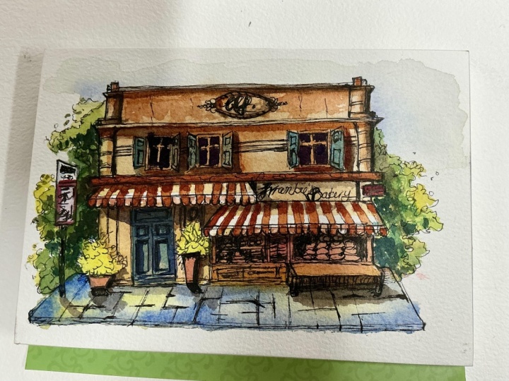
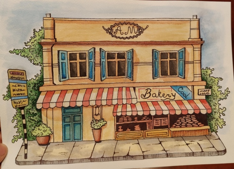
happy to respond. And if you try this painting, project yourself, don't forget to post it in the
project section. I would love to see your
artwork and creations there. Also, if you've
enjoyed this session, don't forget to leave a
review for this class, and don't forget to
follow me on Instagram at Shiba Bazan Art until then
take care and stay blessed, and I see you in the next class.
 Shiba Basan, Art influencer and Content Creator