Transcripts
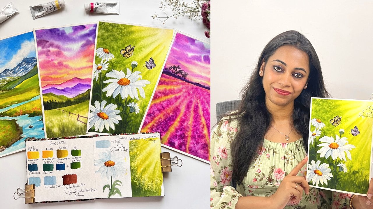
1. Introduction: About Class : Have you ever stared at
a blank sheet of paper wanting to paint but feeling
too afraid to begin? Maybe you have struggled with muddy colors, unexpected blooms, overworked paintings or
the pressure to make every watercolor piece look perfect from the
very first stroke. If that sounds familiar, this class is just for you. Hey, guys. Hi. I'm Nilam Roy, a watercolor artist
based out of Belgium, but originally from India. Over the years, my work
has been selected for international watercolor
exhibitions and recognized by art communities
around the world. But honestly, my journey with watercolor began
with frustration, self doubt, and the constant
fear of making mistakes. What truly changed
everything for me was in learning how
to paint perfectly. It was learning how to
let go of perfection. Spring has always reminded me that growth never
happens all at once. Flowers bloom
slowly, organically, imperfectly, and watercolor
works the same way, too. In this class, we will celebrate the season
of renewal through a relaxing five day watercolor
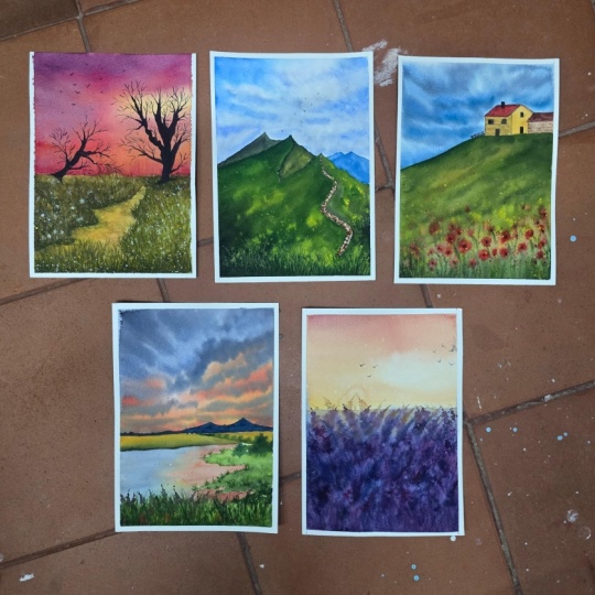
challenge where we will paint five expressive spring
inspired projects together, followed by a bonus lesson on day six for extra
creative practice. But this class isn't about chasing tiny details
or perfect outcomes. It's about understanding
the heart of watercolor, learning how moisture
control between your paper, paint and brush can
completely transform the way you paint with
freedom and confidence. Together, we will explore a loose expressive approach where less becomes
more and where you will learn to simplify
what you see instead of copying every detail
from a reference picture. This class is designed mainly
for intermediate artist, but beginners are
absolutely welcome too. I'll guide you step
by step through every project, including
color palettes. And if you are completely
new to watercolor, I would recommend starting with my class Atmospheric
Spring Landscapes, where I have covered foundational
watercolor techniques, tonal values, and atmospheric
perspective in depth. By the end of this challenge, my goal isn't just for you to
create beautiful paintings. It's for you to feel
excited to return to watercolors again and again
with more confidence, curiosity, and creative freedom. So grab your brushes, embrace the imperfect
magic of watercolor, and let's welcome
Spring together.
2. Essential Supplies Needed : Thank you for joining in. Let's quickly take a
look at the list of supplies we will need to
complete our class projects. Let's start with the
most important supply. That is our paper. The paper that I
am using here is from the Honeymles
watercolor collection. Specifically, I'm here going
for the rough texture. You can clearly see
how beautiful and pronounced the texture
of this paper is. Contrast, the coal pressed grain fine texture in the honeymles watercolor
collection is rather finer and
isn't as textured as one might expect from a
true coal press surface. So if you are using a different
artistic brand of paper, just stick to the standard
coal pressed grain fine, 100% cotton and 300
eaum as is weight. Now the size of the paper
that I'm using here measures 21 into five
centimeter into 28.5, which is roughly an
A four size paper. However, if you are a beginner, feel free to use smaller
sizes like an A five or A six as long as you feel comfortable painting on it
without feeling overwhelmed. Instead of the loose sheets, you could also use a sketchbook
of your preferred size. However, ensure that whatever
sketchbook you are using, it is 100% cotton and is at least 250 Joasm
as its paper weight. Though I recommend that
beginners should work with 300 Joasm so that they are not frustrated with the
drying of the paper. Apart from a sketchbook, you could also use 100% cotton
gummed paper block pad. Additionally, keep
some rough cutouts of your paper handy to swatch out your
colors or practice techniques before diving
into the final projects. Now, if you're using
loose sheets like I am, you will need a non
absorbent surface to tape down your
paper and then paint. The surface that I
am using here is a waterproof PVC foam board, which is very handy and
lightweight for moving around while creating texture
and patterns on your paper. Alternatively, you
could also use plexiglass boards or thick
acrylic glass sheets. Now, to tape down
the loose sheets of paper onto your board, you would need masking tape. I am here using 1 " tape here, but feel free to use any size of masking tape that you
have got instead of this, you could also go ahead
and use your washi tapes. Let's move on to
our next supply, which is our watercolors. I will be using Shenhan Arts PWC extra fine watercolor tubes, which are their premium
professional grade paints. Now, if you have watched my previous classes
on Skillshare, you will know how much I
love this brand of colors. They are absolutely worth starting with as a
beginner or even as an intermediate artist given
their rich pigment load and the vibrancy that they offer even after the
painting has dried. Along with PWC paints, I will also use a few
colors from Izaro, Belgian handmade
watercolor brand, which I have recently
grown very fond of. Don't worry about
the specific colors. I have included a
separate lesson at the beginning
of every project, detailing the colors
we will be using. If you don't have
watercolor tubes, you can also go ahead and use your watercolor pants that are
available with colors that I have used for the projects are all basic shades included in every artist cred set of 12 or 24 watercolor
pans or tubes. So feel free to use
whatever you have. You can always upgrade
your color palette later. The next supply that you would be needing is a mixing palate. The one that I'm using here is a Shinhan Rs 35 weld palette, which is a polycarbonate palate and is stain resistant,
and I love it. Instead of the weld palates, you could also go ahead and use a very normal ceramic palette or even a plastic
mixing palette works. Use whatever that is
available with you. Then we will also need
two jars of clean water, one for rinsing soiled brushes, and the other as a
fresh source of water. Now let's discuss about the most important supply
after paper is brushes. I will be using brushes mostly
from silver Bush Limited. Let me walk you through
them one by one. The first brush that you see is a hag brush from Attlee series. It is a very soft made from
goat hair and can be used for laying flat washes or covering larger
surfaces in one go. Next is this rounded mop brush. This is from the atelier
squirrel series. It is of size 30. It holds a lot of moisture and paint owing to its
big fat belly. I use also another type of smaller sized goat
hair mop brush, which is of size 20
from the aer series. This is the silver
Ater blending quill, size 20, as you can see. The bristles are very
soft and I love using this brush for anything and everything. It's
very versatile. Apart from the
natural hair brushes, I also use synthetic
brushes to maintain precise control over the
water and paint ratio. Here I have the ultra round size six from silver silk 88 series. Even though they are synthetic, the bristles are incredibly
soft with a nice spring bag. The next is this
bright brush size six from silver
belle aqua series. This synthetic bristles
mimic the feel of red sb. It is very wise to keep a small flat or bright
brush like this, as it allows you to create block shapes easily
in one single stroke. Instead of any speciality brush, I use this size 00 squirrel
imitation mob brush. You can see how I can
manipulate the damp bristles, which retain their
shape pretty nicely. Another advantage of
natural hair bristles is the responsiveness and the
way they hold their shape. I also keep handy this size two synthetic soft
bristle liner brushes and another mini liner brush to create delicate
shapes or strokes. Alternatively, you can also have a size two bright
brush for detail. Now, in case if you don't own natural hair brushes or
mop brushes, don't worry. You can go ahead and use your soft hair synthetic
bristle round brushes. But go ahead with a bigger
size that is of size eight or ten to substitute what I'll be showing you
with my mob brushes. And then you can also
alternatively have some smaller round brushes
of sizes four to six. Silver black velvet is a
good choice or just paint with any soft synthetic watercolor brushes
that you have got. Basic sketching
purposes in the class, you would need a pencil. I am here using a three edge
pencil from Shinhan art, or you could also off for any mechanical
pencils that you have got a kneading
eraser and a ruler. Apart from this, I also have a spray or misting
bottle to rewet the paper or to create some special effects along with some tissue
towels or napkins. That's all for this lesson. Use what you have
and remember that you can always upgrade
your supplies later. Have collected my own
supplies over the years, but it is always
important to start with a good hundred percent
cotton watercolor paper. It is truly the backbone of
your watercolor painting.
3. Stages of Paper Moisture: Okay, before we dive
into our projects, let's first understand
the levels of moisture on your paper so that it is easy to follow along during
the class projects. Generally, the first
step with watercolors is to wet the paper and
then load the paint. Here, we will focus specifically on wetting
the paper first. So for this, I dip the brush in a container
of fresh water. You can observe that the
belly of the brush is pollen with water and the
tip is dripping of water. When you use this watery
brush to coat your dry paper, you will notice excess water
moving across the surface. You can observe
here how the belly and the tip of the brush
is pollen with water. You can see the
beading of water, and now as you pull the
water down on your paper, you still feel that there is
too much of water and you can see the water moving
across the paper. This state of moisture
on your paper is known as soaking wet or also
known as wet paper, which is characterized by
a very reflective sheen, and very soon you will start
noticing paper is buckling. Let's look at the next state. I repeat the process of dipping the brush in
water, but this time, I squeeze out the excess water from the belly of
the brush against the side rim of
the glass and then absorb the remaining
water on tissue paper. I will now coat the paper again. From this angle, the difference might seem almost invisible. But when I change the angle, you can clearly
see the contrast. From this angle, you
can clearly see that the first state was very wet with a shiny surface
and buckling. Was this second state
is uniformly moist with very little swelling and very
minimal reflective shine. This state of moisture
on your paper is known as the damp
state of your paper. Finally, there is
the dry surface, where the paper is not
coated with water at all. To wrap up, mastering these
three moisture levels, soaking wet, damp
and dry gives you precise control over
your watercolor flow.
4. Brush Moisture Levels: In this lesson, let's understand the state of moisture
levels in our brushes. Here I'm showing you an example with two natural
hair mob brushes. One is fluffy dry and
the other is damp. Here you can see
that I can easily bring the damp brush
back into shape, which would not be
possible with a wet brush unless we squeeze out
all that excess water. Let's begin the demonstration. I will first start by
dipping the brush in water. You will clearly see
that the belly and the tip of this natural
hair brush are swollen with water because these brushes have a high capacity for holding
both paint and water. Using this fully
saturated brush, I will reactivate my dry
paint on the palette. Here I am reactivating my
dry paint on the palette. Observe the resulting
runny mixture. When coated on dry paper, it creates a very runny
fluid wash. Notice how the paint on the water is gliding unevenly on
the paper surface. Here, the brush still holds a significant amount of water
even after application. You can clearly make out
how watery that paint is because it has started flowing onto the other side
of the palette. Let's now move to the
next level of moisture. I use a tissue to absorb all of that excess water until
the brush is damp and dry. To verify the dampness
of your brush, use your index finger to gently roll the tip and
toe of the bristles. If no water droplets are visible and the brush
retains its shape, it is in a damp dry state. When using this brush to
reactivate the paint, you will achieve a
buttery mixture. However, when applied
to dry paper, you will observe broken
edges on the watch, requiring several layers to obtain a clean uniform result. I will show you here
another example. If I tilt my palette to
remove the runny paint, leaving only the paint blob
and load the brush from this, the brush appears almost distorted, indicating
negligible moisture. When applied, it leaves
dry brush marks, and even when laid, the
swatch remains textured. Look how the brush looks frayed. The tip especially
looks distorted. This indicates that the tip of the brush has now zero moisture. These two conditions
represent the dam dry state, where in both the
paint and the brush, the water is controlled. My paint mix and the
palette is exhausted, so I will squeeze
out more paint, and now I will rinse the brush thoroughly
in water and dab it dry on a towel until the moisture is
almost negligible. My brush tip here
feels damp dry, so I dip the tip
on the surface of the water and reactivate
the paint immediately because I wanted to create
a very creamy mix for which I needed a little
bit more moisture in the tip of my brush. Observe that this
creates a smooth, creamy mixture, and you can feel this difference
while mixing. Applied to dry paper, the brush glides easily, creating a much more
intense and uniform spots. We use this specific
moisture level primarily for wet
on wet techniques. Now it is your turn to carry
out the same exercise with synthetic and natural hair mop brushes to observe the
differences for yourself. You may also wish to review
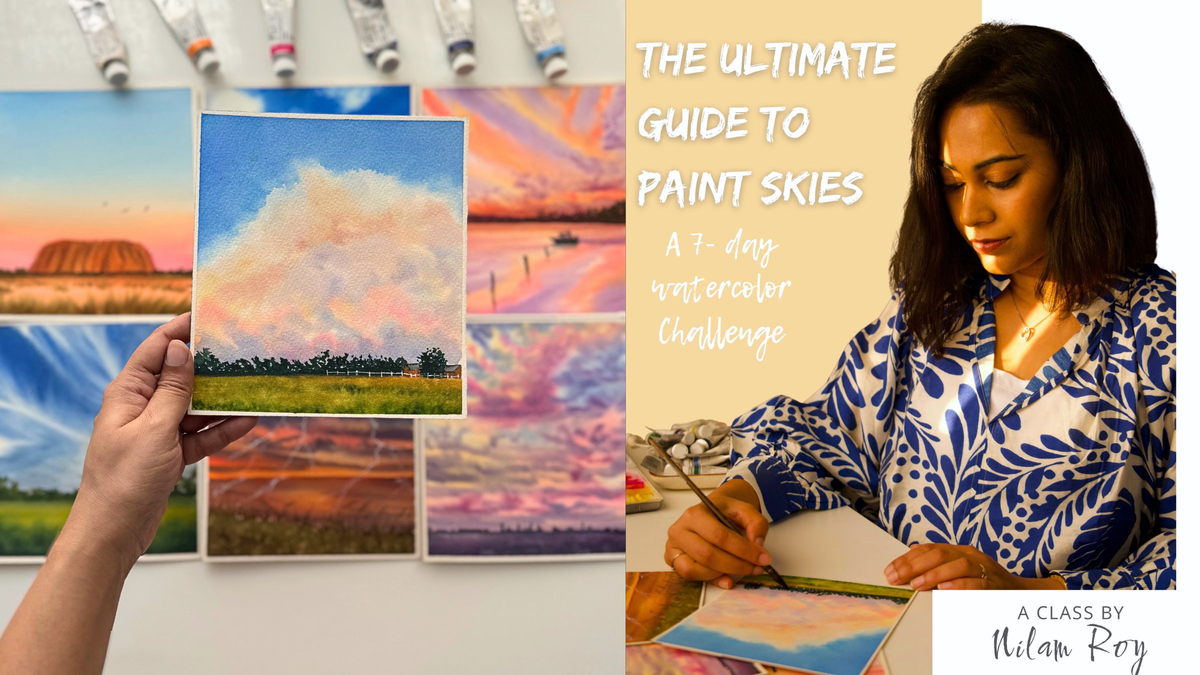
my Skillshare class, the ultimate guide
to paint skies, which includes a
specific lesson on water control techniques for natural versus
synthetic brushes. This content will prove useful as you conduct the
current exercises. I will meet you at
the next lesson where we will discuss about
the paint consistency.
5. Relationship of Paint Consistency on Paper Moisture: In this lesson, we will discuss paint consistency in relation to different paper
moisture levels. Watercolor paints, whether in the form of tubes
or in palettes, start in a dry, sticky form that requires
water activation. The amount of water
that you apply to your paints and in your mixture significantly impacts
the final result. Let's first talk about the
buttery paint consistency. Now, whenever you squeeze
out fresh paint from a tube, you will notice that it has
a very smooth and thick, sticky buttery consistency
with no added moisture. Now, here I grab
a very dry brush. You can see there is
absolutely no moisture. The brush is absolutely dry. Now, when you use this
dry brush to load this buttery creamy paint and apply it on soaking
wet paper surface, here you can see me preparing the paper surface with
loads of water on it. Now on applying this thick
paint with a dry brush will result in moderate sprayed
with soft diffused edges. Here, we have controlled the water in the
brush and the paint. However, the existing water on the paper disperses
the pigment unevenly, causing beading at the corners with highly saturated pigment. Now let's look at the next
scenario where I'm loading my damp dry brush with this
thick sticky buttery paint. You can see how it is offering
resistance to the brush. It's not very smooth. I'm loading the brush properly, and now I'm going to apply the same thick paint on
a dry textured surface, and you can see that it creates this textured broken
patterns due to the lack of moisture in
the paint in the brush, as well as on the paper. Next, we will apply the thick buttery paint
on a damp paper surface. Notice that I first prepared the paper with a damp mop brush, spreading the water uniformly. The surface should
have a smooth, satin like glow that is even
but not highly reflective. Now when you start applying the paint, observe the smooth, soft application with
very minimal spread, which offers us high control. Now let's look at
the next scenario where I'm applying
the same thick, buttery paint with a damp dry
brush on a very wet paper. You will observe the same
behavior as applying thick paint with a dry
brush on very wet paper, the first instance that we saw. Here, too, we have controlled the water in the
brush and the paint. However, the existing water
on the paper disperses the pigment unevenly
causing uneven spreads. Now let's move on to
the next consistency, which is a creamy
paint consistency. To achieve a creamy consistency, we will add water to the thick buttery paint until it feels intense yet smooth. It should resemble milk
cream, thick, luscious, and opaque enough
that you cannot see the white of the
palette during mixing, but you should feel the smoothness while mixing
with your brush. Here is a closer view, a different point of view
for you to observe better how soft and creamy your
paint consistency is. Now let's get started with different moisture
levels on our paper. First is our very wet paper. And on applying
this creamy paint, you would observe that
the paint disperses with blurred edges with
a moderate spread. Now let's look at the
next scenario where we will apply the paint
on our damp paper. Let's now apply this creamy
paint onto our damp paper, and you will observe soft
edges with low spread, allowing for a
controlled uniform wash. Here, you will feel
that your brush is simply gliding on
paper very smoothly. Moving on to the next
scenario where I'll apply the creamy paint with a rinsed damp dry brush on dry paper. Now, when you apply this creamy paint
consistency on dry paper, you observe the heavy bands with dry textured marks
and no spread. I hope you are
following along and grasping these crucial
moisture levels in your paper, brush and paint consistency, as mastering them will make your watercolor journey
significantly more comfortable. Now let's look at
the other scenarios of paint consistency. Now we will create the
milky consistency by adding water with a damp
brush to the creamy mixture. The result should resemble literal milk that
is translucent, allowing you to see
the palette white, but still possessing good
pigment concentration. Now, we will apply
this milky consistency of paint on very wet paper, and you can see that it
instantly starts spreading with reduced paint intensity
and soft heavy spread. Observe pigment pulling
in random corners. Prepping my next paper surface, that is my damp paper. You can observe the
soft satin glow. Now we start applying the
paint onto our damp paper, and you can observe
that the spread is much controlled than
our first instance. Here it is controlled
with soft edges, though the paint
intensity remains reduced because of more water
content in our paint mix. On dry paper, you will observe sharp distinct
edges at the top, followed by gradual
appearance of dry marks as the water is
exhausted from the brush. This effect is particularly
noticeable when applying the paint to a
textured paper surface. We now move on to the
next paint consistency, that is our watery paint, where I add more water to the milky consistency
until the paint becomes very runny and diluted with the palette clearly visible
through the mixture. We will now apply watery paint over the wet paper surface, and you can expect heavy
uncontrollable spread with very low control
and pigment density. Moving on to applying our watery paint over
damp paper surface, and you can expect that
the paint spreads rapidly, offering slightly better control than that of the very wet paper. Next, when you use
your damp dry brush to load this watery paint mix
and apply it on dry paper, you will notice that you
get rough textured edges. It is because you have
controlled the amount of water on your paint
brush, which was dry. I hope this lesson
has provided you the clarity required to
master the relationship between paint consistency and
paper moisture because it empowers us the artists to anticipate and manage
the flow of pigment, effectively resolving
tricky situations that may arise mid
painting session. By understanding
how water behaves within our tools and
on various surfaces, we gain the control
necessary to execute both spontaneous washers and precise details with confidence.
6. Day 1: Color Swatches: In this lesson, let's take a closer look at the colours that we will need
for our palette. First, we start with
our permanent rose. Now, instead of permanent rose, you could also go ahead
and use any other bright, cool reds or magendas you
might have on your hand. Next, we will be swatching
out our lavender. Now, this lavender is a very beautiful
pastel blue violet. You can always mix your
lavenders by mixing a little bit of your
blue PB 28 with your violet pigment PB 15 with some of that white gouache or your white watercolor paint, and you would have
your lavender. When you mix the rose and
the lavender together, you get a pastel
mauve or purple gray, which serves as an excellent transition color
for your layers. For the horizon, I will be using naples yellow,
a pastel yellow, which as a neutral bias, if you layer the naples
yellow with lavender, you will get a gray mix
rather than a green. However, if you want to have the horizon
to have a little bit of that golden warm hues of a
breaking dawn or a sunset, you can mix a little
bit of rose into your naples yellow
or add in a touch of yellow orange to bring more of that orangy yellow
tones to the mix. For the topmost part of the sky, I'm using permanent violet
to bring out contrast at the very top and above the horizon
where I have the yellow, while transition using
analogous colors in between. The next color that I'm
spotching out is a sap green, which is a very common color present in all
watercolor palettes, whether student grade
or artistic grade. Here is how the
limited palette works. When I mix sap
green with violet, I form a muted earthy brown, which is not present
in my palette, maybe. So instead of going ahead
and getting the colors, if you learn to mix and
know your colors well, you can automatically create this muted browns and grays that you would like to
include in your painting. You can see how beautiful and muted that brown we
have formed, right? Similarly, when I mix permanent rose with
that of sap green, I create a very rich and
natural organic green that we can use for
our foreground. By wearing the intensity
of these colors, you can always adjust the tonal ratio or the
saturation of these colors. Now the next color that I'll be needing is a pains gray
or a neutral tint, or you can go ahead with any black to create the silhouette of the
tree and the birds. Lastly, to bring out
those wildflowers, we will need some white quash, and with that, that's
the end of this lesson.
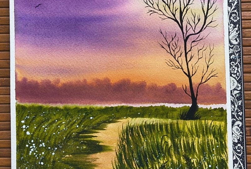
7. Day 1: Misty Sunrise Meadows Part 1: Okay. Let's begin by securing our paper
with masking tape. Once fixed with
the masking tape, observe your reference and
sketch the horizon line. I'm placing the first
horizon line at two thirds up the page to
define the misty foreground, then adding a second
line slightly higher to create the illusion
of receding distance. Next, I'll connect the
major foreground shapes to the sky horizon line. We will avoid creating a
detailed outline sketch. I'm not going to go
ahead and create the slaloutte of
the tree yet as we plan to use loose
brushstrokes to build layers and bring
this painting to life. I always prefer
minimal sketching. This allows me to
make adjustments if things don't go
according to plan. But if you do want to sketch
the slalouette of the tree, please feel free to do so. The next step is to reactivate my paints using a misting
or a spray bottle. Misting allows you to rehydrate the paint without flooding
it with too much of water. Once the paints are moistened, apply a flat wash of
water to the sky area. We will paint the sky using wet on wet technique to
create a smooth, seamless transition between
contrasting colors. Ensure the paper is coated with an even uniform
layer of water, avoiding any pooled
or stranded water. You can check the wetness
by tilting the board. You should see a
smooth reflective shen across the paper
against the light. Now I will switch to my fluffy silver tiler
size 30 mob brush and give it a good
swirl in water. Dab the excess moisture
on my paper towel. With this damp brush, I will create a creamy
mix of naples yellow with a teeny amount of permanent
rose and set it aside. I will create a second pool
of pure naples yellow mix. I will now start by applying the creamy naples
yellow at the base of the horizon line and gradually feeding the
intensity upwards, halfway across while retaining the white space on the left. Observe, as I move upwards, I lighten my grip
and pressure on the brush to create those
smooth light strokes. Next, I'll quickly mix an intense bright
golden orange by combining permanent rose
with my naples yellow, or you could use your
opera pink also to do so. Let this intense
yellow orange hue over the naples yellow base
using soft pressure so as to not lift the base
layer of naples yellow. While my paper is
still wet at the top, I will quickly create
a medium creamy mix or permanent rose and start
layering it from the top left, blending it into the yellow
orange mix at the base, being careful not to cover the light yellow
areas on the right, which will serve as a
glowing part of the sky. This layer acts as an
analogous transition. I will quickly rinse my brush, dab it dry on my tissue towel, and start preparing a pool of creamy consistency or
permanent violet mix. I will now quickly layer a creamy consistency or permanent violet
from the top left, covering the pink hues to create the contrast while our paper
is still sufficiently wet. Ensure this is done in a
single pass without going back and forth to avoid creating muddy mixes
with the orange. Observe my brush strokes. The moment I touch the
base of the horizon, I do not drag the brush
all the way up to the top, but stop at the horizon. Next, using a clean damp brush loaded with a milky
consistency of naples yellow. I will brighten the
yellow areas by dragging the brush from right to
left to lift the purples. Once I lift the purples, I clean the tip of the brush. I repeat this step
every time I lift, making sure the yellow
areas are clean and bright. You can still see that
the paper is wet. You can see that
reflective sheen. If you feel the paper
has started to dry, wait for it to dry
completely before re wetting the areas and
starting the process again. My paper currently is damp, but it is not soaking wet, so I have squeezed out all that extra water
from the mob brush, and you can see
I'm mixing colors, which replicates to that
of the horizon line. This is the perfect
time to go ahead and create the blurred
distant background. Brush tip was too dry, resulting in streaky lines
for the misty background. To correct this, I use the misting technique
to damp just the tip of my brush and remix the colors to achieve
this creamy consistency. Now you can see that the brush moves more smoothly
across the paper. It is crucial to understand the wetness level of
three key elements here, your paper, the brush,
and your paint mix. If there is too much of
water in any of these three, you will notice
uncontrollable bleeding, which can ruin your perfect sky which you already have created. Now just underneath the background foliage
that we created, I will quickly go ahead
and apply a watery mix of the same muted palette
of my yellow orange, permanent rose and
permanent violet. I'm now working here with
wet on dry technique with a little watery
consistency of my paint and dragging this to the
left side of the foreground, creating this base layer. Now, this base layer that
we created will create a misty effect between the distant background
foliage and the foreground. Now here I'm just quickly going over the background
foliage and layering a milky consistency of my permanent violet mix just
to increase its intensity. Next, I will start preparing
my foreground mix. For that, I have switched to my size 20 goat hair mop brush. Now here I'm combining
my permanent violet, a little bit of yellow
orange and sap green to form a muted creamy,
greenish brown mix. The paint mix is already loaded on the tip
of my mop brush, and using the same damp
tip of the mop brush, I create this horizontal
pattern here, leaving a gap between the background foliage
that we created. I quickly grab my second damp
mob brush to smoothen and lift the base color between the layers to enhance
that misty effect. Now I will be building
the depth and contrast by reapplying the muted
greenish brown mix over the initial layer, filling the left foreground with slanted strokes using
the same brush tip. Here, the advantage of using this goat hair mob brush is that I can manipulate
the bristles of the brush to my
advantage and create these vertical grass patterns using the same damp
dry tip of my brush. Now, instead of doing
it with a mob brush, you can also go ahead and use your synthetic fan brush and
do it along the sides to create these vertical
grass patterns or use a speciality comb brush to do the grass
pattern structures. Now switching to a
synthetic rigor brush, I will suggest the
tips of the grass with loose strokes wearing the
consistency of the paint mix. You need to add
darker strokes to ensure visibility
against the background, suggesting the depth and contrast you want to bring
out in the foreground. But make sure that your
paint mixes are creamy, it shouldn't be too
milky or watery. Okay The next step is to cover the sky
with a rough sheet of paper to save the sky from unnecessary blooms
because I'll be using the splattering technique in the foreground to
create wild blooms. I'm using here the rigor
brush to splatter water, though you can also use a white creamy consistency
of gouache for the same. Eventually, I decide to splatter some white
quash, but be careful. A stray splatter on the
sky would be noticeable if the sky is still
drying up or is wet. This is why it is
necessary to cover your sky with the paper to
prevent unwanted blooms. Now, one important thing
that you must remember here, your splatters are going
to be soft and blurred only when the grass
foreground is still wet, so you need to be a
little quick over here. Once you are done
with the splattering, you can go back
with a muted darker green to sharpen the grass
blades in the foreground, with this step, we complete
the entire process of the left foreground and we will move on the next
part of the process.
8. Day 1: The Meadow Part 2: Okay, let's begin by
creating the water body. I will mix a milky consistency
of naples yellow and start applying short
horizontal half strokes using the tip of my mop brush. Because we are replicating the colors of the horizon
in our water body, I will now go ahead and layer over this naples yellow
mixture a little of my yellow orange mix with the same tip of my brush with
short horizontal strokes. To smoothen out this textured dry pattern marks
that we have got, I will now blend them
in with the damp tip of my brush loaded with the
tip of naples yellow. Here I'm employing the
wet on dry technique which provides control
over the paper's moisture, allowing for soft
yet defined strokes. Once the water body is complete, the next step is to suggest the reflection of the
foliage in the water. For this, I have switched to
a size 00 damp dry mop brush and loaded it with a creamy
mix of my muted warm green, the same mixture that we
used for the foreground. I will now quickly work as the water layer is
drying, if I wait, the reflections will form
dark and hard outlines rather than the desired
soft blur defect which we want to achieve. I recommend watching the
entire process first and then painting along so that you are prepared
for the next steps. This reflection, I directly went in with a medium darker value of my muted grain mix
because I wanted to do it in a single layer to avoid
overworking the reflection. Here, all you need is a natural damp brush
with a tip that can be flattened or slightly frayed to easily
create the strokes. Now, if you feel that your edges of the reflection
look too sharp, you can use a damp right
tip of your mob brush and smoothen them out by gently dragging them
towards your right. At this point in the foreground, I noticed that the
previous layer had faded, so I quickly used the same
foreground colour mix, and with the damp dry
flattened tip of my brush, I created short vertical lines to suggest the grass patterns. Now I move on to creating the base layer for the
foreground on the right, using a milky consistency
of transparent raw sienna. Over this, I will use the
same technique to create the grass patterns as we
did on the left foreground. With one key difference, I will intentionally leave gaps in the staggered
layering method to enhance the
sense of depth and light in between
the grass patterns. Keep watching my brush
strokes and the control of water that I have on
my brush in my paint, as well as on the paper. Uh, using the same repetitive
brush strokes, I will now begin at
the bottom edge of the paper with medium values
building to darker ones. Walking with wet
on dry technique, you can see the dry marks
at the bottom right. I will now leave the ***. Then I will load
my damp dry brush with a mix of sap green, and violet to create a more
darker mix so that there are sharper and
thin grass blades without covering the dry
patterns of the paper. I will now use long and
fleaking strokes at the bottom half of this paper to create variation in the
blades of the grass. Now switching to a size
to synthetic rigor brush, I will now employ darker values to create wiggly patterns, introducing varied foliage to break the monotony of
the grassy patterns. I will now apply this sparingly, just a few strokes
at the bottom edge. Remember, this painting
does not need to be an exact replica of the
reference that we have chosen. Remember that the
primary goal of this painting is
to break free from that perfectionist mindset and embrace spontaneity and
looseness in your work. We aim to capture the
mood and atmosphere of the scene rather than getting caught up in perfecting
every detail. With that being said, we cannot ignore certain
fundamentals, for example, as the base layers dry
and begin to fade, I will now add darker tones at the bottom to create
a sense of depth. It is this contrast that
brings character to our paintings without the
need for excessive detailing. Here at this part, to
create additional textures, I use the dry brushing
technique using just the dry tip of my mob brush loaded with
that creamy dark mix. I go ahead with softer strokes, few places here and there. And now it's time to go ahead and start creating artrsilut. Here I have the mix of
my neutral tint ready. I have switched to a size six silver silk synthetic
round brush to paint the tree slave. Since the paper
has already dried, I'm using here a creamy to semi milky
consistency of paint. I vary the pressure on
the brush dip to create organic thick and
thin lines with curves that follow the
natural shape of the tree. Relax your wrist and adjust your pressure to achieve
these varied lines. For super delicate
thin branches, consider switching to a size
two synthetic rigor brush or any size two synthetic round
brush with a pointed tip. Using the rigor brush, I am trying to connect the thin branches to
the thicker ones, creating continuity and harmony throughout this tree sloute. As you near completion, gently fed out the bottom of the tree using the damp
tip of your brush. This prevents the tree from
looking artificially placed, helping it to blend
naturally into the setting. I will now use a spray bottle to miss the right foreground, adding whitequhplatters
to represent the white flowers in the meadow. Although this could
have been done earlier, the meadow had
already begun to dry, so I waited for this
specific area to dry completely before
re misting it. I covered the sky with a sheet of paper just like
we did before, and then applied the
white splatters. Wetting the background creates a blurred suggestion of the wildflowers in
the foreground, which do not interfere with the focal elements of
the tree and the sky. Here I'll cover the left side of the meadow and change
the direction of my splatters just
to suggest that the flowers are growing in all the directions
of the meadow. You can totally skip this step if you are satisfied
with your foreground. Now, once you are done
with your foreground, it's time to peel off our tapes, but make sure that your
paper has dried completely flat before you go ahead
and peel off the tapes. With that, we conclude
our day one project. I'll see you again on Day two.
9. Day 2: Color Swatches: Okay, let's grab a
sheet of rough paper. We are about to swatch out our colors for our
D two project. First, we will swatch
out our cobalt blue. Now, if you do not have
this blue with you, you can always go ahead and use your ultramarine blue
or cerulean blue, which will work well
as alternatives. Now for creating
shadows in the clouds, we will create a gray by mixing cobalt blue
with burned Sienna. Feel free to adjust
the ratios to achieve a lighter or
darker value as needed. Next, let's move on to
the mountain range. We will need a
warm yellow green. In my case, my yellow green is a granulating yellow green, but if you do not own this
pre made yellow green, you can mix your any warm yellow with your green and
create this color. Now, if you add a touch of your cobalt blue into your
yellow green mix, you will create a very soft
and muted yellow green, which is very similar to
the lines of olive green. Now, to create even more
darker muted greens for the shadow areas
on the mountains, I will first need sap green, which is available in most of the professional 12 color
palettes and then mix in a little bit of
dark blue indigo to create a very muted green. We are going to use
this muted green, which is very dark for our shadow areas here at the
foreground of the mountain. For the floral blooms, I have selected a
bright cool yellow. In my case, this cool yellow is a semi opaque pigment,
but in your case, you can also use lemon yellow, which will be available in your 12 color professional set. To create a textured
muted gray brown, we will mix cobalt blue with a small
amount of white quash, neutral tint, and burnt sienna. And by adjusting the
ratios of each pigment, you can refine the gray
brown to your liking. Finally, we will swatch
out our burnt sienna, which is a very earthy
mineral pigment. And with that, we are
done with swatching out our colors for
day two projects, so get your colors ready
and meet me in the lesson.
10. Day 2: Spring Up the Hill- Part 1: Okay, my paper is
already taped down, and I'm quickly moving
on to the sketch. As you may notice, the
reference image is in a horizontal scale while I'm working in a
vertical format. Therefore, I will crop
the composition to focus on the main subject,
the mountain range, and allocate only the top
third of the paper to the sky, leaving the remaining two
thirds for the mountains. I suggest you watch the entire
sketching process first, as I may return to
make some alterations, feel free to pause
the screen once the finished outline is ready so that you can begin
your own sketch. Once your sketch is complete, the next step is to prepare the sky using the wet
on wet technique. I will generously wet the sky area with
a large mop brush. Here I'm using my silver ata
size number 30 mop brush, taking care to ensure
that the water does not seep into
the mountain ranges. We are going to wet
only the sky area. Allow some time for your
paper to absorb the water between your washes to keep it wet for a
longer period of time. I'm currently using
cobalt blue for the sky, though you could also
choose ultramarine blue. As you observe, I use the
damp dry tip of the brush loaded with a creamy mix of this blue and start
with slanted strokes, leaving some white
spaces in between. As I progress with the sky, observe how I vary the pressure on the
tip and the belly of my brush and hold the brush in a way that makes
my wrist flexible. As I begin in the bottom
right of the sky, I notice the area has dried. I will quickly adjust by
creating a milky consistency for my blue mix by slightly
dipping the tip in water and then
filling the area softly. I may lighten the
tone further by rinsing the brush and
lightly dabbing it on a tissue towel and
connecting the strokes to ensure that there
are no hard edges. Once this section is complete, I will then switch to
a smaller more brush. As I switched to my
smaller mob brush, I noticed that the brush
had residues of yellow, which is quite a
staining pigment, so make sure that
you rinse your brush properly to have no
residues in them, because here we are
going ahead with some lifting technique to
create the shape of the clouds. Now, you could also
use your tip of your tissue paper to go
ahead and lift some colors. I'm going ahead with
another layer of cobalt blue mix in a
milky consistency, just to brighten the
top part of the sky and refine the shapes of the
clouds in some specific areas. My paper is still wet, so I'm able to do this step. But if you feel that your
paper has dried out, skip this step altogether. Next, I'll be preparing
a gray mix for which I am adding a little bit of
burnt sienna to cobalt blue, and I will start filling in the bottom white spaces with
the light tonal values. Observe the wetness of my brush. It is very damp and dry, as you can see that
I'm trying to create this fluffy cloud shapes
to soften the dark clouds, I will use the damp, clean right tip of the brush to fade out the
edges at the top. This technique creates a smooth, voluminous finish
for the clouds. You can always find many
such useful tips and tricks in my class ultimate guide to pain skies here on Skillshare. Once you have completed the sky, avoid retouching it repeatedly. The paper's moisture
level is critical. Beginners often
struggle to gauge this leading to blotchy edges. Stop retouching and overworking the area to maintain
a clean finish. Now I have switched to a smaller natural
mop hair brush and loaded it with a
pre mixed gray to paint the distant mountains
in the background. This creates the
atmospheric perspective. Walk relatively quickly here as the bottom right of the
sky may have dried by now. Adjust your paint
consistency accordingly. If the paper is drying, use a milky
consistency of paint, and if the paper is still wet, a light creamy mix will create a softer and blurred
atmospheric effect. Let's begin with the
mountain ranges. I have switched to
a smaller mop brush loaded with a creamy
consistency of greenish yellow. This is a very warm and granulating greenish
yellow that I'm using. Alternatively, you can also
use a light cool yellow, such as your lemon yellow
or cadmium yellow light to create a flat
wash of light first. Then layer a light
value of sap green in select areas to establish the
effect of light and shadow. Start with this
step only when you feel that your sky has
completely dried out. If you start doing this step
when your sky is still wet, there might be chances
that your green start bleeding towards
the blues of the sky, and that can create a mess. To work more quickly, you can lay down a flat wash of water using your
bigger mob brush. And then apply your
light yellow tones, add creamy values of sap
green towards the bottom, leaving the lighter yellow tones visible in between
to create the depth. Please note that I may
deviate from the reference at this stage as I'm not
strictly following it. If you wish to adhere more
closely to the reference, you might skip the darker Sab green values here
on the left foreground. Instead, try blending
lighter tones of your sap green with yellow. Then gradually darken
the color as you move towards the shadow area
in the right foreground. I recommend watching
the entire process first to decide on
your plan of action. I As I reach the lower
section of the mountain, I'm adding darker
values of green. You can create a
deeper mix by adding a dark blue such as indigo or
dothron blue to the green. We will now cover the foreground using the wet on dry technique. You may notice some scratchy marks appearing on the paper. Please leave them as they are as they will add texture later. Now using the same dark mix, I will sharpen the edges of the mountain range to create a contrast with
the lighter areas. Please watch the next steps closely as I progress
with the painting. I notice that the green is bleeding into the sky,
so to correct this, I will use a soft synthetic
angle shader brush to lift the excess paint defining the mountain shape while blending and
sharpening its edges. We will continue
with the next steps in the next part of the process.
11. Day 2: Up the Hill- Part 2 : Welcome back. We will start with the
foreground by misting the bottom area and then add splats with bright lemon yellow. Using a round brush of size four or six or a smaller mob
brush like I am using here will help you create
splatters of varying sizes by changing your tapping motion and direction of your splatters. Once you are done
with the splatters, the next step would be
to add some greens in slanted vertical strokes at the bottom to mimic the grass. We are here using the controlled
method of wet on wet. Adding the green slanted
vertical strokes for the grass here I'm using sap
green, and alternatively, I will add darker tones in between and at the
bottom to bring out the depth and contrast and make the grass
feel more organic. Try to move quickly here. You can also add
thin strokes with the tip of a pointed
brush to create long blades of grass in a few random areas at the bottom to create
a more organic feel. As my paper is drying, I will quickly use the
misting technique again, which will also help in creating
blooms softly dispersed. You can add more of the yellow blooms with the pointed synthetic
tip of the brush. I very carefully and lightly missed the top section of
the mountain just once, and now using my damp brush, I will gently lift
those darker greens to make the area lighter. To bring out contrast, I will add more darker tones at the bottom of the painting. I had to rework this area to balance the
lights and shadows, but thanks to using good quality 100% cotton honeymles watercolor
collection paper, it stayed moist for
a longer period, and I was able to save the
painting and not ruin it. A I had to re splatter the blooms because the new layers of darker
paint hit the previous ones, ensure that you cover
the top section with some rough paper to avoid
yellow splatters in the sky. You can also use salt technique here to create the blooms, but salt can be messy
if you're reworking. Hence, I have avoided here. I recommend watching
the entire process first and then paint
along so that you know the next steps as there
was some reworking involved in this painting due to which I am repeating
the steps again. Hence, I would
recommend you that you watch the entire process
first and then paint along. Smoothing out certain
areas here with a dam control tip of my brush. Ensure that your brush
is not too watery. Now switching to a
synthetic rigger brush, and I'll add few strokes of
thin vertical grass blades. Now it's time to get started with the right side of
the mountain range. And for that, I'm preparing
a mix of burnt sienna, cobalt blue, and a little
bit of white quash. You can also add in a
little bit of neutral tint to create this mellow
tone of muted brown. Using this brown, I will
add some dry strokes, leaving white caps
in between and also outline the margins of
the narrow pathway. All right. Now, in between
those brown strokes, I will add a milky
consistency of my premixed green lightly
with the tip of my brush, overlapping the browns,
not fully covering them. Here we are working with
controlled wet on dry technique. Similarly, I will do the same on the bottom
right as well. I will start with a
milky consistency of light yellow green and quickly add varying tones of
green in between, leaving some spaces for the
light green to show through. Even though we are
working wet on dry, we use a milky watery
consistency of paint to achieve the softness while controlling the
wetness of our paper. Trying to refine the top
edge of the mountain here, and I'll use damp
dry brush to create certain textures using very
light dark color over here. Now, I will switch
to the brown mix. We created earlier to create some horizontal dry marks following the slant
of the pathway. Try to notice the tip of
my brush which is little frayed at the tip because
the brush is damp and dry. I will refix the background
mountain by going over it with a light color of cobalt
blue to hide the green. For the bottom
foliage of the grass, we can use the
scratching technique. However, doing this step
when your paper is very wet will not allow you to
disperse the paint properly. So we will wait for the
paper to little dry up. And in the meantime,
I observe that my blooms have faded since
my paper is still wet. I can add some more of those big or small blooms
with a smaller bright brush. Skip this step if you feel
that your paper has already started drying up and move to the scratching
step instead. Every time you scratch, make sure you clean the edge of your object that you
are using to scratch. And for scratching, you can use any sharp edge
of a credit card, a plastic card, or
a palette knife, or even the edge of a
ruler like I'm using here. Finally, if you notice here at the distant background sky, there are some yellow splatters. I will try covering
them up by adding a few wrds to take the viewer's
eye away from that area. As you see in this project, even if we keep things loose, not everything works according
to our initial plan. We improvise to ensure that
we do not ruin the painting. And with this step, we are
done with our painting. Once your painting has
completely dried off, we will peel off the
tapes one by one. I hope you enjoyed this
lesson and learned to trust the process and move
forward with confidence. Do not shy away from
making mistakes, for it is precisely through
the imperfections that we progress with watercolors and truly fall in love
with this medium.
12. Day 3: Color Swatches: Okay, so I have my
swat sheet ready. Let's begin swatching the
colors for day three. The first color that I'll
be using is cobilt blue. Now, it is a very warm blue, but you can alternatively use any other warmer
blue of your choice, such as ultramarine blue, halo blue, and so on. Or even you could opt for cooler shades of blue such
as your cerulean blue, azure blue or light
blue gray for the sky. The blue that you
see me swatching out here is a cool
blue derivative obtained by mixing cerulean blue with some white,
watercolor or guash. To create those dark clouds, I will now swatch
out my neutral tint. Alternatively, you can mix your own gray by combining your cobalt blue with burnt sienna and little bit of Payne's
gray or neutral tint. I will be using the
lighter tonal range of this neutral gray. Now moving on to the
meadows for which I'm going to use
first yellow ocher, which consists of
PY 42 acid pigment. It's a very warm,
muted opaque yellow. Next, I'm going to swatch out my greenish yellow,
which is granulating. Now, many of you may not have this color in your
basic 12 color palette, but you can also create a
similar looking color by mixing two or three parts of yellow ochre with your green. The next color that I'm going to spotch out is my sap green. I really love the
richness of this color, and it is one of my
favorites from PWC Range. Now for the blooms, we are going to start with
a bright lemon yellow, or you could also use your
cadmium light yellow, a cool yellow preferably. Next, I'm going to
spotch out my red, a bright and beautiful
red for the poppies. Here I'm using vermilion
from Shinhan PWC range, which leans slightly towards orange as it has
orange pigment to it. Now for the house roof, I'm not going to mix
any additional color, rather form a color by mixing
my vermilion with green, and by wearing the
ratios of red to green, you will obtain a muted brown. This demonstrates that even with a limited color
palette and knowing the color theory allows you to easily create the colors that
you need for your project. And there we have our brown, add in a little bit
more of vermilion, and you would get the
perfect Burnsiena shade. That's all for this lesson. Get your colors ready and
mit me in the next lesson.
13. Day 3: Poppy Fields in Tuscany - Part 1 : Hello, and welcome to Day three. We will begin by taping down
a paper using masking tape. Now that the paper is secured,
let's begin sketching. I will allocate
the top one third of the paper for the sky, leaving the remaining two
thirds for the foreground. I'm sketching an inclined slope at the one third mark with a few light lines below to indicate the slope
of the foreground. I have outlined the houses at the top of the slope as well, and for the foreground, I
will not sketch the flowers in detail as I plan to
paint them loosely. Now it's time to wet the sky. I will first begin by applying even coat of water
onto the sky area. Now here, you need
to be careful. If you apply a
very watery layer, ensure you remove the excess
moisture by going over the wet areas with your
damp dry hack brush. Bristles will absorb
the excess water and will help spread
the water uniformly, enabling your paper to be damp
from very wet conditions. Now I will prepare
a muted blue by mixing cobalt blue with a
little bit of burnt sienna. You can also add
in a little tinge of your neutral tint to turn the blue mix into a very muted and
dull grayish blue. Observe my paint mixture here. It should be somewhere between creamy and a milky consistency. And now using the tip of the
brush loaded with this mix, I will create light
strokes for the sky. Since this area is
closer to the horizon, I'm keeping it lighter for now, allowing us to add darker
values later if required. Repeat this process at the top, leaving a small gap
between the layers. I will now add a touch of pure cobalt blue at the very
top to brighten the color. Now with a rinsed damp brush, I will create cloud shapes
using the lifting technique. Each time that you lift, clean the tip of the brush
and dab it on a tissue. Now, I'll be going in
with darker clouds. For that, I'm mixing
a little bit of neutral tint and burnt
sienna into my cobalt blue. To create a milky mixture. You can also use pains gray
instead of neutral tint. Load your dam trip brush with this milky mixture and create sali dark clouds
over the blue lays, but be careful not to completely cover the whites or
the underlying blues. I would recommend you
to watch this process first before you start
painting along your sky. Now, if you observe here, notice how I'm building
the intensity of the dark clouds by adding more concentrated
tones of neutral tint. Notice how my
mixture ranges from milky to creamy as I
build depth and value. All this while I
was working with medium tonal values
for the dark clouds, and now I'm topping it over with a little bit more intense
tones of neutral tint, but making sure that I am
not covering it entirely. I'm pretty happy with how dramatic the dark clouds
are looking right now, but I think the blues
have faded out a bit. Now, I have rinsed my
brush on a tissue, and now I'm loading it with
a little bit of cobalt blue to brighten the light sky areas underneath the dark clouds. Apply this only to
select few areas, fading it into the
darker sections with a damp clean brush. With the help of my
clean damp brush, I will use the lifting technique
to brighten the whites. Observe here that I'm using very light gentle pressure with the tip of my brush
to lift the color. Using a natural mop
brush at this stage aids this process of creating
fluffy cloud texture. As the soft bristles are
very gentle on the paper, you may not be able to
achieve the same level of softness if you are using a stiff synthetic
brush at this tip. With this last step, the
sky is almost complete. I'm now carefully cleaning up any blue pigment that has
heaped into the house outlines. With that, we are
done with our sky. Now it's time to
begin the foreground. I will start by wetting the area at the
base of the house, tapering down towards the slope. Ensure your brush is damp
but not soaking wet. Make sure to leave a small gap between the wet foreground and the sky to prevent the water from bleeding into
the dry sky area. Now I start to coat the area with a creamy
layer of yellow ochre, moving the damp brush along
the direction of the slope. This serves as our
base layer before I start applying the
greenish yellow color. Notice I'm leaving
certain spaces of white to capture the light
between the yellow tones. Now it is time to add the
greenish yellow color. If you do not have a
similar pre mixed color, you can create one by mixing a very warm yellow orange
using pigments like PY 110, PY 150 or PY 83 with a
bright blue or a halo green. Essentially, mix any green
that has a blue undertone with your warm yellow to achieve a color
similar to this color. My greenish yellow here is a slightly granulating color and contains the pigment PY 129, which produces a very beautiful, earthy green gold tone. Now I will use a
little creamy to milky consistency of sap green underneath those
greenish yellow layers, leaving the yellows to
show through to create that organic field of varying green and
yellows in the meadow. Here, I will rinse and
squeeze out my brush, making it damp dry, load the tip with
a little bit of yellow ochre and blend it
with the green at the top. Now, using the same
tip of the brush, I will load it with
a little bit more of green and start
layering it at the bottom. I will switch to a damp
synthetic natural hair, smaller bright brush. Instead of bright brush, you
could also go ahead with a smaller flat brush to create small marks
with sap green. If you observe distant meadows, you will notice
that these patterns mimic the natural
growth of the grass. Now I will start with
the bottom foreground for which I will use the
wet on dry technique, starting with a watery base
layer of yellow ochre that I will blend towards the top and drag it down to the
bottom of the beeper. I will now alternate
between greens and yellows to create a warm and
cool contrast in the grass, but only on the
right half section, I am keeping the remaining space free to create the
blooms on the left. Now using more warm colors in the foreground
will push the sky, which serves as a background
further into the distance, creating the perfect atmospheric effect we want to achieve. Now, I'll cover the sky and
prepare for the next step.
14. Poppy Fields in Tuscany- Part 2: So our paper is still damp here, making this a perfect
moment to splatter water droplets on
the left side to create soft and diffuse plumes. Once the splatters are in place, you can begin adding cool, vibrant yellow or
lemon yellow tones. Regulate the size of the drops using a mix of small
and large ones. I'm currently using a
synthetic rigor brush to control the water
and paint splatters. D once done with the splatters, I will switch to a size six silver black velvet round brush and loaded with an
orangey red vermilion. If your vermilion
lacks orange tones, mix in a little yellow to
achieve the desired result. Use this to create
the impression of the poppies in the wide
spaces that we left. We will not paint the
poppies in detail, instead, keep them
very loose and soft. I'm going with various shapes
and sizes of the poppies. You do not have to
make it very detailed. You can just use the tip
of your brush to create some round sevely strokes to create the illusion
of the poppies. Using the tip of my round brush loaded with creamy values
of my neutral tint, I will fill the center
of the poppies. Since my paper is still damp, you can see the neutral tint blending smoothly into the reds. However, because I
used a creamy mix, I was able to
control the spread. If you observe
poppies in the wild, you will notice them growing along with many
other wildflowers. So I'm trying to
replicate the same, creating the blooms with
a splattering technique. Now we will introduce the
greens to create the stems, starting from the
bottom of the poppies. Begin with green grass
foliage at the bottom left. I have noticed that the
paper is starting to dry, so I will lightly mist it with a fine misting bottle from a distance to avoid
disturbing the red paint. Now I will start adding the
grass patterns very loosely, ensuring that I do not
cover the yellow areas. With the help of
my damp dry brush loaded with my creamy
mix of sap green, I'm going ahead and creating these varying strokes
of grass blades. Here I'm using a damp
brush loaded with my bright yellow colour to
soften the dry patches. You may mix a little red into your green to create
a muted, muddy tone, which you can use
sparingly at the bottom to create a contrast between the
warm and the cool greens. H. I load my size 00 mob brush with more vermilion and
begin splattering again. Since the background is damp, this will create soft, diffused and controlled blooms. I refrained from using
salt at this step, but you may choose to
splatter some salt between the red splatters if you wish to achieve a
different effect. Experimentation is
always encouraged, so do not be afraid
to experiment. To create a balanced look, and also if you have observed
the previous blooms that we created with yellow has all faded into the
damp background. So I'm going ahead and adding few more of smaller
yellow splatters. I'm quite pleased with how expressive and loose the
meadow is turning out to be. So now I will switch to
a synthetic rigor brush, load it with a
creamy sap green and create thin grass blades
with swift movements. I want to keep the strokes soft while the paper
is still damp. I'm adding a few
more water splatters as the earlier ones have
blended into the colors. We will now move on to painting
the houses at the top of the meadow using a round
size number six brush. I have loaded it with a
light wash of raw sienna. You can now create your own raw sienna by
mixing a little bit of burnt sienna into
your yellow ochre to obtain a similar
yellow brown tone. I am here adjusting
and sharpening the edges and filling out
the rest of the white areas. I think here I have
applied too much of paint, so I will lighten
the color by using a damp brush and moving the
colors around to the corners. We are done with a base
layer of the house. Now it's time to create a
muted mix for the shadows. So I have added to my yellow
a little bit of blue, brown and a little bit of neutral tint to create
this shadow color. Now, in case if
you think you went in too strong with
the shadow color, then here is a suggestion. Use the same damp dry tip of
your brush and lighten it by removing the colors a little bit and then blending it
out into the yellow. In the shadow mix that we use
the blue, instead of blue, you can also add in a little bit of violet
to your yellow, and you will already have
a muted shadow color. To create the roof of the house, I will mix red and
green together to form a very bright brown red. I have switched to a
smaller flat brush to exercise better control
while filling the roof. If you are nimble with your large round brush
or a flat brush, you can complete this
step in one stroke. Similarly, I will fill the smaller house with a
light reddish brown mix and go ahead with the roof with a little darker shade
of my brown red. Once you are done
filling in the roofs, it's time to add the
doors and windows. I'm using here my smaller size flat brush to create the impression of the
doors and windows. It's easier with one stroke. I'm adding in a
little small fence here near the bigger house. It's not compulsory. You may skip it if you want. And also, if you want to bring in more variation
to the landscape, you can also add
small animals like goats into the sloping
meadows or sheeps. That's totally up to
your imagination. I'm not adding them, and with that, our
painting is finished. We'll let it dry completely. Here comes the most satisfying
part of peeling our tapes. This is an oddly satisfying part after your painting is finished, but make sure that you have let your paper completely dry
flat before you do this. Otherwise, you run the chance
of ripping out the sides. As an optional step, I have decided to brighten
up the poppies by going over the areas with a brush loaded with my same red orange mix, sharpening the edges
of the petals. You can skip this step if you are satisfied with your mido.
15. Day 4: Color Swatches: Welcome back to Day four. I'll begin by swatching
out my naples yellow. Naples yellow that I'm using
here is from Shinhan PWC, which is a cool toned range. Please follow the on
screen instructions for mixing your colors. The next color that
I'm spatching out is my Juan brilliant number
two from Shinhan PWC, which is a very soft,
peachy pastel orange. I find it easier
to mix this with naples yellow to create
a balanced tone. Follow on screen instructions to mix your own Jean
brilliant number two. To transition the sky
into a pitchy pink, I use permanent rose. You may choose any
bright warm pink such as quinacrodon coral
or permanent rose. Alternatively, adding a
touch of yellow orange to lyserin crimson may also
create a beautiful warm pink. Other alternative pink is Opera, a bright neon pink, and when it is mixed
with naples yellow, it creates a soft,
peachy pink sunset hue, which I love using the most. The next color that I'm going
to spotch out is lavender, which you can prepare
by mixing PB 28, that is your cobalt blue
with a little bit of violet PV 15 and with
white quash PW six. My blue gray is also a cool pastel light blue
obtained by mixing cool blue. That is PB 15, along with a little
bit of white quash. For the dramatic dark clouds, I will combine both of this
lavender and blue gray, along with indigo to create varying tones of light, grayish, violet, and more intense shades to create
the dramatic feel. You may also choose to use permanent violet mixed
with a little bit of lavender or blue gray along with indigo to create the dramatic
shades of the dark clouds. Next, I will be swatching out my ody yellow ochre
for the foreground, which will be the base layer, along with my raw sienna, which is also a very
eardy brown to create warm tones which we'll be
using in the midground. Next, to paint the
foreground foliage, along with the trees, we
will be using sap green. Now when you mix sap green, along with indigo, you create
darker tones of your green. For the wildflowers
in the meadow, we will use a dash
of lemon yellow, along with varying
tones of pinks and purples to create a
contrast in the foreground, which will beautify
this entire project. With that, we conclude the
color palette lessons, see you at the next lesson.
16. Day 4: Spring by the Lake- Part 1: My paper is taped and ready. Let's begin our
basic pencil sketch. Using my pencil, I will measure two thirds of the paper
to mark the horizon line. I will then sketch the
elements of the midground and a small portion
of the foreground to define where the land sits, creating our main guideline. Remember, the goal is not to
copy the reference exactly. I recommend watching
the entire process first and then pausing the screen when I finish the outline so that you
can begin your own sketch. Our outline is now complete. Feel free to pause
the screen and trace your sketch using
my outline as a guide. Now let's start with a sky. As always, I prefer a
soft smooth finish, so I will use a wet
on wet technique. The trick is to moisten
the paper so it is not overly wet with pooling
water at the corners. Instead, evenly
coat the paper with a damp brush until you see the soft satin
glow of the paper. For the sky, I always recommend coating the
paper with a damp brush multiple times and
letting it soak in between to keep it
wet for a longer time. Next, I switch to a dam size 20 goat hair
brush from silver ata. I will create a creamy
mixture of naples yellow, ensuring the paint on the brush has a thick but
creamy consistency. Now I will start at the horizon. I will apply the color and lighten my pressure
as I move upward, allowing the yellow to fade out. I will not cover the
entire left side just as we did in
our first project. Next, I quickly
rinse my brush and use a tissue to soak up
all that excess water and mix permanent rose
into the remaining naples yellow to create that
peachy pink orange shade. Now with this same damp brush loaded with creamy peachy paint, I will layer it over the
yellow using gentle strokes, leaving small gaps of yellow to show through the
pitch pink areas. And it's time to create
a lavender gray mix. So using a rinsed damp brush, I will mix blue gray with lavender and a touch
of that peach pink. Now, I will lead the strokes upward to create direction
and momentum in the sky. Observe my tonal value
of this paint mix. I went with a very light tonal
value of my lavender gray. Now I will try to intensify
the saturation of the colors. I'm going with another layer
of this lavender gray. Observe carefully
how I blend and lay the colors without disturbing
the peach pink underneath. Now with the same damp brush
loaded with lavender gray, I will form loose, fluffy cloud patterns at the transition areas between the peach pink and the yellows. It's now time to create
the darker cloud values. I will mix violet and a
little bit of dark brown. Instead of dark brown, you can
go ahead with a little bit of neutral tint into the
same lavender blue mix. Using the damp tip and
the toe of the brush, I will now start
creating wispy clouds. Adding a little
bit of indigo into this mix will intensify
the color more, which I will use to
layer over the base, ensuring I do not completely
cover the lighter areas. Using the very same tip of
the brush and light pressure, I will build clouds
at the bottom and at the top before the
paper starts to dry. Here, I'll reload another of my damp brush with a blue gray
and peach pink mix to fill any remaining areas at
the top while using the other brush to continue with the intense tones of the
muted lavender gray. This way, I save time when I run the risk of my paper
starting to get dry. I will now here walk quickly to cover the
remaining areas with the cloud patterns with this damp dry brush loaded
with my creamy paint mix. Once you are satisfied with
the top part of the sky, move to the bottom, but first check if the paper
is still damp. If your paper has
started to dry, stop here and let your
paper dry completely flat. Then remiss the entire sky area before you start with
the bottom clouds. If you start when the top is drying and the bottom
is unevenly drying, you will create hard
uneven patchy cloud edges. Time to get started
with a midground. For this, I have switched to a size 00 natural
hair mob brush, and I will create at the horizon a sillouette
of a distant mountain. For this background,
mountain Silauett, I am going to create a mix of my indigo and blue gray until I have a muted,
dark, creamy mix. Now, using this
damp creamy paint, I will create this background
silhouette of a mountain. Because we have controlled the moisture in both the
paint and the brush, the color will not
spread into the sky, even if the paper
is slightly damp. This is the beauty
of moisture control. Once you master this trick, watercolors become much
more fun and easier. We are now done with
our mountain lout. Now it's time to
rinse our brush. But while rinsing my brush, I'll be careful as
splashing water can ruin our perfectly drying sky
with no way to fix it. So be careful while rinsing. Using my rinsed damp brush, I will now load it with
yellow ochre and lay it at the base of the mountain
ilauet that we just painted. Watch my angle strokes as these add depth and perspective. With the same brush, I will then start from the right
and fill that side. The right should be
lighter than the left because we are using the
same tip of the brush. We have not reloaded our brush. The point being
the right being a little further into the distance should be lighter in color as per the atmospheric
perspective rule. At the connecting slants
between the two areas, I will load the tip
of my brush with a little muted bluish green mix to softly demarcate the section. Now using the same
muted blue green, I will add smaller random trees and foliage on the sloping area. You can create this
blue green mix by mixing your indigo
with sap green. Since these elements are
far into the distance, they do not need to be detailed. Focus on simple shapes
rather than fine details. And once you are finished, we will move on to the
next part of the painting.
17. Day 4: Spring Sunset By the Lake -Part 2: Now I will create
a creamy mixture of sap green using
my damp brush. I will then use slanted strokes to connect the eardy
yellow foreground. If your yellow layer has dried, you can use a damp brush to blend the yellow and
the green softly. Then using a little more green, I will outline the base
of this foreground. Next, we will move to the
right side of the foreground. For this, I will start preparing a creamy base layer
of yellow ochre, and we will start with
the wet on dry technique, applying the creamy base of yellow ochre here
at this foreground. I will now connect this to the distant midground
by painting a tree. I will first use a light
vase of yellow ochre, though you can mix a little
bit of white wash or lemon yellow to mask any darker color
impressions underneath. Then I will add varying
tonal values of green, especially near the base, go with darker tones of green. As you can observe here, I have added touches
of lemon yellow, which is of creamy
consistency between the greens to mask the underlying colors
and brighten the tree. You can also add darker and lighter greens
to create now depth, especially at the
bottom of the tree. Using a milky
consistency of green, I will now fill over the yellow with vertical dabbing strokes, extending this to the rest of the foreground and adding
darker green tones at the base. Once the foreground is done, we will paint the
water reflections. I will switch to a size
20 goat hair mop brush and will dampen the
area of the water. And this is exactly why we chose the wet on dry
technique for the foreground. Otherwise, all the colors
would have started to flow the moment you would have started wetting your water body. With the same damp
mob brush loaded with my creamy consistency
of naples yellow, I will start creating the reflections using
vertical strokes. Once the base layer of
naples yellow is complete, I will then layer it with peach pink using the same
vertical strokes, but without covering
the entire yellow. The main idea of painting
the reflections in the water body is to
reflect the sky colors, that is our beautiful sunset
colors into the water body. Hence we will go layer by layer just like how
we painted our sky. Next, I will mix a
milky lavender with peach pink and apply this
with horizontal strokes, moving from the left
corner to the right, leaving the center
part bright yellow. Here, notice that
we are carefully controlling the moisture
in paint, brush, and paper, so there is no
risk of the colours running or bleeding unevenly and creating muddy tones
with the yellow. The damp paper allows
the strokes to appear soft and perfectly
blended with the yellow. Now I will use a damp brush to soften the hard lines
which is formed at the bottom of the
foreground and dampen the remaining foreground
area with the same brush. The next step is to create a earthy green mixture
for our foreground. I have mixed my raw sienna into the sap green to create
these earthy tones of green, starting with a broad
vertical layer. I have used the
toe of my brush to spread it on the wet foreground. Then I will use the
fine tip of the brush to create these long slender
strokes of the grass. Once we finish this, we
move to the water body. Using my lavender gray
mix and a damp dry brush, I will create light
horizontal strokes to form soft, streaky patterns. My paper is still moist, which enables this
soft diffused finish. For you, the texture
might be a little more pronounced if
your paper has dried. In that case, use a very soft natural hair brush at this tip to achieve
the desired effect. I have now returned
back to the grass, and I'm going to use a little bit more of earthy
tones to elongate it. Using the frayed tip
of my damp brush, I will apply now varying
tonal values of green. Being careful not to cover
the earthy greens underneath. I believe you have become
quite proficient at this, as we have already
created many types of grass patterns in almost
all the three projects. Observe how using
the freighted tip of my damp dry brush loaded
with a creamy sap green mix, I can create varying strokes of the grass plades all at once. This is the advantage of
using a natural hair brush, which allows you to manipulate a shape with
different effects. Notice my brush movements here where I'm slowly flicking
the brush to create these varying shapes and
sizes of the grasses and using the pinpointed
tip of the brush, I'm creating these very thin narrow blades of
the grass as well. Changing to a smaller mob brush, and I will create the same
sweeping strokes in between the green blades just
to highlight more of those the tones
of the dry grasses. It's time to create the blooms, cover your sky and water with another piece of paper
to protect them. Then sprinkle some water. If your paper is still damp, you can go ahead
and sprinkle salt to create beautiful
diffused patterns. Oh. Now, using my
synthetic rigor brush, I will splatter
some more purple. I have mixed my permanent rose into violet to create
this lovely shade. By wearing the pressure
while tapping the brush, I create both small
and large splatters. I will repeat this exact
same process using a bright, cool yellow to add more
contrast to the meadow. I have switched my size
00 dam troy mob brush, and I will add darker tones of green to the bottom
of the foreground. You can skip this
step if you are happy with your
foreground, but finally, with my rigor brush loaded with some more of
that purple mix, I will create small
dots and patterns to form blooms within
the long grass. This adds significant
organic depth to the meadow. The varying sizes of the
grasses combined with these blooms helped create
that realistic illusion. Now we return to
the foreground near the water body where
it looks lifeless. Using the damp dry spread out tip of the brush
loaded with sap green. I will create grass
patterns along the edges and fill in the base
layer with short strokes. Oh Here I'm mixing my indigo with my sap green
to create darker tones of my dark green and layering it over the lighter
tones of grasses. Adding the minute
grass details to the right foreground has
transformed the painting, giving it so much more
depth and realism. Sometimes it is precisely
the small touches that bind the entire
landscapes together. And with that, our
painting is complete. We will wait for
the paper to dry completely before
removing our tapes. There you have it, our
finished painting. I really love how
everything came together, and I hope you also
enjoyed the process.
18. Day 5: Color Swatches : Hello, and welcome
back to Day five. We are ready to wind down
our five day challenge. So let's begin with watches. The first color
that I'm going to spatch is our naples yellow. Now, in our previous projects, we have already
discussed how to mix a similar shade if you do not have this specific
color with you. But nevertheless, let
me refresh your memory. So in a warm yellow, when you mix a little
bit of white quash, you can obtain a similar color which almost resembles
to naples yellow. Next color that I'll be watching is a beautiful warm
Indian yellow. Now, instead of this
specific color, you can choose any warm yellow like gamboge that is
available with you. The next color
that I'm swatching out is my burned sienna, which is a very warm, bright and eddy brown. In our project, we are going
to mix our warm yellow with burned sienna to create that golden
glowing lavender. The next color that I'll
be swatching out is my cool blue from
Izaro watercolors. Here I'm swatching
out my yellow blue. This I'm going to use as the base layer for
our lavender field, followed by my permanent violet to create those lavender blooms. Last but not the least, we will need a little bit of sap green to paint the
stalks of the lavender, and with that, we wrap up
our colors watches section. And now let's move
on to our project.
19. Day 5: Sunlit Lavender Meadow- Part 1: Okay, we are all set to
begin our day five project, which is going to be a fascinating play
of water and paint. Let's start by taping
down our paper. Now, once our paper is secured, we will examine the
reference and sketch a horizon line placed
at the one third mark. I have positioned
it this way to give more prominence to the lavender
field than to the sky. We will not sketch the
individual lavender stocks here. Instead, we will
paint them loosely. Before we begin painting, I will use a misting
bottle to mist my paints. It's now time to tackle the sky using wet
on wet technique. I will use wet hig brush
to coat the paper. I noticed that there
was too much of water, so I controlled it by soaking up all that
excess moisture with my tissue and spreading the remaining water evenly
with this damn dry brush. While my paper is soaking up a little bit
of that moisture, I will now prepare
my paint mix where I'm combining naples
yellow with Indian yellow. Alternatively, you can also add a little of white guash to your warm golden yellow
that is available with you to achieve a similar
looking color like me. Starting at the horizon line, I will move upwards with
short left to right strokes, lightening my pressure as I go while keeping
the center white. I will repeat this on
the right side as well, leaving the center white to
present that glowing sun. Now, I will create the
orangish golden tones. I will mix my born Siena with permanent rose to form
a brick red color. I will apply this
with short strokes starting from the base
and then moving upwards, ensuring the yellows
remain visible. To create the impression of dark clouds at the
top for contrast, I will now layer
permanent violet over this red orange layer. Since violet and orange
are complimentary colors, they will create a
muted murky brown. Now using my damp brush, I will lift some of the colour
to reveal that sun's glow. I will now employ here
a cool technique. Using my wet brush, I will use it to push the
colour downward, creating a beautiful
blurred effect while my paper is still wet. I observed that the top
layer has faded out a bit, so I will go and add another
layer of violet at the top, bringing it down carefully without completely
covering the base yellow. Now, here we start
the fern part. I will be using my
fine misting bottle to spray the bottom
of the paper, moving upwards to
the horizon line. Soon you will see the colors
are moving downwards. I will tilt the paper
to assist the process, and using my damp
dry hake brush, I will spread the paint
evenly while tilting the board towards the
gravity with my left hand. On this wet damp paper, I will start sprinkling my thalo blue angling carefully to create maximum splatters at the bottom and minimal
splatters at the top. I am now using my mop brush to create vertical
slanted strokes, starting from bottom
and moving upwards, leaving small pockets of white. This will be important
in the coming steps. As you can observe, I
wanted to lift some of the splatters from the sky but creating a
messy, patchy look. But since the paper is wet, I will incline it vertically
to let the paint run down. We will not touch the
upper area for now. We will concentrate
on the bottom part. I will add splatters
of water here. I'm adding the splatters
in such a way that they are angling to
match my brush strokes. While I'm being careful
not to splash the sky, exercise control over the water in your brush during this step. Now we will add
intense violet tones over the blue but not
covering the blue entirely. As you move upwards, use thinner strokes using
just the tip of your brush. Make sure that your brush is
not too watery at this step. When we reach the warmest
part of the meadow, I will switch to a
muted pastel purple. It is just for an
experiment purpose. I'm trying out your colors. If you want to go ahead with it, you can just mix
your cool red with a little bit of pink
and a little bit of violet along
with white quash to create this pastel muted pink. Now use very little of this
color and then fade it out. Observe my brush movement. I will then add warmer
tones of yellow in between the gaps that are
there within the violets. Now, after splattering
the water droplets, I realize that the muted purples have receded back
into the background, and it's not bringing
that contrast. So after I'm done with
splattering the water droplets, I will add intense tones
of violet once more. Now let the fun begin. I will tilt the bow to the left and using the misting bottle to spray the intense violet tones at a matching angle
to my brush stroke. You can see the paint water
moving towards the gravity. I will keep tilting the
board further to the left so that all of that excess paint
water runs off at the side, placing tissue at the bottom
to soak off the runoff. While the boat remains tilted, I will keep adding some
brush strokes with permanent violet to create background impression
of lavender. The purpose of the day five project is to
show that you do not always need to strictly control the
water in watercolors. Instead, the goal is to
learn how to manipulate moisture to suit your style
and create dreamy effects. Here, we have explored
everything from watery paints that drip
down to controlled strokes. Understanding this balance
is the very essence of the learning experience I wanted you to gain
with this lesson. Now using my same damp mop brush loaded with my buttery violet, I will now make bold slanted
strokes of varying sizes. I have now switched to a
smaller synthetic flat brush to create the impression
of the lavender spike. Later in the lesson, I will also demonstrate
how to achieve the same effect using the
pointed tip of a round brush. Observe my strokes closely here. I'm using the side tip of the brush loaded with
violet to form the spikes. Using a similar technique, I will create the
shape of the spikes on the broad forms we
established earlier. Finally, I switched to an ultra round size
number six brush. Now instead of ultra round size, you can also go ahead
with any round brush of sizes one or two to create this effect using
just the tip and toe, create the triangular shape
of the spikes of lavender, just as you would paint
an abstract pine cone. Once this is complete, we will move to the next step
and the following lesson. O
20. Day 5: The Final Details: He Okay, so now let's start with the warm areas near
the horizon quickly. We need to work fast while
the background is still damp. I will start creating
the lavender spikes using a mixture of burnt
sienna and Indian yellow. Before applying, I will soak up all that excess moisture
from the belly of the brush. We will fill these warm areas
with the same color spikes, but make sure to create smaller spikes as we are
receding far into the distance, keeping in mind the concept of atmospheric perspective
and go with random shapes, but keep the
orientation slanted to the right just as we
did at the bottom. The next few minutes
are all about creating lavender spikes
on a damp background, alternating between
warm yellow tones and violets to introduce the
contrast into the painting. The lavender spikes
which are closest to the sun will be golden
at the corners, but the fronts
will be in shadow. So for these shadowed areas, I will apply a light
tonal value violet over the base yellow sienna. I will now start filling the surrounding areas
with lavender spikes on the damp background
to ensure that they blur softly
into the distance. As discussed earlier,
I will now start adding the shadowy areas
of my lavender front. I would now recommend
you to keep observing and closely
follow my brush movements. Now I will start to
fill up the center and the sides of the
lavender field over here. I'll be going ahead
with my violet mix. Here, at this point, you
may go ahead and add more layers of violet over the initial layer of
bottom lavender spikes, provided your paper
is still damp. H My center and the left side of the paper has
started to dry up already. So I think I will need to mist the entire lavender
field once again. Otherwise, we are going
to have hard edges. Here, I'll be using my fine misting spray bottle to lightly miss the
area from a distance. I will now continue with
the same repetitive step of creating lavenders with
alternating warm and cool tones. I will now quickly introduce a few green lavender
stalks using a script liner brush
loaded with my sap green. Once the stalks are in place, we will need to fill them in. You could use a splattering
technique here, but it might be a little
messier since we are working very close to the
sky and the horizon areas. Since the stalks are pointed
towards the lightest areas, we will start
filling them in with the lightest color that is
our Siena and yellow mix. Armido is already
looking so pretty, and I can't wait to see
the entire final result. Now, here at the horizon line, this center part became a little muddy with the yellow
and the violet mix. So I will damp this area, moisten the area
with a damp brush, and then with the
help of my tissue, I'll dab it lightly to lift
off the murky yellow paint. Now to pronounce the blooming
or the dreamy effect, I'll splatter some more water because my paper is still damp. This is an optional step provided your paper
is still damp. Skip this if your
paper has dried. Once your paper has dried flat, now it's time to
peel off our tapes. We have successfully completed
our day five project, wrapping up our challenge of learning to exercise
moisture control. I hope you enjoyed
this final project. It's a bit tricky, but it
is certainly worth a shot. See you soon again with
the bonus project. The bonus project
will be posted by next week until then
keep practicing.
21. Bonus Project: Color Swatches: Welcome to the bonus lesson. Let's begin by taking a look at the color palette we will
be using for this project. For the sky, I'll be using a cool light blue called
the blue gray from Shinhan. In the color swatches section
of the earlier projects, I have explained how
you can easily mix your own blue gray if you do not have this exact shade,
so refer to them. Great alternative to blue
gray is cobalt blue. Now, if you do not
have blue gray, you can also go ahead and use
cobalt blue for your sky. For the sea, I'll be
using marine blue, which is a beautiful cool blue. Now for the meadow, we will be needing the
following colors. First, I'll be watching
out my yellow ochre, followed by raw sienna. Instead of raw sienna, you can also go ahead and
use your burnt sienna. For creating the grasses, we will be using sap green. Or mixing sap green
with raw sienna creates this warm earthy yellow
green that is perfect for painting natural
grasses and sunlit meadows. Next, Elvis watching out
this beautiful rich brown, which is a very earthy
tone that you can see. Now, by mixing your green with brown and a little
touch of indigo, you can create a deep muted
green that are ideal for adding depth and contrast and dimension to the
grassy meadow areas. For the shadows
along the pathway, we will use a combination of permanent violet
and neutral tint, which creates beautiful, cool shadow tones without
appearing too harsh. Now, to fill for the
centers of the daisies, we will use a mixture
of yellow and brown to achieve a
warm, natural look. Alternatively, you could
also use lemon yellow mixed with your brown to create the center
of the daisies. And finally, we will need
some white quash to paint the delicate wildflowers and to create some highlights
throughout the landscape. With the colors ready, let's move on to the painting process.
22. Bonus Project- Spring by the Sea: Part 1: Welcome back to
this bonus lesson. As always, we will begin
by teeping down a paper. Looking at the reference,
I roughly place the horizon line around top
one third of the paper. Then about the two thirds mark, I will draw another line to separate the ocean
from a foreground. The next step would be to
outline our meadow pathway. I recommend watching the
entire sketching process first as I may erase a few lines and make
minor adjustments once the main
composition is in place. I'm also adding a
series of poles along the right side of the meadow following the curve
of the pathway. Here we are applying the
rule of perspective. Notice how the poles appear
shorter in the distance and gradually becomes taller
as they come closer to us. Here, I'm lightly sketching out the curve line of
our grassy meadow, which will be to our left. This is just our basic
guiding line so that we don't miss this curve when
we have started to paint. With that, our basic
sketch is ready. Let's begin with the sky using
the wet on wet technique. For the sky, I chose to work
with a wet on wet technique. However, you can also use the wet on dry approach
as an alternative. Since we are working with
a relatively small area and only aiming for a simple
gradient blend for the sky, a watery paint mixture can
be easily used to cover the dry surface of the
paper smoothly and evenly. Just make sure to maintain
enough moisture in your brush and work swiftly
to avoid hard edges. Both techniques will give
you a beautiful result, so feel free to choose the approach you are
most comfortable. You're an absolute beginner and wondering what a
gradient blend is, I highly recommend
watching my class, the ultimate guide to
painting watercolor skies. In that class, I cover
gradient blending and several other foundational watercolor techniques in detail, helping you understand
not just the process, but also when and why to use each technique
for the best results. Are almost done with the sky. Next, we will be moving ahead with painting
our ocean body. For the ocean, I choose
to work wet on wet, but you can also achieve a beautiful result
using a wet on dry graten blending
technique with a watery consistency of paint and a moisture
control brush. Okay, the first wash of our
sea is done with water. Now next step is to prepare a cool blue mixture for the sea. Here I'm using my marine blue. That is PB 15 is three as
my pigment for the sea. You could also use
alternative cool blue colors that you have
available with you. And you can add a touch
of red or indigo if you would like to darken the
value of your marine blue. Here, too, I'm using the
gradient blend techniques, starting at the top with our darker values and fading it as we come down
at the bottom. You may notice a
distant bleeding along the distant horizon line, which I'll soften by gently lifting the paint with
my damp dry brush. Next, I'll switch to a
synthetic rigor brush. Here I'm adding a few
subtle wave details. Adding the small
ripples and waves introduces a sense of
movement to the water body, making the scene feel
more alive and dynamic. This subtle details create
a visual rhythm that guides the viewer's eye
through the painting and helps harmonize the
entire composition, bringing all the elements
together naturally. Oh I will stop right there creating
movement in the water. I will not overboard
the details. Next, we will move on
to the left foreground. Here I'm starting with
wet on dry technique. First, I will
create the vertical strokes using raw sienna and then fill the lower portion with a warm green mixture, made from sap green
and burnt sienna. Observe closely how I'm using the damp pointed tip of my
mop brush to create fluid, organic strokes that mimic
grass swaying in the wind. Once this section is complete, we will then define
the meto pathway. And for the meto pathway, I have mixed a brown tone, which I have already discussed in the color palette section. For the pathway, we are going
with wet and dry approach, but with a milky consistency
of paint mixture, observe how my brush is
controlled with water, enabling me to have this
nice sharp pointy tip, which I'm using to create the narrower and broader
strokes of the pathway. After establishing the pathway, we will return to
the grassy meadow, starting from the area
where we last left off. Keep observing the
process carefully. Since we have been painting
meadow since day one, this project is more
about revisiting familiar techniques
while exploring a slightly different approach. I'll switch to my
synthetic rica brush and create a mixture of a little darker
value of my green by mixing my indigo along
with my sag green. Now, you can see, using the
flicking motion of my brush, I'm trying to create
here some pattern and foliage streaks which
mimic the grass meadow. The lower portion of the
meadow is now filled. At this stage, you can sprinkle a little water to create
beautiful blooms and texture. Next step is to lightly miss the remaining
meadow area with my spray bottle and use a damp mop brush to spread
the moisture evenly. As the surface becomes wet, you will notice the
Siana base layer beginning to spread naturally. Use this to advantage to create a very light tonal
value base layer. Here I begin filling the inner
edge of the pathway using a moisture controlled brush
loaded with muted green and softly blending it into
the existing grass patterns. Using the frayed tip of my damp mob brush
loaded with sienna, I will create additional grass textures over
the wet surface. With the same brush, I will
then continue adjusting the values into using darker
greens wherever needed. From this point onwards, it's all about moisture
control both in your brush and in your
paint consistency. So be sure to follow
the next steps closely. Observe how I'm using the damp frayed tip of
my brush loaded with a yellowish green
mixture to create short expressive strokes near the shoreline and around the
lighter areas of the meadow. As I fill the sections, I am intentionally
leaving small gaps between the strokes to preserve a sense of
light and texture. Notice how these broken marks help create a natural
grassy appearance, and you can already see that the meadow is beginning to
take shape beautifully. I will go in and add few
more darker tones along the inner corners of the pathway just because the initial
layer has faded out. I really love how our meadow has started to take shape and
is looking beautiful. Now it's time to add some delicate wildflowers while the background is still damp. I'm going to use whiteqh for the flower petals and
add yellow centers. We will continue building this floral details in the
next part of the lesson.
23. Bonus Lesson- Spring by the Sea: Part 2: Let's continue working on the
wild flowers in the mendow. For this, I'm using my synthetic rigor brush to create very loose flower shapes. Since the area is still damp, the blooms will appear soft with beautifully
blurred edges. Tours of foreground using just
the tip of my rigor brush, I splatter a few drops
of whitequah and then add a few
loose daisy shapes. And next, I covered the sky with a piece of paper
and begin splattering white wash loaded onto the
tip of my rigor brush. This helps fill the mido with impression of tiny
flowers and bids. If you wish, you can introduce bright complimentary colors into the meadow to create a more vibrant and
dynamic composition. To create a control
spread of splatters, make sure you are using
a slightly damp brush loaded with a creamy
consistency of white wash. This will help you achieve fine, delicate splatters
across the meadow. If you add more water to
your brush or paint mixture, the splatters will become larger and spread more
widely on the paper. Adjust the moisture level, depending on the
effect, you create. Now, to create the impression of the daisies more
realistically, I started to add the center of the daisies using
yellow and brown. Notice how the simple
detail instantly changes the impression
of the flowers scattered throughout the meadow. Adding some more of these daisy shaped flowers here at the
top part of the meadow, but keep in mind about
the perspective. Here, when you
create the daisies, go ahead and create a
little smaller variation of the daisies than you have
done at the foreground. Now, using the fray tip of my damp dry brush loaded
with a warm green mix, I create grass strokes between the white flowers to add
the movement and depth. Next, we will move on to the meadow in the
right foreground. I begin by uniformly
wetting the entire area, ensuring the paper remains
damp while we work. This allows us to achieve soft transitions and
blends within the meadow. I start with a base layer of raw sienna in a
milky consistency, observe the direction
of my strokes. They are slightly angled, which helps create a sense of perspective following the
initial pencil guidelines. Also observe how I loosely fill the meadow while intentionally
leaving a few white caps. The next step is to add grassy foliage using the frayed damp dry
tip of the brush. I particularly enjoy using this technique with
a natural hair mop brush because it
allows me to paint grasses in a very loose
and expressive manner. From this point onwards, it's all about building
depth and contrast. I alternate between
raw sienna as my light base layer and then
add it with layers of green, allowing the warm
sienna undertones to remain visible
throughout the meadow. Keep observing my brush
movements and how I build the depth and
contrast into this meadow. Oh Once you're satisfied with the grassy foliage, splatter white wash
across the meadow. Since the surface is still damp, the splatters will
bloom beautifully, creating soft and
feathered edges. I also will add a few larger and
smaller flower shapes to echo the meadow
on the lift side. You can here refine the grassy foliage further by introducing
darker tones between the lighter grasses and adding a few more scattered white wash platters
throughout the meadow. The centers of the
daisies will also be painted with yellow
ochre and raw sienna. This next step is
totally optional, so feel free to
skip it if you're already happy with
your sky and the sea. I have reutted the sea area using my bigger sized mob brush, and I have applied a
milky consistency of marine blue to slightly
deepen the horizon line, fading it out towards
our foreground. While my sea area dries, I will prepare a shadow mixture by combining
permanent violet with a touch of indigo to create a creamy consistency
of the shadow mix. I will load this mixture onto my size six ultra
round brush from silver silk series
and start painting the shadow of the grassy
foliage on the pathway. If you would like
stronger shadows, you can also add a
little bit more of indigo or neutral tint
into your shadow mix. However, be mindful not to
make the mixture excessively dark as we still
want the shadows to appear harmonious
within the scene. Once the shadows are complete, we will then move
on to the fences. I will begin with a milky
consistency of raw sienna as the base layer and then add the darker shadow mixture
to define their form. And then for highlights, you can also add a touch
of burnt sienna with white quash and apply it selectively on certain
areas of the fences. Towards the foreground,
I return to achose the length of
the fence post that closer to us helping us reinforce the perspective and depth within the composition. Next, we create the
connecting wires between the fence post. For this, I'm using white quash and my synthetic rigor brush, which gives me better control
over these fine details. Alternatively, a pointed
round brush will also work equally well if that's what you have
available with you. With that, our painting
is essentially complete. The only final adjustment
that I had made here is refining the slightly wobbly
horizon line of the sea. To fix that wobbly line, here, I went with wet on dry
process carefully repainting the sea and sky boundary to create smooth,
clean horizon line. It's time to peel off the masking tapes from
all the four sides. And, Viola, we have
our finished painting. I hope you have enjoyed this bonus lesson and had
fun painting along with me. Thank you for
joining me, and I'll see you again in
a new class soon.
 Nilam Roy, Art Instructor