Transcripts
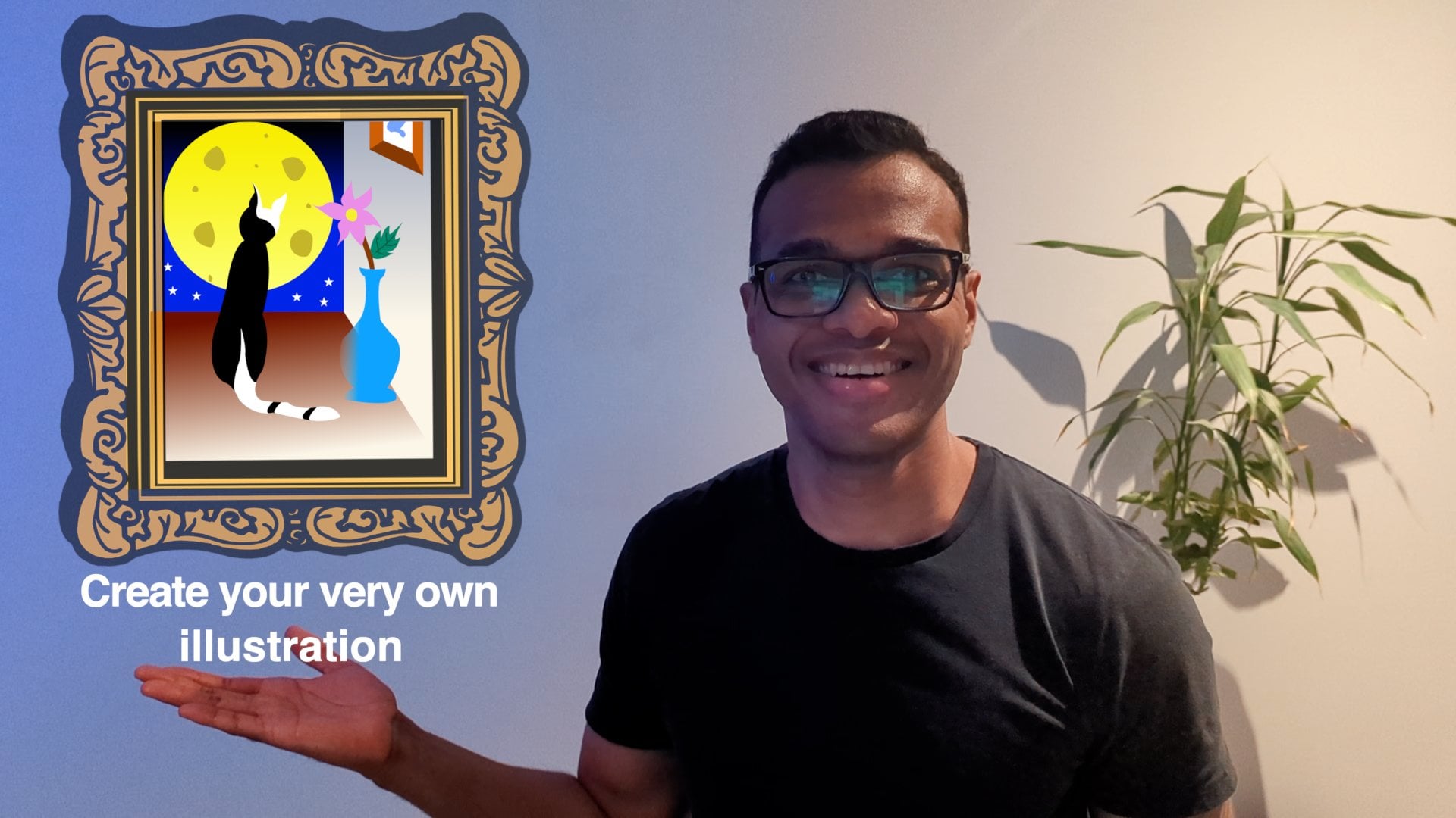
1. Introduction - UX Diamond and Logo Design: Hello friends, welcome. Today we'll be looking
at how to come up with logo ideas together
with design one, using the free design
software, Big Mac. In this course, I'll be
teaching your principles. You can then use them on
your own to solve problems. Teach someone to fish
as this angle is, and you will feed
him for a lifetime. In this tutorial, we learned about the UX two-pole diameter, which is a visualization
of a design process. We'll then use it
to come up with a logo design
through an exercise. You can then post
your exercise on the project gallery of
this course located under the Project and Resources
tab to show us how you went and receive feedback
from myself and your peers. Remember, it's a safe
space and feedback helps us improve and get better
over time. You want feedback. My name is Olivia. I'm a Product Manager
down in Melbourne, Australia working on
digital software products. All right. I'll see you in class. Let's go.
2. Class Project & Resources: Welcome team. This class will be divided
into two sections, a theory section and
a practical section. In the theory section, we'll be learning about
the UX double diamond, as well as the guiding
principles behind logo design. In the practical section, we'll use Figma to
design our logo. And while you're
doing the exercise, it'll be good if you
could post it in the project gallery
section from there, I will be able to
give you feedback, as well as if you
have any questions, you'll be able to ask
me those questions. And you will be able to also show your peers how
you progressing. Alright, let's make a start.
3. UX Double Diamond Theory: Welcome back. In this class, we'll be looking
at the UX doubled. The UN's double diamond is the visualization of
the creative process. Basically, we use it
to solve problems. All right, let's go ahead and draw our double denominator. The first part of
the diamond helps us figure out whether we are
designing the right thing. The second diamond
help us figure out whether we are designing
the thing, right? The double diamond
consists of four D's. 1234. More demand for these
easy to remember. Number one, that is the
first IEP is discover. Number two is defined. Number three is developed. Number four is delivered. When we discovering. Basically, we want
to diverge, meaning. We want to look through as
many inserts as possible, go wide and do our research. Discover. We want to diverge. We want to go wide and gather as many
insight as possible. Once we've done our research,
we've gathered inside. Now we want to converge. That is, we want to define, when we define converging. What that means is
that we zoning on insights that is
of our interest. Now, we've done our research. We are zoning on
particular insight. And this helps us to
design the right thing. And we'll move on to the number three,
which is developed. When we develop, we
want to diverge again. What that means is
we want to generate as many ideas as possible. Generate ideas, and
there is no silly ideas. Everything that comes to mind, put it on paper, put it on your design software. Don't limit yourself. Free thing for it, and put everything on paper. Once we have many, many ideas, we will then want to
converge on the final idea, which leads us to D number
four, which is delivered. When we're delivering,
we converging. What that means is we
want to zone on one idea. One idea. At a high level, the UX diamond basically
takes in a problem. Going through the 40s. It will help us
speed up a solution. This is our UX double damage. In the next class,
we'll be using this to help us come up with logo ideas and hopefully
a final logo or a team. I'll see you in the next class.
4. Characteristics of a good Logo Design: Welcome back team. Before jumping into Figma
and starting to design, let us look at the
characteristics that would make up a good logo. Logo should be
simple in memorable. Basically, make it simple enough that people remember it over
time just by seeing it. And it should also be
versatile and timeless. Versatile, meaning you
can't have it big or small, changing the colors the way I think about it is we've
put it on t-shirts. You can flip the colors back and forth between black and white, meaning making your logo
black and the t-shirt white. Or making your logo white
and the T-shirt black. I'll see you in the next
video where we will be designing our logo in Figma. See you soon.
5. Designing our Logo with the UX Double Diamond and Figma: Hey team, Welcome to class. Where are we going to look at the UX double diamond
and how we can help us with our logo design. All right, first off, if you've never done it before, just head off to figma.com.
As you can see here. And you can sign up
for a numeric out. You can use Figma either in browser just after signing
up for an account, or you can use the Figma
app by downloading the app for your Mac or
your Windows machine, just like I have done here. I will just use the
app for this tutorial. Let's go ahead and you
will see this plus here. If you've downloaded the app, just going to click on the Plus. Go ahead and make that bigger. We'll click on InDesign file. Go ahead and call
this logo design. Great. Alright, so first off, let us draw our UX,
it doubled down. And to do this, just grab a rectangle
which can find up here. Or by pressing R on your
keyboard. I'm using Mac. Some of the commands
might not be the same if you guys are using
Windows machine, we're just clicking Shift, make this bigger
shifts so it keeps its ratio here, 256 by 256. If you guys press Shift X, what that will do, it will invert the stroke and the fill. We'll go ahead and
make that stroke red. We will grow it a little bit. Make with that it bigger. We can rotate this to 45
degrees just up here. Hey, we have our
first UX diamond. If you press option. Basically is drag
this shape out. We'll have our UX double
diamond. Amazing. Alright, let's go ahead and
press L for line on this. Just like so. Come here,
Let's return stroke. Let's change the
line to go. With me. I'm using a trackpad
in this trip. Can bump up the stroke
value on the line. And if you press the
triple dots here, you can see we can change the stroke line from solid
and to make it dash. Now again, if you press Option, you can basically make two lines and drag
the other line here. Alright, let's go ahead
and press T for text. And if you remember our
diamond, the first 1, first part of it was due this, if you remember, the
40s basically discover. Let's make this bold. Let's make this bigger. Now, you can fit that box
to the text just here. Same principle. If you press Option and
then you drag this out, you will get another one of it. If you go Command D, command D will place copies at the same distance
that you had it before. The second part of the first
diamond was to define. The third one was
develop and deliver. And we have our UX
double diamond. Alright, let's go
ahead and use this to help us come up
with logo design. Gonna hide this for a second. We will group everything. If you highlight all of it. And press Command G will group. And then what we'll do is
we'll just expand this out a little bit to
give us some space. Alright, so we had the first
section of the diamond. Discover. If you press F, You will get the option
to draw out a frame. And if you look at the
right-hand side here, there's different frame sizes. Let's go ahead and pk five. So we have some space and we'll put it on
the Discover section. Let's say I have a cafe that I wanted to design the
logo for breast T for text. Said that my kapha is gold. Other, since Cafe, let's say since that cafe
San Francisco option and you can drag this to
create a duplicate text area. What does this remind me of? It reminds me of sun, sunset. Anaphase, obviously. I mean, Melvin reminds
me of the beach. I guess a cafe at the beach. The beach. We'll leave it at that. For now. The Discover part of
the diamond and we're going why diverging aim that we want to put as many ideas
on paper as possible. There is no constraint
in the thinking since it cafe reminds me
of all of these things. Alright, let's use
Google for health. What does Google tells
us for inspiration? If we have a since Set Logo? Not too bad, that's pretty good. Actually. For inspiration, I'm gonna go ahead and print
screen on these logos. How about some low works to Cafe? Be two of those. Cannot spell beach. What about Melvin beach
slope that great. Let's just take a
screenshot for now. Give that a cluster. Now.
Let's see what we got. Since it logos smaller space and make this smaller, I'm pressing shift
as our resides. You can just resize it by
grabbing it from the corner. As you can see, the libraries are simple,
potentially memorable. One here, versatile. I can probably print it on any to show it in flip the
color could even have a good read if I want to hear is to our inspiration. So you can actually
time-boxed to these activities for the
students real-time box. Most of it is that we make it simple for
you guys to have a reference, but then you can go out on your own time and
play around with it. Alright, we did diverged, rediscovered, and all of
these are inspirations. So now we want to
converge and define. So I'm gonna go ahead
and pick the one I like. That will then help me with the third part
of the diamond, which is to develop some ideas. Let's pause this here. Like this, pretty simple. For the colors. This one here. Well, I guess these two
operates important. Well, this is a bit complicated
as many shades in there. So this one is potentially
simple, memorable. And this one for colors. How about cafe wise? The one we were
talking about before, which is this one here? This one for its
squiggly shaky thing. That one. This one because it's pretty
simple and memorable. Mellon one's not sorry,
Interesting. Okay, cool. So what do we have? We converge and we are
grabbing these four ideas. Clicking Shift, I can
resize and unimodal. So again, shift resides. Scrape on the corner to
give us some more space. Alright, now that we have converged and selected
a few that we like, we are going to go
ahead and basically now draw our eye gaze
or is the ideation? I'm tired of this
tutorial so developed, we are going to develop
our ideas again, let's press F A5 here. All right, this is
quite interesting. So looking at this, what's coming to mind is
you can press P for pen. The pen is a very
cool tool in Figma. It allows you to
draw all the things. Press fear for Point. Press again, don't release for another point
and then command. And it allows you to
curve. Pretty cool. Hey, cool. Escape to break that. Then again, click hold curve. And if you keep going, it will usually
draw another one. Maybe that is sun that
I'm thinking about. Because of the sunset Cafe. Because it's a cafe. Probably represent
cathode sunset cafe. The sun is setting. Maybe it's setting
on my coffee cup. Bit bigger. Shift. The lines straight shift. My cup has a handle, click Command, drag T for text. Maybe we'll call it
the sunset cafe. Come here on the
right-hand side. Fit TTX. And we'll make this
a little slimmer. Like, hey, look at that. That is my first logo idea. First of all, good idea team. Right? Now you can either come up with new ideas or go ahead
and play around with this one here
to just generate different ideas and
using this as a source. This is what I'm gonna do. Maybe I will first group these, do not break it. Alright, so now you
press Option and drag, just created a double. You can play around
with that double-click. You'll get back into
this vector mode. And if you click on
this, you can delete, delete, delete it so you can delete sections
of your drawing, which is quite handy. Penn, want to make
the car up a little bit more separate with the cup. Principal, click, click
Command and drag. Maybe I want cornered cup. So click on this
line down below, press Delete and get rid of it. Can make this a
bit shorter shift for it to stay straight. This red line here
shows you that it's a line D for Penn. Click. Don't let go Command drag. Red, showing it
straight number, shift. Help you there. Click, click, drag. Let go. This is maybe our second video. Let's select this option. Drag this copyrighted. Move, this maybe I want to
have sort of a full sun. So what you can do is
option drag and then shift, shift to flip it
vertical. Look at that. Maybe want to change
this a little bit now. Maybe I don't want
this different. Maybe we want a
different sort of cup. Now. Delete this. A little smaller. P for pen. Double-click that
P for pen Command. And then click, click hold Command. Click, click Command, close. Hey, look at that. Idea is taking shape. Okay? Maybe that's another idea. Option, drag, running out of space for time. So just keep flying. We want to change
this a little bit. This part, cool. I want to play
around with my son. P for pen. Suffering or not. I think it was proper. Something like so. Maybe just wanted a
little smaller shift and then you can
decrease the size. I'm thinking is maybe the
sun is sitting inside of this try and delete it. If you press Shift, you can move by ten pixels. And if you let go of Shift, you can move by one pixel. Hey, look at that. My son is within the car. All right, we'll
leave it at that. I think I will go with
this video for my logo. Or maybe you should just
try not to shape all right, team since my recording
died halfway. So I'm just going to voice
over the rest. Here. I doing Option
drag to duplicate. I wanted to do on
a different idea. Before we finish. Change the angle. Do you negative ten, as you can see on
the right-hand side. I think we're coming up
with a saucer kind of idea. Press O for circle and then you just draw the circle,
negative ten again. Shift X. You're going to flip the stroke and the fill
just to get the outline. And then you can basically change to any color
here would pick black so it just reflects
everything. We have. Another one. I'm just tweaking
the social a little bit. If you click on the
line and then you press Delete, it'll delete it. Sam, principal P for
pen, click, click, hold and drag to make
their line become curve. Then same on the other side. Click and drag. There we go. We've got some cool social
design happening here. And that's the final design
we're gonna go with. You can timebox this activity. You can keep going
if you want to. But here for this,
for the purpose of this tutorial way of timebox. And that was the
develop section. So we went, Why do we looked
and found a lot of ideas? Basically put button
in our head on paper by looking at the idea example. We've just put
everything on paper. And then we will now go
into the deliver side, which means we are
going to converge again to clean up our final idea. If you press F for frame and then A5 and you
get the AFI frame. And we take our final idea and we're gonna make it
a little better. I Control C and then I select the frame
and you control V. Then we're going to look at
some color palettes here. So what I did was you press or for rectangle
and you leave your finger on Shift
as you drag it out to make it a square option, click drag out, and then
you press Command D to just duplicate and it will duplicate the same
spacing in-between. You can select them
all and Command D and then basically you
drag it down or sorry, option, and then
you drag it down. Here. I just did Command D
to duplicate this section. Now we're going to use
this as our color palette. We control X that
we put it next to the colors. For ideas. If you select one
of the squares. Then you go to the
field section, which is on the
right. Click on fill. Any other color
picker, click on it, is very handy age
you just click on any colors that you like
any well, fill it up. We're looking at the sun here. So this yellow was interesting. I'm picking the
next orangey type of color that's
interesting for our son. Then there was this
magenta color, again, interested
in for the Sun. This is the blue because that rule was
interesting as well. And then let's look
at Coffee colors. So that Brown was interesting. The pale brown. Very handy tool. Just click on the color you like and
it fills it up for you. Just looking for brands still. As ideas for coloring our final representation
of our logo. This brown here was interesting. Then I was looking
for lighter brown. Make it lighter. Was afterwards looking for a brighter yellow. Yellow there, and then
I made it brighter. That's our color palette
for our final idea, which we jumped on
the drawing board. You guys Shift Down key and
move it down by ten pixels. That similar time here. Then, now let's color design. So you just need to
double-click on the design. And take again the color picker and select the color
that you'd like. Light color for the cover. And this also, I'm trying to make that the sunset cafe
a little border here. As you can see that
as much as possible, we've tried to make
our logo criteria, meaning simple,
memorable, versatile. You can change the colors around if you want to
put it on t-shirts. And hopefully timeless, like the sun will stay
the same over time, even many years from
now as we look up. Thank you so much. Please put your logos in the project section of
this class and we will be able to look at it and
give each other feedback. And then if you have
any questions as well, just pop it down in the
comments section and I will reply to you just to
make the class interactive. I will see you in
the conclusion. I'll see you soon.
6. Conclusion: All right, folks. So that was it for today. The best way to get
better at what we covered is to just
play around with it. Have a problem. Use the UX double diamond
to help you solve it. Use it as a framework. Basically, you can use it
on many types of problems. This was my very first class. So if you have any feedback around how I could improve it, please let me know. In the comments.
Dma doesn't matter. Any feedback is welcome. If you would like me
to teach anything else that's technology-related
or process-related. Please leave it in
the comments as well. I'm happy to create a class
around any kind of topics and until next time my
friends take care. See.
 Olivier