Transcripts
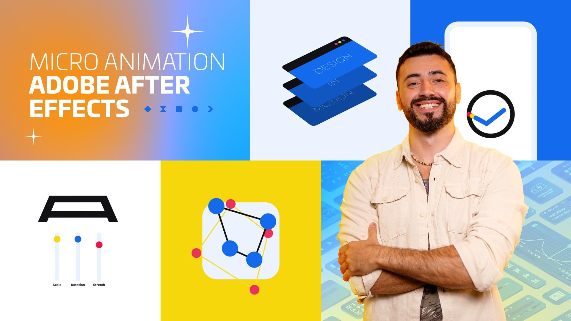
1. Course Introduction: Hi friends. I'm Batu
Han from Libra Studio. It is exciting for me to share my eight years of motion
graphics experience with you. The subject of our course
is logo animation. Logo animations are
divided into two as customized logo animations
and logo animation templates. Let me show you examples of logo animation templates
that I have prepared myself. Now let's take a look at
personalized logo animations. In this course, we will create a personalized logo animation. In this way, you will learn many logo
animation techniques. For our course project, we will create a logo animation
for the Skill Share logo. I want you to add your
own interpretation to the logo animation and share
the animation with me.
2. Class Project - Logo Animation "Skillshare": Hi guys, We're going to
start a logo animation. I'm going to load
the lessons piece by piece so you don't get bored. When you finish each lesson, save the project and proceed from where you stayed
for the new lesson. Let's start by creating
a composition. You can adjust the quality
to four K if you like. I choose 1920 x 1080, 60 FPS. The more FPs, the
smoother the image. But too many frames can
mean too much effort. This rectangle is
now our canvas. I'm clicking on the title Action Safe to use the
composition properly. Let's look at the graphs
we're going to use. Now, I've found a few icons and we can design them
ourselves using an illustrator. But we don't have to
deal with it because animation is our
primary objective. I'm thinking of using some
of the logos and icons. I add the music note icon to the composition and I start
making the stroke animation. I'm going to mask the
lines of the graphic. That's how I do the animation. I'm picking up my pen
and starting to mask it. It's important to be careful that the lines turn smoothly. Now that I'm done masking, I can add the stroke
effect to the layer. I'm checking the all masks box. Increase the brush size until the icon is lost to
produce a proper effect. Note the settings here reveal original image. I'm creating an animation like a trim paths animation
with the start part. For this, the start
value must be 0-100 The animation has taken place, but there are some disruptions. I'm removing these
distortions by changing the slope or
position of the lines. Now I'm going to select
the key frames and soften the motion using
the graph editor. When I turn on the
graphics editor, please take a screenshot and then use these graphics
in your animations. So you'll understand
the logic easily. I'm adding a round
shape behind the icon. When you literally want
to get the circle, you have to press the shift key. This will make it
easy for you to keep the maximum size ratio steady. I want the icon to appear, so I moved it to the top. Now I'm painting this icon. I copy the icon three times and paint each icon
in different colors. I'll slide the layers
side by side so I get a colorful and smooth
transitional animation. I'll see you in the next video.
3. Click Animation: Hi guys. In this
lesson I'm going to add two forward back
keys to the video. I'll also create a click
animation by adding a link. I want you to interpret all these elements
to your own liking. First of all, I'd like to put the icons together in
a single composition. I select all the
layers of notes and convert them to precompose
by right clicking. Move all attributes into
the new composition. Let's write the name of
the shape layers circle, so that we can easily find it among the other shapes layers. In the future, I'd like to create a scale
animation because the circle layer stays constantly
and doesn't look good. I'm choosing the key frames and softening the animation
with the graph editor. It was so good, but I want the music
note animation to appear only in the circle. So I copy the shape and
move it to the top. I click on the composition
and click on Alpha Maat. I'm painting the
shape in dark blue. You know we're selecting the fill effect from the
effect panel to paint. Now there are keys. We'll build these with the polygon tool, we need two triangles. The polygon tool creates
a pentagon for you, so you can easily get other geometric shapes by
changing the number of angles. Polystar path points. Three, I got a triangle looking
to the left of the edge, but the shape looks very sharp. I want to soften the
corners, add round corners. I think that's fine. I've
uncovered the central point. Remember, it's always good to prepare the center
point in advance because it's hard to change the center point after
you've done some animations. I'm making it a little smaller and adjusting its place
in the composition. I'm clicking on
Title Action Safe. Again, I'll do that every time I need to make sure that the shape
is right in the middle. So I click on the grid, Everything's fine. I don't have to work from
scratch to get the right key, because the reflection
of this triangle will be another perfect key transform flip horizontal, I'm changing your position
to be in the same line. Now I need a growth animation
for these two triangles. I'll pick two shapes and
create a scale animation. It's beautiful, just
like I wanted it. Let's write down the names of the shapes so it's
easy to find them. In the future, we're going to do a click
on animation. What we need is a cursor icon. I want the trigger to go
right up and right click. I'll do that, of course
with position animation. I'm also going to
add scale animation because I wanted to grow
up. At the same time, I'll do the position
graphic as usual. I don't give much detail
because I'm telling them in the introductory classes we haven't used so many
different graphs yet. Yeah, it was nice, but
now there's a problem. It doesn't appear on it
because it's similar in color. I'm going to copy this stick and paint it white right away. Then I'm going to
select the Alphamat, so that the white sign only
appears in that shape. I'm actually attaching the
white cursor and now I get the click animation
by decreasing and increasing the scale
values of the cursor. I'm also doing similar
animations with the right click to
enhance realism. It was great.
That's all for now. See you in the next lesson.
4. What is Alpha Matte? : Guys, we did a click on
animation in our last, in this lesson I'm going
to teach you how to replace the music icon
with another icon. After the click animation, I want the music note
to move to the right. Then I'll put another icon
inside the circle shape. We'll have a realistic
click on animation. If you remember in
the previous lesson, we made the note appear only
when it's in the shape. It won't appear when we put the music note out
of the circle. Let's create a
position animation. I'm softening the
movement as we always do a motion that takes place at a constant
speed is boring. Our brain predicts the end and this situation is far
from creating a mystery. I think that's one of the
important rules of animation. I'd like to point out
that an animation that happens very
quickly is bad. This icon disappeared
by sliding. Right now I'm going to add another icon and
it's going to come from the left side at the same time and be placed inside the circle. I match the size and color
of the shape with the other so that it looks beautiful. I'm just turning the pencil
icon into a composition. I need a matt layer for the pen, so I'm copying the circle. Rename pencil. Matt. Pencil Track.
Matt Alphamat. Yeah, now we can move on
to the position animation. I'm bringing the pencil
icon from the left to the middle of the shape
and softening the movement. I'm making the final adjustments and the animation is ready. I think it's pretty good.
Thank you for watching. I'll see you in the next lesson.
5. Jump and Bounce Animation: Hi guys. Welcome. First of all, let's remember what we
did in our last lesson. After the click animation, we scrolled the first
icon and destroyed it. Then placed another
icon in the circle. In today's lesson, we'll do a jump and drop animation for the pencil icon while falling. Replacing it with E, S, the first letter of
the skill share logo. I'd like to explain briefly
why we're doing this. Our eye can't perceive
every frame exactly. It sees about 18:24
frames in seconds. Let's say we're watching
a 60 FPS video, which means we can
easily deceive our brains with a few
frames in the video. Yeah, let's start
making animations. Now, if you remember
in previous videos, I didn't add our logo to the composition because I had nothing to do with the logo. But now I'm going
to use the logo. That's why I'm adding the
logo to the composition. I'm also reducing the brightness so it doesn't get ahead
of other compositions. I press the control shift and keys as soon as the pen
gets into the shape. This combination allows us to divide the composition
into two parts. From where we mark
it. I'm removing the matt part of
the second part. What does that mean?
The second part of the pencil composition has become visible when
it's out of shape. Let's start doing the
jump and fall animation. I'm starting by creating a position animation for
the pen composition. Now I'm selecting all the key
frames and pressing nine. I'm clicking on the
graphic editor. As usual, this is how
I adjust the graph. The point in the
middle of the graph means the speed at the
top of the pencil icon. That's how I set it up
because I wanted it to slow down completely and then
fall to the ground quickly. If we create a
rotation animation with position animation, we'll get a much more
realistic animation. It's so much better. I'll turn the pen into an S. That's
why I'm asking the S. I'm applying the key frames I've created to
the letter layer. As you can see, it switches and turns in the same
way as the pencil. I divide the two layers from the same place I'm using the
control shift D shortcut, as I just mentioned, we've
turned the pen into an S, but I wanted to hit the
ground after it's turned. It looks bad that the
movement stops suddenly. Let's create a new
position animation. Right now I'm doing this by changing the Y position. We'll just select the key
frame right in the middle, and press the F nine key. The pattern should be like this. We're also applying what we've just done for these key frames. And I'm going to create a position animation
for the cursor, because the cursor should go
after the click animation, I'll create a null object and then link the cursor
to the null object. If I drag the null
object to the right, the cursor will be out of the composition because I've been telling you
this many times. I assume you understand now
and I'm passing quickly. I'll see you in the next
class. Thank you for watching.
6. Stroke Animation & Matte Animation: Hi guys. In the final lesson we had an animation
for the S letter. In this lesson, we're
going to create a stroke animation for
the other letters of the word skill and a matt position animation
for the word share. Actually I've shown
these two kinds of animation in
previous classes. We created the stroke animation
on the music note icon. We also created a matt
position animation while replacing the
icon with another icon. Let's start with an
animation of the word skill. First, I copy the S layer. I need to delete all
the animations on the S layer and all the
masks on the S layer. Yeah, and now we're starting
to do the stroke animation. I'll mask all the letters except according
to the animation. I'm passing this section fast. I'd like to point out this. I recommend you practice
stroke animations. You will not have this problem if you click the layer again. After you have
completed the letter, I've finished masking. And now I'm dragging the stroke effect from the
effect panel to the layer. I mark all the masks and then increase the brush size
until no words appear paint style, reveal
original image. When I bring the end value 0-100 the animation
will be ready. But as you can see, there's a little distortion. I'm fixing these, I'm softening the movement. We've finished this part now. I'm taking the word skill
into a separate composition. I'm creating a
position animation because that word must be right in the middle
of the composition. I'm re adding the
Skill Share logo to the composition because
I need to align it. Now there's the
second word share. As you know, we have
right and left keys. I'll get a square by combining these in the
middle, in a little lower. And then I'm going
to tie a mate to this layer and make
a matt a animation. We're softening the motion
in every animation. And I'm not going to mention
it because you know that. Let's watch the animation. I'm masking the word share because I'll only use that
part in the mad animation. I'm creating the matter that we're going to
tie into the square. I'm combining the right and left layers into a composition. I'm choosing alpha so that the word share only
appears in that shape. There's a little mess
here. Let's fix it. Now, as I mentioned earlier, I'm scrolling the composition to the left and at the same time, the word share from
left to right. After I've softened the moves and set the appropriate timing, my animation will be ready. If you remember, we had a mat
on the button on the right. The Matt connection broke because I joined
these two triangles. That's why I'm realigning Matt. Now. That's it. I'll see
you in the next lesson.
7. Dot Animation: Hello everybody. In
this lesson we're going to make a dot animation
of the word skill. As you can see in the animation we did in the last lesson, there was a circle shape in the middle of
our composition. We'll shrink this circle to the point of
the, in our logo. We're going to shrink
the circle first, Then we'll create
a jump animation. Then the circle shape will take its place in the position
where the point is on the letter I. I'm adding
motion blur to the triangles. Because it's a quick move, I will get a better picture. Now I'm going to create a scale animation and
a position animation. We've done the jump and the
bounce animation before. In the same way, we're going to create a similar animation. Again, I'm raising the center of the graphic up a little bit and sliding it to
the other side. Now let's make a
bounce animation. There's got to be a
pattern like this. Yeah, our bounce
animation is ready. But I want it to
be the same size and position as our logo. That's why I'm adding the
logo to the composition. When I put it on, I'll know the right position
and the right size. I want the animations to
happen a little earlier, that's why I shifted them to the left. I think
it's very good. Finally, we need to
change the color of the dot because the dot on the skill share logo is green and our circle
shape is black. I can't change it from the beginning because
our icons are green. If I turn the circle green, some of the main animations
will not be visible. In this case, we need to do a
color transition animation. We'll do this with
the fill effect. It already has a full
effect on our shape, so there's no need for a second. I'm deleting it, make it black
at the moment of jumping, and turn green at the
end of the animation. Yeah, I think it's good. I'll see you in the next video.
8. Thank you!: Hi guys. As you know, our animation is ready. But I'd like to make the animation a little better
with a few corrections. I'm just going to make one
correction to this video. If you remember, a
few lessons ago, we did a jump animation
for the pencil icon. As I watched the video, I noticed that the color of the pencil icon was
different from that of the letter S. I think it'll make a better picture if they're
both the same color. The pen should be green first, but I want the pen to be black as soon as it
comes out of the circle. With the jump animation, we're going to create this
with Matt animation. First we copy the pencil
icon and make it black. Then we copy the circle
shape and put it on top of the black pencil
alpha inverted mat. Finally, as soon as it
turns out to be a circle, we split the green
pen layer into two. Control shift D and we're
deleting the second part. I decided to accelerate because the animation
was a little slow. Select all layers and
right click on precompose. I select the stretch
section from the bottom left setting and increase
the speed of the animation. I'm dividing the
composition into two. I'm bringing pre click
animation to 55% after clicking animation
to 70% That's it, our course is over here. From now on, I'm going to create a lot of courses
about after effects. If you follow me, you'll be
informed about the courses. Thank you for watching.
 Libra Studio / Batuhan, Motion Designer