Transcripts
1. Introduction: I know that drawing faces
can be quite intimidating. I think a lot of the time
we put so much pressure on ourselves to have
a finished project or have something that
we have to show people. I wanted to try and
put some exercises together for you guys
to just sit back, relax, and just
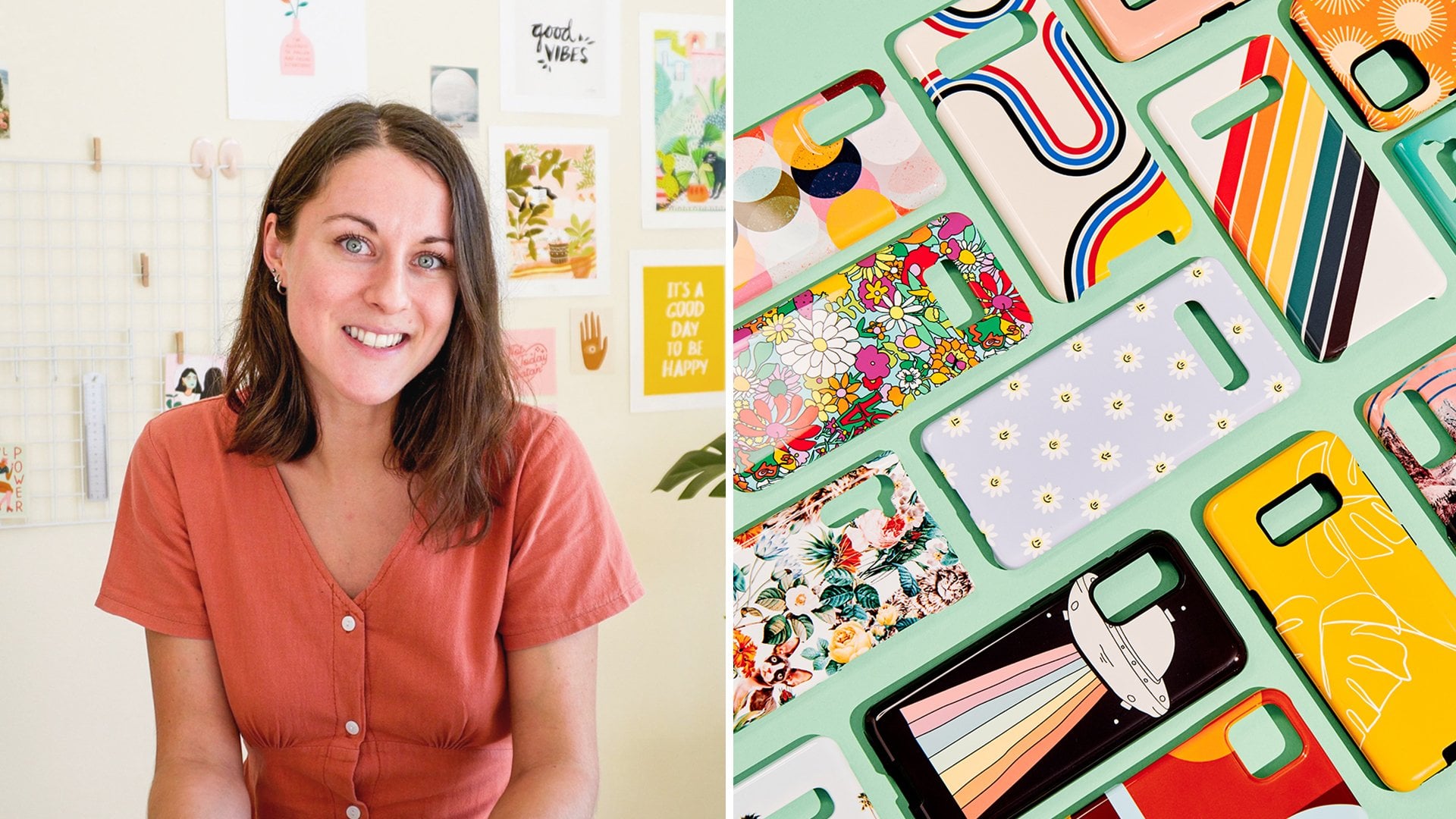
enjoy some drawing. Hi guys, I'm Charlie. I'm a greeting card designer, freelance illustrator
from the UK. I'm currently in Thailand. I specialize in greeting cards but also create
skillshare classes. And I also have
fun faces prompts that I do on instant
about as well. In today's class,
I wanted to walk you through three fun exercises. We're going to
start with drawing some fun features and exploring
some stylized characters. We'll then be moving on to
skin tones in exercise two. I'll just be sharing my process on how I create my skin tones. I know that that is
something that you guys struggle with a lot
in my other class. In the third exercise, we're going to bring
everything that we've learned in five
exercises together. And we're going to create
some more of poses and explore creative movement and personalities through
the shoulders. That's another
thing that you guys message me about in my last
class that you found your As. To be quite rigid and stiff. I want to try and create
an exercise that will loosen you up and most
importantly, just have fun. I think getting started
is always really hard. I love the fact
that we can just be forced to start
drawing here together. I hope after you take this class you gain
more confidence. Enjoying faces. I know it's
an intimidating topics. I want you to just have fun, let go of any perfectionism
you have with your illustrations
and enjoy the class. This class was Recorded life and I got to interact
with the audience. As I was creating,
working, and drawing. It was so much fun. Drawing characters,
doesn't have to be scary. So let's get started.
2. Drawing Eyes: My name is Tiffany Chow. I work on Skillshare's community team. I will be the host for today's live class with Charlie [inaudible]. Hey, guys. I just wanted to say thank you so much for joining us today. I'm so excited to have this community where I can share some of my knowledge with you guys. In today's class, I'm going to be sharing the three fun exercises for you guys to just stretch your creative muscle. We're going to start with drawing some fun features and exploring some stylized characters. Thank you so much Charlie. Why don't we go ahead and dive right in. Brilliant. This is going to be excise 1, and I want you guys to start exploring different features. I've just divided my page into three parts, eyes, nose, and mouth. I want you guys to try and fill up the page as much as possible with different style of eyes. You can follow along with how I'm drawing them, but I'd also like to maybe see you guys trying to use your imagination and just play around with different styles of eyes, nose, and mouth. Once we've created this, we can move on to exercise 2. I'm going to start by using my 6B Pencil Brush in Procreate. This is a really nice brush that has this nice textured feel to it, and we're going to go in and start drawing different features. With this exercise, I love to do it to unwind and stretch my imagination a bit. I'm not going to look at any reference photos, I want you guys to maybe sketch out maybe 10-15 different eyes, and then if you're really struggling, either follow along with me or maybe go in Pinterest and have a look at some cartoon eyes. I'm going to explore different shapes, and start to draw different characters. With these eyes, I like to have this cat-like eye and some, and then I'll bring this arch up like this, and then I can create the iris. When I'm drawing eyes as well, I could explore with doing a circle now, and then having the iris to the side to indicate the direction of the character's gaze. I'm not going to spend too much time on this because there are a few things that I want to show you guys today, but I want you guys to get in the habit of loosening up. Getting rid of that perfectionism and drawing for the sake of drawing rather than worrying about the outcome. If this person's really tired, I could give them some really droopy bags under their eyes, straight away you know that person is tired. Then if I'm having this down eye, you can see this sinister look just from a few different marks. It's amazing from these little tweaks that you can create in your eyes, you can completely change the emotion of your character. I'm going to play around with different shapes. If I've done a more simple shape, I could go in with having the eyes like this and then play around with having some of the eyebrows going up like that, and having that suspicious look for your character. When you're creating your characters, there's so many ways that you could create a stylized character just from changing up the features. You can try with really big eyes and having this eyelid come over like this. I want you guys to spend about maybe 10 minutes trying this out. I could have some eyes like this where you have the tear duct in the middle, and having these lines to emphasize the eyes a bit more. We can go as detailed or simplistic as you want with this, and add some little lines, and play around with all of the different shapes. I'm going to go in with these dotted lines here and having some eyes. Also when I'm creating my characters, I normally add some wrinkles or play around with the eyebrows, so the thickness of the eyebrows as well. Then you can have sleeping eyes like this, really simple again, or you can have eyes that curve in an arch to illustrate someone who's laughing or who's really happy. If you have eyes going down like this, with the eyelids drooping down, just by changing the slope of the eye to downwards and this way, it shows that your character's really worried or scared. Those small tweaks can make such a difference. There's a question from the audience on how to do puppy dog eyes. Puppy dog eyes. Wow. I'm not actually used to drawing animals that much. Maybe you can go for a cute character. I suppose having those puppy dog eyes that always look like they want something, and you can maybe go for something like this, where the eyelids are looking quite cute. You could have the eyes or having folds of skin coming over the eyes to show that skin fold. But I think puppy dog eyes look cute, so I think as long as you keep the eyes quite cute and have that reflection as well going off, gives that really sulky look to a dog character. But hopefully, that answers your question. That's awesome. It's pretty amazing how you could do that in just a few strokes. I'm amazed at myself too. You should hopefully have a few eyes to play around with in exercise 3. I want you now to move on to the nose. If you are struggling or feel like you need some reference photos to help you out, that's not a problem. Hopefully, you've come up with some of your own ideas as well.
4. Drawing Mouths: I'm just going to go
onto the mouth now. And if you have any questions, please feel free to
ask as long as it's no more animal
drawings actually. Do you feel like
it's important when you're sort of
developing or creating a signature style to always use sort of the same
types of these features, Noses, eyes, mouth, et cetera. Yeah, that's a really
good question and I think it's important
at the beginning, especially to explore
all of these styles. When I first started,
I went through so many different before I kind of
found the style that I liked. So it's really important to just explore as much as possible. You don't have to share all
of these things as well. That's the amazing thing about these exercises is they can just be for you the pressure is
off to stay consistent. Because there's been
lots of times where I've done exercises where I've found something
that I really love. And I'll incorporate that
slowly and subtly into my own illustration without it being an obvious shift in style. As like if you look
at my old Instagram, I have so many different
styles at the beginning. And that was all part of the
creative journey for me. It was to find what
worked for me, what I enjoyed working with, and I wouldn't have been
able to get to the style I'm at now if I just kind
of stuck to one thing. So I think experiment
as much as possible and don't feel the pressure to share it all the
time on Instagram. If you don't feel
comfortable with that. But just make sure that you're exploring in your
free time with Mouse. I'm just going to explore
some lips for a while. Just to kind of show
this that the top lip is normally smaller
than the bottom lip. Again, you can play around with having open mouth,
maybe having teeth. Or if you want to
go more simple, you don't have to
add any teeth in. I sometimes like to add this cartoon tongue and
it open mouth as well, which is quite nice as well. You can just go for
the simple smiley face with that tiny little
dimple on the side and just have a little mark
here to emphasize where that mark is between
the lip and the chin. Yeah, I normally just go
for the very simple lips. But like I said, if you are
working with a client that does want something a
bit more expression, it is important to
practice these gestures just in case they want a little bit more motion
in your character as well. Do a big smiley face, and then sometimes
you can just hint at the ellipse as well without
going fully on the line. If you're working
with, say again, a profile and you want
a mouth on the side, you can have slip come down and then you
can have this kind of bum chin that I quite like to do sometimes with my characters. There's a request from the audience to see
a gap tooth smile. A gap tooth smile. Okay, of course I'll try and
do this stretched out V. Then I'll close
it off with this line. And try the line here. Then I like to create all the teeth and then
remove part of the teeth. If you can see that,
I'll just zoom in guys. I'll fill this in dark. And then to have this just thick line that would just emphasize
the gate a bit. Then you can have some
lighter lines for the teeth here showing where the teeth
start and carry on, but then showing that
they have a gateoth. You can go as detailed
as you'd like that but hopefully that
grmalous there. But hopefully that illustrates the point for you guys then, because I think
we are definitely more prone to drawing
female characters. I think I see that a
lot in my students. There's probably a lot more
visual interest in terms of creating lips and having make up and obviously
hairstyles a lot more. There's a lot more
variety in that. If you are creating
lips, just again, just really try and hint at the lips without putting
too much emphasis on it. And normally the
brow line will be, I think that's what it's called. You can also try and create more of a
male lip there as well. It's not always looking
like they're wearing lipstick or have
really plump lips. I'll just try one more mouth and maybe I could do
one that's really wide and showing the Dan. Hopefully everyone's
following along so far. I hope you'll just enjoy
yourself because I think that's I really wanted to get
out of today is just to kick back and just have
some drawing review. You guys, hopefully
you should have a page full of different
styled features. If you are finishing off that, I'll just give you
a few more minutes. Once you have
finished this page, I just want you guys to
click on the spanner here, click on Share, and
just save it as a Jpeg. We'll come back to that
in exercise three. I'm just going to save image, not worry about that too much. That is the end of exercise one.
5. Creating Skin Tones: Now that we're wound up,
I'm going to show you how to create skin tones
that are realistic. I'm just going to
hide this layer now. Just move on to skin tones. Now, in this exercise, I want you guys to just
put any color down, but have this color
on different layers. We're going to change each
spot to fit a skin tone. We're going to go from light all the way down
to a dark shade. I'm just going to show
you quickly how to create your own palette if
you're new to procreate. If you go over to
the palettes here, and then click on this X here
and create a new palette. So I'm just going to
name this skin tones and make sure that this
is set to default. As you can see here, we have our new palette that we
can start to build up. Now I'm just going to clear
that up for you guys. This is where we pick
the hue, the color. Then this in the middle
is where we pick the saturation and also have
control over the grinders. I normally work in classic
because it gives me a lot more control over
what color I'm picking. Normally, with the skin tones, I try to create my skin tones
between the red and orange. Hopefully you guys can see that. I think there's a little bit
of a glare from my light. But I try to pick my skin
tones from this area here. If I go to red, then it will become too pink
and not that realistic. And if I go to yellow, I'll have the same problems. So I normally try
and really limit myself to this orange, red area. And sometimes with the browns, I'll push it to a
bit of a yellow. If you can try and keep
inside of this area, it will just give you a
little bit more control with the skin tone color. I normally try and pick a
color all the way up here. The reason why I say
this is if you come down with your brightness, you'll start to see a
really muddy gray color. So I'm just going to show
you guys now what I mean, this becomes really
dull and muddy. This is something
that I think a lot of people struggle with
with the skin tones. Is having this washed
out, muddy, dull color. And it's because
you're not keeping the brightness up when you're
picking your light tones. I normally work within
this area here, and I'll come down
to about here. I'm just going to show you now how I'm going to recolor these. I'm going to just pick
my selection here. I'm going to go over to
the wand here and press recolor with this little x here. I'm just going to drag it over to the layer I want to recolor. And then just click up here
where I have these colors. I can now see a comparison between this color
and that color. And I can start to work on creating a darker
shade of this color. Like I said, I'm working
within this area here, keeping the brightness
up and going up slightly with
the saturation to create more and more
of a bright tone. I'm quite happy with that, but I can also really slightly
push it over to create a more pinky tone or a slightly
warmer, um, yellow tone. But like I said, really do limit yourself to how
much you change here. If I want the person to look a little bit more
sunburn or sunk, I can just add a little
bit more red to this. Once I'm happy with this
being a little bit darker, I'll go over to the other. I'll just put that on there. I can just recolor that way. I'll just repeat this process. I'm just going to
go slightly darker. I want it to be maybe a little
bit more pink in color. Obviously, if I
go too saturated, this becomes really harsh on
the eyes and not realistic. And it's quite orange as well. I want to make sure
that I'm keeping saturation down enough that
it still looks realistic. Hopefully, you guys are
following along with this. Now, for the bottom ones, I'm going to go even darker. I want to obviously go darker, but if I move this
over to a saturation, the saturation will go orange. And we don't want
an orange color. We want more of a
tanned dark brown. Now this is where the
brightness can come in handy. If you go down, you can start to find all of your browns
within this area. Again, going to saturated becomes really harsh on the ice. And you don't want to go to desaturated where it becomes really dull and not
enough contrast. I like to try and
stay within this area here and just play around
with the different tones. As you practice
with skin colors, you will get better
and you'll grow your confidence with picking colors and it will
become quite intuitive. But I would just
recommend you play around and see what
works for you guys. This seems like a
natural progression from this color here. It's a lot darker. I
could try and just put the saturation up a little bit to create contrast
with the background. Then I'm just going
to do the same. This one I'm going to come down with the brightness and have a different
skin tone there. Again, if I want to play
around with adding maybe a cooler yellow or some
warmth of the red, I can push that
just a little bit. I'm just going to put that down then for the last
one. I'll repeat again. Hopefully you should have six skin tones that vary in warmth and obviously
ethnicity as well.
6. Pairing Colors: Next, we're going to pick some colors that pair well
with these skin clothes. It's really important
to create contrast when you're adding your
character to a background. Like today, we are only using white background just to
make it easier for us, but we'll be adding some
color with the clothes. I don't want your clothes to get lost against your skin tone. Scaling the skin tone
right is one thing, but also getting the color to
pair with it is different. I'll just go to
my color pallets. Now, I'm just going to go down to some colors
that I picked earlier. And I'm just going to show you some of the colors that I chose. When you're working with light, you want to create colors that are darker, with
more saturation. If you can see on the classic, we have some mid tone here. If we go too bright,
I'll just show you. That will not contrast very
well with the skin tone. You want to have a color that's just ever so slightly
darker with the blue, just to be a bit
softer on the eyes. We're just going to
see how this color contrasts with the
pale skin tone. I just want you guys to just play around with any colors that you guys like, maybe it's reds. Go really well with skin colors. Just play around with some colors that you
have already saved in your palettes or you can try and mimic the colors
that I'm using. I'm just going along to see how these colors are
contrasting together. I just want to make sure that the purple is pop
in against that. Let me just add one more. I just put that red there again, that's popping quite nicely. I found a trick to put
your canvas in gray scale, create a layer on top of everything you've
already created, and pick a black to
fill your canvas. Then what I'll do is I'll
click on the N here, go down to Saturation. And this will put your
screen in gray scale. This is a great way to see if your colors are
contrasting enough. As you can see, you can tell that these
colors are contrasting. Sometimes it can be
really difficult to see when you have all these
different colors going on. It's really important that you put your illustrations
in gray scale just to see if there are any
pain points that you need to change afterwards. I'm just going to
remove that layer and carry on with the dark tones. I'm just going to pick
some lighter colors. Now to contrast with
these nice dark tones, I have this yellow here. And again, this
pops really nicely. I just want you guys to find, to pair all your colors
together for exercise three. Then we have this blue here
that looks really nice, pink as well, which
will contrast nicely. Another thing to think
about when you're creating your colors is make sure that there's
enough contrast, not only with the skin tone, with the white
background as well. The clothes will pop once you've created all
of your colors and you're happy with the
combinations with your skin tone here, I want you to just hold, start to copy these palettes
into your palette here. This will just be a really
fast way for you to work in exercise three when we start putting
everything together, I'm just going to
put the red there. There is one other question. In the classic color mode, when we choose a color
to go with skin tone, are we looking for color that is opposite the bottom
line of brightness? Okay. Are you talking about the saturation or when
you're picking the colors? It's really up to you
because as you can see here, there isn't many rules when
it comes to what colors work. Well, I think it's just
a matter of experiment. You just want to make sure that you're picking bright colors for the darker colors, for the lighter skin colors. But obviously, you can
see that the blue works just as nicely with this
as it does with this. It's just a matter of
experiment and seeing what obviously you don't want to pick a that is very close to peach. Try and pick colors that
would contrast a lot. So greens, reds, and blues contrast really nicely
with these tones here. Whereas you wouldn't really work with like an
orange or red with these darker tones just
because there's not enough difference in the color. So hopefully that
helps you guys. Yeah, thank you
for that. There is one other question
around colors too. How do you make
sure the colors you choose are consistent
with each other? This student is saying sometimes they end up
picking colors that are pastel or sometimes they're too jewel tones
all in one drying. So do you sort of have tricks or tips for keeping it
all feeling consistent? Yeah, so I normally
try and limit myself to three to four colors. And I do have a
color class that has fun exercises to explore different ways of finding
those color palettes. I think with color it's one of those things that I could
bore you with color theory. But if you don't have anything tangible practical
to kind of work on, it can just feel quite lost and the theory can just not
feel relevant to your work. So I have lots of fun
exercises for you to kind of explore and try and
find certain color palettes. Then I try and keep that consistent on my
Instagram feed as well. I have a set set
colors that I use. Again, with my color
class as well. You start to build up these libraries of colors
that you can refer back to. If you're feeling a color
isn't working in a piece, you can always look back at your color palettes
and see if you can replace it with a color
that you've already used. Try to keep that consistency with your colors
throughout your work. That will start to become
your signature style. In a way because
people will know you for certain colors that you're using in
your work as well. But obviously, if you're
just starting out, my advice is just to explore
as much as possible. The possibilities to colors is endless and it can
become quite daunting. So I just want you
guys to just build up your palettes slowly and try and work with a
limited color palette. I can't stress that enough. Hopefully you guys have tried to pair your skin tones
with some colors. And we're now moving
on to exercise three, where we're going to bring
everything in together.
7. Drawing Figures: Now we're going to
bring it all together and create some characters. To start, we're going to
create some basic body shapes. I'm just going to hide
all of these so I can create a new canvas. Now that I have all of
my skin tones saved, it's going to be so much
easier for this exercise. Now, I want you to do a little
bit more drawing again. But this time we're not just
going to be drawing faces, We're going to be exploring, creating emotion through the way someone is holding
their shoulders. I don't think you realize that
a lot of people's emotion and personality will come through in the way they're
holding their shoulders. If you're anything
like me right now, I'm very hunched and anxious. I have my shoulders very
high and close to my ears. Or if you have shoulders
that are down and relax, it says so much about
your character. As you start to get used to creating more movement
with your characters, you'll have them
tilting their head, having their neck
moved a little bit. And you're not just
having this rigid, stiff portrait that we can tend to lean towards
because we're comfortable. Hopefully this exercise will get those creative juices
flowing a little bit. I'm just going to start with my pale skin color first
with quite a thick brush. And I think the
studio pen brush, if you can see that it's studio pen in procreate
that comes under. I think the inking in
the brush library. I would just put
this up quite a lot. You have this really
thick pen that you can just make quite
large marks with. I'm just going to really
quickly draw a circle. Not really think too much of it. Draw a line and then have
the shoulders like this. I'm just going to fill that in. I'm not going to think
too much about it. I'm just going to create
some fun quirky shapes. Now that I've done
this head quite round, I'm going to do the opposites. I'm going to have
a ET shaped face, maybe a thicker neck. Then we're going to have
the shoulders up because they're anxious
and a bit nervous. I want you guys to just
fill your page with these kind of shapes and
just have fun with it. I'm going to have
a long face now, a net coming out from the side. And then have this person
looking quite hunched. When you create the
shapes of the heads, just think about different ways that you can present them. Now that I have these long, wide and round heads, I might try and go in with a really symmetrical round head. Quite a thin neck, quite
a long neck as well. Why not have the body
coming down like this? I'm trying to fill that in. Just at the same time, I'm just going working through
my different skin tones, I just want to make
sure that we're leaving a little bit of a gap
between each character. Just so we can fill in the hair and accessories without interfering with the
other characters. I'm going to have
a really tiny head and then a really wide body. This is a great way to start looking for your style when you're drawing
your characters. I know if you notice that there's so many different
styles out there, and some people are known for
drawing really small heads and out of proportion
bodies and it can work. It's definitely worth
paying attention to with these different
ways of drawing characters. With this one, I'm just going
to have quite a big face. I have the shoulders coming up. Maybe I'll just add
one more there. And having quite a big head and a small body where the neck
isn't even existing really. This is just a fun
way. So these are just going to look like
blocks on your page, but we're going to
start bringing them to life with layers.
8. Adding Faces: Now we're going to
create some faces with the features we've
created in exercise one. I did say to save
your exercise one, your features that we're now going to start using
on our characters. I'm just going to show
you a little trick now. Just to bring that J peg in
at the bottom of the screen. I don't know if you can
see my silhouetted hands. You can flick this little arrow that comes up
here, we see that. Then we're going
to pull that up. This will create a pop up, hopefully if you've
been using your photos, if you haven't used it,
just go back to the main, your home page and
just click on Gallery. And then that will then
automatically be added into this. But you don't click on
it, you just drag it. Then this should pop up. You then have the illustration that you created in
the first exercise. I'm just going to drag
that over so it's not dominating my canvas. I can now use these eyes as
reference for my characters. Maybe I'll go for
this cat like eye, is everyone following along? So far everyone got their blobs. I didn't mention. Try
and don't do what I did and always create your
drawings on new layers. I just made a rookie
mistake then. Okay, I'll do that again. Have this cat eyes.
Then I could go in with this funny nose and end it
with this really simple mouth. I could just add some
ears onto this as well. I've added my first face. Then I'm just going to go
over to my other characters. And I'm just going to keep
playing around with it. Maybe this is going
to be ET's cousin. I could have a
little button nose and have the mouth really
wide open like this. Then fill that in these
really big accentuated ears. I'm just creating
these fun characters that we can just
start building on. I'm going to do this
as a side view now this shape makes me think it's
someone maybe who's lazy, who's just really has
had a hard day at work. You can think about
the character having these droopy eyes, or maybe these heavy eyelids
on this really big nose. Then you can have what
I call a half mouth. Then This is how you can start playing around
with different ways of having your character look
in a different direction. I'm going over to this one now. I'm still referring
back to my sheet, but if you do think of something
that would work better, you don't have to use
this as reference. This is just to
help you guys out and just to speed up
your workflow a bit. I could have this
character quite angry. Have a nose that's connecting and just a
really simple mouth. Have these ears come down or maybe have
really small ears. Then this character, just
some really simple eyes. Why don't I just do a line? Keep this character
really simple. And then have the
lips, the draw. Not all of them have to be
these crazy characters. If you feel like exploring a certain style that you've been wanting to do, that's fine too. I'm just really the style of these characters
just to show you guys, maybe I could have a
suspicious character. This is all in the eyeballs. So you have one eyeball going over and then the other
eyeball going up. Let's try this. Notice maybe we could
go for the dimple. I forgot to mention if you can just create a shadow
underneath the chin as well, which will change
up your character. You can do that
afterwards if you want. This will just
give that depth to your character in just like
one quick brush stroke. This way you can
control also the chin. Some people have pointed chins. This one could, my favorite, but chin, this one doesn't
really have much of a chin. Again, it's just really rough. It doesn't matter, it's just
about having fun with it. I think that's what I wanted to get out
of this class today. It's just for you to
let loose a bit and just not worry about it being perfect on
to the last one. Now maybe this one
is looking up. Sometimes you can be
inspired by the way the character has
been drawn for me. I actually originally thought I would do a front facing view, but actually now looking at it, it looks like this person
is looking up at the stars. You could have amazement. That's what I love about
these exercises is you just never know where
they're going to go. I've done this a few times now just to practice for you guys. And I got so addicted to it that it's just really helped me just become a bit looser with my sketches
and not to worry too much, this is how it looks. Now we're now going to go on to adding some
cool hairstyles.
9. Adding Hair & Clothes: Then finally we can finish
these characters off. For some really cool hairstyles
and fashionable clothes, I'm going to stay on the black. I'm just going to change up my brush over to the studio pen. So I have that thick pen again, I'm just going to pull
that down slightly, just so I have a little
bit more control. And I'm just going to do
some wacky hairstyles. This one looks like, it could look quite good
with hair coming down. When you're creating
the parting, remember that the
hair parting always comes from a little bit
further down the forehead. We're not starting the hair
line at the top of the head, but just a little
bit further down. I'm just going to fill that in. I'm done with the hair onto the fum bit
which is the clothes. Hopefully if you followed along, you have your colors head here. So it's just going to
make it a lot easier. We're going to start with this
blue and we're just going to have fun with
adding some clothing. We're going to try and mix
it up as much as possible. I'm going to go with maybe
a turtle neck for her. Again, I'll just put
a new layer on top. I need to remember that myself. I'll just create
this turtle neck and just draw over the top. It's just that simple, just to add some
clothing onto her. Then I'm just going to
go in with my purple and see what clothing
I can add to her. I want her arms to be out. I'm going to put her in a vest top that's going
to come down like this. Then we're going to have
her arms wide like that, and then we'll finish
it off like there. As you can see,
this already gives this illusion of her
being quite scared. You can see so much
emotion in her shoulders, it's bouncing around
a little bit. Hopefully that will stop. And I'm just going to move
over to the net skin tone. I'm just going to
repeat the process. This guy looks like he
would maybe be wearing, I think like a dressing gown. But we can, it doesn't have
to be too detailed because I think there's a lot of
emphasis in his face already. I'm just going to really
quickly now because I know we're running out of time
off the shoulders with her. I want you to just
play around with having different ways of
your characters posing. And then we can take
away and have this arm kind of come round
like this as well. So you can see that she's very hunched, amazing. Oh, they're looking great.
10. Q&A: Now we're going to open up to questions from students
in the audience. Maybe if you could just
talk a little bit about your own creative journey,
how you got started. Was there a time when you
were maybe trying to get into a creative career while still having another full time
job, and what was that like? Yeah, I was actually juggling three or
four part time jobs. When I lived in Berlin, just after Uni I remember just hustling really hard at my creative career and I was just trying to build
up my client base as much as possible while I had
these part time jobs. So I think I get
that question a lot, where people think
that you have to be drawing 2047 in
order to make it. And I think if you have
the passion and the drive and you keep showing up to
things like this like today, then that's actually more than I did when I first started out. I think it's amazing
the commitment that I've seen from you guys and I just want you to know
that you don't have to be drawing every day
in order to make it. You just have to have
the passion drive and also just keep working
on it just every day if you feel like you just need to see yourself improving
on a monthly basis, even if you create
an illustration that you're not
fully happy with, don't let that stop you, because we all have to
start somewhere and it just means that you're
not good enough yet. If you can try and work on your illustration and see
those small improvements, you will see results a lot
faster than you think. Just keep showing up
and doing the work and fill the passion I think, which you guys clearly have. Awesome. Thank you
so much for that. Do you ever use other
programs than procreate to maybe fine tune your pieces or your work before finishing? When I've originally started
traveling, actually. So just after Berlin, I went traveling with
just my ipad and I was working on my creative career full time just from an ipad. I was working on client work, so commissions and also doing
a lot of greeting cards for different companies that didn't actually require anything
other than my ipad, which was amazing over time. Obviously, I've been creating skillshare classes for you guys, and I have needed to have a
laptop in order to do that. But if you do just want to do freelance and work
on commissions, then procreate is
the perfect tool to get started with
your creative career. I do use Procreate
photo shop now, but I just use procreate. That's awesome. Thank
you. So there's been a couple of
questions around sort of facial expressions or features specific to maybe nationality or gender like you talked
a little bit about. Or angles like three
quarter angles, not just in profile or head on. Right. Would you recommend
studying like photos, reference photos to
sort of inform those or Yes, those. Okay, great. Yes, definitely.
Definitely. I think the reason why I have done it from not reference today just
because I wanted people to kind of just start using
their imagination a bit. But when you do get
into characters, that's really good to look at reference photos as
much as possible. When you start to
find your style, you'll work out how to
incorporate your style and the way that you draw
with those angles. Because with illustrations it's a little bit trickier than when you're doing illustrations like realistic illustrations, it is really about exploring the different ways that you can incorporate that stylized feel, but also showing
different angles as well. Because we work a lot
with flat illustrations, that can be quite
tricky at times. Hopefully in exercise three, it might push you to explore
that a little bit more. Wonderful, thank you so much. This person is also a teacher. In considering doing
a skillshare class, would you recommend
teaching on Skillshare? And then also from Katie
and our audience today? How did you sort of
become more comfortable on camera and hosting
things like this? So the first question I'll just answer if you are
thinking about teaching. I would say go for it. It's been such an
amazing experience over the last year and a
half of being on Skillshare. I've gained so much
confidence as well. Am I going to teach
and to kind of want to inspire the community over on skillshare.
It has been amazing. And your with so many
talented teachers that inspire you as well. I remember last year when I first started my
Instagram journey, I think it was I think 10,000
maybe 13,000 followers. And that was after four years of taking Instagram seriously. But when I posted my
classes to Skillshare, I saw a massive increase. And I'm now at nearly
100,000 followers. And that's only a year
and a half later. It opens so many doors. Not just as a teacher, but I think as a
creative and as someone who can lead this
community as well. So I would say go for it. If you're already a teacher, that is a real positive. I never had experience
with teaching. And it was something that
I've had to kind of pick up along the way like anything. If you're nervous about
being in front of a camera, there are ways around it. I did at the beginning. I tried to be on camera
at the beginning, and I struggled a lot. I didn't want that to stop me from sharing my knowledge and my skills with other people, so I decided to just
do screen share. And over time I've built up my confidence with
being on camera now. And I can progress that way. But don't let being awkward
or uncomfortable in front of the camera
stop you from teaching.
11. Final Thoughts: Thank you so much for
joining me today. Thank you Tiff and
the team over at Skillshare for asking
me to do this. This is amazing. So I just wanted to say that
if you are ever feeling stuck or uninspired or just feel like you're
not getting anywhere, just pull out your
canvas and just do so far exercises without any pressure to share
it with anyone else. This has been a
lifesaver for me. There's been so many times
where I've had creative block or just felt intimidated
by the blank screen. So doing something always
leads to something amazing. So just showing up, doing the work, and you don't
have to always share it. And hopefully this class
has just kind of taken away that intimidation that you might get from
drawing faces. Because it's not, it
doesn't have to be scary. It can be fun and hopefully
I made it fun for you guys. Today, I host monthly
drawing prompts from faces. So if you use hashtag,
farmer faces, you can find lots of different drawing prompts to help you out with
your portraits. I also have a really amazing
community over on Facebook. So if you need
feedback on anything, then be sure to
join that as well. I have links to everything
over on my Instagram in case you want
to find that once you've completed the project, I'd love to see what
you guys have done, so be sure to post it in
the project gallery and I can give any feedback or answer any questions
that you guys have. Thanks so much for
tuning into my class. If you want to find
more of my work, feel free to take some more of my classes
here on skill share. I have classes on color, on stylized portraits as well, if you want to go more in
depth after this class, Y.
 Charly Clements, Greeting Card Designer and Illustrator