Transcripts
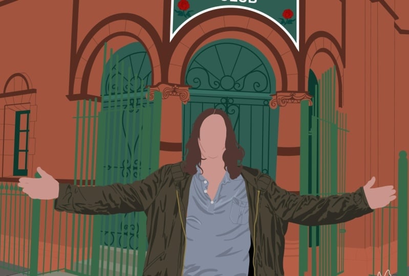
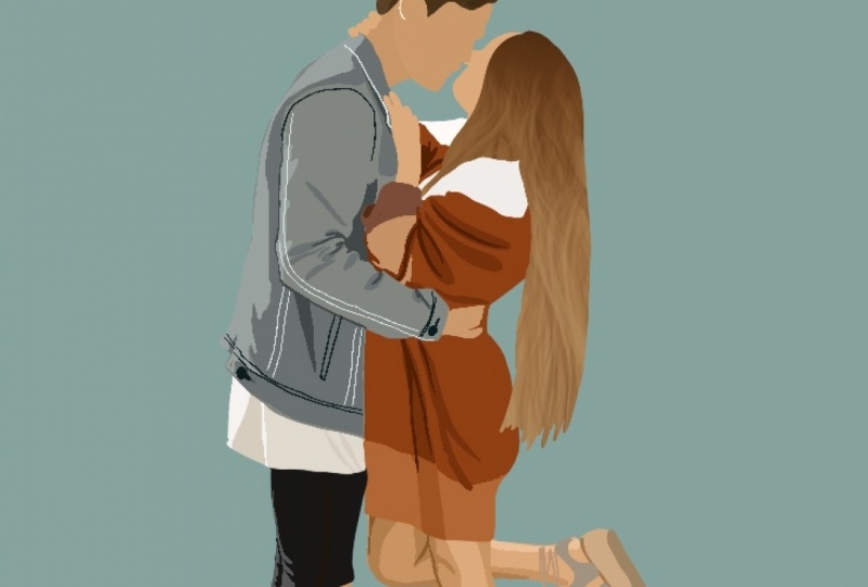
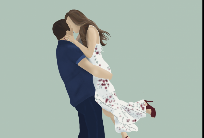
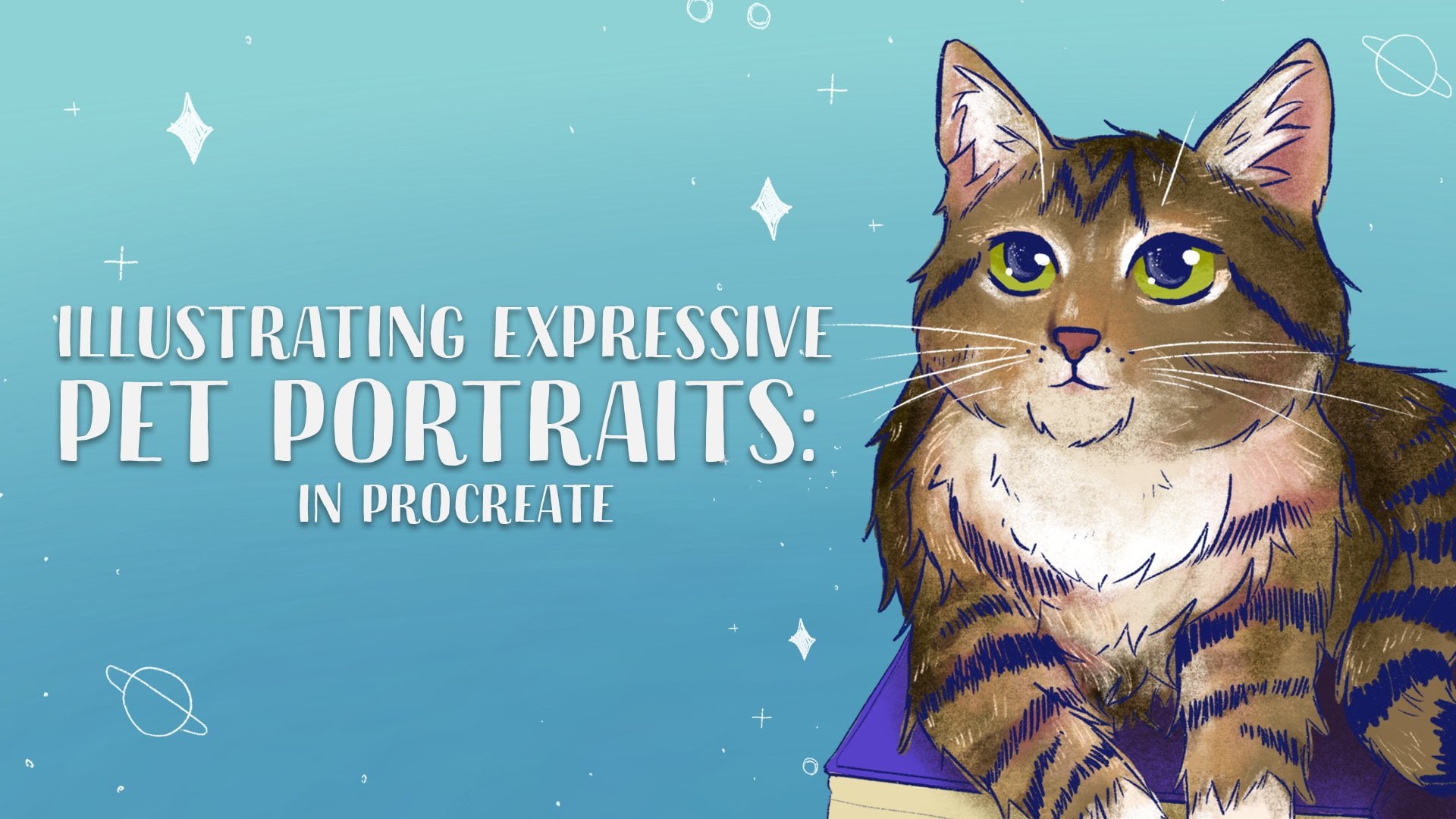
1. Introduction: Hi, I'm back and I'm an artist from Australia. I do artworks, illustrations, but I mostly focus on custom portraits. I loved her and coaches for people as it can be such a sentimental, unique gift that reminds them of a happy memory that they have. Today's clause will be focused just on the basics of creating a minimal digital portrait from start to finish will stop by laying the foundation colors before moving on to adding detail, texture, and depth. This is a simple, easy to follow guide for anyone at any skill level. You'll class project will be to draw your own Portrait using the techniques lending clause. You can download the image that I'm using in the class resource's folder. Most of all, I hope you have fun and learn something new. So let's get started.
2. Procreate 5 Basics: Now that we're in the procreate app, you can see this is your gallery and it shows you all of the different drawings that you've done. And if you go into the top right corner and press the plus button, it will take you to a new canvas and pressing the plus button just below. You can size at any size that you like. I'm gonna go with an eight by ten inch canvas as this is generally the size that customers would print this on. So I'm just gonna stick with that, but it doesn't really matter for this tutorial. So I'm just gonna stick with that and make sure the DPI is at 300. The color profile gives you a choice between RGB and CMYK. I'm going to select CMYK as if someone wanted to print this as, as the color profile that you will want for printing. Whereas RGB is more for display and on the screen. So keeping that as our settings. Then that's all you really need. And let's press Create case another we're in our canvas. I'm just gonna go over a couple of basics of procreate. If you're a total beginner, hea, if you already use procreate, that's totally fine. You can skip this tutorial, but let's just go over some of the tools that they have to offer. So in the top left section, if we click on the spanner icon, then we have add where you can insert any of your photos files or you can add text. We have the canvas where you can crop and resize the actual file size that you're working with. And has your drawing guide if you wanted to draw straight lines or there's different ways to do that. Can also add a reference photo or flip your canvas is also if you click Canvas information shows you what size you're working with, you can name it. You can also see your statistics at the bottom, which is really interesting. Next we have our share button, which is why you will export your image into different file formats. Next is the video. And if you have timelapse recording on, then procreate will automatically create a time-lapse of your drawing so you can see it from start to finish, which is really fun to watch back. So make sure you have that turned on. And you just have preferences of how you want your canvas or your brushes. And the help which is more about procreate. So going along the top, the next icon we have is a magic one type icon. And this is your adjustments way you can adjust each layer is saturation brightness, the colors that you have, you can blur a layer. You can use all kinds of different techniques to do different things to your drawings. Those are really fun to play around with, but we won't be using too many of those in the tutorial today. The next little f's icon is your transform tool. So next is the mouse pointer icon. And if you select this, it's not going to do anything because L is empty, so I'm just going to draw a circle really quick. If you hold that down and edit shaping a perfect circle. And now when I click the mouse pointer, I can move this around and I can reshape it. So that's really handy. K going over to the right. So we have our Brush selection, and this is just a library of all the different brushes that you can download or import. And I'm just gonna keep it basic today. Am I just going to be using the studio pen brush and the flowing hair brush. So I just wanted to keep it really simple for you guys today. And I've just put them in a category by themselves. But I think you can find the studio pen and the calligraphy section. And the head is in touch ups so you can find the flowing hand tool here. So if we go next, we have the smudge tool and I like to keep that on just one of the airbrushing, soft blend or medium blend brushes. And that will just allow you to kinda smudged out or blend your drawings. And the Erase tool I'm going to keep on studio pen as well. And this will just allow you to erase whatever you need to. Moving on to the latest, which is the next icon. So I've drawn the circle on layer one, and if I wanted to draw above it, then I would just create a new layer. And you can draw whatever you want without having to worry about it affecting the circle. And if you click this little tick or check mark on the side, then it will show your layer or it will hide it so that it can be really handy if you need to see something below. Now I'm just going to explain to you two different types of mosques that you can use that will be really helpful for the rest of this tutorial. So if you create a new layer and click on that, and on the side you can see it clipping mosque. So now that it has clipped, you can see this little arrow, it's clipped to the circle below. And now that if you draw, it will only draw in the cycle. But this still allows you to adjust to this individually. You can move it around, you can recolor it. It still easily able to be edited. But let's do something different. We're gonna go with an alpha lock this time. So if you click on just the layer itself and click alpha luck, it will basically do the same thing where you can only draw in the circle, but you can't move around without affecting the actual cycle that you've drawn on. So for that reason, I prefer to use clipping mosques of the alpha lock unless you are running out of space and you wanna keep it condensed to the one layer. So moving onto colors, if you click the little circle and you just see different ways that you can see and choose different colors. I generally keep it on classic, as it can see, a much bigger range of colors to choose from. So you can adjust the hue hea, and the saturation and the brightness levels with these. Now if you want to fill an entire space, instead of having to draw and cover the entire thing by yourself, you can actually drag this little cycle all the way to your canvas and it will fill it automatically. Now if you're wondering how I'm quickly undoing and redoing. If you tap with two fingers, it will undo. And if you tap with three fingers, it will redo the last thing that you droop. So that's a really quick shortcut if you are wanting to work nice and quickly. Another thing that you can do to choose a color is if I wanted this blue color again, I can actually hold down my finger and it will select the ALU. And then I can use that to draw. So that's just the basics that we might be using today. Obviously there's way more different techniques and tools that you can use, but that's all we really need to know for today if you're a beginner. And let's move on to the next lesson so we can get drawing.
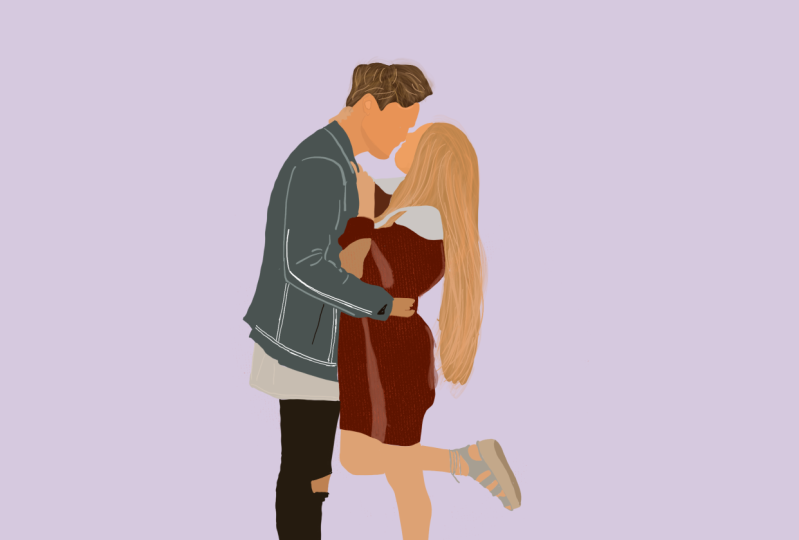
3. Laying the Foundation: So to begin our portrait today, we're just going to insert our photos that we can begin working. Gonna go back to the spanner tool in the top left, and we're going to add an inside a photo. Now you can just click and sort of photo and it will allow you to insert that. But what I like to do is swipe it to the left and ends on a private photo. And that way when you play back your video, you won't actually be able to see this reference image. You'll only be able to see what you've been drawing. So we're just going to size the absolute fits the Canvas. Don't worry about the whitespace, but don't worry about the whitespace at all. And let's get started drawing out base. So create a layer above that. We don't want to ruin the original image. And make sure you have the studio pencil acted. Now looking at this image, we are going to draw it layer by layer. So I'd like to start with what's on top and then continue to draw underneath until all of the layers are in place. When I'm worrying about details right now, we're just laying the basic foundation. So if you just call a select what you think looks like a good color for his hair. We can start there. Make sure you have a smaller brush size. I have mine on 9%. So each time and during a separate part of the portrait, I'm going to add a layer underneath and the skin. I mean, select a midtone around his cheek. If you choose something that's too dark, it's not gonna be accurate representation of what his skin color actually is. I like to do the face and the IAS and kinda Jolene altogether and then underneath of the neck, just a slightly darker color to create that separation. Now, I've just realized that her hand is actually a above his neck. As you can see, the I'm gonna go and create a layer above that. I'll select a different skin color. And just make sure I draw that over the top. Now I like to keep things organized. So what I'm gonna do now that I've finished with the guy, I am going to group them all together so I can keep it a little more organized and don't have so many lays open. So what I'm gonna do is start at the bottom and then the next one I'm going to swipe to the right. And it's going to slowly select each one. We have all of them. And I'm going to up the top, you can see group. So I'm going to group that together. Now I'm going to start in the Gulf and I'm just gonna do the same thing where I start with the layers above and work my way down. Now, even though her face is technically under her hair, I usually like to still do the face fast as make sure that I can keep a really nice smooth line and it won't get affected by the way that I've drawn the hair. So if you notice anything, you don't like the color of anything, you need to adjust it. Remember, a lot of photos might have filters on them or the lighting might not quite be right. So even if you are using the color picker tool to select it directly off the image, it's not always going to look at its best. So just going to change a couple of colors. I don't particularly like don't forget to group those leaves if you want easier organization. So I'm just going to just think his neck is a little too dark and I can adjust soft so they're little y. Okay, so that's looking good just for our base. Now we're gonna go to the next lesson where we add details to the hair and make it look a little bit more interesting.
4. Hair Details: Okay, so this is where the next brush comes in the following. We're gonna start with the guy actually, let's start with the studio pen and just kinda see what direction the Hare actually goes in. So if you just take that layer away, click on that layer and add a layer above it. We're just going to select one of the lighter highlights in his head. Or you can always just go to this color and select one that's a little brighter. So you can kinda see that his hair follows this kind of direction. Industrial these out so that when you use the hair tool, you know what direction to actually draw in. So we're not going to keep that layer, so don't worry if it looks a little messy. Let's create a layer above that again and go with the flowing hair tool. So just kind of a medium-sized, maybe that size 15. Who's going to follow those lines that we just created? Noise, go with lighter color. Keep adding some highlights until it looks good. It's looking a little yellow. So i might actually go into the magic wand adjustment tool. Let's go hue saturation and brightness. Click on land and then I can just D saturate that. So that's not so yellow. And also just the brightness and see what looks good to you. Right. Now that we're done with that, let's delete the label of x. We don't want those lines in there. And we're going to create a clipping mask. So click on that and then clip it to the bottom layers. And now that his hair is done has a little more texture, it looks good. It's still not too happy with that color. So I'm just going to adjust the saturation again and just draw some lines that show us the direction of the hair is going in. If you need to hide some abl is you can't, if you can't quite see cases selecting some of the highlights. Now if you like this style, then you can just leave it like that. Some people like to do it, but I just prefer the actual detail that the flowing hair brush allows you to create and get just gives a little extra detail. Now she actually has darker hair on top. So I'm gonna go underneath this layer that I'm drawing with a darker color. And still with the hair brush. Just kind of blend that in. So now that I have the colors that I like, I'm going to get rid of that original line layer and just clip the hair tools in. Now I don't like the look that I drew, the Dhaka hailing, but you can still see that the base is quite light. So if you want to change that, you can just go back to the studio tool, create a layer just above the original base color. And let's just draw that in a little Dhaka. And we can use as much tool to kind of blend that out. You can do the same if you want to add highlights on the bottom as well. Thank you playing around until it looks good. Okay, I'm happiest that, so that is a head on. Let's go into the next lesson where we add clothing details. Make sure you turn each layer back on so you can see them.
5. Clothing Details: Okay, we're going to go down to each layer and add in the details that we would like. So I'm going to keep them quite a minimal styles and organized the faces n. But let's go to his jacket and see what Lee as we can and see what kind of details we can add to that. So I'm just going to hide the Gulf and now and hide his jacket so you can add the details on top. So again, I'd like to select that colour and go a little bit darker. The details and adult layer above that. Using the studio Penn, I'm just going to draw out some of the lines that can create a bit of shadow and detail. You don't have to go over every single line. But just the ones I can just show you. Maybe some of the seams or the shadows or the creases that are being created. So with denim, it's not always going to be in a darker shade. A lot of these seams are actually a lighter color. So I can go much lighter. It looks go a light grey. And we're gonna create a new leaf that, so I don't need to touch the blue. Draw some of those seams. And now not worrying too much about going out of the lines because I'm just going to clip them to the originally anyway. And if you notice any details that you haven't done yet, you can just add those into. So I'm going to, I'm going to actually going to change those white lines to undying. So I'm going to hold that and then drag it underneath the blue. And I'm going to clip both of those to a jacket itself. If you want to add a little extra detail, let's add you're gonna add a little extra detail because it doesn't. Because datums not quite as flat as this is looking right now. You can go down to the jacket, Leah and add a layer above that. And let's just add some white or some lighter highlights to give it a bit more of a denim feel. So I'm not doing anything too fancy. Usually I'd use a different brush for this, but keep it simple. I'm going to use the same brush and I'm just gonna blend it out. And that just gives it a little bit of a washed look. Identity has. So moving on, let's go down Aliyah. And we'll do the same thing. So adding a layer of the shot and then hiding the Chatelier's so we can actually see the details. Just gonna add a couple lines to show that this increases and just add a little definition, maybe a bit of a shadow. Then we'll just clip it and move on. So you can do that for each layer that you've created. Just go down and create some simple line. And just create a simple line details into sections. We're not going to be doing any shading or anything like that yet. So just focus on the lines themself. I'm actually gonna show you a really nice texture tool because she does have kind of a knit sweater and there is a really good brush that kind of does this automatically for you so you don't have to draw each line. So if we go down two textures, is this one called talking. That's how you pronounce it by if you select that brush and then go with a slightly lighter color, create layer above the sweater itself. And you can just bursa in. And it gives this really nice sweat a texture. Clip it. And there you have it. So now you can add the detailed lines, but you have this nice sweater line in it to begin with. Now if you feel like maybe the highlights you did were a little too strong, you can always use two fingers and tap on that layer. And this will bring up your opacity sliders. You can slide this up and down and kinda just the shadows that way. Okay, so now we are kind of done with the clothing details. Now I like this style and I would generally leave a portrait at this. But if you wanna take it to the next level of detail and depth, and we're going to go onto the next lesson which is about shading.
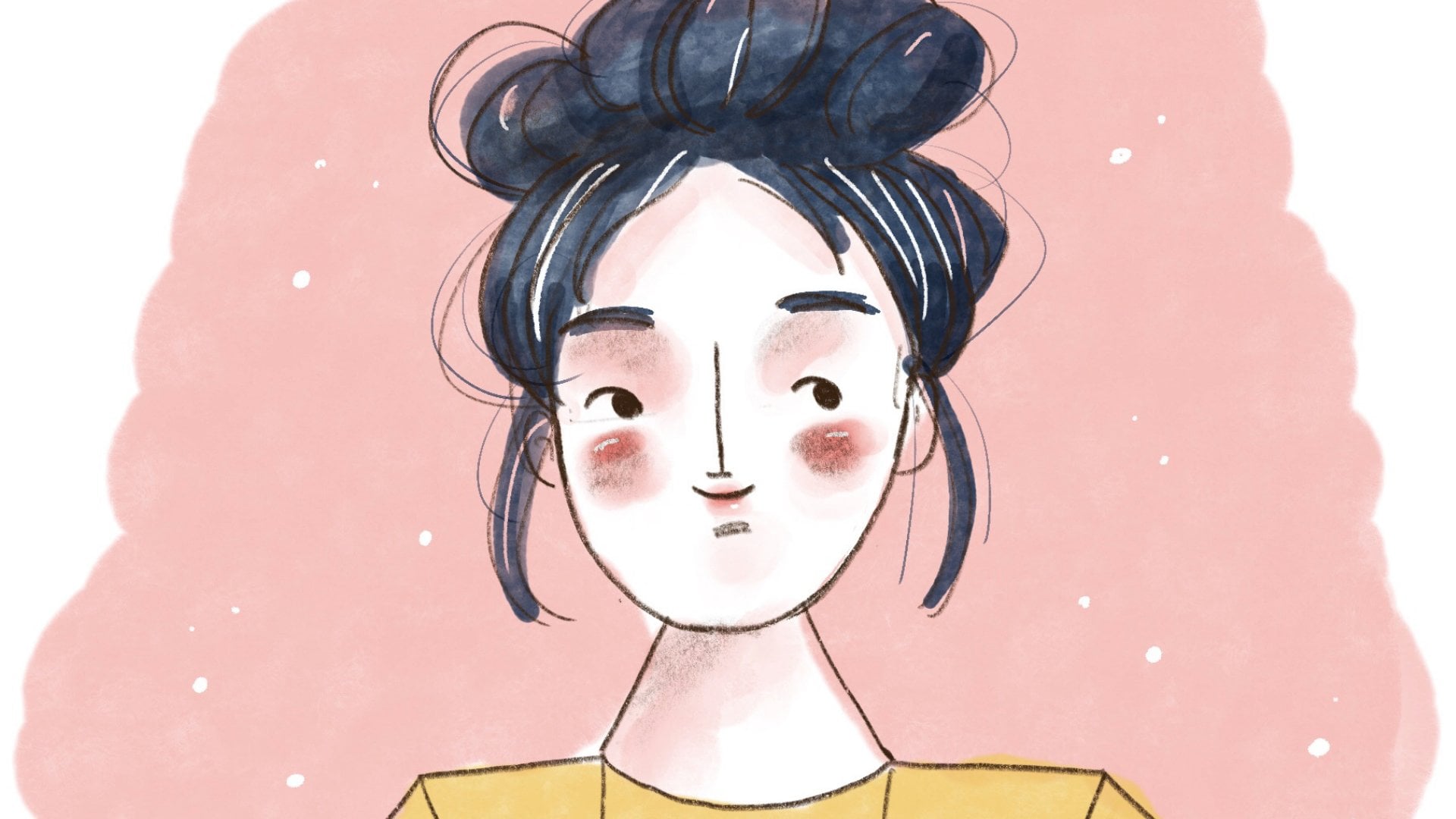
6. Adding Depth: Okay, so let's look at shading. Start with his face, select his face color, and then do a layer above that. Now you can just do kinda like a block Callaway. You literally just draw out the different shadows that you see going to hide the neck. And kinda just leave it at that. That's its own style. That's totally fine if that's what you want to go for. Not too much detail. Well, it's not really dark enough, so I'm gonna adjust the brightness so you can see it. Now if you make that a clipping mask and make sure kinda make it a little smoother so you can do that. That's fine. But I don't really prefer the look of the block. We prefer the look of the block shading. So you can also just smudge it, kinda raises too much, just don't really like the look of this either and adds a lot more work. So if you want to kind of just blurt out and feather out the edges yourself, you can just go to the adjustment Gaussian Blur and pick that Leah and slide it and it will blur it for you and kind of feather up the edges. So I find that a lot easier than smudging. And then if you want to adjust anything specific, you can go ahead and smudge from there. But which can do that for each layer. And it just creates a nice layer of depth and dimension to your drawing without looking too realistic. So we're just gonna keep going down and adding in and adding in the shading. Choosing a dark color, having a layer above, and just kinda drawing in whether shadows fall. Make sure it is clipped. And then you blurt out and smudge anything you don't quite like are going to keep going down. Do this for every LEA. Now if you find you're getting too many layers, you can always combine them. By pinching them together. Can match those details. But obviously you won't be able to change the shadows by themself as they are now combined into this same layer. But if you don't like working with so many layers, then that's fine. Now if you want to create some shadows that you feel like are going to be in the way of your details. Then you can always reduce the opacity of that. And make them a lot less subtle, almost like a shadow just being cost on it. Now same thing works. It highlights if you don't want to shadow, but you just want to add a little bit of extra light where the light would be hitting, then you can do that as well. So on the back of this shoe, I'm just going to add a slightly lighter colleagues. I'm happy with the color of the shirt on a shallow to it. Can I create a lighter color where the sun is hitting it? And it kind of has the same effect. Ie. Ok. So now we have our finished portrait with little bit of detail in shading. I saw it to keep mine quite light and minimal, but you can always go heavier on the shading. Just depends what kinda look you're going for. Like to finish with a nice background color that makes it kinda stand out. And there we have it. Anyone can do this. Stylus is very beginner friendly, but this is just the basics of how to create these minimal digital portraits.
7. Bonus: Export Timelapse: I just thought I would teach you how to export this as time of CDO as it can be really fun to watch back you're drawing. Now, obviously man will have kind of the techniques and tips and things that I drew at the beginning, but yours should just be your portrait. And hopefully you inserted your photo as a private photos so that doesn't show up in the background. So if we click on the spinner and then go to video, hopefully your timelapse recording is turned on and if you wanted to watch it, you can click time-lapse replay. And this will just show you how you drew your video from start to finish and you share that with your friends or your family. It's just really fun to watch back and see the progress. And you can watch it in full or you can swipe with your finger and go through it much quicker or even backwards. So that's just fun little bonus. If you want to see your work, you can do this with any of your drawings, illustrations, portraits, anything like this that you create on procreate. So then if we go back and click Done, Go back to the video. We can export time-lapse video. And you can choose to cut it down to 30 seconds or full length. And you can always upload that to a program of your choice to shorten it or speed it up even further if you like. Once a exports, you can just save it to your video or post directly to social media.
8. Class Project: Now that you've created your own minimal digital portrait, you can expose so many different ways and styles of presenting them. Stay tuned if you'd like to learn even more about adding to your portraits, detailed clothing, faces, and backgrounds. These classes will be coming soon as this class project, I'm so excited to see what you have to share below. And please feel free to share feedback as this was my first class and I've minimal classes I would love to share with you. I hope you had fun. Thank you for watching and drawing with me.
 Bec Wasserberg