Transcripts
1. Introduction: Hi, Angie and I,
motion designer. In this class, I want
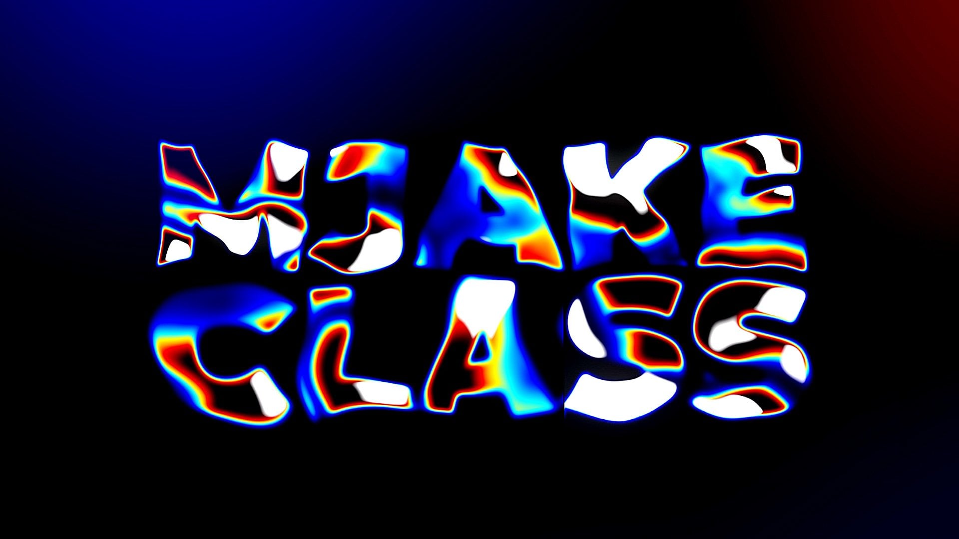
to show you how to create liquid glitch
text animation. This project is approved
for sale on the biggest After Effects templates
markets in the world, which is Video Hive
and Envato elements. So this is how you know that these techniques are up-to-date. Best part of this place is dead. It's paint towards
the beginners. It's okay. If you've never opened
After Effects, before, you can just download
free trial version from Adobe website
and get started. I'll start with the basics. So you would be comfortable
in using tools. And gradually I'll move towards advanced
stuff of gradient, this After Effects template. I'll show you a few
tips and tricks on how to achieve a lipid
like lychee effect. Then we will create unique
3D looking less Effects. I'll show you how to
create custom light leaks using built-in tools in
Adobe After Effects, as well as how to create
easiest particles affects which doesn't
require any plugins. And finally, we will apply
glycine transitions, a really cool setup to create Chrome looking material inside
of Adobe After Effects. All these steps will
help you learn more about liquid glitchy
logo animation. You can always ask questions
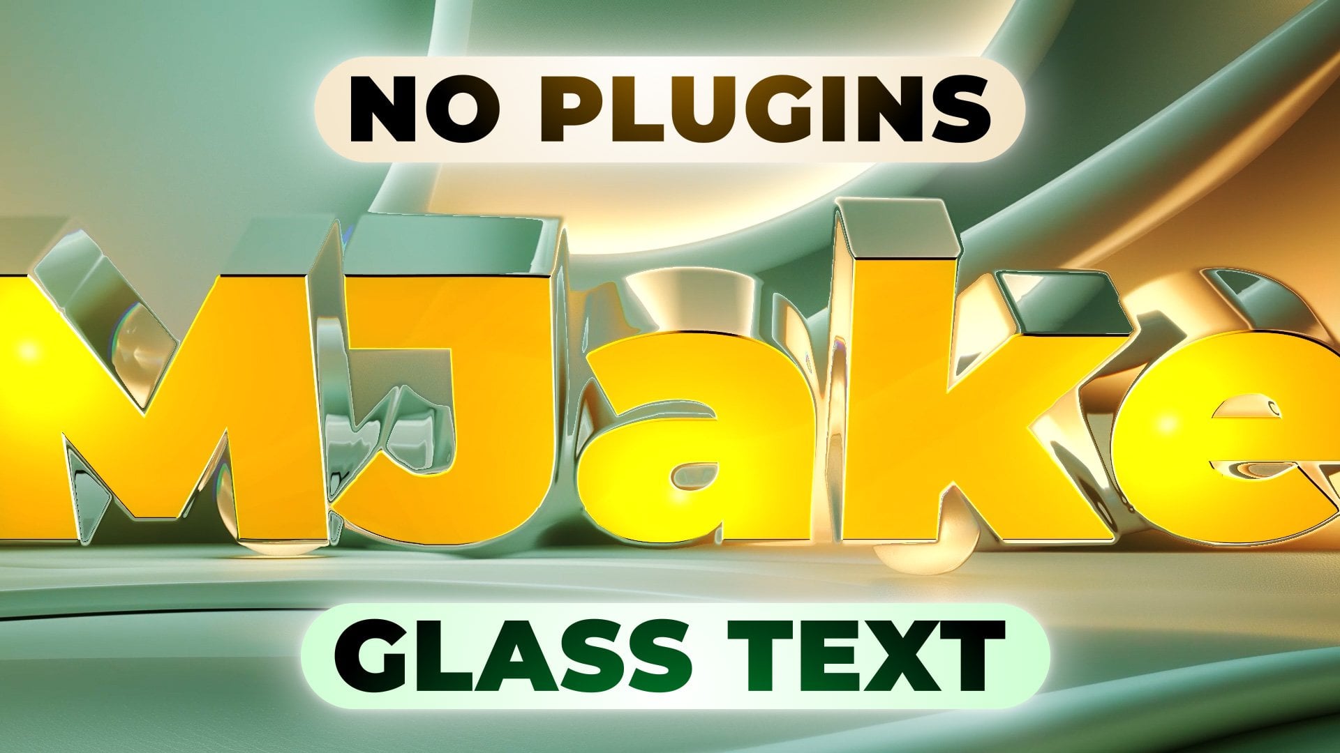
on any parts of this class. I'll be happy to answer. For the class project, you will be creating
this logo animation. Feel free to follow me
here on Skillshare. I post Adobe After Effects
classes every week. And now, let's get started.
2. Basics of Text Animation: First of all, let's
set up our interface. You can click here to the standard layout
and you should be able to see the same panels which you can see on
my screen right now. By the way, if you cannot
see some of the panels which you can see on my
screen, for example, this character, you
can go to Window and enable it from here,
character, character. In this class, I want
to share with you my thought process
while creating these kinds of logo reveals. First of all, we need to
create new composition. We can click here to
create new composition, or click on this icon here. Also to create new composition.
I'm going to click here. Let's name it text. Let's change the
full HD resolution, which is 1920 by 108030
frames per second. Worst. Great. And here we
can set our iteration. Here's our frames,
Here's our seconds, minutes and hours for
this logo reveal. I think eight seconds
will be enough. So let's set to eight
seconds and maybe 0 frames. I click. Okay. First thing we want to create is our text degree, the text. You need to choose
this type tool, leftmost click and drag
to create this text box. And here we can type our text. I'm going to type
smooth because we are going to create
smooth logger review. By the way, the
cool shortcut for this anchor point to
be in the center of our text is to press
Control Alt Home. As you can see, it's
jumped to the center. Basically, the anchor point is the point from which
animation is repeated. So for example, if
I'm going to press R, You can see that it's
rotating from the center. Because I've said this
anchor point in the center. If I'm going to change it here, you can see that it's
rotating from this point. Let's press Control Alt Home. It will be in center. Now let's select
the Selection Tool. Now I want to make my text bigger here in character panel. Once again, if you
cannot see the spinal, you can go to Window and
enable it from here character. And let's change our
fonts to Montserrat. I'm using Montserrat,
but you can use any font which you want. This is a free font
and it will be available in resource
step to this class. So I'm gonna go with Montserrat Black and I am
going to make it a lot bigger, or maybe let's not go too big. I'm going to set mine to 150. Once again, I'm gonna set this anchor point to the middle, which is Control Alt Home. And if you want to set your text in the
middle of the screen, you want to go to Align panel, which also you can
enable it from here. So let's click here
horizontally and vertically. Now it's perfectly in the
center and we can animate it. But as you remember
from previous video, I want to cover with my text entire screen
at the beginning. So let's make this text
a little bit bigger, like this smooth text. Whereas S to C, our scale. So let's set it to maybe 255. Maybe let's go with
the lowercase. I want to change it to maybe
not black, but to bold. It will be exactly how
you see in the preview. By the way, here we can
change the tracking. It would be a bit closer
and nicer looking. Let's set up the
middle with using this Align panel and Control Alt Home to set
it to the middle. So basically, any logo
animation or texts animation could be animated
by these properties, which is position, orientation,
scale, and opacity. By the way, to bring
up these properties, you want to select your layer, press P to bring up
position, for example, then hold Shift and
press S for scale, R for rotation and
T for opacity. Basically, we could animate it really big to really small. And this way we would
have this zooming effect. We could go with the scale
rotation if we would want. Combine these both
animations or opacity, which is quite boring. In our case, I want to
animate with the position. By the way, it's a good idea
to set prerogative to middle and then align to the
center like this. We've said paragraph to
the metal in case if we want to change
to any other text, it will stay at the
middle at all times. So make sure that you have set your prior f to the middle, enable it progress from here, and set it to the middle. Let's apply animation,
which goes from bottom to the center of our screen
to animate our text. We want to press P,
select your layer, press P to C position, and click on this stopwatch. It will create this keyframe. What is key-frame? Key-frame is basically this point in time, we should remember is the
value of this property. We've saved this position
at this moment in time. And now if we will set this
time course of the beginning, which is here, we can
change these values. First value is X axis. If we will change it, you can see that I'm moving in x-axis and we can press
Control Z to undo this. And this second one is y-value. So as you can see,
as I'm changing, it goes up and down. Let's change the second value until this text will disappear. Just like this. And now as you can see, it automatically created
this keyframe. So basically when you create
in your first keyframe, second one, it being
created automatically. So make sure that you
didn't create panic. You frames in-between like this. But if you've created
anymore keyframes, you can just select
them and press Delete. So in our case, we want to
left with two keyframes. First one, which is
here down below, and the second keyframe
is right in the middle. And now After
Effects is trying to connect these both values. And now if I'm gonna scroll
with my time cursor, you can see that it goes from
first value, second value. This is the basics
of the animation. We can approve this animation, we can select this keyframe
and go to the graph editor. Just click here and make sure to click here and check if
you are in speed graph. Because I want to
manipulate dispute. At this point, you can
see that our speed is linear and it's not that
much interesting to watch. So for example, if I'm gonna cut this work in area
to this moment, we can press 0 or numpad
to see the preview. You can see it's
pretty boring motion. But with this graph editor, we can select this keyframe
and drag by this handle, click and drag to the
left while holding it, and drag it down to this baseline until it
will light up orange. Just like this. With this graph, we are showing to the software
that we want to have this really fast moment at the start and slower
till the end. So now if I'm going
to press 0 numpad, you can see that we have a lot
more interested in motion. Let's go out from graph
editor by clicking here. And let's add
secondary animation. Basically, I want from
this moment in time, about from 20th frame. As you can see, we can select our layer and click
S to C scale. We can create a keyframe to the scale by clicking
on the stopwatch. And about here by the end. We can change the scale,
for example, 225. In this way, we've added this secondary animation
of zooming out. It would look even
more interesting. And now we can tweak
these keyframes as well. This time we would not
go to graph editor. We can just select these both
keyframes by clicking here. And hold and drag, leftmost here, and
hold and drag. And this way you can select
both of these keyframes. Press F9 on keyboard. It will switch these keyframes
to the smooth motion. Basically, it means
that from this point, it will start slower than
faster and slower. At the end. If we will go to graph editor, we can see this kind of motion. Slower, faster, slower. So this how you can easy
ease these keyframes, which means that it
will go slower than faster in the middle and
slower towards the end. By the way, if you're going
to have any questions about this class or
any of my classes. You can just ask me in the
comments to any of my classes. I'll try to answer your
questions as fast as a cam. Okay, so now let's
press 0 or numpad. We have these both animations. This great, But we can add even more interested
in animation to our text if we will
click here to close it, and let's click once again, we can open all the properties
which has text layer. So as you can see in transform, we already added position
and scale animation. We can close it for now. And we can go to the text. Here you can see
this word animate. If you will click on this
arrow and choose position. We've applied animator. And basically with
this animator, we can animate each character, which is much more interested in than animated the whole layer. So let's open this
range selector. And the best way to
animate characters is to animate not by start
position and end position, but by using offset. So for example, if you want
to animate each character, you would need to change
this position values, which as you can see, is inside of this animator. So once again, we
have both values. We can change it in X axis and let's change
and y-axis as well. So I'm going to set here
below as we did before. But now if I'm going to
change the start percentage, you'll see that it's
animated like this, and this is basically animation, but it doesn't really look good. For example, if I'm gonna
set a keyframe to the start, the landscape you
frames and set to 100%. We would get this simple kind of animation and it doesn't
look really professional, and we can improve this. So let me show you how you
can improve this animation. First of all, let's
delete these keyframes. You can just select
these keyframes, temporaries delete, or simply by clicking on this stopwatch. It also will delete keyframes. Make sure that your start is
at 0% because it's standard. And we would want to
change offset because with the offset we can do a lot more professional
looking animation. You would need to click
here to create a keyframe. And change this
offset to minus 100. Then skip a few frames and change this from
minus 100 to 100. And as you can see, it doesn't
really work as we want. But if you will go to advanced, this is where you can get
the professional look. So let's click here and
change the shape to ramp up. And in this way, you
can already see that these characters animated
almost together, which really looks smaller. But we can increase
this look even more just by changing
these both values. So for example, if you
will change this is high to 100 and press 0
numpad to preview this, you can see that we have this
kind of stumping motion. And sometimes it could
work for your projects. But in our case, I want to
have opposite of death. I want to have fast moment at the start and slower at the end. To get the opposite effect, we need just to change this
value to minus 100 LS. Press 0 numpad to
see the preview. As you can see now it looks much more smooth
and professional. This is basically
how you can increase the look of your text animation. And finally, you can always
select this last keyframe, the offset, and press F9 to
make it even more smooth. So let's press 0
number to see result. And as you can see,
it's really cool. But let's time it well with our animation
which we already have, we can select these
both key frames and set it to the
beginning like this. And to make this animation of the characters a bit slower, we can just select this
second keyframe of the offset and move
it to the right. As you can see, it slows
down the animation. Let's set this
keyframe about here, which is second, second 21
frame and press 0 numbered. And as you can see, we have
this really smooth animation, which is exactly what we want. And finally, in this video, I want to add some
colors to this text. Simplest way is to
select your text and go here and change to
whichever color you want. But in my case, I wanted
to have a bit of gradient. So it would look
more interesting. And for this, we
can click here to Effects and Presets.
Let's click here. You can see you need
to wait first time, it's takes some time to load up. Here basically, we can type any effects which
you want to apply. In my case, I want to
add gradient effect. So let's type it gradient. Let's pick this
generate Gradient Ramp, left mouse click and hold, and drag it here and release it. Now as you can
see, we've applied a gradient from two colors, which is black and white. And these points are representing
where these colors are. So for example, I can select my Gradient Ramp and click
here to change this point. By changing this second value is you can see I'm
changing this point. I'm going to say that
lower about here, and this one higher about here. And let's click on each of
the colors to change it. In my case, I wanted to
change to yellow color here on top and click OK. And
click here on this black one. Let's change to orange to get this look
angle, Let's click. Okay. And let's also
save our project because Adobe After Effects
can crash from time to time. So let's go to File, Save As, and save it wherever
you want on your computer. And what is cool about
this project is that we can create now a new
composition by clicking here. Let's call it main,
and let's click OK. And now we can track
this text composition into our main composition. What is cool about this is
that if we will go into apply NFS to this composition
decks composition, for example, let's apply
some turbulence displays like this and change some value. What is cool about
this that we can always open these
texts composition. Let's left mouse
double-click here, or also in the project panel here to open this
tax composition. And we can just change this
text to any other texts. For example, like this and
go to main composition. Let's set it here. And as you can see, all the effects we are going to
apply to this composition will apply to any text which you will add here in the
texts deposition. So this is basically how
you can create templates. Let's delete this effect because we don't need
displacement for now. Okay, so on the next
video we are going to apply this cool-looking effect. See you in the next video.
3. Straching Effect: So now we've created our text. First of all, I want to
add this kind of glitchy kind of motion wish you could see in the preview
to this class. So first thing which I've
added is CC scale wipe. So let's go to
effects and presets. Here we can type CC scale, wipe and just left mouse click and drag on this
test composition. Let me show you how
this effect worse. Basically, with this stretch, you can change how much it stretches, which is
self-explanatory. Let's stretch it a bit. Maybe let's set to 5.3. And by changing these values
of the center, once again, first value is x-axis and
second value is y-axis. Anybody changed at
this first value? We can actually animate
each of the letters. Now by changing this value, you can see that we don't get
the effect which we want. So this is why we need to
change also direction. So let's rotate this direction by clicking here and
dragging to the right. And also you can see
if I'm changing here is about 200 degrees. We can actually now animate this effect of the center and
get this stretching motion. So let's start animating this
motion from left to right. So let's set this time cursor
about here to see our text. Let's change the
center to the point where it's not
affecting our tests. Now let's create our first
keyframe by clicking here on this stopwatch
leftmost flick, it will create a new keyframe. And to see it, we can click here and click
here to open effects. And here, and now we
can see our keyframe. But we have a cool
shortcut for this. So for example, if it was closed like this,
select our layer. We can just press U on keyboard. As you can see, I'm
pressing U and it will show all the keyframes
which we have on the layer. And let's move this first
keyframe to the beginning, the way you can press
and hold Shift, and it will stick to the
beginning of this layer. And about here, the fifth, second and maybe 11 frame, we can change this first value. Let's run it across like this. We can set it to 2050. So it will go across like this. Let's see our animation. When I'm clicking on this
time coarser and holding it, I can see my animation.
At this point. It's too confusing
because we have both animations of this text, this animation, animation
of this scale wipe. This is why I want to set this animation to be about here. At the end, where this
text animation doesn't really have any animation
to mess up our work. Now we can see only the
animation of this scale WIP, which is much easier
to work with. We have this stretching motion which we want to have
at the beginning, but it removes all of these
characters from our screen. Let's change this direction and run into grass this animation. You can see that we are
getting the better result. In the next video, we
are going to apply this glitchy kind of effect. See you in the next video.
4. Glitch Colors: So now let's apply the
chromatic aberration effect. But first of all, let's change this keyframe here
at the beginning. This second one, Let's set it about here at the fifth second. Let's say this keyframe
and press F9 on keyboards to make it
slower until the end. And let's go to the graph editor and click and drag
by this handle. So once again, to get this first movement at the start and slower
here are the young. And basically with
this graph editor, you can control how long the
stretching part will take professor on MP3s to pivot
this. It looks pretty cool. Let's go out from
this graph editor. And let's close it here and
go to effects and presets. And let's type VR
chromatic aberrations. If you will tie V or
C, you will see this. We are rheumatic aberrations
and let's click on it, hold and drag it to
this text layer. Now as you can see, we've added this chromatic aberration. What is cool about this effect? This, you can combine any
kind of shifting of the red, green, and blue channels. In my case, I've set this red to ten to shift the red channel is you can see it towards us. And this blue channel, I've shifted to minus ten, so it will go back. It's better to use it
on the white text. So let's make it white. Let's go to effects and
presets and type fill. And so they just fill effect. And let's set it here
at the beginning. And let's change
it to the white. By the way, you can scroll
with the wheel on the mouse to zoom in or zoom
out into your window. And you can see we've
already added this, pushing the blue channel
to minus ten and red channel to turn to
bring it up closer to us. Basically, you can
play around with these values, idiom, new values. You can get different
kinds of shifting. By the way, with this
follow-up distance, we can increase this
kind of effect. In my original example, I've set it to 82, which is much more
pronounced 82 to see it. Let's zoom out from this window
to we'll press 0 numbers. You can see that we
have this pretty cool liquid motion
at the beginning. By the way, we can open this texts composition
press S on keyboard, and maybe make it even bigger. Here at the beginning. Let's go to main. And now as you can see, we even more exaggerated in this effect. And then it scales down. And also we can go to Text
composition, select the scale, press S on keyboard
once again to see our scale so that
this last keyframe, Let's make this animation
also a bit more visible by dragging this
handle to the left. So it will be faster and slower. Towards the end. Let us go back to the main, whereas 0 numbers. And now we can see the
zoom-out effect even better. So at this point we have
this pretty cool effect. But I thought that
I would want to add more thickness to our text. And one of the ways to do
this is to apply echo effect. So let's try to apply echo
effect and see how it works. So let's type your Echo
and effects and presets. Click on it and drag
it to our text layer. If we will scroll through, basically it creates
a bunch of echoes. If we will change this
number of echo effects, you will see that it creates a bunch of copies of this text. And just by setting
this number to one, we already adding one
instance of this text. And if we will change
this echo operator to composite in France, it will set our original copy on top of other echo effects. So if we had multiple of them, you can see that we could
create this really cool effect. And by the way, you
can play around with these echo operators to get
different kinds of results. You can get really
interesting results, as you can see you. But I thought it looks pretty nice and composite in front. So I've set it to composite influent to get this
pretty cool result. And as you can see
what this echo effect, we are getting much
more colorful way of this chromatic aberrations. And if it will zoom in, we can see this kind of repeating copies of our
tests and these edges. In some ways, you would want
to have this kind of effect. But I thought that I want to
blend these copies together. And in order to do this, I would go to effects and
presets and type Gaussian Blur, which basically adds
a simplest possible. Let's select this
guy, the Ambler, and set it before echo effect and after
chromatic aberration effects. And let's change this
blurriness to 20. Now, as you can see,
we have our blade in this effect even more. And here at the beginning, I want to create this key
frame to blurriness and about here where this
animation is about. And I'll set this
blurriness to 0. Basically, as you can
see with this blur, I want to blur these
colors a bit better. And if I'm going to press U on keyboard to see
this Gaussian Blur. I can select these
both keyframes. Press F9 on keyboard. My case I want to change
this first keyframe to here. So it will stay blurrier
a bit more time. And here towards the end, it will become more clear. At this point, I think
this blur effect are worth spreading goods to blend the
colors as you can see it. But I've lost the
crispiness of these edges. And to face this, I want to add curves
effect. Let's type it here. Curves leftmost click, hold and drag here under the Gaussian
blur and release it. With this gross
effect, we can get these edges to be more crisp. Let's change this
channel to alpha. And if we will
change this curve, alpha curve, we can just
click on this curve, leftmost click and drag here and add another point and
make it shape like this. You can see that we've added
this more crispier curve. Analysts enabled and disabled
to see before and after. And you can see that we've still have this blending colors, but now our picture
is not that blurry, which helps with our effect. Finally, I would want to disabled this chromatic
aberration effect at the end. About here. Maybe at
first, second 16 frame. Let's create a keyframe is for
our red and blue channels, because we've changed
it to minus 1010. Let's create a keyframe
here. And here. If you would change
a green channel, you would also would want to
create a keyframe for it. And now we've created a
keyframe for these channels. On the first second, let us go to maybe the
fourth second link here and set it to 0. So basically we will go to
original colors like this. If we will press U on keyboard. And let's press one
more time to see these keyframes of aberrations, we can select all
of these keyframes, press F9 to make it
smoother animation. And let's change on this
work area to about here, just by clicking on
this edge and changes here and press 0 number
to see what we have. Okay, so at this point we have this pretty cool animation, but now it looks like we
have too much echo effects. We want to add this kind
of thickness to the text, but not so visible. We want to keep our
animation subtle. So let's go to the
echo effect and let's change this number of
echoes just to one. Basically if we will
enable and disable, you can see that we've
implying some of thickness, but we don't overdo it. So basically our viewer
will get this hint. This is 3D dimensional test, but at same time
we gave it settle. Because the next videos, I'm going to show
you how you can create this kind of thickness, these letters without this kind of really visible trailing. In the next video,
we are going to apply this kind of effect. As you can see we've added
in this lawsuit effect, but it's much more interesting
and much more reflective. Then if we would use just
this simple echo effect and this technique I'm
going to show you in the next video. See
you next video.
5. Glossy Reflections: So at this time we have
this really cool animation. Now let's apply this lychee
effect, which I promised. So for this we can close it here and we can duplicate
this text layer. To duplicate this text layer, you can just select it
and press Control D to duplicate it or go
to Edit, Duplicate. And with this copy below, we can apply more
effects to this. Basically to get this
kind of 3D effect, we would want to use an
effect called CC glass. So let's dive here and
effects in presets CC glass analyst drag it to this
layer below to apply it. And here and surface we can open it and tweak these values. As you can see, it already
added some kind of effect. But it's not really
what we want. First of all, to see
this effect better, we can set this curves here to reset and change
the shell to RGB. And let's make it a
lot darker like this. Now let's work with
this CC glass effect. Let's try to change
the softness. You can always play around with the values in the upper effects. Don't be afraid to mess up anything because you can always press Control Z to undo
any of your steps. For example, if I'm gonna set
this to really high-value, you can see that we
are getting somewhere, but let's try
different combinations of these three values. For example, if I am
going to set this to ten and height two, really big value like 60. We can see that we are applying
more displacement on RFA. So let's decrease
this displacement and set it may be 250. And to see better how this
cc less effect works, we want to increase
the number of echoes. So let's go with the three. Basically we've added
a bit more echoes. And maybe let's disable this, the next layer on top to see better what
we're working on. As you can see, it's
a bit too bright. So let's go to the
fill wishes color of our text and make
it not so bright. So I'm going to set
this brightness to maybe 92 and click Okay. And let's open this
cc less effect and let us go to the light. And here let us set
light height, so 86. And this time we want to select this text layer and press U. Let's move this blurriness. It will happened a bit later. Our, this reflection
will be more blurry and better looking. Let's make sure that
this blurriness will go from some time like this. By the way, the order of
these effects really matter. So for example, if I would want to get different
kinds of results, we can always
change the order of these effects to see what
kind of results we can get. For example, I want to swap up this echo effect with
this course effect. Let's try to change the order and set this
echo effect before curves and take a look at
this part of this text. So let's set it here
on top the curves. And as you can see, it
blends even better. So from time to time, you can always swap
these effects around. If you want to see what
kind of results you can get inside of
Adobe After Effects. And at this point I want just to animate this height value, which basically worst amount
of this effect applied. For example, here at
the first second, I can set a keyframe for height. By clicking on this stopwatch, we can set it to 100. And about here are
the three seconds. We can change this height to 0. Basically, we would have
this CC glass effect. And at the end of
this animation, it will return to normal. And let me show you another
cool trick which you can do. You can set your
cursor about here. We can actually push
up this glass effect. So to do this, we can go
to effects and presets and type here effect
called bulge. Let's set this bulge effect just here after a
scale wipe effect. And basically this
bullshit effect, if we will increase this radius, electro 400 and a vertical
radius to maybe 380. You can see that this is
basically the circular effect, which is pushes our image
from the center outwards. And if we will change
this bulge height, you can see how
this effect works. It basically pushes result. If we will set this bulge
height maximum value, which is four, and
change this tape radius. So maybe 330. Basically, by changing
this bulge center, we can push this cc
less effect up or down. So by changing this second
value of voltage center, you can see how we
are starting to push this effect up like this. And it will order to this
kind of glitch to work. Basically, you need to set to a really small value just
to apply this effect. So for example, with the 0, it will not do anything. But if you will set
to 0.1 like this, you can see that we already can. Move this CC glass effect. Now if you enable
this text above. So let's select this
text below. Go to bulge. And basically you can even exaggerated something like this. So maybe I'm going
to set mine to 150. And now let's press your
numpad to see our preview. At this point, it
will take some time because we are working
in full resolution. We've applying a
bunch of the effects. Now you can see that
we've applied to this really cool effect, which gives this
kind of reflection. And with this voltage, right, we can kind of push it down. Let's set it to four. And as you can see, we
kind of pushing down this reflection and with the combination of
this bulge height to four and pushing up
with the Bulge Center, we can get this
really cool result. By the way, we can
just select this text below and we can press Enter
on keyboard to rename it. Now let us keep this organized
and call it glass effect. Or maybe it just takes less. By the way, we can
press P on the keyboard to see our position and
move it a bit lower. I'm going to set mine to 560. And in this way, as you can see, I'm adding this kind of
thickness to our effect. And by the way, you
can select this takes less press Control
D to duplicate it, set it above, and
set it to Screen. Which basically will apply only highlights of this effect. If we will press P on keyboard and set this to
original position, which is 540, we will set this last
effect back to normal. And with the combination
of these both less effect, we are grading this
less reflection. And as same time, we are adding this 3D
field to our text. If you will, press 0 and numpad, we can see this animation. Now we've moved to this
text effect a bit below. And as you can see,
it stays below. We would want to move it up
towards our text at the end. Let's maybe a set a key-frame
about here at two seconds. Our position, press
B2C, our position. Click here on this stopwatch
to create a keyframe. And about here, Let's
set it to five, 40, which basically the
same position of our texts. Or we could set
this value to 543. Still have a bit of
hint of this 3D field. Now if we will press 0 numpad, you can see that we have this political
animation at the start. And it all returns to
normal till the end. And at this point is
you've probably noticed that we have this
really cool animation, but we don't go back to original colors of detests
and it's really easy to fix. By the way, we can
select this keyframe. I press F9, so it will
go smoothly at the end. And we can also go
to Graph Editor, make sure that it
will go even smaller. So let's make sure that we are going back to the original
color of the text, which is this orange. So basically what do we
want to do is to select our text layer, press Control D. Set it above. As you can see, I've
duplicated this text layer and not with the glass animation
because we don't want it. We want to have this
simple text layer. And at this point, we want to set our time coarser about here. Select your text
layer and we want to remove all of these effects
which we already have. Just make sure that
you've selected this duplicated layer and
go to Effect remove all. As you can see it in this way, we get him back to
our original text. By the way, this looks
really big at this moment. So let's go to the text and
change this final text. So it would be a lot smaller, maybe something like this. I'm gonna set to 150. Just makes sure that
you're changing the scale while your time
cursor is on top of the scale. Because if we all
change the scale and your time cursor is
a different place, it will create
another key frame, and this is not what you want. So delete this may
show that you own this last keyframe
and change it to 150. So it will be large at the
start and smaller the end. Now let's go to the
main. It looks nice. And basically now we
can just create a mask. To create a mask, you need
to select this text on top. This rectangle tool. To select this rectangle tool, you need to leftmost
click and hold and see this drop-down and
select this rectangle tool. And if you'll double-click here, while selected this text
composition, Let's double-click. You will create this mask, which is exactly the
same as our window. And by selecting
this selection tool, you can click anywhere like here and then select this point. And if we will hold Shift, it will snap to this top part. And let's move this point
about to the right like this. So it will be slanted. And if we will open this
mask and create a keyframe, it would be about here. Two seconds and 24 frame. Unless got this layer to this moment and create
this mask path, which is basically
this mask path. We've created a
key frame for it. Now we can just select
this mask path, just basically in this mask. By clicking on one
of the keyframes, you can move it to
the left like this. And about here at
the fifth second, you can double-click on
one of the points of the mask and click here
and move it to the right. Just like this. This is how you can add
colors back into your logo. As you can see, we've
added this swiping motion. But at this moment
you can see that it's pretty harsh edge. And we can just change
this mask feather. We can set to 150, for example. And it will blur this edge. Maybe let's make
it a lot slower. So let's change this
keyframe up til the end. Alice press F9, so it will
be slower towards the end. And finally, let's
close it here and press 0 numpad to
see what we've got. This point. We've applied a
bunch of effects. So it will take time
to preview this video. By the way, you can
change the resolution here just to check
the animation, but makes sure to preview and
the full before you render because it will change some colors and edges
of the effects. This is why I'm previewing
and the full resolution. So we have this pretty
cool animation. And I'm still not satisfied
with this scaling motion. But let's go to the graph editor and let's tweak it this scale. So something like this
should work better. So this should look better. Let's try to pre-render and quarter quality
emperor 0 numpad. As you can see at this preview, goes a lot faster, but we're losing a
lot of the quality. It looks pretty cool.
But in next video, I want to show you how you can apply these light leaks effects, which are created
inside of Adobe After Effects with no neat
and external plugins. See you in the next video.
6. Custom Light Leaks: So now we have this
really cool animation. But as you can see
at this point, it looks pretty empty. So let's add some
light leaks effect. And you'll be probably
surprised how easy it is to do. Basically, all what
we need to do is to select this text composition
and pre-compose it. What it means. It means that we are taking this position and put it
in another composition. To precompose this, we
need to duplicate it, select it and press
Control D to duplicate it, and go to Layer precompose. Let's call it light leaks. We need to click on
this checkbox to move all attributes inside
a new composition, which means that all
of these effects will be inside of decomposition. Light blinks, which
we are creating. This Adjust composition
duration will take this duration
and it will keep it. So also click on this
checkbox and click Okay. Now we can open this
light leaks composition. You can see that we have
this text composition which we've duplicated inside
of this light leaks. And if we will go to Project, you can see that we have
already three compositions, main, in which we are working. This main composition,
this texts composition, which we've created our text. We can close because this
where we are going to render our video
and light leaks, which we just read it. Basically to create late links, we can set this to
full resolution to see the best quality. What do I want to do is
to use this same text, but I want to make
it a lot bigger. So let's press S on keyboard
to change the scale. And let's set it to a really
high scale lake like 450. Let's move the position up or just select this layer and press P and move
it up like this, maybe at o minus 480. And in this way, we will
have this running across of these letters on top of our
screen, just like this. And we will blur this video and we will
get light leaks from it. And this is basically
how we are going to create these light leaks. So let's go back to
main composition. We can already see
this text leaks and let's also set to full
to see the best resolution. And at this time we can disable
this tastes less effect. This effect also. So it would be easier
on our computer and we can also disable
this text effect. Also, we would left only with this basic animation with this light leaks effect
which we just created. So now what we want
to do is to select this light leaks and
apply a Gaussian Laura select it
and apply it here at light leaks and set to 550. We can also click
here on repeat edges, which basically
with this checkbox, it will not dam
towards the edges. So if you can see, I'm going to press here and let's apply an effect
called curves. With this curse effect, we want to add more
contrast to our colors. Basically I click here and
drag it down like this. And here maybe
bring up like this. So basically you need to
have this kind of shape to get the most colors from
this late leaks layer. And if we will go to the project and hold alt
key on the keyboard, as you can see, I'm
holding Alt leftmost. Look in here. We can change bid per channel. I want to change from eight
bits per channel to 16. Hold Alt key on a keyboard,
leftmost split here. As you can see, by changing
two 16-bit per channel, we are removing those
artifacts which we've had. We can also change it
to 32-bit per channel. But as you can see,
it doesn't work for our projects for now. So let's click it
once again to eight. As you can see at eight
bits per channel, we have these artifacts. And if we will hold Alt key on keyboards and
left mostly here, we can set to 16
bits per channel and get rid of this problem. Let's preview what we have. So now we can see at
least two problems. It goes pretty fast. We can still see a
socket of shapes. So to fix this, we can
select this lately layer, press S on keyboard and bring
up the scale even more. Let's increase the scale. So we would not be able to
see what this layer is about. So maybe something like
190 would work good. We can even press P to CR
position and change it a bit. Maybe move it to the
left, something like 700. Maybe it works good. And as you can see
here towards the end, is still stays up. Let's move it up also. Maybe it's 360, so
it will disappear. Now it looks much better. We cannot see that we've
used same text composition. But if we will press 0 numpad, you can see that it
still goes pretty fast. And to fix this problem, you can just right
mouse click on this light leaks and go to time. Times, stretch and
change it to 300, which basically
it will slow down three times. Let's click okay. And if we will scroll
through like this, just by clicking on this layer
and drag it to the left. We can time it wherever we
want this layer to start. So let's make sure that it
will start at the beginning. Just like this. And now it looks pretty cool. But as you can see, it
doesn't really works like a light because we need to
change this mode to screen. So let's set it to
Screen like this. And now it really works
like a light leaks. Here where it ends. We can just cut this
layer to this moment. We can hold alt key on keyboard, as you can see I'm
holding and then press on square bracket,
close square bracket. It will get to this moment. Now we can see where it
starts and where its ends. By the way, you can just
duplicate this layer two times. So we have light leaks and by selecting this layer
and pressing Control D, we can duplicate it and
move it a bit like this. Second one will
start a bit later. This first one, for example, we could set a lower opacity. So select this light leaks. Press T on keyboard
to see a opacity. Let's set it to maybe a 31st% one would be a not so bright. Then this second one
will start a bit later. Like here. This is basically
how you can add as many layers as you want. I think you got the
idea how you can create these late leaks
in your projects. By the way, make sure to
duplicate this text layer, which we've used as a
source for light leaks. Because if we will change
this text to other texts, this, this light leaks, we'll work a bit different. Sometimes it will not
work great for you. Let's change this
text opposition to our original texts,
which is smooth. And in order to display flex towards the
same all the time, we can open this late
leaks and use a source, a different kind of composition. For example, we can select this text opposition
press Control D, and press Enter to rename it. Let's call it text leaks source. Select this text layer, select this text leak source and hold alt key on keyboard. As you can see, I'm holding Alt. Make sure that this desk
deposition is selected. And this one also
then leftmost click hold and drag on top of this texts composition
and release it. At this way it will swap
these texts layers. And now we can always have
this text leaks source with this word and it will not affect this text
original composition. We can even rename
it to leak source. It would not be confusing. And this we can just rename
it to text placeholder. Now if we will go to Text Placeholder and
change it to test, it will not affect our
texts leaks because it has his own leaks source. In the next video, I
want to show you how you can add these kinds of particles which appears on our
screen and squashes and edit it a bit more
complexity to our effect, which really looks pretty cool. The best part of this that it doesn't require any plugins. So let's apply these coal
particles in the next video. See you in the next video.
7. Particles No Plugins Required: So to apply the
school particles, It's even easier than
creating a light leaks. Basically, what we want
to do is to select this light leaks which is
forced one and pre-compose it. But before we are going
to pre-compose it, we need to duplicate it. And now we can go to
layer pre-compose. And let's call it particles. Make sure that your move all
attributes and click Okay, now if we will open this
particles composition, we are going to
modify this slightly. It will look like particles and you'll be surprised
how easy it is to do. It is basically by
shaking this mode. By the way, if you
can see these moles, you can click here
on Toggle Switches. If you have the bottom here until you will see these modes. Let's change this mode
to dissolve here on top. And now as you can see, we've created these kinds
of particles. As you can guess, it's not
really particles is basically destroying our image
of our light leaks, but we are going to use it
as a particle animation. We can also press P on
keyboard and make sure that it's set to
center. And I had a 60. And by the way, you can see that this noise pattern is to dance. So we can press T on keyboard. By reducing this opacity, we can control how much of
these particles we get. In our case, I've used 24%, which is pretty big, but
we can animate this value. So about here, at 22 frames, we can set a key-frame
to opacity a bit later, like here, we can set it to 0, which will basically grade this animation of disappearing. And you can control how much to have these particles
on your screen. And now we can go to
our main composition. And here's cool trick
which you can do. You can press S on
keyboard if your scale. And about here and
the beginning, we can click on this lock button to be able to change
all the second value. And let's set it to
high value like 370, which basically will stretch
and y-axis, as you can see. Now let's maybe disable
this late leaks. We would see our particles. Let's set it to 370. Create a keyframe on this scale. And about here where
it disappears, Let's set it to 100. And in this way we
would have this kind of animation of squishing down. But it's same time. We can get this really
cool particle effects. We can select this
list keyframe, press F9, so it will be
slower towards the end. And tweak this timing of
the animation as you like. We can also go to Graph Editor and tweak it here if you want. And if we will press 0 numpad, you can see that we have this really cool
squishing kind of effect. Maybe let's set this keyframe to beginning and maybe
a less change it even to higher value. So this is how you can add a little something to make this effect even
more interesting. By the way, you
can move it around if you wanted to
start a bit later, make sure to set
this particles below the late leaks and
this takes less. Let's also set it below. So these effects
will be below here. Basically, as you can guess, with more of these details, we can create a more professional and interesting
kind of animation. In the next video, I am going
to show you how you can apply this glossy effect on top of your letters to
make this transition even more beautiful, Cmax video.
8. Glossy Transition: Okay, so to finish this project, I would want to add this
kind of lysine transition. This really glassy effect
makes it even more beautiful. So for this, we can just click here to create a
new composition. And let's call it
glass transition. To create this glass transition, we would want to select this text placeholder
and drop it in here. We would have it
and we would want to have this running
across effect. So to create it, we would want
to create new composition. Let's call it maybe transition light and click
Okay, to create it. Then select here,
click and hold, and select this rounded
rectangle, just like this. And create this kind of shape. Just left more sleep and drag. To create this kind of shape, we would want to apply
an effect called fill. Drop it here, set it to white color like
this, and click Okay. At this point, we would
want to maybe make it a bit wider by clicking on this
point and stretch it out. And let's move it about here. Let's press P on keyboard
to see our position. Create a keyframe by
clicking on this stopwatch. Here by the end, we
would want to run across our screen like this. Now we have this kind
of linear animation, which will work perfect for us. Now let's go back to
our glass transition. Here we have this takes place
holder unless drop this. This transition
light which we just created in here like this. And let's change this track
Matte to Alpha Matte. Basically this transition
light which we just created is working just
on top of our text. And basically if we will go to the main composition and it will drop this transition
on top of here. We would see this blast
transition we have created. But for now, as you
can see, it's simple, cutting edge and doesn't
really look like less the effect which
we are going for. So to make the changes
to this effect, we would want to go
to glass transition. Once again, this one, we can just close
it and maybe less close these ones so it
will not distract us. Basically, we would work
in our main composition, which is final composition
and glass transition. Now we have this kind of effect. We want to distort
the Azure SQL in a way it wish would
work like a glass. And usually what we would do
is to use CC glass effect. Just drop it here and
go to the surface. With these three values, we will try to restore it, but to distort it in
more interested in way, we would need to
use this bump map. Let's create entire new map. So the software would know
what we want to distort. Let's create this bump map by clicking here on
creating new composition. Now let's call it bump
map and click OK. Here we would want to drop this text placeholder
with our text. And basically we can just
apply an effect called find edges and drop it on
our text placeholder. Basically what it
created, as you can see, it created this kind of
outline on our edge. Animate our text white, which is exactly what you want. Because now the software
sees only this edge, which is different
kinds of color. And if we will go to glass transition and
we will drop in, in here this bump map
which we've just created. Let's disable it. So we would not see, but this composition,
we will see it. And we will select
this transition light, go to a face and
controls where we have this CC glass effect. And now we can set
this bump map to this bump map we
should just created. Now as you can see, it works
more towards the edges. Because these edges
in mathematics are different color by
changing the softness, like DO 65 and height, maybe let's set it to 100. So it would work
more aggressive. And displacement to minus 150, we will get more kind
of distorted. Look. What is cool about this, that we can apply an
effect called blood lies and open this loveliness and also set to this bump map. And this is how would
these both effects, we can get this
really cool look. Basically, we can just
decrease this amount to get more subtle look at a more clean and good-looking less. So let's set this
subnet to nine. And this cutaway we
can set just to 0. And as you can see with
this entire setup, we can get this really cool
looking chrome effect. And by changing the subnet, we can get different kinds
of look of this effect. In our case, we can say just to nine, it should work fine. And now we can go back to main composition and
see how it works here. We can change this
mode to screen. It would look more
like a fraction. And this is basically
how you can add this really cool
reflections on your text, which makes this
transition even better. And to control this
less transition, you can just move this layer
to the left or to the right. It will start inappropriate time we should want
or just simply go to transition light and play around with these keyframes
to adjust the animation. Finally, you can
just go to layer new solid and call
it background or BG. And let's make it maybe
grayish and click. Okay. Now let's add Gradient
Ramp effect on top of it, and I'll let set it below. Let's make it radial
and swap the colors. This top one we can set to
any colors which you want. For example, we can
go with this kind of meant color and set it here. Click Okay, and change these points to get this kind of more interesting
kind of background. And we can animate
our background. So it would go to 100% and here where we have
all of our effects to 0, so it will appear later. Finally, we can just apply some drop shadow
effects just like this on our text placeholder
here at the bottom. Let's set it to 100%. And let's change the
distance so we would see it. We can set this direction to 180 and maybe decrease
the distance. We would still have this
field of 3D dimension. Let's change the
softness if you want. Now we have this really
nice looking shadow. And finally, by enabling all of our effects which
we've created, we can save our project and press 0 number two, prejudice. Feel free to follow me
here on Skillshare. I have a bunch of tutorials
like fundamentals, we effects and logo
animation if you are into it and creating
classes every week. If you are into VFX, this class is great
because it takes only 12 minutes and you'll get really a nice
looking result. And if you're more into a gradient templates
and text animation, I have this really cool glass as well as animation for beginners. Just follow me here on Skillshare and you
can check my classes. I have a bunch of them offer you and I think you'll find
something interesting for you. Now, let's see what
we have as a result. Thank you for watching.
 M Jake, Lets Create VFX & Cool Stuff Together