Transcripts
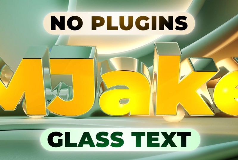
1. Introduction: Hi, I'm Jake. This class
will teach you how to create a glass text animation
without using any plugins. You don't need any experience working with Adobe
after effects. To learn this effect, you can even download
the free trial version, and it will work fine. I'll explain each step we will take to create this animation. You can always write your questions in
discussion section under any of my classes to get hell for me while
creating cool effects. I think it's the
best way to learn the software while creating
interesting effects for fun. And to complete this class, our goal is to create this
glass text animation. Be happy to see in
my class as also your result after
following all the steps. So let's get started.
2. Creating Paths: So I'm using Adobe
After efect 2024, but you can pretty much use any version of Adootor effects. It will work fine. So I'm using standard layout
by clicking here. And if you cannot see
some of the panels, which you can see on my
screen, for example, effXs and presets, you can go to Window and enable it from
here, Effex and presets. And basically, you
can enable any panel, which you can see on
my screen from here. So let's create new composition. Let's click here to
create new composition. And let's go to the
three D render. We need to change this
to advance three D, and then let's go to basics. Let's call it here,
three D animation. Frame rate, let's set it to 30 frames per
second, folishD. The resolution should be
an 18 and 20 by 1080, which is fulishD and
duration here is frames, seconds, minutes, and hours. In our case, we want to
have like 10 seconds. Okay. So now we have our composition with
new three D abilities. So this technique that I'm going to show you
in this last is great for using text
and even your own logo. So instead of importing logo, we will use text right now, but you can pretty much do the same steps by
importing your logo. Just go to File, Import File, and import your logo here, and then just drag it right into this timeline by leftmost liking it like this and
dragging into time. In our case, I'm going to use this horizontal type
tool, leftmost liking it, and just create a box just by leftmost liking here and drag into the right
just like this. And now we can just
type our text. I'm going to type
MGic and I want to have these characters
not capitalized. So I'm going to go to
this character panel, and here I'm going
to click here, so it will be at all caps. Once again, if you cannot
see this character panel, you can go to Window and
enable it from here. Basically, any panel you
can enable from here. So now we have our text. You can also change
the size of it. Maybe let's set it like 400 and just click here to
select Selection Tool. Then in align panel, you can just align horizontally
and align vertically. So it would be directly in
the center of our shot. Okay, so let's say that you have the logo in this way
or you have just text, like we just did, the
principle is the same. You'll need to track it
or by using the mask, just left mostly
on the span tool. Zoom in using scroller
on the mouse, hold space bar to move around like this and
left mostly in it. Then just simply start
cutting your words. If you need to have the angle, you just need to left
most lick and smooth the angle on these parts
of your logo or text. I don't need to have
this kind of angle, so I'm going to press
Control Z to undo the step, and then you can just
simply cut out your logo or text just like this because
we need to trace these paths. By clicking on the last point, it will close the mask. Then you're going to press on keyboard to see the mask
and set it to none. The same thing you
need to do with this next letter or
next part of your logo. In my case, I'm not going
to do the whole word. I'm going to show you other way. This is a quick example
of how you're going to do if you would
want to go that way, so I'm closing the
mask, once again, set into continue with
this logo if I want. This is one of the
ways how you can get these masks which we need to have for the next
video of this class. But second thing which
you can do is to get these paths more automatically. So this time I'm going
to delete these masks. I'm going to select both of them and press delete on keyboard. I'm going to use
layer Auto trace. Make sure that you've
selected your text layer or logo and then go to
layer autotrace. So here, if you're going
to click on this checkbox, you'll see the preview of how
roughly it's going to look. So here you can play around with these values to get
the more ispier look. So for example, you
can play around with these values and see if
you'll get better result. So in my case, I want to
have a lot of details. So I just click here
on tolerance set 2.1, here, one, seven and four,
and then click Okay. So in this case, you
can see that we've got a really detailed go. But in case, if you
don't want to have this kind of really
detailed logo, you can just delete this one and go once again to
layer out trace. Add this tolerance to
higher number like one. And in this case, you will get
a much more smoother edge. So basically, you
can play around with this to get the look
which you like. And I'm going to set these
values to these numbers, so you can also play around with them and see what
you like the most. Like okay. So now I get
less of these points, which makes this cut
out less detailed. But if I'm going to deselect
this MJ text layer, I'm going to see that
my text is pretty good, and you can always
just select this layer and select and delete some
of the points if you want, and just make sure that
your mask looks good. So this is how you can speed up the process of
cutting out the edge. But as you can
guess, if you will take time and use this pen tool, you can get a better
job than these kind of imperfections that you'll
get from this or Trace tool. For this class, I'm
going to leave as it is. I just want to let you
know that you have both choices for high
quality and for speed. And the next video, I'm going
to show you how you can extrude this shape which we got. See you in
the next video.
3. 3D Text: Okay, so we've just
created our text, and now we don't need
even our original text. We can just delete it. What we need is this layer
that we've created. We can press M. And
as you can see, these masks are already
created for us. So in my case, I
just want to delete all of these keyframes
because I don't need them, select all of them
and press delete. And then what we can do is
to create a shape layer. So let's go to layer
new shape layer. We are creating shape
layer because we cannot extrude any other kind
of form of content here. So we need to have
the shape layer. So we can open here or
just let's call it a logo. You just need to press Enter on keyboard to be able to
type your logo name. And then just open here. And in contents, you can just click on Ed and just
select this path. So we need to create a bunch of these paths so to know how much of these paths
you want to create, by the way, click
in here and extend. Need just to see how
many masks we have here. So in our case, we
have seven masks. So let's create seven paths. Select the path one, and press Csel D until
you'll have seven paths. Then you can just select
all of them and open it. By the way, really handy tool
here is to press Tilda key, which is usually below the
escape button. Your keyboard. And if you will hover
with your mouse, you can full screen
by clicking on the Steel Da key and expand
any of these panels. So in our case, we want to expand this
one because this is much easier way to just select
each of these mask paths. So let's select one of them. Press C show C to copy
then go to path one. We want to copy mask path, press Control V to paste it, so we will get the path
on top of this layer. So same we need to each of these masks and
paste them accordingly. So mask path two, select
mask path, not the mask, but mask path, press
Control C to copy, then control V to paste. Mask three, copy, paste, four, control C to copy. Control V to paste. Five, six, and seven. And now we can press till the Que once again to
exit the full mode. And let's close this
one, which is below, not the shape layer,
but this layer and hide it by clicking
on this eyeball. So now we have our paths, and this is how you
can see that you've pasted all of the
paths correctly. If you didn't, you just need
to click on each of them. And as you can see, we
have this little highlight and check if you've
pasted all of the paths. So next thing which
we want to do is to go here to add and
select this fill. And here we can change the
color by clicking here. So I'm going to set
to white click Okay. Then we have a little problem. As you can see here
we need to cut out. This is really easy fix. Just click here
to Selection tool and just select one of
the points of this mask, and now we can see that
this is path five. And also, let's select this, and this is Path four. We need to select both of these paths which we just found. We need just to select the paths from which
we need to cut out. So we need to select this path, which goes around
and this inner part. Then when you've located, just select both of them,
right mostly on them. And click group shapes. We can just open it, make sure that you've
selected your group. And what we can do
is to click here to add and select merge paths. And here we can also open it
and set this to subtract. So this is how you
can easily cut out the parts which
you need to cut out. Just make sure to group
them because in this way, you can just cut out
anything inside the group, and it will not affect
all of other layers, which is exactly what we want. We can just select this one, and this is path six, and let's select
this one as well. This is path seven as so
six and seven, select it, write mostly group shapes, then open it and go to Merge Path and change
this to subtrack. If it didn't work
as you want it, you can just swap these places, and as you can see,
it could be like this when you've used subtrack. So just make sure to try
to change the places. You might get the
choice which you want. So now we have our
logo and shape layer. This one we can
just simply delete. And let's try to extrude it. First of all, we need to
make this layer three D, so let's click here Otagle
species and modes until you'll see this three D cube.
Then just click on it. So this is already made
this layer a three D layer, but we can open here and go to geometry options and we can simply change our
extrusion depth. In our case, we can
use something like 140 and we can play
around later if you want. So now we get our
simple extrusion. We can also add a bevel. So let's change maybe to nine and change bevel type to convex. Once again, if you see
some imperfections, you can always select your logo, then go to this pen tool. Just simply delete
unwanted points and make sure that you get
really nice and clean edges. So it's a good idea at this
moment to clean up your mask. Okay, so we've extruded our
text, and the next video, I'm going to show you how
you need to light it so it would work for our effect.
See the next video?
4. 3D Lights: So we've got our text. Maybe let's reduce the bevel
because it's a bit too high. Maybe let's set to
something small like three, and we will change
it later if we need. Okay, so now we have our text, and now let's add some lights
because we will try to displace our background and
we will use displacement map. And it uses the difference between white and dark
parts of your image, and pure gray will be untouched. Our case, this looks pretty grayish and we don't
have any gradients, so we will not be able to
distort our future image. So let's add some lights to have more gradients on our text. But before let's
save our project because after effects can
crash from time to time. So we can just go to file, save, and save wherever you want on
your computer. Click Okay. Okay, so now let's
add our lights, go to layer, new light. We need to use a point light. It should be something
like 40% intensity and click so we've got our first light. We
can move around. For me, it's easier to select our light and press
P and move here. So this is our depth. If you're going to hold shift and move from left to right, it will go really fast. So my goal is to
have this kind of lighting where we have darker
parts and brighter part. Then just move it wherever
you want on your logo. Then I need to
press Control D to duplicate it and move it up and to the left so you can see we have brighter parts
and a bit darker one. So this is how we
can control it. You can press P on
keyboard and move it closer if you want or farther. Maybe let's set to minus ten and here as
well to minus ten. So our goal is to have this really nice and
interesting lighting. So let's copy this and press Control D once again and move it to the right
on this letter to get interesting kind of
lighting here as well. And you can always select
all of these lights, and press T on keyboard, and change to wherever
intensity you like the most. So let's try 55 to get a bit more of light or
maybe even higher. We'll get a gradient
and cross of our text, so it will be not flat. This looks nice.
And at this moment, we can try to create
an animation. But before we will
create animation, we want these lights
to follow with this shape because if we will try to animate only this shape, just like this, you can see that lighting is changing too much. In our case, we
want to stay with this light on our
text for all time. So to fix this, we need to select all of these lights and use
this parent link, the sick web, select it, and connect to our
logo just like this. Now if I'm going to select our logo and press Rn
keyboard and move it, you can see that the
light stays here. And first, problem
which you can see that we don't have
any light behind it. We just have lights
in front of it. So let's move it just
here to 110 degrees. And let's select our lights and press Control
D to duplicate. Let's set it above, just like this, and we can
even change the color. So we would know that
this is different lights, press P, and just push to 150. Just don't click here
and just set this to 150 because it will set all of
these lights to this position. So just manually drag it to 150. So now we can just simply
select each of these lights. And just move around
like here to letter K, and maybe up, then select this light and move
around a bit here. And this light, let's just
move it up and to the right. So now if I'm going to
select our logo and press R on keyboard
and rotate it, you're going to see
that these lights is a bit in different places, so we would get different kind
of lighting from the back. So let's set this to zero, and let's close all these. And next video, we are going to actually animate our text.
See you in the next video.
5. Animation: So now we have the setup. We can just simply start
animating, which is pretty fun. So what we want to
animate is scale, so select your logo and press S, and then hold Shift on keyboard, as you can see,
I'm holding shift and press R. So basically, we will use a scale
to scale it up instead of position and
we will rotate our text. So let's create a
simple animation. Let's create a
keyframe for scale and for X rotation,
which is this one. So let's create a keyframe here as well. So what is keyframe? Keyframe is basically
the point in time which remembers the value
of sorting property. In our case, this keyframe
remembers the point in time of 0 seconds and the value
of 100 of property scale. Which means that if I'm going to set here about at 3 seconds, just click here, and
here at the beginning, I'm going to change
the scale value. It will create another keyframe, and then it will go
from this value of 485 to this value of 100. And this is how animation works inside of Adobe of erfact. It just remembers
these values and goes through time from
one keyframe to another. Case, if we will try to
rotate it just like this, you're going to see that
the point of rotation is not exactly in the
middle. So let's fix this. Before we can just simply delete these keyframes
and set it to zero. And to move the origin point, you just need to select our logo and press
A, and to move it, we need to change this list
value, which is Z space, and we need to push it to a certain amount and to know which amount you're
going to use here. At the center, you
once again need to look at your
geometry options. So we've excluded to 140 pixels, and if we want to have the rotation
exactly at the middle, we just cut it by half. So 140, we once again
selecting our logo, pressing A to see anchor point, and you can just simply set here 70 or type whereever
value you have there. Then divide by two. In this case, you'll get
the perfect placement of our anchor point, which is the origin from which
this text will be rotated. So now if I'm going to
press S on keyboard to see my scale animation and
hold shift and press R, I'm going to see my rotation. And if I'm going to
try to rotate it, you can see that origin point
is exactly at the middle, which is exactly what we want. So this is perfect, set
here to zero because we want to have this let shot
at 3 seconds in the middle. So we will create a keyframe
and then move it here. Let's add few rotations. In my case, I'm going to
just set it here to zero, but here I'm going
to set to one, which basically means that
I've added one full rotation. So let's see how it looks. So now we have this
full rotation. You can go with the scale
a lot bigger if you want. And then let's cut by clicking here on this
edge to this moment, so we will have this work area. And now if I'm going
to press zero numbed, we can preview our animation. So as you can see, the
scale moves too slow. And in this case,
what we can do, we can just simply select this last keyframe and press F nine, which basically means
that it will scale down a lot faster and
slower till the end. We can also go to Graph Editor and change
here by clicking shift on keyboard and drag along this floor to the
left, just like this. If you cannot see
this kind of graph, you just need to click here. Change to edit value graph. Let's go out from this mode and press zero
NumpD to see how it looks. So now you can see we have this nice scaling
down animation. Let's do the same
with this rotation. Select it and go
to Graph Editor, press selected here as well. Press F nine and drag it to
the left, just like this. Let's go out from
this graph editor and press zero to
see how it looks. As you can see, we have
already our animation, but for my taste, it stays too close and too long
here at the beginning. So let's set our time cursor here on top
of these keyframes. Let's reduce this scale a bunch. So maybe something like this. Now let's see how it looks. It already looks much better. So let's press zero numpad. So now we can have this really smooth and interesting
kind of animation. And if we don't want this
rotation to happen that fast, we can just simply select
this last keyframe, go to graph editor, and just reduce it. Hold shift to make this kind of graph and go out from graph
editor by clicking here. So this is our smooth
and nice animation. We can even push out a
bit this scale animation. So at the end, we will have this little motion
after rotation, which could look even
more interesting. It looks pretty nice. So you can play around with these keyframes to
get the exact look which you like and speed that works pretty
well with your logo. And the next video, we
are going to create our first glass distortion. So we will get something
that will look like refractions and reflections.
See you in the next video?
6. Basic Glass VFX: So we have our animation, and now let's imitate some
reflections and reflections. Close here. And for this, we want to create
another composition. We can just go to
composition, new composition. This time we need to
go to three D render, and we don't need to
use this advanced three D. We can just
simply use classic three D and go to the basic
and leave all of these settings as it was
folichD 30 frames per second. 10 seconds long. And we
can call it final because here we will create the
final effect and okay. So now we can just simply drag and drop our three D
text inside of it. We can disable it, and let's go to layer and go
to new and solid. Let's call it this BG for background let's make it black
and click Okay and Okay. We can select it and press
Control D to duplicate. And this top one, we can
go to effects and presets, and let's type here fail to add a fail effect
on top of this one. And let's change this to
white and click Okay, and here and effects
and presets, we can type here checkerboard
and also drop it here. If you cannot see this effects and presets panel, once again, you can go to Window
and enable it from here and any panel which
you can see on my screen. We can create it a bit
bigger just like this, so we will see our
distortion of our effect. Let's press T on keyboard to
make it not so obnoxious. Something dim like
this should work fine. Also, we can write some text. It will be easier to see the effect if you will
have some text here. So we can type something
like best glass effect, and select all of
this by clicking Control A or just leftmost licking and
selecting all of this, go to character, choose
wherever font you want. I've used Monster At, which is free font
and available on Google and change the color
to something like white. Can see I didn't select
all of the texts. I just make sure
that I've selected my text and then
change the color to white and change the spacing by clicking
here, just like this. And you can just play
around with your text. I'm going to increase
the space here, so I would see all of
my text just like this. Also, I'm going to set here
horizontal and vertical, and now we can have
our background to use. So let's go to Selection Tool, and now we can go to layer
new adjustment layer. And with this adjustment layer, we are going to create
our glass effect. So we can press Enter
and let's call it glass, V and then go to effects
and presets and type here displacement map under
distort displacement map, select it, and drop
it here on glass VFX. If we will use this three D animation
which we just created and push these values like
255 and here like 555, we will get these distortions. This is basically the basics
of this as you can see, wherever we had the light, it will distort
the image as well. This is why we've added these lights to get
even more distortion. And this is how you can
go to three D animation. And if you don't want to have
this too much distortion, you can just simply
select your lights. And push out just
like this and go to final and see that these
distortions are a bit smoother. Also, let's change
this quality to full. To see how it looks,
it looks much better. But as you can see, we have these edgy and sharp corners which doesn't really
look that great. So this is why we don't need to use this three D animation, which we just created here. We need to pick
it add a bunch of effects to solve this issue
with these distortions. So let's go to the
project panel and select this three D
animation and drag it on this little icon here to create new composition
and drop it inside of it. As you can see, we've created another composition
with different name. And now we can just
simply rename it this. So let's press Enter here and
let's call it smooth edges. So to fix these sharp corners, we just need to select
this three D animation and here effects and presets type glass and use this
stylized CC glass, select. And drop it here on
three D animation. And as you can see, we get
these interesting effects, which we need to tweak, so
it would look a lot better. First of all, we need
to open here surface and change the softness to zero. Here, let's set it to something
like -12 and here to 50. Basically, we can
play around with these values and see
what you like the best. So if I'm going to tweak
this value, as you can see, we are playing around with this edge and adding
this kind of outline. So if I'm going to di select
this effect, enable it, you can just play around with these last two values to see how much of this
effect you want to apply. So for my image, it looks like minus ten
and 50 could work fine. And next thing which I want
to apply is Gaussian effect. So let's type here Gaussian blur and drop
it below of this one. And let's set it to ten. And now we can just see how it looks and maybe
tick it even more. So for now, I'm going to
leave at minus ten and 50. I'm going to go to our
final composition. I'm going to move it here, so I know that this is final effect. And instead of using this
one, we can just delete it, then go to Project panel and
drop it here, smooth edge, and we can just
disable it because we don't need to see it
in order to use it. Basically, we need just
to go to the glass, Vx, adjustment layer, go to
effects and controls, and change here to smooth edges. Now as you can
see, we're getting a lot smoother edges here. And you can play around with the values here in smooth edges. If you're going to change
these values, for example, increase the blur, you can get
different kind of results. So as you can see,
it blends too much. So just keep this
Gaussian blur at ten, so it will not blur too much. So let's go to final
to see how it looks. Also, what is good to keep in mind that you can also go
to the three D animation. To our logo open here
and in geometry options, add a bit more of the
bevel just like this. So we would have a bit more of this edge to play around
in these smooth edges. So now as you can see we're
getting a lot of this edge, and now we get this kind of nice edges effect and go to
final and see how it looks. Once again, jump between
these compositions to find the perfect
balance of this effect. So in my ***, I really
like these kind of values, which is not too big, basically -17 and maybe
35 or even smaller, just like ten could
work even better. Just play around with these
values to see how much of these edges you would want
to add this kind of effect. Once again, here in
displacement map, you can just reduce it a bit and find the perfect
reflection which you like. And the next video, I'm
going to show you how you can add a bunch
of more effects to increase the visibility
of this effect and make it even more interesting.
See you in the next video?
7. Subtle Colors: Okay, so now we have this effect and we can press zero
nape to see hot looks. It already looks pretty cool. As you can see, we
can quickly fix this issue where we have
just this black background, make sure to select this
class VFX and click here. And as you can see,
we've extended a bit of these reflections. It
looks much better. And now let's add a
bunch of cool effects, which you can add to make
this look even better. So a few subtle effects which
you can add is to select the smooth edges and just
simply drag it up and use it. So let's enable it, and we can see this
on top of our effect. Let's go to effects and
presets and type here VR. And in this list,
we need to select this chromatic
aberrations effect. Drop it on these smooth edges. In this case, we can just
select it and press Enter, and let's call it VR CA, which means are
chromatic aberrations. Let's click here
on Tagle switches and change this mode to add. Now we've added these kind
of chromatic aberrations. Let's reduce them by changing here minus five
and here to five, let's maybe not use the mode, and let's at this
to normal instead, let's click here on
Tagleswihes and change this to set it as a adjustment
layer by clicking here. So now we get a much better
result, and as you can see, we have these really nice chromatic aberrations
on our effect. You can also play around
with these values to see how much you want to apply
distortions on the edges. So you can see if I'm going
to set to really high number, we'll get effect
basically in the setter, and if we will reduce it, just like here, we will get
more of the edges as well. And we can reduce here
as well, like minus two. Two, so you get this effect
across all of our text, which is exactly what we want, and we can get really nice
and interesting effects. So basically you can play
around with these values and find the balance
between the stretching of the effect and the amount by changing this to
minus the value like minus four and the plus of value to same kind of value
as here, but like four. The second thing which
you would want to use, you can also drop this VR
effect below this glass Vx. As you can see, it fixes this edge problem and
you get even cleaner. Look, and as you can
see we're getting really nice and slick
edges of this effect. Let's also add a bit of
visibility and subtle colors. So select this via CA and
press Control D to duplicate. Let's track it on top. Let's undo this adjustment layer and select the chromatic
aberrations and delete it. Then you can just select this rectangle tool,
left most licking. We can just simply create a mask around the
center just like this, and then press F
on keyboard to see the mask feather
and just feather it a lot, just like this. And then we can go to
Tuggle and switches and set it this to
add, for example. So with this kind of effect, we are adding a bit of light and increasing the
visibility, as you can see. And play around to this effect
and even open this mask and create a path
animation here at the end, we will stay as it is. And here at the beginning, we can just go to Selection tool and leftmost double click
on one of the edges, and by clicking on
this little square, we can just expand it like this. So we would have
a bit more light. So as you can see, now
we kind of colored and added a bit more light
to our glass effect. And you can always rename it. Let's call it subtle colors, close it, and press T on
keyboard to see the opacity. And here, you can
reduce the opacity. And as you can see by adding
this little subtle light, we can increase
the visibility of the edges if you would want. So another cool thing
which you can do is to go to effects and presets
and here type RAM, select it and gin drop on the subtle colors and set this color tap to
wherever you want. In my case, I've used
something like blue, and here something like red. Or any kind of color
which you would want. And in this case,
as you can see, we're getting these
subtle colors, and our glass is getting
these colors as well. And once again, by
pressing T on keyboard, you can change the
opacity and reduce it a bit if you would want to
have this not that bright. And in the next video, I'm
going to show you how you can colorize the front
edge of this effect. So we would be
able to read super easy this text as a final shot. See you
in the next video.
8. Advanced Glass: Okay, so now what
we left to do is to increase the visibility
of our logo or text, and it's also really easy to do. You just need to go to our
project back clicking here and select our three D animation and press Control
D to duplicate. Select this duplicate and press Enter and delete this too, let's call it face
because we would want to add a phase
to our animation. Just leave this
and then open it. Here, we don't need to change
much. It's super easy. You can just select this logo, open here, close the transform. We just need to see only
the geometry options. And extrusion depth, we need
to set to zero, lead here. And in this case,
as you can see, we are getting only this
phase, just like this. So now we can use it.
We can go to final and drop this three D animation
phase here on top. And now, as you can
see, we are getting this three D phase on top. What we can do, we can find the moment just before
this final reveal. So here we don't need to see it because it messed
up the illusion. And just before
this last rotation, where we are going to
reveal our final text, you can just find
this moment just before here and cut
it to this moment. And as you can see, it's invisible, and then
we can see it. For my taste is a bit too thick, so let's go to three
D animation phase. And just change this
depth of our bevel depth. In my case, I like to use something like two, super small. Let's go to final. And as
you can see, it's nice, and it's even harder to
see this transition point. So let's cut it to this moment. And it's really smoothly
transition to this point. So what we can do to change
this color, basically, you can just color it in
any color which you like. You can just go to effects and presets and type here tritone, select it and drop it here
on three D animation phase. And let's change to
something bright. We can change to any kind
of color which we like. We can even try it bluish
tone and click Okay. And here, also,
let's type curves to make it a lot brighter as
you can see here this color. So something like
this. We can just play around with this color
to whichever we like. We can go with the
goldish one if you would want and click
Okay, in this case, we can just disable
the subtle colors at the back and press T on
keyboard to change the opacity. If we will lower it even
to something like 93, we already can see this kind of glass looking effect and we
can even increase the light, so it will resemble this color
even more just like this. Then press Zeronpe
to see how it looks. So now as you can
see, we've increased our visibility of this
really nice effect. You can go to File, Import File, and find this image which I provided in resource
step to this class. And just simply drag and drop above of our background
and our text. And as you can see, it distorts the original image
of your background. So basically, you can
use any background and it will work fine. To fix this little problem here, you just need to go to VR, press as on keyboard
and reduce the size, change the scale until it
completely disappears. So for me, 95 worked well. To fix this, you
can also go here and tweak these values as well. As you can see, we still have these chromatic aberrations, which you like or don't like, and you can always
disable this layer. And basically, press your
numpad, and as you can see, it distorts any kind of background which
we will place here. By the way, if you're going
to go to the glass Vx, you can move it here as
well, these distortions. And once again, you can fix these kind of lines which
you might don't want to see. So move it just here and fix some of the imperfections
if you would want. Or just go overboard. Just like this and even
add more distortions. So this is up to you
of how much you would want to distort your background. As you can see, it's
really dynamic and you can get really
nice distortions. I'm really excited to see your project file after
finishing this class. Feel free to follow me
here on Skillshare. I have a lot of VFX classes. If you're going to
click here on S more, you're going to see
even more VFX classes. Also, I have this section
of new classes this month, as well as fundamentals of Adobe after effects,
logo animation, free AI tools, complex VFX, DaVinci Resolve, and even more. Have this really short
class if you would want to learn even more
about text animations, really cool classes
on text animations. I highly recommend you to check out and try
it for yourself. This one takes only 13 minutes and you'll get really
powerful result at the end, as well as these
kind of VFX classes, which can also take
only 12 minutes. Make sure to submit your project here in projects and resources. I'm excited to see all of your projects and give
you tips if you want. Once again, follow me
here on Skillshare, and I'll be happy to see you in my next class. Thank
you for watching.
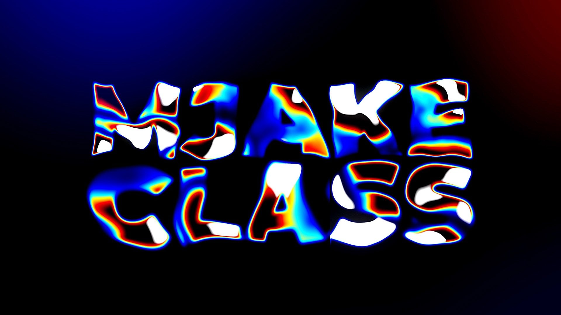
 M Jake, Lets Create VFX & Cool Stuff Together