Transcripts
1. Class introduction and supplies: Hello and welcome to my loose watercolor
painting masterclass. Our subject will be
this beautiful line. We will paint his portrait
and I will explain the whole process
step-by-step in detail. I will show you how
to give your painting a strong foundation
with a beautiful, loose, colorful watercolor wash. We will discuss these colors. I will explain how to pick them, how to choose a brush
and how to load it. We will then evaluate the results and you
will learn how to make corrections if necessary to start building tonal
relationships, volume and realism
in your painting. I will surely helpful
technique how to get a good starting
point on the drawing on building precision
in the painting, we will work on the
lines face with our Align tool with
water-soluble pencil. It didn't just the right
amount of details. And then we will use this
drawing to create shadows as the next step in the
development of our portrait, we'll, we'll go back
to watercolor to add depth and precision
to those shadows. And then you will see how I
put the finishing touches, small details and highlights to give out portrait
even more life. Little style of watercolor is very popular with art lovers. But from personal experience
and from other artists, I know that this is not
an easy style to master. We need to know how
to apply watercolor loosely and how to add just
the right amount of detail, not to overwork our painting, but at the same time make it
believable and realistic. I will tell you right away, this is my favorite style. I spent years perfecting
it and working on it. And today I will share
all my secrets with you. This painting, we will need our usual watercolor supplies. We'll be using 300 pounds or 640 gram watercolor
paper, 100% cotton. I recommend a good quality
paper for this technique. Slightly lighter weight
will work as well. I will be using just
a little sheet, but you can use a block
or a **** out of a pad. I will be painting
with watercolors. I have all the pigments
listed in class materials in a PDF file that you can download in the project section
of this class. I will need just a few brushes. The ones I'm using are
flat angled brushes. I have three larger sizes
and I have a dagger brush. I listed them all in the
class materials as well. And I will be explaining during the masterclass a little
bit more about them, why I use them, and how to apply brush
strokes with them. In other material that we
will need is a pencil. I will be using
Darwin's intense, any watercolor pencil
that you have, or even some colored pencils or markers will work
for this technique, we just need something
that we can add line work with to add just
the right amount of details on the lion's face. Of course, you will need
to have a couple of water containers for washing your brush and for clean water. And also have some
paper towels or some clean Red's ready to
pick up the drips. A couple of additional
materials I need to mention would be a
regular graphite pencil. A soft flat brush doesn't
have to be this big. You will see how I will be using it during the
painting process. And we will also might need one or two pieces of charcoal. This will be optional for transferring the drawing
on watercolor paper. And I will show you in the
masterclass how I do that. And of course, we will
need something to use to add the details that
opaque white material. It can be white ink. I will be using Dr. Ph
Martin's pen white. There are some other
brands of white inks. I have calligraphy ink here by Winsor and Newton
that will work as well. In alternatively, you
can use white gouache. Here I'm showing em
grams titanium white. But basically any
opaque white tool or marker that you have will
be fine for this painting. Alright, without further delay, let's get started on
our lion portrait.
2. How to work with reference: What can we do if we wanted to create a portrait of
this beautiful animal? First thing we can
do is of course to just look at the colors in the reference photo and
try to match them with our pigments and transfer
that to our watercolor paper. So that will be one way to
go which is perfectly fine. It will be a realistic painting. My personal opinion about this is that this is a
highly artistic photo. We have to use a
reference photo. I personally don't have
lions Rome industries, so it can take a photo of them. Maybe the way you
live, it's easier. I don't know, but usually
we use reference photos. And once the photographer
took that photo, and also you can tell it's
been processed in Photoshop. And this is that photographers,
artistic vision. We're artists. We
have our own vision. So maybe we don't want to just copy what we see
in the reference photo. We want to have our
own opinion and we want it to be our own
artistic expression. So I was thinking we could
use this reference photo, but put our own twist on it
and put our own vision on it. So how can we do that easily and kind of safeguard
ourselves from failure? We don't want to waste
the watercolor paper. One way to go would
be what I'd like to do is convert the photo
to black and white. So I eliminate color. I only have form and
I only have kind of tonal relationships
in the photo, right? And then freeze my
mind and freeze my eye from
photographers vision. And it allows me to
work more freely. That is usually my
suggestion when working from reference photos and trying to pick
colors is not to go by the color reference, but to use a black
and white reference. And after we're done, we can
compare with color and see, it will be interesting to see the end what we did differently, what decisions were made
during the painting process? In this printout of Photoshop, the original color photo, I did a black and
white filter on it. But if you don't have Photoshop, you don't actually need it. If you have the photo, you click Edit and you turn
saturation all the way down, it will become black and white and you can easily print it. And this serves a dual purpose. So that frees me
from the colors. It will helps me to make
my own color decisions. And also, I can use
it as a guideline to transfer the drawing
on watercolor paper. Because I could draw this, but a little bit of
help never hurts. I can just draw the
eyes, the nose, and the mouth and
have some sort of a reference to go by and make sure that my
lion looks like a lion and I don't
stray somewhere.
3. How to choose colors: I did a little color sketch when I was preparing
and I was trying to jot down some ideas what
I could do about colors. Let's start on the right. The first thing I was thinking, nothing wrong with just copying the photo
in black and white. This will be an
excellent exercise, especially if we
have a little bit of trouble with light and shadow. Sometimes, you know, watercolors
tend to look very flat and uninteresting because
the darks and missing. So this would be an
excellent exercise to just use one color and try
to find all the light, midtone and dark
areas on the line. And that could be very
beautiful watercolor painting. What I like to do is maybe
add one color as an accent. Obviously, the eyes will
be the focal point. If I just use a
little bit of lemon, yellow or green or something
like that for the eyes that will make the
painting pretty stunning. So that will be one way to go. If you wanted to
try that sometime. Another way to go
would be to pick just a few colors that are close to each other
on the color wheel. These colors are
called analogous. If we stay, let's
say within the reds arrange and went from
warmer reds to cooler ones, we can very easily and successfully paint
this line as well. This is called
analogous palette. And you'll see what I did here. So I used warmer reds for light, and I used cooler reds
for darker areas. If we think about how we show three-dimensional objects on the flat sheet of paper. That's what we usually do. We use warmer colors for lights and cooler
colors for shadows. Sometimes you can
do it the reverse. You can do cool lights
and warm shadows, but they have to be opposite for the object to look
three-dimensional. And that's what I did here. I did not use black, I did not use some other color. I just stayed within that red range can be
yellow range can be blue, range green, whatever
you feel like doing. And I created a painting. That could be another
interesting option for us. The third option that I
will tell you right away, this is my favorite, would be to use
complimentary colors. I know that lions are kind
of tan, orange color. So if I went with oranges, maybe yellows, somewhere in this range on the color
wheel for lights. How do I create shadows? The easiest way to create a shadow is to use a
complimentary color, the color that's on
the other side of the color wheel from the main
color that you're using. So if this is my primary yellow, I would go into purple today. I think we're going to try
this complementary palette. It's my favorite, are very
often use that approach. It does not have to
be yellow and purple. It can be orange and blue, it can be red and green. Sometimes I paint, I use opera pink and it really
looks nice with torque with, this is kind of read, write and this is kind of
green combinations a Endless. The main thing is to
understand that we are using the opposite
colors to show shadows. We're not using black or Payne's gray or
anything like that. We are neutralizing our main color with
its complimentary. Alright, let's see
if it works because, you know, don't take
my word for it. We're going to try it
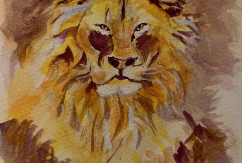
4. Start painting: watercolor layer: Does that painting, I did not
transfer the drawing yet. I feel it's a
little restricting. Also, you can get
a lot of lines and once you put watercolor
on top of them, you can't erase anything. I'm going to try
to win it and do the first watercolor wash just
on a white sheet of paper. If you don't feel comfortable
doing that, that's fine. You can wrap some charcoal on the backside or
some soft graphite. Put it here and just
transfer the lines. Now we'll be doing that. After I do the watercolor wash, I'm going to try
it just free hand. Let me situate my
line right here. I'm going to spray my watercolors with water and I'm going to give my paper a little spritz
or water as well. I'm going to use a
big brush advice for beginner watercolors. Don't be scared to use a big brush because it holds a lot of
pigment, a lot of water. It will just believe me, it will take a lot less effort
for you to paint with it. Once you get used
to it a little bit, then using a tiny brush
and tiny brush strokes, It's very hard to
paint like that. So what I'm going to do, I see, when I look at the
black and white lion, I see that it has light areas, right-click on the face. It has midtone areas,
kinda transitions, and it has darker areas
like in the nose, it's very dark in the
hair or some dark areas. The way I'm going to relate this to my colors is this three. So this will be light, midtone, darker mid-tone, and then darks will be mixed with
purple, right? We're going to neutralize
the yellow with some purple because that's
the complimentary. If you don't have many yellows, let's say you only have primary yellow lights will be that primary yellow
diluted with water. And to get this
color is very easy. Just a drop of red into your primary yellow and you can get this kind
of light orange. Don't worry if you are if you don't have all
the colors that I have, just used, the ones you have. Alright, let's get started. His face. We can actually, lemon yellow is so easy to lift and to even cover
with other colors. We can even just give it a nice big wash
with lemon yellow. Another reason I like
to kinda start without a drawing is also that I can really be kinda scared and use the colors with
quite a bit of intensity. I like intense watercolors. I don't like kind of pale,
delicate watercolors. Some people do beautiful
job with them, but I just, it's not my thing. So I like to paint
pretty bright limb. So you see what
I'm doing, right? I apply that lemon yellow. Now I'm switching to slightly warmer yellow to paint
light mid tones. Looking at my line and kind of vaguely following the drawing. Don't worry about it. If something is not quite
in the right place, we'll fix it later. You can lift, you can repaint. It's no big deal. And I'll tell you guys, I'm using the method of
site measuring to pin this, to do this, to paint
without the drawing. If you took my class
on sketching people, I know some of you did. We talk about site measuring
there quite a bit. Okay. I'm going to surround him. I decided that my darker
areas will be based on this. Very warm yellow are kind of, this is permanent orange actually this
movement is called. So I am going to surround the line with this darker color, darker, warmer
color, I should say. Free-flowing wash.
Don't worry about it, but it's not quite there. Not right. Everything
is correct. Whatever you do is explored. And I'm going to spritz it with some water to make colors move. Feel that his cheeks
a pretty pronounced, maybe a little bit of an
orange on the cheeks. If you learn to mix colors on paper instead of your palate, I think that will enhance your watercolors quite a bit because it just looks beautiful when colors mix on paper and then not pre-mixed. Okay, So kind of vaguely
something resembling the line. And this is a lot
of brush strokes. What I'm going to do
is grab a dry brush, doesn't have to be
this big or anything. You just need a soft dry brush. You can move the
colors around two. So I'm going to just smooth
this a little bit because it's too much a
little more water. And if you have some white paper showing in places,
That's very good. Just don't try to cover every square
inch of your painting. It's not necessary. White paper in
watercolor is very valuable and it
looks really good. Okay, So this, I
wanted this kind of soft warm wash. That's
all I wanted to create. This stage. I will show it to you
a little bit closer. So it's very amorphous and vaguely following what I
see in the reference photo. Let me actually pin my paper to my drawing boards so it
won't warp and move on me. See, it's already starting
to warp and you'd have to be careful you can touch
the painted surface. I'm using the tips of my
fingers to pin it down. What we need to do next is an interesting trick that I learned when I was
learning to paint. When we look at a face, animal or person, we just
concentrate on the features. We just can't take our eyes like I'm I keep looking at his eyes. I can take my eyes
away to help me evaluate what I have on paper compared to
my reference photo. I'm going to turn the
reference photo upside down. And I'm going to turn my
painting upside down. This helps me to
see this is shapes, light, midtone, and dark
instead of the features. And this way it will be
easier for me to evaluate this wash and see if what I
painted is correct or not. You can even paint upside
down, but that's harder, so I don't want to make it
too hard for everybody. But now that we have kind of gotten away from the face and
we see the shapes better. I can evaluate the results. And I see that where the
chin is, this area here, it's a little too much, so I need to lift some pain
there and make it lighter. So let's do that. And lifting water color and
I'm making corrections. People say, Oh, you can make
corrections in watercolor. You can, it's harder than with other mediums, but
it's possible. You just scrub and
you'll lift paint. We're going to paint his What's it called
the muzzle, right? His, his nose and the mouth. And this is slightly lighter. And this kind of goes, I see that shape. It kind of goes this way. And it goes this way. His beard and stuff. We can we can lift a little
bit like on top here. But I'm also going to use a peak white to add a
little bit of detail. Maybe lift here a little bit. And let's see. So this says here, there are a couple
of lighter areas here that we can mark. It also, I see a couple of
lighter areas on this side. They're not supercritical,
but I'll lift paint. There's just so we can see. So not forget about them. Okay. I think these are all corrections
that I'm going to do. Maybe a few here. Well, we need to let this sit a minute and
dry before we can proceed.
5. Continue working: pencil drawing: Let's see what we have here. I don't have any
shine on my paint. It's still a little damp, but I think it will be fine
if I continue working on it. Actually, let me show you something guys about this really need to it's called
heated craft tool. So it's like a little he'd gone. This is actually
let me turn it on. It's a lot quieter
than the hairdryer. This actually works. Just great. I mean, you can
get a heat gun and construction store,
comb supplies store, but it will burn your paper, but this one is not
too intense and it dries your watercolor
very nicely and quickly. It speeds up the drying
time without burning your paper and without
making a horrible racket. So I'm going to try
this just a little bit and we will
continue painting. We're going to switch
to our Align tool. What I want to do
next is actually transfer my drawing and
give myself a guideline. Yeah, this should be fine. So the way I transfer drawings, I am going to take a piece
of charcoal or you can take a soft pencil and just rub it and I can
see the lines face. I'll just rub it on that area because that's the
most important for me. The main we can kinda winners and figure out where things are. But I just would like
to transfer the eyes and the nose a little
bit of charcoal. Let's put this back on
our watercolor paper. I printed this to
size so I would know how to match it, right? If you don't have big
printer like I do, you can just even print the face right and put it on there. And all I need,
I'll use my pencil, but you can use that with
dark side of the brush. Just need something to
transfer the drawing. This is not cheating
because we're just using whatever tools we need to get
the results that we need. And I know from an artist who even asked the
international show, watercolors show judges, and they have no problem
with drawing being transferred on watercolor paper as long as you have the right
to use that photo, right? They have no problem with
you're transferring. I don't think I have charcoal
there, but maybe I do. Okay. So this is all I wanted. Little bit of a guideline. And now, if you guys
need a little more, you can do a little more,
a little more detail. But for me this
should be alright. Water-soluble pencil. Darwin did tense. The color is dark purple. And I'm sure you understand now I did not select
that color randomly. Purple is a complement
of yellow, right? So I'm going to
use this color to neutralize my yellows
and to create shadows. So I'm going to be working
on dark mid tones, dark and dark as dogs like
the dark accents on the line. I keep looking at my black and white photo
while I'm doing this because I'm not copying
colors from the reference. If you don't want to use a pencil or you don't
have watercolor pencils, you can keep working
with watercolor. Pick a purple that you
have on the palette, whichever one you
think will work or complimentary color to what
you have on paper already. My only recommendation will be, let's try starting with a line. So take a small
brush and pick up pigment directly
from the weld with a lot of intensity and
try applying it on paper because then I will
be softening the lines. So I want you to be able
to do something similar. Usually we paint
watercolor layer by layer, but maybe today we can
try something different. But basically any
line tool can work. You can also use a marker and even if it's not water-soluble, we will add purple watercolor later and you will
get a similar result. What I'm hitting. Alright, so I'm just going to basically draw
my lines face here. I'm looking at the
black-and-white reference, and I'm just applying that pigment that I have in
the pencil to my watercolor There will be very dark
area here on the bottom. And I think it's easy. Like I said, we're trying quick techniques
because the paint, this line with all the details with watercolor will
obviously take quite awhile. You know, it's a
pretty complex form. A lot of little
shadows going on here, a lot of lines. So it won't be super quick job, but we want just the
fresh spontaneous sketch. And we want, we don't want to spend a
little time, maybe today, maybe another time we can do super realistic detailed
painting of him. I'm also varying the pressure on the pencil to get
different marks. Variety always looks
good on paper. And so if you can, if your tool allows
you to do that, just vary the marks
a little bit. So here's some markings
on the face here. It looks like a grumpy old man. But he's beautiful
at the same time. So he's got the main
there, his ears, we can see a little bit
sticking out from his main. So this will be his outline. Some way shear. There will be another ear. They're pretty dark,
darker than the main, so we can add a
little more colleague here, little more pigment. There is a darker area here. I'm trying very
hard to stay away from drawing his every
feature and every, he's cute nose and
mouth and everything. But to work with shapes,
with tonal shapes. Pause here somewhere I can
sketch that in real quick. And another one is here. Alright, and now
for the fun part, activating the water-soluble
pencil and adding tone. Let's try to do first
with clean water. Minus has a little
bit of yellow in it, but it's pretty clean. And then we will see, maybe we will add a
little more watercolor. So once I activate that pencil, it softens the lines and
it gives me that tone. And that purple on top of my, you can see it
especially here on top of my yellows and oranges. It neutralizes them and it
creates that shadow colors. So the deeper tone that I need that I see in
the reference photo. So the magic of
color theory that I teach in detail in my
painterly peds class. Because, because we need
it, because it works. In the background behind
him is very dark. But I'll get to it
in just a second. I'm going to do that
with watercolor. I don't want to use that much of that water-soluble pencil over there is very defined, lighter areas under his eyes. And like I said, I will
be using a little bit of a peek white also as well. His eyes, I actually in shadow and I have them
very lemon yellow, so I'm going to drag a
little bit of color onto them and add a little
bit of shadow there. And if you have too much of that intense color
on your brush, you can just rinse it, right and get rid of it. Or good idea to always
have a paper towel or just a piece of gloss
or read any other hand. And that way you can
control the amount of water and pigment that you are
working with at all times. If I need a little more, I can always add a little bit more color
in certain key areas. Okay, let's move on. Don't want to concentrate
on one area to match. Line tool will also be good. See how he has those whiskers. So this will be very easy to do with the
line tool as well. Just some little bit
of hatching here. And this is all darker under his chin and
on the size of his face. And it's dark under his chin. It might not be dark enough
because I lifted color there, so it might not be dark enough, but I have my watercolors. I'm not worried. I can always add a little
more tone if I need to. Because I didn't. Watercolor
will work with layers. So you want to more
or less gradually build your painting and don't jump in super
dark all at once. It's usually not a good idea. It might lead to some problems. Let's see. So there's his face. The dark comes right
up to his eyes. And he looks weird because
his nose is very dark, but it's not dark
in my paintings. So I need to paint his nose. I need to paint his mouth. And you can lift intense
while it's still wet. But once it's dry, it's just going to stay there. So we need to walk through
it fairly quickly here. So this dark line of
the mouth connects to the dark area here on this
side and on this side as well. So we go into drag
some pigment there. Okay. And this is all going
to be dark, soften. And I really like guys, I don't know about you, but I really like how cancels create additional
texture on paper. I think it adds a lot of visual
interests to watercolors. So I'm not worried about leaving this marks and covering
them or anything because I think we can contrast
them with smoother areas. And it looks really attractive and really
interesting for the viewer. So I'm all for that kind
of mixed media effect.
6. Continue working: refine shadows: We've done this. Now. I'm going to take a smaller brush and I'm going to add a
little more colors. So I used a dark purple. So I'm trying to think
which color will be best. I think ultramarine violet
will actually be a good color for me to go with it will, it will match the pencil best, so this will be the closest. And what I'm going to do now, I'm going to add
darkest accents. I have some, but some
areas need a lot more, a little bit more work,
not a lot more work. And to see those
areas, to again, I'm evaluating the result and I'm trying to decide
what else I need to do. And to evaluate
the result better. I'm going to squint when
I'm looking at my painting and then squint when I'm
looking at the reference photo, I can see that some things
are not quite right, so I'm going to fix them now at this stage with watercolor. And notice that I'm not putting
watercolor on my palette. I'm not mixing it with
water or wet the brush. And I'm picking watercolor
straight from the well, because I want that intensity. And if it's too much, I can always grab
a clean brush with some clean water on it
and soften at all lifted. So that's the way I'm
going to do this. I see the very dark area
on his ear right here. And this, I could've
done it with pencil, but I mean, I have
watercolor as well. So when both on my painting. So that's what I'm going to do. And you see I'm
softening that area. Here's the hair sticking out. So we can do that. So the trick is to do
just enough for people to understand what you're
trying to say here, but not overwork it, right? And we all have that problem. We just paint and
paint and paint and then we decide that
it's a little too dry, a little too overworked, and it's hard to go back. So working with layers gradually and evaluating
your results, like I said, squinting and looking is a good idea and it will help
you to be more successful. And I'm guilty as anybody
and I tried to fix stuff. And then it's like,
why did I do this? This is just not right. And you just have to start
over very often. Okay? So the top looks better. Darker maybe here as well. This is a dagger
brush, quarter-inch, my favorite, very versatile. You can paint with
it flat or you can paint with it on, on the edge. So that's why I love it so much. It helps me to do a lot of things that I need to
do with just one brush. His cheeks, need to be darker, so I'm going to just
apply watercolor here. Okay. He's nose is actually not black, not all black, right. So we need to leave some of it lighter and fill in some ligand, the nostrils, It's very dark. It's didn't know,
especially if you squint, you will clearly see it. It's very dark and
the nostrils and on the outside, but it's lighter. The front of it that
flat areas lighter. Let's do this cheek, hillock, his eyes need to be a lot
darker, maybe slightly larger. Correct? The pupil a little bit. Make sure they're in the
right place and they're the right shape because transferring is all
is very helpful, but it might not
be very precise. So we still need to look and, um, make sure we, you know, we were
doing things right. Okay. He's got very
pronounced markings under the eyes here. This can be even darker. Will now write that watercolor
lightens after it dries. So we need to go a little more intense than we
wanted to look after. It's dry. Okay. And another thing I want to do, maybe soften this a little bit. Okay. And let's see, there's dark area here. See how because these areas, they're not super dark. That kind of mid tone. I switched back to my orange. So don't think that you can go back to the color
that you need, right? And we can do whatever
we need to do. So this is light, so I use the yellow, there's the dark area, but the nose is kind
of middle tone, so I'm going to darken
it just a little bit. Chilly, looks much
better. Let's see. The cheeks I think are fine now. Maybe a little bit orange to connect the
cheeks to the main. Take it into the
main a little bit. You can see here why I tell you, only use small
brush for details. I'm trying to paint
smaller areas with it. I really should switch to
a bigger brush by now. It's just hard because it doesn't hold a lot
of paint and water, so you constantly
have to pick it up. I'm going to take
a bigger brush. This one is three-quarters of an inch and it's also angled, is now my favorite brushes. I paint almost
everything with them. Darken his beard a little bit. And let's tone down
the area around him because I like how he has
the darker tone there. So I'm just going to
give it a little bit of purple wash. And because
I'm working transparently, it mixes with my underpainting with it 1.2 orange that
I painted underneath. And that pushes the background
away from us, right? And the focal point, the lines, lines phase starts coming
forward and that's what we want because that's the main
subject of our painting. And maybe here on the bottom we can tone it
down a little bit too. I have sort of an
outline in down here. So it gives me a little
bit of a guideline. Okay. This down as well. Alright, here we go. We're almost done. This is our line. I'm going to let him
drive for justice
7. Finishing touches: texture and highlights: Alright, last thing I
need to do to my lion is to add the
highlights. These areas. I tried to leave them light, but it can use a little
bit more definition right? Under the eyes. I had some paint run over, so it's not quite as bright as I see in
the reference photo. It's not super bright here, but I think a little
bit of white can really help us bring that line to life. And he also has a tiny
highlights on his pupil. I pick white that I think looks best with watercolor is Dr. Ph. Martin's pen white. This is opaque white ink. It's light texture. It kind of blends with the paper and with the
watercolor very well. I used to use white gouache. But white gouache kind of sits on the surface and
you can see it. This, I think,
blends a lot better. So I just use it with a
brush from the bottle. I tried to keep the
brush clean so I don't contaminate my ink. Make sure I rinse
the brush really well and we really
need just a tiny drop. You can even put it on
your palette so you don't dip ten times. Once you pick up the
watercolor on your brush. So I'm going to just add, again, squint when you look at the reference photo and
add a bit of highlight, just a little bit. Maybe in the eyes. He has kind of
lighter patches here. Above his eyes. We can even add some more
texture with this because we can brush it on with
light brushstrokes. And of course, here
on his muzzle, these are the lightest areas. And we can do him whiskers. See what I can do
that dagger brush, I can paint very
fine lines with it, but I can also paint
slightly larger areas. Can be blended a little bit. Very sophisticated technique,
painting with my fingers, matching things with fingers. Okay, Let's see, has a little
bit of a lighter area here, kind of very
pronounced cheekbones. Maybe a few highlights
and the main won't hurt. I'm going over his
ears and everywhere. And then his beard rain. We can surround our focal point a little bit better
with highlights. I feel like I need a
little bit on his beard. Yeah. Just defined his beard
a little bit better. Maybe blended. Yeah. I think that's that's good. That's all we need to do. And always sign your artwork if it turned out good
and you like it. And here's our line.
8. Class project and final words: Let's briefly summarize what we learned in this masterclass. We started with a
loose watercolor wash using a big brush and working with colors that we selected after analyzing several
color palettes. We did not do
preliminary drawing, not to restrict us. We worked free hand. We analyzed the watercolor
wash after it dried and make the necessary
corrections to give it just the right
amount of precision. We gave ourselves a
starting point by transferring lines features
with the charcoal rub. And then we worked with water-soluble pencil
to draw his face with softened that drawing with water to start building shadows. And then we'll continue to work in with watercolor to give those channels precision,
depth, and realism. We stopped from
time-to-time to evaluate the result because
we didn't want to overwork our portrait. Our goal all the time was
just the right amount of information to convey to the viewers that
this is aligned. But we kept our painting
fresh and energetic. Our last tip was a few
finishing touches with opaque white to add a little bit
more texture and highlights. So kindred this class
and I hope you will give blind portrait or try and post it in the project
section of this class. But don't feel that
you're restricted only to this subject matter into
this reference photo. This technique is,
you see works for many different animals for class project you can paint
if post your favorite one, I would love to see your work. Look more examples of this technique on
my YouTube channel. Learn to paint with Taenia ins. They're grouped in
a playlist that's called painting paths
and other animals. I hope you check them out. And also, if you want to
see more of my artwork, it's on my website. I never have.com. Thank you so much for taking
this class with me. I hope you will check out some more classes that I
have here on Skillshare
 Ksenia Annis, Figurative artist