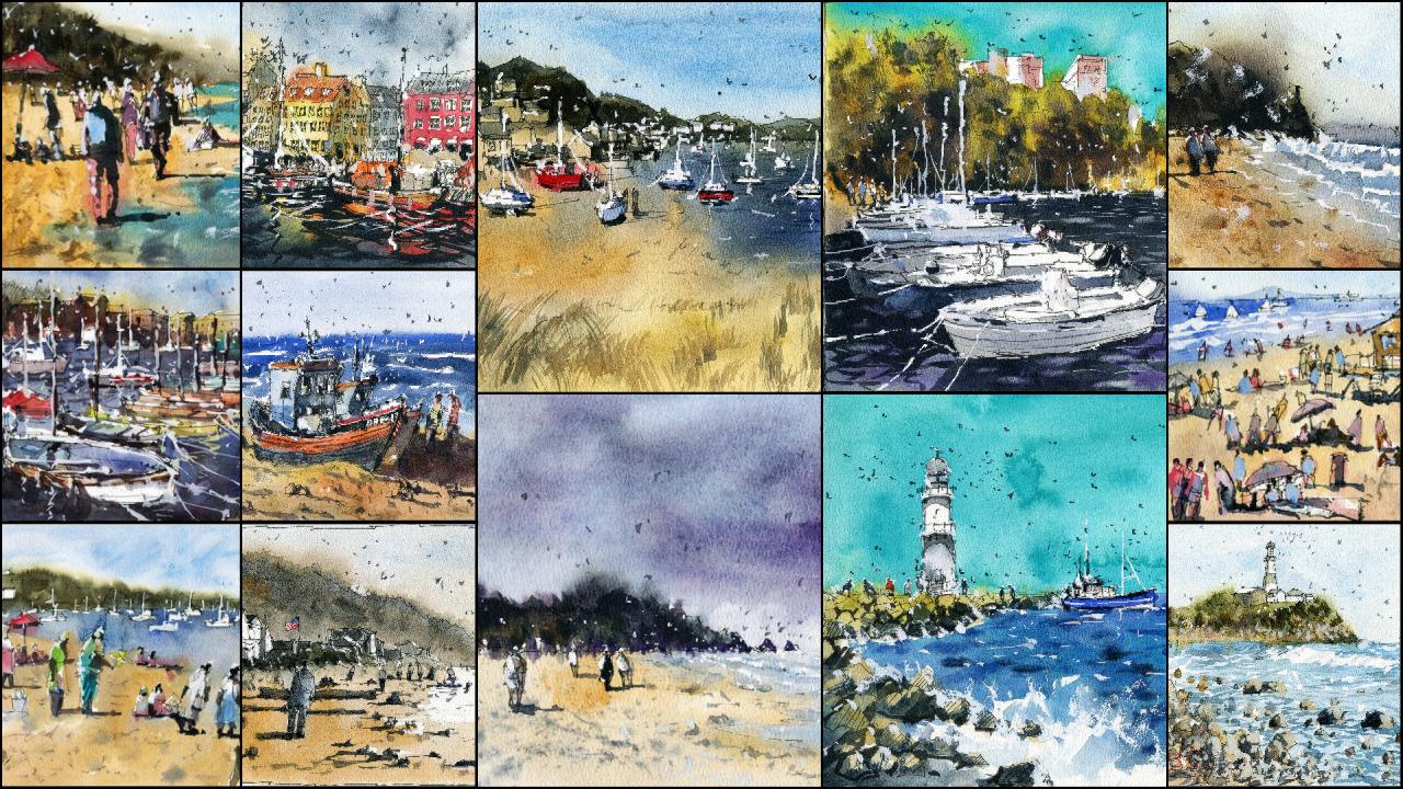
Transcripts
1. Introduction: Hi, I'm Darren, your watercolor artists from
Melbourne, Victoria. Welcome to learn and wash the Central Coastal
Landscapes sketching. You'll learn about
essential pin drawing and watercolor techniques in order to create a beautiful
line and wash painting. In addition to theory
and practical exercises, there are also 17 included projects that will
complete together. Walk through in real-time
the techniques I'm using, such as Witton wet
in wet and dry, also show you how to simplify and sketch
any scene in pin. This class is aimed towards beginners and
intermediate painters. Scans, drawings, and tracing
templates included for each project to
help you transfer your drawing over
quickly and easily. In this class, a narrate my
demonstrations in real-time. I explain every technique I use in the context
of the painting, such as layering
into wet areas to paint shadows of a
tree or building. I'll be going over
the essentials of layering wet into
wet and wet and dry. Watercolor also talk about what materials you need and which ones I recommend and use. If you have some brushes, a pen, watercolor, paints, and paper, then you sit to go. Join me in this class. Let's create some
beautiful line and wash paintings that
you can be proud of.
2. Materials Required: Before we start, I wanted to
talk a bit about materials. So the paper that I'm using is a 100% cotton watercolor paper. It's a cold press surface, meaning that there
is a slight texture. You might be able
to see a little bit of that texture on the
paper here on camera. Basically what
that means is that the paper will dry a
little bit longer. And when you're painting, it's going to have
a little bit of areas where you have the white showing through if
you paint really quickly. So it's really good for landscapes, general
street scenes. I think you can also use it
quite well for portraiture, but it's really good all-round. Great papers. So cold press, most medium texture,
a 100% cotton. Cotton paper. Grab yourself some
normal cellulose paper or normal watercolor paper. Often if it's not
labeled watercolor, 100% cotton paper,
it's going to be made of cellulose,
that's fine as well, but it can be a
little bit tricky when you're layering over the top of a different layers that can lift up the
previous layers. But again, just use what
you have for my palette. This is what I am
using and it's quite, quite messy at the moment. But I'll tell you the main paints and
I'm using over here, I've got Hansa yellow medium, yellow ocher, purlin, orange. Over here. I have a quinacridone, burnt orange could apparently
in red, buff titanium, a cerulean blue,
lavender, turquoise, ultramarine blue, and burnt
sienna, rural amber, green. I've got three different
purples and neutral tint. Also use a little tube
of white gouache. This stuff here, which
is great for getting in some final highlights
at the end of your painting just to recover a bit of the white of
the paper at time. So you can see some of that
leftover here on the palette. Now, you don't need
all of these paints. If you just have your primaries,
if you've got a yellow, you've got your red
and you've got a blue, like an ultramarine blue, that should do quite well. These ones here, like the green, that's more of a, a
convenient and mix. And this one is same here
with the neutral tint. That's about it. I
want to talk too much about paints by them in the tube and I squeeze
them out in here. And they tend to last
for a pretty long time. So I let them dry
off a little bit before I start
painting with them. In terms of brushes, I'll show you in
generally the ones that I use now I don't use
all of these by the way. I use a combination of them, but not all of them. Depending on the painting. I've got a bunch
of brushes here. These brushes are great
for covering large areas. If we're talking about large
areas of sky, of grant. If trees and things
like that, even water, these are fantastic because they hold a lot of water and they also have a sharp tip which allow me to
cut around shapes. I tend to use those were
a lot of the wash mixes. And then I use some
of these ones here, just these little round
brushes which are fantastic for detailing later putting in figures, that kind of thing. Maybe getting in sales. Even with this here, I can get in Moscow ships and maybe a little bits of
grass, that kind of thing. Sometimes I use
these other brushes, kind of specialty brushes
is just a fan brush. I can use that to get
in little bits of grass that I didn't use this
old too often these days. These are more just,
the other ones are just variations here. So of course, some flat brushes, which I don't use all
that often these days. To larger round brushes. Normally in most
of my paintings, I will actually just use the
seven brushes over here. Let me see. You've got
a brush that does. Mom picks up a lot of
paint like a mop brush. It can be large round brush
like this one as well. That is fantastic. In terms of pins. These are a few of
the pens that I use. They come in different
sizes, basically, as long as you have a 0.5 millimetre nib pen or
something like that. 0.5 to 0.6 millimeter
nip pin, that's fine. I've got a few different
variations here. I've also got some pens
that have a flat edge. As you can see, it's
going to flat sort of tips almost like a
permanent marker, one of those those marks that you write your
name in and stuff. So those are just a few bonuses, but you really only need
a 0.5 millimeter one. Just makes sure
that the pin says waterproof fade
proof, permanent. Basically said that the ink
doesn't run when you go over the top of it in watercolors is we're going to
be drawing first. Okay, So that's
pretty much about it in terms of the
miscellaneous material, I do have a little
towel that I use to dry the brush off at times
and a container of water.
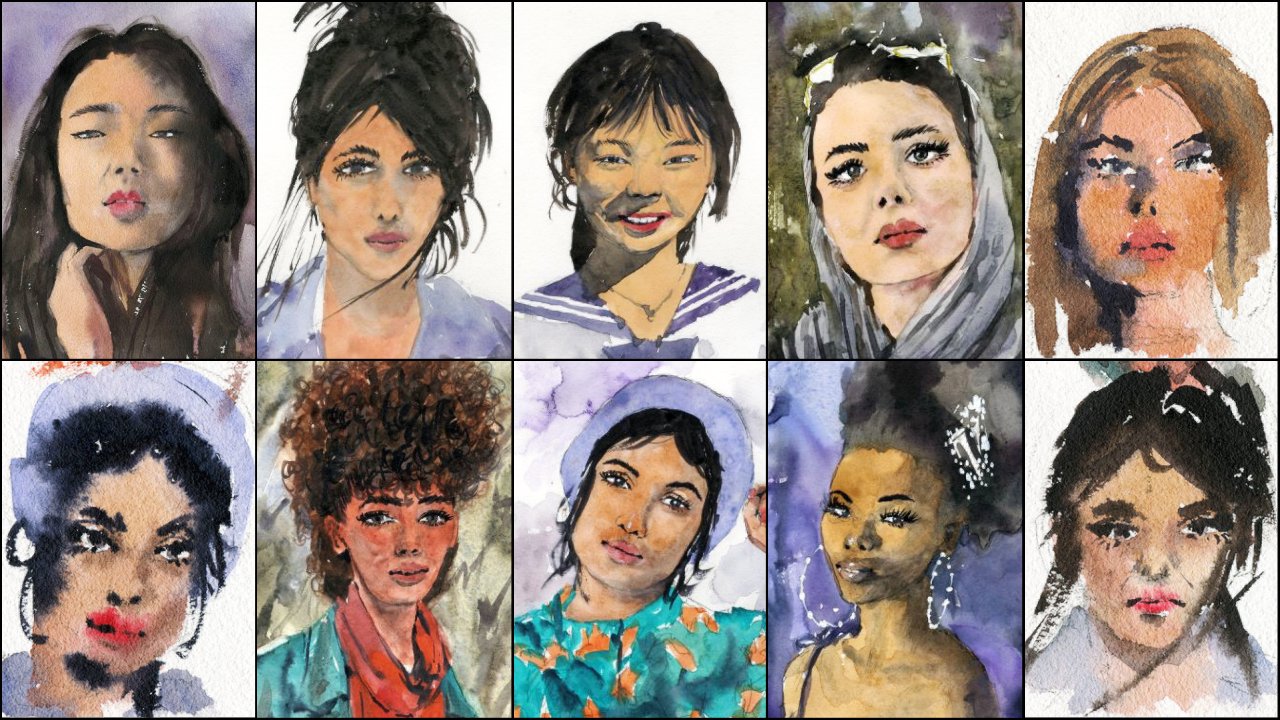
3. Drawing Figures: So before we get started
with this class, I want to run through some exercises with
you so that you're well-prepared in knowing how
to draw some basic shapes, basic people figures using some drawing techniques
like hatching, knowing how I
simplify shapes down. So let's start and
we're going to talk a little bit about
during figures first. So basically what you want
to do when you drawing figures is you want to
simplify them down. We have the head here basically, and we have the entire bodies. It's like a rectangular
shape like this. Leg and the leg here
they hid should fit into the entire length
of the body 7.5 times. So if you've got
the head here, it's kind of like 1234567, maybe 8.57 to eight times. If you end up drawing
a figure that has funny, funny proportions. So for example, if you
draw the head like this and you make the body
kinda like this, shorter. And then we make
the legs like this. Normally, that will be
a little bit off if we draw an adult figure because
that head will only feed. And how many times? 1234, maybe five times. So in this case, this might appear like a
child or something like that. But usually children will have slightly larger heads in relation to the rest
of their bodies. So you've got to keep that
in mind that 7.5 times rule. Now in terms of drawing figures, you see how I just simplify
them down pretty quickly. Basically what I do
is that I just look, I basically just have a look
at them and I'll say, hey, we've got a figure here, perhaps walking towards
into the scene. Basically I start off
with the head rounded, rectangular slash, oval shape, the body of putting more of
like a rectangular shape, but depending
sometimes you can get into more triangular
shaped like that. Okay. If a female, because at times the legs I'll put in usually a thought
with the first one, they are kind of like
a triangular shape. And the other one I can put
like that to make it look like that leg is going forwards. Okay. That's more of
like a figure walking, walking forward. You can also have a figure
that's just standing, standing straight,
something like this. And then you might
have the feet, just the legs, just
a pot like that. They have it. You got to
figure just standing, standing there and other hair is role-plays makes
a difference. If you draw a little bit of
hair coming down the back, it kind of looks like the
figures walking into the scene. This one here, because I've just done the top of the head. It looks like the figure
is facing towards us. You can see more of the fingers, hands as well too. In here. Figure on a side will
be like this, okay, the head will sort
of be the same, but the body will be like this. Maybe a bit of the
stomach coming out a little bit
more but the legs, I tend to just join them
together like that. That just looks like a
figure standing by the side. You can sometimes get coming
out like that as well. It might be looking
at the phone, uh, holding something like that. Now in terms of
other sort of poses, you may come across moments, situations where you want
to get a figure that's running or walking in a
particular direction. Now the direction of the slant of the hidden body is really going to
determine that. So notice this one that the
head is slugs and little to the left that you've got the body so you can sort
of in the body as well, which is still want a
slight slant like that. And then we have a
leg coming forwards and then a leg coming backwards. And look at the way I
simplify those legs, they just triangles.
At the end of the day. There's an arm. They might be another
arm here could be holding something like a
briefcase or whatever, walking into the, into
that sort of direction. Same thing goes if
you want to get a figure that's walking in
the opposite direction, slot that head and body
in that other way. It depends how far you
want that slot to go. If you want that figure to look like they're running very, very quickly, you'd almost
put the figure like this. Like that. There we go. We've got a figure
that's kind of running forwards into the scene. So the grades of the slot, usually the more quick
that figure will appear like they're
walking or even running. Also look at the legs the more wide apart the legs as well. We'll also look
like they're taking large lunges running towards
a particular direction. I always like to add in color to the
figures for the shadows. For example, what might pick up a little bit of paint here, I think there's a shadow
into the right hands. The light source to the lip, to the right-hand side. And I can pick up
a little bit of paint and basically just imply a lot source
to that, right? Like that usually with a bit of the little paint on
the left side of the figure's body joined
that up with the legs. Quite amazing how little
you really need to imply some type of some type of movement and shadow
here for the figure. It's really a few little lines with the shadow and you can really get in a decent indication
of any sort of figure. That's a little introduction to drawing and painting figures. Kind of drawing the
figure like this. You've also got an
opportunity to still go back into it and change things
around the cow might pick up, for example, a smaller brush. I may pick up
little round brush. I'll use this round
brush and think, Hey, maybe I want to put in some like a blue shirt or
something like that. I can pick up a bit of blue, mix that in with some gouache, go over the top
would just normal, normal paint drop that in. We can dock the clothing of the figures as
well like this. Put a bit more
indication for the hair. There's a lot of
options to just make those figures appear a little,
a little bit different. I mean, this person
could have is tie on or something like that, holding a briefcase or
holding something here. This person could be
holding something as well. This person could be playing
around with the phone. For example. We've got here, this person
could have a bag that's just to the side like that, or a backpack as well like this one holding
it from the back. So lots of little details, tiny, tiny brush strokes
can start to add more context and told a story for these
figures, these are very, very loose ones, but few of the longer that
you spend on them, the more detail and more story you can give to his
figures out and try to keep them varied. Sometimes if I have just
two or three figures, I really spend time
just having a look in, deciding warm, want them to be walking into the scene
away from the scene. Do I want them to be running? What kind of storage
or I want to tell. So I hope this has helped
and we'll continue on now.
4. Sketching Techniques: Okay. I want to
talk a little bit about some basic
drawing techniques. I won't go through a whole lot, but just the basics that
you're going to be finding useful here to just
draw and use a pen. So I normally use one of
these pigment liners, which basically has
a kind of felt tip, but the ink is permanent. Make sure when you buy one of these pens that it's
definitely waterproof, because that means that when you go over the
top with watercolor, it's not going to
run everywhere. Okay. So normally when
I draw, for example, if I start off with a scene, just a very basic scene, I just drawing a little rectangle
or something like that. Okay. So I will place the horizon line
somewhere in the middle, just below the middle point. And if I'm not sure, especially if you if
you're just starting out, you can use the pen on the side. And if you use the
pen on its side, or if you touch very, very lightly on the paper, you notice that line
is quite faint. It skips over the paper, especially if you're
using this sort of rough medium to rough
textured paper. So this way, what
you can do is kind of crack the set a little bit and then get that final line in. For example, if you're here
and then you think, okay, it's actually here, that's
where I want to put it. So the rest of it
doesn't really show up and go over the
top of that later. Now I tend to put the
horizon line in because it's the easiest thing
essentially to add in first. Okay. When I draw shapes, anything like that, I basically try to simplify things down. I try to draw with as
few lines as possible. So here I'm just drawing
in some mountains. You can follow along as well. Drawing, you know, just some mountains here in
the background. Look at that. I've used a few little
lines there to get in that sort of feeling here. Now, another thing you
can do is hatched. Now, hatching is a
technique where you basically draw lines in one particular
direction like this and it indicates a darker value. Okay. Dark value. So it makes it look a little
bit darker out there. Now, what if I want to get something even darker than that? Well, for example, if
I draw in another set of mountains or something like that coming through the front. Okay, another set of mountains
coming to the front. I want to make that darker. Well, you can basically
hatch in the same direction, but make the lines closer
together like this. And as you can see. It already makes it appear like this section
is coming forward small to make the lines closer together and you can
also crosshatch, which means you have the lines
running in one direction. But then you get some
lines and you draw some lines in running
diagonally across those lines. That does the same thing. You can do both.
Okay. Of course, you can use watercolors as well and just color this
different area darker. These are just a couple of little a little
hatching techniques. Now, what happens when
you make a mistake? So say if I'm trying to draw
a tree here and I think, oh, you know, ****, that shape doesn't
look so, so right. Well, the worst thing you can do is to go
in here and start, you know, trying to
change it and trying to, like, scribble it away,
that kind of thing. And especially scribbling
away. Don't do that. See how you can work with this. So this was going to be a tree. I would say to
myself, okay, well, I was going to put in the
trunk somewhere here. Okay. Perhaps like this. Okay. So maybe I
could just go over this section and just redo
it like that? Like that. Okay. It just make it kind
of a bit larger like this. Okay. They got it.
You've got to. So you kind of work
with your mistakes. Okay. You could have a line coming through here
or something like that, and that's not what you wanted. Or it goes kind of like that. So learn to work with
it and turn that to another branch like this. They're thinking
about see how you can change it around to
make it sort of fit in. But but whatever you do, don't go in and try to scribble it away.
Anything like that. Work with your mistakes and accept it and just
redirect the line. If you draw a line here
and it's meant to be here a little bit to the right, just restate where
you were going to put that line and simply
just continue along, drawing what you
were meant to draw.
5. Simplify Shapes & Perspective: Ready? So one of the things
that I always try to do when I draw is I look at
ways to simplify the scene. Now, I've got this scene here. We're going to use this
as a very basic example. I'm gonna go in and just draw
in a little frame for it. Just a little frame like this. It doesn't have to be
too big at all just to demonstrate what we're
gonna be doing here. Imagine that's the
shape of your paper. And you see for this particular
scene, the horizon line, which is basically
the area where the sky touches the sea or
where everything disappears, often appears as a tiny dot
on the, on the horizon. That is about a third of the way through the page
I'd say about here. I always start drawing off this area first,
put that in once. If you able to get
this area incorrect, basically the rest of it will fall in place a lot easier now, of course you can
change it a little bit and sometimes you
might be a little off. But at the end of the day, if as long as you're
close enough, that's gonna be fine now with this particular scene where
it's kind of a top-down view. So we see a lot of the
heads of the figures actually below the horizon line. I mean, you've got a couple
here that are standing around perhaps on
the beach itself. You might have them little
ones just off here in the distance but
to top-down view. Okay, so we're gonna have
a lot of those figures still below the horizon
line because we're looking forward from
a top-down view. Now if you're on the
ground looking forward to the heads will be all lined
up on the horizon line, will go through an example
of that one as well. But this is more of a top-down, Top-down sort of view. Now, what we're gonna do is look at how can we
simplify this scene. Now we've got the
water coming in and we know that
the water comes in. Let's have a look a little bit more than halfway
through the page, a few little squiggly
lines like this. There. There we go, comes
out like that. We've got a fence area here
and look at these buildings. How can we simplify them? I always asked myself, if I don't look at
it as a building, if I just look at it as
a shape, what is it? And it will basically,
it's just a box. So we've got a box here. If we draw that in,
like this little box, and then we draw an another one. There's another
Books Behind like this three-dimensional
box facing the ocean. There's kind of a bridge.
I don't know what this is. It's a type of
breach or something here meant to kind
of bridge that. Again, it's kinda
like a rectangle with a semicircle arch balloon
in the background. There's another
rectangle, 3D rectangle, another one here, okay? And the rest of the same
rectangles like that. They have a very simple sort of representation
of what you see. Of course, I spent
a little more time perhaps drawing things
in some of the flaws, perhaps some of the details like chimneys or what have you. But at its essence, this is what we are
talking about in terms of getting in a simple drawing
and looking at the shapes. Even in the shapes
you might find. For example, the building here. You might find this
building that there is a smaller shapes in it. So it's actually smaller at square on top of that
building like that. You work with the big shapes, get the big shapes
in the big lines. The important lines like
this horizon line in. The rest of it will
start to fall in. And then you can place
the smallest shapes after work from big to small, separate the sky
from the ground. Then you can stop putting
in the small figures. At the moment, what I've
done is that I have replicated this scene up above. Basically just putting
the same horizon line, a little bit of the water as you can see up at the top here, we've got a top-down
sort of view. All of the figures heads are
below the horizon line and as we get further
down to the back of the head starts to move up
towards the horizon line. And I'll tell you, make it look like there's more of
a high vantage point. Now over in this one, if we want to make it look like everything is
basically eye level, we go ahead and of course
we draw the buildings in. The buildings don't really
change all that much. I just put them in like this. Not I wouldn't say there's
a huge change through these because the angle
is not so high up. But you're going to
have buildings like this, same as before. Obviously there's that bridge. I'm not going to really draw
too much or they didn't. But the figures, the
heads are going to be here on the horizon line. No matter how big or how
small the figures out, we can have a big
figure here right in the foreground and the
legs just almost disappear. Versus a figure all the way
back here in the water. In the water here. Standing all the way back there. The heads are all lining up on the same point on the
horizon line as you can see. And that is what makes
a scene appear flat. Normally, this type of
composition is quite, quite popular in a lot of landscapes and a load
of street scenes. I use a lot of these. The same composition
and perspective, maybe with slight variations. But the difference
between these two is there is a slide that's definitely a
slight difference. And it's important to know these don't really
use many other, many other views
rather than these, especially for this
sort of saint. If you want to seem that
looks like it's quite wide and majestic
and encompassing. A top-down view can give
you that impression. This gives you a more personal, almost like a snapshot as
if you're there yourself. That's my little section
here on simplifying shapes and a crash
course in perspective.
6. Understanding Values Exercise: The sky and probably the water, maybe the solder that building, potentially the sand as
well, definitely that sand. That's gonna be the broadest
part of the painting. We've got shadows down the right-hand side
of these buildings, costing some shadows
into the water, onto the sand as well. Okay, So we want to make sure we preserve that feeling
of lights in there. So I always like to use a
really light wash first. And for this demo, I'm just
going to use one color. I'll go in and drop in a little bit of
purple here for the sky, look how light that purple is. It's about 90% water. I don't really have any
other any other mixing here, just purple, maybe that
leftover paint there. Try to use one color. This is going to help
you out tremendously to simplify things and
understand this exercise. Okay, so that's the
sky, very light wash. And also here you're getting also quite a lot
wash for the sand. The sand is even
lighter than the sky. Marginally lata, the water. The water is slightly. Let's have a look here. It actually gets lighter. If we look here, the
sand is lighter and then it goes darker near here, near where the water is. Interesting, and then the water then goes slightly
lighter again. You really want to have a look. And sometimes if you squint, it really makes a difference. If you squint, you can
sometimes make out these tones, these values. I also think the waters a
little bit darker than the sky. If we look at the back here, that motor is slightly
darker in some areas, separates it out from the sky. At the back there. Of course, we got
these buildings as well running through
and they are DACA. Pick up a doc, a bit
of paint like this, a little bit more of a
mix of purple in there, drop that in, and there we go. We've got the shadows on the right-hand side of the buildings is a
bit of a shadow. A bit of a shadow here.
They're pretty dark. Shadows. The one ones
in the background, little bits of shadow on the
right-hand side as well. You've got some darkness
in here on this bridge. And of course you've got
these kind of shadows that are just running
across on the ground. The grass here that go
all the way across. So you've got that. But of course you've got lighter areas on that left side
of the buildings that you can leave white
or you can just put in a very lighter mix in there to make sure that it's still retains
a lot of the light. Simple values exercise. Let's go ahead and try
it again on this one. Let's again dark and
that Scott little bit of this purple and
it's still quite light. I mean, it's really one of the lighter sections
of the painting. Apart from the water
and the cement. A little bit of that. Let's pop in a bit for the sand. I'm going to lighten this quite significantly on the left. And as I go to the right, I'll just add in a little bit more paint to just darken
it down near the water. Water does have more of a darker turn my
width Sans sorry. Then you've got the water which
is kind of lighter again. As we go up to the back, you're going to have a
little bit more darkness. All the water out here. It just sort of separated
out from the sky. Buildings. Again,
this is going to be some dark shadows on the right-hand side
of the buildings. Here. Mainly on the right-hand
side like that. And then of course you're
going to get some of these shadows going
across the ground, like these, which are basically the dark
speaks of the painting. Obviously the figures are very, very dark as well. You can go through
them and color them in and also put in a
separate shatter for them. But try this exercise
on different sketches. And if you're not sure
about, about values, this is a fantastic
way to practice as these tiny little sketches
when you're using one color, it's, it's very simple. You don't have to think
about the actual hue and whether you need to naturally
liked to say like a yellow, It's very, very light
versus the purple, so there's just less variables and you can learn
how to do this. Also, you can use a pen, you can sketch as well, and that will also help
you to understand values. You can use a pencil. But that's about it.
7. Understanding Colours: So I wanted to talk a little
bit about color mixing and it's something that I
get asked constantly on. And I think it's quite important to discuss
color mixing and also the relationship
between color and values. So I'm gonna draw an, a few quick sketches here. I've already got
one here from one of the previous exercises, but I'm going to draw four more, three more really
quick sessions. We're going to try
different sort of scenes. For this one here. Let's perhaps go with maybe some buildings or
something like that here. We can go with some buildings. I'm just making this
up as I go like that. Maybe there can be
some boats here. There could be a boat here, there could be a book
here, for example. That could be, it could be like Venus or
something like that. Who knows something there? There's a quick little tree
related seen over here. We might have just
some simple mountains here in the distance. This can just be the, the land, maybe some
figures walking around. We can have a couple just walking doing the business here. Then over here we can have a quick little beach landscape, something like this and
the hit land coming in there as well. And we've got some figures, couple of figures just walking along the beach just like that. Maybe a dog or
something like that. Well, let me be
adult. Hey, big talk. Anyway, let's go ahead and I'm going to show you
how I mix some of these colors and in the relationships to the
value that I'm using. Color and value out. Very important to distinguish. Color is basically the huge or whether it's
warm weather, it's cool. We're talking about
a cool color. We're talking about
something that tends towards the bluish color selection. We're talking about
something a warm color. We're talking about
a color that's more sort of red, yellow, orangey sort of color
on the color spectrum. Now, when we talk MET values, we're talking about
whether that lot that, that color is light or dark. For example, when going into the sky here and I want
to make it a nice, warm, sunny day or
something like that. And perhaps I'd go
in with a bit of light blue at the top you
lights to rule in blue. So the value here is, it's a light value. And I'm using a cool
color, cool hue. Because I want it to be light, because the sky is the lightest
section of the painting. Now I want it to be
cool because I want it to look like the sky. During the daytime when there's no clouds and
it's not raining. So that's why I'm using
that color for the sky. So now what we're
gonna do is perhaps go into the water here below. And normally the water might be, I find the water is often
slightly darker than the sky. Unless it's a really sunny day, the water will be a
little bit darker. Again, we're using a cool Cu, cu colored hue, which is
tending towards blue. And we're using a darker
tone, Todd darker value. You can see going through
in which adding a bit of color here, darker values. We can even pick
up a little bit of really dark values,
like some just, just a really dark
value and just drop that in here like that and create the impression of
little thought waves. Just like that. We can
even do that with the sky, can drop in a little bit of this to create some clouds or
what have you in the sky. If you want to make
it a stormy day? Using a darker value into a lots of air that is has
a lighter value. What about the buildings
here in the background? Well, those need to
be darkened as well. I'm just going to go ahead
and make sure they the dark until they stick
out of the sky. This is again, a kind of
probably a neutral hue, so it's neither cool or warm, probably, probably
slightly cooler. Actually. I'm just coloring, coloring these buildings
so that they come forward from the sky like that. Then we might have, for example, these boats, which we
will get in really dark. I've got an, a full tone here. Who value just a really,
really dark color. Again, we using per a kind of neutral hue or maybe a
slightly cooler gray color. But we're using full tone. In a very dark value there to make those boats come
forward a bit more. So there's one, Let's have
a go at this one here. I'll pick up, for example, a nice orange for the
bottom of the sky, kind of like a sunset
drop that orange in. And this is a warm, huge, very warm because it's tending towards the
kind of orangey red, yellow, the color spectrum. And then on the top or I pick up a light kind of cooler hue, which is basically
this cerulean blue, wanted to blend in to make it
look like there's a sunset. Alright, the ground, I'm
going to pick up a warm hue, which is just a yellow
ocher, drop that in there. I put in a little bit
of brown as well, just to dark and it
marginally like that, just a bit of little
bit of brown and V2. That is also a warmer hue, but the brown adds a darker value in the lighter
value, yellow down there. We're going to go through
and we're gonna look at, for example, these
mountains in the back. Now we want the mountains
to come forward. We don't want them
to be in the same, in the same depth as the sky. So I'll put it in a
bit of blue here, for example, for
those mountains. And let me just dial
that down a bit, make it move like
a purplish color. There. There we go, and then
we just drop that in. You can see the mountains are already come forward
a little bit. But what about these trees? You might ask, well, we can
pick up a really dark color. We could pick up like a
brown and just drop that in. Again, I'm painting this wet into wet so you're not gonna get too many sharp details
usually with these trees, I'd wait until later to put
in the trunk so that it just looks more sharp. But you're going to
have that, you're going to have these trees, these branches here
on the left as well, which are going to
be nice and sharp. Doc coming forward the
document something, the more the more
it comes forward. Of course, the top of the trees, we've got some green somewhat dropping a little
bit of green here to make it also come
forward like this. Shadows often are
quite dot as well, but they usually a
little bit lighter than the actual object itself. So I might have some
shadows running to the right-hand side
there of the trees. Something simple like that. Let's go ahead and try a couple more down the bottom here. So this is a simple scene. For example, I might want to
make it, Let's have a look. Maybe we make it
a nice sunny day. I'll pick up again
a bit of orange, drop that orange in here just at the base near the mountains
or whatever is at the back. I'll pick up a little bit of a cooler color and drop it in. It could be a kind of almost looks like it's getting dark. They just dropping a
bit of that gray in the sky up the top like that. Go into the ground and I'll
pick up some more gray, drop that in here for
the ground like that. Just go around those figures. Some of the figures, which is grays basically
now the warm or cool, It's meant to be in the middle, but you can have grades
that I just have a warm or cool bias. So if you mix a
bit of warm color like red or orange into a
gray can turn it warmer. If you mix a bit of blue, you
can make the gray cooler. So at the moment we've
got a warm color here in the background, which is basically just
a, an orangey color, beautiful gray at the top, they're warm gray because it's
mixed in with the orange. And then I might be a
little bit of blue here. Drop in a bit of blue
in the distance. Using blues and basically cool and warm
colors together creates a beautiful sort of
vibrancy because both of those colors, essentially
complimentary colors. If we looking at opposite
ends of the color spectrum, if we pick two colors from opposite ends or
nearly opposite ends, you're going to get
a better feeling of vibrancy in your
painting. So here we go. We've got an area in the
background that's DACA. I'll just drop in some
more paint like that. I might go ahead and perhaps pick up a bit of
colorful these figures. I'll put in a bit of
turquoise or something there. And of course, getting
an indication of a shadow maybe running towards the left like this for
some of the figures. The legs in a bit
better like that too. You can get in these little
indications like that. Let's have a try this last one. Q. Let's have a practice run again. The sky Let's go
through a dark sky. Maybe go for a dark blue sky. It's nighttime and let
me just put it in a bit of gray in here as well. Just try to dog and down
the sky a little bit. Like I said, we got
really dark over here. I'm going to bring this across. It's kinda like a
purply color like that. Okay, That's for the sky. Maybe maybe we could
drop in a bit of a darker paint in
there just to getting a bit of extra contrast. It could be some
dark clouds that are just moving through
that area and not time. Something like this. Yeah. Then for example, we can
go into the water and it'll just get in a
little just indication of that water like that. Keep it going to be fairly
dark stew in areas. And then we've got a
bit of land here and let's pick up some warmer color, just a bit of a warmer yellow
that I'm dropping in here. It's mixed in with
a few other things, but it's still
pretty still pretty light compared to
the other areas. And it's warm,
which is important, just contrasting with
some of the cool colors, It's got a bit of warm in there. I can go into the background. Of course, we're gonna need
to make this quite dark. So I'm using a really dark tone, dark value here straight into
these headland at the back. Because, because
the sky is so dark, we need to make this
darker than the sky. The only way to
do that is to use a full tone of full value here. I can just drop in like that. Of course we've got some figures and what
have you here as well. We can sort of figure out when do we want
the shadows to go? Maybe we want some shadows
to go to the left, that kind of thing so
I can pick up a bit of darker paint and just
dropping a little bit here on the ground to make it look like the figures have
their legs moving a little bit of basically a little bit of better to the
left and there's the dog. Here's where you can't
really see the dog anymore, but it's kind of indicating that light
sources to the right. So this value here is
basically the largest value, this white and put
the dogs value here. When you have a really
light value next to it, fairly dark value creates
maximum contrast. And the I sort of
focuses in on this area. Basically, we have a
few different scenes here that we can sort
of play around with, but try this out with
a few of your own. And all of these I've
done I've just wet into wet obviously because
they're quite quick. Just want to get
them done faster. But you can already see some of the things we've done
with combine some warm with cool colors to create more vibrant and interesting
color combinations, complimentary color
combinations. And we've used different values
at the same time to bring forth certain speeches and
objects, that kind of thing. To the foreground. We've made these buildings
Lu doc and then the sky. It's kind of hard to see now, but it should be more like this, just slightly darker
than the sky. And then we've of course got all these darker
kind of boats here. In the foreground. There going to be quite dark
and they come forwards. Having a large range of tones, a large range of
values like this, basically allows you to indicate the context
of a particular scene. So nighttime, you're going to need to make that sky darker. And then you're going
to need to make this area of the headland darker to compensate for the darkness and the
sky and even the sand, you're going to have to make
a little bit darker as well. Over here. We've done a little bit for
these, these trees basically, but as you can see, just a little bit of detailing
into the trees as well. With a dark of value, brings out the trunks. We have a slightly
darker value for the shadows here as well, the trees and the mountains and these branch or darker value
than the background, um, which is a combination
of a cool color and a warm color, creates
nice contrasts. We've got a combination of all these scenes of contrasts
between cool and warm, light and dark values. And having that combination is something you should always
aim for in your paintings. It creates very interesting
eye-catching compositions.
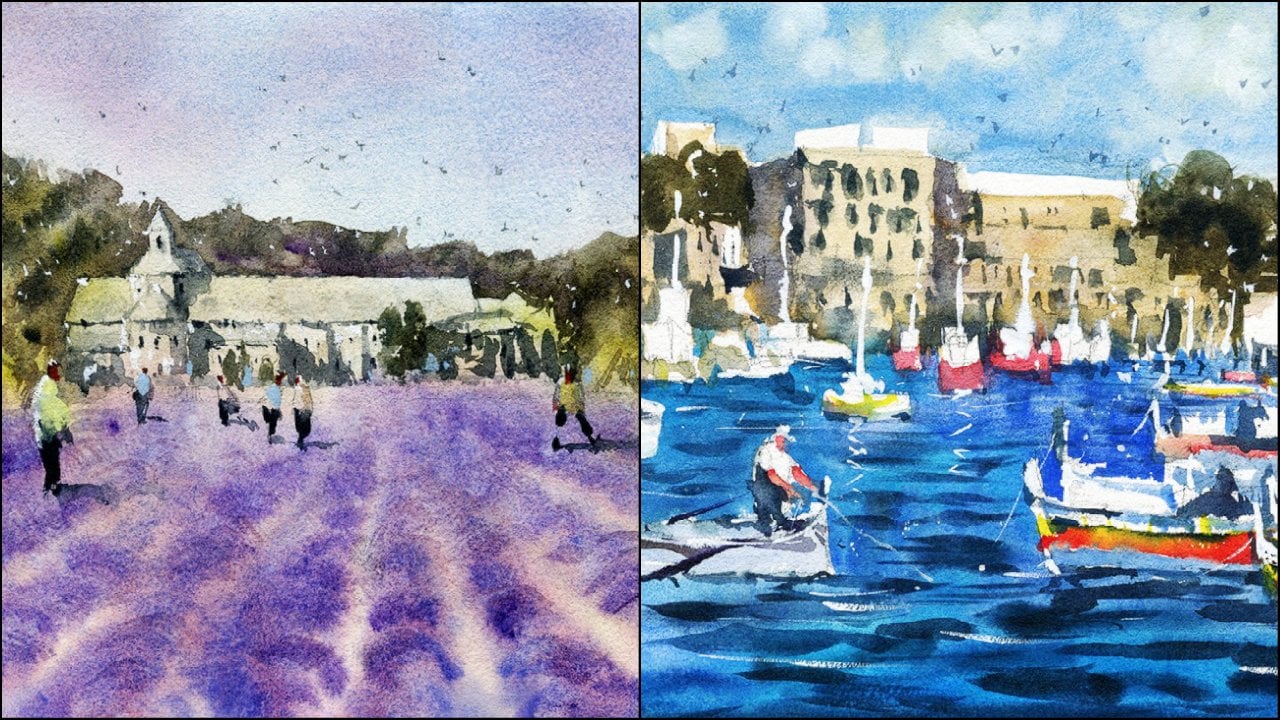
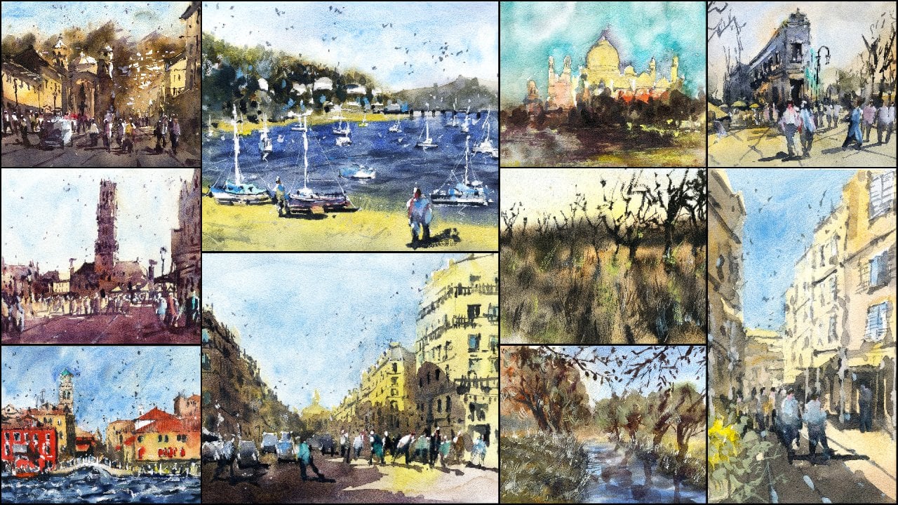
8. Stormy Beach: Draw & Paint: For this scene,
we're gonna be doing a very simple beach scene. A bit of headland at the back, a couple of figures. And this lovely ocean
Spray sort of coming in. The sky is fairly dark. And this is
interesting because it kind of looks like
there might be a storm coming and just keeps things
a little bit interesting. We've also got a high
contrast between the sky, which is fairly dark compared to the sand, which is lighter. So Let's give this guy, I'm going to actually
draw in a little border. I'll keep this a pretty
wide border as well. Okay. Something like that. It's up to you
sometimes I do like to give it a bit more
birth on the sides. But actually most of the time I actually go quite
close to the edges, but we'll see how we
go with this one. I just want to squeeze
it into a smaller space. Surprisingly, some of these
ones tend to look quite, quite nice with the
obvious border. We've got the scene in here. What we want to do
is separate the sky from the ground and
the water so the water we can see it starts
about if we look at the entire scene about a third of the way
through the page, let me slightly higher than
a third of the way so I can mark in these two
sections like that. And of course just
stopped bringing across little line.
Just like that. We've got some headland
at the back here. A little bit of
scratching in for these literal Up headland here, as you can see, just going off into the distance like that. Of course got a
little more of these whose land off in the distance. Just trying to get
in detail up here. It's actually a little
lighthouse rod on the top, but not really able
to see it or not. I don't think I want to
emphasize that as well. Thinking about putting
another beautiful rock here or something, little rocks. Just to bring through this feeling of this bit
of Hitler and keep it. And then bring it a little
bit further out to the sea, but create a bit
more detail in here. Because with a simple
scene like this, often what you'll find is it
looks great in a photograph. You need to just spruce it up a little
bit in the painting. And the reason why is
because we're actually simplifying down
a lot of details. Whereas in the the actual
reference picture, as you can see, even
though it's simple, there's actually a fair bit of detail that the
cameras captured. So when we drawing, a lot of that detail
is actually lost. So let's get in a little bit
of the area of the water. I'm just gonna try to put it in, some of it coming in. Again, we don't have to really imitate exactly
what's going on there. But I thought I'd get it to come in right about right
about halfway. It's slightly more to
the halfway points right in the back a
minute as we come closer, it's sort of receipts
inwards a bit like that. Notice just how lightly I've
gone with that pin as well. I don't want it to take
up too much space. Also look too sharp lines
and things like that. You can see a lot of these waves and I'm just trying to
indicate some of them, mainly for painting afterwards. These black lines, I
hope more and show through too much more sort of giving indication
to the direction in which the waves flowing. Kind of coming inwards
like this already. So let's draw, drawing a few people gonna go
and put one person here. Simplify down as well. The head just a rectangle, the body also the kind
of the larger rectangle. And then I've got of course, the legs, like a BSW. I can join them
together like that. We can put in another
person here as well. Simplify down those
legs like that. You can see them kind of
walking through into the scene. I'm thinking as
well, I might put in a few more figures
in here as well just to keep things a little
bit more interesting, that foot in front and notice how as we go through the same, the figures at the back
and get a lot smaller. You don't have to really put too much detail for the
ones right at the back. It's more than
ones in the front. We might want to, for example, getting an indication of
this person's T-shirt, maybe they're holding onto
something here as well. But I do want to keep this
one pretty pretty simple. Here's another one. Got
another figure here. It's really good
exercise and perspective because you can practice simple perspective
of the figures. The heads are just
on the horizon line, which makes, makes the area, the land to appear pretty flat. And of course you
have these figures, some of them closer and
some of them further away. Perhaps with their legs lifted, certain angles and things got a couple walking
through a bit closer. And I think that should do it. I don't want to
exaggerate anything. Let's go ahead and get out. I'm paints Friday. So for the first wash, I am going to start going to
actually use a mop brush, a medium-sized mop brush. And this is going to help basically just getting a
bit of color into the sky and do like this kind
of almost very dark. But I'm going to go in
with this purplish color, maybe a bit of
ultramarine here as well. And a bit of lavender
mixed in here. I can actually put in a bit of ultramarine down
the base like that. I just wanted to create a
light wash over the top of all this and I'm
actually going to drop in some heavier paints soon, but I think this is a
good place to start. Initially. It's kind of almost like a purplish, slightly
purplish mix. Blues in it as well. A bit of ultramarine and
a bit of cerulean blue. Going. Just bring this wash
all the way down. It should leave the
page a little bit to encourage the water
to flow downwards. If we go just bring
this down kind of where the hit land starts right there, cut around it like that. Just real basic tiny
bit of cutting around. Just with a water begins
on going to stop there. Good. Some of these water upwards. Good. K. So here comes the fun. Of course, we're
going to just pick up some darker paints. I've got some purple here. I've got three different
types of bourbon was actually I can just pick up a bit of this
here is amethyst. It's kind of like a
granulating purple, but we've also got other
purposes as well that you can use good stuff
called imperial purple. I wanted to just create
a bit of darkness in that edge there in the sky. They're a bit here, but I do want to leave in
some of the whites as well. So being quite careful not
to get rid of all that the lots of colors in
the sky because they actually draw out the doc. It's a lot more money, not when you have
lights in the sky. You've got to have
that the opposition of colors running through
here in order to, in order to create the
feeling of light and dark. And one cannot exist
without the other. So this is why I'm
pretty careful here just to make sure that I'm putting in some of
these dark color. Also. I am leaving in
the lighter bits. Very simple, very simple. I don't think I'll actually
go any darker than that. Let's go ahead and I'm gonna pick up a
smaller round brush. Number six. I think
it's a number. I know it's a number
eight round brush. A few hairs are fallen off, so it's probably not a six. Now, what we're gonna do is we are going to work
bits on the water. I'm going to pick up some
of the cerulean blue, just bring that
across like that. I want to make it
very, very light. Hopefully we can just getting a quick indication of some of these blue running
in the water like that. But we'll leave
actually load of the white in there as well. That white color
and that's going to indicate the It's kind of waves swell the way in the distance bit more as
we come down to the front, I'm just going to pick up
a little bit more paint. But a lot of it's just close
this kind of white colors. As we get a little bit closer, I'm going to pick
up a bit more paint like this and just
drop it in here. Just merge it on a little
bit onto the front here. Coming into the shore. Before this all dries. One of the important
things to do. I'm getting the dark
bits, all the sand. There's just a
little bit of sand, a kind of a dark sort of yellow color right here
next to the water. And I'm going to just
darken that a bit and mixing a bit of
gray in there as well. It's kind of like a doc a
bit of sand here like this. It looks like wet sand
or something like that. Just surrounding the water. Not gonna leave
any white in here. I want it to blend
in very nicely with the waves and these blue waves or what have you like of that. Fantastic. Once that's done, I'm going to start picking up some
of these buff titanium. It's just a white
color, off-white color. Mix it in with the yellow ocher and create a very light wash
over on the left-hand side. Notice little light wash, almost the same color of the
background of the paper. But just to get rid of some
of that white in there. Let me go join that
up with the water. That got a bit of this sand. That's all it is, just a
little bit of sand here. Of course. One of the things I
really liked to do is to pick up some paint, a little bit of brown or some
MAC here on the palette, just leftover bits
of paint and use, use this brush to kind of tap
in a few bits and pieces. And at times you can also just dropping a
brushstroke here with it. Sometimes this can
look like a splits a seaweed or washed up bits
and pieces on the shore. It just helps to give a sense of directionality
is what we, interestingly enough,
It's sort of leads, leads the eye in. You don't want to overdo it. Just this little bit of
splatter here on the page. Like that. Simple but can be actually
really effective. Think of going a bit far
down at the bottom here. So if you ever do that and
you want to get rid of it, you can always pick
up a bit fishy. Pick up a little bit
of tissue inches, just dab it off on the edges, just soften off like that. Don't worry too much about it. I'm going to go into the
mountains here in the back and pick up a little
bit of green, which I'll drop in there. Not only that, but
perhaps some brown, beautiful neutral tint, some
blues in there as well. So that we can
just dock and down this headland out the back
because it's very, very dark. Of course, because that
area is still wet. We're going to get some merging, a bit of blending
in there as well, so that's definitely
anticipated. Another thing, again,
you can start using this sort of pick up a bit of excess paint here and
there if you'd like. There's also this sort
of miss the feeling. If you can see that this
misty feeling back here. So I can actually use this tissue to my advantage
and pick up some of this paint to create this
sort of slightly miss the fill off in the back
and in the distance. Sometimes I actually damped
that tissue with a bit of water and do
something like this, just dab that area,
the lift off. Very small amounts
of paint like that. Coming along. The main thing is just
to keep it pretty dark. This area of the headland, perhaps in here would be good for the rocks
and the water. Don't worry about getting a
feeling in all these wights. Well, remember that leaving some white on here,
actually it looks good. We've got some sharp
because some soft the bits may have
to just increase the size of this area
of the hip land because it's coming up and going a bit funny up
there. So I can just That out a bit. Let's bring that across a bit more green for very
dark as you can see, it's just all the darkest part of the painting
really like that. But again, these little
bits of white leaves, some don't have to
call them only in, they could be people, they could be anything at the back there. Funny enough, these
little blooms and areas up there can also look like unstructured
trees or things like that. Pick up a little bit of dry and paint like this and you can just do this kind of
thing to indicate. Again, the soft edges that could be trees, bits and pieces. And it blends into the sky
quite nicely as you can. As you can see already. We're gonna give this
a really quick dry. Now, what I want to do is
getting a little bit of detail for these figures and really fought
for one of them. I think it really dark
like this one here. Almost completely black. Just the very, very dark. So I'm just going to color
that one in a bit like this. Legs in just a week. You're gonna be
able to see much of that pin in there
anymore after this. That's for sure. Okay. You've got one next, next
to the figure as well, which we can just continue a little bit of color,
for example there. And don't always have to always have to
color everything in. Leave bits of the previous
wash on there as well. I've just put in a little
bit of pink, pinkish color. This one here, I'll just
get rid of the little bit of water on the paper light
wash of this warmer color. I'm not going this one hue
with a bluish color like this. Little bits and pieces. I'll let go to the
drop in paint. Sometimes in there to make
things more interesting, we can assume blended
kind of paints. One thing I wanted to
do as well as just get some really basic shadows
running across the ground, kind of towards the right of some of these figures
just like that. Something there to make it
look a bit more realistic. There's really not much to put in here in the
way of shadows. It's just simple. More kind of these little
shadows running towards the right-hand side indicated by the light source in a
little bit like that. Fantastic. Again, we've got these bits and pieces
here and kind of like read or what have
you here over here, underneath in here. Back. These tiny little marks. Because again,
like I was saying, we have such small amounts
of detail in here. They actually really help to
create tiny bit more detail. Even here in the water, you might notice there's some waves that are just a
little bit dark or I can just indicate them like these running through
just running through it. I don't want to destroy this blue beautiful blend as we get sort of where the
sand and the water mixes. So really what I'm doing here
is I'm just using the very, very light brushstrokes to some dark waves
or what have you. It's just so thoughtful. Even actually here,
this dotted border coming up near the front so
I can just darken it a bit. Maybe just spirulina and
the teacher's like this, Suilin drop it in like that. Then that edge off a
touch as well like this. Fantastic, I'm going
to now put in a bit of brown in the mountains
and just speed some pieces. Again, just kind of like this dry brushing technique
that I use a pickup, a bit of darker paint and then just use the side of the brush. Feathery in some
bits and pieces, some little details
or what have you. I'm just having a look at
that reference and seeing if there's extra detail that I can imply all the way in
the back there, especially. It perhaps the headland touches the sky
little because we had lost some of the edges up
there to the softness. I think some sharpness up here. We'll also balance
things out nicely. So simplifying, of course. This area is also
already just so dark, so there's not that
much to add in here. The texture is what I
think is interesting, just a little, little bits
and pieces of texture. When it dries, it actually
looks quite interesting. More bits coming up and
up there like that. Then I want to darken some of these
shadows a little, connect them on better with
the legs of the figures. Put in a few birds in the sky or all the
way in the distance. Just a tiny bit of this
paint and just drawing a few little v
shapes in the sky. Also in this really
large area here where the rocks and the waves and actually putting some
waves a little bit later, some tiny little ways
with white gouache. Small birds around Hera would be good because we've
got higher contrasts. Of course, lists. Dark areas down the bottom. But of course,
putting in a few in other areas is so
important to me. Wrap the brush further
down like this. Get more control. Doing this like that. Little v's and sky. Keep them pretty
randomized as opposed to focus them all in one area where you can have
like a little flock of them, spots, that kind of thing. They help to join up
the entire painting. It makes it look a
bit more interesting. Going to go pick up a little
bit of white gouache. Drop that in to the side
of the palette here. What I'll do is just
use these to finish it off with some async
little highlights. Pick up small round brush
for this little round brush. Be able to put in a bit, a bit. Too much, too much
paint on the brush. I'm gonna get some more. Woke wash. The thing
with white gouache, that it always, it's so easy to get contaminated
with other paints. So you have to really clean your brush well and make
sure that the previous, the previous paint is no longer in that brush
because even at a tiny little bit
of paint in there, we'll turn your gouache,
different color. Just how it is. Let's try
this now That's better. Just promise, just
picking up straight, straight from the bottle, little bit of the
head then a little bit of the head here as well. The shoulder like that. These little indications of
the head and the shoulder. Here's that figure
to the left as well, tiny bit of gouache to the
head, to the shoulder. Do the same thing for
this figure here, indicating that light source coming from the left-hand side. Good. Bit more into the body
too, if you'd like. Testing, I'm going to drop in little up here it indicates
some tiny birds or something just be flying
through, catching the sunlight. Little, little details,
tiny bits in pieces. Move birds, just flying through the mountains and
hit land at the back. Sometimes you, if
you don't connect the wings, it looks
a bit better. Keeping them. Keeping them interesting. Good. Of course, I did
say we're going to work in some of these waves are a little bit and
maybe bring out some of the white that
wasn't there before. So we can also just do
this sort of thing. Sometimes you get a
bit of a spray on the ocean at these waves at
the back, look at those. Some of them just
come straight up. But you've got some
here, for example, just a little waves
coming and joining up. Just a bit of this
I think is nice and all over the
place, but just a bit. Do it with the gouache. A few bits and pieces here
on the assures, well, they're not really anything
that's actually there, but just some color too. I don't know because we've got all these blue and
stuff over that side and it's kind of getting
a bit inconsistent. So dropping a bit here,
make it look better. We are finished.
9. Barmouth: Drawing: In this scene, I have a
photograph of bomb mouth, and it's a pretty
large photograph. And what I've done is just taken the middle section of it so that I've cut off the two edges. It's a very large
panorama sort of view. I think this is going
to be interesting to draw and paint these boats. We've got some houses, bit of beach and a bit of sand genes here at the
back. Oh, or what have you. So let's go ahead
and give this a go. Now I'm going to
start off by putting up some, let's have a look here. Just some thinner one is I think I'm gonna
go in with a 0.5. I'm pretty, pretty
standard sort of line up. What I'm going to do first
is getting the air of rod at the back with the houses
and everything starts. I think it's about it's about a third of the way
from the top of the page. So let's say about here. Again, little generic align, mocking that edge,
like that. Fantastic. And you're going
to notice as well, you'll find that there are these mountains here in the background that you can
really just put in first, It's the easiest
part because you don't really need to
think oh, too much. Just a larger shape
thing you need to remember is just where the
mountains sort of finish. It's kind of interesting
because this one nearly goes about two-thirds of the way into the page or even further. But then there is some
back background mountains as well that connects. Go ahead and put those in and
afterwards what we can do is look at how they are and perhaps sign
doc and some at the front, a bit more so inside
the mountains as well, you can see there are the two houses or lethal
structures in here, building small ones at the back. That was probably these
ones are probably the big. Let me just swap to a smaller
point to pin as well. This is going to help me to detail getting these
shapes a bit more easily. The end of the day, just
remember that they kind of just squarish like shapes
off in the distance. You've got to kind of
other house sort of here. And I breach all the way
in the back as well, just going all the way through. You can see I'm just going to
simplify this bridge down. Really see it that much
from where we are at. Fantastic. So again, with
all of these buildings, it's really just looking
at how we can simplify them down. Of course. I want to get them
all in one go as well so that they
join up together. And the light source is coming
from the right-hand side. You can see the shadows. Certainly left-hand
side, you see the shadows being cast
towards the right. This is something
that I'm doing, just making sure that I getting
those shadows later on. But of course while we are working on those and just again, just putting in some of
these little houses, really just rectangular shapes
and what have you here, which we can indicate there to be extra additional
hazards and what have you. There's a larger one here
that's up near the front, which I will just detail
a little more like that. Comes down around. Let's get this facade in
this as well, like that. Testing. There's a kind of section is blue section
here in a couple of polls. And what have you coming down? There's some windows
here as well. And then you can put
in some little windows with the bits and
pieces that are closer often does help to detail some goofy little
lines and what have you. This is just in front
of that building. Mainly. There's a beautiful area here. Kind of like raise
their elevation where the boats
and what have you potentially don't is
actually few boats here is that you can
sort of just put in that section and it's not too obvious and it's just squares and
bits at the moment, but we can of course, indicates some of that later on with the, with the gouache. But a lot of these
houses look at them. They're just squares. Look at them as one's got a
dome or something though. I think that's a dome,
something like this. I think go up into
the mountains, another rectangle and then I'll get in like a
rooftop, like a vase. For instance, have
a look in here. Just get the rooftops in first. I think that helps a little
roofs and the overlap lot, which makes it quite a lot easier if you can draw in
a few of them at once. Like that. As we move up into
the distance as well, Find the amount of
effort you need to put into detail becomes less. You just looking
at getting in the, mainly the rooftop because the rooftops have a bit of light reflecting or
something like that. It's the little bits
and pieces in there. Let's have a look, perhaps another house
or something here. Another one here. I think that the boats
go in behind it and there's a canal is a canal
that runs through like that. Okay. So I think that
should be enough for now. I'm going to put in a
little indication of where the water line is
somewhere around here and it comes out comes out about a third of the
way through the page here. In the foreground. We have some of these jobs or what have you just some
pieces here near the front. And I'm going to get the mean later on with a bit of Witton wet and wet to make them look
a little bit more fluffy. Job here just to put in some
of these boats so we can start with something like that. Let's just get in
that book there. And just follow the general
structure of these boats. Just look at the stain
and figure it out. Lots of putting the
mass of these as well. They look really good, I think against the water up. If I can go ahead and
indicate some of those, of course, I'm going to
definitely going to do that. He's another one here. Of course, a lot of this as well can be editing once we finished. Once we finish the drawing. Think of this as a beautiful
plan for the painting. But one of the pen will
remain behind anyhow. Some more here in the front. Look at the back. That's kind of like a rectangle. This is kind of a largest ship
that the mosque going up. It's in pieces on the boat
or something like that. We've got a larger
one here as well. Just find a way to get it in that it's kind
of empty space on the back. Like that. Course we've got another
mask going up into the sky. We've got a bit of a I want gear on the side and you've got little ones
here in the back. So just use your imagination and the reference
as well, of course. And put a few in. This looks like some speed boat. Yeah, I think it's
something quicker. Put another one just on
the edge, like that. It's really important to
make sure that you've got variations of
these boats so that some of them look facing in the opposite direction
or what have you. And they get smaller as we go out the back as well
as you can see some of these little ones all the
way at the back like that. Just some little ones like
this gives the impression of feeling of dip in the scene. Excellent. Of course
we've got a few here on the actual Friends at the scene. So I'm gonna draw a
rule, this one here, this red one, It's
quite interesting. I like that one. A bit closer as well. You can even see the shadows
underneath the boats. That's something that I might
do later with another pin. You can do it now, but just getting the
top bit of it fist. And I often use with shadows, I'll use a thicker, thick a lot and I
just forget again. One going off like a
flat pick up a ladder, one here that I can
just play around with this module one. Hey, something like that. Same hue, but this one, a little bit of darkness. From the light source to the left of a bit of
a shadow being cost. You don't really get too many, too many shadows and what
have you ever that side, but certainly you do. Getting really dark ones here. It's more than you actually
reflections of the water, I think that will create a bit of darkness
and there, but of course, on the right sides
of these buildings, you're going to have
some areas of darkness, which is what I'm trying to indicate through this as well. Of course, you know, wait
for a bit lighter as well until you actually
have your watercolors out. You can put in some of these, some of these steps
in there too. There we go. We've got one boats that
independent I was using. This one. Little bits. Just
Hatch hatching. A little bit of darkness. The little window here. Hatch in the back as well. Little bit of extra detail
underneath the butt. Extra detail. Let's have
a look at this one now. It sort of comes up like this. Then the grand go join that up, kind of goes around
like a piece. There's a bit of detail
inside the boat like this. Rooftop and edges like that. That's pretty much it. This actually comes
around a bit more, but that's all right. This is going to actually
be amassed two for later. And get that in, in
some white gouache. Let's put another one in here. Like this. The back of it, this blue section and the
cabin area there. There's the mass going up, the bit of shadow underneath. Let's make this one a bit more. I just want to extend out this
shadow slightly like that. Any chance that you
get to perhaps adding a quick indications
of some shadows work quite well actually
because it already starts to bring
together the scene. It actually helps when you're
painting some of the boats, you get like a bit of darkness even through the
tops of the boats. Look at that. There's a bit
of darkness there as well. Perhaps. Let's have a look. In the mountains. You'll notice there's
actually a darkness around the mountains and
kind of inside them as well. Even the buildings
in the background. You might get some
documents inside too. So let's add a bit
of that in there. Some of it's made
up and some of it's actually there may be dark bits. I mean, good, good. See if I can get in
a bunch of figures. Figures nearby the boats. Figures perhaps Figures. Smaller one here just
in the shadows as well. Near the boat there. Yet distance, little
bit of a lie. It's simply just a teeny
bit of blue often. The thing you want
to make sure is that the figures I just small enough at the back because the two beak, you
can have a problem. It's just gonna look funny. Even these two, they're
probably slightly, slightly larger than I
wanted, but that's okay. Kind of almost like
the size there. Figure. Maybe walking in that side. Fantastic. They increased the size of them actually because these
ones are too big. I think this sketching
looks pretty good. Any other thing is again, these reads and things
and plots out the front. We're going to
have to redo them. And more sort of
wet-in-wet work. For the time being when he
had gotten the drawer OK.
10. Barmouth: Painting: So let's get started
with the painting. For this one, I always like to begin with a light
wash of color, just a light wash of really
soft and wound colors, especially in the buildings. And if you just even
just leave some of the whites on the buildings, that's fine as well. Just a little bit of that
running through them. And I'm just the warmth through that section
is gonna be good. Let's have a look at
the boats as well. Look, we've got some colors so we won't even
have a bit of red. That one just pick up the most obvious colors
that you can find. I've gone a bit of
red and then a bit of the blue, this one. Then I'm just going to bring this yellow ocher down the page, maybe with some burnt sienna, neutral tint to this mixed down a touch cut around the other boats that
one's just want actually, there's not much to do. Cut around those
bits and pieces. Let's go ahead and just
drop in some more here. Good, good, good. I'm just using neutral tint with the the yellow ocher in areas. Create a bit of extra
darkness. There we go. Just get that yellow in. Actually going to bring it all
the way down the front and keep it more light up here. Actually. Maybe
touch more vibrant. If some Watson here. We go right to the edge page, bringing some more yellow
here on this side. Plus bit of that neutral
tint like that. Good. You're going to find as well
if it's just bits and pieces here that we might need
to bring out afterwards, just the little
shrubs and things. I'm going to go into the water,
pickup, ultramarine blue, and drop that straight in
maybe with a bit of cerulean as well, predominantly
ultramarine. And I want that to
mix in with the sand. Really want this
to be quite dark. So I'm picking up vivid
of that ultramarine, just dropping it straight
in there and cut around these boats to get it to mixing nicely with
the sand like that. Going in. Let's cut around those
bits, some pieces, they're going around those buds like this, leave the whites. Can even leave some imaginary
bits and pieces for boats that you could
put in afterwards. Let's get in some
more actual blue in this mix it started
and look a bit too perfectly or something
up and back around. There are these white
bits of the button. We're going to be quite
crucial for lighter. Join up. The mass on top. Also work a bit more. Let's pick up some neutral tint and I'm just going to drop
a bidding for the water, just gathering a few little
waves or something in here. Just drop the test take some of it will
come towards the shore. Some of it one, we're just going to feather in perhaps like this around the birds that should be a bit
darker in there. This will blend
hopefully quite nicely. These little bits of
neutral tint actually helped to create
more interest in the water Toronto ever do with just putting a few like
that and then let it go. The background. Let's put in some green for the mountains. Just a little wash
of green like that. Joins up with the water as
well with little one not fast. But keep it fairly light. Gonna do the same thing
over on that other side, just dropping green around
the mountains like this. Good. You'd feel it's missing mixing
into the water too much. You can drop in a bit
more blue in here. The back like that. And it should
recover a bit more. In the sky. It's time to put
in a light wash of color. And I'm just going
to use cerulean. Go to color. The sky washes. Bring this mixed up
to the top like this. Then just feather
it down nicely. The way. Fantastic. All right, we'll
give this a dry. Everything has drawn
quite nicely now and I'm just going
to be looking at putting in some shadows
for some of the buildings. Mostly gonna get in the
backgrounds better as well. So I'll start getting actually part of the
backgrounds, greens. And what have you say? Just using a bit of, Let's think a bit of
undersea green here. I'm going to simplify
this and I'm just going to add it in green, perhaps a bit of blue in
here for the area behind the houses and get it
in more efficiently. Didn't want to have used
most sometimes this grayish, if you've got a bit
of a grayish color, There's Bolsa, it doesn't
look all the same color. And because there are these
kind of rocky areas inside, actually drop that in and
these mountains are gonna be quite sharp against
the sky like that. Drop that in. Let's just find a way to cut around all these houses
here in the front, which in the light like that, a bit more green in here
that bring that then with the mountains here
run in the background. You want to add a lot
more water than you have. Painting this mix,
sort of dull it down, make it look like
it's further back. Using a lot of wash, it has to be larger than
what you've used there. We added in another
30, 40% water. That makes I think that
should do the trick. Just mock a little bit so
it's not all too straight. Destic. Again, let's start working
on that left-hand side here. Bit more green. Stick, grayish bits and pieces we can just
color in some of the rooftops that
as you can see, some little rooftops that
and then this one is well, coloring this little,
darken it down. Some shadows in this area. I'm just going to pick
up a neutral tint. Shadow and the shadow for this building. Yeah, so the
right-hand side like that get a bit and running
through there as well. Just a bit of darkness that's actually a little bit of grayish color. Years. Well, it helps to also just bring out the
facade of that building. Those ones at the back, we'll just drop in a bit of paint. If we look here, I'll put in a bit of color
for some of the boats. Lost that red in there. So I'm going to just pick up a strong red and drop
that in like that. Really strong red. That boat is also a little
bit of red on this one boat. Just at the base. Getting a bit of that. Do we have the rest of it
is just bluish colors. A strongest sort of blue
ultramarine That should do. Ultramarine in there like that. Green at the top and
just blend it in. Here at the base of that. Let me, most of the boats
are actually just white. They're out there but actually
changing some of them up a little bit of color
in there. This one. I'm going to just go down a
little bit and add a bit of light blue right-hand
side like that. I've been a bit of darker color at the base like this as well. For the Southern boat. Destic. The figure is somebody who
shadows would help avoid Eden, painted some ruins. I mean, before. You can also just a
bit of a play with these little shadows
in there as well. Good, good, good, good. Some of this stuff up here. This is gonna be interesting. I'm going to grab myself
a little fan brush, pick up some of
the leftover bits and pieces of the palate, mainly just the
yellowy bits in and I can get in what
would, might look. Some of these little
drops just growing up have to actually use
a bit of quash later, I think, well, I can
even pick up a bit now because these top bits here, they join up with the water and they need to
be a little more. Just stand out a bit more. These little brushes help if
you don't have one of these, just use a liberal round brush and you can do the same thing, but it will just take
you a bit longer. So these are the kind
of sharp contrasts, but tonal, the tonal differences
are not huge actually. But because the
sand is sunlight, you're definitely going to find that by putting in
these little shrubs, they do stick out, quite
obviously. Change it up. Of course, like make sure that the jobs coming from different directions
and kind of thing. This here in a bit
here at the base. Let's get some
more on this side, larger strokes or pick up more
paint and see if I can get in a few in one go like this, longer ones like that. The paint is pretty
wet area as well, just using a lot of it to
create these little strokes. Indications of grass. Here. This is all wet and dry, wet and dry technique and then good fun because we've got a lot of Witton wet
techniques at the other end, to some other bits and
pieces. Some difference. Brushstrokes is
certainly going to help. Also pick up a bit
of darker paint and drop it inside as well. Just in some areas, perhaps the basis of some of these jobs where you might
get a bit more contrast, there will be that o to the
left side of them. Does help. Just picked up a little
bit of lunar black, greenish, some of these
drugs coming up like this. I think that does the
trick for the shrubs. I'm gonna go ahead and add in a little bit more
darkness up into the mountainous region
at the backhoe use of flat brush just for a different kind of
brush stroke, really. Getting some maybe some
darker bits in here, pick up some brown as
well, mixed that in. Yeah, My goal here is just to change it up a little
bit so that it's not all the same tone
of the same color running through this second
little thing like this. You'll also do a bit
over here on this side, the mountains here in the foreground just dock
and that off widely. The distant ones
appear more distant. Colored the base, more
color at the base. I might put in a
few little quick little soft brush brushstrokes. The water to indicate
some sharp details. Too many, just a few little
bits and pieces like these sharp waves
or something just running through the water. Two obvious, running
in the same direction. As you get up the back, you'll find that the waves becomes smaller and closer together. Using a little flat
brush for this. We're almost done.
I'm just going to finish this off by putting a few mosques in with some white wash squeezed
out of the palette. I'm gonna be using
a rigger brush. Let me just grab it. We get brush, some
water mixed in. Okay. Just to activate the
gouache, pick that up. Let's have a go. We can probably let me stop
here and move my way up. That one. What I'll do actually, I'll
give this a dry so that the water doesn't
spread into the back. Little bit of white gouache. Brush a bit wetter, drier. Mean, There we go. There's one can even put
one in for this one. Not even a bit. Something like that. Yeah. Get warning for this boat. This one is in, but I've not
done the base of it so well, so I may just increase
the size a bit, a bit like that. One. Here's another. Here's another. And if you do this
pretty quick as well, you'll find that they look, I find that they look better. Spontaneous bit
more life to them. Suppose some here in
the background is a little ones all the way
back in the distance. They often they just connect these bottom parts of
the boats like that. Go any pizza that you feel you want to add in or highlights a great
time to do it. And with the wall, she can just recover
some areas of white, even on the buildings, you can drop in a bit. Just like this. You can see not really gotten in all the white areas
of these buildings. I've left some white areas, but most of them are actually
kind of a yellowish color. Not going to color
them in white again. But now thought
might just put in a few little highlights in here. Where I can maybe some of the buildings
at the back we can cause get away with it. Just so small. And they're just a lot of time
you just implying detail, giving the illusion of
detail rather than drawing the thing that's one. Just having a look, what else we might be able to indicate. I know the rigging sort of coming out with some of these boats to see
Mike, Good luck. Lines coming off like
that off the top. One might have a bit
more clicking on it. Change it up and of course, on something that works for you. But it's kind of like also seems to be tied to the
ground or something here. It's amazing how a little
bit of gouache can just make a world of difference
really seem like this. Imply little details. Sometimes it, yeah, just, just trying to get in
this little indication of these little bullets and the water that the
boats are often connected to a times actually
like a different color. Get a few of them running
through the water like these. These also act as little
highlights in any highlights. You can get in some birds some quick little v shapes in the in the mountains like
at the back like that. Another thing that you
can do is stop putting in some little bird's eye in a dark color so I can
pick up later neutral tint. For example, startup
here, getting a few. Hold that brush closer down. Control goods just
flying around. Base them apart so that
they look more natural. Sometimes they are on,
these flocks are very solo. Just don't, there aren't. Good. Mixture of them is nice. Likely want to completely
populated the entire sky. Heading a bit of color
for these figures. Sometimes you realize you
miss out a bit of shadow, so you can go back
into it and redo it. Do that shadow in their
backs of the boats. Going to be nice, little
darker like that. Sometimes a bit of
darkness underneath the boat also helps to
anchor them to the ground. So things like this
underneath the boats, especially closer to the front. I really, I feel like
doing at the moment is perhaps getting in a sort of indication of the sales
reflected in the ground too. Just attempt that. I'm just doing some
little little shadows for the mosque so you can see little ones on
the ground like that. I knew little shadows. I can pick up the beautiful
Washington and drop, drop some of that
in the water to act as indications of
the reflection. Let's have a look.
Little member afflicted select that tends to work a bit better with the ones
out in the front, the back, they don't
really reflect like that. Say get too many of those. Maybe just a little something at the base like that perhaps, but I don't think
you really get much. It's more the ones closer to you that you'll get a bit more of the reflection, some more consistencies and it's running through
here as well. I think perhaps
some little bits of gray or something in here
that would be nausea dry off the brush and just
see if I can get in some. It's a seaweed or something
just washed up on the shore. Like that. Not all too. Brought something like that. We are finished.
11. Beach Boats: Drawing: Okay, so we have
this scene here of a couple of boats on a beach. And I think this is a
really good exercise to get in some closer up boats. It's a different sort of seeing where the subject
rather than a person, more of a boat and
the landscape is little bit more subdued because of the focus on these boats. We're going to go ahead
and draw these in. And I'm thinking out a bunch
of pins, 0.50.6, perhaps, perhaps a 0.8.3, even here
in a couple of little flat, flat, flat edge liners as well. And I'm really just going
to go straight into it. One of the things to remember, I always start off by
using a thinner pen, so I'll use something
like a 0.5 or 0.60. Begin. Let's go ahead and
give this a go. I'm going to put in the horizon
line roughly around here. Let's say about a
third of the way or just above a third of the
way through the page. We know that it kind of goes around about there
and then stops. Now this is the
interesting part. Getting in this larger boats, I always like to
start and bigger and then move my way down. Okay, so let's go ahead. Firstly, let's get
the back ground in first or just the
edge of the water. Again, this is about
probably less than a third of the way through the page. Just wet. The water touches the sky. So just a quick little
line like that. They just said because
this is going to help us to decide where
the boat finishes, especially the top of the boat. Going to start off with
the easiest bit suggests the square onto the boat on top. That and we know we've got
a kind of side edge to it. We know that it comes down here. We've got a bit of shadow
coming across there, but it just pops directly down. Let's have a look here. Just where the roughly where the Sandy's that's about
where it finishes. So we've got an edge
of the boat that's coming across like here. That's the back-end
of the birds. We can go in. And this
is where you can use a kind of broken edge line. First just to get in
really quick indications. We don't need to get in
much detail here at all. Okay. But just to get in the inside of the
boats and give it a bit more detail on the inside. Let's get into this
side of this cabin, that right-hand
side of the boat. Like this. I'm not too fast, especially if I go tiny
bit too wide here. There's no big deal. As long as it looks
like a boat and I can retain some of that
original structure. I'm fine. So it's the top
of the boat, the rooftop. You have also a bunch
of windows is one here. You can see that they
touch here as well. So there's a three, you have three
windows right here. They join up all the way to the edge of the boat like that. Let's have a look now. I know this kind of comes
down more inside inside the boat's going to be to that
inside part of the boat. We know this comes up
all the way up to here. And it just goes all the way
up like a roundabout here. That I like that. And we want to finish it
off somewhere at here. The way down where
the sand is there, a halfway through the sand
where the boat is anchored in? The sand? Bottom lips on the boats just been sitting
there for awhile. Okay. Attached by a bit of
rope down like that. Let me go just a little
bit of detail and I'll get in the edge of the other side of
the book as well because you can
kind of see it down to just work a bit of that. That's the great thing
is well is that you do have these lines running
through the boat like coerce, these planks of wood. So take your time doing this and following the direction
of the lines, look at where they
sort of start and end, goes up and then it
comes down to the back. They're going to go in and getting the backend
of this boat. Now let's see. We go probably bring
it down like a bat. Just connect that up a
little bit like that. I'm just going to bring this. All the way across this
line, all the way across. And you can see go up, all the way up and dissipate
on the other side. Remember on the ground
there's a lot of this. Stand as well. Just gonna go keep
drawing Another one, another line, just follow the same direction
as the other ones. You do that you end up with
a nice little pattern. Looks like the wood that
the boat is made out of. So that's one of them. You can also see within
the board there are these structures that looks like I'm not really
sure what it is, but I'm just putting
in a few structures. This is going to represent
a teeny bit of light. Reflected. Makes good sense to put these in because
we're going to have, of course, the light source coming from that left-hand side. Go ahead and draw a
few little objects, bits and pieces in here. I tend to also do a bit of hatching if I've
got a time as well, a little bit of
hatching like that. Having a quick look here into the back
of the boat as well. You can also see this. Just see there's a few bits and pieces near the back of it. Little bit more detail. Fantastic base.
Metal railing also on top of the boat that's
just connecting up here. Disappearing off your
client as well like that. As well as little
bit any sort of internal bits of the boat
as well with so we're trying to just get
in a few little bits and pieces in here. Essentially. What I want to do, we can actually put
in little bits of darkness inside for
the windows as well. Just start to draw around and
around inside the windows. You can see how some
of them are dark. But then there's also a bit
of light inside as well. So you don't want to
follow them all in. But you just want to imply
perhaps that there is a bit of variation in tone
for the Windows. There's a few bits and pieces on the rooftop of
the boat as well. We can see this kind of antenna
sticking out like that. I'm going to just work on getting in some of
the details for this. Just a little bit of detail. Nothing, nothing much Fantastic. Let me just put in a
little bit of railing. Here's why not. Let me a little bit
of detail here. Counts. Somehow it all adds
to the final scene. If you, if you work on a bit
of this detail, you find, you find later, especially that it shows through in the end, the end result. Fantastic. I'm gonna get this
boat in behind. And let's go ahead and,
and sometimes it's good to swap to work on as well. So I might pick up a 0.3 and
look at where it comes in, just around halfway
point, this window, that red rooftop
in the background. They're also looking to
see how far it comes in. Right about here,
I'd say halfway through the front of this boat. Great. Just get the
rooftop of this one in this deck grants get this side of this
bluish teal color, colored, but I mean,
they have actually both almost pretty
much the same color. Bring this one down here. Again, we can just
work on the windows. I think the window is
where these books are also quite important module because they add a bit of structure. I do like to patch a bit in here just
getting some details. Little bit of darkness really. Anything to remind myself later, not to color in that section. We've got bits on the rooftop
as well, just a little. Little bits and pieces like these antennas really know
exactly what they are, but just bits coming up into the sky impact some of them go a little
bit higher like this. You don't have to
draw all of them. And just certainly just make sure we've got
enough in there. Little bit of the
background now for this, the front of this
boat going out, then it's coming
down and it sort of goes just behind the boat. In the front. We've got
two of them, essentially. Fantastic. Let's look at a couple of boats. Yeah, that's looking
pretty good. We know we've also interestingly got some kind of
a shadow running across the page which we may be able to
get in afterwards. Another thing I
like to do as well is perhaps get in indications of some figures and look
at where I can perhaps add some more details
into drawings. So for example, I might
pick up a thicker liner. I think to myself, I could add
a bit of darkness in here. I've got a few different liners and some of these
ones are really quite interesting because they create a flat aged line like that. That kind of makes things
look quite interesting. And there's also the
coastline of the boat. You can just have to
include it really, but just try to put that in dB. Of course. I'm getting a
little bit of that as well. I'm not a huge, huge
deal, certainly, but it's just a little, little worm nicely,
touch like that. I can go in as well
and just start here where that red lip begins and then the
black areas starts here. And you can do this in the pan, or of course you can do this
later in the watercolors. I'm just feeling at the
moment to do it in pen. But again, it's not
a 100% necessary. You can wait until later. Okay? Just doing it
quite loosely as well. It goes back into
the other one in the distance and then you've got maybe a little bit of it and then coming
underneath here as well, that really I'm just trying to find extra areas of darkness
that I can indicate. Make things a bit
more interesting so that it's not all the same. Line work are running
through this whole mix. I mean, even do this a bit of detail inside the
boat to you can, you can also see inside
the back of the boat here, interestingly, even work on getting in some of the shadow. It approximates what is
going on in the reference. You are good to go. You can even mix
it around as well. I can just hatch
away at the inside. Hatching just creates
a slightly dark area, but what's more subdued? Little bit of darkness. And let's have a look. What else can we get in perhaps a bit more strength here for the age of
that Assad of the boat. Really just searching, searching for areas that we can
Nora out a bit more, create little more
detail as appose. Now even in the
back here you can see there's a bit of a lip, kind of like a darker edge two. And here we can even
get a bit of that in the side like that. Little bits of sand
and stuff here. You can just see it all
going up against the boats. Beautiful sunlight even coming
through here like that. This is actually one of these is actually a shadow
on that right-hand side. Okay, boats. Then you should have something that approximates
what I've drawn here. I know it's really just
a matter of looking at whether you want to
put in more detail or whether you're happy
with how it looks. That is really up to you. That's your, your code and make. Let's have a look. What else can we
potentially add in here? So I'm actually thinking, how about we add
in some figures. Don't have a reference,
but I can just scribbling. That's a figure here
over in the background. Just having a walk
around on the page. For example, just one leg
here and then we have the other leg kind of going a bit towards the back like that. Here. This is going to be
interesting so we can actually getting some little
details of this figure, kind of walking around, shadowed, running to
that right-hand side. We might have a couple more here and be careful
with the scale as well. You want to make sure that it makes sense that
the figures aren't too large compared to the
actual boats themselves. These ones here, just maybe
standing next to each other. The links down like this. Of course that the shadows
are coming off like that. I'm just trying to
indicate the direction of the shadows to that interest. Actually, the water comes in a little further up like this. That's fine. Like that. It's not always, it's
not completely straight. Discussed. These two people may
be, for example, just talking about something. Maybe this person's holding
a bag or something here. Pretty simple. Hussein, let's have a look. What else could we
potentially add in trying to think of putting like a hat or
something on that one. See how we go. Capitals something
for this figure. Indicate that he's
kind of facing these both sort of
facing each other. Like that. Picking, picking out a few
little details that we can potentially add-on and
draw more attention to. Want to create a bit of
darkness in here as well. Inside the boat. You can also add in
details off which don't feel like you have to get the entire drawing
in at this stage. You can actually
wait until later. And of course, finish it off. Finish it off once all
the watercolors in. But I do like to get into
a nice little drawing where we keep going. Here's more figures are, I do want to have another
figure actually just walking into the scene in leg, just chuckled, going
backwards like that. Remember this is
all just sand here. This little sand and seaweed
all washed up on the shore. But this boat, especially you're going to
have a bit of sand. It's just against the
bottom of that boat there. You can see how it's kind of
like waged into the sand. I'm trying to get in just
some little scratches here in the on the ground as well to indicate little bit of directionality, little bit of
gentle perspective. You can see the
lawns all running towards a vanishing
point roughly here. Enjoying a kind of an imaginary dot off
the edge of the page. Then connecting all those
lines to that dot in a kind of basic, rough fashion. It's not, it's not perfect, but it just gives the scene
a slight feeling of depth. Even just these
lines being in here. Course we've got little
bits and pieces. Rocks. Rocks are great as well. That's another thing. Having a rock here, creating a shadow running to the right reinforces
that light source. Don't be afraid to try to
invent a few of these. At times. I mean, it could be seaweed
or it could be rocks. I mean, you just never know, but having a bit of that shadow running
through and it also helps to break up
this entire scene. So we've got a bit more detail, a bit more interest. Essentially. As we get to the back, I tend to just simplify things
down a lot so that it just looks like it will be just seaweed or
something on the shore, but I'll always in
the front you can get away with making
some larger ones. Helps to again, aid
with that perspective, that feeling of depth. The same. As you move towards the back, just reduce it down. That's
what I'm trying to do. Human just wanted to
create a few kind of rocks perhaps that are overlapping with each
other like this. And keeping them spaced apart a little as
well so that there's some variation to put
together and planned out. When it starts looking to
need at times I just try to scribble the bits
around the area. I think that is good to go. We can actually start
the painting now.
12. Beach Boats: Painting: I'm going to go and
pick up a large brush and I want to get in a quick
wash over this entire scene. Of course, we do
have bits and pieces of light here in the
background with a water is. So I'm just going to have
to be a bit more careful. The washing, the brush strokes. So I'm going to
leave in a few goods with the white on the paper. And I'm going to go through, Let's get in some kind of I'm gonna go with a bit of a lab in
depth perhaps for the sky, just a lot wash of lavender. Maybe some cerulean. Just go in. Very, very light wash. Finish it off here.
The great thing about these brushes is
that you can see how much water they
actually hold. It's fantastic,
simple and effective. Just a simple wash like that. I'm flat washes. Suppose. Now what I'm
gonna do is I'm going to continue the whole way down. And I'm going to start adding
in some ultramarine blue, which is a doc, a very dark sort of blue. But on top of that,
I'm also going to add in some some ruling in blue. Just a combination
of both of them. It just makes it a
little bit more subdued. Let's have a look coming up
on the back end like that. It's actually quite dark. I'm going to just blend that
in with the sky like this. Create a bit of an edge. It all the way in the back. And if it fades off
into the distance, That's actually a good thing. I do want a bit of that to fade. Create a soft edge. Wanted to be a bit softer
than the actual reference. Let's go in here and again, we can actually pick up at
some more of this paint, drop it in our mixing it with a bit of neutral tint as well. And you can just drop in
some of these dark bits of be careful is we'll try to cut out around the
boat if possible. If you see look at that. I'm just leaving in I'm
going over the top of some pots to create
some wave-like effects. But I'm also leaving some of the whites on the paper
because that's going to save me some work later with
the gouache and not having to describe everything
pulled away. That's what I'm talking about.
You just leave a bit of that wash and try to make
it the water of the ocean, I mean, but you just want to
make it pretty randomized. You do a bit of cutting
around the boats. Just leave a bit of the white of the paper.
We'll be fine. Keep continuing down again, go back into that wet area and again drop in a
little bit more of that. This bluish paint. I've got a bit of a darker, neutral tint mixed in there as well to just
darken down that blue. As we come forward more. I'm just going to lighten this, mix a little and add
in some cerulean blue. Here. Just gets a little bit
more lighter at the front. This is going to dry significantly larger
as well, by the way. Yeah, leave a bit of
that white on the page. It's so important to do this to indicate
those little waves. Alright? What kind of at that
point now where we are at the sand and I'm going to
pick up, have a look here. Let's pick up a bit of pickup, bit of yellow ocher. I'm going to drop that in. Now I've haven't really done
much mixing on the palette, but you can sort of go in here. Basically just mix up a
nice little puddle of it. Now I'd like to get it
to blend a bit with the water so that there's
a softer edge in there. That Let's just get that
bit to blend a little. Coarse sand actually comes all the way up into
the boats like that. Notice how I'm just leaving the boat at more
or less unpainted. I'm going over
everything else with this kind of warmish color. I've got a bit of
orange in here you can play around with as well. I've got a bit of burnt sienna. Why not just play
around and get into a few different darker
tones in here too. Especially on that
right-hand side where we're expecting to be more shadows. Of course near the front is also a good idea
to stop putting in little elements of darkness and some parts because it's closer
to us in the foreground. Helps to bring it forward. If we have some
extra dots in there, Let's have a look now
I'm going to swap to a smaller mop brush
and go into the boat. I've got some burnt sienna, a little bit of burnt sienna. Let's drop some in here. Some orange as well. Orange and burnt sienna so
that it's more vibrant. All the way up into that area where there's a bit of black and the bottom of the boat. This is gonna be interesting. I think I'm going to just
go with dark color hue. This is a bit of lunar black. The base mix that in
create a soft edge here. Well, it's still fairly transparent. That's
what I wanted. I didn't want it to be completely
black because actually, not too dark isn't
really, really dark. Black because you're
going to have a bit less sun heating the
solid of this book like that. I'm going to do
something similar to the right side of the
boat pickup bit of orange, warmer color in here. Kind of struck they
didn't like that. Good. Leave a bit of
light on there too. Let's have a look into
the boat as well. I always like to
paint as much as I can in one wash if possible. So if I can just go in
here perhaps Doc and this inside of the bolus get some more blue mix that
blue with the neutral tint. Just get that shadowing
for the side of that boat. I can do that. It saves me time. So I don't have to go back
and do it again later. Same here you can actually just create a bit of darkness on the right-hand
side of this button. I'm just trying to
gray it down a bit. So basically added in a
little bit of brown in here. Trying to create some
little bits of darkness. Remember to cut around those lots of bits
in the boat as well. Leave little bits
of lots in here. That's a bit of darkness
and years we'll look bit of darkness and connect that on that. Great. I'll start doing this
thought of the board as well for the little one
on the background, the light sources coming
from the left-hand side. Okay. You see some of the boat up through
there as well like that. Good. Good. You remember to leave that left
side of it lighter. Just drop in some more
black bit of darkness into the base while it's still wet and you can
do this kind of thing. Sometimes you notice that
perhaps it's not dark enough, so you're gonna
have to reject it and alter it while the
paper is still wet. The only way to do
it really boat here. I'm going to drop in a bit of
darkness as well like that. All right. Great. Just having a look. We can get in a bit of light blue on this
side of the boat, the left side of it. Like that. Just putting
in a little bit of it. It's kind of the ruling in
blue, turquoise see, blue. And then it actually turns
to wear blue in here, which I'll soften it
off and try to get that in like that. Good. That's a bit of a
warmer color on top like an orange or something that's just dropping
a bit there. Here for this part, there's
kind of like a warmer color. The full boat in the background. You also get the same, similar sort of
pattern like that. They kind of bluish, light bluish tinge
and then we got to warmth on top
as well like this. What are this is just
painted wet into wet. Let's put in some
colors for the figures. I've got. Let me put it in here. It could be green or something. That maybe a bit of
ridge with this one. Next to the water. We got maybe a bit of yellow
for this figure here. Just some complimentary
colors where we've got blue and cool colors
in the background. Let's put in some warm colors for at the figures
in the foreground. When they start looking
maybe a bit too bright, you can actually
download them down. You've got to be too
much of that going on. So I balance it a bit more bit more of the
legs in there as well. Just a bit of darkness
for the legs. You can actually leave the legs. Here are a bunch of rocks
and things as well. With the rocks, I'm
just going to add in a little bit of
darkness in there. That red and dumb do you
touch of red for the faces? Into the body touch. There's also a bit of red here. I forgot to get in
the top of this boat. Little bit of red is
well, most subdued. Of course. I'll give this
a really quick dry off. Okay, so now that
that's sold drawn off, we're gonna go in and get in the final shadows of the scene. And for that I'm gonna
be using mainly, mainly a couple of these little flat
brushes because they just make sense to getting the shop sort of longer shadows that don't have much of
variation in the edges, but you can use a
little round brush like this one as well. In fact, I'm just going
to try out the flat brush first and we'll see
how we go from there. Going a bit of Luna black here
that I've gotten mixed up. I'm gonna put in some
purple mix that in kind of a purplish like downtown
purple, I suppose. It's a full tone. It's very little water in there, so I'm just having a look. How it how it looks. We will have some shadow is running towards
that end like that. And in fact, they kind of goes back further like this as well. And we can use this
to create a bit of darkness on the figures two, it's actually pretty
dark and needs to be more than a little
bit more than that. It goes all the way like that. Lot peeking through here. Then this one just
joins on like that. That you can sort of dry
brush spots of it on to connect up the shadow with
the figure's a little so that they just look like a slightly in the shadow of this this part of the boat also needs
to be dark and down, just a little like this. Nicked up with that shadow. It's better. Let's have a look. I'll probably go in with
this round brush and putting little shadows
for these rocks, perhaps running to the
right-hand side as well. Little bit of darkness on the
right side of these rocks like this, like that. Then there's a bit like that. Even this man of sand is a bit of just a little little bits
and pieces in the sand. They kind of like little
bits of detail really. Footprints. Inconsistency is really
you've got these rocks, bit of detail on the
right-hand side of the rocks. And the shadow is following these perspective lines
that I put in the fall. That they helped to create
that sense of perspective, depth from the scene. One hand, you're creating
shadows and on the other hand, you also using those to get a double effect in helping increase the
feeling of perspective. Do you get these little lines that come through
the boat as well? So you can pick up
a little bit of dry paint and just basically draw your
paintbrush if it's too wet. You can just kind of getting some broken lines running
through the book like this to indicate some
extra details in the boat. Sometimes you need to
do this because in the initial drawing you may
not have had the detail they see kinda go to
make up for it here where you might have some extra. It's in bulbs to add in a bit. Here as well. Darkness. Some figures on the
left thought as well. Of course, and shadow joining on that boat as
well as important. Little bit like this, they're choosing I'm
trying to not go too far into the body and just
going like this more. I think it gets some of the
hearing, but apart from that, I don't really want to touch the bodies of these
figures too much. Leave them exposed a
bit more to the light. Fuse like Catholic,
they completely sunlit. Course on the ground again, these little perspective lines
I have chosen not to go. With that there is a shadow coming in and I
don't like the angle of it, so I'm choosing
not to go with it. I'm just going to use
these perspective lines. And I think that's going
to look fine actually. At this point we
are almost done. Really. It's just getting in
the really dark areas remaining and I'm mixing up a super dark mix
of neutral tint. This is ball, some of these
final bits and pieces. So for example, this
part of the boat, I know that we've gone through
there with the darker pen, but you find that
actually it's not To doc. And you can go through
and just further emphasize the emphasize in bits and pieces in here because
the really dark areas in here going to create
little bit of contrast. That's going to look
quite appealing, but you just want to use this to kind of
touch and go in areas you don't want to spend
too much time in the defining everything. Just let me be a
little bit there. In here, for example, like that. That, that you have a bit of reading and stuff
of the boat as well. You might want to
indicate like this. Draw out some final contrasts
on the boat course, maybe a bit and running
down like this. Opportunity to get some
of these staffing. Because often you do
lose a bit of that. Contrast. It brings, it really brings
forth the light in the scene. I said Tom De Mont even think the shadow
here on this boat, perhaps it's two To
lot and you want to increase the contrast so
you can do that as well. I can just go in there
and just color it in. Yet again. That cut around the same
only bits and pieces. We've got a bit of
extra contrast. We can do it here as well. That these are really
just the final, really dark tones that we add
in the rooftop like that. Sometimes you get little bits of shadow underneath like that. All the windows,
slides of the Windows, their pieces in here as well. Of course, this rigging not really implied
too much of these, but some extra darkness
in that rigging as well to bring it forward, gotten in the water behind it, but that can just be like
a wave or something. Bits in pieces. The legs. We'd like to just
get the legs in Doc or on that side as well. You're gonna do lakes, for example, these ones, I was going to leave them
completely locked, but I'll drop in
a bit of painting there still. See what happens. Then. Look, you've got just
trying to find I mean, even in here inside
of that boat, tiny bit of darkness and
they ask him to help. Pretty dark in that boat, but you need to go over it. Just double double
take kind of thing. I've been in. Just a
bit more like that. See. Good. Last step really
is just to get in a little bit of white gouache. The only I keep a small tube
of white gouache with me. What I do with this whitewash, I tried to bring out
some highlights, maybe on the shoulders
of the figures have been on the rigging, bits and pieces on the boat. So little round brush, just pick up that goes
straight from the palette. Maybe at Tom's getting a bit of water in there as well just
to activate that gouache. But for example, I mean, there could be a bit of highlights that you could
add in here just for the cosine of the boat if you want to bring
that out a little more. Okay. What else could be do I mean, there's a little bit of
white here in the bud. Sometimes you do get little lights that
run through as well. Just get caught by the
sun slightly like that. So this does help to bring them, bring some of that little bit of that sunlight back into
the boat like that. The trick is to just use
this pretty sparingly. We can bring back some of
their aims even though the windows just I'm
drawing with a bit of gouache and so it is with a beautiful
wash. On top here. I'm just going to
connect these bits of rigging kinds of things
really running through here, but I'm trying to
simplify it down. Catching the light like this. Going up like that. Some of it you can
emphasize a bit more and some of it you
just go to leave. Be careful. Moving years. We'll just bring out the tip of look what else we could do. The figures maybe get a bit of light on that left side of them, the head and then the
shoulder like that as well. That helps to bring
them forwards. Basically imply the light
source coming from the left. Little bit of that
inside the boat to indicates some detail in a bit more 3D as opposed. Let's have a look. What else have we got? We might have some birds, like some of them just hanging around near the
water at the back. And so because the
water is quite dark, I can put in some little
v shapes like these full C goes and things just
traveling through the scene. Did the trick is to make them meet some kind of spread
out a bit and not too similar in size and change the direction of their wings
as well so that some of them are flying off in
different directions. And I'd done yet
because I've got to getting the ones
rod at the back. I'd pick up another
Let's pick up another brush with
some darker paint. Because we're going to have
somebody here in the sky too. So like these help to actually connect the sky a bit with the rest of the scene. And again, be mindful where you place them and keep them quite random looking as well. Near the water like this. Yeah. That last bit is just finishing touches really. It's nothing else. Just little finishing touches. Texture on the boat. Just a bit of dark and texture. Sometimes you want
to think of a bit of texture in the sand like this. And I'll call this one finished.
13. Beach Figures: Drawing: Okay, so just get that pen and draw a box. You
don't have to do it. I mean, you can just paint and draw directly onto the page. But I like having a bit
of a frame at times. Go from using one
to not using one, takes a little bit more
time to put it in. It's kind of interesting. It actually forms nice
contrast with the painting. It's almost, it's almost
like having a profit frame, but this is just, it's
in my sketchbook. I feel that this helps to give it a little bit more
of a refined finished. Now, like I said, there's really not
a whole lot in here in terms of the actual
landscape itself. We have the horizon line all the way up here
and the distance. Okay, I'm going to just put in a little quick line like this. All the way across. There we go. I would've put like
a tree line that just comes all the way down. Just disappears off into the distance here.
Little bit of that. That's just gone
all the way down. Of course we have some bits of the beach and you can
see it sort of just coming. There's a bit that larger
sort of B that comes in, strike from the front. You can see it just
sort of coming. I'm using the side of
the pen to scratch in little indications
of where the water meets the sand as well
because I don't want it to be too obvious. You can see it all
coming in there into the background and here as well. Pretty, pretty straightforward. Okay? One thing you just want
to make sure you get the front waves that come
in just a little bit larger so you can see it just extending out
a bit further. And say some of these
other ones which are smaller than the distance. It's always a feature that you have to make
sure you get right. So the waves and objects, everything appear smaller
in the distance now, because we want to make the scene look I level
in the area look flat. So basically just from an
higher-level position, you're not above
or crouching down. We're going to put
all the figures heads on the horizon line, which is just this
line over here underneath with the I'm trees
and what have you asked? I always like to get in the
figures at the front first, I'm going to try and work
on this fellow here. Now the head is
somewhere around there. I'm not gonna be too
precious about it. Just a bit of a
rectangular shape for the head and I
know we can put it in the shoulders like that. Got a bit of his hand coming in. We've got looks like he's holding onto some kind of jacket or what have you
you can see his arm just going all the way behind, holding onto a bit of a jacket
or something like that. I'll get you in the bottom
of his shirt somewhere here. In the left side of his ****. I'm just going to lift arms. Here's Well, it's holding onto what looks to be
a couple of shoes. It doesn't matter what you put. There could be a bag
even that he's holding onto. You can even change it. So I might put in it could be just an indication of
a bag or something. They're just walking through. He's holding onto
some kind of bag. Putting the shorts as well. Just look at it as kind of like a rectangular
or square like shaped like Please just draw a square like
shape and you can see the sun come across. You're going to get definitely
a little bits of shadow. I'm cutting across his body. Hey, on that right-hand side. So a lot of darkness on that right-hand side
of our body like that. And of course you're going
to have to get in the legs. So this one's going to
come forward a bit there. And of course the, the actual foot and the guy's foot and zoom in a
little bit just to get a bit more of a closer look at
what's going on in it. And it is other foot
is just behind, so it's just sort of
pulling behind a bit like that and maybe pointing
off to the side there. Just coloring the bottom of
his foot as well like that. Might also just getting a bit
of that other one behind. There. We go. We have a little indication of this man and look at
the hat on as well. It's kind of coming out
to the side like that. Let's get the
something like that. But of a hat. The hat like that. Pretty, pretty straightforward. And again, you're going
to have some shadow of running towards that
right side of his face. Haven't got really any
details there for RES Facial features only thing, I just want that to
be pretty simple. With the figures
in the foreground. You always have to make
sure that you've got a little more detail than
the ones in the background. So that's why I'm just spending a bit more time
with this figure. And there we go. We have a figure
in the foreground. I'm going to put in,
There's a lady here that's kind of just standing
off in the distance. She's standing sideways and
you can't really see her arm. Um, but it doesn't matter
because I can just make up. She's in some kind of
bathing suit here. And just get the link
to come down like that. Maybe go facing to that
right-hand side like that. Maybe the other leg behind. Well, like that. Just some bit of hair like that. And perhaps I'm just extend it out one of
our arms like that, so it's a bit of overlap
with the figures. That's fine. We've got a couple there. I might put in a couple
of figures here as well. There's a someone just walking off into
the distance there. We can have another person maybe the head turned a little
bit more to the left as if they are speaking to the bigger the position of
the head is really crucial. It determines basically what
direction the figure is facing and focuses attention
on other parts of the scene. So there we go, got a bit of a bit of a figure. They're just standing
on the side as well. And I like to just make
a few things up as well. So if you zoom into some of the background
bits and pieces, you can somehow
also and pick out some other figures
that you might want to put a teeny bit closer. For example. I might put in a figure here just off here
in the distance. For example, maybe
just standing here and maybe looking,
looking around here, there could be some
children or whatever, just kind of playing the sand, doing what have you. So I'll just getting the leg
another leg here like that. Mckay facing to the left. Pretty quick. Bit of hair for this,
for this fellow. And there's gonna be some
shadowing in his back as well. All the shadows. It's good to just have a little bit
of hatching in there, but you don't need
to really bother too much because again, a lot of that will be done
in the actual watercolors. Later. There we go, got a
bit of that figure and then we're going to get in perhaps two small children here just to sitting
here in the Sindh. Maybe with the little,
with little hats on. Just kind of playing
in the sand, doing doing something in here. Pretty simple. Pretty simple sort of could be like amount
of sand here as well. And let's get in this
little child here and maybe an arm coming
out, stretched like this. They're they're often beaches. You see things like little buckets and bits
and pieces as well. So you can also with that kind of thing and
you could sometimes it's like a shoe or something just on the ground so you can have a bit of a play around and change bits and pieces. I mean, here I can put like
one of these containers. Maybe it could be a drink
and he or something like it drinks container on the ground. You might even think of
putting in an umbrella. And umbrellas are great. And the reason why
I like them is they imply a sense of shadow, especially in a beach
scene like this with so much so much light in here, we do need to have some stock looking shadows
from time to time. So we might, for instance, decided to put one here. Just beautiful. I'm gonna come off on an
angle or something like that. Just kind of sticking
out a bit funny. Then let's have a
local just getting in the bottom part of it like that. It's kind of a triangle. Think of it as a
triangle and a stick. Triangle on a stick. And get these little frilly
bits at the bottom like that. And then we have it,
we have an umbrella. This is going to cost a bit of a shadow to that
right-hand side. So this is going to be nice
and interesting already. Let's get in some more figures. And people at the back, for instance, could be
another person here. And it could be a child or maybe just someone
a bit shorter. Often the distance
probably child there. Maybe just walking off. Sometimes you get people
in in funny sort of poses, running or walking in different
directions like that. Well, that could be good. Stretch there. Something like that. Gives a bit of animation to kind of directionality
where these people are. I'm going what they're doing. There could be this
person could be throwing a bowl or something that this person try to make
them fairly animated. And at times for
some of the figures, don't keep them all
the exact same. Some people will just
sit on the beach. So you're going to
have, for example, I might just put
in a person here, the head will be a lot lower because they not at eye level. So I'm gonna put
this person's head almost around waist level
as they're sitting down. They'll just get in maybe
an hour or something. Coming forwards like that. Just sort of sitting
here on the ground their shorts and put a
Leg outstretched as well. Foot, the back leg that could be drinks container behind this person as well. Just put some hair
on that person too. This is really good fun. You can really do a lot in here and practice
your figure drawings. Just give it a go. Don't be worried. It's going to turn out exactly. Just have a bit of fun.
I might even think of putting in kind of thing here. I mean, I could put in
a larger logic figure, just walking in here
through the front, a little bit shorter
than this person here. So really trying to get the
heads up on the horizon line, but just didn't want
to go too far up in the back of a figure. Maybe he's belt or
something like that. Not a belt, but maybe it's maybe this person is just
wearing some shorts. Are some shorts like that. And we'll just have to get some legs and came
There's a leg. There. Have a little look. And when you have a
reference picture with so much going on like this, the great thing is
that you can zoom in. You can pick out
figure that you like. You can just use that. You can just use that where you pull your drawing as well. Oops. Let's try to make sure
I've got these legs. More. Even, even kind of
looking more like this. When you have them
make a mistake. Don't beat yourself up for it. Just continue on. And you would just continue on. And basically, later
on in the watercolors, always remember that there is an opportunity to
change things up. Okay, So this food is probably
a little bit too large. We can get by, we can
certainly get by. We could have a T-shirt
on just getting, get some arms in coming by side. And this could be
like here as well. Already, we have
an indication of figure moving into the scene. I've got all this
action going on and look at how it all just unfolding from a scene that is actually
pretty complicated. We can simplify down, pick up bits and pieces, eliminate some of those
figures and keeps some of them as well. Kind of just thinking what else we might want to put in here. I think this should do
quite okay for the drawing. We'll start on the painting now.
14. Beach Figures: Painting: So with these top
of each scenes, I always like to
get in the areas of light and
especially the warmer areas first because
once we start introducing some
blue for the water, you find that it can
wash everything out. So what we're gonna do first, I'm going to pick up
some yellow ocher. Yellow ocher is the
color that I use mostly for sand because it's kind of a dull down
yellow bead in here like that. And be certainly and uses a high concentration
of it as well. Don't be afraid to
add a bit more. There. I'm just going to
drop that in like this. I'm using probably about 50%
water and 50 per cent paint. It's a fairly thick
mix of paint. Coming around that
figure as well. Sometimes I might
have to pick up another smaller mop brush. This is just larger mop brushes. Remember where they
are and just trying to get in some color. We're not actually
trying to get in any detail or that
kind of thing, just little bits of color like that around the
biggest TEA as well. Then we're just at the edge of the water with the sand
touches the water. I think that's a really
good place to sort of stop. And I'm doing this
pretty quick as well. I'm not aiming for
complete accuracy is just a sketch and an
impression of what's going on. But we still have to make
sure we paying attention. Still got some
more sandy bits up the back of their sawdust, putting really light
layer up at the back. We can also sort
of spread that up into some of these areas here. I mean, this is really part of the the sort of greeny brown areas of the
mountains in the background, but we can still
go in like that. I've just picked up a
bit of a neutral tint and I want to just drop in a teeny bit at the
edge of the water because it's actually
where the water touches the where the water
touches the sin, it's slightly darker,
if you can see, it's slightly just
marginally darker. There we go. Now, just as quickly as I
picked up the picked up the, what you may call it yellow, I'm going to pick up some
of these turquoise see kinda color and drop
that straight in. Chem actually going to pick
up a larger mop brush. It's just gonna be quicker if I use the mop brush,
it's turquoise. Color. Drop that
straight in like that. I can also mix
inhibitors ruling in there or a bit of
ultramarine too. I'm just going to
connect this up, connect up the sand with water. Let it, let it blend a bit. Blend a little bit
more ultra marine and create a slightly
more vibrant mix. But that's about it. You want to let it mix bit
more vibrancy in here. Bring that down it all
the way to the edge. Like that. You might even want to do this last bit here we
see it's just starting to encroach into the sand. And then you can just
drop in a bit of little bit of paint in there
and just bring it across. The important thing is
just to let it let it mix, mix and do its thing. You've been in the water
here, you're gonna get some little inconsistencies. You're gonna get some
waves and stuff. I'm just picking up a
tiny bit of neutral tint. I'll drop it in there
to form some waves. Put a bit of blue, blue
mixed with neutral tint. They use that to just form these little waves
and things in here. Don't worry about
the white BTX H2S. I will go in later with some other bits and
pieces, some quash. But for the time being, just putting in little
bits and pieces in here, it really makes a difference. So the water doesn't look
too flat little bit early, but we can also start putting any indications of
shadows and not shutters, but literally reflections
of the figures just running through the water. I'll just get a darker color. Just put that through kind
of underneath those figures. Sometimes these ones
will reflect as well. The further back the figures, the less of a reflection
you will get in the water. Another thing I'd like to do is to pick up other bits of paint. I might pick up some
brown, for instance, and just give it a bit of
a tap on the page to get some texture for the
basically in the sand, just something else
going on in there. I don't want to overdo
it, but just a bit, just a little bit of
something in there. To keep it interesting. You can also do things
like mix up a bit. Got a brush, a smaller kind of smaller mop brush or a
brush that just be damaged. Stephen, you can get in just a bit of grass
when indication of grass or something on the left and sometimes you get crossed
that grows onto the beach. But it's very subtle. I'm just going to just get
a little bit of this brown. Pick that up in the
middle here like that. Something like that. Good. Just an indication. I'm going to go ahead and get in the mountains as well
while we're at it, I'm picking up some green
bit of undersea green. Let's just drop that in here. The background. What you can do as well at this point is also
start picking up some colors and putting the mean for the figures
and what have you. So because we don't
have much blue in here, I think it's good to be using
some of it in the figures. So I might put in a bit of a
blue shirt for this person. Just to color. Running
through the umbrella could be a bit of red and we'll pop
in a bit of red, vibrant. So I'm just going to pick it up. You use a stronger red in
there underneath the umbrella. I'm going to just use
a bit of neutral tint, tint into the red just to darken off the bottom
part of that umbrella. Umbrella still needs
to be fairly light. I'm gonna lift off some
of these red just tap, just put that brush on
there and just lift off something like that. Getting some pants for this guy just almost like
a pinkish color. I'm not fast exactly
as to what it is. Just something you've been a bit of color for skin as well. I'm just picking a bit of
pink and dropping that in. Pink there and
there for the arms. We can go in and get
these other ones as well here just a bit of
a bit of color. You can also mix them
brown in there as well. Depending on what skin tones
you would like to imply. It's really up to you. And I'm on a variety of
different skin tones and just the colors and all kinds of things going
on in here just makes, just makes it seem look
a bit more interesting. Some lavender color. This would be nice for
the shirt of this person. We move down, we'll just pick up some darker colors and not really anything specific color. But then There's
a bit of, again, a bit more red for
some of the figures. Just pull it off, putting
a bit of color there. You put the legs. A couple of children
here forgotten to get them in as well. Again, these ones are gonna be pretty because
underneath the shadows, it's going to just be
dot-com under here. So we're not going
to have a whole lot of detail and stuff there. That's starting
to come together. I'm just going to go and
again, work on this. The umbrella more
again like that. Cut around the
umbrella, I mean, dock. And in that background, I really want to create a
bit of extra darkness there. As we move towards
the right-hand side, we just want to soften this
down a bit because we want to imply that it goes into the distance and if
we add more water, it actually pushes that
back into the distance. So I'm almost using 90% water as we get to that
right-hand side. But up here, going quite heavy actually with the paint
almost 60, 70% paint. I think overlay layer
over the top of it again. Afterwards. This is working
okay for me so far. I'm going to drop
in a bit of brown and it's in pieces in here
to keep it interesting, I'm going to be to
brand it as well. The down like that. Then of course the sky, which I'm going to introduce a very light wash of cerulean. Very light wash of cerulean. Want it to almost look
like it's not there. Start from the top like that. Let's move that across. We get down just water now, it's mostly just
water, maybe 10, 20% paint coming down here. And this will kind of blend a bit with the mountains as well. That's okay. Looking good. More darkness on these figures. Well, it's going to
start picking and choosing colors for the figures. I've got a little purple. I'll just drop in some
purple for this one. That figure there on with
this bag of both salts. Leave some of them. The figure is white as well. Like a white shirt or something. There's a few of those
in there. This is looking pretty good so far. I mean, you can do things like outlines some edges of the water where it's sort of it
touches on the land a bit. But apart from that, I don't really want
to do all too much. It looks fuse like
water already. When you've got the
impression of that, you have to be careful
because it's just as easy to lose that. And if you're not careful, anything I'm adding now just
really soft brushstrokes. Give this a dry and
we'll come back to it. This is all dry it off. Now. And the final bits are just put in the
remaining shadows. Firstly, what I'll do is
I want to add a bit of texture into the background, just a bit of darkness and a bit of layering over the top. It's really bring out some
of these tree shapes. So I've got some neutral
tint and I've also got a bit of that green
bit of undersea green. And I'm just gonna go
around and potentially just dry brush bits
and pieces on. I want to also just
create a bit more of a stronger outline to where the headland actually
starts out in the distance. Bring that down. Please. Just darkening that
background a little more. But remembering also
to continue to soft enough as we move towards
the right-hand side too. Because when I keep that feeling of moving
into the distance, we can soften that edge
a little bit as well. That's got a bit of a harder edge soften
off. That should be fun. I have got another
bit of neutral tint, maybe a bit of the other
bit of brown here as well, just some brand drop in
bits in some areas here. In this finding some
docs in areas that might want to emphasize just gives it a bit more interests rather than being
all the same color. And also use it to cut around this umbrella little
as well like that. Drawer it out a bit more. There we go. Trees
and stuff in here. One thing that you can
do is if you've got a plastic card and we've got
a sharp edge of some sort. You can also go in there and
scratch out some details. I wouldn't recommend doing it too much, but just a little. Here, I just want to
indicate maybe some trees, overarching trees
in the background just growing upwards or
something like that. It's just some little textures on it because it's
all quite dark. You see having a bit in
there like this, I believe, will create a bit of
interest and make things give a few more
lighter tones in there. Won't have to really paint
them in gouache afterwards. Something like this. We've got the background
more or less sorted. I'm gonna go and stop working a bit on these figures
and I'll pick up really just neutral tint, pick up between
neutral tint, Brown, bit of blue, mix that in there
to get a dark sort of mix. Pretty dark. We're going to do
this all in one go. So we've got the figure here
for example, but his foot. Have a look. Maybe it got
some shadow running across the bit of this shadow joining onto his leg and foot. They're just running towards that right-hand side like this. Often to the water, almost. Something like that.
Good, good, good. Let's put a bit more shadow and especially on that right
side of his shirt like that. The thing that he's
holding here as well, That's just this jacket
or whatever it is. Run by the side. That shadow inside there. Of course, a bit
underneath his neck, his head because the is costing a little shadow
inside like this. It's just joins onto that shadow on that right-hand side as well. Good. Maybe a bit on that bag, the inner part of the bag. Let's have a look at
this figure here. We can put in a bit of imitate that same
shadow pattern a bit he'd shutter running down
the right side of the body. Bit of shadow on the
right side again, just softening off there and darkening this bit of
his right arm as well. What I noticed now is
that this figure is kind of not dark enough
compared to that one. So I'm going to just add
a little bit more paint to make sure that the figure is as dark as the
one up the front, at least in some parts
of the body anyway, in this shadow and has to
be consistent normally. And shapes and things in
the front will appear darker than the ones at
the back row in front. So this is why I'm just trying
to be a bit more careful. Here we go. That looks good. Of course, some of these figures sitting down and going to have some shadows running across the right side
with them as well. It'll be here for the foods
that are running off. These because he's
gonna be fairly dark as well because they are in the shadow of this umbrella. I'm going to just get a lot of darkness in there. It
makes a difference. It really does
because you then see, I'm, the light of the scenes, pop out more little shadow for these figures
as you go back, you want to make the
shadows a little more lighter as well. A bit of connection with
everything else in this scene. There we go. You got a couple shadows
in for these two figures. Like they're great. Another thing you might
want to do is put in bits of seaweed or
stuff that you might have just wash up
on the shore like a little it scratches using the edge of your brush
Saudi a brush like this. Just getting little potential. It's a seaweed or stuff. Really does help. Good. I'll get in also a couple of little birds and things
off in the distance. You have a beach scene. You're going to have lots
of birds just make these little v looking
shapes in the sky. Like that helps to break
up the sky as well. Good. While this is all drawing, this is when I stopped
getting out a bit of the wash, the white quash. And that helps to bring out some of the
details and the water. Just trying to mix up
a bit of this already got some on the page
on the palette. I mean, can be tricky
sometimes when you're mixing, when you're using white gouache, it's easy for it to get
contaminated with other paints. I'm just trying to use a
clean brush, get a bit of it. Give this a try. Beauty of this. Kind of looking at the waves and seeing if you can
imitate some of it. Going in the Watts wash areas and pick up a few waves here, seem just coming
in from the sea. We go towards the back. You'll notice that
they become smaller. Smaller little waves here
at the back said Don't overdo it as you get out to the back and the more numerous, but they're a lot smaller than what you'd get
up the front here. Just a bit of a bit of
that running through this. One last dry finishing touches is really just using
that white quash. Again. Picking some of that
up from the palette. Putting in some
final highlights. Mix up a bit more
here on the palette. For this person shoulder
there, like that. The head. Just dropping a bit. Maybe a bit here. We go. Here, maybe a bit on
the umbrella as well. That just debit on an area as I don't try to
emphasize it too much. And that could be
a person's head. This could be some figures here in the distance like that. Draw some of them out again. It's some of these
little details you can suddenly bring,
bring forward again. Again. You just water. It's up to you how much you
want to indicate in there. I tend to go a little
easier on here. Some people we've
been just skip out the highlights
altogether in the water. Top of the head of this lady. These two figures here, again, just tap, touch
and touch n Good. Middle around too much in there. Sometimes you get birds, sort of lots of
colored birds that fly through these dark
areas as well. When Sir, I tend to also put in a few little birds
are or who knows, it could be anything in Ireland. So whenever. That also helps to create a bit more interest
in the same some logic. Some of them just in different
stages of floods as well. Closest some further
away. That's it. We're finished.
15. Beach Scene: Draw & Paint: Okay, In this video, we're gonna be doing
this beach scene. And we've got a few really
close up figures I think, which makes this quite unique. And also a indication of
a boat in the background. I quite like this.
I think I might get a few more boats in nice, beautiful turquoise water and some headland pass some
houses at the back. I'm not sure exactly, but let's go ahead and do a
bit of drawing. I'm gonna be using a 0.5 lineup. Do most of this and I'm
not going to bother really getting in the border
of this scene, but what we'll do is look
at the horizon line. The horizon line
is about a third of the way from the
top of the page. So if we look, we divide,
look at the horizon line. It's kind of, it's not halfway about a third and
then you've got another two-thirds
down the bottom. That's about where
I will place it. Simple, something like that. Nothing too tricky. Bit higher, but that's okay. We will make two. And of course, the second easiest part
is getting a bit of this land out in the background. And one of the
interesting things is that we do have kind of houses. The middle has maybe a state or something like that
just up in here. So I'm going to just draw
in and some buildings, just quick indications
of buildings. I don't even want to draw it. Draw the exact details in
but more the rooftops, that general shape of
them, as you can see, sort of just going
up into the distance as some of them will
just simplify down to more of a rectangular
shape almost like this. You can also get in a bit
of this, the sides of them, a bit of this 3D side of it. Anyway. So we've got land coming down. We know that it comes
all the way down here. Let's go ahead and get in the bid of the land sticking out near
the water like that. Okay? And of course you've got this
air of the water that comes in hits about the 2 third part of the page just around here. I'm gonna just go in and get
in a little bit of that. Shorelines, something like this, not too obvious, but
something similar to that. Let's have a look. We've also got, of course, these books, a little boat here, often to the background
and he's the front of it, a little bit of the top of
it then the mast as well, which we will also
get in a bit later. But I can just copy this one a little bit and put
another one out here, a further out into the ocean. This, and a more details. Perhaps we can have a small
one here in the distance. Let's have a look perhaps, a bit sticking out like that. So just drawing in
these little boats here in the distance. Like that. I really liked boats in, just sort of added into
the water like this. It really just create
something interesting, something magical to look at. Contrasts with the water. Some of them be facing
this way as well. So it's sort of flat on, straight on like this. So it's a little bit easier
to see the front of them. And they're not gonna be long. They're going to be sort
of squished down a bit. I think that's should be a k. I mean, you can really come
if you really want it, you can put in a larger one closer to the
front like this, but I don't want to overdo it. I guess something like that, perhaps a larger one in there. Let's go ahead. I'm going to get
in this lady him. I start off with kind
of a hat like this. Lightly. It's down on the page
and getting a face, a little bit of the face
there like that and the neck. And she bit of her
shirt like that. She's holding onto some kind
of knowing like a towel. I think it looks
like a tau for sure. So bit of a forearm
coming in like this, disappearing
underneath this tail, just got a bit of a chin in
more of a chain like that in the back of a **** like that. Some hair here as well. That's about it really for
the tau mean this bits, other bits of this
tau here as well. It just sort of Come
down as on the size, the edges like these. Of course. We've got kind of just
putting his shorts as well. Then we can just basically
put in some legs like this. I think her legs are gonna
go out of the scene for this particular one because
I've got a head little lower, so we'll have to just deal
with the head being out of the legs being added the scene, but at least I can still getting a little
bit of her body. Just walking away from the
scene, something like that. I think that should
be good to go. Great. Maybe a bit
more detail for her. At this, something like that. Let's go ahead and
put in some of the other figures is a couple
of ladies that are just near the water and I'm going to simplify the shirts
down a bit like this and then maybe coming
down the back here like that there and
dress here to look. Is another lady sort of facing
a bit more towards that. The right like this. Just simply down to
simplifying down the ****. Getting an Amin perhaps. And then here in the
back there, IP address. The turquoise see
college risks there. Let's look at this lady
which is elongated address a little bit and
put in some legs, some squiggly indication
of legs like this, just triangular looking
shapes. That's okay. Do Fine. Go in and
put in the bag. We will hand back like
this running down. And then we're going
to emphasize her arm a little bit more like this. Good. Of course. Would have been more hair on and like a
band or something here. Lady did a hair and maybe
taught up in a button, just walking into
the scene a bit. Let's have a look.
There's a man here that's standing up but just behind here and these heads
just means pretty high up. It's almost like around here. I'm going to just draw it in, always hidden like that and getting this side of
his shirt quickly. And I mean, I just
go to sleep and he's holding onto some type of somebody's holding
onto bits and pieces. Something good design. He's holding onto something. I'm not really too
sure what it is. He's maybe trying to
sell hats or something on the beach. Books. Possible. Little bit of that. Part of his body like that. Let's go ahead and drawing
the rest of his legs. Just wanted to just decrease the size and down a
little bit as well. Something like this. Maybe a shadow running towards that, that right-hand side. Decrease the size of
them down slightly. This is something
when you do this in line and wash as
well, you find it. And if you go in the
background, which is quite, quite dark with the water, you can get away with. It's little things like that. Sometimes you're not
always going to get in the exact right size
for everything on here. But certainly this figure is toll of these ones
because there is a kind of an elevation as we go out to the back and then
something like that. Let's put in another figure, another lady here and you're
just standing at the side. And again, she's holding onto
the bag or something here. Getting a bit of a should and legs at the base like these finishes just
standing by his side. Like that. Okay. Continue on. Let's have a look. What
else can we put in? I mean, the times you
might be able to get some some indication of somebody just sitting
on the beach like that. I'm just as good indication
of some figures just sitting together on the beach further off in the
distance like that. You've got another lady
here starting to walk in with the largest
dressed like this, one foot forward and one
kind of at the backend that you've got people who in other person
kind of hunched over, bent over, picking something
up here on the ground. I can't see exactly what. But again, just changing over, adding some slightly
different poses and scenes. It could be picking up
something from container. I've used. Well, let's have a look at it. It's one of the things
is with the background. Bits and pieces,
you won't need to really add in a
whole lot of detail. It's just indicating
bits and pieces, really. Find it. It didn't just not worry too much about the detailing
as we get to the back. More. So the subjects in bits and
pieces here in the front. This Lady is wearing a hat. Just going to indicate that kinda just looking in
this direction as well. This move people and what have you just
walking along the beach. So here is where I'm just
going to simplify getting a few overlapping
figures and legs, perhaps joining up like that. And you actually get a
bit of shadow running here as well for it from a tree, logic tree that sort of
comes in on the side, check what like like that, but that's going to cost
a bit of a shutter. Towards the right on the beach, you've got little bags
and stuff as well. So I quite like this indication. I mean, it could be a tau just around here
with a bag is two. So I'm just going
to get in a bit if this indication of a towel
or something like that. Great, great. Let's have a look.
What else could we potentially add in here? Like we should perhaps
getting another figure here. Again, just sort of
sitting here on the beach. Um, perhaps looking out
into the into the ocean, resting backwards like that, just going through, the shadows are going running towards that right-hand
side as well. So you definitely getting a
bit more bits and pieces, darkness running towards
that right-hand side. The only other thing I could potentially think
of is some kind of an umbrella in
here, for example. Somewhere of a here we could
perhaps put in an umbrella. Yeah. These people could just be underneath setup an umbrella
or something like that. Something like this
should be good to go. Just the kind of
triangular shape might have one here as well. We can just indicate another umbrella
shape and just stuck, stuck into the ground and create a bit of a shadow to
the right-hand side. But I think that should
be, that should be good to go for the drawing. So what I'm gonna do first is I'm going
to go in and getting some colors for the sky
and work my way down. I'm going to pick
up, I'm cerulean. Here. I'll put it in a bit of Guassian bit of white
gouache in there as well. Just to give it
some more volume, I'm just dropping
that straight in. Kind of give it a
little white border. Leaving the edge like this here. Bring this down. Remember I've got
a little bit of tiny bit of white Gaussian here saying before to
give it more volume. Going down here. Yeah. I'm also not doing as well. I'm going to drop in a bit of
dark paint in this mix to, for example, little
bit more cerulean. I could just drop in some areas like Doc and off some
areas like this. Sometimes the beats that
you leave out on it just looked like
lots of bits of sky. Just be my Padlet blend and
it's pretty nicely like that. I'm not going to mess with
it too much just like that. I'm going to pick up some green, a bit of undersea green, which is like the dark, darker sort of green
here, granulate out. I'm going to put that into the spirit of
headland and let it just blend together nicely. And we're using this to also cut around the building is
going to leave a bit of that white and some details of the buildings doesn't
have to be perfect. Bit of the edges of
the headland as well. Welcome. There's some little little bits of darkness in there as well. And maybe some brown would look good to just a
little bit of brand. You noticed that goes all
the way down to the water. Here. We want to keep it pretty dark and it'll get down
to the base like that. You will find as well.
There's a little bit of darkness to the
left-hand side. We're just going to
pick up a bit of a darker black color, mixing green with it to create a kind of a darker
greenish color. Just for this tree off here, which I might have to
actually redo data, but it should be good, just something that I can
blend together nicely. Looking good. I'm going to carry this down all the way to the
edge of the water, somewhere around about here. And this is where
I am going to drop in some of the blue
for the water. I've got ultramarine,
ultramarine blue here. Joel, mixing a
little bit of green. Let me just have a look
and maybe some dropping, some of these.
Let's have a look. Ultramarine. I want a bit more ultramarine and
they're beautiful. Little teeny bit of yellow, a bit of yellow ocher. Can we start going in
and mixing, living in, mix in areas with this background but not
an earlier is because I'm also trying to leave some white spots to indicate perhaps some little boats
off in the distance. Here we go, just
going to go through and cut around like that. These boats. That's why I don't like
the color everything in I like to lot of the time I just like to leave some white on the paper really makes it look
more interesting. If you do that. Just putting in a little bit
more blue in here as well. And again, you see how I've
just gone over that figure? Well, they're gone over
his head because it was a little bit too tall,
but that's good. Go over the cut around these
figures here on the beach. Here on the beach,
especially it gets pretty light as we
move further down. I'm just being mindful as well to get in this stuff
on the left side. Trust sounded like
almost at turquoise. See color for the water. It like that. Seeing how far it comes
in around about here, I'd say, good to go round. It's cut around these
figures and bring this wash down the
page like that. Bit of yellow to
yellow in there. Basically you just mix ruin in a bit of yellow together and you get a slightly kind of
took always say looking color. Good. What I'll do now is I'm
going to start picking up a little bit of buff titanium mixed in with the yellow ocher, and this is going to be my sand. Let's try. Let's
drop some in here. More white perhaps. And the great thing about
it is that you can get these mixing with water, which is going to
make it look quite interesting and more natural. Get a bit of mixing
in the soft edges. Mix some of these in here as well because I just
want to get in all the sand in a warmer color. They just cut
around the figures. Move your way down the page. There's a lot of water in here. Probably 60% water,
40 per cent paint, combination of yellow ocher
and a bit of buff titanium. Just simple shift that down, shift that down the
page like this. That through the legs. So this occurs. Just cut around that tau. More here, further down here. Good. Really From this point on, which is just looking at some dark bits to
add in, for example, for just some of the bits
and pieces on the sand. I mean, you might sometimes
getting little bits of seaweed and what have
you running through? I like to just pick up a bit
of grayish paint and drop a bidden areas and just dock in and create some
slight inconsistencies. Here. You can even start working
a bit on the figures. I like to do some basic work on the figures to
just getting in some blues and some
different colors, light colors for the figures. And if it blends in with some of the other colors,
that's okay as well. Just, just keep it
nice and light. And just think about basic colors that we
want to put in here. Here's just some
yellow for a shirt. Move that blue down amino, pick up some of these other
yellow drop that in there. Down to the base. I'll pick up some
ultramarine and just drop some of that in here. Perhaps. Could even pick up
a bit of purple. Basic colors. Mixes is another figure that another person here maybe have a bit of red
in there as well. Good. Look at these key on the ground as well as
this little beach towel. I'm going to add a touch of
color in there like that. A couple of figures
here that they could benefit from some cooler color
running through as well. You've got this lady
here that's got these towels holding onto these tales and shorts
and what have you. I'll just pick up a bit
of this brand and getting some skin tones and
basic skin tones hue. While, while we're at it. Like that. Good, good interest. A bit of, this is just
a bit of thought. We can use raw sienna or burnt
or raw sienna works well to read and they're actually going to
be the red courses. Not only opportunity, it's just a good time at the moment to start
putting in some colors. Wearing a shirt
here, down there, the side like that. Don't have to get them all in. We can just actually leave some of it out
full afterwards. Umbrellas, let's put
in a bit of coolness. Maybe for this one. We can go with some
red for this one. Just drop that in. If MIT blends a bit, no problem, then it's just
a little bit of colorful, nice figures off in
the distance as well as red and brown mixed
together for these ones. Didn't buy the beach
on the ground. A little bit of color
for these ones as well. Good. Now I'm gonna give this a quick
dry and come back and get the second wash. We now are going to work on getting in some subtle shadows
on the figures and then we're going to work on putting the
darkest shadows in. So I'm mixing up a little
bit of grayish paint him, I put it in a bit
of blue as well, just so you can mix a gray from combining your
primary colors. And I've just put a
bit of blue in there. I'm just going to go in and find perhaps some areas of
the clothing and what have you that I'm
not want to dock and create some shadows
on the figures. So there's a bit of shadow
underneath the handbag. Perhaps I could indicate holding onto a bag or
something like that there. This figure here is
interesting because her entire **** is black, so I just want to indicate that there is
some darkness in there. But I didn't want to overdo
it as well. A bit like that. The hair underneath
and then this part of the hat as well, to leave her hat
white, actually. Little bit of shadow on
the short like this, running underneath
her skin as well. You notice just a bit
of shadow running across like this and this leg, especially as almost
completely in the shadow with the sun
coming in from the left. Also her face. We're going to get in a
little bit more darkness running towards that
right-hand side. Look, it's not a
whole lot of detail that I'm implying here. Little indication, little bit of shadows for those
towels that she's holding. Sometimes you might be able to go into these other figures and putting little
folds in the fabric of the fabrics and what have
you as well go in and start also darkening the lakes. This be it. We're just putting in the
faunal doc bits and pieces. And you can also add the shadow under the
same time. That's a bonus. I mean, if I can just do this
kind of thing, for example, That's great to join
it on the same time. And great deal. It looks more natural as well. Just going to put in a
bit of colorful arms. I've got a bit of brown. I'm just going to
drop that in there. This and this lady's
left and right arms. Good. Again, we're just trying to make sure that we're leaving
some of that white on there for the indication of the what you call it the
indication of the highlights. Look, what else can we do here? Drew out a bit more detail on her legs, create more shadowing. This figure is quite
far in the foreground, so just can't justify putting in a little bit more detail their hair of these
figures as well. You're going to find, look,
it's not dark enough, so I'm going to just add
in a bit more like that. Then. Have a look at these figures. I'm going to just put in
a bit of little bit of hair here for these
figures as well. Sitting down and
join up the shadow, potential shadow
here on the ground. Underneath with the
figure to the right. So legs join up. And we've got a bit
of darkness shadow underneath that figure. Let's have a look. We've got a shadow
onto these figures. Well, running towards
the right-hand side, you might get a bit
on the clothing, for example, like that. Let's put a bit of color
into his arm as well. The one that's going
to outstretched a little bit bigger than his face. Like that. That's got a bit of darker color to just drop in for the hair. I'm gonna just indicate
some hair here. Good, good, good. Little bit of brown
here for the one. And the other arm is maybe like outstretched here for this lady. Bit more darkness in there. The hat is pretty dark as well. So here are some figures
sitting on the beach again, just these shadows running towards that right-hand side
makes a big difference. I forgot to get the shadow of
this one at the front here. So I'm going to just combine along with the legs here
jointed on with that figure. Let's have a look. This lady here, let's
get in the legs. And again, a bit of the shadow
running towards the right. These figures underneath
the umbrella, often you can color
them in a little darker because of the
shutter from the umbrella. Sometimes underneath
the umbrella is will I think adding a bit
of darkness under it helps indicate dark bits. They're going to person just sort of bent
over there again. I'm just trying to just
connect up bits and pieces and the shadow of
that umbrella like that. Yeah, This also figures
off in the background. Simple just joined those all up. But also interestingly
that there is some shadowy area
here for the trees, maybe in the distance out
of the, out of the frame. I can just do this kind of indicating some
shadow coming outside of the scene, perhaps like that. Like to put in
little indications of footprints and things
on the beach as well. So you notice I used a bit of scumbling and turn the
brush on the side. Getting a few little bits and pieces here on
the ground that could indicate footprints kinda like what we did
before, wet into wet. Kinda like what we did before, but we're doing it, some bits of it
just drawing out. Great. We are almost there. We just want to really
adding a final touches, little bits of light
and dark areas. I'm just putting a bit
of warmth for this hat. Ladies wearing like this, just a bit of a
something like that. You might have someone who's maybe this lady could be
wearing a hat or something, just something that I had there. Cuz we'll see, do
you want to mix it up a little bit
from time to time? And I also use a touch of white gouache
to finish things off. So I squeeze a bit here on
the side of the palette and do things like the
sales and the boots, maybe a tidy up a
bit of highlights. So I'll just pick a bit of it up like that. Let's have a go. Even that out a little bit more. There we go and get a bit of B, the sale of that book
at some water in here, it's going to be easy to shift that paint
around with some water in. You can even recover
some whites. Then putting boats that
weren't really there in the first place,
something like that. See remarkable
things with quash. Just lets you finish
off a painting, bringing back some of these highlights and
they look great. When of course you have
all this detail here, but mainly you got
a dark background. So I'm just indicating maybe some smaller boats
off in the distance. I'm not even I didn't even
sure if they are not, but it does help. It's what I'll put in
another one here as well. Very versatile. You can adding what
you want really. Let's have a look.
I'm not putting some highlights for the figures. Just a bit of color
on the backs of them. Squeeze out a bit more. On the top of the head. Maybe Shona like this, indicating some sunlight
coming in and hitting the side of the figure. Drawing out some details. Lot they're finishing touches to bring back some of that light
that we might have lost. This also goes for
shirts and stuff. I mean, I've just wanted to maybe paint these should white. You can do that as
well. Doing this sort of thing. A bit
of gouache there. As long as you can tell
it's not too obvious. You, you'll find this one definitely needs some kind
of highlight on his head. He noticed how I made a mistake before I went up a bit too high. You can barely tell. Now that
it's all kind of Coumadin. Bit of color on the
back of the shirt. Same for this fella
running down like this. It's putting a bit
some little highlights where these ones in
the back as well. Maybe a bit for these
umbrellas to you can just touching
go for some areas. Sometimes you can even play around with these
trees and getting a few little
highlighted branches or stuff like that as well. Here on the umbrella. Like that. Fantastic. I'll call
that one finished.
16. Beach Waves: Draw & Paint: In this video, we
are going to be doing a simple beach landscape. At probably a little bit
more than simple actually, we've got some waves coming in, these white frothy looking where it especially
near the shore, gonna be a little
bit trickier to do. We can cut around them, use a bit of gouache. And we've got also a bit
of headland in the back. They're filled with lush
green moss and shrubs, that kind of thing in a
little house on top as well. Thinking I'll also, we may put in a few figures
in the foreground, so it's a little bit more
tricky than the other. A simple headlands beach
landscape we painted, but we're gonna be
doing this one now. Let's go ahead and
pick out a few pins. Now, I'll show you
what I've got here. I've got myself a bunch of pins. I've just got a 0.5.6.1. I think I'll go with the 0.5. Also got a few sort
of flat line is too, may or may not use them. I tend to just use one
pin most of the time. Anyway, let's go ahead
and I'm going to start by putting in a little edge, a little border going around. So just around the
edge like this. Keep it the alienate. Again, it's stylistic choice. The campaign straight
onto the edges, up to the edges if you'd like. The first thing we're
gonna do is put in the horizon line. And that's basically where
everything disappears off into the distance where the
sky meets the water. It looks roughly about halfway, so quite an obvious separation, but let's just do this as long as you've got
roughly halfway through, you can go to slightly
further up or down. That that's fine as well. So just putting
that in like that, probably the next thing
that I'd want to do is just mark in the area where the water comes
into the shore. So I like to use the
edge of the pen just a little quick scratch on the edge like this just to mark out little positions
where the water comes in. Something like this
as you can see, smaller off the back. Something like that. A lot of this we're
actually going to have to painting with watercolors after. But I just want to put in a
general position for some of these white bits of
froth and the waves, these frothy sort of looking waves off in the
distance especially. Okay, so it's gonna
be interesting. We're going to keep
a bit like that. So it looks like the water's coming in off from the distance. Let's go ahead and put in an indication here
of this headland. And we've got an interesting
situation here because we've got a house on the
headlight as well. I'm going to actually
just draw it in, do a quick indication
of the house. So we firstly want to get in this kind of
triangular bits. Look at the house and
look at ways you can simplify it down
to simple shapes. And I know in at the top of it, it's kind of like
these triangular shape here comes down like that. The rooftop of it
actually is probably more complicated than
I initially thought. I'm gonna simplify it down. And we're just going
to make it straight. I don't want it to
be too complicated. So something like this. Just the edge. The top of that
little house there. Got it comes down into this
area of the and hit land. And you can see the headline
and kind of cuts through it, which is why I tried to
draw the house first so that I don't have to kind of cut over the
top of those lines. It just looks a bit messy, so we're coming down. Let's have a look weird. It does this kind
of headline finish roughly in the center, but we don't have to be
entirely accurate here again, you've got a bit of
artistic license to just change things
up as you wish. I'm just trying to
make that look a bit. I did not create a
little hump there, but it's not exactly
as per the reference. And as you can see here, there's also some small
rocks that get closer. Not only that, but if someone's
beneath here as well. Near the center, a
little clumps of rocks with trauma is catch a
bit of the lights as well. I'm going to put that
in just so that we've got some more interesting shapes here until the background. You can see that
it's mostly costing a large shadow actually
underneath in the region. So there's a lot of lot of
detail in here, lot of detail. But I suspect we'll just get it all in with
watercolors later, rather than mixed around
too much with the pen. Let's also look at
getting in some figures. Now, I would like to get in perhaps a couple
of figures over here. Smaller ones simplify
down so that the head is just a
rectangular shape. Body again, like a
rectangular shape, that's water at the bottom for this particular figure here, maybe a leg going
forwards like that. I'll get another
figure to the left and maybe more of the
ad plug-in inverted, not an invertebrate, just like a more triangular
shape like that. There we go. Again, it looks like two figures all Qing into the distance. I think this would be known
as we can get some shadows, iPads running towards
that right-hand side. I think that should be it.
Then the other thing I might add is just some of these distant
mountains back here. But it's not obvious to just kind of painting off into the distance
like that.net. I think we are good to go. Let's give this one a try. So I'm gonna be picking
up my palette cage, just an aside, I'll move over so that you're
able to see the mixing. And the first thing
I'm going to do straight away is to get in
a little bit of the sky. So I'm going to work
straight from the top to bottom in this particular scene. So let's get in a soft, soft sky really, really light, just cerulean blue
that I'm using here. I'm keeping this
washer very wet. I'm putting in lots
of water in here. I just want it almost as
large as I can get it. Something like this. Let's bring that wash. Kind of light-blue,
a touch more blue. Little bit of this
cerulean blue. Sometimes you got
to retouch it if you feel like it's just not
dark enough for your liking. Something like that. You go over that last one there. I'm going to go ahead and
work this washed down. And one of the things you're
going to find as well is this area here is
going to be darker. So we've actually got a section of water that's just
dark right at the back. I think it's more
of a turquoise. Looks like a turquoise. See the color, very
dark turquoise color. So I'm just mixing some
cerulean blue with turquoise. I've got a bit of
this neutral tint that was leftover before. And let's give this a
test that's I think that's around the
color and tone, so I can just drop
that in like this. Like that. At the back. It is touching a little bit of that wet
area but not too much. So I think it's going to spread drastically only
thing like that. So I'm gonna go through and of course leave a little bit of this white area just
like that for the water. Let's have a look. We'll move forward. You're gonna get areas as
well where there's a kind of choppy sort of areas, at least I would like to use the side of the brush like that, just to imply a bit of that
choppiness in the water. Course against
leaving another row, another sort of bit of white running through
there as well. Leaving the white in there. So important to have a look. Have a bit of this wave running in from the
side as well like this. The more that you suppose
leaving out to just, I guess just to leave wife for easier it's going
to be up to it. So you went after basically
weren't have to go in and use much washing,
that sort of area. There we go, Look just a side
of that brush coming in. It's kind of a chalky
looking water. In this section. As we get closer, it
kind of turns a little bit greenish in here. And the reason why
is because we've got some sand mixture of a
bit of sand in here. I'm gonna go to pick up
a bit of yellow ocher. Let's just drop it in bit
of yellow ocher over here. Maybe some burnt sienna
would be good or a little bit of brown
mixed in there. Just a little touch of
g of thought in here. And we can just drop it
in around the figures, especially get these to kind of blend that mixing and I find just letting
it do its thing. It just looks the best if
we let it mix on its own. Okay, so of course, I do have a little bit of an area here that I
might have to adjust. Blend a bit more, obviously like that because we've got actually dark kind of. It's a water near
the foreground. Just dropping in a
little bit of paint in that section to try to
darken that area down more. Just keep adding in some
more of this yellow ocher. You on the left-hand side. Of course, the steel little
bit of that brown that I've dropped in near the beach
is not completely yellow. The sand is actually bits and pieces of
other colors in there. Browns and what have you. I'm Tom to go into
the background and I'm going to just add in a light wash of green. It's definitely actually
darker than the scar. And we might try just go and dog straightaway because I know this will probably draw a touch
lots and also we want it to be dark enough so that it looks like the house
really just pops out of this whole scene. There we go. I've also lived off sometimes you get a bit too
much blending up the top and you have to play
and play and lift off a bit. Here's a bit of darkness. And in here, I'm just picking
up some neutral tint. It's just a lot darker in
this section actually. You can see. But you've got kind
of green mixed in this cut around that. Let's put a bit of green up
in here to touch of green. In here. We're getting little bits of green and stuff just
mixing into the sky. Not to fuss over this. I mean, it can just
look a bit like the trees and stuff like that. Perhaps. I'm focused on just making sure I've got a nice solid mix of
color through here. And making sure
I'm implying some of those dark bits as well. So even here that's
just a bit of darkness running through the rocks. I'm going to try and to
really bring that out. Some areas. Neutral tint in here. Fantastic. And also start putting in
maybe a few little bits of darker granulating bits
of brown in the sand. This is just to indicate perhaps some seaweed or bits of
footprints and stuff like that could be sticks
and things just washed up on the shore to just keeps the ground looking a
little more interesting. Little bit more interesting. So there we go. Of course, you've got some
of these rocks, Years War, which you can add some little
touch of color in there. Just a bit of lots
of color like that. Okay. We'll give
this little dry, but just before I forget, I know there's actually
a little bit of bit of little mountain here
right in the background. So I'll drop in some
touch of blue image, just a little touch of
color in the dry that off. That area is all dried off now and we're gonna start putting in all the
rest of the shadows, a little bit of shadow on
the house, on the rocks. Finish it off with some gouache. I'm just picking up a bit
of nutrient tint here. I'm going to color in
the saga of the house, kind of grayish color here. It's not, it's probably
about 60% water, 40% paint here, just a bit of that darkness on the house and also getting the
rooftop as well. Just to emphasize the light coming on the left
side of that building. Sometimes you do get a bit of shadow on the top of
the building like that. Whether you want to put
in some little windows and stuff like that
is up to you as well. You can just sort of Gabby in a few little quick
windows like that, I wouldn't spend too much certainly wouldn't
spend too much time on it. Just a little
indication is fine. Fantastic. So what I'm gonna do now is go ahead and mix up a bit of
this brown and ambit of this. I basically got a bit
of brown and black, but you can use
neutral tint as well. And what you can do is actually
just use a soft brush, kind of like what I
was doing before. And I'm just trying to get in a little bit of dark texture. On this area of the mountain. At the back, especially. You've got a beak here as well. Side of this rock like that. Indicating the light, especially putting it a bit
on this rock to leaving that left side of that rock
exposed so that it looks like you've got kind of light bouncing off
the left sides of it. And in another thing
is that if you negatively paint, as
you can see here, I'm just kind of going
around the left side of the back and I ran
the back of the rocks, actually brings out the color of these rocks a
lot more as well. Makes it pop out
because they just lata. So we can go ahead and
definitely do this to get in some of the detail in a bit here. And
let's put in a bit. Here's what I mean. Here are these other
rocks as well. We can just again use that darker paint to
cut around a bit. Here. Also works with these figures because we're cutting
around that figure is slightly like that.
Bit more darkness. And here, this is just neutral
tint or you can use a bit of any kind of dark color that you mix up
essentially in here. This is shrubs and things in the sort of hit
land at the back, the side of the
brushes just test, take a little an age
of that round brush. Again then just going around some of these rocks and
cutting around them a bit. As you can see. It just looks like they are
exposed to the light. Get a bit of light and running across the
ground like that, especially if it's suddenly
these ones at the back. Bit of darkness, sorry, running out in the ground. Could have Dr something
needs some of these rocks just like this one
there, for example. Let's have a look. What else can we have up here? We might have a
bit of texture in there as well on that side
of the house up here. Like that. Huge amount of detail in just a little bit of scratching away in the
background like that. Also going to look at getting in some little rough marks or something on the ground here
using the side of the brush. As you can see, just some little small marks
near the water that help to indicate
perhaps almost, almost like seaweed
or what have you. But the interesting thing is
that you can also use it. Just like very, very
faint directional lines. I don't know if you can
see it, but I'm I'm almost trying to just
make it appear as if going in and if
following a bit of angular structure
going around like that, getting smaller, more
distant here at the back, especially a changed the way
I hold the brush because otherwise it just looks get the same type
of mark everywhere. Just forms an edge
around the water, as well as kind of lead
the eye into the scene. Just little bits and
pieces like that. I won't also getting the
legs of these figures, just the beauty of the same
paint and it's getting a bit of darkness there on the left side of the legs that's lifts out
of the body like this. And then just draw
a little shadow. Shadow just running across
to that left-hand side. Like this. One up as well. One I'll put it in a bit
of color for the body. Some cooler color there. This one here, I can just soften that down a
little bit more, but maybe a bit of red. The faces touching
written there. Just dropping a bit of black for the hair or just a darker color. This will go over the top with some touching quash
later on too. But just a bit of hair on them like that it actually looks, makes it look more convincing. As you can see already. Happier with the figures
of the rod actually. But what we were meant to do is get that shadow actually
going towards the right. I'm going to read
just do that shutter. Last minute decision. I had the shadow running
in the wrong direction and it's meant to be going
to the right so we can go ahead and
get that shadowing. But that means there's
a shutter he is. So I'm gonna have to just
create a bigger here. Actually. Make sure that this one, this Kind of adds up a bit. Putting in another figure here, lift and drop in some color, just define the legs. Touch, touch like that. Well, sometimes they tend
to look a bit funny on the Learn like this
as wealth that you might have to just
putting a few, a couple of others. It could be just a bunch of
people just walking along. These two couples or
something like that. Maybe a child hears something
last minute kind of thing. But sometimes if you need to do that when you make
little areas during, during the unanticipated
errors or things, you can do what I'm doing
here and just fix them up. Let's go ahead. Put a bit of color in there. See what else can we do here? Bit of gouache, I'm
going to go in and get some little waves on the
course just close by. Just really draw out this. And some of the smaller waves. I'll just pick up a
bit of whitewash out, clean off my brush a bit so
that it's still kind of debt. But it's pretty much just
whitewashed, pure white quash. And we can just drop
some of that in. Just a little indications. Here on the shoreline
where you've got perhaps bits of this waves coming in like that.
As you can see. That bit more gouache. You can kind of drawing
them up a little bit with the water that's already there. You can see it kind
of just comes all the way into the sin like here. That's why I'm just bringing in a little more thing that you can actually redo
some of these waves as well. We can just go in there and drop in a bit of extra
gouache if you try, if you've missed out
perhaps a section of a wave or
something like that, that you want to imply. More. Example, we say,
say you want to get some waves here on the rocks
or something like that. And they can go back in there
and do stuff like this too. Sunlight on the heads
of these figures. And perhaps on the left side
of the shoulder like this. Just to indicate the
light source to the left. These figures, these
needs because that I've put in here to the left, we'd have to do the same thing. Maybe a bit of white
gouache for the heads. Just a little bit for the
left side of the body. Simple. Just having a look, what else
could we potentially do? I think sometimes you can even go into the ground and just dropping
a bit of gouache or, or even into the mountains
in areas where you think might be good to
indicate some highlights. Here, here, perhaps up on
the top here like that. Sometimes you get a bit of
watches catching areas. So you can just do
this sort of thing and scratch away a bit like that. Sometimes will be running
through the sand. Fantastic. Let's go ahead and putting
a few little birds, just a little, little
bits off in the distance. It helped to really
bring together this whole scene
so that we've got a guy that's just more connected onto the rest of the scene, as you can see, just helps
to connect the sky with the medial background areas. Make the birds at the bottom
of what smaller as well. And I've changed the
size of them and make them pee randomized. That helps. Okay, we have finished.
17. Boats: Drawing: Alright, so in this video, we're going to be doing a scene, a boat scene, and it's
really busy looking scene. It looks like some kind of port. And the boats sort of tied up here all lined up different colors with some
buildings in the background. I'm going to have a bit of
fun and sketch this one in. And first thing I'm gonna do
is start off with a border, a three thicker border, and go with 0.7 liner. And I'm just gonna go
around the edges In, create a little border
around the edges. And this is a stylistic thing. You don't have to do this, but I'm just choosing to do it for this one times
I even go outside the borders and don't even acknowledge
them halfway through the actual drawing
and painting itself. But I feel like I just
want to put this one in. So you can also just paint to the edges or
draw to the edges. Some people do use a ruler. But I liked the
jaggedness of the edges, just gives it a
bit of variation. What we want to do first is look around about the
vanishing points. So if we look at
where the buildings, I guess they taught where
they meet the water. You can see it's all the way out the back somewhere over here. That's where I'm going to just swapped with a
thinner pen, a 0.5. And I'm just going to draw
a little line like this, just a little broken
edge, line like that. More to signify the
building of the back, where to start and what have
you and that might change. I might make the
buildings even bigger. So, which means I might
have to move down the horizon line or the
vanishing point at the end. So let's continue on
and I'm thinking, how about we getting some ideas here that's
drawing this boat, okay, this is just a bit
of a top part of that. The boat that's sticking out. The way I draw these
boats as well as that. I make sure that they're
bigger down the front. We look at where this boat finishes roughly down
the center of the page. If we look probably
a little bit more right of the center,
something like here. Like that. Drawing.
18. Boats: Painting Light: Let's start off. I always like to start off with all the lovely bright colors. First bit of yellow in here, always go with the
lightest colors first paint from light to dark. A bit of yellow. I'm gonna go with a tiny
bit of quinacridone. Orange here. Kronecker don't burnt orange. Just looking at areas, usually the warmer parts
first I tend to paint. That's because I don't
want to risk mixing any kind of greens are any odd sort of
just greeny colors where I don't want
them into show up. Just kind of really, really obvious colors in here. Often I'm just picking them
straight off the pallet. I mean, that's just read I've just dropped in red in there. As you can see, you're already going over the top of that pin. It masks it. Often
people think once you, once you're in there
with, you go over with the pen and it shows through, but it actually, when you using dark watercolors,
it doesn't. You also want to make
sure you're leaving some white sort of
boats in here as well. There are some
cream colored ones. For example, I could just
put something in like that. This one is actually kind
of like a grayish color. This boat here. So I can just color that
in a bit like that. Unlike to also drop in
some cooler colors. We've got this top on top here. I'm going to pick up It's
almost like an ultra. It's a really strong
ultramarine color. I think it a lighter
ultramarine and just mix that in
their cooler color. It's very vibrant. But I do have some other purples and mixed in here as well. So I'm not too fast. Just drop that in. And really at this point, we're not looking for accuracy
or anything like that. We're just looking for
basically a bit of color to indicate that
might be the inside, that's a bit of cerulean, blue cerulean here as
well for that bird. Now you're just
dropping in colors, letting it mixing,
seeing what it does. It's a bit there. Drop that in these boats out the back then they could do
with maybe a bit of a creamy color here.
Just mix that in. Don't be afraid to
leave some whites to. Here's some darker
color in there. That bit here. This boat here in
the background, we can just going with
a bit of a darker, cool color like this. And then maybe a bit of
red in here like that. This bird here has like, kind of like a grayish top toward I'll just
pick up some more gray and drop it in like that. Bits and pieces even in the
background, you can indicate, I haven't even put
in any boats here, but I can indicate some colors, a bit of red or
something at the back and a bit of blue for that one. Color like that.
19. Boats: Painting Shadows: Okay, so continuing
on the last step and really use just
to put in some of the final shadows
on the buildings. Some of the shadows
in the boats, some of the reflections
in the water perhaps, and some finishing touches
with the Guassian. I tend to use, especially with this size paper which is A14, attend to use a smaller
brush for this. And we're going to
use this brush here, which is basically a
number six round brush. Quite a bit of
ultramarine mixed with a bit of brown water
that down a bit. And I'm going to
go ahead and just dock and off some of
these buildings here all the way in the back link
in this section like this. Just a layer of paint running
through like that to create a sort of shadowy shape that you'd notice also the
shadows and the buildings. They kind of this,
around this point. They sort of start
to cut off of it. You just see the shadows on the right-hand side
of the buildings. So always remember that light sources coming from
that left-hand side. These buildings may be in complete darkness except maybe
the rooftops and things. But the ones closer here, I'm only going to have
the side of the building, front-facing side
of the building. Lot. These other ones here, especially that they're
probably going to be probably gonna be
a lot more lighter. Like in the reference. This right-hand side
of the clock tower. I'm just going to get
a bit of shadow in there in a bit to the
top like that as well. More of these shrubs
just color them in. It's really your
opportunity to get an older docs and
bits and pieces. You weren't able to get in with that previous wash. Let's
have a look at the boats. I'm going to just put in some
shadows, maybe some here, little shadow running
across inside the boat. Remember to leave in some of
that previous wash as well. So important. Here. These bullae ads as
well have a bit of light on the left side of them. So look at that. I've just left a tiny bit of
light there and you can even just even get in the shadow of one of those
bullets like that. I didn't know what they
call it, the float. Floats. There we go. At the bottom of
the board you will notice as Docker as well. So I'm getting a bit
of that in as well as perhaps an indication of a
darker shadow underneath. And not just that because
we're going to actually go in with some gouache later to get in some lots of sort of reflections of the actual boat. But this is a good place to
start just getting in some of these dark bits reflected counterparts in the
water like that. More of the boats kind
of an ANC is the one to the ground like that. Doc and the front of
the boat like that. This boat here I might
have like kind of a grayish color coming
across like that. Then the top bit, you're
going to have a bit of darkness in the boat. Just picking up some
bits and pieces, some little areas of
darkness where you can dropping it in. You can notice even some parts inside of these boats
have pretty dark. I don't have any
other color besides some of this purple color lifts, so I'm kept to go with that. And in bits and pieces
you segment them off. I mean, here, even this
bit here underneath the book, it's fairly dark. Here. It kind of goes
around the edge. There's even a couple of dots. It's kind of shadows
or something in that book. She didn't
have to do it. You're okay. It's mostly just putting in
a bit of color underneath the boats to get in an indication of a shadow or just to anchor it
down to the ground. Let's have a look,
see if we can do this one as well here. Just a real quick one that
they're touching go Really. What else do we have? Little bit for these ones, the windows or that boat
or something like that. Some more little lines inside
the boat to add detail. Detail that may or may
not actually be there. Here on these buildings. Buildings, but these
boat here that you'll probably be dark on that side. Just being mindful as well. Good. Um, I wanted to get in some of these masks. Let me just try to get in
some quick ones like that. I'm just dropping in. This is this one here
that's really quite, quite obvious in
here. Like that. I'm just going to stick
around about there. The good thing as well. The good thing as well
is that you will find that you can add in a bit
of gouache afterwards, bring back the highlights. But I like having some
darker ones as well. Because we need that
full tonal range. We need lot areas, we need dark areas. But we do need the really
light and really dark. Here is a fund that creates
a favorite of interest. We're getting there. We just almost about done
really the finishing touches, a just putting in some
little bits of white in here to bring everything together,
connect everything up. Because I can't
think of any other. It's a darkness I might
want to add in here. I mean, I can think
of doing some more later, but we'll see. I usually grab some whitewash. I'm going to go in with I've
got two smaller brushes. You go to rigor and I've got a number four round brush and the rigor allows you to
really get sharp point. Also holds more paint when doing longer lines as compared to
the smaller round brush. I'm going to go with
the rigor first. Let's pick up just
some white gouache. I'm just pure white quash. I'm just trying to brush
it off a little bit, perhaps adding a little water. Let's have a look. Where can we start? Just draw that off a little. And perhaps here and let's
put in something like that. Let me go to another
one perhaps here that connect them with
the boats like that and be spontaneous as well within the interesting thing
is that you can also bring back parts of the details in the book that was taken away. So for example, the
backpack in that boat can bring that back or bit of the top part of that boat there. This is when this is
why I hold both of these brushes as well because at times I get a bit more control when I'm using the
smaller brush. To put in details. Where I put the sale
in is the master and also it depends strategically on what's going on in the
background is overwhelming. So at some points I might not, might change the
actual position of it rather than use what's
in the reference. Now, there's one little boat
here or something there. What do we got here
in the background, we've got all these
larger boats, I don't think are
really indicate him these ropes or a mixture of
yellow and white squash. I can also just do
this sort of thing. Create a bit of, a bit
of these going on. Oops, that one's just
don't want to be funny, but like this, you can see him. And if you go quickly as well, what you find is that at times, you know, Miss looks
more realistic. You have different lines and bits and pieces
just running off. Isn't one there? Let's have a look one
that comes across, that's too much paint. You can see, picked up
just a whole big glob of gouache. Gotta be careful. Got to be careful. I'll just get rid of that and continue on. So work with your mistakes, work with your mistakes. That's one of the big
things with watercolors, you often are going to
make a lot of mistakes. You have to just deal with them. Watercolors is suited to
spontaneity and fresh washes. You notice I'm going
very quickly and just quite carefree as well. One of the things I
love about watercolors, I don't really need to worry
about complete accuracy. Make it up as we go at times. But having general,
generally someone's standing of perspective and composition. Or really bring you quite far. Just put in another
just another sale or something that has to be sometimes there's
a few minutes lines and things running up towards the sales as
well like this mass. I mean, so go ahead and
do something like that. This mass here,
I'm going to just create some light on the
left side of it like this. Perhaps even goes outside, goes further up like that. Let's have a look
at this one here. In bit here. They're a bit there. What can we do for this? Can we do for this one
bit of color in there? There's a couple of these
little bits in here. I don't know what they are. I can just recreate
something like that. Even the edge of the the edge of the boat like that is a
little bit of whiteness. Just running around, coming down like this even
until the water. Great. Get some little
reflections as well. Tiny little reflections
of the mass and stuff. Perhaps just running
down like that. Simple little reflections
in the water. Barely be able to even tell. It does help, does help
to bring things together. You start to notice as well, perhaps he's been under here, needs to be darkened more
so you can just put on these little finishing
touches really of what the final piece
will turn out. Looking like. Putting a few little
birds or something in the sky up here in the distance, just especially near
the clock tower. They tend to hang around there, so it's dropping a few
little little shapes. I guess it's almost like movies making little v
shapes in the sky. It depends how many
you want to do, how obvious you want to make it. So you can pick up
gouache and drop that in for some birds running, going across the buildings
like this and just breaking up some of
this blue and stuff, making it a bit more, little bit more
bearable to look at. At times. It's kind of just joining up
shapes, joining areas up, creating harmony
across everything and sometimes overdo it, but it's good fun,
It's good fun. Good. Any other thing I can
think of is maybe adding some kind of orangey, yellowy reflections or
something underneath some of these boats for these
colors as well. I don't want to
overdo it as well, just a little little
indication like that. Sometimes when you
find that there's too much coolness
in there as well, it helps to just drop in a little bit of orange
or a little bit of warmth to create some variation and gouache and a bit of watercolor paint allows, makes that possible. Just a few little strokes of yellow running through here and suddenly you've
got a lot of life. Let us stuff going on. Can you imagine what's
happening in there? So we will leave it as that.
20. Coastal Houses: Drawing: Okay, So we have a
scene here that has a lone figure walking through
on the left-hand side, there's a few
figures out the bag. I think there's a
dog there as well. We've got these houses
which have a little bit of light reflected on
the right-hand side. I quite like this scene
and the stocks of contrast as it looks like the photograph has
also been desaturated. So there's not really
that many colors in here. I think this is perfect for
beginners to start off with. And we're going to go
ahead and give this a go. So firstly, what I want
to do is pick myself out a marker and I'm going
to draw just a frame, the H going to make this one. Just want to make this one
frame them on the page. This is, again a
stylistic choice. I do switch it up
from time to time. Great, so I'm just
going across like that. Let's have a look. Fantastic. First things. First I want to get the horizon line and I'm
gonna be using a 0.6, I should have probably
put it down to, let's see, 0.3 or 0.5. That might mean
more appropriate. Let's go with a 0.5.3.
The horizon line is just below the midpoint. So about here,
something like here. Just going to do a quick
indication of it like that. If you draw really quickly,
you will find that it, it goes over the paper
and leaves a broken edge. Very good if we
wish, want to leave. Just make sure that we're not creating too hard of an age when we've got some
of this water, I'm bringing it in the
edge of the water. It's more of just
a little arrow to remind myself to
leave in later on. And little bits of
seaweed and stuff washed up on the door as well. Fantastic. Now probably the
most easiest part to do next is these little tree
line up in the back edge. So I'm going to do
this real quickly. Just something, oops, That's a mistake, but it
doesn't matter. We can still continue on. I think it's always we
exaggerate sometimes the mistakes that
we made as if as if it's the be-all and end-all, but actually something
that will not be noticed. These mountains in the edge
just go up a little further. Something different. Now what I want
to do is stop by, I think just moving
into this part, there's a mound of I don't know if bushes
or what have you in front of these beach houses. But the easiest one, the easiest sort of
beach house to get in. And I'd say it's probably
this one closest to us. I'm gonna get into
a bit of that. I didn't know the shrubs or
what have you in front of that house? Let's go ahead. There's a kind of a chimp
the house that goes up, stand a bit like this, then goes up again. I'm using this
reference very loosely, I k and may not even get in every single row of House
in here. I really do. I sort of change things
up as I see fit. Okay. So little indication
that those stairs and perhaps some of these
railings that kind of go down or
something like that. Good. A few of those
maybe a window here. Like that. Couple, a couple more windows
here, something like this. And Destic, I'm going to do this top part
of the house it's closest to us need to be
pretty straight as well. So it's kind of like
this coming down. And again, if you make a
mistake and you go off tangent, just corrected and
continue alone, don't it? Don't worry about it. Just continue along. This is the kinda
triangular bit, the side of the house. Now this is going to be
important because this is the bit that's going to
have the lights on it. So we're going to need
some of that in there. Simple stuff, real basic. I'm going to simplify that
chimney down as well and perhaps haven't a
chimney here as well, just a simple something
that just pops out of the rooftop. It actually comes halfway
down the booming. It's an interesting
designers like a solid media on the side
of the house like that. Let's go ahead and
get in another age of this second house
just behind like these kind of triangular. And then connect that
on just like that. There we have it. We've got two I'm
sort of houses. They're sort of generally
the right position. It's not exactly as per the
reference, but close enough. Again, I'm just trying
to get in this mound of what it is really is
just all these mounds of drugs and things
like that growing along the shortcut and
just disappears off around here where gets a misty
and what have you. But most of the
structure of the houses, I'd say I rounded in the
foreground like this. I think just indicating some
of these is really good. And you can go along
and decide how much, how far you want to
carry this down. Well, there's another
one I just thought I'd do another smaller house. They maybe another one here kind of dissipates off until you can't exactly see
what's in here. And it's like a chimney
or something like that. There's another couple
of houses here. Coming down the back like this. This here is another house as another triangular bit here. It's more of this
side of the house. Again, this this part of the house is catching a bit of a light on that right-hand side. When you draw, just
look at the shapes. Don't try to draw the house, just try to draw the shapes. If you get the shapes, it will end up looking like
a house once you've done. But if you strike during
the house most of the time, it's going to end up really detailed and you're
going to struggle with it. So try to just reduce
them down to Shapes. Often the distance it's
very difficult to see now, which is just small buildings
in the distance like that. So not really much in there. We have a flag here is, well, the American flag waving
in the wind over here. I'm going to draw that Ian. Like that. Great. We can perhaps do a bit of
fine work later on on this, this flag like that. Great. So we have been
good understanding. A good indicator of the
houses will go in and start scribbling in
a few little fingers off in the distance like that. So there's a couple there, maybe walking around in the distance,
Something like that. I always try to change
it up a bit too. So you might have one
walking into the scene, a few that are just smaller
off in the distance. One that's here perhaps
just running over to a friend over in this side
has raised their hands up, change things
around a little bit so that it looks
more interesting. That's what I'm trying to
say because you're going to want to create a
feeling of life here. And these bits and pieces left on the beach at
great, and look at them. You don't look like much. But once we've done
they actually identify the the direction of the light. This can be like a
stick or something. I think that's a
dog here actually just walking into
the same like that. And it could be a dog. As we get good,
come forward more, the rocks and things increase. And of course we have a larger figure here
in the foreground, which I'm going to
detail a bit more. So it's kind of in a hoodie, wearing some kind of jacket. I'm sort of jacket and latch jacket rolling
along in the beach. Kowtow Jack and whatever it is, There's one leg and
here's the other leg. It a bit more detail
on the pants. Here as well, like that. They're just walking
into the scene. Again, there's not
a whole lot of detail I'm adding
in this figure. Sometime they might have
like a bag or something. I just strapped in like that. And of course, the bits and pieces in
the background here, and this is a log, large log here in the midground. So I'm going to
just draw something like that in more seaweed. Just crossing over. Having these overlapping shapes really makes a scene
more interesting. And talking about some of the seaweed here in the foreground and just through the middle of
the scene as well. That helps especially
bigger ones down the front. But I'm always wary of
trying to change things up. The shapes of the seaweed would just the rocks
and debris and stuff like that because I tend
to fall into the habit of drawing the same things, shapes and what having an okay. We are certainly getting there. Getting there. I think we are ready actually to progress with the painting. Let's go ahead and get started.
21. Coastal Houses: Painting: Okay, so to begin with, I'm going to be going
over the entire scene. Thusly, from top to bottom
in very light washes. And shadow also indicates
some Witton wit, bits and pieces while we can stop the Scott first,
I'm gonna whip the sky. I've got some cerulean, but I've also got some of these gray color on the palette. So I'm going to pick up
that little bit of gray. Then dropping some of that
cerulean here into the sky. I'm keeping this
really lot as well. Keep that sky as pretty
much the lots of section of your painting
except for a bit of the water here as well. It's gonna be interesting
because a lot of this is actually going to
be white in the water. So want to get maybe
a little dry brush, dry brush strokes running
across the water like this. That may be something quick
like that across the water. A bit more warmth in the
sky perhaps like around here just to get a bit
of orange at the base. Perhaps. This scene is actually
a lot warmer. And it looks a little bit in there so that we've got
some blue in the sky. Sometimes a bit of gouache
as well does help. Funny enough, I don't often
use gouache in the sky, but it's just to kind of
add a slight bit of volume. Especially when we've got such a light wash going on in there. I'm going to bring this down. Let's put in a bit of, let me get a bit of
orange and mix that in with neutral tint, orange, neutral tint, little bit of brown as well in there.
Let's drop that in. It's kind of like a warmer gray if you think
of it that way, just to warm us sort of gray. That bring this down. What I'm gonna do. I'm actually going to start working on the houses as well. One of the most efficient way. Normally you see me do the
lot of the houses first, but I actually want to
leave the lights of the houses just
pretty much white. What I can do is actually
go into it and I'll get the tissue tissue to toughen up some
areas of the sky. They I thought that was
spreading too far into the sky. Something like that. Let's go and continue on
with these buildings. Remember to cut around
the flag as well. Underneath like
this. And of course, the roofs of these buildings
are actually pretty dark, darker than the
background color. In fact, so just want to cut a bit
around those buildings. Just a little bit
around like that. See if I can pick up some green, touching green through here. I think just lacking something that I need. That's Section. Bit more depth. Layering, Witton width layering, schwa, this area is still wet. Just a great time to OTO
bits and pieces that you want to change up
or anything like that. They might use a
smaller round brush actually for this spot. Smaller round brush. And I'm going to pick up some neutral tint or just whenever darker paint
I have on the palette. This scene does not have a
whole lot of colors in it. So I'm going to go
through, and of course, just getting the
top of this dark, just bring it down. Cut around that right-hand
side of the house like that. Okay. So you've got a bit
of that light coming down. A bit multiple here as well, Indiana. Fantastic. This side of the house is
also going to be pretty dark, but it'll leave a touch
on the side there for the the light gonna be locked here is darkness here on that house behind.
Let's have a look. Where else can we drew
out a bit more darkness? Maybe here. I mean, all the houses and things in the back are actually pretty dark except
for the little edges. Just to A few little
brushstrokes like this. Be surprised how little you need to put in there
to indicate some lights. It a bit softer and lighter
as we go back as well. Fantastic. Moving further down,
I'm going to mix a little green into this. The base here. That a little bit of green with the neutral tint bit of
lunar black as well. That Ian like this. Really use these mounds of
their wishes and stuff. Bring that back like
this. There we go. Looking good. Let's continue a bit of this
further down like this. Struct it in that it just goes into the ground a bit
more onto the sand. Now I'm going to stop putting in some yellow ocher and
maybe beautiful orange, yellow or current orange
into the sand area. Just combining this wash that
at all just melts together. And no, I'm not really going to cut around these rocks
and things like that, maybe just the figures of touch. But then we're talking mostly the mostly, mostly sandy area. I'll leave that bit of white
in there for the beach. Cut around and we'll go left a bit more yellow
ocher, especially. We move further down to the
front, the scene foreground. Bring this all down. It will just melt together. Good. Good, good. I'm just having a look to see. Now, would you use I think
that's looking pretty good. Now, I am going to probably going to just work on the figures just by putting into a bit of
color to the figures. I've got some swirl blue over the edge of my grab
some of this lavender color, drop it into this figure here
because we've got a lot of warm colors running
through in a bit of color here is gonna be good. Balance it off. Completely blue. Dropping
some darkness in the links. Suddenly spread as
well into the stands. So just let it do its thing. The rest of the month.
Just kinda dock. I mean, there's not much you need to do imply
for the other figures, this one is just so close, I thought I would
detail a little bit, little bit more in the we've got the American flag out there in the back as well. I'm gonna pick up a
bit of ultramarine. Just want me to Kate and drop that in a bit there like that. Then another just
being makes it easier, I'm going to grab some
red to get in a few of these stripes. Goods. The only other thing is, I think the blue is probably
needs to be it darker. I'm just going to
go in there with a bit more more strength. Just debit in there. We have it. Let's continue on. I'm going to look
at what else I can work on while this
is kind of drawing. That there's more of a misty sort of fill
in the background. And I do think
perhaps the top of it could do with another, another bit of layering. I'm going to use a
small round brush. Pick up a bit of brown and a
bit of lunar black together, a bit of blue mixed
in there as well. Just to kind of
add another color and I'm going to start
dropping in a beat up the top here it's still slightly wet and I might be able to get some sharp edges in some areas. Just some sharp edges. Because one thing that's bugging me is that
I don't feel that the these bits of mountain
here just dark enough. They need to be slightly darker. Again, just kind of melting nicely if you let
it do its think. Bring this down another Great. This side of the brush as well. To your advantage, getting leaving some
of that previous wash. Was there. I'm just
going to add water to this area to encourage
it to bloom a little bit. Just water. Use Section. Run this flag. I'm gonna be careful. We just didn't lose a
bit of color like that if you're watching out, starting to starting
to come together. Now, little tissue, just a dab of the tissue here
can also help to increase this
atmospheric sort of soft look at the base like that. Something like that. Thinking whether the
houses need a little bit of little bit of
something in there, like a little just a warm color. Just detail slightly
with a few marks, perhaps indicate windows
and things like that. But apart from that, haven't really touched it. We might just go
with that same kind of pattern that we've got here. You've even got maybe some lines or waves or
something just coming, coming into the scene like this. I'm going to mix up a bit of
darker paints and use this now for the rocks and bits
and pieces on the door. So there's a bit a little rock here and look how dark they are. We really want to
get them quiet, Doc. Can you, especially the ones
here in the foreground, I'm just mixing a bit of
blue to get a huge mix, a bit of blue and brown,
that works quite well. Your three primaries, or
if you've got any kind of dark color works
well. This is a dog. Interesting thing is
that you also may get some little reflections
here in the water. Remember the shadows are
going to the left as well. You kinda just
connect up legs that use the log log or something there as well. Another seaweed or
rock can be anything. These beaches, you always
get little bits of seaweed that might
wash up on the shore. So some of this is good just
to indicate the shoreline, essentially because it just
helps to connect it a lot. Like going through the
scene, you'll notice I'll just sort of little jewel, little lines here and there. Imitate. Take what's in the scene. Dock in this figure
more as well. Softening here on
that right-hand side, I want to get a bit of
that blue come through. Something like that,
something that edge off. And then we'll do the left
leg and then the right leg, a little bit of
darkness in there. They'll connect up the
legs as well, the body, the shadow of the figure here
on the ground like that. There we go. Good. Rock needs to be indicated more. You can also do stuff like this. We'd see some lights, these little white highlights. You can actually use
the edge of them to indicate like a rock or
something washed up. And it looks kind of whites
are on that right-hand side. Give that a try where
you can find it. It's kind of input
like improvising ways, some of the shadows for
these rocks and things. So I'm going to some of these in some way that
join them up nicely. Base of these logs you might
have a bit more shadow, I will just dock
and off a bit more. The base here. Beach landscapes, such little, little things like this really
make a difference because there's not that much
detail in this scene. Gives in the background
perhaps a day of darkness folded legs
of some of them. Shadow patterns that also pick out some areas in the background that you
feel needs to be dark and doff maybe need
some more color in there and have a bit
of a play around just dropping a bit of few
birds in the sky. Flying around. Some of them may be near the ocean. Grouping by this. And I'll call this one finished.
22. Copenhagen: Drawing: Okay, so we have this lovely reference
photo of Copenhagen. And where do we even start with? This is so much going on. Let's start by choosing our pins with the
same like these. Often. Look at it and it just
looks overwhelming. A lot of people
wouldn't even pick it. But one of the
advantages of having a complex reference photo
like this is that you can pick and choose what
you want to include. And at the end of it, even if you exclude
a lot of detail, the remaining detail Stewart, quite impressive on its own. Let's have a go at this
and I'm going to start off probably with a 0.5 lines. Good, a few different
lines here. We'll start off with a 0.5. Now, what will we go with basically is just
this little line that separates the jetty or the era of the walkway
with the water. So let's say it starts just about above a third of the way
across the page there, and then it just
ends roughly here. Again, it doesn't have
to be so accurate. We just want to get a
slot indication of it. I'm going to use
the entire page, but it's actually there we
go. So something like that. Now, I think one of the
most important things is to make sure we get in the
really large shapes here. Because we've already separated
the land from the water. I think the rest of
it is gonna be a little bit easier now, one of the things I would
say is right smack bang in the center of the page is we've
got this little building, which between the yellow
building and that little taller one to the left. So this is a shorter
building next to this yellow one in the center. So this is a yellowy
orange color. So we can actually start
drawing in this building. And if we look at where
the building ends, I'd say it ends
about half wave at the halfway point between the Ginny and the
top of the page. So I can sort of already
start to pick out an outline. The rooftops. Take a bit of time there, there's one of the rooftops. We can go in with
this other rooftop here again of this
larger building, for this one actually
goes up probably a little bit, a little bit more. And again, this
one has a kind of top section like this
chimney like shape there. On top. They're going to extend out the building a
little bit more. And we know that it comes
down all the way to here. I'm going to just get
the root topping first. Something like this, like that. Of course the building
comes all the way down to the ground and you've got
these umbrellas down the base, which I'm going to
just try to get in a quick indication
of the umbrella is actually redo them a bit later. But I think just the
main thing is to keep keep it a little
bit of it there. So then I such that basically you're not drawing over
the top of these lines. So as you can see here, these little separations
in the building, it actually makes a big
difference if you just kind of leave a bit of space. I didn't know what this
is, is some kind of box like structure here.
I didn't know what it is. But anyway, There we go. We're going to go down and draw the edge of this building now, kinda like the side of it. One of the things you'll find in this reference
picture is also, you can tell the light
is very, very subtle. Sometimes you get that
in reference photos and in this particular scene, what you're finding
is that the light's coming in from the left. A little bit of a shadow costs to the right side
of the buildings. It's hard to see. But it's certainly in this. We're gonna have to go in and later when we paint,
keep that in mind. They've got a bit of that bit of that triangular shape on
the booting like that. We know it goes across there. Perhaps comes down like this. Here. Let's have a look. We've got a bit of this side of the building
like that as well. We've got a kind
of a rooftop like this chimney just taking
little bits and pieces, okay, and essentially just getting in a bit of this
rooftop, these other buildings. So take your time. Certainly take your time. Leave a bit of room as well. For this building rot
on the right-hand side. This I'm really not taking all that much detail to put in all these
little figures. Figures, but basically there's little windows and
what have you. But I will actually go
through later with a, with another marker to getting
a bit more detail in here. But this is just a little Stott. You will find that the amount of detail
that you want to put in here, It's all up to you. It's all up to you. It's not. In stone. I'm not even trying to get in that reference
picture exactly. I'm just trying to
get in an impression. We know that there's this kind
of house like shape here. We've got a kind of
umbrella that goes off to the side underneath
here that there could be, it looks like a clothes
rack and someone could be people walking along
here as well. Who knows? But what we do know is that
there is a building here and it's roughly the same
height actually, it's kind of like comes up here, but I'll have to make this one a little
bit taller actually. Like that. Goes off the side. The scene. I'm not going to try to get
it all in like that that that it's kind of like a window shape like
that here. Like that. Chimney. Bit of this top part. The antennas and what have you. We have got a separation
down the center of the building
here and two rows, two rows of four windows. So let's get them in the window. Fourth window. Just keep me pretty rough
with this both window. And then we're gonna go
in with the second room. Take your time with this. Kind of think of it as a
little peaceful exercise. Exercise, which is taking out
time during in the Windows. Not getting, not being too
concerned about accuracy, but at the same time practicing and taking notice
of the shapes that you see. And I don't draw a window
rather than draw a window, draw a shape something that
looks like a window again, and reduce that window down to something like a rectangle. For instance, as
you can see here, a slot switching to
other pens as well. Sometimes it helps to have a
few other alternatives out. I've got some flat blindness
as well which are fantastic. They have a flat edge
and they work very well at times to get in Windows. So I'm going to put
in a few of these, but a very thin liners. Well, just in case we've got
a bit of that on that side. I think now it would
be a good time as well to perhaps getting
a little bit of the walkway over here. Of course you have got walkway that's covered
by the top on this, but it's kind of hard to see exactly what's
happening in here. But I'm gonna try, I'm going
to try now we got a bit of this kind of shape coming
over across like this. Less really important. Rather than the tones and the general structure
that you can see in here. You should be able to tell
it's a tough or something. It's something
covering the boat. I think that's what
you want to indicate. That's not anything complicated, more complicated than that. The viewer should be
able to figure it out. Rough sketch of what's going on separately sounds a
little bits, just the top. Basically that's
covering this boat. Of course, we can
have put a bit of effort into drawing
the actual boat. Now, when it comes down here, stronger curve
actually like this. Let's have a look where
it hits the water, does something else in the water here. I'm going to ignore that. I don't want to I don't want to put too much
effort into that, but it's flat as
it hits the water. And the back kind of comes
up a little bit like this and joins on its
longest stored a boat. In fact, it probably goes
out a little bit further. I've just not included them. Just made it a little bit
too short, but that's okay. A lot of the time I'm just looking at the shapes of what's going on in here. I'm not really paying attention to whether it's a boat on what really I'm
just looking at. Okay, that's a kind
of slanted edge, kind of triangular edge. And then the rest is
kind of like almost like a rectangle with
sharpened edges. That's the way that I try
to simplify things down. Otherwise, it gets too overwhelming when you
try to draw boat. Rather than, rather
than just drawing the shapes and the bits of darkness and things
that you see. So it's a way that I have adapted to draw and it's taken a while to
get to this point, but it does work a lot better. And you have less
pressure on yourself, especially when you're
looking at that bone yet, just struggling to make
it look like a boat. Remember this is just a sketch. So when we actually go
in with watercolors, this do another
opportunity there to add more detail and
create a bit more. Contrasting all of this, we know that there's actually
this mosque that goes up and it goes through the
middle of the building. But because I've kind of put
the boat a little bit to the faster the right. We'll have to get that coming
through that building. Let's get let's just go for it. A little window here. Let's go for a few more windows. Is 13 of them in
a row like this? Pick up this little flat
liner or does it see us? And kind of flat liner pen just makes drawing in these windows just a
little bit easier. I don't know why, but it
creates a sharp edge. And especially for the windows, it does make a
difference and get a thinner edge as well,
which is fantastic. It just makes these
irregular marks at times it's not always completely, completely drawn out
and visible when here, which is what you want. You just want
variations and you have a window that looks a
bit more obvious and you got a window
that's half finished, that kind of thing as well. Also, I'm here to have hairy, very frustrating having to
draw all these windows in. I'll pick up a bit like this and getting a few roads is 123. And then this force and
there's like four rows, one to not go there that's getting in
the third row like this. Then the fourth row is kind of like a longer ones like this. Getting the dark bits of the
windows like this, 1234, then you think
she'd go around and draw the frames of the
window to likeness. It's another little
strategy that I had that I do use
from time to time. You can just draw the actual
window frames in first. And it's not an exact
thing as you can see. Just taking time. Some of them, you might want to
take a bit more time to actually color them in this, and then we need to do this. You actually draw out a bit
more detail on those windows. Really just depends. I actually, I really liked doing these windows and then good
fun once you get into it. When you start off
and you look at this whole reference pictures, easy to just get overwhelming. Think it's just too
much, I can't do it. But when you actually
start getting into it and begin seeing I guess
the basic shapes. And then you start getting
in bits and pieces. You suddenly start
to build a bit of confidence and every
bit of detail you add in thoughts to build
the picture of this scene. That's what I'm
trying to do here. That's what I'm
trying to do here. And most importantly,
enjoy myself. Because if you look at it as just an exercise
and learning exercise, just something a
little bit of fun. You more likely end up with something that you
happy with in the end. Because often, often when we're painting
and we're drawing, when we put too much
pressure on ourselves. Works in the opposite way. We need to be relaxed. Getting in this
what you call it, of the walkway may
change actually later. I think. Just having a look and
seeing how the angle is, sometimes it appears
in its steep, so you gotta be careful. Here's another bird.
I'm just going to get this one in
its sort of around the 21 third waypoint
starting right here. Kaitlyn getting we know that it's sort of
comes down like this. Maybe here actually,
it'd be closer. Notice when I make a mistake, just put the line where it
should be in continuum along. Happens all the time. You always make mistakes, especially when you're
drawing without any pencil marks prior to that. So you just got to continue on. Know that it's also an opportunity later on for
you to change things up. It's not the only time. This drawing is not always
the finished product I like to put in bits and
pieces off as well. Often the drawing just
forms a slight plan. But I know with lawn and wash, the thing you got to
c'mon is also that it does show through
in the final scene. So we want to take a little bit more time
to get into details. Facade of this has
got 33 rows of these three rows of these
windows, three times. So many of these windows. So I'm just going to make it up. And it may not be that
many rows actually. A window here,
There's one on hand. Tidy these up as well later. Always do these off to
the demonstrations, uh, sort of go in and double-check and see whether there's enough detail in there
that I'm happy with, that, whether I can
improve it in any way too. But look how simple
it is just to get an a few little
windows like that. Not much at all. Even at the bottom,
you've got two figures. You've got potentially figures just walking around in here. I'll just draw in a
few people and things. Little crowds, who knows, just people just
walking along in here. Be the walkway. Let me there we go. Simplify. Simplify down. Could be some darkness
behind these people as well. Like that helps to draw
them out like this. Now of course there's this, what should call it, the
mass comes up around here. Actually, let me just let me
just try to get get it in. That comes up all the
way up like that. And it's actually a
bird sitting on top, I believe in there's a
little bird sitting on top. There we go. Got a bit of a mask there. Let's, let's try
it with this one. Of course, this
may not stay here. We may change the
location of it later, but I think this is a good
place to put it here. And this is the first
building that we actually started off drawing. We're about halfway through
the drawing actually. We can again, just
goes through and put in a couple of these
what do you call him? He's a little window
areas at the top like this guy or something like that. Goods good. We forgot
to put a few here. Let me just get some in. The edges. Doesn't have this kind
of triangular in here. That makes it look
a bit more 3D. Again, notice how I'm referencing things in terms
of big shapes as well. It really makes things much
easier on you if you do that. Let's bring this down. Let's bring this down
and cutting through that umbrella as well. Here is, look at this one. We move people and things
running around at the bottom. There's a larger kind of comes in and it's
going to go up, that, oops, like this, and then comes down, comes down behind some,
something like that. Let's get in the edge of it. Something like
this. Not perfect. I don't put a little bit wobbly, but it will make do. Let's keep getting in
a few of these others. And I may not actually get in
all the buildings that are in the reference down
the left-hand side. I mean, you may run out
of space, which is fine. Fine. What we want to do is just
make sure that we have this nice row of houses
that, that join up. There's a kind of triangular
looking house as well. I'm just going to bring
that down, simplify, that nice simplification. As you notice, the
house is actually gets smaller as we get
down to the back, which is super important. Because if you want to, you want to kind of indicate sense of depth in
your, in your drawing. You're painting, you need to have a kind of a
diminishing look. All the objects. Say this chimney or what have you here. Coming down like this. You get into the background
as well if you've managed to get in
some details, great, but sometimes you, maybe you
may miss bits and pieces, which is quite natural. As long as it decreases in complexity as you
go down the back, you completely fine
to sort of pay less attention is go
down because what you don't want is for the
viewers eye to be drawn to all the stuff in the background when
it's not really a focus of what we're
trying to achieve, but the overlapping shapes
really helps, really helps. It's simplifying this down. Just basic shapes. I mean, I think I'll be
able to get them all in almost all the buildings. This is great practice. Just boxes, just a little
boxes basically that join up and form houses, buildings. It goes off the scene as a
kind of section like that. That But that's it. It's almost
gone and you can see it decreasing and getting
smaller. The distance. This is again, a time
were asked would have stopped going in and seeing
what else I can put in. Here is another book, like a kind of a
bluish colored one, starts roughly here, comes
all the way across like this. There we go. That's a kind of a boat shape. This sort of squarish
bit here as well. That's a bit of a top or
something at the top. That that bluish top and something here as well covering that
side of the boat. Floating bits in pieces here on the ground
near the butt to just getting
inabilities Of below the buildings walkway and it gets smaller as we go
into the distance as well. You see all the people around
the topic old top here. These little houses here, tiny little house
isn't really see them. That's actually
part of the boat. I fill up the drawer it in, but there's actually a
little cabin near the pack. This is gonna be helpful to just getting some details here. Met Kevin area here
as well at the bottom of this section,
name to the bridge. Here anyway, got
a darker line up. It's going to help
to just create some contrasting areas between the boat and the bottom here. Just a tiny bit of
contrast like that. I don't want to
overdo it though. You do actually get a lot
of this lives in the water. But underneath the Bulge directly It's quite
dark, actually. Got some boat like shapes here. We are going to be fine. The windows and what have
you of the boats Do you have these sort of dark
sections inside? Good. Let's keep going and working
on these little houses. I'm gonna just put
in a few words, put them in some random
places like the top, the rooftop like that. Kind of like Boathouse,
something up. They maybe they just have
not sure what they are. They look quite
nice. There'll be these multi-colored little
areas on top like that. Joining up nicely. There seem just starts to recede off into the
distance, especially. You've got a few of them in. We should be good. Bit smaller as we go
into the distance that these restaurants
and umbrellas or no, I just wasn't seeing
there, right. So keep it fun and interesting. Fun and interesting to be another umbrella just put
here in the background. Award is going to have a lot of reflections and stuff
in here as well. Of course, we've got all
these millions of Windows and then let's just put
some mean like this. Middle sections,
we'll just color in getting some of
the the window, the darkened areas
of the windows. Some of them I've kinda
like six dark and areas like that and then
you can shape them. I think maybe
drawing them first. It makes him look a bit neater. And that way you can then
go in and just color in the color in the darker
sections of the windows. These ones look a little bit sloppy so we can actually
go back in there. I can redo them like that. In this one here, if you have another
marker that can rule, this one's a bit thicker
as well, saves time. Can you missed details
if you're not careful, put too much in. So just do the same thing
for all the windows as well. You'd find that
actually distributing details around enough coloring, summing, leaving some as is, actually looks so much better. And even here,
there's some windows that might even draw extra frames in for
some of them like that. To accentuate some
of the details, it might leave some
of the others. Something incredible
about just imperfection. The variety of shapes in
here. Variety of shapes. It's something that everyone tries to get an exactly
tried to get the moment. If you tried to get
him in an exactly if you've got one
that's a bit off, it really stands out, but if they all kind of slightly imperfect, then it looks fine. It looks like it's style like it's meant to be there if they're all kind
of looking like that. Gives a few bits and pieces off the top of that one there. The chimneys and things that stick out the
top of the buildings. Um, again, don't put too much pressure on yourself
to get everything exact. But think of it as just a bit of fun to
practice these windows. A few rows of windows, I kind of this building's been probably be thinner
than I should have done it. So I can only put in a few
rows of these windows in here. But making them quite obvious. Guy and I could
just color, I mean, it's just call us some
of them in as well. Another strategy, just coloring around these umbrella
like shapes as well, That does help to make
them stick out a bit more. That same with these kind of
houses that we've got here. You will find that using a bit of darkness behind them to draw
out the detail. The kind of white. The buildings are lots of
colors of the buildings. Just going in and just doing essentially the same
thing, just continuing on. More. The longer you spend doing this. The longer you spend doing this, the more detailed obviously and more representative
it was Look. I really do with my style. I have very loose sort of
style occupying that actually. That actually I tend to
find the easiest way, although the most efficient way to putting any of these details. That's just something that I've kind of adapted to do over time. Whereas initially
I think I wasn't really so focused on getting in exact details and spend really, really long time on painting. Sometimes I'm really up to you. It's really up to you,
your particular style. What kind of vision you
want to portray in this, if you really want to be
more representational or draw a tangent to the details of what's
happening in here. This is certainly
something you can do. You can add more details. More particular case or not. Opting out of that. Putting in poke me
just enough detail. Signify what the seas. Without doing it. You might get another boat or something in the corner here. Then maybe I could
just do one that's like here and just
make one up like this. At the top section
come up like that. Would be nice.
Just a little bit. Like that. Same sort of shape, isn't it? Stimulus sort of shape. Outline, and date birds to have. Certainly restate the
book a little more. Mainly that the the actual boat, the white section
of that boat really needs to be going
out a bit more. This is one just using
this pen to sort of find areas where I can just
create a negatively. Coloring some of the bits and pieces behind negative painting. Negative drawing
essentially means you're coloring around or adding darkness around the shape to bring out the detail
which I'm doing right now. Actually, I'm cutting around these figures and
darkening around the figures to bring out details of the
figures themselves. So it's kinda hard to see, but doesn't doing
it quite loosely. Of course. It's another way
that you can do things. Not really people here on
the pier really close, but I'm just adding some into make it look a
bit more interesting. I suppose. This boat here, I
don't want to think, well, how are we
going to change? We're gonna need to
change anything up, leaving bullets on
this side of the boat. Put something here as well. There's a couple here actually, but there's not really any here. I think I'll just add in a few. I don't know. I just
thought that would be nice to pop in here. The rest of this at the
bottom is going to be all reflections in
the water, actually. Great. Just a little
reflections and it's in pieces. Of course, the buildings
here in the background, they stop getting a little
more teeny bit more, less detailed as we
go into the back. 3d. Like this one here. Make it look a bit more 3D. Be careful. You're not overdoing it. But what I want, I've gone
over a bit too much detail, too much in a specific
area, it sticks out. To achieve balance,
you have to make sure that you don't draw attention to a particular air unless that's your
that's your focal point. Of course. I sort of had a few
different areas of focus. Just kind of putting in
a few more details bit of darkness underneath these
areas here to like that. Wounds, putting bits and pieces. Maybe if he beats here as well, there's some windows
that look to be open. The side of this building. I will just drop in a
few bits and pieces. Maybe little pen would be
better at something like 0.05, which is really miniscule. But just getting
extra details that I struggling to get in with logic pants and this is
making it a little easier. I'm just like a needle
cutting through this. So easy. Drawing these squares
far in the distance out. They try hatching that building a bit on the side there to see how
and looked at them. But it's actually fine. I'll do it here as well. Just darken up that
building a bit. You don't have to
really do this. I think it's just more of
a stylistic thing when you use a thinner pen like this and just draw lines in one direction at condom
looks like a bit of shadow, which I'm going to try to get in any way for this side
of the building. I don't need to
emphasize it too much. But it's more of a
reminder for me, hey, that's, that's where I'm going to create a bit of darkness. He's building,
getting smaller and smaller than the background
makes it harder for me to draw the windows
and what have you. But you still got quite
a lot of detail in here. Darkness, only two
sides of the building. Here's well, perhaps
looking at areas of shadow, perhaps indicating the direction of the roof tiles and
stuff like that as well. It's something that you
can do just to call this went into stick. You know what, I might just go through and do this side of the building to just a
little bit like that. Little bit there. Just stick. And I think we will
leave this drawing and we're going to start
doing the painting now.
23. Copenhagen: Painting: It to begin with this painting, I am actually going to be
picking up a couple of brushes. I've got a number
eight round brush, and I've also got this show
what this is actually say, three slash 0
watercolor mop brush. The first thing I'm gonna
do is I'm machinists width the sky with a
bit of this water. I've got quite a
bit of gray in it, but I'm not too
worried about it. I just want to get in a little bit of little bit
of witness into the sky. The reason why I'm gonna do this is because
we're gonna do some nice Witton wet clouds. Beautiful wet-in-wet clouds. So having this area wet already is definitely
going to help. Normally, I just do
it one color and then drop in other colors in there. But I want to just gonna
pre whip this area first. You will actually
find it makes it a lot easier to paint clouds
and stuff this way. Pick up Buddhist cerulean, I'm going to drop that in there. It's pretty pretty wit. In that region,
I've got a bit of gray as well that
I'm dropping in. So I want to create
kind of mixture of grays and some blues and the
sky, mainly blues those. So one of the things I'll just do is try to get
a lot wash of the soul. The scene kind of just
stopping shy of the rooftops. And because we've only put the water up to
around the rooftops, it won't really go below that any way unless you add
some more water off this. As you can see, things that are already
starting to happen. I'm just picking up a
bit more darker paint to shift that in there. And to get some dark at
clades perhaps in this area and create a bit of interest and a bit of
a moody looking sky. Well, for some reason I
get these weird bubbles on my in my paint. Some of the paints that you
use can tend to do this. And so I'm just trying to just generally move
some of them quickly. Kind of like these
test drive very fast. More of this cerulean, especially at the top. Let me sing a bit
of blue up the top. I think it comes if it comes down and it goes
a little bit lots or as we move down the page, that's exactly what we want. We don't want it to be a
super dark down the bottom. More sort of darker
down the top. On the top amine,
down at the top. Just picked up
just some gray and stuff on the palate
and dropped it in to get a bit of
moodiness to the sky. If something going on, The different from
drama going on, they're a bit different
from the reference photo. Turned out a lot more grayish than actually I anticipated, but and we'll be okay. We'll work with that. Fantastic. Let's go ahead now and
work on the buildings. I'm going to drop in some
colors for the buildings. This is fantastic time on love this part because
we just got to get in whatever colors we want. We want in here. This is a
very vibrant sort of yellow. I'm going to use
some orange as well. In here. The kind of, it's like a granulating
type of orange like that. Even soften this edge. Here on the top
of the buildings. It blends a little bit
in with the buildings. Blends a little bit
into the buildings. I see you got a bit of this. And also don't be afraid to
leave some whites in here. This is something that
I should do more of. Just a little bit spec, speckles of white in there. They keep the painting
looking interesting. I might do this, for
example, just the top. Joined it on with the yellow. Try to get it all in one. Go. Like what I mean by that is you want to get
it to just mix. Because mixing on the
palette looks on the paper. I mean, it looks
amazing if you do it. If you let it just
go in wet into wet. Cutting around some pieces here. I might even pick up the
smaller round brush that could help holding two brushes.
What am I doing? But couple of brushes have
one in the other hand, this does actually help a
little bit of cholera in there. Look, I'm not aiming for complete accuracy here
where I'm trying to do with getting a basic wash
over all these buildings. Looking for colors,
different colors, this buildings like
a creamy color. Let's get in. This is a top of a. I'm just putting
in a little bit of gouache or something in here. Just agree to creaminess
that I'll just mix in there. Then on the side
of this building, Let's go in with a bit
of blue or something, as well as darker color, maybe some brown as well. In this route top, Let's go with some of these burnt sienna. A lot of them
actually this kind of burnt sienna color lines you, so you can actually
go ahead and just stem a dean to a lot of
the areas like here, even though it's just
a bit of a bluish, cool color, categorize
colors by cool and warm. It makes it so much easier. This is kind of
looks like a pink on this building to the right. Thanks so much like
a pinkish color. I'm picking up a bit of red
and just dropping that in. Cutting around the
buildings like that, just going to leave a
bit of that white light to indicate the window frames. When it dries it actually
be surprised out looks paint to the edges. You can paint to
the ages one out. I'm here. This building here is kind of like what calories is
kind of a neutral color. Archie put in some blue to balance out oldest warmth
to the left and right. Something that I do
just to change it. Or as we go, this
is a creamy color. As we come down here. These umbrellas all
have this creamy color. Even the sides of
these buildings, they kind of pinkish
color even so it can pick up bit of red diluted down. And we'll add a bit of
white gouache in the red or a bit of watercolor
white as well. And it does the same
thing that nothing, it's not rocket science really. It's just a quick
wash and letting it all mixed into each other
here in the background. These rooftops are pretty
pretty warm, actually. Cool. The background and
kind of like a bluish color. I've added in a bit of that. Those ones up in the background. Let's have a look That's
getting some little colors. I'm just going to change it up. I might put a bit of red, for instance, it's
dropping a bit of red, the purple, It's getting some purple for
some of these buildings. Maybe a bit of this lavender
color year as well. Change it up and let
the colors mixed together and turn
into something else. Keep the wash very light. And that's probably
my biggest tip. Just keep it as
light as possible. Go out the back. This is too heavy and you just lift off some of that paint off the back. It's very, very light. Wash of whites or
something like that. Some of these buildings
and just a couple of brushstrokes and we can already indicate what's the stick. You can see that Sky's gonna kind of funny at the moment
with this weird edge. So I thought, why
not just re-wet it? See what happens? I can just drop in some other, maybe some painting here. Maybe a bit more blue or
something beautiful ultramarine. Ultramarine, but cerulean blue. It because I can still influence this area while it's wet. I don't want it to
draw it like that. It was looking a bit funny. And for sometimes
when you have an area that's already wet here up at the top when
starting to dry. And then you introduce
some wet paint. It's going to bloom. And I think I might get
some blooms up here. But as long as it's not
just one isolated bloom, that looks a bit funny. So I wanted to just amend
that over in that section. Fantastic. I want to get into
a bit of orange maybe for this sale thing. He had just been an orange. Brought orange there. The flat top for that as well. Leave some of the white man, they're not going to
bother with that. And this dark colors
in this section, but it's not super
important into lighter. We can always get all that
stuffing a little bit later. I like she really liked to really liked to get the
watts of these boats as well, just a bit more
exaggerated like that. Now the reflection of it. Into the water, you get
reflections of all of these buildings and
what have you as well. So you can do something like pickup the yellow
and put it in here. Little reflections in the water, just want little bits of warmth thing here due
to that building. And I keep it very
loose and just put in little reflections of the
building here in the water. It's kind of a lot
at the moment. But what I'm gonna do is we'll
put in some more blue and stuff so that it just
use it down a bit. Or even maybe blue
there from the water. This sort of vitality color. Great. It's kind of just
mirroring the buildings, the color of the buildings here. As I move further down
when I want to try to do is just adding a
bit of darkness. But firstly, just try to get
into a bit of that color. Pick up some neutral
tint and drop that in there to actually get
in some of the Watts, watts of the waves serve the reflections of the boats and things like that later on that right-hand side
because I've gone over it. Just dropping in a bit of the darker paint in
here with a flat brush. What this is doing, not a
flat brush or round brush. What this is doing is that
it's mixing in with all of the beautiful colors
on the page already. And forming some
interesting blends and you never know what exactly
is going to turn out. But I find that you
get some beautiful, really beautiful
mixes and situations that kind of exciting. In many ways actually
tend to just let it go as as it
is and see what, see what it produces. And we want to make
the bottom just a little slightly darker. Like this. Paint all the way to the bottom. Test stick. Little bit of color
from this book. This is these lavender
color on this boat here. I just want to drop that in that kind of any way
that you see that they could be some other color or a bit of interest there. Just play around with it
and getting those colors. I mean, these top is a little
bit funny, but I'm gonna, I'm gonna just put
in a grayish color here to just simplify it down yet simplify that top-down. While we have a bit of time, I'm also going to pick
up some darker paint. And this is what I'm going
to drop in just well, I can't just a little waves
or little wet on wet and waves running through
and I'm just picking up some nutrient tint
here on the palette, just pure neutral tint to drop in kind of waves that
are going over the top. Like that. These sections. You can see these
little waves fantastic. Down the bottom. You
can get away with doing some really dark ones as well. But you don't want
to put too many. And because this is just to
have some wedding width, softer sort of waves, once it dries, the great thing is actually putting
in some sharp ones. But you also don't
want to get rid of all the beautiful color and stuff running
through it as well. I think what I'll do
is I'll actually make this boat a warmer
color so that it looks like it's reflecting
that color into the water. That's Crystal way around it. Instead of going through instead of actually going
through and leaving it white. Just trying to find
myself a clean brush, some orange paint to just drop a video in
like that, It's tricky. Liftoff as well. Just we've talked a
bit of that paint. The warm color. This
looks like it's reflecting it into the water
flows for whatever reason. Like hit a red bird or wherever. Walking how this is turning out. So I'm going to leave it to dry and we will get back to it. Okay, fantastic. This is all dried now
and what I wanted to do is not indicating some shadows and stuff
on the buildings. Now, I'm just going
to be picking up some of these neutral tint that I have left on the palette. It's just really just a
grayish color. To use. It's just a light
wash to kind of adding in a bit of shadow
on some of these buildings, especially these ones in here, indicate a shadow here. For example, this
is almost because of the darkness of this is
actually a little bit more, little bit more obvious
than the reference photo. It kinda looks like
it's becoming almost like 06:00 PM or the evening. So I am just going
to go with that. And we will imply these little shadows on the right-hand side
of these buildings are very light wash. I'm using mostly just water. I'd say 80% water, 20% pain, or even 10% paints. Such a small amount of
painting here for the shadows, especially the ones at
the back where you, essentially, you just want to imply that there's perhaps
a bit of shadow day. It's not it's not too
much work at all. Putting some
something like that. That's looking a bit
funny. You can always just lift off and soften the edge of
shadow like that. Okay. Look at the boats now. Now the thing
detailing the boats, the steps up to this point
have been pretty loose, but what we're doing here is just bringing
out some details. So I might pick up some
pure neutral tint. Very dark in this thin
allows me to actually go in here and put in some remaining details and things like that for the boats, for the people
around these boats. I'm just cutting around
this one a little as well. Little bit of darkness
underneath the boat like that. A lot of darkness in the water. And this is great because
I'm glad I've left. I've left the docks to loss and we've got a lot of
lots to left in the water. Because we can now just do this sort of thing where we kind of around the water and
create these sort of soft, sharp, sharp looking
reflections in the water. Kind of just imply
this shop away. He's around the boats down
the center of the boats down, like separating them
out and you get a lot more darkness as well. Some of the boats look
a lot darker than not. That is to come out of just
experimenting at times, modifying it and just seeing
what what it's doing. This is all just
darkness in here, underneath the spot
as well like that. But it darkness here. You have to really
go quite dark. Don't be afraid to leave. Certainly leave a bit of
lots in the water as well. I want it to sort
of look like it's reflecting the boats
buildings at the top as well. That does help. Taking my time essentially in
this darkness in that boat. It also helps to use this brush to draw out
the, some of the details. Hope the actual boat
here, as you can see, even the mosques here that
goes up through there. I'm just going to
document a bit. We can get into a few of these
bits of rigging and things cutting through the buildings. This point we are just doing
the really dark areas. Putting in the final finishing
touches of the painting. You find that this is basically what brings
it all together. Makes it look at pleated. As you can see, just cutting
around and trying to create a bit of contrast between the boat as well and
the background area. This is a kind of wider
area in the boat as well. Just a bit of a It's something in there so I
can actually dark and often that the background
help bring it out more, more neutral tint, pretty dark. Let's have a look. What have we got in here? Perhaps written here. Sometimes you get a bit of
this stuff coming across like the wooden planks or whatever
running across the boat. So do that. The main void actually
is a lot darker, but on one I just change it up because just change
it up and make it like a kind of
reflection where there's a bit of that
blue in there as well. The rigging and the
mask, as you can see, that kind of reflects
in the water like that. You know this talk, but do with that, Like that. I draw these lines as well, a lot of these lines
in bits and pieces. So sometimes I'll skip a bit of a line and then continue on. Great goods. So it starting to slowly starting
to come together. I'm just going to put in this mass theme
infliction of the mass as well in the water
like that really helps. One in the background. This is kind of like more
whites and color to it. We can use some whitewash later to change that one up a little bit so
that it doesn't look, look all to a similar
energy as you get back, you see that the boats and less reflective as we
go out into the distance, they just lists reflections. They traveled only
a little further down from where the boat
sits or the reflection. Certainly when you
get really close, the reflections
look a bit more and they travel down further
is what I'm trying to say. That's not this is not the
end as well because we need to go in with a
bit of gouache later. But I'm just trying
to get myself in some really strong
docs in areas. And especially up in some of
the buildings to you might have bits of darkness in the
buildings and what have you. So not in all places, but just bits and pieces. I'll just tap on
and leave it there and create a little
bit of contrast. Often that off a bit actually. More of these repos, these as sharp as sort
of repose in the water. Very, very wet and mixed. But at the same time it's also got a lot
of painting there. So much like a black
mark or something. Just as important is, again to leave that some of those previous marks in
the water get into few, some of these pieces as well. Little waves and mocks and the water gets some
middle like this. Turning out. All right. Really just looking if
there's anything else, any other dark bits I
want to put it in there. I think this is fine for all the dogs will give it a draw and we're gonna get into
final bits and pieces, basically just a bit of gouache. Okay, In this part
of the painting, you're basically
just playing around with the faunal highlights. I use small round brushes, usually a number two
to four round brush. I've got these little
detailing brush as well. I don't know if I'll
actually end up using them, but I always squeeze a bit of
fresh squash from the tube. It's reason why is
because gouache is very easy to contaminate on. Once you put it onto the palette and mix it in with
some other colors, are your brush won't have
a little bit of color onto it soon enough that Washington's
kind of grayish color. So to get that full
white color, contrast, use it straight from the tube, squeeze it out and
put a bit of water on your brush just
enough to activate it and continue on. So I've got a bit here already. I'm just thinking. What we can do is
perhaps indicates some little bits of lines long or just underneath
this bird here like that. But I will bring this
bowed out a little bit, tiny little bit first like this. Have a look,
something like that. And then just putting
report in the war. Watts in the water like that. With these with using white quash is that you
have to be pretty sparing. Use it sparingly. If you use it too much. It doesn't look good anymore, so be careful with it. Here. For example,
there is a cabin on the side of the boat,
like just over here. So I'm going to bring that
out a little bit like that. Wouldn't be too this cabin. I
don't know something there. And then I can just join that up with the top of the
boat like that. Something there. Or I
can just shrink a bit. Let me just indicate that boat Here's won't have
lost a bit of that paint. Where else have we got some
little bits and pieces. I mean, the master
might think, hey, I'd like a white mask
for this one so I can actually put that
one in and white. Again, just structure
the rigging as well a little
bit differently. Maybe some of it just
catches the lot. And areas like that. You select. You can see I'm just using the end of the brush to
do some of this stuff. Sometimes it doesn't pay to look at the scene from a
distance as well. From that you can actually draw routes and bits and
pieces, some little details. Kind of looking at
it from a distance. Finding some areas
of contrast in here. As soon as sometimes the tops of these buildings
would catch a bit of a wider or
something like that. So touch and gouache
in here does help, especially with this
sort of style that we're using gum. Look good. And they're not just for
years. Sometimes you can reflect this mask, a tiny bit of white
in there as well. I'll just drop in a
little white bits of backwash in the reflections. That is just a way to get a bit of extra
contrast in the water. Again, we don't want to really
don't want to overdo it. Can also make squash
with other colors. I mean, I could pick
up a bit of yellow, bit of yellow ocher here and
just mix that with gouache. And then I've got a more
subtle kind of color, warmer color that I
can use for the boats. For some of the bits
pieces behind like that. Different look to watercolors. Transparent watercolors. It's just, one thing you
can do is actually go over at the top of everything
which is fascinating. It's something that
you can't really do. In normal watercolor. Transparent watercolor. Just dropping in some of these slightly opaque
painting areas. To create this kind
of the CARTO ethic, this sort of not looking
staccato effect. Another thing you can
do is just pick up other paints and drop them
in as well with the gouache, you can pick up a bit of the ruling in blue
and drop it in. I'm just thinking. Moment, I will want to just create a bit more
dark missing this one, this boat, Something like that. There we go. That looks a bit
better. I think I had an overwhelmingly too much
Guassian there before. Going over the top and
change things around. You've got a lot of
time to do this. This part is really, it's really up to you. It's really up to you how long you want to spend on this bit. Just detailing and getting
it to the point where you feel happy with it. I'm going to add in
a few little birds, often the distance, few little ones in the sky
or that kind of thing. It's not be done
without some birds flying around and it also helps to join the sky
with the building. Something you hear me say a lot is overdid it around
about here, but that's okay. Maybe you're using
another brush. Let me just use
this round brush. Like this. Yeah, there we go. So we'd better
similar, maybe bigger. Who knows? That's okay. I mean, these little v shapes
going through the sky, some may be in different
stages of flights as well. So this could be
a flock of birds, that little flock of
birds in the sky. Some of them over
the side as well. If you want to draw a bit of contrast and a bit
of attention here, I just wanted to draw a
bit of attention there. So that's why I've
painted a flock of these birds all in the same
spot because the eye will be drawn to this section
a little bit everywhere. Put some of them running through the buildings as well like this. 20 bit of what, that the white is also good
to indicate maybe some of the birds that are close by
in front of these buildings. But we try to do them document
really going to see him. So it's, these little
birds may have a different look to them. These look Bowl ads
on these clouds, different colors and stuff. You can use that to
your advantage and just drop in a bit
of that color at times to indicates some of that. Then the size of the
boat. That's about it. I'll call this one finished.
24. Greece: Drawing & Light: Instead we're going to do these lovely little scene
here of these boats. And they're gonna cliff edge, maybe some houses
in the background. It's quite an interesting thing. Let's go ahead and
I'm going to actually start off by putting
in the horizon line, which is about halfway
through the scene. Let me just stand
up a little bit, sit up a little bit
and destroy the scene. Nice and family
neatly like these. Kind of just separating
this page in half. I actually do separation
like this. Fantastic. Now one of the
things I like to do is always going with
the easy shapes first. And I'm going to just do that
with some of these trees. You can see them just
coming in like that. There's one got another one
coming out in the bank. Another one coming out here. They're just kind of
both the luck with each other and the interesting
about thinking about these trees that they have really beautiful
shadow patterns on them and I want to preserve
some of that later. So just have to remind myself to make sure that
I put them in later. And not just one, sort
of one big clump, but with a few bits and pieces, bits of light and shadow
on it as well. Fantastic. Look at these ones here. They sort of just meld into these buildings
that had behind them. I think what we do is just
draw in these little bits and pieces to us and look at how I'm holding the
pen and holding it right on the edge as well. Around about here, turns
into the rocky cliff, but with the bits of trees and things on the
top of them as well. As they sort of go down smaller, just dissipates off
into the distance. I don't know what these
are, little umbrellas or something like that in there. But on top you've got
these little houses like this as well. So I can just drop
some of those. Use a small category
three or 0.1 line or I think this is
just going to make these and push them back better. Use a thinner line up or
objects in the background. It helps to push them back. Just a little tip. And I don't want to detail
too much in here as well. So what put in a couple of bits and pieces like balconies
or something like that. But lot of it. I'm just going to leave it maybe this one here
because it has a bit of a 3D three-dimensional
area at the back there. Put that in. Even just the general
shape of it is okay. We don't need to get in all the little details
running through the entire the entire thing. Of course, here in
the right-hand side, you've got middle buildings. Very difficult to say. They're just more
in the background, distance kind of thing. Not going to really put
too much effort into those back into the foreground. And this is where we need to
pay a bit more attention. Now these books,
we've got a big one that comes in right here. I'm gonna get rid
of this little bit of air walkway in
the front there. Let's have a look round about. Here. You can give
a bit of space. I'm going to go
in with that boat and get that holiday in
front of it like that. Sort of use the edge
of the pin as well. Like that. Where does it go in and goes further than halfway
of the page? It goes in more kind of
like around here actually. Let me go ahead,
come down like that. Then we'll just connect
it up with the bottom to the top section of
the book like that. This is kind of like
something that's in the book. I'm not sure exactly what it is, but it's covered there. Perhaps you can draw
in a little bit to the inside of the butt like that to give it some
dimensionality, make it look like there's
something inside it. Just a bit of space
and inside it basically at the back
here, it's this, this kind of rectangular
shaped motor at the back here. And I'm just drawing in shapes, looking at how I can
simplify them down. It doesn't matter exactly what's in there because we're going to. We're going to just leave
it white anyway at the end. Fantastic. One board is pretty much done. I mean, you can just go in and getting some of
these balls here. There's one like
something like that. Courses bit more detail and here little bits of detail
in the book as well. You've got this side
of it in like this. I think you should
be good to go. So that's one boat. Let's go ahead and put
in the book Behind. Always like to do the
one in front first. So then you're not worried about the overlapping everything just overlapping and you're
missing the point. Cut in front of things.
If you do stuff in the back and then work your
way towards the front, at some point you're going to accidentally cut over something. So if you work from the
front towards the back, in the sort of scenes here
we've got overlapping, but it tends to look a lot better and it's easier for you. So keep, keep that in mind. We go, I'm just going
to draw in this here, the bottom of it kinda just
cuts through there like that. Um, similar structure to
the other one as well. So you've got, for
example, this area here, this kind of motor and the back section looks
like a box at the back. There's another one
out here as well. Just simplify these
structures in here. Look at the MS shapes, little squares, and there's some little ball
odds in the border there. I didn't realize those. I thought they were
part of the boats. And then we can go ahead and indicate the front side
of the boat like that. Continue along. We looked at what's in it. It's hard to see
exactly what's in it. There's some kind of something
and then there's a bit of section in the
middle like that. It's all just white. Goes towards the back. Like that. Just cuts off. They got a bit of detail,
touch, detail tone. They're just outline that
section a bit more like that. Of course we've got
another bird here. Sort of cuts over the top
of that one like that. Again, it's the sort of
inside of that boat. Similar structure to
that one coming across. This forms part of this bit that sticks out as
well over the top, I can't tell exactly
what that is. But at these repeating
structures really it's just repeating structures
that go along. We're going to be
cutting around. Later. As we go through the back,
it becomes a lot easier. We just begin to see a lot
less of what's actually inside the boat and more
just the side of it. So I attend to just go
in there and getting a few little bit
of top like that, that top section and a bit of that engine cover at the
back, that kind of thing. Okay. But apart from that, that's all I that's
pretty much all I do. I sort of just simplify simplify them down and
get them to overlap. Especially in a lot in
wash, it seemed like this. There's not a whole lot of detail that you need
to put in here. Especially when you, when
you go into the distance, gets smaller and smaller. We're going to see into the
top of them after a while. Of course, you've got some
of these little boats back in the distance like this. Just kind of like almost looked like these
rectangular type of squares that they just
overlap with each other. Put another few
birds in like that. Just the general
structure of it. That fantastic. There's a wall here and some people kind of
like walking along the walls is interesting
where we can kind of get in some details of the boats. Not the bullets, but the walkway is what
I'm trying to say. So I might get in a little
indication of it like that. Kind of goes into
the water its way. All the boats are kind of up to. You can see I'm especially here, there's a few people in these figures add
the sense of scale. They're actually quite
crucial to add into the scene because little figures like
this give the same life. Make it look like basically makes the boats
look a little bit bigger. Part of the scene. Let's look in good. Most of the sexually is
just water area here, so I'm going to
just go in and make it darker later this
week will be light. You can actually see
there's a kind of a wall that's carved in here,
something like that. But most of it is just these shrubs and
things like that in there. I think we are ready to get
started with the painting. I'm gonna go in with
a mop brush first. And I always just like to go in pretty light with the colors. I'm going to go in with
a bit of yellow mixed with green to get
the sort of softer, the light green color
running through the trees. And what we'll do
afterwards is go over the top in a darker
sort of green. Start off just
putting a little bit of this lighter green. Again, you can just
mix it around. I like to use a bit of wet
and wet in here as well. So I might actually
be able to mix in good amount of that green. Going with some dark highlights, stories and dark areas
later. Just cut around. There's like these obviously
these little buildings in the background
which don't need too much attention as we
go down around this area, especially if there's more
yellowy areas of this rock. I'm going to just drop
in some yellow ocher in that section. Some bit of brown
men, be nice as well. It just a bit of brown. And especially if the paper
starts to forget the sort of skipping bits of white
and running through. Love that I just
leave it like that. Look so much better. Color it all. Just leave it. And the boats just going to cut around them. A little touch of yellow. The base near these figures. Little bit of color in there. I'm going to go straight
into the water. I'm picking up some bit of
green and I'm mixing it with ultramarine to kind of
come up with a phthalo blue, phthalo blue top of color, just like in the reference,
greenish blue color. And if I can blend some of
that in with the water, sorry, with the mountains
and the land at the back. That's good. So you
see what I'm doing? Just adding a little
bit of it like that. I'm just going to
soften this down a bit, add some more water in there. We'll go through, cut around
these around these boats. Some more blue in here. We have to do as well, is actually going there one more time
afterwards and getting some didn't some software
bits running through. Give it a quick run
first with this. Lots of wash always helps. Of course, this is actually the dark color that
we've used so far. Looks quite dark, but
I know it's going to kind of blend and work. Just got to get it in. Make sure that I've
got a good wash over this whole area is
getting a bit more blue. Just a bit more coolness. A few like we've lost a
bit of that coolness. There we go. Good.
Bring that across. Whole underneath these
boats like that. Or even just in here. Underneath that across. We've got a good amount
of water in this section. Now, what I want to do is start feathering in just some purple, just some Doc I'd be
it's for the water. I'm going to use purple
because it's just DACA. Just drop some of these things, especially down the front
where perhaps I can get in some larger strokes and let
it melt into this area. It's in. It's quite
crucial to use a small round brush for this section because it
doesn't spread old too much, especially near the back. And you're feathering
in a little bit of this little bit of this stuff, it's going to look better if you use a smaller round brush. This is just getting in soft. It's in pieces. A little bit of softness
in the water. Reports. Want to overdo it, but
just a bit like that. Good. This area here, I'm actually going
to put in some yellow carry that further down. Cut around those boats as well. That there are actually lots of coolness
in there as well. So let's just dropping
a bit like that. Good, good, good. I will also, while I'm at it, it's not putting in
some of the sky. And for the sky, I'll just use a bit of
issues, a bit of turquoise. Turquoise. And some of it is
perfectly just going to mixing with these green. What you can see it
already kind of hands just cut around these buildings. Dropped it in like that. The good look at that. It's all blended
in quite nicely. There's not anything else, nothing else I want
to add in there. However, I haven't
forgotten about the trees and a bit of the
green I want to add in there. So I've got a bit of green, mix it up with some
purple and I'm just seeing where can we drop in a bit of this dark
and mix up the green? And so I know we've
got some here we can do just leaving in some of that golden
color running through the background
a bit there. And it's all wet into wet, so it's not gonna be perfect, but when it dries, it's just going to
look a bit more magical in a bit more fluid, randomized rather than just painted over top
and a sharp manner, which we're gonna do
is, well, mind you, I mean here for example,
it's more sharper. But the great thing
is the combination. Having a combination of both, create something just
quite incredible. If you let it, use it, if you use both methods. And look at that,
I'm just mixing mixing in a bit
together like that. Wouldn't remembering to leave in some of the previous wash. As I move down as well, it does make sense
to actually dark in a touch base to give maximum
contrast to the boats. That's why I'm just, I'm
adding some more neutral tint. It's just a quick way to getting some darkness in
that bottom section. It really achieved way,
but it's too quick way. It's just a really quick way rather than having
mixed up a bit of green and think about
what blue, I've gotten. A little bit of
darkness in there. That does the trick. Not only that, you can sort
of start putting it in a bit further up as well in here. It's all wet. While the area is wet. Take full advantage of that and do your best to get in some of these
beautiful transitions. Here, you've got
a lot more light running down the side
of this building. Not building, sorry, the cliff face or what
have you used? You can kind of just
wing it in areas, just drag that sort
of through like that. Drag that through. And getting a bit more
darkness here into the cliff, but trying to just
get this rugged, textured look as well. And the only way
you achieve that is by drawing that brush off and just quickly scratching that brush
through the area. You will also get a little
darkness at the base. These, so I can just
drop in a little bit of Touch of Color
here at the base. Great folder. I'm going to put
in a bit of color. Let's get in some of
these bluish color for the bottom part of it
anyway, like that. Just bring that across. Small round brush is really helpful in this
regard to cut around. It's in pieces. It doesn't have to be perfect. Let's get in a bit of
grayish color for this boat. Here at the base. Kind of grayish color that bring it all the
way down to the bottom. To use as few
brushstrokes as I can. You don't need to go in
there with too much paint. I went to that because
it's can be unnecessary, can just make things look
a bit messy at times. Bit more careful
when that sense. Let's have a look. Again, just more
detailing inside. There could be a little
line there to indicate some ditto of the inside
section of that boat. Back here. Back here as well. Underneath that boat, the sunlight is coming in
from the left-hand side. Remember, you're gonna have kind of these bits of darkness, little bits of darkness
and shadows to the right-hand side of
some of these shapes. Not only that, we've got some trees or something like that sort of in
the way to the left, casting a bit of shadow
on these, on these boats. It's not actually
gonna be a 100% light. You're going to have
some little shadow is running on these
boats as well. And I'm going to imply
that with a lot of these other ones down the
back, look how simple it is. I'm just using a bit
of grayish color. I don't want to overdo things. But every now and then
what I like to do is grab some more vibrant color
and drop it in like that. Little bit of more
vibrant color. For example, this section here, I can just get that in blue. It changing it up
from time to time. So really important tone revalue of these birds are important. So let's have a look at
these buildings as well. I do feel that I can just get in a light wash
of something over the top. Just a light wash up,
maybe titanium white. Maybe here, just
on this building. The right-hand side of it imply the light on
the left-hand side. Let's see how else
can I simplify this? Maybe leave a bit of light. They're here, for example. What can I do this one again, just dropping a bit
of darkness here. And already these look like buildings at a bit of light
coming to the left of them. So it doesn't take much. It doesn't take much at all. Good. Let me have a look. What else can we
possibly do in here? I think we mostly done. We just want to let it dry. We'll go in with some doc.
25. Greece: Paint Shadows: Okay, so this has
all dried off now. And what I want to do is
get in some sharp shadows, finishing touches to bring this. Altogether. I always start small and round brush in
these sort of moments, I've got a couple of
small round brushes here. I think this was like
a number three or number four round brush. I'm gonna go pick this one up. And let's, let's start with the shadows
underneath the boats. I know we're gonna have to get in some reflections in here. So I'm going to mix up basically just all the remainder
paints here on the palette. As long as it's pretty dark, we can add some more
neutral tint in there. We want to make sure
that the paint is just a little darker than the
actual water itself. We must start with this one. And we can see the
reflection comes all the way out like this. Sharp sort of reflection. The way across the boat
like that down the bottom. Then we get these little
ripples that just extend out to the bottom of the
page. Would of course. We need to fill in
this middle section. Touch like this. Going all the way down
to the base because I've painted all the way
through the paper actually. Normally I'll put some
sticky tape on it. The bay around the edges. Haven't done it for this one. Good. Same thing around there. I might actually
use a larger brush. There's not enough that it's
not picking up enough paint. This one here. Just working my way through this
section as well. It's incredibly dark
through this region here. So I'm just picking up a
lot of neutral tint here. Heap of neutral tint and just
cutting around these boats. But you do also, as you can see, there's also some lighter sections in here. So it's important to
not get rid of all of that light. That bidden. We're gonna go down and just bring better this water through. But at the same time,
just leave some of it. Leave some white. I'm going to join it up
a bit with this boat. And below. Let me go a bit
of darkness around near the water to reinforce the front parts of
the boat like this. A little bit more of that part's really bring it
all the way at the back if you want. Good. Let's go at the back. I mean, there's actually some
darker reflections here in the water as well. Just off the cliffs that we can just put in a bit of a
little reflection lobbies. Just see through the back. Yeah. I think joining up the
darkness on the left side with this slightly darker section on the right-hand
side is so important. That's what I'm really trying
to focus on at the moment. Gathering at these a bit
more, creating a mall. To transition, I suppose
around these boats. You get a bit more of this repos and things like that
running through the water. Not just that, just small, little, small little
bits like this. You can see some of them just
coming through the border. That sharp a bit of water that we can
imply like that. But of course, these darker
bits that just run through like that. Really important. This bit of dry brush
for these trees. Again, using the
side of the brush, I'm picking up a
bit of the stock of paint, dabbing it off, dabbing it off on the Mattel, going in there and
just getting in a few little
brushstrokes to imply on the right-hand side,
especially some sharpness. Shadow for these trees. Remembering to leave in that last wash as
well as you can see, I'm not getting rid of all
those previous washes. In fact, they they all add up together to create
something that's greater than each
individual component alone. So you've got to have
all of them together. Let's get a bit more here. Great. I'm going to pick
up a little bit of darker paint and just
continue working a bit. Perhaps on some of these
little lines on the boats. Little details like this. Getting more of what is
actually going on in here. We've got these figures
out the back here too, which I think are a great
opportunity to stop putting in a bit of blue cerulean. And we can put that in that one, we can leave white. And I'm not just that we can start playing around
with the boat to a bit as well when I can perhaps
getting one that's got some bit more bluish
tinge to it like that. Kind of bluish tinge. Change it around a bit. Some of these, you can
actually see both. I'm putting in some
of these little mosques that aren't
actually there, but I think they
actually look quite nice when we contrast them
against the background. So there's not really any
yachts here or anything, but I will just put
some in and you can even make up some
imaginary ones. I just dropped the
mean and I didn't know. Some bits and pieces. Let me just sum of
these rigging as well. Like that as well because
I did find that there was something just missing
out of these ones. I mean, you can even
you could put one in for larger one here
or something like that. But really, we went to
look for the ones closer. You can see it works. Look at that one here. I did not I did put one there. I was just wasn't
accurate with it. Like this one could
just be facing forward. Like that. Some little bits and
pieces there as well. Bring out some of the buildings
if you've lost some loss, some of them in there for a bit, you can just hash
sum out. Like that. I'm just having a look around. What else could we potentially
adding PM in the figures? We could put in some shoes? Not sure, sorry that
the shadow running across to that right-hand
side like that. Little bit of color
for the legs, just darken off the
legs and join them with the shadow that off
in the distance. Kids coloring for
the heads like that. And I'll actually go in
with some white gouache. Once that has dried. Let me have a look. What
else can we do here just to start with details. I mean, here there's
like some kind of cloth on this structuring the boat so I can just
try to get something like that in darkness there. Some pure neutral tint. Where can I get in
some really dark? It's probably here. Maybe try here, just a bit. Broken line like that. Perhaps. Motor in
the back-end engine. You know, there's some
maybe some black areas in here for some of the
structures of the boats. Bit more darkness near the shore line and
even in the water, I believe that suddenly Sarah
is just too little light. It hasn't completely dried yet. But if I put it in a
bit of darkness and we might be okay when
this all dries off. A few more little
downward brushstrokes. Good. I do feel this one also needs to be just dark and a little bit like that because it's these
boats near the water or just significantly
darker being in shadows. So I've to blend these
moron with the water. What we can actually
add in a bit more vibrancy like that for the boat so that it just gives it a bit
more volume. I suppose. That makes it stick out
more because already it's, the tone is already
approximating. The value is approximating
the value of the water. Getting a few extra little
bits running through here. That here you'll notice there's some shop a bits of
perhaps water as well, just create some
little patents here. There's multiple, multiple bits of pieces
in here, really. Some smaller ones. Often the distance. It just sort of feather in
a few little bits and bits. Inconsistencies, which
strangely enough, make it look more realistic. Certainly getting
there, I will put in, give it a quick drawing
and add in some bits connecting up these
little ropes. Some fresh squash. Stop I'm using has a little bits and
pieces mixed in there. I just wanted to be
white as possible. Even clean my brush
off a little bit. Let me squeeze some
more of this stuff out. On the palette. Fresh squash always
saves the day. I might use a smaller
brush actually, you got a little
rigger brush that could actually accomplish
the same thing. Let's use the rigger brush. Let's paint on it. Let's pick that up just, it's just white gouache
straight off the palette. However, I will add some
water to it because it's just not that's
too thick right now. Thinks a little water in
there to activate it. Great. Start off by doing, putting a globally
in some area that, that clean it up a bit there. Sometimes you get
way too much on. We've got a little bit here that just joined straight onto
this boat like that. It does help if you kind of break the lines
up a bit as well. Let's see. So we go in like
this, for example. Then it comes down and then
it just goes up to connect. And then you might have
a bit that just comes down and then another
bit that goes behind there and
then a bit comes out here and disappears
out of the scene. Bit. Maybe that just
also comes through. It's P is out here, kind of
like a broken, broken line. Like that just makes it
look like it's catching the catching sunlight for a bit. This one is too bright. I need to tell that
down Funny enough. Which is an odd delta down with a bit of remainder paint
and lift on the palate. Often trying to do the opposite, trying to get it looking more, more vibrant and bright. Of course, you can see,
look some of these, some of these ropes go straight
onto the boat and some of them cut through others. Got some here in the
background like that. Look, put in some little
details on some of the boats just like the handrails and
stuff on the sides of it. Rails and kind of thing. I mean, if this is a yacht and imagine was another yacht here, we can just put in another, get another one like that. Just going further up mast. Um, we can just get
into another one. He had to like that
for another potential. We have a look at these ones are just kind of fishing boats or
something like that. So I don't really
need to do much. Just a touch of light, especially on the top of these
boats like this is good. There as well. Kind of
catching the light. The angular sort of box-like
structure of the boat. You can preserve some of that. It actually looks
looks more realistic. I'm just dropping a few
more in, in the background. It's not be going off the board, but I think it's still works. Stopping these ones up. Touch. Really any way that you think am highlight or something like that and you
can drop it in. Good. I'll just try putting in maybe some birds or something
running through, flying through, sorry the 3s. You can put the link, their wings spread apart like this with little
highlight in the center. So the wings are not joined. Or you can just join
them so that they look more like this one there. They can just be like
one dot here and there. That works too.
Making these kind of what birds in the distance, they really help to just join up steam and make
it feel a bit more. I don't know, It
just makes it feel a little bit more lifelike. Maybe some birds just flying along near the water like this. You can just drop in a bit more detail just to
outline some parts of the boat. Really can spend as long
as you want on this. You're completely satisfied
with how it looks. I recommend to just spend
as little as you need. Sometimes in the
water you do get these little white reflection,
little white reports. You can do this as well,
kind of like what I'm doing. Obviously, but small little repos running through
in areas like that. That little rigger brush. And funny enough,
this helps to kind of join up further
join up the scene. Because we've got all
these white lines and stuff running
on that left side. So by using a little
bit of gouache and that white salt on the
right side, sorry. Do you get a bit
more uniformity? Sometimes you get
little reflections, but normally with
reflections of the mass, but not normally with
objects in the far distance, you're not gonna get too
much of those reflections, just too little touch of it. Perhaps. This could be one
I'm just thinking, could turn this one until
we thought as well, just put a bit of
gouache in there and then start drawing this down. Something different. Make it a bit taller. And of course, finish it off
just putting a few little, lots of these figures,
the head, this one, a little bit of the head and
the shoulders like this. We're finished.
26. Lighthouse Scene: Drawing: Okay, we've got this
interesting looking saying here with a birds in the background. We have nicely with Lighthouse, kind of a little closer rocky shore in some
way splashing around. I think this has a
few unique elements, especially with the water, with the boats in
the background. Even somebody who figures
here where we can practice on and getting a nice
little composition. So I'm gonna start by picking out my zero-point five liner. Let's go ahead and
get this scene. So I'm going to go in
and put the horizon line roughly halfway
through the same case. That halfway through like this. I'm going to just try to
seem fairly accurately. Just to divide this
page into half. This is going to basically be
the waterline out the back. Fantastic. Let's go ahead and
get started in terms of all the little
bits and pieces. So that's the easiest part, dividing the sky and the water, even the kind of rocky
area in general. I think the easiest thing
to do would be to put in this rocky area because
we know it goes up to just before the
halfway point. I'd say just about here. I've just put a
little mark there. We know that it comes
into the water like this. There's different
sections of it. I mean, you've got area here, you've got an area
sort of over here. I'm going to just mark it out. Really sort of basic manner. But of course you can take a few little indications of
the rocks that are there. You can see them
just overlapping with each other,
that kind of thing. I'm look, I'm going to just
keep it as simple as I can. And of course I'll go over
the top probably with some with another line or
a thicker a thicker line. But I just want to get in
a quick little indication of where the rocks and
everything like that. B first, just getting
a little bit of this overlapping of the rocks on top of each other like this. Of course, rod on top, you've got some figures and they're quite important
for the same because they'd give a sense of life and sense of depth
in here as well. As you can see just
a little rocks. I'm just putting in
some basic shapes. You pick out a few and then repeat them along and
just change the edges. Touch like that. As you get closer to the front, you'll notice that
the rocks of course become bigger and
they overlap a little bit more with each other
as well as you can see over on this side here. Very good. Kinda just come in more. Then you've got all
this splashing water and stuff going all over
the top of these rocks, as well as you get
closer to the front. And the important
thing is getting in this sense of
overlapping shapes. I think that's really
going to help create this sense of depth
in this scene. The overlapping rocks, shapes
that are going in front of other shapes really
helps, really helps. There we go. So
another one here. There's actually a
lot of water just running through this
section like that. Yeah, as well down the base. Mckay said, that's a good
amount of those rocks. I'll probably leave
those for now. The next easiest thing I
reckon is to put in this boat. And I'll see if I can
get a smaller pen up. Good one, maybe a 0.3. Actually, if I've got a 0.3 pin, not necessary most of the time, but I do find that it does
help create a bit more detail. Now the boats roughly here. There it goes up above the above the water
actually up here. I'm just going to draw
the bottom of that. Boy teens like that. Fantastic book does have a
few little elements here. There's a kind of a
rectangular section in the book like that. There's a section like that. Let's have a look.
Kind of rooftop Lear. There's a section
there, the back. Fantastic. And written a few little bits
on top of the boat as well. On top of that, you've also
got some little bits and pieces for the mast here. I mean, there's
actually other bits and arrows and things connected onto the back of
the boat like that. So I'll keep that in
general sort of sense. Make sure I've got
this large of rock connected up to the back of
that boat there as well. It's kind of like dark there or just tied
there somewhere. Let's have a look. What else do we want to put in? Of course, we could add in another boat or something
in the distance. I think it would be good
just to I didn't know you have another indication of something else running
through there like that. But it's not by itself. So there's a couple more
over on the right-hand side, I'm going to go in
and start drawing in this lighthouse now. And I always just use my fingers sometimes just a measure out roughly how told it might be. And we know it kinda
comes through, halfway, halfway through this
chunk of rock here. There we go. There's the base of it
like this, like that. And we'll come on and just bring up that
middle section there. You can see the
separation there. Of course, at 20
bit more detail for this area and just more of a steady hand I think
to get in some of these details makes a
really big difference. So I tend to slow down a
little bit at this stage. Just to getting some small
details, take it easy. Here you go. This is
the top section here. The dome on the top here, and underneath the sort of area where the
lamp is in there. Let's have a look
a little bit of this railing to
the top like that. But you can see
these little shadows underneath which you can hatch into what I'm
doing like this. You can just wait until later and getting
some more details. There is a little door here, just just an indication of a door and
actually some stairs that run down the lighthouse. And these people standing
around the lighthouse, very small figures that are basically forming
basically a little, almost like a little
crowd of a here, but they help because they give the scene
a sense of scale. Put people that are
quite small there. So it's going to make the
lighthouse appear a lot bigger. Even these two people
may be standing near the backlog that who knows, You could have another person
just sort of walking off in this direction here and another person just
walking forwards as well. I think that's looking decent. Then the other thing
I might do is again, I'm just going to pick up
this other pinball God, it's kind of a flat edge pain. If you've got a thicker pen, you can use the same sort of thing as well,
just these flat. It's more of a stylistic
sort of touch. Anything else? But I can go in in the tool. Tom, Do you have any of these
because you recap them. Recap them and they have the wrong lids on them and
you get, which is which? Let's have a look here. Now the light source, It's something I've got
to think about as well. It's coming straight from above. It's coming on with
straight from above to the from the back. I'm going to need to
keep that in mind. Let's put in a tiny bit of
darkness into the boat, just a touch of darkness in there
and sometimes at the base of these rocks as well. As you can see that it
does help to create a bit of variation in here so that
it doesn't look the same. Let's have a look.
There might be a rock here that's kind of darker. Be inside here that's kind of darker in a fissure or
something like that too. Yeah. You can pick out a bunch here, mainly near the basis. I think that's in-between
the cracks of the rocks. You can see just little
bits of darkness. Really helps to just
indicates some of that little bit of
that coming through. I mean, I'm not going to do
in all every single place, but just in some spots and
these thicker paint as well, it forces me to do
this quite quickly, so I'm not too focused and drawn in onto
any particular area. That can be a dark
pit there that can be adopted here and here. And here. Just these little fishes
inside the rocks, which may have a shadow
at the inside as well. As you can see, it does help. Just little bits
of this darkness. The rest of it is just kind
of water. Let's have a look. Another rock there. Okay. So basic little bits and pieces. Dark and inside there as well. Lighthouse, I do feel
like it could benefit from a touch of darkness
inside as well. That frames of some of the
openings and things like that. Also a good opportunity
to define more. You got these little, little bits and pieces on the lighthouse as
well that you can just at drawer out with
a bit more strength, k kind of a little shadow
underneath that door. You can see this
railing here as well. It's very basic, but
there is a kind of railing that goes up
into the lighthouse. Go a step further and just hatch away at some
of them as well? That I don't know. I'll do it to all of them, but perhaps just a few. A few in here. Create. Just a bit of difference. Doesn't look all the same. Especially with some
of these darker rocks near the front. Does create a sense of texture. And darkness in here. Probably only do
it to all of them. Leave, some of them may
kind of lots of color, but every now and then
I want to disrupt that. Basically just
disrupt that pattern. Great. Alright, I think, I think we pretty
much good to go. So let's go ahead and
start with the painting.
27. Lighthouse Scene: Painting: So over on the side here
I've got my palette. And to begin with, I'm going to go in with some of the warm colors in the
rocks and simplify this. I'm just going to
go in with some yellow ocher maybe mixed with some yellow which is more
vibrant, sort of yellow. But just a lot little
wash over these rocks, as you can see, like that. Wash of this yellowy color. I do have a bit of a warmer colored basically just
a bit of buff titanium, as you can see here. Maybe the buff titanium
which I will just drop in here. Great. What I'm gonna do
is go into the sky, picking up some
turquoise online, you use a thicker brushes well, because this is just
going to make it easier for me to painting
the larger area. So it's just a bigger mop brush. I'm using paint almost straight from the palette with
the water mixed in. Lot of the time, if you just mix on the actual paper itself, you can get some
very good results. Don't need to mix on
the actual palette. If you're doing something like a sky wash or
something like that, you'll find that you can
actually you can pick up a fairly consistent wash of paint if you just
doing one area like this, look, I'm just cutting around
some of those figures going around the left side of
this lighthouse as well. As you can see. Just bringing that good. There we go in and
bringing that also to blend in with the ground. I've got a bit of
blending with the sky and the sky and the warmth
of those rocks. So it's just a turquoise see, kind of color as you can see. All right, bring that across painting all the way to
the edges with this one. Cut around this boat as well. Cutting around if it like that. Oops, I forgot. And actually to get
in, some of them, let me get in. Therefore, the rock, the rock. Great. Bring this down
and I'll come around these boats as well. Then as I move into the water, what we want to do is
pick up a doc and makes. What I do is that I pick up a bit of that
turquoise color. I might dial it down with
some neutral tint and also pick up some of
these ultramarine blue. If I mix it in there, it actually creates a
darker mix, some turquoise. Not even turquoise
anymore, but pretty dark. And you want that for
the ear of the water. I'm just going in like that. I'm trying to get it to blend a bit with the
area of the score, but I wanted to really
go up too much. So I'm just being careful. Just nip the edge. As you can see. I hope that it travels
down a bit further. Here we go. We have this moving in, a bit more turquoise
in here as well. Me getting you to the shore, this is what we want to
be a little more careful. We leave in some
areas of white near the rocks just to indicate some of the splash of the water, perhaps hitting the shore and
moving near to those rocks. Just in some areas. Going around here as well, doing some little bits of
cutting around for these rocks. You can see. Another thing you
have to keep in mind is that we do have a lot of this breath that's coming
up here in the front. So you've got a couple of options I tend to
exercise both where I will actually go
back into it with some white gouache later. But this also gives you the
opportunity to leave out. Basically just leave
out a bit of a White on the paper. As you can see here. I'm using that
side of the brush. Started the brush to grate some kind of dry brush
elements on here as well. Bring this down a bit more. Bring it down. Good. We've got these kind
of dry brush elements, which indicates the sense of nothingness in the water
and that kind of thing. And then just adding a
little bit of blue in here, just a very light blue so that it changes it
up a little bit. So just white all the
way through, like this. At the base here. I'm not just adding some darker color in here,
something like that. Getting some of these rocks, base of those rocks,
something like that, needs to be a bit of
darkness running through the bottom there. Of course. I don't want to
forget some little ripples across the water. So I will pick up a bit of blue mix that down with
pepsin neutral tint, neutral tint plus
ultramarine blue. And I can do this sort of thing. It just dropping
in little reports. And as we get down to the front, you're going to get
more sort of choppier, sort of repose near the, near the front of
the water and neat, but in the background, it looks a little bit more
structured as you can see. Trickier is just to use a very dark mix and
you want to make sure there's more paint in
there than there is water. Just make sure you
blend that as well. So see how I'm bringing it all the way to the back and then carrying it down in
little strokes and then making the strokes bigger
as I moved down the page, that's super important, needs to be somewhere
over here as well. To keep things consistent. It makes the water look more
interesting rather than having just being one color. And that's it. A little bit of color
underneath that boat as well. It helps to anchor
it to the ground. Here you go just a little. Again, just these
little bits and pieces. Don't waiting wet, so
it just moves through. Blends nicely. Good. What I'm going to do is
also tried to get in a little bit of darkness into these rocks just using
the side of my brush, near the edge of the
water because some of these rocks are actually
fairly dark and they need to be just
need to indicate that I'm using some neutral tint and be the brown mixed in. It's kind of what we're
doing with the pen. Before when we were
just darkening some of these rocks earlier, we're doing the same thing, but we're just trying to indicate some of the shadows
running through these rocks. Do it in an efficient
manner as well. Remember the light source is
coming from the back of the, sorry, the top the scenes
so it's directly overhead. So the shadow
pattern you leaving the top part of the rock exposed and then the
bottom part of the rock. Little bit darker. I think that's going to that's
going to work quite well. Just drop some of
these seem like that. I'm just dock and this off
here even at the base, that good Rock is actually pretty dark as well. It's kind of like a
black this one as well. But it's hard to see them. They're just all covered with water splashing
all over them. Bring out some
blue in this boat. Just really brought ultramarine. Drop it in like that. We might have to
straighten it up later and some more little bit
more detail on the boat. But that should do the
bottom of this lot house. I'm going to use just
a grayish color. Like a light gray
color to get rid of white of the paper here. Something like that.
The rapids just basically going to
be pretty dark. Just mixing up a grayish color. Let's have a look.
Actually, we're going to have mixed up a shadow color, just the gray. This. And it's contrasted
with the white. The lighthouse underneath. So you just coloring that
shadow section like that. The good top part. Of course again, putting a bit of blue here
for going to get in the sky behind
the lighthouse. They're more of that
gray up the top, but literally lighter
color. Fantastic. Let's go in and put in
some of the darkness here. Now this sharper sort of shadow
underneath there as well. Good, Good. Bit more here on the
side of the boat, even underneath the
top of it like that. Which will help. Let's give it a quick dry
skin figure that's dry now, I will just redo
the shadows here. I think they need to be a
little the touch darker. That's something that
you have to do from time to time when you draw off the painting or if
you wait for it to draw and it comes back and it's not quite the value that
you're that you planned for. Go ahead and head back
into it and redo it. There's no issue with
that whatsoever. Don't always get it
right the first time. Let's have a look what else
we can sort of looking at, what else we can add in here. Probably some touch of
darkness up here as well. It would be good. Kind of just bringing
up this lighthouse. That it comes forwards more. Not always, but basically
so that it just looks a bit more imposing. Suppose that good. Just putting it a
little touch of darkness on the edges at times. That can often do the trick. Have a look. Do we need any more
darkness in these rocks? We could put some more in. It's not so necessary,
but for example, a little bit of dry
brushing in here. Sometimes it helps
to get in a bit of the extra of the rocks, that texture of the rock. Let's have a look
at the figures. We can actually stop
putting in a bit of color. We can get in some, perhaps some orange
with some of them. A bit of other
dulled down color. Just have a bit of fun. And the figures are
just indicators of indicators of scale of
what's happening in this scene. Rather than being
super detailed. They add a sense of, yeah, They had a sense of scale. Good for the heads. The legs coupled back here, just standing in the background, the area. Neutral tint. Just going to be used
to bring out some of these dark areas on the boats. Mass, for example. The little touch of
detail in there. Underneath the book. We'll just darken
that up a touch. Tiny little, little areas that once you have some elements of
darkness in there, it actually brings out
that much of the detail. The indications of this
this boat commute. Like that's where it touches
the water as well here. And you just want to drop in
a bit of paint at the base. Their test stick. Putting a few little bits. One minute. Little small
birds flying around. New little lighthouse as well. I think that would be nice. Just pick a few areas to drop in some birds maybe
near the boat as well. Sometimes it's got a little
bit of white in the sky. Just these little bits that
you might have missed out. Make great little highlights
for the birds as well. Even here there
might be a couple of bigger ones are kind of thing. Make use of little
incidental things like that. More up the top like that. They look a bit more
randomized as well. And maybe some areas of higher concentration
kind of thing. I like to use them to sort of move the eye through the scene that you're not just
focused in one area, might put a larger
concentration of them here to just draw
attention to the boat. Then to these books, to the right-hand side. But a lot of them, as you can
see a near the lighthouse, they could be there
because there are people just fishing nearby or just attracted to
that particular area. But I use it as a
compositional element. I think that looks
okay for the sky. Have a look, I think for
the remainder bid on just going to get
in a little bit of white gouache to finish it off and squeeze that straight off, straight out of the tube. It's nice and fresh water and
continue and paint width. I've got a smaller round brush. Same one actually, I'm using
that same round brush. I got a bit of water
on that round brush. I'm just going to
activate the squash and taught it needs a
bit of water in there, even straight from the
tube, It's a little thick. There we go. Let's have a look. What can we do? We can I think I'll go
into this area first, actually just will the
water is in getting perhaps some bits and
pieces coming through here. I'm just going to just
draw this off a bit. It's too It's a bit too
much paint on there. Okay. There we go. And I can get him some kind of bray spray like
effects of the water. And the trick is
to connect on the, already the bits of
white that are left from that water already connected on. Dry brush it, dry
brush it on like that. Kind of just splashing
over the rocks. You might even get some
over on this side too. You can exaggerate. In some areas like that. Do it. We also have a mast here. One of these maybe like a bit
of white in there as well. Inside the boat. We might have a
little bit like that. The base of the boat, bring back some of that
white into the water and connect that on with some kind of bitter the water
in here as well. I'll do the same for those ones. Course. You might get a
little reflection, but normally in the background it's don't get a
whole lot of that. If you do put it in, just
make it quite subtle. It's bring over a
few little drop of white running
through the water. Now, not all over the place, but a bit here and there, I think would be nice
just to indicate the kind of I didn't know just a bit of movement in the water because we've got
a lot here in the front. But I do find there's not enough something in the
actual water itself. But all these splashing, everything in the foreground, they go into the
figures a bit as well. We'll go into the
figures just dropping a touch of GWAS hits. They hit shoulders that I think already drawn
out quite well. So there's not a
whole lot to put in, just something like that. This will just indicate some light on these figures all the way in the
distance there. Whether you want
to actually add in any gouache to the rocks or small little highlights. You can also do that as well. I will add in a few
here and there, but not a whole lot. You got to go easy on
the gouache. At times. Use it sparingly. Little bit back onto
the lighthouse to indicate just some of the areas that are catching
the light on the mat. Join parts of it onto
the figures slightly. Sometimes you get
some birds that are going through
the water as well, just flying over the
top of the water. So you can see, I'm just trying to
indicate some of these birds in here too. But I think we finished.
28. Overhead Beach: Drawing: Hi and welcome to the video. So I'm gonna be
doing today a scene, a overheads seen off this
beach and simplify down a few details as
so many people and tau's and bits and
pieces on the beach. But I just wanted to get
in a basic impression of this overhead view, these nice waves in the
background and this feeling of disappearing and then
softening off in the background. So let's go ahead
and give this a try. Now, one thing you'll notice
with this scene is that you have a pretty
high horizon line. It's exposing just a
little bit of sky. And you've also got bits and
pieces of the, you know, the waves, you can see them just crashing through
in some areas, but mostly it's just sand
and a lot of people here. So I'm going to pick the
0.50.6 million liner. Let's start with the 0.5 and then they'll let
me just check the 0.6. That could work as well.
That's quite large, so I think we'll go with picked up the wrong
one, That's the 1. So the 0.5 or 0.6, I think we would do quite well, especially for
objects in the front. So one thing we will do
first is we're actually getting a little edge
around the scene. So I'm just going to draw
it in quite quickly now, just something like this. This is just to give it a bit of a frame, not so necessary, but it's just something
that I like to do more of a stylistic choice tends to look better after when you
finish off the drawing. And the painting gives it a, just makes it look a
little bit more refined. Engineers focus through
the same white border. Same thing happens when
you put a frame on it. So anyway, there we go. We've got a middle
edge like that. And again, this is the
0.60.5.6, that's fine. One of the easiest things
I like to start off with ease, the horizon line. The horizon line
here is basically where the sky meets the water or the sand often off in the
distance there it where the sky meets the water and this essentially little
bit of hierarchy, little bit of water in there. I'm just going to use this generally and just put in a
line here for the horizon. This something like that. And I'm going to just scratch in a little bit of
detail also here for the sense of the water just disappearing off into the distance like that. Okay, So you should be able
to see a little bit there. And it gets smaller as we go
into the distance like that. We can get in some waves,
things like that afterwards, just even some mountains off in the background which
we can put in vita. So one of the big things
I think that sticks out to me is just
some of these shades. And there's life guide house
right in the center here. The light source is coming
from the left-hand side, probably actually
from the top left. You can see the shadows
of the figures run towards the right very slightly. We can go ahead and
draw in bits and pieces and have a bit of
fun here really. We've got a bunch of
figures here at the bottom. I might just start here and getting a bit of
hair for this figure. Shoulders like this. I usually like to start off with really simple bits
and pieces like this in just work my
way through that. Someone's sort of kneeling system down on the beach
towel, that kind of thing. May be another person here
just backwards like this. Sitting down on the beach. Again, casting bit
of a shadow there. There could be
another friend. Here. It looks like just lying
down with the arms behind their legs, like this. And then we can
just put some legs here as well for
this figure here. So really important to
make sure you've got this sense of
overlapping shapes, overlapping figures
and what have you. Okay? We've also got some these
tau here and the ground. So I can just go ahead
and put in a bit of that tau like that, like a base. And then one thing
you notice is that the figures are below
the horizon line or their heads are below
the heart horizon line until you get to about here. But basically all the heads
are below the horizon line. And as we go a little
bit more into the scene, they start going further up because this is
our level here. Basically everything
from the front we're looking more down upon from a bird's
eye view. Here we go. Just stop putting in a
little bit of detail. Again. It's kind of just implying what you
think is there. And sometimes you get tau, that little bit of this Hs like that kind
of coming off like that. They could be bits and
pieces running through here. They could be a
bed goes something here as well that
we can put in this, be creative, be creative
and just have fun. Change things around
a little bit. You don't have to make
it all too obvious. Just as long as we have
some figures in here, practice drawing these figures, it's so important to be
able to draw figures. Just imply little bits
of detail in here and a case or something
like that is fine. We can go ahead, I can draw. Here's another
kind of recall it. A little bit of a beach umbrella that's tipped over on the side. Over here. I can go ahead and draw in
some of these one like that, the underneath of it
like this as well. We have a bunch of figures here and then someone
just standing up here maybe with some shorts on to the
side, legs like this. Let's have a look. Maybe someone here as well. Looking down, looking
just grabbing a drink or something like that is a container of some sort behind. So just drawing in a couple
of legs quickly like that. And that may be a
couple of figures here that it just overlapping. Looking over to the
left-hand side, just communicating perhaps
to these, to each other. Overlapping again. Let me just get some links, quick legs in like that. There we go. We've got a bit of something
going on over here. Let's have a look in
the center of the same. What I really like
is this beach, this little life god LCI, I want to draw it in. Let's go ahead. Let's getting the roof. It's kind of this funny. Almost like a triangular shape. Always like to get in shapes
at simplify them down. Okay, So that's the roof of it is going to be at the
top here like that. We can move this further down. Let's have a look like this. You can get in a bit of
the bottom like that. For that a little bit
towards the right-hand side. Fantastic. Now, again, this is just, again more of an impression. So as you can see, I'm just giving it a one
over and not spending too much time on trying to get
in all the little details. But I also want to have a bit of fun and if I'm enjoying the
detailing drawing things in, I'll just continue
on and see how I go buy an ad in a
few more details, bits and pieces because
all these lines I'm going to show through
in the final results. So we do want to pay a bit
more attention at times. It's not just about getting
things in as quick as we can, but more so as
efficiently as we can. Sometimes do like to spend a bit more
time in some areas and other times I
just let it go. Yeah. As you can see, this is
a kind of steps going down into the sand
from above like that. And then you've got
the bottom part of the bottom part like this. It doesn't matter all too much. Just something that
grounded because you've got this big shadow
just being cost on the ground. So it's not a big deal. Let's put in a few other people. Let's put in some figures here. For example, we've
got someone just sort of sitting
here on the ground. Again, maybe with the legs outstretched out in
front like this. What we can get in bits
and pieces here as well. There could be a tau here
on the ground like this. Um, it's interesting
because we've got all kinds of bits
and pieces in here. Gears like it looks like a
binge to shape like this. Bit of a shadow running
towards the right-hand side. A lot of this is just just
implying what is going on. And I might even have
a few other figures. Could have a figure maybe kneeling down here or something
like that on the ground. Let's have a look, maybe just holding onto something here. The back there. Let's have a look. What
else can we put in? We could have a little kid
say some figures here. We can get in maybe
like an umbrella and it just stretch that out a
little bit more like that. Just getting these nice sort of frilly bits of the umbrella. Maybe two people in underneath
the umbrella with seats. Maybe this person
is just sitting in. This person here has got an extra seat underneath
the umbrella on the beach. That maybe running again
often to the direction here, closer to the front of the
same went up these two towels, just two people sitting here, the beach underneath
an umbrella. I'll give the stem in
something like that. Let's have a look. What else we might want
to put in the background. A lot of it is just figures, maybe, perhaps walking around. And as we get towards the back, what you'll find is
that they start to get smaller and smaller, getting up closer to
the horizon line. So you might even want to change pens to make it
look a bit smaller. In some areas and other areas. For example, Walmart pick a smaller liner or a zero-point three or even
a zero-point one line up. And as we get up to the back, we can do stuff like these. We can add the details
for the figures. Molar figures moving
towards the back and get some umbrellas,
something like that. More umbrellas came up, put a few in here. Could be people just
sitting down on the ground. As we move further on
to the background. Some people just sitting here on the ground when the beach, okay. But one thing you
definitely notices, yell a lot of these shapes start to get smaller
at the back. Do have this kind of beach. Again, this life god
house there as well. The most part can't
see all that much. So just pick up bits and pieces. And I think practicing with reference photos that can
be quite complex like this. A lot of people are
intimidated of it, but the way I look in is that it gives you a lot of
options to choose from, so you don't have to
necessarily get everything in. I mean, I wouldn't even
try to get everything in. What I wanted to do is
make sure that I've gotten an impression
of this entire scene. I might just modify this. Find this life guard house
a little bit just to have maybe like a window
here or something. Just give it a bit,
a bit more darkness running through there. Sometimes it helps if you've got a thicker line or some sort. You can go in there
and just coloring, coloring a bit of this color
in a bit of that to give it some more definition, in some areas I tend
to do it afterwards. So those just thought I'd do
it at the same time there. Let's go ahead. At same thing. Look, I mean these
little figures here until the distance, who's going to
grab opportunities to put some little details
of people in here. They're running around
walking in the water off in the distance. Like this. Again, you don't need
to put too much in just ahead and rectangle for the body and a triangle for the legs. Make them small as you go up
into the distance as well. So that you're not making it look like it's disappearing
off into the horizon line. It's really important
for perspective to be doing this kind of thing. I like to sometimes clump
them to get them might be few of them to get a few
people walking together. There could be some
by themselves. Often the distance is where you just want to stop and joining, joining things up a bit more. I mean, there's all these little life guard
houses that go off. You can barely see what is happening, what is
happening in the head. But the main thing
just get them in smaller as we go off into the
distance and continuing on, let's say putting a few more, look, it's quite busy. It looks pretty
busy, but have fun, have fun and practice these
figures and drawing them. You've also got people may be sitting lying on
the beach. Here. The arms outstretched. Example, just lying
down on the beach. Just add a bit more
thicker line here. Line down to the beach with
the legs out, stretch. There. Could be two friends. And these are just the ones
that I can see in this scene. Just outstretched and kind of maybe want to tell or
something like that. Just increase the size
of the Sun Burleigh. Like that. Maybe another, let's
put in another figure, perhaps walking in from
that side as well. More people just on the beach, just lying down you filling
up some of these empty space. Up some of these empty space. Making it look like we've
got details in here. Look at this. This is
a little umbrella that I'm just deciding to
put in like that. Whiners pretty thin on
might pick up the 0.3, actually reduce some
of this a bit better. Putting a little
container or something. I'm just having a look
to see what we can do. We might even getting
some figures just walking in this
direction as well. Just some queening,
loose figures. This leg. A little link here. We've got another, maybe
another figure here. Some shorts like
that, walking in. Let's put some hair or like
a hats on or something. These two figures won't even, It's not being some details
and these other ones as well. So simplify, simplify. That's the most important, the most important thing to do. In the same. Let's have a little look. Let's put in a few
more frequency. I'm just going to go to loose Lucia and make it
look like a crowd. A crowd of people just
standing around us. Simplify those legs again, make it look like, again, just a rectangle for the body
and triangles for the legs. That really does help. To get in extra detail. I'm going to
actually put in what you may call it the
shadows afterwards. So I'm not biased at all about getting in some
of these shadows. We just want to we just want a simple indication what's
going on for the time being. The shadows will come later. One of the things I
really like is putting in a, these little umbrellas. They add a splash of
color to everything. These triangular shapes and other kind of disappear off
into the distance as well, but they indicate
as other figures and smaller details in here. Okay, So they really draw a bit more interests
to what is going on. Let's have a look around. We might, for example, on this side we're missing a bit of detail on that
left-hand side. So I want to have a look at, see what else we
can put in there. We can have some people just sitting on the
beach, for example, there could be a gentleman here just sitting with
legs outstretched, Something like that
with the friends, just in the same direction. That sometimes is tau listen
thing here with something. Bits and pieces. Just keep things interesting. Figure just walking here. Notice we don't have
any figures here, so I'm just going to put in
another umbrella and perhaps getting getting some maybe some people just sitting
underneath here as well. Legs just coming off
to the side like that. There, this person here, maybe sitting straight
on and another person next as well. And this will create
a bit of a shadow towards the right-hand side. You get a little
bit more confident drawing the figures you find. I'm getting them in particular positions and what have you is a lot easier than you think. There's another
figure that I drew, another one in like that. The ones in the background,
you notice this. You don't need too much detail. You just got to putting some bits and pieces
and you are fine. Some of them together,
some of them are pot. But more importantly,
making them a lot smaller, just tiny little figures in the background with
not much detail. Making them, their
heads go further up on the little
horizon line there. Maybe go a bit more than
that. Let's have a look. What else do we like
to put in here? But few more figures. Again, just standing around. Sometimes it helps to just put the heads in first
like I'm doing here. Then Bodies after. Because when you
have the heads in, the bodies then
become a little bit easy to do because you can place the magazine and have
them overlap as well. It's so important to have overlapping shapes and
running through the scene. And it creates a
lot more interests. The kind of a feeling of depth. Here's a few more people.
I thought I'd had a bunch more just sort
of near the back, walking walking around as well. Kind of walking near the beach. Someone just, again, just
walking here as well. More closer by like here. Sometimes if you draw figures, ones if you just take your hand off the
paper, for example, if I was just to draw a
figure like this and just not take the hand
off the paper you can get in an
interesting looking. At times. It looks a little bit
more organic, natural. Trying to do with female
figure perhaps like that. Walking through,
just having a look around and seeing what
else we can draw really. I mean, I can, I can
go forever doing this, but of course that's
not the point. More umbrellas. I just play it by play
by ear at times and go with what I feel
comfortable with. At the moment. I'm quite happy to
just continue drawing. But you could stop at
any point in few, hey, I'm done with all the the
level of detail in here. I think I might put in another, a kind of umbrella here. Just have someone sitting down, punch me via a bunch of
people just kind of sitting down here under this umbrella. That can be just people
sitting next to each other. Which of course then leaves
a bit of space here so I can put in a bit of detail
figures and close a bias. Well, just some small details for these four extra
figures in the foreground. Here. Let's use a thicker pen
to do these ones as well. It's just easier because
they end the full Grammar C. And this one, I
hadn't done so well, but I think we will
make do with that one. Sometimes we just simplify scribbling some bits
and pieces like this. And we will go from
there. There we go. More people. Could be a small elongate
the body a bit more. This figure doesn't
look so great, so just work on that
figure a bit as well. Let's have someone walking to the right-hand side like this. It maybe another person or both of them walking
in that direction. Another figure off in
the distance here. Again, these overlapping shapes starting to look more interesting
if you do it this way. Not perfect by all means
they're not perfect. They all add to the story. I think that's enough.
I've got lots and lots of details in here. The other thing I might
want to do is perhaps adding a few little boats
off in the background. Some of them are at large
tankers and so you can see them really far
off in the background. They can just see perhaps a little bit of
that going on there. But sometimes what you get at the smaller yachts
sail through the back. I like to put in some
of these as well. Makes it keeps it
a bit of interest. That's a little
bit of interests, something else going on in here, getting in the
distance and remember the yachts kids gets smaller
and smaller as we move off. And you just make
these little triangles smaller and smaller essentially. But of course here
in the foreground, these ones are closest. You can outline them
little bit more as well. So just putting bits of detail. Good. Good. I think that should be good. Be drawing.
29. Overhead Beach: Painting: Okay, so for the painting, what I wanted to do here is basically just getting a
lot of the lighter colors. I always start off with
lighter colors and then end up doing the shadows, everything else
directly afterwards. So let's have a little bit
of a play around. Now. I think probably what's going
to be easiest is if I start doing little details of the figures and the beach
towels and stuff like that. First, we have to be very careful that we're not
overdoing it as well. That I mean, making it, making these colors
as light as possible. Okay, so for example, this little beach
towel here might just put in a few bits and pieces, little indications of
the towel like that. Some of them you might even
leave white or what have you. You can also put in
little bits of color. Or the figures.
Want just like to pick up lots of pieces of paint. And I'm hearing there
get a bit of blue, get a bit of a cooler
colors running through. What works well I
find is that if you just mix it
around so you've got some cool colors and you've got some warmer colors that blend
and mix with each other. Not too many warm colors. But if you do use
any warm colors, I'd say just mix it, dull it down with some neutral tint or brown or something,
something like that. You can even leave
some of them white. I like to leave some of
them white actually. I tend to get in and little impression of the clothing and what
have you that they are, they may be wearing. Also you will find that might be people that
just have their shirts off. A bit of I'm going to use a
little bit of red in here and we'll get in some of these figures maybe just
sitting on the beach. That little bit
of pink in there. That it's put in some here. That just simple, such a simple exercise of putting
in a little bit of paint in there and then picking up a bit of blue,
bit of ultramarine. And I like to just, again, like I was saying, dropping some of that in areas
to make it little bit more interesting so
that we don't have all these just warmth running
through the whole scene. But what happens also is
afterwards when we go in with a slightly darker
color for the shadows, this, all this will appear
pretty, pretty light. Just really simple and not even thinking about this too much, just getting a little wash of color and that should
be your aim here. Just a little wash
of color to remove some of that harshness. Suppose, Let's have a look, the harshness of the
white of the paper. So let's put in a bit of
yellowy color for some of them. Just dab it on some
areas like that. More here. Let me go. Maybe grab some blue and drop it in for some
of them as well. The ones off in the background
becomes a lot easier. I mean, just just
use a teeny bit of red and a bit of
orange, perhaps. Just a bit of warm color. Drop that in there. To color them in simple, a little dab of color. Brushes the same size as
some of these figures say. That really need
to do much at all. Say something like that. I, once you've got
all the figures in, your opportunity now is just to put in some
extra colors for the details in the
ground and whatever you kind of like that
tau I had up there. But for things that
are a little bit more obvious, for example, the these little umbrellas
or something like that, I might just drop in some color, a bit of turquoise here, little bit of turquoise,
I'll mix some red in it. Let's see what happens. So we got some a little
bit of another color here. But I do want to
make it more bluish. Purple, exactly the kind
of desaturated purple. This little which you
call it lifeguard house, is kind of a creamy color, so I'm gonna go over with
a bit of yellow ocher mixed in with some
buff titanium. Just a little bit of that. We can see this good. Blue here. Sometimes I forget I bought from noticed
I've got to get into stem of some of these
so you can just draw them in a little
bit like that too. Pretty simple, straightforward, just getting a
little bit of color. To keep some of that. White moves on that. Watch off the page. Splashes of color
here and there. What I'm gonna do now is work my way through with a
smaller wash brush. What i'll I'll start off doing first is probably the sand. I'm going to use a
bit of yellow ocher mixed in with this
buff titanium. Lot wash, very, very light wash. I'm just putting
mostly water in here. Let's start off perhaps. Start off like around
here perhaps and Mary being cut around, the figures and everything else. But if you get little bits of white in
there, don't worry about it. Coming across. Just the
waterline is just there, so it really would
just cutting around. I'm a little bits like that, but trying to get in this sand, I'm making it definitely little bit lighter
than the reference. The sand got more, little bit more white in there, but I think this is
going to be fine. I just want to create more
contrast it with this sort of decent wash over the top that you got all the
way up to the back here. Just the at the back. You can't really see exactly
what's going on there. Simplify and mixing is
fun if you get a bit of that college just
mixing in the yellow. The figures or umbrellas. Don't worry about it,
Just continue on. You're not gonna be able to
get everything in exactly. In love. I love when beat some
pieces and mixed together. It just looks more
natural and spontaneous. Gives it a different
kind of feel. Rather than it being
looking to put together into Ford out. More here. It's move this downwards here. Let's cut around some of these, cut around that tail
again, here we go. So it's okay to leave
some of that town. What? Some of these umbrella
rod gone down too far, but we're not gonna be able to tell the
difference anyway. That, that Let's move this down. And we are almost
done. Almost done. Here we go. Notice as well with what? The sand does have
a bit of texture. So sometimes I pick up a
bit of wouldn't believe it, but I do use a
toothbrush at times and I'll pick up a little bit
of this and just spray it. I'm onto the ground. While I pick up a bit
of brown or a bit of darker paint like this and
just give it I don't know. It just gives the
ground a bit of texture and make it look like perhaps as footprints
and what have you. And of course some of it goes on top of the figures and
that kind of thing. But for the most part, it actually looks pretty
good and it's not too obvious a little bit like that. It's just a shortcut. Kinda make it look
nice footprints or textures in the sand. Let's go ahead and now let's
start putting in a bit of blue for the water. And then they give me a second. Let's pick up, pick up
this wash brush again. I'm going to use
ultramarine with a bit of ultramarine plus trillion. Start off the back here. The reason why I'm using
ultramarine is because it's naturally a bit darker. Because I'm getting in
this indication of some of these these little yachts want to create more
contrast around them, which is why I am going darker. Good. Step. It will shift and merge
a little bit with the sand. You can make it
merge more actually. By adding a little
bit of water here. The edge of the sand like let me I want to just lighten up this
makes a bit more as well. Shift some of that color across. More darker in the back areas, but for the front
area is not really much cut around this. There we go with a color. Putting a bit for the sky and
cerulean blue for the sky. Lighter, actually really
just almost all water. Just drop that in. Fat. Here we go. Good. We've got all
the light colors in. Now I'm gonna give this
a really quick dry and then we'll put in the it's in pieces for the
shadows, dry it off now. And for the next step, what I'm gonna be
doing is picking up some darker paints to stop
putting in the shadows. I've got a bit of
darker color here. It's lunar black. But you can use neutral tint. You can use your primaries
mixed together just to look at getting a darker color
perhaps with some bluish, bluish kind of Tanja lot to make it almost a slightly
perfectly tinge. That works well. What we'll do is I'm
going to start putting in maybe a lot of little wash of shadow on some of these figures just on the
backs and what have you. And then not just darken it off and where we get
down to the legs. This is where I actually
created a little bit more of a shadow here on the
ground like this. The reason for this is that it accentuates the
feeling of light, the edges, the
strength of light. That's why I sort of the
dark, the shadows are. The stronger the light
tends to appear. Let's have a look.
What else could we do? We've got some over
here in the distance. It's quite not too much. We need to do just putting
the legs a bit of shadow on the right-hand side with
figures because again, the light sources
coming from the left, we need to make sure
that we've got enough of these indication of the
shadows. Here as well. Underneath this umbrella,
we're going to have a bit of shutter on the ground. Not only the dev bad but
underneath the umbrella. Sections like that to kind
of join on like that. Look bit of shadow for the back. These figures like this. You're already
noticing as we start putting in the shadows that the light is starting
to show through. Quite obviously. One of the tricks
suddenly add in the shadows and it's really
begins to make sense, but you have to do
it spontaneously. Don't spend too much
time thinking about it. Just a little bit of hello, I suppose on the
edges of objects, a little bit of this darkness on the edges of some
of the objects. And just let it go, let it dry. I mean, here there's
a there, for example, here there's a bin or something, some kind of object there. Someone walking like this. Any way that you can
just simplify this down? Even with these
umbrellas, look at that. We've got perhaps a bit of darkness underneath the umbrella is moving over like that. That right-hand side. There we go. Figures. The shadows just
bring everything out. It's really quite amazing. Just to, just a dash of
color underneath like that can make much
of a difference. As we move into the
background against simplify and basically simplify and lightened some of these
shadows a little, but you still want to
follow that general. Suppose that a lot at and
running towards the right, they all have a bit of shadow or something underneath them, especially the ones in the back. You just you'd want
to be careful not to add too much shadow in there. I'm here as we start
moving towards the call it the
little beach house. Just going to put it in a bit of shadow underneath like this. Really quick. Just runs under like this. Towards the back. That there we go, bit of shadow underneath there and of course, perhaps a bit like this
just joining up with the legs of the
stilts or what have you of this lifeguard house. Just some details. Here is actually a bit darker. Just under there as well. I'm just gonna talk and make it look like it's a bit
of shadow underneath. Top of it will be lighter. Just going to follow
the same pattern. Let's get some more shadows
in running towards the write. This, like this. Notice how little
work it is really, it's just putting in
a bunch of lines. Thinking how quickly
can I, not quickly, but I guess how
efficiently you can I drop that in there and
imply a shadow. And as long as all the
shadows consistent with each other isn't going in the same direction and
what have you. You. Absolutely fine. It's going to look
consistent and realistic. Here's another bunch, couple
of figures in the foreground here I'll just emphasize a
bit of darkness in there. Let's join up the legs
better, like that. This could be some
shadow underneath this umbrella and that's like kind of covering these
figures as well. Now you get something like that. Two or more figures. The shutter running towards
the right-hand side, just system sees the key. Just a little bit of shadow underneath these ones as well. Good. Fantastic thing I forgot to do is to get in some little mountains
in the distance. I wonder if I can
get summing quickly. Here. Just a bit of something. Mountain off in the
distance sharp and north. A bit sharpened
off of it is I'm, I could even just repeat
them along here as well. Just off in the distance soft
in the bottom of the water. Destic. I think that
is looking at decent. Let's go ahead and
put in a bit of indication for the waves. And I like to use
some kwashiorkor and little tube of white
gouache, flat brush. Dry it off. Pick up that white gouache
straight from the palette. What we can do is
stop going in here. I can just start
putting in a little bit of this running down, be part of the water and little
bit of that white areas. Just pick it up. I
just have to pick that goes straight off the
pallet so that it doesn't mixing with
anything doesn't become a 20 sort of
color because it often doesn't stay
white for very long if you using it in conjunction with any of
the other watercolors, it's very easy for us to just start looking quite
messy after a while. So little waves coming in from the distance like
that. Fantastic. Really. Now let's shift
the finishing touches. I mean, we can go in and getting some extra
details on the figures. For example, you might have
been read and thinking, I'll just pop in a bit
of red for some of the, the faces of the figures or kind of thing
we might want to, for example, I've got a
bit of gouache as well, so I can put in mix the rig with a bit of
the white gouache and create inability details for their arms and legs
and stuff like that. More so for the ones
that are closer, I find that the
closer ones tend to be better if we detail them slightly more red, pinkish in areas. And we can mix a bit
of browning as well, just dark and it off. Getting some few
different skin tones and variations in here. Details. Because indicates
some of the chlorides as well. Loved playing around with quash. And at the end, because
it really allows you to some details and finishing
touches that would normally be very tricky
to get in any other way. And I don't want to remove the beautiful wash that
you get in some areas. So I find that using Bosch at the end gives you the best of both worlds you can get in a consistent
Washington, the end. When you're doing these
little bits and pieces, you can just go over the top of the darker areas and still
getting the highlights and little details that normally
you might miss out on. So I quite enjoyed this part. Here is a bit of maybe a
bluish top of gouache. I can mix in a tiny bit of
cerulean blue in here as well. We can get in some
bluish color for some of these figures
in here, of course. Of course, some of this stuff
will not be too detailed. We can actually go
in afterwards yet again and put in a
little bit more, a little bit more color as
well, darkness scenarios, but these little touches
of blue really help. I find. It. Kind of went the
Windows software, I'll put it in a bit of
blue in there as well. And sometimes you then start seeing the areas and just
try to balance it out. Like that. The
blue funny enough, contrast so well with
the sand and detailing, the umbrellas and the bits and pieces and stuff
in the background. Looking good. So if we look at putting, put on a bit of hair for some of the figures that's just
pick up some dark a color. I'm gonna use a bit
of brown and a bit of maybe to this neutral
tint just mixed together. For some of the figures, especially the ones
that are closer, them a little bit of
a hair and then just suddenly brings up details
that you didn't think were. There. You start seeing seeing
bits and pieces like that, some longer hair like that, that got kinda had a hat on, but we've gotten rid of it. Some of these figures, hip person there
as well. One but because we've got so much detail in here in terms of like all the some of the bits and pieces of figures
and what have you, sometimes you'll find that just a touch of color in there. It really makes a difference
in the background. I don't really
bother too much and just dab a bit of color there
for their heads perhaps. But as we move further back, it's not a problem. You just kinda just
leave it at some point. Let's get in some little
birds in the sky. I'm just going to drop in some darkness here for
some of these birds, especially in the sky where it looks quite at times where
it's just one color. Having a few birds here
like that really helps. I like to do them in
different stages of flat, some of them with the wings
spread apart, it bigger, but keeping them apart as well. It's nice. You do also get some that
are just perhaps sitting on the stand and little bits of debris and stuff
on the sand as well. On that really helps too. It's some detail and
interest in here. And we're almost done writing
up a few bits and pieces. I'm not want a bit more
darkness underneath with the legs like that. I'll call that one finished.
30. Rocks & Lighthouse: Drawing: Okay, we're gonna be doing a lighthouse scene
with all these rocks, interesting details
in the foreground of large wave coming in. And it's quite a
complex landscape. And I think this is going
to be a good one to do. It's going to be lots of fun. So let's pick out a few ends. I'm going to be grabbing
a bunch of pins from that point to 0.8. Also a few liners. Again, I do use different
variations of lameness, but at the end of the day, if you've got a 0.5.7, you can actually use that
for the entire drawing. I just like to have
some variations of lines and what
have you in the same. That's why I tend to pick out a few different pins also with the objects
in the background. Sometimes a thinner pen helps
to push them back a bit, but it's not, it's
not a huge deal. Let's go ahead and
give this a try. So we are going to put
in the horizon line, which is roughly just above, since I'd say it's about here. So I'm going to Good, nice little line in here. Let's put that in. Keep it quite straight. I'm probably going
to paint right to the edges of the paper as well. And probably the next thing
that I want to do is just to get in a bit of this indication of the headland at the back. So there's a bit of
land at hearing and it's on a hilly area. And that's actually where the
lighthouse actually sits. And we also want to look
at where these hilly areas finishes off and
where it touches the water and goes into
the water, it's bad. That two-thirds of the
way into the page. So I'm just marking that
out roughly around here. And we know it kind
of goes up and then comes down like this. Fantastic. There's a lot of little
details and smaller rocks and things like that
in this area as well. So that's something that you
can imply if you'd like. And sometimes that's why I like having a smaller pin like these. It just helps to getting
these little details, little rocks and even not
going to draw them all in, but perhaps a few of them here, they're just scribbling in little bits and
pieces like that. There's all little posts
and things here is where you can actually see
just a bit of detail in there. It's hard but tiny
bits and pieces, so it's up to you. I think there's
little, looks like a little shack
there or something, but the main thing is that
a lot of this is going to be done a bit darker in
the background anyway, so we didn't need to
really bother so much. Another thing to also
keep in mind that the light source looks like it's coming almost directly,
directly above. It's gonna be
interesting. I might have to change that light source a little bit to make it look like. There's more shadows
potentially costs in a certain direction
from the rocks. I'm Mike, just sort of bring
that shadow forward so that the light source lights or just straight up
maybe to the right. So I have the shadow
is going to the left a little bit. There we go. We've got a bit of these, the headland at the back. Now, I want to put in some
of these bits and pieces. Now before I do that, I'm
just actually getting a little element
here of the coast. We think all these rocks
and what have you here. Look, I'm just going to make
up some of these and put in generally indication here. The good thing with
these rocks is that they all come in different
shapes and sizes. If you like, you get the mean exactly as the
reference picture, give them to overlap the way
I think that's the trick with a lot of these
rocky landscapes. These rocks that overlap
with each other really help to create a sense of
depth in the scene. So just dropping in a few
here, take your time. Certainly take your time.
The pins to have gone. I think you've got to 0.5
using a thinner pen to fall. So now you've got
something out in the water there as well. There's one Flatow one and then one with
a bit of an edge, for instance, and that goes
into the water like that. And a few bits and
pieces over here. Let's have a look. We've got another one
roughly around here as well. Into the water. You might have a larger one
here in the full grant. Often you find that
shapes objects. A little features like these
will increase in size as we, as we of course, coming to the foreground. There we go. So just picking out
some small rocks and things and some of
them can be an odd shapes. I always get into the habit sometimes of doing
them too similar. So remind yourself to
change it up a bit and create different shapes of rocks because they all come in different shapes and sizes. Of course. Some of the flat as some of them
a little bit rounder, some of them more jagged. And they go all the
way out, actually, quite a few out
of the distances. A big one here, pretty big one here, kind
of overlaps, actually. See that before, but
it overlaps with another one of these. And little ones next
to it like this. Another rock here, little one at the back there. And interestingly, we
do have a few figures. So I might change
this up actually an add some figures
perhaps a bit closer, like they could be someone just here standing on the rocks just trying to get
through this scene, walking through like that might be interesting bit
more interesting than having a being with the speed of rocks
all over the place. I just want to not just
change it up a bit. If someone walking through here hidden an arm or something
and maybe the carrying carrying something at the
side like that can even have another person here just
walking through together. So a couple of figures, they're standing on some
rocks or something like that. You can just make it up. Getting in a few more of
these rocks and overlapping. Make sure you create
overlapping shapes. A little ones here as well. You can see just gets a bit messy in this section like that. But having the smaller ones mixed in with the bigger ones, again, gives a sense of
variation in this whole area. The shapes that I'm putting in here at
the end of the day. There are so many
different variations. There's another one
that we can have another one here and look,
there's one overlapping. You can see these
kind of smaller round rocks in years well, taking a bit of that reference picture and using that as a
nice little guide. What I'm going to do,
again, I'm good Really. I think exaggerate the shadows
a bit more and have some that are kind of going
towards the left, more to the left. So these ghettos perhaps step
some areas where it's just kind of looks like saying
there's something in here so that the rocks, they make sense. You might have bigger ones
that are just casting shadows over the
smaller rocks as well. So I think this can
take quite some time, really depends on
how much that Tom, you want to spend drawing this. When you draw it and make
sure you go in and draw the shape once and just leave it be deliberate in the shapes. And especially if they look
imperfect or what have you. I think that's
actually a good thing. Don't go back in here
and try and correct everything up and make it look. Try to make it look. Feet total. Think. At the end of the day, the sketch is just a
sketch just to get in basic details of what you have in here so that we have a good foundation for the painting course
with line and wash. There is a bit more
There's a bit more drawing required because we've got the pin that's going to show through at the end of the day. I try not to overdo things. Certainly keep it loose. Overlapping shapes like that. There we go. We've got a water
running through here, so there's not all that much
we need to put in just yet. Let's see. I've just
spotted a little bush here that just comes up there. So just remind myself
to put that in there. There's lots of green
here and it's so to smaller bushes that run through. You can see just run
through the hills. Go around here. It's a green running
through here as well. Yeah. Goes up like that. Let me start putting in these
little houses is small. One here is to the left
of the main lighthouse, going to get the roofing. Just something like that. This is where I
might want to swap to a smaller pin as well. I've done that quite
a thick line up. But if you use a
thinner pen like this, you can often get a bit more bit more of a subtle line running through the back leg in
another house here. Again, simplify down,
simplify down like that. Okay, there's
actually another one here as well brought in front. You can barely see it
just in front like that. So we'll just indicate
a bit of that one. Got one here running towards the sawed and we just put this. Now it's there. I don't
know what this is. It's some kind of the edges like a taller building and you know what, I'm gonna
get rid of that. I don't want to put that in. It just looks a bit like
it just looks a bit funny. I don't want it to detract
from the lighthouse too much, so I'm going to leave that out. Gets the edge of the lighthouse. Little, little
details like that. There's actually another HU, let me just draw a bit of that in these kind of comes out to the age
like these little like that rectangular section. And at the top is kind of
this random dome like this. That's just joins up a
little bit with the rest of the insides of
the lighthouse. So that's seven. I think that looks good. Another thing I might want to do is look
at this large wave here and just indicate where
the error at the swell is. The way basically here, we got a bit of crashing waves
coming through like these. Really this wave just goes
all the way out like that. And a lot of frothy bits
here on the shore as well. But just an indication also
indicates the directionality. Let's put in a few figures here in the background as well. In some might just
be standing around 20 little recede
into the distance. They help to create
a sense of depth. You can seen say, if you make them really, really tiny, you will
find that you can indicate people walking around on the beach or
maybe having a swim. Oh, and I have some
people standing rotten the water that I think we will begin
with the painting now.
31. Rocks & Lighthouse: Painting: They said, Well the fist step, we're going to go into the sky
with the large wash brush. I'm just going to do
this very, very quickly. I've got some spirulina
in blue here on the palette and just want
to keep it white lot, okay, so I'm using about probably 80% water or
even 90% water in here. I want to keep that
sky really lot. Just adding in a
bit of extra water, maybe tiny bit more
paint in hand, but really keep it quite flat
in that area of the sky. Now might have something
consistencies like that, but apart from that, I'm going to just call
it everything in. It's so crucial to have a little mop brush with
a fine tip like this because it just
allows you to cut around and everything else. Say, a quick guide doesn't take much time at
all. All right. What I want to do now is
start working a little bit on perhaps the water and some of this
headland here as well. And what I, what I want to do is pick up a kind
of turquoise color. Do have some turquoise,
but you can of course, mix a bit of green
into cerulean blue or into your ultramarine blue to create a bit more
of a turquoise color. One important thing
to note though, is that you want to make
this darker than the sky. It's a midtone.
I'm going through, going through the
back-end like that. Some bits may go
up into the sky. Don't want that to
happen too much. I'm just being wary
of that as well. So not just more
pop a bit here if it just gets a bit soft
back there, That's okay. Here we go. Going in and I'm just
dropping in a bit of this color and trying to leave some white
in there as well. So as you can see, notice I'm
doing this way like that. But then behind the
way I've got ICA, bits of water like that. Just painting around
the white most and wanted a bit pretty docs doing here. Underneath this wave. It's kind of lots or
actually I'm going to just make that a bit lighter. Wave coming in. That's about it. I'm going to go in and just keep on feathering and a bit
more detail in here. And if you can leave
a bit of white as well in some areas,
go ahead and do that. It just means that
you don't have to then repaint any of these, some of these white bits. Later on. I like to leave a bit of certainly like to leave a little
bit of white in here. But make sure that
you still getting this lovely turquoise color. I'm not to foster that
cutting around the rocks. If I get I get around
it, that's fine. Otherwise, I just
kind of leave it. Carry that blew through it. That's okay. Like this. Bring it down. Cut around these rocks here. Run these ones as well. Fantastic. I'm going to put in
some color now using a smaller brush into the background and let's get some green beauty of
undersea green perhaps. Do we have all kinds of greens? Always remember that greens
just a convenience color. You can mix up your
own just as well. Going with a lots of
sort of shade of green. It like this. I always like to start
with the lots of colors. If you guys notice lots of colors and then go in
with dark over the top, it makes things so
much easier to layer, ensures that you
don't miss out any of the lots of times that
might be in here, which is often what brings
out all the darkness. Just drop that in. Just stumble that brush
around this down. I'm going to pick up some
yellow ocher, maybe a bit of Buff Titanium which just drop some of that even at
the base like this. Good bit more here. A lot of this is just
painted wet into wet. And at this stage, again, we're not getting
in really any detail. All we're trying to get in is just an indication of
the lights is seen. So here on the beach, I'm just going a little
bit lighter with some of these sandy looking
color. Folded rocks. That's the great part. We just want to put
in some warmth in bits and pieces in here and
change it around a bit. You can even pick up
some grays and stuff, but it's all kind of
warmer colors in here. But I do mix up those. You can see are just
change up the warm that color is at times and get the rocks and so that
they don't recall. Oldest, same color. We've got some rocks that
are a little bit darker, maybe slightly cooler hue, but most of them are
just warm colored. And look at that just takes a moment of his sick and
literally to just paint. Some of these. Don't get too caught up
with the color of them. Rather than just
look at how warm and how warm they
are, just alter it. Some warmer than others. The saturate, some
of them get a bit of orange to make some
more saturated. Okay, but coarse rocks and nature come in all
different colors. Making sure that you are having a variation of those
colors are so important. Some white looking ones in areas is follow the ones in the water will need to
dark and up a bit more, but this is just creating a kind of lighter color for the back. The lighter bit of the rocks. So don't worry too much. Putting a bit of color
like that. Let me go. Water in the back in this
section like that as well. I didn't want to cover
a lot of this up. At the end of the day if we end up painting to
the edges, so be it, but don't force yourself to
sometimes like to create these neat edge like that. Pick up some of that water. Suddenly let's have a look. We're looking good so far. I'm going to put in some
more greens at the back. A smaller round brush I
think might do the trick. Just a bit of green, bit of green like this. Because that barrier is already, if you think about it,
it's almost dried. This is going to create a little bit of texture
and a little bit of this feeling of lights and dark, perhaps some of
these little shrubs and things just growing off the edge of the area as well. We can even put in drugs and things that
aren't really there. For example, here you might be part of a
tree or something. A couple of largest
shops to the left. Drop it in. Don't be afraid to add some
darkness into this mix because it will make
your lights stand out. If you do this. I'm not going to
overdo it though because it can be easy be easier to stuff it up at
Toms if you've got too much running through too
much busy-ness in here, but I think there's a
good amount in here for me to actually continue on and put in perhaps the thoughts and the buildings are gonna
be kind of a brownie color. I'm gonna mix it with
a bit of burnt sienna. Burnt sienna and brown. These purply color here. And I'm just going to
go ahead and get in a lot sort of wash of color on this side of this
building like that. We're going to leave the
right-hand side of the building. Perhaps I'll I'll get in
half of it like that. Keep it a little bit. I should get the
whole thing, but I'll soften it down a bit. Leave the rooftops. It's putting a bit of this one, just the rooftop here, around rooftop and this
one here like that. Little bit of that
and just little bit of darkness on the roof. Lifts of the buildings. This lighthouse as well. It's got a bit of darkness, the center of it like this. But really most of it. Tiny bit slither of
darkness to the left. Lot of this stuff is
actually gonna be done with a bit of
dark and paint later. We can already start
getting a little bit of darkness in that area. I want to preserve
those lovely white. So let's have a look. I think we are almost
done with all of these warm areas in here. As you can see, I'm just
dropping in a little bit warmer. What kind of white colleges to buff titanium color in here as well for
some of these rocks. But remember a lot of this
stuff you can do later on as well through
that later on. But I'm just wanting to put it in a bit of
weight and weight. I love using wet-in-wet. Fantastic. So I'm going to start working on the
rocks down below. And of course, let's pick up, I might just pick up a
little flat brushes, small flat brush I find with rocks using flat
brushes are great because rocks are kind of of
that slightly angular shape. And flat brush works well to
cover those angles and shop. It's sharp new details on this. As you can see now I'm
just putting in a bit of darkness on the left
side of some of these rocks and
telling them coming cover over the
right-hand side as well. It's just a bit of neutral tint. And put some Luna black
here on the side. And then wrapping that in and maybe a bit of
ground as well. Good at maximum contrast for some of the rocks as you
can see in the water, some of them are very dark. Want to make sure I've got enough contrast in for
some of these guys. For the rest of them. For the rest of them. Not all of them are
actually that doc. This one is really feel most part you just kinda wanted to touch and go and on these rocks because these
ones are in the water, there's not really going to be I don't want anything in here. It's mainly the ones that are on the shore to the left that
might have a bit of a shadow. So for example, we've
got these rocks here. We can just put a bit of darkness on that
left-hand side of them. Maybe be more coolness,
little bit of blue. Blue in here. It lifts off some of
these rocks here. Trick is to just get in an indication of that
shadow but not overdo it. Leave the lovely,
warmer colors on here. It's going to look much better. Here, here. Here. Destic. More of this darkness
and some of those areas. Again, this is where you can start putting in some
of those shadows. For example, running
to the lift. Some of the rocks may have a shadow running to
the left like that. Indicates some of them but not bothering too much with
Holden little detail of that. Just mainly the shadows of the rocks onto the
left of the rocks. That's quite important. Lovely softness
running through here. Good. Just leave that bit. Stopped working a
bit more water. And what we'll do, we'll
add in another layer of just another layer of
dark bluish turquoise. See paint in here because
I've just noticed there's actually little ripples and things running through it. I'm just mixing up some of
these little takeaway see pigments and they join up
with the rocks as well. Look at just getting
these tiny little waves around this area of the shuttle. Layering it over the
top of all this, the white bits as well. Just having a look at
that reference and trying to get in that little kind
of pattern of those waves. We want to make sure
you leaving enough of that previous wash as
well so that you've got, you know, combination of
tones running through here. You can see them actually
go out the back of it, but they just get more subdued as we go out
in the back as you do near the shoreline, you do have more of these largest waves that
drawn out with the froth. It looks quite choppy in here. That's what I'm trying to do. Just indicate a little
more detail in here. And hopefully when it dries, it will identify a bit better. These waves coming together also makes sure as you go
out into the background, decrease the size of these waves so that
one was a bit large, but I'm talking about you make the waves a little
closer to each other. Also lighter and
smaller. As you go back. Here, example. This is a bit of lots of little waves here at the
back but actually joins up. That becomes a real
big one actually. Look. So now I'm just darkening
off and creating this larger wave
that's coming up. It has a dark. It looks darker
because the shadow, it's actually casting
a shadow to the left. Lots of coming to the right, so little bit of that.
Let's have a look. Where else can we put
in a bit of darkness, maybe up the top
here of the wave, 20 bits, darkness up
the top like that, just picking off areas, dragging it down to
make it look like there are some give, give that wave a bit more. Structure. Little bits of broth or running
through the wave as well. Tiny bits that might sort of creep over again that helps imply a bit of
direction to the wave. Underneath you can
see just little, tiny little bits of
darkness and semi areas. But I wanted to do my
best to preserve that. The watch on that wave. So being careful here. Notice I'm also going back to my hotel and I do that so I can just dry
off that, brush a touch. When I do that, it just
allows me to create the softer sort of lines
here, lighter lines. As we go out the back, it doesn't look too
dark aesthetic. And even at the
back here there's actually a bit of darkness. Some of these areas of
the waves not necessary, but I thought I will just dock and off a little bit
at the back there as well, get a few little bits in pieces. There. We are getting close to
the end of this scene. The final bit here is
really we're just adding in just basically some
final finishing touches. The remaining dark
bits and pieces. Basically our final
contrasting bits are all really dark areas
of some of the rocks, maybe some details
for the figures. But apart from that, we
are pretty much done. So let's go in with
these figures first, I want to just
create epidemic of darkness on the legs
of these figures. I've used some purple, just teeny bit of purple here, which is fairly dark. Naturally it's quite dark. I might leave this guy's white. This one I can just coloring
a little bit with some blue. Let's go with the
beauty of this. Let's go with a bit of that
blue puck and lavender color, which is more vibrant like that. The one on the
right, we'll leave a little bit of pink
for their heads. Maybe these like
that work there. And the figures out the back, there's not much we
need to do with those. Maybe even put in some
small indications of rocks or something
in the water like that. Good, good, good. Now let's have a look. Let's put in some using
some neutral tint, just mixing up a favorite
in neutral tint now, with these buildings in the background is a little
bits and pieces you can enter. For example, here,
you might want to drop in a bit
underneath the roof. So that indicates some shadow. And underneath the rooftops. You can do that with
even these ones here. A little bit of shadow. You keep it transparent. The B, make sure you're
not darkening too much. Top of the lighthouse. There are some dark
and beats in here, but I don't think I really want to touch those,
make them too dark. Maybe the top of it just slightly dark and
the top like that. But I I wanted to sort of blend a
bit in with the background. And if I touch it too much, I think I'm going to stop it up. Another thing we can do is just again putting little
windows and things. This could have also been
something we did with pins. So I'm doing it in a brush
with some brushstrokes, but we don't have to. Of course. You've had if you've done it before, if you've
done it in panel, you've added the mean and pain, that's fine as well. It's just another tool, really another drawing tool
for these smaller shapes. A little, something like that. Sometimes you might
get a bit of a window here on the side of the
lighthouse as well. Touch and go with these bits. Let's have a look. Maybe we can create
more contrast. So I'm picking up some
dark paint, neutral tint. Draw that brush off, but still pick up a
good amount of it. I can just slowly getting perhaps a few
darker contrast and some of these rocks
that came while we put them in little, little nice little contrast like that. I'm being careful. I don't want to
get rid of all the what has already
been put in there. That lovely shadows and
warmth of those rocks. It's just some finishing touches
that we might, you know, just to darken up some areas
and when it dries off, it actually looks better. But at the moment
when it's shiny, it tends to look a
bit out of place. Good thing is that these
areas still slightly damp. So with that actually
comes the advantage of the advantage of making
it look a bit more natural. Suppose just trying to, in these rocks
casting some shadows. They are, they are causing
some soft shadows, but I want some sharp
ones in there to me, we're almost done almost
done with these rocks. I don't want to I don't
know how to do it, but sometimes they look
a bit too perfect. And so that's why I
want to go in there and just mess them up a bit. Even you might think of another few rocks you
could add in here or speckles of things that
were not included before. So you can of course, go in there and drop in
a few other bits and pieces of rock here as well. Here we go. I'm gonna be in here. Let's have a look in background. Perhaps I'll mix up a bit
of brown with neutral tint. Let's figure out some of these doc and beats
here to here. You've got just where
it touches the edge. Yet little bit of darkness. Carry that across, along here. I will scratch in a
bit of this brown on using the side of
my brush like this. Often it off of it. Lots and it off. You can pick up a bit of a
bit of brown paint, wipe the brush on the towel, and then go in with the solder, the brush like this. This will help indicate
a little texture. Often the distance like that. Other bits on top and floating
around that kind of thing. Sometimes you do get some It's underneath the base
of these areas. Don't want it to be too sharp and the whole area there just maybe a bit out
here that that's a good that's good, but
something like that. Final finishing touches
and I keep saying that but some gouache and whitewash and I find
this helps to bring, bring it all together and adding a few extra waves
and things like that can also add some hair onto the figures of forgotten to actually do that. So I can just let me just
pick up a bit of brown or something and just these
ones in the front, they do make a difference. A little bit of hair. Back to the gouache. What I'll do now we don't do is actually work on a bit
of the waves first. Just pure white gouache and on, picked up from the palette. Let's think of these waves. And one thing you got to
remember with gouache is that you want to
make it look natural. You don't want to put
too much of it and you kind of touching go in areas. For example, we speak
here in the background as a wave or something
they're touching, go. Spend too much time in
one particular area. I'm just basically adding a few strokes during the month. It's actually best
to wait for it to almost completely dry. I use it to indicate the direction of some
of these waves as well. Just maybe some
smaller ones that, let's have a look here. Just to this wave looks like
it's going a bit further up. A bit of that way of just
continuing along. Perhaps. You won't be some pieces here. Great. Let's put in a
little bit of this. I'm gonna take a little
bit of this white color. I'm going a bit of
the yellow ocher, and I'm going to
mix this up with the white gouache to
create gonna creamy color. And for this, I'm going
to just use it to perhaps bring out some extra highlights
on some of the rocks. Tap that onto the right-hand
side of the rocks. Look out quick, I'm
going just touch and go. Literally touch and go. To emphasize some light
sections on the rock. You can spend a bit more
time and some of them, but I love this sort of just
touch and go. Some of them. Wait in detail a bit
in some of the others. That looks better. Just touch and go
because you get a bit of this dry brush feeling in there that actually
creates texture on the rock. Maybe enough. Maybe you don't want to
do for all the meetings, skip over and pick a few here, just scumbling over the
top of some like that. Right-hand side of these rocks. Top and right-hand side anyway, He's a bit when I get to
the edges of the page, I'm not gonna do much more
water in here actually brings a bit of a
light back into the scene, creates interest. And you can also do this, not just here but at the back. As you can see, some little, a little rocks in here
which are lighter, which I've lost lost out. So I can just take that
brush and stumble in some of these areas and bring back
some of those rocky areas. These little details in
here separate out kind of a bit of this rocky
area from the rest of the trees and shrubs
and stuff like that. Like this. Easy to
overdo it as well. So just be mindful of that. Also on the figures I forgotten, but they do need a bit of highlight or something on
the right-hand side of them. And then there. And then on the right-hand
side of that alphabet, of that more warmth
in some of these, sometimes these actually
look much better if you're done wet into wet, these
little highlights. I will start putting in some
little birds in the sky now. Just with some darker paint. Just put a few little v shapes in areas like near
the lighthouse. And you can have them in a block or that we can just have
them going by themselves. I like to just keep them
varied enough though. You have a few
bunched around there and then you can have
a few more here. Just helps to connect the sky
with the rest of the scene. Also makes it look
very much like a beach scene to
these birds flying around near the sea as well here the further
back the lab is small like that looks good. Also pick up some that might
be flying through here. It I don't think I'll
do that just yet. I want to actually just
darken off some of these, blend this off a little
bit with some of these green and perhaps use this green to create
extra contrast in the areas of income. Just somehow realized, I want a bit more
darkness out the back. They're going to be the
purple in there as well. Why not? Purple? Good. Good. Fantastic end. I'll call that one finished.
32. Class Project: Your class project is to sketch and paint a coastal landscape. This can be a same
featured in one of the class
demonstration videos, or based on one of
your own photographs or scenes you've
observed outside. You can also refer to the scan drawing and painting
templates attached below, which will allow you to trace the drawings if you
choose to do so. Men, during each scene, freehand drawings
and important step in improving your
painting skills. It provides you
with an opportunity to compose and plan
your painting. Once you've finished
your drawing, usually watercolor
steps and processes included in the
class demonstrations to complete your painting. Finally, upload your project.
 Watercolour Mentor (Darren Yeo Artist), Art Classes, Mentoring & Inspiration!