Transcripts
1. Introduction: Welcome to watercolor
essentials, developing your
own unique style. In this class, we'll go
through how to create unique watercolor paintings from a series of related images. When planning your painting, it can be difficult finding a reference photo that
matches your final vision. Often necessary to design your own scene by forming
a composite painting. Finding your install is
something that comes naturally through time
and through deliberate, repeated choices that you
make in your paintings. Believe it or not, you already
have your personal style. Style is linked to your
own visual language. In painting, this relates
to your brushstrokes, use of water, colors, composition and choice
and subject meta. This class will show
you how to make your own decisions when
composing your painting. It will help you to
develop a heightened sense of awareness of your use of visual language, brushstrokes, and techniques. Together, this will allow you to develop your
own unique style. I'm excited to get started.
Let's get painting.
2. Lavender Field: Drawing: The top seen here. As you can see, it's quite
a really flat on view. You're looking straight into the building in the background. You've got some shadows
coming in from the left. I think they kind
of soft shadows on these rows of lavender, beautiful, sort of seen. But I think, I think having
a look at it myself, I want a bit more sky in there. You can see those nice liberal mountains
in the background, but I might want to, for
example, adding additional sky. So as you notice, the reference photo
is pretty short. It's kind of it's not really the dimensions
of a bit of paper, it's more kind of long ways. And so we've got a little bit more space
on top of the page. So we might, for example, just do a scene where we put the horizon
line roughly here, where the buildings, maybe where the buildings finish
at the bottom here. And then we've got a bit
more space for the sky. That's something that
I was thinking about. The second one here, which is bottom bottom-left
reference photo. It's much darker background of the the mountains and you can see the rows of the lavender. But it's a sharper
looking scene that's for sure a little sharper
than the first one. And I can't really see
many of the shadows from the rows of lavender. That's something that
I want to add in. I want to add some
more shadows in. I also am not such a fan of these shrubs and
things in the foreground. I think look, they
help to, I guess, create a sense of depth, but I didn't really like them. I don't know what
it is about it, but I feel like we might
also interrupt the flow of the scene and I'd want the rows of them to come
forward, these rows of lavender. So that's a personal choice. So that's kind of what
I'm thinking about. One, I'm looking at
reference photos. I do like the soft green shrubs, little bit blades
of grass that are coming through just in front of the rows of lavender, those. So I might just get rid of
all those largest shut that trees in the foreground
and just opt to put in some more of
the green in there. This last photo here gives a view of a building on the
right-hand side as well. I was thinking, should I put that shut up with that
in, should I not? I mean, apart from that, I also liked the fact that
it has a largest sky. In here. I'm looking at the three reference photos
and I'm thinking to myself, well, I want some of that sky. And what's some of
that lovely sky from that one on
the bottom right? And then I want some of the
softness from the first one. Also, the building looks a
little bit closer as well, a little bit more personalized. We might be able to
add some figures in the shadows of the
figures as well. Just walking through the field. When I really like the sharpness of the bottom
left-hand corner one as well. And this, you can also
see there's an emphasis, the different rows of lavender. It's like there's more of an emphasis on the mid ground
and the foreground and the is of the actual building in the background and the
mountains and things like that. So these are the things that I'm thinking about when I'm
looking at reference, reference photos and
decisions, decisions, right? But I'm going to
give this one a go. And what I really want to
challenge you to do is to make some of you
own decisions in terms of your vision
of the scene. Because what I've
described to you in terms of what I
wanted to put in, might not be something
that you like personally. So you might, for example, want to have a scene where the buildings in the
background are a lot smaller. We have maybe larger
figures in the front, maybe something focused
more in the foreground. You might want something that's a lot softer and lighter like the first one and just
more personalized. You might want something that looks a bit more like
the one on the bottom, bottom-right with I'd
say there's probably less contrasts in
that bottom one. They'll have been fueled
also look a bit there. I don't know. Maybe it was the season
or something like that. I just want to I guess the
whole point of this was the Tokyo through what
I'm thinking about. Because the painting process
starts way before we even, we actually begin
painting, even drawing. And I'm already thinking
and deciding what to, what to do and I haven't what have done this scene for
a long, long time ago, but I'm in a very
similar position to you guys at the
moment where I'm looking at these three
different polarities. I've not done these particular three reference photos before. And I'm thinking, how
am I going to do it? Let's have a go. Great. So what we, what
I recommend is to have, if you're watching this, maybe on your computer, you can get the
reference photos up. You didn't have
to use all three, but I might have
a couple that you want to incorporate
different elements of. Have the mark when you
screen off on the side. And that's going to
allow you a bit of time. Beauty of convenience
to kind of reference and look at them along the way. Like I said, I want to
put in the horizon line kind of similar to
actually the third, the third reference and the
bottom right-hand reference. What that is going to do
is that it's going to give me a little more of the sky, tiny bit more of the sky. Something like that. Pretty, pretty straightforward. It's going to be just a line going across. You
can see it. Okay. I found that the last
demonstrations as I was doing more of a pin pen and wash, it's easier to see. I'm actually, I'll always make an effort to draw a little bit, little bit darker
this time round. Because I know it
can be tricky to see at times when you've got pencil, pencil on the paper. So let's have a look at what we wanted to
do for the buildings. We've got two choices really. We can, the shadow
patterns are the same. It's coming in from
the left-hand side. What do you want to you want to do is decide whether you
want the building small. You want them beak. And
if he had them small. What that's going to
imply is that we're further back in the scene. The one, the first
reference photo, the really long one at the top, you can see it's just,
it's almost filled. The horizon line is almost
covered with that building K. That means we're gonna
have to do it this big. And I think I want to find
some type of balance, some type of middle ground, that certainly some type
of middle ground here. Of course, this comes with
a bit of experimentation. Also another thing to keep
them on is that these rows, these rows of 112 fields, they come up with slightly
different angles. The one on the topic, it has less rows and it's a lot closer,
whereas the one on the right, you can see so many different
rows of lavender fields. And the thing with these lavender fields
is that you want to try and get the same with a lot
of wet in wet afterwards. So I just thought I might put in a few little directional
lines like this more just to indicate indicate the direction of these bits of lavender. But apart from that, I'm not
really going to do too much. The main bit of drawing that
we're gonna need to do is for this building here
in the background. So I'm going to go in,
let's, let's get in. The buildings is
gonna be a bit Tim. Probably the most tricky part of this scene, getting
into building. Firstly, let's get
in the roof of it. So I'm gonna go across
something like this. Depending how far, how far do we want this
building to come in? I want to maybe
let it go slightly past the middle
area of the page. Something like this. The past the middle
area of the page. Remember as well, we're
going to need to leave. This is just the roof
of the building. And as you can see, the
roof of the building is basically a really
long rectangle. If you've been
draw a really long rectangle, you could go. So you just got to look where the horizon line is
and draw that roof in, leave a bit of leave
a bit of space in between the horizon line
and the bottom of the roof. And that's gonna be the
main body of the building, that the bottom
part of building, it's roughly equivalent heights. The roof and the bottom
part of the building. Let's have a look. I
think this is good. Let's end it here. I don't want to go too
far over. At the moment. It's kind of it's kind
of in the middle, but I'd say it's
more approximating the building on the right hand. In the bottom
left-hand reference, reference 1-p. pop in
their roof like that. And then we're just going to bring that bottom of the
building down like this. And of course a zoom into
the reference photo, guys, if any of you are
okay with computers. Basically, I can just zoom in and have a look at that
building a little bit, a little bit more so that you can be more confident
in drawing it. Now, there's a little triangle
sectional thing here. You can see that kind of
goes through like that. And like this. I'm very, very light with
this pencil work as well. You can see that there's a
kind of tower here as well. I'm going to draw this scene. Interesting because
you can actually see the subtle shadows in here. So we have to be
probably a little bit more conscious
about drawing. At this stage, take your
time because it tells you why drawing the other stuff's
going to be a breeze. It's going to go really quick. But focus and have a look really at the
shape of this building. You can see it's got like this. This is like a triangle. Draw a little triangle. And at the bottom, yeah,
it's kinda cylindrical, but from the side, without the shadows, it
actually looks squarish. If we put it in that
kind of just like a little square at the bottom
with the triangle on top. The top part has finishes off just at the roof roughly a little bit above
the roof like here. We've got different sections. We've got this
section here which is darker on the right-hand
side of the building. I don't normally shade with
my pencil when I'm painting, but sorry when I'm
doing paintings myself, but I'll just shade
in a little bit so that you can have
an understanding of where that light sources is coming in from
that left side. And there's also maybe a bit of darkness coming in here on that left side of
the booting like that little bit there as well. But apart from that, and that's about,
that's really bad. It knits, get in. There's a yet another kind of triangular shape
up the top here. But there's not exactly, but there's a flat
exact triangle, but it's like a flat
section on top of this mini roof of this tower. I think it's a bell tower
or something like that. I'm not gonna try
pronouncing the name of this place because it's
in French and i'm, I'm gonna, I'm probably
going to butcher it. But I'm pretty sure it's
some kind of bell tower, but anyway, it's got a flat
section at the top like that. Then we're going to join this
up to the base like this. Have a look. There's another kind of squish
shape on top like this. Having a look, sitting blank, kind of moving back. I always like to
move my head back. Have a look. United States. How's it looking
from a distance? Is it making sense or not? If I join in some
areas too tall, I think I have realized this is a little bit to that section is actually
a little bit flatter. You can amend that. And going putting a little square
at the top there. And there's some sort of
Steve Assad of it too. It's very, it's
quite tricky to see, but the sort of it's a cube. When you look at the building
isn't an entire thing. Looks almost
overwhelming sometimes to draw stuff like this, but when you simplify them
down and look shapes, a triangle, you can
draw a triangle. It's a drawing that top part
there, that's a triangle. A little bit of that
side of it as well. We have almost the tricky
part out of the way. There is a gonna
just an outline, a touch more in here. Already had there's a
little rooftop in the back. It's quite tricky to see, but it kinda comes
out like this. Almost like a house in the
back of something like that's really too
visible from this angle. It is only something like that. Let's have a look. What else do we have
in the building that we perhaps want to emphasize, maybe the bottom part
of the roof here, just to separate that
out a touch more. Notice I go from
really light working quite light with the pen Sue. And as I go over the top, again, it just go over the
top of that pencil. Once I become a little
more confident with the building is and the
general structure of it, you can obviously
darken up a bit more. This is actually
quite dark as well. That little building in
the background, again, I don't normally shape things in much in pencil prior
to the painting. But I think for your benefit, to see some of these shadows, you can even see some of
them on this building, this part of the building here, which is this in a
triangular loose shape here, the shadow is running
towards the right-hand side. What else have we gotten here? We have quite complicated, isn't it than the right,
that right-hand side. This is again, another I
know that judgment cool. You can make as to
how detailed you want to add it in terms of the other parts of the building. I'm just going to add
in a kind of sort of rectangular
shape right there. There's another little
part of the building here. The important things
about this section, these sections is they
create a sense of. Shadow as well. So this is going
to cast a shadow. Here. You can see I can kind of a round looking funny
shadow like here. And then this thing
here, whatever it is, it's just this part
of the building that sticks out to me. I don't even care what it is. It's just out of the building that serve to cast a shadow
to that right-hand side. Just draw that in
a bit like that. Then you can see it's sharp
shadow the building kind of separates off little
separations in the building. That you can see that
costs a bit of a shadow. Let me studying shadows as it can be very
tricky at times, but just look at the light and the dark areas
that building, trying to emulate some of those darker and lighter shapes. So here for example, this is a darker area, like some shadows costs, so that right-hand
side, like that. I'll just darken this off a bit more for you
guys so you can see hopefully
rooftops, whatever. I want to see exactly what
these, but it doesn't matter. What we know is that they cast shadows to that right-hand side. And you can indicate
more than state. In such scenes like this, you very wealthy yourself. Look, just tinker with this. Think of with this top
part of the building. Just to tinker
with that a little more in a bit more
detail inside there. You can even have a look here. There's a little window at the top there like
that, as you can see. And we could have Darkness, kind of like a separation in the building
running like that. Emphasize this
vertical line better. Well, on that edge
of the building to the left of this stuff. Now there is a tree here. So let's indication
of some kind of tree DACA thing like that on
the sides of the building. This is where it
gets a bit tricky. And if you don't want
to draw this part in, you can kind of
keep it just like that first reference
photo, reference photo. And that has more
of a frontal view. This is a slightly side on view. And so you notice this
little other buildings here on the side like connect the buildings on so I don't want to get the buildings
on the right-hand side. I kind of I kind of like this, kind of like this by itself. I think another set of buildings here might be a
bit overwhelming. And I'm thinking of maybe
getting some figures, figures in here as well. So he's he's I don't know. It's a bit early, isn't it? But he's a figure. Let me just drawing
something like that. Person walking through. Often if you place
the senses of focus. Where I think I talked
about this before, the rules of rule of thirds, we have divide your paper up
two thirds and then you put the areas of interest in
the intersecting points. You can get some little bit more focused
on that area. Here. You know what I'm gonna get in these I'm just
going to getting these buildings on on that
side because I don't know, I haven't done the last version
of this scene that I did, which was, I think last year. Last year, sometime in August. I didn't I didn't have
this reference photo. Had a much more simpler
reference photos. If I can just, um, they've got to get
the the edge of that building at lease. So it still looks
like a completed that rectangular shape.
Really funny as well. It's kind of like with
lawn and wash with if you if you skip over some areas and just indicate edges of buildings with
a few little dots, some broken lines that actually looks a lot better than if you go in there and ignore it and draw that
line in to shop. I don't want to make it
to shop because I like to leave a lot of this
to the imagination, a little bit to some
of the brushwork that we put in afterwards. He is a little bush here. These are DACA, as you can see, the values of these bushes
that quite, quite dark. And so they're going to
cost a bit of a shadow. You're going to cost
a little bit of a shadow to the riots. In fact, it's a
defense in and see that there is a
wall or something. He has some more lavender fields actually right in the back at the base of those buildings. So I'm going to emphasize
the base a bit more. Really, really bring that back. What I like about that
second reference, photo reference
1-p. there's more. Details, whereas the
first one is very soft, very sharp is going to more atmospheric field,
which I really like. But I do want some of these
extra details in here. There's a bit of that weird
part of that building. And then we might have
like another part of the building or something
here on the right-hand side. Something like this. I don't know. It's just making it up really part of that building which I'm going to leave white. We've got more of these shrubs and trees and
things like that here. You can see she knew chimneys on these buildings
as well like that. Like that. This one has a kind
of not detail, but there is some type of a
chimney here or something. Right. Get that in
later. Yeah, I might actually get that in later with a bit of quash or
something like that. I feel like that might upset
the flow of things too much. Let's have a look more trees
handler is a big one here. But of course we have
a bit of this slide, what you call it like the wall, a little wall here. I'm going to just draw in a
little indication of that. It's really just a big
rectangular shape. Big old rectangular shape. Stretching and you can
see how it curves. The curvature of it indicates
undulation of the land. If you keep it
completely straight, it's going to look left. But if you keep it on this
kind of weird slightly convex, slightly convict sort of shape. In a weird way. It starts to indicate the depth, the perspective of the scene. Planning to do
bits and pieces as it's kind of interesting here. With me. I can use this one. These are just some of these
directional lines that I've known in before
because I was trying to decide in terms of the rows of these the rows of
these lavender fields. Thinking kinda like the
VCE would be better. You want to imagine when
you're drawing these lines, you want to imagine a point. So we say like there's
a point right here, draw a little dot here. Then we're going to draw lines all going
towards this dot. Does that makes sense? Let's imagine a dot there. Even stick you, put
your finger there. Don't use a ruler or anything, or I want you guys to
try this out without a ruler and just see how you go. It's quite doable
for all of you. Put your finger
there, draw a line, a bunch of lines that
converge at that point. Just converge at that point. Ok? And you'll find that
just having little lines like this already start to bring out the sense of
depth in the scene. Kinda like this, unlike
this a bit more. Another thing I want to do
is batch editing some trees, humans, the left-hand side. This is going to make the
buildings pop out a touch more. And I'll see if I can
see if I can pinch some details from
the first reference, photo reference one. If we can pinch a few
little details here that might help us out. And now, I guess imply a
bit more detail in here, because actually in
the reference photo, there's not really much stuff going on the left-hand side. But I wanted to just create
some more lushness here. That left-hand side,
having some shrugs, maybe go up like that. This tiny little like
little wooden sticks. I don't know what they
are, but they're just like little wooden sticks there. Behind them is a whole
bunch of shrubs and things. But what I like is that
there's this sort of kind of shadow shapes kind of going over to the
right-hand side like this. I'm just thinking. I was just going to work in
the context of the same. It's gonna be interesting. We can sort of try. I want to get a
little bit of shadow, but whether I carry it a little bit further
into the background, foreground like
here, for instance. That's to be decided. I actually think it would
be a good idea to get in a larger shadow here
in the foreground over the top of the softness
so that we have, I don't know, like a kind of vignetting effect, if
you know what I mean. So that kind of focuses
attention here on the light. Little, something
to think about. I don't want all this
craziness going on with the second reference photo with too much shrubs and
things like that. So again, it's up to you. If you want to add in a bit more in the
foreground, go ahead. But I really encourage you to make some of the
decisions here and just think to yourself, because everyone's got
their own preferences, their own experiences, the way that we sort of
have lived our lives. And we often see the
world in different ways, even reference photos and
what we want to paint. It's so funny like get pinned people paint from
the same reference and they all turn
out in different. But consciously making
these decisions, I think is very important. It allows you, it's one of the important steps in
developing your own style. I tend to, as you guys know, I focus a lot on buildings. I don't know why, but I really like drawing and
painting buildings. But for some of you may, you may not be so interested
in the buildings. You may be more
interested in the nature and the softness of the lab in the field and
the figures, the people. You might want to
detail the people more. So we all have a
different story to tell is just a way for us
to express that story. And if you want to
follow what I'm doing, a 100%, go ahead. I think I really want
to challenge you guys. That's why I'm saying try
to make a few decisions. As few different
decisions yourself. They may work out. They may not. I mean, I'm not sure if
this will work out even, but I find that as you get
a bit more experienced, you will know what works
for you and what doesn't. So certainly it's just a
bit of experience in here. I'm going to put in this
figure in a bit more, just a bit more detailed
manner like that. In other leg here in some
shorts or something for this person walking into
the scene like that. Should we get into
some other person? Can get into another person went up getting another
one here like that. Looking like that. Let me keep it too busy. I might put in a smaller, one, smaller figure here in the distance That's just
already kind of walking, maybe walking across
the field like that. The touristy areas
as well, apparently. So somewhere in the country
in France, I, again, I'm not going to
pronounce a name, but, but but it isn't the using the video description.
Here we go. We've got a couple of figures, little bit of shadow
running towards that right-hand
side, perhaps years. Well, this Saud, I might decide to put
in a few more figures. But one thing I want to have
sought out right now is putting the horizon line and having that
horizon line you now, sorry, not the horizon line. The air of the sky in the mountains off in the background is what
I'm talking about. Look at that third reference. I'm going to take a bit
of that third reference to that third reference. And let's see if we can bring in some of these mountains is distant mountains in the
background like this. Coming through the buildings. Maybe it stops here. Where do we want
it to begin again? Well, we can go about
maybe let's have a look. The holding this pencil
right at the age, especially that it
doesn't get too, not too much of a sharp edge. I think that looks all right. Sometimes with these mountains, like I find that if
you kind of make little bumps in
bits and pieces on the edge of the mountain
where it touches the sky, it actually looks more natural. So that's that seems
to be going okay. There's little gate here, I'm just drawing
that little gate. But really apart from that, you can put in maybe
some smaller figures. I like to put in smaller figures and things like that in the background
because they again, they help increase that sense of sense of depth in a scene. So we have more yeah, just a bit more. This receding into the distance. Like that might be a
little figure all the way, all the way in the
background like that. Here's another one just
standing in the middle of the field doing what? Maybe just talking
these two people may just be having a chat. Um, well, one another
bigger figure here. You could do that. Maybe just standing
side like this, facing, facing
towards the right. Again, this is going to cost and legal shadow towards the right. Same with all these
other figures. This one is going
to be interesting because I think this figure will look a bit like using the light. But then in the background
though it might be just dark shadows coming in from some of the
buildings to the left. But I think that should
be good for the drawing.
3. Lavender Field: Light Areas: Now we're going to put into
practice what we have learned again in the process
that I've discussed from the previous,
previous weeks. So we want to identify the light and dark areas of the painting. So I'm gonna be focusing on
the first, second reference. I'm going to close off
that third reference because it's not relevant. Now what I took from that
third reference was just the Skyline having
more of a skyline. But now that I've, I've, I've decided that I'm
going to just bring up the first two references, 11 b. Let's have a look. Well, I think they have certainly more similarities to each other than differences. I'll just say that
there's more contrast and sharpness in reference, reference photo 1-p. where
the light areas well, the building really light color. This is it's kind of like a like a little bit
warm as I said, it's not yellow
ocher, maybe kind of gray down, very muted color. Not even sandstone color. Maybe like a buff titanium
color or something like that. I'll try to I'll try to
replicate that a bit more, but I'll also add in perhaps
a little bit more yellow. And the reason why I'm
gonna do that is because I think by using a
teeny bit of yellow there might just help to
contrast and emphasize the complimentary between
the purpley lilac color, lavender color here. So funny enough, I have a color, a lavender color as well, which I'll probably use. But again, we can mix up purples and many
different light purples. And even if you've
got three colors, always recommend you guys to use as few colors as you can, because the more colors you use, you'll find actually the
more tricky things get. I'm going to firstly wet the entire the entire
sheet of paper. The reason why I'm
doing this is because I want to get in a really
soft Witton which feel because I favor the softness
of that first reference. This reference, that's
kind of what drew me into it to begin with the
softness of everything. You can just, I don't
know whether it was the camera lens that was
used or just the effect. There's a little softness in here and we can always get in some shop at bits and
pieces later if we want to. But this is quite
crucial to paint these lavender fields as well with a bit of
softness in them. And the only way, I think anyway, the only way to do this is through
written width. And I'm going to wet
the paper first. I'm going to type down. Normally when I use a lot
of wet and wet techniques, I'll take down the page because
it makes it a lot easier. Doesn't warp and stuff like
that while I'm painting. But generally speaking,
as you guys have seen in my last demonstrations, I don't really take
down my paper at all. Sorry. How do you know how wet
the paper needs to be? Well, agree. You have looked at the paper from an angle you kind of see on the
camera here as well. There's a little bit of
a sheen to the paper, but there's not
any gigantic pools of water running everywhere. It's fairly wet, but there's no enormous wet areas are sort of let it
sink in a bit as well. Let that paint, that water
just sink into the paper. Make sure that
you've got equally saturated in all
parts of the page. I'm overdoing it at the moment, but basically just make sure
it's completely saturated. And what I'm gonna do
is I'm going to firstly start out with the warm colors because it's going to help. I don't want to mix
any strange greens or anything like that later. Easy just to start
with the warm colors. And of course, the main where's of warmth
that I can see anyway, adjusts passionately be a
little bit of the grass, but mainly just
in the buildings. So I have some buff
titanium here. It's kind of like a
milky white color. And we don't have that, just
use a bit of yellow ocher. Little bit of yellow ocher.
You can use a bit of whitewash mixed with yellow. Let me just drop that in
and have a look. Alright. That looks all right. But as I said before, I'm going to just yellow it up. A tiny bit of yellow ocher, which is a kind of Jude yellow. It's a kind of
desaturated yellow. But I want to use a bit of that even though it's
not really present in that reference photo because
I think it will form a nice complimentary
with the lavender. Look at how I'm
painting as well. I'm kind of going
into the sky here. I didn't really want to
do too much of that, but at the same time, we do want some things
to blend together, but you just don't want to bring all that
yellow ocher here, for example, if it touches on the edge of the
scar, that's fine. It's going to form a
nice, nice soft edge. Remember with this section
of the painting, I'm sorry, with this part of the
wash that we're using, It's very, very light, yellow. The kind of weak, because in the absence
of all the shadows, it just doesn't look
like much just yet. But when we put in the shadows, That's when things
will start coming together and making more sense. If I shift this a
little bit like this, I think that will make
it easier to see. Something like
something like that. The paper is completely
wet so you're going to get stuff like this happening. As the paper warps, as you can see down the bottom, paper warps and
little bit as it, as it becomes width. And especially because
actually today, today in Melbourne it's
very warm. This is weird. This paper is warping lot
more than the normal. I don't know why I did buy a new new chunk of paper yesterday and you stack of paper warping quite a lot, much just be due to the heat. Glad that I'd take this down
because I wouldn't be able to deal with this if
it wasn't typed down. Bit more white in here, but just really light
colors in there. Let's have a look at
the background now. Let's have a look at
the trees. I'm going to grab a bit of green. This is just a bit
of undersea green. Drop that in with
a bit of yellow. Yellow and undersea green. If you go too dark, darker
green drop that in, along with some of these
lots of bits of yellow. And this basically
encouraging them both to mix together and creates some
interesting contrasts. Spend see, this is a
bit of water here is kind of come down and brought a bit of that green down which don't worry about that. Just continue on. Do you think? Because what I wanted to do is maybe getting
some shopping habits of darkness in the background later to cut around
the buildings. But having some of these soft missing here will really
make a difference. Especially some of these
yellowy air isn't here. They create areas of
highlights and contrast. Always doing this bit. You can see I did
the buildings that I didn't mix any
yellows and I really wanted the yellow greens in
the buildings necessary, necessary. Wet and wet. This is just a watercolor
mop brush that I'm using, a basic watercolor mop brush. The width of the paper you find, the more the spread of paint. Again, I'm actually going
to go in perhaps with these mountains and getting
a sharp edge to them later. Because I need to do that to get cut around those buildings. Let's put in some of the sky. Boolean gonna go with
Trustee cerulean blue. Mix up a little bit of that. Trustees cerulean blue
always gets the job done. Very light. As you can see, extremely light. You can see this is so strange. The paper that I'm using is
just what significantly, depending on the meaning, the brand that you use,
has different effects. Also, the weight of the paper influences how much
it warps as well. I only use 300 GSM and above paint my watercolors
unless it's like a small sketch or something
like that because I just can't stand the warping from
some of the lighter papers. It's just not worth it. Just not worth it. You might need, especially when you doing a bigger painting
like this here, you might save a few bucks. But if you spending all that time explaining all this time doing the
painting might as well. Not as we'll get a bit
of paper that's gonna be heavy enough to do
what you need to do. This is look what I'm doing. I'm just feathering
in a little bit of darker blue into the
top part of the sky. In fact, I've picked
up some little bit of dark ocean marine. Fit that into the top. And this is creating
a little gradient, a small gradient up the top, so that it blends downwards
into softer and lighter. Blue down the base,
loved that granulation. I do have a bit of
purple as well. It's called imperial purple. I'm having this urge to adding a touch of that into the sky, little bit of a touch
of that into the scar like these large brushstrokes, this area of the sky
remember, is still wet. So I can get away with
doing stuff like this. Going to feather in and
disappear with Dilly. Please. Stand up a little bit and have a quick look and just
see what you've done. See whether it's
making sense or not. A paper is drawing
as we speak as well. Because of this weird warping of the paper that I'm getting, you can see the paint is just like coming
down and odd air is not something that I
had anticipated at all, but we will work with it. The work was what? The watercolors once
at the end of the day. Because you've got lot that's
really out of your control. But what we can do is we
can still indicate a lot of these 112 fields want
to re-wet this area. Actually it's like that. Some of this stuff around
really the error in the back. I think that's almost done. I mean, I just want
to add in just a bit of lots of greens
and things in here. As you can see, it's
weird because it moves, it shifts down the page as well. So you have to redo
some areas like this. Let me do some of these
little areas as it dries off, but as the paint dries off, the paper becomes more damp. You get a little more control. Softness, beautiful softness
running through here. Let's try doing some of
these fields I'm going to use to use a round brush and perhaps smaller
mop brush like this. Let's just give this a try. Maybe like a smaller mop brush. I've got actually go
to 11th of color, but I'm going to use
some imperial purple. Attention to the mix, a bit of red and a
bit of blue together. Let's drop that in. Beautiful, beautiful wet-in-wet
sort of effect like that. Another thing you
can do, I haven't noticed that the
sum of the parts of the little pods in
the center here, actually, I've seen
really greenish tinge to it and that's because of the shrubs and things
that run through. The fact that a lot
of this green has actually run through anyway. It doesn't matter. Because look at that. I'll put it in a bit of
green in there anyway. Okay. I want it to be completely what? Running through like
that little bit of a light sort of green just running through in
some areas like that. Because that just light
bits indicate the yeah, Just a little love shrubs
or something in here. I can put in some more yellow, a little bit more yellow.
Don't want to overdo it. I'm getting a bit too
much funding already. Round brush, smaller
round brush. Let's try getting
some of these details now you're going to find, depending on how
wet the paper is, it's going to be tricky to, I am going to be tricky to preserve details
and some areas you don't have to keep
going over areas again. So here's a bit of that purple. I've kinda mix this
up previously. Just drop that in and what you wanna do is
make sure that purple is a little bit little
bit more picker. The paint is a bit more
thicker than what we've got on the page.
4. Lavender Field: Darker Areas: All right. I think that area
of the painting has dried. They obviously it is a little
bit of green on that roof, but I can't do too
much about that. Here comes the fun
bit of the process. We're going to paint
in the shadows. When I talk about shadows, I'm talking about
more the mid tones, mid tones and probably
the full tones. We can get them in at
the same time as well. That's good. The mid tones are basically the in reference to the
first reference photo. I'm looking at basically the
shadows on the building. A little bit of the darkness
in the background for the the trees and things
like that as well. Perhaps at least softer shadows
coming in from the left. I want to leave this to dry
a little bit by itself. I don't opposite that
too much he gets. So if I can just
getting that big there, I think that'll be
a key from there. Alright. There's only one way to do this. I'm just gonna go for it. I can't bit of green, bit of undersea green and
let's just drop that in. And I like to I like
to kind of create I'm areas where there we can see the previous wash in there
as well, super important. But the place where you
got to focus the most on, let's say is just
around the buildings. Nearly have to pay attention
here and make sure it is a sharpness like that. I was holding my breath. Just parts of that building. I'm trying to just get in the dark wash fleece mountains
off in the distance. Again, allowing
that previous wash to show through in some
areas like for example here, this can be like a sunlit bit
of that tree or something. Why not go in? There? We go a bit more of this these mountains on
that right-hand side. I'm going to just go in
there and drop that in. Do we have smaller brush? I think this would be good. A little spray bottle is great. If you have the ability to just use one of those will
save you a bit of time. But yeah, you can also just use a brush tap tapping
technique with the brush. I've got a couple
of options here. Actually, I can actually go around being tired
building and getting a bit more the mountains
and stuff on there. And i'm I'm actually
considering I'm actually going to do that
because I don't know, I think it would just look a bit better having a kind of
contrasting against the roof. And I want to just make
sure that I've got a bit more color, a bit more darkness in
this section as well. It's certainly like
a lot darker than that previous wash and it's
almost as dark as that. But I don't want to
make it too dark. Because that's going to
imply just going to make it come forwards too much and also don't want it to look
a bit too much like that. They can reference that, just drop that in US the end of your brush as well with these
little bits and pieces, you can really getting more of a softer and more
spontaneous look this way. Look a little bit of more
cutting around to you guys. It's quite tricky. But you can do it.
Cutting around. More purple in here. It's like purple and green, I think I'm just using a bit
of purple in dark green. Cutting around the
edges of that building. It's super important
to preserve that. Lots of them that building, probably the most,
the most important, but it's the area that you have to
concentrate on the most because we want to
imply contexts. We want to still be able
to identify where this is. In such circumstances. We just have to just have to create a bit more
detail and sharpness. Let's go in. I'm just having a look in here. I'm going to go over the
top of things again. I'm just trying to
sweep my spray bottle. Don't use a spray bottle and the sharp areas like around
the buildings as well. If you do too much of that,
it's going to just going to blend in and create soft
edges on the buildings. So I'd say just be
careful with that. Heel down the base. Again, I'm just going
to leave a bit of that previous wash in there. Let's grab the small brush,
smaller round brush. Random rooftop like this. We'd be more touch,
more darkness. Bring this down here. Bigger here. Got them. Now that figure
in the foreground. We've also got,
perhaps, I didn't know, I was thinking whether
I should put a tree in front of this building
like around here, shrub or something like that. You might just do that. Just a little soft
indication like this. As you can see, I'm
leaving out some of that some of that previous wash their can't just refer this
one up as well so that we've got some soft edges
and some of these sections. Again, always tapping, little tapping technique is
comes again to save the day, to break up this, got this shape
into small pieces. I'm going to do it for
this section out the back. It's kind of tricky, but
it's kind of tricky, but a little bit of a bit of water and things and
you perhaps might help soften it up a little bit. In areas like doing this because it just creates was great. So imaginary details in there. Looking at K, probably
the only thing I can think of doing is like picking up a little
fan brush like this. And I'm just thinking, want to giving any shop it's
in pieces and then coming up through the top of the mountains
and is sometimes you get these little sharper edges
and things like that. Just like this while
the paint is still wet, irregularities and
that kind of thing. On the PO2 flat, you in the background.
Let me go. You can also lift off. You see how those leaves
off a bit of paint. Because if you look into the if you look into the distance, you'll find it's not actually not actually the same
color all the way through the same darkness
all the way through. It's actually here is of light and dark
and light and dark. Some of this stuff
is going to help. I'm just dropping a bit
and maybe a bit here. Too much bit of that. You can see a lot of
it just wit, in wit. Let's go into the
buildings and do a bit of detailing the buildings. Now, I want you guys to pick up a color that's a doc sort
of color. Not too dark. Want you to water it down a bit. So I'm probably
just going to use neutral tint because
it's pre-mixed. Be easier for me to work
with at the moment. I want you to dilute that down
to maybe about 30% paint, percent paint and the
rest of it's 70% water. And what we're gonna do
is try to get into some of these shadows
for the buildings. And for that, I'm
going to zoom in a little bit on the
reference photo. You'll notice the shadows on that reference photo
on the right-hand side. Reference one B0 is actually shop looking shadows and then little bit darker in
terms of the contrast. So I might just use that because it's more for the
purpose of that, it's easier to see what
is specifically going on. A little bit of that
shadow underneath the rooftop and you get a
little bit of it here as well. I'm also checking,
is it too dark? Maybe, maybe it's too dark so I can just reduce that
down a little bit. I think that's okay though. Something like this. A little bit of shadow
underneath the roof top. This course we have little bits of shadow on, underneath these other parts of the building like that pot. The great thing is
because we had drawn in some indications of
these shadows before. You can of course, use
these as a bit of a guide to getting the
remaining shadows. I'm not gonna spend
too much time on this. I just want to just
want to get this done. One large shadow shape and a
farm with shadows as well. We kinda go to get
it done in one go. Because if you don't and
you go over the top again, it can look a bit funny, so just a little bit more
artificial, suppose, but again, just do your
best to get in that shape. Couple of shadow shapes like running towards the
right-hand side. You see this building here is kind of triangular
part of the building. It's good to dock and shadow running towards that
right-hand side of it there. The right-hand side of
this building as well. It kind of joins on. These joins on, and it comes
down to this one here. You've got a beautiful
didn't darkness on this top part of the roof. We basically, because
we would basically just putting in darkness on the right-hand side
of these buildings. That sum, that's the idea here. Docker is on the right-hand
side of this buildings and soften off some of these
shadows like here for example, it's, it's kinda like
software on that side. Here, on this side
of the building, there's more darkness again, they're casting a shadow
towards that right-hand side. There's a shadow coming
in here as well, just trying to get that
in that meeting as well. Great. Maybe bit more darkness. Much more darkness. Let's put in a bit
of shadow here. Went up this part of the
building there. Like that. Of course, you've
got a larger shadow running across and under here. So top of the roof, that little miniature roof
area, they are the building. And just darkness here. Good. Good. It's coming along. Let me slowly but
surely starting to come along underneath
this area as well, this little little lines of perhaps putting
the window there, but I kind of had a hand. It'll be a little bit of darkness on the right-hand
side of the building. Top areas draw it.
I can rest my hand a little bit of darkness on that right-hand
side of the building. This little tip of the
building like that. Something NAMI might go
into it a bit later. Who knows? But I think
that looks okay. What else do we have? That right-hand side
of the building? Oh, there's a big tree here
of difficult to put that tree and do this quickly. This is just some green
dropping a bit of green in there like that. Green. And not only that, there's actually some
little trees we can pick up near here is really treat
maybe somewhere here. Trump being a bit
of that and using the side of that brush. Let's do we have cheap, it's a darkness
in the buildings. Towards that
right-hand side. Here. I'm going to go into the base of that building or something. They're like more more darkness on this side that do this
one quickly as well. I don't want to spend
too much time on it. You look at rooftop of
something here as well. Shadows running
towards the rights. That it doesn't have to really look like a whole lot as long as you've
got that part of the building and we were okay. I also like to pick up a bit of I don't know
if you could have written that grayish paint
here on the palette, whereas it a little bit of a grayish paint
or something like that. Neutral tint, dry off that brush and really,
really dry that off. If not neutral tint, just see if we can get in
some texture on the roof. I use the side of
the brush for this. That brush across like that
while picking up a little bit of darker paint and just this, you can get lucky. Little indications of texture
on the building like that. You need a little bit of a
guide so you want to preserve all these lovely
warmth in there. So try not to overdo we
certainly you ever do things, something like that to
give it a character. It's pretty old building
it affect them. The rooftop is actually
even these little areas, they're slightly darker color. You can see this
slightly more grayish than the other areas. Can even just do this as
well as give it a light wash of color wherever the top
victim be quick with it. The quick. That's my only suggestion here. If you're going to
do what I'm doing right here, just quickly, just a quick little
wash and let it sit in. Spend too much time in there. Just out the shape of this. Let's talk of a
building like that, a little more like that. Good bond to draw off a bit. Now, while I can't, I'm gonna put in some little
details for the figures. So some colors I think, would be good to just decide on what colors
I want to make the figures. Actually with. We've got lavender here. So actually I kind of
like this, lots of color, but I may put in some more, maybe, maybe some more kind
of like Walmart color. I could choose a
red orangey color. Let's see. An orange,
mixed them together. A little bit of that. Let's try that. How's that look? It looks a little
bit of color there. Another option is just to go in with a darker
color and getting the general silhouette
of the figure as well. Which is probably what
I'm going to end up doing mostly later on with the legs. We can actually do it now. Let's just do it. I'll just do these legs of
the figures will go darker. Kinetic DACA and Donald bring these legs downwards like this. One. The other one, the other
leg for this person here and that letting it melt
into the body at touch. They're the kind of generally where the legs
finish up created a bit of a little highlight on the leg as well to indicate perhaps a
feeling of light coming in. Now the shadow is just gonna be interesting because the
shadow is fooling with funny on these funny and these are kind
of like follow that, this row sort of patterns. So if I just pick up your
paint and just go like this, make them too dark but
something like that. Just running across to that right-hand side
and disappearing. That paper is still
slightly wet, which is fantastic because we're gonna be able to just get in some of these contrast, but still have softness running through these two figures. Let's have a try with
this figure here. Can we do for this friend here, let's put in a bit
of putting a bit of this yellow or
something. Yellow. Touch to that in
the complimentary. I don't want to make
all of them yellow because it's just going to
draw too much attention. But a tiny bit of yellow, yellow contrasting
with the orange, that creates a slight, slight kind of what
you would call it. Complimentary. Draws attention to that area. We've got that better
than yellow in it. It sort of dry weight
a little bit too. It's kind of draw it and
then I'll go in with the legs to the color. I'm using the links just
really dark color spending neutral tint, drop that in. You only get one chance
at doing this kind of practice in my head in a bit. Go in, doesn't always
work even if you do that, but then something like that, He's a link going off
into the background, not stopped out that they have. It doesn't matter. Just went down that shadow color again and let's just
do that same sort of pattern as we've done here with the one on the right,
these two on the rod. I mean, there will be these
kind of pattern which is more following the mountains of
these lavender. It's 11. Join together. Want to get into the
arms of this person, maybe something like that. Do you have any
onto these people? Maybe just put it in a bit of something, something like that. We can put in a bit of red. So the heads as well, I find that does help too. I didn't draw attention
to where they're a little bit of red for the heads and then
for the last let that melt into the
rest of the body. Sometimes with the
hands as well. We can just do
something like that. Indicate a bit more detail
with those two figures. The NIC, like that. Good, let's have a look at
these two figures here. Notice how much time I'm spending on these
figures as well, because they are sharp shapes
with sharp details in here. And you really got a
really good at try to get a sense of darkness
in there and detail. Let's put in, I'm not putting the legs of this person here. This person is just
standing sideways. So I'm gonna leave this shirts that color
for the time being, standing sideways,
talking to each other. I wanted to turn out so well, but something like that. And then of course, this one here kind of
walking in the distance. Link coming off in
the background. Little shadow
underneath them and you find that the
shadow is tend to get a bit more than Jude as you
move towards the back. The shadows of the figures. So really you have to
imply them all too much. As you move towards the back, its most stuff in the front. And he is another figure
that we had in before. They're not almost forgotten, but we actually have one. We actually have one
also here to the left. And my intention
previously was to keep the a bit of the light on the
shoulder of that figure. Won't keep. I'll try that again. With that shadow for that
figure in the background. Colors of the shirts. Well, up to you really, I'm going to pick up
some bit of this. Yellow, maybe get
a yellow ocher, just drop it into
the right-hand side of the shirt like that. Just a little bit of
color running down the right-hand side
of these figures. That's how you keep, you keep bit of light on the left
side of the figures, but still make it look
like they are there. In red. Tiny bit of red for the faces. Too many, just a few in there. Is another figure here, the one that's sort
of standing sideways. I'm gonna do the same thing. Going with darkness
around the legs, can barely see what's going
on with this figure now. Something like that
might be okay. Alright. This shadow
running towards that right-hand side
over the top of that field or wherever. The shift some of this paint off here to the front of the
ways billion years. Keep the sorry the
lights on his back. That I won't be
able to bring a bit of that out more
with the gouache. You can certainly tell, yeah, that's that's a person perhaps walking through the scene doing something or another
little things you can do like add bags and stuff like that on
some of them as well. Getting there, we're almost out, say at the moment
we're just looking at putting in some
finishing touches, final dark bits
and what have you.
5. Lavender Field: Final Touches: Again, we're going
with the darkness. Again. I'm using a darkness
almost the same as the legs and I'm going to go
into areas of the buildings. So we're going to see, for example in here perhaps some little
bits of dark for the, the areas inside the buildings,
these little windows, a little bit of darkness
then it will be just a little thing like that. Try to your mean
just touching code. That's my only advice with this little kind of bits
and pieces in here, they look better when
you indicate them, um, and even if you
indicate them with sort of broken brick and edges, as you can see, more
shadow in there. Perhaps just thought
that would be good. And some more windows. Of course, there's some
windows in here as well. Just as long as you create some repetitive
structures in here, the viewer is going to be
able to tell that, yep, these little windows going
through the buildings, we've gotten this side, maybe
a little bit more darkness in here would be favorable. Little bit of something.
And of course, the base there is this kind
of fence wherever he is. So I'll just dock and
around behind it like this. See just a really dark
and around it like that. Rejig that shadow and make it a bit more darker there as well. We have a shadow on
the top of the well. But I'm not convinced actually. Dropping a bit of
darkness in areas like this upon this helps to bring out the roof
a little redefine. Some of these areas. Don't draw a straight
line all over it. Rather just pick out places like this control
limit straight line. Let go back into this bit
like that kind of thing. I don't know when
I realize this, but I found that
with this style of painting looking more like
a looser style paying, the more you indicate
things that the more it actually kinda started
looking like what you, what you try to paint. Of course, I've done very
detailed ones where I'm just sitting there
trying to get into every single line of the
building, this and that. And if you do that, you
can get amazing detail. But if you painting in this
style, you're going to find, it's going to look at a
place when you have areas of excessive detail in areas where there's
not enough detail, balance is really important. Putting in just enough detail to get you to that final result. And that's why I love
loose watercolor painting. It's just the efficiency of it. The ability to just getting an imply a beautiful scene without you spending
all day fussing about. Amazing. I mean, if you're using oil or something like that, good luck with that
and you're gonna be sitting there all day. That I there we go. Looks all right.
Now, I don't think I really want to
change anything else. I'm just looking at the
lavender fields as well and thinking do not really want to put anything
else in there. I will, I will remind you I won't add in a
few little strokes to indicate the mean, the case, some line work
on their roundness of it. I'm figures always make it look better with a
bit of hair on them. Another thing you do is put in like a hat or something
on some of these figures. I'll put in some hair first and some of them maybe person with a bit of a long day
ahead. You went ahead. They're shorter hair there. So just to touch a detail
like that for the figures. I think some bugs would be good to just off in the distance. Moved to overdo it
terrane and I'm very trigger happy
with my birds. I want this to be painting
all about just bids. They help to connect up the
sky so that it doesn't look so disjointed and separate
from the rest of the scene. Like that. It's just a bit of neutral
tint that I've picked up. To do this. If also if you made some mistakes in terms of like dropped in a bit of paint, we shouldn't have dropped it in little paint from open my case. Playing around with
that toothbrush, getting too excited
with that toothbrush. I'm like, I've never like
brushing my teeth as a kid. Use that tooth
brush all the time. Just not on my extra
little few bits like that. Remember to enjoy the
process guys, like the most, most important thing
is just to enjoy, enjoy doing, learning
and enjoy painting. And whenever the result
may be. You can do that. You can at least do that, will see a lot of results, but it's not going to
come automatically. It's going to take time. This is a bit of
dry brush strokes, picking up bit of green
paint, darker, neutral tint. I'm just dropping
some of the scene, the side of my
brush into some of these hairs of the mountains. This is creating texture. It's just creating
also elements of dark and light and dark through
here. That's too dark. It doesn't matter.
Okay. Little details that don't really I mean,
they're not really there, but my opinion just
sort of make it look more interesting
because just one color, it's one color, it's kind of another way how I
pick up that brought that toothbrush and
flicking a bit of water in there to change that text
drop in there a little bit. This is the same thing,
implying detail. Layering over with little bits of paint like as I'm doing here. Witton wet layering. Mainly just looking at the
areas of light and dark. I'm going to pick up a
little bit of white gouache. White gouache. I'm gonna pick up a little
bit of purple paint, a tiny bit of that purple
paint and just dial that down a bit.
Just water it down. I mean, let's see if I can see if we want
to do this and moments. We can put in a bit of something like that for some areas of the lavender redefined
in some points. Getting in some of the right-hand
side parts of the lava that might have maybe some
shadow or something there. You don't have to do this by
the way, I've just done no, For some reason I feel like
adding a little bit of that. In some of those areas. The danger with this
is that you can upset the wash. You can upset that previous beautiful
soft wash in there. So make sure if you're
going to do this, use a very light paint. Don't go too dark. I think the beauty of this, my opinion that the beauty of this kind of reference photo, the first reference photo
and seen is in its subtlety. I just felt like I needed
a few more bits in here. That's when you often make
biggest errors when you think. Just give me one moment, I'll just add in a few more
little things in here. It's almost done. I just, I'm just gonna do this. And that's famous last words. But if you get lighter
as I'm doing here, you just layering over the top. Bits of layering
in the background. Little something there. I'll pick up a bit of
white gouache now, getting some final highlights, There's a question
from the beach says I don't have any quash, can I use soft pastel instead? Something else you
can substitute. Anything that is like
an opaque white. That's going to work. Soft pastel was fine, but there any problem with
pastel is that it will rub off from thinking, Where are you using
those kinda like chalky stuff you can use, yeah, you can use pastel as
well, but it doesn't rub off. I've seen people
use that old white, kind of like white out
stuff to like a pin here. This is like a white pen liner
and you use white acrylic. Many substitutes
that you can use. I've just got gouache
because I actually like to use this mixing around with some of my other
paints to create some daily kind of colors I just found
here when you mix some white gouache
and with the other colors that makes them light, really beautiful mixes that
you can use to contrast. Archie, show you how to
do that in a moment. Maybe I'll get into blue, blue shirt or something for
this person on the front. Here's a bit of white. And drop it in there for the head and
remember the shoulder there as well here they're gonna be
to evolve with that quash. Actually draw off that brush and just make sure that it's nice and a little bit on
the back like that. That's more of what
we're looking for. We're just going to
manually shifted with my hand with my finger a
little bit to soften it down. So you go to OneDrive
brushstroke in the wash that you can use
for this stuff the better. You can also do things like
this part of the building. We can get in a little
highlight here. Cheaper than building. Stuff like this. Just sort of go back in
there and the KD out. Little details, but also be
careful you're not doing it. Very easy to overdo it. Notice I'm just kind
of like feathering that brush in areas to feathering it off to create almost like textured
areas even on the building. Sometimes also you might get some little birds going through
the mountains like this. You can do this as well. A few in there,
near the buildings, around the buildings as well. But done this one a lot
slower than I normally do. Then I normally
do my landscapes, especially because
I work quite quick and more of a sketching
sort of manner, but the pace of things
as being more suitable. Some of the feedback
from you guys is that going to quick? I hope this session, it is running lowest
so that you can keep up and know more
about what I'm doing, what's going through my
head, what are the time? Do you know? It's kind of automatic for me, but of course it's not
you if you're learning. So like I said, the pastel colors V, so I might pick up white
and a bit of blue. This one is this ruling in blue. We have this person here. I don't just dropping that. Maybe. There you go. That's kind of like a pastel
type of color for the person should get in a
bit there as well. A bit here for this person. There's even a figure
back there that I didn't really put in before. But this is a kind
of a nice contrast, actually having some of
these I didn't know, like blue areas or something running through some of the areas of the
background as well. They help to tie up the
scene weirdly enough. And you've got it
in the figures. Do we have a bit
here, for example, bit of blue there,
or for example, I might just grab yellow. I'll just drop some yellow and
some white quash together. In turn, this
person more yellow. Lot of options you can get in this lovely opaque contrast, I think when you're using gouache in combination
with watercolors, but you gotta be
using it sparingly. That's the think. I'm gonna finish this one off, just take this off
so that you can have a look at the final
final product. Just moved that
bit of background. Got another one underneath. Yeah. Just a quick recap. We went over we did the drawing that was based
on three reference photos. I took elements out of the
three reference photos I took the sky. You might have decided
something different. You might have
decided, Hey, I don't, I don't really like too much
of the sky and I mainly just have multi darker background. Hear more from an angle of
a photographer shooting. I'm closer to the ground. This is more eye level. Yeah, more than
eye level is seen. I've taken the reference onesie, just the sky, but I wanted that. I've taken the building
and the I guess the general proximity
of the building from reference one be the first one. I've taken the
looseness in there. The only other thing I might do, I'm getting probably
we do a bit of it now, but I didn't end up putting
in that little shadow. There was little shadow, some shadow shapes maybe coming in from the other
side like that. Some imaginary shadows coming in from I don't know if
it's in pieces there. That's something you
might want to do. Yourself. Just soften
that up a little bit. I think I might just
leave it actually. Later on, I might go in and restate some of these
shadows, but I really, you got to make sure
they go over these, these rows of lavender
so that they make sense. They've got these convicts
shapes at the top.
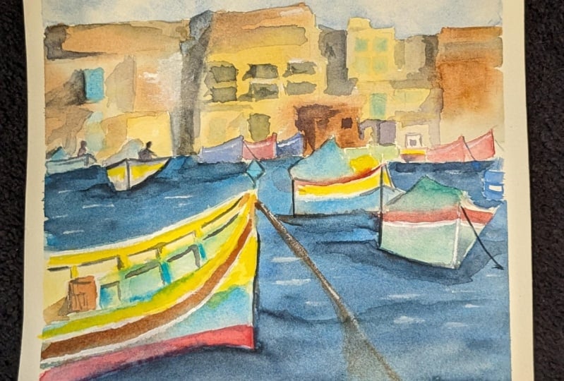
6. Malta: Drawing: This is a scene of motor and got the references up from the top to bottom left and right left. We've got one reference, one H1B, and onesie. What do I have all
these three photos? Well, there are
elements of each that I like and I was having
I think in the break, how am I what am I going
to do to incorporate them? Or do I want to
incorporate them? Most important thing, do you want to just
because you have all these photos doesn't
mean that you have to use every element in each
bits of pieces of each. But it just so happens
that I do the buildings. In the second one, I think I started
in the last one, I find that they notice
the shadows and noise, but there's a little bit
too much complexity in those buildings and I want to simplify the
background buildings. So reference from today, which is basically
the one right at the top there with
the guy in the boat. That's also great
in terms of the, you can see the light source coming from the right-hand side. And its boats a lot lighter. Well too. And you've got this really obvious shadow pattern
on the buildings to the left so that the
buildings are not too complicated and maybe simplify them down into
just block shapes. It's gonna be a
lot easier to do. Of course, is that.
The second theme I like in terms of the simplicity of the
buildings in the background, but there's not a obvious light
pattern on the buildings, so I don't think
I'll use those ones. However, I do like
some of these boats. I think using some of the boats, using, definitely using some of these boats will be important. Maybe the shape of
some of those boots, the color patterns of
the boats as well. I think I get some
good ideas from that. The final one in to see. I really like the side would angle of some
of these boats. Also that there's
more of the sky showing you a few options here. If you don't want to
have too much of a sky, you can use predominantly
the first reference photo. If you want more of a sky, you can use predominantly
the third photograph and then putting this guy in the boat if I liked
the guy in the boat, but again, it's up to you. The light source is also
different in the first and the last reference
photo that coming from left and right, literally
different angles. I want to use the light
from that first one. Reference to a with
the guy in the boat. Unlikely the lightness
in that boat as well. Drawing in this
boat to start off with the one that's
already in the scene. We can pick out a few other
boats and whatever you to. I'm gonna go in with this book right in the foreground
and getting this guy, it's just like just look at the shape of
that boat, drop it in. There is a bit of space
inside like that. The front of that bird coming
down sometimes I like this. You're going to have the guy
sort of like around here. We'll just zoom in a little
bit so that reference, so I can just have them
look at it closer. It's not super important, but just a bit more bit closer. He's doing something years. It's doing a bit of fishing. Looks like he's pulling in line, pulling in a line or
something like that. Let me do that. Kind of arms outstretched
one here and then one kind of coming
across his body like this. And he's just holding
a pseudo stream that's going into
the water like that. The legs are not visible. Just the bottom of
his body as it goes into the boat and just
leave the legs like that. That should do it
should do the trick. Hello In the OMB. I think just
a little bit more of that because he saw close that sometimes we just got to pay a bit more
attention to the details. Okay. But I don't want him to be too
much of the focus as well. Certainly I want them to be an important
part of this scene. Not overwhelming. Everything else in here. Say yeah, the motifs flag on
the left side of his boat. I felt like that actually it's putting putting the
indication that flag. I think it's a flag or
maybe just the colors, runner, the rudder of the boat. Any other closer look
because it's like a night. It's actually a it's another
boat in the distance. Another but in the background, so just the color of it. Let's just get that in. Since I've already
drawn that in already, it looks like it's
connecting onto this one, but it's not really it's just another boat
in the background. Okay. There we go. Good opportunity getting
some different colors later. Let's have a look
at the buildings. The buildings and
just having a quick, quick little study of those to see how we're going
to reduce them down. Now, over here you can see this like boats off in
the distance like that. So you can, of course, use a little indication of
some of them in here. Little bits of the details
in the boats as well. I really liked though
is maybe pinch a few of the boats from the
other reference photo. I'm going to just draw
the mean one here. Next to this larger. The guy doing some fishing. Just have them lined
up kind of in a row. Let me draw one in here. This is the boat right in the front of the third reference to see cons of
stuff in this boat. It's just a bit of
a mess, isn't it? Stuffing hand is
a little shapes, circular shapes
like these kind of like bags and the
full bags of stuff. Boxes can hear a lot of
stuff, a lot of stuff. Who knows what's in here. Little indication like that. That one's good. Let me reshape this one, this little boat as well. Reshape that but the
front of it like that. Good. Redefine this one slightly. Oops. This good bit straighter. The back of that,
That's the back of the boat there as well. Good. Column it back in
then just for good measure. Reminds me a lot. Sources. Good. Let's go ahead and in a few more
shimming a look at this and seeing actually something up the top wooden area at the top of that
bodes and something connecting it to the
ground, water ground. Get some repeating ones
here in the background. He's another one. Okay. Smaller. But
having that sort of same shape that maybe
it's kind of covered, obscured by this burden, the front, something like
that disappears off. It's probably stuff
in it as well. This point doesn't quite matter. We're just looking
at living shapes. These are just kind
of rectangular shape. Some of these boats have, I don't know if it's actually there's actually some kinda
like shades in the boats. It's at the top
that kind of attach these red shades attached
to some of them like that. As we move back
into the distance, you will certainly find
that it's harder to make out what exactly is
going on in the end, you just starting to pull
in things like this, like you're getting
the basic shapes. Shapes are having, but
there's no need to, to really focus too much
on all the little details. Should have one here, one here. The foreground to kind of
mirror that one to the left. Something like this. Stuff in there as well. And part of that,
but it looks better. It needs something
to balance that. But another one here
right in front. I think that will be good. It's something like
that. Because these look perfect in a way. Let's pick out a
few other boats. Course we've got more
in the backgrounds. You can even get in
some like Yeltsin, just going through
and picking out one, speaking out a few
shapes and things became choosing so many things in here that you
can really add up. And that's one facing
forwards, Here's one. Skip this one and
it's kinda like a squarish shape and you can see the front of
it come up like that. The colors of these
birds as well. You've got so much
character to them. Then they just kind of lined up next to each other like this. Just lined up in the distance. You, maybe you
have somebody just facing forwards like this. Notice how simple, simple
I've made them as well. Just shapes. Just draw the shapes. This one's facing
towards the side. Like that. Go ahead and find a bunch
that you want to put in. There's even boats
that are look here, there's one that's
in this section may be closer like this. I'll just get that
overlap a bit. For instance, someone may have a bit of something
coming up the top, especially these smaller things. He's another one I just
thought I'd put one in here. Another one. Maybe go getting the mass on
some of them as well. Here's another okay. Good, Good. We have another one of
a huge create a bit of this receding feeling of
receding shapes here. I think maybe one over
here would be good to go, another one coming in
from the side. Of course. It's probably going to be
a bit much after a while. So make sure you've got enough space for
the water in there too. That's gonna be important. I won't one of these
kind of boots that look like these ones in the front, maybe one coming off the
side here like that. That some kind of code top or something
inside there. There we go. I think that looks quite a cake. The boats. Enough. Nothing there really
to imply what I want. Buildings. Let's go
into these buildings. And I did say I want to
make the buildings more. I'm focused on the
first reference, reference to a large, this one into full screen and
I have a quick look at it. Many shapes send me
kind of like it's just long as you
just draw them in. Very simple kind of
like a rectangular base with a cube sort
of thing on top. It's not exactly rectangular, but yeah, that fine. Let's try some of
these buildings. I'm going to go in and getting
the general silhouette of them first so we
know that it may be comes up like around here, then it comes down, disappears off in there. So let's start off maybe in the mid part of the page and the
other midpoint I can see a big building that
runs across the base. A little kind of stops here. So come down like that. I think building down the base. The top of the building. Sorry, this is the side
of the booting here, which is where the dark
misses just a rectangle, gigantic rectangle courses
bits and pieces in there. It's a big rectangle. That slide is in darkness. Then we've got this
building here. Again. Again, another
building that's in the shadow on this side
hits the sky there. And it's just an
apartment block. It just comes like maybe
a third of the way into this building coming down
like that, this Beta stock. And here we've got
another look at me, say just a little. Shapes really, there's
another one here, comes across like that across the top of
this other building. They're kind of like another rectangular shape that has a bit of darkness there. Remember the light's coming
from that right-hand side. You're gonna get
shadows on the left. Same thing. We're going to repeat
the same sort of structures and
another one up here. Move that across like that. Something where
another one here they kind of just buildings almost like stack on
top of each other. I've gone up a bit
too high for that, so we can just erase some of that stuff like that disappears. The cool thing is that we've got these kind of trees
here as well. They will help to
break up a bit of this sharpness and create
some softer shapes in there. Was another building here. I'm doing this one a little bit looser as well because I want some more of the general feel of the scene and
I want to create a bit more life and actually
running through here, I'm going to paint this
one a little bit quicker. So we've got a general shape of the buildings here
in the background. We've got the big building here. I've got the, the larger, long rectangular
building on the base. And there's like three little
ones on top, more or less. I mean, there's little
bits and pieces in here, but we didn't have
to worry about that. On the left-hand side. Again, let's pick out a few
that might interest you use. Here. There's another kind
of rectangular shapes. Just look at them, kind of ship or another
rectangular shape. We've got a kind of Bush
trees here as well. More buildings that kind of
stretch up into the sky. That button. Notice how I've left more of that sky in there because
I just wanted a bit more. I just wanted a
bit more of that. That it's just going to carry some of these
buildings down. Again. They all follow the
same structure. They all kind of this
rectangular structure, as you can see, like that. Just rectangles and you've
got the left side of them than a darker like that. It's just 0 boxes if
you think about it, That's one on that side, that's one standing up blocks. He's another block. We're going to joy
in that darkness on the left-hand side. In here, it's just
all bits and pieces. You've got just another
other buildings and similar structures in years. Well, so kind of looks
like more modern, more modern buildings actually running through this section. You can make up a few like that with a lapping with each other and
stuff like that as well. I think that's it.
I think we will actually continue
with the paintings, so it just moves simply drawing, but we're going to bring out the details with
the watercolors. Move this up a little
bit and get started. I'm not going to wet the entire
sheet of paper this time. I'm going to do is go in with
a medium-sized mop brush. About the size I'm using. Getting a bit of
detailing, cutting around. Still have a large amount
of water that it's holding. Let's go in with a bit
of yellow in here. There's a lot of warmth in here. This is basically our
opportunity getting all the warm colors in
this area of the scene. We can also leave
in whites as well, so we don't have to have
everything colored in. So I'm doing that
one and kind of like a Buff Titanium white color, but you might leave
that one white. You might go in here with
a bit more yellow ocher, a bit of, a bit more strength, and don't be afraid
to leave some of that white on the paper. And some of these quick bits and pieces like that as well. Sporadic kind of
movements in the US, the hold the brush at the end as well as
you can see me there, you just hold it at
the end like that. Around these boats. Leave, make sure you cut
around them because it's super important that we have some of the whites of
those boats as well. So we can get in
some more details off these bits is actually
green bits and stuff on those. In this area around that's
putting a bit of more white, I guess I may leave in a bit more whites and some of
those buildings like that, that should actually
be darker here. Well, let's have a look
in this building and a little bit of yellow.
The yellow here. Might think leave that
bit white and then go in here with a
bit of yellow again, maybe some buff titanium
drop that in there. Use that tip your brush and hold the brush at
the end like this. That's going to make it
a lot easier for you. That's just basically adding in warmth for these buildings
and leaving some of the whites on the paper as well so that it doesn't look all
the same kind of color. You can even pick
up a bit of gray or something and drop
that in there as well. If you feel just touched
your color here and there. These little gray that I mixed up with full and they
don't even really graze. They kind of like purplish
last last scene that we did. But what? It's a neat complimentary color which will be helping here. This is some Witton
width, so I know Louise, you asking about Witton weight is going to be any Witton
width bits and ESA, this is probably the closest what we're going to
get apart from the water. So just dropping in
some purplish color in here for some of the
shadows on the buildings, but mostly shadowed are
actually getting lighter, so I don't worry too
much about that. Just some soft, soft
looking shadows, bit of green, bit of this. When you call it undersea green. Blend that in with
the buildings and just print some soft
shapes like this. Is it too early for the
sky? Don't think so. Let's get into a bit of
a boolean for the sky. For the sky. Look at that. Drop that
straight in their spirit. Accidentally put
some green in there, but we'll just delete that
off. Some more of this blue. I'm going to make it quiet. The blue in the sky like
almost like a full, like a really juicy
sort of blue. So I'm picking it up. I'm picking up this
ruling in blue. You've got to remember
with cerulean as well, because it's naturally
quite a light color. Even if you use it straight. It's not going to
really be too dark. But I want to make it really juicy and up the top theorem, really lots of strength because this is going to kind of help me to cut around these
buildings a bit more. Maybe I'll do this bit first. I can't look at that just kinda round those trees you can leave, get a bit of it to
mix But like that, but don't worry too much. This is just using
the same mop brush. Still enough. Still
basically cut around everything with the spoon and keep getting
smaller and smaller. Maybe I'll make a
smaller building like that behind there. There could be a
smaller building here. I've done, I've
just invented those that cut around these
buildings with that blue. It's kind of like
negative painting. In a way, negative any painting, these buildings using
this truly in color. It's quite, quite flat on top, isn't it this color
maybe I'll add in a bit of a bit
of white gouache. I'm dropping a bit anomaly. Don't do this for skies, but I won't do it for this one. A little bit of white
gouache to get in some of the clouds and
staffing the distance and a bit kind of wet on wet like this and
it will blend in. It's due, it's sort
of sort of thing. More water colored ones as well. If you've got some other white, you can also just feather that in watercolor white as well. I quite like that actually. The temptation is to just
start doing it everywhere. I've got to be careful myself
because I get quite overly the aquatic excited
when I start seeing stuff like this and then
go a bit overboard. And then all of a sudden
the sky gone, disappeared. The edges. Because, you know, clouds,
they have all different. You'll find that clouds
have all different kinds of values in them as well. Normally actually the
bottom of the cloud, you're gonna get a
bit more darkness. With top of the cloud
will be more light. But I'm just trying to get in a good little gathering of these different
colors in here. Values. Because I've done
that sky with software, sort of sort of wash. It's all wet already in this
dropping in that gouache. Look at how it's kind of
joined in and spread nicely.
7. Malta: Light Areas: Okay, let's go further down. Let's pick up some loose. Let's go with turquoise. If you don't have to. Just mix up a bit of yellow with your with your ultramarine blue. I'm using ultramarine blue
anyway because the water doesn't need to be
sufficiently doc. And look at that. I'm
just plotting around these boats is cut
around them and this amount actually
re-wet some air at the bottom of the
buildings just around here. Soft enough some of that so that the water
blends into it a bit more. I feel like sometimes it
just looks better like that, which is gonna be
careful not to overdo it because I want to preserve the whites as well in the boats. We're just cutting
around the boats. Use a smaller round brush for
some of these areas like we spit bit of that
smaller round brush, just a bit of
ultramarine mixed width. It's throughly and mixed
with a touch of yellow, creates this beautiful
turquoise color. Again, if you've got
turquoise just used to coerce or whatever
you want really, you can use other types
of blues in here. That's not a problem as well. I just want to have a more turquoise color
running through here. And the important thing is, you can see it's cutting
around these boots. Actually, the way through here. Make it the water go
through the touch. Better. Yeah, actually it looks better. I had actually drawn
the boats to have more line up in a row, but having spaces in-between
limb to put the water, I think that has actually
made them look a bit better. One thing you got to
realize that the water is, the water is significantly
darker than the sky. What we need to make sure we're implying another but another
part of this boat as well. Just talk across, across. If you get any bits of
white in the water as well, it's where it skips over. It just leave it. Leave it. The technique I'm using basically for this one is
that we're going to paint all the lighter colors
later on the boats, but we've painted
the warmth than the lighter warm colors
onto the buildings. But everything else. We can slowly work into that. Just cut around
this, but this is the other one that
we were trying to play around with before, bit more blue in there. Most ruling in this mix took voice around this boat. Now if I want this one
even in here anymore, let's just let's just
keep it in there. But I'm not keen on that one
anymore for some reason. You can always change it later. Now that looks okay.
Actually, look at how it blends into
the buildings as well because I've wet
that area, touch it. You want that, you want a
bit of that blending so that it's not too sharp. Hopefully that's a bit much. But can you use a
tissue to lift off as well? Just to lift off. And a little bit of that
paint where it goes too far in the Angular that
just debiting. This kind of almost looks like a bit of smoke or something like that in there. Let's go around
this one another, but here, we're just
cutting around it. This one here as well. I think I drew in a
couple of boats here. Essentially what we're doing, we're just cutting around
the boots that we've drawn. But we make sure that
it's dark enough as well. The kidneys because
the wash These significantly darker
than anything else regarding around
this little boat. Then we've got the bigger here. Need a bit more cutting around
as well so that we don't cover keeping the arms
in a touch like that. Space for the arms. Good. A bit more of this. Top of that in book,
just cut around. Moving this down a
bit more ultramarine. Some water. Decade. Switch off
to this mop brush. Now this is going to be easier getting remainder
of this like that. Let's try to do
this pretty quickly because I'm worried that the a wash will dry too quick and we won't be
able to get in some of these beautiful Witton
way to fix that. I want to show you
for the water, just a nice softer Witton
wind waves, doc and more. It's getting some more
of this turquoise and ultramarine here. Quickly on paying that. Not as not willing to
order in here at all. Comes the fun bit, one of my favorite bits anyway, it's just dropping
in a bit of color to indicate the shadows fall. My round brush here. Here is neutral tantalum. Or you can go to purple
or something like that. You can use that neutral tint mixed with a bit of
blue, ultramarine. And you can get in some darker shades of
these kind of ways, little waves that run through
the water because it's wet. This area is already wet. And you can actually get
soft little indications of these waves that
just drop them in. I do have a smaller brush as well that you can do this width. This is just a
little round brush. So you can pick up a
little round brush and do exactly the same thing. I normally use the little one
when we move further back. So like around here, perhaps not want to put in, go a bit slower. I can tend to rush things. I have that tendency. Quick and time. The background, I'm just putting in
a few little bits and pieces like that. Running through make the
waves smaller at the back, these little sort of horizontal
lines running through. It's very calm day, so there's not much
disturbance on the water. Crash. Notice how I'm moving my not moving fingers,
not doing this. Using manteia arm. That's the trick to
get these lines in straight and to make
it look a bit looser. Some of this stuff is already
dried, believe it or not, I'm spray it a bit. Losing my spray bottle. You can just drop in
a bit more like that. That bit more of this blue mixed in with neutral tint here
in the foreground with a water resistance where
you can sort of adding the biggest strokes of water and mix running through like that. And it's still wet though. My genius layers
to wit point is, is just getting some softer sort of sort of running
through like that. Now, what we want to do is start getting in some of the details
now of the boats. Some of the colors. Keep them really light as well. I'm talking about almost
as loud as the sky, maybe even than the sky
and some of the areas. This book, for example, was a very lights
ruling in blue. So I'm just gonna put it in like this little wash
running through. I'm going to wash of spirulina, the inside of the boat. Glad. One thing to keep in
mind, just make sure that the areas on the outside of the boats that
you're painting have seven mostly dried all
this stuff out the back. It's mostly dried up
at the front here you can see at the base to
kind of went there, but everywhere else,
it's pretty much dried. When we go in, then we
added some a lot of colors. It's not going to all this. Darker color in the water is not going to just go straight in and engulf, engulf the area. Look at this, all
these amazing colors. It was amazing
colors of the boats. I think we can try
to do some of that. Yellow, for example, here, just straight off the
pellet because it literally is this vibrant. Running through video yellow. Let's see where
else can we get in? Maybe we'll do another one. I'm a little bit of yellow
for this one as well. To distribute yellow. We've got a strip of blue underneath
strip or whatever, but I want to let this dry
off a little bit first. Bit of blue for this one, just some blue like that. Some of the can tell us or some parts of the
boats that just wot, not really much that you
want to do in there. You can even do
some of the dock, the boat as well if
you're around that area, that's again, something
else you can do. Probably leave that on. That's more something I
did because I was there. And you can do all the all the dark if it's later actually. Let's continue. Let's put in some more colors for what
is going on in here. We have got, and I'm bring
up another reference. Know I've got another one
here on the screen actually. Let me just have a
quick look at this one. Got a few different colors running through
there, didn't we? Stockholm and even some of
the boats have these kind of yellow running
down vertically. That as well. Some of these ones he went
to another bit of yellow. Yellow or something. Just think
it's in places like that. A bit of red. Some of
these ones as well. Be nice touch of this. Purely in red. That's red. Look natural grid
maybe underneath the yellow phantom big
fan of weight and weight. But at the same time I
want to make sure that there's enough contrast
between the two colors. So it's not all the same. Just sort of blends together
until the same thing. Read their lawn or right here. Maybe be able to look. These other ones. Red, yellow, blue, darker base, some black and some black
and some of these boats like you see me
through like that. It's through really
for the most part, there's just a lot of
blue and ultramarine is gonna be great for that. Actually. Just joining
this up a bit better. This cerulean ultramarine mix it knows to you is to dock, still want it to
be fairly light. This bottom section. Cerulean, I think that's better that I have a tendency also to go through these
areas with a bit of wash off. Just getting what you can do. More stuff, just implied
bit of detail in the buds. Cut around some areas. Good. What else do we need to work on? Maybe beautiful blue
for this one just to me inside of that
board there as well. A bit of that blue is spreading towards the right-hand
side of the boat. Like that. I have some written in
here, maybe some more red. The warm color is
really contrasts nicely with the cooler
colors on here. Great. So we've got a bit of,
a bit of everything really going on in here. Of course, we've got this
figure here as well and a bit of red for his face. Just outlines, face mocking
out a bit more like that. He's just a bit of
pinkish color for exams. In a bit, a bit of
a yellow ocher as well. That's the trick. We'll do his shirt and some
of the shadows and stuff when his shirt and his pants later. But one-on-one to work
on now is some of the shadows and stuff
on the buildings. Let me just test and
sees Syria dried. It's mostly draw it. I think we can go in there. I'm going to use a
small round brush and I'm going to pick up purple, taken mix up some
purple yourself, but I'm going to mix up just a general bit of this purple, maybe some, whatever I
have left on this ballot, really just a dark color and I'll go in,
let's have a look. I'm really tempted to
use a bigger brush, slightly bigger brush here
actually to do some of these. I preserve this sort of Lucy feel round brush, happy medium between
both of them. Need to make sure that
you detail enough. There we go. There's a bit of shadow to the left
of the building. Some of these areas have not
completely dried, actually. Not such a bad thing. But when you're looking at these larger buildings
like this one here, that's gonna be important that
the ears around the dry so that it sort of brings out, brings out the face
of that building and makes it look like
it's in the sun. Wondering if this is a
bit too dark as well. I'm just going to lift
off a bit of that paint, the touch of that
paint, it's just awful. There's a little bit too dark. I put it in a bit more
water in this shadowy mix. What else do we have
in here? We've got we've got more trees and things. Let me just go in and add these little shadows
in for this one, a little bit of
shadowing for that one, they're all kind of coming to
the left of the buildings. Left side of these buildings. In the background is an area here that hasn't
completely dry again, I'm on it. She grabbed the hair dryer and just give that a quick blow dry.
8. Malta: Darker Areas: Dry now so that I can
continue on and work. Working to this background area. This is a bit of green. I'm gonna drop that
green here to indicate these trees off in the
distance like that. Let's just go around
and create a sharpness around around them like that. And you can see it's
kind of like this. We'd pen back like that. Kind of cuts around
this building, has even a bit of green running through that
building in there as well. Quite dark. It's section quite doc. That's coming down. There is another building or
something here at the base. More bits and pieces like that. I'm not going to not
going to overdo it just a bit of wiggly. It's in pieces. Ok. To indicate the
tops of the trees. Even drop in a bit of
neutral tint in there if you feel that some areas might
need a bit of darkening, which I do feel, you can see the different layers
of the trees as well. Some of that, some of that
would be better if we were to darken it like that. Good. Little bit of the
buildings and well, you've got some areas of like little windows
and stuff like that. I'm just going to pick up some neutral tint
and just see if I can just dropping a bit of detail and stuff TO for
some of the the windows, these areas of the buildings, just quick little
indications like that. The background. Just drop it in like that. Not exactly following
the reference picture in terms of out the window
shapes and what have you. But the most sort of getting an, a general impression of some darkness and obeys
windows and doors. Of course. I just mean desperate kinds of bits and
pieces in there like that. I think it's just
going to look better. This is a large apartment block. But I don't like I don't really like those
windows actually. So I want to, I'm
just going to create my own little bits of bits
and pieces like that in it. I think this might
look a bit better than having putting in the floor
is like a lucky days. And then let's get in a few bits at the base of
this building to just, you're looking at that
reference very generally. Trying to get in some of that. Noticed around the
boats as well. You dock and around the boats. Course you need to
blend that into the building. Like this. A little bit of
water in the ER doc and around the boats like that actually makes it kind
of brings them out. Often at the base of
buildings as well, you will find that there
is a bit more darkness. So this is kind of a way
to indicate that as well. But cutting around those
boats, it like this. It's really a super
effective way to get in more contrast
around the boats. But of course, the dot and the yellow are in
the buildings as well, is going to already
help with that. You see here, look,
I'm just softening. This softening suddenly say area so that it doesn't
want to artificial. Bit like a smoky Swift feel. A bit more here. I bring that up a bit like that. Top on the boat there as well. Good. Then we haven't gotten
rid of those boats in more shadows. Let's go pick up some extra
shadows on these buildings. They might be a bit
of a shadow here. This is a bit of green
in the building. At the bit of green
for the building, but for the trees, that background sort of area. Drop that in. Not super pleased with
these windows, but we can. It always read through
them a bit later as well. One thing I'll do like
about them though, is that they follow
the general style that we have in this scene, just like the loose style, but I do want to redo those. These ones are what I'm looking
for, something like that. I can just place the
brush like that. Place that brush down. And it already just creates a window light kind
of shaped like that. I think it kind of muddled
with this one a bit much. We can do that. Please. Read stapes. Restate them already. I think it looks a
little bit better. More windows and stuff running through
here, more shadows. These buildings mixed with some of these little
windows like that. This is the shadow on the left side of
this building here. Good. Buildings are looking quite. I'm going to work my way
down into the boats and start to put in maybe
just the dark areas. Neutral tint. Neutral tint here. Let's have a look.
What can we do? Firstly, I think a little bit more darkness in the water will be good in terms of some
shopper little bits and pieces. So this is just picking up some of this darker
paint and just dropping it in getting these kinda shop a little
ripples in the water, especially at the base
of these boats as well. You're gonna get a bit
of a reflection in the water like that. Okay? So I'm trying to
imitate a bit of that. The dark reflection here
underneath the boat. Carry that on like this. But try to retain some
of the softness of the previous boat. Wash as well. See here it's kinda like dark and sharp sort of shadow here. Reflection like that. The base of this boat. With this guy's movies, a little tiny moon,
reflection of advancement. Easy to say, but just a
little, something like that. Got more of this
heat. Just better. Some Morin create some
elements of darkness shop doc, reflections running through
here that will contrast with the softness of the software reflections
in the background. It's this layering technique
brings things together. That mortar looks all right. I'm going to work a
bit on the figure. In some darkness. He's got around his arms and he looks like he's just standing over
holding something. We were trying to imply before. Darkness behind underneath
his shoulder like that. That shadow is coming in
from that right-hand side. Started the light source coming
from the right-hand side. Shadow of his in
the boat like this. You could have
shadow in the boat. Good. Shadow in the
backend of the BOT-2, but a darkness that kind of just a bluish color in the back. I'm going to actually
joins onto the water. Good. There's even though
he doesn't eat, It's like a darker blue
or running through. Let me try and get
some of these same. Maybe if it's like a
purplish color like this, sharp color like that. And then this movie or out
the back there as well, indication of that, we will
get a brown or something. The boat again, we're just really
putting in the docs. That's just the final
contrasts of the painting. By now, you should
be familiar with the process that we use to
paint pretty much anything. And you'll notice that just
go from light to dark, light to dark and
just constantly use the same structure
wherever I go. You're able to paint
more efficiently, certainly more
efficiently that way. And to be able to getting
the full range of values. I'm just even
looking through here and I'm thinking what
colors don't want to putting it on
a bit of darkness here on the left
side of the boat. And this section like that. But they're a bit,
they're trying to follow that shadow pattern running
to the left side of things. Degrees of darkness. The darkness isn't really
in qi and that's the thing, but might be able to just put a bit on the left
side of the boat like that. Darkness there. Helm of that other one. They're just little indications
like shadow and things. I mean, here you can
put in this well, let's have a look on this side. That boat is mostly
fill in light. Strengthen the base of it at
a bit more color in there, a little bit more darkness at the base of some of these boats. There. You can see drawing a little bit of a dark shadow at the base of the boats helps
to anchor them to the ground. The water, the grounds. I think that we get in there. Let's have a think what
else do we want to do? I'm not actually going
with some quash now. Bit of gouache, smaller brush, whereas it like a little
number four round brush. I love this part of it because
we just kind of picking up with basically just picking
up little bits of paint, putting in the final details. I just got a cap on the
cap so I can just like this little cap
that he's wearing. Good. And kind of getting this rope or whatever that he's
holding in the ward, I can just kind of something
like that and make it look like he's trying
to pull something out. It's amazing how a few
little brushstrokes can indicate something that
is so complex in mind. Fill in the blanks. Them to give my views. Make them create their own
interpretation. Times. Drawers thing out to perfectly. No room for interpretation. Can be good or bad depending
on what you want to achieve. Better. This bit of this. I really want to get in some of these sales masks so that
I can just join that up. There's one. Let's do another one here. Getting a bit more of that
whites we can retain, regain a bit of that
white like that. Good a little rigger
brush as well. Rigger brushes are great
for this type of thing. This is too much, too much paint and
draw it off a bit. Something like
this, for example. Getting some more
that gouache and you dilute it too much
with water and just sometimes lose that control with the gouache that you get. Something about. They see
that much like slightly dry. You can see. They believe that the
top of that boat maybe still is another one, maybe here across
the water as well. You might see at times
a little kind of reflection of some of the costs. This, if I put one
inside for this one, this will be a bit more
obvious like this. And just get a little
reflection like that. More of that mass. They're little bits
of wash in the water like this kind of
like you can see it just the little bits of whites
and the water also work. Well just to create some little
variations in the water. Not all same. Can do this exact
same scene in wash. If that's what you want.
You should see bring out these little highlights on
the boats. Bits of whites. Perhaps I'm lost out
before we bring them back. As long as you don't overdo it. And the edge of the boat,
bring some of that back. That back. Finishing touches really. Maybe some. Maybe I'll put in
a bunch of birds. Again, more birds
in the background, just a little ones flying around near the trees
and the buildings. Some bigger ones like some of the mountain,
the clouds as well. I think those clouds of
turned out quite well. Just that touch a
Guassian there has really created a bit of
heaviness in the sky. Um, it's quite a loose to
an aquatic loose painting. But I think I've managed to get in the essence of what
I wanted to portray here. Combine the three
references up to something that stands on its own, really. Mutiny the water as well. I'm going to remove the tape. Let's take a look.
Everything off. See how we have done. I'll probably go back into
this little bit later as well and perhaps
sharpen up some, some bits and pieces, maybe darken some areas
in the background for the buildings, that
kind of thing. But overall, I think this
has worked out quite well, really like the sky the
most is figure as well. Here in the foreground. Elements of light and dark
that splashes of color, splashes of color
here and there.
9. Projects Summary: The big goal of that is really to get you guys
to go out on your own and to create your own style is to create your own visions because that's
really the only way that you can develop your style. You obviously, you can
watch all my videos. You can do this process. Again. However, I think it's
really important to see which bits and
pieces of the process that you want to tweak. For example, I might spend a bit more time doing
this wet and wet stuff, but you may want to
do some of these wet in wet and dry, for example. Definitely enjoying the process
of figuring things out. Obviously, you do some of
that figuring out on the way. And you do some of
that prior plan, some of that on the way. And then while you're painting, you may change your vision.
10. Finding Your Own Style: How do you find your own style? You have people always ask me
that and believe it or not, you already have your
own personal style the way that you use
your brushstrokes. It's just like when you writing, you have a way that distinguishes
you from other artists. It's just about
refining that and choosing which bits
you want to emphasize, which bits you don't
want to emphasize. Visual language. It's the way you express
yourself through brushstrokes, and this comes in
patterns, colors, compositions, compositional choices where they decide to include this or that. Whether you do with certain subjects as
well subject matter, some people may like to have a more intimate
subject matter, whether it's just like one
boat or something like that, something really focused
in, in detailed. We can often develop
our own style through just understanding other artists practicing our own brushstrokes. Time after time. Painting from references and doing like doing
tutorials is great, but making sure, making
sure that you are trying to paint and draw from a reference or even
better going out there. And in real life, if you have your sketchbook, sketchbook with you, drawing
and painting what you see. I think that's the best, the easiest way to
learn if you can't go out using reference
pictures is just as good as just
that you don't get the beautiful
scenery in front of you and some nice,
nice fresh air. And after a while, you end up developing your own way of doing things and build upon
what I've taught you and find out
what might work, what might not work. One of the things I really wanted to drill into you guys as well as to not be afraid
to make mistakes. Give yourself permission to produce work that's not perfect. It's imperfect
because it's through creating imperfect
work that we end up being more adventurous and finding new ways
of doing things. Often stumbling into
subjects or into a way of painting that we wouldn't have normally done because we went adventurous enough
to try new things. Remember, it's just paint and
paper. If you stop it up. Um, it's not the
end of the world. You can always try again. Most styles of different
artists actually composite. When you look at especially
a lot of artists these days, they'll have classical
influences though have contemporary influences and
that just modes together. And they may decide to
emphasize a bit here and there, add a bit of their
personal flair and they're in
subject matter and suddenly you've got something of your own, something
of urine style. So I guess long story
short, be adventurous. Adventurous. Style comes from your
compositional decisions. Unique brushstrokes, then, like what I've
taught you today, your planning and your thoughts, your own unique experiences and preferences will come
through in your paintings. Enjoy the process. And rather than think too
much of the end result, I'm because I know I'm
often that myself off. I think I've got to
produce something like this has got
to look like this. And if it doesn't
look like this, and then you get all
worried and worry and thinking too much does
the opposite with, with arts. And we need to be
relaxed and we need to, It's almost like a
meditative thing. Lip thoughts come in and just
let it flow on the paper. And it's hard to, in the beginning when
you're learning because it can't flow because you're
learning the techniques, the how to do certain things. But once you know
a bit of the how and it gets incorporated
to your muscle memory. It's like driving. You don't think
twice if you have to break or you have to shift gear. I don't know who drives
a manual or whatever, but you didn't think
about that stuff. You can focus more on the journey and make
decisions along the way. Be more flexible and adaptive. Once you've got the techniques and the process that I've
shown you down packed. We have individual experiences, memories that shape the story that you want to
tell in your art, doesn't have to be
something profound as you can see in my work, there's not any profound
meaning. I believe in it. But I always for some reason
just seem to be drawn to go into a sense of
beauty in the world. And I tried to
bring that out, uh, try to find a way to look at a scene and bring out
its inherent beauty. And it's just express it in my brushstrokes and I think the simplification
of things as well. Big fan of that. Again, there's some
of you have seen some of my portraiture as well and can spend a
lot of time on that. But I like the
looseness of things. Can just be vision
as simple vision to transport the viewer. Transport people to a
beautiful place and a time. To send the message to them of good times
in the happy times.
11. Class Project: The class project
is to compose and paint your own unique
watercolor seen. This can be one of the two
scenes featured in this class, or based on a series of your own related
photographs or since. You can refer to the touch scanned drawing and
painting templates. I recommend sketching
each scene. Freehand. Drawing is an important step in improving your
painting skills. They provide you with
an opportunity to compose and plan your painting. Once you've finished
the drawing, usually watercolor
steps and processes included in the class to
complete your painting. Finally, upload your project.
 Watercolour Mentor (Darren Yeo Artist), Art Classes, Mentoring & Inspiration!