Transcripts
1. Lesson 1 Introduction: Welcome to class. I am a fed, an urban multicolor
artist based in Norway. Over the years, my work has been exhibited
internationally, including with
prestigious organizations like American
Multicolur Society. In my painting practice, I focus on capturing the energy, light, and mood
of dynamic cysts. The painting we will be creating in these
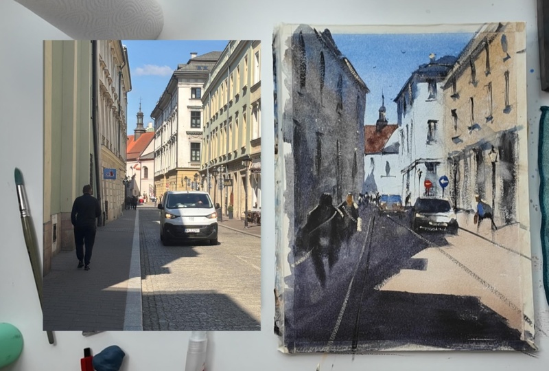
classes based on a photograph I took during
a trip to reco Poland. The moment I walked
down the street, I was immediately struck
by dramatic lights, deep shadows, and
intense contrasts. Everything was right
there, ready to paint. My artistic
philosophy is simple. I plan carefully first, so I can paint with
total freedom. I set the structure
ahead of time, which lets me paint fast, act on instinct and
express feelings rather than copy reality. In this class, I
will take you step by step through my
entire process. You will learn how to break down complex architecture into
simple value shapes, how to connect lights and
darks for maximum impact, and how to effortlessly
place simplified figures and vehicles into your streetscapes to add life without
overworking the scene. Whether you are looking to lose a style or master urban
light and shadow, this collides will give you
the confidence to paint free. If you'd like to see more
of my daily planning work, you can also follow me
on era. Let's slive in.
2. Lesson 2 Class Project: For your class project, you will be painting your own version of this Grecoskit using the techniques we
covered in the lessons. Your main goal is not
to copy every window, but to apply value control, capture the dramatic
light and shadow, and paint those
spontaneous videurs. Once your painting is complete, take a photo and upload it to the project calidy
right below this video. Feel free to also upload your initial value sketches
or color palette tests. I love seeing the full
creative process. I will be reviewing
every single project and giving
personalized feedback. All the free resources you need, including Iris
CrocoRference photo, first, and finished painting are all available or download in the resources top right
under this video. Download the reference image, and I will see you
in the first lesson.
3. Lesson 3 Materials: Welcome back. So this
is regarding materials. Let me introduce
my materials here. So let's start from
the right side. So we have water
container, water water. We have sponge, okay? We have here some big
brushes or big washes, and for the middle
second washes. I will use this proces
chinle brushes. So a few similar
size round brushes as well, and also liner. Then here I have my palette. So in this painting, we will use Identrmblom, but maybe you can
use ultramarine. Ultramarine blue instead. So cobalt blue and lavender, we will use this as well. So we have Perna maroon. Maybe we can use it
for the shadows, mixing with cobalt and
also Identrm blue. And then here burns in a
light. We will use it. Then sepia, we will
also use it as well, just to have dark turk, mixing Indian trim Bolu and sepia to have our darkest
tarps and yellow wer. So here my paper is Bahung
trend gram, 100% cotton paper. So I just use tape around it. Also, I use this tape
just to have some angle like, ten degree maybe. Then we have spray bottle and small spray bottle
as well, and app towel. And I have also John Brilliant number
one from Holbein to have highlight at the
end of our painting, soft eraser, and and also HB and four B
mechanical pencils. Then I have just regular
paper because we will have value study by pencil
in the next lesson. Then I have my path so I will
see you in the next lesson.
4. Lesson 4 Value Study Part 1: So first, we will have
Value study by pencil. So let me just draw
the scene first. It will be some y. So so we have eye level almost in the
middle of the paper. So if it is our paper, then this is almost eye level. Okay. So now we need to find
out our vanishing point. For the right side,
our vanishing point is around here, okay? Because we have two
vanishing points in this in this reference photo. So then other one is
somewhere here, okay? Then let's start drawing now. I will start the
building in the middle. So there's a building here. Okay? And so following
this perspective. And then yeah, like this. And then it's also following this perspective as
well. This building. So we have rooftop
and so on. Here. This is another building. Okay. Then we have this orange building
somewhere here. So this kind of rooftops. Something like this. And then. So on the building, the building on the left side is following the benching
point on the right, like here, you know. So let's see here, okay? So tens going like this. And then it was high level, and ten stre level can
be a bit, you know, lower, something like this
than then after that, let's finish this building
on the left side. It was following the point here. Something like this
okay, or maybe. Yeah, something like this. Just building on the left side, then windows and so on is following the
perspective as well. So one more here. So we have we have this windows. The important thing that it's
following the perspective. Yeah, something like this. Then we have a
tower here as well. And then, yeah. Then, yeah, other
vanishing point was here, and it's also falling
in the perspective for the windows and also
for the building. And this is the end of
this building, okay? So just just suggestion, you know, we don't
drove all of them. And even we have
walking way here, okay? And another walking way
is something like this. You know, so we have the windows here. Then this is this was eye level. So we have a car here. This will be our focal point. This is not in the middle,
slightly on the right side. So remember that we had another lesson regarding
simplifying figures, cars and people. We
will do the same. So this was eye
level slightlylolow lower of the people's heads. Okay. Something like this. Car, we are seeing this
dip side a bit as well. So there is shadow like this. Okay. Then this was our car, and we need to put some figures
and maybe we can put more 11 here walking towards the
focal point to the car. Okay. Oh This end of the paper. So maybe, maybe you just
put small car here as well. Okay. Then this high
level, this high level. Small figures here, maybe one. And then we have
bigger figure here. Even maybe two of them. So this will be a drawing.
5. Lesson 5 Value Study Part 2: So we have five values, okay? One, two, three, four, five. I always follow this. First one is just white of
the paper. The second one. The light, then a bit stronger. Then a bit more stronger. And then this is a duck stock. So let me do this
in this painting. I will also attach a black and white version
of this painting. Then, you know,
the first rule is that you should see
where the us light, where the darkest darks
and middle tones, I mean, this values. So you just scan your eyes,
then you are able to see. If you have some difficulties
in the beginning, then you can just turn this photo to black and white,
then you are able to see. Okay. Then where is our
lightest lights the car. Okay. Then I will leave this
part of the car is white. This is our focal
point. And we can maybe leave some white
on the tis sure of this person since
it's our focal point. And we have buildings in the
background is not white, but it's just kind
of beige warm color, but they are not white, so I will just put
very light value. So this part. These part. This part is the same as well. Okay. The ground is also
the value one. So this is one, this is one. This is one, okay?
Let's say this is zero. So we put this part, and then we have value
three. Oh, sorry, value two. So basically, this is the building on
the right side, okay? And also, yeah, this is
building on the right side. Also sky. So this is two, this is two, This is two. Okay? So then we have value four. Value four should be this part or we can, you know, let's say, also 3.5. Okay. So this is maybe 3.5. Okay. Then also this tower. And then on the building
on the left, this is four. But it's starting with 3.5, then I will make it stronger since this is
getting quarter. Okay? Something like this. The same also we have number
for the shadow, okay? But this is, you know, here is also shadow, but
also here is shadow. Since this is this
part is closer to us, then this part
should be stronger. So that's why I'm
saying this is four, then this is 3.5, okay? Also, this part of the car. Yeah. So making stronger when it gets closer.
Something like this. Spars stronger. Okay. Number four is
this, and also we can, this is also number
four is also for the shadows here in the background in the background
of this building, okay? This is kind of the shadow. And also this building, you see, there is a that
shadow and also here. And also here. Yeah. And also but maybe, yeah, we can make
them like 4.5, okay. So these are these. Yeah, then these are five. Maybe a bit lighter than five, but just these windows
and also some shadows. This is number five. And say this is four but
inside of the windows, some dark parts as well. Yeah. Yeah. Soothed up. And again, we put some dark
Turks down B five. Okay. Yeah. Here. So in this shadow, also, we have figures, then this should be number 544.5 kind of one more
here, just in the shadow. And the bottom of the
cars also number five. And also this part is
oh something like this. And bit shadow of the scar. Then this one also you can have white t shirt and dark
trousers in shadow. Okay, this is our value study. Let's start painting.
6. Lesson 6 Drawing: So as we said, eye level
is almost in the middle, but I will put a bit
lower maybe, maybe here. So first, I am using
this HP pencil, then I will make
stronger with four B. Then we had to vanishing point, one of them is here,
one of them is here. So in the middle, we
had this building and it was following
this maybe here. Yeah. To the left. We have tower here. So the building on the
right side this footpath. Then let's draw this car. Let's put it. This is eye level. Then slightly right or maybe it's realist, maybe. Yeah. Okay. Then let's
put these figures. This one eye level. That's as you remember, this part is straight
and this is bending, then we give him impression
of moving, walking. And also, we have, is that? So then Windows. So those from here as well. Well the perspective. So this was high level. Let's put to Biki here. Or maybe one is a bit smaller
and walking this direction. And we have some
cards here as well. Just imagination. We
have small figures. One more here. So we have shadows. This So I'm just continue with this. And so then stops intention is only perspective, not detail windows, okay? The windows in this building a few shouldn't be
exactly the same. We don't need that. Okay. Yes, maybe this. Okay, I think our
drawing is ready now. Then we can paint. Mm.
7. Lesson 7 First Layer: So let's start painting. First, I spray the
paper then my colors. So starts. Cobble Blue. Touch of Sana. I'm starting from the sky. Okay. Spray it. So this is first layer. We can just take on for the building on the left
because we will not paint. We will paint on the second
layer, this building, it doesn't matter
what color we have in the stage for the
building on the left. Then I add burns a light to
the cold blue to have gray. Me then I am using this gray. For these buildings. The BgroundT ones as well. This is just a cool gray. Video light. So this is, I can say this is value one. But sky is value two. So I am moving to
the right side. This is slightly
warmer building. I will use yellow ocher
and just touch of Percena So this is value. Around two. As we discussed in
the value study. Okay. You can just cover this part 'cause this will
be in the shadow. So it doesn't matter which
color? In the first layer. So remember that we will leave
this car white of white. And this is warm color, but let's put maybe a
few drops of lavender, grate down a bit. It's precious. Yeah. Something like this. Then I will add more
burn sienna to this mix, yellow wkerV little,
but bun sienna more. Is orange, Burnsiena light. Strangler, yeah. Sing
around this car. Yeah. So this is value white, but we will make it stronger
since it is coming since it is closer to us, closer to us. Yeah. Me bun sienna.
Should be stronger since this is closer to us. That's why I add a bit
cobalt bullue and burnina. When you mix cobalt boll and
bunsena its start gets gray. Yeah. This is our first wash. So
8. Lesson 8 Second Layer Part 1: So I'm starting to
the second layer. So cobalt blue,
burns in the white. This is a value for, let's say. Yeah. Yeah. Something like this. Then cool gray for this part, and I will connect
to this Front. Don't need that should be very shouldn't be very
realistic. We don't need this. This this is shot I think we are in
the wolf section. This shadow. I am now, so you should follow the
perspective this shadow. Two, two, and then I am just putting some damp brush to soften this. Okay. You maybe we can, maybe more interesting. Yeah. Then I was connected
to the rooftop. Connection is very important. This is Bern Siena
more Cboblue is less than just opposite
for this roof, more coboblue, less Bern Siena. And then I am switched
to smaller brush, more paint, less water. Let's say, number 4.5
or first, number four, tower. That's private mover. Leave some untouched
area for the tower. And then yeah, something that. Then also, we have
shadow of the rooftops. We need to connect
it to the right now before let's
soften this a bit. I see here. Same again. How about blue Bncena. I will start with very consists for first, this Yeah. The Cornet this roof. Maybe this more cobalt. Okay. And then Mbun Siena. We just shift the temperature to make more interesting painting. But we have also
shadow here, remember? Yeah, something like this. So I added Indian tremble
to the mix because we need stronger value closer
to this building. Yeah. Let's spray. There are lots of white spots
here. We don't need it. Okay. Now I'm switching this bigger brush
in the infant blue, paring maroon and now
painting the shadow. So we have shovel here. This the Uh huh. Yeah. We have some interesting
shapes in the shadow. More spray. And let's
make it a bit darker, since, you know, shad off. I also should follow
the perspective. I mean, atmospheric perspective. So when we have closer, then it should be
darker. Yeah, like this.
9. Lesson 9 Second Layer Part 2: Now I need to paint these
people in the shadow. So I will use sepia
and indent trombu. So then I get easily very dark. So this is number five in value. Since I right. I
know what's here. Here. I'm using press now. Yeah. But we shouldn't similar guys. And maybe I can
put a bit launder. Yeah, I kill this. Um very light value
because it's under shadow. Maybe then also I can do
this percena with this. Okay? Need to spray more and I shadow should be stronger. So we need to make it stronger. Yeah, this part. It's a poker face. And let's make this other side. So just cover this. So we see this guys. Let's pick off it.
Then maybe back. Then also, let's paint
small figures here. It's Then let's paint this car Dart under the car Darker This Mm hmm. So on this small one. Then this is so right. Yeah, now it's better. Windscreen and some
water just to mix it. And maybe one more
small figures as well. So time for this shadow. So here I have cool dark gray. So but this is maybe too bright. I will let this cena. Yeah. Yeah. Then just back to our number
five value strong one. Yeah. Let's leave some
white under this car. And then let's rough
on some of them. And maybe we can use
Lavender screen. You want to be bit darker. Okay. The time for decoration.
What this is. Like, we can start again, then trim Blues or sepia for, got a dry brush for the
top of this buildings. So you see this was vanishing points
following the perspective. And one more here, here Just perfect there. And maybe some kind of things.
10. Lesson 10 Second Layer Part 3: And he also dark should
be darker, more darker. This part. This part. So here there's a window. That's just not
just this window. There's no no time for this. Minos This is value and L four. But now just in front
of just top of this. It's dark, but not everywhere. Just to give some depth. Okay. Then we all do the same for the windows on the right. First, I'm putting some darks, then I will put windows. That's where impressions
the way of windows. Yeah. I bit more drugs. Okay. Shadow of this off this Windows. I lose way. Okay. We need to soften some edges, not all of them be hard edges. Yeah. It gives nice movement. Okay. So this was fo path. And this one was as
well, maybe. One more. Okay. The time for more decoration. So we have some lamps. So it's also following
the perspective. Let's put this was
vanishing point, right? Summer here, J here. I. And another one here. Lose approach. And maybe one more hit. Okay. So this car should
stand out more. Something like this. Yeah, more dark. As Maybe. So we can put some traffic
signs here, maybe one here. So since this is
our focal point, it will help us to
have some attention. Yeah, but yeah, it should
be nice round chip. Yeah, we forgot that
we had person here. This is a good exercise. That when you learn
to simplify figures, you can do that by brush. You don't need to have pencil. H
11. Lesson 11 Decoration: Now time for decoration. So I will use red, red light. I will put it here to have
some attention, okay? This is traffic light. Yeah. Make it better as well.
Okay. And then I'm starting to use Jon Brilliant
to have highlights. Just straight from the tube. And let's use colors now. That we missed, you know. And this. Also, this under the car a bit. And let's give T shirt,
same color here, and also head and shoulders for people people here. Et's give a back like this. Okay. Yeah and maybe can here just a bit. Here. Just to have some sparkle. Yeah. And you can also use
form the lights. And maybe it's here there Mm. Okay. And maybe we can give him lavender t shirt to have some more
attention here. And maybe um, bunsena colored. B. And we can put some birds. A That's all. Last date. This dig too, but this is not right yet, so that's why it's
a bit difficult. Yeah. Okay? This is our
painting for this lesson.
12. Lesson 12 Final Touches: Let's finish this. This signs and our finished
our painting is finished. Maybe. Yeah, can help
us to more interest. And then finally
signing the painting. I think this part
is good to have. Okay. This is our painting. It's a final talk about it. We have followed what we have done with the
pencil value study, our foc point, this
area, this part. So we left white here
and around the stronger, and we use bright colors, the traffic lines and
so on, this part. And and then the building on the left wasn't
completing the shadow, and also we had this
shadow here as well. And we put some figures. For example, this is bigger. So it helped us to have
some depth in the painting. And shadow, you know, this part is stronger than
this part, have more depth. And the background also
on the building on the right, there in sunshine, but some have a few shadows, then we put the shadows as well. And the sky is just blue with touch of burned
Sienna value around two. Yeah, I hope you enjoy
our class today. See you in the next one.
13. Lesson 13 Outro: Congrats on
completing the class. We have covered Ea today from breaking down complex Craco architecture into bold shapes. So managing value contrast and painting those spontaneous
figures into deep shadows. You should be really proud of taking this time to practice. Now it is your turn to shine. Please upload your
finished painting and even your value sketches to the project
gallery right below. I will be dropping by to review every single submission
and give you feedback. And if you enjoy this class, taking a few seconds to leave
a review means the world to me and helps other
students to discover it. Keep embracing the spontanet. Keep painting loosely and
trust your feelings on paper. Thank you so much
for joining me, and I will see you in the
next class like a paint.
 Efe Arabaci, Plein Air & Urban Watercolor Artist