Transcripts
1. Introduction: E. I spent hours learning
to draw and paint. But now you're wondering. What's next? Every
great artist has a style that makes their
work unmistakably theirs. Think, M G. And if
you're like me, you probably felt that having a unique style is
the key to success. But what if your art style
feels all over the place? What if you love so
many different styles that you can't seem
to settle on one? Or maybe you feel
like every artist online has it all
figured out, except you? I don't really get it.
And you're not alone, and you're definitely
not behind. So let's figure it out together. Hi friends. My name is Bina, and I'm an artist with a
background in fine arts. I created a scores
to be the resource. I wish I had during
my art school days. For years, I could replicate
any style perfectly, earning praise from teachers, making the best copies
of other artists. But all that time I didn't
have style that felt like me. That frustration
led me to develop a process to find
my true RStyle. And now I want to
share it with you. In this class, I'll guide
you through an exercise designed to uncover your
unique R style step by step, using simple tools like
paper and gouache paints. But feel free to use any
materials that you prefer. In this class, we're
going to cover what an RStyle really is and
the common misconceptions, how to set a goal that
acts as your Northstar, practical exercises to
unlock your creativity, how to find inspiration from your favorite artist
and artworks, sketching and creating
final drawings in your unique style. How world famous artists develop their art style over time and what we can learn
from their journeys. Whether you can
draw realistically, but struggle to make your
work feel personal or you're jumping between different
styles and feeling lost, this class is for you. Finding your art style isn't
about endless practice. It's about intentional
experimentation and reflection. I'll help you take
actionable steps to discover a style that
feels authentic to you. I hope you're excited
to start this journey. So let's dive into the first
lesson. See you there.
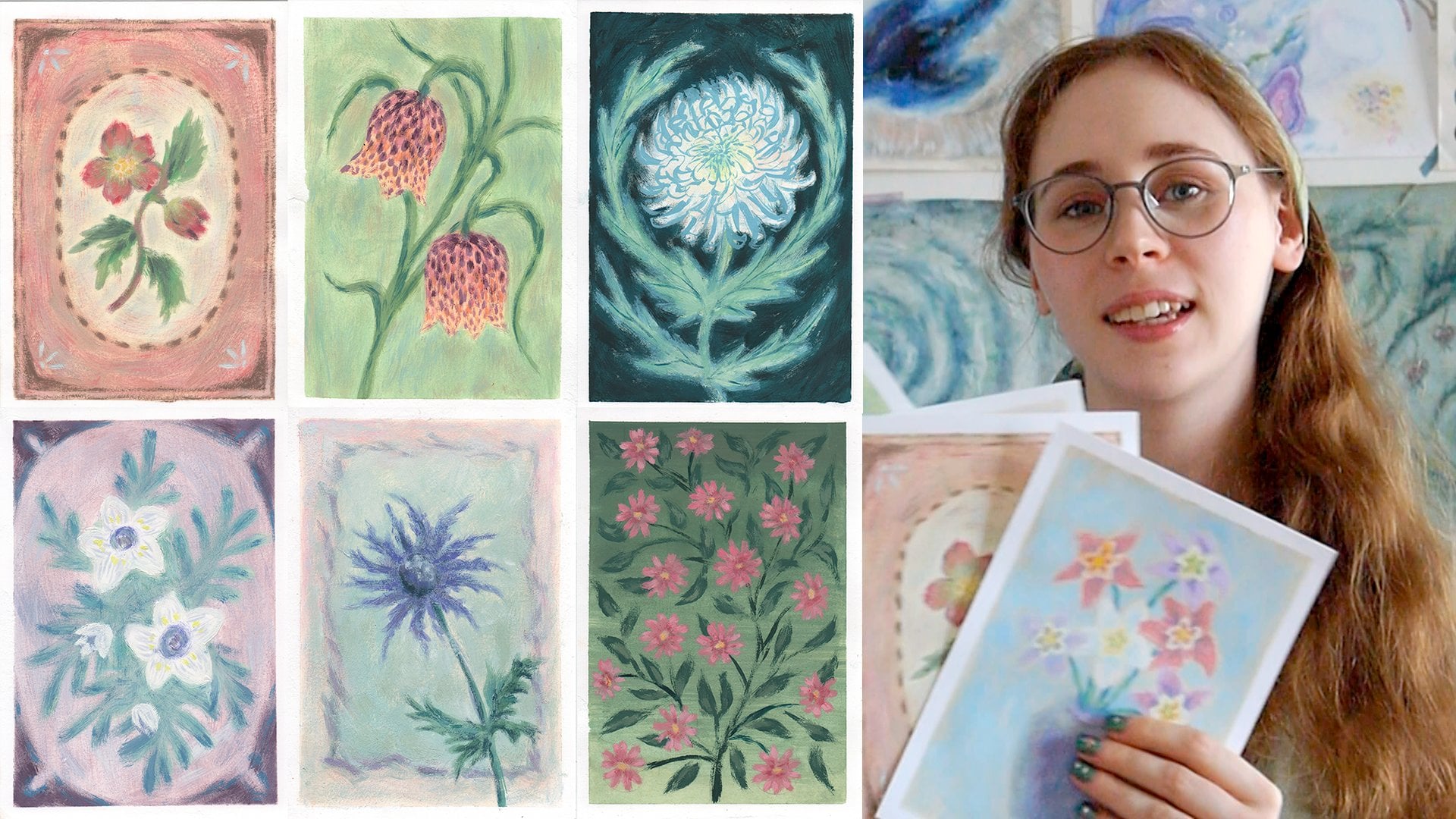
2. Materials and class project: About class and project. To help you uncover
your unique style, we'll work on a project that's broken into several
manageable steps. Each next video will guide you through the process
step by step. By the end of this class, you'll have one sheet of
paper filled with sketches, a personalized salmon
color palette, and one finished drawing created based on one
of your sketches. And the first step
in that process will be choosing your materials. Step one, choosing
art materials. You can use whatever
medium excites you. Acrylics, oil pastels,
digital tools, like procreate,
anything you like. I don't want it to
limit you here. Brought up, if you're feeling unsure about your
materials, don't worry. Remember that many
famous artists like Sala Dar Di worked
in multiple mediums. Yet their style
remained recognizable. The material is just a tool. The essence from your
style comes from you. But if you're interested
in my brooch, here's what I like to
use for this exercise. For paper, I recommend
using thin of white sketch paper like
this one. Why off white? Because it reduces the pressure to create something perfect. The neutral tone feels more forgiving and encourages
experimentation. You can find affordable
options online at art supply stores
or even second hand. For drawing tools, I
prefer to use pencil for sketching or just a pen and
gouache for a painting. But choose medium
you are comfortable with or you're excited to
try like watercol pencils, markers, or even charcoal. Don't worry too
much about making the right choice because it doesn't really
matter that much. And the exportation is
a part of the journey. Start with whatever materials
you feel drawn to today. And if they don't
feel quite right, switch things up on your
next page of sketches. Is the part of the process.
It's okay to explore, change your mind and
refine as you go. And when you're done,
don't forget to share your project in the
project and resources tab. I'd love to see your work
and give you feedback. As well, before the next video, don't forget to
download the workbook template from the project tab. We'll use it to set your goal and keep track of your ideas. We'll use in the lessons finding your goal and creating a list. But I'll see you
in the next video.
3. Debunking Art Style Misconceptions: The bunking art style
misconceptions. You'll figure it out, or
it will come naturally, paint 100 times, experiment
until something clicks. When you're searching
for advice on ArtStyle, you'll often encounter
phrases like these. While these statements
sound encouraging, they rarely provide
actionable steps. Let's break why
this advice often doesn't lead to the
results you're hoping for. First, painting by prompt, for example, Ink Dauber. Participating in art
challenges like Ink Tauber can be fun and inspiring
you're given daily prompts, which help build
your imagination and improve your
technical skills. But here's the catch. The prompts dictate
subject matter, which means you are
not necessarily exploring what truly
interests you. These challenges often
encourage you to try different styles or mediums, but they rarely help you
or find consistent style. Practice doesn't equal style. It's a fantastic way to
build discipline and skills, but it doesn't inherently lead to finding your unique
visual identity. I participated in
prompt based challenges myself and enjoy the
creative workflow. However, I found myself jumping from one style to another trying different techniques
without a clear sense of who I was as an artist. These exercises taught
me to experiment, but they didn't help me to discover what was uniquely mine. The hundred drawings advice. This advice suggests that
you'll find your style after completing 100
sketches or paintings. While there is value
in repetition, here's why this
approach doesn't work. When I tried this approach, I became skilled at
creating quick sketches, but felt no closer to
discovering a cohesive style. It was only after reflecting
on what I truly wanted to express that I began to
see patterns in my work. Experiment, and it
will come to you. Experimentation is
essential to growth, but on its own, it's not
enough to uncover your style. Without clear goals
or reflection, experimentation
can feel aimless. You're trying lots of things, but you are not
learning from them. With so many techniques, mediums and styles to explore, might feel more
confused than focused. And the next video
we'll dive into practical exercises that peer experimentation
with analysis, helping you to
refine your style. Let's leave this fake
advice in the past, and we'll try some
more actionable steps. See you in the next video.
4. Finding Your Goal: Finding your goal. While goal setting matters and
finding your art style, after graduating from
two art schools, one thing became
very clear to me. Art education often feels
disconnected from reality. In the school, the focus
is often on developing technical skills and meeting
teachers' expectations. While these skills
are important, they're rarely aligned with
the deeply personal reasons. Most of us start drawing
in the first place. And this lesson will focus on something that art
school often overlooks, setting a personal
meaningful goal for finding your art style. Everyone draws for
different reasons, and understanding your
unique motivation is key to shaping your journey. Before we dive into
exercises and techniques, ask yourself, what
is your end goal for developing an arts style? For some, it might be creating recognizable portfolio for commercial purposes like
selling illustrations, licensing patterns,
or building a brand. For others, it might be more personal
expressing yourself, finding joy in your art, or building a cohesive body
of work you can be proud of. Here's why this
distinction matters. If your goal is commercial, you'll need to study trends, understand market demands,
and find a style that appeals to a specific
audience or industry. If your goal is personal, the focus shifts inward. It's about discovering what resonates with your
favorite colors, themes, and techniques, and creating work that
feels deeply authentic. It's important to note that these goals aren't
mutually exclusive. You can absolutely develop a personal style and
monetize your work later. However, being clear about
your primary goal will definitely help you approach this journey with
purpose and focus. Defining your specific goal. A good goal is more
than a vague wish. It's specific,
measurable, attainable, time based, and meaningful. Let's break this
down. And here's an example of a clear goal. My goal is to find a drawing style that feels
personal and authentic. I want to create work
that I'd be proud to display in my home using soft, muted colors and nature
inspired themes. My aim is to develop a
consistent style that can be recognized across at
least 50 pieces of work. I'll dedicate the next
12 months to refining my style through focus
practice and reflection. My priority is to
create for myself, but I'm open to selling
prints in the future. And here are steps
to define your goal. Start with your motivation. Why do you want to
develop an art style? Is it to express your
identity or emotions? Build a portfolio for
a specific industry, create a cohesive
collection of work, or explore your
creativity and have fun. Make it measurable. How will you know when
you achieved your goal? Will it be when you've created a cohesive collection of ten, 50 or 100 works when
you feel confident enough to share your work
publicly or sell prints? Set a timeline. Well
you don't need to rush, setting a timeline can
help you stay focused. For example, I'll dedicate
the next six months to exploring different
styles and techniques, or by the end of the year, I want to have at least 20
pieces that reflect my style. Make it meaningful. Why is this goal
important to you? Why setting a goal matters? By defining your goal, you are giving
yourself a roadmap. Instead of feeling
overwhelmed or aimless, you'll know exactly what
you're working toward and why. This clarity will make
the process of finding your art style more intentional, enjoyable,
and rewarding. Now you can take five
to 10 minutes to write down your goal
using this framework, and you can use the
template for this, which you can find in the
resources of this class. And then I'll meet you
in the next video, where we'll take the first steps towards achieving your
goal by analyzing the art you admire and understanding what inspires
you. Let's dive in.
5. Gathering Visual Data (a.k.a. Finding Pictures): Gathering data. Now that we figured out our goals
and gathered our materials, let's start collecting data. This sounds serious
and complicated, but it's actually quite simple. Think of this as
creating a gallery of inspiration
taller just for you. Like behind me. Chances are, you already have a
enterrs account or Instagram or Tumbler filled
with R that inspires you. Why are we doing this?
Without visual examples, it's hard to articulate
what you love. What resonates with you and what you'd like to incorporate
into your own artwork. By gathering references, you'll
begin to notice patterns, preferences, and
themes in your taste. This is the foundation
of your unique style. To begin, you'll need
a platform where you can save and organize
visual materials. A Pinterest account is
a fantastic choice, but you can also
use alternatives like Instagram or your
saved images on the phone. Make sure your chosen
platform allows you to organize these visuals into different collections
or folders. You create two boards
or collections. First board will be
artwork inspiration. This board is for collecting
examples of artists work. Focus on pieces that immediately
grab your attention. These might include
specific styles, color palettes, techniques or teams that resonate with you. Don't overthink your selections, save anything you feel drawn to even if you're not sure why. The second board will
be photo references. Board is for gathering real world images or
photographs that inspire you. These could include landscapes, objects, people,
animals, or textures. Your goal is to collect
visual material that excites you or could serve as a reference
for your own creations. So here is my completely new Pinterest account
that I just created. And let's create two new boards. One will be called
Artwork Inspiration, and the second will
be photo references. Here we go. Now we can start by saving some pictures
that you like. I think if you're starting
completely from scratch, it will definitely
take some time, and it definitely feels a
little bit overwhelming. But if you already know
some things, for example, I enjoy looking at paintings that have
flowers that have plants. So let's search plants.
And look at this. I really like these photos, so let's save them. And spend about 15 to 30 minutes gathering
visuals for each board. Right now, I will skip to my two curated boards
that I previously made, and I will show you what
we'll be working with. So here are my
reference pictures. And here are the artworks that I really enjoy
and really like, and I'll take inspiration
from these artworks. But now we will jump into the next video where
we'll write down some notes based on
these saved images, and I'll meet you there.
6. Analyzing Your Boards and Drawing Insights: Analyzing your boards
and drawing insights. Once you created your boards, our next task is to look at all the examples we have saved and make notes and insights. Because just saving pictures
doesn't give us much. It doesn't enough to
feel your growth as an artist to truly learn
from your inspirations, you need to actively analyze your saved pictures,
your saved boards. And this process will help you uncolored
patterns, preferences, and your visual taste guiding you towards elements
that you'd like to incorporate more into
your own artwork. Use the questions I'll give
you to guide your analysis. Write down your observations in an e book or on
a piece of paper because you'll need to keep
this paper in front of your eyes in the next
video and the next task. And I printed out a
document with a template, as you can see that
I made to make it easier to understand what
needs to be written down. And you can find
this document under the tab projects and resources
and print it out yourself. So let's look at our boards of saved artworks and write down your answers
on these questions. That will be the second
page of this document. And the first question is, what are the predominant
colors in the saved artworks. And based on the
artworks that I saved, I definitely see lots of green. So let's write that down. I see beige backgrounds. I see some blue backgrounds or blue dries, blue
water sometimes. So let's write
that down as well. And we can see a
little bit of yellow and sometimes a little
bit of purple as well. So let's write
that down as well. And the next question,
are the colors muted pastel or neon?
Maybe they're bold. And from the pictures
that I saved, sometimes it's a little
bit difficult to tell, but I think most of the
pictures are mostly muted. Do these pieces
share a common mood, for example, bright and joyful, dark and moody, serene and calm. And I think the pictures that I saved are mostly
I would say they are dreaming and some
of them are call, and they give me a feeling
like a vintage maybe style. So let's write that out as well. What mediums do you
think the artists used, for example, watercolor ink, digital painting
or mixed medium? And I think this question could be a little bit tricky for some to answer because
from the first glance, you can't always tell what exactly artists use
in their artworks. But you could write
down your assumptions or skip this question if it's
too difficult to answer. But from the paintings
that I saved, I can assume that some of
these paintings are made with gouache or at least I could recreate these paintings
using gouache paints. So let's write them down. And I think most of these
paintings are painted using wall paints because this is the most popular material
that artists use. So let's write that down. And the next question is, do you notice any textures, brush strokes or fine lines? I think from the paintings
that I saved that sometimes we can see
loose brush strokes, not always, but I want to
write them down anyways. Because I like when
paintings look flowy and there gives a
sense of freedom. And I think sometimes artists use this dry brush technique, for example, and this painting. Again, it could be
a wrong assumption, but I could try
to recreate it by using dry brush technique
and see if it works or not. Gary subjects and themes. What subjects appear most often? And I think we see
lots of trees. So lots of plants and flowers, and just different
kinds of laurels. We can see some butterflies. So birds. And I can see that I like some
cute animal shapes. But I'll just write
down cute animals. The next question is,
Are you drawn to people, animals, landscapes, abstark
shapes or something else? And I definitely
say that I mostly like some kind of landscapes
or a single object. But a simple background. Do the subjects have
a story or a theme connecting them and
looking at these pictures, I think could be like,
some kind of magic. So write down magical. And maybe mystical nature. These paintings evoke
like a sense of of wonder and other wilderness. So I'll write that down. Okay. And the last category is what other details
can you notice? And I think I like some spirals,
some flowing shapes. I'd say. Let's write that down. Let's see what else. I like when the objects have some
kind of glow to them, so they look a little bit
more moody and interesting. You know, like glowing flowers or something
similar to that. And I know that I
really like prints with the intricately
painted borders. Like a part of the
painting itself. Let's see if I can find
good examples for that. Like in this example right here. And the last question, what would you like to
try replicating or incorporating into
your own artwork? And I think I like textured
but simple backgrounds. Like in this example, Mm I like soft gradients, like in these paintings. The last task is to write down a list of
things that we like. You could go through
your photo references, your second board
that you created and write down ten to 15 items or things you find interesting. And I think looking at my
photo references board, I can definitely see that
I say lots of plants, but I'll write down
one specific one. Let's choose Blackberry bush. And you can write down these
descriptions quite simple, but detailed enough
to visualize. And you don't have to look only at your photo
references board. You can write out
the list of things you'd like to draw from the board of your favorite
artworks as well. But from this board, I would say I would really enjoy drawing Spider wp with
the spider or butterfly and I'll write
down butterfly and the Spider rep Now let's look at our board
with saved artworks. And from this board, I can
definitely see that I like spiral shaped plants,
flying birds. I'll like hands. I'll write down open hands. I like these glowing
flowers and the darkness. I definitely save a lot of
paintings with Moody Force, so let's write that down. Let's see what else?
I like castles. With tourns. Why not? Let's write that down as well. I like glowing
dandelions. I cute. Animals and plants. I can see some bond.
What's write down. I like I like when there are
some animals in the pond and like fishes or frogs. And I would prefer
frogs in the bond. And a boat boat on the lake. And I think that will be enough for the next task that we'll do. But you've made a lot
of progress so far. Keep up the good work, and I'll see you in the next video.
7. Choosing Color Palette: Choosing colour palette. Now let's move on to painting. Let's start by choosing limited colour palette
that you like, and these will be the basic
colors of your art style. Of course, in your works,
you can use more colors, but this palette will
be more convenient to navigate and see what
is the most important. Like you see right here, choosing a limited color palette helps you unify your work, and it gives your art
recognizable identity, while you can always expand
and adjust to your palette. Having a core set of
colors definitely simplifies your creative process and keeps your style consistent. And in this lesson will
create a seven color palette. You can see here more, but
we will choose only seven, and I think that will be enough. And you'll choose
the seven colors inspired by the images and
artworks you analyzed earlier. And these colors will
serve as the foundation of your artyle as the
building blocks. And I'm going to paint
these colors on paper about 30 by 40 centimeters
or 12 by 16 ", but you can choose a
different paper if you like, and it's like of
white colored paper. But I got it secondhand, and it definitely helps
eliminate unnecessary stress regarding the use of the
expensive materials, especially if you are trying something new and you
want to experiment, then it's much better to choose something that
you are not afraid to use. And maybe you can find
something second hand as well. So it'll be cheaper and you'll not have to invest a lot of money into trying
out something new. And we'll position the
calpel right here on the edge of the paper because in the center and the middle, we will draw these sketches. And next, I'll
draw seven circles using a bottle cap
like this one, because it'll make them a little bit more perfect and unified, but it's not a necessary step. You can skip this and just
paint them with paintbrush. Now return to your artwork and inspiration photo references board and look closely at the colors in your saved images and use the following tips to
identify your palette. First, identify your
dominant colors. Which colors appear most
frequently across all of your saved works and
maybe even references. Are there specific
shades, for example, warm yellows or deep blues, light blues, maybe soft pinks that consistently
catch your eye. Then consider supporting colors. What secondary colors
complement the dominant ones? Maybe some yellows
here and there, maybe some pink
or purple colors. These might be background colors or highlights or even
subtable accents. Now using your observations, select seven colors to
form your core palette, and here's how to
structure your palette. First, choose three
dominant colors. Those will be your main
colors you'll use most often, then you choose two
supporting colors. Those will be
complimentary shades that balance the
dominant colors, then choose one highlight color, a color to draw attention or
add vibrancy, for example, bright yellow or white and
choose one dark color, such as black or purple
for shading purposes. And let's take another
look at the colors I wrote down in the template, and you can see what you've
chosen as your response to a question at the first question that
we studied before. So I wrote down
here green, beige, blue, a bit of yellow, and a bit of purple.
That's five colors. So I'll have to think about two more colors to
add to my color palette. Now, let's mix those colors. I'll use gouache, but you can use any other
medium you like. I have this really
popular HimiGuach set, and I have my little palette that I'll use to mix the colors. And I'm going to start
mixing these five colors, and then I'll see what
colors I'm missing and decide on the last two colors
that I don't know yet. And we'll use the soft brush
and a little bit of water. To mix those colors up. They don't have to be perfect. You can change those colors
later if you think they don't represent the RSL
that you would like to see. But I'll start with
the green color. And I never like to use the colors straight
from the palette because they definitely don't represent the color palette
and the RL that I like. I like muted colors. And to make muted colors, I'll have to mix all
the seven colors. I'm not going to take
any of the colors straight from the gouache set. And I'll mix a little
bit of light the green. Those colors don't
have to be perfect. They can just
represent the mood. But when you're going to
paint your paintings, you can change a little bit those colors according to the subject that
you're painting. That's totally fine. And I made this green color
a little bit more muted. Let's see my codon references and decide if it's
a good fit or not. If it's good enough,
then we will just add it to the first circle. And I definitely
like this color. Next, I'll have to
mix beige color. I'm going to make it
a little bit lighter. I don't really like this color. So I will change my beige
color a little bit. Let's see. It's a little bit better, but it's missing some of
the pink tones. I think. And yes, I like it more, but I want to add more white, that'll be good enough. Amazing. Now let's
mix some blue. I will just use some
of the beige color that I already mixed on my palette and use it
kind of as a base color too. Actually, it really helps
to unify these colors if you're integrating
some parts of the colors that
you already mixed to the new ones that you want
to mix, and look at this. It's a little bit
more tone down. It's not too bright. So it just gives the same mood as the
two previous colors. Okay, three colors done. And now, in my response, I'll roll down to mix a
little bit of yellow, and I think it'll be
my highlight color. So I'll have to
clean my paintbrush, have this little
spray with water, and I'll spray a little bit
of war on my white paint. Now, let's let's make
some of the yellow. And again, to unify this color, I don't want to make it as
bright as you can see here. It's a little bit it feels
a little bit too much, so I'm adding just a little bit of beige color to this yellow, and it'll be a little
bit down down as well, as you can see right here. And this can be my
highlight color. For supporting color, probably, I'll choose some of the purple. And again, I'll use some
of the blue color to tone down my bifr let's see. And I think it's quite good. As I'm looking at these colors, I don't particularly like
the green color right now. I wanted to make it a
little bit more tone down as well because it
was the first color. It was I think it's a
little bit too bright. But don't forget that you're
mixing your own colors, so don't repeat after me, but mix your own colors based on the artwork that you saved. And to make these
colors tone down, I um I think some brown
and some beige colors. I think I have to choose a
little bit of a darker color, and it either will be
dark blue because we don't have that much blue
color right here dark green, or maybe I'll make
it something in between in between dark
blue and dark green. So that could be that. And let's see what
additional color I could add to my palette. And I think it could
be gray color or maybe brighter blue color because my purple color looks a little bit
similar to gray, and I think we could
add bright blue color. So let's mix first of all, bright blue, and then I'll mix a little bit of dark color. And I think it's a
good enough color. Now let's mix dark dark
green, dark blue color. Add a little bit of
black and a little bit of brown. And let's see. And I definitely
like this color, it's something in the middle between green and blue colors. And as for my accent color, I would prefer to
make the beige color, maybe a little bit more
pinkish or this one. But for now, I think
it's good enough. This is how my color
palette looks like. And if you're working with
traditional media like paints, it's a good idea to
premix small watches of your chosen colors
because it will be easier to work with
those colors later. That saves time during
the painting process and ensures consistency
across all your works. And as well, it's
totally okay if your initial choices don't feel perfect because this is
a part of the process. If something doesn't look right, you can swap out the color for a different shade later
on in the process. Now that you created
the palette, let's move on to testing these colors and a piece
of paper right here. We will draw some sketches in the next video using these
colors right here to practice how you can
apply your color palette to your sketches and I'll
meet you in the next video.
8. Drawing Sketches: Drawing sketches. And now let's get to the most
anticipated part. Let's develop your art
style through painting. Open your boards
and saved pictures and put the list you made
in front of your eyes. Let's find our list. Now take a look at all
the pictures you save and just look through all these pictures and
read through your list. And you can take a few
minutes to look through all these pictures and images. But then I'm afraid you
won't like the next step, but you have to close
all the pictures and put your phone away because you can't look
at the pictures anymore. Let's put our own way.
Why are we doing this? Because finding your art
cell is about tapping into your own unique perspective and not copying
someone else's work, not copying other
artists as well. And drawing for memory
allows you to internalize the elements that
resonate most with you, like colors, shape, subjects, and reinterpret them
through your own lens. I hated this kind of assignment in art school. I'll be honest. But since I experienced this, I definitely think this
exercise is really effective. And I know that it can be scary to start drawing
something from memory, especially who have never
done similar tasks. But you just have to start. Just put you in this situation and start by drawing
your first line. As well, you already know
the colors and the list with themes with what you like is in front of
your eyes as well. So it should be a little
bit easier to start. Your goal is to create
some quick sketches based on notes and themes that
you identified earlier. And as well you can sketch more or you can
sketch a little less. It's definitely fine. And don't aim for perfection. These are meant to be loose
and experimental and fast. So I'll begin by
drawing free hand seven rectangles that
we will fill in later. And here are my sound blocks 12, three, four, five, six, seven. And now we'll start by
drawing some sketches. Let's look at our list. And I'll be drawing
with a pencil. But I used to paint with, uh, just bow pen because you
can't erase the lines then. And it definitely encourages you to just do it and
don't overthink. So if you're willing to try, I can draw your sketches
with a Bandoner marker. But right now I will use bentl. And then I'll just
I'll just start. I think I want to draw
some butterflies. I see that I mentioned
them in my list. So I'll just sketch
some butterflies here, and I mentioned some thorns. So maybe I will sketch
some thorns like this. And I wrote the Spider wp. So I could I don't really know how to draw a spider wrap because I'm not
looking at any references, but just just paint
something similar. And to be enough
for these sketches, you don't have to be perfect. So here you can see,
I looked at my list. I saw Bird butterfly, Spider Rap, and somewhere here, I saw thorns and this
is our first sketch. Let's paint the next sketch. I think that this could
be a good landscape. So for example, flowers
and vase would not be a good fit for this
horizontal rectangle. But let's see what could be a good fit for this rectangle. And I think either a boat in
the lake or I could do some going dandelons and frog in the pond or Blackberry branch. Let's see. I could
do and I don't know. Right now, it feels like a boat, so it could be boat. It could be pond. And I wrote down that I
like spiral shaped things. So let's think of a way maybe to add some spirals
here and there. I wrote down that I like
cute animal shapes. So I'm thinking maybe I could add here some
kind of animal, and I think that could be a
horse or someone similar. As you can see, I'm not able to draw horse from my memory, it looks like a cow, so
but be a cow, as well. But some kind of animal, and it's not for a sketch. But actually, I'm not sure what's the position
of this animal. Maybe it's like that, and we
can just erase that part. And I'm starting to
overthink it right now so you can see it,
and it's not good. It's not good to
overthink stuff. But it has some kind
of animal here, and spirals, water
could be some flowers. I'll roll downing glowing
flowers, glowing, glowing dandelions, but it could be any other flower as well. And could grow. So here's my second sketch. Now, I was considering
painting this rectangle here, and let's see what's left. It'll be a branch with blackberries or
glowing dandelions. I'm thinking about blackberry
branch with berries. And to make it interesting, I could either make some kind of interesting intricate
board right here. But I'm not sure about
the composition. I'm not sure about the
composition right here. Could be nice. Okay, we have
blackberry branch as well. Let's see what else we can do. H boton age. Now we have these glowing
flowers and moody forest. So as well spiral
shaped plants as well. Moody forest could be like this. Maybe some rivers right here. Maybe it's enough that
there will be no flowers. Moody dark forest like this. So I think this
vertical rectangle would be good for
flowers in a vase. So let's make some kind
of interesting vase. Why make it simple. And it could be actually
spiral shaped plants. Maybe this thing could be
like decorated in tiles, but I'm not sure. It doesn't matter that much, so I dart like it
has some tiles. And the background could be
really simple and textured. So that would be
flowers and vase. Now I roll down
dandelions, as well, and I'll roll down open hands, maybe open hands with dandelion. As you can see, I'm not
sketching those hands perfectly. Just something at least a little bit recognizable
those h hands, it could be those
glowing dandelions. Maybe it's not that a good
idea, I'm not sure yet. Maybe maybe I like the idea of flying birds and
maybe these hands. They could be flying birds. Right? Like, small
small flying birds. A collection of lying
birds and the open hands. I think it looks interesting. Yeah, I really like
the sketch right now. And here we can add like some stars as well and
the Spider b to make it more interesting because I mentioned adding
stars right here. And I'm starting to
overthink it again, so we need to move on to the
last sketch and what's left? Would be dandelions and castle. But I'm not sure. What if it would be dandelions in the circle, like, right here. And there could be, like, a little small mouse castle. I'm not sure of the
shape of the castle, as I'm not looking at any
references whatsoever. But, um, from my memory, could be something like
this. I don't know. I really like some of the
ideas I came up with. For example, I like
these hands, but birds, combining all of your ideas for things to draw
is such a good idea. It'll make your sketches
so much more interesting. But now we can move on onto the next video where we
will color these sketches.
9. Coloring Sketches: Coloring sketches. So here
are all my finished sketches. You don't have to color
them with paints. It's my preferred
method because I think it's just faster
to do it that way. And as well, avoid spending too much time on
a single sketch, aim for 7 minutes per piece. And if I isn't working, move on to the next
one without judgment. And how I like to
start is to start with the things that I know that
should be the certain colors. For example, I know
that this is probably grass and grass is
probably green. So let's paint it green. And here's my little palette
so you can see how I work. I have that color right
now on my paintbrush, so maybe we can start
with the darkest color. And I know that I've
written down Moody forest, so I think the forest
should be dark. And I know that I like gradient, so I think I could make some gradient right here
with this dark color. Then I will move on
to the next color. As well, what else
could be dark? I think this pond right
here could be dark green, but mostly dark
color because I want to paint glowing flowers
as I written down here. And to make things glow, they need lots of contrast. So the pond should be
kind of a darker color. And yeah, don't
make these sketches perfect. Make them fast. So you can see lots of
ideas come to life faster. And I use these gouache paints when I'm sketching,
like watercolur paints, as you can see, I water
them down quite a lot, so they definitely have this
feel of watercolor paints. So here we go. And this background will
be probably dark as well. And the butterflies will be like and the spider wrap
will be light. So I'll add some of the
darker spots, for example, right here, and the smells
probably will be darker color. I want to make a
gradient right here. The darker color. There's some blue color
in my paintbrush. You know, we will
incorporate that as well. Here we go. I want to make
this background dark, as well. So let's make it dark. Let's leave butterfly slight and some star slight
and thorn light. And I'm not going to
make the sketch too dark because the main point of these sketches is to
just get the point cross. And those sketches
are only for you. So if you get your idea that the background
should be dark, then you don't have
to make it black. It can stay like lighter color and just represent the dark
background right here. So I definitely know that
I would like to make this background blue because the hands will be warm color, so the background
could be a contrast, and the background
could be, like, a beautiful blue color. So let's make it blue. There's just a tiny bit of
paint left on my palette, and I think it's perfect. Here we go. I think the
birds could be darker color. And let's paint them. This dark blue, green color. Like, so yeah, it's good. Now, I know that this
background should be green, so let's paint it green. And as you can see,
I'm not spending too much time to make
these sketches perfect. Because remember, these
sketches are not final pieces. They're just stepping stones
to help you uncover patterns and your preferences and develop natural
flow in your style. I think the beige color
could be good for the frame. I actually think the mouse could be like purplish, pinkish color. A little bit different color. Or not the mouse, or the castle could be
like purplish color. Spine. And the frame could be, like, um bluish color. And what I like about gouache or sketches is that
I can start to thin it out and paint it
like watercolor paints. But then if I don't
like certain areas, I can make it thick and cover it up with a
different color. And it would be difficult to do that with watercolor paints. So I want to dot a bit
of yellow right here, and I think the
background could be pinkish purplish color because I think it looks
really interesting. Like this yellow
color right here and pink purple sky
and probably blue, blue river and then some
kind of neutral color. Actually, now that
I'm looking at this, this water down dark color looks really similar to
this dominant color. And here we go when
sketch is done. So I think that these leaves
could be green right here. As for the background, maybe purplish color as well. And as for the berries, let's make them really dark. They don't look dark,
but that's okay. Let's add a little
bit of purple. Those will be the blackberries. And as for the sketches, I don't know how to draw this
branch or blackberry bush, but I could just sketch out
the composition, you know, I know that there are berries
that I want to draw and leaves and just see how the
composition could look like. And as for the frame, I could make it blue or
yellowish or I can mix all these colors together
and see how they look like. I think it looks pretty fine. Let's finish painting cans. As I mentioned earlier, they could be light pink, light light beige color. I'm still using this
palette that I used for mixing up all of
these colors right here. So this is the other
reason why I like gouache waketching because
if the paint dries down, it's totally fine to add a little bit of water to it
and then use it once again. And the sketch is
done. So what's left? It's this background br here, and I think I want to
make it beige color. So let's paint it beige. And the vase, again, could either be purplish color. And I think I'll make
it a little bit blue. I actually really like this technique of making gradient as well,
right here, like, making the edge just blue, and the flour itself could
be, like, just green. And maybe, flour could be actually purple and
the boat could be, for example, beige color. And now it's our last
sketch right here. I think I want to make some butterfly kind of white color, but with the blue
bright blue outline. The other butterfly could be, the stars could be,
like, yellowish color. Thornes could be greenish color, and the butterfly, the other butterfly could be
purplish color, actually. And this butterfly
could have some kind of a pattern on it swings, yeah. I don't know, maybe later when I'm going to make
it as a big sketch, I could add a spider
right here in the center. Or maybe not. But overall, I think we have finished
our page with sketches. So I think it looks really good. And this exercise pushes you
to trust your instincts and focus on what feels
meaningful to you by drawing from memory, because you're distilling
your inspirations into something truly
uniquely yours. And in the next video, we'll take your favorite
sketches and begin refining them into
more detailed studies. So I'll meet you there.
10. Choosing a Sketch: Choosing a sketch. You learned
a lot about the goals, color palette, and sketches
used in art style, and now it's time to explore one of the first steps to build a successful artistic voice and paint your first painting. I know that this process
can feel daunting, especially if
you're unsure about certain details or you worry
about making mistakes, but starting is the
most important step. And in this lesson,
we'll walk through the process of
choosing a sketch, scaling it up, and refining
it into a detailed artwork. In step one, choosing a sketch. To keep the selection
process fun and intuitive, try this simple technique. Close your eyes and move your hand randomly over
the sketches, then stop. On one of the sketches, open your eyes and
just commit to it. I know it sounds a
little bit challenging. So instead of that, what you can do is to choose your favorite sketch of
all these sketches that we've painted and just try and scale up your
favorite sketch. Right now, I'll do
different approach. I'll take the round object, and here you can see an acorn, and I'll just draw it and
here's the chosen sketch. So we'll paint the ways and the outcome to
this exact painting. This approach helps you
bypass our thinking. We hesitate because
we fear making the wrong wrong choice or doubt or abilities and by
randomly selecting a sketch. You give yourself
permission to simply start without a judgment, and I think it's
more fun, as well. But I know it could be too
difficult for some of you. So if you're not ready, choose the sketch that's your favorite and commit to
painting this sketch. And that will be
totally fine, as well. Then step two is
scaling up the sketch, and we'll be painting
this sketch right here. And you can use a
piece of paper or canvas that's proportional
to your sketch, but larger in size. It not necessarily
needs to be larger. You can paint on smeller skew, and I can show you some of the examples that
I previously made. So, for example, I have this previous
exercise that I made. Here are all of the sketches
that I made, color palette. And here you can see, I painted
this sketch right here, and I scaled it up, and I'll show you the
example right here. The same sketch right
here, just bigger. And I made it kind of like a poster that you can
hang on your wall. And we'll do the same
in the next video. You don't necessarily have to do this kind of big
painting right here, you can do a smaller one, and I'll show you the example. For example, right here, I have a few other examples. You can do much, much smaller works
like right here. And I have these
sketches right here. I painted this sketch right
here on a larger scale, and that will be this
painting right here. It's still small, but it's a little bit bigger and a
little bit more detail. And I painted this sketch right here of the fish, and
it looks like this. It's really small and cute. And then I painted this sketch. This sketch right here
on a bigger scale. Then I painted
this bigger sketch right here, and it
looks like this. And some of these
paintings I made with oil paints like these two, and some of them are made
with gouache paints. And as you can see, the
results are quite similar, even if you are using
different kind of medium. So it doesn't really matter that much which medium you'll use. You can experiment and see
which mediums you like. And as well as you can see
from my sketches right here, I painted much more
sketches than just seven. I don't know the exact count, but it's definitely much more, and you can do the
same if you want to. But we'll come back to
the sketch right here because I'll be using
the same paper. As I use for the sketches, I'll use the same paper, and then I'll just slightly redraw the sketch using pencil. And step three
will be filling in missing details as you
enlarge the sketch. You might notice gaps in your knowledge about how
to draw specific details. For example, the proportions
of a figure might fell off where you may realize that the perspective isn't
working as intended. And during this stage, it's completely
normal to encounter areas where your skills aren't yet where you'd
like them to be. And instead of
feeling discouraged, treat these as opportunities
to learn and to explore. And you can write down
what's challenging you. For example, I need to practice drawing hands in different poses or I need to study perspective, and then you can
just add details and refine your work using
references as needed. And in the next video, I'll show you a
demonstration of the process of creating the next painting
and my thought process. So you can see how I make
these paintings detailed and how I use references.
And I'll meet you there.
11. The First Drawing: The first drawing. You've
come a long way already. Keep up the great work.
Now we're going to start creating the first painting,
based on the sketch. We chosen the last video, and I'm going to paint
it using gouache on the same paper that I
used for the sketches. But you can choose
any size of paper, any size of canvas
that you like. I'm going to use
this sheet of paper. I marked out the line where I'm going to cut the
sheet of paper later, and I'm also likely to use such coarse brushes in order to make the work more textured and achieve the dry
brush technique, as I mentioned in the exercise
we filled in earlier. So I'm going to start by drawing the vase and the flower as I
did earlier in the sketch. Now let's move our
sketches to the side right here and I'm going to
start painting the vase. So let's begin by sketching the same sketch
but on a bigger scale. It doesn't have to be perfect, you can change it however
you'd like it to look. And you can look at the
sketch from afar to see how well have you
painted the sketch. So now as you can see, it's approximately the same
sketch as I drew right here. And our next step would
be painting, right? But to understand what
exactly we need to paint, we need to make this sketch
a little bit more detail. For example, I haven't decided how my flower should look like. I just approximately found a position where I want
to paint this flower, but I haven't decided on what exact flower
I'm going to paint. So now our next step is
to find these details, find these missing puzzles. And to do that, you can look at the specific references
for these exact details. For example, I need to figure out what flower I want to paint and I need to figure out how I want to paint this
as, for example. And I'm going to start
by searching for the purple flower
because painted purple. So that's the first clue. That purpose, we're going to
use Prints account again. And in my example,
that will be purple, wildflower or just
purple flower. I prefer to paint wildflower. So here are my options, and I actually really, really like this
flower right here. This is the first bottle piece. I just need now to make it a
bit more detail right here. Oh this is the second spot that I did not
know how to paint. I decided that I
want to make leaves like these spirals right here, but I drew some of the
leaves right here, and I did not know how
exactly I want to paint them. So I'll take the reference
from this picture right here and I'll try to replicate
these leaves right here. And again, I'm not making a copy of this
reference picture. I'm just taking the details
that I think would look nice. And trying to draw something similar to
this flower right here without necessarily copying it or you don't even have
to make it look similar. You can take inspiration
of some kind of details or some
kind of textures. For example, I think adding these spikes right
here would be cool. So this is going to be
my flower right here. These spiky leaves right here. So the next question I need
to answer is how I want to draw this vase because it takes the majority
of my sketch. You don't necessarily
have to make it detailed. For example, you can just make
it an interesting texture, but you can search
up the textures that you like and see how
you could replicate. Texture that you're
interested in. I want to make near a little opening like this. I and then if
something's missing, for example, I'm still not sure about the space right here. I can change it along the way where I can add
additional details if I feel like
something is missing. And I'm going to
use gouache paints and my little
palette right here. And actually, another thing that you need to keep
in mind that we're going to use the same
swatches right here. So I think I'm going
to make some kind of combination between these two
colors as our base layer, and then maybe I'll try to
do the dry brush technique. And for the background, I'm going to use this big brush just to make the process
a little bit faster. And I know that
you usually don't use coarse brushes to
paint with gouache, but I already experimented a lot with different
kinds of brushes, and I definitely know that
this is my preference, and this is just a
part of the process. I can try out
different materials as you explore
different sketches, as you look at the reference
pictures and try to guess what kind of medium
your inspiration artists use. And I know that I'm gonna build this painting layer by layer. So I'm not that afraid to
make it from the first go. And as you can see,
I'm not worried to make it 100% perfect. I'm just trying my best
and experimenting as I go for example, I haven't decided on a background if I'm going
to include a table or not. And that's something
I can decide later on in the process. But right now, I'm just gonna
do it in one solid color. And then I'll see if
I like it or not. So my background right
here is done for now. It's the first layer. Now I want to paint
this flower right here, and I want to see how I could
paint the space right here, and then I'm going to come
back to the background. Probably a few more times to
make it more interesting, to make it maybe more textured. And it's just the way
how I like to work. And your way of painting could be completely
opposite of that, and it will be totally fine. You don't have to copy me. I'm just showing you how I
make my paintings more detail. But this is definitely
kind of trial and arrow process because making
will complete pieces of art. It's a long and
complicated process. But right now, I am going to paint this
flower right here, and how I like to paint is if I know certain
things, for example, I know that I need to make
this background beige color, then I just do it because it's easier for me to
start and then see if I like something or not and
make these small decisions as I go because sometimes
painting process could be extremely overwhelming
because we have to do 1,000 decisions at once, which color you want to use, which material, and
etcetera, et cetera. So if I know certain
things, for example, that these leaves right
here should be green, then I can just jump in
right in this process and paint these leaves green and then see if I
like it or not. If I don't, I can cover it
up with a different color, and it's going to be
totally fine if I try and fail because it's really
easy to fix this mistake. And I'm not, you
know, spending 20, 30 minutes figuring
out how to make it perfect because it doesn't
matter that much in the end, especially if it doesn't
allow you to paint or experiment or try
out different things. If it's stagnating
your progress, then there's no use
in overthinking, trying to make
something look perfect. So I try to mix this
green paint once again, and it's not perfect in terms of the color and
the way I'd like it to look. But, again, it's totally fine. I can change that up
later on in the process. But as you can see,
slowly step by step, something is emerging
from the sketch, and we're making
quite fast progress because we're not overthinking. So I would say, I'm fine
with this stage right here, with these leaves, and I want to move on to the next step. And that would be painting
this flower right here. So I know that it should be
some kind of purple color. And let's try and mix that up. And I think it lacks something, and I want to add
bright colors to it. I know that we don't
have this color in our color swatches, but it's okay to add some additional colors to
individual paintings if you see that something is missing because it definitely
looks a little bit better. This pop of color right here. So my next step is to paint
this vase right here, and then we'll get to see what the midpoint of the
picture looks like. So I have to mix probably
this blue color right here. So I'll apply this brighter blue here on the edges of the space. And then you might think, Oh, it looks like the kindergartener painted this flower and
this painting right here, and to not make it look like the work of
the kindergartener, we just have to
continue and continue experimenting with adding
different details. And it depends on how much time you can give this painting. But since this is the
demonstration of the process, I'm not going to spend hours
and hours on this painting, I'll spend around an hour, and then I'll have to
finish this painting. So right now I'm adding some darker colors. So right now, I would
say that this is the midpoint of the painting. So let's see what next steps we could apply to make
this painting better. For example, this part right
here is definitely too dark. I need to make it later. Then I would like to add more colors to these
leaves right here. And I definitely think that the vase is missing
some kind of pattern. So that's something I
could work on next, and then I would like to make this flower right
here more detail. I want to cover up these lines right here that the pencil left. Oh, these lines right here. And adding more details as well. So I see the problem, for example, with my
sketch right here. It's a little bit
too boring out of all the sketches that I think that this is one of
the most boring ones, and it's totally fine, but then my one to make
this painting better would be thinking on how I could make this painting
more interesting. So let's look at the
reference pictures, and let's see what else could
I add to the background. Let's look at all of the paintings that
I saved right here. And to be honest, that
looks kind of similar to this painting right
here. That I saved. And yeah, I'm
thinking just making this background more texture. And to make it more textured, I'm thinking of adding maybe some color using
dry brush technique because looking at the examples, I definitely see some
kind of use of dry brush. So let's start by trying
something interesting. We could add some kind
of table right here, and I could do that just by adding more texture and color. So here's one of the ways how you can make the background
more interesting. So let's look at the
references to see how I could make this flower
right here detailed. First, what I could do is to add more contrast to
this flower right here. And let's start by
doing this exact step. And to add more contrast, I need to add the darkest
color from our color palette. And that would look like this. And I like this effect of
the dry brush technique. So that's what I'm
doing right here. Then we could make
this flower more interesting by
adding some spikes. Like so by adding some
additional pops of color. So my next step would be making this flower
more interesting. And I think adding a little bit more color to
it to make it look alive. So I don't have this color
in my color palette, but I think to make
the painting better, I could add some pops of
color here and there, just to make the flower more interesting because without it, it looks a little dead and
not interesting to look at. And let's add some highlights. The next step could be
making these leaves more detailed by adding
some dimension to them and some additional
colors to make these leaves more light
and more interesting. For example, a little bit of brown color here
and there, as well, adding some pink make them look more interesting. Now, I'm adding some blue color. As well to make these leaves
more life, more interesting. And it's okay if the color
doesn't exist in reality. But my main goal is
to make this flower look the way I'd like
to see on my wall. So it doesn't have to be realistic because I don't
really care about that. I just want to make it. Interesting to look at. Next, I'm finishing up
with some final details like adding a trim to the vase and an extra
leaf on the stem. Then I came across
a reference photo of an ancient vase
that I really loved. So I decided to transform my
vase into something similar, so it would be full of color
and be visually pleasing. As you can see, I painted the decorative motif directly with paint without
sketching it first. I also added more colors like a touch of pink to
make it more vibrant. And now the vase has own little outfit that makes
it fun and fashionable. And this is what my
final result looks like. I spent about an hour
on this painting, so I don't plan on
detailing it further, but if I wanted to, I could
work some more with lighting and shadows and make the lighting more
dramatic and interesting. But I'm completely
happy with the results, and I'll see you
in the next video where I'll talk more about how the art styles of famous
artist evolved. See you there.
12. Looking at Examples from Famous Artists: Looking at the examples
from famous artists. When we're searching
for a style, it's incredibly helpful
to see how others have approached this process
throughout history. Every artist's
journey is unique, and by examining their stories, we can uncover patterns, lessons, and even
inspiration for our own pet. Today, let's look at
two iconic artists Hokusai and Wan gong. Their journeys offer
valuable insights into how style is developed. Not overnight, but
through years of dedication, experimentation,
and adaptation. When you hear the name Hokusai, you probably think
of this iconic work, the Great Wave of Kanagawa. What we might not
know is how long it took him to
develop this style and the incredible number of works he created
during his lifetime. Hokusai began to truly focus on his art around the age of 30. Does seem late, but it's a reminder that art
has no deadline. Over his lifetime, Hokusai
created 30,000 works, an astonishing
number that reflects his relentless pursuit
of improvement. Hokusai was also inspired
by European paintings which were becoming more
accessible during his lifetime. He integrated elements like perspective and
shading into his work, blending them seamlessly with
traditional Japanese art. Now, let's talk about Mangog. Bangkok didn't begin
painting until he was 27. At first, his work reflected
his environment, dark, somber, and inspired by
Dutch realism of his time. He painted what he knew, but his work wasn't
selling, actually. Realizing he needed to grow, Mangog moved to Paris where
he studied impressionism. And work with other artists. He absorbed their techniques, experimenting with
brighter colors and looser brushstrokes. This period of study transformed
his work completely. Bango's exposure to Japanese art also had a profound
impact on his style. He admired its simplicity, both outlines and emphasis
on natural beauty. And you can see this
influence in his later works, where he combined his
unique vision with elements from different
artistic traditions. What's fascinating
is that the Won gog, we know and celebrate today, the artist of
vibrant Sunflowers, didn't emerge until the
last two years of his life. It took him about eight
years of relentless work and exploration to reach
the style that defined him. Lessons from these masters. Both Hakusai and Wan gag
show us that finding in our cell is rarely
straightforward process. It's a combination
of experimentation, continuous learning, drawing inspiration from
other artists and artworks, honing your skills through
dedicated practice, and allowing your
personal experiences and emotions to shape your work. Most importantly, they teach us to be patient with ourselves. Both artists started relatively late in life and
faced challenges, but their persistence
led them to create works that are celebrated
centuries later. And now it's your turn to walk a similar path like
Hokusai and Mango. You'll go through phases of experimentation,
frustration, and growth. And this process
might take years, but each step will
bring you closer to discovering your unique
voice in the art world. And what's interesting that Mongog's brother
was an art dealer. And then he suggested
Mongog to work with him. And they both saw an opportunity to sell
his works because he he liked to draw when he was a kid or in early
years of his life. So they both decided to find
a way to sell his works, and it didn't work out as
easily as they wished it would. So that's why he never stopped trying to paint something
that will bring him profit. So I think that's a really
interesting story about Bango.
13. Conclusion and Next Steps: Conclusion and next steps. Before anything else, pause and acknowledge
how far you've come. Take a moment to be
proud of yourself. Stay curious, not judgmental, and let your heart lead the way. Even in my personal experience, my art style didn't
truly stabilize until I had grown and
matured as an individual. As a teenager, I experimented
constantly shifting between influences like even anime
or in bright colors. But as I got older
and my taste evolved, now I gravitate
towards muted colors, earthy tones, something I could have never imagine
loving back then. This is a reminder that
your style will reflect who you are at a different
stages of your life. When your world is
changing rapidly, it can feel impossible
to pin down a consistent style.
And that's okay. Don't rush the process.
It's totally fine. Revisit the task periodically. The exercises and lessons in this class aren't meant to
be one time activities. Think of them as tools you can return to over
and over again. Every few months or years,
revisit this process, sketch new ideas, reflect on how your tastes and
preferences have evolved, try new techniques
and materials. Don't forget to upload your drawings to the
project gallery. I'd love to see your
work and feel free to ask me any questions
you might have. If you enjoy the course, I'd love to hear your thoughts. Your feedback helps me improve
future classes and create content that's even more helpful for aspiring artists like you. Congratulations on
completing this class. And thank you, Paul, letting me be part of your
artistic journey, and I hope to see
you amazing work.
14. Need More Help? Let’s Work 1-on-1: Need more help. Let's work for one on one. But one more thing. Sometimes having
a personal guide can make all the difference. If you feel like you need more support or tailored advice, I'd love to offer you
one on one session. Cars what a session can include. Personalized feedback. I'll analyze your drawings
and help you understand what's working and what
areas you could improve. Customized tasks. I can suggest specific
exercises designed to help you strengthen your skills and explore your style further. Collaborative drawing. We
can work together on a piece where we'll guide you through
the process step by step. And we could do this
exact exercise together. If you're interested, reach
out to me for more details. It's a great way to
deepen your practice and continue building
confidence in your art. And thank you so much for being with me. Have a great day.
 Policorne, Illustrator & Fine Artist