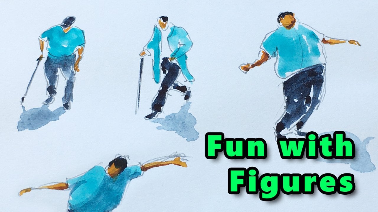
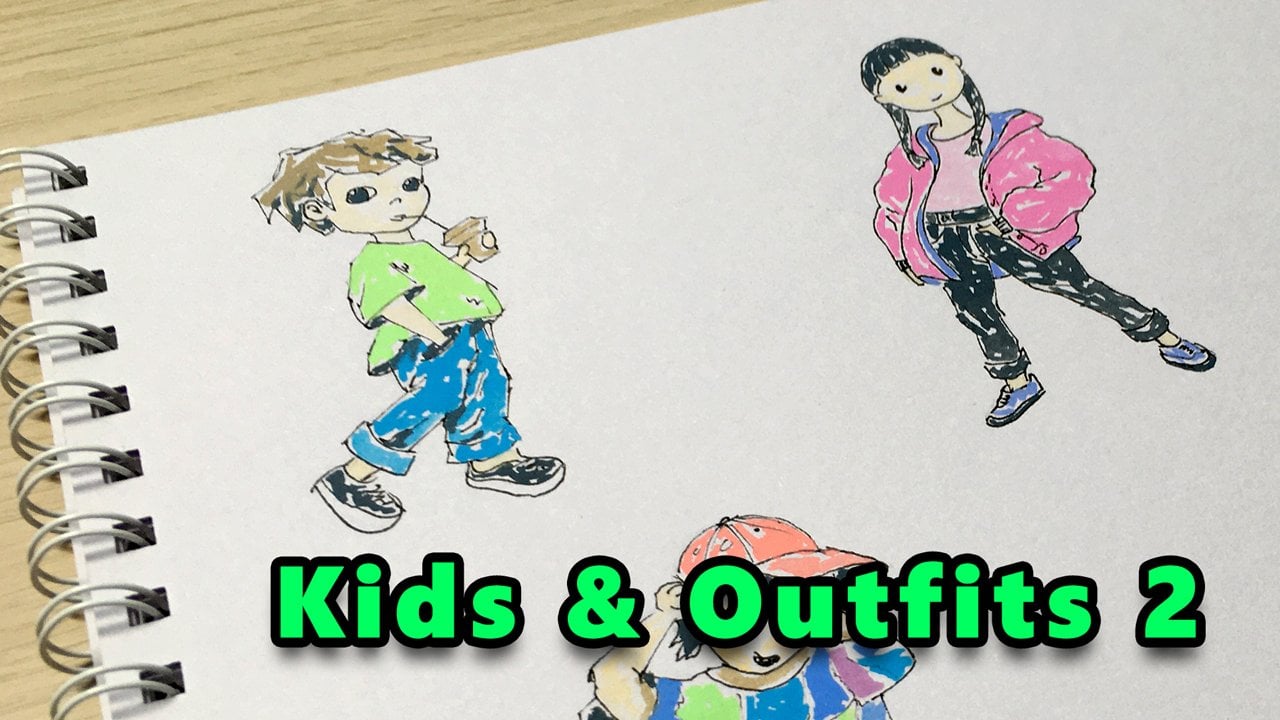
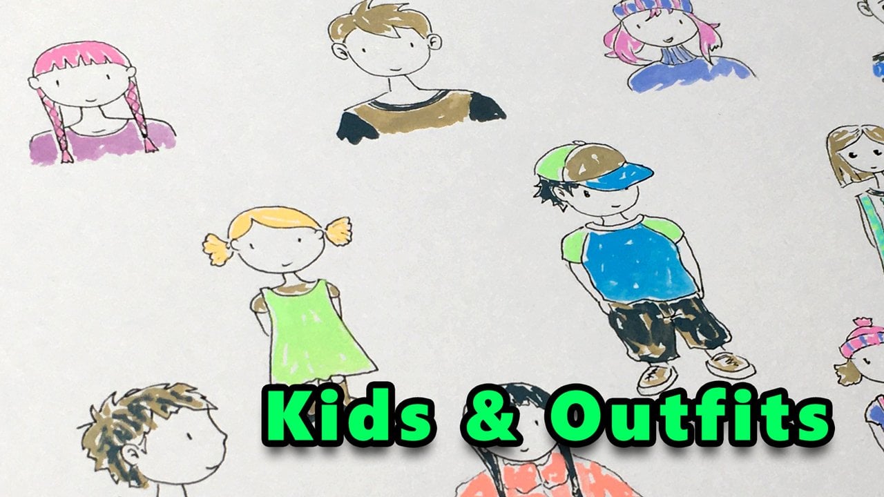
Transcripts
1. What's in This Class?: Welcome to My People for
Urban Sketching class. My name is Tomas, and
we are here to learn several different illustration
styles from simpler to more complex ones that you can use in your
urban sketches. You may have fears
about illustrating people or you may
struggle with them. Maybe for this reason, you try to avoid them. But deep inside, you probably feel how
great it would be to be able to sketch people with confidence in all kinds
of body gestures. It's time to
overcome your fears. I'll teach you how
you can sketch people with ease for
your urban sketches. We are going to start with very simple illustrations
that architects use. Then step by step, I'll show you several different
illustrations styes that you can
practice with me and later you can use in
your own illustrations. The main benefit of
sketching people is that your observational skill will develop by each
character you draw. We will practice all
sorts of body poses, and I'll show you how
to apply shadows on your subjects to create
the illusion of depth, how to make your figures more realistic and more
believable to the viewer. During the sketching session, I'll be using two sheets
of schedule paper, 120 grams, size A four, which is similar to
the US letter size. I'll be using pigma micron
archival ink size three, but feel free to use
whatever ink you have. I just have to be
waterproof in case you plan to color your
figures with watercolor. An alternative can be a permanent
marker with a thin tip. You can see my
watercolor paints here, but the set of colors
doesn't really matter. You can paint with
whatever color you like. I'll be using a size
one round brush for the tiny figures and a size 12 round brush
for the bigger ones. You will need some paper towels, a water container, and a mixing palette.
Nothing really special. Note that watercolor is not mandatory in this
sketching session. You can also use
your color pencils or markers to add
colors to your figures. Now, I hope you are excited to dive into my people's
sketching session. Let's make some fun by sketching all kinds of exciting
human figures together. I'll see you in the first video.
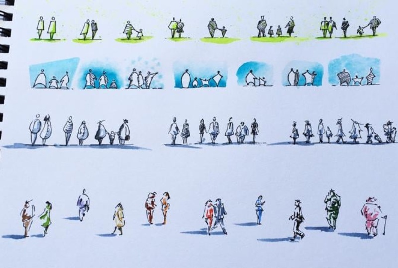
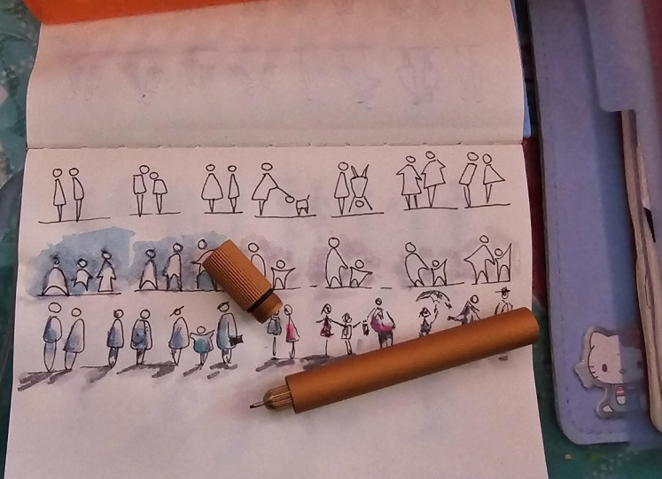
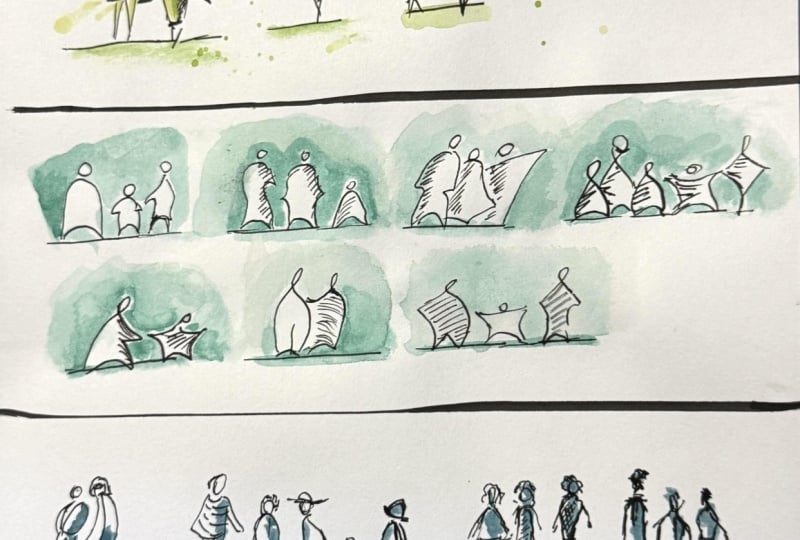
2. Silhouettes with Straight Lines: It's great to have you here. In this first lesson, I'll show you how you can illustrate people in
their simplest form. We'll be drawing
simple two the shapes, so there is nothing
to worry about. This practice is also intended to be an
easy warm up session. So your nerve pathways can prepare for some
more complex tasks. I'll be drawing relatively slowly so you can
follow along easily. But as always, you can pose the video at any
point and catch up. Try to arrange your
figures inside the page as I do,
including relative sizes. This way, you won't be
running out of space and everything will fit
into this format. Good. Let's draw a
horizontal line like this somewhere here
on the top left. This will be the ground level for our first two characters. By the way, first,
we are going to draw our characters
in this row with ink, then we are going to add some colors to them
with watercolor. It will be just
more practical to paint several figures at once. Anyway, when we
illustrate people, proportions play a key role. In other words, the
relative sizes of the different body parts
compared to each other. The right proportion is more
important than the quality of your ink strokes or how
you connect those lines. Here is how you can approach
this on a very basic level. We will have two equal parts. One for the torso, and one for the legs. On the top, we can draw
a circle for the head. Notice that I left the
gap below the head. Let's say this is
a male character. Now, let's draw a female
figure with the same height. The only difference
is that I stretch this kind of a rectangle
shape downwards. Technically, it's a
parallelogram or trapezoid, but you know what I
mean, the triangle is representing the legs. I know we are not here
drawing toilet symbols, so let's take this
further real quick. Let's make our figures
asymmetrical in some ways. So on the left, I'm
drawing a lady like this. And on the right,
a man like this. They lean towards each other. Good. Now you can make
your simple figure more interesting by using the so called hatching technique to add the darker
tone to this shape. They are just straight
lines in pearl in about a 45 degree angle or basically in any
other angle you like. We can illustrate
the arm in some way. And let's fill in this
shape too by hatching. But this time, I'm using
a different tilt angle. Also a lower line
density, if you notice. This way, you can add
variety to your characters. Now, let's draw a little
kid next to her mother. Likes. Very good. M You can always
mark these points, the shoulder and
the hip level if you feel insecure
regarding proportions. So you will know what size you can work with for
the upper body. We can even simplify
the head like this, just a thick short line. The legs are the same. This time, let's draw our female figure partially
covered by the man. They kind of cling
to each other. Let's say they are a
couple standing close. Now watch this. You can also alter the
line density within the shape like this. So we have a different
effect again. Now, we don't
necessarily have to separate the upper
and the lower body. So we can illustrate the father and his kid like this, extremely simple but
still expressive. We can use another direction for our hatching And we can
fill in the entire shapes. We've got a different
look again. You can use this type
if your characters are standing below a tree in
the shadow, for example. Now, let's draw a family. We can separate the legs. And illustrate the head
with a block shape. We can draw a triangle for
the head if we want to. No. By changing the
outline of these shapes, we can express infinite
number of body gestures. Now for the man, I'm
starting with high density, then I thin out and
make it dense again. Another technique to illustrate a dynamic change in the tone. I'm drawing the model like this. And let's not forget the legs. Of course, you can also use vertical or horizontal
lines for the hatching. Very good. Let's show
some more figures. We can start adding details to the character like a
v shape at the neck. Let's draw another one behind. He's wearing a suit. While the one in the front
is obviously a woman. We can add a kind of pattern
to the dress like this. There are so many ways
we can make our figures diversified with this
simple hatching technique. Notice that I tilted the
head for this figure, which can convey a
different body gesture. Such a tiny detail, but it can be important. Yeah. We can even add the gap inside the main shape a little
bit more information again for the viewer. Awesome. This was
very simple, right? We are done with the ink sketch. Now, let's add some paint
to our illustration.
3. Coloring with Green: I'll be using my size
one round brush to add the nice yellow green
watercolor paint to my figures. You can use any color
you want, of course. And actually, you can
use any other media, color pencil or marker. I'm sure your illustration
will look just great. I'm diluting my paint
with some water. Looking for a place for
my mixing palette where. It's not in the way, but
you can still see it. Now, let's start making brushstrokes on our
figures like this. I'm going to paint
the characters mainly on the right side. This will tell the viewer that the light comes
from the left. I don't think too much. The figures are very small, so there is no point to
overthink the shadow patterns. Just a few touches
here and there and a pool for the ground
play as simple as that. Okay. I think I'm making
the tone a bit darker by adding some extra
paints directly from the pan. More pigments in the mix will
result more intense color. All right. You know what? Let's cheer things up a bit. I'm cleaning my size
one round brush. I don't need it for now. I'm taking two sheets
of office paper to cover the area below
and above my figures. Now I'm taking my size eight round brush so it
can hold some more paints. And by doing this, I'm adding splashes as a background
to this illustration. Reload your brush
if it's needed. Not that I'm changing the
direction of my handle, so the splashes will
look more random. And we are done with
the decoration. Looks good, I guess. I'm cleaning my brush
on a paper towel, rinsing it in the water, and putting it aside. We are done with the first
style I wanted to show you. This style is often used by architects to provide the
scale for their buildings. The viewer knows how tall
an average person is. This way, he or she can put the surrounding objects into context in a fraction
of a second. The viewer will know how big
the building structure is. You can use this style in
urban sketching nicely when your buildings are in focus and your composition
covers a larger space. These figures are easy to draw quickly and your streetscape
won't look deserted at all. Very good. We can move
on to the next style. See you in the next video.
4. Figures with Continuous Outline: Welcome back. Now, let's see another simple style that you
can use in your sketches. I'm drawing a U
shape upside down. Another curve at the bottom, it represents the legs and a
small circle for the head. This is even more simpler
than the previous style. While the figures above were built mainly
from block shapes, this style is more like curve
intensive, as you will see. We can illustrate
the arm like this. This shape looks more
like a female figure. Let's practice this
style some more. You can alternate the
length of the arm. Is steeled angle, the
curvature of the bottom curve. You can draw a kid
as simple as that. And we can use the same
hatching technique that we have already practiced
in the previous row. Arms can also be
illustrated like this, so there is no pointed tip, just a break in the line. It's like his hands
are in his pockets. Can also illustrate
overlapping, of course. Or a certain body
gesture like this. And we already have a story. The guy on the right is showing something to
the couple on the left. Very simple but expressive. You can add some
shadows if you like. Now, let's see an alternate
version of this style. We can include the head in the continuous curve by
using a loop like this. We can of course
show the legs too. This kid seems very happy. Try to copy these
curves very slowly. Speed will come with practice. Think through the shape
before you actually begin, then do the ink stroke. A female character can
be as simple as that. Let's practice some more. You can mix the two
versions, of course. We can illustrate a
couple like this. I or like this. The first one suggests more
like a standing pause. While the second one
is more dynamic, they might be in the move. Now, let's add some tones to convey the illusion of depth. I find it fascinating
how we can add dimension to our subjects
with such a simple technique. Now let's draw another one. This figure is
filled in entirely. The kid shape is empty, and the female character
has a stripe like this. Good. We are done with the
inkwork. How do you like them?
5. Background Variations: Now let's make these simple
illustrations visually more appealing by adding some
background paint to them. This will also be a great
opportunity to practice some basic watercolor
painting techniques. Let's get into. I'm taking my mixing palette so you can see what I'm
doing with my paint. I'm taking some
cobalt turquoise, but feel free to use
any color you like. I'm adding some water to it. I'd like to get a nice
fluid consistency that I can apply on
the paper quickly. This background is planned to
be a nice even paint layer. To make it more interesting, I'll be form a shape. Actually, this is in the way, so let me put it aside. As you can see, I'm leaving
the figures intact. I'm painting only
the background area. Make sure you apply
enough water. We don't want the layer to get dry before we finish
the entire area. Otherwise, we won't get a
nice even layer of paint. This is a very thin paper, way below the usual
watercolor paper grade, this can be a challenge, but I'll show you
it can be done. If your layer dries quickly because the humidity level
is low in your room, add additional water
to the surface. Try to apply as few brush
strokes as you can, so you can fill in
the area quickly. Good. I guess this looks okay. Now for the next background, I'm taking some paint
directly from the pan. I will need more dense
paint consistency. The plan is to create a
nice gradient background, lightening from the center
in radial direction. So I'm starting with
an intense mixture directly around our characters. Make sure there is enough
water in your mixture, though, because we need this layer to remain
fluid for a minute or so. Now, I'm cleaning
my brush quickly, taking some clean water and
create a wet area around. But I make sure there
is a gap between the two surfaces so they
don't connect for now. Like so. Now, I'm wetting my brush
and connect the areas. Like this. I'm applying
very light touches. Pigments will spread
on their own as long as there is enough water on the surrounding surfaces. We can also have them spreading
with some gentle pushes. Very good. Now I let this alone. Pigments will continue
moving slowly, and we are going to get a nice gradient background
in a few minutes. Now I'm taking some
dense paint again. And jumping to this group while my second
background is drying. I plan to create a
gradient layer again, but this time, it
will lighten from the bottom to the
top in a linear way. So I'm applying the dense
paint on the ground level. Now I'm dipping my
brush into the water and start moving the
pigments upwards like this. Um, now you can see, but I'm pushing my brush gently against the
wall of my water bowl. Less and less pigments
remain between the bristles. This is how I can get lighter and lighter tone on the paper. At this point, I'm cleaning my brush and using only clean
water to finish the top. Wonderful. I'm
cleaning my brush. And we can move on
to the next one. I'm using the same technique just in a different direction. The gradation will happen diagonally from the top
left to the bottom right. We are just experimenting
with the different layouts. You can always add more
pigments to the surface. Just make sure you use a clean
brush on the lighter side. We can also use gravity to have the pigment spread
in the right direction. So I'm tilting my
sketchbook this way. H. You may see these dark spots on your paper. Don't worry about them. It just means that the paper
has been soaked. Once it's dry, the
spots will disappear. Now, let's add the
diagonal gradient again, but in the opposite direction. This time, I'm tilting
my sketchbook this way. Note that pigments
can spread only if there is enough
moisture on the surface. No puddles on the paper, but if you look at the paper in a certain angle,
it has to glimmer. Otherwise, pigments won't move. Creating a soft gradient is a very basic
watercolor technique, but we use it all the time. So it's worth practicing. I guess now we can go back to this one with a clean brush. I'm making the surface wet. It seems the water is
dissolving my ink slightly. This shouldn't be happening. Pigma Micron is usually a
good quality waterproof ink. Maybe it's because of the
thin sketchbook paper. I'm not sure. Anyway, it's not a big deal. The surface has been prepared. Now, I'm taking some paint and tapping and dabbing
the wet surface like this. The spots are closer to
each other at the bottom. And I let the pigment spread. Now for the last background, I'm taking a little piece of paper towel and
crumpling like this. I want this to be
ready because we are going to execute a
time critical operation. Now we will need some
well diluted paint, so make sure you have enough
water in your mixture. I have to do this quickly
because my layer dries fast. Now I take my paper towel and push it to the
surface gently. So it's soaking up
some of the paint, and we get a nicely
textured layer like this. By the way, this is an
excellent technique to use for illustrating
clouds on your sketches. Awesome. We are done with
the backgrounds. We can clean our brush
and put it aside. I hope you are
enjoying the lesson so far because I definitely
have some more people, illustration styles for you. See you in the next video.
6. More Like Rounded Shapes: In the next style,
we are going to use more rounded shapes
with some extra details. If you have a light,
graceful linework, by instinct, you will
like this style. In my case, there is room for
improvement on this area. Anyway, let's practice. I'm trying to keep
my hand muscles loose and making
very light strokes. Everything is rounded and
the shapes seem lightweight. Note that we still don't
show any facial features, but we can add some
details to the dress. Or create the hairstyle. Let's see some more. We can illustrate very
different characters. She will have a slim figure. An oval face wearing
a stripped sweater. Let's draw shorter older lady. With her hand in her pocket. Okay Now, let's change the
body form again. She will have a
different body posture, and she will be wearing a hat. We can also add shadows with the hatching
technique, of course. And let's not forget a
kid in this rounded form. And the father is taking a briefcase in his hand and wearing a different hat. Let's suggest a shadow
for the man too. Good. It all depends on
your personal taste. I think this is a nice
illustration style. You just need to make
sure it harmonizes with your other subjects on the
scene like buildings or trees.
7. Get Wonky: You might have a less
confident line work or you want to
express uncertainty, fickleness on your sketches, so you intentionally get wonky. Let's see some examples
for these kind of figures. I'm trying to draw with
uncertainty, a shaking hand. My ink strokes are
not continuous. Everything seems like unsettled. I am undetermined. It's like I'm not sure which direction I should
draw my strokes. These are the feelings that I should transfer to the viewer. I'm not sure if I'm doing it genuinely because this
is not my nature, but I hope you get the idea. Drawing single lines for
the limbs may also help. If you feel yourself
authentic in this style, please don't forget to
upload your project. I'd really like
to see your work. Et's raw some more figures. I think it's useful to
practice a certain style, even if it doesn't
feel like your own. For artistic reason,
you may need that. And it's always good to have
a broader range of skills. I also find it interesting
to draw people like this. Good. We can move on to
the next catching style. See you in the next video.
8. Get Loose: Now, the next style I'd like to show you is something
that can be very useful to practice if you are kind of stiff with
your ink strokes. In order to prepare our nerve pathways and
muscles for this style, let's take a sheet of
regular office paper. Now, watch hum scribbling
and try to copy the motion. I'm doing this without thinking. You have to be quick
with your curves in order to do this effectively, so you don't leave time
for your brain to think. This is a very
interesting experience. Take your time and do this until you feel fluent
with your curves. Good. Now I imagine
the figure in my head, and I try to draw it with a similar motion.
I just practiced. This can be easier to
practice in a larger format, but I'd like to keep my figures with similar sizes in this role. If you are a heavy handed person and you're struggling
with small figures, feel free to magnify
your characters. Whatever feels
comfortable for you. I think of a certain
outline or body pose for my figure and let my
fingers move with ink. Note that swiftness is
key in this practice. If you realize that
your brain has too much time to think,
then it's no good. At least to form characters
in this specific style. You see, I'm thinking
too much here. All right. I guess it's time to add some colors again
to our illustrations. See you in the next video.
9. Let’s Create Some Shadows: In this lesson, we are going to add some shadows
to our characters. Note that when I
edited the video, I realized that I made some
mistakes with some shadows. But don't worry.
During the lesson, I will mention what I'm doing wrong so you can learn
from my mistakes. Shadows can create the illusion of depth on your sketches, so it's worth spending time on getting a basic understanding on what happens when the light hits the surface and
shadows are created. Now let's get into. I'll
be using my indigal paint. It's a deep rich blue shade, a perfect option to
illustrate shadows. I'm adding plenty of
water to my mixture. I prefer starting with
a lighter tone that I can make darker in a
second round if I need to. Okay, but where shall we put those shadows
on our figures? The first step is always to define where the main
light source is located. This is usually the sun. Let's assume the light
coming from the top left, so I'm going to
place my dark paint primarily on the right
side of my figures. If you want to be realistic with your cash shadows
on the ground plane, they should be located
below your subjects pointing towards the
opposite direction than your light sources. Not that I'm placing the case shadow on the
wrong side of this couple. It's supposed to
be on the right. I'm applying a similar shadow
pattern on these figures. Here, the case shadow
could be shifted slightly to the right
to look more realistic. For this family, I have defined a different light
direction by the hatching. So here, the light source is
located on the top right. Consequently, the shadows on the figures will be placed
mainly on the left side. Again, the case shadow is
far from realistic here. I should have put that brushstroke the
opposite direction, starting from the feet
of the man to the left. As these figures are very
tiny, I don't think too much. I'm just stepping on the shapes on the right side
here and there. The final impression
will be just fine. Later, we are going
to draw characters in greater sizes and we'll discuss shadows there
in more detail. Notice that this time I'm
placing the case shadows right. I'm pulling the brush from
the feet to the right, which is correct if the light
source is on the top left. I'm adding a second
darker layer of paint at some places to
increase visual interest. All right. Now let's move on. Now on the third group, I'm trying to recall
the motion from the ink drawing and place the shadows the
same dynamic way. Note that here, I'm placing the shadows on the
figures kind of random. There is not much consistency
in them as a group. So don't look at these
figures as a composition. They are more like
individual examples. Here, I'm using simplification when I'm making these
uniform cast shadows. These shadows are not
realistic this way. In this lesson, the
main concept was, do not think too much when
sketching these figures. Actually, if you want to have realistic shadows,
you do need to think. But don't worry. We will go into more detail regarding
shadows in the next lessons. Now, I'm cleaning my brush. And let's see
another interesting illustration style
in the next video.
10. Just Suggest the Figure: In the examples above, we were kind of accurate in drawing the complete
outline for our figures. It didn't take too much time, but we can be even more
economical with our ink strokes. Watch Hum drawing
the next figure. That's it. With a
few ink strokes, I'm just suggesting
the character. Let's throw another one. They are obviously
lacking some parts, but the thing is
that the human brain likes to add the missing pieces. Viewers will like these
figures and find them more interesting because their brain can play with the
missing puzzles. It's kind of
interesting, isn't it? In this practice,
you don't need to copy my figures line by line. Feel free to leave
out some ink strokes or use extra ink strokes
wherever you feel like. Experimenting is key in this
specific illustration style. Let's draw some more of
these unfinished characters. I Notice that the head is just a small curve here. His right leg bend
in the knee is just a dot illustrating
only the sole of the shoe. Um, You may have the question, but hey, how do I know
which lines to keep? While I don't have an
exact answer to that, I can provide you
with some hints. Depending on the
light direction, you can choose to draw only that side of the shape
that is on the dark side. Also, you definitely want to
make some ink strokes for the darkest areas like at the
armpit or between the legs. You might also want to
illustrate the hair partially, as well as the shoes. So the viewer will know where the figure
touches the ground. Good practice exercise
can be to find some professional photographs
where there are usually spectacular shadows
on the subjects and copy the dark areas
only to your illustration. In art, the light and dark
areas are also called values. We can assign a number to a certain lightness or darkness. Then you can filter these values and indicate only the dark ones. I encourage you to experiment and see if something looks good. This is not an easy style, so don't be disappointed if something doesn't
look awesome. Simplification can be quite
challenging sometimes. Over time, you will also notice that the lines
are not that important. The shadows that you
paint with watercolor or any other media have a lot more impact on
your illustrations, consequently on your viewer. Let's practice some more
of these characters. I'm drawing another couple just in a different
viewing angle. In this specific style, the goal would be to use the
least amount of ink strokes, while still showing the
gesture of your figures. You can see lots of
gaps in the outlines. The strokes are rarely
complete or finished. H. Now I'm drawing a man inside view as he's
checking his mobile phone. Now I'm drawing a
man inside view again in the middle of his walk. M. Now, let's draw a man in rear view. He's carrying his backpack while he's talking on the phone. Finally, let's draw an
old man in rear view again in a hat with a
walking stick in his hand. Good. Some of my figures look better or more
expressive than others, and I'm perfectly
fine with that. For example, I especially
like this old man at the end. Anyway, our ink
sketches are ready. We can move on to
the next video.
11. Let’s Make Them Colorful: All right. I think we have
done plenty of work by now, so let's play some with colors. Choose different colors for each character and
paint some shadows. Don't think too much
where to place them. Just try to be playful and
enjoy what you're doing. You can use lighter
tones, darker tones. You can mix different
colors together. You can use one single
layer of paint, or you can add the second
darker shade if you want. Just have some fun. Though I have been and I'm focusing on shadows with my paint layers, you can also use your paint to illustrate the actual
colors of the dresses. However, it's important
to leave some space for darker tones on your characters to be able to illustrate
some shadows. I find this painting
part extremely relaxing. This time I won't be talking. Let's enjoy the mood. Finally, I'm using my indigo
to paint the cast shadows. And forgive me that
I wasn't consistent again with the light
direction on all my figures. At least my cast shadows are pointing in the
same direction. Very good. I hope you enjoyed sketching
in different styles. If you'd like to practice
some more in the next videos, we'll be drawing characters in bigger sizes with
more details on them. So I encourage you to keep
watching the lessons. See you in the next video.
12. Let’s Get Bigger: Welcome back. I'm so glad you decided to
keep sketching with me. It tells me that
you are one of the few who like to complete
what they start. I'll be drawing characters in three rows next to each other, but feel free to place them on your page
wherever you like. In the first row, we'll
be drawing figures in a simpler style that
you have already learned. We are just getting used to a slightly larger format as your urban sketches
may require this. Also, we are going to add more and more details
to our subjects, so they are getting
more and more complex, as well as realistic. Not that when I'm
saying realistic, I'm not talking
about photorealism. That's a completely
different subject matter, and it's out of our scope. All right. Let's draw
a mother with her kid. The main goal of
this section is to practice what you have learned
and let the skills sing. Not that I'm going to draw
a bit faster this time. So feel free to pause
the video after each character and
finish your own sketch. I, Asymmetry is usually a good thing in illustration. So if you watch the dresses
on these characters, their bottom lines
are not horizontal. They lean in one or the other direction and make your characters
look more interesting. Also, the boy is turning his
head towards his mother. That's another asymmetry. Now let's see a couple and
their kid walking from behind. Illustrating the walking process is tricky. Placing the legs in
perspective is challenging. If you feel a struggle, I have a doodling people
session where you can practice this in
many different scenario. Another challenge in drawing when two shapes
overlap each other, like the legs in this case. So you need to think
ahead and start drawing the outlines of the
shape that is in the front. In other words, that is
closer to the viewer. Now, let's show the young boy. O. The kid is walking
with a greater momentum. He needs to step bigger in order to keep the pace
with his parents. The good thing in a rear
view like this is that you don't need to
draw faces. Good. Now let's draw another couple where the guy is embracing
his girlfriend on the shoulder and holding an
umbrella in his other hand. We see these figures
from behind. Um, The girl has a backpack. They are in the move, so their legs position
reflect this. Here comes the umbrella. Good. Now, let's throw
a guy inside you. He's taking a
folder in his hand. And his walking position
will look like this. Let's put a coffee cup
in his right hand. I'm using roughly the level of his left elbow to place his right arm in a
believable position. Good. Finally, let's draw a young lady in a hooded coat. We see her from behind. She's holding an umbrella
in her left hand. A right arm is taking a
nice curved position. The outline of her coat is
asymmetrical, of course. And let's draw her legs. She's standing with her
feet apart slightly. Finally, let's show a
pattern on her coat like this. Very good. These are kind of
1 minute sketches. It can be a good practice
exercise trying to capture some people's gesture
while you are waiting in a cafe or you are
traveling on a train. Your observation skill
can improve quickly. You will notice some repeating
patterns like backpacks, hoodies, coffee cup in the hand, shopping bag, and so on. You may also want to observe the different patterns
on the dresses. Anyway, we have our figures
ready in the first row. Now let's add some colors
to them real quick.
13. Orange Shadows: I'm going to use this
orange paint for my shadows this time with a
bigger size of brush size 12. I'm diluting with water. I'm cleaning my brush and adding a touch of cadmium lemon to shift
the hue a little bit. I'm assuming a light source
somewhere on the top right. So my shadows will be
located mainly on the left. If you want to illustrate
realistic shadows, think through which surface faces the light
and which doesn't. You can divide each
three dimensional surface into two parts, the light side and
the dark side. The dark side is what
we are looking for. In other words, those surfaces
that don't get direclt. As there are all kinds
of folds on the dress, this won't be an unbroken plane. It's more like a bunch of
small connecting shapes. Another concept that
you can use to find the shadow areas is that some parts on the body
cast a shadow below. For example, the head usually casts a shadow on one
side on the shoulder, the coat casts a
shadow on the pants. The skirt casts a
shadow on the legs. In the meantime, I'm
adding a second layer, a more intense color at
some smaller places. And as the light source
is on the right, the cast shadows for the figures will be
located on the left. There can also be surfaces
that face the ground. They are usually
in shadow as well, like the right lower
leg of this man. While the lower leg of
the woman faces upwards, so it is probably in light unless something else
casts a shadow on it. Make sure your cast shadows on the ground plane touch
your figure's feet. But of course, only if the feet touch the ground in
the captured moment. Yeah. Now, you could say that on a rainy day
we barely see shadows. Well, if there is any
light on the scene, there will be some shadows. There won't be that much
value difference between the light and dark side,
but there will be some. We may not have a main
light source like the sun, but the sky is also a
light source itself, even on a rainy day, or the sun can
shine from lower on the horizon and we can have
rain at the same time. That's a beautiful coincidence. Definitely a moment
you want to capture. Anyway, for this guy, I changed the lie direction
as it wouldn't be that much interesting to paint shadows on the entire left side. So let's assume the
sun on the top left. I keep this lighting
scenario for this girl, too, even if she's
holding an umbrella. I I forgot the cas shadow
for the couple. Okay, here the cas shadow
location is incorrect. Sorry for that. At the
lady, I started to think. So I placed the cas
shadow correctly. I'm cleaning my brush so I can bring some ruby
paint into my mixture, which is a vibrant red paint
with a slight purple in it. Adding some more orange to add the darker
tone to my figures. Just to make them look more appealing with the
second shadow value. I'm trying to place it where I think the surface
is the darkest. Let's do this for the
other figures too. I'm using the principles that we discussed at the
beginning of this lesson. Note that the cast
shadow here should have been placed behind
the guy on the right. Awesome. Now we can clean our brush and move on to
the next illustrations. See you in the next video.
14. More Figures from the Street: Welcome back. Now, let's practice some more walking
figures from the street. I'm drawing a young lady with a big ribbon
bow in her hair. Her ponytail is
curving like this. Here is the color of her coat. We are seeing her back. She's wearing a long coat. She's walking in boots, something like that. Now, her front leg will
be placed like this. She is walking with
a great momentum. Good. Now, let's draw a woman
in three quarter view with long hair with a handbag crossed on her chest, Let's chew her on. Her coat with the other arm. I'm marking her hip
and the ground level. Her leg position
will look like this. Okay. Let's complete
the coat on this side. Some final touches
here and there. That's it. Now let's show a couple
with the lady on the left. Yeah. Mm. Holding her hands together in front of her chest. Wearing a long coat again. Being in a walking position
like this. Mm hmm. That's true the man on her left. In a jacket, keeping his
hands in his pockets with leg position like this. Mm. They are talking
with each other. Now let's show a lady in a hat. With a handbag on
his left shoulder, Walking away from us. Like this. Holding a dog leash
in her right hand. And her dog is peacefully
walking right next to her. Good. Now we can
add some shadows.
15. Painting Brown Shadows: I'm going to use an
earth color this time. It's burnt amber. I'm assuming light
source from the right. Beyond the principles that I
mentioned regarding shadows, you can improve greatly with your shadow illustration
skills if you observe people walking on
the street on a sunny day, analyze the dark and light
surfaces on their clothes, watch how the fabric
folds on their dresses. Make some notes
about your findings. With just a ten minute
observation session, you will paint way better
shadows on your figures. Mm. Let's not forget
the case shadow. The light comes from the right, so it will be on the
left of our figure. Note that we could also
give it a slight angle. It doesn't have to point
in horizontal direction. Let's see the couple real quick. Note that her thigh
on this leg is facing upwards, so
it remains light. Yes. Okay. Guess shadows are pointing to the left. You can place these
shadows in just seconds. They will look just great if
you know what you're doing. You don't have to be perfect
with them. Just believable. In this row, I managed to create pretty consistent
shadows on all figures. I'm taking some dense paint and adding a second
layer here and there. With this darker shade, we are basically
increasing the contrast. In other words, the
distance between the light and dark values
on our illustrations, which will result
a more striking I love painting these shadows. It's fascinating to see how these characters come
to life by them. Nice. We can clean
our brush now. In the next lesson,
we are going to look into some additional
interesting body poses. See you in the next video. I
16. Getting More Realistic: As our figures are
getting larger, we can start adding more
and more details to them. But note that more details
also mean that you place more focus on these characters inside
your composition. Now let's show a young
man in front of you As you can see, I have already started to add some
facial features above. Now I continue, but I'm kind
of minimalist with that. Almost just three dots, two for the eyes,
one for the mouth. Now let's draw a
sweater for this guy. With the sleeves rolled up. I guess I have to go
lower with the hip. He's walking towards us. Wearing pants like this. I'm illustrating some faults. H. And that's it. We can move on. This
will be a young lady. Similarly, in almost
front you in a sweater, Wing in a different position. Like so. Her arms are close to her body. I guess that ear wasn't
necessary, but never mind. Now, let's show an
old man in a hat. In a short sleeved shirt with suspenders on his back. He'll be grabbing a stick in his left hand that I'm
going to draw in a minute. His legs will look like
this in his wide pants. We can see the sole on his left hood as he's
stepping forward. Here is the walking stick. His bat. And we are done. Now, let's show a lady
with a big volume of hair. In a sitting bows. But holding a book in her hands. A legs will be tricky. As they will be crossed, like this, providing
support for the book. Good. Finally, let's
show one mother. As she's leaning
forward or downwards helping her kid with something he'll be wearing a hat. And a big coat. His mother's leg will be bent in the knee. Wearing a shoe like this. Her other leg is
pointing towards us. There is a pocket on her coat. So additional
details to the coat. Now, let's show the pants for the kid along with the shoes. Finally, a few extra touches. And we are done. Let's
paint the shadows.
17. Painting Indigo Shadows: I'll be using a well diluted
indigo for the first layer. Shadows hold extremely
important information for the viewer as the brain can translate the three D form or interpret
the volume based on that. The lines are secondary. I'm sure you know by now that our light source
is on the top right. This paint seems too
dark at this stage, but we'll see what color paint
gets lighter as it dries. So we can calculate with that. Remember, if a surface
faces downwards, it is probably in shadow,
so it can be dark. But note that this is
not always the case. There can be reflecting
surfaces in the environment. For example, a window or a
shiny metal surface around or a puddle on the
ground that lights our figure from a direction
we wouldn't expect. So I can imagine a situation where even downwards facing
surfaces can be light. That's the beauty of illustrating
people on the street. It's kind of difficult to
create unrealistic shadows. Well, I managed to do that in some previous lessons
with the cash shadow, if you recall, but
you know what I mean? The lighting conditions can be so diverse that you can paint many different
shadow patterns on the same subject and all of
them can seem realistic. You just need to make sure
that you are consistent with those patterns inside the
scene or your composition. I guess I'm changing
the light direction here to make it more sense
in this composition, the sun shines
from the top left. I need some more
paint from the pen. Let me paint the cast
shadows real quick. Okay. Nope, this is a wrong
direction here. So please don't copy this. I'll come back here in a minute. In the meantime, our first layer has tried and faded a bit, so a second darker layer
will help. Let's do that. Not everywhere, on the
presumably darkest areas.'s The guy looks much better
with more contrast. You see, we can even
add more paint here, where it was already pretty
dark in the first round. Let's move on to our old friend. So extra dark for the lady. And finally, for the
mother and her kid. I'm realizing the
wrong direction of the cas shadow in seconds. Yep, light from the right on the previous figures and
light from the left here. Let's see what I
can do about it. So this is the correct
cas shadow on the ground. And with a clean and
slightly dap brush, I'm trying to lift off some
pigments on this side. The thing is that
indigo paint is one of the worst from
this point of view. It absorbs quickly
into the paper. So I don't even try to
remove the rest on the left. I'd rather add some
more dark on the right. Maybe it's too much. You know what? I let it go. We are just practicing here. Now I'm checking my
figures one last time and making
some final touches. All right. I guess I've
showed you what I planned. I hope you enjoyed it a lot.
18. Final Thoughts: I'm so glad you have made it. I truly admire your dedication. I hope that by now you have overcome your fear
of sketching people. Now, obviously, you won't be drawing perfect
figures overnight, but I believe you already know how to approach the
subject and step forward. If you like urban sketching, being able to illustrate
people is just part of that, and it's so exciting. Now, I'd really like
to see your sketches. You can upload your work in the project section
right below the video. Whatever the outcome is, there is nothing
to be ashamed of. I always say, look at your mistakes as something
you can learn from. If you feel like you're
getting some value, you have learned something new, or you have found some kind
of joy in this activity, I'd like to ask you a favor. Please leave a review or
rating for this session. You can be very short or feel free to share your detailed
feedback with me and others. It can make me smile or
I can learn from that. And if you like my
teaching style, I definitely have some more drawing and painting
lessons for you. Make sure you check them
out on my profile page. I hope you had a
good time with me. See you in another course.
 Tamas Benko, Drawing & Painting Classes