Transcripts
1. Welcome and Introduction: Hello, and welcome to
Watercolor From Scratch. I'm Emma, and I'm
about to take you on a crash course to watercolor. We are going to be whipping
through some stuff. We are going to go through my
methodology to watercolor, and then we're
going to put it all together and do a little
portrait together. Now, before we get stuck
into all the good stuff, let me introduce myself. My name is Emma. I'm an
artist from Melbourne, Australia, and I run Paint Wild. Paint Wild is an online
academy where I teach realistic watercolor
wildlife portraits online, and I've been teaching
art online since 2016. I'm also a published author. I've got two books, one
on brush lettering, which was my original
gateway drug into art, and also another
book on watercolor, which is basically what I
am very addicted to now. Also a paintmr. So Paint Wild has a shop where I sell
my handmade watercolors. It's a very traditional and
time consuming process, to be honest, but very fun. I also want to give you a bit of an overview of why Paint
Wild is different, and that will explain
my methodology, my scratch method,
which is an acronym for all the things that I
think are important to watercolor, specifically
wildlife portraits. So Paint Wild is all about
one medium watercolor. And all about a simple
set of supplies. So when I was trying to
learn watercolor myself, I became very overwhelmed. There are so many supplies. There's like a pagillian
brush types, like shapes, let alone sizes, all these different colours and variables. You could use the same set of supplies to paint a
portrait one day, come back the next day
to do the same portrait, and the climate betrays you. Humidity in the room
makes things different. And with so many variables or even fighting the
environment here, the way that I was able to
get control of this medium and grow my skills was to
reduce that overwhelm. So I'm a very big believer in a minimalistic set of supplies, including paint, and I
have a limited palette. So you won't find
more than five colors on my watercolor palette. I mix everything from
the primary colors, and that's how all the portraits are taught in my
academy, as well. So I've got the three primary colors and also black and white. Don't tell the art
police that is a felony in their eyes,
but I don't really care. I think they have their uses. I also only teach
wildlife portraits. I used to teach everything,
but then I realized that my true passion was with
painting wildlife portraits. I felt like that was
where my strength was, and I was always more excited
when we did paint animals. So I focused down on that, and I do also believe
that focusing on one subject area can help you excel faster at an art form. Is that always
realistic when you're excitable, new person to art? No, I dabbled in everything, but I did see more growth in my own practice when I was
focusing on just one subject. So try to keep all
my tutorials and paintings 30-90 minutes long. I'm a very impatient person. I do not want to sit at my
desk for hours upon hours, painting every stroke of fur in. I do paint realistic portraits, but not hyperrealism
or photorealism. I don't want to do
every last detail, and I do want the medium to
be able to shine through. I do want someone to
look at my work and go, Oh, that's a beautiful
watercolor portrait. And so I find that keeping
it a little bit shorter, taking some shortcuts or, like, leaning into the qualities of the medium can
help you achieve. Let's get into this
scratch method, shall we? I'm going to talk
you through what each letter of this
acronym stands for, and then we are
going to come back and dive into each one
in a bit more detail. So the first letter
is S for supplies. I'm going to talk you
through the supplies that are in my minimalist kit. I'm not going to explain to you every watercolor supply that exists because
just to be honest, I just don't use them
all, and I really do believe that starting off
smaller is the way to go. We're then going to look
at some color theory. So as my school is based all around mixing from
the primary colors, there's just a couple of
things that are good to. I'm going to throw in some
realism tips for you. These are not specific
to animal portraits. These are just more
general realism tips, not even sometimes
specific to watercolor, but this will help you to understand how you can
go from making something look two D to more three D. Then I will throw
in some animal tips. So we'll talk about
some color mixing for wildlife portraits, as well as some techniques
that suit wildlife portraits. And we'll also have a look
at techniques that are more just broadly applicable
to watercolor in general. Then talk about composition. What can you do or look for when it comes to
reference photos, how to structure your portrait? Where to put things?
What can we do to make something pop and
be visually interesting? And then finally, honing. How do we fnesce our portrait? Where do we put the highlights and make things really pop? There's often quite
an ugly stage in art, and sometimes my paintings are predominantly
in the ugly stage. And it's only when you
hone the little details at the end that things
start to look beautiful. So that is my little method
for all the things that I think are super important to watercolor
wildlife portraits. Let's jump in now and
talk about supplies.
2. Supplies: Supplies is one of
those things that I could talk to you about forever, like how stuff is made
and blah, blah, blah. Like, I'm very much a nerd
when it comes to this stuff. But we are limited time. So what I do want to do is
point you in the direction of a video that lives on
my YouTube channel at Paint Wild Academy. I think it's about 30
minute video that runs you through all the supplies I recommend for beginners and why? We're just going to run
through the recommendations. But if you want to learn
a little bit about why about ways to save
money with supplies, there's some good tips
in there as well. I would recommend
you find yourself some 100% cotton paper. Don't have to use the
same brand as me, but I am an Archers girlie. Live life love archers. Saunders Waterford is
another good option as is Fabriano Artistico. The brand isn't that important. Just look for 100% cotton. Paper weights as well. You can get away with 185
GSM paper most of the time. It may warp and
buckle a little bit, but it's perfect for practice. I tend to use 300 GSM
when I'm wanting to do commissions or just something that I want to give
to someone else. It really does reduce the amount of buckling in your paper. Recommend grabbing it in
a pad format that's just glued on one side or
loose leaf sheets. They're just more
cost effective. And what I will do is buy the bigger sizes and
cut them down myself. If you buy something like a small sized pad or a block that's glued on all
the edges so it doesn't warp, they're going to charge
you for that convenience. They're going to
charge you more for having it all glued
down and not warp. Well as being a more
convenient size. Paper really is the most important supply when
it comes to watercolor. A lot of people
don't realize that. They just assume it's paint. So even if you don't stick
with 100% cotton paper, I implore you to at least try it so you can
compare your results because quite often
people are very surprised and they feel like they were not
getting watercolor, then they try the good supplies, and all of a sudden
they're like, Oh my God. I think I can do this. Now
the last thing to worry about with paper is
the texture of it. It comes in three
different textures, hot press, cold
press, and rough. Cool press is sometimes
called, like, not as in, not hot pressed. And basically, think
of it like goldilocks. Not too cold, not too hot. Right. So which one you use is really
going to be up to you, but most artists will use cold press because it's
somewhere in the middle. There's a little bit
of toothy texture, but not so much that
it's going to be a super thirsty page or really
shine through at the end. It is going to be
able to hold water. You might prefer hot pressed. It's more tightly compressed, and that means it's
going to be smoother, and that's going to help
you be able to, like, write on it and do really
intricate details. It'll also help if
you're going to scan and digitize your work. The texture is not really going to shine through at the end. And speaking of that, if you are planning on
digitizing your work, you may just want
to consider the color of the paper as well. There's not very many options, but you will find
that there's, like, white, bright and then,
kind of off white. So you might want to go for the very bright one just to help you with that process when you have to finas it on screen. That's the rundown on paper. Then we have watercolor paint. I will, of course, recommend
professional grade supplies. Of course, I'm going too. But you can definitely
use student grade. There's nothing
inherently wrong with it. What you can often find, though, is student grade paints
have multiple colors shoved in the tube or a
lot of filler in there, and it can affect
your mixes and make them just less
clean and vibrant, or, you know, you're
just wasteful with it because it's
not as pigmented. So the commercial brand
I recommend, I mean, the handmade brand
I recommend is my own, but you don't
have to buy from me. The commercial brand that I love and recommend is Windsor. Just old faithful, you know,
it's been around for Ebar. It's very easily accessible. They have a Cotman range, which is their student range, and then they have a
professional series range, which is their artist range. Because I'm a color
mixing galley, I'm going to recommend that you go and get primary colors. So from the professional
series range, it is Windsor lemon, permanent rose, and
Windsor blue red shade. From the Cotman series range, their recommended primaries
are lemon yellow hue, ultramarine and permanent rose. So permanent rose
is the same one from the professional and
the student grade range. Ultramarine, I don't normally recommend a color like
that for your primaries. It is a granulating color, which means it shows texture
in it and anything you mix and anything with hue in it means it's been made
to replicate a color, but it's not necessarily
that pigment. So I usually avoid that.
Sometimes it's a good thing. They used to be
colors like cadmium colors that were really toxic, and now there are hues
that imitate them, but I just prefer to
get the real pigment provided it isn't toxic. So you don't have to go
with that brand either, but what I recommend you do is whichever one you want to
go for, jump on Google, pop in the name of the brand, plus like watercolor recommended
primaries and find out which ones you should be getting to get the
most vibrant mixes. I will say, before we even
get into color theory, I subscribe to the more
modern color wheel. So instead of more I do say red, but the traditional red, yellow, and blue, I have
more of a magenta for red and the blue is a
little bit more turquoise. So it's just like, which I'm sure you're familiar
with as well, the CMY type situation
of printers, gives you more vibrant mixes. And for me, I'd
rather be able to start with more vibrant
colors and make them muddy if I want than be stuck
with dull colors and not be able to make them.
Like the versatility. So it's totally fine which brand or grade you want to go with. I think it's just more important the colors
that you choose. Single pigment as well,
is really important. Try to avoid primary
colors that have multiple pigments
in that one color. You can usually find this
out from the packaging. There'll be a little
code, P, something, something, something, which
is just a color index code. Having single pigment primaries
just means cleaner mix. So do recommend a
white and a black. Like I said, the art police would have me arrested
for doing that. They don't believe in using
white and watercolor. They think you should
use the white of your paper by negatively painting around it or using
a supply masking fluid, which is like liquid latex. That's just too much
fussing around for me, and I like flexibility, so I prefer to paint my
highlights on later. White watercolor, though, is a bit lack luster a
lot of the times and fades away and doesn't have the hiding power that you
need over dark areas. So a lot of artists will
use gouache instead, which is basically just
watercolor with chalk in it. It plays very well with
it, and it's also very forgiving if you make a mistake and you want
to get rid of it. And then for black, I
like using Mars black. That is a granulating color, though, meaning, it
does show texture. And while I avoid that
for the primary colors, I like it for the
black because I paint wildlife portraits, and I just love that
I can have a bit of texture in my paintings. Think of what you would
paint black on an animal. A snootPerfect for dognses, a little bit of texture
on a snout. Love it. But when you use it concentrated for something like
whiskers or pupils, it can be very, you know, thick and no texture will
show through at all. Again, versatility. Let's talk about brushes now, which of the three I think are the least important to
spend a lot of money on. I do not paint with natural
animal hair bristles. I go for synthetic
sable bristles. I mentioned earlier, I do
have my own brand of brushes, but a brand that I think
is really reliable and accessible just like
Windsor and Newton would be Princeton. So when I got started, I used
Princeton select brushes, which are very entry level, kind of like gold
tacklon brushes. Then I moved to
their snap range, which is a bit
better and then up to the heritage range,
which is really good. What's the most important thing about brushes, I
think, rather than, the quality or the brand is just selecting some sizes and shapes that are going
to suit your work. Now, I just continually
lean on round shape, and the size is three
slash zero, six and eight. Might not be versatile
enough for you. You might want a big
old juicy 12 or 14, but I find that six and eight are really good for
the sized portraits, I paint, which are often
A four or smaller. A four is kind of the same
size as US letter size, if you've never heard
that terminology before, and then A five is like
half the size of that. If you were planning on
painting bigger than that, then maybe you'll need
something different. But those three
sizes have suited me this whole time stuck
to them like glue, and round, I find is the
most versatile shape. Not only can you get
really fine details with a tip of a round brush, but you can also get big
juicy strokes from the belly. Something that I've
adopted over time is having a spare brush to use for color mixing and
dry brushing techniques. So I actually use an
old Princeton heritage, which I've had for eight years, and that just means
I'm not going to destroy the bristles
on my newer brushes. If you like painting
big portraits, you might also want a
big juicy flatwh brush just to wet down your page. But these are not essential
in the beginning. So those are our
three big suppliers, but that is not all we
need for watercolor. Watercolor is a water medium, so we're going to
need some of it. I prefer to have two jars, one to rinse off
my dirty colors, and another one to
pick up clean water. We're going to need paper towel. Paper towel is great for dabbing off your brush for
cleaning up mistakes. Painters tape is how I
try to avoid buckling. It doesn't always work
perfectly, though, but that is how I secure
my page to the table. I use threemblue painter's tape. Whatever tape you decide to use, just do a test before
you commit to it and ruin a painting
because we've all been pencil and eraser if you are going to be transferring
sketches to your work, which I always do because
I'm a realistic artist, so I'm tracing the
outline to get it proportionate and
also because I'm too impatient to sketch
something myself. You may also then need
something like a light pad. This is, honestly, like,
out of all the supplies, the most expensive in my kit, but I need it. I love
it, and I need it. I've had mine for years. It doesn't really
work unless I jam the adapter in exactly
the right place and put, like, a paperweight on it, but it still gets the job done. You can always just pop
something up against a window. Don't have something like that.
I've seen people DI white with a piece of tupperware and shoving like a bright
light underneath it. There are plenty of other
ways to get around that. A palette, you are going to need something to
put your colors in on and to mix on if you're going to be a
color theory nut with me. Now, you do not need to go
out and buy a fancy palette. For years. I used a
$1 Kmart side plate. It was perfect for
when I was using tube watercolor and squeezing paint into exactly
where I wanted it. And then later when
I switched to pans, I just blue tacked them onto the inside lip of it,
and it was great. But if you're someone
who's going to travel or be outside of
the office a lot, you might want a plastic
folding palette, something that's going to be light and easier
to take with you. To note, you can
reuse watercolor. So if you squeeze it out and
it dries on that palette, do not wash it down the
drain, you can reuse it. And a lot of people
find that color fresh out of the tube is just
too powerful anyway, so they'll squeeze
it out, let it dry, and then activate it
once it has dried. Another little supply
that's not essential but I can't live
without is a heat gun. So I use an embossing heat tool, which is very high heat
but very low force. And I use it to dry my work because like I have
stated a couple of times, I am very impatient,
and I do not want to have to wait for my
stuff to dry and come back. I want it now. So I like to dry my
work off between lays. Some people like to
use a hair dryer. The only thing I say
there is just be careful of the force because it might blow the water and pigment into areas you
didn't want it to go, especially if you
are someone that uses a lot of wet techniques. But those are our
supplies. In a nutshell. Like I mentioned, if you
want more detail on this, I yap about it incessantly
in that YouTube video. So go and check that
out. You'll hear a lot more about the why and a little bit more
about the supplies and their qualities as well.
3. Colour Theory: Alright. Time to talk
about color theory. So this is yet
another topic that I could talk about forever
and ever and ever. But let's go back to,
like, why even do this. So I mentioned that I was really overwhelmed
when I started watercolor, and this is what really helped
me just get the hang of things and get going was
to reduce my supplies. So I remember back to school where we learnt about the
primary colors and mixing them, and I was like, Hey, I
want to give that a go. What I quickly learned
was that I wanted a really vibrant
selection of colors. And so when I say primary red, I mean more of a magenta color. And we still end up with a more traditional red
in our color wheel. It's just not in the
position of red. But it's not only helpful in reducing overwhelm when
learning this medium, it's going to save
you a bunch of money. Like, watercolor is not cheap, and they come in tiny
little tubes and pans. And when I, I'll
admit something here. When I first got
starting watercolor, I took some course that told me to go and buy
like 20 different colors, and I think I spent
$300 on those paints. I squeezed them all
out into a palette and barely touched
them for months on end because I didn't know
what to do with them. That was another reason
why I just needed to cut down on the stuff I
had because I was just frozen with just overwhelm and not knowing what
to choose first. But there's also another
benefit to this, not just overwhelm,
not just saving money. If we paint with colors that all go back to just these three, all of our colors that we make, they all come back to being
made from just these three, we are going to end up with a
more harmonious final piece of art than if we were just willy nilly
grabbing a bunch of different colours from
a pre made selection. These are all going to
relate back to each other. Going to jump into the color
wheel in a bit more detail, but you can see
here the evolution and the way that I approach it. I start with three,
I turn them into 12. This color wheel
becomes your map. It becomes what you can compare or your
future color mixes, too, if you forget how to do them or you just want
to make them again. But it's also going to help you choose color combinations. So we'll look at that towards
the end of this section. But you can take those 12, then mix them with
each other and make this beautiful color chart or a glazing chart that is going to show you so
many more possibilities. So you can either mix
the color combinations together on a palette and
paint them in squares. You can just paint the
colors over each other. Glazing is where you put
two colors on top of each other and the first
layer has to be dry first, and you end up mixing colors on the page.
It's really cool. And then down the
bottom, you can see that those primary colors and
then our secondaries, which we'll get
into, they can be put together and give
you some neutral colors. Now, this is something that
I love doing because I paint a lot of natural wildlife. Let's take a look
at the wheel now. Right, so here is our
map of our color wheel. What you're going
to find equally distanced apart from each
other are the primary colors. So I've got yellow at the top, primary red down the
bottom on the right, and then primary
blue on the left. These are just simply taken from the tube or pan and
painted onto the wheel. Now, you can make your very
own color wheel like this, whether you want to do the circles around
the edge like this, I'm going to show you one that looks more like a pie chart. Make sure you check out the
handout that's attached with these lessons for a printable
traceable version of each. And so you can
follow this activity from a YouTube channel, as well. So you take those primary colors and pop them equal
distances apart. Then equal distances apart, but between those wedged between them are
secondary colors. So this is where we have orange. We have violet,
and we have green. We're going to talk
more about how exactly you mix them up, but that is their
position on this wheel. But then we stretch
them even further by creating our tertiary colors, which sit in all the gaps left between the primaries
and the secondaries. So we have yellow
orange, red, orange, red violet, blue violet, blue green and yellow green. Now, the main thing I want
to point out with this here, you'll see the two asterixs next to primary red
and red orange. So primary red my
more magenta color. It's not really red,
but then red orange. Even though we're
going to call it that, that should be your
more traditional, like, fire truck red color. So let's talk about how you
can get to those colors. Now, of course, you can watch
along the video tutorial. I'm going to put this in a bit more simplistic terms for you, but it's not an exact science. So with the primary colors, easy, easy, 100% strength, straight from the tube or
pan now if you want to do this pie chart
color wheel version, it is really cool
because you get to see the characteristic of
watercolor shining through. You can paint the really punchy concentrated
color in the center. Then rinse off a little
bit of color and paint the rest of that
wedge in with water, and you're going
to be able to see the mask tone and the undertone. You're going to get a good
idea of the variations with just that color. So
these ones are easy. But then when we get to
the secondary colors, what you want to do
is roughly use 50, 50 of each of those primaries. So primary yellow
and primary red, roughly 50% of each to get
your secondary orange. Now, this is just a guide. When I started watercolor, I was really wanting
someone to tell me, like, how many milliliters
of water should I dip my brush into and should
the paint have in it? I wanted this, like,
exact science, and it just doesn't work
like that because all of our suppliers are going
to respond differently. Like, the ones that you use
are going to be different. To me, individual
paint colors have different
characteristics and are stronger than each other, so we can't get too
hung up on that detail. So even though 50 50 is
a good starting point, you need to do this by eye. So we just want to end up with a color wheel that has 12
different looking shades. We don't want to
have three oranges sitting between yellow and
red that all look the same. Want a yellow orange and
orange and a red orange, which is going to look more
like the traditional red. They should be different.
And you might even stuff it up the first time,
and that's fine, too. I've had to repaint over my
circles before because I did a slightly too similar
color to yellow orange, and I realized once
I mix that one up, it's okay. You can
always redo it. This is just an experiment, and you're going to
learn along the way, even if it's from your mistakes. Roughly 50 50. If it's
looking too yellow, hey, add some more red. If it's looking too red, hey, add some more yellow. We know that the
red orange should look more like a
traditional red, so that's going to help guide
you with the other ones. But as you go towards
the other mixtures, like blue and red, you're going to have to
just wing it and go by eye and just try and end up
with three different shades. And so you can have
these big puddles on your palette of these three
colors that you've mixed up, because you're not going to
have puddles of the others. They're going to come straight
out of the pan or tube. You have three big mixes
of your secondaries. And then what we're
going to do is stretch them even further to
create the tertiary. But, again, if you're
looking for a rough map on like a ratio of
how to mix these, what you can do
is roughly 75% of the closest primary and 25% of the next closest primary
to create that mixture. So, for example, yellow orange, you can use roughly 75% yellow
and 25% of primary red, and that should give you kind of probably close to
the color you need, but again, go by eye. I mean, you can even
use min as a map. Try to replicate colors that
you see in my color wheel is just a that is going to get you your 12 colors of
the color wheel. Now, I think this activity probably takes me half
an hour every time. So give yourself the time to
play around and have a go. You might want to have a scrap piece of paper
next to you just watch the colors out before
committing to the wheel. It doesn't matter. It's just for fun. Give it a go, though. It is a really great
activity for obviously creating your little map,
your color wheel map. Also going to teach you a lot about just watercolor
in general. Mixing colors, how to
apply them on the paper, what they look like, what water does to those mixes,
it's a lot of fun. I do want to point out, though, that with your primary colors, they are going to be super saturated because they are coming straight out
of a pan or tube. Every time you mix them down into secondaries or tertiaries, you have to naturally introduce a little bit more water in there to mix the
colors together, so they will end up a
little bit more diluted. So don't be discouraged if you're seeing that
and you're like, Oh, why have my mixes gone? A diluted and lack luster. Just going to lose a bit of that intensity because
you've added more water. But let's look at how we can
actually use these wheels to help us choose color
schemes for our portraits. So if we grab our
little wheel here, and we just choose
one of these colors, that is the most
simplistic color palette, a monochromatic one. But the cool thing
about watercolor is that you can dilute it. So we've got here just
this beautiful blue color, but I've made it
really punchy in some areas and really
watered down in others, it just gives this beautiful, flowy airiness to it. Whenever you're creating
anything in watercolor, we don't want to be using
100% strength in our colors, or it's going to become
very overwhelming. We want the magic of the
watercolor to shine through. Another color scheme,
which is just almost foolproof is analogous. And that is when you choose
colors that sit next to each other on the color wheel and you use them together
in a portrait. I love this color scheme because it just
always looks good. So here I've picked
some blues and greens. Again, mixing up the
strength, though. I don't want these to
fight for attention. I don't want this
to look too loud and overwhelming to my eyeballs. Let's have some
airiness shine through. It doesn't matter
if you want to use two colors next to each
other, four, five, six, whatever, they're
just next to each other on the color wheel
for this. Have triatic. And so this is a triangle, like equally distance apart,
colors on the color wheel. Naturally, yellow, red and
blue would fit into that, but I've just pushed all the colors one to
the right with yellow, orange, red, violet
and blue green, again, mixing up the strengths. Depending whose beliefs and
theories you subscribe to, some people think
that triatic could be just any kind of triangle
shape within the wheel. So for example, blue violet, yellow and red violet, they're not equally
distance apart, but they would create a triangle between them if you
connected them. It's really up to you. You can subscribe to whatever
you want to. Why not try them all out
and just see what you like. Now we have my favorite
favorite favorite color scheme, and this is complimentary. And there's two reasons why I love this color
scheme. It's very easy. All you have to do is find two colors opposite each
other on the color wheel. Once again, though,
you really want to vary up the intensity of the colors when you
use them together, because this color
scheme in particular, they're going to
fight for attention. When used in their full
strength next to each other, they can look quite overwhelming
and just a bit too much. It's just so easy. I think of an animal and
I'm painting, let's say, I'm painting, I don't
know, an orange parrot. Then immediately, I know that blue is going to work really
well in that portrait. So maybe if it's got some black feathers in
amongst the orange, I'll make them a little
bit more blue tinged. Or maybe I'll just use
blue in the background. It's just such an easy
go to color scheme. But the other reason I love it is because
complimentary colors, and this does you know,
this is a bit of a warning, your danger with is that they, when mixed together, cancel each other out and
neutralize each other. So this is your
foolproof way of making browns and beautiful
neutral colors, natural colors that
you might need a lot more of day to day depending
on what you're painting. So you can kind of
see it happening in this image with
the violet and the yellow in some of the yellow circles where the
violet has traveled across, you can kind of see this
different color emerging. That is because they've
started to mix together. You want to be really
careful when using complimentary colours
that you're not letting them like
mix together on the page if your aim is to
keep them really vibrant. So this might just mean painting them in
different layers. My absolute go to for making
brown is orange and blue. I do it all the time.
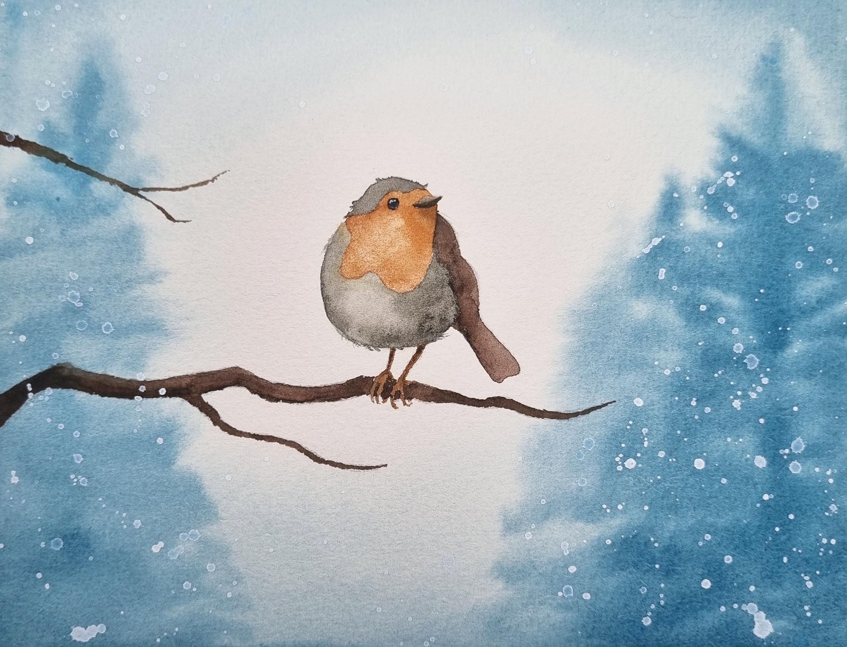
You're going to see it happen in the Robin tutorial. It is so versatile
to me because I also quite often
like making dirty, dark blue gray mixes, which can be achieved from
the same combination. You just use more blue. If you want it to be more
brown, you use more orange. It's just such an easy
quick way to access neutral colors from your
beautiful vibrant palette that I can't go past this one. It is my absolute favorite. Moving on to another
color scheme here, we've got split complimentary, and that is basically two
complimentary colors, except instead of
the second one, you pick the two colors
on either side of it. So here I've used
violet, yellow, green and yellow orange
instead of violet and yellow. And again, just mix up
the strengths of them. You don't want them
fighting for attention. You then have analogous
complimentary, which is basically
the one before it, but you include the
complimentary colors. So here, I've got yellow green, violet, red, violet, and red. Again, mixing up the
strengths, a beautiful color. Lastly, another one you
can try is Tetratic. So this one you
can make it really simple by just picking
two complimentary colors, but then using the four
on either side of them. So here, I've picked red and green, and instead
of using them, I've opted to pick all the
four colors on either side, blue, green, yellow, green, red, violet, red, orange. I will say, when
I've gone through my previous portraits
before to find examples of animals or just anything I've painted
using these color schemes, I don't think I found
a Tetratic one at all. It's just definitely not
something I lean towards. But it's just an option there if you're really stuck with
what colors to use.
4. Realism: Let's talk about realism now, and I'm going to
tell you the most important thing you
need to learn and understand to create realistic
watercolor portraits. So we are taking
something from two D flat on the page to making it feel like it's about
to jump out at us, and that is values. Now, when we talk
about values in art, we're not talking about honesty, integrity, any of those things, we are talking
about the lightness and darkness of a color and
all the shades in between. So depending on the
color that you're using, this could be a whole
bunch of different shades, or it might be quite limited
and only have a few. But when we say values, we're basically referring to
highlights and shadows. Emphasizing them,
making them correct per our reference photo to make
something look realistic. Now, color is very deceptive. So what I recommend
you do to get a grip on where your
values need to go, where your highlights and
your shadows need to go, is to grab your reference
photo and turn it grayscale. This is going to
take color out of the equation and
really let you see the highlights and the shadows because something that
might look like a bright, vibrant, beautiful, colored subject that you feel like needs a lot of color
and a lot of saturation. When you actually take that
all away and put a grayscale, you actually really need
to be light handed with that color if you want to
keep it looking realistic. Point of values and focusing
on them and why they matter is that it's going to make something look
three dimensional, realistic, pop off the page. It's going to help you
emphasize focal points. It's going to create
some depth in your portrait and create the
illusion of light in it, and it can even convey mood. We need to build
these values over time to create something
that looks real. And we can do this
by either just diluting or using our
color at full strength, depending what we
need the value to be. If that's not enough,
we can also layer. It's a transparent medium, and watercolor allows us to layer and build up
depth over time. Now, take a look at
these dogs here, right? You might see the ones
on the left and be like, Okay, cool, two dogs. I can see that one looks
painted on the right of that, and the left side of the left
one is the reference photo. But then you look
at when I play with the colors and turn them
back on on the right, and you see the photo and
what it really looks like, and then you see what my
painting really looks. Now, there aren't any green dogs getting around that I know of. But I was able to paint this, and, like, it still
looks like a dog. You turn the colors
off, and that is a very recognizable dog. But look how silly I
went with the colors. It really allows you to have
some fun and play around because you don't
have to be stuck with the values of a
reference photo either. You might think, Oh, it's
actually too dark and I want this to be lighter
and feel more air. As long as you adjust all
of the values consistently, you can do that,
and it'll be fine. And likewise, as long as you pay attention to those values, you can go bananas with your colors, and it's
still going to look good. We do have color
limitations, though. So on the screen, you will see in the middle some swatches, some small value charts of
primary yellow, red and blue. So you can see their starting
point at their darkest. Yellow is very pale, and that's as dark as I'm
going to get that color. Red is darker than that, and blue is even darker. And as I stretch those colors out and dilute them
more and more, the yellow almost
disappears immediately. It just doesn't have the
range of the others. So you do have to bear this in mind when you are choosing
and using colors, that some of them will have
individual limitations. We take a look at
this bright and colorful Guldian finch here, and then we have a look
at what that actually looks like when you take
the color out of it. Would you have
guessed that there is such a crazy difference in value between that yellow color on the tummy and that violet
color on the chest? I didn't expect
take a look here. I've got on the left the color reference photo
on the far right, the grayscale reference photo, and then some paintings
in the middle. So second from the left is a painting where I did
not look at the values. I just color blocked what colors should be in
this GuldianFinch, and painted it accordingly. I did not bother shading it,
highlighting it, nothing. Next to that inner
center is that very painting with the
grayscale mode activated, and you can see how
flat it truly looks. Whereas to the
right of that one, that is a painting that has been painted monochromatically, but I've paid attention
to the values. I've tried to replicate
from the grayscale photo. And it just pops off
the page so much more. Yeah, I may have emphasized the highlight on the
bulge of the chest, but I was having a bit of fun. It looks a lot more
realistic than the one that was in color that I've
turned gray scale. And this is because
I paid attention to the values I referred to my grayscale photo and
really got a handle on which area needs to
be darker and lighter, regardless of what color
that area actually is. Fun activity to do
with your paints, whether you use premade ones or you're going to be
mixing from the primaries, is to create your
own value chart, and that's going to
give you an indication of how far you can stretch your color and how to match them up
with a gray scale photo. Also, painting
monochromatically and doing a portrait completely in one color is a great
way to learn this. So I highly recommend
you give that a go. Can create your own
value chart by just getting the most saturated
version of your color, fresh out of the tube or pan, swatch that down, dip the tip of your brush
in a bit of water, not swish it off, and then paint another little
blob next to it. Repeat that until the water
is basically running clear, and you're going to have
a really good idea of how far you can
stretch that color. Let's now jump in and talk
a little bit more about animal specific things to help your wildlife portraits
look more realistic.
5. Animal Tips: Let's talk about
some animal tips, some more specific
to wildlife tips to help you paint
realistic watercolor. Now, the first one is actually applicable to
more than just wildlife, and that would be to
get an outline sketch. So you saw in my
suppliers section, I love my light pad, and that is because I trace the outline of my reference
photos before I paint them, and I transfer that sketch
onto my watercolor paper. Reason I do this is because
I want it to be accurate. I want it to be exactly the shape and
size that it needs to be in perspective
with other things in the portrait and because I
don't really like drawing. I can do some pretty decent
accurate drawing freehand, but it's just not something
that I particularly enjoy. I find it very time consuming.
I just want to paint. So I like to skip that
process and trace my outline. And this here is
the Robin outline of which we are going to be
painting at the very end. So you will find
this in the handout, and it is there for you to print and to trace onto
your watercolor paper. That you can have
an accurate sketch, and it just makes the
process a lot easier. Some people were born to paint abstract and free hand and all
that kind of jars, not me. I want to paint realistically, and if I'm going to do that, I want it to look
like the thing. And so an outline sketch
is the way to go. Let's have a quick chat
about colors as well. We were talking in
color theory about how complimentary
colors make neutrals. These are the colors you are
more than likely going to need a lot of when
you paint wildlife, because most of them
are not yellow, orange, red, magenta,
violet, blue, green. Yeah, you get them sometimes, but a lot of them are brown. So you get really
used to mixing up a brown color or some
variation of a neutral. What I wanted to share
with you here was just some swatching exercises
so that you can see all the colors that
you are able to mix between sets of primaries
that have a compliment. So at the top left, we
have yellow intervilet. And the way that
you can do this is just by starting
with some yellow, have some like a
yellow puddle on your have a violet puddle on your palette and then slowly introduce that color
into the other puddle, mix it all the way
through, and swatch it. Some colors take a
long time to turn. If I reverse this and was
turning violet into yellow, maybe it would have
taken even longer. It's going to depend on the
order in which you do them. But you were going to get to see a much bigger range here of what you're capable of achieving than simply just grabbing
a bit of each color, shoving it together, and
seeing what you get. We get to see this beautiful
gradient and transition. Now, I don't often use yellow
and violet to make brown, but I'm looking at this
now thinking that I should because there's a
lot more options in there than my go to, which is orange to blue. The orange changes
quite rapidly and becomes neutralized very soon
after adding the blue in. That just goes to show how
strong that blue color is. And I definitely use the
red and green even less. I don't mind some of the colors that are in between those two, but they're just
not really for me. So keep these color gradients in mind and have a go yourself. It is really eye opening to see just how many
possibilities there are from just putting
two colors together. Keep these combos
in your back pocket for when you are painting
wildlife portraits, you will rely on these
neutralized colors a lot. Now, a really big tip I have for you about wildlife realism is that more detail does
not equal more realistic. You do not need to paint
every stroke of fur in or every feather to create a realistic watercolor
animal portrait. That's going to take you a long, long time if you do, but it can also just
make it look like an overly processed photo
with too many noisy details, way too much contrast. What I prefer to do is
suggest the detail. Flick a few strokes of fur
or feathers out to the side, use something fun like salt or blooms to make texture over large areas
with minimal effort. Don't worry about every single
stroke of fur or feathers. It's just not necessary. I also recommend you focus
on the focal points. So before you even
start a painting, have a think about where you want the attention
of the viewer to go. In wildlife portraits, for me, it's often the face. I want them to see the eyes, the snoot, the mouth, the ears. I want them to really stand out and grab the attention
of the viewer. But maybe if I was painting
a different kind of animal like a peacock
that has a big, beautiful tail that
is a showstopper, maybe I'd want the feathers
to be the focus and not really the whatever it is
you want to focus on that. You can use the
watercolor medium to soften other areas,
paint them loosely. And as long as those
focal points are nice and crispy and detailed, it'll
still look realistic. So you can see in this
cat portrait here, I've really tried to focus putting the detail on the ears, the eyes, the nose,
and the mouth, and I've left the
fur quite loose. Tying those two tips together is just remember the medium. Remember that we are painting
with a transparent medium. When you're new to
realistic watercolor, it can just feel like you've
never done enough detail. You've got your reference
photo next to you. You've got the black
and white version, and you're seeing the values, you're seeing every
little stroke of fur, and you're just
thinking, Oh, my gosh, I have so much more to go. I'm nowhere near done getting this looking like that photo. But you don't have to. It's not necessary to make
it look realistic. So try, if you can,
to achieve what you need to do in as
few layers as you can. You might need to pre plan this, but it will help you
keep your paintings airy and still looking like
a watercolor painting. That's not to say that has
to be your goal, though. Maybe you don't want to maybe you want it to
look like a photo. Maybe you don't want it
to look like art at all, you want someone
to think that this is hyper realistic,
photorealistic. If that's your goal, go for it. But what attracted me to watercolor as a medium
in the beginning was that lightness and that
airiness in portraits. And I was finding that I was getting way too bogged
down in the detail, as you can see from my little
crocodile friend here, that the first
time I painted it, I just dehydrated it. I made it look like a dinosaur
more than a crocodile, and I really had to start
pairing things back, finding quicker and
more simplistic ways to do things to keep
it light and airy. We already talked about values
in the realism section. But if we see all of
this in action now, here's a little and
this wasn't even like a super realistic portrait. This was like a ten, 15
minute painting of a samoid. We've got crispy focal points around the face where we
want the viewers attention. You can't see all these
strokes of fur in it. I've had some fun
with the color, which we talked about in
the values area as well. I've used yellow and purple
in the fur for white. I've done a single layer on the body to keep
it nice and airy, and I've valued the values and shaded things that
needed to be shaded. Let's do some
actual painting now and jump into some techniques.
6. Techniques: Okay, let's get into
some actual techniques. Now. Let's put paint to
paper and have a go. First things first, don't
look at my thumb, okay? I'm not about to punish
the whole sisterhood just because one of
us betrayed them, but we are going to get started with an activity
called tea to butter. Now, I did not invent this. This is not my thing, but it is a great way to start learning
watercolor consistencies. So what we want to do is
get together a color. Now, if you have a tube
and you just want to squeeze some color
out, that's perfect. If you're using pan watercolors, you need to understand that you're not going
to be able to get quite the buttery consistency that you would if
you were using cube. But let's get a color. I like to use just a bit
of a bit of a violet. Now, what we want to
do here, you do need water to activate your pans, but what we really want is a
thick mixture to begin with. So you can see my brush strokes in the palette as I put this
color down, that's good. That means there's not
a lot of moisture, but I am going to
still need some to keep reactivating this paint. We just want to try and keep
it a little bit controlled. So this is all
about just learning how much paint you need
because some people really struggle with this and they
feel like they're doing 1,000 layers in order
to paint something. It's because they
just haven't wrapped their head around consistency, and they are just making
their mixes too watery. I'm gonna dive into
some blue now. And just try and grab
that without the water. I'm just kind of grabbing
it from the top and letting the water run to
the bottom of that pan. Then we can mix it through. Now, I had some
water there that's just it's coming in. You
know what? Who cares? Let's just let it happen. And can you see how
just that little bit of blue really took
over that puddle? So some colors are
stronger than others. I want this to be a
bit more red violet, if I may. Alright. So it's looking pretty good. Now this is just not as thick as if you squeeze it out from a tube where it looks like paste, but it's gonna do
for this activity. So, this would be our
starting point of butter. So if we go ahead
and pop this down, should be really thick. Like, you could almost see the brush strokes in
the paper as well. And you might even have
textured edges looking a bit rough because there's just
not much moisture in there. Then what we want
to do is, like, introduce a little bit more
water into this mixture. You can see it kind of
pulling together now. It's a little bit more watery, and then we can kind of
paint this one down. This would be our cream. And so the edges are
looking a lot smoother now. I mean, obviously, I'm
trying a bit harder as well. Still quite thick, though.
Let's add more water. And now we can get a little bit more a little bit more closer to the
consistencies we need. If we were using cube,
it would be a little bit easier because we'd start
with something thicker. But what we want is to
make this look like milk. Now, milk should run, right? This is looking a
little bit too thick. So let's keep going. We possibly could have
used that for cream. Like, let's maybe
let's maybe do that. Let's maybe repaint
this one under here, so it's going to look different. I don't even know if it will.
It's looking very similar. That's okay. We'll keep going. And let's get something
that's a little bit more like milk. You know, there should still
be some opacity to it, but it's a lot runnier. So that would be our next one. You can see it on the page now. It's not kind of like
collecting these tiny pools. It's just kind of everywhere.
Let's keep going. The next one we want is coffee. And so naturally, we are going to dilute this colour as well. It's not just about
the consistency. It's about the color. And so, you know, maybe we say, This is coffee, made really fun by the
fact that I don't actually drink coffee or tea. So what would I know? Let's go and put
that down. And then we want something
that's more like tea. So we need to add even
more water to this. And, you know, this is going to be super duper running now. And then we pop that down. And so, yes, it did lighten
in color as we went, but it's just all about
that consistency. So this is a lot more. You know, we can stretch
this a lot further. We can load up a brush
with a lot of water, like, let's say we just load up our whole brush,
right? That is dripping. See that? Dripping. We load
up a whole brush of water. I can go a really long way. I'm gonna take that
as far as I can. This consistency is
really thin and watery. And one brush load
can get us quite far. But the same cannot
be said when we have that thicker
buttery consistency. Like, let's say, let's really
load on up on red here. I'll try and have no
moisture on there at all. And if I go and
pop this down now, see how it's already
immediately super textured. Now, I could try my hardest
to kind of work this out. I did have some
moisture on the brush, but, like, I am not
getting that coverage. That I was with
the watery brush. And so if you are having
trouble with your paintings and you're running out of water
and paint really quickly, I mean, it could be a
quality thing as well, maybe just using lesser quality paints that aren't as pigmented, but maybe you just have
the wrong consistency. So have a go at this
activity for yourself. It's really useful for
just getting a feel for what watercolor
should feel like on the paper as well
as your palette. Something else that
is really helpful to understanding the flow of
watercolor and how much you need in a mixture is the same activity that I
used for the color scheme. Creating those
watercolor bubbles. So what you would
do here is, I mean, I've already got a super watery mixture here,
but that's fine. I'll try and pinch some of
this more pigmented side. What you want to do is
start off by painting a circle. Nice and colorful. And then rinse off your
brush, dab it off. Try and get a little bit clear. And then you want to just
give it a little kiss with a watery bubble next to it. Now, I like to
make them touch at the last minute because
I don't want to keep going around and around and really
working at that paint. I want it to do its magic. So if we just kiss them
at the last minute, how beautiful is that
little exchange there? It's just really soft. Let's zoom on in. It's
just a very soft exchange. Now, we can make
that more dramatic. We go back and add.
Whatercolur here. We can kind of force
it to do stuff. Likewise, you could also have a let's put a
colorful circle here. I want to try and take some
of the excess moisture out. Now, this is really
what you want to aim for when you paint this kind of sheen that's
not super, super damp. This is too damp here. This is perfect
working consistency. But then if I go and add a circle next to
it, a watery one, but I make it super watery, it is going to have
the opposite exchange. It's going to push the water into the bubble that
has less in it. If I keep putting this here, can you see that exchange start to happen
the opposite way? I mean, I'm hinded a little bit by the fact that the
paper's buckling. But it is going to happen the opposite way
than what happened here. So it's just wherever
the most moisture is, it's going to try and expel into an area that has less moisture. And you can think
of your brush like a vacuum cleaner or a leaf blower is how I
like to describe it. So when you have an area like this that has less moisture in there and this
is fully loaded, you are acting like a leaf
blower and you are going to add extra moisture and
expel it outwards. That is what's called a bloom, and that's essentially
what's happening here. But in an area that's super, super damp and you don't
want it to be that way, you can dab your brush off
still technically wet, but there's not much
moisture in there, like, Nothing's
really coming out. And that now acts like
a vacuum cleaner. And see how I can just lift and dab and suck this color
up, this moisture. And now the exchange
is a lot more even. So how go at creating these
little circles that kiss and touch vary up how much
moisture is in them, even if it's a
super colorful one. And how much color is in them, and just watch the exchange. If you create, like,
a page full of these, and it is tricky because you're
managing multiple edges, and watercolor dries
from the outside in. So those edges aren't going
to stay damp forever. You're going to learn
about speed there as well. But if you create a page of
them and you end up with this kind of line that's traveling all
the way through them, you're going to see
that you've got too much moisture
happening in your bubbles. They are basically
making this big fluid exchange all the way down, following the bubbles as they go. And we don't
really want that. We want some soft exchanges, but they should be happening
in a much more natural way. Like they should just happen without completely flooding
down to create a pattern. So we want to be practicing how much water we
are putting on. We want them to have an
exchange between each other, but that exchange
shouldn't carry through. So that purply one that I
just added there, you know, that shouldn't reach the bottom here and go into
this purply one. These exchanges should
just sort of be happening where they touch. You don't have to worry about
creating perfect circles. But let's see if I
can create an example here. I'll zoom you out. If we just keep
putting too much, can you just see
that exchange there? It just immediately gravitated
towards this purple one. And if we do another one, It's immediately gravitated there. And I keep adding and see
how it's just smushing. It's just swishing
all the way down. That means too much moisture. That exchange is just
whipping through everything. And just basically being
sucked all the way down. That's not we want what we want. We want something
softer like this. Let's talk about some
other techniques now, and you may have heard
some of these before. So wet on dry. We've got wet on
dry, wet on wet, dry on wet, dry on dry, okay? We don't Like I only call
wet on wet wet on wet. I don't bother with
all the other names. It gets too confusing. Dog fur. But wet on dry is essentially
just taking wet paint from your palette.
And painting it down. We are going to do this in
the Robin tutorial when we paint the branch on top
of a dry piece of paper, the bird on top of a
dry piece of paper. It's just about
putting color down, moisture down on dry paper. But when we do wet on wet, that means we need
something to start with. Now, it could be color
or it can just be water. So we can go, This is what
we'll be doing for the robin. We'll be putting
some water down, excuse the dirty
color of this water. But we'll be putting
some water down, and then we'll be dropping
some color into it. Now, remember the leaf blower vacuum cleaner
thing, right? If I have excess moisture on this brush and that's
already a wet surface, I'm going to put even more
on there. I drop this down. Leaf blower explodes everywhere, whereas if we had a
little patch here, but I'm going to suck up all the moisture or as much as I can. And then I have a relatively
kind of dry brush. When I put that down, the
exchange is a lot different. So it's all going to depend
on how much water is on the page and how
much is on your brush. Kind of course, you
know, just keep adding and emphasizing it. It's going to concentrate the color a lot
more than that one. But just remember that exchange needs to
happen between the two, and how much moisture
you have on each will influence that impact. Now, if you did something
like this on accident, the cool thing is when I'm wet, you can just kind
of go in there. It's still damp,
it's still workable, and you can just kind
of smooth that out. Maybe you realized you wanted the whole background purple, and then you wanted to add
a blue Blue little bloom. You can do it like that.
You can do the same thing, and this is what a
bloom is using water. So you just load
your brush up with some water and you just
create this little rush there. And a little bloom. Now, the way that this
works is going to differ on the dampness of the paper and if there's any
color in there. If you have something
that is sopping wet, that is just going to
kind of dissipate in it, and you're not even going
to see the border anymore. Likewise, if I wait
a little bit longer, let's actually maybe try
and do it to this one. The effect will
be more dramatic. If I drop that there, this
has already started drying. Now, see how it's
just traveling down all these little
crevices in the paper. That is going to dry
much harsher than that. Is one of these better
than the other? Some people hate
blooms altogether, and they don't want them
in their work at all. I like to use them as a cheap
way to make fur texture. Instead of painting
every stroke of fur, why not do something like this? Now, you can actually
use salt to mimic this, but it creates a
lot finer blooms. And again, the effect
of that is going to be impacted by how much
moisture is on your paper. You do kind of need to let it dry a little bit before you
sprinkle the salt down, and you do need to let it air dry to have the best effect. So I've used salt
in my fox painting, my seal, my owl as just a
quick way to make texture. So I used it for all those
different applications. Fur for the fox,
feathers for the owl. But then on the seal, it was more like to create the effect of dirt and
sand on its belly. So it has some great uses, particularly in
animal portraits. But you can if you don't have salt or you don't want
to let it air dry, you can kind of
mimic it with water. You can either use your
brush to dab it in. Just be mindful, you
don't create a pattern, or you could even when
the papers you know, dry enough that it's not going to do this
and just dissipate, sprits it with a bit
of a water bottle, and that can create more of a random splattery
effect of blooms. I'm jumping a little bit
all over the place here, but back to wet on dry. So that is what we would call
like a flat wash. That's when you are just
painting wet on dry and creating a flat wash it might be for a background. You might be doing it
with one single color. You might be doing a
gradient that changes color. Some people, depending on
what they're painting, if they've got a
subject that needs to be in the middle
of this flat wash, it is much easier to apply liquid latex masking fluid and let that dry on the object. Paint over it nice smoothly, let it dry, peel
the masking fluid off than it is to, like, try and do this beautiful
soft gradient background, where you are painting like all around some kind of
intricate object, and you're trying to keep
your color consistent. But, you know, now things are drying because you've got
so many edges to manage. And oh, no, you've
run out of color, so now you've got
to go and get more. And now this side's darker. It's just it's not
working out for me. Oh, gosh, it's just
not looking good. It's much easier
sometimes to just put masking fluid down and
do something like this. So that is known as
negative painting, and we're going to do
a tiny little bit of that in the Robin
Tutoria when we paint around the
eye and the beak to preserve that space to
then paint it in later. Dry on wet is just
essentially when you've got very little
moisture on your brush, and you put that
into a damp area. So we are going to
do a little bit of that in the Robin
tutorial as well. We are painting the trees in, and we do them at different
moisture levels in the paper. The first ones that we do,
they kind of spread further. But then as the
paper dries more, we can actually get some
more detail down when we go back in and pop
our little trees in. It doesn't spread as far. And so we can manage that
with how much moisture is on the brush,
but also the paper. Versus if I dipped into some extra water now and went
and did that same thing, it's just going to
travel a lot further. I'm not seeing any
definition of anything. It's all about the
moisture levels of both. So dry on wet is
just a way to get a more defined shape that's still soft in a wet
on wet background. And dry on dry, or I just
call it dry brushing, usually, is just a way to use your brush to
create texture. Now, I love using scumbling, which is just kind
of where you rub the belly of your brush around. I just find it's more of a natural look than
if I was like, trying to paint fur like this because see how I've
just made a pattern. Rubbing my brush around
and just kind of changing the direction and
the angle that I hold it, it creates just a
more natural effect. Now, I'm not necessarily
doing this on blank paper. I might have a wash of brown
down first and then go and just add some
little gumbly details, maybe even in a crevice to
shade something and then, you know, dab, dab, dab and
just kind of fade this away. Instead of having to do a wet on wet layer to shade something, I might just be trying
to put something a bit rough and natural
under like a chin. I lent very much
into this when I started watercolor animal
portraits, though, and made my work very
textured and noisy, so you do have to try
and use it sparingly. So those are our wet on dry, wet on wet, dry on
wet, dry on dry. Let's talk about some problems that we can have
with watercolor. And one of those is harsh edges. Now, because I've been
playing with all of these little patches
for a while, I've inadvertently created them. You can see these edges on the border of all
of these shapes. Now, what has
happened there is I have gone and basically
got this shape, and that has enough
moisture in it, right? Like, that's a good
amount of moisture. There's a sheen to it. If that dries, it's going to dry flat. But if I keep messing with it, even just with
water on my brush, and I just keep going in
in in, what am I doing? I am expelling everything away from the tip of my
brush and to the border. And so as I do
that, it is forcing pigment to the outer
edges of the shape. And that is what is
creating a crust. So see here, I
didn't go back and touch this one. It's all soft. But the ones that I added
a lot more water too, even over here where we
went back and added extra, it makes a bit of a border. So what happens? Do you just suck if you create that
and you should give up? No. But it is a
reality of watercolor, and it happens all the time. Just remember to
manage your edges, and if you know you still
need to smooth something out, try to keep working at it
instead of leaving it for a long period of time to
avoid that from drying, because when you go
back to adjust it, you will create
some harsh edges. What you can do, though,
is scrub away at them, and you're going to see me do
this in the Robin tutorial. I like to preserve preserve. I like to keep a kind
of cruddy spare brush. This is just like
it's a good brand, good quality brush, but I've just ruined it over
years and years of use. I like to keep that on
hand as my scrubby brush, so I don't wreck the
ones that I'm currently using in my rotation
and what you can do You grab some paper towel. You can dip it in some
water, clean water, ideally. And then you've got
that at the ready. And what you can do is go in and scrub away at these edges. So let's take a
look at this here. Now, this isn't
dry and that would be ideal because what I'm doing here is picking up the
color within the shape. Whereas if I dried that off and let's maybe
do this one here, That'll help stop the color from lifting where
I don't want it to. Now, you want to scrub in the
direction you need to go. Like, there's no point
doing this, okay? I'm just gonna drag purple
here there everywhere. But if we just concentrate on scrubbing exactly
in that spot, it doesn't help that
this was just a roughly painted shape anyway. Then we dab. See how I've been able to
remove some of that. Now, this is going
to act like a stamp. So if you pick color up and then you just keep
stamping with it, you're just going to end up
putting it back on the paper. So you got to remember
that and keep rotating it. But these two are
my secret weapons the lifting off mistakes. And I make a massive
mistake in the Robin one. I drop my brush in
the whole painting, so you'll see me
recover from that. But it's also good for just cleaning up some
harsh lines because oftentimes we just
have to paint things next to each other, and
they inadvertently touch. So it's not actually
a technique problem. It's just that we had to put two different shapes
next to each other, and the borders therefore
cross over each other a little bit and just
naturally go darker. So scrubbing and dabbing
your secret weapon. Lifting is another
amazing technique, and you're going to
see us use this to create some realism
in the robin. So that is just using a brush or paper towel to remove colour. You've seen me do it
already in some of these, but that would just be using it like it's a vacuum cleaner. You go in, you swipe
off, you dab off, you might need to clean off
to get some of the color. Or you can use some
paper towel dry or damp. And just lift away.
Look at that. It's almost all gone. And
if I kept working at this, I could probably almost
completely remove this because it was
so pale and watery. So it's very helpful if
you put something down you didn't mean to, but it's
going to be limited. Some colours that
are really dark, you're not going to
be able to get off. And there are also qualities in watercolor paints,
not all of them, but some of them are
called staining colors, and they are intended to stain the paper really soon
after application. So you might have
trouble getting them off if that's one that
you're trying to lift. And let's just
finish with talking about a little bit of texture. So I mentioned some salt. So that is where you would
need to have some kind of area that is damp you sprinkle
some salt in it, and you let it create that
beautiful texture for you. Experiment with how long you
need to leave the salt on, how long the watery patch
needs to kind of settle, like, get familiar with
what it looks like. If I have too much water in that patch and it's
really, really, like, very shiny and almost runny, if I tipped my page, that salt is not
going to do anything. The water is gonna be able
to get underneath it. So you want it to have
a bit of a sheen. Like, this is still
damp over here. This might even
work a little bit, but then there's gonna be a
limitation where the papers dried too much and
nothing's going to happen. Or you can do what
we mentioned and create blooms and DI y that. You just have to try to remember not to create too
much of a pattern, and it's such a very
natural thing to do. Like, even these are
pretty evenly spaced apart that I was dabbing in because that's
just what we do. You can also use brush marks, like we talked
about dry brushing and scumbling to create texture, a little cheap way to make fur. And you can also use
a granulating color. So I talked about that
back in color theory that I avoid granulating
colors for my primary colors, but I like a granulating color
for the black that I have. So Mars black over here, beautiful and dark black when
you use it concentrated. But if you water that down, it will dry with a
beautiful texture. And I love that effect for snoots because they are just
textured and beautiful. And we can also use splattering. And this is something
we're going to use in the robin to create snow. But in this instance, let's just use color because we don't
have anything down here. You're not going to see
white if I splatter it. But I like to load up a brush, and I like to use my not great
brush for this, as well, because I just feel like it Bistles go everywhere.
It can hold more water. And so you load that
brush up and you can just kind of tap at
it. Splatter away. Some people like to
use a toothbrush, not one that they're going
to reuse and just kind of really finely missed some
of that splatter down, bristle different
sized brushes and different types of brushes will give you different effects. The last thing I want
to talk about is just, like, adding color to an area. So we looked at wet on wet, and that was where we had
some color down on the paper, and then we added
color into it, right? But what tends to happen, as you can see over
here is it gets very diluted because there's a
lot of water going on here. There's water that
we put down already, and then there's water
in what we just added. So sometimes I want a punchier
kind of color to build. And you can, of
course, do glazing. So glazing is when
you would paint over something that
is already dry. We'll do that on a spare piece in a second, just
so you can see. But what you can
also do, instead of going wet on wet like this, you can basically do what
I did with this black here and put the
color down first, and you can really
kind of manage that as well to have it concentrated. And so that is not
sitting in water. It won't get diluted,
but you can soften the edge by running water up next to it and
letting it come across. So similar to the
little circle activity. But I will often do this. If I really need to
darken something and I'm getting sick and tired of
doing infinity layers, I will put color down
on paper first and then let the water touch it
and meet it and flow across. I'll still get that
soft exchange, but it's not going to
dilute the color as much. And so glazing is when you have an area
that you've painted, and it's already dry and you
paint something over it. So let's take our blue here, and we just paint
this for our work. Now, the cool thing
about watercolor is that it's a
transparent medium. So we can see through this. I mean, if I used a really
dark color, then no. So like, if I grab the
black out of here again, and I came and put that down, you're not going to see through that, that is a darker color. But we can see through the blue, the watery blue that I put down. This is actually a
color mixing technique. So you don't have to just
mix colors on your palette, added some black in
there, deepen that up. You don't just have
to mix colors there. You can mix them on paper, so you could literally
put some color down, come in with another color and add to it and just
mix on the page. I don't really like
doing that because I feel like I create like lines in the page that
aren't going to easily go away because I'm just
putting it directly on there. But you can actually
color mix by layering. So we're not mixing
them together. But we're letting the colors sit over the top of each other, and therefore they do
create a different color. I don't tend to do
color mixing that way. I find it just requires too much brain effort to figure out what color is going to be
created when I glaze them, but I do like using glazing or layering to build
depth in my portrait. So that might just
mean I'm putting the same color over itself again and again
to build some depth. But those are the most common
watercolor techniques. I encourage you to have a go
at all of these activities, get your brush, put it to paper. Playing around, swatching
colors and using different techniques
is such a fun way to get started with watercolor, because I know that
realistic portraits can look quite intimidating. So just start by having some fun and putting
paint to paper.
7. Composition: Okay, let's talk
about composition. How do we put
together a portrait? What do we need to worry about? We're kind of lucky
in a way that when we're doing portraits of animals that we can just focus on the animal
as the centerpiece. It's not like we're
painting a landscape, which has multiple different
elements like trees and the horizon line and mountains and a house where
we have to think about, oh, how do I crop this? Where should I
position those things? It's a little bit
more simplified. And honestly, a
lot comes down to the reference photo
that you choose. You know, we're doing
realistic work here, so we're going to have a
reference photo to go of. We want to look for
certain things, and I'm going to show
you lots of examples of things to avoid, I find is a lot more helpful. So here's an example
of a good one. We've got soft,
natural even lighting. There's no harsh
light or shadows. The photo is taken at eye level. There's a happy expression
on the dog's face. It's comfortable, relaxed. There's a slight angle
on the snoot which is really important with
all types of animals. If they have a long snout or muzzle or whatever
you want to call it, if it is pointing
directly at the camera, be really hard to
translate into a painting. It might come out
looking super weird. So oftentimes I'm looking
for portraits that have the animal's head tilted off to the side a little bit. The contrast with the
background is nice. This is a white animal, so it's very clear to see
the outlines of it. There's nothing blocking
the face or even the body, like nothing we'd
have to try and guess and potentially mess up. It's forward facing. You know, eye contact works just as well, and all the important
details are visible. Now, using my own adorable, beautiful models and pets, let's have a look at some
stuff we should avoid. Recommend for your
own health and well being to just avoid
harsh uneven lighting. It is really hard to translate that into a painting without
it looking a bit funny. That's not to say
it can't be done, but we're talking about
from scratch here. We are talking about building
our skills from the bottom. Let's not start with
some tough stuff. So you can see here my dog is in this warm sunlight
that's going to make it really confusing to
paint the colors of the fur. Then a couple pictures of them
under direct light inside, casting shadows on their face, on their body, on the floor, and also outdoor harsh
lighting as well. You want to try and avoid
some extreme angles. Again, this is just
going to make it a lot more difficult to paint. Also just busy photos. Now, you can use an
amazing tool in Canva and probably a bunch
of other software where you just remove
the background, and I rely on that so much when I've got a background
that's really distracting me. It can just kind of isolate
the image for you use some of these might be cute if there weren't so
many distractions. But the more extreme the angle, the more odd something
may look and not everything translates
well to a painting. To try and avoid the
face or the body being blocked by something unless
you want to include that. Like, if you wanted to include the toy in the painting,
then that's fine. But if you don't want that
and it's wearing a costume or stealing one
of your paintings or has a ball or
toy in its mouth, you are going to find
that really difficult to make up the missing piece. So try and make it easy
for yourself and look for something where there's
not additional things. In wildlife photos
versus pet portraits, you are more likely
to find, you know, a branch or a leaf in the way. So you might be able to fill in the gaps depending
how much is blocked, see if you can find
something that isn't being blocked in anyway. Now, we talked about harsh
and uneven lighting, but we want to avoid
poor lighting as well. You know, we've got a really
back lit photo here that is reducing all the
contrast on the dog. We've got the king on his
porcelain throne with just, you know, terrible
inside lighting. And then we've
just got 1 million Instagram filters as well from way back in the day that we're just altering the
colors of things. Try and avoid extreme close ups and odd expressions, again, just things that make
it really hard to translate into a portrait. We got the snoop
from a weird angle, the cat's face is squished, and then my dog when
she's very stressed, that's just not going to
make for a good photo. You can still make
things work, though. I ended up painting
my dog's portrait from the one that's
really sunny and outside, as you can tell,
though I just made the shadows and therefore, the highlights less dramatic. Here are some photos
that I would choose of my adorable sweet angel baby. Natural lighting, you know, neutral or happy expression. The snoots off to the side in all of them. So we're
getting a good look. Like, that is a key feature for a dog like that is
a big old snoot. And, you know, I'm
just making my life easier on myself when I
go to translate this. And for the kitty cat, as well, we've got front facing. We're seeing the whole
body a lot of the time. We've got natural lighting, go to make our job easier. Side of reference
photos, there's other stuff we can do as well. So we talked about focal
points in terms of making them crispy on the
important bits like the face. But you can do things in the
whole portrait to emphasize a focal point and to draw someone's attention
to a certain place. With the lionfish here,
we have left it really blank in the middle and
put color on the edges. We're going to do something
kind of like this but a lot less dramatic in
the Robin tutorial. And that's just really bringing the viewers attention inwards. It's just naturally
creating a bit of a tunnel. And then we kind of have the
opposite on the gecko here. We are crisping up those focal points and
blurring out the background. So even though we
don't have color on all edges drawing
us into the center, the fact that all
the crispy details are there and everything outside of that is a lot fluffier and softer,
it draws you in. We can use color as well. We can play with our color to create interesting
compositions, as well. So black and white are my
favorite ones to mess with, and I often will
turn them purple. So you can see a
little Tasmanian devil here that has black fur, and I've really leant
into that being purple. Same with the cockatoo,
there is purple being used in the shadows of the feathers and
for the beak as well. I didn't paint the beak
with a black color. I mixed up my own and made it a little bit
purply undertone. I've actually played with a color scheme here
just very subtly, which is the complimentary one, using purple for the black
and the shadows and then contrasting that with the yellow for the cheek and the crest, and they are
complimentary colors. Similarly with the ladybug, we've got the green on the leaf playing off
the red of the ladybug, and those are
complimentary colors. And a tip here is, make sure you are adjusting
the intensity of them. So I wanted the ladybug, the focal point to be really
punchy and bright and red. So then I had to make some
adjustments to the green. I dolled that down a little bit, and at the bottom, I didn't
take the color all the way. Because if I painted that
entire leaf really bright, punchy green, that
would have fought the ladybug for attention,
and that's not what I wanted. So I made sure to just put a little bit
of it up the back, and then as it came down
the leaf under the ladybug, it just faded out and
became a lot lighter. Only can we use contrast in the actual animals
themselves and, you know, really tightening up the details on the focal points
to draw us in there, but we can use it in
the background, too. With the eagle here, we have the contrast through
color and also texture. So I've played off the yellow and used purple
for the background, but I've also used a lot
of blooms in there as well to create some
textural background versus the animal itself, which looks a little
bit smoother. There's also a very
purply brown used on the bird to infuse more of
that color scheme in it. When you've got a pale
animal, so, you know, the eagle is another
example as well, but also this guinea pig that's got a lot of fluffy white fur. Can use the background
to negatively paint that thing in
and have it stand out. Because we're painting
on white paper, we need a way to
define those edges. We don't just want
to do a line all the way around it in
black paint, you know, outlining it like a
cartoon character, so we can use things
like a darker background to cut that in and
make it stand out. An example of one
of my paintings I don't actually love
the background of. I don't always paint
full backgrounds in. Actually, I kind of rarely do. And this little dory fish, I really didn't like the colors that I chose for the background. I felt like the
contrast wasn't enough. If I had my time again, I would do that background
completely differently. I wouldn't have the yellowy
color in there at all. I think it really takes away from the marking on the tail, and I might not even paint
it as a full background. I might make it a
bit more splashier which can also help
create movement, which is important for
something underwater. Speaking of
backgrounds, here are some examples and other
ways we can do backgrounds. If I don't want to
paint water in, I will do something like splash some color down so we can
see that with the octopus. Little splash of
color at the end of all its tentacles to give the
impression of movement and, of course, just
being underwater, not floating in the air. With the red panda, I've
played up the color scheme. It is a red animal,
so I've used green. I naturally had some
with the leaves, but I wanted to put a little
bit more in the background. I wanted to negatively
paint around the white fluffiness
on the head and just fill in a little bit of the white space that
was surrounding it. The cougar, actually
really love this portrait because it kind of sums up
my goals in watercolor, which is to make things
look a little bit more loose and watercolory. And so for the bottom half
of it, after the face, I really just let things
flow down and dribble. Like, I held my portrait upward so that it
would drip down. And it's created
just this really fun visual effect at the bottom. Sea turtle is a classic underwater background
that I would do. I'm playing up the
color scheme, as well, really emphasizing
the orange shell and then playing into that with all the blues and greens
in the background. When I create those
backgrounds as well, I don't like to make
them a flat color, so I'll often drop
more intense color in lots of different places
just to keep it interesting. Down the bottom
middle is an example of a background I don't like. This is a blue footed booby, and I really regret painting
all of those rocks in. I think it took away
from the final piece. I think it lacks some contrast. Hopefully, you can see
the difference between this portrait and And if
I was to do that again, I would just only paint
water in the background, as I think it just
competed too much, and I had to intensify
the color on the wings and the feet
just to make it stand out. Then we've just got a
little fluffy arctic fox down the background where
the reference itself, the background
looked very purple, and I liked the
color used there, so I wanted to incorporate
that in my painting. And what I did very subtly is
use some yellow on the fur. You might not even notice at first glance that there is
yellow in that portrait, but I'm playing off the
complimentary color scheme. Wrap up with some
dos and don'ts. We want to choose our
reference photos carefully. We want to create focal points, whether that is things on the subject itself or just
creating some kind of tunnel, something that's going to draw us in and look at that place. Use a variety of values. We don't want to lack contrast and have something look flat, which is where that blue footed
booby portrait was going. So we want to make sure
we stick to our values, get our black and white
photo out to check. We want to change
up the shapes and sizes fur patterns or
background objects. So we don't want to make things look like a stamp or a pattern. It's very distracting
to a viewer. If you've got a couple
trees in your portrait, you don't want to
make them all exactly the same height and size. You want to vary it up or
it becomes distracting. And we'll talk about that
in the Robin tutorial, too. And lean into color theory, lean into using
the color schemes that we talked
about and infusing them into your portraits, even if you're making
adjustments and changing the actual
color of the subject. Want to not minimize an important feature
like a big dog snoot. We want to make that be the
centerpiece, if need be. We don't want to use all full strength punchy
colors that is going to make the painting
lack contrast and actually make it
quite overwhelming. We don't want to
create patterns and unnecessary symmetry.
It's distracting. So whenever I'm
doing, let's say, spots on a cheetah, I'm not just going to
press my brush down in the same position each time.
I'm going to vary it up. I'm going to move my arm and move the position
of that brush as I go to make sure I'm not making a we don't want to
create distraction. So, for example, we
don't want to paint this hyper realistic
background and this kind of looser style animal in the
middle because people are going to be drawn
more to where you've put all that energy
and effort into, and it's going to distract
them from the focal point. Let's jump in and
talk about honing.
8. Honing: Alright, final section,
we are talking about honing. What
do we mean by that? We mean putting the
finishing touches on something to really
bring it to life. Oftentimes, for me, this means
applying the highlights, so working with
some white quash. But you could be honing the portrait for a
large period of time. They do have ugly stages. I want to show you a couple of stages of previous
portraits I've done. So we can see here
the French bulldog. It takes a while before it
stops looking terrifying. I would say it starts looking
decent on the bottom row, but it's had a hard time for the first two thirds
of the portrait. And I want to talk to you
about this process that I notice myself doing over
the years, and that is, like, if you had to sum up the
process in three steps, I am putting a wash of color down on all the
areas that need it. I'm then trying to find the darkest parts of the
portrait and pop them in next. And usually that is
something like the eyes, as in the pupils or the nostrils then I'm spending the rest of the portrait bridging
the gap between them. And the reason why
I think this is a successful method is
because by step two, you already have your range
of values down on paper. You have the lightest
parts of the portrait. So in this example,
the eyes and the nose, the snout, I painted
around them. I negatively painted them when I painted the first
layer of furin. So we've got the palest part of the portrait and also all
the paper surrounding it. Then we've got the
darkest in by step three. So now we know the lightest to the darkest for
this portrait. And what I think it helps
you do is not go too dark. Remember I showed you
that crocodile portrait where I made it look really
dehydrated and dinosaur like, that used to be my weakness. I would not have,
like, a boundary, something to stop me, something
to use as a benchmark of, like, where to
take these values. So I would just keep going,
dark, dark, dark, dark, dark. Then I would step away from the portrait and
be like, Oh, Okay. I've made a horrible mistake. So I feel like getting
those really dark features in the pupils and nostrils, whatever it might be really
helps me from overstepping. I already know they
need to be the darkest, so it gives me a point
of reference that I need to keep everything else
a bit lighter than that. In this example of the horse, I've done a wash over the
neck and the top of the head, and then in the very next step, I popped in the nostrils and the mouth opening,
the darkest parts. And so I got my range
in nice and early to know what I have to
bridge the gap between. Can feel a little bit like
jumping all over the place. You're doing this beautiful
light wash of color over, and then all of a sudden
you're going really dark. But I do think that
it just helps me pare things back a little
bit and achieve my own goal, which might not be
yours, but to keep my paintings looking like they were done in the
medium of watercolor. So that means
keeping some kind of lightness and airiness to them. So I mentioned a lot
of the honing for me is typically adding the
white wash details. Let's have a look at what
some of that might so that might mean putting whiskers
on your little animal. And I won't always do
these in white guash. I might use black, for example, on a really pale animal where you just would not
see white guash. I also will do nose
and eye highlights. I love eye highlights, and I always follow the
same kind of pattern. I'm always doing
this really intense, harsh highlight in the
top half of the eye. And then I do this
little crescent shape in the bottom of the eyes, I follow the curve of
the bottom of the eyes. I rinse my brush off,
get the guash off it, dab off the excess water, and then I blend it in. And what this does, it just
looks like the light is nicely lighting that area up
or on the top of the eye, it's like, reflecting off of
and showing us something. I really like the
contrast between the two. So give it a go if you
feel like you're not super duper happy with
your eye highlights, the ones you maybe
put on the top. Have a go at putting that
soft one in the bottom part. I think you'll enjoy it. And
knows highlights as well. Sometimes I will
highlight the top of it. I will highlight
under the nostrils. Sometimes I will blend it in, but oftentimes I find successful just kind
of dabbing it on, and it shows up great if you've got little black snoots as well. And you might also use it to create some splashes and shine. So, for example, in this whale, I was splashing it all around. I wanted this kind of
frothy water effect. So I splash that down in the lower half of the body, but then it's got
all these, like, little grooves in its chest, and I wanted to kind
of, like, trace some water flowing down there
and creating some shine. I really love about these small details that can happen in the last 60 seconds
of a portrait is it really just does
bring everything together. You can have a portrait
that you kind of think, it's kind of mid. It's
not that interesting. And then you pop the
eye highlights on, and all of a sudden,
it springs to life. I often find as well that sometimes it's
just looking quite flat and it's looking like the body is on the same
level as the head. And then you add the whiskers in and cross them over the body, you can kind of see
on the otter here. I don't think that's
its own body. I think it's leaning
on another otter. But putting those whiskers
down and having them go from the snout and then
crossing in front of the body, it pushes that body
and recedes it into the background of the
portrait a little bit more, and it just helps pop the head forward and make it
look more realistic. We're not going to be
doing any crazy highlights in the Robin next because
it just has a teeny, tiny little eye, but you'll get to have a little bit of
experimenting with it. Let's jump in and
finally do our portrait.
9. Putting it all together - Robin in the snow tutorial: It's time to put everything
we've learned together now and create this beautiful
little Robin in the snow. So make sure you grab
the handout that has the outline that you
can print and trace. And let's see how we're going to incorporate everything
into this portrait. We're obviously going
to use our supplies, but we are using some
color theory as well. We are playing up
the color scheme of complimentary colors
with orange and blue. Going to create a
little bit of realism, not anything too scary, but we're going to do a
little bit of lifting on the chest to create a highlight on the roundness of the bird. We can do a little bit of
shading on the branch, as well. We aren't going to
go too detailed. We're not painting
every feather. In fact, we don't really
paint a single feather. We are just going to
suggest feathers. So we're leaning into
these animal tips. We are going to do some wet on wet painting when we
create the background. We are going to be
having a whole layer of water and drop color in and create these
beautiful soft trees. We are going to do
some wet on dry, which is really just
putting paint to paper. It's just a fancy
way of saying that, but this is the most
common painting technique. We will do that when we do
the bird and the branch. Can, if you want to do a little
itty bit of dry texture, dry brushing, dry and dry to create some
texture on that branch. We even do some negative
painting when we do the initial layer
around the eyes and the beak to cut them out
and paint them in later. We're going to use
some splattering with some white gouache or watercolor to create snow on
top of the trees. And we're going to use
our composition knowledge to make this bird
the focal piece. We are going to ever
so subtly darken the edges to draw
us into the center. We're having branches
come off from the side without painting the whole tree that
it's sitting in. We are leaving some negative
space around the bird to draw us in and make that
the center of attention. Then we are going to finss our portrait with some
highlighting details and some finishing shading to
really make this pop and look a little bit more
realistic. Let's jump in. Welcome to the Robin tutorial. We are going to get started
with our background. I don't always do that
first in a portrait, but we are going to
paint our soft wet on wet diffused tree background. So we're going to need to mix up some color for this,
and quite a lot of it. We don't want to run out
halfway through while we've got a wet page that will start drying while
we make new color. So mix up some big
amounts of color. And I'm going to
get started by just putting some yellow
on my palette, which you might be wondering why on earth do you
have yellow there. But what I want to do is use my primary blue and just make
it a little bit turquoise. I don't want it to
be blue, blue, blue, but also don't want
my trees to be green, and you might be wondering, why? That's exactly what
color they are. Bear with me as I get
pet fur off my brush, which is the story of my life. But what I wanted
to do was play up the color on the chest of
the robin, which is orange. Orange is opposite blue
on the color wheel. They are complimentary colors. So I wanted my trees
in my background to be a little bit more blue
for that purpose. Now, it's up to you exactly
how blue you want this to be. Obviously, I said I'm gonna make mine a little bit greeny, a little bit turquoise. That's why yellows here. So
I'm grabbing some yellow, mixing that all the
way through the color. And then I will also
put a little bit of red in there just to
take the edge off it. Any time you use a
complimentary color with itself and mix
it in a puddle, it's going to just
desaturate it a little bit. So I'm taking a
little bit of red and just go to mix that through. You want to make sure you
mix these colors all the way through your puddle
before you start painting. Otherwise, if you pick it
up from a different spot, pop it down on your page, you
might be in for a surprise. The color will be
different. Now, we are going to create this
background wet on wet. And because the center of
this portrait is so pale, we are able to just put
water over the whole page. We don't need to negatively
paint around anything, worry about creating
harsh lines. We are just going to wet
down this whole page. Now, if you've got
a bigger brush than my size eight in my hand here, you're more than
welcome to use it. I just like to prove
a point that you can get things done with less. So I'm going to go in and just keep continually
dipping into water with my size eight and wetting this whole paint this
whole portrait down. Now I don't always do
backgrounds like this. I'll often only add
backgrounds at the very end. But because I've done this
painting a bunch of times, I know that I can do
it in this order, and it's going to
be totally fine. I also do prefer whenever
I am doing a portrait, to do the wet wet first and then work on a dry paper
for the details later. The reason that I wanted
these trees soft and done wet on wet is because
I didn't want them to be the hero of the piece. I wanted the bird to
really stand out. So I wanted the trees to kind of melt away into
the background, and that's why I chose
to do them wet on wet instead of painting them
on a dry sheet of paper. Now, once you've got the paper sufficiently wet
and you can see, with the lights
reflecting on it, 'cause it started to warp a little bit, you
just want a shen. You don't want to see
puddles of water. So if you've got that, please use your clean brush to kind of pick some of that up and
dab it off on paper towel. But once you've got that
sheen all over the page, we are going to start with
laying some color down. So we don't want to leave, like, any of the paper
necessarily white. You can with the bird. But
the background around it, we want there to
be at least a pale amount of color on there. Just take a little bit of color and start spreading that around. You'll notice I'm also
putting this in the cornice. I think I'm doing like
the Instagram filter, or it vignette or something where all the
corners are darker? I'm trying to create
that illusion, and what that's going to do is further draw our focus
into the center of the portrait at the bird.
So I'm going around. You don't want to
really see your brush strokes at
the end of this. It's okay if you do immediately, but they should start
to fade into the water. You can really see all
of your brush strokes, you might need more
water on your paper, or you might just need to
blend it a little bit. So we don't want to see,
like, harsh triangles of color in these corners. We want them to
be soft gradients slowly going lighter
in the center. So if you have to fiddle around with it a little
bit like I'm doing here to kind of create that
gradient, that's okay. Now, you want to really perfect that before you get
started with the trees, you're going to make
your life really hard, trying to adjust
that afterwards you will move the trees
all over the place. So work on that first,
then start the trees. I've dipped into some color now, and I've started my
first tree here. Now, a trick here is to work quite quickly,
as you can see, but also keep it really
tight and skinny because it is
amazing how quickly you will end up
with the biggest, widest triangle that's taking over half your page if
you go too wide too soon. A way around this
is to start from the bottom and work your way up, which is an option as well. You might want to
paint your line down the center of the
tree where you want it, the big, what do you
call it? Not the branch. What do you call the
middle of a tree? I'm gonna have to come back
to you on that. I'm blanking. Anyway, you might want to paint that down
the middle first, then create your branches
and your leaves, starting at the bottom up. And that will help you
control the width of it. So I've done kind
of like a medium bluy color on that side, then I'm going to
do three trees on the right. And I
wanted to mix it up. I don't like making things
look like a pattern, so I don't want to put like
two trees on either side, the same height, same color. I want to mix it up. So I've done a tree
on the other side, and it's pretty
similar in color. So I've made this
one quite small, because what I'm
going to do is make them progressively taller as they come in the foreground
and progressively darker. And what that's going
to do is just make it look like they are
appearing closer to us. It's creating perspective
in this portrait. If the tips of your
tree start going a bit blobby and wild and you want to make
them more of a point, you can with a clean damp brush, just go and swipe to bring
them back in towards the tree, which is what I just
did on that small one. But we're on the second one now, so I'm making that slightly
taller and slightly darker. And this is going to create
this awesome perspective. So here I go fixing up
that tree tip on the first one after I'd kind
of swiped it all off. And, like, we are not
painting leaves in details. This is all very quick
and very blobby. You do want to try and leave some gaps between each
branch, if you can. That's just going to
help it look more realistic. But we're
not aiming for that. Now, I've got some darker
colour on my brush here, and to get darker color on your brush, you need less water. Now, what has also
got less water is this page because it's been
wet for a few minutes now. So that's why we paint
them in this order, light to dark, you know, furthest away to closest because now as I'm
at this closest one, the paint's not
spreading as far. It's more concentrated. I can see more gaps in the
leaves and the branches. So therefore, it
looks closer to me. We've got our beautiful
stack of three trees. Now, what I noticed at this
point is the one on the left, that is basically the same
color as the small tree. Does that make
sense? Not really. It should actually be
a bit darker because going by what I've
done in this portrait, that tree is the same height
as the one on the right, so it should be almost
the same value. Before I get there,
though, cleaning up a little bit of the
tree on the right. What I wanted to do was adjust the value on this
one on the left, not only just to
match it up with the one a little bit
more on the right, but also because the paper has dried a little
bit more as well. And now if I go in again, I'm just going to get a little
bit more crisper detail. It gives it a little bit
more dimension as well. It's almost like shading the
original work that we did. I didn't want to
match it up exactly to the value of the
one on the right. What I try to avoid in my
portrais is creating patterns. I find that they're quite
distracting for the viewer, so I don't want two trees on either side that are
exactly the same height, same width, same depth in color, because then it kind
of plays tricks on viewers' eyes and they get
just stuck in the pattern. So I've done them a little
bit different in value. Then you want to dry that off, and I've just bed
through that cause who wants to watch me drying
a page for 2 minutes. But if you've got a heat
gun or a hair dryer, it's probably going to take
a couple minutes to dry, even longer if you need
to let it air dry. And once that's dry,
I'm just going to take a little bit
of the sketch away. Now, you might be thinking, I didn't think you could
erase the sketch through a layer of watercolor.
Sometimes you can. Doesn't always work,
but sometimes you can. And given I didn't really put any paint here,
it's not too bad. I'm able to get a little
bit of that sketch away. I don't recommend doing
this first just in case you accidentally make the color a little darker on
your background, and therefore you won't be able to see your
sketch anymore. So I'd rather you just
have it a little bit darker than light to start with. So we need to mix up some
color for our Robin. Now, I probably wouldn't
always start with the orange. You know, there are lighter
colors on this bird, like the gray, the chest, you know, the gray color on
the chest and everything, but I wanted to just get the brighter colors
out of the way first, more from, like, just
a more efficient way to use my palette, basically. So what I'm going
to do is mix up some primary red
and primary yellow, and that's going to
create our orange color. So I tried to reuse some
of the yellow that was on the other side of that puddle,
but I didn't have enough, so I dipped back into the orange pan to add to
my primary red mixture, and we've got a beautiful
orange there now. So we are going to get
started filling in the orange area on this bird around the
head and the chest. Now, there's no
real magic to this. We are not painting the
most realistic bird you are ever gonna
see in your life. We are just making this
beautiful, colorful, and it's gonna have
such an amazing pop of contrast against
this soft background. So we will do a little bit
of lifting of this color, so it's not just blocky,
but don't stress too much. You know, people can often
be really intimidated by realistic animal portraits or just animal portraits
in general. It's not that scary. We're
gonna do it bit by bit. So we've kind of got
this little funky star pattern happening
at the moment, and I'm just painted
around the eye, and I'm just going to tuck this color around
the beak, as well. All we're really doing is, it's like a paint by numbers except I haven't
numbered it for you. We are just filling
in little bits of this sketch that have already been separated in that outline. We're taking it across the face, cutting out the
eye and the beak, and then kind of
just wrapping that around to tuck next to the wing. I'm adding a little bit
more darker orange under that beak to shade it as if the beak is casting
a slight shadow on it. And now with a clean damp brush, I'm lifting off some colour
in the center of that. And that's just going to
help make this little birdie look more rounded, like the light is catching
its big round tummy, again, dropping some more
colour under that beak. And now I'm mixing
a little bit of blue into this corner
of this orange. I grabbed a little bit
of red to make it not so greeny undertoned and I've just dropped that under
the beak, as well. So I wanted to shade
that more dramatically, but the orange wasn't
really cutting it, so I turned my mixture
a little bit brown. While I've still got
the brown on the brush, I'm going to work
on another area of this portrait that is not touching because it's not going to interact with it itself, which means I don't have to
stop and just dry it off. I can just try and keep going and reduce the stopping
and drying process. I'm painting the little legs in. Again, the sketch is there. All you have to do is follow it. Make the legs a little bit wider at the top
underneath the bird, and then pinch them
down a little bit skinnier towards the feet. And then we just want to curve a couple of those toes around. I hate painting bird feet. I think they are the
weirdest, ugliest, creepiest little
things, if you've ever held a bird on your
finger or hand. Oh, don't like it. So I don't think too
deeply about this. We are gonna paint a dark
brown branch around it, so you're not really
gonna see the detail. I think I just put two claws on the front and
one on the back. Done. Now what we're doing
is mixing up a gray color. So to create gray is pretty similar to brown
orange and blue, it's just going to
have more blue in it. And I find myself just
constantly with this mixture, having to add red to it to cancel out the
green undertone. My orange and blue mixture
always makes a greeny color, so I use red to cancel that out. And we're just going
to keep adding blue and then red if we need to cancel the green until we get some kind of
just dark color. Essentially, we're just putting
the three primary colors together in various proportions, which inevitably will make
some kind of dark black color. Adding a bit more red in there because it's looking
really dark green. And finally, we are getting somewhere a little
bit more blue. You can also, obviously,
for any of this, just use a convenience color. That's totally
fine. If you've got a gray color in a pan and a brown color in a
pan, go for your life. You don't need to mix it. But
I've got that color there, and I've dried off
the orange and the legs section
of this portrait, and I'm going to go in and
start adding the gray. So we are going to add that
to the top of the head. We are going to add a
little bit of gray there. What you want to do
in a couple spots, it's not hugely important
if you don't do it. But if you remember, just
flick a couple little teeny, tiny strokes up and out to the side to look
like some feathers. This is my cheat way
of creating feathers. I don't want to
paint every feather, and that's, you know, you
might have already noticed. We didn't do that for the chest. We didn't paint any
feathers on the chest. We just painted the color of the feathers. But
you see me here. Licking a couple teeny
little strokes of fur out as not fur feathers, and you want to just
make sure you're following the direction
of that growth. So if we're on top of
the head above the beak, we don't want to be pointing
them out to the right. The feather direction
is usually, you know, coming up and over to the left when they're looking
in this direction anyway, and sprouting out that way, it's not sticking out ford
to the front of the bird. It's kind of, like,
pointed backwards. That's how they lay. You might need to
study some more photos of animals and birds to really get familiar with the fur and
feather growth pattern, but that is why I'm not
sticking them forward, like the direction of the beak. We're now going to fill in
this tummy section under the orange and make sure we leave the wings blank because
they're going to be brown. And we're going to
do a similar thing here that we did with orange, that little bit
under the orange. We want to keep a
little bit lighter because we want to give
this impression of this big round tummy that's catching the
light in that area. So we can make it a little
bit darker around the edges. I'm going to lift
there, take that color off to give that big
round belly effect. But we can keep it
darker around the edges, particularly where
it's going to tuck around under the
wing on the right. Once again, you want
to add a couple little feathers out to the side. I kind of left this a
teeny little bit late. You might want to
do it a bit quicker because mine end up looking literally painted on and you can see a bit of a
harsh edge there later. I'm going to show you how
you can fix that though. It's not the end of the
world, but that is. So did you see that? I dropped
my brush over my page. I've skipped it,
fell out of my hand, ran right over that
tree on the right. Don't freak out, though. I'm gonna show you
how to fix that, too. Watercolor can be quite
forgiving as a medium. It can be a pain in the butt, as well, but I'm going to
show you how to fix that. What we're not gonna do is touch it while it's wet, though. So I'm going to keep working on this bird in the meantime. I've added even more color to the right of it where it's
going to tuck under that wing. And I'm just kind of fiddling around with
the bottom here, lifting off color,
spreading it around. I want this to be, you know, a smooth looking gradient. I don't want it to look
patchy or anything. And now I'm gonna
dry it off, and I'm gonna dry off that
mistake, as well. So I'm going to show you how
I fix something like this. I've sped this up because it
took me a couple minutes, and I'm hoping you didn't
do it in your portrait. But that's dry, and
I've got a clean, damp brush and a damp
piece of paper towel. I dipped it into my clean water and squeeze the excess out. And what I'm doing
is just gently scrubbing at that colour. It works better when
it's dry, in my opinion. Less chance of just
smoohing it further away, and you can just
really concentrate that scrubbing exactly
where you lay it now. I had to be careful around this tree because it started to lift off some of the tree.
And that's not what I wanted. So I decide what I'll do, as well to extra cover that up is I'll just paint another
branch on there later. You know, sometimes
you get lucky and you do a mistake in
a place like that, which is very easy
to paint something over. That was the case here. I'm doing a similar technique
here around some of the edges because when you paint a lot of little edges
that touch each other, like we are doing in this Robin, you can create double lines where the edges had
crossed over each other, and it just makes
those edges darker. It doesn't look soft anymore. It looks a little
bit illustrative. So what you do is just
take your clean damp brush and your damp paper towel. You scrub at those lines, and you don't want to go, you want to go in the
direction of the line. You don't want to be
scrubbing it back and forth into an area that
doesn't even have paint. Keep that really
concentrated and immediately lift it off
with that damp paper towel. Now, don't press the same area of paper towel
back on that spot, or you may create a stamp. Keep rotating that paper towel
so it's clean each time. But that is how you can scrub
away at your harsh lines. You don't really grow out
of doing harsh lines. It's just a thing that
happens with watercolor, and it's your choice
whether you want to fix it or leave it alone. Now, while I've been yapping, we have mixed up a beautiful, dark brown color here. So orange, plus blue, canceling out any
green with red, and we have a
lovely brown color. Please be encouraged
to go back and watch that mixing process
because I was just chatting over the
whole amount of it. But now that we've
got that, we're going to start with
some of the details. So I'm going to use
this brown color with my detail three slash zero sized brush to
paint in the eye. We're just doing it
a flat brown color. Just fill in that tiny
little circle, EasyPs. We will highlight it later, but you don't need
to do anything fancy with the color of
it at this point. Then I'm going to take
it onto the beak now. I'm going to put this color
on the bottom of the beak first and then invite
it up with water. So I've rinsed off
there, dabbed off, and I'm going to fill the
top of the beak in with this kind of watery brown
that was left on my brush. And it's going to
mean that there's a soft blend happening there, a soft exchange, but it creates this beautiful
gradient where the bottom of the beak looks darker. And that's gonna match up
with a shadow underneath it. Beautiful. Now we're going to use the same brown color and just paint these wings in. We're not doing anything
particularly fancy with these. I've just added a
little bit more red in that color
there and a little bit more yellow just to try
and alter it a little bit. I like to just kind
of mix up my colors. Sometimes, have them
look a little bit different to each little
section that I've painted, so different from the
beak and the eye. And I'm just filling in the remainder of the sketch that is on the side
of the portrait. So we are popping the wings in. I've decided to rinse
off my brush and just kind of make
the top of it paler, kind of matching up what
we did with the chest, having a bit of a lighter
color in certain spots. I'm going to do that on
the edge of the wing, and then as I come down and it merges into the tail, I
will make that darker. They're gently dragging
that color down. And as we get
towards the bottom, we can dip into some more color, and we can start to
flick this out to the bottom to create this tail. Now, you might want
to literally flick these strokes out to make
the tail look more loose, but I've just simply filled in the sketch, keeping it simple. So alternating there with a little bit more
watery color as well. Carefully going
back and forth over these straight lines before dipping into some darker color, and just dropping that
down the left side. Cleaning off my brush
and dabbing it off, picking up some
color at the very top, just playing
around with it. Instead of just
having a flat color that's the same the
whole way down, I like to vary it a
little bit just for fun. We are going to use the
same color for the branch. So this is where it
starts to really pop now, I feel because it's almost like something's just coming off
the side of the screen, and it's just like,
right in front of us. So we are going to
sketch this branch in. I started with really
dark brown color and then rinsed off my
brush to once again, turn it more pale, especially
at the top of the branch. I like to make the
tops of the branch lighter to make it look like it is catching the natural sunlight and then have the
bottoms darker. Now if you find this
too hard to manage, I found with such a skinny
object like this branch that it was just looking a bit rough and wasn't
blending smoothly. You don't have to do
the gradient thing. You can just paint it flat
brown. It's no problem. It's not going to be ruining
your painting or anything, but just changing it up and making the top lighter
and the bottoms darker, it just ever so slightly creates more realism in your portrait. I've dragged that
skinny little branch down at the bottom, and we are going to fill
in near the bird now. So again, I'm taking some more water to fill
in this top part. Now, we don't want to paint
directly over the feet, so, you know, a little be a little careful here
to paint around them. And I will go and actually dip back into some color
because think again, realistically, this bird would be casting a shadow
onto this branch. So I want it to be darker underneath where the
bird is sitting. So I'm very carefully sketching around it's
ugly little feet. It's creepy little
disgusting feet, and they're gonna
kind of blend away. No one's going to see if
you painted them weird. I'm gonna make that darker
right underneath it like it's casting a big
shadow from its big tummy. And then as we come out
from under the bird, we can switch it
up a little bit, so I'm adding a bit more
water into my mixture. Dragging that out
ever so slightly. You want to taper these branches off into a fine point as well. Again, just to make
it look more natural. That's what I'm doing here, very faintly dragging that up. I'm going to go back
and try and kind of clean up slash deepen the bottoms of these branches
or this branch, again, just for that realistic
effect and just smooth out anything that
was looking a little rough in terms of color. Then we're going to
dry that all off. And I'm going to dip
back into that color, and now I'm going to just freestyle a branch to
cover up my mistake. So yeah, I'm scared. I don't have a sketch
here. I'm making this up. You do not need to add
this. This is purely because my brush fell out of my hand and
skipped across the page, and I really wanted
to cover that up. It was kind of dragged
a branch down. Similar thing, a little skinny branch coming
down to the bottom, another one pointing upwards
in a different direction. Done. I think it was actually
a pretty nice addition, but at the same time, also
could have lived without it, you know? But we improvise. What we're going to do
now is highlight the eye. So again, we're
working small area, dipping into my three slash
zero brush into my white. This is white watercolor. If you have white guash, even better, but I make this watercolor, so it is a lot punchier
than normal watercolor. And we are going to
add the tiniest of dot highlights on the
top left of this eye, and then we're going
to add the tiniest, tiniest of crescent on the bottom right of this
eye and blend it out. I think I may have put two dots on the top of the eye. My
gosh, it's hard to see. I think, like a bigger dot and then a slightly smaller
dot to the right of it. And then with this crescent
on the bottom of the eye, I rinsed off dabbed off, and now what I want
to do is blend it into the bottom
half of the portrait. So I don't want to
leave it like that because it looks
like it's crying. What I want to do is
just blend that out. So curve your strokes around. You might need to dab off
intermittently because you are, you know, disrupting the white
and moving it all around. Just want to add this beautiful, softer highlight on the
bottom part of the eye, like it's just catching
a little bit of light, but the intense ones at the top that make it look
shiny and beautiful. Now that I've got that
in, I'm just going back into a little bit of
brown and just deepening up the center of that eye around those highlights just so
it doesn't look like I've glazed over the whole eye
with white and made it look like it's not able to see anywhere,
given it cataracts. That was certainly not the aim. Now I've just taken the
same brown and decided to just shade the top parts of the legs directly
under the bird, make that brown a
little bit darker. Again, looking for
just little ways to make something
more realistic. The tops of the legs
should be darker cause that big round
belly is casting a shadow on them and just going around the toes
a little bit, as well. Now, as a final little thing
before we do our snow, I'm going around the bird and all those edges I
talked about where, you know, we're touching
them up against each other and
creating harsh lines. This is not something
you have to do, and sometimes doing this
makes the end result worse, but I like to do it
every now and then, especially for something
soft like this. So on this belly, where the
orange is meeting the gray, I'm scrubbing those
meeting lines and dabbing immediately
with my damp paper towel. I've just, you know,
picked up a new piece of, like, move the paper towel
so I've got a fresh side, so I'm not creating a stamp, but you want to make
sure you are scrubbing in the direction of that line. Do not drag back and
forth, or, you know, I might drag brown
into the white of the paper or the orange of the
chest. We don't want that. And just be cautious
because using good brushes over time to do something like that will damage
the tips of them. That's why I have
that spare red brush. I normally use that, but it's always so dirty that I
just couldn't be bothered. I used my normal brush. Grabbed a square of paper
towel now and covered up our little birdie 'cause I don't want snow
on him. You might. And then I've grabbed
my big brush, dipped into some white, and you want a little bit of water on your brush for this, or it's not gonna come off the bristles when you tap it down. But in the same vein, if
you have too much water, when you dry this off, all of these little specks
of snow are gonna disappear. Which actually happened to me. I thought I did a good job. I thought these were,
like, punchy and white, but when I dried them off,
they kind of disappeared. So around with this. Some people like to get
a toothbrush and flick really fine mists of color
onto their portrait. I like using a brush
and tapping it down. They're normally a bit
bigger and bobbier, but that is totally up to you. Then we're going to
dry that all off. And that is our
fun little Robin. I absolutely adore
the color contrast and also just the
contrast of this sharp, detailed bird in
the foreground and these beautiful soft
trees in the background. I hope you enjoyed this
tutorial and learning some different techniques and how to recover from
some mistakes. So ones you'll often
encounter like harsh edges, but some other more rare ones like literally dropping your
brush on your portrait.
10. Outro: Made it. Welcome to the end
of Watercolor from scratch. I hope you had a
great time. I hope you learned a lot
about watercolor, and I hope you gave the
Robin painting a go. It's been an absolute pleasure nerding out with you
all about watercolor. And if at any point, you've got any questions about the
medium or wildlife portraits, feel free to get in touch. I'm more than happy
to help you out. I've been Emma and
happy painting to you.
 Emma, Paint Wild Academy