Transcripts
1. Introduction: Hi, everyone. My name is Nia, and I'm so excited to share
this class with you today, where I'll be painting four simple winter
landscapes using only two colors with
the addition of white, if you would like,
and I'll also include a fun special watercolor
effect for one of them. We'll be using the
full potential of watercolors and the free and diverse
nature of this medium. This class is suited for all
levels, including beginners, and I will be painting from the simplest composition to the more complex respectively. But if you ever feel inclined to add any more or adjust
things along the way, you're very welcome to do so. Before we begin to paint, I'm going to do a quick
rundown of the supplies, including things like
swatching the colors, what kind of colors you can
create with only these two. And then I'm going
to take you to a quick run through
of the techniques, which is the wet on wet and
the wet on dry techniques, which we'll be using for
all of these paintings. But if you're a true
beginner and you would like to get a better
grasp of these two techniques, I do have a dedicated
class on this, which is linked in the
description, by the way, it's called watercolor basics predict the flow of watercolors. You can take this beforehand
if you want to get a better grasp of the techniques before moving on to this class. But of course, this
class is designed to take as is as well, which is why I've added this quick run through of
the techniques as well. With these types of
loose paintings, it does require a few different
brushes for you to use, and sometimes it can be a little bit complex to understand
if you're new to this. So I have a dedicated lesson
in this class where I'll go through why I've chosen certain brushes for
specific usage. In this class, I've included
four landscape compositions. Feel free to paint along to this side by side or even create your own compositions together using the techniques that
I've shared with you today. Now, as for the
final composition, I will be tackling it a
little bit differently. I will be sketching
the outline as guide because the composition is a little bit more complex. But if you feel comfortable painting
freehand after watching the demonstration,
you can do that. Or if you don't want
to draw at all, but you the outline, I'll have it available for download in the projects
and resources section, so you can trace
it straight onto your watercolor
paper without having to bother with the spacing
and things like that. Lastly, as a disclaimer, I tend to cut through
parts of the footage if my hand is either
inactive or off the camera. Sometimes I like to also speed things along if it's just for a quick demonstration
purposes without having you to paint with
me side by side. So I would recommend for
all students to just understand the pacing of my videos first by just watching a quick
run through of it. And when you are
ready to paint along, please pause in
between each step, and you can move it along once you're ready to move
on to the next step. This way, you can paint at your own speeds without
ever feeling rushed. I guess that's it
for the disclaimer, if this sounds like a class you'd be interested in taking. I'll see you in the next
lesson, and let's begin.
2. Supplies: In this lesson, I'm
going to go through all the supplies that
you need for this class. Now, let's start with the
paper I'm going to use. I'll be using loose
sheets of paper, but it came from
this sketchbook. This is by Arches, and it's a cold
press 300 GSM and the size is 23 centimeters
by 31 centimeters. For the final
painting, I'm going to divide it up into four sections, and it's just cut up
vertically and horizontally. So it comes down to this size
and for one single sheet, I can make four
separate paintings. For demonstration purposes,
I've cut mine out, but you can also
paint it like this. I just use washi tape to separate the paintings
and mask off the edges. Also going to use
some scrap paper. You can just use a single sheet, but since I had cutouts, I'm just going to
use these cutouts. This is for trials if you want to try out
certain techniques, I just used it to show you
my brush and the type of textures I can create with the brushes and also
the techniques. If you're advanced enough and
you don't need to do this, you don't need the
scrap bit of paper. But if you want to practice, please use the same
type of paper, so it will react the same
way to your paintings. Next for the colors, I'm only going to
use two main colors. Here I have indigo by Schminka and also burnt
umber by Holbein, and I'm also going
to use my ble proof white by doctor Pig Martins
for extra snowfall. As for the palette,
you can see I'm going to use my old palette
that I got from die, so it's just a cheap
plastic palette for basically $1 or 100 yen. And you can see it's discolored,
it's already yellow. It was originally white, but I've used it so
much that it has so many micro scratches
that you can't really see. This makes loading on my
brush so much easier because the paint no longer beads
on top of the plastics, so I don't accidentally load my brush with too much paint. If beating is a problem for you, you can also use
porcelain palettes. You'll, of course, also need a jar to hold your clean water. I'm personally just
going to use one, but you can also use two. And if you prefer
to use two, one, the large one generally would
be to clean your brush, and the other one would
be to reload your brush. So one jar would have
mostly the dirty water, and the second jar
would be a bit cleaner. Personally, I always
just use one jar, though, and I just change my
water whenever I need to. Next, you'll need some tissue. This is as important as all the other supplies I would
not paint if I don't have a paper towel or
tissue next to me because I would not be able to control the load on
my brush otherwise. It's super important
to sometimes dry your brush or take
excess load off. Here are the brushes
that I'm going to use. I'm going to use a few of them, but I'll just list them at the end of this
video because I have a separate lesson
just to go over the different textures you can
create with these brushes. For this last painting, I'm going to create
an outline because it's a little bit more complex in terms of
the composition. And for the pencil,
I'm going to use this. This is by Pentl Sharplet, and I generally use the
hardness of HB or two B. And, of course, you also need an eraser in case you
make any mistakes. And my favorite eraser
here that I use is B Boxy. Now, depending on how you want
to go about your painting, I'm going to personally
paint them one by one. Instead of taping it down and masking the sides on my table, I'm going to use
this cutting board or cutting mat, I should say. And by doing this,
it's much easier to move my painting around. And I can also tilt my paper if I want to direct the paint
at a certain direction. As for the tape, I'm just using a regular masking
tape for the sides, or you can also use washi tape. For one of the compositions, I'm going to use salt
to create this effect. So here I just have a
little bit of salt, and this is fine grain sea salt. Lastly, I'm going to
use a hair dryer. Usually, I would
say hair dryer is optional because you can
wait for the paint to dry, but because the paintings I'm going to do in this
class is more simple, and I like to mix a lot between the wet on wet
and the wet on dry. I prefer to have hair
dryer next to me, and I used a lot of it in order to make the process
a little bit quicker. And that's it for the supplies. Here I'll have the
whole list that you can screenshot or even download in the projects and
resources sections. So it's a bit easier to
get everything ready.
3. Colours: Let's start by going over
the colors I'm going to use. I'm only going to use these two. The first one is indigo. It's a dark muted blue. It's very versatile. This one is burnt umber. This is a very common color
that you'll find in sets. And with these two colors, we can create different shades. Just going to show you what the indigo looks like by itself. You can see it's a
very dark color, but I love really dark pigmented colors because
once you add water, you can create different
tints of blue. So I'm just going to spread it here and you can see a bit more clearly what the actual tone of blue looks like
when it's slighter. I'm also going to swatch the burnt umber the
exact same way, starting with a very
thick consistency. This is also fairly dark, but because it's a warm reddish, dark brown, you can see that it's a little
bit more vibrant. It doesn't look as black, per se, in terms of value. And as I spread it, you can see this has
a lot of warmth. Now I'm going to start
adding indigo to the burnt umber going
little by little, so you can see the different
shades that I can create. Starting with a little bit of
indigo to the burnt umber, you can see that this
becomes a darker, more muted brown that is
almost similar to CPA. After spreading it
with a bit of water, I'm just going to
clean my brush. Then I'm going to re dampen
it with water to pull the paint further to show
you a really consistency. Let's move along and
keep adding more indigo. I'm going to add
more burnt umber as well because at this point, I was running out of pigment. You can see that
the brown becomes even darker and even more muted. It no longer has that warmth. Now it's a cool tone brown. In a thick consistency, it almost looks black, which is great for adding details like
branches and fences. But as I pull the paint outwards with
the lighter consistency, you can still see that
it's a very muted, dark, cool brown this time. Let's add more of that cool
temperature from indigo. Now, it looks like more of a
grayish tone, I would say, a cool gray, starting with
a very thick consistency. I'm going to clean and
re dampen my brush so I can pull the colors outwards
with a lighter consistency. Now this cool gray tone becomes a little
bit clearer to see. I'm just going to
make one last mixture with a bit more indigo, and you'll see that the color will be a bit
more rich this time, bit cooler, less of
a gray this time, but a little bit more blue. And finally, I'm just going
to do straight up Indigo. So here are the color
variations that you can create. Obviously, you'll have
the different colors in between these ones, but I feel like this is a clear representations of the different tones
you can create. So feel free to adjust to the ratio that
you're looking for, depending on your
composition and landscape. I feel like this is a
great exercise to see the different tones you can
create between two colors. Here are mine, but if you have more patience or curiosity, you can create even
more colors if you're more sensitive to the ratio
compared to what I did here. Let's talk about the colors and the application it
has on the paintings. You can see that the spurnt
umber is quite warm, so I don't think I'm going
to use it by itself. Instead, I want to keep
the cool temperature and the cold atmosphere
of the paintings. So I'm going to stick
to this bottom row. Even with this color, I
don't think I'm going to use too much of it
because it's quite warm, and I feel like the
atmosphere would be in between autumn to
winter instead of, like, a winter landscape, which is still doable if that's
what you're looking for. Personally, though, I like to use probably like
these three colors. And let me just show
you an example. This is the last
painting that I'll do. Maybe you can even take it
up to these four colors. But you can see that
I'm going to use mostly indigo in the ratio
compared to burnt umber. Personally, I only
use the burnt umber to add a little bit of warmth. So as an example here, I like to break
up the trees just so they don't look like
a giant big clump. But if you only want
to use one color, I would suggest for
you to play with the values more to
separate elements instead. No, because we have
a limited palette, one thing that you need
to consider is the value, which means how dark or light the color you're
going to use is. You can see that there are some really dark areas
in my paintings, but also really light
parts like on the snow. This is why I've chosen
these two colors because they're quite dark. And also one is warm
and the other is cold, so I can also play with
the temperature as well as have a wide
spectrum of values. This way, we can take advantage of the darker and
lighter colors. So as an example here
in each painting, you can see really
light and dark areas. So technically,
you can even paint with just one color by
changing the value. Is something that is done
by adding more water or using less water
to paint ratio. Now, this is also
the reason why I've chosen really dark colors
because now we have a wide spectrum
from dark to light versus if we use or start
with a mid tone color, then I can't push it as dark as the colors that I've
chosen to use today.
4. Wet on Dry: In this class, I'm going
to do two main techniques, which is the wet on dry
and the wet on wet effect. In this lesson,
we're just going to focus on the wet on dry. It's just a quick run through in case you're new to water colors. But I'm not going to go into too much depth since
what we're going to do in this class as a whole
isn't too complicated. Essentially, wet on
dry means you're painting on a
completely dry surface. So if you're creating
line on a dry surface, like what I'm doing here,
that's basically a wet on dry. You can also use a
light consistency as I'm applying here. Initially, the paper
itself was completely dry. This is called the wet on dry
and what you can see here are really sharp edges because the paper of choice for
today's class is cold press, which means it's
slightly textured paper. You can see that if the
load of my brush is getting light or maybe I am initially
just using a light load, the edges would have a
nice dry brush effect. Or can also be applied
on a painted surface. So as an example here, I'm painting on a background, then I'm going to dry
it off completely. I'm just going to
use a hair dryer until everything is
completely dry to the touch, meaning there aren't
any cold spots. It's bone dry, just like I'm
painting on fresh paper. You can see it doesn't
smudge as well. And with this, if I paint the trees on top of the
painted background, you can see that the
paint stays where they are and the edges
stay nice and sharp. You can also paint things like tree trunks
or tree branches. I'm using a light
consistency here, so it looks like the branches or the tree trunks are
in a far distance. And we can also use a really thick consistency
of any chosen color. Here I'm using the mixture that is almost black to paint fences, and because the
load on my brush is almost dry, it's very light. You can see that
dry brush effect that I was showing you earlier, but this time with a
thick consistency. So with the wet
on dry technique, you can paint details or any elements that you
want to be well defined. This can also be
distant elements like the branches I painted earlier with a
thinner consistency, you can see a bit of depth
in this composition. This will just mean that
it's not a hazy atmosphere, since we can see
everything clearly. Now in the next lesson, though, I will do a quick run
through of the wet on wet technique for
more of a hazy mood.
5. Wet on Wet: Now, in this lesson,
we're going to do the wet on wet technique
as the name says, and we're going to paint
on a wet or damp surface. Just like in the
previous lesson, I'm going to start by painting a background very quickly here. This time, I'm not going to use a hair dryer or even
wait for it to dry. And I'm just going to apply a thick
consistency of indigo. You can see that the
paint starts to burst out and spread a general
rule of thumb is, I like to use a
thicker consistency compared to the concentration of pigment versus water in the background because if we're using the
same concentration, the paint and the water has the same density
and the paint will just blend into the
background instead of creating this
wet on wet effect. Now, in front, I
did a wet on dry. You can see that the edges are very crisp compared
to the background. While the surface is still damp, you can also tilt your
paper to help the paint move in a certain direction if the paint is still very wet. With a wet on wet technique, you can also create something
like a water reflection. I'm just going to paint an area here where
there is frosty water, and I'm just going to
apply the same technique on this damp surface
using the same color, but basically painting it
upside down this time. While the surface is still damp, you can also use your brush
to help the paint move around or even absorb excess pigment
or water with a dry brush. Now, let's mix this
with the wet on dry. I'm going to dry everything off, and I'm going to paint some branches on the hazy
trees in the background. Now that everything is
completely dry, can feel it. I'm going to paint
on the branches. I like to use my dagger brush
when I'm painting branches because of the unintentional
weight shift of the strokes, which makes it a bit more
versatile, in my opinion, but you can also use a liner brush or size
zero brush for this. Sometimes I also like to use them
interchangeably as well. I would like to mention
that wet on wet doesn't necessarily mean painting
on a background only. As an example, what I did
with the water reflection. And if I'm painting on the
ground with a wet on dry, then certain areas might still be damp while I
add different color. This will just make a
slight color shift, and the colors will also
mingle with each other. And I would say this is a mix between the wet on wet and
the wet on dry technique. But what you need to know is that paint will always
travel on a damp surface, and if it's more
wet and puddling, the paint will become
more uncontrollable, so be mindful of how
damp your paper is.
6. Salt Effect: This is just an extra video, but I want to include a fun
effect that I'm going to apply to one of the paintings
later in the lessons. And this involves salt. I'm using sea salt here. So salt absorbs water. So in this case,
the watercolors. And this creates a really nice, kind of like a frosty effect where the salt absorbs
the extra paint, and the paint gathers
into the salt, which creates these white spots that looks very
frosty and light. Process takes a while
because you do have to wait until the salt absorbs
as much paint as it can. But you can start to see all the white spots that's creating. You can create
trees or even just add texture on top of random
spots even in the sky, and it's just such a
fun effect that goes really well with
winter landscapes. Is a fairly well known special
effect in watercolors. But if you've never
tried this before, feel free to try it
on a scrap piece of paper because I've tried it with different
types of salt and sometimes it doesn't
absorb it properly. So it's up to you if you want to include this in one of
your paintings or not, but I would recommend for
you to do an experiment on a scrap piece of paper before applying it onto
your final painting.
7. Brushes: In this lesson, I'll be going over the brushes that
I'm going to use, and I'm going to try to show
you the application as well. I understand though these
are very specific brushes. However, I feel
like this class is still doable as long as
you have a large brush, medium brush, and a very
small ones for details. Going to go over this from
the largest to the smallest. So this is my largest brush. This is by Rafael is soft aqua, and it's a flat brush. It has fairly soft bristles, which can absorb a lot of water. I like to use this to paint on backgrounds or to even just
dampen a large surface area. In this class, I'm going to use both soft bristle brushes and
snappier synthetic brushes. Generally, the softer
bristles just absorb a little bit more water as it traps more inside
of these bristles, so you can have a much
larger load in your brush. Okay, but going back
to this large one, I like to use it to spread across in the background
because of its large size, it just takes much
less time to do, and I can cover it and evenly distribute the water
fairly easily. So I'm just going to
show you here with a really light tint of color. You can see how much
it covers already, and I can help the paint
move and absorb the excess. And you can see it's
very simple and quick. With this set though, of course, you can use a large round brush, but because of the smaller tip, it'll just take a
little bit longer to cover a large surface area. Okay, next is a
round soft brush. This is bi Holbein. And again, because this
has soft bristles, it can hold a lot of water. I can also squeeze the
tip, as you can see, I can twist it around and
find the sharpest area, so I can control the
weight fairly easily. Because of these soft
bristles, though, it is a little bit more
floppy and you would need to be a bit more sensitive with how much pressure you use. I like to use floppier
brushes when it comes to creating random edges when
painting bushes and such. Because of the floppy nature, you can create really randomized
textures for the edges. And this is something
that's a little bit more difficult to do with
harder, snappier brushes. I like to also use this
brush to paint backgrounds. This is still a little
bit damp, as you can see. And because this brush holds
a lot of water and paint, I can cover quite a large
area fairly quickly. I also use this brush to paint on textures of the
snow on the ground. I find that because this
covers a large area, if I use even a
light consistency, I can create these really
nice jagged edges. Of course, this is
also in combination with the cold press paper
that is already textured, and I like to use my
brush by dragging it following the
slopes that I want to create with the snow
and you can see that it has so much character
from the dry brush edges. And this one here is by hobein. It's a size six and it's
a black resable brush. Moving along, this is a synthetic brush, and
it's fairly small. This is a size four, and this one is by Georgiorn. This is probably the more
common brush that you can find. It's just a very basic round
synthetic brush, super, super snappy, and a
more common brand for this would be reefs or ra. I'm using a brush by Georgiorn, but they're more
or less the same. Because of the harder bristles, this holds a bit
less water or paint, so you have a lighter
load on your brush. The lines that I can create with this brush is very uniform. And I have to mention that this can take on a lot more pressure. It's much easier to control because you can
put more pressure, and it still creates
fairly uniform lines. Here you can see the
edges are getting dried because it doesn't
hold too much load. As with softer bristles, it's able to hold so much more. So you can paint a bit
longer and you can distribute more paint without
having to reload as often. The upside to not having
a lot of water within the bristles means that you can still control the paint
flow a little bit better. Let's exaggerate the
thought process. So if you have
little plastic pipes and you pour water
down the pipes, it will just run down, and not much would be
captured between those pipes. And let's compare this with a brush where it
has finer hairs, and you pour water down those hairs because
the finer hairs can be pushed a
little bit closer together and therefore
trap more water inside. Because the snappier brushes
don't hold as much water. I personally like to use it
with the consistency paint. I feel like I can use it
a bit more efficiently, whereas with softer bristles, because I have to load so
much within the bristles. I I don't end up using all of the paint that I floated
in a thick consistency, which means it has a lot of
paint compared to water, then I need to reload my
brush with a different color. I'll just end up
wasting and cleaning off the extra paint that
I floated on the brush. I mentioned this before that the brushstrokes I create with a snappier bristle would be a bit more uniform, personally, I find it a little
bit more difficult to create natural
edges when it comes to painting things
like bushes because the bristles just doesn't flop as randomly
as I'd like it to. Instead, it tends to come to
a fine tip most of the time. So the edges are
just thin lines, whereas you can see from
the previous demonstration, some lines may be a
little bit more thick, whereas others are
thinner and you can also make the overall look a bit
more rounder and organic. So just have a
look at this area. Most of the lines
there are fairly thin. Moving along to
the small brushes, firstly, I'm going
to use this one. I've had this brush
for a long time that the writing
disappeared already. This is by Windsor
Newton scepter gold and it's a size zero. This is also a round brush. So again, the lines are very
uniform when I paint with this and I can have a lot of control when painting
small details. Like to use this
brush to paint things like branches or anything that
needs a bit more control, like maybe painting fences. You can see the
weight of the line here is more or less uniform. It doesn't have any
weird jagged edges. It just really depends on
how stable your hand is. And if I put a bit
more pressure, I can also paint thicker lines, and you can see the bristles
are also quite short, which means it won't
really flop in random places because it's such a small size and
it's also quite short. It doesn't hold a lot of water. So when you're using this, you would need to
reload constantly. Let's start to paint
some branches with this. You can see I can control
the pressure quite easily. So when I put a
bit more pressure at the bottom of the tree trunk, the line can be a little bit thicker and as I take
off more weight, the ends are a
little bit thinner, but I do have to move my
hands quite a bit in order to create some of the
jagged textures to make the branches
look more natural. You see, as I'm doing this, I have a lot of control. This includes controlling
the line weight where I can make the lines a bit thicker at the bottom
and lighter at the top as I take
off more pressure. But you can also go back and go over it again with this
brush to make it a little bit thicker or even use a larger brush like this snappy brush that
I used earlier. Moving along, next, I'll be showing you my dagger
striper brush. This is optional, but I like
to use it to paint branches probably more than this
small Windsor Newton brush because of its long bristles
and a very pointy tip, I can create really randomized
natural looking branches. You can see there's
a flat side to this, and on the other side, there's a flat side on
the right hand side, and on the left, there's a diagonal curve
going to the tip. So this also holds a lot of water from the bottom
of the bristles. Personally, I just like
using the tip of this brush. I use it specifically
to paint branches because I feel like I can paint
really quickly with this, and the tip is so fine that it's even smaller than the tip of my size
zero brush here. With this brush, I
feel like I don't need to move my hands as much. I can just control the tip ever so slightly in order to create really nice lines with
character because of the different line weight when it comes to
painting branches. And this is because of the width and flatness of this brush. It makes the lines look a bit more uneven and
it looks natural. And also the length, making
it a little bit more floppy, and therefore, I can create more natural looking branches. Let me just paint
with it so you can see the different line
quality that it gives. First of all, I feel like I can just constantly paint
on lines because it holds so much
water and I can do it fairly quickly because
of the long bristles. If I just angle my
wrist ever so slightly, you can see the differences
in the line weight. So it doesn't really take much. I don't have to move my
hand around too much in order for me to create those
differences in weight. I also like to paint
just using this if there's a body of water and
before it touches land, maybe there are
some muddy areas. But just look at the difference in the weight and the sort of textures it can create without having to
put too much effort. Now let's try to paint on some
branches with this brush. I like to use the very tip. You can see the lines are very, very fine, especially if I take off pressure
towards the end. And if I move it
ever so slightly, you can see there's some weight differences which makes the branch
look more natural. The downside to this is the first time this
brush touch paper, it will always be a sharp tip because of the shape
of the bristles. And because of this, I
like to pair this up with a round brush to paint
the bottom of the tree trunk. Take notice of the edges and the difference
in line weight. You can see how
easily I did this. It was so much quicker
compared to how I was moving my lines little by little using my small
Windsor Newton brush compared to this decker brush. Now, let's compare it to
the one I painted before. You can see the lines
are quite uniform compared to the lines that I've created with a Decker striper. This is the velvet touch
series by Princeton, and it's a quarter
size tiger striper. This is probably one of
my favorite brushes, even though I don't
use it too often. I only again, use it
when I'm painting edges or when I'm painting
little details like branches. But of course, it's still doable to paint the smaller details and branches or little edges
using a smaller round brush. So again, these are just
the specific brushes that I prefer to use. But if you don't have
these specific ones, as long as you have
a large brush, medium size, and a
couple of small ones, it should be enough
for these paintings.
8. Set Up: In this lesson, I'm
going to show you how I've set up my paper. Here I have four pieces of paper that I'm going to use
for the paintings. These are cut from a larger
sheet of watercolor paper. This is by arches,
and one sheet is 11.5 by 15.5 centimeters.
This is fairly small. What I'm going to do is tape it down on
this cutting board. The reason why I
prefer to stick it on this board is so I can
tilt my board if I want my paint to flow a
certain way so I can pick it up and move it around if that situation ever
arise when I'm painting. It's just a bit more flexible compared to sticking
it on the table. Here I have an A
four size board. You can also use a wooden board, by the way, any
board that you have. And if you can fit taping
more pieces of paper down, you can do it all at once. However, for filming purposes, I'd like to fit my palette
as well as my water in the frame so you can see the process a
little bit better. I'm only going to
tape one at a time. Just using ordinary
masking tape here. You can also use washi tape. I like to measure the length and the width with my tape and cut a little bit extra so the tape can grip
around the edges. I'm just eyeballing the
width of my frame here. If you want yours to be
a little bit thicker, if you have a larger
piece of paper, feel free to take it in, but I feel like this
is enough for me.
9. Trials & Practices: In the next lesson,
I'm going to show you my setup for the painting
and how I mask my paper. You can follow
along straightaway and jump straight
to the next lesson. But here I'm just showing
you that if you're ever unsure of certain
techniques and you want to practice somewhat on
wet or wet on dry techniques or even the extra
sprinkling with salt, you can do little
thumbnail paintings and your scrap paper to get used to the movement of the paint on damp surface
and things like that. I've made two tiny
paintings as little trials, but you can do as
many of these before or during the final paintings
whenever you're unsure, or you want to practice some brush strokes
before applying them on. Just as a disclaimer
for these tiny trials, I'm using my brushes a bit differently because
the dimension of these trials are very small. You might see me using smaller brushes instead
of my larger ones, if you want your finals to be larger than what
I've made mine to be, feel free to just the
brush sizes as well. I've sped up this process a
bit because I just want to show you really quickly
how I create small trials. Of course, this step is
optional depending on how comfortable you are with these techniques
and brushes. So I'm not going to
explain too much here. You can go ahead and
watch the rest of the trials or you can move
ahead to the next lesson. This is also a great
way to try out different compositions
really quickly if you ever want to create your own
compositions and not follow mine using
the same techniques I've shown in this class. I'm going to add a little
bit of snow for the first one with my bleat proof white just to see how it looks. And that's basically it. Let's move on to
the next lesson.
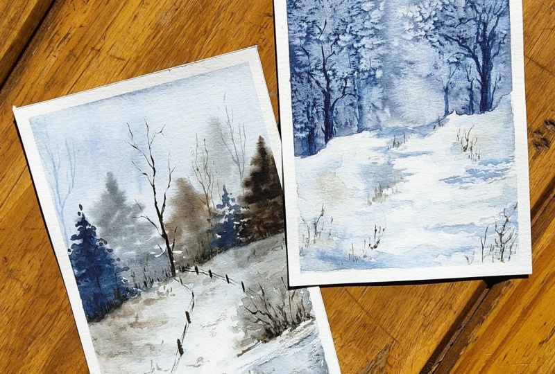
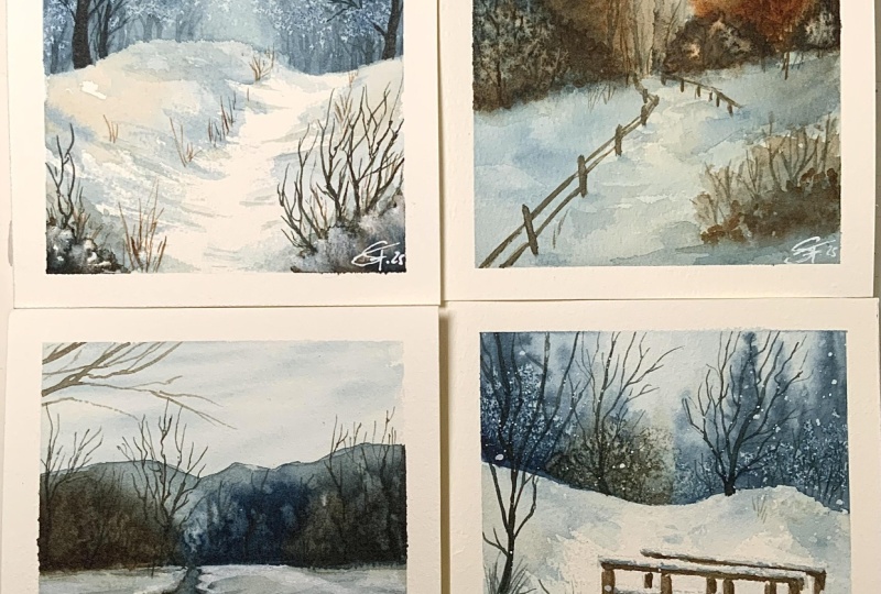
10. Painting 1: Frosty Trees: Let's go to the
first painting now. I'm going to do
the simplest one, and I'm going to be using the
special effects with salt. I'm starting with a large
soft flat brush here so I can distribute the water to
dampen the surface evenly. I realized that this
brush is a little bit contaminated with paint
from my previous painting, but it doesn't really matter. I'm just going to dampen the
surface and I'm going to use quite a dark color
anyway for the background. It's just going to cover
this grayish tone. You see, I've left
out a little bit of space at the bottom because I want a separation from the
snow and the background. Then I'm just going to use indigo painting vertical
lines from the sides and I want the center or the middle of this part to
be a little bit lighter. I didn't pick up enough paint, so I'm going to take
a little bit more, and I want to let you know
when you pick up paint, please distribute the paint
evenly on your brush. If you just take it
straight from the pan, parts of your bristles might
not touch enough paint. Whereas if you add
water and paint, and then you try to distribute
it evenly on the palette, you'll have an even
distribution on your bristles. And it just makes application
so much easier this way. Now I'm going to switch
to a smaller brush because it was getting a little
bit difficult to control, and this way, I can correct
the edges for the snow. I'm also going to place even more pigment
along the sides. With a smaller brush, I can also pick a thicker consistency compared to my
large brush because I am painting on a smaller area. And just like before, I'm going
to create vertical lines. If you haven't noticed,
these lines represent trees and I want the taller ones to be on the sides which
are closer to us. As I get towards the middle, where the color is a
little bit lighter, I made the lines a
little bit shorter so it looks like
there's a bit of depth and we're looking
at more distant trees. Before everything dries, I'm
going to sprinkle some salt, and as I applied the paint, I want more salt around
the sides and I'm going to apply it from the top to the bottom whereas
towards the center, I'm going to sprinkle the
salt at a lower position. The salt takes a while to react. This is why I'm doing this first before I paint any other areas. And you'll start to see
as the salt dissolves, the paint will disperse, leaving the area where I've
placed the salt white. I'm using fine grain
sea salt here, so I want to be very careful
as I'm sprinkling down. I try to evenly distribute
the sprinkle of salt grains instead of getting
large clumps together. I feel like these smaller
grains work best because it has enough time for the full grain to dissolve into the
watercolor paint, which makes them react
a bit faster as well. So I've left this for a while. You can see the
smaller grains have dissolved and it created
really nice textures, whereas the clumpy
areas still has that paint because the paint just end up plumping
into the salt. Let me just show you an example
of what I did last night. I didn't wait enough
time for this to dry. Instead, I used the hair dryer, so it didn't have enough
time for the salt to react yet and it hasn't
absorbed enough paint. Be very mindful of this when you're trying to
create this effect. I'm already happy
with how this looks. I feel like it's
distinct enough. So I'm going to set everything by drying it off
with a hair dryer. And if there are any excess
salt which hasn't dissolved, I'm just going to try to
take it off the paper. I like to just use my finger
very gently to push it over, making sure that
everything is dry, though, because you don't
want the grains of salt to damage the paper, especially when it's still damp. I want the snow to look light, but just leaving it white like this makes it
look very flat. I'm going to add some dimension
to it by using a really, really light consistency
of just indigo for now. When I'm painting the snow sometimes I'm just
doing it randomly, but I do want the corners or the edges of my paper to
have a little bit of color. So when I take off
the masking tape, the frame would be clear. So I'm starting
with the edges and I'm bringing it inward and I'm making sure that my brush strokes go in
a certain direction. So there's a leading path
for our eyes to focus on. You can just use indigo
for the whole painting, but I want to introduce
a little bit of warmth. So here, I've mixed in
some of that burnt umber, still using a very
thin consistency, though, because I don't want
the snow to look too dark. Again, I'm just enhancing some of the areas that I've already painted and smudging some parts if I feel like the edges
look a little bit too sharp. I want to enhance the slope
on the right hand side, so I'm using a slightly thicker consistency of the indigo, but then I'm going to
smudge some of the edges. So the pathway is
a bit clearer now. Here I'm just cleaning
out my edges, making sure I don't miss any
spots because I want to have a clean frame as I take off
the masking tape later on. I'm fairly happy with the value, so I'm just going to
dry it off completely. This is just going to be a
very simple and clean design. Next, I'm going to add
on the finer details, making sure that the
surface is completely dry because I want to
create really crisp edges, especially for the small
details like the fine branches. I'm starting with my small
synthetic brush here. And I'm painting on
the main branches. Generally, I like to
use my dagger brush to paint some really fine lines. But since I feel like these
trees look fairly big, the tree trunk has
to be thick enough, which is why I've chosen
to use this brush. I'm just using a really thick
consistency mix of indigo. This has mostly indigo with just a little bit of burnt
umber because at this point, I'm quite enjoying
the frosty feel and I feel like the blue really helps to enhance
that cold feeling and the frosty textures
from the salt. Now here I've switched
to my dagger brush to paint the finer details for the smaller branches that is attached to the main ones
that I initially painted. You can see I can move a little bit more freely
with my dagger brush, and the lines become much finer, and I can also play with a
little bit of the weight, which I find makes the
branches look a bit more natural when I'm
painting the smaller ones. Sometimes I like to add the branches in between
the white parts. So the frosty parts of the trees sometimes are covering
some of these branches, and this just makes it look
a bit more believable. Next I'm going to add a little bit more tree
trunks at the back, but I'm using a lighter
consistency this time. This will just make the trees
that I'm painting right now look like it's further
back in the composition, and by doing this small
change in consistency, we're adding depth
into the composition. For some of the trees which are closer to the sides, I'm going to darken
them slightly. And as the trees are getting more further
towards the back, I'm going to make sure the tree trunks are
gradually lighter. That I've added the
details for the trees, I feel like I need to add a bit more depth as well to the foreground and
the middle ground. Here I'm again going
to darken some parts to enhance the
area for the path. But this time I'm only
painting a small portion, so I don't end up covering everything and
flattening it out again. I want to also include
some dry brush marks, which is by using a
lighter load on my brush. When I apply the paint
and doesn't have enough water to
smudge these lines, instead, it has those really nice uneven
edges that I'm looking for. Once I'm done, I'm going
to make sure everything's completely dry so I can work
on a completely dry surface. Just one final touch
to this composition. I'm going to add
some twigs sticking out from the snow.
This is optional. You can also add other
elements if you would like, like fences or bushes
in the foreground, but I'm just going to stick to really tiny little
twigs because it's quite easy for me to paint
using my dagger brush. So I'm just going to keep the first one as simple as possible. I feel like I have enough here, so I'm just going to go
ahead and unmask the sides. And this is the completed
first painting.
11. Painting 2: Snowy Fence: O. Let's move along to
the second painting. I'm going to start out by again painting the portion of the sky, just dampening the
surface with water, and I'm going to bring it down to around two thirds of the way. I'm going to take a really
thin consistency of indigo, making sure that it's evenly spread all throughout
my bristles. And I'm just looking
for a light spread, especially around the corners. I only want the sky to
have a very light tone. This is again to create a clear frame once I take
off the masking tape. Now I'm going to go
straight in with a thick consistency to
paint on some trees. I've switched to my
synthetic brush here. The bristles are very
snappy and it doesn't soak in as much water
as my softer brushes, so I can easily absorb a
thick consistency of paint without having too much
paint in the bristles. As I'm painting the trees, I want to alternate from thinner consistency to a thick consistency
to create depth. In the background, I
like to use mostly color tones with predominantly
indigo in the ratio, and then I'll start to
add more burnt umber into the trees closer towards
us in a thick consistency. Notice how I'm using
quite a lot of pressure on my bristles as
I'm painting the trees. I'm also directing the brush
downwards or according to where the little comes off leaves within
the tree is going to face. For the trees with a thicker
consistency, though, because I'm painting
smaller ones and I have a lot of pigment, which will spread on
the damp surface. I try to put less pressure, so the brushstrokes that I'm painting will be smaller
and more controllable. I like to play with the
height of the trees and also alternating the placement
to create a natural feel. As I get closer to the front, I'm increasing the value. Here I'm using the mixture
from both the colors, but I still like to play
with the consistency. Some are a little bit thicker whereas others are
a bit lighter. As I'm painting this, I
feel like the top feels a bit empty and everything
is completely dry, so I decided to re
dampen it very lightly, so I have a damp surface
to work with again. I'm just going to use
the thin consistency of indigo to increase the height for some of the trees
in the background. For some areas, which
I feel is a bit dense, you can also add a small
sprinkling of salt. But I don't want that to be the main feature of this painting, so I'm just using it to
break up certain areas. I like to also take advantage of the damp surface to increase
the height for some of the trees in order to rebalance the composition with the taller
trees in the background. Let's move on to paint the snow. I'm just using a very
thin consistency of the two colors with most of
the indigo in the ratio, and I'm moving my brush in the direction where I feel
the snow would be going. I'd like to make it
mostly horizontal or diagonal sometimes with
slopes and this way, when you've left out a bit
of white space in between, the brush strokes will suggest the flatness or the
slopiness of the ground. This is why I would avoid
painting vertically except maybe to clean
little tiny edges. While the surface is still damp, I'm going to enhance the
gentle slopes for this, I've just added a little bit
of burnt umber into the mix. The color is very subtle, but after I dry it completely, it will also fade and
become even lighter. Now I'm going to paint on the dry surface using a
thin consistency of indigo, and I'm going to try to create
some dry brush textures. So you can see how quickly
I'm sweeping through that area of the painting in order to get sharp
thinning edges. It's going to dry
everything off, so I can paint on
the finer details. You can also start to see
where the salt have dissolved. I just like to use
it to break up those dense areas to give it a little bit of
breathing space, I guess. But next, I've picked up my small size zero brush to
paint on some dormant trees. I like to use this brush, or if I want the lines to
look a little bit thicker, I would use my larger
synthetic brush to paint the main tree trunk or stems and also some of
the larger branches, then you can switch
to a smaller brush or the dagger brush to paint
the smaller little details. Just like the trees, I'm going to play with the
consistency as well as the color to paint these
dormant trees as well. Uh Okay, I'm going to switch
to my dagger brush this time because I don't need to paint the thicker
tree trunks at the center, since I'm painting the
trees at the back. I feel like I can move so much quicker with
a dagger brush, but notice how I'm
holding my brush. I'm using my pinky as a
stabilizer underneath, and I'm almost
holding it upright. So the very tip of the bristles are making
contact with the paper. Now, I'm going to paint
the tree chunk and the smaller branches in between the trees that we can still see. At the bottom, if
I want to just use my dagger brush to
thicken the tree trunks, I would just go over it a few times until it
creates thicker lines. However, it is a
little bit harder to control because of these
very long bristles. There's quite a bit of space
on the bottom right corner, so I decide to paint on a bush using a light consistency
of a muted brown, but I'm going to
also vary the color. So there's a little bit
more interest since it's quite large in
front in the foreground. I know the bush is still
a little bit damp, but I'm going to go in with
quite a thick consistency and my dagger brush since
the tip is very small. Even when the paint
kind of smudges into the damp background, it's not going to
travel too much. Once I'm done, I'm
going to dry this off and paint more
on the dry surface. The final element that I want to include in this
composition are fences, which will help guide Rs to a certain direction
in the composition. For this, I've switched
to my size zero brush. Since the bristles
are fairly short, it's easier to control, and I'm using a really
thick consistency of a muted dark brown. As the fence get further
in the distance, the lines for the fence will be smaller and
also lighter in weight, and so are the horizontal lines. Just a final touch here. Looking back at the composition, I feel like the bush kind of
looks like it's floating, so I'm just going to add a thin consistency
of this dark brown. Then I'm going to dry it off and take off the masking
tape on the sides. That's it for the
second painting.
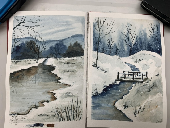
12. Painting 3: Frozen Reflective Water: Onto the third painting, again, I'm going to start by dampening the surface for the background, and this time I'm only going
to paint a small portion, probably around one
third of the paper. For the sky, I first
mixed in a really, really thin consistency of a mixture between
indigo and burnt umber. So it's a grayish base. With this, I'm just
going to spread it down. Then I'm going to take
a bit more indigo, but still in a fairly
light consistency to paint on some diagonal
lines for the sky. I'm going to make sure
I get the corners. Then for the lines, I'm just directing my bristles or the flat side of my bristles, where I want to angle the wispy
clouds in the background. I just want the sky to be
very light and subtle. Then I'm going to dry it off so I can paint on a dry surface. I want to paint some
distant mountains, so I've switched to
my soft brush using a mix of the two colors,
but mostly indigo. So it's just more of
a muted dark blue. And I'm just roughly creating the shape or the outline
of the mountains, trying to create something that looks kind of
natural and uneven. And I'm just going to
grab more water so I can drag the rest of
the paint downwards. I'm just going to clean
out some of the lines if the paint is gathering
in a certain spot. And now we have a damp
surface to work on. I'm going to use a
thick consistency of both the colors and
also some mixtures, varying the colors and painting
it on the damp surface, doing little dots
with the tip of my brush to suggest some
trees in the background. Because the surface
is quite damp, you can see how much my
paint is traveling upwards. This is why I want to make sure that I'm only slightly
tapping my brush. I'm also going to help direct
where the paint is going. You can always
pick up your board and tilt it in a certain way. And because the dark
colors are quite strong, I also sprinkled a little bit of salt to break some
of the dense areas. I'm going to map out an
area for frozen water, which links to the end
or the horizon line. Here I'm just using
a thin consistency of the indigo mixture that
I used for the mountain and I'm directing my brush horizontally so I don't lose
the flatness of the ground. Now taking advantage
of this damp surface, I'm going to paint
the reflection from the background just so it
doesn't look too flat. I'm adding a little bit of
color at the end of the water, but I'm just going to
spread it horizontally. This is generally the
movement that I want to do with my brush to
create a flat surface. Now, for the trees, I'm going to use
stronger colors. I'm using a fairly
thick consistency here, but I realize I didn't use
enough indigo in the mix. However, I'm just going
to leave it as is because I don't want
to disrupt the wet on wet process for now
and I'm just going to move on to paint the other
tree reflections as well. So if you've noticed
here for the reflection, I'm basically just
treating it the same way, but it's kind of upside
down compared to how I painted the trees
under the mountains. Once the paint has
settled a little bit, I'm going to switch to my synthetic brush
and pull some of the colors horizontally to again suggest that flat surface. Now, around the edges of the snow where it's
touching the water, I'm using a little bit of
muted brown here because maybe there are just some muddy spots near or right
underneath the water. I felt like I used too thick of a consistency for some of
the trees in the background. So just like how we
sprinkled some salt before, I'm going to try to take off some paint using a
clean dry brush, just a little bit
though, because I don't want to disrupt
in the surface. Then I'm going to move on
to paint the snowy ground. Just like the water, I want
to paint horizontally, but this time I'm creating
some random slopes as well. Now, I'm going to go back with
a thicker consistency and a darker value of a muted brown
to paint the edges again, enhancing the muddy areas
that I've painted earlier. I'm going to
strengthen the color, especially around
the bottom corner on the right hand side here, but I want to be very
careful since I'm painting quickly to not cover up the previous layer that I've
already painted earlier. I felt like this area in the background cut off a
little bit too cleanly, so I just made some lines, smudging it and some
dry brush textures just to create some unevenness so it doesn't look
unnaturally clean. I'm going to set everything
first because I'm going to fix the reflection on
the frozen water later on. I think it's bothering me a little bit that the
color of the tree on the left is different to the actual tree in
front of the mountain. So here I'm just using
a clean damp brush to just lightly
dampen that area. You don't have to get
to all of the edges. Then using a muted dark brown, but in a lighter
consistency this time, I'm just starting it right
at the edge here and making the paint come down naturally without having to play
with it too much. I just want to create
a soft transition between those two colors. It's okay if a little
bit of the base color is still showing as long as it
still has that muted quality, which helps to match the
reflection to the actual tree. I'm quite happy with
the reflection now, so I'm just going
to dry it ever so slightly so it's not overly wet. But I'm going to add on
saturation on the sides a little bit more using a thick consistency
between the two colors. I don't really mind too much
if some paint runs down to the reflection as long as
it's not traveling too much. I feel like I have enough here, so I'm going to make
sure everything set before adding on
the finer details. Okay, once everything's dry, I'm going to add the small
branches, the trees, and such for the composition, and then I'm going to do final adjustments to make
sure everything's balanced. I felt like the foreground
was very empty, so I decided to add
some branches in front. And here I just stuck to my dagger brush since I
was already using it. But you can see
that it's actually quite difficult to create a thicker line weight due to
the shape of the bristles. The line weight
becomes very uneven and due to the
pointy nature of it, the tip will always be thinner, so you can either fill it in. But it's also quite
uncontrollable, which is why I
always recommend for you to use a round brush to get an even brush stroke
before adding on the finer natural ones
with the dagger brush. B Don't forget to also add these details
to the reflection. As I'm painting them on though, I make sure I use a slightly lighter consistency because I don't want the
reflection to look as distinct as the actual elements. I think that's enough detail. I'm just going to dry
everything off and try to balance out the colors that I have in the
composition so far. I decided to add a
small bush here to cover up the large
blue tree at the back. I'm going to do a
couple or a few of these to just break up I guess the large mass by covering the front
with other objects. I thought that I was done here, so I took off the masking fluid, but as I looked at this again, I felt like the
small bit of land at the top looks a bit
too light and flat. I'm just going to darken
the middle ground ever so slightly using a
thin consistency, and I'm just going to add
some dry brush textures. I feel like I have given enough information
for this painting, so I'm going to
call this one done.
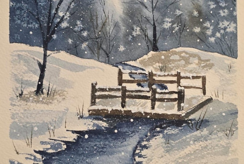
13. Painting 4: Snowy Bridge Pt 1: Now let's move on to
the final painting. I feel like this one is
the most complex one, and I used a reference image, which is this one on the left. Since this one has
a main focus point, which is the bridge, I decided to sketch it out
this way as I paint later, I don't have to figure out
the exact placing in order for it to interact with other elements in
the composition. Was actually my second
attempt of this painting. For the first one, I've miscalculated the
height of the bridge. I already painted the snow, and I didn't realize
I needed to elevate the slope near the ends of the bridge in order for
the height to make sense. This is why I feel
this time drawing out an outline
would be beneficial when you have an
actual composition in mind or if you're using
a reference image. With the sketch, I just want
to make sure I place more or less the main elements
like the water, the bridge, and
where the snow ends. But I'm not going to sketch out all the other details
like the trees and such. Instead, I'm going to
treat them like how I treated the previous
paintings and personalize some of these
elements in order to support the main element
of this painting. In the reference, the water
have seemed to disappear. Maybe it could be in
between the taller slopes, but I'm not sure if I can
paint that convincingly. So I decided to just add a connected body of water that is directed
to the background. In the reference, the bridge has some little pillars underneath. Instead, I'm just
going to cover it with snow so I'm not going to
paint it on specifically. I think I'm fairly
happy with the sketch. I have enough information here. Next, I'm going to
start by dampening the background with a really
light tint of indigo. I'm using my large brush here just to make the process
a little bit quicker. Try to make the damp
surface as even as possible and take off
any excess puddles. I can see some tall trees
or hills in the background. So I'm going to use a medium
consistency of indigo. Again, I'm directing my
brush strokes upwards and downwards mostly vertically in order to create a
tall background, and this will also separate it from the flatter foreground
and middle ground. I like to make the
lines a little bit taller on the left and
right to create a frame, and the lines or the hills a little bit
shorter in the middle. Now, working with
a darker value, I've added a bit more
burnt umber and using a slightly thicker consistency to paint on top of
the background, still on the damp surface, creating something
similar, but again, still playing with the
height to make sure that the composition looks
organic and natural. I'm going to layer
this even further with a thicker consistency
this time using my synthetic brush
since I can pick up a bit more pigment and I'm just going to
apply it the same way, but I'm making
these ones shorter. I felt like adding
a nice salt tree on the left would look
nice in this composition. So I just sprinkled
a little bit. Then I'm just going to wait
for the salt to react. While I wait, I'm
going to move on to paint the snow and try to figure out how the slopes are going to work for it to interact
with the bridge. I'm going to be very careful as I'm painting around
the bridge, as well, because there are
some spots where I can actually see the snow
between the railings. Technically, you can just paint over it, but at this point, I wasn't thinking of
including bleedproof white for the snow on
top of the bridge. Instead, I was going to leave
out some negative space. But the area ended
up being too small, so feel free to actually
just paint over it. Just don't forget
where the lines are once you're ready to
paint in the bridge later on. Now I'm going to
paint the water. This time, I'm going to
paint it full with indigo, but I'm going to follow
the same method as before, which is to paint horizontally, but I'm trying to be a bit more careful as I'm
painting the edges. Again, you can also paint over the bridge except
for the walkway, but I was trying to avoid the railing still because
like I mentioned before, I was thinking of leaving white negative spaces on
top of the railings. While the surface is still damp, I'm going to use a
little bit more indigo for the left corner just so
it doesn't look overly flat. I'm also going to add shadows directly underneath the bridge, as well as a really thick
consistency for the sides. Like for the previous painting, I was thinking of things that might be under that you
can see through the water. I feel like this also enhances the pile of snow on the edges. I'm also painting some
horizontal lines here to depict the texture
of the flowing water. Once I'm done with the water, I'm going to add the shadows on the snow under
the bridge as well, making sure that it's a little bit lighter compared
to the edges, so it still looks
separate to the water. Keep this just with the indigo, but I personally want to
include a little bit of brown in the composition
still to add some warmth, but I still want the
dominant color to be indigo, so it still looks nice and cold. I tried to use the tip of my
brush to create textures. Then I smudge the edges with a clean damp brush to make the edges look a
bit more textured. Again, since there wasn't much happening on the
bottom right corner, I added a small
sprinkle of salt. Here I've darkened the shadow on the water underneath the bridge and then I'm going
to dry everything. Going back to the edges, I'm going to add extra texture with uneven lines
using my dagger brush. I'm using a really light load, so as I'm dragging
the tip of my brush, you can see a light
dry brush texture. This last painting takes a bit longer to complete, so I decided to
divide this in half. In the next lesson, we'll
start to paint the details like the bridge and such once you're done with the background, the base of the
snow and the water.
14. Painting 4: Snowy Bridge Pt 2: Okay. Moving along, feel like I have enough detail for
the water and the edges. Next, I'm going to
work on the bridge. I want a lot of
control to paint this, so I'm switching to my round
brush I'm using a mix of indigo with burnt umber to
create almost a black color. Using a thick consistency, and this is my
attempt on leaving some white space as the
snow on top of the walkway. I decided to ditch
this idea after I tried painting the rest of
it and not seeing results. So don't worry about
leaving any space instead just paint it with
the color that you want. Then for the snowfall on top, I'm just going to use bleedproof white to
paint it on directly. The only space that I'm
going to leave, though, is the top part of the walkway, because I'm going to paint using a light consistency of
the blue and umber. So at this point, I'm
just focusing on painting the railings on the side as well as the bottom side of the
bridge that you can see. Okay, next, I'm going to
paint the snowy boardwalk. I've just used a
little bit of paint in a medium to thin consistency. Notice how I'm directing my brush strokes following
the direction of how these wooden boards or wooden planks have been
placed on the bridge. I'm fairly happy with how
the bridge looks for now. Next, I'm going to paint
on the details like the dormant trees
on either side as well as the background to
fill up this composition. I want the lines
to be a bit more dominant for the dormant
tree on the left, and I want them to be
a little bit thicker, which is why I started with
my smaller round brush. Then for the background, I'm going to paint
on the tinier, more fine branches
with my dagger brush, as well as the areas in between the sprinkling of
salt that I've added earlier. I'm just going to use
a thin consistency of a muted light brown, and this is just to add a base for a bush that I want to
add into the composition. My intention here is to
create more contrast between the snow
that I'm going to put on top of the railings
and the background. Here I'm just going
to fill up some of the empty spaces with some
twigs and dried up grass. I can see a weird slant
on the top left corner. So here I'm just going to add a really thin
consistency of paint. At first, I was thinking
of adding some leaves, but then I realized it
doesn't make sense, so I ended up just
smudging it into the background to
soften the slope edge. Then I just added a
little sprinkling of salt to break up
those edges even more. Now I'm ready to take out
my bleed proof white. I'm using a thick consistency of bleedproof white here and my small size zero brush to add the snow on top
of the railings. I'm intentionally slightly
wiggling my brush here, so the edges of the snow doesn't look
completely straight. I like to also add a little bit more height
next to the corners. I know it's really small,
but I realize the snow would probably collect in
those areas a little bit more. Here I'm just adding more
dried up tall grass, and I'm also going to paint the branches on the
dried brom bush. Turns out some parts were
still a little bit damp, so I used the hair dryer to
make sure it's dry first. And I'm going to go back to paint on more of those branches. Now, here comes the fun part, which is to splatter
on some snow. I'm using quite a liquid
consistency of bleedproof white, but generally bleedproof
white is quite opaque, so it just makes it a
bit easier to splatter. The splatters are
quite small, though, so I'm going to also add some snowfall manually
and I'm directing these lines a little bit more
diagonally to add movement as if the snow is being
blown by slight wind. I'm just going to darken
this tiny little spot, and I think I'm done
with the final one. I'm just going to unmask the edges to reveal
the painting. And that's it. The fourth
and final painting. To
15. Closing & Class Project: Congratulations for
completing this class. For the class project, I would like to invite you to paint along to the four winter scenes that I've shared in this class. However, if you're in the mood, you can also experiment
a little bit more with different brushes or
different special effects. You can even add on to
the colors that I've shared in this class after you're done experimenting
with these two. Once you're done
with your paintings, please don't forget
to post it in the project section at
the bottom of this video. Just like the descriptions
and things like that, you'll see a tab at the bottom. This is where you can
share your projects with me as well as
other students where we can sign each other comments and likes to support each other. It always excites me to see all the different styles that you create with
different hands, even if they're painting
the same composition. It just brings such joy. I'd also like to ask
a favor from you if you found this class
worthwhile or useful. I would really appreciate
it if you write a review. It really encourages me to keep creating new classes
that you enjoy. And I feel this also encourages other people to take
this class as well. If you enjoyed
painting along with me and you would like to see
more tutorials by me, I do have a YouTube
channel where I post weekly
watercolor tutorials. My channel is Nianiani. And if you would like
to see more art by me, I also have an Instagram
and a TikTok account. My Instagram handle is at IG Underscore Nianiani and my
TikTok is at Nianiani art. That's it for this class. I
hope you enjoyed watching it. I can't wait to see your
work in the project section. All the best for them, and I'll hopefully see you again in
the next class soon. Bye.
 Nianiani, Watercolorist and Graphic Designer