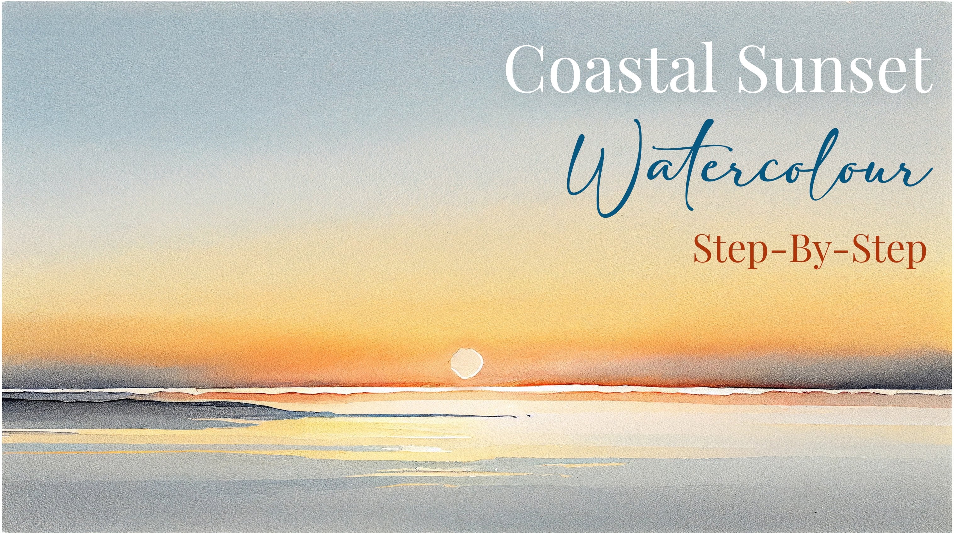
Transcripts
1. Welcome to My Class!: Hello everyone. My name is way less than and welcome to my Skillshare class. I've been a
professional watercolor artists for many years now. Exploring many
different subjects, from wildlife paintings and portraits to cityscapes
and countryside seems. I've been lucky
enough to take part in many exhibitions
around the world. And I've won awards from well-respected
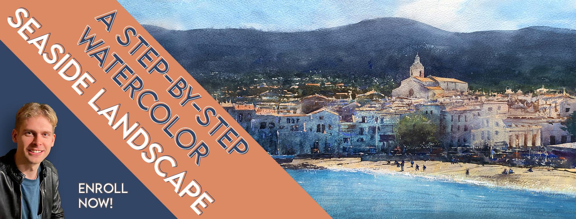
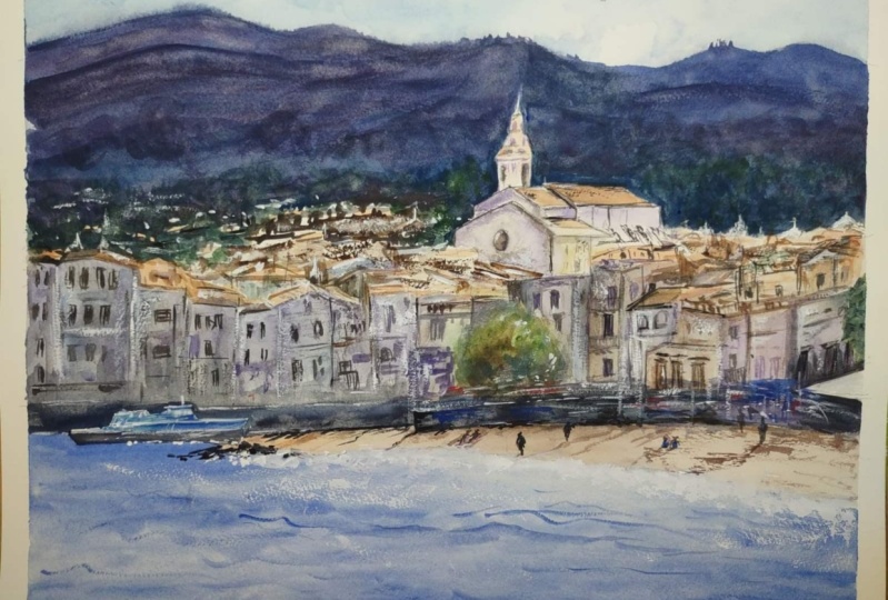
organizations as well. This class, I'll be taking you through my process of painting, a seaside landscape painting. Painting landscapes
and watercolor can be very intimidating. So by showing you how
I go about painting them from beginning
to end, hopefully, it will demystify this
elusive medium and give you confidence and knowledge to create your own masterpiece. Today we'll be
painting a scene from a lovely picture as
town called catechists. It's been a favorite for many artists
throughout the years, including Picasso
and Salvador Dali. I visited, kind of
guess not long ago. I have been excited to make a painting from some
of the photos I took that this class will go through the complete
process step-by-step. On the first brush
stroke to the last, I have predrawn
the composition so that we can focus on
the painting aspect. I'll give you an image of the outline sketch so that
you can draw it out and follow along with me by seeing the painting being
done every step of the way. You can follow along
at your own pace, pausing and rewinding until you feel more comfortable.
Moving on. I will showcase all the
techniques I use in watercolor to achieve many different effects using a variety of
different brush marks, including large washes,
gradations, and dry brush. I'll share my thought
process on how to simplify complex subjects into easy to
paint shapes and textures. If you're concerned about your skill level in
taking this class. Remember, being fearless in watercolor is what allows the beauty in watercolor
to come through. After all, watercolor
flourishes for happy accidents. And it's through
trial and error that we learn to control
the medium better. For complete beginners class. It could be inciteful
to see what potential for
watercolor medium has. Even if you don't feel confident
to paint along with me, I'll show and explain
which supplies I use, including my color palette, paint brushes, and paper time. Throughout, I'll be
giving plenty of tips and tricks for taking the stress out of painting and having fun. When you enroll in my class, I'll give you my
photo references, including a high
resolution image of my finished painting. You can use as a guide. I'll be splitting
everything up into different sections so it's
easier to follow along. If you have any questions, you can post them in the
discussion thread down below. And I'll be sure to read and respond to everything
you guys post. Don't forget to follow
me on Skillshare by clicking the Follow
button on top. This means you'll
be the first to know when I launch a new class, post giveaways, or just have some cool announcement to
share with my students. You can also follow
me on Instagram at will Ellison to see
my latest works. So do you want to
create your own work of art all whilst having
fun learning watercolor. But I'd love to have
you in my class. So please click Enroll,
and let's begin.
2. Your Project: First of all, thank you so much for enrolling in my class today. I really do appreciate it. I'll go to learn a lot
and have a lot of fun. As seen in the
introduction video, we're going to paint
a CSAC seen today. It's a nice painting
to learn from. As I cover, many of the common techniques used
in landscape painting. As this class is focusing
on the painting, expect a watercolor.
To save time. I'll be starting this class
from the painting stage, having the sketch
already drawn out. You'll find a copy
of this drawing in the resource section and can draw it out or
even traced out on your own paper,
radius paint along. Don't feel guilty
about tracing when using it just as a guide
for learning how to paint. It's important to have the
under drawing correct? So that it doesn't
inhibit your ability to practice and learn the watercolor medium
in its own right. Learning to draw its vital, but it's a different aspect
of the creative process. Alongside my
sketching reference, I'm included the photo
I'll be painting from, which you can find
in the Tableau. I use photos as a guide. However, I do deviate and stray
from the reference when I think of all the different watercolor effects
I can make use of. And of course, I've put an
image of my final painting in the resource section
that you can use as a reference
throughout the process. On a side note, it
might be a good idea to watch this painting first
before painting along, so that you can plan ahead and prepare whichever way
you use this class. I'd love to see your results and the paintings
that you create. I'd love to give you feedback. So please take a photo after and share them in the
student project gallery. You can find the gallery under the same project
and resources tab. On the right, you'll
see a green button that says Create, Project. Tap that. And once you're there, you'll
have the option to upload a cover photo and the title and write a
little description. I'd love to hear about your process and what you
learned along the way. Once your project is uploaded, it will appear in the
student projects gallery. You can view other
projects here. And I definitely encourage you to like and comment
on each other's work. It's a great help to
feel the support of others in the community
whilst learning new things. If we put time and effort
into creating something, we're proud of, that
why not chairs? Now we know what
this class is about. Let's get on with it. Starting with the material
to supplies I'll be using.
3. Materials & Supplies: Let's go over the materials and supplies for me to follow along. We'll start with my palette
and the paint I use. Like most of the materials
we'll be using today. It's a lot to do with graphics. I don't use any
particular brand. I have 12 stable colors in my palette that I
fill up from tubes. And they are cadmium
yellow, yellow, ocher, burnt sienna, cadmium
red, alizarin crimson, ultramarine blue, cobalt
blue, cerulean blue, violet for radian, black, white gouache, and lavender. These colors you can get from
any brand I personally use, Daniel Smith, Winsor,
Newton, or Holbein paints. Let's move on to brushes. I use a range of brushes and when I choose them as
quite spontaneous, I'll be using full
kinds of brushes. In this painting. The most common brush I
use are these mop brushes. Here's a couple of them
which are used for larger brush strokes to
fill up areas quickly, but they also have a fine tip, the smaller details if needed. Next up. These Skoda brushes, which allows for more precision
because it's a final tip. I mainly use these for details. And for even more precision, such as final touches
and highlights. These cheap little
synthetic brushes that don't really have a brand. They're just very
small brushes were very small tips that
you can see them in most art supply stores. And lastly, is this solid
brush or rigger brush. It's actually quite long. But when it's wet,
it tightens up. And it's used for
very small details. It holds a lot more water
than those brushes, but because of the
shape of it is quite difficult to control. So I only use it for
lines, very fine lines. And that's it for brushes. You're welcome to use your
own favorites as well. Onto paper. The better quality
your paper is, the easier it will
be to paint on cheap paper crinkles easily
and is very unforgiving, not allowing you to
rework mistakes. Good quality paper, such
as cotton base paper, not only allows you to rework mistakes over multiple times, but because the pigment
reacts much better on it, the chances of mistakes
are a lot lower anyway. I use arches paper because that's what's available
in my local art shop. Next, some various materials that will come in very handy. Of course, you'll need a pencil. And I use a mechanical pencil as it always has a fine tip, which is perfect
because we only need it for the outline and the
drawing stage anyway. And I use potty rubber is because they
don't leave residue like regular rubbers that would otherwise stick to the paper. A water spray. It's absolutely essential
because by using this, it gives you more time to paint the areas you want
before it dries. It also allows you to
reactivate the paint. If you want a smooth line or remove some paint
with a tissue or a sponge next to a hairdryer for speeding up the drying process
is very useful, especially if you're painting in multiple layers like we
will be in this painting. A relatively large
water container that's either transparent or white in order to distinguish
how clean the water is. Also, the larger it is, the less often you have
to replace the water. I also keep an old
rag or a t-shirt, which you can use to clean your brushes before we're
dipping it into the water. Also, if you put too much
paint or water on your brush, you can control the
wetness by dabbing it on there before actually
putting it on your painting. It's always useful to have a tissue in your hand
while you're painting. You never know when a
unwanted splash might occur or there's too much
water that causes a drip. You can use this just to
quickly brush away, dab it off. And lastly is masking tape, which of course just
holds the paper down to the surface and creates a nice clean border for when you take
it off at the end. And that's everything
you need to paint along. Let's get on with it.
4. Painting the Under-Layer: I'm going to start painting
in different stages. I'm first going to
do the underlay on the white buildings. And then I'm going to paint
the sky with some clouds. They're gonna do an overlay of the mountain
and bring it down. And with one wash, my work, my way through the buildings and the roofs ending with a C.
So let's get on with it. I actually have some
orange on my palette here, so that's what I'm
going to start with. But it's, it's virtually
a mix of red and yellow, cadmium red ketamine, yellow. So I'm just going to use that. And they're terracotta roofs. So that's the kind
of terracotta color. Terracotta color that
I'm looking for. Now. I don't need to
be exact so much of these because I
gotta be coming back over and later on with
a much darker wash. So all the rough edges there
will be virtually no way. You don't have to be
so careful with that. Mixing up my colors a bit, a bit of variety, making it dark enough just so that
I can see the lines vary. There's a lot of intricate
details in this painting. We're going to have
to find a way to imply this detail without
actually painting it all in. Because not only will
it look a bit too well, it's impossible to put
so much detail in. And attempting to will cause the painting to
look quite amateur. It will look like we've
attempted to put in the detail without
actually succeeding. So at the moment I'm
putting this in and I'm not being so careful about, I'm just putting it in random places or at
least places where I feel they might be needed. I'm not looking at the
reference image that much. How to be a bit careful
with this one here, because I can see that
it won't be so dark. So I need to be a
bit more careful. That area there that has the dark background
with the trees. Do some dry brush
here, actually. I believe some
pencil and that's, that's one way you can
because in detail imply details without
actually putting any. Okay, it was close to
the finishing stage. Let's mix some yellow ocher here and mute it
with some black. Because I don't want
to put pure pigment in there is very, very light because I don't
really don't want to. I just want this to
be a hint rather than a full-on statement. That's trying to think
it'd be easy to keep it a bit darker because even though they
look quite intimidating now, with black underneath it, then look way too light. It will be virtually
black underneath there. Okay. Well, I will also do the sand to quite a dry
brush kind of way like that. A dry brush edge there
for where it might lead into the scene. I'm always willing
to change my plan. I go to conception
from the beginning, but if I think of a better way to do things
as I'm painting them, then I'll quite happily change. The order of things. Might even do that. See is blue, but
I'm going to put this turquoise base just to
help it out to begin with.
5. Painting the Sky: And I'm just going to
paint the sky now. Going to start off by
wetting that area. Because that's going to be
a cloud, a white cloud. Get that nice and wet. And then I'm going to
mix it really in blue. That's a nice sky color. We've just did drop of cobalt. And the drop of
bullets were in there. Make it a bit more
water, I think. And then we'll put a
bit more civilian. It's too dark, just
add water across. Same, merely ever end. It can get lost down there
and get lost. Lost edge. More clear text is I'm just going to let that do what it needs to
do while it's drying. Can I get the hairdryer now?
6. Painting the Background: So now let's try it. The painting a bit
because I want gravity's help with this. With this brush, I'm going to
paint the outline of clouds and have a little bit
the cloud coming in. To do that, I'm first
going to mix my wash here for emphasis
of ultramarine. Okay, Well then now this is going to be quite a long time before I
reach the checkpoint because I want everything
to merge together. So I'm going to
start with a line. And it's going to merge
into the buildings. And might be a while before I can take another
break because I need to go the water spray also
to help keep it alive. Case it starts to dry. But there'll be a lot going on. I'm just preparing
myself mentally and then I think I need
to mix a bit more of a wash hair because I want to run out
before it's too late. I'll start a little bit
bluer at the top hatching. Then when we go a bit down. I also wanted to have
a few dry brush marks. I'm going to prepare a wet
brush as well with just water. Again. That seems to
be okay at the moment. Sprays. Now. A few tabs here where I
want it to be a soft edge. I could add to spread now
because it's trying to dry. Completely wet there. Moving quite fast to get this dry brush marks more pigment. There will be a point when I've missed the boat
and I just have to leave it alone but haven't
reached that stage yet. Bringing us down again. Now, it gets very dark here. Kind of reached a bit
of a checkpoint here. Well, I'm going to paint the negative shape of
this building here, making sure I have more pigment on my brush than what's
already on the paper. Thicker consistency rather. Okay.
7. Painting the Rooftops: Now I'm going to mix some green. I'm going to use yellow ocher, enteric coated with
some cadmium bit of viridian bit of burnt sienna. And bring it in here. Merging with the blue. To begin with. It can be quite a light pigment
and now we can add more. We can make it a
bit darker once we know where the buildings
are a bit better. And of course we can
come back at the end of the painting to put
highlights using gouache. A bit apprehensive with this painting because
there's lots going on. But I still felt like
there was potential, therefore a nice painting. That's why I've
gone ahead with it. So I'm working out
where certain things are not going to extreme
of the different hues. By that, I mean, I'm not
jumping from green to brown, sticking with the green and then implying a
little bit of brown. I'm going to flick a
little bit of water. So water on my brush
to flick it a bit. Bit of dry brush there. Now we can start
in certain places, dabbing, well,
implying little trees, dabbing little blotches
every now and again. Then we can take a
little break and dry it and have a look
and what to do next. And that's
what I'll do now.
8. Some Corrections: Now if I'm drawing
it, I'm very happy with the implied details there. And although in my mind, I liked the idea of having
wispy lines here in the cloud. In reality, I don't
think it's worked out. So I'm just gonna go
over the mountain again. Just to make EBIT times
you have less going on. I can just yeah. Quite like that. Dry brush. Happy accident there. Some more texture here for what? For dislike it. Implied
detail, I guess. And I think that's
works out quite nicely. Mindset. Name that
building of it. Now I'm going to go
back to these rooftops. Just kind of unify them
because they're all different colors in
the photo. In reality. But to give the painting
harmony a unifying feeling, I'm going to paint
them all this color. I'm just selecting a few
obvious ones so that I know whereabouts I am in the painting because
there's so much going on. When I keep on
looking at the photo, I don't quite remember which is which which
part is which. Okay.
9. Painting the Buildings: What I'm going to do here is mix a very watery grayish brown. Kind of like that. Maybe add a bit of
red in tiny bit of red. Painting was building. Now, you got to try and see comments
that aren't there, which is a weird thing to say. But if you feel like
you see a bit of purple or there could be a
bit of purple, put it in. You don't have a lot
of faith sometimes like you got a little wet, let the watercolor do its thing. And a lot of that is
an experience really. Like you put a few
dots of pigment in and you got to hope that it goes
where you want it to go. Because it will look different when it's dry
from when you put it in. And he would have counted
that in when you do it. The more you fiddle
around with it, the less authentic and all that. So any certain things like this, I'm willing to put
in more details. But the rest of the
painting would be a bit looser. Okay. Moving back onto the stage. This part of the painting. Well, I'm going to have to activate some of that
because I want it to merge. I don't want any peak any area to feel like it's
disconnected from any other area. I'm trying to trace it
back to where it starts. Move to a bigger brush. You sprayed through, reactivate it because I felt like it was
getting a bit dry. It's buildings a bit more green. So I'm going to
add a bit of that. Sometimes you read it and know
how successful a painting, unless you just give it a go. Because I'll be putting
this painting off a long time because I thought
it's an impossible one to do. But although it hasn't finished
and far from finishing, it has more promise than the last few
paintings that I've done that I thought would be easier. Glare on that
building that I like. So I'm just going
to emphasize it. It's gonna be a tree there, say mine, if that
stays a bit green. Some dry brush marks here. Bright dry brush bonds can be
quite difficult to master, but when you work out, when and where to put them,
there can be a real lifesaver because they save
you from so much. Or deal with when this when something demands
and lots of detail, you can just put it in
some dry brush marks and the eye reads it as
detail even though it's not. But it can be easy to overdo. So trying to bear in
mind not to overdo, it finds the time being.
10. Adding the Tree: Now there's a tree here. And to help it fit in a bit
better with my color scheme, I'm going to use the green. Make a green out the
colors I've already used. Because otherwise
it won't work well. This is just the back. I'm under color or the tree row. Put more details
into the tree later. Some markings on the beach. Not doing things in
any specific order. If I feel like something
needs something quite, it's on my mind
because I'll do it.
11. Adding Details to the Buildings: One a bit more color here
before I add more detail. So I'm just going
over some blue, cerulean blue that is bringing some of it up above
as well so that it manages. Tilt it a bit. Making sure not to get past
that line at the bottom. And while it's still wet, testing to indicates and buildings, not quite wet enough. So I'm just going to use this because I don't want
these to be hard lines. I want these to list. Bleed, bleed on there like a soft focus camera. More detail later. Doing it this way. It's quite nice because
you can always use the water spray to reactivate
it at your own speed. If you want to take a
break, you can do it. Brown hair. Quite wet brown. So I didn't mind
if that bleed out. Was it wet? As long as it's wet, it will
bleed out and be smooth. You have a lot more
control that way. There was great back
over it like I just did. I can use this brush to do
some very thin shadows here. Playing Chinese.
12. Refining the Tree: I'm going to start painting this tree using negative shapes. On this side of the tree,
the darks, the light. The light is likely the
buildings from tree. As it kind of counterbalance. Mish mash designs together dots of viridian. I'm going to leave
that alone for a bit because I don't
want to mess it up. But actually in hindsight, it does get a bit darker
at the bottom there. So I'm just going to dab
some dark pigment to bleed. Bit too yellow. For tips of these
feminist brushing, some really on top
for highlights.
13. More Buildings: I think this area is
still a bit bright. So I'm going to okay. Right. Yeah. Going to be
quite bold this time. It was a bit too dark here, so I'm going to picking up
some of this dark plaque. Give it more careful
with this book. Now. That's a bit lighter. They're signing key that some dry brush marker. Morning having a
bit of text here just to knock that tree back. Because taking a bit too
much attention, I think. Flick a bit more.
Lavender on here. Okay. Grayish blue. Right here. The details later. So there is a lot of back-and-forth
trying to work out where the details go. Just part of the process that comes above there. I think I can get this blue.
I get a bit more blue. And I'm going to
merge it into a kind of pink, purple right here. So take that blue mix and bring it in here again. And here we've got some kind
of nice perfectly shadow. Starts off purple and then go a bit more
blue as it goes down. Bringing that edge that goes all the way up. Emphasize that edge there. This needs to be a bit darker.
14. Adding Shadows: Now it's time to work
from the bottom up. That will become clear. What I mean when
I start doing it. So I think it starts here, going up to there, starting with amid, a
mid-range dark at the moment. And I can always add
a darker one later. And also making my phrase
a bit more interesting by adding color where I can, a little person there, I can fly his head later. Quite blue there. That's why I had that blue. Then. Here, I'll say it's a
bit red and add some red. Here can be a bit brown,
a little bit lighter, so that you can make one of these
lines rich brown. For getting to play. Again. Keep some of these lines. Might have to spray spray
gun from a distance because I don't want to
smudge any other parts of it is a bit like it is meant
to be lighter than it is. I'm going to pull
a tiny bit of out, even a tiny bit, but I think it's a lot darker. So I'm going to have to
add more pigment here. So I'm going to swap
my mop brush again. I see almost purple there. So that's what I'm
going to put in. To blue dabs of water. There is a kind
of warning there, but I don't know how Wherever it's a good idea, but
I'll put it in any way. I can get rid of it. If it's not. My smallest brush. I can quite as solid black. Creating a dry brush stroke
for the bottom of the trees.
15. Using a Sponge: Dr. to off there and I'm just
going to use a sponge here. Spray it a bit first. I want to bring make
this a bit lighter. Then I'm just going
to use a sponge. Just dab it. The Haiti.
16. Adding Some Details: I'm gonna go back here and
start adding some details. Typing up the details
that were behind last time. This is lavender. Too much I was. So it takes a bit
of time these bits, but in the end it
will be worth it. It's very ambiguous shapes here. Some windows here. Take a darker windows here. Lots of windows. Must be a pretty boring
part of the video. I'm sorry about that, but
I guess it's full process, so I have to do it a few windows. When do these things. There's some ambiguous
shadows that are having to be there. I've tried to break
up some lines there to make it less boring than there is a tree
silhouette here. So I'll just put that
in quite quickly. Details on the main two, it may take me there. That's more like it.
17. Painting the Sea: Now we're going to do for them the water that I want
a bit of the color, the boat to bleed into the sea. So I'm just going
to fill a bit color into that so that when
I go over it bleeds in. Haven't finished
yet. They're just going to add more pigment. Hit the bottom, altering down to say a bit wet. I just
want to tell us again, keeping some of that dry brush effect, letting go. Some of those was it tried out a bit more waves, some pure water. And I dry it off again. I'm just bringing down the
area again a bit too bright. When I was squinting my eyes. It was just a bit too obvious. Now, I'm going to get some
more texture on the C here. Getting a wet brush and just brushing it across like that.
18. Painting the Beach: I'm going to add a few shadows, cast shadows onto the beach. So I'm just mixing occur now. The boat it's not wet enough. Water. Can anybody can have it spilling out a tiny bit at the bottom. There's a few rocks
leading out in the sea. Some people, just the tiniest bit of finesse goes a long way. Person here, I believe. I think that's okay.
19. Finishing Touches: Highlights here. This tightening,
tightening the ends of the other
highlights I've made. Phew close and some lights. This team, the
finishing touches. Now, a few more details I've missed. Yeah, I want to
get a bit darker. This doesn't make sense. Thin lines here. The waves. Now I'm going to take the tape off and have a better
look at a bit. Rather take some last
minute decisions. Then I'll have a final summary. That'll be it.
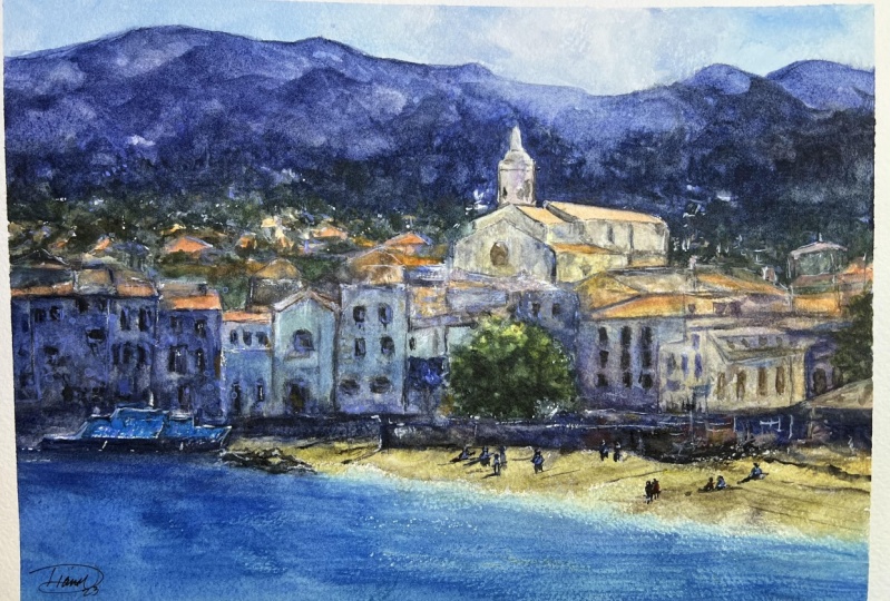
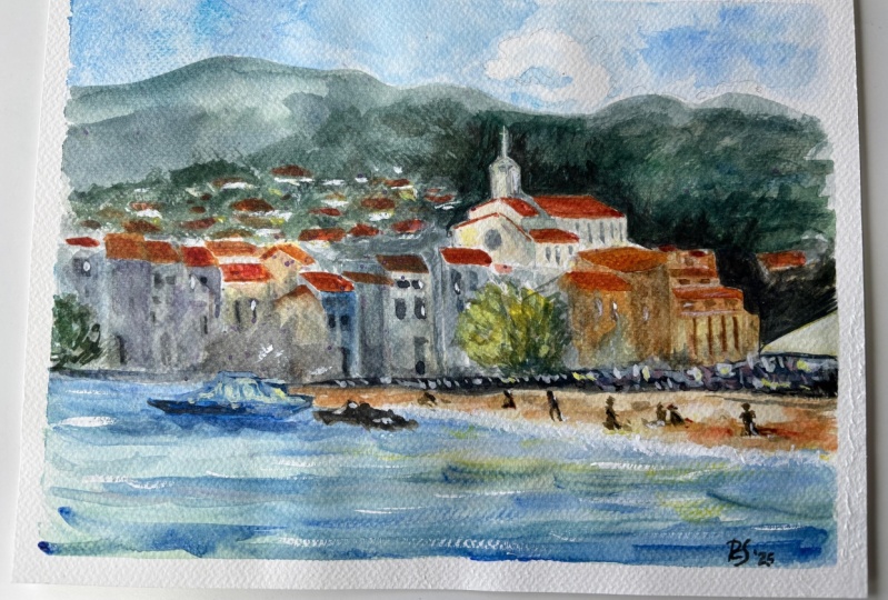
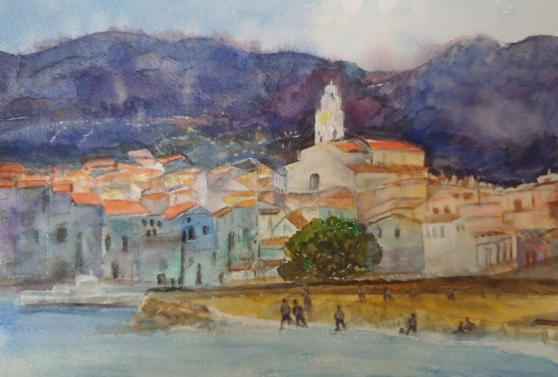
20. Final Thoughts: Welcome back. Here's
the finished piece. I hope you have your own
painting to look at as well. Let's have a closer
look at this one. We've taken a complex scene
and use the nature of watercolor to simplify it
into a harmonious painting. When comparing it
with the photo, you can see, instead of painting it as
realistic as possible, we made use of the different
effects watercolor can achieve to imply the detail, such as dry brush and add
suggestive textures that could be perceived as
waves, buildings, trees. And what makes a
painting interesting and satisfying to look
at is indicating what something is and allowing the viewer's eye
to work it out themselves. We also did large washes
and brushstrokes, the sky and background Hills. We made use of the
full tonal range. On the darkest darks to
the lightest highlights. We used a balanced
watercolor palette, making sure all the
colors work together. All these elements are like a recipe that have the potential
to create a masterpiece. It just takes some
time to learn them. And what proportions
to use them in. Watercolor is about
pushing the boundaries and seeing how far it
can go. Do that. We have to be willing
for mistakes to happen. If you're not happy with
your result or progress, don't be so hard on yourself. By putting paint to paper, you're doing The most
important thing, which is actually
giving it a go. If you'd like some feedback on your painting or
like some advice, please share your paintings in the student project
gallery down below. Or if you'd prefer, you
can share it on Instagram. Attacking me at will understand as I would
love to see it. After all that effort
we put into it. Why not show it off?
Remember, please click the follow button up top so that you can follow
me on Skillshare. This means you'll
get a notification as soon as I published
my next class, we'll have an
important announcement like free giveaways or sharing some of my
best student artwork uploaded to the project gallery. Thank you so much for joining
me in this class today. Please leave a comment below
in the class discussion. If you have any questions or comments about today's class. I hope you learned a lot and I'm inspired to paint more in
this wonderful medium. You can follow me on Instagram
and Facebook at Austin. Again, thank you so much
for joining me today. I hope it's been really useful. And see you next time.
 Will Elliston, Award-Winning Watercolour Artist