Transcripts
1. Introduction to the Class: Hi, Saprita I'm a visual
designer and an illustrator. I love to create nature inspired illustrations
like landscapes, mountains, seascapes
and florals. Today I'm going to demonstrate minimalistic landscape
design on procreate. You can also bring your
procreate along to draw with me. You can also follow the
traditional method of drawing like drawing
it on paper or pencil. You can bring colors
of any choice of any medium like watercolor, gouache, acrylics, watercolor pencils,
crayons, et cetera. The simple rule here is to create simplest
illustrations or designs. To put out your creativity out there in the most
simplest way possible. There is no hard and fast rule for you to which medium to use, but you just have to bring paper and pencil the
most minimalistic way. We're going to create this
by using our references. In our first lesson, we are
going to learn how to pick references and once we
take our references, we are going to find the color palette
and then move along. We're going to learn
more about extras and debts in our coming class. This is the most beginner
friendly class for you. Let's get started
for our next lesson.
2. How to pick References for Drawing: The references are very easy. You can pick pictures from your old trips or treks
or even the recent ones. If you have any good
pictures of mountains, please do take that
as references. If you don't have, you
can always look up to the stock photography
websites like Shutterstock, Pixabay, Pixels
and unsplash.com. My most favorite place to
find images is unsplash.com. So I have already picked three
designs for today's class. And for now, you can
just follow along. In our coming project, you can pick any
reference images you want to and then create
a project around it. I'm going to give
everything in detail in the last project and
conclusion class lesson. So you can just follow
along for this.
3. Trace and Draw Outline: Okay, so we have
a screen here and now we are going to add
image as our reference. We can also trace or just keep the reference image and simply do a rough sketch or
create an outline. But for some of
you, I'm going to demonstrate by
tracing the image. So we're going to add an
image add inset photo. I'm going to choose this one. I'm going to fill
this with the screen. You fill this with the screen? In this layer, we
are going to grab a brush and pick a pencil. Going to create another layer and the color can be anything, but I would like to use black. Once the cistern, we can simply
create outline for this. The way you see it. It's a very simple process. I can see another one. Okay. This is very simple. Also, I'm not able to see
a few outlines there, so I'm going to slightly
increase opacity. You can pick any brush
for your outline, whichever is
comfortable for you. I usually prefer monoline, but as pencils are the
most popular choices, I'm going to add outlines
using the pencil brush. Have to create
outline like this and then hide the beneath
layer like this one, and now create another layer on top of layer two,
that is your outline.
4. Choose Color Palette: Okay, so you can also pick
color palettes from Google. You can find a lot of zillions of color palettes if
you search from Google. But I recommend you to go for monochrome or
complimentary color palette, preferably a warm and
cooler earthen tones. Once our color palette is ready, we are going to make
our drawing colorful. The easiest way to use color palette is by
importing the image or screenshot into the section
and you can get started. The most easiest way too
is go to the color tab. And go to palettes. You can create number of
color palettes you want. You can upload you can create a new color
palette or new from camera, new from file, new from photos. If you have any images
or screenshots that you picked from Google
or any other website, you can upload them here. I would like to choose
this color palette. This is the shade of blue,
what we are going to create. Eight. Okay. So once your
color palette is ready, come back for lesson four.
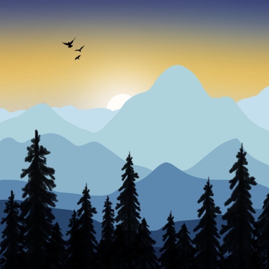
5. Landscape in Shades of Blue: Once your outline is done, I'm going to pick brush
from gouache bottle nose. Then going to create another
layer on top like this one. I already have a new layer,
so that is layer three. First layer is your
background color. Layer one is your
reference image, which we have made it.
We have hidden it. The second layer is your outline and now coming through
your layer three is our first mountain. How the layer works is any
object that is closer to the screen comes on
top of the layer. Rest every other
layer goes beneath. Now I'm going to
create first layer. I'm going to pick the color and I'm going to use the
darkest color here. I'm going to use the
darkest color and just outlining it and then increasing my brush
size to fill the mountain. Okay. Once this is
done, go to Leo. Now go to the layer three, grab the darkest color
and start painting. Simply fill this
one with colors. Once this is done, go to
layers, create one more layer, pull down the layer
beneath because we want this part to come
below this layer. Let's see how this
is going to work. We're going to grab
a slightly lighter blue and we are going to
color this on our layer four, mark your liner, then you can hide the first
layer to avoid confusion. You can either color
only this part, You can either color this part or you can color it completely. Let's do this completely. However, the above
layer will be hiding the previous layer
like this one. I hope this is clear and now
coming to another layer, let's put this layer back and we are going to select a
slightly lighter blue y Once this is done, we're going to move
to another layer, create one more layer. This will come beneath.
Every new layer which we are creating goes beneath layer
three and above layer two. That is your outline. We're going to pick a
much lighter blue now. Now let's go for the new layer. Increase the brush size and simply fill them
with the color. Since this is a huge space, you can increase the brush
size to the maximum. Be careful not to move outside the outline that we created. Now, let's create one more
layer beneath this layer. In this layer, what we're
going to do is we are creating much lighter blue, creating much lighter blue, and we are filling it up. This is a much lighter blue. Coming to another layer, create every new
layer beneath and choose the most lightest
color that is its layer. Now, you get to create
much lighter layer. Let's move on to next layer. I'm going to choose very light that is almost a white color. I'm going to color this part. Once this is done,
I'm going to create another layer just above
the one that I created, and I'm going to use
the same color blue, which I used here to give a little depth
to our mountains, and I'm going to hide the previous layer and I'm going to give the depth
only to this one. I'm going to pick the darkest color just
to give the depth. I'm going to choose
a much darker color. I'm also creating a little
interesting element here just by raising it a bit. Now I'm going to make the
previous layer visible. This is not quite contrasting
with the other layers. I'm going to slightly change
this color into this one. How you can change a color
is by long press on that and the current layer I'm
going to simply replace them. I'm going to create
a layer above and just fill it with a new color. You can use any
brush you want to. I'm using wash, bottleneck. You can use any
color or any brush. You can also make
shades of blue, shades of teal, shades of
orange or shades of green. Now I'm going to hide or
delete the previous layer. I'm going to hide the
outline that we created. This is a very simple
illustrations which we did to demonstrate
the perspectives, if you're standing from here, this part is going to look
much darker and the farthest, the farther the object is, it's going to look much lighter. Let's not dive deep
into the technicality. Here we are going to create
the simplest illustration. And this is one, let's go to the
second one. Yeah.
6. Landscape in Earthen Tones: Hello, we are back with
another illustration. Now we're going to create a very simple mountain
illustration. For the reference, I'm
going to just show you how it's going to look like. So some are going
to look like this, but not really the same, we are going to change its colors. In the first one, we saw
how to create a gouache, but we are much simpler we're creating this by
using much simpler brush. I'm going to just delete
and clear all the layers. In the layer one, I'm going to create a basic outline. Okay. To create a basic outline. And the brush, what
I'm using is monoline. I'm going to make the
brush percent one. And once this is done, I'm going to create a land. I'm going to create
a land. And then I'm going to add Mountains. So this is a flat land, and this is mountain. Another. A basic outline is done. You can outline
anyway you want to. Now I'm going to reduce the opacity of the
outline by 50%, close to 50%, and then
add one more layer. I have a very interesting
color palette. You can just follow along. I'm going to use this
color palette right here for the land or
you can just think, maybe I just consider it as a river or a lake or something. I'm going to use this
blue. Going to create. And I'm going to Go fill it. These tiny gaps right here. I'm going to fill
it with the brush. Okay. So once this is done, I'm going to include
one more layer, add a different color
for the mountains. Going to use this color. Go to first add an outline. Okay. So this is above
the river layer. I'm going to drag this
beneath the river layer. This will be layer three
and this will be layer two. I'm just drag and
drop the colors. I'm going to fill the gap. There's also a trick called
increasing the threshold. I'm going to show you how
that works in the next layer. Okay. So coming to another layer, I'm going to create this
layer beneath this one. And I'm going to pick a yellow. Okay. And now I'm just just sorry, use a much darker color at layer beneath and go to
going to pick dark green. And this is a continuation. I'm going to just continue. There's a threshold. You need to adjust
the threshold as per how much you want
it to be Fill it. Okay. Now I'm going to
create one more Leo beneath, then going to hose
a much lighter green and fill it this one. You can just choose however
you want to fill this with. Now continue filling and
adjust the threshold. I'm unable to do this because
I'm using my left hand to increase the threshold and somehow I'm not getting
the grip of it. Now let's move to our next
layer, create one more layer. This time, I'm going to
use a nice nature green. I think it's the same colour. Sorry. I'm going to
use another color. Another color. To use another
green Scurry outline. And fill this color. I'm going to use a much lighter
color for the background, and I'm going to fill it up and then create one
more layer on top. I'm going to make I'm going to choose a
much darker color. I'm going to make a nice silky fill it with the color, and I'm going to
slightly move so that it is hiding
behind the landscapes. So yeah. This is the most simplest way we
have created a design. And since there is no much
contrast in these two green, I'm going to slightly change
this green into um blue. Now, it creates a little depth. Okay. So I'll see you in
the next illustration. It's a much easier
and much simpler one.
7. Landscape with Sea: So for next one, I'm going to create
square canvas. I'm going to slightly
add it like this. I'm going to quickly
create an outline, or maybe the outline is
not really necessary. Okay. Okay. Now I'm going to merge them both. So I'm going to merge them both. Going to reduce the opacity
of the outline to 50%. Then I'm going to
create a layer. And here the layer will have the color orange with this one. Fill it. It's like two lands visible from the lake. So once this is done,
create one more leo on top and I'm going to
make it look green. I'm going to use
green on this one. I'm going to create
one more layer and I'm going to keep
this beneath both layers, and the color will
be deep blue. Sorry. I did not create a
boundary out there. Create Blue. I'm going to keep the
background as it is, but I'm going to add
one more layer of it. I'm going to create
one more layer and add a little friend I go to drag and
drop the colors. This is, again, the most easiest and a very quick illustration.
8. Project & Conclusion: So it was so much fun to
create class with you and we created the most minimalistic
landscape illustration. We made three, and I have
a small project for you. You can create your
illustrations of your own choice and
your own design, and please submit your project
in the project section. So this is the most
minimalistic way of understanding how the layer works and how to observe or how to create
reference and how to outline. This is the most
basic thing ever. So in coming lesson, we are going to
add more depth and texture to our um,
illustrations. So please, uh, continue to
learn illustrations with me. And I would love to
see your projects, and please do leave us a review. 1-4, and I hope it will be a four because I'm very sure
you're going to love this. And please do follow me on
Instagram tera dot patterns. The link is in my
profile section, and I would love
to see your work. And if you're on Instagram, please do post your
work there and please do tag me and I'm
going to show your work. And thank you so much
for staying with me, and I hope you learn something. I hope you really
enjoyed this class, and I'm going to
bring a lot for you with lots of surprising
elements for you on how to create more um textured
and more depth included illustrations
and how to create multiple illustrations
in one single canvas. How to sell your artwork, how to sell your artwork or how to create products
for your artwork. What are the possibility of products and what are some
of the training products you can create by infusing
your artwork into it? And I would also like to
show you how to create mockup for your products
using AI tools. The most favorite tool
I use for myself is hagibti newly they have
launched gemini as well. The Gemini Nanobanana
is killing it. I'm going to drink all
of these tools for you and I'm going to show you how to create products
using your artwork, how to print them, how to make
mockups for your products, and how to scale them on any
marketplace or your website. Okay. Thank you so
much for joining in, and I would love to
see your artwork. Once again, I'm
telling this because I'm very curious
to see your work. It doesn't matter
how it is perfect, imperfect, nothing matters, but I would love
to see your work. And please do tag me on Instagram if you are
sharing your work there. Uh, please to share in both the platforms like Instagram and the
project section, thank you so much for
staying with me and I'm going to bring you a
fun class in the next one. Thank you so much
and stay with me. And if you have not followed me, please do follow me
on skill change. And Supritha Shet signing off.
 Supritha Shet, Illustrator