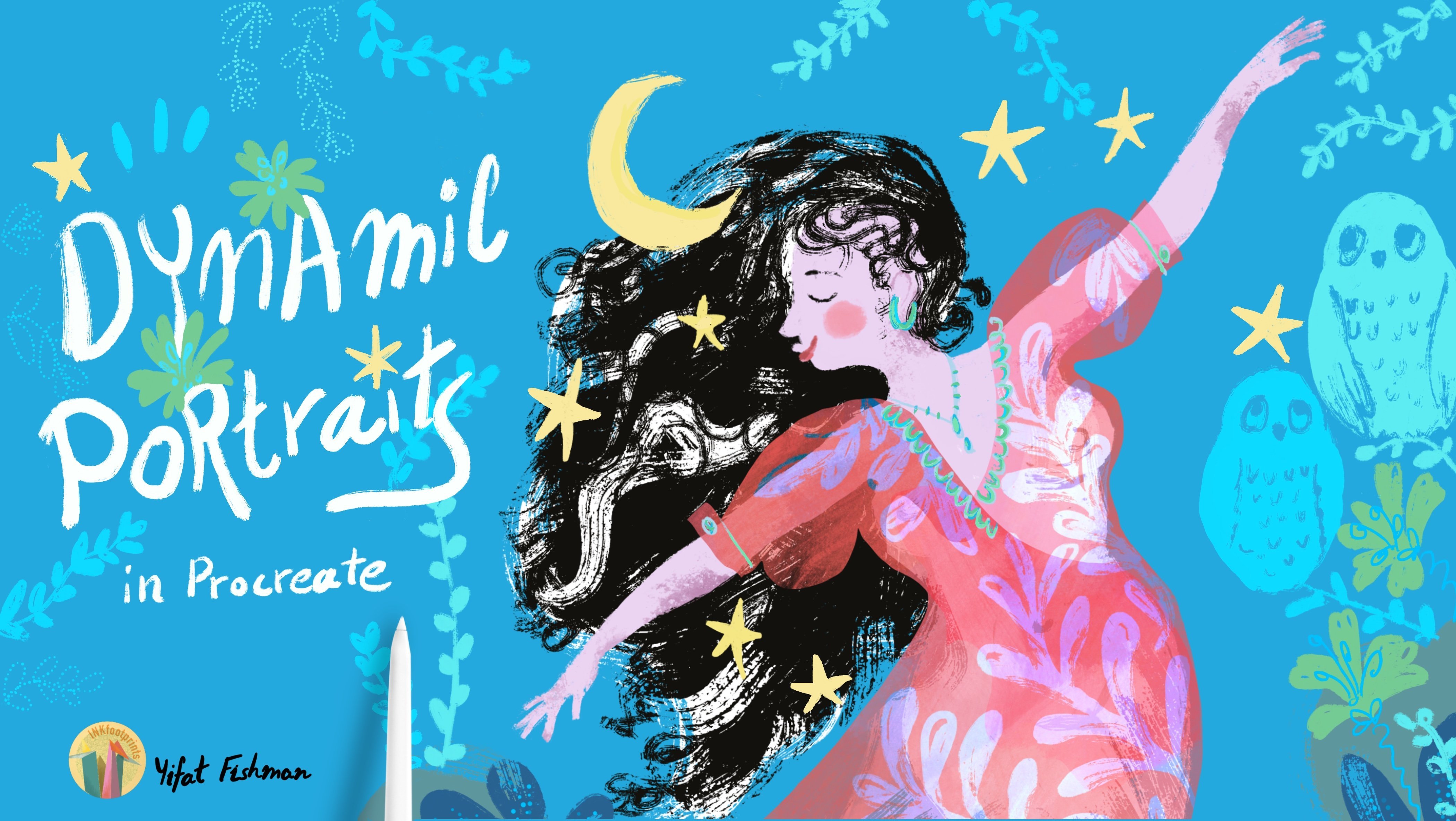
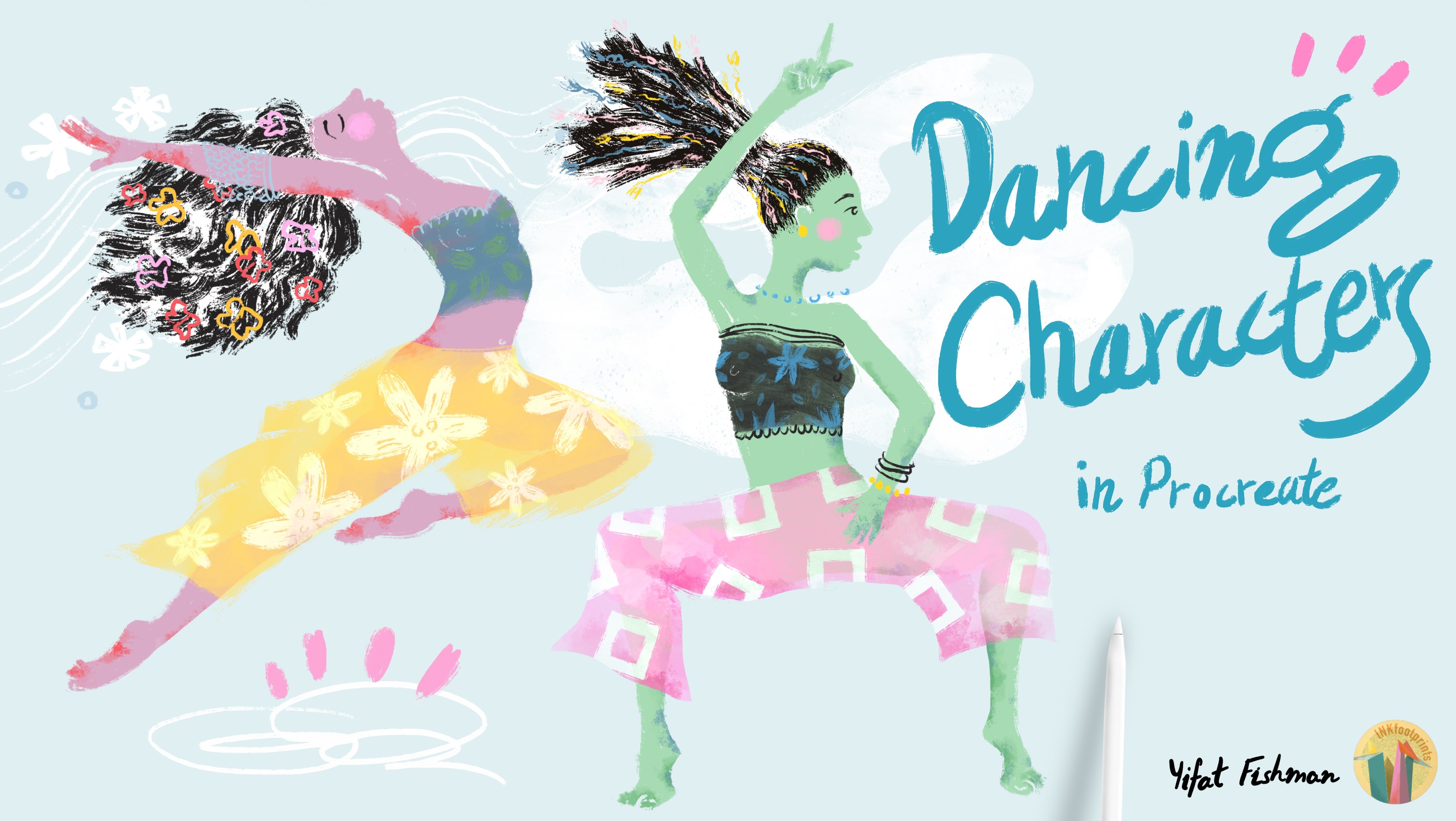
Transcripts
1. Class Introduction: Why do we like drawing people? People are complex, we're
fascinating creatures, we have fun hobbies and
meaningful relationships. I think that when you capture
a person in a portrait, you get to understand
yourself better. It's a self-exploration process. And that's what makes drawing
portraits so interesting. I am Yifat, I'm an artist and
illustrator based in North Texas, an
industrial designer by profession and a
self-taught illustrator. In this class, I'll show
you my creative process for illustrating colorful portraits
using the sketchbook, pencils, iPad and Procreate. On top of
designs for my store. I'm working on
professional portfolio for art directors and magazines. And I mostly draw women, maybe because I can relate
to female subjects better. I love drawing strong women
with positive body image, capturing their
mood and motion. In class, we'll dive into
portrait illustration, creating fun and expressive
personal artwork. We'll begin with brainstorming
ideas in the sketchbook, using simple pencil sketching to generate
imaginative concepts and compositions. Next, we'll refine the
sketch on the iPad in Procreate. You'll learn
how to choose your colors and illustrate with limited
palettes, layer textures, and show motion through
dynamic brushwork. Draw hair, fur and fabrics. And finally, add
meaningful fun details and personality
to your portrait. Throughout the class,
you'll discover the power of self-expression. Pervious knowledge of
Procreate is helpful, though you will learn
many essential techniques on the app in the
following lessons. Join me in class and
let's get started.
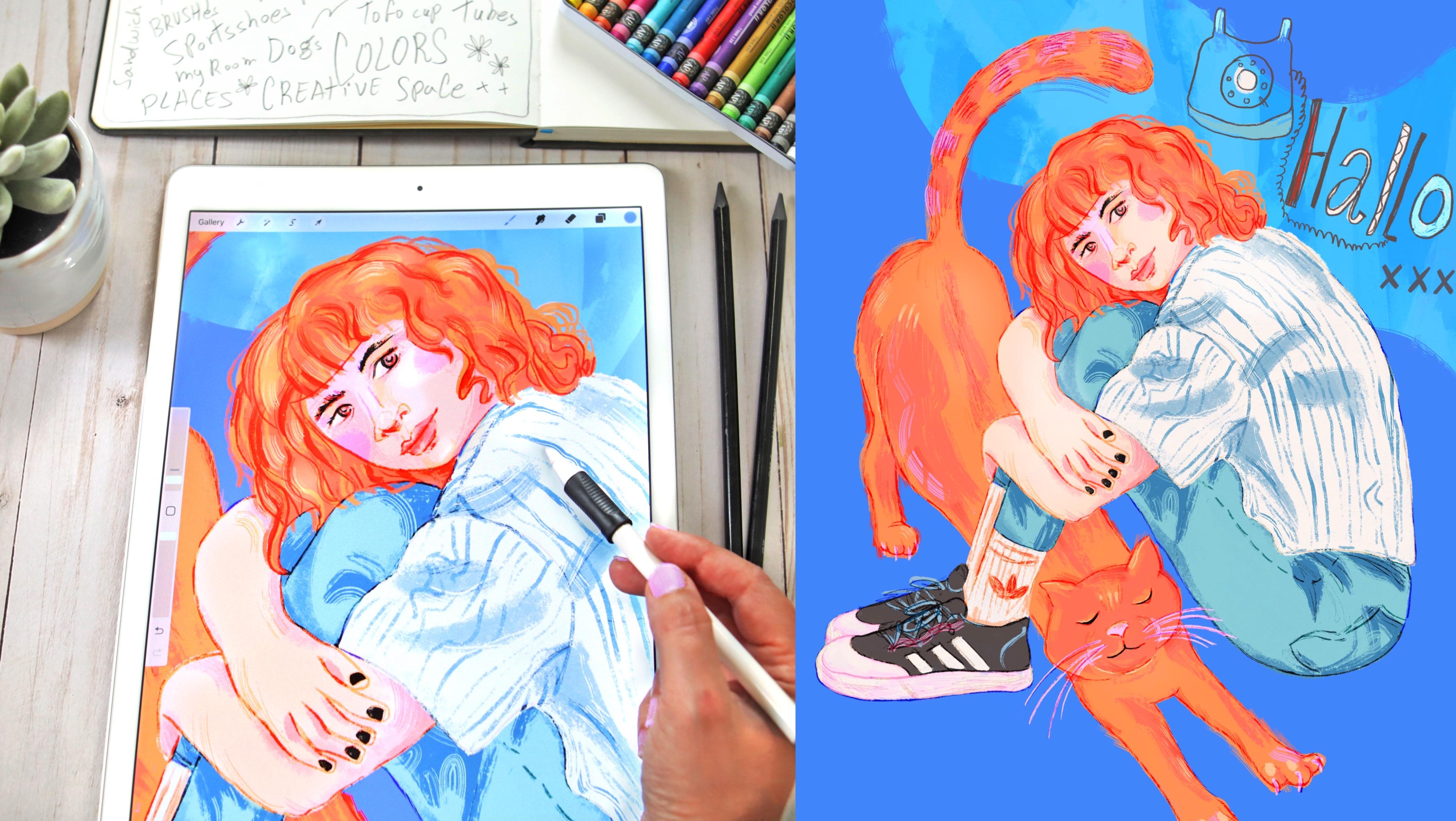
2. Materials & The Project: Welcome to class! Before we dive deep into
the illustration process, let me show you the art supplies that you'll need to go
through the class. I like using an H pencil and
some kind of a B pencil. The H or HB pencil is hard pencil that is not very helpful through
the art process. I call them dumb pencils
because they don't do a lot of shading or don't
help you much in your work. And that's important. And we'll talk more about this as we move
into our sketching. I also have a few
fancy graphite pencils that were a gift for my son. They're very cool.
Look great on video. Sometimes it's just fun to use fancy sketching
materials in your work. I think the type of
materials that we have sometimes inspire our work. So whatever gets
you going, use it. Well, the next thing that
you'll need is a sketchbook. I really like drawing in mine. It's like a process. You open your sketchbook, you get into the
zone, and you start working. So I have an intention of doing good work in
this sketchbook. It's kind of new and
I'll give you a tour of this one in the
following lessons. Last thing that you'll
need is the iPad and your pencil and
the procreate app. Some people don't have an iPad and Procreate and that's okay. You can use everything
that you learn here to draw with other digital apps. I had a student who used her wakom tablet and some kind
of app that came with it. And she did beautiful work. So you can use Photoshop, Fresco, which is a great app by the way. If you don't have Procreate to draw along with me in class. Now that we have
all our materials ready, up next we're going to write down creative ideas
to use in our project. I'll see you in the next lesson.
3. Finding Inspiration & Creative Ideas: How do we find creative
subjects to draw? The old masters used
to draw models. And oftentimes they put a mirror and they
painted themselves. It was much less expensive and the subject was always
available for them. For us, we have websites that list out
copyright-free photos, and this is what I'll
be using in class. All right, so now
let's brainstorm ideas that will help us create our composition and illustrate more in the background
of the scene towards the end of the session. I'm going to bring
in my sketchbook, open a fresh new page, and use my fancy pencil to
start outlining my page. So let's write down
creative prompts. We're going to fill
up the page and just flow with our ideas. Let's start with drinks. When I'm thinking of drinks, I'm thinking of coffee, tea, maybe cocktails, wine. How about fruits? Fruits are always fun to draw. I'm thinking of veggies, sandwiches. What about plants? House plants are always
a fun subject to draw. And I actually liked to draw
plants as tattoos on people. I'm thinking of a fashion
items like glasses and sunglasses, shoes, sneakers. Something else that is great
to work on is technology. Phones, screens, our tablets. They're all everyday items. And part of our creative world. And people, of course, people are the main reason
why we're here today. So people, that will be in
the center of my page. How about art? Pencils, colors. We can do brushes,
watercolors, paint tubes. And I'm also thinking
about places, my room, my desk. Buildings, architecture. That brings me to think of city views and streets and shops. I have a betta fish, so I'm thinking about fish. Up next, we'll bring
our reference photos on and sketch a few
composition ideas. I'll see you in the next lesson.
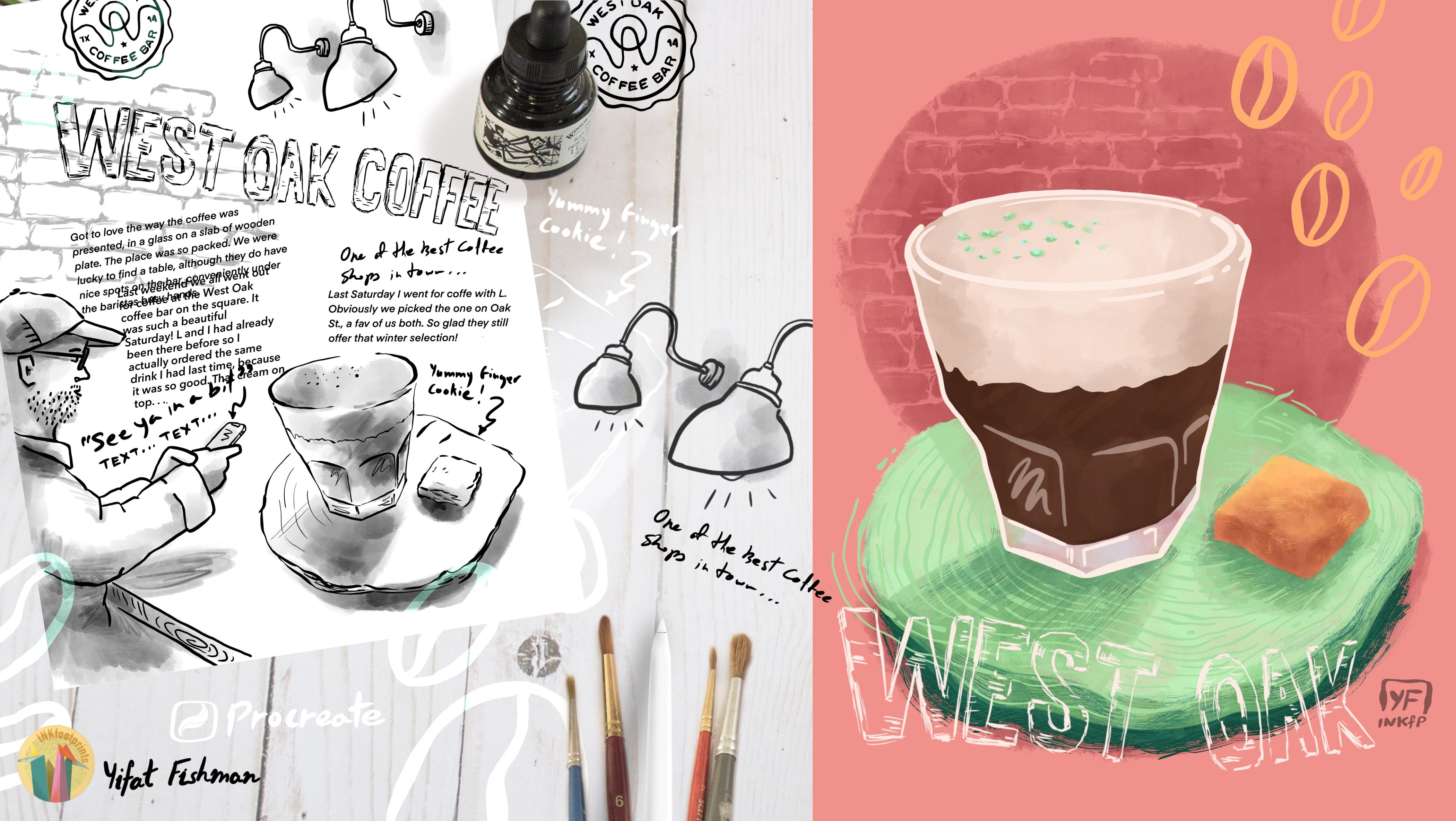
4. Sketchbook Tour: In this lesson, we'll start sketching composition ideas for our projects, then we'll be using the reference photos that
we've saved from our search. Before we start, let me give you a short sketchbook tour. Opening the sketchbook is kind of a ritual with this one because
it has this rubber band. I have to remove it and
open the sketchbook and get mentally ready
for the art process. It's a pretty new sketchbook. So I actually started
out by marking down my pencil collection and then moved on to sketching
a few postures. And these sketches mature
into complete illustrations. My sketchbook is also a
great place to explore different compositions
and ideas like this one, for instance, and here
I was trying out small thumbnails to explore the compositions for another
illustration that I drew. I'm really proud of this spread. I just sat down and sketched women following
reference photos. And eventually I paired up two females into a
complete illustration. And it was quite a
discovery process. That I really enjoyed. And
from this one actually developed further the tattooed
man at the front center. Alright, let's move on to our reference photos
and figure out which one you want to develop further
into your illustration. So these are the ones
that I downloaded. I really like this
lady with her cat. There was a whole story in
this photo that appeals to me. And so I went ahead and
downloaded a couple of cat photos with
two different poses. In this one, the cat is
stretching forward and there was something that was
pulling me into that photo. Here's other photos
that I've downloaded. I like the atmosphere
in this photo, the woman is very serene. It might be easier to sketch her because her eyes are closed
and this one is super fun. I really lovely enlarged boxing glove the way
her gaze is facing me. So this is a photo
that intrigues and pulls you in and
inspires a whole project. And lastly, this photo, what I like about
it is how she is compressed into the composition. So she's kind of folded
inside the page. I like the way her
hair is falling. I think I'm gonna
go with this one. Composition is really important. It's the way in which
all the elements work together to produce the overall
effect of your artwork. So let's explore a
few composition ideas before settling
to our sketching, we're going to start off with
drawing a small thumbnail. When you draw your thumbnails, you want to catch
the main idea and you don't really need to
get into too much details. So in the first one, we're
going to see how the image captures most of the space
that we have in the frame. Now let's try another one. In this second composition, I want to make room for the cat. So I position my portrait further up the page
to give more room for the cat and try to see
what kind of relationship I have between the human
form and the cat form. So in a way, I'm trying to
make room on the canvas for combining the idea of having a person and a
cat on the same page. Alright, now let's try a
different composition. So what if we give all
the attention to the cat? The cat will take most of
the space on the canvas. And then I can draw the
girl maybe behind the cat. So she's going to be smaller
and the cat is going to be very large on the canvas. Now these are the kind
of creative ideas that come up when you draw
in your sketchbook. Last thing that I want to
mention is the Rule Of Thirds. Draw a grid on your
composition and you want to position the head at the
upper third of your grid, preferably a little
bit to the right. So draw a few thumbnails
and come up with ideas. In the next lesson,
we'll start our sketch.
5. Starting Your Sketch: Let's start with
our initial sketch. And that will be a
sketch where we just explore the shape and try to understand how the body is
forming the shape on the page. We're going to draw
with very faint, gentle lines and explore
how the legs are folded, where the arms are positioned, the tilt of the head, and just getting the basic
idea of the portrait. And after we do this
initial sketch, then we're going to
move on and refine it with better detailed
sketch in the sketchbook. And after that, we'll move
everything to the iPad where we'll be refining
the sketch again. So remember that we have
several stages where you can correct your work and refine it and bring it to the next level. So when you're ready to draw
a more detailed sketch, I would recommend
using the dumbest, simplest pencil that you have. That would be a pencil
that won't help you a lot. It allows you to really explore because it draws very
gentle and faint lines. I'm using the H pencil
and comparing to the 3B or 6B pencil, it's not soft and gives
you pronounce dark lines, but rather very gentle lines, so that when you make a mistake, you just go ahead
and continue drawing until you find the right shape. You don't really
have to commit to any line until you're
absolutely happy with it. This is a great pencil
to start off with finding all the finer details
in the portrait sketch. With this more advanced
version of the sketch, I really want to
be more observant and really get all the details, like the shape of the pants, the way the arms are resting against her shins,
the tilt of her head. And I want to start
seeing some details in the face and constantly
looking in the reference photo and comparing it to the
sketch on the page where we try to convey all these
details with our pencil lines. When drawing the hand. Here's a neat trick that
I want to show you. It helps if you kinda frame
out the shape of the hand. So you would draw
the index finger and the small pinky and
the thumb, of course. And then the two middle fingers will naturally fall into place. Try that out and see
how that works for you. Now, something that I like about this specific portrait
is that she has this black nail polish and it really works well
with the dark sneakers. I want to make sure
that I capture her nails because this is something that I want to
bring into the final. All right, Let's get a
closer look at the face. The face is really
important because it communicates with the
viewer of your portrait. So you really want
to get that right. Also, it's really easy
to mess up a face, so we want to pay
extra attention. Now there are very
different approaches to drawing faces personally, I like to put a
lot of details in. I like to really draw all the little details in
the nose like the bridge, the nostrils, the
tip of the nose. So this is something that I'm trying to get into my sketch. You can decide to do it in a different way, like maybe just draw
the nostrils or just give an idea of where
the line of the nose is, two dots for the nostrils. You really don't need to get into all the details to draw a successful portrait. Here's something that I want to mention about drawing the eyes. I like for the gaze
to be a little bit off center, it creates
a more curious effect. Like we're wondering what
she is really thinking. When we draw the hair, we really want to look
at the direction. Is it a straighter? Do we have any curls? Those are the kind of lines that we're going to
show in our sketch. Personally, I really
like drawing shoes. So the design on the shoe
is important to me and I'll try to capture it
when I'm sketching. The cat is a really fun
element of this portrait. And I've decided that it will
be more interesting if it stretches out so that they're interacting, and he's
closer to the viewer. So the head is going to be larger than the
rest of his body. But most important to me is
the direction of his stretch. I really want to show
the body stretching all the way from the front
paws to the tail. And up next, we're
going to start placing our colors
in the digital form. So we're going to transfer all this beautiful
sketch work that we did to the iPad and
start placing colors.
6. Choosing Your Colors: So I think I took
the sketch as far as I can take it
on the sketchbook. Now it's a good time
to take a picture and move it on to
the next level, which is adding colors. You can snap a picture with
your camera or your phone. But I think the iPad is doing a decent job for what
we need to do next. All right, so let's
switch over to the iPad and I'm going
to set up my canvas. I wrote it down for
you so that you can copy my settings
if you like. They are very good for printing your
document afterwards. And now we want to
bring your photo onto your digital canvas. If you're following
me in procreate, press the wrench button
and choose Insert Photo, and then just adjust the
sketch so that it will fill up your canvas in the way that you want your
composition to look like. What I like to do next is clean up the sketch
a little bit. So we go over to Adjustments,
Hue and Saturation. And here you can up
the brightness and reduce the saturation so that the sketch will
look cleaner. For me I think it just less
distracting when the sketch is cleaner and
brighter on the canvas. What you want to do next
is add another layer and place your colors
on that layer. You can find inspiration for
color palettes anywhere, like if you scroll down
your Instagram feed and you see a work
that you like, that could be a
good starting point because you like the
colors. And there are also colored generators that you can use as your inspiration. I would suggest picking
up three main colors to start off your
illustration process. It's just an easier starting
point because you can always create variations
of these colors. So for now, what I'd like
you to do is just pick three colors that clicks
for you. That feels right. And you want to work with. The key to working
with colors is to experiment and be flexible. You can always adjust and change your colors throughout
your workflow. And right now we're still in
the ugly stage of the work. Nothing looks pretty or not sure where we're
going with this. So we just want to give
ourselves a place and the freedom to try out and see what works
and what doesn't. Placing three good
colors to start with is a great way to begin. So what we're going to do
now is create a Color Rough. Color Rough is the rough placement of colors in your illustration. And it's a great way to test if the colors work well
next to each other. When we're done with that, we're going to use
our color rough as the guideline to our
complete illustration. Alright, so the one thing
that I'm sure of is that hair color for the girl and the cat
should be orange. But what I want to
test out is how that color would work against
this cool pink background. And when I'm not sure
about my background color, I like to create a
dedicated layer for the background color and not setting it into my document yet. It's just kind of
a floating layer. This is where I'm going to drop all my color tryout to test if the background
is working for me. And since this background
layer is covering my sketch, I'm going to change the
blending mode so that it will be kind of transparent and show up my sketch lines. Time to introduce a new color. And this time I'm going
with white for the shirt. And I think it's a good
choice because it's a very neutral choice so I can place any color
on top of that. And this is one of the reasons I worked with that specific photo. It had a lot of textures
and not a lot of colors. So that gives me a
lot of flexibility. My second color is up next, and this is the blue, and I chose it for the
stripes on the shirt. So I'm going to adjust
the pressure on the brush when I'm painting
down my stripes. And that creates
interesting lines. Now this is still
the ugly stage. This is still the testing
of the rough colors. So this is a good place for you to test out your painting, and your ideas for how you want
your final work to look like. For shading the folding of
the fabric on the shirt, I want to use the same color. I don't want to introduce
another color yet, so I want to test out if
this blue can work for that purpose by adjusting
the opacity of the brush. Let's create a variation
of the blue for the pants. I don't want it to be a
very different color. I want to be in the same
color family so we can fine tune the shade of blue
so it's different, but it's still within
the same color family. Now placing all these
colors on the canvas, the bright background doesn't click, doesn't feel
quite right for me. So I'm going to try to adjust it and maybe use the pink that I chose initially to try
out the girl's skin color. Let's see if that works. I think this pink is just
too artificial, too sweet. I like to work with
natural skin tones. So I'm going to adjust the
color and it's actually works, I think because it's
closer to the orange. And now that I changed
the skin tone, Let's see if my original choice for the
background color works. And I still don't
like what I see. So let's try a different color
scheme for the background. Let's be brave. I like this background
color for now. So let's move on and we need
another tone for the hair because we need to
create two shades to add volume to the
hair and the fur. So I'm going to pick the
orange on the cat and adjusted so that I'll have
variation of that color. So let's test it out
and see how that works. Yeah, I really lik the
two tones of orange. I think they work well
together on the cat. So let's try it out on the hair, just adjusting the brush so
that it will paint smaller. And I can try see how different shades of
orange work together. I like it. I think I'm going to
keep this combination. Okay, let's move on. The shoes are going to
be the darkest color in this illustration because in the photo they're basically blank, this creates a contrast. Any dark color that
I introduced is going to make all the
lighter colors look lighter. So it's a good idea to
test out your black color. And black doesn't actually
needs to be a total black. It could be just a dark brown
or dark blue or dark green, depending on what
goes on your canvas. And this dark color that we pick for the sneakers
is going to be the same color that I'll use for the lines when drawing
the details of the face. So let's try out what the eyes are going to look like in that dark color. And you can immediately see
how the dark works with the light skin tone and decide if this is
working or not working. I also really like
to get a sense if I like my colors
so far at this stage. So I want to explore and try
to draw a little bit more, messing up with the face and
the details on the shoes is something that we like
doing, we like drawing. Okay. Now I feel that all the basic colors that I picked for the
illustration work. And what doesn't click
for me is the background. Since I picked the bright orange for the hair and the fur, they really stand out. I think what will complement
that color choice would be a very cool blue rather
than a muted background. So I'm going to choose
the value settings for the colors and really fine
tune the background color. I love this color combination. I think it's vibrant,
It's lively. Yeah, I'm going to stick
with it and let's move on. I'll see you in the next lesson.
7. Refining The Sketch: I set up my background color to the color that I've picked
in the previous lesson. And so now I can go ahead and
delete that floating layer. I'll hide my color rough layer as well because I
don't need it. For now what I wanna do is refine the sketch on the
iPad. When sketching, following your paper sketch, Ii's a good idea to
lower the opacity of your paper sketch layer so that it won't interfere with
your digital sketching. And then I'd recommend bringing in your reference photo as well so that you can reference it when you refine your lines. It's a good idea to
name your layers as you work so that you won't get confused with what kind of layer you're working
on at the moment. What do you want to do in
this stage is really give an extra attention to
all the fine details. The hand, for instance,
is really important. I'm taking the time to find the right lines and
stylize it a little bit. And really take a closer look at my reference photo to make sure that I'm
doing a good job. And remember this
is a digital form, so it's super easy
to just erase and redo until you are absolutely
happy with your line work. The way that I like to style a face is to be kind of closer to reality. I'm not really drawing a very
simplified type of face. I really want to get
all the little details of the nose and the eyes. I'll do the simplifyed version when I move into the colors. So my line work is
really fundamental. I want to get a
lot of details in. You can do the same
or you can create your own version
of drawing a face. For me, what works is
to look at the image. In this case, it's the reference photo, and try to draw my best version of it. Now the fun thing
about working with digital tools is it just
easy to adjust everything. So if something is too
small or off center, you can always select it
and use your tools to move it around until
you are absolutely happy with what you got. I think this is a
really fun part of the illustration process, since I already know
what my colors are, I put this away and now
I can focus on really starting and refining
the final work. And the line work is really fundamental part of how
I create my illustrations. I usually like to layer them. So whatever I create here is going to show in the
final work, right? So we want to really
take the time to create the right shapes and the right
textures with the pencils. Because we're just going
to build on that later on when we add our
layered colors. This is also a great opportunity
to style your shapes. For instance, my original pencil lines for the shirt where very
straight and boring. In this stage of
drawing in Procreate, I can always redo them and draw lines that are
much more interesting. So the overall shape of the shirt is going to be
more pleasing to the eye. Here's a cool trick,
if you want to see if the elements are
aligned right, all you have to do is
draw a line and see where they are relatively
to one another. So the legs came out too long. And actually I made the same
mistake in the sketchbook, but here it's just super
easy to correct it. I can just pick up the part
that I want to move or stretch out and adjust
it so everything sits just write in my final work. Okay, let's move on to the cat. It's a good idea to have
your reference ready. I'm reassessing my original
paper sketch and what I think is that the cat is too
close to the girl's legs. I'm just going to
go and readjust my original sketch so that I can then create my refined digital
sketch based on that one. Eyes in an illustration are super-important
because we're kind of geared towards focusing
on eyes and looks. So having the cat
and the woman with open eyes looking in different directions
is really confusing. I want to draw the focus to
the girl rather than the cat. So we think it's a good idea to draw the cat with
his eyes closed. So that we'll have the girl's
eyes front and center. Then they'll take most
of the attention. I want to go back to the changes that I made
in the original sketch. And now when you look at
the cat's head compared to the space that was left for it in-between
the girl's legs, you can see that there
is enough room for the ears and some mention
of the cat's body. Alright, I'm pretty happy
with what I have so far. So up next, I think
we're ready to start adding the real
colors to our line work. I'll see you in the next lesson.
8. Color Blocking: The next step would be to
start blocking in the colors. I'm going to work
with the major colors that are designated
for different shapes in the illustration and later on, add layers of textures and shading to this
fundamental work. But first, I want to set up the blending mode
for the sketch. Choosing color burn will allow the colors in the
layers underneath the sketch layer to
show through the lines so that they will interact
throughout the illustration. The next step would be
to bringing the color rough and sample colors
directly from that layer. Alright, so I'm
going to start with the body and I'm sampling the skin color and
making sure that I'm bringing a fresh new layer
to paint in the skin. I'm going to use
the Oberon brush. It's one of my favorites lately. I just really like
Its grainy texture. Key things to
remember when you're blocking in your colors. You want to pay attention to how the colors interact
with your lines because your line
work is going to be showing through your
color blocking. So take the time to
erase and finetune your color blocks so that you'll see some of the
lines showing through them. If I want my line to be orange because it
interacts with the skin, I'll make sure that I color over the lines when I'm
blocking in the arms. Sometimes you need to scale
down your brush in order to draw over your line work and then block in the
rest of the colors. Really pay attention to
your shapes at this point, because later on
we're gonna build layers of texture
is all over them. The body is one layer as
far as I'm concerned, the arms and the face, for this illustration I'll
put them in one layer. You can separate them. You can create one
layer for the arms, another layer for the face. The important part is just to keep the same skin
color for both. Something that I
wanted to mention is the texture of the brush. I love how it interacts
with the line work and creates these little fine
texture added to the lines. And so when I paint, I make sure that I paint some over the lines but not
covering everything. Later on when we add colors
to the pants and the cat, the lines are going to take a different colors because we're using the blending mode
for the sketch layer, the Color Burn is going to
bring in all the color from the shapes that we're
painting under the line work. So it's interesting
to see how lines that are contouring different shapes like the pants and
the hands can take some color from the pants in
some color from the hands. Let's add a new color, and this one is for the pants. So we'll create a
dedicated layer and remember to name it. Placing the layer
under the body layer it makes sense
to me because it gives me the freedom to
draw under the arms. I don't have to be careful about covering on my work so far because I'm working
on a separate layer. So basically the
process of blocking in your colors goes like this. We add a new layer for each
color and name the layer. And then we block in the colors, making sure that we paint
over the lines that we want to have colored with the color we are
using for that layer. That's basically it. Rinse and repeat and do it
over and over again. For the cat, it
made sense to me to paint in two colors
on the same layer. I just makes things
more simple that way. I want the cat to be on
one layer basically. So it means that if
I want to bring in the lighter orange or
the darker orange, I don't need to bounce
between two layers. I want it to be more
of an organic process. Actually, when I'm blocking
in the colors for the cat, I'm already starting to paint in the shading because I know the cat is going to
have these two colors. I'm not gonna do
this for the hair, for the girl though, because that's going to be
a bit more complex. So the hair for the girl is on a separate layer and that one goes over the layer
for the body. I'm going to add
details to the hair and volume and shading and
all the fun stuff later. Okay, I'm going to
let the music play now and I'll talk
to you in a bit. Last thing that I
want to talk about in this lesson is about
adjusting your colors. I've already placed the
color for the shoes but when I'm painting in all
the actual real colors, it seems kind of off to me. So this is the time
where I'm going to revisit the colors that I've placed in the Color Rough
and finetune it and tweak them until
they feel just right. Now, how do you know
if a color works? Yeah, there is a whole
process behind that. There is color theory,
but basically, I would suggest go with
your guts and see what feels right and what
clicks and go with that. All right, up next we're
going to add more layers with textures and shading and all the fun stuff. I'll see
you in the next lesson.
9. Tips for Layering Textures: Now we're going to bring all
this into life with textures and movement that
we'll create with our brush strokes.
So let's begin. Let's go ahead and sample the colors that I've
planned out for the shirt. Next, I want to
add a layer above my shirt layer and set it
up as a clipping mask. I want to start with
adding some shading to the shirt and
then I'll draw in the stripes. For shading I'm going to reduce the
opacity of my brush to about 80% so that it will
be a bit transparent. That will give me a
rendering of the same color. So you want to be painting
loosely at this stage, it's not an exact
scientific approach. Wherever you see shading, you want to add a
patch of color and check if this seems
to be working. Now I want to open
up my shading. And so I'm going to do
this using the eraser and setting it up to a fun
brush that I really like. And we're going to
talk more about this brush a bit later. But for now, I want you to
remember that the eraser is pretty much a brush.
In a digital form the eraser takes away texture, and so we can set it
up to any brush that we like, to produce the
effect that we want to get. For drawing the
stripes on the shirt, I want to make sure that I have no opacity at all
set up for the brush. And I want to scale
it down so that I'll be able to draw
narrow stripes. Stripes are much more interesting
when they are diverse. Adjusting the
pressure on the brush will give us lines the change. Sometimes they are
thinner, sometimes there are heavier and sometimes they don't give us a
lot of color at all. So that creates a very
interesting effect. I'm also trying to mimic
the rhythm on the fabric, the way the fabric folds, just making my lines warp a little bit and move
around the fabric. So it's really a
very playful effect. You may also want to
pay attention to, seems to where elements
of the fabrics are sewn together over the
shoulder we have a line and the side of
the shirt has a line. So these are all little details that helps give
dimension to the shirt. Up next, we're going to do
similar things to what we did for the stripes on
the shirt but with the hair. So we'll add another layer
above our hair layer, sample the lighter orange, and start painting in
lighter strands of hair. And then the same way as
we did for the shirt, we can use the eraser to
open up patches of color. So it's a very playful process. I draw some and I erase some. And eventually there is
some kind of balance between the painted
part and the erased part. Also following the
reference photo really helps when we draw hair, following all the light
strands of hair that I see. If I see curls or wavy
hair or a hairstyle, I'll try to mimic that
with my brushstrokes and eventually the hair that
is painted on my canvas, we look pretty lively and bouncy in a similar
way to the photo. Another thing to remember
when you're painting hair is to vary
your brushstrokes. You want to make sure that sometimes you're using
a heavy brush and sometimes you set up the
brush to draw thinner lines. And that pretty much
mimic the way we see light falling on the hair. Although you know,
in your mind that the hair is made out
of thin strands, when we paint, we want to create an overall effect of hair
flowing and bouncing. We don't want to paint in
every strand of hair just to create the effect of what hair would look
like when it's painted. One last thing that I
want to mention about painting in the hair
is that I didn't set up this layer as a clipping mask because
I want the freedom to draw beyond the
original hair block that I drew in
the previous lesson. So I want to be able to draw a bit frizzy hair and
hair that is falling on her forehead or slightly going beyond the
knee and the shirt. So that again creates
a very playful effect. And this is really what I
like about drawing hair. Here's a tip, a long press
on the color swatch will switch between the two colors
that you've recently used. So it's really
helpful to bounce between the darker orange and
the lighter orange. I want to switch a brush
and move over to the cat. I really like the Blackburn
brush in a way it seems very much like painting
with a thick real brush. So if you press heavily
on your stylus, you'll get a stain and
then when you release it, it will give you a
thinner, finer line, but you'll still see the hairs of the brush as if it
were a slightly dry. It really helps when I
want to bring in textures. And for the cat, I think
it's really working to mimic the fur with the added
bonus of shading. It really helps to work
with a clipping mask because I can freely add
shades wherever I feel like without being
concerned about deleting any brush strokes that go
beyond the cat's body. And remember to use the eraser to open
up patches of colors and add the effect of fur
with the erased lines. In another lesson,
we're going to bring in more details
into the hair and fur, but for now, we are creating a very good foundation
for our next step. I really like the effect of the Blackburn brush on the cat. So I'm going to use it
again for the pants. Because the pants are
jeans and jeans is a pretty rugged
and rough fabric, I think this brush fits the effect that I'm trying
to create on the fabric. What I like about this brush is
when I'm pressing on it, it gives me these abstract stains on looking at
the reference photo, noticing where there's gonna be more shades or fabric that is folding because the girl
is folding her own body. So that's where my darker
shades are going to fall. Now let's pick up
the eraser again and open up these
shading a bit. Alright, let's add a
bit more soft shades and finish up the pants
with the Oberon brush. We want to make sure that
when we do the shading, we create soft shades
so that they won't contrast with the textures
that we created on the pants. The socks are going to be
pretty simple because we already have the foundation
in the sketch layer. So what I'm gonna do now is
repeat the stripes pattern. But try to make it interesting. You want to bring in
the shading and the texture of the
fabric as you paint. So make sure to pay attention to the area where the
socks meet the shoes. This is where we're
going to have shading. We're going to have some
shading between the legs. And of course we have
the striped fabric in this case with
these sports socks. I think I did a pretty decent
job in the sketch stage. So what I want to do now is
emphasize it with a paint. And since the layers
are in blending mode, my paint layer interacts
with a sketch layer, and that brings in
the darker shades of orange for the fabric. And once again, I
want to remind you to use your reference photo to help you out with getting all the fun details
in your illustration. One last thing that I want
to do here and show you a new technique, is to go back to the sketch layer
and erase some. Because sometimes the lines
are just too fine and too nice, and maybe they're coming up too dark in the
final illustration. So going back to
the sketch layer and erasing some
of that will help the layers interact better and create interesting textures
in your illustration work. So go ahead and
create your magic and meet me in the next lesson, where we'll work on our skin tones and layer
down some fun textures.
10. Shading Skin Tones: For shading the skin, Let's pick the soft
brush, in this case, going back again to
the Oberon and setup a new layer as a clipping
mask over the body layer. Now I picked pink for shading the body because I have a
lot of orange going on. Orange would've
been a good color or light brown for shading because my base color for the skin is a very light orange, but I kinda like the pink, so that's the reason
why I chose it. The important part is to pick a darker color for your shading. So let's give it a try. It seems to be
painting too dark, so I'm going to scale down the opacity to get
a lighter tone and maybe scale up my brush so that I'll have
broader brush strokes. Yeah, that seems to be working. Okay. Now I want to
explain a few principles. When looking at a face, think about it as
an abstract shape. The places that are higher in our face like the cheekbones, the bridge of the nose, very center of the
chin, and the forehead. Will get the most light. Those parts are going
to be the parts that will paint with a
lighter shades of color. In the same way, think about
the arm as the cylinder. So the parts that
are at the sides will have shades on them. And the part that is in the center of the cylinder
will be mostly lit. The same goes for the fingers. And that's why we will
paint shades between the fingers and the top will get the lighter shades of
colors that we use. Alright, now that we
have all these shading, I want to add some
interesting textures. And this rake brush is a really fun brush that
recently I've been using a lot. So let's try to add some
interesting textures with it. Alright guys, I had
to go ahead and find out how to pronounce
this brush's name, and why is it called that way? So it's pronounced thylacine, since Procreate is an
Australian company, they named it after an extinct Australian
carnivorous marsupial. Interesting facts, right? Thylacine, now we know
how to pronounce it. So let's use the
thylacine brush to bringing some more textures
into the skin and the face. And the reason I'm doing it is because I want to
make the illustration more interesting and the
textures more playful. Creating textures in this way makes everything come alive in, adds a lot of movement
to the illustration. So even if the pose and the
character is not moving, I can still add movement with the lines that are
used to illustrate it. Up next, we'll draw all
the details of the face and add personality and
character to our portrait.
11. Adding Expression & Personality: In this lesson, we'll get into the fine details of
facial expressions. We'll build on
what we've created so far and get
some darker lines. So I picked the Blackburn brush because it's more
precise than the Oberon. I want to make the
eyebrows darker but still retain the red lines. And the red lines are the result of the interaction
between the layers. So when I draw in
the black lines, I want to make sure that
some of the red lines still show underneath. In the eyebrows we may want to draw
in more detailed hair and go over the eye lines
and refine them, make sure that we have
really nice shapes. I like to draw in a little
bit of the eyelashes as well, just because I think it makes the portrait look prettier. It really helps to
bring the eyes to life when we add in a lighter color. I am going to use the
same white that I use for my shirt to draw in the
whites of the eyes. Adding the white creates
a contrast between the darker lines and
bring everything to life. Next, I want to refine the
details in the sketch. So using the red will be less contrast then
using the black. And it's also a way of not adding a new color
to the illustration because I'm using what
I already have to create that contrast
between the dark, the medium and the very,
very light colors. Next, let's scale up the brush
and add more definition to the lips. With very light
touches of the Oberon brush, add definition to the lips,
texture and shading. When you do that to the lips in the portrait that
you're drawing, I'd suggest try out
this technique a few times until
you get it right. You can always go back
and redo your work. Now I want to add just a little bit more color to the lips. But when I go over
the sketch lines, I get this strong red
line that I don't like. So like we did before
with the socks, I'm going to go over to
the sketch layer and erase that line and then adjust the lips just
to the right shape. This is all a very gentle work
with attention to details. But eventually when we do that, we get really nice
lips for the portrait. And getting the
lips just right is an essential part of the
expression of your portrait. Next thing that I
feel like doing is adding more shading and
definition to the nose. So when I work with a
new color, I like it. I really think that the orange
is working in this case. So let's add a bit
of definition using this orange to the chin and get some more color
over the eyes as well. So whenever you introduce a
new color, make sure that it's a slight variation of what you already have
in your portrait. And you can check it out in a few places and
see if it works. Now the rest of the face seem
to be too pale and bland. So I want to add some
more shading there with this orange that
I've already used. Next, let's add
some highlights to the bridge of the nose
and the forehead. And the fun thing to notice is how the sketch lines interact with every new color that is
introduced to the portrait. These are all
complexities that are being added gradually
throughout the work. So I'm just mentioning it because I love this
part of the process, discovering how I'm
getting new colors very, very gently as the
work progresses. Last thing that I want to do
is add the fun detail of nails. I want to add the
black nail polish. Then I want to clean
them up a little bit to create crisp edges. Up next we'll add definition and shading to the
hair and the fur. I'll see you in the next lesson.
12. Drawing Detailed Hair & Fur: I want to make few
final touches to the face before moving
on to the hair, I'm adding darker
shades of red under the nose to create a
more pronounced shape. And I want to mention
that once again, I'm using the red because
if I use the black, the shadows will
be much too dark. Next, I want to add some
beauty marks to the face. I feel that the face is
just to bland without them. So I think these two purple blushes really help
the face come to life. And now let's move on
to the hair layer. And I'm picking the
thylacine as my main brush. The darkest color for
the hair is gonna be the red that I'm
sampling from the lines. And the two other colors are going to be the two
shades of orange. These are the colors that I'll
use for painting the hair. And for your portrait. Of course, you're going
to be bouncing between the colors that you've
picked for your palette. So when I want to introduce
the darker shades, I will use the red. The base layer is going
to be the dark orange and the highlights are gonna be drawn with a lighter orange. Basically, what I'm doing is I'm using the thylacine brush to soften my sketch lines. I'm keeping them as
my darkest lines. But I'm softening them with the brush that gives
me these thin stripes. I like this brush because it's more graphic and less painterly, but I'm using it in
a painterly way. And so following
the direction of the hair that is already
established on the canvas, I'm just adding more lines and more texture
with this brush. It's a good idea
to bounce between brushes and switch because it just creates more diverse
brushstrokes on your canvas. Once I've worked with one brush, I'll bounce to another one
and add more brushstrokes. I'm keeping the same color for now. But I'm going to
switch it around throughout painting the hair. So when I paint, I want to add shading with Blackburn brush, but I don't want my brush
strokes to show too much. Sometimes I'll just draw and
go back and undo what I did and correct myself a lot until I just get
the right effect. So it's a trial and error. It's a process, flow with it and see what works and what
doesn't for your portrait. Something that I want to
mention is when working with Blackburn brush that it is highly sensitive to your
pressure on the stylus. Make sure you
diverse your pressure so that the hair that we draw start off thick and then end up thin at the edges. It just looks nicer
when we draw hair. Alright, let's move on to the cat and take a
few moments to assess the work and see where
more needs to be added. I always like to revisit
parts that I did and correct and then build on the work that I've
previously done. So let's see what I
want to add more here. I really like the way the
cat's body is stretching. And I want to emphasize
that with my brush strokes. So for that, I think the thylacine brush is
going to do wonderful job, not only to drawing the fur, but also to show the direction
of the cats movement. So starting up by randomly
touching up on places that I've already
drawn before helps me reconnect with the subject. This is how I get a
sense of where I want to add more visible
brushstrokes. I'm going to deepen
the shadows and tweak a little bit things
that I've done before. And then I feel like, hey, I need to add more
here and there. And I feel that I'm
connecting more to the cat's movement and I have a better sense of where
to go from there. Getting a few brushstrokes outside the cat's
body really feels like the blur that we get
when an object moves fast. And I really like it.
It shows the fur, but it also shows the direction in which
the cat is moving. I'm going to build on that and
do some more brushstrokes in that way. It may really be tempting to draw the fine hairs
on the cats fur, with the thylacine brush. I would advise you
not to do that because I think it just looks
too much like digital work. I like to create
the effect of warm, painterly brushwork that has the sophistication of working
with digital brushes, but connects with
traditional mediums as well. I think it's more
interesting to create the effect of fur
without actually painting in every hair line. So again, it's a fine balance with the tools that
are available to you digitally and stylistic choices that you make as an artist. I'll see you in the next lesson.
13. Styling Sneakers: In this lesson, I want to
finish the sneakers and do the final touches
for the portrait before I'm ready to move on to draw more
in the background, add personality and meaning
to the entire scene. So let's begin. Let's
add a layer below the layer of the shoes
so that I can paint it. But it immediately tries to be a clipping mask because the layer under it
is a clipping mask. So I'm just going to go
ahead and uncheck that. I've picked a light purple for the white part of the shoes just because I think it's more
interesting than white. And I can always bring in
the white as the highlight. I think the purple is much more vibrant as a color
than the white. And also the interaction with the line work gives
me purple lines. I initially picked
the blackburn, but I don't like the texture. So let's switch to the Oberon, which will give us
the softer textures. And it's also more consistent
with what I did so far because I drew the main parts of the character
using the operon. So I want to keep that texture going throughout
the illustration. Here we can see the reason for using two separate
layers for the shoe. It just much more easy to determine where the
black part of the shoe is and where the white
part of the shoe is when we keep them
in separate layers. The thing that I'm
trying to work here is get just the finer details
of how the lines look. Because where the black
is covering the lines, I get dark lines. Wherever the light
purple covers the lines, we get the purple lines. So I want the lines to change between the black
and the purple. I think it's really important
to take the time and really fine tune your illustration and create a very nice finish before moving on. We can go ahead and merge down
these two layers. Let's add another
layer on top of the shoes and set it up
as a clipping mask. And this is going to be our
texture layer for the shoes. I want to pick up the thylacine again and create highlights. So the white from the socks looks more orange than the
white on the shirt, that looks very crisp and cool, but essentially they're
the same color. The only reason it looks
different is because the added texture is cool on the shirt and very
warm on the socks. I want the highlights at the top of the
shoe to be softer. So I'm switching to my
soft brush and working there. For adding the details
of the brand of the shoes, Let's switch to a
more precise brush. I like the texture of
the Blackburn for that. So when you paint in
detail like that, you can create exact rectangles or very well-defined
geometrical shapes. But it's much more
interesting to keep it painterly and free
and imperfect. I think the overall effect is warm and much
more interesting. The next thing that I
want to do is bring in some more highlights
to the shoes. Just going to try a few
things and see what works, what clicks and
what feels right. I think it's fun to
introduce a new color. Let's go with a pink
and see if it works. I like the pink, but the
texture is kind of off. So let's try to switch brushes, and let's work with a new brush and create an interesting
shape with it. This brush feels good. I like this direction. Let's try a few things and see what clicks. This is working, I like it. Alright, Let's move on. The next thing that I like to
do is paint the shoe laces. Let's try a few colors and
see which one works best. So the shoelaces could be black or white in
the original photo, but I think it's much more
interesting to introduce some color over the black shoes. It just brings it to life and makes everything more vibrant and fun. Let's merge down the layers of the shoes because I like
what I have so far and I want to draw over the shoes. Before my texture
layer for the shoes was setup as a clipping mask
so it wouldn't allow me to paint on the shoe
laces over the shoes. I could add a new layer
just for this detail, but that's just gonna be
very small and confusing. So it makes more sense to merge everything down and
keep on drawing. Let's take a few
moments to assess the work and see if we need
to make some final changes. I like what I did in the shoes. So I think it'll be a good idea to do something
similar for the cat. Let's try a few ways and
see which one clicks. This light purple really
brings the cat to life. So let's add a few more
highlights in this color. Last thing that I want to do
is finish up the cat's face. Up next we'll finish up
the project, adding personality and designing the
background for the project. I'll see you in the next lesson.
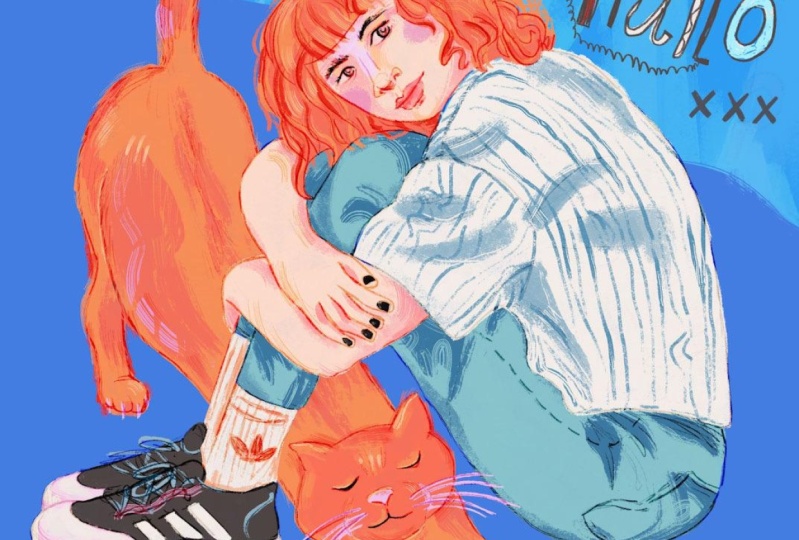
14. Designing Your Illustrated Scene: In this final lesson, we'll add individuality and character to the portrait using
meaningful objects and hand lettering.
So let's begin. Referring back to
the creative prompts is super helpful for coming up with fresh ideas to add to your
Illustrated scene. I want to begin by adding more interest to
the background. So let's add a new
layer and place it below everything that
we've drawn so far. And up next I want to show
you a fun new technique. We're going to use
the Select tool in a Freehand mode, and
draw a fun shape. Make sure you
close the shape, so that area will be selected. Next, let's pick up
our brush and set it up to draw
big brush strokes. And let's begin by picking up
a few colors directly from the canvas and placing them freely within the shape
that we've just created. Play with this technique, switch between brushes and
pick up different colors. The only thing that
I would suggest for this illustration is to
stick to the same palette. So I'm only working with different shades of light blues
so that this element will be set in the background
and won't take too much attention from the main subject,
which is the portrait. I'm going to use a new tool, which is the Smudge tool. You can set it up for
the Oberon if you like. And I'm using it to add texture and open up the shape
that I've just created. This is a really
fun tool to use. It's really helpful
when you want to blend in elements in
your illustration, but it's also great
for just adding some playfulness and texture
to your illustration. The only caution
that I would advise using it is not to overdo it, play with it for awhile and
see how it works for you. If the new element that we've introduced to our canvas
takes too much attention. We can tweak its colors and make sure it works better with
blending in the background. In this case, I'm changing
the blending mode for this layer and
I'm also lowering the opacity so that this
layer will blend more into the background and take less
attention from the portrait. Now I'm going to do
some free drawing using the six B pencil. I've already checked
my creative prompts and I have a few ideas of
what I want to do next. I'm going to combine the
word tech, the word phone, and create something
from my own world, from my memory, which
is an old dial phone. And that way I'm telling a story through
the illustration, maybe setting up the
stage for saying that this character is old-fashioned
or loves retro objects. Maybe she loves
frequenting vintage stores and buying old tech,
like old phones. And I really think that objects
help tell a story. And so introducing them into the scene adds a lot of
character to the portrait. Drawing in letters really brings a lot of character
into an illustration. We can do it in a
very stylized way if you're very good
at calligraphy. I love drawing in my hand lettering in a freestyle. I think it's super fun to play with your letters
and experiment. I really want to
show the pencil work and allow it to be fresh
and not overly worked. I'm not nitpicking
every tiny mistake or imperfection because
I think all of them add a lot of character
to the illustration. So I wrote down Hallo
instead of Hello with an E, because this is how we used to pronounce it growing
up in my home. So in that sense, the illustrated
word becomes more personal to me in my project. I'm putting down
the question mark. I might just change it
later on to something else. For now, I'm just flowing
with my creative ideas. The phone image
seems to be a bit disconnected from the lettering, so I want to connect them. And what is more
natural than adding the old chord of the phone and connecting it to the
letters in this way, I think it's really
playful and fun. You can always adjust
your illustration. And since we are working
on separate layers, use the transform tool to move elements around until the
composition is just right. Next, I want to add something to the composition in the
lower left corner. The story behind my
character is that not only she loves retro
and vintage stuff, She's also a creative person. And so to show that she
is a creative person, I would like to draw in paint tubes. After working so hard to get all my layers
blending modes right, and everything working
finally together, drawing in this
creative freestyle is super fresh and it's a fun
way of ending the project. It's also fun to remember
that whatever you draw here, you can change later. I know that the red tube
is something that I later on change because the red drew out
too much attention. So remember that we're in a digital canvas and we
have lots of flexibility. Next, I would like
to add some color in the hand lettering, and I'm going to
use the texture of the six B pencil to paint
inside the letters. And that creates a
really fun texture. Once again, I want to
remind you to sample colors from your canvas to keep a
consistent color palette. We can use the same
technique as we used for drawing the shoes with bringing in a layer below
the layer of our subject. And using this new layer
to block in color. Using the same color in different elements of this layer really helps connect them. And so if I use the
white in the letters, it will be a good idea to
use it with the phone. Then it's a good idea to
take the time and reassess your work and evaluate
what we've done so far. And I feel that adding more coloring to the
phone is something that would help it
look more solid because there's
just too much lines and not enough color work there. And I'm going to do the
same for the paint tubes. Here is my final project. It's playful, personal,
and meaningful. I hope you enjoyed
following me so far. I'll be looking forward to
seeing what you'll create.
15. Final Thoughts: Thank you for joining
me in class and congratulations on
following through. I'm looking forward to
seeing what you create. So do share your portraits in the class gallery so that
I can leave you a comment. If you have any questions, don't hesitate to reach out to me through the discussion board. So in class we went
through the entire process of creating an
illustrated portrait. We started by
brainstorming ideas, looked for reference photos, and created a few
compositions and then sketch our initial
pencil sketch. This is essential part of the process and this
is how I create all my artwork that is here. And you can check it out also on my website if you'd like. So I hope you enjoyed. Please stay in touch, follow me on Instagram. See what I'm up to and reach
out to me there as well. Follow me on Skillshare to learn when my next
class is ready. And draw, practice and do art. Bye for now, and I'll see
you in my next class.
 Yifat Fishman, Artist & Illustrator