Transcripts
1. Intro and Overview: Hello, by you, beautiful people. My name is Nathan Jones, and I'm an illustrator and up and coming comic book creator who's been studying the art of illustration for over ten years. But every artist knows that
when you first start out, getting to that
finished illustration seems like a mighty
mountain declimb. And it can seem even
more overwhelming when you realize that that's
just one illustration. If you want to go any further, there will be many
mountains to climb. That's why there are
teachers like me to help you out and break
these tasks into bite sizable chunks to convince you that being an
artist is very doable. To climb the
mountain, let's start with the first hill
and go from there. Let's go over what this class is really
going to be about. We'll start with
pre illustration, which includes gathering
a wide array of inspirational work from
your favorite artists, finding useful references. Understanding the
importance of a warm up before any serious
illustrations. We'll then move into
the illustration while breaking up the
progression into chunks. We'll start with a sketch phase and move into the cleanup phase, coloring phase and lighting phases before ending in
the stylized background. This will be the first class in a series of classes
that will teach processes and
techniques that we're turning you into a
multi faceted artist. In this class, in
particular, however, we will be creating a
relatively simple example of this process with a portrait and a simple stylized background. A simple in concept, this is by far the
most popular type of art that one will find being churned out by the top artists on
websites like Instagram, Twitter, and Art Station. Tough everyone can
learn something here. In future classes, we will
explore deeper concepts, such as backgrounds
rooted in the real world, storytelling, perspective, special effects, and
dynamic lighting. And I realize that every artist has their own style and process. And that's good. Artists
should be different. The differences between us
are what justify our art and bring special meaning
from our unique perspectives. More than anything, I want my lessons to be
a stepping stone that inspires you
to keep growing and explore what makes you you. And then put that on the canvas. So, without further
ado, It's get started.
2. Inspirations: Inspiration is easily one of the most important things
that every artist needs. Without it, you wouldn't
have even started. Not on our current art piece, and maybe not on any art at all. We all get ideas and create unique perspectives from
the bits and pieces of creativity that we collect from our favorite artists
in the environment around us. And then we steal. I mean, borrow those ideas
and techniques for ourselves. And that actually brings me
to a common question among the art community about
styles and inspirations. If you are drawn
to some aspect of someone else's
artwork and want to apply set aspect to
your own artwork. Is that stealing? Is it copying? Are you simply discovering your own style and interest
through the work of others? It's a difficult
question to answer. And I'm not sure if anyone could ever completely answer
one way or the other. Personally, I'd like
to think we are discovering our own
style through others. Of course, That's mostly
just so I can still feel good about myself after I blatantly steal
from other artists. So, you know, take that
with a grain of salt. Seriously. To make art to look appealing
in the first place, so I can't really say it's
stealing if someone else also finds your art to
be appealing and wants to make art
with a similar feel. And it would be very
difficult to argue that any one person holds claim to a specific looker style anyway. But now that I'm done with this unwarranted
philosophy section of this clearly not philosophy
part of this class, I should probably,
at some point, each and wife is
relevant for the class. You might have already figured it out while
I was ranting. But it's important for
every artist to gather as much creative data and information as
they possibly can. Every artist that's ever
made anything of themselves has a list of inspiring
artists that they took after. So, I think it's best that each one of you
takes the time to build a library of pieces and artists that you look up to. And from every medium as well, not just necessarily from the
medium that you're using. For instance, there's
tons of things that a td artist can learn
from a photographer, an illustrator can
learn from an animator. All of these
disciplines compliment each other in important ways. When you collect these
bits of artistic data, you can start using them as references for your own artwork. And I'll be talking more about
that in the next lesson.
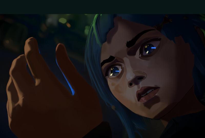
3. Reference: References. Who
needs them, right? Everybody knows that real
artists don't need references. They can draw straight
from the dome with the utmost precision. Even when drawing
stuff that they've never studied before. Yeah, no. Every top of artist uses tons of references in
their everyday work flow. Anyone who says
otherwise is lying, unless you're Kim junkie. And for those of
you who don't know, since I'm not sure if there's a communication barrier for the word reference as terminology, reference is any image that
an artist looked at to see how something or someone looks so that they can
illustrate it properly. And many people
seem to think that professional artists don't
need to use these references. I also used to be one of these people thinking
that I wasn't good until I could create
entire scenes all from my head. Man, did I stress myself out with all that
immense pressure? And Oh, boy, was that
so so very wrong. Not only is reference
not a pair of shameful trained wheels that you need to put on your
artistic bicycle, but it's actually
a tool that you should carry into every
piece that you make, cause none of us can draw the entire world
shirt from our heads, unless, like I said
earlier, you're Kim Junge. But even Kim Junge dedicated
countless hours of his life, more than any sane man
should to studying the construction of
every mundane object in existence from every angle. Yeah, you don't need
to do all that. Instead, you're having trouble picturing how something
looks. Use a reference. Don't know how to draw that
person. Use a reference. Don't know how to
draw that tree. Use a reference. Don't know
how to draw a stick figure. Use a reference. I swear
I won't tell anyone. Have I bet it into your
head how important it is to use reference yet?
I certainly hopes so. But the project in this class, I'll be using a
reference for a kick because I'm very
excited to draw. Everyone put your hands
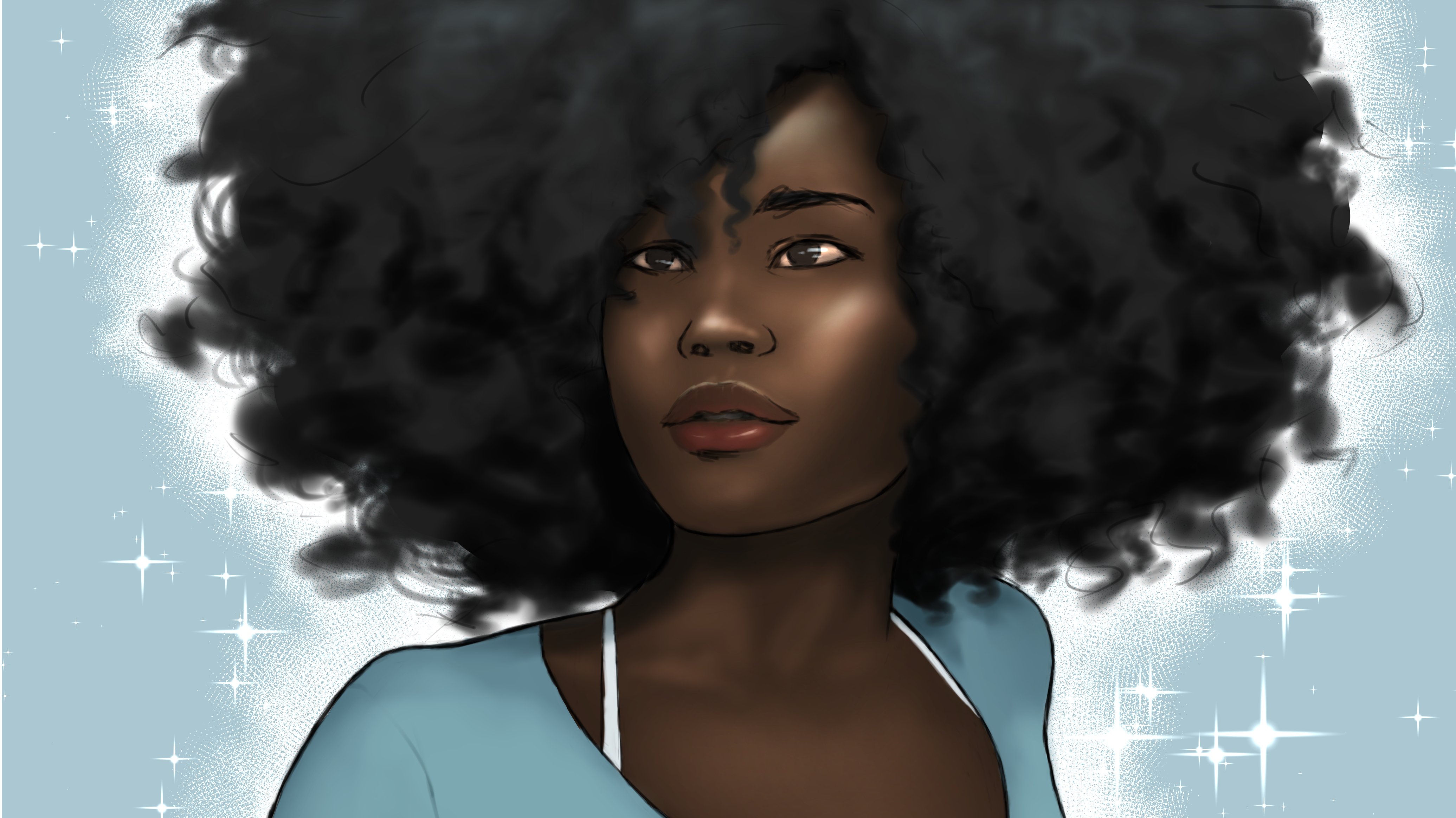
together for the beautiful, the intelligent, the amazing Mel Madata from the
Hit Netflix show. Hurricane. If you have any
interest in art at all, and you haven't seen this show, I strongly urge you
to do so immediately. This show is one of the most visually amazing
things I've ever seen, and we're going to try
to incorporate some of its outstanding signature
style into this project. I especially love the shapes and textures created by their
lighting, even on faces. It's a beautiful
blend of gradation and hard edges that
really looks unique, and I hope I can do it justice. But this illustration
isn't gonna start it up, so let's get to it.
4. Warm Up: So, you're ready to jump right into the
illustration, are you? If you're gonna set
pin to the tablet with immediate grace and diligence
and create a masterpiece. Oh, who am I kidding? You know where I'm
going with this. You can see the namuls lesson
right down on your screen. This is something that
seems so obvious to me now, but for years, I used
to skip warm ups. I used to just jump right into a drawing and just wing it. I now a learned man. Have come to the
conclusion that you should always do some kind of warm up before going into your illustration
proper. Trust me. Jumping straight into a
drawing without a warm up is really going to mess
you up in the long run. Your arm and your brain
definitely need some time to get into the swing of
things before getting serious. There have been many times
where I started a picture, but because I didn't
warm up in any way, my sketches became really
stiff and uninspired. And then after wasting too much time and realizing that the piece wasn't sligable, I would have to start
over, meaning that my first attempt ended up serving the purpose
of a warm up anyway. So beforehand, you
definitely want to at least get your hand and arm moving.
Just to get into the flow. So, we're going to just draw
some lines, get it started. See if you can make
them parallel. And then we're going
to draw some spirals. Make sure you're really using your shoulders for
the full effect. Be sure to practice doing
it in both directions, and try to go about
it quickly to make it flow as
smoothly as possible. And then we're going
to draw some ellipses. Try to make it so that the ending meets up
with the beginning. I swear it's more
difficult than it looks. Next, we're going to
draw some circles. We're going to slow
down if we have to and try to make them as
perfect as possible. Well, emphasis on. Try. Anyway. All of this
could suffice as a warm up. But honestly, it would be
best to sketch some kind of subject matter to
really get warmed up to not only help your arm, but to also get your
brain juices flowing. And remember, it's a warm up. We're not trying to make a sophisticated
illustration here. So we're not worried
about actually making anything look good. And as an artist, this is
actually so framing to just draw and not actually care about trying to make a
masterpiece out of nothing. But once you're
finished with that, now you going to
the sketch proper.
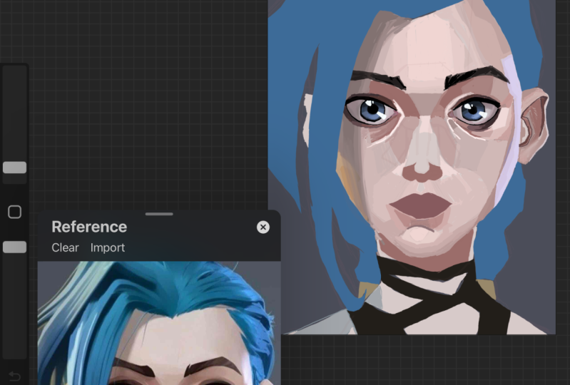
5. Sketch: How that you're all warmed up. You can finally get down to
what we're all here for. But first, let's set
up our references. Remember those things I
said were really important. Hoops studio paint has a
pretty neat function for this. You can set up a
sub window next to you drawing for
easy accessibility. That way, you don't have
to swap back and forth between different windows or
need two different screens. It'll be right there for you. To set this up, first, feast your eyes upon the top right corner
of your program, where a small version of the
canvas should be visible. This is the navigator. But if you click the little
tab to the right of it, this will be your subview. Another way of getting
here is by clicking on the window tab to the top and scrolling down
to the subview. Here, you can click on the
little folder icon and search your computer
for any saved images that you want to use. But you might be
thinking to yourself, but this little window in the
corner is a bit too small. You can remedy this by shifting your tabs and
functions around or, and this is by far the
better option in my opinion. You can just pull
the subview out altogether and place it
within your canvas area. And now you can click on the corners and resize
it, however you like. And once you've got
all that set up, now we can start drawing. When getting started,
be sure to place your canvas and sub
view in a way that your subview doesn't
obstruct anything. Zooming out like this is
actually a good idea. And for several
reasons, actually. For one, you don't want
to get too caught up with zooming in for details and
lose the bigger picture. But for the sketching
phase specifically, it's better to be zoomed
out so that you can more easily construct your
composition with loose lines. I tend to start my sketches off using the default
lighter pentel. But use whatever is most
comfortable for you. God tip that usually works
for me is to start with the most dynamic or most captivating or most important
shape in the picture. Whatever the main concept
you want to focus on is, I always pencil that in first and then build the
rest around it. This tip is more useful for more complex figures
and compositions as this is merely a portrait, but it's always good
to think about anyway. And for a portrait,
you want to focus on key markers of the
face and their relationship to one another. Key markers such as the
shape of the jaw line, the chin, the center line, the eyes, nose, ears, et cetera. I want to try to get
this in pretty quickly, and don't worry about
making the lines clean. This is all going to
be cleaned up later. Right now, we just want to
convey their general idea. Be sure to always
compare your image of the reference and make
adjustments accordingly. Now, there's something important
that I need to address. There was an error
that I made in my first video entitled Flip
Sudo Paint Beginners Guide. I stated that you
could flip the Canvas by pressing the F K
on your keyboard. Though this was incorrect. On a fresh installation
of the program, there is no shortcut key
for flipping the canvas. You have to set it up manually, and I had forgotten
that I had done that. So, I'm going to show you how to set that up for your
own convenience. Under the File tab, click on the shortcut Settings option. A menu should pop up showing all the tabs that you have
at the top of your program. From here, click
on the arrow for the view tab and find the
option called Flip Horizontal. Click on it and then
click Edit Shortcut. You can now accept this to
whatever key you'd like. I just set it to F for Flip. It's easy for me to
remember it that way. And be sure to click
Okay, when you're done. And it is of the utmost
importance that you flip your canvas regularly to catch
big issues in proportions. I made an issue with the placement of the
eyes immediately, and flipping the canvas
made that clear to me. There's a button
to flip the image in the subview as
well, if you need to. Keeping your eyes on a
specific orientation for too long can really mess up your illustration as
your mind will start ignoring imperfections to make things feel better for you. These imperfections can
add up really quickly, so it's best to snuff them
out as though as possible. Flipping the canvas
helps because it forces your brain to look at the image from a
different perspective, thus, essentially giving you
a fresh look at your work. It's important to
note that I don't copy my reference
picture exactly. I'm taking some
artistic liberties, which you should do as well to strengthen your creative juices. Notably, I've took some of the head like in
the first reference, but I've relaxed the shoulders
like the second reference. As such, the visibility of the neck will be somewhere
between the references. And I plan on changing the hair clothes and
accessories as well. Something that's
worth pointing out, that it's easy for the changing of values and tong
and references to confuse you and cause you to distort the general
ship of your figure. For instance, the shadows from the edge of the face as
the face turns away from you can cause you to bring
to think that the face and your reference is more
sliner than it actually is. Translating colors and values to linework can be very tricky. So always be conscious of that. Once you've gotten a bit more detailed in your illustration, you should be noticing the small errors in your finer details. As I said before,
having knowledge of different artistic disciplines can be a great help to you. And it is at this point
that you'll want to start treating your drawing
in the way a sculptor would. So, shave down some edges, readjust some lines
and curriers, and make sure to keep in
line with your reference. A lot of issues that
can arise later will likely start with
your initial sketch. You will likely going to chisel as many of those issues
out as possible. I changed the earrings to a single feathered
earring because I already had an idea
of what I wanted to change when I went
into this drawing. I then darken some
lines with the eyes because they're
the most attention grabbing part of the body. You'll want to make
them stand out, especially when it
comes to a portrait. I decided to go with a different style entirely for the hair, so I ended up going with a completely different
reference for it. I also like to draw on the
hair on a different layer. So that any changes
to it doesn't bother the lines I already
have for the face. Keep in mind that this is
very rough and not really an accurate representation for what the hair will end up
looking like later. I mostly just want to get
that overall shape in so I can see how
all the elements will eventually fit together. As artists, it's an essential skill to be able
to visualize what an illustration will
look like as early as possible so that we
can plan accordingly. But for most of us,
that visualization is blurring and lacks detail. And as we continue to work
and add sculpt and construct, that visual in our mind comes clear and informs
our next decision. So with the placing
of the hair and consequential getting
of information in mind, it's time to sculpt some more. With the clothes and necklaces, I decided to go with
the third reference again because I wanted
something a little more realistic and modern and
not the fantastic garb that Mo wears as one of
the ruling counselors in the City of Tiltoer. And with all that,
the sketching phase of the drawing is completed. Well, kind of. The sculpting
process is something that you should continue to engage in from the start of your
piece to the end of it. And I know that this is
looking very rough now, but that's what the
next phase is for. So we can clean all
this up and define these lines. And
that's finish the
6. Clean Lines: So now we've got a sketch done, which is essentially the
skeleton of our illustration. Now it's time to clean
it up and flesh it out. Getting right into it, you're going to want to
create a new layer above your sketch layer and then lower the opacity of
your sketch layer. You're doing this
so that when you start putting down
your clean lines, you'll be able to see
them more easily without being confused by all the
lines of the sketch layer, and then you're going to want to choose your drawing tool. The letter pencil that I used
earlier is a great tool, but if you want a more
professional look, you're gonna want something
a little more solid. A later pencil
might be too soft. The G pin is definitely the default tool for
this exact purpose. Though person I like to use
the darker princel more, despite the fact that it has
a softness to it as well. Cause me to sometimes
having to duplicate the layer to make the
lines appear more solid. But it's what I've
become accustomed to. Use whatever tool works for you. And once you do choose, be sure not to make your
brush size too big. Thick lines can sometimes obscure the shafts that
you're trying to contour. Don't necessarily take my exact
brush size for reference. As the size of my
canvas is rather large. Play with brush sizes and see what you think
would be a good size. And if you draw a lot, you'll know how easy it is to draw on the wrong
layer by mistake. To prevent this from happening, you can hit this lock icon at the top of your
layer settings. For whatever layer that
this is active for, you prevent it from
making any changes to it. That way, you can't
accidentally start drawing on your sketch layer
when you're intending to draw on your clean layer. And when you finally do get around to putting
down those lines, this is a great
time for some more sculpting and fixing
small errors. As you may be able to see a slightly change the shape of the eyes that I
had in my sketch. You're going to be making small changes like
that as I go on. And you should, too, as
you're chiseling what was present in your sketch layer
down to a single line, but you'll still want to more or less follow what was established
in the sketching phase. And speaking of a single line, you want your illustration
to appear as if it was all drawn in a single
line in one stroke. Obviously, you're not going
to draw it in one stroke, but you want it to
appear that way. The easiest way to do that is to make broad confident strokes. Control Z is going to be
your best friend here. Alternatively, you can draw
your lines in segments and then sculpt them
down to make them appear at singular lines later. This can be a long
and tedious process, but since you're
mostly following the guide that you've
already set for yourself, it's likely the part
that's going to take the least
amount of brainword. Even though you're
following the sketch, don't forget to flip your canvas from time to time to refresh your perspective
on how things are looking. They're still sculpted. We shouldn't turn off your
sketch layer from time to time to see how your clean
layer looks on its own. Even though the sketch layer
is set at a lower capacity, its presence oftentimes fills in gaps of information that shouldn't be there
in your clean layer. Turning off that sketch layer, makes those issues
more glaring and allows for us to fix
them more equally. You find that your lines
are looking a bit janky, and you're finding
it too difficult to draw them in clean strokes, it could help a lot to turn up the stabilization level in
your tool property settings. This will help to counteract any shakiness in your hands so it doesn't appear
in your lines. Unnatural objects
are generally hard to draw up because their
shapes are uncompromising. Whereas natural objects such
as human bodies and hair and objects that completely conform to gravity
like clothing, have tons of leeway
when it comes to form. Natural objects like
these necklaces can only look right one way. The word of advice,
don't be like me. Use up that cooler. That way, edit your lines after you draw them and shape
them however you want. Would have made this so easier. But at least you get to watch me struggle drawing
these necklace. And after taking way too long
drawing those necklaces, I decided to make the irises a bit smaller than in
my initial sketch. Now, once I've gotten
all these lines down, I like to employ
some line variation. First, make a new layer
and chop the felt pin. Then use this pin to
be hop some lines to suggest shadow and
depth in our TD image. And if you have
some trouble with deciding what lines to beef up, some good areas
to start would be wherever you would find
the strongest shadows. Like the upper cheek
bones, the chin, the mouth, the nose, and especially the eyes. You definitely want
thicker lines on the eyes and pop more than any
other area on the face. You'd be surprised at how much of a difference
this can make. You should check
that by flipping this layer on and
off to see D path. Do the same line variation
technique with the clothing, which should be much easier. The form of clothing is far less defined because the
plane shifts a randomly. So you can pretty much
make it up as you go, and just add some thicker
lines in some places. It's easier than it looks. And then when I'm completely done with the clean line layer. You would think that I would
turn up the sketch layer, but I actually like to keep
it around at low pacity. I like to settle softness that adds around
my cleaner lines. They often give the
appearance of finer details. And I also like the
texture they provide. But I won't just leave
them as they are. I like to use the layer
mask to erase out any part of the
sketch layer that I don't want around
for the final piece. You can do this by hitting
this button at the top of the layer menu when you're on the desired layer that you
want to apply the mask to. Then you can erase away any lines using an eraser
tool or a tool with a transparent color
and simply add them back by using any
non transparent color. This way, you can
erase things and add them back without
any real commitment. You may have noticed
that I didn't draw lines for the hair, eyebrows, or the feather. And that's because I'm saving
those for the color phase. I personally find those areas
much easier to add with solid color rather than outlining every strand
in my line layers. And that will be coming up in the next part of this lesson.
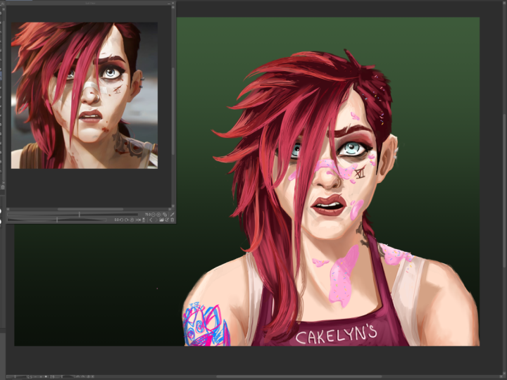
7. Base Colors: So we've got our lines down. Now it's time to bring
some life to our piece. Adding color is a huge
step for a lot of artists, and many people find it
intimidating to attack it proper. But I'm going to show
you that it's not as complicated as you might
be imagining it to be. We're going to be
doing this in steps, and our first step is to
decide on our base colors. Well, naturally, our
first step is to make a new layer and place it beneath our line and sketch layers. But after that, we're
deciding on our base colors. Looking at the color wheel,
I'm going to pick a color that resembles the color of
mell skin in my reference. Of course, first
thing that we should notice is that there are
many colors in her skin. It's not just any
one flat tongue. What you need to
do is to discern what color best represents
the middle value, the color that lies between the highlights and the shadows. Obviously, since Mellow
is a black character, your base color will be
some shade of brown, which you will find
around the reddish slash, orangish color of
the color wheel. Here, you should try
to pick the color closest to your discerned
base skin tone. If you want an easier
method of doing this, here's an eye dropper
icon on the sub view. If you click that, you'll be
able to click anywhere on your reference image
and select that color instead of having to find
it on your color wheel. And that's fine if you
choose to do it that way. But finding the color yourself
is great practice for times when you're drawing
without such clear reference. Once you've got the
color selected, you're going to
want to pick out a good flat coloring tool to evenly lay out this color. I'd like to go into the
marker subsection of the pin tools and use
the fill in mono pin. And now we revert back to our grade school days and try to color inside the
lines of our image. Hopefully we're better
at it this time. This could easily take
quite a bit of time, and the criest way to do it is to outline the
desired area with a color and then press the GKey twice to get to the field tool, or you can click this icon
over here on the left. It should automatically be on refer only to editing layer, but make sure just in case. And then just simply click the
area that you've outlined, and it should automatically
fill in that area with color. R. If you've noticed, the color over even the press that will be
covered by the hair. That's because there
will be places where the scalp shows through
this hairstyle, and the hair will be
on the higher layer. Now I'm going to make
a separate layer above the skin color layer
for the clothing color. It's safer to make a new layer for each color and
value that you put down because it'll be easier to edit later on if
they require it. I'm using the third reference for colored choice
for the clothing. And since the color is dark, it makes it a
little difficult to differentiate between the
color and the linear. You can lower the opacity of the color layer
that you're using, and this will
differentiate the values enough to keep working
without any trouble. Once that's done, it's
time to make a new layer above the other co layers
so we can color the hair. Nel's hair is brown, but I decided to go with black just as another difference
that I decided to make. As I'm coloring in the hair with the fill in
monopin, by the way, I only used the earlier
hair sketched layer as a guideline and
not as a schematic. I experiment with
the form and sculpt the image into something that
I find visually appealing. This is a big reason for
why I didn't want to attempt to draw in these shapes
in the clean line layer. I swap to the light
pencil tool in order to soften the edges of the hair and make it look more natural. The techniques that I
use here are more so from experience of
drawing black characters. And perhaps I should make a
more in depth tutorial on black features and hair textures at some point in the future. Let me know if you want
to learn more about that. At this point, I decide
that I don't actually want to go with a duck should have black for
the hair after all. And I seek to change the color without having to do
it all over again. An easy fix for this
is to go up to edit, scroll down to
tunnel correction, and click on huge
saturation luminosity or simply press control you. Here, a menu will pop up for you from sliders for altering
the color on your layer. Sliding hue will
change the color. Sturation measures how vibrant
or dull that color is. And Luminosity measures how light or dark you
want the color. What's amazing about
this feature is that you can see the colors
changing in real time, making it easier to
gauge what colors and values work and
which ones don't. You can even tackle this preview check mark to see you
before and after. This feature is a big reason
for why I believe it's easier to separate all your
colors and values by layer. That way, you can do
tomal corrections on each of them individually. I decided to leave a gap on the right side between
the hair and the face because the hair on this side of her face is being
pulled behind her face. I could just simply try to be careful and slowly
color up to the line, can turn out to accidently
color over her face, but there's a much
easier method available. And that is to make
a separate layer, this time below the
skin color layer, and fill in these
spaces that way. Now I don't have to be
careful with how I color it. I use the third reference
to construct the braids. For advice on how to do this, try to group the strands into sections that fan
outward from the braid. Curving forward
toward the face as the braid draws closer
to the forehead. But make sure that you
leave enough space for areas where you can see the
scalp between the braids. Make another layer below the
hair layer for the eyebrows. Using the same liner pencil that I used for the softer
edges of the hair. I intentionally
make the eyebrows a different shape
from my reference. I just like them that way. Use an off white
color for the square, something slightly grayish with a very diacritic hint
of yellow or orange. I first colored this on the same layer as the
clothing layer, but I soon realized I had was a mistake and moved
it to its own layer. I did this by using the lasso
tool on the selection menu, outlining the eyes and
cutting and pasting them. You can do the standard
control X and control V, or you can click on the
cut and paste option on the tool bar beneath
your selection. I decided to use another
tonal correction for the sca where I made them slightly more saturated and
darken them a bit. Next, make a new layer
for coloring the rises. Mo's got quite a few interesting colors
going on in her eyes. I can see some oranges, some yellows, some greens. I decided to go with a
more natural brown color. I make them a little
too light at first. Chosks a dark and brown. I could use another
tunnel correction. But another way to easily edit
a layer color is to click the lock transparent pixels option in your layer settings, and simply color
over what was there. This option makes it so that
you can only edit what was already existing on that
layer. I can't add to it. Alternatively, after
locking the pixels, you could just hit
the fill icon at the top instead of coloring
over the area with a brush. Next, make another
new layer and select a brighter color to
the lighter rings of melis in her eyes. Remember when I said that
the sculpting process happens throughout your
entire illustration, it was at this point, though, that I realized that one of the eyes was a bit
shorter than the other. Problem is, there's a bunch of things that need to
be edited to fix this. The solution is, use
a selection tool. First, start by selecting every layer that
needs to be edited. You can do this by
holding control and clicking the
necessary layers. That should be the sketch layer, the clean line layer, and
every color layer that's here, like the skin color,
sclera color, iris color, and
inner Iris color. Then use the lasso
tool and select it. Next, click the
scale, rotate icon. Sentence my plan to warp
the shape a little. Make sure that the keep
aspect ratio option and the tool property
settings was turned off. If you want to
edit something and keep the proportions
to the same, make sure that this
option is turned on. Make a new layer
above the skin color for the color of the necklaces. Grab a very saturated
yellow for this one. They use the same color
for the earrings as well. At first, I put them
on the same layer, but I later decided to move
the earring to its own layer using that good old lassal
tool and cutting and pasting. Use a layer match with
a clean line layer, so you raise up the lines that you don't want to show
through the hair. I decided to color
in the feather on the same layer that had colored the golden part of the earring. Suddenly, remembering that I hadn't colored in the lips yet, make a new layer of both the
skin and start coloring. The first color I chose was
far too bright and vibrant, so I toned it down a bit. Be sure to make the
upper lip darker than the lower lip because
it casts a shadow. At the very end, I
realized that I had been coloring on the wrong
layer the entire time. So I cut it out, tasted it, and then merged
that new layer with a layer that it was
intended to be on. If you do this by
putting that layer directly above the intended layers that you
went to merge with, right click the layer and slip merge with the layer below. I then add in the color for
the teeth behind the lips. It decided to do this on the
same layer as a skin color. I didn't really think it
needed its own layer. And with that, the base
colors are complete. Next, we're going to be adding dimension to our
worth of shadows.
8. Shadows: So, we've got our
base colors down. It's looking nice, but we're trying to draw on
the style of arcane, and it's looking a little wet. So now, we're going to add depth to the illustration
by adding in the shadows. Of course, we're going to
start by creating a new layer. It's been a state
at the beginning of every part of
this lesson so far. And I see no reason to stop now. Up, I'm going to create a
layer above the lip layer, like the lip layer, wouldn't
clip it to the layer below. You might be thinking
that this is absurd. If I clip the shadow
layer to the lip layer, then I'll only be able
to draw over the lips. That would be correct,
but the lip layers already clipped to
the skin color layer. So when I clip a layer to a
layer that's already clipped, all of them get clipped
to the base layer, which in this case, is the base skin color
layer. Confusing. I know. Now, picking the right color for the shadows can be a
bit of a rope block. You might just think
to pick a darker vase from the same color that
you're already using. And that's logical to think, but it's not exactly
that simple. In truth, you want to pick a cooler hue than the one
you have for the skin color. And by that, I mean, pick a color that's more in
the direction of blue, which is the coolest
color of them all. Hun slightly intended. But look at your color wheel and move it slightly
toward blue. Then you'll want to move your
color crestor down to get a darker value and then toward the left to get a
more saturated color. The presence of light is how we see color at all in
the first place. But it makes sense that when less light is
hitting the surface, we see less of the
surface this color, and it appears more
on the grayer side. When it comes to most
things involving value, the lights and the darks. L to start with the eyes. They're the most
important part of the face that you
want to look good. So I find it smartest to start with the first
to set the standard. Like before, using the
filling moto marker to quickly lay down flat color. I know I said earlier
that this was going to add depth and get
rid of the flatness. And the dimension
we're adding is definitely going to be
more apparent later. This is the part of
the illustration that requires a lot more planning
and forward thinking. Pay close attention
to the reference. We're getting into the
meat of what makes arcane look like arcane. It's all about the relationship
between light Jada. Takin's unique appearance is thanks to the creative
blend of hard edges and soft edges that create such interesting and
appealing shapes. And you'll see what I mean
by that as we proceed. Once I get a good idea of
the layout of the shadows, I do a tunnel
correction and make sure that the colors
look the best. I said earlier that shadows are typically cooler
and less saturated. That's a good rule of thumb, but it isn't always
true in nature. It's best to play with
all of your options. I don't think that the
previous color looked bad, and I believe that it
definitely could have worked, but through the
tunnel correction, I realized that there
was a better option. Now comes the good part. We've got everything blocked in, and now we're going
to start blending. We do that by hitting
this little icon over here or by pressing the
J Key as a shortcut. Select the blending tool and start softening
some edges with it. Make sure to follow
the reference. And here is what I was talking
about when I mentioned before about Arcanes mixture
of hard and soft edges. Especially around the eyes here, you can see the drastic
change in value going from light to dark
areas, and vice versa. But as those shadows move down toward the nose and cheeks, the values change more
gradually and fans out. The former is
called a hard edge, and the latter is
called a soft edge, and Arcane plays with
these concepts a lot. There are times when
the blinding tool can create messy smudges. The use of soft airbod to clean up these
oughts more easily. So we've got some shadows down. But the reference shows some clearly darker shadows as well. So what we're going to
do is we're going to layer our shadows on. Get it. Anyway, create a new layer. We want to clip the deeper shadow layer to the
first shadow layer. But using the clipping button, we'll clip it all to the base color layer
as I said before. So instead, we're going
to color on a selection. So right click the
first shadow layer and go to selection from layer, then click Bate selection. This, as you can see,
creates a selection in the shape of
everything that's in the first shadow layer. And no matter what you do, you only draw on this
selection while it's active. You'll go back to the
second shadow layer, and everything will be contained within the bounds of
the first shadow layer. And if these selection
lines are bothering you, and I know they are, can simply turn them off by clicking this
little button at the top. The selection lines will still be there. You just
can't see them. Now, paint the second layer of shadow similar to how
we did the first, but with an even darker, cooler, and more
desaturated color. Make sure to leave room between the edge of the
second shadow and the edge of the first shadow to give the appearance of
gradation occurring. Once again, I make use of my
handy gay tonal corresion, to see my available
options and make the shadows more faithful
to my reference. I'm using two different
references for the lighting and shading
of this illustration. So naturally,
there's going to be some creative decision
making that is required. While I'm using the
first reference for most of the structure, I want to hard slight cast in the face and the
second reference, and I'm building my
shadows with that in mind. I create a third layer
for the deepest shadows, which are almost straight black. Just remember not to overdo it. When it comes to creating
cast shadows for the eyes, I go with a bit of a
different technique. There are a lot of
different colors here that the shadow
is being cast over. So unless you want to grab a shadow color for each
and every one of them, I suggest you use
a layer filter. There's a drop down menu in your layer settings that
should say normal at first. Clicking on it, you will get a bunch of options
for your layer filter. For shadows, a useful filter
is the multiply filter. Select an appropriate color, probably something relative
to the colors around the areas that you're shading and start laying down shadows. Because it's a filter, the
multiplier layer is taking the colors below
into consideration when you place down
your colors or values. We could have easily
done this for all of our shadows throughout
our entire illustration, but the hues would
have ended up looking a bit superficial compared
to what we're going for, especially considering
the variety of colors that
exist within skin, which is most of
our picture here. Create a new layer for the
shadows from the jewelry. Only thing is, the ear nd and the necklace are on
two different layers, so we can't clip this layer to both of them
at the same time. You could create two layers and clip them to each piece
of jewelry instead. But I've got a better idea. Like we did earlier, let's
do a layer selection. You can actually include
more than one layer in a selection. That's
perfect for this. So hold control and click
each necessary layer. Then do as we did before
by right clicking one of the selected layers and
click and create selection. Now, the brush trucks are limited to the two
jewelry areas. In shaping the jewelry itself, you want to use the marker tool again and select the
dark brown color. But instead of
softing the edges, you want the edges to be
as hard cut as possible. Because we'll want to to metalic we'll want high contrast, so the shifting between lights
and darks will be sharp. Erase out some of the
shadows around the edges to give the impression of rim lighting on the shiny material. And try to make some interesting shapes with the
light and shadow. The shadows on the face
are more or less complete, but we'll take some
time to sculpt things into a satisfactory condition. Now, I suppose it's time to do something
with the clothes. We've been using
the third reference for the war drove thus far. So make a new layer above the base clothing
color and clip it. If you look closely,
the shirt isn't flat. There are some
ridges in the shirt that are casting shadows. So grabbing the
lighter pencil tool in a slightly darker
and cooler color, we're going to draw
on these ridges. Once that's done, create a new layer above the ridges
and clip that one as well. This layer is going to be
for the shadows proper, and we're going to be
using the same color as before because the ridges
are technically shadows, but more representation
of the shirts design. Now, we're doing the
shadows that are borne out of the form of
the character's body. Use the same marker
and blending tools that we've been
using before this. Then use the soft
airbrush across the lighter areas to suggest the subtle changes of
planes in the shirt. Use the marker to
erase out hard edges, while the blending tool
is used for soft edges. And now it's finally time for the most important part of this illustration
to shade the lips. And by that, I mean, I forgot to place
the shadows earlier. So I'm just now doing that. Just make sure to
place the lip layer below the third shadow
layer, but above the rest. The darkest shadows are the ones that I use
for the lips here. And once that's done, the
shadows are now complete, not counting any
later sculpting, which will most
definitely occur. And the next part, we will be
putting in the highlights.
9. Highlights: Now that we've added
shadows to our image, you can really see the
depth that they bring. The picture doesn't
look so flat anymore. We can push it even further
by adding the highlights. So, as always, make a new layer, but place this one
below the shadows. Because we did the
shadows first, we've already used
them to define a lot of shapes and
edges of the face. From now, using the highlights, we simply just need to
color undervill shadows. When color picking,
just like how you generally shouldn't go
black from most shadows, you also shouldn't go white
from most highlights. And while shadows are
generally cooler and darker, highlights are generally
warmer and brighter. Warmer in this sense means closer to yellow on
your color wheel. That being said,
both shadows and highlights tend to be less
saturated than your base tone. All of this is
almost moot anyway, though, because let's be real. I'm going to use tonal
corrections later as my digital crutch anyway.
But it's still good to know. And also, without
this knowledge, using the tonal
correction function would be harder to use anyway. I begin by testing some brushes with some
texture on them. I wanted something with texture because skin isn't
perfectly smooth, and I wanted to represent
that in some way, as so long as the texture wasn't too jarring or too noticeable. I ended up settling
on the charcoal tool, which is among the
second list of sub tools besides
the pencil tools. This part might be a little confusing because you
might notice that I have charcoal and charcoal
two listed in my tools. This is because tools are
sometimes changed from version to version when
clip DOPA gets updates, and the charcoal tool
was one such tool. The charchl two that I have listed here is the newer
version of the tool, and the charchl that
I end up using is from an older version
of Clip Studio Paint. Don't fret, though. If you
don't have this older version, you can download
it pretty easily. You got the Clip Studio
Paint art program, you should have gotten
another app alongside it, the Clip Studio app, which manages all the files and materials you use for paint. If you open that
up and click the Clip Studio Assets
tab on the left, it'll be taken into a
database of materials and assets that you can download and use for your own artwork. Many of these are
even free to use. But in the search
bar at the top, if you type in 1.10
0.9 and tools, you'll find the default
sub tools for version 1.10 0.9 of Clips VDO paint. Here you can download
these older tools, and once that's complete, open your actual paint app and click to the single
arrow at the top here. Under the download
tab, there should be a folder from the tools
you just downloaded. In there, you can find the
charcoal tool that I use and simply click and drag it to the subtol menu that you
want to place it in. Just make sure that you rename your early charcoal tool if you want to place them
in the same menu. You can do this by right
clicking the tool, selecting settings
of the sub Tool, and changing the name there. And now we finally start laying down color for
the highlighted areas. But remember, none of the
layout is coming from my mind. I'm taking it from
the reference. Blend the edges so that the
texture isn't too jarring. And if you find that your blending is
smoothing things out too much to the point that it completely flattens the texture. Another good option to
use is the blur tool just beneath the blend
tool in the subtol menu. With the blur tool, you
can make the textures less distinct without mixing
everything into a flat tone. This will keep the texture, but it will make it
less eye catching. And then you know
what time it is. It's tonal correction tie. Try to find a medium
between texture and grain, where they both
exist, but neither of them completely
overpowers the other. Now we're going to create
another highlight layer, but this time above
the shadow layers, for those areas where the edges between values have
yet to be defined. At first, I only put the layer above the first shadow layer, but eventually move it above all the shadow layers as well as the lip color layer as well. When putting the
highlights on the lips, I swap back to using the
marker and lighter pencil to simulate the high
contrast shine of lip gloss. Similar to the shine of jewelry, with a little more
softness to it. And now, create a
third highlight layer above all of the other
highlight and chatl layers. I wanted to add the
bright light cast in the side of the face like
in the second reference. I initially went for a
bright pinkish color is similar to what had shown
in the second reference. But as you might have guessed, I rely on our Lord and Savior
Tomo correction later on. I also use the marker
for this to portray the intensity of the light
shining on her face. The placing of this
bright highlight is why I constructed
the shadows as I did. As I said before, I
planned ahead for how I wanted the lighting to
be laid out over the face, which is why I
placed the shadow to bit unevenly on both sides. I put more shadow
on the exposed side of her face because I knew
that the harsh lighting would create a harsh core
shadow where the plane shifted from the side of her face to the front of her face. Whereas the other side
of her face has more of a gradation from light
to dark and vice versa. And then I used my handy Danny
tonal correction to change the color of this
highlight to be more consistent with the colors
of the first reference. Seeing as we've been using the first reference for most of the colors up to this point, we should keep
things consistent. And then we use
the blinding tool and soft airbrush for
a lot of sculpting. Layer masks are a
good way to erase something without fully
committing to a decision. Here, I use a layer mask on
the first highlight layer to erase the way some
of the highlight on the forehead to make
it less intense. And then I turn the mask on and off to see if
I like to change. If I do, I can just
keep the mask. If I don't, I can just
turn the mask off. Next, I create a new layer
above the eye color layer, but below the eye
shadow layer to add some lighter colors and bring
some light to the eyes. I end up using a
layer filter again. This time, it's color dotage, which will add a
slight glow effect. I choose a yellowish
color to add some warmth. But since this is
a filtered layer, I don't actually
know how this color will translate until
I lay it down. It comes out as this
light and brown color, which I was happy with. But, you know mean,
I just had to use a tunnel correction to see if there was
anything better. Yes, I know I have a problem. And no, I'm not changing it. In the end, the color
I end up going with wasn't that much different
from the initial color anyway. Next, I create a layer
for the white shines in the eye above all other
eye color layers. Usually, this is the
part that really brings the eyes together in an
aesthetically pleasing sense. Initially, going
with a pure white, I place the white sparkles in the same places that they
appear in the first reference. Now the eyes really stand
out as they should, since the eyes are the
part of the face that our attention gravitates to
when we look at people. But Zooming out, I
notice that that the white sparkles
are a bit too much. So, like the addict that I am, I go running back to my precious tunnel
correction and dim down the aluminous so
that they aren't pure white, but rather very light gray. Now that the face is at a
relatively satisfactory state, I move on to the clothes
and create a new layer. I use the pastel brush
for the texture and use the blending tool in
the soft airbrush a smooth things were necessary. I next want to give
the jewelry a bit of the shine we see in the
fresh reference picture. I create a new layer above the jewelry and set the
filter to glow while I choose the same
golden color that I use as the base for the
necklaces in the hearing. Because there's a glow
filter on the layer, this golden color is
going to appear a lot brighter and more
vibrant than before. I then use the same function
that we used before by creating a selection
over multiple layers to limit where I draw. Teaching the soft airbrush, we're going to gently apply this glare on the side where
the light is coming from. At this point, I'd like
to start fleshing out that feather on the
ear ring so they can stand out a little more. But first, I imported
new reference of a raven feather to make
it shape more accurate. When all else fails,
in more reference. Once I'm satisfied with
the shape of the feather, make a new layer for the
lighter stem of the feather. Athos a grid slightly lighter than the halfway point
between white and black. But, of course, because
I can't help myself. I run back to my total
correction and make the stem darker so that it doesn't demand too
much attention. I then make a new layer for the highlights on the
feather part itself, using the same color
that I use for the stem. You're probably starting to see just how many layers one can use when making
an illustration. We probably could
have used less, but more layers are safer. Albeit very tedious to
edit if we need to. Make a new layer for
highlights in the hair. This time, I decided to go
with the charcoal tool, that is the newer charcoal
tool that's actually native to the latest version
of clip studio paint. The value of the highlights
don't need to be much lighter than the
base color of the hair. They just need to be light
enough to be noticeable. You don't want to
make them too light or else they'll demand
too much attention. When it comes to illustration, it's largely a game of balancing hues and values that guide the audience's eyes to
the places you want them to focus on while
creating interesting, yet less noticeable
areas around them. I made the hair quite a bit
different from my references, but I don't use them for this. For this part, I draw
from experience. But it took for doing
this would be to think of the hair as coiling bands
that overlap each other. If you decide to go this route, be sure to make the bands appear as if they're laid
on top of each other. I also suggest some
highlights on the side of the hair opposite of
the primary light source. This is to suggest a
secondary light source, which is very likely
to happen in nature as light bounces from
surface to surface. Unless you specifically made a decision to have
one light source, you should always
consider a second one. And then the total correction you started to call
out to me again. What you probably
didn't expect was me turning it down this time and going with the color
that I already had. I do believe this is what you would call character
development. And after that, the rest of this highlight process is
simply just further sculpting. The next video we'll finally
be adding a background, so she's not just standing
inside of a white void.
10. Background: Well, would you look at that? Looks like we've got ourselves a relatively complete character
on our campus so far. Of course, this goes without mentioning the corrections
that we may make later on. But at this point, I
hope you're really starting to see a possible end game for this illustration. The finish line is in sight. If you've been following along with your
own illustration, I certainly hope
that you can see everything coming
together at this point. And now it's time to
make a background, but something that isn't
too complex or detailed. It's mainly just
something to cover up this white board in
the background thus far. Let's start by placing
everything involving our character into a
folder of its own so that the layers that make
up this character can be easily separated from the layers that make up the background. Select every layer that's viable in the same way that
I showed you before. Next, you want to right plate
somewhere on these layers and select the option and
create folder and insert layer. Now, all of these layers are placed inside of a
neatly packed folder, and you can minimize
this folder by pressing the drop down
arrow at the top. And here, I'm going to duplicate this folder
and all the layers inside of it by right clicking the folder and selecting
duplicate layer. Notice the difference
that made in the hair. It really darkened the wild
strands around the ages. Using these lighter
pencils and brush tools, sometimes duplicating
the layers that use these can make your art
look more intangible. That being said, there's also another completely
different reason for why I duplicated this layer, which I will explain
in greater detail in the next section
of this lesson. But for now, let's focus
on making the background, which will be based off the background of
the first reference. First things first, create a
new layer below the folders. And grabbing a dark
desaturated bronze color, create a base color for the
lower part of the background. Do this by using a
function that can make straight lines and draw a horizontal line
across the canvas. In order to make
these straight lines, and simply tap a spot any spot within your drawing
parameters and hold shift, the spot you tap doesn't actually have to
be on your Canvas. And when you do
this, a projection will appear wherever
you move your cursor, displaying how your straight
line will be placed. When to is placed,
I use the fill tool to fill in everything
below the line same color. I soon realized, however, that this area is too low, so I scale it upwards
using a transformation. Since the upper part of the background in the
reference is white, we're going to leave
the top part of the background in
my canvas as is. Next, create a new layer above your previous one
and use a blue color with a soft airbrush because even though the background
is a bright golden light, there are still some cool tones present to balance it out. Here, we're going
to lightly place in these blue tones around
nine specific areas. And then we're going to
make another new layer this time with the glow filter, per bright yellow
color for the rays of light at the edges of the white section and the bronze section. At this time, it would
be really good to note that you can have two colors
held at any given time. As you can probably see
with the two squares at the lower left corner
of your color wheel. And we definitely want
to make use of this, since it can be tedious to use the color picker on
layers that have filters, since it will grab
the filtered color instead of the actual
color that you chose. You can still color picker. But you'd have to turn the
layer back to normal and then reset the filter once
you've picked the color. But instead, you
can swap between your two colors with
the g shortcut key. You're going to want to
save that yellow color that you've got for
later adjustments. So use the second color
and make a new layer. This one also with
the glove filter, but the color we're using
for this one is white. We're going to use the
white to give that blown out look pressing
the reference. Be sure to pull the light down, pressing harder at the
top of your stroke, and loosening it
as you come down. This makes it look
like the light is being cast upon
the character. I save that yellow color
so that can switch back to the previous layer and make adjustments without
missing a beat. Now that the background is
starting to come together, I start thinking about how this newly established
background lighting might affect the character
that we've already made. Though, I create a new layer
above all previous layers. This time with a
glow dodge filter, instead of just the glow filter. Using the same white color, I look for a spot where
light might be bleeding through or wrapping around
the character, like the hair. I also use it to brighten
the shine on the jewelry. Then create a new layer
above the rest of the background layers to put
the finishing touches on it. Here, we will be putting in the light particles
that you see floating around in
the first reference if you look closely enough. To imitate this effect, I go to the tone scraping
tool in the airbrush menu, and then I adjust
the particle size to a reasonable magnitude. I then begin laying
down the tone scraping particles with some even
distribution on both sides. And lastly, use the blur
tool in the blending menu to soften them and
make them appear as dust being eliminated
by the light. Depending on how
hard you press down, you can get some
nice variation on how much each
particle is blurred. Please try to keep the pressure
light for the most part. Returning to the
glow dodge layer, I decided to add some rim
lighting to the clothes. I begin with the soft airbrush, but move to the
old charcoal tool later for that added texture, as well as the blending tool
to manage that texture. Be sure to remember
where the light is coming from and where the
shadows will be laid. I decided to erase out
some of the rim lighting on the clothes for the shadow
being cast by the hair. And just like that, we are just about done with
this illustration. Anything we do to it now will be for sculpting and
correction purposes, which I will talk about more in depth in the next
part of this lesson.
11. Corrections: I'll be honest, this video is difficult for me to
place into the lesson because it's something
that one should be doing throughout their entire
illustrative process. From the beginning to the end, you should be taking the
time to take a good look at your illustration
and make corrections whenever you find something
that bothers you. Because, believe
me, if something in your illustration is
bothering you early, it will definitely
bother you later on. Those imperfections
in your artwork build up fast over time. And this is why I
put so much emphasis on the sculpting process before. I considered placing
this video earlier in the lesson because of how early in the process
that it's required. Like when I altered the shape
of the face before adding the color or when I edited the hair before
placing the shadows. I would go back
and forth editing these shapes throughout
the illustration. But the reason that I decided to place this part of the lesson here is because I believe that those edits are kind of obvious. Of course, you should be editing those things if you don't
like them early on. But there are certain
edits nearing the end of your illustrative process that can require a lot more nuance. A very good example of this is when I decided to
shorten the distance between the eyes and the nose of this character after I had
already finished the lighting, the shadows, and the finer
details of the face. So there was a lot of
things that needed to be corrected on
a lot of layers. Now, I definitely should have fixed proportions of
her face earlier. But honestly, it wasn't
something that bothered me or that I even noticed
until I added detail. And sometimes that's just
how the cookie crumbles. Sometimes errors don't look like errors until the
detail is added, but by that point, the
editing needs to occur over several layers. So
what do you do? Well, in the case
of this example, it's easier when you
can group a lot of problems together and solve
them at the same time. We can start this
process by making a group selection of every
layer that will be edited. This is actually the
time of the illustration that I group these
layers into a folder, which I talked about in the
last part of this lesson. This is also when I
duplicated this folder. And the reason why I duplicated
this folder was to make this mass edit and
have a backup folder just in case I didn't like
how the edit turned out. As it turned out,
the duplication made the hair appear
thicker, and I liked it. But moving on, I made a selection cutting
through the nose, the hair, and
around the earring. And with everything selected, when I click on the scale rotate option in
the selection menu, it applied to every layer. So in this instance,
I just want to pull the upper part of
the face down a little. I could do this by
clicking the dragon, but my hand could
easily drift to the right or left, and
we don't want that. So instead, I click the
down error on my keyboard, which will move the
selection pixel by pixel. I move it to a point
where I'm satisfied. The change may be quite small, but small details can
make a big difference. Now, you may have noticed the
line going across the face, where colors have now
overlapped because of the edit. Unfortunately, fixing
this won't be simply. The solution to this one is going to be the easier
blending tool and go to each and every
color layer that's affected and blend them
back to a reasonable point. To make it easier for yourself, turn off all the layers
except the one that you're working on and go
through them one at a time. Moving on to the next
important change that I made, after making the background, I decided that the
character wasn't popping out as well as I
would have liked her to. The background was a
little too overpowering, so I decided to cast a
little more light on the face using a glob dige layer above all the other layers. Using the same yellow
color that was used in the background and with
a soft hair brush, and gently brighten the face to keep the focus
where it should be. These are just examples of
some of the obstacles that you could come across nearing
the in of your heart crisis. But with time and practice, you will gain the
experience needed to tackle any obstacle add on.
12. Assignment and Thank You: So, we've reached the
end of the lesson, and now it's time
for your assignment. And for that assignment, I want you to follow my
route in this lesson. I will provide every
reference that I use in this illustration as tools
for you to use as well. And like this process
that I just showed you, try to mix things up and add your own flare and
personality to your picture. Instead of just trying to match the reference pixel for pixel. And if you're feeling
confident enough to translate this to another
character, then by all means, illustrate a picture
of any other of the amazingly
designed characters that Arcane has to offer. And when you're
finished, be sure to post a picture in
the class projects. And if you're feeling brave enough to share your
artwork online, be sure to tag me on
Instagram or Twitter at Blue Underscore Omni and
Blue Omniverse respectively. I'd love to see your
work. And thank you so much for tuning
into my lesson, and I hope that everyone who viewed this has gained
something from it. Let me know what else
do you'd like to see in the comments and be sure
to stay tuned for more.
 Nathan Jones, Digital Artist | Clip Studio Paint