Transcripts
1. Let's introduce : Hi everyone and welcome. In this video, I
will explain you. I will introduce you
with this class and what we are going to
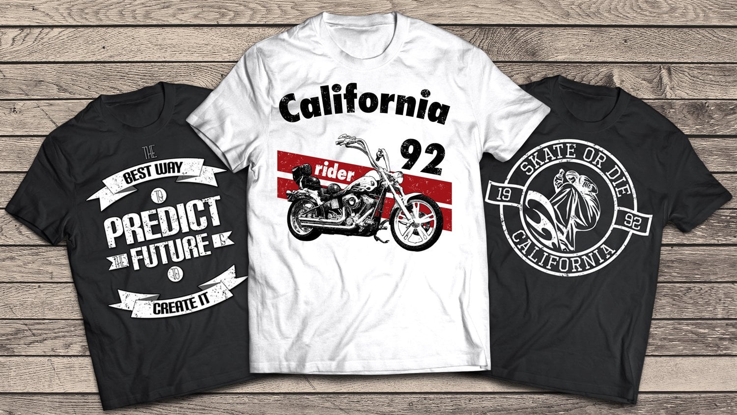
cover in this class. So in this class we
are going to create four different posts that are
on four different topics. Why we created on a
different topics. That's because when you
go to work out there, you won't get every time someone asks you
to create posts. Therefore, they're
fast food or only for a music festival or
some e-sport boosters, or some some bottle
for, for some drink. So each time someone will ask
you to do different things. And that's why I created for completely different posters on a completely different
topics to cover more. So that's why you will see step-by-step on each boosters how we get the
effect that we have. Right now. This is
what we are going to learn to create in this class. This is one of the videos. This is the second one, the third one and the bottle. So this is really
fast, easy tutorials. And once when you
see how I create them and how I think
during this process, you will see it's really
easy to work with this. And you won't need anything special to
create something similar. So that's it in this
introduction video. And I hope to see you
inside and till then, see you and goodbye.
2. RGB and CMYK Color Models: In this video, I want to show
you the difference between RGB color mode or CMYK mode. So what's the difference? What's the big deal in
those two color modes? So as you can see, RGB color mode is red, green, and blue, and it's
an additive color model. What this means is that this color model is based
on adding and mixing light. When you add red, green, and blue light together, you create a pure white. You can see how adding
pigments in RGB color model affect the ultimate color
results as red, green, and blue all come to why it
is understood that white is truly the combination of all colors and black
is absence of color. Lgbt is permanently using for designing elements that can be displayed on television set, computer monitor,
or a mobile phone, or any other kind
of light source. Obviously, it's a device
dependent color mode. What about CMYK? Color mode is opposite thing. So as you can see, cyan, magenta, yellow, and black. So those are four
colors for this model, and it's a subtractive
color model. A subtractive color
model works exactly opposite from an additive
color model or RGB. It works up partially or entirely masking certain
colors from white. So instead of adding
light to achieve color, this color model is using ink to subtract
brightness from y, therefore, cyan, magenta, yellow and combination is black, the absence of brightness. Where does the key or black comes in through
additional printing, cyan, magenta and yellow inks were layered
to create images. Eventually, key or
black began being used to additionally
subtract brightness, imprinting and heavily reduced Inc.'s usage of
their other tones. So Cm, why K is also a device
dependent color model, but it is most frequently used this day as a main color
mode used in printing, whatever It's
posters, brochures, business card,
books, or magazines. So now let me explain you
when we create our document, which color model we
are going to use. So let's go create a new file. As you can see from up here, we can create a new file. And when we designed some
button that we are going to use for our webpage or
our mobile device. We will use this
color mode, RGB. As you can see, we can from
up here change eight bits, 16 or 32 bits. This is the default
settings in Photoshop, and usually we will use
resolution of 72 pixels per inch. What's going to
happen when we design our business card or our
posters or something similar, for example, book covers
and stuff like that. From up here we will usually
going to work with 150, but the standard is
300 pixels per inch. There is more pixels and this
file is going to be larger. And from up here, we will change this mode from RGB color mode to
CMYK, as you can see. And there we have it. And one more thing. What's the difference between 72300 pixels per inch when we create something
for Web Legacy, recreate some web page, we need our webpage
to load fast. We cannot achieve that if
our files are really large, so we need really good
Internet connection to load that site rights. So if I go with 300
pixels per inch, that's not good deal. We will use 72 pixels per
inch and RGB color mode if we using our work for web or mobile devices or
something similar. But when we wish to print
something, for example, some T-Shirt and
stuff like that, we can use this CMYK color mode. So I hope you got this right. And it's really simple as that. When we wish to work for web, we will use RGB color. And when we wish to
print something, we are going to use
this color mode, 72300. It's really simple as that, and that's it, guys. I hope I make it really simple. And if you have any
questions about this, please feel free to ask
and I will be here, gladly transfer in
each question you ask. So see you in the
next week. Bye.
3. Photoshop Introduction: Hi guys. I hope you're doing
well. In this video, I will introduce
you with Photoshop. So basically in this video, I will show you
every tool that we are going to use
during this course. So I'm not going to cover all
tools that Photoshop God, but we will cover only
the most important tools and the tools that we are
going to use for our work. So let's start this. You guys can see this is the starting screen of Photoshop
and I use version 2020. So when we go to File
and we create new, this is the window
that will open. So basically what's
important up here to know is when you want
to print something, for example, we want, our shirt will be printed. So we need to set from up here resolution to this
is density pixels per inch. So I will go with 300. But if we want to create
some image for our web, for our webpage and
the similar stuff, hour logo and stuff like that. The stuff that are not
going to be printed. So there will only show up on, in a digital form. So if we want to print
something physical form, set 300 pixels per inch. If we want to see it on
a digital form, only, that set, only 72
pixels per inch. So basically that's it. We will cover. I will discuss about
this later and we will talk more about
that in that topic. So basically, I will go with my shirts with this resolution. So from up here we can
choose the orientation. Do we want pixels, inches, centimeters, or
some other points? Anyway? Let's go just with this, hit Create, and that's it. We will have our document ready. So basically from
up here guys are our tools and up
here is our layer. So I can just drag and set
up whatever I like to. So basically this is the
interface I like and I prefer. So if you have anything, you can arrange by your
own or you can go from, or you can go from up here
and choose some of those 3D, graphic, motion,
painting, or photography. It doesn't matter, or you
can create your own custom. So that's it. The most important is
this, this layers. And we will go over this
area a lot during our work. And let's try. Let's start with our tools. So basically first
tool is move tool. And let me just go
create a new layer. And from up here we
create new layers. So let just go. Create something like this. I will fill it. It doesn't matter. You don't
need to follow this step. Just wanted to show you how
you can move your objects. So basically, what
I'm doing currently is I'm only moving my
layer one just like that. And we can go and
duplicate that layer. You will see in a second. So there is couple of things you need to know about
Move tool anyway. First thing is this. You see, this is
auto select checked. But if I go and
uncheck this one, you see this is layer one. This is that layer from up here. We can go close it or open it. And the now if I want
to move layer one copy, that's this layer, I will go
and move it just like that. And now if I want to
go over this area, you see I still moving
my layer one copy. But let's go try
with auto select. You see, it's still
this layer active. But when I go click
once up here, I will drag this one. So this is important to know. I would suggest you, if you are beginner and you
don't really know what to do, make sure this auto
select is jacked. You'll see this is
the main difference. You see this is layer one copy to and with my auto select, it will automatically move to my layer that I'm currently
over with, my mouse. And if I go and
unselect this one, Let's go back to layer one, copy to this layer. And if I go over this area, it will still move my
layer one copy two. So this is really
important to know. It will help you alot. Next tool that we
are going to use is rectangular marquee tool. It will basically
create the selection. And now I can fill this
selection with my brush, or I can paint with my
gradient or fill it with some. Color light from up here
with Paint Bucket Tool, we can choose a
color and this is the color that we are
going to fill with. And you'll see I
just click once. And now what I did, I created. Let me go unselect this. You see, those two
are in one layer, so we don't want
to work like this. We want to go in a
separate layers. It will go a couple
of steps back. And now when I want to
create something new, I will make sure I
create a new layer. And now I can fill that with my paint bucket tool
Control D to de-select. Now, I can go grab my move tool and arrange
it however I like. So this is it. This is how we do with
Rectangular Marquee Tool. The same thing is with
the Elliptical Marquee. I don't want to lose
a lot of time here, guys, to showing you
everything about Photoshop. Basically from up here we got options panel and we can create, you can get a lot of different
options with each tool. So from up here, we've got Lasso Tool, polygonal lasso tool, and magnetic tool,
magnetic lasso tool. Anyway, It's also
selection tool. We just create disease with our free hand and it
will create selection. And if I press Shift, it will bring more
into our selection. Upon release on my mouse, it will expand that selection. But if I press Alt
or Option key, if you're using Mac, it will reduce stuff
from your selection. Just like this, we
can do the same thing with elliptical or rectangular
marquee tool legacy. I want rectangular marquee tool. And let's just say
I want to remove this area from my
selection just like that. And I want to add some
elliptical from up here. I will hold shift all the time and I will expand my selection. I can go create a new layer, pick my brush tool, and from up here, I can go left or right
bracket key to increase or decrease the size of
my brush, just like that. And the color of my brush
will be this color, this foreground color, and
this is the background color. So basically, if I want
to go with some green, I will go just like that, appear to color and I will see, you see guys, it
only affect things that's inside my selection. And that's it. So Control D to de-select. Now, this is also important to learn how to arrange
layers in Photoshop. So this is layer three. It has priority because
this is on the top. But now, when I want, if I want to go and move
my layer two, I want, let just say I want my red, red layer to be above
this green thing. And you see I'm moving up here, but it's still behind it. And if I go from up here
at the Layers panel and just my just by holding, I will go when I see
this blue stuff, I will just release. And you see now this is
my layer on the top, the red one is on the top, so this will stay behind. Anyway, I don't like this
green just go over it, right-click and you
just go delete layer or simply press Delete
on your keyboard. Anyway, let's continue. We don't need to crop
tool for our work here. We're also don't need Spot Healing Brush
and healing brush. We will need Brush Tool and
we will need brush a lot. I think from up here, we can choose a
size of our brush. Just like that. We can go from up
here to increase or decrease the
size of our brush. And let me just go close those layers so you can
see better what I'm doing. And let just say Guys, I want hardness to 100
and I want size 81. So I will create a new layer and I will just bring my brush
a little bit larger. So this is what
will I get if I go with my hand and
with hardness 100? And let's go decrease hardness to 0 to
see the difference. You see what the
fact we are getting when our hardness is to 0. Anyway? If I want smoother edges, you see this is really rough. I will go and increase this
ledger, say around 50%. Now let's go bring
back our hardness. And now you see how my
edges are more clear. You see there is no rough edges like that because Photoshop. We'll use their
algorithms and helped me to create more precise stuff. Anyway, let's close this one, create a new layer. And from up here, we can choose something like from up here we
choose Symmetry mode. Let just say I want vertical
and I want to increase that. Make sure to hit okay there. And now let's bring
back our brushes. Blood ledger say I want
smaller brush and I want smoothing to around 70%. Now what I do, it will replace, it
will create same stuff. This is like mirror. And it will create same thing on the other side of
my of my workspace. So that's it also. That's cool thing
to know sometimes. But let's just say
I want this to 0 and flow, flow and opacity. It's, it's similar,
but it's not the same. Anyway, let's go create something with our
logistic green. Excuse me, I need to
create a new layer. And I go up here at
the pads and I want to delete this path
and go back to layers. Okay, Let's go back
with our brush tool. I will make it larger. So let's go opacity 100. And now this is something
that we got and let's create a new layer
with the opacity around 20%. And let's go bring the black color for
our foreground color. Now, just go with, this is width 20% opacity. Let me show you with 100%. It will go over that area. You would notice this
is 120 per cent. So this is different from
between those. Anyway. I think you understand
how Brush Tool works. Anyway, from up here
you can create, you can download more brushes. You see guys, I got from
up here some more brushes. Like, let's try with something like this,
special effects brushes. So let me create a new layer. And you see this is
some leaf brush, so this is really cool thing. And you can download from web, like there is, like milliohm
free brushes for Photoshop. Or you can use stock ones, or you can create
your own brush. But for these scores, we don't need that. Anyway. That's something
that we can get for free. You will see, let me
go create a new layer. This is something that we could use for some
of our shirts. And that's it. So we want to use
clone stamp tool, Aaron tool, but we
will use eraser tool. And the eraser tool is also, it also work like a brush, but it will just your
paint with a brush and you will do the same thing but only erase with our eraser tool, you can go create hardness 100 or decrease it to any
percentage you will want. You got the same options, like with the brush tool, but only you will
delete things when you using this classic eraser tool. Make sure your brushes
large and just delete what you want
from your work. So guys, it's also important to stay organized in Photoshop, but we are not currently. This is really messed up work. I just want to show you how you can work in Photoshop anyway. From up here, we got
our paint bucket tool. And if I want to, let just say, let's go back to background and I want
to paint it in red. Just one click, and
there we have it. It will make the whole
layer in one solid color. But if I want to go with
Elliptical Marquee Tool, and let's just say I want
some color like this. Again, go back to Paint
Bucket Tool click once and control D to de-select. And there we have it. But what I did, I did something that I shouldn't do because I paint all
of that in one layer. So if I want to go
with my Move tool, I cannot do that because
those two are in one layer. All I can do is
move them together. This is working
destructively in Photoshop. What would I suggest you go Control Z to a couple
of steps back. And when we got our
selection ready, make sure to create a new layer, go back to our
paint bucket tool. Just fill that area
control D to deselect. And now let's go back with our Move tool and
we can move our, you see those purple things. This is smart guides
showing us what's the best position
and trying to fit that circle in some position. So this is really useful
thing in Photoshop. You will find yourself
using it a lot. Anyway. That's it about that. It's also important
to know how to say I want to increase the size
of this specific thing, this layer, layer that
just hit Control D together and make sure you make it larger or you
can get it smaller. This is free transform option. Hit Enter when you're
satisfied and that's it. So that's about those. And the gradient tool, it's also really important. You will find yourself
using it a lot if you want. If you're planning
to create shirts in Photoshop from up here, as you guys can see, I got some a lot of
different things, but let's just say I want to use these gradient from up here, this gradient to use five different colors
by different colors and color in those areas
are really different. And it will go from this, this. But in the middle, we got some more. So I can move this. You'll see the
effect I'm getting. Let just say I'm satisfied
with this one hit, okay? And now how this tool works. So it's all it also work
like the previous one, like the paint bucket tool. I don't select it. If I don't make selection like I did with the previous one, it will fill the whole area. Let's go back to
our gradient tool, and this is the gradient
that we are going to get. So if I go from this
area upon release, it will create gradient
inside my selection. And that's it. So let's go back, step back, control the n. Now, let's go to see what
we are going to get. If I release. So it will fit, as I said, the whole area. So we don't need that. Let's go back. And from up here we can
changed some radial gradient, angle gradient, reflected
gradient, and diamond gradient. So let's go try this out. As you guys can see, this is the effect
that we are going to get if we using that option. So we can also change the Blend Mode opacity and even reverse it
and stuff like that. So you need the
experiment with those. You'll see from up here. This is something new that came with new version
of Photoshop. So this is a really,
really useful, I find myself using this a lot, so it saves me a lot of times. In a previous version, we didn't got
something like this. So this really helps me out
because sometimes I'm like, I don't know which color to pick for something, for
some gradient. And I came here and those
colors look amazing. So I'm satisfied how this
looks and it really helps. So it's really up to you which one you like for your designs. So I think we got this, right. This is it. This is about gradient. And one more thing, if I
go double-click up here, I can go and change
any color I like. You see automatically how
that gradient change. And we can go and create a
new gradient from up here. And we can call it
whatever we like, just hit New and it
will be up here. Let's just say this. And now we got our gradient. It will save this one
for our later work. So let's try it out. This is really messed up. Anyway. That's how you can
work with gradients. So that's it. We want to use these
tools for our work. On shirts, pen tools, pen tool. It's really useful, but it's
only for advanced users. I want suggested for
beginners in Photoshop. So I will try to stay away from the pen
tool in Photoshop, It's tricky sometimes,
but when you find the way how to work with this tool,
it's really helpful. What we are going
to use a lot is this type dog from up here. Let me close this one, create a new layer. And this is, this is
the color of our font. And let's go with white color. So I'll just type example. And control makes sure to select your text and
increase the size of it. You can go by just clicking up here and drag it up
here, like this. And it will make
your font larger. Or you can go and type up here any dimensions you want once
you are satisfied with it, Okay, Bring your Move Tool and arrange it
wherever you like. So I'll go up here
at the characters. If you don't see this step, you just go from window
find care up there. And it will bring
something like this. And you just go arrange
it in your workspace. And that's it. So from up here, if we want to edit this, we need to select it. So make sure if you have your move tool activated and you want
to select this one, you can't, you need to
go up here or press T on your keyboard
and just click somewhere in between those two. You will see when you try it by your own control eye and
make sure you select it. And now I can go from
up here and change the font to any font I have. So what I like to go and do when I download some
font or by some font, I like to make it my favorites. And from up here are
my favorites font, the time currently using. And if I want to
see all the fonts, I can go and just overdose area. If I want to get this Bauhaus
93 inside my favorite ones, I'll just press up here at this star and it
will show up here. So it's up here. So this is how you can get something in your
favorite fonts. So that's it. And we can arrange
that from up here. We can go and add warp text. We can add some
effect like this, increase the size or decrease, or horizontal or vertical. So it really depends what
you want with your design. You can create cool
effects in Photoshop. Let just say we want
something like this, okay? K, and this is what we want. Now, what's really important and what you will find yourself, Self using a lot when you creating shirts in
Photoshop is up here. These blending options. So just go on on a font, on a layer that you
want to add it, right-click on it and
go to Blending Options. And you will get this
window m from up here. You will see when
I go over some, when I go over
something, it will, you will see automatically
how my font change. For example, if I want to add, this can increase the size. You see how we got this effect? Let's just increase
the size a little bit. So we can add texture. This is cool. And we can add a stroke. So if I want to change
the color of my stroke, I can just go from up here. Let's just say I want
some black one for map here we choose the size
of our font and we can, we can choose Opacity also, do we want 100 or we want
something like this. Let just say I want
something like this. From up here, we can add
inner shadow to our layer. You see how those areas getting larger and we can increase that. So this looks nice. You can add inner glow. But we can go call color overlay and change
something like two, some color like this or
something like this. It's really what you find
yourself. The light. We can go even from up here,
choose Gradient Overlay. Let's go close this one. And from here we can
choose any gradient. This is some
gradients that I use in a couple of my
previous works. Let's just say we want this
or something like this. Okay? This is how you work with this layer styles or
we're blending options. So from up here we
can add drop shadow and increase the distance or
decrease it anyway, guys, I don't want go over those
too much and just hit, Okay. What's also important? We can, from up here, close
some of those effects. For example, I don't like
my stroke right now. I can just go close it. And that's it. Or inner shadow. I can close that also. Or drop shadow. Just by clicking, once we
can go and change that, this red color is
really hurting my eyes. So I want to change that, just give me a second.
And that's it. So this is our work. And those are basic things
that we need to know about Photoshop, about our work. We will discuss more about
this later through the course, but this is some, some things that
you need to know if people want to
work in Photoshop, I just run over all the tools. So if you've never
been using Photoshop, this is maybe too much
information for you. But don't feel, but
don't be scared. It's really easy to
work in this program. And I will make sure
you understand that. And I will go through my
tutorials really slow, and I will give my best to show you the easiest
way possible. And one more thing that I want to show you
is from up here, Let's go to Edit
and Preferences. And let's go to general. From up here we can go and
change couple of things. For example, color theme, I think default one is this one. Maybe some people
will like to work with white or this gray color. I like to work
with darker colors because I'm using my glasses. And the one I got this blue, when I when I see
this white color, there is too much
light coming into my eyes and it's
really painful for me. So I like to work
with darker colors, so those are relaxing. So a lot of designers
will tell you that the caller team or you will
see a lot of tutorials. Lake ninety-nine
percent people using darker colors because
it's easier for our eyes. For our eyes. Just imagine you're
working in Photoshop for 56 or even more hours per day and you've got this
like all the time. This is really stressful. So make sure to go
with darker theme. Just kidding, It's
really up to you. So from up here, workspace, this is really some,
some regular thing. Anyway, what I wanted to go
and show you from up here, you can go if you
want to let your Photoshop work a
little bit faster, you need to go and do
something like this. I think it's around 60 or even 50% Photoshop allowed to use your
memory, your RAM. So just increase that for
a couple of percentage. And Photoshop will
have much more space for those data things
and stuff like that. From up here, history states, I think where the fault
was 40 or even 50. So I don't know
anyone who wants to go 50 steps to make a change. So this will basically only
remembered the last 15 steps. So if you want to go
and change something, if you want to use Control
Z to go, undo some things, it will only remember the last 15 steps you made or
you can increase this for, I don't know, if you need 100, you can go with 100 steps, but that's not something
you need and you're, and it will use a lot of more information and program
can be laggy sometimes, so make sure around ten to 15, even 20 is enough. So that's what I wanted to
show you in this video. So guys, that's everything
for me in this video. If you have any
questions, let me know. This is really like
half an hour tutorial, but I needed to explain
some basic things about Photoshop because we will
need this through the course. You will need to know
some basic things. Please, if you have
any questions, if you need help with some of your designs with
anything in Photoshop, let me please know that and
I will gladly help you out. So CEA, in the next video, Thank you for watching.
4. Drink Poster Design in Adobe Photoshop: Hi everyone and welcome. In this video we
are going to create some juice poster
for some company, for example, let's say
someone to hire us to create a poster
about their product. So what we want from them, we want from them to provide us information that we need
about that product. For example, what's the main thing they
want to show to audience? For example, these data product. We want to ask them
what about description, what they want and
similar stuff, which color they prefer, or they will leave
us that part to choose which color suits
the bust, their products. So let's get started at, for example, let's just
say we have couple things. This is the dream that we
need to create a poster for. From up here we have
some water splash. And up here we got some lemons. So let's get started. First. This will be really
fun and easy tutorial. So don't get, don't
worry about it. First we will go and
pick Paint, Bucket tool. And I want to fill
this area with some yellow color like this. That's it. Now, I want to add this product right
here on the middle. Let just say I want to
make it smaller a bit. Something like this. Maybe just a bit more smaller
and align on a middle. Now what I want to add, I want to add a layer above my background,
wheat white color. So I'll bring my brush
tool hardness to 0 and I will increase the size to around
something like this. And I'll just click once
with white color as the foreground color somewhere
here to make it pop out. Rate. Now we can go and
do the same thing, but we create shadows. So let's go create
shadow for our product. For that, we will need
some black color. And let's just
paint around here. Great. And we can go and
transform this. Make it just a bit larger grid. Now, this looks much better. This will be really fun and
easy and fast tutorial. Now we can add color
splash of water, splash, excuse me, or
we can add lemons. Let's go with lambdas. So I will just drag and
drop those lemons and put them behind my, my, my work. So I will transform
this to rotate up just a bit to create
something like this. Great. And let's go
drop shadow for that. Just grew, grab a drop shadow with distance. Something like this
is okay, Great. And now we can go
and add text up here and below and some
color splash yard. We need to add this. This will be the hardest
part of this tutorial. So don't worry about it. Let's just say I want
to put it up here. And I want to
increase the size of it to round something like this. Great. Something like this,
maybe even rotate a bit. And that's it. So now what I want
to do is I want to create hue saturation. And I want to create
clipping mask. So everything I do here, it will only affect
that layer rate. And now I'll just
drag this up here, some yellow color and make it more saturated
or desaturated. Something like this. This is just me trying the
best solution for my design. And let's just say, I'm satisfied with
some color like this, with blue color, great. And now how to remove this from my selection or this
area at the top. So what I'm going to do now, I'm going to add a mask
up here at this layer. And I want to select a
layer below my bottle. So I will just hold control
and select this bottle. Great. Now, make sure you are on your mask layer and
bring your brush. For that. Let me zoom in. This will be really
simple and easy. And I will just paint over
that area and it will automatically remove everything
from my selection there. So let's just say, I don't want any of
those at my bottle. Great. Now let me zoom out. And there we have really nice
and good-looking effect. Great. And what I want to
do is I want to select all of those
and hit Control T to get this area smaller because I need some additional
space for my text. Great. Now we can go and add something like some pieces of a lemon. And we can get those smaller. So we'll just couple of those. By holding option, I
will just duplicate that layer and I will
just place them randomly. So to get this nice effect, a couple more, and we're done. Great. Now let's go add a
text. For this one. I will just go with some classic fresh lemon juice. And I need this regular and get this smaller to
around sixth grade. They sit right on the middle. And below that, we
can add something like 100% pure juice. Refresh your lifestyle rate. And let's just say, I need this on a smaller
to around 4038 rate. And I need to change
this color to white and place it
right on the middle. For this one also, we can go and place it. Choose a white color. And the same thing
up here and even increase the size of
it just like that. And that's it. Also we can bring this
just a bit below. So this upper area
looks more natural. So let's go do that or that. I'm just going to select
a couple of those layers. Bring my move tool
and move this below. And now I can go back to my to my fresh area and increase
size of it just a bit. And we are done. So that's it, how we can create really fast and easy logo. And this is how we can create really fast and easy tutorial. Maybe we can do
couple more things like that for this area. So let's go do that. I'll just do
something like that. And I will duplicate
this layer to some, something here or
here, and maybe here. So just lays and
have fun with it. And that's it guys
for me in this video, I hope you'll learn
something new and see you in the
next one. Bye.
5. Miracle Dota 2 Poster Design: Hi everyone and welcome. In this video, we
are going to create one poster for e-sports players. Hi everyone and welcome. In this video we are going
to create one poster for e-sport lovers, for example. In this video, we are going to create a poster of this guy. Miracle is a duty to
player is the best. I think what he does. So let's go start. First thing. I want to fill my background
with black color. So how I'm going to do that? I'm just going to find my
bag foreground color black, and just fill this
layer just like that. Now, my next step will be, I will from up here go and find. I will type miracle. I will use this font, it free for commercial use. So if you want to follow me, you can go and
download this font. It's free. So I'll just type miracle. Just like that. Great. And now I want to go and click Command T for free transform
and make this a bit larger. Something like this. Okay? Now what I want to do is I
want to reduce fill to 0. So we don't see
anything for now. Then let's go click, right-click and then go
to Blending Options. And from up here, I want to add stroke. So I will add stroke and fill it with white color
and pixel width five, It's up to you. You can increase or decrease. I will go with five pixels. Okay? Now what I want to do is I want to duplicate
this couple of times. And I want to move
it to the bottom. And now what I want to
do is I want to select every one of those
and just do this. So it will automatically
fill this gap in-between from first
one to the last one. And it will make this
happen just like that. Great. Now what we want to do, we want to add this image into our I will just use my
drag-and-drop technique. Just like that. Control T and F We hold Shift. I can just rotate this with straight and make sure to
fill all of that area. And once I'm
satisfied with this, I will just place it
below those layers. And I want to
change Layer Style. I will go with hard
light. And that's it. So now we can go and add this guy and how we can go
and remove this background. So we can do that
in really one step. Just go Object Selection Tool and just do something like this. And we have our selections. So how we are going to
extract this selection? I will just hold Command J, and I will make that selection in a new
layer, just like that. Again, bring your move tool
and just move this up here. Great. Hey, can, I will move this other top and make sure
it's right on the middle. Control, the L just increase the size to
something like this. Great. And now we can go, I think I want to reduce bit
of this or I can rotate it. I want to rotate this 1480 degrees because I want this area to
be at the bottom. Something like this,
looks much better, okay? And now we have our image up here and we can go now and
add a couple more things. We can choose
Rectangle Marquee Tool and do something like this. We can fill this
area unreleased. It will create selection
and now I want to create a new layer and fill this selection
with a gradient. For that gradient, we
want to use some color, some purple like this, and some, and some blue for this area
so we can go and do that. So I want to go with just a bit softer color than this one to something
like this, okay? Okay. And now we have our
gradient tool selected, and I will just fill this area with this
color, just like that. Or we can go and do
something like this. I want this. Okay? And let's go reduce
the opacity to around 50 per cent rate. Draw the de-select that area. And now bring your way or
move tool and just move it a bit to fit this perfectly. So what I'm seeing
here, my layers, my font is not really
the same edge. You see the last one is moved, so we need to fix
that. Once again. Go to your first, then your last layer and make
sure to select background. And let's go just aligned
horizontal center, just like this. Everything is okay now. So let's go back to our
layer three or this area and just bring
it up here a bit. Great. Now when we're satisfied
with that, we can continue. So let's see what
we are missing. We need to add these logos. So let's go bring
that logo up here. So now let's go bring
that logo up here. And I will increase
the size of it. Fulfill this area. So I make it smaller
to fit inside of it. Great. And now we can go and
delete this background. So the easiest way and
the fastest way for this to do is we can go
make selection of it, or we can go and just go pick your magic eraser tool and
delete this white area. So we will try both ways. So I need to rasterize this. And now I'll just delete those white areas from
this logo, just like that. Or the other way is
let me undo those. The other way we can go. We can create selection of it. From up here at the
object selection tool. We can go pick Quick Selection Tool and
just fill this area. Control J to duplicate
and a new layer. And we still need to
remove those two. I can create selection of
that and simply delete this. We can deal with this later, but this is the fastest
way to do that. So anyway, let's
go and fill this. I need to bring this logo below, because logo is not
really important. Up here. K will bring back logo up there just to make sure
we know which logo it is. So we are almost done. We are nocturnal. So now let's continue. Okay, now what we
are going to do, we need to add this image
up here, somewhere up here. So for data, I want to
use some cool trick. So how we are going to do that? I will create a new
layer and put that layer below my player and
go to your brushes. And you can find this brush. It's by default in Photoshop. And what I'm going
to do is I'm just going to click around this area to create
one cooler fact. Once I'm satisfied, you
will see what will I do? So just like this, don't worry about it. Just move your mouse
around and to create some cloud like this k. And now just a couple more times to add those extra space
around death rate. Let just say that's
what I'm looking for. And we can go now bring
this image up here. Great. And I'll make sure this image
is something like this. Enter. And now all we
need to do is hold all hold Alt or Option key
to create a clipping mask. So now everything what's
in this layer will fit only and it will only
be shown on a layer below. Now with our move tool, we can move this around to
get something like this. This is the effect I wanted. This is I think one of
his favorite heroes. And now let's go to create
this object pop-out. So now what we are going to do, we need to create one, couple more cool things up here. So how we are going to do that? Well simply we are going to
create something like this. We are going again with brushes and we are going to
use general brushes. And I want to use soft
round and make sure I get it smaller and
create a new layer. And now let's go bring
some color like this. And go create
something like this. Just go to create this
glue effect around him. Just have fun and
paint around him. Great. We can do the same
thing up here. Don't go too much. And that's it. So maybe just a
bit more up here. Great. Now, let me change this. I really don't like
these gradients, so I want to fill it
only with white color. So how we are going to do that? So for now at the layer
three F I hold command, you see how this
selection pop out. So now I'll just
click and it will create selection of my layer. And I want to fill this
with color like this. So how we are going to do that? I just want to go from
gradient to paint bucket tool. I just want to fill it with
this new color control, the de-select or command. And now let's go close
this layer below and reduce the opacity of this
one to around 50 per cent. Yeah, this look much
better or we can even decrease a bit
more to around 40%. Great. The last thing, what I want to add is
his real name up here. And that's it. Okay for that, I want to bring my type tool and I want to, Let's just say I want to close this one to create a new layer, to create a new
layer to type in. And I will just Control V, paste his real name. Okay, Let's go bring back, move this to the top. Great. And I want to
bring this layer also, okay, for his name. We can go and place
it right here. Make sure it's aligned
on the middle. And the last thing
for this, we can go. And the last thing, what we can do, we can add some, some effect up here at
his name so we can go and try to do something like this. Let's go duplicate this
layer, right-click. Then duplicate layer and
bring that layer at the top. Don't worry about it. I will make sure it's close. This is just me trying. I'm satisfied with this. Look, it's finished. But we can go and
try one more thing. Control G, then go right-click on it and hit rasterize type. Now what we can do, we can go and create
clipping mask and just fill this with that. Okay? And we can go from up here and reduce the opacity
to around 50%. Or let's just say I'm bit more around 30 or
religious play with it. See, which looks the best. I think we don't need this. It looks bad. And that's it. What we can do also, we can create one more
layer to make his name, like pop out, like those
background, make it glow. So how we are going to do that? We can create a
new layer and put that new layer below his name. And now we can go bring our brush tool and just
do the same thing that we did with with his body. Make it glow. Just like that. This is just me
having fun and trying to figure the best
looking way for this. Okay? And this looks really
nice and simple and easy. So everyone can make
this look nice. And we are finished
with this poster. So I really hope you like it and that's it for
me in this video. If you have any questions, please let me know and
see you in another one. Bye.
6. Music Festival Poster Design: Hi everyone and welcome. In this video we're going to
read Music Festival poster. And what's important about those festivals is to give people information
that they need. For example, we need to
tell them where to come, who is there and how
much it will cost. And the similar stuff
or place where they can get additional information
about those stuff. So a couple of things
before we start, we need to add for
this is ruler. If you don't see your ruler, just hold Command R
to bring your ruler. If you see it, it's okay. And how we can add those, those lines is
just from up here. Click and drag a line and
place it wherever you want. If you want to remove
them, just go, pick your Move Tool
and just put it back where you got them
at the first place. So that's couple of things we need to have for this video. And I will just this
one at the bottom. So this here is our
safe area where we want to put the main
information about our stuff. So images that we are going
to use is this image. We are going to use this
maybe as a background, we will see about it
and we need to add, this will be our logo
and social media icons. So let's get started. First. My first move will be, I need to add a gradient
for my background layer. Above that, we can go and
choose something like this. I will go with some
color like this. Maybe even a bit darker. And some purple up here. Also even bit darker and some red or pinkish color
or something like that. Okay, and now let's
just click and hold. And upon release, we will
create our gradient. So I want this color
to be up here and this blue or purple color
to be at the bottom. So I will go and undo this step. And I will do the
same thing up here. Great. So let's go close it. And I want this red
color to be dominant. So that's it. Great. Now we can
go and continue. My first move will be
I will drag and drop this image up here at my
document. Just like that. I will use Control T to transform this image,
make it smaller. So the point here is to make
his guitar inside this area. Great. Something like this. I can move it with my keyboard. This is too much. And that's it. Okay? Now, my next move
will be up here. I want to change from normal
to multiply this image. Great. And now let's go up
here and create a mask. And to bring mask to life, we need to add as a foreground
color, black color, and go paint over this area
to get some transition. We don't need straight
line up here. So let's go your brush
tool or press B on your keyboard and use soft
brush with 0 hardness. Okay, and now let's just
remove those edges. Just like that. Let's go one more time rate and now I will
increase the size of my brush to get this effect
will also do up here. We can try it also there. To make him stand out. I will undo this last step. Great. Now, I'm satisfied with my work and we can continue. For now, we can go start
adding stuff to our poster. So let's go at this logo. I will just drag and drop it. So Control T to make it smaller. And place it somewhere
around here. Okay, Now, let's go bring
social media icons. And I will place them in,
in-between that area. So I will zoom in and control T. Forget them smaller. Great. And on the other side of this, I want to let just say
add a website name. So I will bring my type tool and make sure all
letters are opera key. So, so now let's go start typing rate and make it smaller. Something like this is okay, and I want to make it bold. And now let's go just
move it up here. Great. I want to zoom out to see
how it looks for now. It looks really nice. I can even get this
a bit smaller. For example, like 40. And that's it. Great. Now let's go add a
couple of things. Let's go add a date
and stuff like that. For example, I will go type 20 and below that
legacy December. So I want to make
this regular and increase the size to around 60 or even
more, legitimacy, 80. Yeah, this is much better. And up here, I need to
increase the size of this to around a 100 or a 110. Great. That's it. Let's go at electro music festivals,
something like that. So how we are going to do that? I will just type electro music and I want to
place it, make it smaller. Make it smaller to around 80. Great. And below that I
want to add festival. Festival. And I want to increase the size of
this one to around a 110. Make sure it's selected. And I want to add
extra spacing between those and even increase
the size a bit. Because this is important. Great. And what's also important to place those two at the same
line and about festivals. So what I'm going to do, I'm going to reduce fill to 0. The Dow go to Blending
Options and add a stroke. So something like this. I will remove to
around four pixels. Great. And now we can
place this up here. This looks much better. Now, what I want to add is
he's lying somewhere up here. So we will zoom in. This is really boring part
of this, of this tutorial, but this is really boring
part of this tutorial, but those stuff are really
sometimes like that. So now let's go just add a line somewhere,
something like this, and create a new layer and
just fill this layer with white color with our
paint bucket tool rate control D to deselect. And now let's go
see how it looks. I need to increase the
size of this letter. To make it more important rate. And I will move this December
below this edge grid. And I can even increase
the size just a bit. For example, like 85. And move it a bit more. Great. Now let's just move this
festival. That's it. I need. Now. I will add, we need
the same spacing between those two and how
we are going to do that. I will add festival and
electro music in one group. So I will make it in one group, and December and 20
in the second group. And this will be the third one. So let's go make sure to
select all of those three. And from up here, just create same spacing between everything,
just like that. And now let's go. And now select all of those
three and create one group. Then that group with
our background layer. Make sure it's aligned on
the middle and that's it. Now. It's everything
aligned and perfectly. Well. Great. Now let's go add a couple
more information below. For example, up here, we are going to add DJ. I don't know. I will just type random rate. And we can we will stay
with the same font. Great. Make sure that's
right in the middle. And up here I will add featuring and make
this really small. For example, 40. Great. I'm pleased this
ornamental, nice. And now couple more things, and we are done
with this poster. So how we are going to do
that legacy from up here, I will go with rectangle tool and create something like this. Upon release to create
something like this. And now I want to go fill, no fill and the stroke
with white color and how much pixels
Logisim ten rate. This is nice. And now what we are going to do, let's close this one. Right-click and rasterize layer and bring your
rectangle marquee tool. Let me zoom in and do something like this. We create a selection and I want to remove
this line up here. So I make sure my rectangle
one, this is selected. And I will just click on Delete. And I want to delete this
area control D to de-select. And let's go back. Great. And we need to add
a couple more things, couple more information
and we are done. For example, like doors
open at 09:00 PM. Dan dollars. Entry. Free drinks. Great. Control. A, because this is
really large spacing. How we can deal with that. Just click up here and bring back that area up here. Great. And now I want to align
it on the right side. And that's it. I want maybe to reduce the
size to around 35 pixels because we don't want them to see it's free drinks.
I'm just kidding. So let just say this is I
will place this right here. And on the other side, I want to add more information, more for on some random number. Let just say that's it. And I want to align
this on our left side. Great. I need to bring a ruler to make sure it's
aligned perfectly. So we'll move this below. And the last thing I need
is I want to copy this one. I can just drag it by
holding Alt or Option key, and I will just
drag it up here on the middle and Control
D to make it smaller. And that's it. So let's go zoom out
to see and result. This is our work. And I think it looks
really decent. We can maybe add a couple
more things about here. We can add drop shadow
and stuff like that, and we can add this background. So let's go see how
it will look up here. Just drag and drop it, makes sure it fits everything. Okay, and place it right
below our background. So from normal, we will go to something like screen or color. Religious see. Which one suits the best. I think we'll go with screen. But we need to reduce
the opacity drastically. Let's just say
around ten or 15%. Yeah, I think this
is fine because it, It's really nice texture up
here at this bottom line. So that's it. Let's go maybe try to
add drop shadow up here. So let's go to Blending Options. This is just trying
out different options. So don't be afraid to
experiment a little bit. Don't go too deep, but you can feel free to experiment a little
bit which your work. So we can add
something like this. Okay, this looks really nice. And that's it. So that's it for
me in this video. I really hope you like it. And if you have any questions, let me know and see
you in another video. Thank you all for watching. Bye.
7. Fast Food Poster Design in Adobe Photoshop: Hi everyone and welcome. In this video, we are
going to create one poster for fast food restaurant
about their product, for example, in this video, we are going to use this
burger image and we are going to create one cooler fact using only a couple of things that
we already have prepared. This is my image that
I'm going to work with. And let's start. So my first move will be, I will import this
image up here. Just like that. I can go and make it
just a bit smaller. Something like this is okay, I think we can
rotate just a bit. Great. Now, this is it. Now what I want to do
is I want to go and add some color for my background and which color is going to be. So we are going to
use some green color. So we are going to use
some color like this. If you don't know
where to choose color, just go click once up here and choose any color
that you like. So what I'm going to do
now is I'm going to create a new layer or we can go and fill this one for
our background. Great. And now we want to go up here at this shape and bring
that shape to our file. Great. Non fourier about it. I will make it around
something like this. I think is okay, maybe they will increase
of IT. Planning five. It doesn't matter. Okay. Let Jesse, let just say this is too much. Let's go to 15 for now. Great. Now we want to add
something like this. We are going to our brush
tool and for example, we are going to use
soft round brush. Now, bring a white color for our foreground color and
just click once or twice. I think two, twice
is still much. I will just click once. So we got this glowing
effect behind it. And now what I want to go, I want to create a new layer
and move this layer below. And now I want to do the
opposite thing with black color. So I will zoom out a bit just and I will paint
around those edges. So to make it pop out. You'll see this is
really nice effect. I want to make sure focus
is right here and a middle. So I'm just going to do
a couple things up here. Just like this to
get this effect. So don't go too much with it. And I think this is nice. So basically we added
around this area stuff. Great. Now, we need to create a shadow for our
border and the dowel. Let's go create a new layer and decrease the
size of our brush. And just go this, appear below our burger
and make it smaller. And just do something like this. And I think this is nice rate. And we can go and
use Control T for our free transform and move
just a bit our shadow. And I'm satisfied with this. Look, great. Now let's go add
some line up here, some random line with
one of our brushes. So for that, I will bring. Your colors, something like
this, some orange color. So pick your color and hit Okay, and make sure that color is below our shadow and
above everything else. So for now, let's go back to
brushes and choose a brush. So I'm going to use this brush. And now I'm going to paint
something with this brush, some random lines,
something like this. Just add a bit more. Got some cool effect like this. Great. We can add even blending
options for this. We can add the drop shadow
to be more dramatic look. So let's see how it looks. We can even spread it a bit. And something like this is okay, Great. And that's it about that. So now we can go and add some smoke because this
is a first burger. And for that, I have a brush. You can find that brush. It's free for commercial use. So you can just go online, search free, abstract,
smoke Photoshop, brushes, and you will
find some for free. So let's go. I will use this brush and make sure to
create a new layer and create a white foreground color because I want my smoke
to be white color. Now, I'll just click
once and I need to rotate this brush so I will go in other direction,
just like that. And repeat this one on the other side one more
time, and that's it. And now I want to
remove those area that smoke inside
this burger for that, I'll need eraser tool. And I'll just remove
that from my burger. Great, and this
looks really nice. Now let's go add
some text for that. I will bring my type tool and it'll just
click once up here, and I will choose this font. For example, I want my color, my text to be exactly the same. Orange like this one. Okay? And I will just type burger and it will increase the size just
a bit like 170 or even. Yeah, I think this is nice. And what I want to add up here, I want to select this
text and add some work just like this. Great. Make sure it's up here. It'll rotate this, just great. And now let's go
add something more. For example, special hard
burgers, something like this. And let's go change a font. But first let's move it up here so we can see
what we are applying. It wouldn't go with some farmed, like I would go with this font. And I want to change the
color of this one to white. Just select your text
and change that. So now let's go once again, add something like this
artifact around 30%. And place it up here. Great. This looks nice. And what I want to
add now is I want to add some information
like order now and 50% Off and some information
where you can get this border on a
website and a phone number. And that's it. So let's start and let's go
up here at the Ellipse tool. And let's drag something
like this. Great. Upon release we will get this. And if you hold shift, we can add to this ellipse. So I'll just drag, I'll just add something
like this couple of times. All the time I'm holding
Shift and just placing this. Great. Now what I want, I want to remove, fill and I want to add
a stroke of white color with something like
five pixels grid. And it will only, it will only show
the border of that. Everything inside this,
it will be closed. So we want see that. That's because this pathfinder. So if you choose something like this or something like that, it will automatically change
how your shape looks. Great, this is what I wanted
and inside, Let's go now, type something like 50% off. Let's make this smaller and change a font for this one. So I am using only
two fonts for this. I didn't need to
get this smaller. Great. And now we can move
this just a bit. Can place it somewhere
around here. And from up here we can
add something like order. Now, let's create a new layer. And we can just type order now. We can now go and
rotate this one. Control D and make it larger. Also, annelids go to Blending Options and
add a drop shadow. This is too much. Something like this is
really looking good. And we can just bring this
distance back a little. So we get this effect. Great. This is nice. And let's go add a
couple more things. For example, additional information where
you can get this burger. So for that, we need phone
and a web page button. Decrease this. Thank you. It's really small. And now let's go
add a phone button. Control T, got it smaller. I need to zoom in so I
can see how large it is. And make sure align them. So the size is the same
for those two buttons. Here it is. And that's it. Great. Now, let's
go bring rollers. Make sure we don't
miss anything. From up here. We can add some number. I'll just go with some random number k, get it smaller so
it fits this area. Nice. That's it. So let's go up here or webpage. Zoom out a bit. And let's go move this
a little bit because this shadow is making this
thing not looking really nice. So let's bring
those icons up here and bring this. Right. Now, everything is aligned and this is how our poster looks. I think it's turned
out really well. So guys, that's it
for me in this video. And I hope you really
like this video. And if you have any questions, please let me know and
see you in another video. Bye.
8. Where To Sell Your Services Or Work: Hi everyone and welcome. In this video we
will discuss about places where and how to sell. So I got up here a couple of different places where we can sell our product or
sell our service. First one is Fiverr. Fiber is my favorite
as a beginner. So on Fiverr, I found
my first customers. And what's good about fiber? Once you set up your account and you create couple of
different gigs, show, show to other people what
you have to offer and put the price on it and just wait
for someone to hire you. That's a good thing about fiber. Once you set up your account, there is nothing else to do. And the bad thing about fiber is you get
everyone as a client, that's really bad thing. Someone will hire you. There is a lot of people who
don't know what they want. Basically, someone will
hire you to do something. They even know, don't
know what they want. So that's a problem sometimes. To go over those stuffs, you need to have
experience how to deal with those
kinds of clients. There is like two
or three per cent of total customers like that. But those customers are really, really hard to work with. And that's about Fiverr. Second place, where would I go? Is Upwork. An upward. You can create your account, show your specialties
through your what you can do and how much you will charge
per hour to do something. Or you can go up here to search and search
for different jobs. So there is two different
things up here. So basically, if
you are a designer, you can show your
work to other people. And if someone like your work, they can hire you or you can
find a job for yourself. You'll find someone
looking for poster design. You just go from up here, apply. You just go and find a work and show people
what you have to offer. So when you contact someone, you show them your work, you can tell them how
much will you charge to do that job
specifically for them? And stuff like that. Upwork is really,
really, really good. But you need to be able to communicate on
English really well. Upwork is much better when
it comes to customers. You will find people who
know what they want. On fiber. There is a different situation, but that's pros and
cons on each platform. But on Upwork you need to be if I can see better
than you are on Fiverr. So you have to you have to have better skills than
you have on fiber. That's my opinion. Maybe you will find
customers even like that. And the third place
that I would suggest you is 99 designs. So basically people come to 99 designs and
tell it to everyone. I need a logo for my company and a lot of different
people will contact them. Here is my solution. And everyone offering something, and if buyer likes
your solution, you will get commission. And to apply up there, just go at the bottom
and find became a designer and fill than this. And became designer out there. So that's one thing. If you want to work
for someone else, to create, work
for someone else. But if you want to
work on your own, then you need to upload your work on different
kinds of platforms. For example, one of the
best is at C. So if you want to sell your artwork
and anything else, you can go on Etsy, create a store and sell
on Etsy or on red bubble. Wrap bubble is also amazing. You can create your account and sell your art, upload your work, and earn commission of every sold item on Etsy
is a bit different. Red bubble is much
simpler on Etsy. You need to create listings, you need to have description, you need to upload. It's a bit more job. But on Etsy, on a long term, if you want to create, really, if you want to create
a business on your own, Etsy is the best. So I would suggest you, if you want to sell your
artwork, go to Etsy. So basically that's the
difference between if you want to work for someone else or you
want to work on your own. If you want to work
for someone else, you go on platforms
like Upwork 99 designs. And there is a couple of
more serious platforms. But if you want to create, designs and sell
them on your own, for example, you can connect. Even Shopify store with
printed phi or print full. Upload your work there
and earn commission. Deal with everything else. But that's a bit
more serious job. But for start, this is the best solution for you
that I would suggest you. So that's it for
me in this video. I hope I made this
easier for you. But simply there is a
process you need to go to see which thing
worked the best for you. So find what's the best
and good luck with that. To share my experience, I prefer fiber
because on Fiverr, I got like tons of different jobs and I
earned if I may say, a lot of money on Fiverr, I didn't go well on
Upwork for some reason. I don't know. But on Fiverr, I earn decent
money and I got customers that I've worked on a daily
basis besides fibers. So I got couple of
customers that I can work beside this fiber thing. And what's the best thing
once you find someone who knows what they want and it's
basically ideal customer. They told you what they want, how they want, and that's it. You get the job
done, they pay you. And that's it. Simple as that. And that's it. See you in the next video. Thank you for watching if
you have any questions or if you have trouble
with creating account, setting up your account,
please let me know. I'll be here to help you to guide you
through this process. And that's it.
 Aldin P., Designer