Transcripts
1. Intro: Welcome back today. We're
going to be building this responsive design
grid component. If you're new here,
hi, my name is Zoe. I'm a software
engineer and former university professor who
loves teaching folks how
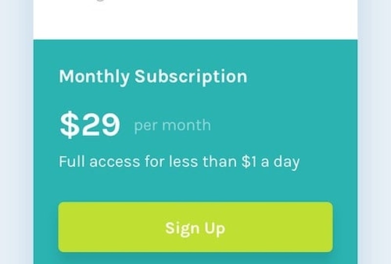
2. Class Project: Alright, so yeah,
as you can see, it's a pretty simple component that we're going to
be building here, but we're going to
do it responsively. So it has the desktop version
and the mobile version, and we're going to use
CSS grade if we can. So taking a look at
our component here, we don't actually
have to use grid. We could use flex, as well.
So let's see how it goes. It might be easier actually
for us to use Flexbox. But we see how we have
our individual sort of that first section
on the top here, and then we have our two
smaller sections on the bottom. And then on the mobile design, it just falls
straightforward in a column. So pretty straightforward,
pretty simple, but just a little bit different because that lower section does shift in terms
of where it's placed. So let's go ahead
and build this up.
3. Tutorial: So I've gone ahead and built
out the starter app already. Again, that's nothing I did this like months ago sort
of thing in terms of setup. You can just go ahead and
use this starter kit. It's the material I next typescript combination
all already set up. And you can just go ahead and clone it and use
this as your starter. You can use this and
you don't necessarily have to use the
Typescript element. You could use JavaScript
if you prefer. So totally up to you if
you want to use this, but it's linked in the
description below. And also, if you do
want to follow along, like, always, I'm going
to link the design. This is one of the free
designs from front end mentor. I'm going to link that in
description below as well. So we have our basic
spun up app here. I'm just going to go
ahead and delete all of the existing sort of
reset stylings there, and delete that there. And then I'm going to
actually go ahead and drop in the background color for this design here
if I can grab it. Desktop. Let's see which color
we're dealing with here. I think it's this light
blue sort of color. So I'm going to say for
the body and the HTML, the background color is going to be this and, yeah, that
looks about right. So we have our
background color set. Let's go ahead and
build out this page. So on the page, we're
going to have three cards, one card with, like, three
sections, I should say. So I guess for this larger
section, how should we do it? Let's do three little boxes. So I'm going to create a
components folder components. And we'll say New file is
going to be, um, Card header. I'm going to call it. New file. Card header. Oops. Header TSX. And again, you can use
JSX if you prefer. And then I'm going to
create a new file called card container dot TSX. And that's just going to
hold all of our cards. So we'll use box to be able to style using
XX prop for material UI, and then I'm going to import the card container
onto our home page. So card container.
Save that there. Awesome. And then
the card container now is going to take
our card header, and then it'll take the other
two smaller card components as well. Header. Awesome. Cool. So far so good. So let's work on the
card header now. So again, I'm going to
turn this into a box. Um, save that. And cool. We're seeing
it on the page. Um, let's center the card
container on the page. So yeah, the card container is I'm gonna set the display
of the page to flex. And we're gonna say flex
say justify content, sorry, center and line items Center. Save that. And I think I
do need to set a height. Um, a height for this
to be 98 view height. I think I should probably
end up doing this in CSS, but we'll cross that
bridge a little bit later. Alright. So the next thing
we want to do here is yeah, build out build out these
little pieces here. So, within the card header, it looks like we have
joined our community. So we need some
sort of typography. We need probably three
different typography elements, so let's drop those in.
We'll say typography. Um. Cool. And this will be our first
one. Join our community. Awesome. Second one Hassle
free money back guarantee. And then the description of, like, what they're trying
to actually sell us. Um, cool. So that is pretty
straightforward. Now let's do a
little bit of silen. It looks like there's about
40 pixels of M or padding, I should say, padding, um, around the elements. We'll say 40 pixels, 2.5 Ram. Um and what else
do we need here? I think, that might be we should do our font size and
things like that. So this is gonna be 24 pixels. Font size. It's
gonna be 1.5 rim. Um, this one here
is going to be 18. And then this one here is going to be regular, so
we'll leave that alone. And then we'll set our color. So this one is going
to be this color here. Fond. Or just color. Um Good. Uh This is gonna be
this, like, neon green. Let's do that there. And then this one is
going to be this, like, bluish sort of
thing. We'll say. But. Cool. We'll save that there. Awesome. So so far so good, we have our little box there. The other thing we do need to do is set the background color. So we'll set the background
color of the box to be white. Save that. And that's looking pretty good.
So far so good. The other thing I
want to do is set the max width for this box here. So it looks like
the width is 635. That's gonna be for
this card container. I'm gonna say max
width is gonna be 635. Oops, pixels. And the max height. 'Cause it's just supposed
to be a component. It's not like a whole page. It's gonna be 475. We'll set that there. Awesome. Cool. So far, so good. Oh, another thing. Actually, another thing we're gonna want to end up doing is
setting the corner radius. It looks like it's
about eight pixels. So we'll say the border radius
is going to be 0.5 ram. And that'll just
curve all the edges. Oh, no, it didn't. Okay, so we actually have
to set it on the card. Alright, so we'll set it.
We'll go ahead and set it on the card the card
pieces instead. So we're gonna set
the border radius. And it should be
the same as when you're doing top
right, bottom left. So it's gonna be top, um, what is it top top left? Let's say, 0.5 Ram, 0.5 Ram and zero and zero, and then we can modify it
if that's not correct. No. Okay, yeah, that's correct. So see how it just curve
the top left and right. So that's just to get us
little that little bezel. So we're gonna leave
that as it is. And I think, maybe we can
add some font weight, just a little bit of weight
to this one here, not much, maybe 600 font weight. And yeah, maybe for
this one, as well. We'll do the same.
Let's save that. Yeah, that looks pretty good. Um, do a little bit of
spacing, maybe 24 pixels. Alright, so let's
say, um, Margin. Margin. Top is 1.5. Oops. 1.5 Rm. Um, right. And then what was it like
0.75 m and then zero. Yeah, and just gives us a little bit of
margin around there. And I think that's
pretty good for now. Let's go with that, and
let's go ahead and build the next two little boxes
here. So first box there. Next one is going to be our CTA, I'll call it our
CTA call to action. So whatever we end up if we
end up changing the product, we can always just
repurpose this component. So we'll say box. Um box. Cool. So far so good. And then we'll import it into
a card, our card container. Now, this is where
it gets interesting. So this is where I was like, we could use Griter.
We can use Flex. What I'm thinking we do
here is we use a box, and then within this box, we have our next two our
next two components. So we'll have the
CTA and we'll have whatever else YS,
you know, component. And then we'll flip where their position
based on the orientation. We'll use the media
query to do that. So let's try that,
see if it works. So with our CTA, now we see
we have it right there. Let's go ahead and
do the same thing. So we're going to add in
some similar stylings. And honestly, we could just use, like, a car, like, a component force
and all this stuff, but it's not like we could
create a card that has 2.5 padding automatically
and then takes a background color
as a property and takes border radius
as a property. I think we're building
something larger, it would definitely
be useful to do that, especially as we maintain
our design language. But I think because it's
just a singular component, right now, we can just copy
a couple of the styles. So we'll add in
some padding there. We'll set the
background color to be. Let's see what it
is. Uh, rectangle. This rectangle. Mm mm. Okay, let's see. I think it's this color. If it's not, we can change it. So we'll start
with this color. Cool. And then we
need same thing, essentially, three
different CTAs or three different sorry,
typography elements. So we'll start with typography. And first one is gonna
be monthly subscription. Save that Cool. Again, if they were more similar in terms of the actual style, this would totally make sense
to just separate it out into one to one
reusable component. So then we have this,
and I'm going to put in a span here for the per month, just because it is a little bit different in terms of style, but we want it to be
on the same line. And then it's more of a design choice rather than like an informational
separation. And then we have that
and then we'll have a button underneath all of that. Oops. I'll save that. Alright, cool. So yeah, basically that
section of the CTA. The next thing we want to do is actually set the max width. So, um, what is it? Height is gonna be 259. Max width is gonna be 318, so we'll say Max width is
going to be 318 pixels. That way, it doesn't
take up too much space. Um, cool. I think that is correct. Um, I think once we
add in the other one, it'll sort of occupy
that other space. So let's go ahead now, and
we want to set the color. So we'll say, colors for this. Color is white. And we'll
borrow that for the next one, as well, I think
are they all white? Yeah, they're all white.
Except for that little spin. I'm not quite sure. Let's take a look and see what
color that is. Okay, it's still white. Just
the opacity is smaller. So we'll style this. We'll say, um What is it? Uh, color is RGBA. Whoops. I put it in quotes. Uh oh, it's missing. There we go. Um, and
I think it's 100, 100, 100. Then 0.5. Yeah, that's basically, yeah. So I want it, I want it
actually, sorry, 255, 255. Yeah. Okay. That's what I want. I want it white, but a
little bit see through. That looks correct. And then
let's set the sizing now. So this is gonna be 18 whoops. We'll say font size 18 pixels. This is gonna be 32 pixels. And also font weight, we
can probably say as well, font weight of 600. We'll say font size two
REM and font weight, probably like 800. Um, and then but per
month it's different. We don't want per month
to have any of that. So we'll say font weight like 400 and font size
is going to be uh, 16, so one Ram. Cool. And I think we also
probably need to do some sort of display flex, um, align items in the center. Yeah, that way,
there's a little bit of space there. Okay. Interesting. And then we'll
also guys do margin left. Just to give some space
there like 0.5 for them. Awesome. Looks pretty good. And then the last one, I don't think we need
to change yet. It's just regular size 16. Um, another thing, we'll
add in some again, just add in some
padding, some margin. Um, between these two, I think there's about one RM, let's say, margin top. One Ram. And yeah, pretty good. And then we'll add in this
button at the bottom. So the button, probably
about 1.5 Rm padding on top. Okay. And then it's going to
be it's gonna say sign up. And the background
color is gonna be this. So we'll say background. Color is that. And the actual text color
is going to be white. Cool. Uh, and yeah,
that should be it. I think, yeah, we'll
make it full width. That's Width whoops. Equals 100%. Text transform is none it's actually forcing it into uppercase,
which we don't want. And then we'll probably
make it, like, font weight, maybe 600, make it a little bit more bold. Um, size wise. Yeah,
it's just regular. Maybe we do 800 even. Cool. And I think maybe there's a little bit
more padding on top. Onion. That looks pretty good. So that's the second
card, right there. Let's go ahead and create that third the third piece
of the card, I should say. And that is gonna be our Y. And again, you can probably come up with a better name than Y, but we're gonna use Y for out. So this is, again, starting with the box
for material you. Using that as our base. We'll import it into
our card container now, so we'll say why. Cool. So now we have
you see how it's stacking going straight down. We actually wanted to
come over to the side. So this is where
we'll start to mess around with our display. So we'll say display flex, and that should just, that
pops over to the side. You see how it takes up an
equal amount on the sides. So it's sort of compensating for the
fact that it's there. The other thing we
actually do want to do, which I completely
forgot about is setting that border
radius on the bottom. So let's do that real quick
before we completely move on. So sort of copping over
from the card header, we're gonna modify where
the border radius is. We actually want it
to be the bottom to. So we'll change that. Or, no, actually, probably
just the bottom one. So it'll be three zeros and 0.5. So we just want this
corn to be curve. So, um, yeah, we
have that there. And then let's move on to Y. So now for Y, we want to do basically a similar
style to this. So a copy, we can borrow this
and use that as our base, and then just change
where the zero goes. So the zero we
want on that side. So yeah, you'll see the
outside edge is curved. We also need to grab
this color, which is Oh. Which color is that? Mm, I think that was the other color. I don't think that yeah. Uh, another quick way I often grab colors is
using this color picker. Yeah. Awesome. Super quick. Uh, background color is
gonna be this. Perfect. Perfect. Alright,
cool. So we have that. Now, let's drop in our text, and this should be
a lot more simple. So we have y us. Um drop in a typography element. Why US Typography. Cool. And it's gonna be, again, a size 18. And then font weight
is going to be, I think it would be on
600 for the other one. Um, so it should match. And then the color is
going to be white. Cool. Awesome. Um, Max
Width, we got that set. Then we need this list here. Now, there are two
ways we can do this. We could do this, like, just
kind of break using breaks, but I think the better
way to do it is using an actual unordered list. So we'll say Unordered list. Do they have a list component? Oh, they do. I haven't
used it before. Let's try it and
see how it goes. Um, so we'll say list. And then what is it? List? List item, maybe?
Yeah, list item. Okay. And then let me put in the first one and
see if that looks alright. Tutorials by industry experts. Let's see, element
type, I look bad, Lazy element type. Oh, uh item. Okay. Mm. It indent it. I don't really
love it indent it. Um, I think there's a property that's like
Listyle List style? None? No. Um, Listyle CSS. Mm. Square inside. None. Inside. Oh, interesting. Okay. I don't really love that. How to remove List
indentation, CSS. Out margin left. Margin left. Zero. Let's see if that worked. No. Let's try it here. No. Okay. I'm not really loving the list just because it's not doing what we needed to do. So let's use a box, and let's use typography elements
just going right down. So let me copy all of
that text. Drop it there. Mm Okay. And we'll just drop these
into typography elements. So, geez. Alright. Um Okay. Yep. And Wow, actually the
right number. Fantastic. Uh, Oops. Okay, cool. We'll get rid of this
extra little space there. Alright, cool. So now we
have all of those lined out. Um, another thing
that I'll want to do. I could have just made a
style component for these, but I did not. Again, there are ways to
make this a lot cleaner, you know, if you're using
this for your portfolio. And that looks good. The only
thing I want to do is set, like, a min width.
So what is it? 318? I think I'm gonna set
the max width, but min width. Or is that Is that the same? That should be the
same, actually. Oh, no, that's not right. Um, I think this is why
it's saying use grid. Um. So let's go to CSS Trix grid layout guide. So, we say display
grid. Let's try that. Um, so for it would be
for this container. So if we say display grid, grid template columns, one FR, one FR, they should just take up the same
amount of space. Cool. That solved our
problem. We'll go with that. So that works for this. For the desktop design. So our desktop design
is basically complete. We're good to go. The next thing we want to look at is
our mobile design. So I have it open in a
second tab just so I can toggle back and
forth between the two. For the mobile design, we actually want the we want
it to just be one option. So if I say one FR, yeah,
that's what we want. Alright, so let's put our
mobile query in here. So we're gonna use our media
query hook from material UI, import it from here. I think we might need
to use it. Well, see. We might have used it in
a couple of locations, and I'm just going to
flip it up a little bit. I'm gonna say Cs mobile
equals min or sorry, Max Width, 600 pixels. And so I'm going to be asking
like, if it is mobile, do this, if not,
do something else. So if it is mobile, we want the grid template columns to just be one fraction. Otherwise, we want it to be one fraction and one fraction. Basically saying, like, it's, it's either set up like one
and one or it's one and two. So that's what we'll do there. Oh, and it does not like it because this needs to
be a client component. We'll save that. Okay. Awesome. Cool. So
that looks good. And then, yeah, it's
doing it correctly here. The only other thing
I want to change is these little pesky little, um, border radius things. And I feel like that's part
of the trick of the design. Oh, actually, here, they just don't have it curved
at the bottom at all. Interesting. So I
guess you just remove the border radius if
it's straight down. Um, I don't know if that's ideal or that
was just an accident, but we'll follow the
design as it is outlined. Um, so border radius. Yeah, we're gonna
have to do two more, um, two more mobile queries. So we'll copy this
media query into CTA. And again, it's not
strictly necessary, but it doesn't look gray. It doesn't look polished.
So we do want to make sure that we sort of do the best with what
we're working with. So we'll turn this into a client component,
and then we'll say, I mobile, border radius is zero, otherwise, border
radius is that. And then we'll do the
same thing in our Y. Also remove some of
these imports from not using just to keep things clean. We'll say if it is mobile, mobile order radius
will be zero. Otherwise, it will and, yeah, that looks pretty good. That's exactly what we
want there. So I think, yeah, I think we're
pretty good to go there. So yeah, that was
a really quick way of how we can use CSS grid, a combination of grid
and flexbox, really, in order to build a
responsive design. As I said, there are ways to optimize this and sort of
make it a lot cleaner. And I'd recommend that if this is one of your portfolio pieces, you definitely take a few
minutes and just clean it up. You know, use a lot more
reasonable components. Don't repeat yourself
as much and yeah, make it a really, really
solid portfolio piece.
 Zoë Davidson, Software Engineer & Cinematographer