Transcripts
1. Introduction: Hello everyone and welcome
to the learning session Learned meeting vector arts
in Adobe Illustrator CC. In this session, you will be learning about
the interface of Adobe Illustrator workspace of Illustrator creating
of the noon documents, some tools how to
important place images, steps to create vector art. What is the difference
in tablet and mouse use when
creating a vector? How to outline using brush, using pencil for hairs, using mask for base color collection data
sheets for shading, how to use gradient
for background, and then exporting
of your art work. This is going to be
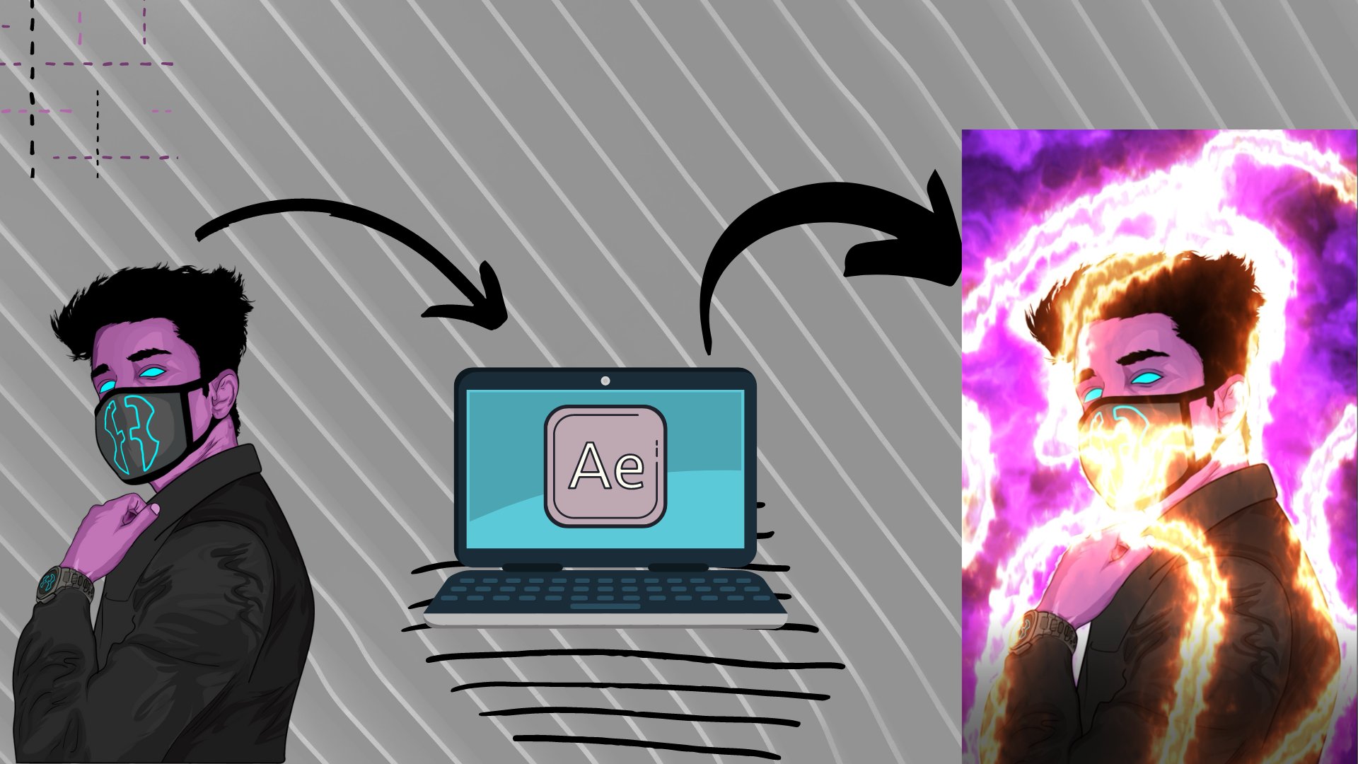
the reference image I got mine from Unsplash. You can get the Lincoln
Project description. This is the vector that we will have by the end of
this learning session. So without any further
ado, let's get started.
2. Illustrator Workspace and Picture Importing: As we all know, in this class, we will be learning how to make vector arts as a beginner. So first of all, we need to know on which software we're
going to do that. And obviously we will be doing that inside Adobe
Illustrator CC. And this is the interface you
are going to get when you launch Adobe Illustrator
CC for the first time. Now, obviously your recent
part will be cleared, but I have some files
here because these are the files are these
are the projects I have previously worked on. So if you do not see anything
in your recent part, there's no need to panic
because you just have not made any single project inside Illustrator and you are
doing it for the first time. When it comes to creating a new file inside
Adobe Illustrator, you can either click on Create New button or go to
File and then click on New. When you click on news, you will get a Windows Popup
in which you can select the dimensions of
the document or the Canvas on which you
are going to work. So for instance, this time we are going for art
and illustration. So we can go to those templates and select any template
which we like. For example, we have
the A4 paper size, we have before paper
size and other. Similarly, if we go
to Film and Video templates here you
can have HD for k, k to k, etcetera, etcetera. And the same goes for web, mobile, print, and etc. So what we will be
doing is we will be making a custom preset. And for our custom preset, I will be suggesting you
to go forward pixels. Then 1080 by 1080. And this is because 1080 by ten, it is like the standard for most of the
social media post. These actually fill up your mobile screen in the
portrait mode and that is good. Actually it doesn't
fill the whole screen. It actually like if this is
your imaginary mobile screen, it fills about 80 per cent and then 20% is left
for the caption. So this provides a
very good impact. You can choose the color mode. It can either be RGB or CMYK. And I will be suggesting
you to go for 72 ppi raster effects. And that is because if you
will go with the higher PPI, that will be importing more load or that will be more CPU-intensive
for your computer. So if you have a computer with like the RTX
30 TTI and stuff. So you can go with the height. But if you have like a
normal PC or a mid-range PCI will be suggesting
you should go for 72 PPI. And then you have all of this. You can name your document. So I will be naming it vector. And then just click
on Create button. And when you click
on Create button, it will take some time and
your document will load. And now this is the
basic interface in which you will be working
inside Adobe Illustrator. So now I can make it full screen by pressing
F on keyboard. And now we are full screen. And now you can see
here is this like a white page with some borders
and here are some panels. So first of all, let's
talk about from the top left here you can see it's the Illustrator logo and
then you have the home icon. If you click on Home icon, you will be redirected back to the home side from where
we created this document. Then you can see some
of the buttons here. We also call these tabs. And these tabs has different kind of
function that you will need when you will be
using Adobe Illustrator. Next thing you can see here is this button written
as essential. The essential is actually
for the workspace. The overall interface
that you are seeing right now is the workspace of
your Adobe Illustrator. And it is made by docking and undocking of
different panels here. So you can see this is a panel, this is a panel,
this is a panel. And even, these are some panels. You can even dog these here. So this is for the workspace. And if your workspace is
not looking like mine, you can just click on this. Go for essentials, classic
or even essentials. And still, if your
interfaces not like mine, you can just click on Reset Essentials and everything will be shifted back to
the default one, and you will have the
same interface as mine. On the bottom, you can see
this is the Zoom percentage. It will be modified. If you use zoom tool, you can either go with this and then you have this
number written here. And this tells you about
which art board are you on. This white page is
actually your artboard. Similarly, like you have a Canvas in your
physical painting, you can have multiple
artboards if you are going for a
storyline, for example, let's say you have
1234 art boards, so it will tell you on which
artboards you are working. If we are on the first
one, it will save one. If you are on the
second one equals C2. If you are on third
one equals c3. Next you have this bar
which says selection. This bar actually tells you the name of the tools
you are working with. For example, this is the toolbar and I have my selection
tool, select it. The next tool is set
direct selection tool. As you can see, if I left-click
on it and select it, it will say direct selection. Similarly, if I go for the
color picker or eyedropper, it will say, I drop it. I will go with width tool. It will say width tool. I will go with Zoom
to liquids is Zoom. So this is just to tell you which tool you're working with. Then you have on the right side some panels which say
Properties layer in libraries. The libraries is actually for the people who are going
to work with Adobe Stock. So you have all of your creative data linked
to your Adobe account here. Then you have the layers tab. It is essential to know
about the layers tab or LED panel just because it is the thing you will be
working with the most. For example, if I
click on this button, I can create new layers. So now I have six layered hairs. For example, if I'm on layer
one and create a stroke, so this is a stroke. Then I go to layer
three and I create a solid and maybe
color it with white. Then I go to Layer five and I create a random shape
with a different color. So now I have some
elements inside my layers. And these elements can be shifted from one layer to
another just by dragging them. And the arrangement
of these elements inside these layers
actually tell you which component you
will be seeing first. For example, layer six is on top but it is
empty right now. So we'll go towards
their five and layer five has this path. So we're seeing this on top. If we drag this
path to layer six, you will see that pattern top. And this is about the
basics of layers tab. Also, you can hide layers
by pressing on this button. You can select the circle to select everything that is
present inside that layer. You can delete the layer by
just pressing this button. You can click on
this layer to create a sub layer inside one layer. So these were some basics
about the layers tab. And then you have
the Properties tab, inmates, you have the
information related to Document. And then if you select
a particular tool, you will have information
regarding that tool. For example, if I have
selected brush tool, I have information regarding stroke because that is required, I can increase the stroke value. I can change its opacity. Or you can say visibility, I can change the brush style. I can recolor it. I can join two or more strokes, et cetera, et cetera, et cetera. All of the stuff or all of
the related function of that particular tool or of that particular element can be seen inside the property step. These words, some basics
about the interface and some musste use panels of Adobe Illustrator when it
comes to meeting vector art. Now we will be going towards
the vector naught formation. Now for the vector
art formation, you can either go for
drawing or tracing. If you are going for drawing, I will suggest you that
you have a better handle. You can see the better practice of drawing all of
the lines and stuff. For that, you can go
for a software that is called your ref. This is the spelling. So pure ref is a
software that is used to dark images on
top of your screen. If you open up pure ref, you will have a rectangle or a scared that you can modify it. So let's say you are working on illustrator in this position. So you will dock your image here and then you can just come here and see that image and draw a figure like
here are the eyes, the nose, the lips. These are the distance this
and you will draw a vector. So this is the first
method that I will suggest to go for when
you are an expert, or at least when
you have created like 50 or a 100 vector
arts just by tracing. So then you will be
expert in lines and stuff and you will have the basic knowledge
related to anatomy. The second method is
by vector tracing. And in the vector tracing
you will have an image on your art board and
a bottom layer. And then you can lock
that layer so that you don't mess up the image and you begin drawing on
the upper layers, and in the end you just
hide the tracing layer. So we will be going
with this same method. And let's see, delete
all of these layers. We're on layer one, and now we will be
importing a document. For importing. You can go to File. And then here you can
see the vet in place. When you click on
it, you will get a windows pop up and
then you can redirect to the place where you have your reference image and just click on that
and select Open. Now I'm going to place
that image here. When you open that, you will see that
image like a square or rectangle near your
cursor, right? I'll just left-click
using my mouse. My image will be here. And as you can see,
the dimensions of my art board for 1080 by 1080 and image is far
bigger than that. And this is going to
help me in making the vector art because
my image quality will not be distorted. So when you have
decrease the size of the image are optimized
as the size of the image. By using these handles, you can place that anywhere on your art board just by using your left mouse button
and moving that. But make sure you have selected the selection
tool in doing that. So after placing the image
at correct position, this is going to be a
good position for us. You can just change the name by
double-clicking obviously, and then typing reference or maybe simple raft
will work fine. Then you can lock
this layer and now nothing will work on this layer. And to draw anything
to do anything else. Inside this day, you
have to unlock this. You have to create a new layer. So we will be going
with a new layer and then we will
work on that later. So this was all about
this lecture in which we learned about the
basics of Adobe Illustrator. We learned about Workspace, we learned about
different panels and some basics of
most use panels. Also we got knowledge about two ways of making
the vector arts. And then we'll learn
about importing the reference image for
creation of vector arts. This was all about this lecture.
3. Explanation of Picture and Tools: So in the previous lecture, we learned about the basics
of Illustrator workspace, some panels, tools, and
importing of the image. Now, let's move towards
the vector art purely. So first of all, the question is that what we are seeing
right now is an image. This image is captured
by obviously a camera, and it is made up of
different kinds of pixels. Everything is fully detailed. It's a human face. So how we are actually
going to create this? Or let me rephrase that. How we are actually
going to recreate this just by using
some lines and colors. This question arises. We actually have to recreate
this the most possible, realistic, or at least
semi realistic way, how we are going to do that? So the basic answer
to that question is, we will be first of all,
making the outline. So for example, I have
the brush tool here. First, what we
will do is we will outline the face like this. And then we will be
going for lower part. And here we have the
eyes and the lips. So I'm just going to rough
right now because I just want to let you know how we
are going to achieve. So we will have the
basic outlines first. The next thing that
we will do is we will make another layer
by new layer button. Then we will draw the head
part and this is the hairs and this after the outlines. And here we will have a sketch of our
person or the image. The next thing that
we will do is we will create another layer. And then we will make a closed
figure like extending from this part and all the way to the skin
part that is visible, the ears, and again like this. Then in this closed part, we will be making
this part a mask. And we will make that by
clicking on this button and it will make a clipping
mask here, as you can see, then what will happen is
anything that you will create will be limited
inside this part. It will never escape. For example, here you can see
this is the scale we made. It is outside that mask
but it is not visible. If you turn off that
mask, you can see it. It is outside. But if you
make that mask visible again, it is limited to that, but this will actually help
us in shading the figure. We will do like this and
move this layer below, obviously the outlines and the colors and this
will look like this. After that, in the colored part, we will be adding
a color that is at least closest to
the natural color. Something like this maybe. Then we will add sublayers
of the same color, a bit darker and a bit lighter. Let me clue you in like this. Here you can see this is
the base color rehab. We made it a bit darker. And then we are on the
different sublayers. And now we will be going
forward like this. And some thing like this. We have the darks here. And then we will go
towards the right, create another sub layer. By clicking the Save
button. Here it is. And now we will be going with the light layers or
you can say highlight. So the difference
of these layers, or the difference
of these light, dark and the base color
will create a depth. See me as you can see in the original picture,
like you can see. This is the base color and this is the part that is
against the lighting. For example, here you can see this is the highlights part. This part is against
the lighting because this is
creating shadows. And we will actually be
using this depth of colors to recreate this image
in the most possible, realistic or semi realistic way. So I tried my best to clue you in how we are
going to achieve this. Given also, be able to
do the same stuff by the end of this session
because you will be having the lectures on all of this. Like the, all of the outlines here, shading, coloring, etc. You will have separate
lectures and all of this. So this was enough about the
explanation of the picture. And wanting more hair is what
type of picture you should. Opt for when creating
a vector art. So I will be suggesting you to take a friend feast picture because that has
the most possible. As you know, the elements
of the face like, you know, you see, here we have ears, we have lips, we have
nodes, we have eyes. Side post pictures. You will only have one eye and nose and half of the lips, etc. And that actually sometimes
can create some mess, especially for the big news. So as a big need, at least, I will suggest you to go for front feast focused portraits. And that will actually help
you a lot in developing the techniques of making
the good vector arts. Let's just delete all of
these layers right now. Now the other thing that
we're going to talk about is dividing the viewers
into two categories. So for that, let's just
create a new layer. And here we have the brush tool. And now you can either
be a mouse user, You can be a tablet user. Both people can make
vector art sexually. Even if you have a mouse, you have like two buttons, right and left leg, you
can move the mouse right, left, up, down depending
upon your accuracy. For example, let
me draw something. I'm making this by using mouse. And obviously I'm
not a good artist when it comes to
creating using mouse. When it comes to the tablet, you can actually be pretty accurate with that
just because you have a pencil and you have
a tablet and you will just drive the thing
and that will help you. So if you are a mouse user, you will only be using one tool and that is pegged to here
you can see the pen tool. You will have the pen tool, you will use leftmost button. It will add a node. A
will move forward at another left mouse click
and it will add a node. This would become a line. You will add another
left mouse button and you can drag
to make a curve. If you have a curve,
you can click on this anchor point to make the line again straight
and again add a curve. And this is how you
actually use the pen tool. Is it just the basics? And here you have the stroke color, you have the inside colors. You can always
change that stuff. When it comes to
the tablet users, I will be suggesting you
to tools that we will be using throughout the procedure
of making a vector arts, we will be using brush
tool, as you can see here. It only uses the outline color. And then we will be
using pencil tool. Here you can see This
is the pencil tool. And it is it can use both. It can use the insightful
and it can use the outlines. For the brush tool. You will actually be using Brush tool for all of
the outlining work. And you will be using pencil
tool to make this hares. Also to do all of the shading stuff and all of the things
that we will be doing inside this learning
session using brush and pencil can be achieved in the same way using your mouse by using
the Pen tool. I explained this in the beginning of the learning
session just because so you know that
when you are going to do the vector add
stuff with mouse, which tool you have to use. And vengeful going
with a tablet, which tools you have to use. So right now you can see you have a flowchart
in front of you. If you are a mouse user, I will be suggesting you to
go for pen tool if you are a tablet users will be using
Brush tool and pencil tool. Also, I will be
recurrently telling you these things inside
upcoming lecture. So this was all about the difference of
tools that we will be using as different users. And all of the steps
that we will be using to progress inside the
session to make a semi realistic or
realistic vector art. This was all about this lecture. Meet you in the
next lecture soon.
4. Outlining of Face: Now we have the basic knowledge for starting with
the vector art. So let's start making
the vector art. Officially. The first thing that we wanted
was our reference image. We have that on layer. We have rename that
layer and we have also lock that layer so we
cannot mess that up. The next thing is
creating a new layer. And as we discussed in
the previous lecture, we will be beginning
with the outlining. So I will just double-click
this layer and rename it to outlining or maybe outlines. So first of all, again, let's divide the category. Or you can say,
let's categorize. If you are a mouse user, just click P on your
keyboard or go ahead. You spend two and
start outlining. If you are a tablet user, click on B from your keyboard or you can go here and you have
the brush tool. Now, first of all,
before going for the brush tool, double-click it. When you double-click it, you have this fidelity. You can either make the
lines smoother or accurate. Now, this will depend upon how efficient you are
using your tablet. If you are efficient
enough that you can actually draw
all of the circles, all of the roundness and everything you can
bring that on. You can go with
almost this fidelity. And if you are not good enough, I will be suggesting this
to stick with the default. The next thing you have to
do is go to Properties. And here you can see the brush. Expand this and you
have different options. Five-point round brush
works very good. When you are going
for the outlines, you just need to
double-click this and have this brush options here. And then in the sidebar, you have to click
on figs and then pressure and increase the
variation to the max. And when you click Okay, you will have your
brush related to the pressure sensitivity of
your tablet, for example, you can see this is like the minimum to the
maximum and minimum. Again, this is what
we all actually want when we are going
for graphics tablet. And for the pen
users, don't vary. I've also got your back. You will draw all of these lines and you
have these lines, then you can increase
the stroke like this. And if you click on Stroke, here you can see the profile. And from the profile you can
change the uniform to this. And it will also
modify like this, some hardness and softness and hardness and some softness. So don't worry if you don't
have a graphics tablet, you can also achieve the stuff. So let's officially
begin the outlining. I will be beginning
with the nose B. Obviously. I can reduce
the size by using the brackets button
that are present on keyboard after the IOP. And here you have to
select the outline color. We will be going with the black. And let's just draw the
outlines for the nose. And here we are. Like this. You can press Control Z on your keyboard to undo
your last action. And that actually helps a lot because when
you are drawing, most of the stuff happens that
you don't want to happen. And this is it. We have the nose. Let's go for the lips now. Z on your keyboard will
help you zooming in and out when you press Z end, but you hold all that zooms out. So Control Z again
for the board or do. And this desert this. Okay, So we have joined the
boot edges in a good way. And here it is. We have got the lips. Now.
Here we have only one ear, so we will be doing that
actually, as you can see, I'm going a bit rough on the edges when it comes
to lips and ears. And that is because this will be covered inside the hair parts, so you don't need to
worry about that. But obviously you have to be precise and accurate
when it comes to the part which will be
exposed throughout these parts, but these edges will be covered
inside the hair parser. Don't need to worry about that. Then we can go with the
facial feature like this part and it is
pretty accurate. Now the eyes. And we will be making just the outline for the I and the remaining part will be done in the respective lecture. Let's go like this. So we have almost the
same techniques and some light lines or light strokes you can
see for the borders. We have it again. And here it is. You will obviously be
taking more time if you are new to the outlining
and the vector art style. But if you are
already working on this stuff for like
some year or two, you have made some vector
arts back in the time. Or even you just have used
the pencil for a long time, you will be accurate with
your strokes and stuff. I'm just ending it up here because we want the
canvas to be filled. And you will actually have to do this stuff again and
again when you will be making vectors because
not every picture has all of the extremely T's
and stuff that you want. Now you can hide the
reference latency. We have a pretty good outline
here for the r vector. This is looking good to me. See. So I think we have
made of the extremity. Let's just add some
detailing to the ear. Like this. And this. This is going to work fine. We have the eyes,
we have the nose. And this is pretty
much everything. We have got the basic outline. Like. Let's just also
add something here. We can make this a
bit lighter and yes, this is what we
have made so far. You can always save
this by pressing Control lesson keyboard or
go into File and then Save. I've already saved that. That is why it is
showing me the button. So this is the basic outlines are the basic skeleton you
can see for our vector art. Let's just lock this layer. And in the next
lecture we will be working on another layer.
5. Using Pencil for Hairs: By far, this is what
we have created. We have actually added outlines
to our reference image, and now we have done the first step in
making the vector art. Now let's proceed
towards adding here. So inherent part, we
will be adding eyebrows, we will be adding
beard and mustache. We will be adding the head here. And this will be actually
helping us turning this outline into a proper like grayscale
image or a basic sketch. So far that first of all, create a new layer and you
can rename that to here. And we actually rename these layers so that
it makes easy to move these layers up and down in the end so you do not
create any type of mess. So again, when it comes to here, you have two options. You can either go for pen
tool if you are a mouse user, you can go for pencil tool. If you are a tablet, use it. For the tablet users. I will be suggesting
you to choose pencil tool and go slowly
and add some sharp edges. At some, you know, the flame like effect. And these are the things
that will be helping you in achieving the
greatest things. Related to vector are the
most realistic things, the most semi realistic thing, etc. Whatever you like. You have this, you
can just click on this button to change the stroke color
into the fill color. And obviously we wanted
black and we are good to go. So we have one eyebrow. Let's go for the second one. And it is now actually when
you create vector art, sometimes you have to change your reference image
according to your choice. For example, you can see the eyebrows of the
reference image are just like the simple strokes
from the genome, the brush. But we're actually
making these dark just because that will be
adding a better look. So at it is we have eyebrows and then we will be
adding a mustache. And similarly, you see here are some black and white hairs mixed up properly
for the moustache, but we will be going with
only black right now. So the person will be
looking more younger than he actually is right
now in this period of time. So these are the something, these are some
adaptations you will have to learn when
making vector art. You can obviously go for the exact thing in
the reference image, and that is what
actually, OK, means. You have to do the modifications
according to your choice, according to your taste, according to the requirements
from your client. If you are doing this for like freelancing work and stuff. So these are the things that you actually have to keep in mind that you actually have
to practice these. Like I myself when I
created the first vector, that was a really, really flat and that was like the exact replica
of the image due to which some part of the eyes and eyeballs was
not in the proper place. The hair part was not good
and it's sector, sector. You actually learn from
your mistakes every time, like you have to modify
all of the things you do not get anything like pretty
accurate to the reference. Sometimes you can
actually also get everything pretty
accurate as a reference. Like everything is like to the point like how
you want it to be. The actor's face is
actually in position. The header, like you want these to be like
you want them blonde, they are blonde, you want
them black, the black. You want everything
to be pretty accurate and everything will be that sometimes this will also happen. But most of the time you will not be
getting what you want. So you actually have to
meet that by herself. And we have the mustache. Now, we can go for the beard. And here it is like the
same methods you just have to draw on the reference. You can modify that a bird and it is small
part of the beard. And then from here it is. And see, like I
previously told you, these lines are these outlines will not create a mess
because these are going to be hidden
in front of hairs and this is actually
happening right now here. This is also a good
step before creating vector art to properly
evaluate your image and see like where you want to
be pretty accurate and you just want to have
like a group look. Now as you can see, we have created a massive
regard this here. So we can change that, but we can fix that by
going with the tool. And here is our knife tool. You can move it with a
knife tool selected. We can cut this part. And when we cut this part, this part gets
separated properly. That x selection tool. Now this part is Cartier. So now we can go with the eraser tool and
remove this circle here. I actually use scissors
for us just to make sure that we don't mess up
the remaining part here. When you have done that,
you can go back to your layers. It is. Again, keep drawing. And you will be good to go. And all of this
stuff is actually just the muscle memory
that you will also achieve when you will create like
a 100 vector arts or 200 vector arts within two
or three months of Vmax. So there is nothing
like you can do. There is nothing like
a big thing that only a person like person who is teaching can
do and you can do now, there's nothing like that. You can also do all of the
stuff that I'm doing here. And everything is just
the muscle memories. This is the muscle
memory that I got my cell by creating this
vector arts for years. Now. We have the beard here. And now you can
see the vector is actually looking pretty good. Let's go for the upper here and see I messed up
here a little bit. See, I can compensate
that by adding another layer of here like this and none of
it will be fine. And this is the thing
I was talking about. You actually have to modify everything according
to your liking, how you want it to be. This is the main theme or how
your client wants it to be. Are you can see how it
looks pretty impressive. So everything depends on you and luminance
and nothing else. And again, you can see we've got this. We go from here. Drive it easy. And boom, we are good. And see here it is
actually a bit. Let's develop, but we are
going to make it properly developed because we want
a vector out to be way. It is the basic here
for the vector. Now you can see if you see
the reference image now, it's actually looking like that. See, now we have actually
got the sketch and this is like the first or the second step in
making the vector art. You can also add some
shades too. The head. For that you can
add another layer, hide the log, the hair layer
and call it hair shade. And for the shields,
you can actually go like long lines like this. And then you can
go for a gradient. Then you have a gradient. You can select black and white. Can change its direction
to something like this, like top to bottom. So nine teach should
be minus 9090 is good. Actually, we have dark on top. And we will move this color. Modify this to something
like something darker. This it's almost like the
same color, almost the same. Then you can modify its opacity a bit to make it properly blend. So it almost looks
like the same thing. And then you can just draw
again the long lines which are going to add some depth
inside the beard. You again selected
the same gradient. We can again go for 90 degree. And all of the paint tool
users can also do this and that isn't also not
going to cost more work. So everyone can do this. Everyone is more than
welcome to do so. I will also suggest
you to do this. Since we are adding some depth. You can keep on adding this. Here. You can see we
went from here to here, and now we will be
going from this part to maybe a bit less deep. And when we will add now and change the dimensions,
it will go towards. This is overall adding some pretty nice
depth, I would say. And here it is. And that's again the
gradient, the 90 degree. See, we have this. Now for the moustache. We can go with another
type of shading that we will also be learning in the shading part of
the face colors. You have this. Let's add a color a bit
lighter than black. Here it is, so dark gray. And then add other layers, like extending throughout it. The same dark black. This will also create
some nice depth. Here is you can always modify these colors
later if you don't like them, if you don't want
them to be this way. And even I will also suggest you to try
different things actually, because these are the things that you will learn
or you will get the final result
after practicing and after trying some maybe
two or three types C. Now we have some
depth over here. Even here. Let's do this. 90 degree modified capacity
this time. And here it is. We have a beard completed. And upper here we will
find the same way. This is pretty much it. Now we have outlines
and now we have here. And we also learned
about the gradient and gradient filling when we will, when we were discussing the hairs and shading
of the hair x-bar, this was all about this lecture. We will be moving towards the next step in the
upcoming lecture.
6. Masks for Base Color: In previous lectures,
as you can see, this is what we have created. We have gone for
outlines here and the shading of the hair to
give it more realistic look. Now, the next step is
going to be the coloring. And for the coloring, as we have already discussed, first of all, we're going
to add a base color. And then we will go
for the shading of that base colors,
different color variance. So first of all, for
the base colors, you have to decide which
areas you have to fill. So here you can see only this part and this part of the human
skin is visible. Obviously, if you will
change the image, there will be different parts. May be if the person or the subject in the image
is very long neck, the neck might not be visible, Or the second year
might be visible. So there are different kinds of variance when it comes
to the pictures. So the basic thing is
you will have to create a new layer and name it color. And then you have to create a
figure extending from here. And the whole of this
part, just like this. And then you have to
turn that object or subject into a clipping
mask using this button. And for that you
can always go for a pen tool as this
would be easy to grow. Or you can either
go for pencil tool. But in the case of
pencil lecture, do you have to go like this? For example, I'm drawing
using a pencil right now. And also make sure to stay below the outlines when
drawing the colors. So here you can see, I do this. Now what I have to
do is move towards the end where I left
off last stroke. And here you can see the icon
below the pencil changes. Like here you can see changes
from start to a dash. So when it becomes a dash, you can press it on the graphics tablet and
start extending it, and it will become the
part of same stroke. If you were using a pen tool, you can always go
for the same thing. And for that, you will
see the icon of a hat. And here again, I
can go like this. May be extended to
this part first, Zoom n, or maybe just use pen tool and
extended from this part. Actually when it
comes to the curves, the pen tool is
actually quite handy. And here it is. You just have to stay
below the outlines. And that is the rule
when you are going for making a mask
for the base color. Now here you can see we are
going with the neck part. This is, how's it
going right now? So both tablet and mouse users can do this using the pen tool. Or the tablet users can also go with the pencil tool as
I showed you earlier. Here it is now the last
part, which is ear. And we're almost done here. Just a second. And it is the final curve. So as you can see,
we have covered almost all of the parts and you can now extend it below the hair is
like an easily. So here it is. We have this figure right now. Now let's test
this figure first. I can change the color to maybe blue is actually
change the outline. So Herodotus, so this is the
figure that we just created. And if we just click
on this button which says make or release clipping mask with
the layer selected. It will convert the image yet element into
a clipping mask. And now every new element
that we will add, for example, I have a rectangle here or
maybe a square here. I change its color. Now, I can see this
clear right now, but it is not showing its color. That is because it is
outside of this mask area. If I move it inside the
mask, you can see the color. See, this is how the mask works. Now the next thing is how to move this mask below
all of this stuff. That is just simple. Hold your left mouse button
and drag this layer below. That is why told you earlier that you have to
know about the moving of layers up and down
because you always want outlines and here to be on the top and all of the colors and stuff below that. So now we have our mask. Let's just create
a simple figure, maybe using the rectangle
tool or maybe pencil, pen, anything, just cover everything and change its color to
something more natural. Like this can be
a good skin tone. See, this is somewhat
realistic skin tone and I actually like that. If you also want to copy this, you can always use
this hashtag, ED 9169. You can copy this and add this into your
Illustrator color picker, or you can say the color panel and you will
be good to go. You will get the
exact same color. So this is how you do it. Now, one more thing
is if you are a person who makes vector
arts, again and again, you can always make
a new layer and make different rectangles or squares or any kind
of figures here. Now, this is going to be a
base color for every vector. And then for the other parts, you can always change that. Maybe this is the dark one. And then we can have this
fun for the darker version. This is going to be
the lighter tone. And here we have the highlights. So when you do this, you actually have like color
palettes for yourself. Then you can just
click on your vector, or you can say element of
your vector and just press I on your keyboard to get color picker and
change the color. See, this is that easy. So it is also advised to make color palettes for yourself
using like these squares. So this is how you make
swatches for yourself. And then you can just export these swatches as a
different document. Like go to File, Export and Export
As and then export. These are different
document and then place them just like
we placed picture. And then you will be good to go. You can just pick these colors every time
you are making vector art. So this was all about making the base color inside Adobe Illustrator
for your vector art. And when you have
your base color, when you will fill up
your lips and eyes, you will already have
a flat vector art and actually a flat
good-looking vector art. So this was all
about this lecture. Meet you in the
next lecture soon.
7. Eyes and Lips: Now we already know we
have created this so far. We did the outline
work we made here and then we went for
the base colors. Now the next thing
that we're going to do is the eyes and the lips. And for that, we will
make separate layers. So we will just
create a new layer. And here this time, you will follow the
same exact format that we learned for
the base color. We will zoom in, delete, focus your lips. I mean, the vectors lives and we will change
its name to lips. And now we will create a mask in the same way that we
did for the base color. And this is going to
be a quick one because most of the part of
the lips is covered inside the beer and stuff. And here it is almost done. So as you can see, we have completed it already. Now you can just move it
below outlines there. Remember that don't
move it below the color layer this time because if you will
move it below, it will actually vanish. So here we have the lips. Just click on this button. And obviously the mask has
been created for your lips. Create a new rectangle
and now color the leaves. Now for the lip color, you can go for something like maybe this will go
here it is, like good. And then you can lock
both of these elements, the mask and the base color, create a new sub layer
and begin drawing. For example, you can
give a better shade, maybe a bit darker
one to the upper lip. And here it is. I just do it using the pencil. If you do not have a tablet, obviously you will be
going for pen tool, as we have discussed earlier. We gave it a darker color, actually, the mood, right? You go, the more
brightly-colored you will have, and the more bottom you go, you will have the
more darker color. If you go towards the left, white will be element that
will be added to your color. And if you go towards
the upper side, you will be getting more dried. So this is how you are
going to get your careers. For example, if this
is your base color, you move right and down
to get a darker variant, and you move up and left
to get a brighter variant. So here it is, the dark element for the lips. And then we will be drawing some random figures
alongside the borders. Just for the purpose of shading
the lips the same dark. And here you can see, I figured is not leaving
the area of the lips. And that is just because
we made a clipping mask. Actually the making of this clipping mass saves
you a lot of, I mean, a lot of a ton of effort just because when you create
a clipping mask, once, you do not need to be worried about the
remaining figure just because you can
draw like anything. As you can see. I'm drawing like anything here, but if there was
no clipping mask, I will obviously have
to be cautious about these boundaries
and these borders every time when I'm
going to draw anything. So we will be adding some
different shades for the lips. Obviously. This
was a nice colors, so we make it less. And just a bit more like this. Actually, your lips have a color and then the light falls on Eric and your lips get
different kinds of colors. You can actually see that in different kinds of photographs. When the light
falls on your left, some part of your
lips turns darker and the same red or pink color becomes darker at some
point, becomes lighter. At some point, sometimes you'll get the change and the
variation of the seasons. Stuff also happens. So this is going to
be at the bottom. Maybe like this point. Yes. These are our lips. So far. Maybe just change the
opacity of the black part. And that is just to make sure that everything
blends perfect. This is all just a
game of, you know, the practice and how
you like it more. And now we'll be creating some of the highlights
for the list, like the parts where
light is falling here, right one, a bright
patch actually. Similarly, on the spot. A bright patch. So
here are the lips. And just turn this into something
more natural like this. Okay, so we're done
with the lips for now. You can just log the ellipse layer
and then create another layer for right. Now, don't confuse this with
the perspective. Actually. We are seeing the left
eye of the vector has the right eye and right eye
of the vector has left eye. But don't confuse this, just name it. Again. We have the I. We're
on a new layer, we will be creating
a mask again. And here is one more thing
that you will learn right now. As you can see, our
mask path is going black and we can not see that underneath the
black outlines. You can always change
that by double-clicking your layer and changing its
color to something else. Maybe sound, great,
and C, We are done. So these are the small bits of illustrated that you learn
when you are falling up, something like maybe
a tutorial thing or maybe you are
learning vector. You're learning some of the stuff that you can
do using Illustrator, like making a brochure
or anything like that. So we have this, again, we'll be making
a clipping mask. And this time we are going
to move this into white. And after moving it to white, we are adding some layers for the shading of
the whites of I. And here it is. We will be moving it to something like dark tea
or maybe a light one. This time, a light gray. And the borders would be darker. So here it is. And we're almost done
here. Here it is. See eyes look way
more realistic. Now you can hide all of these
layers and you can hide them just by holding the left
mouse button and dragging. So hide the color layer and even these layers
except for the mask. So it will be easier for you to track where it's eyeball is. Now press M on your keyboard or hold this and go
to the Ellipse tool. Make a circle that perfectly
fits with the eyeballs. So here it is. We have it turn its
color into black, or maybe just pick
it up from the base. This is good. When you have it. You can again go for another ellipse for the eyeball or the pupil auditory nerve, whatever you call it. So here it is, your eye. And to give it
more natural look, pick up the base
color and then move it towards a bit darker
and the same old fashion, a bit trite and a bit down, and then shade this part with some color or dark
color of this leaf. And after that, again,
pick ellipse tool, go for your vibe and make
some random shape ellipse. And that is going to be like for the light shades are the reflections that
we see in our eyes. Here it is, our
eyes looking great. And now we have to do the
same thing for the left eye. Again, a new layer name, it has left eye and make a mask. Do the base color and stuff. To save you some time. I'm going to
fast-forward the Spark, so just enjoy it. One thing here is that
you don't need to go again and again for the eye color or
anything like that. And to make your both of
the eyes match pretty well, you can always pick colors from the other eye that you made. For example, I picked
up the white first, then the light-colored, and now I'm going to pick
the darker one. And similarly, I will
turn it off like this. Turn the color layer of open the href and make the eyeball. And this desert. And after the eyeball
renewed the basic colors. So you can just go
here. We have it. Now, the black
color. We have it. For the same thing. The sheets, we will meet debt. And here it is. Now the same old white ellipse. We completed our eyes. Now, you can move these
ellipse a bit closer. And this is by far our vector and it is
looking good to be honest. This is looking
like a flat vector. And I guess even if you send
this to your client with obviously the coloring of the
clothing, he will be happy. So this was all
for this lecture. By five, we have
created outlines here, base color, lips,
eyes at sector. Now we're just going for the facial shading and
the clothing, etc. This was all for this lecture. See you in the
next lecture soon.
8. Clothing to Complete Flat Vector: We have completed the
flat vector by far. So let's just continue
towards the completion of the same flat vector by
adding some clothing. For the clothing,
we will again make a new layer and make sure it is below here and the outline part. And then you can name it floats. So now you can do one
of the two things here. You can either make
a clipping mask by going from here all
the way towards here and then taking care
of all of the neck and parts are you can either move this layer below the
color layer and then make a mask cautiously towards or over this outline and then go rough and this part and then
go towards the end. I will be going with
the second option. That is because that's going to save me a bit of the workload. So let's just use pen tool. And we will be going towards
the end here and the same. And then we will zoom in a bit. Move this a bit towards the end. Actually I'm holding control on the keyboard
to move the ankle using the direct selection
or the snap two button. So here we have our mask going all the
way towards the top. Then you know, we can go. And this part because we have our layer below
the color layer, which extends all of this neck. So it is we have got the layer done. We have this again, we will just create the
mask and add a shape, and then add a
color to the shape. Let's see what he was
reading in the reference. Okay, it's kind of
a dark t-shirt. So we can obviously give it
some maybe light gray shade. So here it is. Then for the shading part, we can obviously lock
both of these layers, create a new sub layer, and go with the pen tool for the mouse users and
pencil tool for tablet users. And here it is, and give
some dark color to it. And how we get the dark
color, obviously, right? And down. And here it is, the dark color. This dark color should
be around the neck two. And that is because in
most of the t-shirts, we have this part a
bit darker because we have the stitches
around all of this area. And then we are going
for the borders again. The shading actually helps a lot when you get
the dark borders. And then you draw something in the lower
part of the middle. And that is also a bit darker, but that dark is the font that blends with
the original color. And this is the basic principle when you are going for shading. So here it is. A bit dark. See, we have got our clothing and
to make it blend better, what we're going to do, obviously changing the opacity. And here it is. We have done our
clothing so far. What we can do now is lock the layer and move
towards the next lecture.
9. Shading Darks: Now we have a flat
vector art completed. Let's move towards
shading of the dogs. Now, for the shading
of the dogs, you can either
create a new layer and a new mask and
stuff like that, or you can just be a
more sensitive and lock the base color and
clipping mask layer inside the color layer
and create a new layer. And you can call it the darkest. Because we are going with, for shading layers this time, we will go with the
darkest, darker, brighter, and the brightest, or what we call highlights. We are on the dark guest. Now. What we will do is color, pick the base color
and move it to something darkest,
maybe darker actually. So you can either go here with
your basic anatomy or just turn on the reference
layer and check which parts are the darkest
compared to the base color. And obviously this area and under the eye and this inner part is
going to be darkest. So we will be doing that. Let's begin with the ear. Again. You can use pencil tool. If you are a tablet
user and mouse. If you are actually, you can use pen if you
add a mouse users. So I'm just growing on all of
these lines and head it is. Now we are going to create
a straight line out of this like it is extending through out and blending inside the eye. No worries if you mess up the eye because
that is going to be below the eye Kelvin because we have the eyelid up on upside. So you can see,
let's blend mode. And this is it. Now. This is going to be part of the face that is
away from the light because light sources like this. And then we will be completing the nose here by extending from this side and portraying it in the most
beautiful way we can. And this is going
to be like this. Is this desert. Actually, I would say
we can it is this part. And just keep it a
bit darker this way. And then we will use the color that is a bit lighter than
this, the darkest one. And we will use that to shade. So now by five we have
completed the nose part. And then we will go for the boundaries and actually their darkest
colored suits the boundaries because we actually
have the hair part and some here base
growing out of that part. So darkest color suits. And let's complete this
across the beard stuff. And here it is. Make sure you don't
mess up the ear. Because that is also
inside our clipping mask. And here it is. The more time you
spend on the shading, the more realistic
thing you are going to get as this part of Nick is
going to be under the beard. So it must be darker
because the beard, but obviously be stopping the light from
falling on this part. So here it is. And also the brows will be obstructing light and you will also be having
some small hairs. So we are also going
to portray those using the guest possible color. And we're going to be done in a few seconds
with the darkest color. Here we go. We are done with the
darkest right now. You can just add one
layer with the name blacks and fill up
these nostrils. And here is just make it up sweet and
simple to Black. Similarly, on the other side, turn it to black. So we have the
darkest part done. Or maybe we can do a bit by adding some of
the darks here. Under the nose part. This is going to
create a good depth of field or the shadow. This is going to
create a good depth. And here it is,
We're almost done. This was enough for
the darkest shades, so you can lock this layer. So now we have done the darkest. Let's make another layer, which we will call it dark. And don't forget to move this layer under
the darkest part. So here we are going
with another color now, which is obviously less darker. You can check whether this
color blends perfectly or not by making a patch
on the skin and seen. So this blends perfectly. Let's start with the next part. Here. We're going to make
the border with that. And it is simple. Now for the ear
will make boundary. And then blend all
of these species. Again simple. Now let's go towards eyes. This is not going to be simple. So we will be going from here towards the end
of the eye, like this. And it is part C. We will also extend this now
from the upper part like this to make it a
proper face patch. Here we are light. This. And let's move from this. Like the lower part is going
to be cheeks and we are on the upside part is
like a proper patch, is actually testing with
those small shapes. So here we have a proper batch
now for the darker area. Now let's go for the other part. And this time we will be
going for like this again. This is how our face
batch will be this time. Extend this two out because this is going
to be the proper patch. See, let me explain you
this a bit in a new layer. For example, let's look
at this is the face. You see, this is the phase. You have a base color on it, and then you have
to add some darker, darker, and lighter layer. So what we do is
we go like this. And this part will
be the darkest one. Let's add an outline. So this part will be darkest. Then we add another batch. This is the darker, and this is the lighter. This is the lightest. This is one way of shading. This is like the
most easiest way of shading and that also helps the beginner to go for the other
aspects of shading. I'm doing this right now, like we added the darkest one and now we are adding
the darker parts. It's going well for me. It is. Also don't forget
to go for the nose. And this part and BU for almost this. Just like this. See, now we will be completing
this by going like this. So we got a proper patch, right? This is a proper batch of a
layer that is a bit darker. And by clicking on this, but we'll select everything
and then we will manage the opacity to blend
it a bit better. And it is blended a bit vector. You can always add
another layer. Maybe this is going
to be looking good. See it properly covers
up this part and this. So we have this now. Then we will be
adding another layer. And this layer is going to be on top of darker and darker. And this will be
named as simple, maybe dark, but
actually it is going to be for the compensation
of the colors. So we will go like least dark. And this is going to extend
on the different regions. Drop it below the darkest one. And also turn it. A bridge like this. Yes. Similarly, we will
be going like this. And here we are,
this face batch. And then we will be
going this face batch. See, it is looking good now. It is properly having
different kinds of layers. Now, Let's just give
it a proper color. And I would say the color
is not blending perfectly. School with the same base color. Something like this. This is good. Now. See we
have got another layer. And this was all
about shooting Dogs. You can always add highlights
for dogs, like all. You can just do that inside
the black slip by going here. And because these part of
i's are actually more dense. So you can just give them a color and drop down
the opacity a bit. Similarly for this part. And to give it the
exact same look, you can just press I and obviously opacity
will also be copied. This was all about
shading of dogs. Were there this an almost
1234 layers out of which one was the
darkest, dark blacks. And some color fixing layer.
10. Highlights: Now we are towards the last stages of
completing our vector art. We just need to draw the highlights and then
just a background. And we will be done. So far. The Brights
are the highlights. You will obviously
go in the Color part and create a new layer. Click on the Layer and click on this button to
create a sub layer. And this sub layer will go between the darkest
and the dark parts. Maybe just let it above here, above the dark parts. So now we are going
for the bright part. So again, filter out the
base color and choose something which blends
the deck perfectly. And now we will be
drawing the lights. For the lights again, you can just go like this part. Let's see if it looks good. Okay, so it actually
kind of lens, but it's not perfect. Let's just keep trying
a color that we like. Base it out. And here it is. Let's see if this color
is going to help us. And here we are. This color. This is kind of good. Let's drop it below. Here. This is like a bitcode, not the best one. Again, filter out,
and Here we are. This is not looking good. Let's try again. Actually just keep
trying until you get the color that you want. We actually want it to blend
perfectly with the scene. So this is not doing that, so we can always
modify its opacity. So here we are. Now you can just go for
this part and the nose. Like the light is falling on it. So it is and just try
to blend it properly. See, here it is. Again. Some part, some
part of the cheeks here just for the satisfaction. And maybe a batch on the forehead will work
great. Just like this. Now for the eyes, we actually have that already, so let's just fill it up. And it's looking good to me. Let's just lock this layer
and add another layer. And I already told you that we will actually
have to keep on adding the layers again and again and again and again just to make sure that we get some
good-looking vector. And when it comes to vector
art and shading and stuff, all of the things or
just the addition of layers with different colors, different variants of the
base color, and nothing else. So here we have this. We can go into
like this already. Some thing like this, okay, So this is good. Let's just try to
blend it perfectly. Like maybe this. Okay, So we get deleted. And you must have seen by now
that I am actually adding some dogs also when I'm discussing the highlights
part or the white part. So that is okay, Actually there is no
hard and fast rule for their doubts and whites
and blacks and stuff. This is just to make sure that you learn something that you have to play with the colors in this regard and in that regard. But you actually have to just add colors to make
the vector look better until you get the short, the place where you actually kind of like the
vector that we have achieved something that at
least semi realism or at least something
that viewers will light. So just keep on, just keep trying that
stuff and you will get to that as soon as
possible just by practice. So maybe let's move it. Now. This is not looking good. Just fill the eyes. Is this looks fine. And this is pretty much it. Now, the one layer that
we're going to add above the blacks is going to be the actual highlight layer. And that is actually
the most, you know, the testlet that is actually for the part on which actual light shines like
the sunshine and stuff. So you know, here it is. And these are actually usually
just a bit of the part like the nose and some
part of the cheeks. Just like this. Like a bit of the patch of the skin
that is actually a bit raised and more effected by
the sunlight or light, etc. This is gonna be pretty much it. You can always modify
its opacity area. This is our final vector. You can always add
more and more layers. As you can see, we have
1234567 layers of shading. You can always add more. You can add more colors, you can add more natural colors. You will be getting
more and more better results by doing that. This is pretty much it that
we wanted with our vector. We learned about our clients, we learned about basic shading, we learned about the
clothing and stuff. We learned about gradients
and this is our vector. So let's just go towards
the final lecture.
11. Framing and Export: As you know, vector
art is completed now, but you know, the white
background is not the thing. Actually we are even
the clients look for, so we will just add
a background for it. For the background, we
will add another layer, go with the rectangle
tool and create a scared. And here it is. Then we will go towards
outline, add an outline. Black color will work fine, increase the stroke of it. And here it is. One thing you need to know is you have to actually
duplicate this layer. By moving it towards this part. The layer gets duplicated. And here you have to
turn the color off. So this is going to be your frame and this is going
to be your background. Now for the background, you can obviously go for a gradient, maybe something like this
four-color gradient. This looks good. But still we are going with
the circular gradient. And we will modify colors like this and something
like a blue maybe. Yes, this is fine for me. Maybe on the beta
of the green there. So this is comparatively good. I'd say we have this now. The last thing that
you can do is add your signature or your copyright here you can add
your logo. The logo. You can just go to File, Place and place your logo
image or for your signature, you can go with the
brush tool, pen tool, and even text tool by
just typing it out. This was all about
making the vector art. And you have done it. Congratulations, you have
learned how to do it. This was pretty much it. Now to export or
just go to File and then Export and
click on Export As. And just press. Okay, I'll go to Export
and Export for Screens. And here you can add a
scale to it and then just locate the area
where you wanted to export and click
on Export Artboard and it will get exploited. So this was all for
this learning session.
12. Class Project: Congratulations, you
have completed the class learned making vector arts
in Adobe Illustrator CC. Now because you have learned everything regarding
vector arts, it's time for you to give
an honest feedback and make a class project and then
upload that on Skillshare. So for the class project, you will obviously need
an image and you can get that image on any stock website like Unsplash story blocks, Canva, I stock, et cetera. But you can even use
your own picture, your friends or your family. By far, in this
learning session, you will learn about
Illustrator interface, workspace of
illustrators, some tools, how to import images. We talked about the steps
required to make a vector. How is it different to
use a tablet and mouse? How to do outlined with birch, how to use pencil for here. And after that, we talked about making mask
for base colors, some colors and shades, how to use gradients for backgrounds and in
the end exporting. This was all for this
learning session. We will be back with
another class soon. Tilden, take care. Bye-bye.
 Art Hub, All Arts at one Place