Transcripts
1. Introduction: Hello everyone. In this class, you will
be learning how to edit your pictures for your social media
inside Adobe Lightroom. We will be learning how
to adjust brightness. Contrast, whites, black,
shadows, highlights. Do the color grading
inside Lightroom. Import and export
the images that we want to edit or what
we have, agitate. And then we will do the framing of it inside Adobe Photoshop. So this all will be the content
for this small session. Without any further ado. Let's just jump right
into Adobe Lightroom.
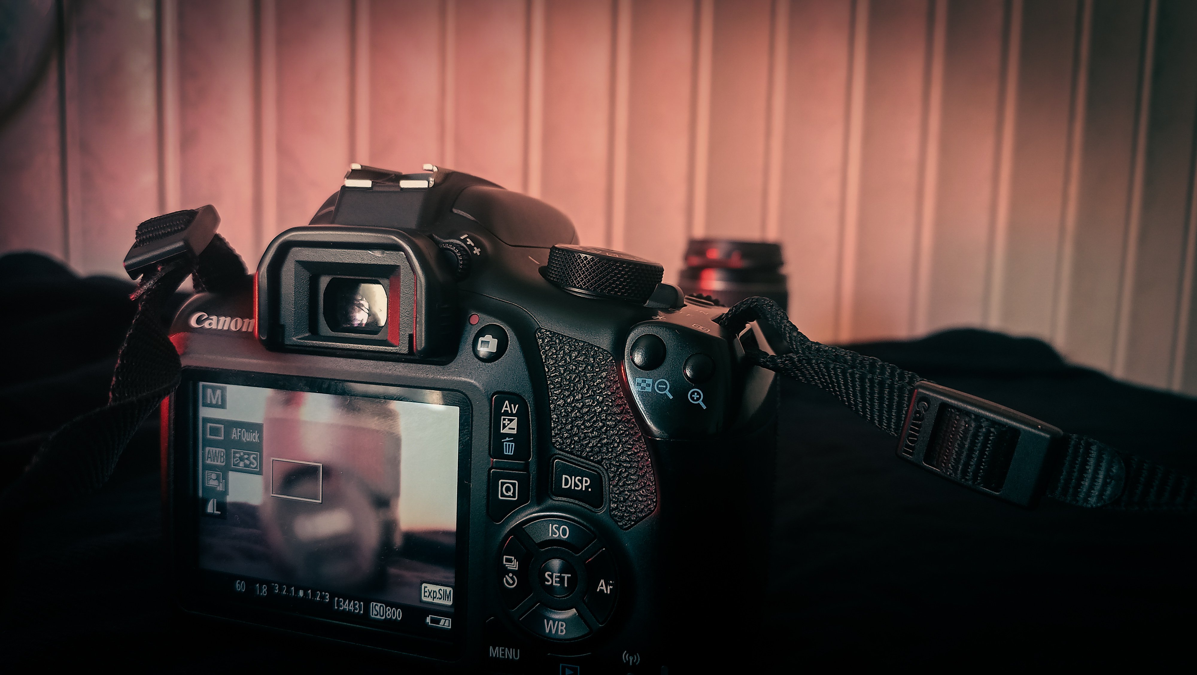
2. Importing Photos in LightRoom: Here we are inside Adobe Lightroom Classic or Adobe Photoshop
Lightroom classic. You can say it
whatever you want. And the first thing we
have to do is copy, or you can say import
your image or photo from the computer onto
your Lightroom gallery. For that, you can go to File and then press the Auto Import. You can go with import
photo or video, or you can just click on this
Import button and it will pop up a window with
your computer address so you can just locate your
image file and then click on Import button to get that inside your Lightroom gallery. So let's just click import. And now I am going
to locate my file. Here is my file, I
just selected it. And now I can press input. And as you can see, I have my file in my gallery, and here I have it
inside my gallery. Now, this is how you
import a single file. Even if you had multiple
files in that folder, you can just select all of
them and click on Import. If you have the files and different galleries
or different places, you can look at them one-by-one
and import all of them. So this was about this lecture
in which we learned how to import your files or
photos inside Lightroom. So you can aggregate them, you can color grade
them to give them an attractive look for
your social media.
3. Lighting: We have our image inside
our Lightroom gallery. Now it is time to
develop the image. So after selecting the image by using your left mouse button, you can click on this
developed button. Or sometimes this
toolbar is not visible, so you can just left-click
and click on develop. Or you can go to Window
and click on develop, or you can even
use the schottky. So I'll just click on develop. And here now we are
inside Lightroom editor. On the right side, you can see there
are different tabs which say basic tone curve, HSL, color split, toning, detailed lens correction, etc. So all of these functions
have different importance, have different
functions in editing, or you can set different role in editing images and giving
them attractive look. As I'm seeing this image, I can see this is
clicked in row, I guess, or maybe a slight of color grading has been done. So first of all, we have to go with the light
and enlightening. We will be talking
about the basic, we will just go with the
basic Exposure contrast, brightness, highlight,
shadow, violet, black, et cetera, et
cetera, et cetera. So first of all, when
you are inside basic, you have to decide whether
you want to keep your image. Black and white are colored. So you can just click
on black and white to turn the image into
black and white. Obviously, you can see monochrome or you can click
on Color to keep it colored. Now the next thing you
can see is white balance. White balance is actually
the colors that you see on your screen or you
can see the color range. For example, here is
a temperature that can go from blue to yellow. And even inside, you see it is like tuning your whole image
into a single color. And then you have tent, and it's actually the same, but just into the
different color scheme. So you can just slide the
sliders a bit abet, abet, and get to a point where you
actually like the image, but makes sure the
white balance is actually applied to
the whole image. Next thing that you see here
is exposure and contrast. Now the exposure and
contrast can basically be understood very easily by
the brightness and darkness. For example, if you
increase the exposure, all of the image, we'll have more light. For example, here you
can see the image will become brighter and brighter and even if you decrease contrast, image will become darker. So exposure is like the aperture
of your camera that will actually allow amount
of light to pass. Now, this is not a
real-time camera image. Or you can say this is not
real-time camera actually. So we have the
image and when you increase or decrease
the exposure, it actually applies
the brightness on whole image or the
darkness and the whole image. And similarly goes
for the contrast. If you increase that, it actually turns
the blacks into the more blacks and
enhance the whites. And if you decrease
the contrast, it actually makes
your image look flat. Or you can say like Roy image. So here you have to merge
your contrast and exposure, or sometimes it is
written as brightness. So you will merge
both of these dials, or you can say sliders, to reach a particular point where your image will look good. For example, in our case, I can go to this point. And maybe this. Now, one more thing
here is obviously, you should not go
like this or this. And nobody actually
goes like this. Some people will like this
image at about this exploit. Somebody like at this X4 here. Somebody like at this contrast, something like this contrast. Actually there is no
petrol for everything. Photography or you can say videography or image editing
and all of the stuff. That actually depends more on how you want
your image to be, on how you want your
product to look like, because every product
has its own audience. Art is not restricted to a single parameter or
something like that. Just because your art is not liked by the
person who enjoyed room, doesn't mean your artists trash until unless you
actually like it. So you have to search for your audience and
you actually search for your audience by posting the same pictures on the same the parameters again
and again, again and again. For example, if you like
black and white photography, you are posting all of those stuff again and again
on your social profiles. And the people who actually like the black and white stuff. We'll get to your
profile and you will get your own room where people like. Or you can say the people have the same brain or the
matching vibe that you want, or that you want to
make, or that you have. Stay easy when you are managing everything in the color grading
or the picture editing. Just because not everyone
likes what you collect grid, but if you calibrate
something that you like, I'm 99% sure as you
will find another 100 or a thousand or even lacks of people that would
like the same thing. The world is so big. So now we have the exposure
and contrast managed. Let's get toward highlights, shadows, whites and blacks. Now, the highlights are the brightest portions
on your image, for example, in which
the light is striking. As you can see, these parts. And the shadows are
actually the darks. So you can enhance them or
you can just diminished them. So for example, I
showed you with an example when you
increase the highlights, the wider portions
become more white. And if you increase the shadows, the black portions
become less bright. So if you decrease shadows, all of the dark portion
becomes darker and darker. And if you decrease
highlights the white version, the white portion
becomes darker. If you increase the highlights, the white portion
becomes more white. This is how everything works. So again, you can manage everything
according to your own choice. And this is gonna be good. Now you have the
whites and blacks and these actually applied
to the whole image. The whites will actually
change the whites or decrease the whites
of your whole image. And blacks will actually change the black portion or the
dark portion of your image. So let's get to a point where
the image seems good to me. I'm good with this. So this is messing
with the basics of your color grading inside
Lightroom Classic. Now you can also see
the texture, clarity, dehaze, vibrance,
saturation, etc. I'm not messing with
that at the moment just because that will actually become a mode of the intermediate or
advanced level class or want to stay to the bigness. But I can let you know
a bit about these. So the texture is actually the areas or the
clarity of your image. For example, if you
increase the texture, you can see all of these
pixels become more sharpened. If you increase the clarity, the all of the sharpened
part becomes more saturated. If you decrease the clarity,
everything becomes soft. If you decrease the texture, everything becomes soft
and a bit of bloody. So it is better not to
miss them right now. And then the D Hayes is
actually overall making your image row and vibrance and saturation will actually
change your color schemes. Or you can say mature image
mode color the less color. So for the moment, we are done with the basic part. And we have an image like this. For the moment, we
have done all of the basic part and we
have an image like this. We can compare this with
the original image. So here was the
original image and here is the edited one. So you can see the difference. By far. We can see that we have made the subjects stand
out a little bit more. As you can see,
everything is like the same panel or the same
level in the row image. Or you can see the image
which we were editing. But by far not added, we can see that there is a depth at background is separated. The shadows are more clear at the subject
is most standing out. So let's just end
this lecture right now and jump towards next part.
4. Colors: So in the previous lecture, we learned about the basics of the brightness
contrast highlights, shadows, whites and blacks, etc. Now we will be talking
a bit about the colors. Now you can see this
image is looking good. This images, right? But we can also enhance
the colors in it. Now, with enhancing
the colors, I mean, you can go with the hue and
saturation by going into HSL, going into hue and
increasing a color. Or you can saturate
the colors of it, or go to the luminance and
increase the brightness. You can even get to the don't go and change the
tones of the colors by changing these graph values
and enhance your colors. For example, if I go
to the red graph head, I can see that this
area is going to give a green pens to my image and
this will give a red bench. So I can add a node and
move it a bit like this. Maybe this. And so now it's giving a
proper cinematic look. Then you can go to greens. And you can see that this
is going to be like this, pink or purple and the
green on the upside. See you can again
add some nodes. And the main function is actually to give your
subject a vector look. You just modify everything until you get something
that you like. So this is okay. Then you can go to the blues. And this is done. Now. This image is actually
looking good to me right now. One thing you can also do
is in the calibration part, the shadows which
were fixed earlier. You can turn them
maybe like this, and then you can increase
or decrease the reds, greens, and blues of
the image like we did on the upper part. So you can maybe
decrease the hue of green a bit and maybe
saturation of blue. And yes, this is it
regarding the color grading. This was the previous image. This is the image that
we have enhanced or you can see calibrated
or changed a bit, even if you don't
like them as you can. Go to the tone curve anytime and then modify the brightness,
contrast, anything. You can actually do that just by changing
this curve if you don't like to mess
up with the sliders. So these are two variants of the same image
that I created. I'm actually liking
this one mode. So this is how you do with the colors inside Adobe
Lightroom, Classic.
5. Final Touch: Now it's time for the
final touch to your image editing inside
Lightroom Classic. And then we will be shifting towards Photoshop for framing. So for the final touch, you can actually
go to the details and increase or decrease
the sharpening. And maybe increase this
to a point that you like. You actually don't want to
have noise inside your image. And this will work fine. Then you can go towards the lens correction and take this button, Remove
Chromatic Aberration. Now what chromatic
aberration is, if you zoom in a bit and see near the hair part
or this part here, something looks like
a bit messy actually. That is, I think very least, or no chromatic aberration. But in some cases you will
see that at the edges, some colors mix up like shows like a rainbow
or something like that. That is actually called
chromatic aberration. So makes sure to click on this button to remove
that from your image. And then you can even
transform your image like in different kinds
of planes like this. But these things actually
were good when you are modifying a
landscape image, etc. In the brokerage, you
don't have to do this. When you have done
everything you like. When you are happy
with your image, you can just go to the
File and then Export. And when you click on Export, you can go towards this
button to specify a folder. I'll go with same folder as the original image on tactical explored
would be the name. Quality will be 100, Which format will be JPEG. And then just export. Now the Lightroom will
export this image, but the same folder
I had, the image. Which row actually, we convert this into this using
Adobe Lightroom Classic.
6. Framing and Export: We have already edited our image inside Adobe
Lightroom Classic. Now it is time to make a frame potted inside Adobe Photoshop. So first of all, let's decide where we want to put that
image invert perspective. For example, if you want
to post it on Instagram, you can create a
new document with dimensions 1080 by 1080. And that will work fine. If you are going for Facebook, you can go with the
same dimensions, but if you want it to be your cover image or
something like that, I'll suggest you 1920 by 1080. So first of all, let's go
over the ten by 1080 format. I'll go with pixels
orientation will be portrait. And then we'll go with 1080. By 1080 pixels per inch. Resolution would be
300 RGB color mode. It would be fine. And then create. So here we are inside
Photoshop now, first thing you have to do is unlock your background layer. And now you have to
import your file so you can either go to File, open and open your image
as a separate PSD file, or you can go with Place, Linked, Art, Place, Embedded. So I'll go with Place Linked. Select my image and
click on Place, and my image will
get placed here. You can even open this image in a separate file and you
will be good to go. Now, it actually shows that we have already
made the frame like this is our image and
this is our bought a frame. You can modify these frame by selecting a color
from your background. And then going to
paint bucket tool. Just make sure you have
selected that layer. You can click it. Now
you have the red frame. Now you have black frame. Now you have the green frame. Actually the frames which
usually work at the white one and the black 11 thing more that you can do is
select your image layer, right-click and
then duplicate it. Duplicate the layer, lock
the layer that is up, and move this down. And for the copy layer, you can show Transform tools
and then increase its size a bit so that it feels like
whole of the canvas. And when it fails
all of the canvas. And when you have the image
selected, go to Filter, Blur, Gaussian Blur, and then increase
the applied amount. Make sure you preview
button is on. And blooded to amount where
everything looks good. So this is how you edit your social media
images and upload them. You can go with this frame, you can go to this frame,
whatever you like. Also, you can also add, you can also add your signature. For example, you
can add a layer. You can go x. And let's see, I'm
saying simple. So you can go here,
select your sample. First of all, change its color. Then you can change
its font style. Maybe this, the
sample is selected. You can decrease its opacity
to make it blend better. And go to filters. Black Box Blur, list
of all, rasterize it. And be like this. So you have your
watermark on your image, but the blurry background, you have a watermark on your image with the
white background. And this is pretty much it. Now when it comes to exporting, you can again go to
File and then Export, Quick Export as PNG. Select the area where
you want it to explode, just press the Save button, and your image
will go to Export. Similarly, you can explore
the second variant of it. We explored, change its name, maybe one or two. And you have your
image right now. Let me show you all of
the three images now. This was your raw image and this is what you edited with
the white frame and with the bloody frame.
See the difference. This is what you learned in this session related to
Adobe Lightroom, Classic.
7. Class Project and Picture Reference: Congratulations. Now you know how to edit your pictures for social
media inside Lightroom. So now you have to upload a class project up
here on Skillshare. So you can confirm me that you learned something
from this class. Now the only thing that can
be a hurdle is a photograph. You can use your own
picture or you can go to any of the
free stock websites. For example, I got the image
which I used from Unsplash and you can find the link to that image inside
the description. So just get an image. Edit that according
to your taste, according to your style. Frame that in Photoshop and upload as class
project on Skillshare. This was all for this class. I will be back with
new classes soon. Bye bye.
 Art Hub, All Arts at one Place