Transcripts
1. Intro: Hello, my name is West Gardner. I'm your professional artist and illustrator and
Art Instructor. Currently working as
a freelance artist in the entertainment industry. I have credits that includes Star Wars or him or
40,000 Percy Jackson, Adidas, Universal Studios, Warner Brothers in
many, many more. I am here to teach you
about landscape painting, but more importantly, I'm here to show you
some techniques. Instead, to break
down any type of painting you might be
working on into repeatable, actionable steps
into one another. So for this class,
we're going to be making a landscape painting from a blank canvas all the
way to the complete finished, where you've picked your
signature on it and shown off on socials are for
a client or what have. This class is aimed at
skill levels of all types. Because there's going
to be little bits of information for
every skill type. You're an absolute Art
beginner. That's great. Welcome aboard
because we're gonna be starting with a
blank canvas and talking about creating
images based on Ideation, shapes, values,
colors, Rendering, edges, extra, a whole works everything you
want in your painting. What we're going to be in there. Now if your intermediate, Let's say you're a hobbyist, you've maybe gotten
a few client gigs before you've done commissions,
something like that. This is going to be a set of techniques to help you
streamline your process. I know Art can feel
very overwhelming. This is gonna be a nice
little map that you can follow to make sure you're checking all of the
boxes as you go. And if you're a fellow
professional, welcome as well. It's always nice to talk
shop with other bros. You're going to
find some tips and tricks from another
professional, me, that's going to help
maybe bring your Art to that other level or next level of eating
might be looking for, Let's say you do portrait. You want to start branching
out into landscape. Or you just want to find a
way to refine your process, speed up the parts that you might still feel are
a little monkey. Or just get your
confidence level exactly where it needs
to be before you start work with
that major client. So without further ado, let's hop into this. All you really need is a
device that can make Art, that can be a canvas, that can be a, an
iPad or a scooter, or any sort of Digital Art tools that we'll talk about that
and of course Overview. So without further ado,
let's get started.
2. Course Overview and Setting Expectations: Hey guys, what's up? It's Wes, welcome to Lesson zero. I guess. This is more of an
introduction video to set expectations and let you know kinda what
you're gonna be doing. Over the course of this course. We're going to set up the
expectations for the videos, in what order they're
going to come in, the type of information
we're going to go over. And also just some
helpful tips and tricks before we get too far
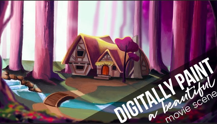
in the weeds on this. So let me hop over here. There we go. So yeah, landscape
Techniques volume one. So this video is just gonna
be the course Overview, your basic tips and Setting
Expectations for the course. I just want you guys to know ahead of time what
we're gonna get into before we get into this. But let me click over there. There we go. So here we go. Let's just start off to the races with the
course overview. We're going to dig
into the structure of this tutorial set. So the main goal of
this course is to learn basic repeatable steps
than ensure that we have the most opportunity for success when creating
landscape paintings. And it doesn't
matter what type of landscapes you're
going to be making. The method that I
want to teach you and I want to show you
It's kind of a set of problem-solving tools
that's gonna help you regardless whether you're making something
from imagination, whether you're doing
a master's study or like a photo study, or even if you're Painting
outdoors in life. And this works with
Digital Painting. It also works with
traditional painting. But since we have all of
our digital stuff setup, that's what we're
gonna be focusing on, is the digital side of things. But I'm going to sprinkle
in some knowledge, if you're working
traditionally that this should maybe help as well. So who is this course for? Every course has a
key demographic. Who are we really teaching too? Now, you can be at any part of your Art journey and
hopefully you're gonna get something
out of the course. But primarily, this is aimed at beginning to
intermediate painters. So let's say you've been
painting for a little bit. You've been wanting
to get a little better at your landscapes, or you just want to get a little bit more
refined on your process. Overall. This is probably
where you want to be. In regards to this course, you're going to learn some
techniques and nuances to make image-making
a little easier. And we're really just
using landscapes as the vessel or the vehicle
to learn these steps. So you can even
be a pro painter. I know I've learned a ton
from other pro painters. And watching how they work helps me solve
problems differently. So I'm like, oh, normally
when I get caught up on a certain rendering thing or a brush stroke type of
technique or whatever. If I see somebody else do it, it makes it easier for me. If you're in that camp as well. Hopefully there's gonna
be something to light. So you can be an absolute Art beginner
and still enjoy the course. So you're gonna go from
beginning to end and you're gonna learn the steps
to make a landscape. But we may be covering some topics such as color theory or value
or something like that. I'm going to try my
best to kinda repeat the fundamentals over and over because that's all
that this is really, is, everything comes
back to fundamentals. But you may, it may
go a little quick. So I do recommend studying
a little bit and maybe being familiar with some Art
terms and things like that. So I put it here basically, if you're an artist who
wants to Pinker first, serious attempts at landscapes. If you want to paint
more refined landscapes, let's say you're already
doing landscapes, but you want them to be a little sharper, a little better. You want to push your
Art to that next level. You want to have a
level up moment. Or if you've ever said, I'd love to paint backgrounds
for my characters, but backgrounds are super hard, which I hear a lot from
where it's students. This is for you. This is going to
break it down in such a way that it's
repeatable, actionable. You can remember where you're
at any step of the way. You can really get
the most out of your time whenever you're
creating your Art. So how is this
course structured? How are we actually
going to do this thing? So this is gonna be broken
up into a variety of videos, each that talks about
one main topic. We're going to talk
a little bit about every topic in every video. Because that's how this works. You always have to
be thinking about the entire picture whenever
you're making an image. But we were going
to frame it around one main idea in focus on that idea
from beginning to end, to push ourselves to completion
of a landscape painting. So we will start
with a blank canvas. We're literally going to
be starting from nothing. And we're going to go all the way until you sign
your landscape, until it is done. Paintings never really done. It's just either when you
sign it or when you sell it. That's when it's finished. So we're gonna go from blank canvas all
the way to signature The whole, the whole shebang. So each video will
lead into the next. So what that means is whenever we do stuff for
video number one, video number two is going to use the image that we made
in video number one. Then video number
three is going to use what are final was
from video number two. Does that make sense?
So it's going to fully lead into itself. Because the problem-solving
steps are all connected. Trust me, we're gonna be
hopping back-and-forth. We're gonna be doing
a lot of stuff, but we're going to keep
it very structured and very linear that way
it's easy to replicate. So I will put this out there. If you're a more
advanced painter, Let's say you're a hobbyist,
you sell paintings. Even if you're a pro, you're
gonna be very tempted to jump ahead to
the render phase. Well, what, how does he render? I want to know how he renders. I highly recommend for
your first go round. Watch every video in order. Because decisions we make it the very beginning will
directly impact decisions, we make it the very end. And you're gonna
notice that instead of like drinking
from water hose, and it's all at once
and all coming at you. As we start working on
one thing, maybe color. We're going to realize, oh, maybe this doesn't work right, because our values are
off in Values come before color will look at
that structure here in a minute about how the
videos are gonna be. But you're gonna
notice that these are very deliberate steps
in this process. But they feed into each other in such a way that you
can always go back, do a correction and it
feeds into the other one. So please watch from beginning to end for
your first time. And also if you're
following along, if you're making your
own landscape as part of like a course project
or something like that. That's a great way to do that, is follow along, do
step-by-step by step. Then maybe I have to jump
back to previous step, but you don't have to. That's fine. We all have our
different journey to get to our destination. But major, major
decisions we make upfront directly impact
stuff we do later on. So if you're if you skip ahead and you're like,
Well, why did he do that? Well, why did that
doesn't make sense. Why did he do that? I probably answer it
in a previous video. Does that make sense? So yeah, trust in the process. Trust me. The process works. You just gotta believe in it. You go through the ugly
phases of your paintings. It's fine. We'll get there. We will get to our destination. So our task over the video
lessons will be to create a landscape painting that acts as a sequel
to this painting. So this is my goal. As I work through
this, this tutorial, as I teach you all this method, I am going to be making
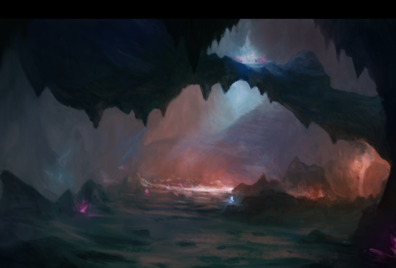
a sequel to this, which is cavern camp. I've made this about a
month-and-a-half ago, got real big reactions
on social media. People seem to really
enjoy it and love it. I loved working on it. And I use the method that I'm using in this video
on this image. So this is the type of final
that you're going to have. Now I will say, I do have
for my Skillshare students, I do have a course called traditional looks for
Digital Painting. Miles off some YouTube
stuff that talks about this to get
the painterly look, but we'll look at
that as we work. So, yeah, making
a sequel to that. So before we get into foreign in the nitty-gritty and really
breaking the course. Now, let's talk about some
tools of the trade, okay? This is just gonna be stuff
that's gonna be helpful. That way you can follow along or find some
good resources. That way you're kinda set
up for success, okay? So you needed a device
and you need software. Now this could be a
tablet of any sort, like a touchscreen, or it could be a pen tablet that you have. You can work with a mouse. I mean, I'm not your parent, you can
do whatever you want. But I do recommend
getting some sort of touched device to make it
a little bit more natural. In that brain mentality of the stroke that
you put down mimics a paint stroke or
a pencil stroke. You want that as close to
one-to-one as possible. But yeah, you can make
Art with a mouse. Pretty easy. I know one of my
favorite artists ever, his name is Craig Mullins. He's the godfather Digital Art. He did some incredible, incredible paintings, just
all the mouse for years. They didn't really
have pen tablets when they first made Photoshop. So he just used use what he had. So yeah, use what you have, but I recommend having a device. It doesn't whether
it's an iPad and Procreate, anything like that. There are some paid options
for painting software. So of course, photoshops
and industry standard. You also have Corel Painter, Clip Studio Paint,
or some big ones, but also there's
some free options, some non-cost options,
such as Christa Metabolic paint. There's
a few that you can use of no cost to
get started on your, on this lesson and on
your Digital Art journey. And also there's some paid
options for mobile, such as, I really like Art Studio Pro, I really like infinite
painter, procreates. Awesome of course. So there's a lot to really
what this means is you don't have to follow me exactly
based on what my program is. You can use your
preferred program. Just hear some options if you
don't know where to start. Here's some options to look at. Yeah, and I do highly recommend a tablet or a
touchscreen as well. So here's some helpful resources to make your life easier, okay? So I will be using something whenever we
make our mood boards and whenever we actually use reference later in the
rendering process, I use something called pure ref. It's basically a, a free to download deal for
desktop computers. So Mac and Windows, I believe Linux as well, to where you can literally
have your set of images and keep them over top
of your Painting Program. That way you don't
have to like keep looking at different I
have three monitors. But the goal is to not really look at the
different monitors, to really be able to
zone in and focus. So this allows you to mix
and match up your images. You can spin and
flip your images. Another cool thing
you can do with pure ref is you can
make things grayscale. So you can strip away
the color and work specifically in value,
which is supercritical. We're going to talk
about that during the course of the lesson. But yeah, there's other
things like viz REF. Ref is a great one for mobile. It works a lot like
pure ref does. I don't know if it's
by the same people, but if you just search on your App Store viscera,
if it's going to pop up. Then also references let me, let me hide me real quick. Um, so you have for
your references, references are gonna be
a topic we're going to cover in very big detail. But just know that
there are places where you can freely use references. But some of them
are going to have to have like attribution. You're gonna have
to attribute it. You're gonna have to
give credit where it's do what you should anyway, even if it's not required, you should give credit
to the artists. In this case, photographers, that allow us to use
their materials freely. Okay? So they're gonna be a lot of light Creative Commons,
zero attribution licenses. So a few websites you
can check out for that. Or like Pixabay,
Pexels, Unsplash, sketch, daily, Morgue file,
public domain archive. There's also paid things
that you can get. So for landscapes, for instance, I put some of my
favorite ones here. Graph it's Studios has incredible landscape
things you can buy. Tom Lopez, Jonas, Ronald
guard and Setting Zillow, Mel's knee in and Aaron Miller, There's dozens of artists. If you have a
favorite photographer that makes some
stuff, email them. And it'd be like, Hey, I'm working on some paintings. I love your stuff. Can I buy the rights to be able to use some of your
Art as a reference, not copy it, not unless you're doing a
master's copy and on that, I recommend doing a
true master's copy. And Albert bird stat, some of the Hudson
River School painters, classical painters. And then you still are a very
upfront about it and say, Hey, this is a master's study of this other person's work. If you're sharing it on
social media or something, but always give credit. And if you can, please support your fellow
artists by references, by them, yeah, you can use them for free from these other
websites and stuff. But if you're able
to purchase a pack, a lot of times these
photographers will put a pack of six to 700 images
for like five bucks. Absolutely. Sign me up, man. Then you're
off to the races there. So yeah, support
your fellow artists. That's what this is all about. So now let's talk about the
video structure and Overview. Okay, So this is
just a review of the videos we're going
to be doing in this set. So funnily enough, I have not recorded any of
the other videos. I'm actually recording
these in order as well. So it's not like I came back after the fact that
did this video. I'm doing this one first. Then we're gonna do
video number one, Number two, number
three, all that stuff. So volume one of this Landscape thing is gonna be taking a landscape
from beginning to end. It's gonna be broken up
into four main topics. And these are repeatable steps, actionable steps that
you can remember. And we broke them down
in such a way that they naturally feed
into each other. So the first one is gonna be
over Ideation and Shapes. So getting the main
idea of our painting, What's the mood of our painting? Blocking out basic structure
and composition elements. But we're not really worried
about what the thing is. We're just putting in
shapes to see if we can make something that
looks appealing to the eye. Number two is gonna be value. Now we're going to talk about
this and the value video. But in my opinion, number two, value is the most important
part of any image. Doesn't matter if
it's a portrait, if it's a poster, if it's a, you know, if it's a illustration for a children's book or
a card game or whatever. Doesn't matter,
value is everything. We're going to spend a lot
of time discussing value. So that's blocking in
the readability of our landscape through value
control and silhouettes, really, values come down
to light versus dark. What is dark? What is light?
What is in shadow? What is enlight? We're gonna
be playing around with that. Number three. After we work on our value, we're gonna put
color on top of it. So color, this is exactly
what it sounds like. We're gonna be applying
color overlays to our value painting
to nail down a mood, to really feed in
to the mood that we establish on the
ideations and shapes to really get that
mirrored in and get us excited to push to the final
step, which is rendering. Rendering takes a lot of time. But all these setup steps,
number one, Number two, number three to set up before
Render are going to help us make that transition as
smooth and easy as possible. So once again, I put
the tip down here. Please watch this in order
for your first time. And you're gonna notice after the fact that Let's
say you watch through it, you follow the steps, you make your landscape project,
you're excited about it. But then you want to come back six or eight months from now. Revisit this series. Yeah, feel free to
jump wherever you want because you're gonna know
what steps you need. That's part of this as well. If you can break down your steps easily into repeatable patterns, you're gonna know the step that you're going
to need work on, or that you're going to
need to practice more. Just like anything else. Before we begin. Here are some helpful
tips and just things to keep in mind before
we get going. So my goal as your Art instructor is not
for you to paint like me. That's not interesting, right? My goal as an instructor is
to help you solve problems. So you can paint like you. Everybody has their
own distinct style. And it's just like handwriting. Who taught you to do
your handwriting? Maybe you practiced it in
school, but your handwriting, this difference from
somebody else's, it always will be, right? So we're going to embrace that. And we're going to do
these steps in such a way that I'm not telling you
how or what to paint. I'm showing you steps that
you can repeat to make your paintings go easier so you can really
enjoy that process. Okay? So something to keep in mind, there is something
called the rule of cool. We're making images. We are visual communicators. Above all else, we want our
picture to be interesting. We don't want it to be boring. I mean, there's a
time in place for one-to-one exact
replica copying. But if it's not a unique image, there's not really a
lot of point rather than just the dexterity
of it, right? Of physically learning how
to see and then implement. But the rule of cool
is very powerful. I work in games, I
work in entertainment. That's it. We need to make
stuff that cells, we need to make stuff that gets interests that maybe a buyer, if someone, if you made
traditional paintings, you want people to
buy them, right? So you want to build that
rapport by the rule of cool. You want your images
look cool, right? That makes it FUN to work on. It makes it funny to look at. And then people are gonna be
a fan of your work because they know every time
you do an Art drop, every time you show
off something new, it's gonna be
something fulfilling and visually
interesting to look at. So if it looks good, it is good. That trumps everything else. If it looks good, it is good. Even if it doesn't follow
realism or whatever. We'll talk about that in
Ideation and stylization. But something else that's very important if you find a technique
later on down the line, or if you already
know a technique. And it completely
contradicts everything I say, use your method. Which is weird thing for
an instructor to say. But the whole idea and
this comes back to style. You're going to have
so much information in your brain about how to
process information. Pick the one that
resonates with you. Pick the one that works for you, pick the one that makes you excited about painting
and learning. And if it contradicts
what I'm saying, all the better, that
feeds into your style. Style are decisions
that we keep, problem-solving,
things that we keep, and also which ones
do we throw away? Which ones do we not need? Alright? So even if what I teach isn't exactly what you're
looking for, hopefully, it gives you a
perspective of what you don't want that's
just as valuable, if not more valuable in some respects to your
learning process. So Art is definitely subjective. Beauty is in the eye of
the beholder as it were. But there are certain things, especially younger
artists don't leverage. But these are objective truths. These are things that
you cannot change. The laws of physics exist. The way light works, light cannot bend
around a surface. Light is a straight line. That type of stuff
doesn't change. But that actually helps us whenever we're making
an image because we can use the rules
that are already established and they are rules, they are laws, man, you got to follow these. These help you make your image better because they're
more believable. They follow the rules that
we're used to as human beings. We resonate better
with the image. So why are we trying
to redefine the wheel? Whenever color theory exists, the color wheel
exist for a reason, which we'll talk about
in the color section. Values and light
and the way light works and the way our eye
focuses on information. These are scientific things. These are things that have been proven over and over and over. People way above my pay
grade over the course of hundreds of years have
figured this stuff out. So let's use it. Let's take that and let's utilize it to make the
best image as possible. Okay, Then let me hide
my mean mug right here. Most importantly, have FUN. This whole thing
is supposed to be enjoying yourself having FUN. Really learning the new
beautiful experience of bringing your landscapes or any type of painting to life. But learning is improving. And if you're improving
your always morning, okay? So enjoy the process. Just enjoy yourself. Give yourself some grace. It's gonna be hard if you're really trying to push
to that next level. If you're somewhat
of a beginner or hobbyist and you really
want to improve. Give yourself some leeway, man. This is hard stuff. You're inventing
something from nothing. You are an actual
magician, right? You are conjuring stuff up. It's you. You are providing the world
something that has never, ever been seen before. Think about it. That's impossible. That is an impossible ask. It's an impossible task. It's mentally exhausting. Please be easy on yourself. Have FUN with this. Enjoy yourself, okay? But guess what guys? It's time to get started. So we will see you in, we will see you in
video number one where we talk about
Ideation and Shapes. Let's start getting
stuff on the Canvas. Let's start this process
off with a bang. Can't wait to see
the next lesson, but until then, take it easy
3. Lesson 1 - Ideation and Shapes: All right gang, Welcome
to the first real video. Hopefully you watched
less than zero, the setup and stuff to see how we're going to
structure this course. But now let's just get to it. We're going to start
making our landscape. And I'm going to hop over. Just like video is zero. We are going to do a quick little PowerPoint
style presentation first, kinda cover what we're
going to be doing and then we're going to
just jump right into it. So I'm a big fan of
doing the stuff. There is something that
tattoo artists always say that you get better the more
time you have under the gun. Meaning as you're
doing the process, you're going to improve faster because you're solving
more problems, doing the actual movements and doing the actual dexterity
of creating something. So that's what we're gonna do. We're going to take a
look at a few little tips and tricks and some
definitions of stuff. And then we're just
going to hop over and start making some ideations. So this is Ideation and Shapes. And basically we're going
to talk about what this is. In my opinion, It's always
good to start off strong. And really as artists are, one of our main goals is to have something evocative
and emotional. Have a viewer having
emotional response, whether it's good, bad, very cheery and majestic or somber and
sometimes depressing. It depends on what you want
to get to your viewer. But we're going to talk a
little bit about that and then about how shapes can
influence that a little bit. So this is also called
the blue-sky phase. Okay, so we're going
to capture mood, we're going to find reference, we're going to do
all that stuff. So Ideation, what is it? The Oxford English
Dictionary defines this as the formation of
ideas or concepts. And they put the deal that
it doesn't already exist. Like it's something
from nothing, right? So the way we as a visual
artist and landscape painters approach this is by asking ourselves some
questions, okay? What or where is our location? Like, what do we want to paint? I know that sounds very obvious. You have to make the decision. But that decision is
a pretty big one. What do I want to paint? Isn't a mountain is at a Cavern. Is it? Like a vista? Like do I want to beat side? A sunset is at a
ranch with cattle. Is it nice planes and
fields and hills? And you get your
very general idea. That is your starting point. The old saying is
you cannot edit words that aren't on the page. You have to have
something to work with. So yeah, what do
you want to paint? You want to paint a farmhouse like any type of landscape or, and this goes for portraits and characters and
all that stuff too. But really for landscapes,
what is it like? Where is it, right? It can be an, like I said here, this can be very basic or
it can be really complex. So depending on how
your mind works, There's no wrong way to do this. So it could be like, I want to paint a mountain, done, great. We solved it. Or I want to paint
the sci-fi alleyway. It leads into an
underground train station, kinda like the matrix C vibe, but it's Cyberpunk like Blade Runner and it has
a nice like rainy see, you can get very
invested in what the idea is and that's the
whole point of this step. Get engrossed in the
decisions that you're making. There is no right or
wrong way to do this. So I'm not gonna give you have to do it this way, you
have to do it this way. There's no right or wrong way. However, your brain
works the best. This is also known as
the blue-sky phase. So in production Art
and making films or tabletop role-playing games or commercials or whatever. The blue sky phase is
kinda like navel-gazing. It is looking up at the clouds
and anything is possible and you get that
very triumphant. Like I can do anything. I'm going to soar through the clouds like
Superman or whatever. Like. No idea is a bad one. Blue-sky phase is very important
because it lets you just discover and imagine and try to get yourself into
that place of creativity. So for this painting, I wanted
to define what mine is. This is going to
be a continuation of the underground
cavern system that a group of fantasy characters in a role-playing game can explore. So it's pretty specific. Like I'm very inspired by really old school
role-playing games like Dungeons and Dragons. But specifically I grew up on the video game
side of things. So I'm a big fan of games like never winter nights and ISO and Dale and boulders gate and boulders gate
three just came out. So I mean, there's all these amazing like World of
Warcraft and EverQuest. And there's a ton of
games in this style. That really base themselves on Setting a mood and
exploration and discovery. I'm going to places
you've never seen before. And fighting big monsters are getting amazing
rewards and treasures. And I like that since
I grew up on it, I'm going to style
joke about it. So it's a lot of PFK-1 to tap into that whenever I'm
making a landscape. So the other main question, so we have our object
and like where are we? What is it? It's a mountain, it's a river, it's a forest, whatever. But now, here's the part that I think is even more valuable. What is the mood? Now? Mood, I'm a big mood painter. I paint mood out
of all the things. Some painters say they paint a light and dark and
shadows and all that stuff. I'm a big fan of mood. How can I feel a feeling and then have the viewer feel the
feeling as well? Alright, it's a 5050 split. It's a give-and-take between
me and the audience. So how do I want this mood to
feel while I'm painting it? By, how do I want to feel? But can I get some of that energy into the
painting itself? So, yeah, do you want it to
be majestic or apocalyptic? Try your best to
channel something. It probably part of your idea. Like, oh, I like the big open plains and the ranch and there's a barn
on the side and the cattle, there's probably something
that you're thinking of, whether it's a movie scene or a song on the radio or maybe
it's a core memory that you have growing up on a ranch
or something like you have that nice warmth
of the returning home or like that's
what we're getting. Because whenever you start
channeling stuff like that, now you start getting
into self-expression. And that's where Art just becomes a whole
other thing, right? And that's what really
connects with people, people like connecting
with other people. And through Art, we hopefully give a visual stimuli to do so. So really channel it. Don't, don't feel embarrassed,
don't feel basketball. Like if you have a
landscape in mind. Let's say you're painting
on plain air or outdoors. Life painting. Well,
there's your mood. How do you feel right now? You're looking at this grand
vista or you're looking at the forest or the trees or
whatever, how do you feel? Like try to capture
that in your painting. Okay. Yeah, I like to
put mood music on. I like to have mood boards. I to have all that stuff, so to speak on mood boards. I actually made a mood
board right here that we're gonna be using on the landscape. I'm going to be painting. A mood board is inspiration. A lot of people use
Pinterest for this. If you're a big fan of
Pinterest and how they have boards that you can make things and save
images to certain boards. That's the entire idea. It's like a pin board, that's like a mood board. So this can be anything. This could be
shapes and designs, this could be colors. This can be still shots from
movies or music videos or anything that gets you in that headspace of what you
would like to achieve. Now, you'll notice on mine, I actually found quite a few. It's all based on
like fantasy Art, kinda Dungeons and
Dragons stuff. I think there's some stuff for Guild Wars and
World of Warcraft. There's one for winter
nights in the middle. See, the one in the
middle doesn't quite fit with the same thing because that's a city and the rest
of these are dungeons. But I put that one in
the middle because like those are the games
that are used to play. So to get there to see that
screenshot and be like, Oh yeah, I know
where I'm at now. Kinda pulls it all together and that's a super
important part of this. So this can be reference
images you have, this can be reference packs. If you have this, if you're
doing a master's study, have not only the master's
study that you're doing, but other paintings by the same artist and see how they solve
different problems. So that's why making a mood
board is such a great idea. For this mood board.
I did use pure ref. We talked about that in
the preliminary video, lessons zero as it were, but we're going to
take a look at that here in a second as well. I love using pure ref
as my mood board. I love it. So of course this, I'm making essentially
a sequel to this image. I'm making part
two of this image. We're gonna go further into this cavern and see
what it looks like. Okay, so having this image readily available is
great because I can see, oh, I had the warm oranges, I had the nice kinda cyan almost magical water
puddle type things and these rock formations that the person or player or
viewer has to step over. This is still giving me ideas while fitting
within the mood. Okay? So that's reference
you want to find. You want to find
reference that gives you a lot of information. Packs quite a wallop In one single image. But then if you have 13
or 14 of those images, now you're cooking, now you have a lot to kinda go off of. So I do want to do some
notes on reference, okay? So reference means different
things for different people, especially if like where you are in your
artistic journey. If you're a new artist, use tons of reference. Oh my gosh, get as much
reference as humanly possible. Bind every good picture. Let's say you're
painting a mountain. Find every picture of
a mountain that you like on Pinterest,
Google like whatever. Make a mood board
and look at it. Really look at it
and be like, Oh, that's what are
these shapes doing? What are, which
we'll talk about? But what are these shapes doing, or these images
composed a certain way? There's the mountain always
on the left-hand side. Is it on the right-hand side? Start noticing traits
about these images. Whether it's the colors or
how vibrant as the light, or really find out why Europe
peeled to a certain image, like out of all the
images on the Internet, you chose specific ones. Why? Okay. Yes. Too much
reference is a good thing. The artist's young artists, even, even newer artists, they had this weird
idea that Art has to come purely from your
imagination all the time. Or you're not a real artist. That's not true. In fact, all of the
professionals I know myself included, use
references religiously. We have to know how things look. How can you paint the tree? If you don't know what
a tree looks like, it's a mind-blowing idea, right? But you need to
look at the thing. You please, I'm begging you. Please look at the thing. If you're painting a rock, find images of rocks and
see what they do and how it does the weathering make sharp edges and rounded edges. Please use, use more reference and you
could possibly imagine. Okay, Now, don't
straight up copy. Unless that's part of an
exercise you're doing. Don't, Don't be a copy machine, but look at stuff, really start to build it. And what you're gonna
do is start building what's called your
visual library. And that is how you start
working from imagination. Because if you see
5 billion rocks, rock looks like you can paint
a rock from imagination. Like you have to put that time and you have
to look at the stuff. You have to do studies, then you have to figure out how these things
work together, okay? So, yeah, you're building your visual library
for your beginners. Just get your reference, make a giant mood
board and look at it. Have it available all the time. If you're more of
an intermediate, Let's say you take commissions. You are an artist, you
are working artist, or you're wanting to
make that leap to be working artist and you
want to work with clients, you're taking commissions
and all that stuff. A good exercise is to take multiple references and blend them together in your
mind to make a new thing. So good way to do that is called photo bashing and others. A lot of tutorials out there
about photo bashing where you take photos and then you compile them and
composite them on each other to make one
cohesive image. That's a great way
to start thinking. As far as making an image
rather than painting reference. Does that make sense? There's a difference between having a reference
images that you look at. Can you try your best
to copy and then making your own thing utilizing that reference,
utilizing that reality. So photo bashing
is a hard thing. It's whenever you're
taking photos and then you erase
some of it and put another photo next to it and
erase some of it and try to blend them together and
make it look realistic. It's way trickier
than you think, because every image
that you're going to find is probably
LET differently. It probably has different color. It was probably
taken with different cameras, with different lenses. So the perspectives off, it's really tricky to
blend these things. So that's your intermediate. I do think that kind of getting that stuff
together and trying to make a brand new
reference image out of multiple
reference images. And combining them together is a great exercise
because it's going to show you what works
and what doesn't. Yeah, you'll no real quick if something fits really
well or if it doesn't. And that's also training your brain and
training your eye to see if things work together in a cohesive whole
for your painting. Okay? But now if you're advanced, if you're on that pro-level and you probably
already know this. But a great way to use
reference is to not, not until you need it. Don't even have a mood board up, don't have anything up, or you can have the
mood board up. Sure. But don't really rely on it. Rely on your visual library, rely on your years and
years of training. Make something that
you think looks cool. But then if you need some, let's say you're
painting a barn. Let's say, Yeah, let's say
you're painting a barn, you had the field and
that's figured out and you need the
reference for the cows. They've tried to
get the shape of the face right, that's great. But let's say you're painting the barn and you had
the shapes down well, in the forums looking
good, the colors good You can't quite nail down. Let's say that there's a tin
roof and it has rust on it. You want it to be
rusty and you have it, you know, it's a
brown, blackish, yellowish color and around
the outskirts is brown and you have a vague
idea of what Rust is. Go search. Nothing but rust. Look up Russ, to tinfoil rust, aluminum
rust, whatever in, find the one that you like and then notice the
pattern and be like, oh, it, it starts off almost like mold
and then it grows out. And then on the outskirts
where it decays stuff less than you're doing this
and then toss it away. Go back to your
painting. Oh, I get it. Now. It's going to
click for you. Okay. So references depending on where you're at in this
and you might fall a little bit of everywhere depending on what the thing is, depending on what
your landscape is. Let's say you, you are a pro at painting beaches
and in the ocean, waves and stuff like that. And you've done it and you've
made a career out of it. Well now somebody commissioned you and they want you
to paint the city. You think, you know what
a light post looks like. You think you know what
a stop sign looks like, but you need to reference like you need to
grab that stuff. So very much be a beginner. If it's a new type of thing
you haven't tried before, get all the reference and try to absorb as much as possible. I hope this makes sense depending on where
you're at here. One is not better than another. It's just the more you do it, the less you'll have to rely on reference to get you started. Does that make sense? You can work from imagination
and then you fix the stuff that doesn't look right based on looking through observation. That's a great way
to do it because then all of your
ideas are really your own and then you're using real life to just kind
of accentuate it, make it a little bit more fulfilling to yourself
and the viewer. So shapes. Let's talk about
this real quick. Going back to the basics, man, this is grade school stuff. Yes. Those shapes. Those shapes right there, the square, the
circle, triangle, the stuff that you drew in
kindergarten and first grade, is the paramount of
making good images. This is it. I always have family
members whenever they know I'm an artist or they
see my work or whatever. Like Man, that's amazing. I can't even draw
a stick figure. Good news. Stick figure is the basic thing for everything. Like if you can put a little
circle and some lines down, you can be an artist,
I promise you. And I would argue the first
for shapes and this image. If you look at the
square, the circle, the triangle, and the rectangle, every other, every other shape on this list is made up of a combination
of those four things. So you know how we
talked about taking different references and
putting them together. Now you're taking a circle and a triangle. In you're making. Your tape may dig, had
taken the rectangle and the circle and
you're making a hexagon. You know what I mean? Like you're taking
triangles and you're taking the different triangles on a square mixed pentagon. You're taking the
shapes and you're developing different
customs shapes based on it, but it all comes
back down to shape. If you're shapes read well, if it's easy to tell
what the shape is, you're good to go like. Okay, bottom, bottom row, the heart. Everyone knows that. That's a little icon
for a heart, right? That's almost like a
hieroglyphic of a heart. We all are familiar
with that shape. Does that actually look
like a human heart? No, human hearts us weird, bulbous and it has valves
coming up and you have the aortic blood while and
then chambers and the like. It's a whole different
don't look like that. It looks way different. You know what I mean? But we have this
intrinsic understanding through visual
communication that, that little icon right there, the two little circles on
a triangle on the bottom. That's a heart. You know, emoticons,
emojis, what have you. These are ways that
we communicate. We can use this
to our advantage. Okay? So remember, shapes are literally
the building blocks. You remember Legos and
play them with those. That's what shapes are. Shapes. Build your image, okay? The more basic you can keep your composition
with the shapes, the better and easier the
more advanced steps become. Because once you block
in your silhouette, your shapes and how they relate to each other on the canvas. If you stay within
that silhouette, if you don't break
the boundaries, very much you can look at that. But if you stay with
your shapes being solid, your image will always work. Always. If it's easy to read, then you, when you get the
point, you know what I mean? So like my job I
work on card games, like trading card games? Some of the artwork is only
like 2 " by an inch tall. But not only do we have to make sure that the Art
reads at that size, we, as artists for
these card games, have to make sure that they
read upside down as well. Because you're playing the
game against a person. They, whenever you
put your card down, they, your opponent, or
seeing the card upside down. So they have to know the
moment it drops, what that is. There has to be
pattern recognition. And the only way we get
that done is by shapes. That's it. Okay, and we'll take a look
how Shapes feed into form. Form feeds into value,
feeds into lighting. Lighting feeds into color. It all like we
talked about before, it all works together. Okay? So once you create a good silhouette,
stick with it. Strong shapes always make
for good paintings. Always. I don't care if you're traditional artist,
digital artist. Your watercolor is YouTube, pencil sketches,
shapes are everything. And then when in doubt, if you're ever running into
something and stuff is getting too
complicated, simplify. It turned the weird
shapes back into a rectangle or a circle in C and pivot them and
see how they work. Okay, so Let's do this
quick review, right? There is no right or wrong way to block
out a composition. Some artists use
very basic shapes, so they literally draw circles and squares and they get
a collection of them and put them across things almost like they're
magnets on a board. And then they step back and they're like, Yeah,
that looks pretty cool. Yeah, we could work with that. Or you can really dig in
and do pencil sketches. And like some people
like to use graphite, you really dig in there and
you start making the shapes. Oh, we're making a mushroom. Let me try to make that
hieroglyphic of a mushroom. Whatever works for you, do it. Okay. But I will warn you do not get bogged down
in the details. That's not what this step is. Details come later. I promised you some details
come at the very end, literally at the variant before you put
your signature on. In fact, this is the Ideation, the dreamscape, the
head in the Clouds, anything is possible part. So your intent is to
keep your energy up. The best way to suck
out energy, right? When you start making an image is dark. Worrying about details. Do not worry about details. I probably won't worry
about details and the real-time painting for a
good two-and-a-half hours. Easy. And that's if it's a quick painting, you
know what I mean? So we'll take a look
at that type of stuff. But what we're going to actually do is make some thumbnails. Thumbnailing is a
great way to get a lot of different compositions. Try to see stuff to
get you warmed up. And it gets your mind in that headspace of
making things happen, okay, and making an
image come to light. So the later steps would
deal with details. So don't worry,
trust me right now, it won't look good, but it'll give you a little
spark of something that's enough fuel to energize yourself to push
onto the next steps. Okay? So yeah, we're working to lose. We're gonna make the thumbnails. So here's a pro tip. Here. Here's a little behind
the scenes curtain thing. Whenever I work with
a client in this could be just a general client. They just want to
sketch of mine. They want an original
of mine board. This was for Star Wars and war
hammer and all that stuff. I always give three
sketches per prompt. Because that allows my client to look at a variety of options and be able to give their
input very early on. That way they trust
in the process, they're part of the process. They share in that creativity. And it makes your life easier. There's nothing
worse than spending a bunch of time on a piece and then you send it in and it's not quite what the
client wanted. They still grateful when you
got paid and all that stuff. But there are a
little bummed out. Nothing feels worse. So you want them part
of that process? Okay? I usually do three on
this we're gonna do for, I have some ideas, very vague hese things and I
want us kinda sort them out. So I'm gonna give myself for
little thumbnail positions. That way we can
kinda look at them. So hey, let's get painting. Alright, let me check my phone
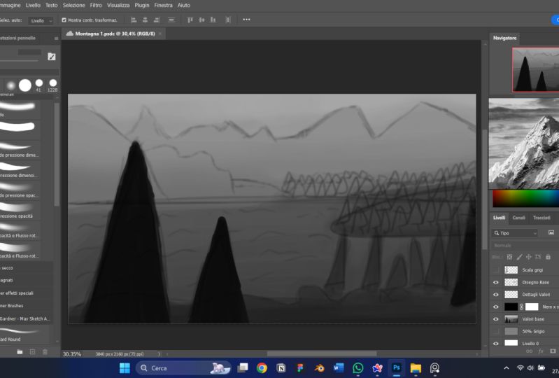
real quick. Alright, cool. So let's get painting. So this is going to be
right here and let me move my move this stuff over. I have three
monitors by the way. So I'm gonna be looking
and all sorts of stuff. So this is what we were
talking about earlier, which is pure ref, okay. This is my mood board. I'm able to zoom and look
at things and details, and let me set my pencil down so I can
do some of these hotkeys. So real quick, I'm zooming with the Zoom with the mouse wheel. You can make words on here by right-clicking
and going to note Hi, I'm a note. Then you can move that. You can re-size it,
all that stuff. So let's say you like
this one, I like this. So this is option a. You know what I mean? Like in you can hover
this over right here. So what's also really
cool is you can do some image manipulation. So we can select an image, you can make it bigger
or smaller if you go and rotate it here. But my favorite one, if you hold down Alt and I
believe it's Alt and Shift. So instead of Alt on a Mac, I want to say it's like maybe
I don't have a map, sorry. And then you hold
down the Shift and Alt button and then
you click and drag, you're going to flip
the image horizontally. Then if you drag
up or down holding the same hotkeys vertically. Very cool, very fast. Now I like the mouse
Zoom of course, but here's the real
kicker and we're gonna, we're gonna talk at great
length about this later. If you right-click, you go to, well, first off mode, you're going to say you
can overlay the selection. You can make it
transparent here Mouse, meaning your mask can
click on it anymore. I'm always on top. Always on top means
that while I work, let me move this right here
and I'm gonna move this. While I work in Photoshop. This is always on
top of my screen. Very, very cool, right? Because if I turn that off, always on top and disabled, then I click Off, you go, see. So it's always good to
have that always on, always on top on whenever
you're working for reference. And let me move back. Where's my Photoshop? The last main one, the last main thing. The reason why I
love pure ref and viz wrath and all the
programs like this. Dearly, if I right-click, I go to Canvas and
I click Grayscale. Now, everything on this canvas, all my mood board is
now put on grayscale. So this was whenever
it's gonna be invaluable when we're
working on our value passes. Okay? So and I also have
my piece right here. It's always good to
have it. I'm just going to have it on the side. But really what I'm gonna do, I'm going to move go
to Canvas preschool. Okay. I'm gonna move this. I wanted to show it to you, but I'm gonna move this over
to this monitor right here. So I'm working over
here on my Art monitor. But then this monitor, my mood board is gonna be
over here to the side. Okay, so now that
we have that setup, I am going to keep glancing
over because I want to see what my cosine, if I bring this over here,
I'm going to have this. And if you double-click
on an image, it scales it to the proportion
that Puritan window is. I'm going to have this open. And really I'm looking at
just some of the stalactites. Right. Is that right? The
cavern stuff coming down? How did I format
some of these rocks? Just basically looking at
this basic composition to try to make a sequel. So I'm still going to
have the pointy shapes. I'm still going to have it go lighter as it gets further
in the background, in, as it gets closer to us, it's gonna be darker. So we're talking about that
at great length next video. But just to give me some basic, let me actually change this
over to Canvas grayscale. That way I don't try to get
hung up on the colors yet. Okay? So we have all these, and I will have this
template right here, this thumbnail template Save. It's going to be
part of the extras that you're gonna
get with the course. So I'm just going to be using, let me just use,
I'm going to use the straw blend right here. And then I have a layer
called draw here. So that's what I wanna do. I
am just going to get this, if this pretty small, and I'm just going to
start with shapes. Okay? So like something right here. Then I know we had
stuff like up over. So maybe nice triangle. This is a repeat of
the same composition, but I want to show this to you just, just to kinda show it. Okay, Then maybe more
stuff right here. Then. A nice secret to getting debt is to do
what's called the Z line. If you just write as Z here, it looks like you
start off at the front of a trail and then it
goes into the background Just make, make sure
the top of the Z is narrower than you're
automatically get a really cool look if we have that and then like if
that's part of the cavern, seeing you can see
I'm just doing some messy, messy, messy stuff. So really those are a
little bit too symmetrical. So I'm going to break up some
of the shapes right here. Feel free to get more
stalactites coming down. Maybe those mushrooms right
here, something like that. Maybe the opening. Okay. There's one. It's not very pretty, but
it doesn't have to be. That's, that's not
the point. Okay. Then erase some of
this right here. Give give my eyes
something to kind of yeah. Like give my eye a little
bit of something to look at and kind of infer information instead of directly telling me
exactly the information. So like we said, details at
this point, not important. I'm doing a lot of
light diagonal shapes. I really like triangles, triangles out of
all these shapes, I like triangles the
best because they have a flat side and then tilted side to
direct the viewer's eye. Okay, so here's one, maybe that's a big column
for something that comes up. So let's just start on
maybe the second one, the second one,
Let's make this one a little bit more open. So let me put this
the lag tight like the triangles stuff
in the corner here, like it's in the foreground
and we're looking through like almost like we're like climbing through
the cavern ourselves. And then we've seen
this big, I don't know, open thing, the thing
we were looking for, big treasurer or something. So we have this and we're kind
of framing it right here. We can even put these
shapes like triangles to face inside to keep
the viewer's eyes in. Then let me sort
of oval this out, almost like it's a clearing that we've gone
through a tunnel. And light tunnel could have like spider webs or something in it. Then. But now we yeah, now we see what we were
looking for this whole time. So like what if it was just
a big like weird structure? But then the structure, if there was sitting here, maybe the structure, Let's do, let's do that Z tricky
in that structure. Like a square, but then you have some pointy stuff
coming out of it. Maybe it's like a
beacon of light. Like light is coming through, like shining across everything, kind of how we did the
light on the first thing. Then maybe or sense of scale. We have some other mountains
removes or something. We have that and then
some more stuff, just a little cubby hole type
things kind of escape into. Okay. So we can some of
that right there. Okay. He's don't have to look pretty. That's the whole
point that we're, we're gonna get to
the pretty stuff. This is just to get our mind going and get us
into his own, right. So let's do. So. We have a big structure. We have kind of the tunnels that feel a little
more claustrophobic. Let's do another sort
of claustrophobic E1. Um, yeah, and then we can do just a
weird one at the bottom. So let's do a Let's do one
like we're in we had walked in and the roof is kind
of low where we're at. But then as we get
further into it, it's kinda like opening
up almost like a mall, like a big like a tunnel. Yeah. So yeah, let's actually do that. So if we start like
right here as a circle, then that gets
progressively bigger. Have marked on that
one. That's fine. We can use these shapes
to give us a perspective. Now you'll notice I haven't talked at all about perspective. We will, we will at various
points of the piece, just know that a lot of these, you're going to be one-point
perspective paintings. There's going to be one
point of interests. So there's a technical
term for perspective. How many vanishing points do you have and where's
your horizon line? We're gonna talk about that. But that's a little
bit more academic. Then Because you can get lost in
the sauce if you do just, oh, I'm gonna follow
this and it has to have this and the perspective
has to be perfect. It's great and it's a very, very good skill to
have and we will be covering a lot of it
during the process. But notice, I'm not making it. My attention, my attention is about the mood and the image. The mechanics are
gonna be up to you, whatever you feel
comfortable with. But just know these
are gonna be more like one-point perspective
type of pieces. That's going to make
it easier for us to, to just kinda get on with it. So if we do this, maybe that one's there. So maybe these rocks, maybe, maybe this one's a
little more flat. So these right here. This one's kinda flat too. But this one is going to have just a slightly different vibe. I liked the idea of that
pillar right there, but let's push that pillar
back a little more. And then it kinda feeds in two. Then we can kind of
repeat the shape. Something like this, right? And then we can have
our main idea be right here that we're looking at. And then let's say
we liked that water, that nice cyan blue water
that we had the puddles. So if I just make
some rocks right here, something like that. Pretty cool. Okay. Yeah.
A good one right there. Then what I can actually do, what we kinda follow
those lines right there. Then that wound. Actually, we will keep that one. You'll notice that
it still works even when we get rid of the circles right
here because we're, we're staying within
the silhouette of those shapes that we've
established, right? We're, we're, we're following
the rule of the surface as the spiral goes further
and it keeps it kinda tunnel. We're staying within
that tunnel, as it were. It's a little bit more direct, but it's also a
little more imposing. It's like do you want to go
and look at that tunnel? Do you want to go see
what's at the end of it? Because there's a
lot of room between yourself in whatever
your goal is. Do you want to take the steps? Do you want to take
that leap of faith and hope that nothing
gets you on the way here. Because we want
this to be majestic but also a little bit dangerous. That's the whole idea
of this type of deal. And then this last one. We haven't everything's
kinda flat, right? What if there were
like walkways up? Like what if we had this stuff down at the bottom,
kinda like we normally do. But then what if there was
a series of just walkways and paths that you could take
up to add some verticality. So even though this is a one-point perspective,
what happens? Okay, Let's say the
floors right here. Then we have like our
stuff right here. What if it was like will do
the diagonals again, right? One, if this was like a walkway, we still have that. Maybe we still have these
big ones in front. Right. Then maybe there's
like a little roost or something right here. This is all rock. This whole thing is a piece of rock and it's like coming
towards us or what have you. Then? Maybe if there's
like steps here, every cool, then maybe our main event is
right here again. Will there still some light
or something up here? Maybe we want to
explore that may be, you know, maybe the thing we're really after
assurance right here. But there's other
stuff to look at two, and if the whole idea is
to build adventure and to build that sense of
wonder and exploration. We should probably give our viewers a place to
explore, right? So let me do that again. Basically I'm just using
these kind of shapes. Once again to structure
in to vignette. A little bit like vignetting
is when you take yeah. So vignetting is when you take The edges of something
that make it darker. And what that does
is that builds the focal point on the
part that you can
4. Lesson 2 - Values: Hey gang, Welcome to video
number two, all about values. So before we get
too far into this, I do want to really hammer this home out of all of the
steps in this tutorial. This is the one, that one you're going to return to a lot during
the whole process. But this is the most pivotal. I don't say it to mean like really high
pressure on high-stakes. But all of the work that you
put into this portion of your image-making is going to make the other
parts easier, okay? I say this to every Art
students that I have. Whether I'm working one-on-one
or in a class setting or mentor mentee type stuff. Value is the most important
part of making images. Period. It answers every
problem you might have. And it does so quickly,
repeatably and easily. Okay? If you have a problem with an
image that you are making, it comes down to values
99% of the time. Okay, So let's talk about this. Let's do the lecture. Then we're going to hop over
and we're gonna do a value passed on our, on our painting. Okay? So landscape Techniques, while you want values and
the beauty of grayscale, values, lights, darks,
and how the eye works. We're going to start
getting into optics. This is really going to
really take off whenever we start digging into maybe some of the details or we start making corrections and
things like that. We're really going to
utilize the science of how the eye focuses on things. But values are a
massive part of that. So what do we mean by values? Okay? So we define value on how light or
dark something is. How light or how dark is it. Okay? Then it goes from a
scale of pure bright white, like big giant flashlight, what you blindingly
white to pure black. Okay? So in science there are
millions of values. Millions. Our eyes are pretty good at
seeing small nuanced details, but they're not that good at it. So if we have, on a light spectrum, if we have millions
and millions, if not billions of tiny
microscopic transitions between pure white
going all the way to pure black, the human eye. Even perfect vision, even
even like enhanced vision, if you have like a cybernetic
or something like that in your part machine as well. You can only see about
1,000 out of millions, if not billions, the
human eye can really only distinguish about 1,000. Okay? Artists, our job is to simplify. So we're taking,
we're gonna be taking this thousands or thousand that the human eye can see
between darks and lights. And we're going to
compress it to nine. Right? We talked earlier about
ideations and Shapes and how we simplify
going 1000000000-9. Pretty simple. You know what I mean? Value is actually a
component of color. So it is a part of a
recipe to get you a color. So color is made up of
hue, saturation and value. Also chroma, which we'll
talk about a little bit, but that's a whole
different lesson. We're gonna talk about
color theory and all that stuff and
the color lesson. But here, just know that
value in my opinion, both my professional and
my personal opinion. Value is the most
important out of all of those components to
making an image read well, okay, so don't worry about the other stuff and the light reds and dark
greens and stuff that, that's part of the definition. But really right now
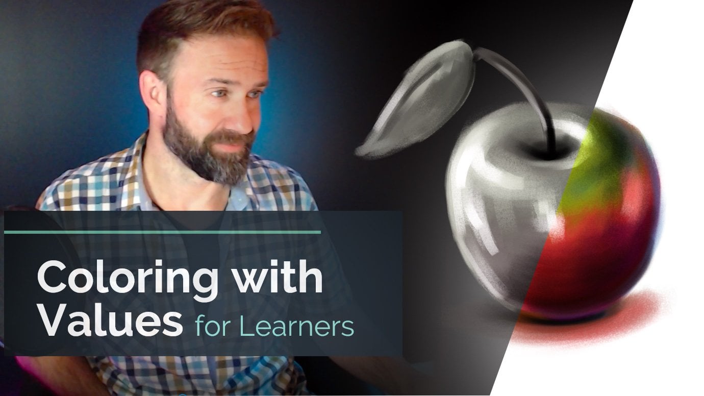
we're just worried about the dark and the light. That's it. Okay. So many words. Think of this step as
painting in gray scale. You're just going to
use black, white, and all the grays
in-between and paint. That's all we're gonna
do. We're painting in black and white. Okay? This is what is our value pass. I'll, I'll start referring to it as our values or value passed. That's what we mean. Just worry about the blacks
and whites medium it. Okay. It's helpful to
think about it on a scale. Literally there's a thing
called a value scale. So a value scale, I like it having nine steps. And the reason why is five is right smack
dab in the middle. Alright, you got 12345
in the middle, 6789. So you have four on each
side, five in the middle. It really helps us whenever
we go and start painting, you're gonna know why? Because I start with a
background that is 50% gray. It's smack dab in the middle, and then we work lighter
or darker dependent. Okay. So Working on gray scale, purely gray scale
is a critical idea. Once you get used to this
and the sounds crazy. And when I tell my
wife this and when I tell other Art students this, they think I'm nuts until
it happens to them, until they're able
to do this as well. And that is, I can physically, or I guess imagine narrowly, but I can put like a filter over my eyes right now
and know, okay, that's the darkest to lightest the world
around me at any point, I can snap my brain into
value mode in see the values. Oh, that's darker,
that's lighter than the light's
coming from that way. Once you start practicing this, you'll be able to have
that ability as well. It sounds like a superpower
or something in some ways it is because it helps you simplify
what you're looking at. Okay? But just know, just get
this idea that there is a value scale that you have your bright whites
and your lights. And then you have your
really dark blacks, your darks, dark
grays, all that stuff. And then there's a
smooth gradient or a transition from one to the other, from one
side of the other. Okay? So instead of seeing
the image for everything, it's worth looking
all the details, look at all the nuance and all the cool control and stuff. Break it down. Try your best to see it in black
and white. Okay. Some of my favorite movies of all time or black and
white movies. I like. I love Akira Kurosawa,
samurai movies, movies like Hidden Fortress, Seven Samurai, your
Jimbo song row. All these like samurai films are beautifully shot
and they're timeless. They don't age because how well the value
control is on the screen, how well are the
lights and darks and the contrast and
that type of stuff. What makes it readable? And you can see it clears day. And that's what
our goal is here. So readability,
What is our intent? There's nothing worse
as an artist than having something in your heart and you want to paint it out. Then you showed off, you know, how finally you've
got this done. And then everybody kinda
has the moment of like, that's cool I guess,
but what is it? Like? Nothing's more
disheartening, right? So value control allows
us to make Shapes. Going back to shapes
and Ideation, more clear in the intent as the artist comes
through more. Okay? So some key components and there's quite a
few slides like this. So I'm going to try to break
these down as best I can. Value only has meaning
in relation to itself. So something,
instead of thinking, we're going to talk about
this in colors as well. Instead of thinking about
white or black or gray, or dark gray or light gray, don't think of it in
very absolute terms. Think of it in relation
to stuff around it. Is this lighter or darker
than what's around it? This way? Lighter. There's a sun coming through. Is it really burst of light? Is a way brighter,
is a way lighter. Is it really deep dark
shadow is way darker. That's how you want to start building that relationship
in your mind, is it's all relative. I'm a big fan of the
artistic laws of relativity. Everything only exists in
relation to stuff around it. We're really going
to dig into that to color some of that system. Boy, your mind. I knew it blew my mind whenever I
learned it I was or what. But with values it's
the same thing. Don't think of an absolute. You can a little
bit whenever you first block stuff out like okay, this is a value of
28 using that scale. But then once you start
digging into the image, it's all in
relationship to itself. Is this lighter or darker
than the stuff around it? So if you ever hear something
having high contrast, if you ever hear that,
maybe it's a movie, maybe your television Setting
has a high contrast mode. What does that mean? That
means the variance between the amount of like
the brightness of the whites and the darkness
of the blacks is greater. The difference between
the two is way greater. That scale is bigger. You would think that would be a lower contrast because you
have more steps in-between. But really high
contrast means you have a bright white
next to a dark black, right next to each other, they really pop out
from each other. Okay? So you might even
hear something about high dynamic range or
like HDR on your TV. If you have a newer,
cooler fancier TV, it can have an HDR
mode that deals with the dynamic range or your value range on how much light and dark
comes through the picture. So areas of low contrast
are closer on that scale. So we have this
scale right here. High contrast would
be like going immediately from number
two to number eight. Number one to number eight, low contrast would be going from number four, number five. For number five to number seven. You can still have a big, like a larger contrast. If you go 3-7. That's a pretty big leap as far as darkness
and lightness. But it's not as big of a
leap as one dynein is. That would be our
highest contrast. The biggest difference. So once again,
work in relativity is a leap 3-7 or three
to eight a big one? Yes, it's a huge one, but it's not as
big as one denied. So as it starts getting, you're going to start seeing almost it's like a puzzle piece, start coming into play. So, yeah, think of it. How dramatic is the leap between your numbers on
your value scale? Okay? So the best way to
draw attention to a painting is by making
it higher contrast. Make it something very dark
on something very light, or make it something light
on something very dark. Okay? In fact, this PowerPoint, little PowerPoint deal that we have is pretty high contrast. I have darker grays in
the background and I have pure white text and it
makes it easier to read. Okay, so just think it doesn't even have to do
with just painting. It can be photography, it can be making PowerPoints. It can be anything higher. Contrast is going to
be more eye-catching. It's gonna be easier to read. Okay? So working in values allows us to focus on what I consider
the important stuff. So your composition, your mood, your shapes or forms,
your light, shadow. And you don't even
touch details. You don't touch color. You don't touch
any of that stuff. It's just value
painting in black and white allows you to
solve so many problems. Early. You get, you shake those cobwebs out and you
get stuff on the panel, you get stuff on the canvas. Then once again, we talked
in the first video, like writers have
a saying that you cannot edit words that
are not on the page. This allows us to
get our stuff on the page. You know what I mean? So everything else
is just bonus. If your values are right,
everything's right. I know it's a big claim. But so here's some
just exercises. Now, we're going to talk about
this stuff in real-time. I just wanted to show this
just to get your idea, your head spinning on what we're meaning when we mean
exercises and value. So if you have a
tube of black paint, in a tube of white paint, you can make your
own value scale. You can see what the
relationship is and how much white do I add to the black
to make this more gray? You can start doing
things like that. And it's going to teach you
about those relationships. And those relationships. Once you really start fine-tuning
your value structure, even little nuance brushstrokes with a slightly
different change in value are going to be lined people's attention
relatively, right? So that's why on, then you see on this
right-hand side, you can break down
paintings that you enjoy, even your own work into your
basic shapes in your values. So as you can see here, it's just a collection
of paintings and then just some shapes
in various values. What's a little darker,
what's a little lighter? You can see though,
that those grayscales, the value passes the value
studies still read well. They show you the gist of
what the images you get. That top one is a mountain. And then it kinda
looks like a mountain that kinda looks like clouds. That's our only
goal for right now. We want it to look
like something. Right now. You can dig all in and you can really
paint and really refine edges and details and you can dig into that
and your value pass. But the main intent and
our main goal for right now is to make it
look like a thing. Give you that, give
you that Ideation. Once again, we go back to
the Ideation and Shapes. We're using Values and
shapes to build on the idea. You see how this is all starting to connect. A little bit. More quick tips. I just wanted to throw up here. You're gonna notice
there's parts of your painting journey for every painting to where you're gonna be like that this
part isn't working. Something's not right. You're going to look
at whether it's digital or on
Canvas or whatever, you're going to look
at it and be like No, something doesn't feel
right about this. Something's off.
Check your values. Check your value. That's why that weird superpower
of being able to light gray scale your vision.
It's really important. It's a cool skill to know because you can quickly check
your values and be like, Oh, that's off, that's too dark compared to
this other stuff. It's strong, too much attention. Let me buffer it out. You'll be able to quickly
jump on stuff like that. So your goal isn't artist is to always make your
images appealing to look at whether you're doing
it for personal pleasure and you'd like showing
it to your friends or family members, loved ones. Or if you do it
for big business. If you do it for huge clients, you want the image
to not be boring. Right? Like your intent is to have something cool and exciting and interesting to look at
Values As a great way. In fact, the biggest
way to do that. I always tell people if they're taking like still-life course
or something like that. Your still-life painting
of an apple on a table. Even in black and white. You just use black and white to paint that Apple on the table. Your goal is to make that as interesting and awesome
to look at as possible. Okay? And values a huge part of that. As much as you're
going to want to. Do not worry about colors
and details in this phase. Don't do it. That's
gonna be for later. You're gonna notice
all the work we put in here is going to help you solve those problems
of color in detail later. This, if it reads in black
and white, it reads, well, if your value is right, you can use any color and
it will work. Alright? I cannot overemphasize
the importance of value. Like value chains my whole life, it gave me an Art career. It didn't like it. Let me see the world. It's like peering through
the matrix or something. Once you understand
the relationships of Shapes in regards to value, the sky's the limit. Alright? Our main goal for this part and for a
landscape painting in general, is to provide depth. How far in the distance as
it a big epic Vista is. What's our range look like? How close are we to something? How far away is the goal? Do we want to travel? That's all controlled by value. So that's why early on the
Ideation and Shapes phase, we made it our main topic or main focal
point to think of. Okay, where are we? Is it a mountain range? Are we looking at a valley? Are we looking at are we at a national park and we're
looking at the Grand Canyon. What's the scale
of where we're at? Are we on a planet? Are we on Mars? Or wherever you're
thinking about painting? There's going to be
an intrinsic depth. How far can you see
in the distance? In value is going to be the
way that we communicate that. Okay? Our goal is that we want
our landscape to be able to be traveled through
by the viewer. Meaning that they could
put themselves in that area in feel like they
can travel through it. Okay. Especially since
my goal is to make a fantasy role-playing game
exploration adventure area, I want you to feel like you
should explore this area. I wonder what's in there. Let me find out what's
behind that rock. Like. That's the vibe I want to give. And that goes back to
the Ideation and Shapes. Alright, we're fulfilling
the promise we made in that part. In this part, right? You'll find values in recipes, meaning like, I like going from on the value scale from
number two to number eight. I think that's a cool look
if you put those right next to each other, remember those. That becomes part of your style. Alright? You'll just start
absorbing this in. The more you paint, in, the more you put stuff down, you're going to build those
relationships and what you like and you don't like in your mind and you know
what that's called. That is called taste. And taste to something that
will get you very far. Everybody has slightly different
taste and that's a okay, that's part of your style. But you want to
realize and you want to start understanding
what works for you. Then utilize that
in your own work. Alright, so we're gonna
talk about some rules. Hard rules, you
can't break them. Know, you can break them. But these are going to help
us while we're painting. Alright? And here's a Fun fact. These rules, I
follow all the time, all the time on every
single painting I do, whether it's a landscape
or characters or whatever. Master studies. I follow these rules every single time and I made
a career out of it. So people that say, oh, artist subjective,
There's no rules, man. I'm not a big believer in that. Yeah, sure. But if you're making
stuff that's not appealing to a viewer and they don't understand what
they're looking at. I don't buy it. Now, I'm a big fan
of abstract Art. I really like inferring your
own relationship to stuff, but even that
follows these rules. Alright? Jackson *******
stuff kind of follows this. So the two main ones, and I put these up
top for a reason, bake these into your brain. This will be the thing. If you've had trouble
with value before. These will be the two rules that will change your artistic life. I know it sounds dramatic
because it is dramatic As something gets closer to
you on your, on your image. If you want something
to get closer to the viewer, make it darker. As something gets further
away into the distance, make it lighter. Band. If you don't remember anything else out of this
whole course, really. Remember those two things. If something is
closer, it is darker. If something is
further, it is lighter. Period. I want to hop back a few deals. Okay. Check this one out. You see a middle one, you see the top one, you
see the bottom one. Top one's a little weird because the light is hitting the ground. But look at how
bright those clouds are compared to the
mountain in front of it. Right? This is my painting. As something goes further away, it gets lighter closer to white. As something gets closer, it goes darker, closer to black. That's why those stalactites
upfront look like they are upfront because they
are darker. Alright? So hopefully this is
starting to kinda connect. The closer the darker it is, the further away it goes, the lighter it gets. You can break those
rules as you see, I do a little bit here, but there's a reason and we'll
talk about those reasons. Okay? But just get that in your mind. Darker, closer,
lighter, further. Alright. So each plane and not playing as
in my room airplane, but plain as in the side
of a shape or a form, the planes of a shape. Each plane of an image correlates to a value
on the value scale. So your foreground
could be dark, it can be an eight out of nine. Really dark. Your midground, the middle of the picture, could be a five or afford in
the middle of that scale. And then your
background, your very, very back could be a one or two, very bright, very light. Right? So you're mapping, I
call this value mapping. You're going to map what
value each area is. You have nine to play with, so you can kinda play with them. And then once we start doing some brushwork and my
blending and stuff like that, you're going to
see a really start forming into a cohesive piece. But you can break these rules. But there better
be a good reason. I can tell you right now. I know for a fact the
rule I'm going to break as something
that's further away. It's a lighter, that's
gonna be absolutely true. But the focal point, the thing in the
middle is going to be dark because I want
it to pop out more. Have you at higher contrast, which draws the eye. I'm going to have
that pop out more against the really
light background. I'm going to have
something dark. So that way your
IB lines into it. But we'll look at that. Okay. So remember high contrast, bigger leaps on
your value scale. Draw the viewer's eye. Use this to your advantage. Where do you want
your people to look? Where do you want
your viewer to look? Make that higher contrast, make that a bigger leap
between your lights and darks. Okay? If you want to
blend something in, or if something in your image is like drawing too much
attention to itself. Make it, but it's probably because it's too
high of contrast, too high of contrast around
the stuff that's around. So blended in, blend
that contrast or blend that value in with the values that
it's surrounding. So let's say you have a
bunch of white 4.5 midtones. But then there's
something that's a one. It's really bright. And you didn't mean for it to be really bright in
the middle of that. Make that one go to
a three or four. Because then it's less abrasive, it's less of a change
on your value scale. Okay? So whenever you want
to smudge something out or make it foggy
or misty or whatever, really blend in those
those values together. And you're gonna make
this muddy thing. We're also going to talk
about muddy colors. Mix these colors and
made muddy colors. That deals with the
value you lost, the values intrinsic
to each color and hue. But once again, it's
advanced stuff. We're going to talk
about that later, right? So let's look at
those value rules. Controlling your value range. Meaning if your whole painting only has like four
or five steps, you're going to have a more
somber kind of painting. It's gonna be very
relatively low contrast, as you can see to that
painting on the left. But The higher contrast if you're brighter or brighter and
your darks are darker, you're going to get
more of a push, right? So there's a high-value
contrast versus low value. It impacts the
mood of our image. Photographers call this key
like high key or low key. What is their exposure set for? Is their exposure
set for the light, how bright everything is? Or are they set for the shadows to where you see all the
details in the shadows. That changes the mood. Once again, Ideation and mood. It changes the
mood of our piece. If you want something
to be a little more stoic and a little more warming and
inviting, less bombastic. Make it lower value range. Use less of those numbers on that value scale and make
sure they're closer together. But if you want
something to really pop and be eye-catching, use high contrast and use
everything in that value scale. So you can see the waves
on the right-hand side. The closer they get, the
darker they get, right, the further away it goes
towards the horizon line, the brighter it gets. And once again, darker is
closer, lighter is further. So caravaggio is
considered the master, the absolute master of light, shadows and lights and all
just beautiful compositions. This is 1 million% because of his value control and
his shapes. That's it. This is the Calling
of St. Matthew from 1615991600 around there. It's nothing but shapes. Look at, look at the window. Look at, look at the
window up there. It's a dark rectangle with four lighter
rectangles inside of it. Look at that beam of
light coming down. That pretty much
makes a triangle, that bottom dark triangle
that you can see. Then the higher contrast, you can almost make
little rectangles out of those bright light, bright white light that
are in the dark shadows. You see what I mean, like, once you start seeing the shapes and once you
start seeing the value, how ****, how light
or dark something is, you can see how the
composition works. He's building an image
based on shapes. So whenever you hear about
somebody Mastering light, oh, what a Master of white. Notice that the colors
are kinda just yellow. They're more brownish, three
ogres, their numbers there, those sort of like
warmer, less saturated. The color is not as
important as the value is. The values and the lights
and the darks are. That's the thing that captures your attention and
really draws your eye. A perfect example if
you see in the shadow, like right directly under where the libc and I would
point out deep, right directly under
the Window is where that harsh line of
the light and shadow. But you see directly
under that is a very bright pointing finger. Right? So that's makes
you want to look, what's that guy point in that? Because that hand is catching,
you know what I mean? The hand is catching that
light in a place of shadows, so the contrast is super high. Capture your attention. So final thoughts before we start actually digging
into painting. Okay, I know this is a lot
that's kinda heading material. Especially if you're not used to thinking just purely in values. But the more you do this, the easier it gets and
the better it gets. So you will struggle
with this at first. I promise. Values are tricky. It seems easy. Oh, is this black or white or
is it somewhere in between? Yeah. You can
simplify it that way, but seeing it is much different. So you ever hear that term? What's the term? And like
Art School people say this. Don't paint or draw
what you think you see. Paint or draw what you see. So don't, don't paint
what you think you see. Paint what you see.
What that means. Or some people call it
like opening your third I like seeing your artistic eye. What that means is
don't put something or put information where
it doesn't belong. If you're painting a television, like for a still-life
or whatever, It's a big black rectangle. That's it is.
Alright, you're done. Like it's a red.
Just look at it. It's a rectangle.
Is this a circle? Is this a square? How light or dark
is that square or circle or rectangle or
parallelogram or whatever. You can see, as we
simplify things, we cut to the core of them. We just cut to the chase. What is it? Is a lighter, dark. What shape is it done? Once you nail that down? Making images becomes
way more pleasant? In way more interesting, because you start with a
solid foundation. Alright? The contrast and the alignment
and the repetition and the proximity of stuff like
all of those design elements, even in like graphic design, all deal primarily with
your controls of value. What are your shapes
and how do they correlate to shapes
around it? Right? But remember, if something
looks good, it is good. We are visual communicators. This is what we do. If it looks good, it is good. If you're breaking a value rule, know why you're doing it. Have intent on why
you're doing it. Because Art is the
choices we make and style are the
mistakes that we keep. Alright? So keep that in mind. Keep in mind if you're
going to break a rule, do it for a reason, otherwise, follow the formula. It might be boring, but I promise the image is
better because of it. So we're going to revisit values every single
step of the way. When I say values,
make an image, I think kid, we're gonna look at Values during
the color phase. We're going to look at Values
during the rendering phase, during the finalization phase, or even an a look at values
when we put the signature on, how bright or dark should the signature be in correlation
to the stuff around it? I promised you value
as everything. I cannot stress enough. This is, this is all of it. If you take one thing away
from the whole course, value is everything, okay? So when in doubt, use higher contrast
between your shapes. You want to make sure that
your things read separately. Then you can always come
back and lower that contrast or blending your values to
make something less important. So it's good to start with high contrast and then work
your way to more subtle. Okay? Because yeah, once again, you want the viewers to know
what they're looking at, that that helps them. Except the reality that you are providing to
them in the payment. So values lead to
good color control. So we're going to talk
a lot about this in value or in color. If your values are right, your colors are right. You can use any
color on the planet. If your value is right, the color is right, period. You're going to see
the power of that. Once we splash color
over R value pass, you can change the
mood instantly by changing your colors because
your values are correct. And we're gonna look
at that technique. Okay. So without further ado man, Let's get painting,
Let's get started. I'm super excited
to start this part. We're going to hop
over here real quick and we're going to
make a new canvas, kinda make our canvas the way it means to be for the final, like the sizes and stuff. And then we're just going
to take that little sketch. We made an Ideation phase. We're going to blow
that bad boy up. We're going to refine
it a little bit. But we're going to start
putting down values. And we're going to narrate
through that whole process. And I like to render
a little more in my value phase just to really
get a good separation. But you'll see what I mean. I don't get into the details. I just tried to really make sure that my shapes
are read okay, the way that I want them to. Alright, so, yeah, let's
go, Let's get painting. Alright, so we are back
here in Photoshop. Let's okay. Yes. So I have my mood
board still here. It's in grayscale mode, of course, because we're
working in grayscale. But let's make sure
that's good. That's good. I'm just going to bump
this out of the way. But yeah, so we can see
basically, remember wearing it. My intent right here is to
make a sequel to this image. So we have the warms
and all that stuff, but we don't care
about that right now. That is not our intent. We go to Canvas, grayscale. This is what we're after. So like we talked about in
just a few minutes ago, if something is closer
to us, it is darker. If it is further
away, it is lighter. And that's the rule
we are going to do as we block in
our new painting. So let me move this over
here on my other monitor. Yes. Okay. Cool. So basically now we're going
to make our canvas, Okay, so I want this to be
four K resolution, like as far as the screen size. And then I'm going
to make it just 72 pixels per inch
or dots per inch. There, kind of
interchangeable when you're dealing with Digital Art. But we're 72, I'm just
making this for the web. I don't intend on printing this. Yeah, not, not really. If this is just an
exercise typing for me. So we're gonna go
to File New and then we have deals right here. So I already made one. This one's at 200 Pixels per inch. So let me just do 72. Adjusting your
pixels per inch or dots per inch when
you make something, he's just gonna be a little
easier on your computer. It's gonna be less processing
that it has to do. So for me, I like doing this, especially while I'm recording. I have the microphone up, I have all this other stuff
that I want to make sure that clarity is good. So this, I just make the size of the picture
a little smaller. But on a screen, on
a digital screen, 72 PPI or DPI. Completely great. It's actually the standard. So it keeps your file size
small tube, which is nice. So we're gonna do that. Great. I am going to get this
draw here, right here. Take my selection box. And I'm going to go edit, copy. Just going to copy the
information that's on this layer. And then we're going to
edit base tiny it is. Okay. So I'm going to free
transform this, which means I'm
going to scale this up to make it a little bigger. So Control T. I'm going to grab this, bring it up to the edge. I'm going to grab this
marine down here. Cool. Perfect. That looks really bad. Scaled up like that. So what we're gonna do, let me go ahead and refine
this sketch a little bit. Okay, I know we put down the shapes and we're going
to work about values. But like that's kind of
an eyesore right now. And I want to clarify some
of what the ideas are first. So a great way to do that. I'm gonna make a new layer
on top of all the layers, but the layer we just
copy and paste it down. I'm going to turn this
down on the opacity light. Yeah, like yeah, like
right here. Okay. So let me come in with
a more accurate here. I'm just going to use
the draw blend brush on my brush pack. Then I'm just kinda, kinda sketch over, I guess. It makes the makes us shapes easier every Let's
do that one up. This one back. So yeah, I liked this idea. Maybe if it this
ramp kinda comes up, then does like a cool
dip down for something. I'm looking at my other
piece just to kind of mimic some of these shapes. That way you can tell
that these are definitely connected in regards to
they are the same place. Okay. There. And that's going to actually
come up in there. That's kinda like
a stepping stone. We can maybe make that a
mushroom or something. This kinda comes back here. Then this will be in front to
give us some of that debt. Still looks like
a mess right now. But I promise once we start
getting our values in, this picture is really
going to like come alive. And you're gonna see it. You're gonna be able to start
seeing it almost immediate, which is, which is really
cool. Then we have that. Yeah, so our main
area right here, we're going to mimic what
we did in the other piece. We're gonna have kind of
a rock structure here. Maybe some rocks here. Over here. Main area
is gonna be here. We have main event,
like right there. A main focal point is
going to be right here. We're going to keep it. Then
just more craggy stuff. Okay. Maybe do some lines to maybe point
because we had those, those God raise those, those light blooms coming through and do
something like that. And then these can
kinda go back down. But you'll notice we're going to put these
shapes back and put this sketch back in just enough for us to
be able to put in, maybe define that
shape a little better. The values are really
going to be the thing that defines what this is. And we're not really
worried about details yet, just because our values
are going to let us start seeing patterns
and seeing things. So we have this, right? Let me bring this
down a little more. So once again, quick sketch Once we start really
getting in our values, it's really going to come alive. So let's do that. I'm under my sketch
layers right now. Okay. Let me make a new layer. I'm going to edit, fill this layer with
50% gray. Okay? 50% gray. Another way to do this. If I hit Okay, 50% gray, and now you can see those dark lines are
above it and stuff, it automatically changes the
mood, which is pretty cool. But another way you can do this, if you look over here at our make sure that this
is recording, right? Yes. Okay. If you look over
here at our value, you have hue and saturation
and value in our PowerPoint, we talked about how value
is a part of color. It's part of the definition
of what makes up a color. So you'll see this
slider right here. Mine says 15, which means
I'm 1-2 on that value scale, one being ten, into being 20. Pretty dark.
5. Lesson 3 - Color: Alright, gang a. So we are
hopping into the color phase. We just wrapped up
or got at least to a good stopping point
on our value pass. Now we're going to move on to what a lot of people consider. One of the trickiest
parts of all Artwork, not just landscapes are Digital Painting or traditional
painting or whatever, but of anything, any kind
of visual communication. Painting and Artwork definitely
be part of that is color. Okay, So quick little disclaimer before we start getting
too far into this, this one, the color topic and
also the Rendering topic. We're going to have
a little PowerPoint. We're going to have the
little discussion about it. But primarily we're a lot of the really good tips and tricks and foe is
going to come from, is gonna be from the actual painting part that
we're gonna be doing. So this is where you start getting into the
experience of it. What does it, but if you're doing something
over and over, you're bound to
get better at it. Just that's the way it is. So using some of these
more advanced tips and I'm going to get in the
PowerPoint presentation, we're going to jump right in. We're gonna start messing
around with stuff. But hopefully what
you're going to see is how the method
that we're going to use is going to make the whole
thing really start to come together and make
our rendering phase that much more enjoyable. And where you'll probably end up spending a majority
of your time. There's what's called kinda
the at 20 rule in Art. And it's the first 20%
of what you get on the page is usually
80% of the way they're like you pretty much
have what you're looking at. And after this phase, you're definitely
going to see that. But then the last 20% of your painting
takes 80% of the time. Okay, so that's just a
weird thing to discuss. So let's get into
into the deal here. Let me, there we go. Yeah, so we're going
to talk about color, temperature, and
relative relationships. So, you know how in the
values video we discussed if something is lighter or
darker than something else. That same rule applies
when we talk about color. Okay, So let me click over here. So we're going to define
what makes up a color. Then we're going to
simplify the color wheel. Now, like I said, color is such a huge beast. That being like, Oh, I'll cover all of color
in 20 min is ridiculous. Like it takes a lifetime,
many lifetimes. In fact, he kinda
figure this stuff out. And it's always going to be something
that's on your mind. The color phase is
never easy for me. I really enjoyed
the value phase. That's where I like
to actually spend a vast majority of my time
is getting my values right. But the reason why I
wanted to jump ahead into the color phase a little before I was
ready with my values, is I want to show you
that you can mix and match these steps depending
on what you like. I know we talked about that
earlier in the course. But if you like the value Phase, spend more time there. If you really liked this color stuff that we're
going to start doing, spend a lot of your time here. Whenever you find the most enjoyable is the
right way to do it. Okay? So once again, this
is just gonna be a quick crash course
on color just to get you started and
start playing around and hopefully relieve
some of that pressure. Because I know color,
a lot of artists, even pros we discuss a lot like, oh, is this the right
color for this? I don't know. Should it be this color? It's a thing, right? So it's major decisions, but we're going to try to take that the weight of it
off your shoulders. So whenever we say
color, what do we mean? We have to define what we're
talking about before we move on to tactually utilizing what we're, what
we're talking about. So color is actually a term for a multitude of variables
to define a pigment. Okay. Now it sounds a little
weird and wordy, and it is. But it's basically
broken up into three different categories
just for simplification. So you have what's
called your hue, your saturation, and
your value, okay? Sometimes the values called
lightness and they are very, very similar for
what we're using. We can use the words
interchangeably, but there is actually some math because you're
dealing with light, right? Like literally your
digital screens, especially in Digital Art, you're dealing with
something that's doing additive color theory, which is the more pigments
you add on top of each other, you're adding light, meaning
you get closer to white. But then if you're
using pigments or ink, like your printer, or you're
using traditional paint. The more paint you
start stacking on top, and the more pigments
you start mixing, the closer you get to black, meaning light cannot pass through to differentiate
what color it is So that's called
subtractive color theory. I tell you I can talk about
this for 5,000 slides, but just know that
lightness in value regarding the way we're defining
it can be interchanged. They mean the same thing, how light or dark is something. So it's very simplified by just thinking about how
light or dark, okay, That's your value. So your hue is what people usually think of
when you say the word color. What color is that?
Oh, the sky is blue. The apple is red or green, or the school bus is yellow. That's actually
defining the hue. But a lot of people
interchange the term Q in color. There are different. I mean, color is all three
of the things right? Hue, saturation, and value, because you can
have a dark red or a light sky blue or,
you know what I mean? You can really start finding these nitty-gritty ways
to define these things. But just know that color
has to involve all of them. So once you start thinking
holistically like that, what, what am I really
discussing when I say that the tree bark is brown,
what does that mean? Is that a desaturated orange
or is that fully saturated? Yellow but just darker
on the value scale? What am I talking about? You start defining these things. It makes it sound more complex, but in a weird way, it
actually simplifies it. So if you think of
like Roy G Biv, you remember like,
oh the rainbow Roy G Biv, that's your hue. Saturation is the amount of the pigment or amount
of hue present. So the higher the
saturation means, it's like very red, like it's candy apple, blindingly like laser
pointer read like, whoa, like a stop
sign, very red. But then if you have
something a little more, Let's say you have a red t-shirt and you've had it for years
and years, and it's faded. It's now more kinda
like the pink. Really worn out, muted red. That is low saturation. There is a low amount
of that queue present, meaning that the saturation is low. Hopefully that makes sense. And then value, we had a
whole course about value. How light or dark is
it comparatively. Now, I did put a note here. There is something
called chroma. And a lot of people
say chroma and saturation are the same
thing and they're not, they are very closely related, but they are not the same thing. This is going to
sound really weird. And I promise when we
show the examples, I have a little
exercise and I'll show you what I mean by chroma. It's going to hopefully
make more sense. But chroma, think of it as, where does this color look
the most like itself. Sounds really bizarre, right? But where does read
look the most read? Where does yellow
look the most yellow? Where does blue
look the most blue? So it can be fully saturated. But if the value
is dark or light, that changes, that
changes the saturation, but it never changes the chroma. The chroma is a
yes or no answer. Is this full Cromer? Yes or no? Meaning, is this the most
yellow you can possibly get? Does it look the
most like yellow? Does it live where
he yellow lives? Yes or no. I know
it sounds weird. Will take a look at it. Okay. Trust me, I'm going to
try to keep this simple. I lecture about color
for ever and ever. But really the only things
we're gonna be doing to really get rid
of all this fluff, weird definitions and terminology
and things like that. We're just going to simplify the color wheel into
two main things. Warm, cool, warm and cool. Warm. What do you think of? Fire? The sun. Beach, right? You think of hot. Hot, meaning
fire, red, orange, yellow. Those are your warm colors
on the color wheel. Cool colors. What
does that mean? Water, ice. Anything with more of the blue is going to be on your cooler
side of the color wheel. Now I say warm and cool. You can actually divide it
right there in the middle, as you can see in this example. I'll tell you exactly
where you divide it. You can see the example here, but you can memorize this. You divide it in the
green and the magenta, or the purple or whatever
you want to call it. That's where you
divide your warm and your cools. You know why? Because green and magenta are the only colors that are
equal parts, warm and cool. Does that make sense? So how do you get purple? You get blue, which
is a cool color, and red, which is a warm color. Meet them in the middle
and you get purple. Same thing for green.
What do you have? You have blue, which is cool. You have yellow, which is warm. They meet in the
middle, you get green. That's how any color wheel gets split into the warms and cools. Alright? Now, where we
start getting real fine. This to me really
simplified things. But it was almost an aha moment. Because you know
how he talked about with values, it's all relative. Is this lighter or darker
than something else? Think of temperature. The color temperature
is the same thing. I want you to try to not
think of colors like, well, I'm making a leaf, so I need to get more green. Oh, I'm making the ground. So it needs a little
bit more brown. I don't want you to talk about
colors in regards to whew, I want you to start
thinking more about is the color I need
warmer or cooler? Meaning, do I add a
little bit of blue? Do I add a little bit of red? Does it go near the
middle of the cogwheel? This, this is part of why
I said at the beginning, this is an have a
slide about this. Color is about doing. Once we get into Photoshop, I can quickly show you
exactly what this stuff. Okay? So a lot of painters like to go around the color
wheel to pick their color. So if you're painting something and you need to paint the sky, you're like, Oh, the skies here. I need to go over to the
blues and get a blue. I would say, don't
think like that. I would say the
color that you're at go through the color wheel. So instead of going
around it to try to pick these different
hues, go through it. So you go through gray, it's going to give
you way more control. So gray is actually
my favorite color. And the reason why is It's
always the color you need. If you push towards gray, you're gonna see some
magic things happen. Okay? So if you're on, let's say the yellows
side of the color wheel. Instead of going around to the blues to pull something off. What if you started
heading towards the gray, towards the middle
of that color wheel? Where's your final destination? If you draw a straight line from the yellows diagonally
towards the, you know how it's kind of see if I can do my
hand the same angle. Doing this is weird. Okay, So here we go. So you see how the
yellows are right here. They start going down
into those grays. You're going towards
blues in the violet. You aren't getting cooler. But instead of making the drastic jump from
yellow all the way to blue, now you're taking your time, you're going and you have complete control
over quote-unquote, how much blue, how cool, how much cooling are you
adding to this heat? Does that make
sense? I love gray. I love it because it's always
warmer than your cools. And it's always cooler
than your worms. Because it's in the
middle. You have to go through the middle to
get to your destination. Does that make sense? Hopefully this is starting
to like make more sense. So my dogs on her way. So if you hear
clicking, I apologize. That's her nails on
the hardwood floor. So there's an idea, and I fully believe that
this is a great idea. Utilizing something
called a limited palette, meaning limit your options
only to four to six colors. It doesn't matter what
the colors aren't necessarily just colors
you might think might fit. So here's where you
can pick your Hughes. I need a blue, I need
a purple and yellow, I need an orange, I need a red, and then I need a gradient. There. That's your limited palette.
You can only use those. Then you just start mixing them, select them and mix them. Traditional painters
and traditional artists actually can do
this, in my opinion, a little easier than digital
artists unless you're using a software like ART
rage or rebel or Corel Painter or something
that has a good mixer brush. I don't procreate as any sort of wet blending can get you
some pretty good results. But I was trained with
traditional paint. So that's how I think
about color mixing. Take two parts. This one part that, That's a little harder to do in digital, but
it's still doable. But that's why it's so important
to limit your options. My favorite limited
palette ever. And it's the one I
recommend to everybody because you can really start to see how colors work together
and how it's more about temperature than
it is about naming a direct hue is
the Zorn palette. It's named after Anders or in one of my
favorite painters. He's a Swedish painter
from the 19th century. And he does incredible
portraits, heated landscapes. He did all kinds of
stuff, but he was really well-known
for his portraits. Keys along the same lines as
like John Singer Sargent. So if you've heard
those names before, That's his wheelhouse
in his color control. It has value control or Perfect. He's one of the best
that's ever lived. And I highly suggest looking at his stuff because
you'll, you'll learn stuff. Every one of his paintings
is like a master class. So basically he just
had four colors. Get ivory black, titanium white, yellow, ocher, and cadmium red. The ivory black and
titanium white acted has to cool colors because
they were made of blue. White and black primarily
have blue in them. And then the yellow ocher and the cad red or
your warms. Okay. Now, yes, you can have warm
blacks and warm white, and you can have cool reds and cool yellows. But
that's what I mean. Everything's relative. Do you need to cool
it off a little bit? You need to warm it
up a little bit. This is where you
can see even some of these examples on the chart. If you see under the black right there on the leftmost side, those two are pretty green. But they've got the green. Andrews already
got that green by mixing equal parts, titanium, white and black to make the gray mix that yellow
ocher in there. Because if your gray
is primarily made of blue and you mix it with
yellow, you get green. Now notice it's not a super
vibrant like neon green, but it's a green that fits
with the rest of the colors. All your colors
are going to work together because they have to, do you have to mix
a little bit of each color into each color. You know what I mean? So you're really teaching
yourself the recipes. So you'll notice, I
haven't even talked about, and I probably won't
talk much about like, Oh, colors apart from each other on the color wheel
are complimentary colors. And then there's
analogous colors and they're the same,
they're the three. I don't really nice to know, but I don't think that way. I don't necessarily think, well this needs, they
split complimentary. This needs a triadic color
scheme, this needs a boy. I don't think that way. It's
cool to think that way. But I like a little more
nuance in my colors. I think instead of doing the
split complimentary stuff, I would rather just
mix my color palette. You know what I mean? You get way more interesting
results that way. So Digital Art and
what we're gonna do, we're just going to
limit ourselves. The nice thing is, at least for me in my painting, if you're following along
during the class project, based on what your
colors are going to be. You're gonna notice that
the way we set this up, because we did values first, we can actually go in and
do pen color splashes, try to get different
moods and a menu of options in super-fast time. Okay? So there's
no wrong answer. Okay, I will just say
try your best to limit yourself to some
warms and cools. And that's about it. Okay. So before we get into the
painting side of this, this slideshow is a
little bit more sporadic. It's a little bit
more theory based. Instead of hard and like this
as a rule and with Values, hey, if something's darker, it's closer to us. If it's further away,
it's a lighter. There's no real rules like
that regarding color, because color is
very subjective. It's going to
change the emotion, it's going to change
all that stuff. However, it does
follow optics, right? Reds are harsher than
even like cyans are. Just the way our eyeballs work. The way light bounces, the way the physics of it works. There are certain reasons why, like stoplights are red. As you can see them through
even foggy weather and stuff, you can see them more clearly. The eye just picks up on it. It's very intense. But it's still, it's still
subjective, colors subjective. So really the tips and tricks are going to come from
the doing of this. So the lecturing part of it, it can be helpful when you can kinda see some
examples of stuff, but until you're
in there doing it, you're not going to really
get those aha, moments. You can read about, excuse me, you can read about
theory all day. But if you're like, if you can get into
shape by reading a fitness magazine,
you know what I mean? At a certain level,
you gotta do it. You gotta, you gotta
read this stuff, get it in your mind, and
then try it and go for it. So yes, every part of
this whole process. And it doesn't mean
just landscapes, but any painting, it can be
adjusted to meet your needs. You don't need to nail down
your colors right now. Right now we're just
think of this almost as another Ideation
phase we are making. We're gonna be making
different examples of stuff. The benefit from my thing, I already have my colors
picked out because I'm making a sequel
to another piece, somebody who is the same colors. It's kinda lazy, I guess, but we might spice
it up a little bit. I have a few ideas to really hit home some cool like magic Example type of stuff
and we'll look at that. But nothing's right or wrong. You're not going to ruin all
of the work that you did. We're gonna be working in what's called a non-destructive
environment. Meaning if you don't like, let's say you're doing
some color splashes and it's just not working. You can just delete that layer and you're back to your values, your back to square one,
which is not a bad thing. So whenever I work with clients, I give them a menu of options. So we agree on a value
sketch first, right? I usually give like
three values sketches. So they can kinda see the mood
that I'm after the diode, the light and the dark
and the shadows and all the lighting and stuff
and kinda get a sense of it. So with the color, I usually give them two options. One, it just saves me time not
having to make 18 options. But also you're gonna
get it with just two. It's gonna be ones
primarily gonna be probably a warmer tone and one's
gonna be a cooler tone. You send it. They're gonna give the feedback. Oh, I really liked this one. It's a little more blue
and my favorite color is blue or whatever
their feedback is. Oh, this is a daytime scene, so we really want it
to be warm. Great. But it's super fast. You didn't give this
to clients very, very quickly before you
start pushing into render. So every digital painting
software, because of Photoshop, photoshop kind of set
the vernacular and the, the definition of
terms in the way that we think of
digital painting. They use layer blending modes. So it's an algorithm, it's a mathematical way that one layer sits on
top of another layer. And the two main
layer blending modes that we're going to be using, our color and overlay. You're going to see
whenever we start painting, color literally just
takes the hue In, puts the hue over something without
changing the value of it. Overlay does the same thing, but it can change the value depending on
what color you picked. So if you have like something that's pretty light and you pick a dark purple on
color blending mode, it's gonna be a light purple. You're going to put purple over it and it's gonna
be light purple. It doesn't care about the value. It just cares about the hue, the area on the color wheel
around where you are overlay. This also going to take the
value your dark purple and probably bring that light
area of value mid tone. So it is going to affect it. It does it almost like soaks in more. If
that makes sense. Like if you're a
watercolor painter, how, you know in
acrylics for sure, acrylics in watercolor dry, one value darker than what they're put on the paper fresh or the canvas
fresh, right? So oils you can get, if you're working with
high-quality oils, they kinda stay the same
as long as you don't mix like linseed oil or
something like that. And there are two yellow it up. They stay about the same. But with acrylics and
with watercolors, they tend to darken
at least one value. Some colors really darken
like almost two Values, but neither here nor there. Think of this as glazing. Okay, if you're more of
the traditional artist, what we're gonna be doing
as glazing or painting. Okay. So yeah, I'm
trying to think of yeah, color and overlay
and all that stuff. That's it, man, we're
gonna get painting. I know that was probably a weird lecture compared to the other ones that was
less straightforward. But once we get in here, first I'm going to show you
guys what Cromer really is. But then I do want to just kinda show some
examples of going through the color wheel
instead of a rounded. You're gonna start
getting the gist of what we're going for, okay? And then a vignette, once we get a few
color things down, primarily minds just
gonna be one color thing, but I'll splash another set of colors just so
you can see it. And see how easy it is to
make a menu of options. Then we're just going
to take it to render. Render is going to
take a long time. Don't worry, it's not
gonna be real-time. You're not gonna be
sitting here for seven-and-a-half hours
watching me paint. But we're going
to Timelapse that and I'll narrate over it. So it should be the
hour or whatever, but that's then, right now we're going to work on the
color stuff. Let's hop over. Let's get to putting our
color splashes on and talk about using color theory
on top of our values. Alright, so we are
here in the painting. So yes, Like I said, this is not where I would
leave a value sketch. This is very, very rough. I would actually go
in and probably start rendering some of my
value stuff just to really kinda get that full mood and everything
that I would like. But the reason why I
wanted to kinda do this color phase is I want to show you you can do
these steps at anytime. And I know I've mentioned
that quite a few times before. But it's true. Don't feel pressured to do the steps exactly the
same time I'm doing them. If you want to just
jump right into color, you can just put
blocks and basic, basic really geometric
shapes as your composition Or you can do almost a full
black and white render of your piece before you
even touch this color stuff. Okay. But would that being said, let me show you
the chroma example and this is actually going
to be part of your extras. You should have a
folder of extras, and this is gonna be called
the the chroma example. Okay? So let me move that right here. So here we have our, sorry, I'm gonna keep
moving my mic around. It's on a little mic
arm, so I'm moving it. So here we have
fully saturated red, fully saturated blue, and
fully saturated yellow. In the way I did this, the way I picked these is
I came on the color wheel. I chose a yellow. And as you can see,
I just went in the upper right corner. And you can also tell here, because the value and the saturation sliders
are both at 100. The same thing for the blue. Okay? So if I color
pick this blue, I'm would be good over here. Same thing, 100, 100. Same thing for the
red. 100, 100. So this is the most saturated, the brightest, most saturated
that you can possibly be. You would think, oh, all of
these are Full chroma, right? Well, sure. But what is the chroma? This is where this starts
blowing people's minds. Every color at full
saturation and Full vibrancy, the most visible it can
be, have different values. If you don't believe
me, watch this. All I'm gonna do is put
a quick basically and I'll show you guys
how to do this at any step of your painting. But this is what I
call it value checker. Okay, I'm going to turn this on. It strips away any color, any hue, and leaves us
just with the value. Okay, So we'll do this in 321. Alright, what do we see? The red seems to be more mid
tone, a little bit darker. So if we looked at
that value scale, remember from the
value definition, this would be about a five
or six on the value scale. That blue looks pretty
dark comparatively, right? Then of course, the yellow, depending on the brightness
settings on your monitor, you might not even
be able to see it, but the yellow is
extraordinarily bright. Okay? This is what the chroma means. Very candy apple red. The most vibrant red
you have is a mid tone. That's where it exists. It lives in the mid tones. Jared's live in the mid tones. Your blues, purples,
things like that, live in the darker side
of the coin, right? Your yellows are your brights. You can actually mix a nice
white color using yellows, like you can use
it as your lights. This is what we mean by chroma. Can you have a dark,
fully saturated yellow? Yes. But the chroma isn't right. The chromosome low chroma. It's not wear yellow lives. I know that's kind
of a weird day and because it's the best way
I can really define it. Saturation is relative. It is subjective. Is that saturated? Yes. Well, compared to what? Is it more saturated than this? Yes. Yes. So now that really
looks like a saturated red compared to a dull
red or something. But with chroma, chroma is an actual scientifically
measured thing. Bright, 100% light. Your visibility for
yellow is light. It's a light value. So
it lives in the light, Jared's live in the mid tones. They just do optically,
that's where they live. A lot of people think red is brighter than
what it really is. Red's not all that bright. But like we talked about, it's so aggressive on our eyeballs
and the way it works, it just pierces
right through it. So we give it were like, Oh, wow, that bright red
is really bright. It's really light. It's not light. It's mid tone. That's where you start getting into these
different deals. So I just wanted to show
you that, like I said, if you want to play
with this yourself, I'm going to include it. But just think about that. Where do my colors live? So why is that important? Chromosome important? Once we start painting
over top of a value scale. So if I wanted purely saturated, beautiful, vibrant yellows,
where would I paint them? I would paint them in the
lights because that's where yellow lives.
Do you see you? I mean, like, oh, if I really wanted this
thing to just blow out, I would paint all
these mid tones, read I wouldn't because that would probably burn
your retinas out. But do you understand
what I'm saying? And then the darks are
going to be a little more blue if I wanted them
to be very saturated. This is basically
think of it like having the answer
book on a test. Every answer you puts
going to be correct. That's what learning
color theory is. That's what learning
how these optics work. Not to say it gets easier, but you're less stressed
about it because you know how you can fix
it and try stuff. You can try whatever you want. A lot of people
think if you follow these rules and you're
learning about Cromer, the color wheel and
warms and goals. It takes all the creativity
in the fanout of Art. I think it's the opposite. Once I started really understanding this and
doing some deep dives, I was more interested to
make more Art because I had the confidence of knowing that I could probably make
a pretty good painting. It's not gonna be
the best painting anyone's ever painted. But I'll be happy
with the outcome. And hopefully fans or people on social media or my
clients will enjoy the painting as well because
they're going to follow certain rules that don't change. I mean, if you mix
red and you mix blue, you get some form of purple. It can be a warm or
cool purple depending on which way it goes. But that's what
you're getting like, that's a law of physics and you're going
to get that color. You're never going
to mix red and blue together and get like yellow. It's not going to happen. This is not unless you live in the upside
down or something. But anyway, that's
what chroma is in. Chromite is important. But I do think it's more
of an advanced thing. Okay? So we're gonna dig in to why do we work with
Values first, okay? So at this stage, what I like to do is I like to Let's make a
merged copy of this. Anytime I hit what I consider a checkpoint like a nice
place to save my project. I like to make a merged copy. Meaning it's everything
that you see. What you see is what
you get on this layer. I'm going to come up to
select all edit, copy merged. So every painting software is going to have a
different version of this. But then I'm going
to make sure I'm on my top-most layer here. I'm gonna go edit, paste. And it's going to
make a new layer. And I'm gonna call
this merged values. You can call it
whatever you want. I just always like
to keep it like, oh, where's my merged evaluator? Oh, there it is. I've
done it for years. So whatever your vernacular is, whatever you want to
call it, feel free to. Okay. So here we go. We have this. How do
we start applying color and a non-destructive way? Well, there's two
layer blending modes. Now, every Art software
is going to have these. Well, except for like MS. Paint. Yeah, I don't
think they do. Usually any any Art that has any Art program
that has layers. Layer management
is going to have color blending
modes because it's basically just a
computer algorithm telling it how to
mathematically show your each layer in order
from top to bottom. Okay? It's like silk screening. If you're familiar with
that process where you put one color over the other
color over the other color. You know, kinda had
a printer works. So same principle applies here. But what we're gonna do,
We're gonna make a new layer. In the blending mode. We're going to
change it to color. Now. I'm just going to pick the, I'm really if you wanted good transitions and
stuff like that, you can use a softer brush. But I'm just going to use a hard round brush that
has like a wet tip. It's the one that we use to why my Photoshop is running real Genki,
real, real Genki. So we're on our Color Overlay
layer. Let me rename it. Alright. Now let's start picking a color. I did have my
original open here. Okay. Let me close out our
chromate example. Yeah, sure. Like I said, you're
going to have that in the extras if you're just
curious about it and you can make other little
squares and test out where you think the chroma, where, where that color
lives in the value spectrum? Um, yeah, that's
a font exercise. But there is a way, Let's say you have an image here and or a year working from
a photograph or something. And you want to have
a the reference up. You can do a number of things. You can, you use pure ref. So we can come in here. If I want to like
load up the image. Let's do load. Let me bring it over here. Right-click load, load images. And then I want to
like get something. Sorry. It started off at a some artwork that's not
undisclosed right now, so I can't show it, but here we go. We have my initial
painting right here. You can do it in pure
ref, you can have it here and just
kinda pick from here. Or if you're painting
software allows it. Like Photoshop right here. You can actually do
a side-by-side view. If I go to Window, Arrange two up vertical, it literally makes an even split between or two or two pieces. Select here. And the reason why
this is helpful, because I'm using the
exact same color palette. I can just pick colors
from this and use it here. So that make sense. So let's do that. Let me come in here. And okay, let's say our delight bloom is
going to be a cyan. It's gonna be kinda
that light green color. I'm going to click here. You can tell it
picked it from here. Then if I come back
over a little, so that way we can see this big. Remember I'm on my
Color Overlay layer. As I start putting
this color in, you're gonna notice that
it brings in the hue, but it doesn't mess
with the values. So it looks kinda weird, right? It doesn't look very natural. But that's fine. I'm
bringing some right here. Here. That's fine. Because we're just going to keep either color
picking or picking another color over here. Okay, so let's this muted
purples, pretty good, right? So we're gonna just
do our rocked here. That same color and see
we can even color over. Once again, you notice, you notice something happening. The purple isn't in. This
goes back to Cromer. The purple is not really
showing as well here. As it's looking more
purple, the darker. Remember, the blues
live in the darks? The purples live there too. So the same thing, if we did beet red.
We did be red. It would really show
up in the mid tones, but it wouldn't show up as well as red necessarily in the light. You know what I mean? In the darks, it can. But like see even the dark red doesn't really
look as red anymore. It almost looks like
a really rich brown, maybe a little purple
additive in there. But your mid tones, pool boy, they really blow out, right, because that's
where the reds lived. But you can see all this
is non-destructive. I can always just hide this. And we're back to
our value sketch. Bring this backup. Now, if I was just painting
on a normal layer, That's what it
looks like. Right? Not not great. Then I know we've talked about
the overlay layer, but I'm going to wait
to actually paint, get my colors blocked in. Before I show you the difference between the color and overlay. They're very, very similar. But basically the overlay
does affect those values. So I'm actually going
to more of a purple. Let me, instead of color
picking from the deal here, let me just pick from here. Let me get a darker purple, something like this and see how these are
really saturated. Like there's a term in
Art the artists use. And it's a funny term, it's a gross term. But because like if we look
at our colors right now, the term for this
as clown vomit. Everything so bright and so saturated that it
looks like confetti. It's like we, some
big party thing. The secret to getting
good nuanced colors. I'll give you a minute
to think about it. What did I say? My
favorite color was gray. Right? So instead of let me see if wish I wish I had the color wheel that was just a sphere that had the gray in the middle
and stuff like that. Because see this, let me do it. Color sliders, you. Not the spectrum. What? We can use that for
more harmonious colors, get them closer to gray. So these are in the extremes
of the saturation, right? These are really full saturation
6. Lesson 4 - Rendering and Finalizing Your Art: Hey there, Welcome to the last, like I guess, lecture
style lesson. Before we get into the final Timelapse and narration and all
that good stuff. So this lesson is
about rendering. So let's recap what
we've done so far. We've created an
idea in our mind. Blade out some basic
shapes and things to kinda get the general
gist of what we want. We blocked in our values, our lights and darks
in order to see the, the composition sort of come to life based on that mood
that we established. Then we did some color splashes. We found some different methods that we can actually go
and integrate color on top of our value pass without destroying anything that we've
made up until this point. Now, let's say you've
done all that and you've got to a point to
where you liked the colors, the general layout
of the colors, the values are pretty on point. Now it's just time to
finish this thing. So we're going to
talk about Rendering. So let me come over here
and get this right there. So, yeah, landscape
Techniques volume one, it's the last class lesson. Hurray. You made it. Congrats. You've heard me drone on and
on about this for awhile. So pat yourself on the back. So rendering, this is
where we push to final. And yeah, we wrap this thing up. So there's some rules that
we're going to talk about. But really this is
about balancing your focal points
and your details. Using edge control with texture, a few different ideas to try
to wrap your mind around it. So rendering is something that everybody does differently. It's part of your style, is definitely part of
your artistic style. Some people enjoy more
quote-unquote, cartoony rendering. Some people enjoy the more
photo-realistic stuff. But there's, the
great news about Art. Is all of it as valid and
all of it is necessary? I think the world's a big place. Your version of your voice on
how you bring a painting to life is absolutely valid and
it should be celebrated. That's, that's my professional
and personal opinion. Alright. Rendering is simply
a term to mean finalized. So they a whole bunch of stuff. There's different
techniques that people use, like photo bashing or
like really getting into the nitty-gritty
of rendering something to make it look
truly three-dimensional. Another quick example of
rendering is if you've ever seen those videos of
people with sidewalk chalk, where they do something
in three-dimensions. And then they make it to
where it almost looks like you're going to step
into a chasm or something. That's a form of Rendering because there has to
be a certain amount of believability to make your mind, even for a split
second be like, Oh, I need to walk around this
giant hole in the sidewalk. Even if it's not real. The rules that it's
following as far as perspective and where I worked definitely gives us
that impression. And that's part of rendering. So don't think rendering
is like 3,000 hour along. You have to get every skin pore. That's not really what
we're talking about. Basically, this is just a way to finalize the image in
the style that we want. So I think about rendering
only two main ideas. Okay? It boils down to edges
in texture. That's it. Once again, we talked
about simplifying stuff and values as
light versus dark. Color is warm versus cool. Rendering is
controlling your edges and controlling your texture. That's it. Alright. So what do I mean by that? So edges, and this is
a funny one because, you know that rule, you're
not supposed to use the word in its own definition. I tried to think of
other ways to say it, but edges, a sharp line. Sometimes it's sharp between one value or color and another. Edges or the relationship
between paint stroke, edges, between hard edges, soft edges are lost edges. In fact, I've been kinda subconsciously
wiring you to look at distinct edges by the
background of these PowerPoints. If you notice the
different brushstrokes and it might be pretty
interesting to look at because there's different
shapes and there's different edge control and
some of them are blended in, some of them are smudge and some of them are pretty harsh. That's the idea. You want a variety of
edges in your brushwork, in your brushstrokes to,
to generate interests. Then the other one is texture. I just put texture is applying detail in such a way
to mimic reality, emulate the visual and
material of a surface, or add believability to an image or objects
within an image. That sounds really big. But it's pretty, pretty easy. Okay, first let's
talk about edges. So edges, in my opinion, are what separate painting? Charcoal and the artistic visual Art
flare of interpretation. This is what makes it different than every other visual
form on the planet. Okay? Edges are
distinctly painterly. It's something that you
can really add a lot of personality based on how
you control your edges. So there's a myriad
of different edges. If you look up edges on wikipedia or light artistic
edges or something like that, there's probably dozens
of different definitions, but I only worry about
three types of edges. Okay? I worry about hard edges. Are sharp edges, soft edges, and lost or no edges. So a hard edge is a very sharp distinction
between value or hue or both. It's a contrast. But there is a literal line. There's a distinct line, It's a very sharp
between this and this. Think of it like a
reasonable razor blade to cut right down the middle. In fact, I have a brush
called the razor blade. So I know that's my
hardest brush that I have. So I can go in and
do that stuff. So a soft edge is kinda
what it sounds like. There's still an edge, there is still a place
to where this value, in this value or this color
in this color change. You can clearly see the separation because
there's still an edge, but it's a little smudge doubt, it's a little kinda
out-of-focus, little blurry, if
that makes sense. But you can still
see a distinct line of separation between this and this lost edge, this
smooth gradient. There is no distinct line where one thing
changes to another. It's a gradual process, okay? So lost edges have no
visible transition point. It's very important. So think part edge, razor blade, soft edge, kind of
out-of-focus blurry. And then a lost
edge doesn't exist. It's lost where to go. Alright. So here's how we
had the formula and the rules for our values to where if something is
closer, it is darker. If something is further
away it is a lighter. We're going to use
that same type of mentality with our edges. Now, I can tell you I made a career literally of being
a professional artist, following these rules for
every single painting I do. And this is one of my
paintings to give you an idea of the different
types of edges. This was a portrait and
then I decided, Hey, wouldn't it be cool
if I just went haywire with my brush
work and brush strokes. And you can tell that there's all kinds
of different edges. But hopefully you
can still tell where the focal point, okay? So the most simple formula
I follow for edges. If you have a hard
or sharp edge, it is automatically
a focal point. The eye wants to know because it's going to
make distinct shapes. That's why shapes earlier in the Ideation phase
or so important. It's gonna give you
a silhouette of hard edges so you can build
your focal point as it goes. Okay? So the more tension
that's going to get, the harder the edge of
the more attention. As you get less focused, things start blurring out. It's on a gradient. It
is literally on a scale. Your focal point is going
to have the most amount of hard edges close together. Then as Let's get
further away from being the focal point or less important for the
overall composition. You're going to use softer
and softer edges. Okay? So there is a hierarchy. If you have to focal points, you have your main focal point and then a secondary
focal point. You can make the
secondary focal point and have quite a few hard edges, just not as many as
your main focal point. So hopefully that value makes sense or the scale
makes sense, okay? So less focus equals softer edges. Just give
that in your mind. Good paintings
have every type of edge and they each
serve a purpose, okay? So your focal point
is your heart. Edges are soft, edges is
reinforcing your focal point. And then you're lost
edges literally give your viewer similar to rest. If it's just chaos all
the time bombarding you. It's really fatiguing
on the eye, right? We can only focus on so much at once and we're
going to talk about that here in just a second. But I will save this. And this is a tip I actually learned from
the artist James gurney, who's one of my favorite
artists on earth. He's an amazing teacher. And he said, 95% of your painting should
probably be in soft edges Because that's how traditional paint actually
blends into itself. Very rarely do you see a razor sharp edge in a
traditional painting. You can, We saw that Caravaggio won during the value pass. That line that comes down
literally it looks like he took a ruler
than just painted, almost like masking
tape and painted. But that's why it's so striking, is because with paint, even as it's drying, it's starting to
melt into itself. It's starting to
soften the edge. Even if you have a
razor-sharp edge, you might have to do it 12
or three times while it's drying to make sure that
the edge stays razor sharp. Because of the paint,
especially Oils. Oils just all kind of mingling together and
they're beautiful. I love oil painting. It's actually my favorite
type of traditional painting. But just know it's not like
acrylics where there's plastic polymer toward
stays where you put it. Boils, blend in, making every edge a soft edge until
you go and correct it. So a majority of your Digital Art should
probably be of soft, not lost edges, but soft edges where you can still see shapes,
you can still see stuff. That's why I put
this painting here. So you can see if you
look at the hair, there's not really a
lot of part edges only where the difference between
the forehead in the, in the bangs are coming in. But every other edge for
the hair is a software. You notice I didn't render the hair but you
know what it is. Your mind fills in the blanks. You're making the viewer
work for their meal. That's an old saying.
And that's a good thing. You want them to be invested
and connect the dots. You know what I mean?
You know how we talked about the blue-sky phase. You see shapes in the clouds. It's the same thing
and rendering, you want your edges to allow for interpretation
from the viewer. You want them to be
invested as well. So if you give them
all the answers, That's cool I guess, but they're gonna look at
your image and be like, oh yeah, get it. And then they're going to leave. But if you get some
of these edges, if you lose some of the edges, if you smudge some of them,
if you soften them up, if you get a few razor-sharp
ones that your focal point, people are going to look
and they're gonna be low. What's going on here?
And my eyes drifting, but I always come back here. What do I always come back here? People that don't know the
terminology may not know why, but they're always going
to come up and be like, I love your brushwork is just
something dynamic about it. That's what it is. You have your differences and
they're all playing apart. So here's an actual trick and I want you to do
it right now, okay? Got this image from I Start. And ironically I stopped
right with eyes. But our eyes can't
focus very well. Like mine really can't
because I've glasses. But literally the
human brain were very good at focusing on
one thing. That's about it. Everything else gets
fuzzy in the peripheral. No better way to, to show this example as to focus on one word,
on this image. On the image, your
focus on one word. And don't move your eyes. Don't dart your eyes around. Don't do anything. You like to really
be line in on a word like so I'm going to
look at the word love, the tear on this image. Then I'm just going
to look at it. Now without moving
your eyes at all. How many other
words can you see? I can see to the
left, it says pure. To the right of it. It says of I think above it, it says it, and
it has the colon. And then like I see the M 0, M of moment underneath. That's about it. I can
kinda see the word the, in the lower-left
from the word love. Literally everything else. I can't tell what it says. Okay. You're focusing in your eye literally like rural
like tractor beam focuses. So this image has a
depth of field effect. But what that means is it's
telling you where to focus. It's blurring out stuff
that's unimportant. As the image goes up.
The focus isn't there. It doesn't matter. Use this exact phenomenon
for your painting. Like I told you in
the very first deal, how the rules of optics and science and we'll
laws of physics and our physical world in the
rules that we follow on a day-to-day basis will
help us as visual artists. It's not about
fighting the system. You can do that with your
message and your Art. But like use these laws
that are around us, that make up the world around us and make your
life easier, right? So use this knowledge. Hard edges are your
in-focus word. What word do you want
them to focus on? What object do you
want them to focus on? And as you get further
away from that, whether it's like left, right, up or down, or if it's
literally further away. In regards to light
distance for debt, we talked about atmospheric
perspective in the values. That contrast is way less
and it's way less focused. The further we get
away from the viewer. Because it's going
to add distance. We cannot focus. We can't laser-focused
on the word love. If 10 mi away from us. We just can't our
eyes can't do it. We're not able to do it. So Start with your heart edges and as you get further away
from the focal points, soften them up until you
get to the outskirts, lose the edges, just lose them. You're going to literally
vignette or tunnel vision your viewer exactly
where you need to look. Okay. So I wanted to show this. I'm actually still really, really proud of this painting. It was an edge control study. Literally I wanted to do edges. I wanted to look,
this is actually of a statue and I wanted to render
it in a way that didn't. It's not realistic because
it's very stylized, but it follows the
rules of physics and it follows the rules of the
way that our eye works. So if you notice right here, this is my focal point. And the reason why we're
going to talk about stacking contrasting elements
here in just a second. But I have a razor sharp edge where this eye socket
is the orbital bone, the very top part of
here, razor-sharp. It doesn't do that in nature. Like it's a very smooth
transition normally. But I wanted you to look here. I made this razor-sharp. I also made the structure of the bridge of the
nose razor sharp. So you can also see
the shadows here. Pretty razor-sharp, not
as razor-sharp as this. But I also did a nice
trick to where I put the darkest dark next to the lightest light while
having it be a hard edge. So now you're double-dipping. You're really making sure you're using every tool available to make sure that
you're getting focus. But then as you get away, if you're focusing
right on the eyeball, it looks fairly
believable, realistic. The whole piece that. But then you start
going away from that focal area and you
start looking at the beard. Beard is a mess. This is just paint strokes. It doesn't matter. Like I didn't try
to render hair. I didn't try to render
any of that stuff. You will get the top
of the hat here. If you're looking
here at the eyeball, then you let your I do that, that illusion of
softening things out. This looks fairly soft. But if you look at it, it's
a lot of hard brush strokes. So it's how we're playing
with value as well. But you notice there's
no real detail here. This is just like
open paint strokes then are lost edges in
the background here. You can still tell if
you look really close, you can tell there's some
blues or some purples, little bit of even like a
greenish yellow that I put here just to try to
have something hidden. But there's no edges, there's no, there's no
harsh thing to look at. This is giving your
eye a place to rest, a cloudy, nice Misty
place to rest. Before you hop back into like razor-blade
central over here. Then you can see even some of these smudges and
things like that to lead your eye almost as an
on-ramp to that rest area. Then you can take that to and fro almost like
a bridge, right? I like to think of soft edges as a bridge that your viewer
can literally walk across. Okay? So I just wanted to show this because I did
this painting, but also I do think
it shows that focal the phenomenon
fairly well. Okay. So now let's talk about texture. So texture actually
consists of edges. All of this is edges, but texture is something
that feels different. I have a texture on my brush. It's very gritty. I have a texture and
it looks like rocks. I have a texture brush
and it looks like I'm now basically a texture is simply a way to think about adding
details to something. So if you have a smooth brush, like an airbrush or
a hard round brush, a soft round brush. A lot of detail. So I'm going to have
a lot of texture. Doesn't mean there's no texture. It means that it's very limited. Okay, It's very smooth. That's a great place for an IDA rest because
with smooth brushes, it's easier to make lost
edges that make sense. There's no, if it's
a smooth outer ring, there's no weird transition. But if you look at all
these brush strokes here, all of these are
very hard edges, and then you have within them some softer edges where
it kind of gradients out. It turns a little gray,
gets a little speckled. So you're, you're
playing with the eyes, focus even within each
individual brushstroke. Now that can be a
lot to remember. But just remember at texture brush like
this means detail. Doesn't matter what
the detail is, just matters that it's detailed. So any amount of detail is going to attract attention because it consists
of harder edges. There's a different
sharper transition between even little nuances if there's
a texture on the brush. Okay? So anything different? Anything detail gets attention. Anything the same or no detail
is forgotten, it's lost. Okay, and that's a good thing. So just think Instead of with values, we have lightened dark colors, we have warm and cool
texture detail or no detail. Do any detail on this item. If so, use a texture brush. If not, use a smooth brush. This is another
landscape that I made. And primarily I used
soft and kind of harder round edges to do a majority of probably
98% of his painting. The only place that I use texture brushes is gonna
be here in the rocks, here in the tree trunk. And then sporadically up here, you're gonna see little, little of light canvas texture or like a gritty texture and
noise texture somewhere. But a vast majority of this, and as you can see, the background
looks really foggy. That's on purpose because
now it's going to draw you in to see the rest of this. And you can literally tell, we're using the same rules
that we use last time. On all of the previous
lessons we did our shapes. Shapes are here. It's a lot of cylinders,
It's a lot of rectangles and diagonals
and stuff like that. Then we built our value. If something's closer
to us, it's darker. As it goes further
away, it gets lighter. That's how we got that effect of these little holes in the trees. Then now we're using
edge control and texture to further emphasize where we want the
viewer to look. Okay? Yeah, if you use an
airbrush or something, you don't how you've probably
heard if you're been in Digital Art for a little bit and you've
taken other courses. They're going to tell you
never paint with an airbrush. Never paint with an airbrush. Primarily, that's true. Everything's going
to look washed out. Everything's gonna look
a little, you know, there's nothing to look at
really because it's all kind of like cemetery on there. But remember that
in you can use it. Okay. A lot of this background, especially right here, was airbrushed because I
didn't want an edge. I specifically made the
choice not to have edges. And then I came back
afterwards and put some brush strokes here
of a lighter value to reinforce what these scraggly looking
branches look like. Okay, so remember detail
versus no detail. That's one of the
big, big things. So renderer Wrap-Up, literally we're going
to wrap this up. And then we're gonna
do, I'm gonna show you a few Rendering examples using brushes that you're going
to have in this course. I'm going to give these
brushes to you for free. There in.ABR format or
Adobe brush format. They work in Photoshop. They can also be
used and stuff like critter, loop Studio Paint. I believe Procreate
can bring in ABRs. I'm not sure about stuff like infinite pain or rage
or things like that. But anything that allows Photoshop brushes should
allow these to come in. Okay. So hopefully
it's going to, It's going to enter a lottery problems as far as
if you don't have brushes. Now you're going to
have a set of a bunch of brushes and I'm going to show you what each of them do, talk about that and how they
can be used for rendering. Then that's going
to wrap that up. We're going to go
to the Timelapse, okay, but let's
review this first. So quick tips, combined edges and textures for maximum impact. If you have a hard edge and detailed textures with a lot of high contrast or the values, you have a very dark
and very light. That's always going to be your focal point whether
you like it or not, right? We talked about that before. Remember what you're doing, pace yourself and know if I
have a hard edge and texture, odds are pretty good. People are going to
want to look there, especially if I have
software stuff around it. Okay. So yeah, really
direct your viewers eye. I will say working with clients. Really just wanting, like if you just want likes on
social media or when I impress your friends are like really feel more fulfilled
with your artwork. Using these techniques
is gonna be, it's going to, after awhile, it'll feel a little obvious. Almost like you're
handholding the viewer. Making them look where
you want them to look. That's good. You want to do that. Like be as obvious as possible. The worst thing in
the world is to send something to a client and they're like, What
am I looking at? That's not great. Be go more on the side
of being too obvious. If you have a good rapport with a client after ten
or 20 paintings, then you can maybe
talk about, hey, let's make something that's
more interpretive in nature. Maybe let's be less obvious, then you can kinda control that. But I will say if you're just making stuff to post online, if you're making stuff
for your portfolio, be as obvious and
intentional as possible. Literally point big
arrows like look here, look there, look
here by Bao, Bao. Like use your edges,
use your texture. Make a neon sign pointing
where you want it. So here's something that's, this could be a whole
course in and of itself. But I want to discuss quickly the difference
between believability And realism. Realism means like
photo realism. How realistic does this look? We've made the joke
about drawing every skin poor and every
threat of hair. Like Yeah, we have millions
of skin boars and we have millions of hairs and different fibers on the
fingernails and stuff. Now, you can Don't get me wrong photo realism
and learning how to do that is extraordinary. The dexterity needed for
that is unbelievable, right? I'm super talented artists do that because they are really
dedicated to a craft. I need to replicate
this to where it is. You cannot distinguish
it from reality. And that's super incredible. Eye on the other hand, light to go more
for believability. I don't care if something
looks realistic. I care if it looks believable. Can I see a character
in this place? Does this look like a landscape? Can I explore this? Does the portrait kind
of look like a person? Does it follow the
rule of cast shadows? Does it follow the
rule of warm and cool? Does it have it rendered
well enough that I can see the form of the
shape that is believability. I don't care about realism. Yeah, I just don't really, I'm not super
interested in realism whenever I was really
a student in Otellini. Yes, like I wanted realism. I wanted to, to look
exactly what I saw. No mistaking, no interpretation. But now I think interpretation
is more interesting. So if you follow the
laws of physics, if you follow these
focal points, your stuff's gonna
be believable. Okay? And even using that
depth of field effect, that makes stuff believable because that's how
our eyes work. So all of this stuff
basically goes to the old adage of Learn the rules first and then
break them afterwards. Do that. If it looks good, it is good. We talked about that
in the Ideation phase. We're a visual medium. If you're breaking rules
for a reason and it drives interest in your
piece, it is successful. Don't let anyone
tell you otherwise. If your intent is pure, and then people get it. If they understand
it, if they're engaged, it's a success. If it looks good, it is good. So I will say something on the more
detailed side of things. If you use photo textures
to speed things up. We talked about this in the references and
stuff like that. Please have the proper
license to do so. So if you get, let's say a landscape pack from graphics studio or another
example that we gave earlier. Be sure you get, like if you're making
something for a client, makes sure that you have
the commercial license. It's going to be more expensive. But that actually allows you to use some of those textures and those photos in ways as part
of a commercial product. Because remember
those photographers and the people making
these Art packs. They are absolutely artists as well and they
deserve to get paid. They deserve to be
compensated for their work. In credit where credit's due, your textures wouldn't
exist without them. So you owe them a very
big debt of gratitude. Not only just on the
money side of things, but on the artistic
side of things as well. So please have the
proper licenses if you if you have
questions about that, contact the
photographer that you would like to use
their photo ID like, Hey, I'm interested in this. I'd like to use these textures. I think they're beautiful
in some of my painting. Can I pay you to do that? Canine licensed this image
in order to do that. And usually if
photographers will be very you, uh, yes, absolutely. Whatever you want, and then you guys can
negotiate it from there. Or even better, we all
have one of these. You might even be watching
this tutorial on a cell phone. So use that, take pictures of stuff and use those
textures in your painting. Okay, so let's get painting. I'm gonna hop right
over here right away. And let's just go, boom, cool. So I made this right here. I'm going to just
show some techniques. So you're gonna get,
in this course, you're gonna get
something called my may sketch a day 2020 brushes. So yeah, these are
three-year-old brushes, but they still have
heavy hitters that I use in pretty much
every single painting. And I'm gonna do
a quick showcase on what these brushes do. Okay? So what I'm
gonna get you that. So what this has, this has a classic
hard round brush But if you see the edges
taper off a little bit, they kinda smooth out the edges. It makes for a really
nice painterly look. Classic soft round. As you can see, this is
perfect for lost edges. If you're gonna kinda go through here different values and stuff like that to great
way to make lost edges. Or if you press a little harder, you can still make an edge. But it is softer. Write it is a softer edge, but you can still see the
specific brushstroke. I call this the
best pencil ever. It is basically a
very dry chalk brush. This is going to give you
some really good texture. So let's say we had the, these edges right here. And then I really wanna do
like showcase something. Let me get pure white. Now that texture really pops
against those lost edges. You have that contrast.
You have hard edges. On a lost edge, It's always
going to get attention. Okay? Traditional pencil and
on the same thing, It's just a different feel from a different amount of grid, a different amount of texture. You can use it for
whatever you want. I just call them pencils
because that's what they remind me of an ink pen. These are a little
bit more razor blade, but they still have
some grit to them. Okay. Rich pencil. Now you can start seeing these really squared
heart edges, but they have
speckling on the side. So they can actually like, if we do this, this is a very hard edge. But there's still
a little bit of visual interests on where they're blending in
these little spots. Water and oil. This is a brush that depending
on the pressure you put, It's going to mix
your background in your foreground colors. So if you've barely
put any pressure on, it's gonna give you more of your It's going to give you more percentage of
your background color. If you press pretty hard, you're gonna get a
bigger percentage of a randomness of your
foreground color. Okay, So let's say
I want to change this to be like white, green. And then my background
color here, I want it to be kind
of a darker green. It adds for some
really nice painterly. I use this quite a bit. Painterly looks because now
you have a variety of edges. Just by doing four or five
different brushstroke. You have some hard edges here, some lost edges and smooth
edges, some software edges. So really FUN to play with
those diagonal texture. This might be the
favorite brush I've ever made that I use the
thing all the time. It is literally a
45-degree angle. It looks pretty soft. But I will say as you zoom out and this is 100%
view right down here, I know I'm blocking
the percentage, but this is the actual
size of this document. I didn't come in here. Use this as like speckled
wine type stuff. But this is great
for adding detail, kind of sketchy detail, or if you make it bigger. It's a really
interesting brush to use to render out details, okay? Once again, it has that
nice painterly look. You get a variety of
edges within the edges. So it's edges on edges. Pastel works the same way, but it's a little crunchier. I guess. You can see that canvas
texture on there. It's a little more sporadic on where it
gives you pigment. But that can actually be pretty cool to blend in to
other areas, right? To start introducing or lead
the eye somewhere else. Let me hide myself here. So you can see the names
of these graphite square. Same thing. Smoother
texture though, but there is a little bit
extra in their sharp charcoal. And this is very, very, very sharp texture. Okay? Like very, very, It's almost, it almost looks fake. But that's a good thing. Because let's say I have the nice kind of a
lilac color here. I have some darker, lighter. You start getting that nice, really beautiful
splattering grid. Okay. Oily chalk kinda works the
same way as the water and oil You're still going
to get that mix. But it's definitely
going to be probably 95% your primary color with a little bit of tinge of your secondary
color right there. But yeah, allows for
some smooth blending, adjusting the one brush. Very nice. Mullins scribbles. This is after Craig Mullins, one of my Art idols. Basically, this is just going to give you
visual interests. It looks like chaos. It looks like nothing. But whenever you
start implementing value control and
things like that. Now if I move that, you can see that it makes for some
kind of painterly impasto, impressionistic sort of stuff. A lot of funny to use. Smudgy smudge or tin. So this is basically the diagonal texture
brush flattened out. As you can see, it's
still making that look, but it also mixes
that soft pastel, which is not an instant
dry watercolor. This is using, once again your foreground
and background stuff. But if you like that look
of a watercolor brush, if you see some of those, that color jitter right there, it gives a little
bit of life and vibrancy to your
brush stroke. Cloudy. Guess what? These are good for. Clouds. Notice. These are primarily air brushes with
some soft edges inside, right, that are
somewhat transparent. So this is great for making fog and smoke and
things like that. I mean, like just at
the click of a button, you can make some really
cool looking stuff. Then a palette knife. I like palette knives
and traditional Art. And I really liked palette
knives and Digital Art because they can be harsh. And based on the
amount of pressure, you have an angle
that you're doing. You can sketch what this
thing, if you wanted to, you can really start painting with this thing
if you wanted to. The more pressure you put on, the less texture on the
inside of the brush. Like it makes more silhouette
shapes to block things out. But if you put less pressure, you start getting some of
that grit in there, right? In the cool thing about
every single one of these, you can use these in
different brush mode. So let's say I go to the
smudge tool and I go to, let's say diagonal texture. And I want to smudge this out. Now I'm smudging
these things, right? Normal, normal mode right there, perfect. Sample, all layers. So the strength is at 99, let's say I'll put
that down to 42 and then come over here. Now we're blurring
out some edges. We can get the graphite square. We strength of the 86 smudge, this smudge V edges. And together, you can start
to see how you can control your hard and soft edges just based on using
the same brushes. But coming in with
a blender tool, Smudge tool, a softening
things up a little bit. I'm trying to think of
something else. Oh, yes. Let me actually
what I'm gonna do, let me bring in I'm gonna show you how to
follow bathroom real fast. That's a very quick
look at this. There are whole tutorials
on how to do this. Some people could do a way
more effectively than I can, but I'm gonna show you the
way that I have found that it is the most it works
the best for me, at least. Like load images. Yeah, I'm in pure ref right now. I am going to perfect. Okay. So I actually do have some licensed images that
I bought the rights for. And these are some of the
caves we're actually going to use some of these textures
in the final painting. But you can see, okay, let's say I want to bring in
a piece of this rock, okay. Now that let me yeah, I'll do it here just to have it be easier to
look at the gradient. Fill me, get rid of that. Let me fill this with 50% gray. That way here. I can block out part around. I'm going to block out a shape. My split short
suddenly hit B for brush. So let's say This right here. I want to implement some
of this photo texture. Let's say that's a
big rock structure that I'll see isn't that war? Look at my rock structure. You're like, What are
you talking about? It doesn't look like anything. What I'm gonna do,
I am going to use the value trick to
make this work. So I'm going to go ahead. Actually let me
bring in the image first and then
we'll do the trick. So I'm just going to
edit, I'm going to copy, or I'm going to
right-click Copy, then I'm just going
to hit Edit, Paste. Oh, actually won't do it. Something you can do a pure ref.
7. Lesson 5 - Timelapse (w/ narration) and Wrap-Up: Alright, welcome
to the Timelapse, the sped-up version of the full render process that
we talked about earlier. So this was over the course of two sessions and I kept making
the comment or the joke, I guess in lesson number four about Rendering
and Finalizing. That this would be a four to five hour long super
hardcore painting session. Not really. So this was only
about an hour and 40 min and it's sped up to be about 45 min worth right here. And just did it in
two little sessions. One was about an
hour and 15 min, and then the second one was about 30 ish minutes from there. But it's sped up
to 250 per cent. So just for a little
bit of clarity. So the first step that
I did here is you'll see that I made a
merged copy of my value where the first thing I'm doing is I'm getting rid
of all of the light, the lines, things
that look like lines. And there's a number
of reasons for this. The first one is because lines just automatically
make things look a little more cartoony
or like illustrative. And if that's what you're
going for, a fantastic. But I wanted this painting
to be that concept Art, high fantasy painting, much like the one we
were basing it off of. You know what I mean? So I wanted to go that route. But a big reason why I
like to get rid of lines are lines are the very
definition of hard edges. And how we talked
before about we want to save our heart edges sparingly, like we just want
to use them for focal points are points to
get the viewer's attention. If there's these harsh
lines everywhere and how the lines are just darker than everything
surrounding it. Even like I would even
consider these lines darker or more noticeable than even
the shape silhouettes are. You know what I mean? In Shapes
definitely reign supreme. Whenever you're making
landscape painting. You want your shapes to read
before, really all else. And while that's
somewhat true here, I think the lines were
really getting in the way. My first-order of
business was just to really look at my value pass. I don't even care about
color at this point. I just wanted to
come in and make sure if it's shapes
we're reading. Okay. And it's, it's
an interesting, I don't know, it's an interesting
like almost a dilemma. Because everybody has a
part that they enjoy. More out of all the
parts of making Art as part of your process. So like your preferred method, you might spend a lot of
time on the color fades. Like really putting in
color and trying to see what happens and
what it looks like and stuff and that's
completely valid. But like we talked
before in the tutorial, I really like values. That's where I really, I feel like that's my strength. I really like to just do the
thing I'm decent app though, that none of us like doing
things that were not good. It's just not FUN. But this is the Fun part for me, is coming in and doing the, hey, if stuff is
closer, it's darker. If it's further
away, it's lighter. I think. It starts to read better. And I'm really, even while I'm painting and
putting paint strokes down, I'm looking at that
Navigator, that, that top right kinda
smaller version of the painting to make sure that the shapes are reading
even at a very small size. So I'm working in
for K resolution. So that's what,
what does that 38, 38, 40 by 21, 60, I think. Which is just a standard for
K image like you would see on a television or
something like that, or a computer monitor really. And I like working at that resolution quite a bit
because it's not super huge. But it's also big
enough to make like for K wallpapers for if you have mentees or
patrons or whatever, It's a good way to make
some stuff for them. A little bonus, Thanks for them. It's just a nice size to
work with because you have that nice view port
where you can do. I mean really anything is just a great aspect
ratio of 16 by nine. So if this were printed
out based on inches, it could be a 16th inch
by nine inch print. Almost almost a two-to-one. Not quite, but pretty
good ratio in you. Notice here I'm still not
super specific about things. I'm just color picking
darks or lights, and I'm using some some brushes. I think this is oh yeah. This is using the brush pack that you guys have access to. I made that decision
as soon as I started recording because I was going
to use my standard brushes, the one that I use all the time. I was like No, no,
You know what? I'm gonna I'm gonna
kick it old school. I'm going to use
that 2020 brush pack that you guys are going to get. Still works like a charm. Love it, comes with your
texture brushes and your diagonal texture
brush is a game-changer. It is a winner
through and through. Because you can
carve out details. It gives a little
bit of grit to it, but not so much that it's like harsh on the
eye. It's great. Finding your, like your
special brushes is very much an exciting part of being an artist because that's
dictating your style. Do you enjoy using
more angled brushes? Are harsher edge brushes, or it's good to use a
little bit of everything. But you're going to
find the stuff that you you really like and
you're going to use it. And you're going to, the more you use it, the
more you get better at it, just like anything, the
more you do this stuff, easier it gets in. You may see we've even made some dramatic
changes already. And we're only like 6
min into this Timelapse. And it's already meaning worth
of maybe 15 minute mark, maybe 17 or 18 minute mark. And real-time. And big things
are happening already. I start getting this idea that
maybe what if there were, what if there were almost
two main focal points? And I know I've probably told
you guys not to do that. But it's like Do as I say, not as I do type of stuff. That top area which
we wanted to have as a walkway for
whatever reason. I had in my head
that it didn't quite look like a place that
you can go explore. As like, how do I really make it look like something
that you can actually, this is part of the
structure or part of the rocks that naturally
made a walkway to go up top. And I decided, okay, well, let me put some
light stuff up there, almost like a glowing
crystal or glowing kinda campfire type thing that we could have up top there. Then what ended up happening is after I
did that, I was like, Oh, that can replace
that light ray. Remember how we
had that light ray coming down diagonally earlier. Maybe instead of having a light ray to that
big dramatic thing, we just have that topmost
fantasy camp fire there to be our light in the
middle of all the darks. But then we have the
same thing on the floor, right there in the middle, you see where we still have the darker square right there, almost in the smack middle
of the composition. That way we have two
things to look at. And I thought that fit pretty
well with the idea of, hey, this is a place that
you want to explore. Why not put my money
where my mouth is in, make things for you to look at. You know what I mean? So that way your eye
travels around the image. Like, well, what's over there? Oh, what's over
there? What's that? What does this it starts to really feel like a place
you could go visit. Now something I do
want to mention. And this, this whole
video is going to be filled with quick tips. Think about like almost a, a Christmas present or a nice, a nice birthday present for you. Because these are
all kinda pro tips. Just spit, fire it out to you. And hopefully
they're gonna be one of those things that like
whenever you see it, I'm whenever you see it being
done and then you hear it. It connects and way beyond, wow, away. Yeah, I get it. So great example. Do you notice how as those brush strokes on the floor coming
towards us like to the bottom of the canvas are
very straight line looking. It's almost like we
call it busy shape, where you like
write the letter Z. But then the top of the Z is shorter than
the middle of the Z, which is shorter than
the tail of disease. That helps you guide your
viewer into the painting. Another thing for landscapes, especially you'll also notice, I don't really have anything quote-unquote,
blocking the entrance. It looks like it's a
smooth walk, like yeah, you can see some little
rocks and pebbles and the foreground most part, right? But it's not it's not
blocking your path. You do not real. You don't want to have big shapes right in front of there unless you're
doing it for a reason. Unless it's because you want the viewer to feel like
they're peering through, maybe like a keyhole for something to where you just
give them unlimited viewport. But here, since we really wanted to do the
exploration thing, you want it to invite
the viewer in. And you do that by keeping the bottom of your
composition open. Literally keep it to where if
I got a pencil or a pin in, started in like drew a line, like I was doing a maze from a activity book that I could
draw a consistent line. And I think I started
doing that here. Consistent line from that base. Yeah, I think I cleared
that little gap there that way if you draw a line and it could
follows a zigzag and stuff, it's going to take you right to that bright light
hitting the floor. You want to make it
an unobstructed path. Because you do, you
want your viewer, or at least in my case, for my goal, I wanted my viewer feel like they could explore that they could come
into the painting. And the more you practice that, the more you do it, the easier it gets. And really I do it
subconsciously now beforehand. I mean, I went pro as
an artist in 2019. And ever since then, I've made something artistic every day, every single day for four years. And whether it's a
full painting or a sketch or study or
whatever, can really, what that does is it like
beat the good habits and you really notice the things that worked in the
things that don't. But hey, now we're doing, now we're going into color. I'm like, Yeah, the vote
Values read way better now. And I completely
ditch what we had before completely because now
we have a new value pass. And I'm still looking
at the upper navigator. I can zoom in and out and
stuff on the main workspace. But I'm really looking at the navigator and
how does this work? I thought, oh, instead of the really big cools that
we were used to, what if we had a green
and orange vibe? And I start introducing
those blues again into the outskirts automatically
using a gradient map. And then on top of
that gradient map, making a new layer
as a Color Overlay. And just bringing in more
saturated colors on top. It automatically does pretty
much the hard work for us. And I'm using Let's see
what brush oh yeah, big airbrush from one
of my brush pack. But you could also use the
soft round brush that's provided in the pack that you get as you're working on your, whether you consider it
like a class assignment or just your landscape that
you're working on right now. Feel free to use it and
use that as an airbrush to airbrush some color ideas
over top of a grading. You'll be really
surprised at how much it speeds up your process. And I will say, I know, I'm going to probably get
a lot of students sitting, but like you were able to do
this in an hour-and-a-half? That's crazy. How do you work that fast? How can I work faster? Speed is something
that comes with time. Whenever you start kind of
firing on all cylinders and you realize what you're good at and where your strengths are, especially if you break up
your the way you make Artwork, your process into
repeatable steps. Once you get good at
your favorite step, everything else kinda
falls into place. And I mean, normally
let's say this was 2019. I just went pro. I'm still learning some I'm
always learning fundamentals, but I'm really still trying to get the
good habits in here. This painting would have
taken me about 7.5 to 8 h. I think the goal
is or I've heard this from other pro
artists for every year. You're diligent in your
practicing in your year, being an active participant
in your own farming. Meaning you're not just making paintings,
just to make them, but you're really studying and trying to figure out
the world around you. You're going to shave at
least an hour off every year. One thing on your first year
that would have taken you 5 h three years later, it'll take you 2 h,
probably even less. Because you know how you are
going to work and how you can set yourself up for
success. Does that make sense? Yeah, it's, it's one of those things that speed,
Don't worry about speed. It doesn't matter that
I did this in merit. Doesn't matter
whether it took me an hour-and-a-half or it took me 50 h. It's the same painting. You get to the end goal. Now I will say for white client work in
professional work, but I know it's gonna be
published everywhere. Yeah, I'm going to spend a minimum of
probably 25 to 30 h. But it's 25 to 30 h
working at this pace, working at trying to just
nail down values quick. That way I can spend 30 of
those 35 h just rendering, just making it look exactly how the client wants it or
exactly how I want it. This one was a little
more loosey-goosey. And that's fine
though, because I, a lot of times I like
these paintings better than a lot of highly
rendered, super realistic. Like I think these
are more interesting Because the viewer of your Art gets to be a participant in it. They get to see it, make it
to discover it with you. Because you're not giving
them all the answers. You're not using photo textures like it's funny we did
that little sub lesson on how to photo texture. We don't use any
photo bashing here. I was just having so much
one painting this once we got once we got the colors in and then I was like,
alright, time to render. I just started grabbing
brushes and we're going to go. So something on the
right-hand side, if you look at my layers, what I ended up
doing is I do very, very rudimentary basic
layer Management. I'm not a big layers guy. I don't I don't use layers. What I think it's
because I was trained to paint professionally
or traditionally. I don't think of it like layers. I'm like, Oh, now this
is my this is my pass. You know what I mean? Like this as my, you do work in layers and traditional Art with blazing and
things like that. But really it's just, you use a layer to maybe
correct something. Or if you have a big dramatic change
you're going to make. That's really the only
times I use layers. And I, yeah, I like
having simple layers, but what I did is
everything that came before this light color
value merge paths. I put it in its own folder. Just to get it out of my fix. I just call it setup. I do that every time all of my clients that
I've ever worked with, if they get the layered PSD
file or Photoshop file. If they get it, they always
have a setup folder. I wouldn't all this stuff,
but it's the sketch, It's all of the problem-solving
to get to this step. So then what I did is whenever I got to a
point, I was like, okay, we can really start
pressing this, this to render and
make a merged layer. Anytime I know I'm ready for
the next step, I merge it. That way it's non-destructive, meaning I can always
delete the new layer. If I'm working in, something's
not working right, and I want to do over button. I can just delete the
layer and then make another merged copy
of the layer I had before and then start
working from there. It's super-helpful because
I always have a backup. But that allows me and
gives me the competent to continue just to do
ideas the whole time. You'll notice I'm using
different brushes and trying to see what looks good
and what's, What's this. And right now we're
doing the kind of that background look. I think I darken it or something here in a minute just to
kinda see what it looks like. And then do the undo
button a whole lot. I always think it's more
interesting even if I make a mistake to paint over
it rather than to undo. Because with Undo, you're
getting rid of something. And I found out with painting,
even digital painting, the more you have on there as far as brushstrokes or
decisions that you're making, the more interesting
it is to look at just saves all that stuff. You know what I mean?
So why not use it? Why not use those brush strokes? Now if, if, even if
it's just texture, That's what that's very a
purpose. You know what I mean? So it's visual interests
in feel free to keep it. I mean, for a majority
of my paintings, professional or personal, I don't use the undo
button all that much. I just think it's
a waste because it feels like I'm getting rid
of decisions and it's like, I don't know, I don't I don't want to get
rid of anything. I want it to be part
of that process. Like right here I add some
blue crystal and I did that purpley fuchsia one
down at the lower right. Unlike those. Okay. But I think I
end up during that top blue one or maybe even just getting
rid of it entirely. I really can't remember. But it's one of those things. The reason why I got rid of, I think the top one or
at least toned it down a lot is as I would zoom out, it was catching a
lot of attention. And I was like, I
don't know if this is working right. I don't know. I don't want it to be
its own focal point. Like it's one super
bright thing in the middle of a
really dark area. And you just throw ideas out there and
if it doesn't work, just get rid of it. Like no harm, no foul. You're always doing every
step of this process. So I know even it could
seem very static. Like, Oh, I'm gonna do
the Ideation phase. Then I'm going to
put down my Shapes. Then I'm gonna put
down my value. Then I'm going to
put down my toddler Then I'm going to render
I I would say that, yeah, it can seem pretty static. But at a certain point, you're going to start
realizing that you're doing every step, during every step. Does that make sense? So right now basically, I'm just doing the
Ideation phase. What I'm doing it
in full color and, and values with
different shapes. You see what I mean? I'm, I'm still exploring
in figuring things out. By merging. I already know what
my darks look like. Already know what my
lights look like. Let me just color pick
from there. Use that. And then if it doesn't work, then I can modify it. You know what I mean? Like never be afraid
just to go for it. Just put some stuff on the
canvas and see what happens. Yeah, fame here
is where I kinda, oh yeah, just get rid of it. I had the idea that we had mushrooms in that
first landscape. I thought with this
one, what if we had like little crystals are flowers that glowed or something, you
know what I mean? Like something similar that you can kinda call back to
that original painting, but something on its own. Something a little differently. Your further into this area. Yeah. Overall, I
think right here I'm redefining some of the
silhouette shapes. I'm trying to get a
sharper edge brush. It's a good old
diagonal texture brush. I'm telling you it is a winner. I'm coming in and
I'm just adding some light where that
light is hitting and just coming in
and yacc kind of silhouette in the structure of the rocks and
things like that. Here's another thing that I want to emphasize
because I feel like we haven't emphasized enough yet. If it looks good, it is good. Right? We talked about
the rule of cool. Like sometimes if
things just look cool, that's reason enough
to put it in. So technically, if
I were to be like a stickler in a hoity-toity,
like, Oh, well, technically the light on the
floor there would not be brighter than the
light source that's providing the light.
You know what I mean? Like we've all been while we
haven't all been Art School, but we hear or see
on TV or something that sort of Art
Instructor stuff. And technically that's correct. Technically, you can not have a a light like some light on a floor or
something casting white. Nothing can be brighter than the thing producing
the light itself. That is a rule, that
is a rule of physics. But you notice, I don't care. That line, that
light focal area in the middle of the composition
is almost pure white. And nothing else in this composition is really
even close to that. Maybe that little fire thing, the little magic fire up top, has a little bit of white in it. Like, why is that thing
the brightest thing? Why is that middle part? Why not? It looks cool. That would be my
professional answer. But does it look cool?
Mission accomplished. So don't get so
hung up in rules. And well, it says here, and because the rocks are another good
example, these rocks, I'm just starting to put
some bounce light on the bottom of these rocks just to give them a
little more form. Now, are they following the exact laws of
nature to where for every however many feet light
dissipates and therefore it wouldn't be that orange because things
further what know, like if you're so caught
up and hung up on that, either one of two things. Number one, you actually
lack confidence. I know that's going to maybe upset and Russell's of feathers. But if you're that worried
about things being exactly like mathematically or
physically correct. You lack confidence as an
image maker because you're too worried that it doesn't quote unquote
will look right. I hope part of this course, even if just briefly Shapes you out of
that thought process, it doesn't matter if it
looks right or wrong. If it looks good. It is good. I'm saying I can tell you. If you ask other pros, they will tell you
the same thing if you work with a
professional client. And they're kind of wishy-washy
about what they want. I go into default mode of how can I make
this thing look cool? Doesn't have to look real, doesn't have to look a
certain special way. The only thing I have
in my mind is like, alright, How can the salt pool? And then I make that
in the next, show it. In 92% of the time, the feedback I get is like, wow, that's cool. Right? So that just means my shapes
are on point and my colors work well together and I'm
doing my warm versus cool. And that's why that metal part of this piece works really well. Because we have a big
thing of orange right next to the thing of that
nice cyan, ice blue. That doesn't make sense
necessarily, but it looks cool. Does that make sense like books? I like how it looks. That's the reason as an artist, that's all the reason you need. Okay, So another thing that looks cool is timed
out really well. What I just did, I
made a new layer. I got a soft round
brush and I am on that. If you check that
layer blending mode, it's on Color Dodge. What Color Dodge does is it saturates the contours
of your values. But it does it with a
very saturated color. It does some math to where, oh, now I'm checking
my values again. Of course, after I
do any Color Dodge or any like quote unquote
special effect brush. I always check to see to make
sure if stuff reads well. So now I'm bringing out
the old piece and I'm comparing and you can
see how they're common. They look similar, but they don't look exactly the same, and that's the point. So Color Dodge gives
you a little bit of vibrant pop of color that works really well
in your mid tones. But use it very sparingly,
very, very sparingly. Use it around your height
is like highlight, going into your mid tones. And you can see how
it added some nice, almost like a light
bloom effect. But then I don't touch it
anymore. I do not touch it. All right. Then I
just continue going. I'm like, Okay, I need
these backgrounds to look a little
more put together. In regards to making my shapes
connect to one another. That's always a
great Rendering tip, is like if you don't really know what to
do when you render, make everything connect
to everything else. Like to see how I'm
closing some shapes and I'm making some
lines and boxes, but then they kinda
go and merge into the other stuff in
the foreground. I like everything to be
what I consider connected. Just because it allows the
viewer's eye places to rest. If everything is broken
up and everything's ease, small slivers of brush
strokes and things like that. It can get really chaotic. So it's based on
that focal idea. To our focal point is gonna be the area that has
the Color Dodge and the big light bloom
and really bombastic, like beautiful color
mixing and all that stuff. Everything else can
take a backseat. So the best way to get rid of
a lot of that extra noise. Remember, like we talked about, is match those
values to the stuff around it and use
a softer brush. Use a smaller brush or like maybe softer brush
or a lighter touch. Then just kinda make
it less abrasive. Make it less contrast. And it's going to go, it's
gonna go well for you, it's going to really
start to draw the viewer's eye
or make sure that the viewer's eye is drawn
to where you want it to go. Which is the most
important thing. Yeah. Now I'm just I'm
continuing to do that like under under lighting. The good rule about
lighting and light. You may be asking, well, how did you know to use an orange over there and
maybe a little orange over in the middle part on
the undercarriage of the bigger shape
on the top level. Or how are you known
what color to pick? Basically? And a very
easy rule to remember. It sounds obvious, and that's
because it is obvious. But it's something that
we don't necessarily think about as its own thing. If something is facing
a white source, it picks up part of
the light source. Alright? The version of
this that I always say is, if it, is, if it's
facing the light, it gets the light. That's why the reason why we use the orange color
on the underbelly of that path in the
middle that's going up Is that correlates
those two things as being on the same plane. The only reason that would
pick up orange light on the bottom is because it's nearly orange light
on the ground. Does that make sense? So we're connecting
those two ideas using the similarity,
that is the orange. But basically even if we
went back into values, it's just that under part is lighter than the middle is dark. It's your darker area because it's not really getting
light from anywhere. And then the topmost part
is gonna be a little more blue because it's
getting that nice, weird fantasy fireplace
thing. That was really it. If base is the light, if if looking at the
light, it gets the light. Now here, I'm just
vignetting a little more. I tried it with a cloud brush
and I hated how it looks. I was like, oh no. So just got the
soft round brush. Then went around
literally the edges of the canvas in a circular motion
and darken everything up. Just darken it up. I did want to start
focusing a little more on details on
the foreground here. So you can see me get the hard round brush
income and just start carving out
some more shapes. And that's just to give
that impression of rocks. It's to give the impression
of some rebel on the floor or just
some sort of texture. And notice I don't
even mean texture in regards to like a texture
brush, it's just texture. It's just, there is noise
here, there are brush strokes. There was something to look at. Remember we talked about
detail versus no detail. Right now. I'm just
going and making tiny little
adjustments in detail. I'm color picking. I'm using the value slider. Here. I wanted to darken that
area a little bit. I think I'm going a
little too much fair. I think I back off
of it a little too. That will re I carve
back in with some lighter so because I really wanted that topmost fireplace
thing to pop a little more. So the best way to do it, you can only get so bright instead of we're pretty
close to pure white. A little bit of
that. So you can't go brighter than pure white. So the secret is instead
of making that brighter, make the stuff around it darker. You know what I'm eating? Remember it's all relative, It's all in context. And that's just how
you have to think. You have a limited capacity
for light and dark. I'm just in general. So if something is pretty light, can you want it to be lighter? Don't worry really about
making it lighter. Just worried about making
this stuff around it dark. There's a comedian, his
name is Mitch head bird. He's been passed
away for awhile. But he had a really great job. And he was like, I could get my teeth widened or I
can just go get a tan. And I was like, that's
a perfect example of that idea of like just change this stuff around it and you're gonna get
the result regardless. Yeah, I guess the technical
term for that would be almost like working
in negative space. Think about the stuff around
it, not about the thing. But there's so many
different ways. That's all it makes us so much fine in the real power of this. And I know we have about
6 min left in the video, so I'll start wrapping
up the whole course of hopefully this makes things a little easier because it's
training you to break up your own process into
repeatable, actionable steps. The more you can get it
down to like a menu. It's almost a recipe. It's like you've got
to preheat the oven. You gotta prep the this,
you gotta do that. You got to mix those
and then you put it in for this amount of
time and then it's done. That's almost exactly
what you do with Art. You have to come
up with the idea. You have to make
sure it reads well. So hopefully this
whole Ideation and Shapes vendor to value, then go to color. Then with all of that
being established, start on your file. You'll notice this
looks way different, way different than even at the start of this
Timelapse video. Like if you would show that first little image and then this image
and their weight, okay, That must have taken to infinity hours of difference. But every decision we made
leading up to this point, goddess here, every decision we had to figure out that that middle area had to go back in the background
a little more. So we had to adjust the value. Just the way to
composition work. The middle, the middle area with the white
light right there. Now it doesn't have a thing in the middle of a
box or a person or whatever. But it's because it
doesn't need one. It's about the environment. It's not about whatever
is there in the middle. You can make drastic
changes like that and it's fine because the
changes are informed You are making
these decisions and these changes because you
did your due diligence in you did the steps beforehand to know what was working in what
was not working. That's, that's the secret guys. I know this is a
landscape course, but this works for portraits. This works for your
imaginary character design. It doesn't matter if you have your structure that you start to follow and
it works for you, use it. This one's mine. I do this for every
painting I ever do. I start with a sketch
and then I put in the values first and then
I add some color things, and then we render
it done, right? But that's after years of
painting every single day. That's not an exaggeration. In fact, in 2020, I did to paintings a day. I think I had nearly
700 paintings. And that's not a Bragg. It's just to make
up for lost time. I went to Art School and then dropped out and
then didn't do Art. I didn't even pick up
a pencil for 12 years. But then got the passion back. I wanted to go forward. One of the GoPro got to go pro, like getting hired for a studio or a freelancer
in a studio gig. Then I was like, Oh, I have 12 years to make up for. So I just peddled with
the metal, went for it. You don't have to do that. Trust me, I would recommend
not doing that by the way. But it's just like we
talked about before. It's just the time
under pressure. It's the time spent, is the knowledge earned. And that's what log comes
down to is just use this and use methods like this
to build confidence. You can make good images. I know it, know it for
a fact or else you wouldn't be buying tutorials to learn how to make good image. You know what I mean? Like, you got to
where it counts. So the real thing is just
finding your endurance, finding the way that
your eyes work, finding the way that
your taste works, and repeatable steps to get
you where you need to go. The more you do it, the faster it gets, the easier it gets, the better it yet, I have more FUN making
Art now than I ever did, and I loved it before. Now it's like it's on
a whole other level. Like my wife and kids are the only thing that the
trumpet but barely. What I mean, this
is I'm a lifer now. Because anything
that I can think of, I can start solving and
start figuring out, oh, check this out. So I wanted some of the
stalactites closer like, but then I couldn't
quite figure it out. It didn't quite look right. So I got the soft brush and I wanted to do a
depth of field day. Like, oh, if it looks
blurry up front, like it's blurred out,
like it's out-of-focus. And I liked the idea, but then I thought
it was too big. I was looking at the navigator. I was like, That looks a
little a little too big in. So what's funny is I end up going back and
making it smaller. Just a second. I think I did it and I was like,
Oh, this looks cool. And I looked at the navigator and I was like now let's do big. But I just wanted to further emphasize that depth
of field effect. I mean, we're on our last
minute and half of this, but it's been an
absolute pleasure to be able to share
this process with you. And I'm super humbled that you allowed me to be part of
your creative process. And I cannot wait to see
what you make with this. Just all, all bets are off now, had the balls in your core, you can go have a blast
doing this, but yeah, so I resize it and then a blur out a little
bit or oh, yeah, I clean it up a little so that way it's still there but it's Not Taken attention,
it's not doing all that. Because remember, our
eyes can only focus on so much so we want to
vignette with the viewer. But that is that it's pretty
much it guys, but yeah, it's been it's been a blast and appreciate you
all very, very much. Hopefully this gives you some FUN stuff to look
at it now you know, you know what time it is, it is time to sign this bad boy. Another pro tip, make an image, a transparent background
image of your signature. That way you can just resize
it and put along everything. Real, real helpful. Lower the opacity so it
doesn't grab attention. I zoom out, lowered
a little more. And then that is done. I'm gonna hit tab to
show it frayed here. But then that's where that images and let me
link it back over here. Boom, there we are. That's it guys. There's so many goodies, extra stuff that you
can find in the course, but I appreciate you
all very much and go make cool Art will
see you next time. Take care. Bye-bye. You'll make landscapes.
You've got this. You're a pro already. I know it. All right guys. Take it easy.
8. Outro: That is a Rap. Congratulations, you made it
to the end of the course. I hope you found a lot of
these tips and tricks helpful. Really, what it's all
about is just making sure you're setting yourself
up for success early. So you start off with
your Ideation shapes. You get your mood board, kind of get in the zone
and you start drafting the very bare bones
of Boyden idea is then whenever you
figure that part out, you move over to your values. Make sure that you can
get those lights and darks in there to
be able to read the piece as well as possible
before moving on to color. Applying your color,
making sure it's really nailing that mood down. And then moving on to
your final render, once you're happy with all the choices you made from there. Now, like I said, we did this with a landscape painting
for this painting, but this actually works
for all types of papers. So feel free to use this method. And the best part is once
you get this method down, you can modify it, change it. Remember this method
now belongs to you. Do whatever makes you happiest, do whatever gets you the
results that you want. And I cannot wait to see
which you make with this. But my name is West Gardner. I haven't been your instructor.
It's been a pleasure. You can go check me out at
Western Gardner dot Art. I have all sorts of links there. So if you want to say hi or kinda show me what
you're working on, I'd love to hear from you and I can't wait to
see what you make with all of these cool landscape Techniques
will see you next time. Bye
 Wesley Gardner, Illustrator, Painter