Transcripts
1. Course Intro: There's a certain point in every artist life where they get the advice, either from an art instructor or someone they look up to artistically that says, Do a master study. Do a master study, take a painting or a photograph or something of a NA artist that you admire, or an old masters like Rembrandt Picasso in order to Vinci John Singer Sargent and do a master study toe. Learn from it toe. Learn about brushstrokes, how they use color, how the use value. And every once in a while you'll have a fun one. But then, after a while, if you're anything like me, these things start feeling a little academic. Not very creative, a little not, you know, just not expressive about the way you want it to feel. So what is the remedy to that? Is there a way that you can still get what you need out of a master study, but still have your own unique take on what the topic in the subject matter and answers? Yes, I'm hoping with this course. Having fun with master studies is gonna put you in a mindset where you could take what you need from the masters that you admire and take it from a blank canvas all the way to a successful master study that says more about you than it does about the master. That your study. So we're gonna jump into the entire thing from a blank canvas. We're gonna talk about studying from the Masters, looking at their peace, understanding what's good about it, things like shape, language. We're going to see how his composition made. What draws our eye? What is the focal point of the piece and why does it hit us so hard? Then we're gonna move on to sketching. How can we represent the same shaves, The same fluid momentum, the mood, that sort of just beautiful field of what we're seeing And something is easy as a napkin sketch. Can we capture that? And if so, how can we do it? Then we're gonna move on to value, which I think is the most important part. Setting in your darks in your lights, seeing how things relate to each other, We're gonna touch on edge control. We're gonna touch on some more intermediate steps right here, and then we're gonna make the leap over a color color always sounds scary, but I have some secrets and I'm not just saying this is an infomercial guy or whatever. I have some secrets to make you look at the color wheel completely different. It's gonna blow your mind Easy tips and tricks, awesome stuff that you can replicate no matter what your. Then we're gonna take our color rough sketch sort of composition toe final. We're gonna refine it. You're gonna paint with me for an hour and like 50 minutes where I think it's about a two hour session where I paint in real time taking my color pass and something that's essentially done putting those last little finishing touches on it. Really push it over the edge, make it something sellable Make prints of your friends, your family, your art heroes will look at it and be just completely blowing. So start with me. Let's take a look at how we can make these these master studies that could have the tendency to get dull, boring and make them into something exciting that has your voice, your artistic expression. Uh, let's get started. I can't wait to get in, and I can't wait to see what you create with. So hey, let's go
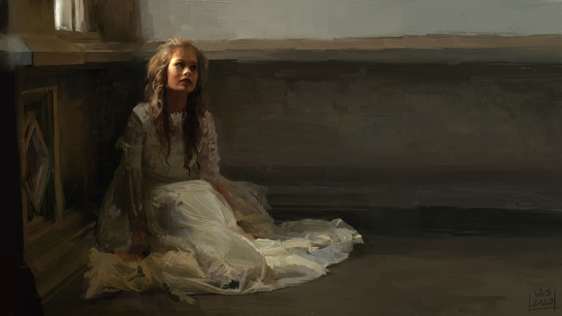
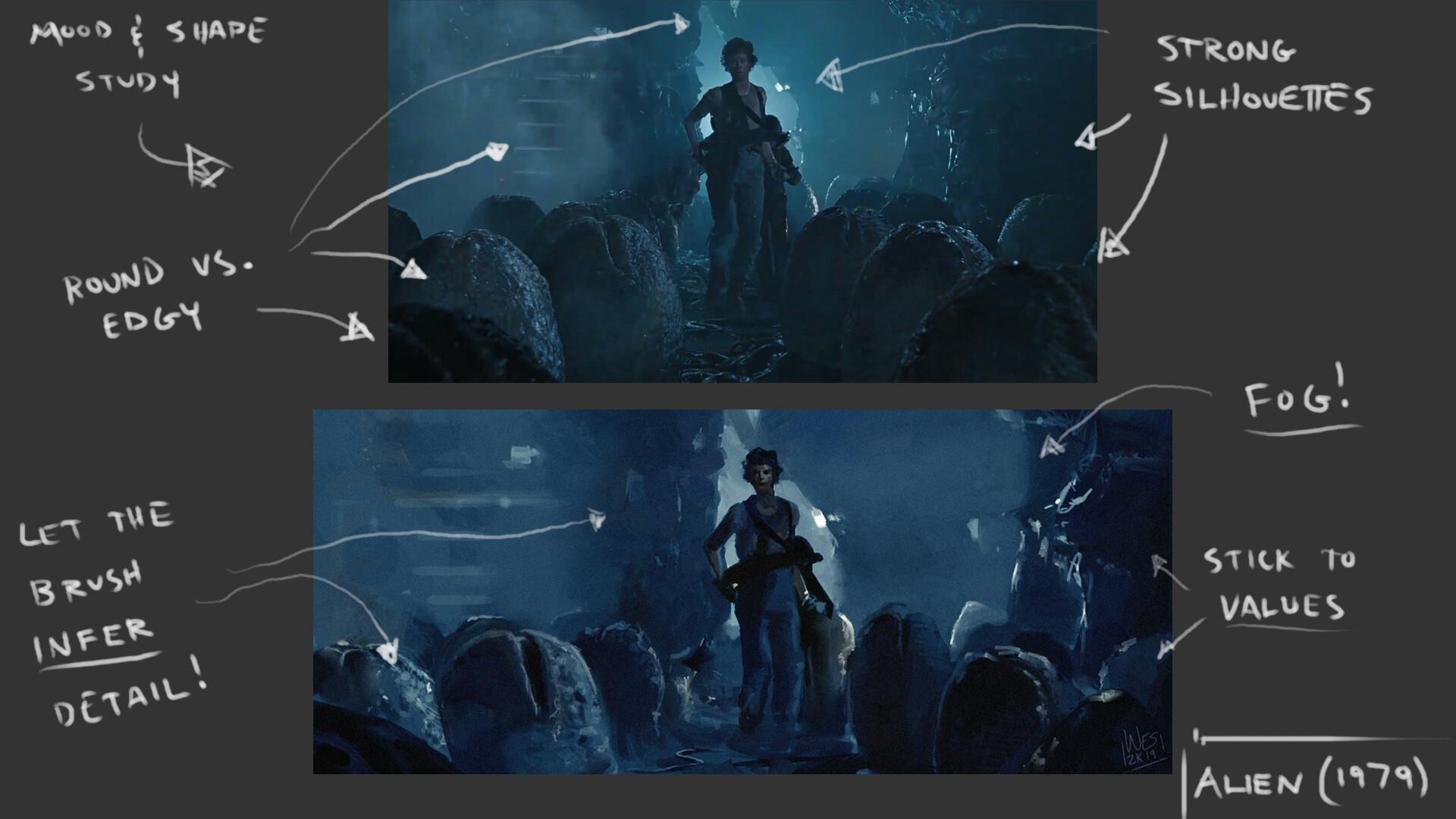
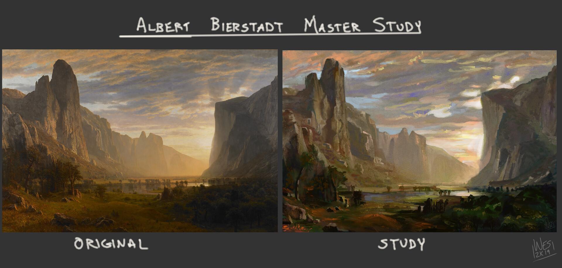
2. 1. Finding Inspiration, Mood, and Reference: a class. Hope you're doing well. Welcome to the very first lesson in Are having fun with master study class? This first lesson we're gonna be just taking a look at what inspires us. What makes us want to do a master study when we say, Master, what do we necessarily mean? Um, just this is the exciting part. This is the part where you can really start stretching out your creative muscles and really appreciating the work that from people you look up to. So I have actually done a number of master studies in my day, and I will probably be doing hundreds more over the years. But they're just to start off with what is a master study, A master study. But kind of what my definition is is take a piece of art from someone you look up to, and it doesn't really matter what the art is. It could be photography. It could be illustration painting, um, Cochet, like, really anything. If there's someone that does your art form and you really admire their work, you can always learn something by trying to replicate either one of their pieces directly or notice what they do is part of their style and incorporate that into one of your own creations. So I've done it a number of different ways. Let's actually take a look right now. I'll hop over here to the old brother window. So I have done some master studies in a spoiler alert. We will be doing a Frank Rosetta master study because I love for presenting. We'll talk about him in a minute, but just to kind of show you an example of what I mean. So this was of Death Dealer three. It's a frank for a set up painting, but here's kind of a comparison. So to give you an idea, you have the original on the left there, and then you have my version on the right, and they're not exactly exact. But without, you know, there was no tracing. There is no, like color picking any of that stuff. It was just me looking and trying to replicate the best. I could, um, even still cedar some stuff that you know, the skeletons not as fancy as Frank for asceticism, but the gestures air there and you can see Oh, yes, I recognize this piece. Hopefully you can recognize that that's what I was kind of going for. Um, and then there's also you could do it with films. I'm a big film guy. I love movies so you can take a still frame of your favorite film, like, if you like, the way it makes you, the way it looks and the way it makes you feel when, like it doesn't even have to be visually gorgeous. But just something that really resonates with you. Why does it resonate with you? That's what you have to ask yourself, these air kind of leading questions to get to the heart of making a master study from it. So on mine, this is from the original film Alien, which, if you have not seen it, we're no longer best friends until you do see it. It's scary. It's amazing. It's beautiful. Good horror, sci fi from the seventies. But this is great because I made this one win like November of last year. Yet November last year saw Scroll back up. So basically, this was the finished a study that I did. I maybe spent about 44 or five hours issue on it. Here was the initial render pass, which I want to kind of show you this to get to get you in the right mindset. This is how we're going to start working. We're gonna go from initial sketch to render to color the finishing touches and then Teoh Final. But we're gonna go every step of the way. So what you'll see here? This was the basic Value pass, and this was the color pass with slight refinements of slight color correction. But you'll notice here, and I'm gonna put this stuff in the file as well. So you guys will have. This is part of lesson one. You'll see what I mean by studying. I took the screenshot, which is the top screenshot right up here, and I noticed. Okay, what are the things that make this unique? What are the things that make this special? So you can see I said, strong silhouettes. You can see the shapes even though there's not a lot of light. Um what what's the mood? Oh, here we go. There's some edges right here. Some sharp edges around our focal point. But then over kind of on the outskirts of the frame, it's more roundy, less focused like I wanted Teoh embrace that and get it. Because I think that is what can to set that mood. So then you notice what I did is I implemented those, But I also I let the brush in for detail. I'm I added some atmospheric fog toe help with that, showing some things in the distance. I stuck to my values and that's gonna be the biggest one on the value. One I highly recommend, like book marking, saving at whatever you gotta do on the value one values make a painting values make anything really visually its value. Um, then we will talk about that, but yes. So there's one right here of a film grab study and you can even see the dimensions are even the same. I mean, why really wide? Kind of that I'm Max frame while this original one was in the normal kind of 16 by nine desktop while this was in the 2.35 by one ratio with long lens. But I was able to adapt the initial idea, stretching things out. But it has that same feel andan moving on like Albert Bird Stat Albert Birds that he's one of the Hudson River school painters, One of my favorites. And I love his drama. I love the way he does a light. I love the way you want to go to the places that he paints. And this was very much a 1 to 1. I wanted to look directly. No color picking, No, you know, No, no cheating as it work. I wanted to see how close I could get to the original. So you have the original here on the left, once again and then my studies on the right and what's really interesting about this one is I made a work in progress video so you can see these steps. And this is kind of a microcosm of the whole course on what we're gonna be looking at. But you can see you just have your basic building blocks and you go forward. But I'm pretty proud of this one. You did this one in December last year, so it's been already 34 months, Um, and then the one I'm kind of the most proud of. It's the most recent. It was actually not a master study of anyone in particular or of a specific piece, but it was more of an ode. A love letter toe Artists like John Singer Sargent. Anders Zorn You have Alaska as you got people like this. But here you go. It's called classical. It's literally called classical. So yeah, the end resort John Singer Sargent. I love their brushstrokes. I love how just beautiful in the texture. Um I love it. I love it. Love it. You can see the brushstrokes. And I wanted to make a painting where you can see the brushstrokes. Um, yeah. So I'm pretty proud of this one. I know this one has gotten a lot of hype recently, which I'm happy about. I am very grateful for that, but I was more happy as an artist being like, Oh, I think I finally I've gotten close. I'm getting closer to those classical beautiful Impressionist Romanticism portrait artists . So this is more of in the style of So I still had to take the same things. What's the shape? Language? What did they do with their edges? Were you know, what's their color? You have to open your mind and start asking these type of questions to really get, uh, that what really makes that master masterful on. What do you like about it? So I will say, this time you're gonna watch me. I'm gonna go kind of through every step of the way. I've completed a majority of it, but the last one are refinement. Phase will be a live painting session. I actually have not recorded that part yet, so I'm right at that part. So I'm gonna finish up the painting problem next day or so, but you're gonna be there every step of the way. I'm gonna talk about my process kind of what I'm doing, how I'm painting what I'm thinking about to really finalize it and make it a sellable Make it make it beautiful in a way that captures people's attention. But what we are doing. I wanted to do a master study of Frank for Rosetta. Already did the one of Frank's Rosetta back here of death dealer. And I love Frank Rosetta because what inspires me about him is his understanding of AM Ian's. And he does really cool things in regards to focal points. So if you'll notice like that, he's really famous for like, Conan the Barbarian and you'll notice he always does. He's beautiful, like mythological Big wall, you know, tough looking paintings. But he could also do like paintings of, you know, beautiful women. But they keep the same theme like they keep a lot of things similar. So if you'll notice on here like this is just a basic sketch that he did. But you'll notice the kind of blotched out background is the same here. It's a lot of colors, very vibrant, Um, but it really sets a mood, and it sets a location, and it sets just this overwhelming sense of place. And I wanted to capture that. And then I also wanted to capture kind of that mythological Yeah, book cover like, you know, I mean, just there's something great about Forever's at a heart that really appeals to me, but I mean, even look at this beautiful look at the waves. Look at the mean, stunning, stunning stuff. So he does do the fantasies, type things in the, you know, the horses and armor and big, tough guys and fighting. But you can see he usually keeps ah, main idea in the middle frames things around it to really draw as a focal point like these mountains right here in the light. Getting that. But the one were actually doing is this one. It is actually Death dealer six, Frank for us, that death dealer six. So this is what we are going to be painting? Um, not this exactly, though, because there was something that I have saw the other day, and we're That's really small. How about I just opened the main one that you guys were gonna get in the, uh There you go. So you guys are gonna get this in the pack as well. So this is a full on look at, um, at this one. I love this piece. I will. Oh, my gosh. Look at me. And like, the snake is almost secondary. I think we'll know the snake is absolutely secondary. I love the look of the darks in that light, vibrant, and you got the death dealer in the middle. And he's looking. He's ready to rock and roll, man, he's going for it. But you see these beautiful oranges and beautiful purples, and you have those complementary colors, but they blend and they blend into this beautiful gray. But because it's close to the oranges and the yellows. It looks green. So you almost have this huge spectrum of color. And I really wanted to kind of capture that. I loved the way this look. I love the way this composition was. And the next lesson we're gonna talk about what makes this composition really work. And what can we quote unquote steal from and make it look like a frank for Rosetta? Painting based on shape, language and shape language is something where you do. You simplify whatever you're looking at into either a square, a triangle or a circle. That's it. That's all. You You don't have to do any fancy. There's no such thing as an arm. There's no such thing as a horse. There's no such thing as any of that stuff. You just simplify what you see into the basic common denominator that you can sketch out within 20 seconds, right? So this is basically what we're doing, and I wanted to do the Frizette a study, and I wanted to have that feeling the impact. But a few days ago, I'm really late to the party on this, but I saw Thor Ragnarok and I love the words my favorite superhero. But it was just a while until I got to see for Ragnarok. But I loved it. And the reason why I loved it. There were some parts of this movie that looked like a painting, like, genuinely looked like a painting. So let me see if I can find So if here's huh So, you know, things like this like that you could paint that like That's amazing. Um, I mean, artists over at Marvel are incredible. And there was one set, and I actually sent this to you guys as well as part of, um, this reference board. But if you just look at some of these look at that. Oh, my gosh. Are you kidding me? Like, this is the one I You're the biggest inspiration from when I saw it in the movie, I was Whoa, that looks like a present. A painting has the blotchy background. It has the kind of big fighting, cool, dynamic light stuff. Um, that's what it looks like. An also good. Um, you know some of these soldiers and and then I got all these different references, but basically, yeah, I could do oppose Yeah, maketh or have a pose like that and then have it in the middle and all. Man, we're gonna make this thing awesome. So that's where my inspiration was. That's where I came from, but one of the most important things to do. Go and gather research. Go gather research from the person that you're wanting to study and also things that you just like, whether it's the color something. Hey, I saw this bed of flowers the other day and I love the way they look. How can I incorporate that into my master study? Go for it. You're the artist. So you get to make those decisions. Uh, let me show you. Probably. In my opinion, one of the most important pieces of this is what is called a mood board. And what a mood Board is is just getting a collection of your source images together and making one big giant image out of. And the reason why that's important and you'll see right here. The main event, of course, is Death Dealer six. But then you'll see right next to here. Here's Thor also got some doom box art in there because it sort of has that same vibe. You have that kind of going towards the middle. You have your main character in the middle of the power pose. Cloudy background, but very dynamic color. So there's some similarities there. And here's another friend for Is that a piece? I think this is Conan the Barbarian. Um and then you know the pieces from four. Just to get those colors just to kind of see what these are. And actually this is interesting. So if you think, Oh, master studies may not be for May simply because I don't you know, I'm not creative. I you know, every you know, every idea has been done, And what am I gonna add to it? I know a lot of people who think that way, but even the geniuses like Frank Rosetta in Rembrandt they weren't the first. They were not the first. This is actually I want to say, Is this the Fouke Kelly a picture from like the 12 hundreds or something? So I'm seeing there's the whole idea of Thor in this sort of dramatic lighting has existed for hundreds of years. Frank present. It was not the first to do Conan the Barbarian this way like these air paintings from who crusades type stuff. This has existed for a long, long time. Um, just this idea has existed, so that by itself shows me that it's a decent thing to study. If it's done throughout generations, there's probably something to it. And what can I learn from that? And that's really what got me excited about going forward and really pursuing this, making basically a piece of Thor fan art in the style of a Frank Frizette. A painting. Andi, I would throw in my stuff there. It won't be as realistic necessarily, since it's Thor. I kind of wanna have that fun saturated Marvel comics Look to it and you'll see what I mean once we get in there. Uh, but, yeah, mood board, very, very important. Maybe make sure it is something that excites you. Make sure that who you're studying or what you're studying is something you're truly passionate about, cause that passion will get you through the tougher parts later down the line whenever it starts getting into difficult rendering or hey, my shapes aren't working as well as I thought they were. If I get this far and it's not looking right. What do I do If you have a true love for your subject matter, that is gonna be the thing that will allow you to overcome any of those odds. And that's the fun part. Find what you love. Your artistic voice is yours. It's on Lee yours. So you're gonna have likes like other people. You know, a lot of people like Frank for Ceta. He's one the best in the world. You got Thomas Kinkade. You got Bob Ross. You got the's huge names and art. You know, your Picassos and Rembrandts and your, you know, John Singer Sargent's and you have these people that people are drawn to. But your unique taste belongs to you. And that's part of your artistic vision. So you should harness that. Why do you like what you like? Eso find your inspiration binds and cool images. Pick yourself a topic. It could be anything. It could be just a photo of a flower. It could be a huge sweeping landscape. It could be a still from a movie. It could be something you read in a boat. Actually, like a book is a great way to get a lot of very vibrant ideas. Because whenever you're reading, you're the director and the, you know, cinematographer and actors at your everyone. You're all of its going on here, so use a book to your advantage, but find something you really love and go for it. So what we're going to do, we're gonna hop over to lesson number two where we are going to actually start sketching out stuff. Looking at what makes Death Dealer six here work. What can we use? How can we make our own composition based on this to be ableto have the nice nod to Frank Rosetta, but we'll see you in lesson number two.
3. 2. Sketching, Composition, and Simplifying Shape Language: a class. Welcome to lesson number two, where we are going to discuss shape, language, clarity of ideas and just basic composition while we start our sketch Our initial Just putting some lines or charcoal or whatever, have you down on digital or down on paper, Um, or through a camera lens, kind of whatever piece of art you're working on your preliminary ideas and brainstorming. So what we're gonna do, which we did discuss on Let me actually come over here. What we are going to do is Frank Rosetta's ah, Master study of Frank, for that is Death Dealer six. And what I like to do whenever I first start off is I get my image editing software, whether it's Photoshopped or I know there's some great free run ones like Critica. Uh, I think clip studio pain. It's a small fee, but there's a lot of them. There's a lot going on. We're actually going to use two or three during our sessions here, but I usually loaded. I haven't loaded in photo shop right now, and I'm gonna study So what does that mean? You know, those people in the museum's like Mm hm. They look at the painting room. Yes, Yes, the man. My, My, my So Ah, a lot of those people might be full of it. You can take it for me. I'm a pro. Sometimes I think they're full of it. Sometimes I'm full of it. You know what I mean? But there is an actual method on how to do this. And I want to show you what My method waas of dissecting this piece and sort of understanding it on What? Why do I like it so much? So the first thing I do and this is one of the more important things in my opinion, one of the first things I do is turn whatever it is into black and white. So depending on what piece of software you have and maybe like a black and white filter. But I'm gonna show you, no matter what piece of digital software you have, how to make anything black and white. So I'm going to go in here. I'm going to make a new layer, and I'm going to fill this layer. Wait there. I'm gonna So it with black Oh, no, it's com. Um and what I'm gonna do is I'm going to come over. You can also fill it with white white works as well. Um, I'm gonna come and change the blending mode over do color. There you go. That's it. And you can always hide it. I always do this to check values. It's very, very easy. It takes no time at all to set up. You can have it with you during your entire process, which I did have this during the majority of my process. But the reason why I like to do this is that simplifies it even more. It gets the vibrant color out of the picture. So now I can really start honing in and looking. So what is it that I noticed about this? I'm going to get a red pin. Um, let me actually get my my brush here. Okay. Cool. Um, there we go. So I got Where's my little are glove? Oh, no. Higher. It is in my pocket. Okay. I have to wear the fancy are glove guys. It's a real deal. Makes me feel all nice, actually. What this is I do get a lot of questions about this. What? This is since it's 1/2 see right here. I can actually rest my year ago. I can rest. My, um I can rest my hand on the monitor because I do have a touchscreen monitor with a pen, and it won't My mold. Greasy mitts won't put oil smudges on, like, you know, so you can just do this and go on it and everything. Uh, it works really, really well. So we're gonna cut over to here. And the first thing I noticed, the very first thing I noticed is Look how much move darker the main. Actually, you know what? Let me get the old red here, so we didn't really see it. Um, look at how much darker the death dealer is than anything else. This is pretty much pure black. You don't really see. Actually, you don't see, except for maybe, like, right around here, Um maybe kind of the can. The nooks and crannies type things, but like those air, really, these are the darkest areas, and then something else you want to notice and we're gonna talk about this and values, but a little jumping the gun here. You also noticed the lightest lights are around here is well So what that does is that draws your eye eyes really love contrast wherever your darkest start in your lightest light or right next to each other that automatically becomes your focal point. Like I said, we'll go way over this on under the value lesson, but just to kind of give you a heads up of where my headspace was whenever I started with this. But the main thing I wanted to look at here was composition. So yeah, you could say Oh, you know, uh, let me ah, get rid of this. Oh, this works because, you know, you got the main guy in the middle, right? It's box kinda the I mean, yes, that that is true. But if it was just a box in the middle of another box, that's kind of boring. So frank for Rosetta uses a za general rule. And I know a lot of classical painters use this as well, especially if you look at the Renaissance painters. They swore by triangles. So this is where we're getting into shape language. So if I were to break down this piece, what does it look like? So I wonder, do you notice how you have the arms and stuff right here, and they're kind of coming down. Um, you know, this is coming down a little bit, but then you look. Oh, cool, though. The horses, you know, smelt forces have snouts, snoot. When I muzzles, uh, clearly need to study more and more. Nah. Thick. Um, but you have this right here. You even have the acts gonna coming down here. This curve of the helmet so kind of cool. But then if you take upset back, what does that start looking like? Oh, I get it. This starts looking, and then you see this line straight across here. Now you have a triangle. That's why it works. It comes to a focal point right here. Then you have your straight line, which is your horizon line. That's where your line of sight is going to be. Because anything below that horizon line you see the top of like, do this example. I do this with my students all the time. Hold your hand up to your face. Here, let me let me. You would be, uh, bring back up here. Hold your hand up to your face. This is the only lesson you ever need to know about Horizon Line. Hold your hand. Right upto high level toward you only see the exact side of your hand. Now move your hand down. Don't move your head just or you can move your head, but just move your neck. You see how you have to look down, and now you see the top of your hand. But if you do the same thing and move this up so anything above the horizon line you see underneath you see the bottom of it. Anything below the horizon line, you see the top of it. That's a super easy, quick way to know exactly where your horizon line is. Just look at the part of the picture that you're looking at square like it was just right in front of your face perfectly flat. That's gonna tell you no matter what, you're studying where your horizon line is. So we have this and you can notice that because if you look right here, you can start seeing the underneath of the horse. You start seeing the top area right here of the snake on the same thing here. So of course you can see parts that kind of come over here. But yet see how this is barely above the horizon Line on the snakes face. But you can still see underneath right here. It's a great rule of thumb just to keep in mind. But you notice this is our composition. This is it. And then something else. Let me erase some of these so we can look at this too. So we're gonna keep this. We're going to keep this, uh, triangle here, okay? Because I think that's our That's the crux. So the next thing is I was looking at it was like, Well, there's something else too. Then I noticed I'm gonna zoom in a little bit. Then I noticed right around here This, you see, unless it's like piece of wood right here. And then there's almost, you know, the rocks coming up here. It almost looks if I follow this guiding line and follow this, this starts looking like a reverse triangle to kind of come down to another point right down here. So now you have these competing triangles, so basically, you just have your genuine shape, and then you have kind of the smaller shape, right? here balancing it, almost angering it down. Okay, so that's so. That's probably why this works. Then you notice how that that the movement of the tail coming in like this the movement of the snake's head on the other side is coming in as well. So everything's coming back in towards the middle, which is our focal point, which is the middle of the triangle. So there's a lot of stability on this. That's why it's so such a powerful image is you have nothing but concrete. Beautifully flat, perfect shapes that are just standing tall, standing proud, and everything else is pointing at it literally. Composition. I can't tell you how many times if I'm in a rough spot on my sketch. I didn't sketches well or whatever, and I'm in the middle of the painting and it's just not working. It's probably because my compositions bad and I'm no master composition. Trust me, I'm still learning. I learned every day, but what I have found it sounds ridiculous. Draw an arrow literally in a painting drawn arrow of like Okay, my main thing, my main guy is the death dealer. So, like, have everything point at the death dealer. So you have the snake. He's looking at the death dealer. The horse. If you follow the line of the horse, it comes up to the arm which anchors and heads up to the death dealer. Even the legs are doing the slight deal. This one's coming up here. The feet coming up here. You got your snakes. Tell right here. You got even this topsy turvy. We fun, fun, fun, fun, fun, fun, fun. It leads you back. So as you start, this is an absolute mess. So I apologize. Um, let me erase some of these. So as you start getting away from the death dealer, see what say the actual insert sending you this way. But now the clouds air coming back here. So it's bringing you back so you can follow this. But then it hits this side of the tail and swoops you back around. Everything points back to the death dealers. So that was a big revelation for me. And I knew I liked a lot of Frizette of stuff, but it's because he didn't do anything fancy with composition. He really didn't. Whenever we talk about values will talk about how the values pointed at it, but that's that's critical. You know what I mean? Because now imagine you had the right answer toe, whatever question on whatever test. But you always got the answer, right? That's what composition is. The other thing that blew my mind. And like it was one of those deals. I have a big couple water here. It was one of those deals that I was like, How I wonder if this is true. And then I did kind of a rough calculation. I nearly spit out my water because there's something you always hear about the golden ratio . And what the golden ratio is is basically it's the mentions, essentially of, like, a credit card. Okay, so what it is is you have something like this. Some people call the Fibonacci sequence, but the ratio is actually one is 21 point 618 681618 I'm gonna google this. Google is our best friend in the world. By the way, let me show you the window. So, while I come over here, Ban, um, show you sketch, but, um okay, Golden ratio yet 1.618 So the golden ratio. You guys have probably seen it more so in one of these, like, spiral looking exercises. It's great. It's great. I use it a lot. But now I'm trying to move away from it a little bit because I feel like I'm relying on it too much on and I don't want to get pinned down on all my art looking the same but coming back over to the art window, we have the one point 618 and I thought about it, and I was like, I don't know, I I don't think present is using the golden ratio, but then I was like, Wait, So we had our horizon line, right, Because we had our we had ban. I am. And then we had our horizon line right here. I was like, Okay, there's our power deal, But wait a minute. If I come over here and I flip this 90 degrees clockwise and let me get rid of this now, this might not be exactly the golden ratio, but I am pretty sure if this is one. This is pretty close toe 1.618 It just works. You find it everywhere. It's crazy, but just a fun one. Like I didn't even know this one until, like, earlier today, whenever I was painting, I was like, Wait a minute. Wait, Is this following the golden? You know, Asai was painting along and stuff. I just had that weird think, um but so hopefully you're seeing the trend if you break down to this very, very, very court. So let's do that right now. Actually, I didn't even plan on doing this, but let's go in. Let's do this. Let's go. Um, what I wanna do? What am I doing? A new a new do image image rotation here. We'll just flip it back. A cover, boys. So we have this, right? I'm gonna make a brand new deal. Let's bring up here. I'm going to do the triangle right there, OK? Yeah, So but right here now with here. Let me go toe edit. They'll completely with black. Now I am going to come in here completely with white Now, this is not a gorgeous picture by any means, right? But that is essentially what we're gonna be painting. Don't wrap it up. Wrapping up game. We did it. Masterpiece Yeah, but that's it. This this is the painting we can make It is crazy and is whatever is we want. But at the end of the day, at the end of the day here, let me merge us down, Birds down. What boom doom? Murder stone. Okay, at the end of the day, that's the painting. Or make and see if you really want it. Here's what we can do Let me get And the silhouette of our do your friend the death dealer here, Uh, do and it cup emerged. I'm gonna go at it. Eights in place. That's it. That's the whole pain. And then we'll just do this to be goofy. Uh, then what? What is it? We had the snake right here, and it was like there is the tail. And then what it did, like swooped down something like that. And then people angry mirror right here and then as it look at that genius, right? Look at that. Perfect. Only nailed it, but yes, simplifying things like this is that's where the secret sauce is so in the reference materials that you have is part of the class actually did put down some of these shapes, Things like that. That way you can come to see it. See what I was thinking while I was thinking about it. But what came out of this? What all of the shape language came out of was a quick sketch. And we saw it just a little bit ago, but a quick sketch. So I wanted to put the cool mountain in there. I wanted to put four holding me owner his hammer. You up here? Is Kate blowing in the wind? Sort of the same thing. And what you're gonna notice is it is the same. I use the same exact the same exact, uh, pyramid. The same exact triangle shapes that I did on the Frank Frizette. A painting? The one that you guys get included. If you want to open up this image, open up the Frankfurt. Is that a one with the triangle over it? And look at it. I didn't budge that triangle. I wanted everything toe work, the same exact way. Okay. On Ben. What I did is I was like, Well, to add some more that Frank was that a flare? I could add little guys reaching up Adam I like we saw in the Doom Reference Board. I will say later on I kind of get rid of that idea and we will talk about why just kind of it changed the meaning. I wanted this to be about four, not about impending danger, if that makes sense. But we'll get to that. We'll get to that whenever we get into the painting. An actual color passes and things like that. But yes, so you'll see right here. Um, basic stuff right there on What I did is I took this black with white sketch. I like working this way because it really shows me something a little different. It's not. It's not black pen on white paper. You can definitely work that way because what I did afterwards, I inverted it and then added some details. As you can see, I made it look a little more like Thor. I added the chain mail arms added this. I gave some detail the Milner I gave you know him some boots, just some basic superhero stuff. Um, but this was a sketch. This is really what it was, but I knew I would have something close. And you can also see the A little clouds and stuff back here. But I knew I would have something close because I was following very precisely with the exact shape that exact triangle shaped language where the angles land so the same. His knee is kind of the same thing as the horse's leg. This leg is actually pointing down at the apartment like parallel to the triangle. See what I mean? Like it. You can see his arm is coming down. So it's a shoulder on his bicep were part of the line. Um, he's looking up at me owner, me owners facing back down. So once again, I wanted to learn all that stuff and even these mountains right here. The clouds air kind of swooping back around on. And, um, everything points to four everything points toe. So I hope you found something useful out of this set right here. But like I said, this will be part of that as well. All of your reference photos and reference pictures for my step by step process are gonna be on there as well. But yeah, if you have any questions about this one, leave a comment. And in the course or shoot me an email. Yeah, I hope you like this one. The next one is kind of the Well, this is where I would say 85% of any of your work of art gets done And that is in the values. How light is something versus how dark is something And we will take a look. We'll do some. I'll give you some cool cheats, some cool hints on what to look out for. And you will. I guarantee this. I guarantee it. You write it down on a piece of paper on an IOU. Whatever. If you study value, your art will get better overnight. It happened to me. I can swear by it. I was always floundering. Uh, but yeah, you could tell him pretty excited about value. So let's get over to it. Hope you like lesson number two. Let's hope hop on over sea. I'm so excited I can't talking the top on over the lesson Number three
4. 3. Values And The Importance of Black and White: a glass. Welcome to lesson number three, where we talk about, in my opinion, the most important part of any piece of art. The values. So there is a lot of incredible traditional artists like heroes of Mine, the John Singer, Sargent's of the World, Anders Zorn that never thought about color. They would at be asked in interviews. How do you pick such beautiful, vibrant colors like a color? I don't know anything about color, and you look at these pieces and they're incredible. It's like, What are you talking about? You don't know about color. These are the most beautiful looking paintings I've ever seen. Like, I'll show you the one that I always think of When I think of John Singer Sargent, it's ridiculous how good he is. Let me pull this one up. But yeah, and he always talked about color like man. Now color is not all that important. Um, John Singer Sargent and is So let's pull up where I know that one. Yeah, here's it. Here's a really good one. Um, load for me. Um, so, yeah, the, um, beautiful colors. A super rich and vibrant, Just incredible looking stuff. And I actually own. I own this book, by the way. I highly recommend it, but just stunning, stunning looking. This is just such a good understanding of color. And he didn't like color. He was like, Yeah, color is not a big deal. But why is that? Why did he feel that way? Because he felt the importance was on value. So technically, what value is is your lightness or how bright are the brights? Or I should say, Excuse me, how light are the lights and how dark are the darks? Brightness is something different so that that's where things get tricky. There's something called like saturation, which would happen to deal with how bright is something How vibrant. Then you have value, which is how light or dark something is. And then you have color, which is what color something is. What is the hue? All three of these things can be interwoven, but they're separate. They're completely separate steps. Which is why in this series I want to bash In India, values are the most important part. You can use any color you want as long as your values air. Okay. I've heard that from people that I have meant toward with. I've heard that from people I idolized like Craig Mullins. Um okay, Uh, Pataki, there's incredible artist that they're right. No, we doesn't matter what color it is like They just don't care at all, though. Yeah, color. Who cares? It's always it still blows my mind. But now I see what they mean, and I'm gonna teach you to see what they mean as well. So what we're gonna do is we're gonna look, we're gonna hop on over to the hero. So we have death dealer six up the French Rosetta study were working on. And what we're gonna look at is, you know, what do we mean by values? So you notice that I did remember how we had it in color, and then I put the black or 100% black or the 100% white layer over it and changed it to color overlay mode, um, or color, uh, blending move. And it makes it black and white. What this allows us to see is how bright I said it again. See, they're very easily interchangeable, but they mean different things, and that's a very important deal. Even the pros mix it up. Uh, it's one of those things that once you start working with it, you'll realize that you really embrace it. So just to kind of show what I mean, what works? And we talked about this a little bit in the sketching stage. But what works about this is just how um incredibly like dark. This is This is pitch black. Um, and you have these shadows or just lost. You know what I mean? These shadows air just so like, yeah, we can even zoom in and look at that. Look how dark that is compared to it. Um, and something you're gonna notice with value. I was always until recently, I want to say, Until a few months ago, I was obsessed with the fact of oh, texture, texture, textural, this texture, that texture. I'm starting to kind of come away from that now because what I'm realizing this texture is actually change in value. So is a perfect example. Notice how? Let me zoom in even more on this. Do you see how quickly the eye goes from bright to completely black? You see that? How you have like this right here, So anything within the red is lighter, but on immediately the outside of that red is complete black. That draws your eye. That draws your focus because you have the darkest dark, which is this next to potential legal lightest light, which is right there. So it really draws your eye in and it makes you want to see what? Well, what is that? What is the same thing for the range? Right here for the actual harness? Um, you'll see Complete black right here. But then, almost not even pure white. Really? Let's see, this is probably at okay, 80%. So on on a 10 step scale, this is an eight out of 10 as faras brightness. Um, if 10 is complete white and number 10 is complete black, like, literally goes from complete black. So a zero or one on the scale actually a zero in the scale to an eight with no steps in between, you know, So let me do a quick lesson on value real quick. Um, let me go. Here. Let me actually let me fill this one, okay? We'll do this. We will fill this with 50% gray, so we're gonna start right in the middle. Okay, so 50% 50% gray at 100% opacity. That's what we want. So here we have a completely neutral, completely neutral 50%. So I am going to Well, im box right here, and I'm going to go and paint in. I'm gonna paint this in white. Okay, so we have this. We have that right there. Great economy, moving around a little bit so we can see it even a little bit more. Perfect. Now, since I have that, I'm gonna lock the transparency. So any painting that we do will not go outside of the bounds of the box. If you want to know how to do that, it is a helpful tip. Go ahead. Make a shape on a new layer. That way, you know, this is on a layer and click a transparency lock. All the our studios that I use digitally have this function. They may be called something else. Are like lock transparent pixels, something similar. But what that does is let me grab a color. And then I will come in and I will start painting. It will only paint within the box. You see, very So there you, um let me. You're perfect. Cool. So we have a completely white box Now we're gonna go and make something completely. Why? And we're gonna do complete black over on this side. Then we're going to start slowly going down the grayscale a little bit until we get something. So this is like a super quick and dirty way. Literally. A very dirty way to get yourself. Um, the value mapping. Yeah. Yes, that's so you have just something like this, right? Let me get a blender smudge tool, and then you can start blending in between these, and it starts becoming gray scale. You know what I mean? Like, start doing this. Start over here. So you start getting this grayscale look to think so this is value. This is something super, super dark. This is something super super light, and it gives you a sense of rhythm. Gives you a sense of positioning on there. Some rules you can follow with it, such as anything that is closer to you is usually going to be darker. So write that one down. Anything closer to you is usually going to be darker unless you have a weird son, the sort of beam of light thing happening, but or perfect example. This doesn't quite follow that rule because, as we can see based on how this is painted, the snake is closer to us. But what is the thing that we go to first? The darker item, right? Everything else is kind of a mid tone is kind of that 50% home, except for the death dealer who's completely black, Um, and then any of the detail. We want the muscles. So we have this, also the snake's head. So what's funny is I would argue that the snake is lighter, then really hardly any of the stuff on death dealer. But why doesn't the snake stand out like it is? Because you would think, Oh, if something's brighter or if something's lighter, I'm gonna look at it. Not necessarily. What is it around? So that's where value really comes into play. So the reason why the snake doesn't pop out as much is because look at the ambient air like look at the look at the ambience here. The difference between and if you want to keep an eye on my color wheel, or especially like on this black, um, slider right here. It was kind of small, but, um, the difference between this color and this color is not very big, right? And as you start zooming in, even the difference between you know, and as we can see on the snake, this color is really dark in this color is lighter. But look, it's barely a tick up on that color real. However, you get this little sky color back here, ban that skyrockets straight up near the top to the white and then compare it with, like, the lighter part of the horse is, uh, leg. That drop is way more drastic. So that went from, like, if 10 is the most bright that one from, like seven or eight to a toe like a uh, let's see. Yeah, that won't like from a 7 to 8. And then you come over here and that went to, like, a three. So really, Really? Yeah. This is a five. So you got 357 then if you come upto here nine So as you keep going up, that's where those values come in of your brightness and basically your eyes going to look at the place with the highest amount of contrast. Contrast, meaning the biggest difference of the biggest leap between your darks in your light, Um, trying to think of other things in regards to value. So value is definitely a thing to study because this also tells you shapes. So I I know I'm I. Hopefully, I'm not the only one to blow your mind. But in the world, there is no such thing as a lines. Lines do not exist in reality. Lines do not exist. What does exist? Our planes. So planes, meaning like a plane, are region a region that you can stand on a fold or so if you have, you know, let's do Let's do ah to this. So let's say you have a box is a really sloppy box, so you have a box right here. So the best way and let's say it's lit from the top. So the best way you can really like this bad boy is get three different values, one for your bright, one for your mid tone and one for your shadow. So with the shadow, we're going to do it at about a two on a 10 scale. So pretty dark. It's not quite black, but it's pretty dark. All right, so we got that. There you. So now let's go up a little bit. Um, let's bring this one up toe like a seven. Okay, now, that's quite a bit brighter, right? So now it looks like we automatic. We have some form. Um, Now, let's crank this one up almost to the full white. You see what I mean? Now you're starting your starting to get that sensation that there is. There's a plane here. There's light hitting an object. So what happens? Let's get rid, See? And even when you get rid of the lines, you're gonna notice, Clean up some of that a little bit you're gonna notice That's pretty legit. Like that's fairly convincing. But what happens if you lower the contrast if you bring your value ranges down What it's going to start looking like is this cube is going to start looking more rounded because as something if it catches light and it's round, the light barely tapers away from it. So your values are very, very close together. So just to prove that point, let me get here with this blur tool and see if I can't get something like this. So basically, what this is doing is this is just blurring out some of this stuff. So the same thing up here is Well, so if we can come through this, then this it starts becoming like this Jello, we sort of not, as you know. And then if we actually came back here, let's see if this is a in 96 this is a 71. Let's bring this to about 80 on my brightness scale, and then we're actually going to come in here and look at that. If you round the corner, it starts looking fairly convincingly like it's rounding a corner. So the same thing here, if we go, what was that? The 90 and then down to the 20. What's that? The middle of 987 Let's put it right around 50 right here and then the same thing. And it just come along the lines here and then kind of blend all of those together right here. So as you start getting a little muddier, you're gonna notice that things start appearing a little more rounded and then if I actually coming here, blur these together now, that effect really starts taking precedent. Right now, this really looks like almost like a table cloth, like a rounded edge. Um, so if you want to give your art that perception of depth as things get further away from you, they actually aren't very contrast. Heavy. They're not very black, they're not very white. They're kind of this muddy rate. So as we look at that, let's take a look at what I decided to do on my value passes. So we took our initial sketch with me, uh, moved back over here. We took my initial sketch, which, let's just say, was right here. And I wanted to block in values based off the Frizette a study. So what I did is I looked and I said, OK, um, I notice my main person is the darkest. Then as it goes out, the immediate background right here is going to be, ah me, whom me do there pretty those. So my immediate background right next to my focal point is gonna be very light, maybe the lightest things in the picture or one of the lightest anthem picture, but that my main focal point is gonna be the darkest. Everything else is gonna be this nice, like mid tone, right, Because once again, we want to build that triangle. Everything within the train was very, very dark. If it's right next to the triangle, it's very, very light. And then it kind of fades into your more mid tones as you go out. I'm just showing a few darker things here just to show shape. So what's get rid of all those? So I wanted to take that lesson and really just apply that exact same value structure to my sketch. And what I came up with for the first pass looks a little like this. So we were able to take the sketch. Me get rid of those. Get rid of those. Um, yes. So we were able to take the sketch and block it It we were able to block in this value so you can see right here I did the same thing. I made my Thor the darker part. I wanted to keep myself honest a little bit, so I didn't go complete value range on it. But I've made this clearly the darkest thing back here is clearly the lightest thing. Just to get myself an idea of what my idea was actually could work. And the good news is, yes, it could work. Um, so I took that idea, and then I refined it a little bit. So I went from this right here, which is a little cloudier to something like this where I start making shapes. If you notice the word structure jawline, I start adding more darks in there to kind of show the form and what way the form is facing . So you start getting more of a sense of OK, this is starting to kind of feel a little more Frizette alike. Um And then after that, I went and you can see I add a little bit of texture and on the feet stuff as well. Um and then I did something drastic, which is? I took away the lines. Normally, this is about the time that I will get rid of my lines because now I want to think about this like a painting not like a drawing. So once my values are in place, I keep my lines on a separate layer. I get rid of that layer and the peace should still read without lines. I don't want lines doing any of the work for me anymore. Here we go. This is what we're left with on the value past here. Excuse me. Here I was like, Okay, we're far enough in this. Convey workers a painting. Let's go ahead and start adding color to it because we can use whatever colors we want, but because our values are in place because our darks air there and our lights air there. Whatever color we put in there, we're going to go. Ah, note. I will say a lot of people say, Well, why didn't you start in color or on the flip side? What? Why don't you make it look finished and then add color on top of it later is because I like getting the best of both worlds what I found with color and this will lead us into the next lesson. But what I found with color is if you start with color, it's way harder to understand what the values are because dark blue and light blue might sound like Oh, well, that's a darker yone darker. We're going the shadow on ladder will go in the light. Maybe, but what if that dark is actually purple? Because what were your surroundings? Where are you? Is that sunset? Is it? Sunrise is a golden hour. Um, just because something an apple was read does not mean the shadow is dark red. What if it's next to a thing of glass and there's a bright blue light next to it than that ? Shadow is gonna be pretty light blue. So this is where you have to start thinking light. And that's where the values really come into play. Because if your values read well, you can kind of have whatever tell you want. It still looks OK, which we will look at whenever we get the color. But also, if you go completely, um, all the way in black and white and then just add color at the very end. From what I've found, it's it feels disconnected. It feels it feels like it's not the same piece because it looks like you just took a black and white thing, and through color instead of it being a real painting and you see the vibrant blending of colors. So what I like to do is I like to get to this point toe wear. Okay, I kind of had my structure. Now let's start working with color, start integrating it with the shadows and start smudging pain around, because that way I get that flexibility in the liveliness of a real painting or real painting techniques. But I still know that I'm not gonna go too far off the course because I still have my values in place. But I hope you learned a little bit. This one went a little long. There was a lot of kind of bigger ideas. Um, please let me know if you have any questions on value. Just know how light and dark something is definitely responds to the human eye. That's what we see more than anything. A perfect example is, let's say you have a giant spotlight. You have a giant spotlight. I mean, it's one of those. It's like the deer poaching writes the big Whoa, cool like the bat signal bat light. You cannot put out the bat signal in the middle of the day because no one will see it. Everything else is too bright. Everything around it is too vivid. It's too too much. You can't put light on top of light and expected to work well because you can't see it. It's like Did you ever wonder if you have, like bright blue and then you try to put like bright yellow over it? It doesn't work. It makes your head hurt a little bit because it's like that doesn't make sense. We need one of those things. Either you can have with, you know, black text on a white screen or white text on a black screen. Because of what? That the contrast it. It's just easier for your eye to understand and make out shapes and it just a lot of the heavy lifting for you. But I hope you learned a little bit about value in this one kind of rambled on it a little bit, but value something I'm really I love it, and I could talk about all day eso If you guys want I could do another set tutorial just on values and what I've learned over the past year, year and 1/2 just studying it a lot. But yeah, before we head over to the color side, this is what we have so far in regards to the sketch. Um and then Ah, bam. And remember, whenever we brought that sketch in, this is what it looked like. We were fined it. And then we got riddle lines that was just basically are set up to get the color phase, which we're gonna look at next time. So, yeah, take care. I will see you in the next lesson where we start adding those rich, luscious, beautiful colors. You're gonna be amazed at what we can get away with now that our values burn place. But we'll see you soon.
5. 4. Colors And Mastering The Color Wheel: a class. What's up? So welcome to lesson number four. This time we're gonna look at color, so this is kind of that biggest leap. Um, now that we got our values kind of figured out, we at least have something on the board. Now we can start introducing color. It really started getting that kind of rich, vibrant look, um, the frame present is known for primarily, but also gives some personality to the peace because right now, the values can work well, but it's one of those things of does it feel like us? Does it feel like a personal piece of mine yet? Not yet. But once we start playing around with color, start mixing in some different tonal on value shifts. It'll be really fun. And we can get that nice, beautiful kind of buttery, painterly look Frank Rosetta's so famous for. So actually, let me a prep this real quick. That way I can do some big grand reveal for you guys on what we got started with. So let me so I'm gonna do the same thing. You're perfect. Let's move over on to this. So this was what we had, um, at the end of the last episode, we had our values we blocked in our values based on studying the frame Rosetta composition . And we knew. Okay, Main focal point is dark. It is really bright. Right next to then it kind of comes out, um, into more of those mid tones and sculpts some shapes toe back towards our main character. Um, so that's what we have. So basically, my next step was coming in and doing what's basically a color overweight. So I'm actually gonna make a new layer. I'll show you what I came up with. But I just want to show you how I did this first. So I'm gonna hit new layer here, Um, and then I'm gonna pick an orange, because if we look, we have death. You were open, and we look a lot of orange is a lot of oranges. Very warm in the back while you get those nice purple lee cool clouds back there. So let's actually start. I won't even color pick. I'm just gonna kind of eyeball it and get something that looks sort of like those Cool. So we'll get that right here and on this new layer. What I'm gonna do is I'm gonna come in and I'm gonna paint. So I'm gonna keep it on normal, cause I want to show you what happened. So let me come over here and just start. Um, Let's do this. Okay, Owner, if it Let's see. No, let me do it. Come on, bro. Oh, yeah, I was on the eraser. Silly me, that's why. Okay, So, basically, I just get in orange, get a brush, and right now, I'm gonna have this on the normal look, and you're like, Oh, no, it's kind of going all over. It's blocking everything. What's happening? We haven't changed the layer blending mode yet. So what we're gonna do down here since it's a normal once again. Remember how we made a color thing in a gray scale? This is going to make a grayscale thing into color once you pink color on top of it. So I will actually work with it going from normal. Bring this and you can see all these different things. Doing some crazy stuff like that looks cool, you know? I mean, so you can play around with those, but if you come down to color, look at that. It's getting the hue, meaning that actual, like hex code color and, like, Oh, I could get purple. I could get, you know, under that blue right here. But you noticed that it doesn't change my values. The dark and the lights stay where they are. So, like, Oh, since the war's blue, I could come in with a little bit of blue in him up right there. Oh, Red Kate. Sure. And I know this looks hideous right now, but this is how it starts seriously. Like, this is exactly how I started. So you block this in, and then you're like, Oh, well, these mountains, they have to be kind of that brownish color right toe look, kind of nice. So that might be a little too saturated there. But let's block this in, then we're going to get. Remember how he said this was orange is right here. We're gonna do some oranges over with the sky, and then we're gonna kind of bring that back in the purples and then sort of nose and dark and nose up a little bit and kind of do this. Oh, and then we need his skin tone. So let's bring in another little deal right here and make his skin tone right there. And, of course, what would Thor be without his long flowing one locks? So it's ugly, But can you see it? You know what I mean? Like Okay, sure, this is starting to become a thing. So probably I. What I did is I came in here and I studied all these kind of vibrant looks. And OK, while it has a lot of color, it's not very saturated. It's not hurt. No, at the excuse me, it's saturated, but it's not super bright. It's still sort of Dole. It still has that kind of painted archive. E look to it. So to do that, basically, I just came in and let's say we went back over here instead of these big, loud, really vibrant deals. I actually moved this saturation down a lot, You know what I mean? And then the brightness is still kind of down, things like that, and then you can actually come in and pick these colors and see how that's still purple. But now it's way closer to gray. And then if you come over to the Brown once again, it's brown, but way closer to gray. You see what I mean? So now the values air still there, then all I'm doing is I'm just changing the wheel. I'm not even moving any of the color stuff yet. So we have this right here. Let's get that blue. It's really settled. Weakens, weaken, bringing in more of it here in a minute. Um, so, like, next to each other, these air very, very, very close. It's almost a grayscale again. So if we just want to introduce a little more color, a little more color you see now how we're starting to get that. If we bring that blue back in, bring the yellow. So the yellow I could actually kind of get away with it because his hair is like crazy. Um, and then we got the orange right here. And see, I'm not messing with the slider as much, but I'm coming in here. I'm kind of making this happen. Um, just kind of following those rules I already set for myself. And then with that, we can actually make back end of a slate. Bluish color is his hammer. Um, but you see what I mean, now it's actually really starting to look like some colors, like, Okay, now we can start seeing how this is looking like a painting. You see what I mean? So we pulled out all the super harsh bright, so basically, that's what that was. But to show you what I came up with after the fact I started mixing some greens in there, I mix. I did some really nuanced, uh, just color stuff within their When I started messing around with some of those sliders, I made things slightly more black, slightly more brown orange. Cem pops of this because that's what I noticed whenever I was looking at the Frank presented deal. Look at this. You have, like, a just a smidge, like a tiny smudge of super bright yellow. But because you mixed it with the kind of the purple and orange and stuff, it made this nicer green. But he left it alone is left alone. Same thing here. You see all this orange, but then whenever you put gray next toe orange, it looks more blue. So that's another thing. Let me actually change this. So if we want to talk about, uh Brennan. You okay? I'll actually called real. Should be fine. Um, let me bring up a color wheel here. This is just a quick crash course in color. I am not an expert in color by any meat, but since we're talking about it, let me bring it up. So the color wheel, a lot of people use it. And I know I used to use it in the way that actually hurt my progress. More so than helped it. So, um, let me look. Or the color wheel Here, let me find what that kind of shows what I want to give. Okay, Perfect. This is actually the exact one. So let me show you guys this this is pretty much the exact when I have at my desk all the time. Eso I got one of these. I think it was, like two or $3 at hobby lobby, or like Michael's or something like that. So on one side, you have basically what you're try. Attic colors are what your complementary colors are. So you know, you have your arrows pointing and stuff and says, Hey, these are complementary. These are analogous things like that. And you can spin it, um, just to figure out what your color compositions are. But then the other side is nice, because this is what happens when you add the primaries, your colors when you add red to it. Here's colors when you had yellow to it, um, and then whenever you have blue to it. But then you also get tint and shade on this other side, which is whenever you add white to a color and whenever you have black to a color. So let's move over here. This is kind of my favorite color wheel, because one that mimics what I have in front of me, but this makes the most sense. So you see that out. Most right here is you have bright yellow, bright orange, bright red. Now, as you get further to the middle, get closer to the middle. You're adding more and more gray. So this right here I know in this picture it's white. But if you would imagine this as a filled up cover will, this would be 50% gray. Your dot in the middle would be 50% gray, no color at all, completely neutral. So here's what I used to think in regards to color. Oh, I have yellow now I need a complementary color. So I'm just gonna go across the color wheel and I'm gonna pick up Violet. But what ended up happening, and I'll bring this up is I got what I called him, and I've heard it called fruit salad. Till here, everything is just so loud and vibrant. No, my God. Like, ah freaking out. You know, um, so let me let me come back over here real quick and show you kind of what I'm talking about . So let me get a new layer, and I will want to get to 50%. Great. Um, let's go to Phil. 50% gray. So we're completely neutral. So now let's say I'm on my color wheel. I'm like, Oh, man, I have beautiful, right? I'm want I want this to be super bright. I'm gonna make it a science. And you know what, man I wanted to be Bam! Look at that. Look at that. Like baby blue. Wow, Look how loud That is amazing. Oh, but now I need a complementary color. So now I'm just gonna take my color picker. I'm just going to go over to the orange and then I'm gonna go like my I already hurts. Oh, man, Like you can't do that diving you can do. I recommend it. Milk. So what? What? How do you fix this? So how do you introduce? How do you introduce orange or a complimentary color into this color and still make it look good? So let's say I want to end up here. Let's say I want to end up here. What color do you think goes in the middle here? Guess what? It's already there, 50% grape. So let's cut back to here. I want to explain this before I show it to you, because whenever I first warned this whenever I was taking a Craig Moments class and he talked about this, I flipped out. So let's say we are kind of at that blue green area right there, and we're adding these oranges and reds. I was going from bright blue scion, too bright red or orange. Technically this color, this color, which is still well in the blues well in the balloons is more red. Then this color do you get it? So you think of This is a map. Think of it as a You have your blue, and then as you you're traveling along towards red, not make the full leap, you gotta go each step of the way. So if you wanted this blue to be a little more red, I wouldn't come over here. I wouldn't even come right here. I would come like right here, Right. I would come right here, because thes have slightly more red in them slightly. But it's just enough. That's what Frank presented does really well is he manages the temperature of his colors very gracefully, very smoothly. And that's how he does that nice, wispy, dreamlike atmosphere within the stuff. So this changed my life like this right here. Learning the values did the heavy lifting and then if I wanted temperature control or complementary colors are analogous like Okay, so say we wanted blue and we wanted to get over the yellow. Okay, let's say we want to kind of the dollar yellow. And we started with a bright blue draw a straight line from here to that. Here are the colors you're gonna use. You're gonna use this light green you're gonna use this gray, yellow green, you're gonna use the blue green. These are the ones that are gonna get you there. That makes sense. Or if you want to go super settled. I mean, all man like you can barely even help. You could go towards 50%. Great. So you could move up on the blues towards the middle, then almost like what is it is a, like, trivial pursuit or monopoly or whatever, where you get the middle and then you have, like, mover, it's not Monopoly. Uh, what am I talking about? Um, but the games where you get to the middle and then you move out from the middle again, you'll go towards the middle. 50% gray towards yellow. That takes longer. That's a longer trip. But if you want more exact control, that's how you'll get there. Does that make sense? So let me show you in real time. So let's say we did want to get to these two colors. So if I went from here and there, Okay, so what I'm gonna do is I'm actually now on my saturation deal. I'm going to let me make sure I started the same deal Okay, I'm going to start moving this towards Gray. Right. I'm gonna move all the way to great. Yet I'm gonna move it, like right here first. And now let's see if this theory works out. Okay, so it's a little darker. Sure, sure. Well, little list less saturated. So then we're gonna move it over again, a little bit little, a little less saturated shirt, and then we're gonna move it over again, even less saturated. Okay. Okay. Okay. Are you starting to see it now? All right, Now, let's get the saturation down a little, actually, let's bring it down about that 50 50. All right, All right. All right. So we're getting there. You see it There? Is it starting to like, I'm telling you the first time I saw this in blooming way? Now let's actually select this color and then do the same thing. Let's bring this saturation down and then come from the other direction. Actually, let me get a little bit more right there, so that way we have more more room to play with. Um, OK, so then we're gonna get that, and we're gonna lower the saturation, and we're gonna take a little bit more of that out. We're gonna bring that right here. You're gonna learn the beauty and the power of gray. Gray is the best color ever in the world. Because gray is every color. Gray is a perfect transition color. It's perfect, is absolutely perfect. So then we got this right here. So let's bring that right here. And then let's bring that saturation. See, this is a little brighter, but we do this. We bring this right here once again. You see? Now we have If we come in here like a nice little smudge tool, do you have a nice little color palette? If you ever wondered how they made the color wheel, this is how they did it, man. Well, no one knows that right there and then, Yeah, let's say okay, Perfect example. Now let's say we have this. We're gonna get these edges. Oh, it's gonna take in a minute. I'm working at a huge resolution, by the way, which is why it's taken my computer a little bit to sort of keep up with itself. So we had this right here. Let's get this. We got a sliver. We got a sliver. There you have your color value. You have your gannet. You have your running the gamut of all of your different deals. So that's how you can get from bright blue toe bright orange and have it not make your eyes cross. You used graze use white to use these neutral tones. Another cool tip. I know I've already been going on for 20 minutes, but another cool tip is we're gonna talk about warm and cool. So let me, huh? Back over to the color wheel here. So this is the everything. I don't think whenever whenever I'm painting, I don't think in colors like I'm gonna make this blue. I'm gonna make this red. I'm gonna make this purple. I'm gonna make this green. I'm gonna make this orange. I don't think that way, I think. Temperature, How hot is it? And how cool is it? So with a friend present a piece. Let me cut back over here. Um, with a frank Frizette apiece with this one in particular, I would say that this is a very warm piece because of all the orange. Orange is a warm color. The sun outside yellows, oranges, reds. Think of anything that is hot. What color is the associate with hot fire? Those air your warm colors on your color with? Yeah, it's warm. It's warming. If you see Thomas Kinkade paintings, he has beautiful blue and white and purple snow. But a house in the in the distance is orange. The light is orange because it's inviting and it's warm and you want to go there. Bob Ross does the same thing. It works because our minds are already built to think. Yellow light said the sun, the warming light, the comfort. It's a comforting deal. So this is where Frank Frizette gets his stuff at. And then I wanted to keep, um, my deal warm as well. So I use a lot of the neutrally Brown's that that's that. My first color pass. And I did. So let me come over here and I will explain this a little more. So instead of saying, Hey, I'm gonna go from blue to red. I want to go from cool colors, which will be basically this one's just straight down the middle, the's air, your cool colors. So if this lines right here, you got your mob violet blue violet, blue, blue, green and green. I'm gonna say green is a cool color because it's primarily. But the nice thing about green, it's a perfect transition color, because what do you get to make? Three. You get a warm color yellow and a cool color blue, and it makes so that that's a nice it went in doubt. Use green and see if that doesn't help you greens. A weird one. Um, but just try it. Just do me a favor and trying. So if you just cut this in half down here is gonna be your cool colors up here. Gonna be your warm colors. Your read your oranges, you realize So let's say something is in light. Let's say you have a bright sunlight. Beautiful, bright sunlight. Let's cut. Cut back over to our friend for Is that a painting? Um, so we can take a look at what this really means. So, you know, bright orange, the fiery cool. Oh, man, that was awesome. So if your light is warm by definition, what is a shadow? A shadow is the absence of light, right? That's where light does not hit or if it does hit it hits at a smaller intensity. So if you have warm highlights and a shadow is the removal of light, what's the opposite of a warm highlight? A cool shadow. That's it. That whenever I learned that, that blew my mind. So let's take a look to see if, uh if our ah good friend frame presented here does that which I think he does If you look, the snake is kind of the perfect point. And I think that's really what the snake is here for. So you have the orange is right here, and you can see these big highlights right here. The nice, strong yellow, strong orange strong. But as it starts moving away as it starts getting away from that main light source now you're starting to see some purples, some blues. So you're getting those cool cues that are showing you right here. So the absence of light is gonna be the opposite temperature? Um, the same thing if you have a bright blue sky, be beautiful Bright blue sky Your shadows will always be warm. Always. I don't know why it just it just works. Eso Yes. So that's the thing is what you want to do is you know, if you have the blue greens and your highlights are kind of here, your highlights on the yellows and oranges your shadows should be the complementary color, your blue violets or violence, but they don't have to be all the way violet. They could be 50% gray because, as we learned, if you're bright yellow and you move closer, any of these from here down all the way to here is more violet. Then yellow is so it's the intensity how much occlusion is happening. How much is the light being blocked? If it's something like you can't even see under the thing, it's gonna be pretty close toe all the way. Dark, dark, violet, almost black. But if it's just a small little turn like once again, we'll look at presente. If it's a small little turn, Look at that, it goes great TV. He didn't go all the way to violate yet healing with the violet right down here at the bottom, you know, just right down here. But here, these air your transitions. This is literally him, walking down that color wheel until he gets to where it needs to go So once I I learned that I saw and I used it. I was like, Oh, man, Oh, man. Um, So let's actually show what my progress was on the color side of things. And that way we can get to the to the big, big fund stuff of, uh, here we go. The big fun stuff of doing their life plant painting to really tie this all together. So right here, you're going to notice that I do a lot of different changes. So I started with this basic color pass and moved over to refine it. Um, I like this. OK, there were some things I liked about it. Like I like that I refined for a little more. Um, let me, uh, do that. So I like that I refined or a little more. I like some of the brushstrokes stuff that I was doing, but the face, the face you can look like a hobo. I e I didn't know. He was like, uh, you're so angry. Um, it was like weird Santa Claus. Zach. Wild like it was a weird thing. I was like, I don't know about this. Eso I went and I looked at some old school for a reference, and I refined it even more so you can see from here to here. I simplified some of the shapes at the bottom using the color. So the nice thing about this palette is now, this is every color I'm to use. I'm not gonna introduce new colors. Nothing like that. So I went from basically dropping in like this, which it was my initial kind of cooler deal until I noticed. Hey, I think Franks is a little more warm. I turned those a lot of those purples and those greens in tow, oranges and yellows. But the values never changed. The lightness and darkness never changed. It was just the huge just what version of orange. And what version of yellow would I color overlay on top of that? Um, and that's when I refined it to make it look like a hobo, which was not intent. But, you know, it is one thing. But then I added the more old school look to Thor right there. Um, and now this is where I am currently. So I have this right now. Um, and this is gonna lead us to our next one where I'm actually in paint live. We're gonna paint live. I'm gonna discuss what I'm doing. This is pretty close to finish. I could do a lot more with this, but what I wanted out of this master study was I wanted the vibrance of first data, and I wanted that triumphant, heroic mythos of frizz ente. And I think I've gotten pretty close like it. You know, I'm no for Rosetta, but like, I learned a lot with this. As you guys see, I went and I change stuff. Didn't quite look right. Night messed with some color a little bit, and it started off to cool, and I made it warmer. So there's a lot I've already learned, but I think I'm really going to start pushing stuff whenever we do the next lesson, which is the life painting session that we're going to do together. And, um yeah, any questions you have for me? Let me know. Are actually, this is where I am. I had one more step, so you'll see right here. I had kind of the basic light and stuff and then I started thinking, Oh, yeah. If behind Thor is a big, bright light source. I need to dark and stuff that is not directly in the light. So whenever I darkened it, um, you can see especially forest body. I brought back in that thing that I love so much about french fries that his work is that the death dealer was so dark compared to everything else. I wanted to bring that back a little bit. Eso we went from here to here. Funnily enough, this has more detail. This one right here does. But I think my Iife fills in more detail on that one on this one right here. Because that light is reacting more realistically. It still looks cartoony. It still looks a little comment bookie, But the rules of light are applying on. And I do know one of the things I'm gonna do during the life painting. I'm gonna come in. I'm gonna make the cape. Is cape actually have some of that nice orange light kind of come through it a little bit, Really. Show that vibrance of how bright that light is behind him. Almost like when you look at Alief outside and you can, like, hold it up to the sun and you can kind of see sunlight through the leaf. I'm gonna do that with this cape. Even those capes really thick. I want to make it look like that light back there that orange and orange and yellow and bright light is so vibrant and so crisp that it's a cutting through all of his material. Um, so that's kind of where we're gonna leave off. But yet next lesson is when we're going to do the full on painting, I'm gonna be using a program called Paint Storm Studio, which I do highly recommend. I used photo shop. Of course, I brush packs of all that stuff. I've used clips to be a paint sketchbook critter. I've used them all. I actually have a previous skill share course which goes into getting traditional feels of paintings with all of these free Softwares and photo shop and paint storm and all these other ones. But it will be using paint storm studio and I can't wait to dig in. We're gonna finalize this saying, do some finishing touches, talk about tying it all together, making it available, like make it print ready, man. Make it ready that if people want to order. If they want to go on my print shop and get it, they can, um And this will also help you do some hidden secrets Tricks of the trade to really finish off your piece in style in a way that I think you're gonna be really impressed with. It's just a few button clicks, but we're gonna go. We're gonna tighten up this painting. We're gonna get this one finished. I can't wait to see you in the last step. Part number five, the finishing and refinement part of the master study. So I hope you're having fun learning how to do master studies in your own unique way. Let me once again let me know if you have any questions, anything like that. But let's go on to the big old finale. Let's see how this thing is gonna turn out. Um, we'll see you soon
6. 5. (Live Painting Session) Refinement To Finish Edit: a class. Welcome to the final lesson Lesson number five where we are going to refine what we already have So far. So we've already gone through our sketching. We've gone through our values. We've refined some of the colors. We've kind of made it to a place we've got it to A place where all we really have to do is kind of tighten the screws a little bit, make it look just that little bit more polished. That way we can put it on prints. We can sell it, we can post it on our portfolio, things like that. So just a few things to keep in mind before we start diving into the finale, I guess, or finishing off our master study. Hopefully, you like what you have so far. If not, it's never too late to change it. In fact, as you saw at the end of the previous lesson, I changed kind of the basic look of Thor in my piece, like, three or four times. I didn't really like how his face looked, and then I want more old school than it went a little more cartoony. Then we're of kind of like a line. Decker, Look on DNA. Now it's kind of more painterly. We'll see it. Whenever we dig in, I'm gonna be using paint Storm studio. I really like paint Storm studio. Another good one. This art rage. But I know other things that critica in sketchbook have some great paintbrushes. Really? Anything that gives you solid paintbrushes that mix pretty well, a t least if you're studying someone like Frank for Rosetta or, you know, the giant singer Sergeant Anders Zorn type of thing, the more painterly approach mixing those colors and those hues and the shifts in value a really kind of part of it. So I like art. That lets me do that. What I will be, including in the bonus folder here is gonna be 12 or so Photoshopped rushes that I love to use. I'm actually going to use them on the rial finishing parts because we're gonna take it in the paint storm studio first. Kind of get the paint in there, get everything situated the way we want it. Then we're gonna do some post processing effects in photo shop. You can also do this in something like Rita. Some free to use things also affinity photo, I think does this pretty well. But we're going to do things like add noise, some slight texture. We're gonna slightly blur some parts just to really drive home the focus of what our pieces about which is Thor looking cool, holding up his hammer. So let's get into it when this is actually gonna be really time painting. So we're gonna kick on over to my art monitor. I got my pin. I got this set up right here for paint storm, and now kind of explained what's going on right now. So hey, I'm here in the corner right now over on this side. I have, um, the death he Whereas my reference the great thing about this, the same thing happens in critter I know have a reference panel. Art rage has a reference panel you can actually color pick now. Color pickings. Not bad. Like, trust me, I've color picked up dozens, if not hundreds of times. I'm trying now, where I'm at in my learning. I want to see if I can eyeball colors better. But sometimes I might need to shift just a little bit to make it look a little more like what? My references, which is why having it up as a reference here is pretty cool, because I could just hold down Holt in select. And, as you can see, the color wheel over here actually updates. So if I do the same thing like get a black right there, get the purple right there. You can see it updating in real time. From what my references, it's handy. It's really cool if you want to do a one toe one study, absolutely use color picking, please. How else are you gonna learn how cultures work together if you don't have the exact same colors as the artists are trying to study? So there's that old saying, How do you know how to draw a tree If you've never seen a tree before, this is kind of that same thing. How do you know what colors Frank Crosetti uses? If you don't use the colors that frank furs entities like, it doesn't that part doesn't make sense. But for me, I didn't want to do a 1 to 1 replication. I just wanted to get the feel of the peace, and I think we're almost there like I can see the similarities, but you can see the difference is already like, Look how much darker the death dealer is than Thor. So what? I think what I'm gonna do primarily for Thor is darken up some of these values. I'm going to highlight some of the things as well make the contrast even higher than that already is. Um, and then down here, I added a quick photo texture, Um, kind of a photo bash, e thing of a cliff. And it has a little bit of leaves because I wanted to pull some of the oranges and the yellows from appear down here to kind of give it a little more balance so your eye doesn't get bombarded up top or a bottom based on too many differences, But we're gonna try to blend all of this in. As you can see on Frizette is on. Let me move. Because my big old mug is in the way. Actually, let me hide myself real quick so you can see right here with the snakes, tail and stuff. This gives some rhythm. We don't quite have any rhythm down here, so maybe we might paint some rocks to give us some rhythm, Something I don't want to just put a snake down here because that doesn't really make sense . I mean, Thor in the and the stories of old, he's fought serpents and things like that, so it wouldn't be out of place necessarily. But it's not really the vibe I morning, I'm wanting more of this to just be about four and no one else. I could probably touch up this hammer as well just to get a little shine, Maybe a little glisten draw a little bit of attention to it. But primarily, I want his face, um, to be the real star of the show as well as this background blending into him. So let me let me pull my my old bold mug back up here. Um, come on, mouth stereo. So we all right there? Hey, locum back s over right here. So let's get started. So I'm gonna kind of narrate in real time as I'm thinking, just so you can get a good sense of what am I doing? Like, why am I making the choices? And I'm making so looking at the two I'm feeling okay so far on the clouds. Maybe I could cloudy up a bit more. It looks like Frankfurt that actually has more colors. I got worried that I was using too much color, but it looks like he has way more color in here that I do a minds very purple and very orange while he really around these corners gets kind of that gray color. But because of what it surrounded by, it looks green. So let's let's actually do a little bit of this. Let's bring in some of that around these corners. I have a little bit, but I could push it even more. So let's do that during my ice water. My I'm also doing, uh, were if you don't know, I work in a community college and we are doing work at home stuff. Now. We went from an in person face to face school of about 10,000 students to completely online only, um, because of the cove in deal. So please stay safe out there. I know this is about that time. So, uh, in please stay safe. Wash your hands. Do it. Um, it's a very important thing, but let's come over here. So we are. Let's get right here. We're gonna make a brand new layer so you can see all my color adjustments and vibrant adjustments that I didn't photo shop. We're gonna do another passage. These, But what I'm gonna actually do now, let me go ahead and make a new layer. That way, I can just color pick from my colors that already have. So I have some custom brushes I made here in paint Storm. I'm wanting to get a little bit of texture on this, because if you notice right around here, in fact, let me zoom in a little bit. So right around here, it looks kind of splotchy, but it kind of has a little bit of everything. You see what I mean? So you got a little bit orange right here. You got a little bit of the blue gray. Got some purple. That's amore yellow. That's a nice outline. So let's kind of do that over here near the hammer. Um, let me come over. You're zoom in a little bit. And what's nice about this is as you zoom in and you guys are going to get The high quality version of this image is part of my project, Um, file on skill share. Um, so if I zoom way in, you can see I've already used some texture brushes to kind of differentiate between these, But let's go ahead and refine some of these, um, parts right here. Kind of add clarity to these shapes while also allowing things to kind of blend in together . So you're going to see the paintbrush themselves, Has this nice, thick, uh, look to it, you know, and what's cool about that is you can kind of based on how I'm, how much pressure I'm putting on. My tablet is how much pain actually comes off the brush. So I'm really What I'm doing right now is I'm just getting a little bit of these different colors in here. Um, And then just to show some color picking, I come in here and get this, which is more of the kind of actual blue color, and put it in. You see how saturated that is. So now if I come in with, like, something like a, uh, let's do blender brush right here and let's do something like, um, let's do the hard and dirty talent knife and kind of spread some of the stuff around so you can see it's really kind of changing that dynamic. But then if you come in here, I had some more that back at a few of these and some of that I'm gonna come in with maybe the soft blender, raise this using the bracket keys and just start really getting rid of some of these edges to give it that nice frank for Rosetta. Because I know I always wondered, How did he blend these colors? And from what it looks like from what I can see from the study, it looks like he put down very vibrant color and then around the edges were they connect kind of blended them together to make it kind of 1/2 half tone, half value shift. So that's how one color just sort of magically turns into another. One is it is to separate colors, any smudges and blends the connectors. That is one of the themes that I found with frizz ETA that I like a lot and it gives it that nice, dreamy look. So I definitely want to incorporate that into my piece in the cool thing about blending edges is it makes your It shows attention to detail. That way, if we zoom all the way out of the peace like hopefully it looks cool and it gets people's attention in like, Wow. But then if they're like, hey, I wonder how he did some of this and they want to zoom in now they can see all these nice little variations and it shows attention. It shows that you really thought through, even if you're just tossing down color or value or whichever stage you're on. But having control over those edges makes a world of difference. Um, let's go. So I feel pretty good with, like, around here. I like how this works, how you can kind of see the stroke and stuff. So I'm gonna keep some of that. Um, that's more of a Sergeant Anders Zorn stuff is keeping those, but also I kind of like this blend between these darker values and the lighter values with the spa, like the splotchy dirt brush, um, same thing for like, right here like that. Quite a bit. And if we notice here, this is really just a picture of the texture of the canvas. More so than anything but our version, since we're working digitally instead of like putting down a texture layer or like an image of a canvas and then like messing with the blending modes, which is totally possible, that's a OK to do. But for here I want to try to mimic a much as possible using the paintbrush. I think that's a very valuable way to go. Um, I think it's a lot of fun, too, and like, yeah, down here, I'm like and held This looks. It's a little abstract, you see. But once again it shows, Hey, there was some sort of attention put here, so let's look, I know we were talking about doing this area that looks a little better, A little more Ah, a little closer to what we had right there. So, like I said, it's not a 1 to 1, but it's just kind of getting and actually we can pull in some green here. So if I bring the brush back over this'll, I just do like the draw blend opacity, which is a very smooth, buttery, not hard brush at all. It's almost it's It has the intensity of a hard brush, but the rounded edge nous of like an airbrush. I'm very, very cool. It's very smudgy and buttery, so we'll look at that. But I actually want to add some greens right up here because I like how this looks. But if you see here, that has a little more kind of that greenish color. So I'm gonna hold all to get my color picker pick that color right here. Come on in. And I want to keep my texture that I have right there. So I'm actually gonna move my version. Maybe right here. And you see how that's already coming in really blotchy and blending automatically. Um, so if I I'm gonna pick that, make sure have, like, the nice green right there and then maybe it there and see how it's like almost an airbrush . Right? But what's really cool is if I press that down pretty thick. But then if I grab the color around it, it's very lightly kind of. Go on and I'll give you guys a Photoshopped brush that does this exact same thing. I think I call it a gritty butter is what I named it in my brush pack. But I'll give you guys this brush. Um, now you see how it's kind of that cloudy. There's no edges. Really? Um, very, very soft transition to it. It almost gives that sense of a cartoony, um, cloud. So I'm actually going to select this one and go upto a harsher brush. And this is where we start getting into edge control is then, if I kind of Sprinkle in some of these right here, it doesn't look like much yet. But as I come in and just color select from other places on the canvas and just start putting stuff down whenever we come in and blend this, that's when it's really going to start taking off in getting the mind of its own. So you don't have to be at least would like the Frank Frizette a style studies. You don't have to be super exact. You can just sort of grab some stuff. You already have a perfect palette here, so you can just kind of pick colors and play around and like the even show it. Let's draw a little, Uh, Let's get this color are actually let's get this color and we're gonna draw a little happy face, like there and then like their two eyes, and then we're gonna just do that. Okay? So see if we can see, like, the happy face, just to prove a point that you don't need to be super exact on this. Now, I'm gonna get a smudge brush, Or, like a blending brush of some sort, which I'll also include in the brush pack for you guys. And I think the brush packs gonna be in a BR format so it should open in things like credit a sketchbook. If you have photo shop, anything from CS three onwards should work just fine. So let me go ahead. Let me get that right there. Let me get soft blender and check this out. So we're gonna come in here. We're gonna light drag some of these down. I'm gonna hit some of those up, ro quick and you'll see it's kind of overbearing right now, but that's whenever we can actually get ourselves a nice smudge brush and then get a Ah, yeah. Here's I think that's the mixer brush. Which one is it? I really, really like, Um, that's a good one. Yeah, that's a pretty good one. And I think this one is a pretty good one, too. Um so let's get some of these. Yeah, So we're gonna there. We're gonna hit a few of these, and you see how it's kind of smearing that stuff around. Same thing for Let's get a brush in there. Yeah, that's the one we want. So something like this and you just start kind of cutting through these creases right here of where the color sort of blend You keep it almost a circular. Ah, color as far as making clouds, that kind of cloudy shape of those wispy clouds. And you're going to start seeing subtle little variations and the same thing you can do. If I grab like this right here, I grab yeah, the dirt and splotch. And maybe I add a little bit of that yellow, and then I add a little bit of the blue. And then I had a little bit of this green, and then I add a little bit more of the lighter green on bend. Maybe even some of this bright orange, um, kind of the neutrally stuff. A little brighter that dark green, dark green, dark green. Once again. We're going to come in. We're gonna grab our blender. I'm gonna do a cloudy blender and then really kind of go to town getting rid of some of these edges in bringing in other pieces and other parts of the canvas around here just to give it that sense of a human touch. Because that's a Some things I noticed with kind of finishing is if you work digitally. Ah, lot of stuff can look very digital if you're not careful. Um, let me get the extend blender. Yeah, there we go. And then you start muddy and some of these you keep a few of those dots and check just for ah, few this blotches and check just for fun. I'm gonna make this brush bigger. See? Look at that as you start kind of losing those edges. Now, this appears a little more interesting. A little more human. Um, And as you fade out, it really starts handling itself pretty well, right? So we have some more of those, actually, really like these more texture, gritty brushes to put in the splotchy detail and blended away. So I'm gonna come in. I'm actually gonna add some more splotches to my middle fire area. So we have some nice deep orange is almost reds on the color wheel, and I'm gonna add these as texture toe hopefully draw the eye in all around here, See, just to give it little specks of of just fun. And we'll do some of these and it's OK if sometimes some of these paint strokes go over. That's actually good, because it shows that you were more spontaneous. And I actually just grab Dwight right here and now I'm gonna go over kind of blend that in and a blend some of these in. So it looks a little more spontaneous in regards to that. I did mention last last time. What I'm gonna do is I'm actually gonna add some beautiful like back light highlights to the Cape. Because if we have this yellow and it meets this red cape, what does yellow and red make? If you were up here on the color wheel, yellow and red meat in the middle, let's get us an orange. Let's get us a very light saturated orange. So what, this is hopefully going to look like is some sort of subsurface scattering toe where light is gonna hit from behind. Something like a perfect example. If you take your hand here, let me let me let me get all webcam Only real quick on you. Um, if you take your hand like this and hold it up to a light, keep your fingers together and hold it up to a light. What you're gonna notice is around your fingers like where they connect, it looks orange or it looks kind of a very bright color. And what that is is skin, no matter what your skin tone is, is not completely opaque, like we just have layers and layers and layers of skin, which means light actually goes through it. Which explains how we get some burns, all that good stuff. But what that means in regards to light in regards to the way it works is little bits of light will pierce through and give you these nice, vibrant colors. Another way to do it. If you're a big fan of nature, walks and hiking and things like that pick up a leaf and hold it up to the sun. Now don't look directly in the sun. I don't recommend that but hold it up And what you're going to see those beautiful colors and even kind of the I want to say that genetics, that's not right. But like the makeup of the leaf is more visible, and that light is gonna pierce through it and give you all these beautiful looks to it. So we're gonna try to mimic that on the cape to make the background look super bright. OK, but we're not even gonna change our values. Not really. We might lighten the values on the cape a little bit, but nothing on the background. But hopefully, if what I'm thinking is gonna work is gonna works. We will hit this right here, and then I will come in and we'll give little hands little tiny hands of slightly more orange right here. And then we'll hit some reach here, almost like outlining here. And this may work the way we want. It might not so far. I think it's OK, but, um and then, like, right here once again, Okay, Yes, I see this one's working because we have those nice contrasts in value. Now it's starting to look like some of this light from the back is really making things happen on this cape. Um, very cool. And we can even if we really wanted to do this and then bring up the, uh, the brightness a little bit more or bring out the value I should say we can actually outline and see we're not using complete white. Um, let me zoom in real quick. We're not gonna use complete white, but we're gonna kind of trace around some of these edges, and it's gonna give us that look of like, a light bloom effect. Okay, so same thing down here, let me get right there. This and it's subtle. We can even around that edge a little bit and what you can really do and this will be Part of the finishing is whenever we go into Photoshopped, we're going to color dodge this, and I'll explain what that is whenever we get there. But just to give us, um, wiggle room a little bit. Let's do this. And I recently drew spawn and spawns Cape is almost like bat wings, so I'm very much still in that mind set. Um, so if we have this right here, we're going to come in now that resumed in little. We can even hit these up pretty well. But we're gonna also color dodge this to really give it a blown out look. Um, everything else I do want to refine some of this hair because this is a little sloppy. It's ah, which is okay, I guess. But if Rosetta is known for one thing, I mean, if we look at, like, the wispy nous of right here and right here, this to me doesn't look sloppy. It looks very intentional. So we have to be very sure, like this hair strand looks OK because it comes to a sharp point. It makes sense. But what we're gonna do, let me move this over here. We're going to keep I like that. I like the value of it, But we're gonna come in and we're gonna sharpen this up a little bit. So what I did is I grabbed the color of the sleeve. That's where the idea outfit that's behind the hair. And now I'm kind of just painting over it, which is something you can always do. The nice thing about digital is you can always paint over it. Well, the nice thing about any painting really is You can paint over it, so don't feel like Oh, no, I made a mistake. I mean, sure, but that's how you learn. Like I always say, when I tell my students is if you're not making mistakes, you're not trying new stuff, you know what I mean? So I would much rather you try a thing and it turns out not the way you want it. Because then you're gonna learn what to do different or or let's say you try thing and it works. Perfect. And Oh, my gosh, You're never gonna forget how to do it because you did it on your own. You will never forget it. You'll be like, Oh, here's this cool thing I learned, which is totally true. Um, art is very much a something that you will never master, ever the nature of it means you're never gonna master it. You can always get better, but you're never going to master it. I'm actually gonna include this really cool visual deal on the the bonus files. So where it's basically a graph and what the graph is is it shows how impressed you are with your own art. And then how you feel like you're getting worse. Or like, Oh, I used to be good, but now I'm bad. What happened? Did I get worse? Which really happening? Is your training your eyes better. So you're able to see more mistakes and see what you could change, but your skills air at the same level. But then your skills start coming up and you start getting better and better. And that's when you start running into that man. I'm doing it. This I'm getting great at this whole art, they because now your skills outpaced your eyes. Then your eyes and your noticing of certain things is going to start coming up to meet, and then it's gonna pass it again. And then you're gonna be like, Man, I'm and an art funk I can't draw. I can't paint. Nothing looks right. It looks Justus. Good is the stuff you're proud of, if not better. But because your eyes better now you gotta meet. So it's this constant float. So if you're in a state right now of like man, I'm no good at this art thing. And trust me, I go through it probably every other week, you are getting better. I can compare my work with even stuff I did a year ago and it's leagues beyond. Just because you keep grinding, keep pushing. And that's what the old Masters did. I mean, I mean, I'm talking about Rembrandt. I'm talking about DaVinci. All these people just kept grinding, kept grinding. They didn't say no. They took whatever job came to him within reason, of course, but they push themselves, and I think that's what really makes a difference is you get out of your own comfort zone and it starts off being difficult, but then ends up not being super difficult anymore, which is kind of the point. So, yeah, as we can see here we have this since Caesar yellow what, me? Bring in one of these really intense whites. I'm not going to do a lot of him, but with me, let me like almost like that. The hair is catching the light. You see what I mean? Like just kind of on the tip. Just those little tiny nuances. That's what the's refinement faces are. Um, and I can tell you that some of these don't follow the rules of light, and that's okay. That's, um who was it? What creators said that was it. Neil Geiman, the author? He said, That style is the mistakes that you make that you live with like Oh, that's OK. I know it's wrong, but it's fine. That's your style. Eso You don't want everything to look perfect. You don't want everything to be absolutely picture like perfect photo Realistic, because if your photographer, I mean of course you want to get well, I couldn't miss that. The noses angle, they're here. Let's fix that. Um, if you're a photographer, it's kind of the point. You want people to be at the place that you were have the same feelings and emotions. But if you're a painter, don't make it look like a photograph because, like cameras were way better than that and our cameras were way better than you at getting photo realism. You know, I just it is what it is. A good exercise to try to make something photo realistic. But like don't I see a lot of younger artists, especially, or I should tell you artists that haven't done art for very long, they think photo realism is the Pinnacle the center stuff. But then, on the flip side, you have artists who are like Oh, don't do animate, don't do whatever because it's not good. If it's a thing you're passionate about in your learning and you're having a good time, it's good Spoiler alert. It's good. I would much rather and I can show you some, like anime, manga, fan artist type people that will blow your socks off. Oh my gosh, There is some incredible talent out there. One of my favorites is an artist named Young Taek Kim. Unbelievable. He does very very and, um, a style And, um, Carton not cartoony, necessarily. But he does realism. He does very exaggerated proportions, so be prepared for that. But his his nuance of color and understanding the value and form is second to none. I would put him up against any of my favorite realism painters easy. And it's a different style. It just it just is. So don't get hard on yourself. If your master study isn't photo realistic and oh, I can only do so many apples. I can only paint so many oranges. Man, make it fun. Make it fun for yourself. You're going to see a lot more progress that way, and it's just gonna be cooler to look at. People are gonna wanna look at it if you're already passionate about it. So right here the words looking. Okay. You know, if the whole goal of this piece is the feel and the emotion of it, I need to push the contrast a little more, which I actually said I was gonna do something to do that right now. Um, but you know, a painting you can work on forever. You can work on one piece of art forever. But you have to ask yourself during master studies, what am I trying to learn? Like what? What, what is the goal? And like we said in our first lesson or go for this is to get that mythos to get that power a Frank Rosetta. But also get that beautiful understanding of, like, focal point and color warping into your focal point, like kind of that dreamy aesthetic. And I think we're getting there. I think we're pretty close. Probably another flying out of the guys for another 35 40 minutes or so. So this is the longest video of the Siri's. But I wanted that to be that way, because normally the finishing phase is takes the longest. This is the part that is really gonna test your mettle in regards to, uh, How bad do you want it? You know, So if we look at the anatomy, I know his arms a little screwy, but that we always fix it. Do as I say, not as I do. Um, right here and then that's a forearm. But I wonder if this should actually come out, like of his brace. Er should maybe come out. And then here I can go light that. Yeah. So it gives it a little bit more volume, I guess. And then if I get this right here, and this is away from the light, But I want to still make sure that it has the form of that and then kind of get right here . I get this middle right here. Is there and then I think, kind of Yeah, something like that. A little bit better. I'm a little bit more texture on there, Which is good on then. Of course, we're gonna get our saturated light. There's a thing. Um, that I'm still learning. And one of my favorite resource is one of my favorite artists is James Gurney. And he actually writes a book. Let me Robert, Right here, because I haven't next to me. Huh? Um, let me get my oh, me. And there. So color and light. A guide for the realist painter. This is something that will change your life. For sure. It's James Journey. He makes a Dinotopia best book purchase I ever made in regards to a light and things like that. So there's something that he refers to pull the Terminator, which is whenever light stops and shadows starts. It's usually a harsh line like, um, let's see. Well, kind, I'm trying to think of, like, my hand or something, but actually, let's go look at the art that Frank presented. So the Terminator line for here is going to be Let's find a good one. Okay, here's some good ones. So right here, let me see that. Okay. So see how there's more color here than there is really anywhere else, even in the light or in the shadow. But in between there where that transition of the forms happens, you have these nice, like lighter yellows and oranges, making the blues and the grace kind of blend into that. That's your Terminator line. Basically, whenever or perfect example this I the eyeball that bright at the eyeball and then the dark viable but right next to it is actually like the color red Almost. You know, you're gonna notice that whenever things in perfect example is right here. The most beautiful color is kind of, in my opinion, on this is kind of this greenish color cause purple is your shadow. Then you have your light, which is your your yellow. But then whenever it first starts falling off into shadow, you get that beautiful green. It's a nice saturated color. Um, that's the Terminator, and that's one of those really important things to keep in mind whenever you're making a form. And I did my kind of cartoony version right here, which is where I have the highlight of the light. And then I have this coming into brown. But then the Terminator line I made orange. Then if you zoom out, it looks like there's that small hint of color getting caught before the form starts falling away from itself. which is what we want. So let's get black right here. Let's come in and let's get all the parts that really have no light coming to them and really start looking at our forms. Because if we ever lead coming down here on this, we have this when this, which is you don't wanna add a big shadow under this because you don't want to seem like it's coming up up because you see, if I put my hand by my chest right here and then move it out, you see how that shadow is getting more and more kind of. It's big and it's more prominent. That just shows the distance, a way for overcoming closer to the light source and where the plane that the cast shadow hits is further from the item. So we want to keep this dark. But we also want to keep it kind of type because we want to show that this is kind of the part that's attached, um, to keep his cape on these air like the little closed pins. As a little kid, you would put clothes pins on to make your cape, so this is kind of what that is for Thor. Let's do that also right here. That way. See that light kind of hits and comes across here, and then it gets lost in shadow, and we can kind of dark in this up is Well, so this is making a cash out of see how it automatically added some depth to that. This is what the refinement passes. So once again, we have these little quick blotches of light white light, almost like spectra highlights getting caught. Um, actually, let me bring back that yellow, cause I like that yellow light right there. They really, um, what I'm gonna do now to show texture let me get that black again and let me come in here and just start adding little little nuances of some form of picture, almost sketching. So in a lot of ways, you're gonna repeat steps you're never done sketching. You're never done composing. You're never done with your values. Your never duck like you can move from one thing to another. But you're always going to come back and forth. So never think that like, Okay, my values are done. Maybe, but always keep an open mind. You can always come back and fill in some of these things just to make sure that happens. Okay? And I kind of like this color, that kind of beige color. So I'm gonna come in, and I'm gonna add some scratching us to it. Nothing real crazy, but just enough that if people want to zoom in, they're going to see a lot of warn texture on doors, armor. Um, financial. Let's bring some of this blue since it's a sort of a metal. And bring some of it over here because right now, we don't see hardly any of it. So let's bring in the dull color kind of the shadow color of the metal. And bring that in here. There we go. That way we start getting that variants back of what that metal looks like. You see what I mean? So it's coming from that lighter color to white pitch black, but that's kind of okay, because it's gonna tell us even more about what? What for? Is wearing Yeah, So this now looks more like one of those gauntlets that you put on like a big vest that you
7. Course Outro: All right, guys, that is it. That courses a rap. Thank you so much for hanging out with me. My name is West Gardner. Professional illustrator, Digital artists. All that good stuff. Even though check out my portfolio page at www dot Wesley Gardner dot com. Contact me. All that stuff. Have other stuff up there to kind of learn from all my pieces, air up there by portfolio stuff. It's a lot of fun. I want to see what you make. I cannot stress that enough. Please let me know of any comments you might have by messaging me down the discussion board area. I'd love to see your art. Like I said, I just thrilled with seeing other people's creations. And hopefully you got some fun stuff out of it. I'm always learning something new every day. I love sharing that knowledge with you. Um, yeah, just just take care, make amazing art. If it looks good, it is good. I'm gonna swear by that saying for my entire life, if it looks good, it is good. I don't care what your style is. I don't care what your inspirations are. If you're making art and you love the way it looks, and it makes you feel good making it. You succeeded. There's nothing I could tell you that can make it any better. So that's what it's all about. Hopefully, you learn some cool tips and tricks to take forward with you, whether it's values which it should be values or the bee's knees. Man the color learning the color wheel learning, sketching, looking at shape, language all of those different aspects. Keep those in mind on your next piece. And I promise you're going to see exponential growth from piece to piece in a way that you never thought you'd be able to do. You're going to impress yourself, and that makes me very, very happy. Um, you can do it. Whatever your mind set is, whatever your goal is, whoever your master is, not only can you meet that, but you can surpass it. Keep practicing, keep grinding. You got this? I believe in you. I'm here the whole step of the way. Save these. Say the references. Whatever you gotta do. Um, yeah, let me know what you think. Let me know if you have any questions at all, but I would definitely see you around. So until next time, keep painting cool stuff, blow my stuff out of the water. I promise. Like, go do gotta go. Just make better stuff. And then I'm gonna take your course, and I'm gonna learn from you. And you are now the sense a and I'm not the studio. So until then, we will talk at you very soon. Stay safe. Take care of yourselves and your loved ones. Um, we'll see you next time piece.
 Wesley Gardner, Illustrator, Painter