Transcripts
1. Welcome to Class: Have you ever wanted to
draw botanical scenes and landscapes but didn't know where to start?
Welcome to class. I'm Yifat Fishman, a professional
illustrator and artist. Here on Skillshare,
I offer courses for beginner artists as well as intermediate
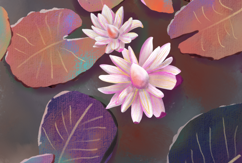
level illustrators. For our class today, I chose an image of
water lilies in a pond. I love drawing flowers, and this is a
wonderful opportunity for you to learn to
move beyond painting, single subjects and start illustrating complete
mini landscape scenes. We'll work in a style similar to how I created the flowers in a mural I illustrated for
a Walmart store in Oklahoma. You'll discover how to add
depth to a small scene, a valuable technique you can use in future larger
landscape paintings. One of the key ideas
we'll explore is color. While our class reference image has a monochromatic
color scheme, when we illustrate it, we don't have to commit
to that palette. Instead, we can
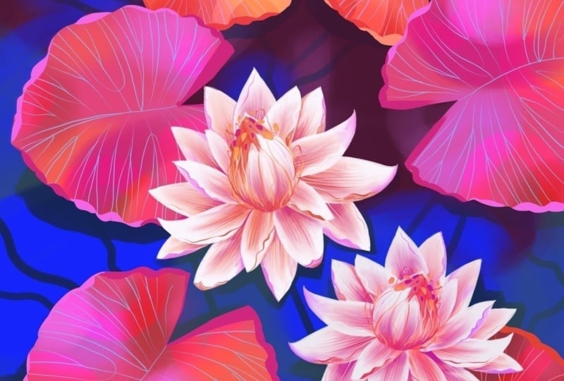
choose colors that feel more vibrant and fun. What makes this project
easy to follow is that we use the same
techniques throughout. So even though the final
piece may look complex, I'll break it down into
clear and manageable steps. This hands on class is perfect for artists
who want to learn creative techniques
that can be applied to your future landscape
and botanical projects. You'll build
confidence, get artsy, and improve your procreate
drawing skills along the way. Join me in class, and
let's get started.
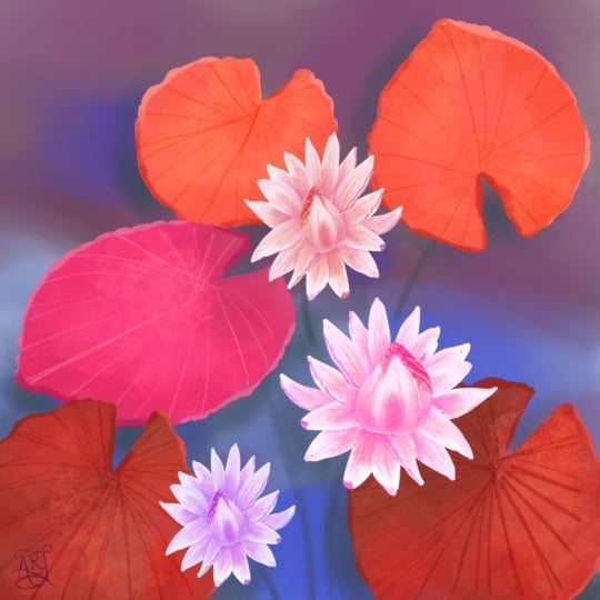
2. Your Project: For the class project, we'll focus on creating a mini landscape scene
of a water lily pond, starting with a quick sketch, then illustrating large
leaves and stunning flowers. We'll walk through
the creative process in the class lessons with a step by step approach that makes it fun and easy
for you to follow along. If you'd like,
share what you make in class. I'd love to see it. I encourage you
to take your time and allow yourself to
experiment along the way. And I'd love for
you to find ways to make your class project
uniquely yours. When you're ready, please upload your illustration to
the class gallery. You can share your artwork, a quick sketch, or first draft. And if you'd like, include
some process images as well. I love seeing how your work develops and always leave
encouraging feedback. This project is sized for
printing as a poster. The specs are provided in class. So if you create a poster, and framed it, please share the photo of your framed
artwork on your wall. I'm really looking forward
to seeing your project. And with that said, let's begin. Up next, we'll start with
creating our color palette.
3. How to Choose A Color Palette: We'll use the reference
image provided in class for inspiration
to our project. I chose that image because I was really drawn to
its color scheme. The goal is not to copy it, but to use it as a guide while making your own
creative choices, especially when it comes to
color shapes and composition. When we think about
water lies in a pond, we usually imagine
bluish green water and bright green leaves. But in this image, the
pond is quite dark. The leaves appear in
different shades of brown. What I love about this is that the image feels
almost monochromatic. In other words, most of the
colors are closely related, which helps the
flowers really stand out and become more
of the focal point. In this lesson, I'll
show you how to look at any reference image and understand the overall color
relationship within it, and then we'll use
those observations to create our color
palette. So let's begin. As a first step, I like
to sample a few colors directly from the image and
place them on the canvas. This helps me start
seeing the range of colors that are actually
present in the scene. In this image, I notice
a lot of variations. There are oranges, muted browns, and even browns that lean
slightly towards the red. Now, it would be very easy to simply use these sampled
colors exactly as they are. But I'd like you to take a moment and make
these colors your own. For example, I like the idea of using orange in the leaves, but maybe that orange could
be a little more saturated. That brown could shift
slightly towards the pink, and that reddish tone
could become deeper shade. In this way, I'm
using the colors from the reference image as
inspiration and suggestions while creating a color palette that feels right for my project. Next, let's take a look
at the background colors. The dark color we see in the image may appear
brown at first, but when I sample
it and check it on the color wheel in the app, we can see that it's
actually a very dark blue. Looking at the color
this way helps us understand its true orientation
on the color wheel. Doing this gives us a much better understanding of the color in our reference image and helps us make more informed choices when
building our own palette. For the background, we want
to choose colors that help the main elements like the leaves and the
flowers stand out. I decided to use colors
that are a bit more saturated than the ones I
see in the original image. For the flowers, we
want them to become the focal point of the piece. So their colors will
be the brightest, most playful, and the most eye catching in the composition. Now that we've gone through
this process and we understand how the colors work in the image and
for our project, here is the color palette I
created for this project. You can see how it relates to the original colors
in the reference, along with the adjustments I made to help each
element stand out. So you can create
your own palette using the same
approach or just feel free to download
this color palette from the class resources.
4. Warm Up with Coloring and Sketching: In this lesson, we're going
to start playing with color. This is where we begin building the foundation for our peace. Now, because we're
drawing a pond with movement in the water
and soft reflections, it's a really nice
opportunity to explore colours and shapes in
a loose, playful way. Nothing has to be precise here. Think of this as a warmup for both your hand
and your creativity. I placed my reference
image next to the canvas so that I can look at it
for inspiration as I work. I already have my background
colors in my palette, and now I'm going to choose a wide and soft brush
to get started. It's always a good
idea to try out a few brushes and see
what feels right for you. I want my brush strokes to
stay loose and expressive. So I'm using a soft white
brush from my own brush set. If you'd like to use
the same brushes, you can find the link in
the project descriptions. But feel free to explore your own brushes and find
something with a similar feel. As we start building
the background, we'll loosely follow the shapes we see in the reference image. Now I'm switching to
a darker purple and softly painting into the
top area of the bond. I really enjoy painting
everything by hand. It's a calm and
relaxing way to work, and that's really what
this stage is all about, just enjoying the process. If you'd like, you can
also use the smudge tool, the little finger
icon at the top. It's great for blending
colors together, softening edges, and creating those gentle transitions
that look so well for water. Alright, this is starting
to look really nice. So let's bring in another color. I'm using a lighter purple
to add some abstract shapes. This can suggest reflections or subtle shadows across
the surface of the bond, and then I'll repeat the
same idea with a blue tone, layering it loosely
over the background. This is a great way to warm up your hand while also
building a rich, colorful base for
your illustration. I like to think of color as a starting point
for inspiration. So beginning with
something playful and enjoyable really helps set the tone for the
rest of the project. Now that we have our
background in place, let's move to sketching
the main elements. Grab your pencil brush and start lightly sketching the
lily leaves and flowers. As you do so, pay attention to how the
leaves are positioned. I especially like
that little V shape at the base of each leaf. Try to include it and vary the angle slightly from
one leaf to another. Also, think about
size variations. Some leaves can be larger, some can be smaller. This helps create a more natural and interesting
composition. And if you're not sure
about drawing from observation, that's
completely okay. You can make this step
easier by placing the reference image directly on your canvas and creating
a new layer on top, then you can trace the main
shapes to guide your drawing. So tracing is a
great way to start your project without worrying about your ability to
sketch from observation. You can always in any project, help yourself by just
skipping to this stage. One of the things I
really love about working digitally is
how flexible it is. You can always adjust your
sketch, resize elements, move things around, or even
make the flowers a bit larger so they can stand out
more in the composition. Alright, then now that we're
all warmed up and ready and we have our foundation
in the next lesson, we'll block up the shapes of our leaves and add more
color to this project.
5. Creating Flow and Composition: Before we start drawing,
I want to share a quick idea about creating depth in landscape
illustrations. In general, elements
that are closer to us tend to have more
saturated intense colors. As things move farther
away, they become lighter, cooler, and less detailed as they gradually fade
into the background. Keeping this in mind
will help us create a sense of depth in our
water lily pon scene, even in a small composition like the one we're creating
together in class. I'll start by drawing the outlines of the
leaves and flowers, then paint inside each leaf. I recommend drawing with an inking brush for this
stage of the process. You can refer back to your
reference image to help you place each element on the canvas and use your
sketch as a guide. Try to notice where
the leaves overlap, how they are spaced, and the general flow of
the composition. At this stage, we
are just blocking our shapes and building a
foundation for the next steps. For this project, we'll create a different layer for
every group of leaves. I named my layer for the ones at the top of the
composition, leaves one. And next, let's create a
new layer of the leaves in the middle and switch to
a slightly darker color. Here I want to try
another technique for outlining the
water lily leaves. Let's start by creating
an oval shape. Then add the
irregular leaf edges all around to create that
organic look and feel. This is a great way to color in your leaf shapes if you want to have more control
over your drawing. The next step would be to draw the V cut at the base of the leaf and fill the
shape with color. I love coloring my
leaves manually. It's fun and helps get me
in an artsy state of mind. As you draw the
water lily leaves, keep a few key ideas in mind. Aim for a stylized organic look with slightly
irregular outlines, inspired by the reference photo. Notice the leaf shape. It has a heart like form, starting with the
V at the base and ending in a gently pointed tip. And finally, vary the
direction of the leaves to create a more natural and
interesting composition. Finally, we'll create
the third layer of leaves using the darkest
color in our palette. At this stage, we're really building the foundation
for the entire piece. In the next steps, we'll bring everything to life with expressive brush strokes, adding dimension, texture,
and more visual interest. So take your time here and focus on creating clear
confident shapes. As I wrap up this step, I'll also refine the flowers, working on each one
on a separate layer. This gives me more flexibility to adjust and improve
them as I go. I like to use the
eraser to shape the petals and create
slightly sharper edges. It gives the flowers
more definition, stylized look that
I really enjoy. So keep your shape simple. Trust your hand and enjoy the step of building
your composition.
6. Exploring Brushwork and Textures: In this lesson, we'll
explore brushwork and start layering color to add depth
and variation to our leaves. I've placed an image of
the florals from my mural for Walmart next to my
canvas as inspiration. I'd like to create
something similar here, bringing that same
soft textured style into our water lily leaves. So let's begin with
the darkest leaves, the ones closest to us
in the composition. Start by adding a
new layer above your leaf layer and set
it as a clipping mask. This will be your texture layer. Now let's choose a brush. For this step, I'm looking
for something wide and soft that will allow me to build gentle
color transitions. I like to test a few
brushes before deciding. And here I'm trying out
brushes from my selections. I'll test out my
dream weaver brush, the jellybean, and
misty motion brushes. Each one has a slightly
different texture, and this is really
the process I go through when creating
my own projects, as well as I'm doing here. While I might have an idea of which brush I'd like to use, I can't be certain until I've tested out few brushes
options first. So for these leaves, I'm aiming for a very
soft subtle look. So I'm going back to
my soft flow brush. It's my softest brush, and it works beautifully for this kind of
gentle layering. So now let's move into the
next step, layering color. Instead of leaving the
leaves with one flat color, we're going to build
variations by adding soft abstract areas of
color on top choose colors that are close
to your base leaf color and lightly paint large soft
shapes across the leaf. This is a fun and
playful process. So just be here and explore. You can add slightly lighter, brighter areas along
with a few deeper tones, and this soft
variation will help the leaves feel more
alive and dimensional. Take your time here and
keep your hand relaxed. Think of this as gently
staining the leaf with color rather than
painting in details. And if you remember in
our reference photo, there was a lot of play
of light over the leaves. So this is a kind of effect
we're looking to create here. Because we're working in layers, you can always adjust. And if you feel like
you've added too much, you can use the eraser to
remove some of the texture. A helpful tip here is to set your eraser brush to the same brush you're
using for painting. And this keeps everything
feeling soft and consistent. Next, let's move on
to adding details. Create another new layer and
set it as a clipping mask. Then let's switch
to a pencil brush. I'll be using my pencil brush to draw the veins of the leaves. Keep your lines organic
and slightly imperfect. They should feel natural but also intentional
and stylized. We're not trying to draw
exactly from nature, but kind of a stylized
version of what we see. Follow the flow of the leaf. There's a very definite
line in the middle, and from that line we have
branching thinner lines. And let your linework curve and branch out very
gently and naturally. You can also experiment
with your layers blending modes to see what works
best for your style. Sometimes lowering the opacity or using a blending
mode can help the detailed layer sit more naturally within the
colors and textures below. You've been following
my other classes, you know that testing
different blending modes is something that
you'll see me do often. It can also inspire
my color choices. As you'll watch me work on
the next set of leaves, I'll borrow that light blue that I've checked with one
of those blending modes, and I'll use it when I draw
the next set of leaves. I'll repeat this process
across your leaves, taking your time to build
up details gradually. This is a really enjoyable stage where your shapes
begin to come to life. Trust your process, keep
your strokes loose, and don't be afraid to
experiment a little as you go.
7. Building Depth in Your Leaves: Let's continue by completing the coloring of the remaining
leaf layers in our project. In this lesson, I want
to reinforce how we use color layering and brushwork across different parts
of the composition. Even though we're
working on new leaves, the process stays very similar to what we did in
the previous lesson. Start by adding a
new layer above your leaves and set it
as a clipping mask. This will be your space to
build color and texture. As you begin, be mindful
of your base color. These leaves are lighter than
the first set we worked on, so the colors you layer on top should stay within
that same family, just slightly brighter
or more saturated. At the same time,
we can introduce a few darker tones to create depth and give the
leaves more dimension. Think of this stage as
a gentle exploration. We're not trying to
perfect anything. Instead, we're building
up soft variations of color using loose,
expressive brush strokes. Let your hand move freely
and allow the colors to blend and overlap
in an organic way. You can use a wide
soft brush to create subtle transitions and
layer colors gradually. Try adding larger
areas of light color, then balance them with
a few deeper tones. This contrast is what helps the leaves feel more
dynamic and lively. You work, step back every now and then and look
at your composition. Notice how the colors interact between the different
leaf layers. This helps you keep a sense
of harmony across the piece. And remember, this is a
playful part of the process. You can always adjust,
add more color, or gently erase to reveal
what's underneath. There's a lot of
flexibility here, so take your time and enjoy it. Next, we'll draw the
veins over our leaves. I'm choosing a light
blue color and use the pencil brush for drawing
these fine detailed lines. If you remember, I mentioned in the previous
lesson how moving between blending modes can
inspire your choice of colors. Well, this blue was inspired
by that color exploration. When illustrating
these leaf veins, keep your lines organic
and slightly imperfect. They should feel natural but also intentional and stylized. Follow the flow of the leaf, letting your lines curve and branch out gently from
the central vein. We can repeat this process
across the remaining leaves, but we can also duplicate
this layer and then adjust it so that it would
fit over another leaf. I'll repeat the same process
with the last set of leaves. At first, I try layering a
lighter cooler color over these bright orange leaves simply because it was
the last color I used. Exploring different
color options is something I do all the time. It's part of the
creative process. But in this case, we want to stay closer to the
base color of the leaves. This blue felt too different. I created too much contrast and pulled attention away from
the harmony of the piece. So instead, I recommend
layering colors that are closer to the original
lighter oranges, soft yellows, and warm reds. Now for the final step, let's draw the veins over the leaves just
like we did before. Create a new layer, set
it as a clipping mask, and switch to your pencil brush. Use gentle flowing lines
to draw the veins, following the natural
shape of each leaf. Keep your lines slightly
varied and organic. This will give your leaves a more natural and
expressive feel. You can also adjust the opacity or try different
blending modes to help the veins sit softly within the colors and textures
you've already built. Your time with this step. It's where everything
starts to come together. As you finish up, notice how repeating the
same simple process across different leaves create a sense of unity in
your illustration. Each leaf is a little different, but they all belong together because we use the same
techniques throughout. And remember, this
stage is about exploration as much as
it is about techniques. Trust your choices, enjoy
the creative process, and don't be afraid to make small adjustments along the way.
8. Details: Making Your Leaves Pop: At this stage, our leaves
already look complete, but I'd like to take them a step further and really
make them pop. We're going to do that
by adding highlights and a few finishing details
that will bring more vibrancy and visual
interest to the leaves. To start, add a new layer
and place it between your existing layers above the texture layer and below
the detailed vein layer. This placement will allow the highlights to
blend nicely with the colors while still sitting underneath the linework
that we want to keep. Now I'm going to test a very bright color
red over the leaves. What I'm really looking for here is not just the color itself, but how it interacts with
the layers underneath. So I'll go ahead and explore
different blending modes. In this case, the
saturation blending mode works really nicely. It enhances the color without
overpowering the texture, and I want everything to look bright to give it highlights. Repeat this step across
all the leaf groups. Keep in mind that each set of leaves might respond
a little differently, especially if the base
color is lighter or darker. Take a moment to test
different blending modes for each layer group and see what
works best for your piece. As you paint, aim for stylized
intentional brushwork, I like to create soft shapes, arches, curved and round forms. I like how everything
pops up and really comes to life
with this added step. You'll start to notice
how the subtle addition bring more life and
movement into the leaves. That's exactly the effect
we're looking for. Now for the final touch, add another new layer and
set it as a clipping mask. For this step, switch to a
smaller, more precise brush. I'm using my liner brush, which is great for clean
non textured details. We're going to draw
along the edges of each leaf to create a
sense of dimension. Almost like the edges
are slightly raised. Choose two tones of
a similar color, one lighter, one darker, for drawing these edges. Use the lighter tone to highlight parts
of the edges where light might hit and the darker
tone to add subtle shadow. As you draw, let your line move in a gentle wave to
mimic the natural, slightly irregular
edge of the leaf. Avoid making it too perfect. Those small variations
are what make it feel really more
organic and alive. Work slowly around each leaf, adding just enough
detail to define the shape without
overwhelming it. This final step really helps
bring everything together. It gives your leaves a finished, polished look while still keeping that soft
painterly feel. Take a moment to step back
and look at your work. You'll see how these
highlights and refined edges make the leaves stand out and feel
more dimensional. So enjoy this stage
of your project, give your water lily leaves
a nice finished look. And up next, I want to show you how we draw the
water lily flowers. I'll see you in the next lesson.
9. Drawing the Waterlily: Shape and Structure: We're moving on to one of the most exciting parts of the project, creating
the flowers. At this stage, now that I've established the overall
style for this piece, I feel comfortable adjusting
my initial sketch. I'd like the flowers to
follow the structure of real water lily
a bit more closely. This is a great moment to
remind you to stay flexible. It's completely natural for your idea to evolve as you work. Let's begin by
sketching the flower again using the reference
image as a guide. Start with the center
of the water lily, which has a teardrop shape. From there, draw the
petals around it. As you sketch, notice how
the petals feel organic, similar in shape,
but not identical. As they extend outward, each petal shifts slightly
in size and direction. I like to draw
slightly larger petals underneath the top ones. This helps create that
layered look that is so characteristic of
water lily flowers. Each petal has an
elongated teardrop shape, starting at the base of the flower and growing
out all around. A friendly reminder,
feel free to trace over the reference image if you struggle to sketch
from observation. Once you're happy
with your sketch, let's start building the shapes. Create a new layer for
the flower center. I'm using my pencil brush and selecting white from
my color palette. I like to draw and feel
the shape by hand. It keeps the look
soft and natural, and I love drawing and colouring even these basic
elements of the object, so fun and relaxing. Next, create another layer below the center and begin
blocking in the petals. At this stage, it's helpful to think ahead and
plan your layers. Try to imagine your
flour as being built from about three
layers of petals, stacked one above the
other beneath the center. This is the bottom layer, so I picked most of the large petals to set as
the backdrop of the flour. To make this easier, you can lower the opacity of
the layer you're working on. This allows you to
clearly see what's underneath and decide where
to place the next petals. Add a new layer,
and as you draw, aim to keep the petals
visually separated. Petals that sit side by side or lightly touch at the base can
be drawn on the same layer. But if a petal overlaps another, it's best to place it
on a separate layer. This layering
approach helps avoid a flat or crowded look and creates a sense of depth and
structure in the flower. Take your time in this step. It's really about organizing your shapes in a thoughtful way. And that's about it. For this stage, we now have the main structure of the water lily built from multiple layers, the center, and the petals. You can bring the opacity
of your layers back up, and in the next step, we'll start adding texture and color to bring the
flower to life.
10. Drawing the Waterlily: Textures and Definition: In this lesson, I want to
show you how to create more definition and
depth in your flowers. So let's start by going to our layers and setting
each one to Alpha loq. You can do this by tapping
the layer and selecting alpha log or by swiping
right with two fingers. Next, let's choose a brush. I'm going for a more
expressive painterly look, so I'll use my dry burn brush. It has that slightly
rough dry textures that feels like a
real dry paint brush. Now let's pick a color. I'd like my flowers
to feel warm. So I'm choosing
one of the oranges from my palette somewhere
in the middle range, and using a very light touch, begin brushing color
over the petals, starting from the center of the flower and moving outward. Try to leave plenty
of the white visible, especially towards the edges. This contrast will help define
the shape of each petal. We'll repeat this same process on each petal layer,
working gently, building color
slowly, and keeping that soft gradient
from center to edge. As you move from one
layer to the next, you'll start to see
the structure of the flower come
through more clearly. Each layer adds a bit more depth and richness as we create definition and add
gentle texture to the flower to
bring it to life. Now let's move on to the
center of the flower. I like to add color
mostly around the base while leaving
the top lighter, so it stands out
against the petals. At this point, I like to
deepen the color a bit more. I'll introduce another layer of brushwork using a darker
pink from the palette. Again, working gently
and intentionally. I'll add this color mainly
at the base of each petal and softly
blend it outward. I'm being careful not to
cover the orange completely. I want the two colors
to work together. As you repeat this step
across the petal layers, think of it as building
up soft layers of color. Think of it as adding
gentle texture. Use light pressure and allow the colors to overlap
in a natural way. These subtle shifts
create texture and give the flower more dimensional,
lively, warm feel. Now let's try a new technique blending with the smudge tool. Select the smudge tool
that's the finger icon at the top bar menu and choose the same dry burn brush that
we've used for painting. This will help keep the
texture consistent. Use the smudge tool to gently blend the
colors on each petal. Pay attention to your direction. When you blend from
the center outward, you'll put more color
towards the edges. If you blend from
the outside inward, you'll soften the color and reveal more of the
lighter tones. This back and forth
movement helps you find a balance between
color and light. That balance is
what creates depth and gives the petals
a soft natural look. Be sure to use very
light touch here. We want to soften transitions
but still keep some of that textured
brushwork visible. I really would like for you to feel confident with
this technique. So let's watch the
complete process before I move on
to the next step. When working on the top layer, the flower center, I like to
be a bit more intentional. You can use this step to
define smaller shapes within the center by gently pulling lighter tones
between the darker ones. You can suggest tiny petals that are just beginning to open. I'll refine the shape by
adding a touch more orange, blending it with the pink, and softly brushing it
over the lighter areas. So take your time here
and enjoy the process. This is where your flower
really starts to come to life. In the following final lessons, I'll show you how to get
into more detail with a smaller brush
to create folding petals and movement
in the flower.
11. Creating Movement and Vibrancy: Et's get into more details and
bring this flower to life. I'll add a layer above the flower petals and set
it in a clipping mask. This is a step we'll repeat with all the flower layers as
we add more life to it. Next, let's pick a brush. I picked my pencil brush. It's super versatile and has a grainy texture
built into it. Let's draw the edges of
the flower petal, like so. Notice how I started my line
close to the petals tip, then continue drawing inside the petal shape
with a wavy line. Then I want to mark the lines on the petals surface, like so. Now, since we're
using a pencil brush, we can utilize it to
add textures and depth. As I mentioned before, it's a very versatile brush, and that's why I
love it and use it as one of my first choices
when picking a drawing brush. We can change the pressure
of our hand to create thicker lines and control the density of our coloring
when we add shading. Watch how I left
some flower petals with just an outline of the edges and others that got colored through to better define their
dimension and depth. I intentionally created
those variations in the coloring to achieve a more diverse and
interesting look. So let's start by drawing those neat parallel
lines across the petals, and then we'll do the same thing with all the
other petals in this layer. Since these are the top petals, we'll add the most
details on them, and then we'll add less
details on the layers below. So we want these top
petals to stand out the most because they're around
the center of the flour. I can also pick the white
as my color and see how beautiful it looks when we draw the white lines
over the colored flower. Plus drawing the white edges over the petals really
makes them stand out. I'm trying to keep
the colors I use for these details consistent, so I'm altering between them. Sometimes I'll even mix two
colors on the same flower petal like orange and pink
or a color with white. Now I'd like to show
you a new technique. Let's create a fold at the
tip of the flower petal. Imagine the tip folding inward towards the
center of the flower. So to do that, we
need to head over to our layers and release the alpha lock mask
from the layer. Now we'll remove or erase the tip of the petal
and create rounded edges. Remember, we have two layers
for each part of the flower, one for the petals and one for those pencil drawn details. I deleted part of
the base layer. So let's repeat this process
with the last petal layer. I'll remove the mask, then erase the tip of the petal
to create rounded finish. Next, we add a layer for drawing all the pretty details
on top and use it to draw the folded petal tip and add those parallel lines over it
to add texture to our petal. This is a really fun stage. You can play an experiment. For example, you might add a soft shade to
the bottom petal, then gently blend it with a smudge tool to create
smooth transition. From there, you can go back in and add a bit of definition
along the edges. As you work, you're gradually bringing
each petal to life. Move across all the layers
you created for the flower, adding subtle shifts
in color and detail, so the petals feel like they're folding and
catching light. Try to make small variations
from one petal to the next. This helps the flower feel more natural and
full of movement. A slightly different
shade, a softer blend, or a sharper edge can make a big difference.
Take your time. This is where your flower
really comes together and starts to feel
vibrant and alive.
12. Finishing Touches to the Flower Center: Now, let's focus on
the flower center. This is the most detailed and eye catching
part of the flower. Take a moment to look at
your reference image. I like to keep it
visible on my canvas so I can look at it as I work. It's a great way to stay inspired and guide
your decisions. To begin, add a new layer
above the flower center. This will be your detail layer. Using the pencil brush, start refining what
you already have. At this stage, we're not
adding completely new shapes. We are enhancing and defining the petal forms that
are already there. I like to focus on those small closed petals that sit at the
center of the flower. Because we're already
created a soft transition from white at the top to
darker tones at the base, this step becomes much simpler. All I have to do is define
them with my pencil lines. Now let's bring in
some brighter color. Take a look at the
reference image. You'll notice those
beautiful oranges and reds in the areas where the
petals have started to open. This is a great opportunity
to make the center feels vibrant and
even more expressive. Start by adding those warm
tones to your flower center. Gently pencil in the color. Then use the smudge tool
to soften and blend it so it feels integrated
with the layers underneath. Once you have that base, go back in with a lighter orange and begin adding definitian. Use it to suggest the smaller closed
petals at the center, keeping your stroke
soft and controlled. Then we can switch to white to refine those details
even further. Adding whites on top
helps those tiny shapes stand out and gives the
center light and clarity. I really love this step. Just by shifting
between those colors, you can create a
beautiful contrast and make the center feel rich, detailed, and full of life. Next, let's add a new layer
above the flower center. This time, we won't
use a clipping mask. We want the freedom to draw
beyond the existing shapes. And since our hands
are already warm, we can allow ourselves to
get really playful and creative as we draw the final
touches in our project. Start by choosing
the dark pink from your palette and lightly
draw small oval shapes. These represent the stamens, where the pollen is,
and they'll add fun, playful details to the center. From here, I'd like you to loosen up a bit and
draw more freely. This is a more intuitive stage. Less about following the
reference exactly and more about responding
to what you feel, what you see, and what you feel that you want
to add to your drawing. You can gently suggest
a few more open petals by sketching soft outlines
around the center. You might also refine the overall shape of
the flower center, just slightly adjusting
it as you go. Use light quick touches. These don't need to be
perfect or uniform. You're building
texture and movement, letting the eye
fill in the rest. Then go back in and add more small dots and marks
to suggest the pollen. It's a playful stage where
everything comes together. Do you think it's enough or should we add more to the flour? To meat feels it has
everything working now. I like how the petals and the detailed center
look together. I hope you enjoy drawing the water lily flower
together with me. Up next, we'll use
this flower to create the second flower
and finish our project.
13. Duplicating and AdjustIng Colors: In this lesson, we'll expand
our composition by creating a second flower and making sure it feels similar
but not identical. But first, let's
tidy up our layers. Start by organizing
your flower layers. I like to group all the flowers center layers
together first, and then create a main group that includes the entire flour. This helps keep everything
clean and easy to manage. You can also delete any layers you no longer need to
make room for more. Some devices have a
limited number of layers, so it's a good habit to
keep things organized. You can also flatten your leaf layer groups if
you need to free up space. Now let's duplicate
the flower group to create our second flower. And with the duplicate
group selected, use that transform tool
and flip it horizontally. Move it into place next
to your first flower and start thinking about how it
fits into your composition. To make this second flower
feel a bit different, switch your transform settings
from uniform to freeform. This allows you to adjust the height and width
independently. So let's begin by selecting the flower center and
using the free form, you can make it slightly shorter or adjust its proportions. Even small changes can make
noticeable difference because our eyes are very trained
at recognizing patterns. So if something is
exactly as the other, the eye will immediately
recognize it. You want to make
these tiny changes. Next, let's go back
to your layers and start merging
parts of the flour. To merge, you can just choose from the drop
down menu and merge down layers or pinch together each petal layer with
its detailed layer, to merge layer together. So each section becomes
one single layer. Now using that
transform tool, again, gently adjust each of these
petal layers one at a time. So we're making slightly
different changes. You might stretch one slightly, compress another or shift
its angle just a little bit. And by making small
variations across the layers, you'll create a flower that
feels related to the first, but is still unique. If you don't want to
merge layer together, but you want to retain the layer count that you have here, you can just go ahead and duplicate the
entire document and leave the one that has all the former work
with the layers intact, and in the new document, you can merge
together your layers. That's just another
thing that you can do. For the final step, you might want to adjust the
color of the second flower. If your device allows
you can duplicate the group first to
save it as a backup, then flatten the group into
a single flower layer. This is the important step
before adjusting color. Go to the adjustments menu and select saturation brightness and start playing with the u slider to explore
different color options. Then you can increase
the saturation to make the colors more vibrant and adjust
the brightness until you like the
color that you see. Aim for subtle but
noticeable variation. Just enough to make the
second flower distinct while still fitting beautifully within your color palette. In the next lesson, we'll bring everything
together with final touches.
14. Adding Dimension with Finishing Touches: We're almost done.
For this final step, we'll add a bit more depth to bring the whole
illustration together. Start by creating a new layer and place it at the bottom of your layer's stack just above
the background water layer. This will be your shading
layer for the pond. Now switch to a wide soft brush. I am going to use maybe my dream wave or I'll
pick my jellybean brush. It's great for soft
diffused shading. Choose the dark green from your class color
palette and begin painting underneath the
larger water lily leaves. The goal here is to gently
separate the leaves from the water and create the feeling that they're
floating slightly above it. We're creating shading that will help the sense of depth in the water use soft loose strokes and build the shading gradually. Next, let's help these shadows blend more naturally
into the water. Try experimenting with
different blending modes. I find that darken
works really well here. It helps the shadows integrate smoothly with the
colors underneath. Once you've chosen
your blending mode, continue refining the shading, color in, adding soft depth
under the leaves and flowers. You can add a bit
more shading beneath the flowers but keep it subtle. I like to place the shadow
slightly below and shift it to one side rather than
outlining the entire shape. You don't want to
do the outlining. So color slightly
below and to a side. This maintains a natural effect, making all the elements appear
to float over the pond. For a final touch, reduce the size of your
brush and use it to draw stems with a few gentle
lines beneath the leaves. This is how we'll suggest
stems that are under the water because these plants have roots that are at the bottom
of the pond, right? Keep these lines soft
and slightly curved. They add a subtle
sense of movement and help connect the elements
in your composition. Take a moment to step back
and look at your work. This small addition bring everything together,
adding depth, anchoring the elements, they add movement and a finished
feel to your illustration. Beautiful work will put
your entire scene to life.
15. Final Thoughts: Congratulations. You've
finished the class, and thank you so much
for drawing with me. I hope you enjoyed illustrating your water lily pond as much as I enjoyed
guiding you through it. You explored color palettes,
built your composition, and brought your scene to life using textures and brushwork. Along the way, you practiced simple repeatable techniques
like working in layers, using masks, and building
depth through color variation. These are all skills
that you can carry into future botanical scenes
and landscape projects. Remember, the more you practice, the more confident
you'll become. So stay curious, keep playing, and continue making these
techniques your own. I'd love to see
our final project, so be sure to share it
in the class gallery. I enjoy learning how you interpret the project
in your own unique way. If you enjoy this class, I'd really appreciate it if you could leave
a short review. It helps me improve and also helps other students
discover the class. Thank you again for being here, happy creating, and I'll see you in the next
class. Bye for now.
 Yifat Fishman, Artist & Illustrator