Transcripts
1. Introduction: In this class, you will learn how to illustrate the fiesta step-by-step from sketching with layering watercolors on your iPad. In my arm process, I love using textures and watercolor brushes. I especially love the dynamic and flexible workflow on the iPad. If you never drew a llama before This class is a good place to start. Hi, my name's Yifat. I'm an artist and illustrator. And in this class, I'll be sharing my process with you, we’ll be drawing llama ointment watercolor textures on the iPad. You’ll learn my special water coloring technique we’ll cover all the essential elements of the illustration. Starting with drawing Llama on your own we’ll explore different watercolor brushes that are great for this process, we’ll work with masks. And in the mini bonus class at the end, you’ll learn how to draw cactuses and piñatas. It helps if you have some previous knowledge of procreate, but it's not required as we'll be covering everything that you need to know for this illustration. Thanks for joining me, I’m looking forward to seeing you in class.
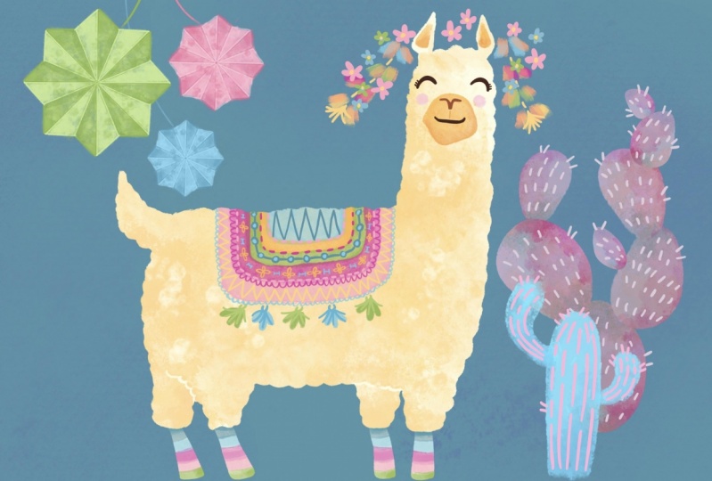
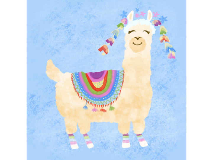
2. From Rough To Refined Sketch: I always start my frustration with the rough pencil sketch, and it's a very good practice to do that because the sketch will guide us through our entire work. So this is our planning stage, and we're going to use the six B pencil to lay out the fundamentals for our illustration. We're going to start our sketch by finding the center of the page and draw a line. This line is going to be the back of our llamas, so it's gonna be a position of roughly the center off the off the campus, and from here, I'm going to draw a rectangle. Drawing a llama is actually fairly easy if you follow these steps, so we start with a big rectangle and redraw the legs into parts. We can draw the legs in slightly different angles to show the animal leaning towards one side of the harbour or in kind of meat step. I think during the leg this way, on some dynamic to our illustration, we'll throw a smaller rectangle for the tail and then let's start drawing the llamas neck, which is pretty long, so proportion wise, we want to think off a long neck and on top of the neck. We're gonna put the head, and the head is gonna be kind of a trapezoid with two triangles for the ears. From here, I can start marking down the facial features, not gonna get into too much detail. But I do want to have a face that I can recognize and connect with. Now I can start refining and adds more details to my illustration. Now the llamas furry. It's covered in this thick coat of hair, so I'm choosing to represent it with a wriggly line or wavy line all around the llama. Now, at this stage, I'm pressing more on my pencil to get more defined lines. We can go back to the front and back off the animal. Andro curves for the back and for the chest. Let's are more definition to the legs. Next, they're starting to get a nice shape, and I'm really liking it So far. Now the tale can be up or down, depending on the llamas roots, and I want my longer to look perky and happy. So I'm going to draw the tail facing up, one off the things that I love most about drawing a sketching on the iPad is that I can make changes so quickly and so easily. So if I want to get the head slightly larger or tilted. Repositioning wanting to do is select it with my free hand, Select two and make the changes. Is that easy? Let's have more element of illustration to create a story to set the scene. And since this is a celebration of Fiesta, our little party, we're going to draw Pini Otto's and they're gonna have some kind of movement and variation in sizes. And I'm gonna make sure I draw a group of three elements. Three is the magic number. I'm using the opinion. It'll string to indicate movement. They're curved. They're kind of slanted there all over the place. They're not straight lines, and I'm also adding some idea off where I want to take my illustration with the Panetta's design, so I'm kind of sketching it very far. Flee in next. I want to add a sense of place. I want to add some vegetation, mechanical elements that reflect the scene, and frankly, I just want to draw a cactus. I've been wanting to do this for a while, so I'm going to add a cactus and maybe another plant in the background. Lastly, let's not forget the llama, all the accessories that weakened after this animal, and this is really the fun part of drawing llamas that they're usually so heavily and colorfully decorated. So we're going kind off very roughly in sketchily mark a settle maybe with flowers, maybe with pump bones and make some suggestions for the harness and had decorations. And with us are rough, Bloom is ready. It's actually not so rough anymore. It's pretty refined, and I'm getting good sense off where my illustration iss heading. And so with that, we can move on to start laying color.
3. Outlining The Llama Basic Shape: All right, we're ready to begin coloring, so I want to draw the drama in fairly light tones. But I'm not going to start with white because white is kind of a non color. So I'm gonna choose a very light yellow, and my darker shade is gonna be orange ing the next stage and next I'm gonna pick a brush to work with. And I'm working with my rugged brush, which has nice textures and the outlines. This brush is gonna help my lemon blend in with the paper textures that will be drawing on the converse kind of towards the last stage off the illustration process. Before I start coloring, I want to make sure that my sketch layer is locked. Then I'm going to add a new layer for my coloring foundation, and I'm ready to begin. This colored layer is gonna be all about color blocking. It's not gonna have any texture only in the edges where the llamas curls are gonna show up in this wave and rippling line hands. What I'm going to do is draw the line all around my llama and color it in to create a solid shape. And this would be the foundation off the layered work and watercolor textures that we're going to draw on top. - Let me show you why I'm not dropping a color into my outline. And here's the reason why the brush that I'm using has texture. And if I'll drug and drop color swatch into a close shape using this textured outline, I will be able to see the place where the block off color and the outline meats. Now let me show you an example where we're using a non texture, a brush. It's completely smooth, and into that shape I can drug and drop a color swatch. And that's the reason why I'm coloring in the llamas body in the old fashioned way. And actually, it's kind of fun to now I'm ready to draw the legs. I'm going to do this in and your layer and place that layer under the layer for the body. And that's planning ahead, because I intend to color the legs in a different method, then on coloring the body. Of course, it's not gonna be a mistake if you color in the entire body with the leads and one layer, because you can always cut them from that layer and move them into a new layer. And that would be a good way to go to. If you can plan ahead, it will be a good idea to draw the legs on a separate layer. All right. And I've got everything droning on. My foundation is ready, and the next thing that we're gonna draw is start layering in our water colors.
4. Getting To Know Your Watercolor Brushes: to color in my watercolor brushes. I'm going to use a new layer and then will explore a few goods, watercolor brushes, and I really love coloring in with watercolor textures. I do it a lot in my work. There is no specific watercolor brush that I use. I keep changing them and the secret to succeeding. This technique is the way you lay down your brush, stroke the way. Use your stylists. All right, let's take a few brush options that we could just from for our work. Let's take a look at the brushes under the painting menu. The Jackal brushes a great first to check outs, but let's look at another one. Maybe the weather Cree link and see what kind of results it gives us on the compass. We'll set the brush a paucity to about 70% and scale up the brush so we'll have big kind of rough strokes. And let's see how this brush paints. So while it's a great brush, it has very subtle texture to IDs, and even if we linger it out, we don't really see a lot of it. So maybe for this project, it's a big, too subtle So let's look somewhere else. Let's head over to the artistic rush menu. This one has lots of great options to choose from. Now this is a pretty good brush. It's rather smooth, maybe to smooth. Let's give it a try and see how we feel about drawing with it. Now, if I press with my stylist, I'm gonna get more color in. If I tap lightly or brush in my texture lightly, I get lighter. More kind of diluted strokes is if I used more water in my counter. This brush texture has the look off convents, and I'm not sure that it's really the look that I'm looking for. We're usually drug watercolor on paper, so and see kind of a more of the tech paper texture and maybe places where the color was dryer or we had more condensed color in our water drops. So this while this brush is great, it's not really giving me the right look that I'm looking for. The horse is a pretty good brush, and recently I've been loving it. It has a very nice sexual, kind of like drawing with a sponge, so let's give it a try. However, it's a bit too rough for the texture that's I'm trying to achieve here, so I will remember it and maybe use it later to just add a little bit more definition.
5. Layering Watercolors: Now this is the brush that I'm going to go for for this work. Let's scale up the brush in lower the A positive E and give it a try. So this is difference between a very light stroke and the more pressed down stroke. You can see that texture and the color is more condensed, so we want to kind off work in between those different brush strokes. As we put down our color. We don't want to block our shade completely with color. We want to achieve kind of a look in between words more subtle and layered. That's practice so they will bids. I porous down on the stylist. As I go, I start likely. And then when I pressed down the brush will give me more color and then on top and draw again. This brush has this Jeter configured into it. It creates all sorts of interesting angles, and I think this is why I love it so much. So when I drove, I start likely with my stylist. I laid on my collar and then I gradually add more pressure. No. Two are more interest. I will lift up the stylist and another gentle brushstrokes, so it's a very gentle process. It's also kind of a trial and error, or you can always top go back, do and go again until you feel that the broad strokes are blending in really nicely. Remember the hearts brush. We cannot go back to its and use it well. It's a bit more definition, another layer of texture and maybe pronounced some shuttles where the legs are and under the tail and under the llamas chin. Well, I'm really liking all the watercolor effect and layered brushstrokes that is created on my converse. I want to style eyes my illustration and control it, So I'm going to set a clipping mosque for my texture layer. The last thing that we're going to do here is add a little bit more definition and stumbling to the legs, using offensive
6. Drawing Water Drop Touches: a fun way to finish up the Twitter color Luke is to draw in watercolor droplets, and I actually created brush for that that you can download from our class. Resource is, I would recommend scaling down the brush so that you'll achieves rather small drops of water and kind of tap it lightly all over the llamas body so that your brush strokes will blend seamlessly with the watercolor brush that you've already created. This is a really fun kind of lost touch to this illustration, and you're welcome to leave border drops all over the compass if you like. And now let's take a closer look at the water color layer with all the different brushes that we applied on it. We use three different brushes, and they work seamlessly together and blending to create that watercolor Newt. And the next thing that we're gonna do is drawing the llamas face
7. Exploring Facial Expressions: it really helps to have the sketch this points to refer to when we start exploring now the llamas facial feature. So to do that, we're going to lower the apostle ity off our sketch layer and lock it so we want accidentally create all or illustration on the wrong earlier. And, of course, for the face, we're adding a new layer toe our compass for this lesson. I would really like to show you my whole process off, exploring and eventually finding the face that actually works for my llama illustration, and it took some trial and a roar, and we're going to explore it together. So the first brush that I tried out waas the rocket brush that I actually used for creating the outline for the body I tried out think what isn't working with this choice is that I feel that the snout is kind of pasted on the face. It's not really blending in, and one way to approach this is to add a new layer and add some more features to the face. In this case, we can try drawing the nose and the eyes and see if everything is now working well together . I'm trying to refine the face and see if everything looks better. So how about adding a mouth and getting into more details with the nose and the cleft lip? And again, this is my real art process. This is how I eventually figured out what my llama face should look like. That's introducing you. Brush. It's the old beach, and we'll draw the cheeks with it. It has this very transparent and textured order color look and 11 and pay attention to this brush because we're gonna be using it much more next in our illustration process. Now, seeing how the old beach brushes performing, I'm pretty sure now that what I did for the snow is not working an easy way to remove part of the illustration that you don't like. It's simply to select it and slided off the canvas. Another way to do it is to use your razor, but this way is much quicker. And next I'm trying a different color, and again it's a different brush for the snout, and this time I get the feeling that things are starting to look in the right direction. It feels like this is working much better But now I'm not loving the mouth and the nose. So scrap that. Try again. What about this silly looking mouth? And how about a new nose with another color? Now, why? I feel that the nose is working. The mouth is definitely wrong. What about a little smile or a surprised face? Well, maybe the smile iss working, so I'm gonna go with that one, right? And this is what my mama looks like eventually. And with that, we're ready to move on to accessorize our llama.
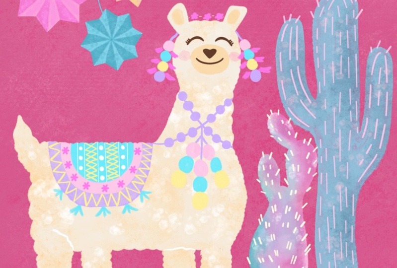
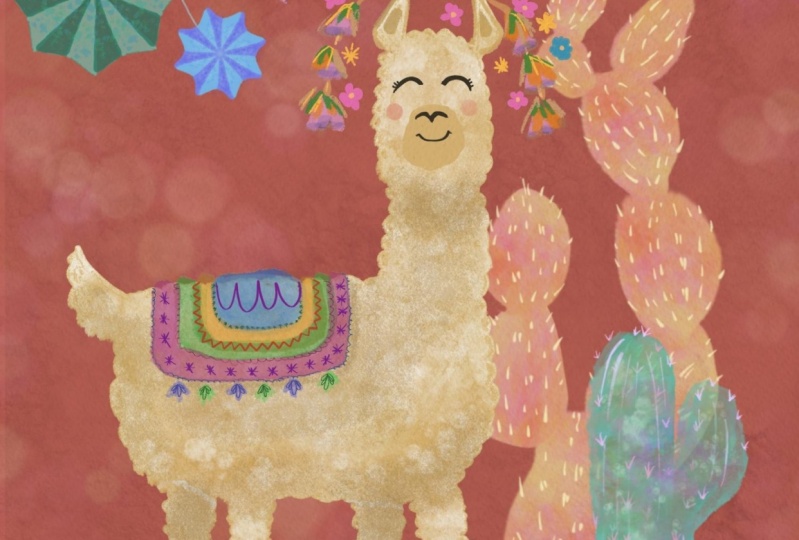
8. Designing a Llama Blanket: Let's take a few moments to finish the llamas face. I'm using the old beach brush to draw shades in the years in the same color that I use for the LAMAs on snow. And the next thing that I'm gonna do a start creating the llamas blanket. I'm going to slide right on all the LAMAs layers and then group them together into one lama group. It's much easier to have all your layers grouped for one object, because if I want to move the llama, I can just move the group rather than each player individually. Next, let's create a new layer above the llamas body and create a clipping mask for it so that everything that I drove stays within the boundaries off the llama shape. Now what I'm going to do is draw stripes, and the thing about drawing stripes is not only that, I'm changing colors, but within each color I keep the stylist pressing on the convents until I'm completely done with my drawing, because the old beach brush works in the way that it has this wet outline. And as long as I'm not lifting up my stylist and starting and you brush stroke. The wets brush outlines are gonna be pushed by the stylist to the very edges off the watercolor stain that I'm creating. So when you draw, try practicing a little bit, and when you're mustering this technique, simply draw all around your stripes, change colors and do it again. Now the patron that I've created is made out of horizontal lines. You can create a partner and made out of maybe three blocks of colors that are going vertically and then outlined them with maybe two stripes of colors. I mean, you can play with the design off your blanket any way you like it. Another fun feature off the old beach brush they're really like is that it's really has this Goa sh watercolor look to it. When you have colors that are overlapping is in the stripes on the blanket, you'll see a color that forms in between, like maybe a darker shade off, think or color that is in between the greens and the blues. And that's a really fun feature to explore. When you're drawing, try toe, overlap your colors a little bit, all right when we're down laying down our blanket colors and that's kind of laying the foundation for the blanket. We can start decorating it, and I'm adding another layer off elements. I'm going to use the brush been. This is from the calligraphy. Brush is a very precise brush, and what's I can do with it is really playing and at colors and interesting designs to my blanket. So I'm starting off with a very simple line to out like a contoured to my blanket. And then I can take this idea in and maybe see how the same Parton works inside the blanket . The colors that I'm using to decorate the blanket are the same colors that I used for the stripes from maybe playing with the shades, making slightly darker over lighter. This really asked to the integrity of the design. Everything works together when you use the same colors and slightly different shades and tones to move faster with this just to demonstrate, because I would like for you to form your own ideas and create your designs. Decorations for the blankets are fairly simple. They could be I. There is exact line or lines that look like stitch lines like dashes. They can look like very simple flowers, they could look like embroidery. The fun thing is that they all kind of work seamlessly together to create this cheerful blankets Look.
9. Drawing Colorful Head Decorations: I want to show you how to draw the Tess ALS on the blanket before we move on to the head decorations. And you can use the principles we use here when you do your head decorations. So I'm going to pick the old beach brush from the artistic menu. I'm going to draw the tassels in two different colors. One is gonna be shades of blue. The are gonna be shades off green. So let's start with the first layer and that be just blues. And then I'm going to draw in between with Green Way Foundation. We can get into more details. So I'm going to pick darker shade of green and used my fine calligraphy brush and for this instance, and using the brush band the same one that I used for decorating the blanket to draw the details off the tests. ALS Now you can do just lines that are connected at once. Both are chose to draw kind of notes, and I'm trying to create this very light and fun line that is not trying too hard. All right, then, with that, we can move over to the llamas, heads and decorations there. We can do all sorts of different things. We can draw ribbons. We can draw bouquets of flowers. We can draw strings off pump bones. I'm going to create the design on the two sides off llamas head. We're going to use the same principles that I used for the tassels. So once again, I'm picking off my base layer and the same brush that they used before, which is the old beach in one illustration tried to use the same set off brushes. It helps with keeping the designed tight and kind of keep the same language. So choose a set of brush and stick to a throttle illustration. So my base layer is gonna be the old beach brush. Very simply, I'm drawing ribbons and changing colors. Now, I try to repeat the design in the other side of the llamas head, but I'm not really copping what I did that I want to create slight variation with the sequence of colors so that they won't be exact replica off each other. And other things that I'm trying to do is create some kind of movement. The ribbons are flying in slightly different directions, was slightly different, Tildon high, so that I have a sense of movement, like maybe it's windy and one side is writing higher in the air. I can draw two layers with the old beach brush because it's transparent and I like the colors effect that are created when the two different colors are meeting. The next thing I'm gonna do is pick up my calligraphy brush and drove very simple flowers. These are very simple flowers, but they're very cute. And the reason I'm not creating a very intricate design is because I want everything to work together. So I'm kind of keeping each element simple so that they're all working together at the end . Of course, if you like you can take more time and invest in richer and more text arise flowers. Okay, The next thing that we're gonna do is draw the llama socks, and after that we'll create our paper textures
10. Adding Llama Striped Socks: to finish our lama. Let's go back to the legs. And if you remember, I drew it on a separate later, so we're going to swipe right on the layer to lock it in. Alfa Lock, Mus. That's a very quick must to use. I use it a lot when I want to create some changes to the layer, and it's very quick to use. We're going to use the old beach brush for creating the llama socks. We're going to alternate between the different colors, and the something about this brush is that you can see the color bleed. And I like how the stripes air kind of blending in as the process likely transparent as you draw you're going to use. Your style is very likely because if we press on the brush, we're gonna get more color out of it. And it's good if we want to create shadowing on one side of the legs. So over there, we're going to press a little bit more on the side. We're going to fresh, very likely from side to side to create the stripes. I'm alternating between colors, and the colors that are used are similar to the one that I used for the along with blankets . Now, as I reached the top off the legs, when there is a slight shadow right under the body, the color is gonna be slightly more pronounced to create the effect off the shadow. And with a garland eyes done, we've had nine layers for Islam A. And they will work very nicely together. I'm looking forward to seeing your llama illustration, but before we move on, we're going toe on some more elements. Store compass. We're gonna mansa paper texture.
11. Crafting paper Texture for Your Canvas: There are a few ways to add paper texture to your converse. You can simply import photo off a paper in high resolution and then blended into your converse. This is one way of doing it when I want to show you. Here is how you can actually draw your paper texture right onto your converse with the tools that are available in procreate. A few good brushes for drawing can be found under this catching menu, so let's try out the soft pastel and see how it performs. The soft pastel comes pre loaded with paper texture, so just brushing it gently all around your page will give it that paper campus. Look, let's try another one. How about the oil costume? The oil pastel is also very good for adding the textures, and I do like to mix up my brushes when creating this effect and maybe fell. Choose a darker conger. The texture off this brush will show through. All right, let's try another brush Now. This time we're trying out the burn tree one. It's a pretty rough texture, but we cannot a few touches of eight onto our convents. So basically what I'm doing is I'm blending a few brushes together just to create a known uniforms. Look, you can totally big just one brush and work all around paper with it, but I would like to see some variations so that my canvas would not have this very uniform texture. I can also add a few scratches. This brush will give me that slightly scratched this dress paper look that I'm looking for . Everything that you can do is play with the depths of the colors. Some off a texture can be created with color that is slightly darker than your compass color on those odds more shading, and you can change the brush color to a lighter shades to as highlight to your paper texture. And, of course, we're going to play with skinning operas, getting down our brushes to get the desired effect.
12. Thank You!: things were joining me in this class. We covered everything that we need to know to draw a llama. Starting with a sketch, we build up our lama from basic shapes and gradually layered watercolors. Until we have a finished illustration. I'm looking forward to seeing what you create. Please post your projects off beautiful watercolor layered llamas. Have your blankets at pump bones out flowers, all sorts of decorations and use what you learned in this class to create a project. You can also take all the techniques that you learn in class and apply them to your future projects. I'm looking forward to seeing what you create Lee supposed them in costs also share with me on Instagram. I'm always happy to see your projects alive in the world. You're welcome to move on and take the next too many classes and learn how to draw cactuses and pinatas with the same techniques and in the pinatas were going to use the symmetry tool as well. So for now, take care. And I'm looking forward to seeing you soon, and my next class
13. Bonus: Creating Watercolor Cacuts x2: Let's throw a cactus. I have to cactus ideas for you, and we're going to start with a simpler one. It's really fun and easy to draw. So the first thing that we're gonna do is pick a nice and vivid color. I'm gonna go with Aqua blue and head over to the brush set menu and get the old beach brush , which is just amazing for what we're going to do next. This capital shape is pretty easy. It's gonna look a bit like a thumb long and round at the end, and once you draw the shape, just keep filling it in until it's all covered in paint. Next, we're gonna add two new sections to the cactus, one in each side and make sure that slightly varied in shape and size. We're gonna head over to the layer menu and swipe right with two fingers on the character slayer to lock it in Alfa look, And as our layer is locked in a mosque, I can add more textures to my cactus. We want to make sure that the color off the texture is visible, so adjust the color accordingly as you paint. I've used the hearts brush for this one because it has this sponge texture, and I want my texture to be fairly visible. The next thing that we're gonna do is not a new layer and pick a lighter, different Carter and then head over to the calligraphy brush and we're gonna big the brush been that comes in procreate. You want to be setting the lines as not very thick and not too thin. Kind of like so. And as you drove them, stop for a second and then start again. Stop and start. And it's just much more interesting than drawing complete lines from from the bottom of the characters to the top off the characters. And creating those dash line kind of reflects the fact that this is a cactus, and maybe it has ridges or thorns coming out. So it's a way off simplifying that cockles shape, and we're going to go over to the two sides, sections off the cactus and do the same thing only with gentler strokes. And, of course, we can draw a few thorns on top of the cactus. This character style is pretty fun and humorous, so we want to keep our illustrations style light and fresh as we work on it. Don't overwork this character. Stone. Draw too many thorns or too many lines. Try to keep it fresh and lunch, All right. And with that, we can move on and drop a different style of practice. And believe it or not, these two different styles can work fairly nicely together. So bear with me because the nectar practice, it's gonna be a big, more intricate, too drunk. Starting off, we're going to pick the calligraphy brush that we use for the llama. This is the rugged liner, and we're going to draw in a light pink. A shape that we're gonna draw is gonna look kind of like a potato. We're going to draw the potato shape and fill it up with Qatar. Next, we're going to draw another potato ships likely different, similar size, maybe slightly smaller. And cholera 18. Okay, we have are two basic shape. Now let's sell over to the layer menu and add a new layer. We're gonna set this layer as a clipping musk the next, we're gonna head over to our brush menu and pique our water Carla brush and we're going to work in a similar way as we worked on our llamas body. So we're gonna pick the same water, brushed it to use for the body as I drawing the color. Since these are small shapes, I make sure I work very, very gently. My color will be very transparent, and I would use my stylists very, very likely. I'm not pressing at all on the stylist. Now, with characters, we can kind of go wild with the colors so we can blend in slight green toe warm to roam the colors up. And I'm adding blue. And since I'm working on a kind of a pink reddish background, I'm working with colors that are from the cold scale off the color wheel, some working with purples and things and blues. And if I want to warm my colors up, add a little bit of green and some touches of orange, and all these colors blending in are creating a very nice watercolor effect for my cactus. All right, so this is pretty much the effect that I'm trying to get. And now I'm going to merge down these two layers, and I can lower down the opacity to about 70% to help my cactus feel even more like watercolors were drawn in on my digital compass, and the next thing that I want to do is separate these two cactus links and paste them in two separate layers. To separate these two cactus links. I'm going to select one slide on this screen with three fingers. That's a short gesture and big the cuts and pastes and procreate is gonna cut this shape from the canvas and face it into a new layer off its own. From here, the magic begins. I'm going to start with the van on the bottom. That's gonna be the base off my cactus. It's likely to big into my face, and I want to fit it in with the lama, so I'm going to make it slightly smaller and let's head over to the next one and do the same thing. We can place the second cactus ling on top off the 1st 1 Like so I'm Here is a tip to quickly pick a layer. Just happen it and you'll see this small bar showing a floating on your screen, showing that you picked that layer and that will save you the time of going to the layer menu and picking your each layer individually and wants about Mylar picked, I can very quickly transform it and re positioning on the base of the cactus. If I want to create a slight variation off this piece, I can choose to distort it very slightly, making narrow where And now that I've created a variation off that piece, I can head over to the layer menu and readjust a capacity off this layer. Okay, and next we're going to duplicate another piece of practice and transform and adjust it. So in this method of working, we're picking up layers, duplicating them and then handing over to the transform to go and with two fingers repositioning those pieces on top of the ones we already have on the campus, we might want to drag a layer so that it will be on top off the layers before so the characters will appear is if it's growing from the ground up. Now, as Mike Octus keeps growing, I'm creating slightly smaller versions off the layers that I created before, and all I'm doing is I'm not changing them a lot. I'm just slightly tilting them in different angles and kind of squeezing them down to scale them down. And now, when all my layers a group together, I'm going to add a new layer and head back over to calligraphy menu and pick the brush band . And with a large lighter shade than the colors I've used for my cactus watercolor effect. I'm going to draw very simple short lines. And these are the cocktails thorns. Now you may say, Hey, we could have drawn it once and then duplicated all but think about it. What we did to each cactus piece is reshaped it with some of them. We kind of squeezed and made them more narrow. Some of them we made smaller. So if we done that illustration off the thorns in the beginning, before we duplicated our pieces, then are thorns would have been all in different sizes. And never reason to draw the thorns at the very last stage is that you don't want all your phones to look. Uniforms are I is very trained in finding patterns, and if we create the same pattern and then duplicated, it will be very visible that this is what we did with this cactus so to make it more interesting, we're going to take the time and really draw in every thorn individually. Last thing that we went out to this cactus is those fun water drops, and we can use a few different colors that are similar to the ones that we used to draw the border colors. And this is just a fun last minute touch for our characters waken Bring everything to giver and rearrange your elements. I'm going to flatten my cactus group and make it one layer because I can then take this layer and readjust states capacity so that all my layers will work well together. And this stains your kind of bringing all your elements together and adjusting them so that the lama is not completely covering your thorns. They are still visible, but there in the background. And so the cactuses air or the cocked. I are complimenting your llama, and every element in your illustration kind of works well with the other one's complement and enhances your work. In our next meaning class, we'll be drawing pinatas and we're going to use the symmetry tool and all sorts of water, collar and watercolor drops to finalize our illustration.
14. Bonus: Symmetry in Piñata Painting: for this many class. I would like to show you how to draw a pinata using procreate symmetry to. So we're going to start off within you layer and head over to the actions menu and pick drawing guides. From there we're going to edit are drawing guide in the drawing guides. May new. We have several options. We're going to pick symmetry and make sure we're on the radial Symmetry and rotational symmetry and assisted drawing are all checked. We can reposition the center off our symmetry guide anywhere on the canvas. And of course we can always move our layer. But we can also just adjust our symmetry guide to reposition it on the place on the canvas where we want to create our new illustration. So I want my pinata to be on the side so I can just reposition the guides. I can also tell them if I want and change their color. All right. And now we have our guides place on the page and we can also see that the layer is marked as assisted in in the layer drop down menu. We can see that the drawing guides are marked to draw my pinata. I'm using the six B pencil and a light shade off the color that I'm gonna use from my pinata For this one. I'm using two shades of green and starting off with the light green, I'm drawing this very long triangle and then replacing my color to the darker shade and finishing up the shape like so And this is going to be my basic Kenyatta shape. Now that I have the outlines all set up, I can move on to conjuring. Now, my coloring technique is going to be very similar to what we did with the llamas body. I'm going toe head over to the painting brushes and get the watercolor brush that I use for the llama. Yes, I drawing my P ETA. I want to adjust my paintbrush, so I need to scale it down until the brushstrokes fit within the little shapes that I've created. And I'm painting very likely because this is a smaller shape. We're going to paint with two shades again using the same colors that we used for framing or Panetta. So we have a doctor grain and then changing into the lighter green. And once we have our Panetta all shaped and colored. I cannot. The water drops touches now. I'm going toe work with small brushes and top, very likely because this is a small shape. Now that's I'm done. I want to clean up my pinata. So heading over to my razor brush and simply erasing the outer line is one option. But I do want to keep that gentle watercolor Luke. So I'm going to replace my eraser brush with and set it up with the same brush it I used to Qatar the pinata. And so when I delete following my outline, I will still have some water. Color bleeds out off my outline, and that's pretty much what we get when we drove with real water color. They're not really precise. We don't have this very clean outline. We do have some water color bleeding out, so we want to keep that effect on our digital canvas. When you're done, you can go ahead and check the drawing guides so that they won't be visible on the converse . But your assisted layer is still following the drawing guides as long as it's marked as assistant. The only thing is, that was drawing guys are not visible on your compass, and now we can go ahead and create a second Kenyatta. We're going to market as assisted layer and go. Heads and edit are drawing guides. Now we need to shift our drawing guys, too. A second position on the canvas so we're going to edit are drawing guides and shift them across a canvas. Now, if we want, we can also tilt the drawing guides by moving the handle like so. And now we're going to create the second Kenyatta with different colors following the same way that we use for the green Kenyatta. - When you're down drawing europeana, you can transform it like you would do for any layer that you drone so we can hit the transform tool in resize our pinata because this one is too big and I would like to create some science variations. The last thing that I would like to show you is a way off changing the Carters for your Panetta's. You're welcome to draw them in any different color that you like, but you can also duplicate Kenyatta and alternate the colors. So let's add in Yulia right above the new Kenyatta layer and choose the Qatar that be wound for our new Panetta. Next, we're going to drop the color into the new layer, and now that the layer is filled with color, we're going to head over to the letter menu and set that layer up as a clipping mosque to the peanut underneath. Ebola, the pinata ISO painted out, and now we can change the color off the pinata by dropping different colors into the coloring layer. Another thing that we can do is choose another blending mode for the layer. And I do wanna do this for the Panetta's because they are transparent. They're very gentle. Color changes because we used the water coloring technique. And so just dropping color in is not enough. We got to find the right blending modes that really brings out all the textures. It's a kind of trial and error here, which is going to scroll down the blending mode and find the one that really makes the colors and the textures vivid and pop out. When you're happy with the coloring results, you can merge down the coloring layer with your pinata by choosing merge down from the layer pop down menu. All right, and the last thing that we want to do is draw the pinatas strings. We're going to draw them on a new layer, place that layer under older P atas, and we're going to pick our calligraphy brush, set it up very low because we want a very gentle line. So we're going to scale down the brush pans. So picking the collar by placing my finger down that brings out the color picker. It's a very quickly off choosing commerce off your converse. And then I'm drawing the strings in different directions, not straight lines, but curved lines that are coming from old directions to create a sense of movement. And the last thing that I want to do is help my strings blend in with the P ETA's. So I'm going to very gently raise the parts of the strings that are attached to the Panetta's. All right, my friend. With that, my illustrations done. I have all the elements working in together. I'm looking forward to seeing yours. Thanks for joining me today.
 Yifat Fishman, Artist & Illustrator