Transcripts
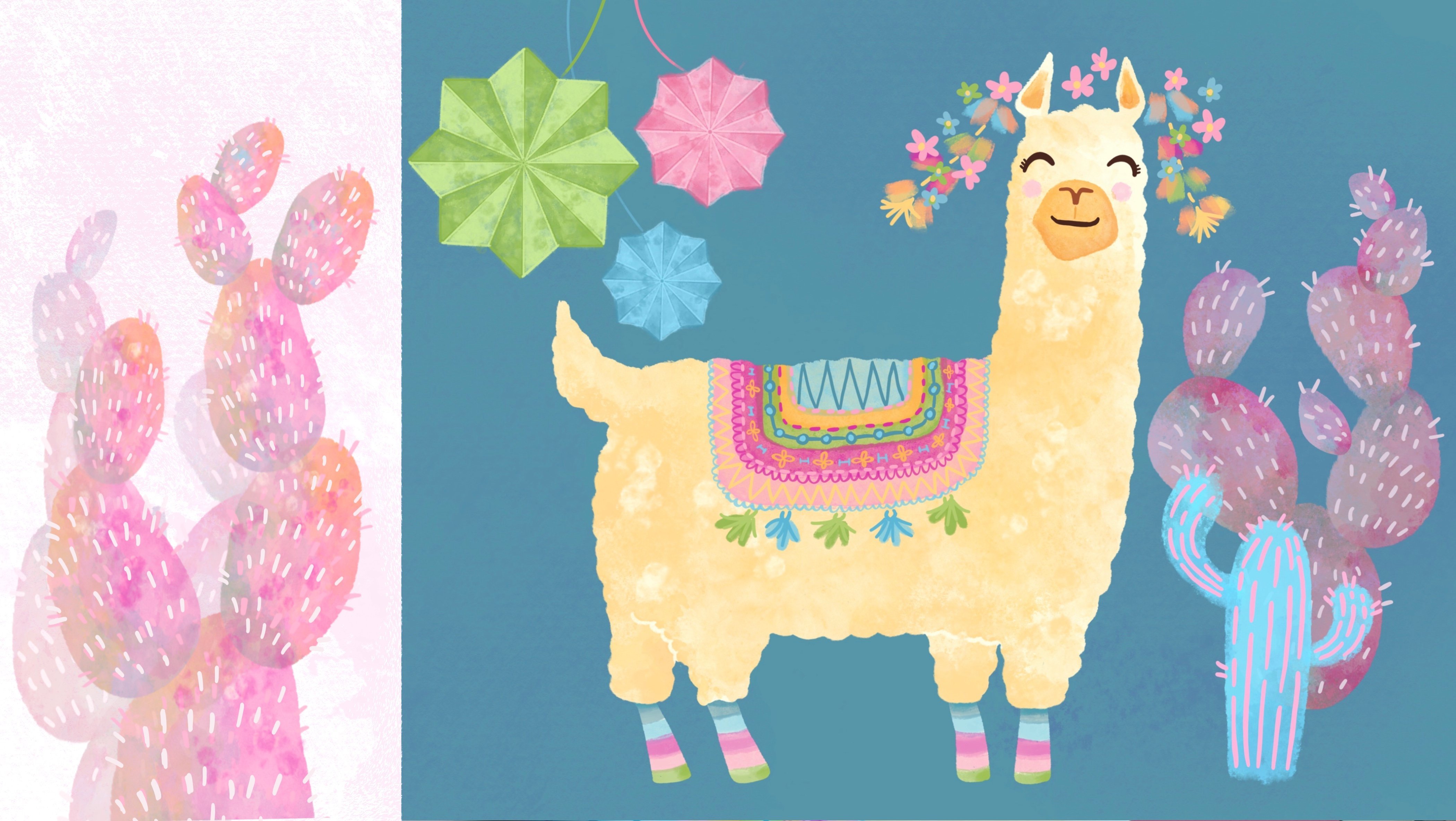
1. Class Introduction: Textures add a human touch
to the digital canvas. Whether you like the
traditional watercolor and paper look, or you're all about
modern jazzy textures, Procreate has a
great collection of professional drawing
brushes designed to help you illustrate
your creative dreams. That said, the huge brush selection can be overwhelming. So which ones should we pick and combine to create these
funky, yummy textures? Well, this class
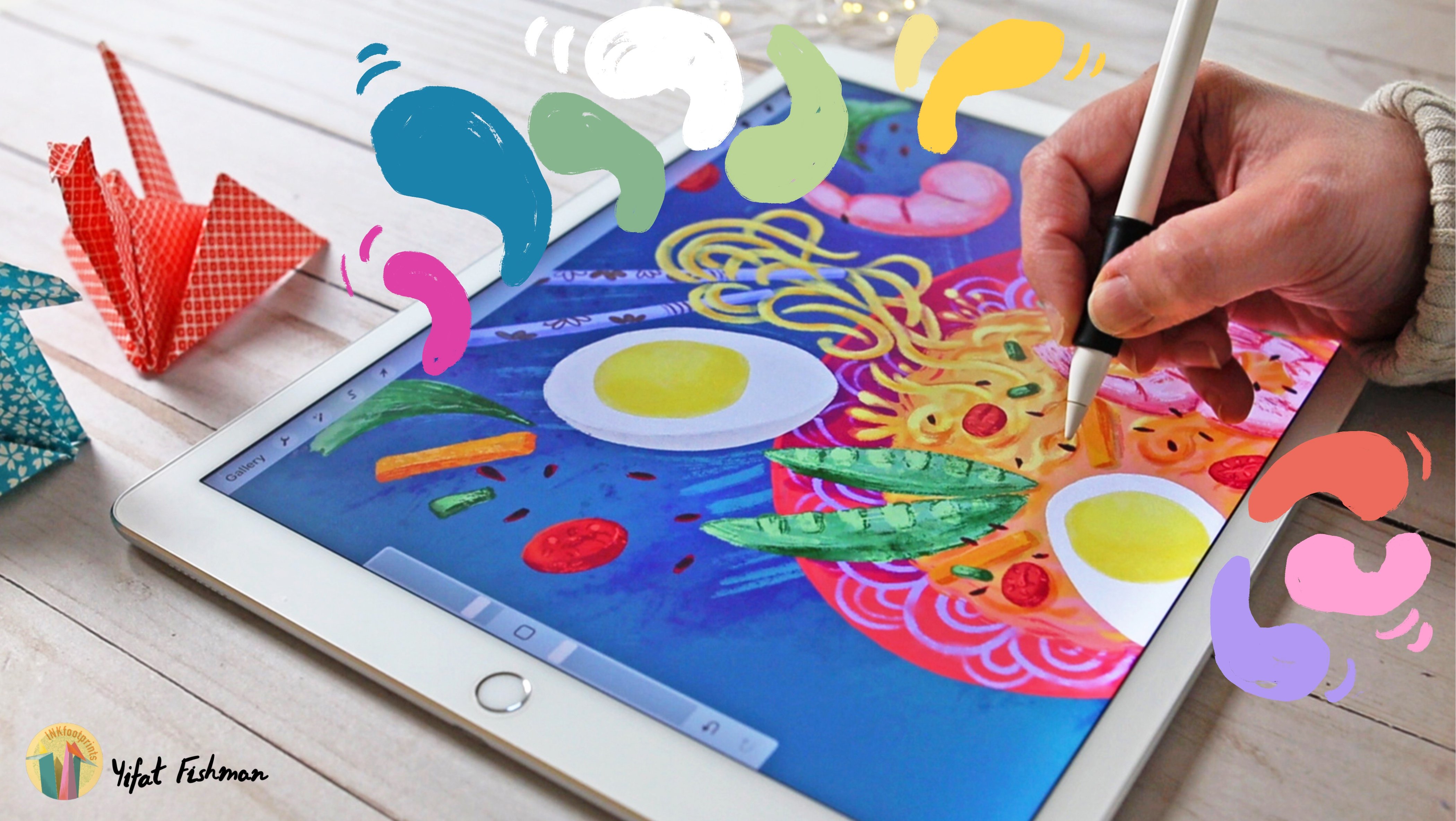
has you covered. Hi I'm Yifat, a North Texas
based artist and illustrator. In my work, textures make
a striking difference. I use them to add character
and dimention to digital drawings and bring
my illustrations to life. Procreate is my go-to app from simple warm-up illustrations to more complex layered paintings. In this class, I'll
be sharing with you my creative process
for illustrating fun and colorful textures using the iPad and
the Procreate app. You will learn to
paint layer defects, practice principles
and fun techniques, and apply what you've learned
to a step by step project. We'll begin by coloring a texture page with the downloadable template
provided in class. You'll learn how to
navigate the brush menu. Use the Apple Pencil for
painting and applying masks as an integral
part of your workflow. This class is for everyone
looking to add character and dimention to their illustrations
with playful textures. It's packed with practices
that you'll be able to apply to any creative
dream project. So join in class and let's
start playing textures.
2. Getting to Know Your Pencil: Alright you guys, let me take you to my studio
and we can start the class. Welcome to class. I'm happy that you're here. This is really how
I start my day with good breakfast
and a cup of coffee. And then I head over
to the studio and sit at the desk that is right behind me and start drawing. So go ahead and download the texture template that
I have prepared for you in the class resources, and our
task today or your mission, if you so choose to accept it, is to fill out each
and every one of these empty spaces
with playful textures. So let's go ahead and
start with the first one. And we're going to pick the easiest brush and
the most basic one. So let's go ahead and add
a new layer to our canvas. Be sure to lock the one
that we have underneath, which is the sketch layer. Because if we don't lock it, we might accidentally fill
that one up with colors. And let's go ahead
and pick the pencil. I love using the
six B pencil brush. It's super versatile. For the first texture, we are going to tilt the stylus and apply a
little bit of pressure. When we tilt the Apple pencil, we get a broad texture which
is really soft and nice. So I would suggest starting with a dark color and then
add on a lighter shade. And that would create a very
nice and playful effect. We don't want to go to light, but slightly lighter color that is still distinguished
than the one underneath. This is also a great way
for warming up the hand. We're just starting with
playing with our pencil. And I'm not trying to do anything too complicated
at this point. What we're gonna do here is layer colors we're starting with a dark color and then adding lighter shades that are
within the same family. So if I'm drawing with green, I want to add lighter green
and then maybe an aqua blue. And I will finish it
with a darker blue. So everything is within
the blue-green family. We're not going for
any splashing colors are crazy things
in this exercise. For the next texture, we're going to continue
using the pencil, but we're going to use it in
a slightly different way. We're not changing anything
to the settings of the brush. We're just changing
the way we tilt the pencil against our screen. So rather than working with
the broad side of the pencil, we're going to use
the tip to create firm strokes so that the texture is going to come
out very gentle and dense. The six B pencil is really
a very versatile brush. And the texture
that you get only depend on the way that
you use your stylus. So it's also a great
opportunity to get to know the Apple pencil and how
to use it with the very, very basic ways when
you're painting textures. For our next lecture, I want to pick a new brush. And this one is the Oberon. It's one of my favorite brushes. And I've been using it a lot lately in my personal projects. What I like about the
Oberon brush is that it has a texture to the surface. It also has very fine
edges to the brush. So when we create brushstrokes, if we press more will
get more color in. And if we press less
we'll get less color in. And so that will allow us to see more of the
texture of the brush. The texture is really
still very visible, even if you press a lot and
apply a lot of color in. So for this exercise,
what we're going to be doing is set the
brush for about 5%. So it's kind of middle-range small and apply the
texture with tapping. Because what we want to have eventually is the
effect of seeing these small brush strokes
filling in our texture shape. Alright, so for this texture, what I want you to
pay attention to is to fill up the template with small taps so that you'll be able to see the
texture of the brush. And then we can change the color, and without changing any of the settings
of the brush add another layer to
our texture swatch. So go ahead and follow me and
create your own textures, and we'll continue this
exercise in the next lesson.
3. Playing with Colors: For this exercise, we're
going to start off by coloring three texture swatches with just three basic colors. Very simple. You can use the
Oberon brush to do that. And now, we're going to head over to our Layer menu and add a
new layer and set it up as a clipping mask by tapping on the layer and choosing from
the small menu: Clipping Mask. Now there are two types of masks that are super useful
when you're illustrating. The first one will
be a clipping mask, and that will be on an
added layer that goes above the layer that we're
using in our project. The second one that
we'll be using in this class as well
is an Alpha Lock. And an alpha lock applies to the same layer
that you're drawing. And that means that
later on you have less flexibility to
make any changes because when we
use the Alpha Lock are actually applying
all the drawing into, directly into our
painting layers. So in that sense, using a clipping mask allows you a lot
more flexibility in your illustration process. So what I want us to do
now is be more playful in this exercise. We're still going
to use the Oberon. Let's scale it up so it will
create larger brushstrokes and pick a completely
different color than the one that you have
on your painting layer. And what I would like for
you to do now is just create some playful shapes and
also play with the size of your brush to create
different brushstrokes. Some of them will be larger, some of them will be slimmer. And that will create
just very playful and interesting shape on top
of your main painting layer. Now I want to
introduce a new brush. This is a brush that I
also use frequently and I'll be actually using
it in our class project. This one is the Blackburn brush. It's a digital brush that draws very similar
to a real brush. You can actually see
the texture that the fine hairlines
of a dry brush will create on dry paper, but it will also
give you full color. It's not a transparent brush. If you want it transparent, you just need to change
the opacity settings. What we do want to play with is the pressure that we apply on the brush that will create diverse shapes when we
paint in our texture. What we really want
to see is those dry, hairline texture that
this brush will give you when you apply
it to your canvas. Alright, and let's do something slightly
different and just create playful
shapes of texture on this one as well with
a very vibrant color. Alright, let's play a little
bit more with this brush. Let's color in another
shape with the Blackburn, and then apply the texture by scaling down the brush
and choosing a new color. This time around, try to
control your brushstrokes, so there'll be similar. We're going to apply the
same pressure and draw very similar line work all
through this texture sample.
4. Erasing Textures: So we're going to
start off by doing similar things to what we
did in the previous lesson. But we're going to add a new elements and
that'll be a new brush that I'm excited to
introduce you to. For this exercise,
we're going to start off in a similar way to what we did in
the last lesson and just fill out two shapes
with a background color. We're still going to use the Blackburn brush to
create some textures. Now, I want us to
do something new. We're going to change our eraser brush to
the Thylacine brush and erase some of our textured layer with
this specific brush. Cool, I really love the effect. So play around with it and
see what you can create. Now, let's use the same brush, the Thylacine, to
draw in some textures. So what I love about this brush is that it can be
very structured. I can draw parallel
brushstrokes and create this very designed
graphic effect because this is a rake brush. But you can also use it to draw very warm brush strokes by just very gently filling
in your texture. Play with it for a bit to get the real feel for this brush. See how you can apply
different pressure with it to achieve
different effects. For this exercise, try to keep the same direction for
your brushstrokes. And we can open it up later
when we erase some of the texture and create some playful erasing
effects with it. And we can also revisit some of our other textures that
we've already created. And by just erasing some of the shape or
the texture layer, open up our textures with
this really fun brush. So since we're
working with layers, we have two options, two layers to erase from, the one that is
layer number two, which is my background layer, and layer number three, which is the texture layers. Now bear in mind that some
of my textures were already applied
directly on layer two. So it really matters which
layer we choose to erase. So whatever I erased
from my purple layer applies to the orange
layer as well, because that layer is set
up as my clipping mask. Now if I want to erase
just the orange layer. So that's some of the
purple will show through. We'll need to go ahead and pick the texture layer and
erase from that layer only. In this way, we're not affecting the purple
which is underneath and only revealing some of it through the lines
that we erase.
5. Tips and Technics: For this exercise, I would
like to introduce a new brush. This one is the Hartz. It has a very subtle texture of feels like you're
painting with sponge. If you press a lot
on this brush, you'll get more
textures in that, there'll be more rough. And if you draw very
lightly with it, you'll have a very
gentle color wash. So play with it a little bit. But what I want to do
in this exercise is use this brush to color
on our texture layer, which is set up as
a clipping mask. And just paint in from
the edges of the shape, not feeling everything
with color, just dabbing with a
brush and pushing in the texture very,
very, very gently. And then what we're going to do is just change the
color a little bit. And so that will have layers
of colors overlapping. And so we'll be able to
see the color underneath. Alright, so let's do that. So this is more of
a pro technique for working in your textures. Try to have more control over your stylus
when you do that, and have some stains more
visible and others more gentle. The key thing is to really layer your textures
very, very gently. Our technique is pushing the texture from the
outside onto our layer, leaving the center exposed so that not everything is completely
covered with textures. What you do want to see is the interaction between
the two layers. The one that is under and
the one that is over. That gives you all
the fine textures. You can alternate
your colors and pick different ones and see how the textures work together
with different colors. Color choices should be
really free at this point because we can
always go back and edit and change our colors. And we're going to do this towards the end of this lesson. So let's go ahead and
paint another shape. And this time around, we're going to layer colors so that they almost touch,
but they don't cover one another. What we want to see
is the layer underneath our texture layer showing
through our brushstrokes. Sometimes what really works is actually colors that
work nicely together. And so in this exercise, we're going to pick
similar colors and use our brush strokes to keep everything really visible
and not blending in. Try to keep some gaps
between your brushstrokes so that the background
will show through your texture layer and
work very, very loosely. This is really a
simple technique that gives you a pro
results because you're gradually brushing in
gradient color change that is totally in your control. And the result is a really fun color effects that
play really nicely together. Alright, let's color in another texture template and try to keep our
brushwork visible. I'm going to do that and
talk a little bit about the brush that I'm using
though for this exercise, you can pick any
brush that you enjoy drawing. The brush that I'm using is actually my own brush that I've created for another class
here on Skillshare. This one would be the
Landscape in Gouache class. And if you want this brush, just go head to head over to that class and
download this brush. You can use any other brush
for this exercise as well, and it will work just fine. Personally, I'm not fond
of using brown color, although I did try to use
it for this exercise, it just didn't work for me. So I'm gonna go ahead
and edit my color. And it's a good opportunity
to learn how to do that. Since all my background for these texture swatches
are on the same layer, I need to somehow separate
the one that I want to edit by selecting it from the
other shapes that I've created. And after selecting it, we can go ahead and pick the Adjust Colors and just change the shade of this brown. And personally, I'm a
huge fan of purple, so I'm just going
to go ahead and use purple for this exercise. Alright, so this is how
you edit your colors. Next, we're going to pick another color for our
texture layer and just layer it in, trying to keep the brush strokes
airy and fresh. I don't want to see a block of color covering my background. I really want to see
the brush strokes layered in this
particular exercise. So go ahead in draw in
with small brushstrokes, change the direction
and layer the colors. And we can also apply
a nice direction to the shapes that we create when
we color in this texture.
6. Watercolors and Traditional Mediums: In this lesson, we're
going to create more traditional looking
textures on our digital canvas. For those of you who love
drawing with digital brushes, but create that look of watercolors in more
traditional mediums. This is the lesson for you. But also, if you really
like the more graphic and controlled
digital environment, you can still apply some
of these techniques to add warmth to
your illustrations. So let's begin by creating a background layer using a brush that
I really love. It's called the old beach. And it will give you texture
as a few with really, really color with
a watercolor brush. Key thing to remember
when working with this brush is to scale it up. You want to really
be able to see the texture with
wide brush strokes. So in 300 DPI canvas, my setup is about 10% brush
size. When looking up close. And from this above view, you can really see the
texture of this brush. We want to see some areas where the brushstrokes
are overlapping. And so there we have
more opaque brush stains. And that's pretty much the effect that you would
get with a real water brush. Alright, now we're going
to change the color just because I want to see
more of my texture. And since this is a light color, the texture is not very visible. I'm going to select
just this area and then play up with color settings. And now we can really
see how the texture of this brush work. Key
thing to remember when applying the second coat of color is to work lightly. Imagine watercolors at work, they're gonna be very
airy, very fluid. We want to apply a second
layer of very diluted paint. So work very gently with
the Hartz brush when you apply the second layer
of watercolor texture. Now we're going to do
something really, really fun. We're going to head over to
our water brush selection. And these are all brushes
that are native to Procreate. This is not something special
that you need to download. So let's go ahead and pick
one of those brushes and add this water splash
effect to our canvas. This is a really,
really fun technique. You may want to play with
the opacity of your brush and also play with the size of your brush to create
a desired effect. So the best way to know which one is working for
you is just to try it. If the brush is too
small, just scale it up. And you might need
to change the color to create the watercolor
splash effects. All right, now let's
try another brush. For this effect to
actually look convincing, we need to draw those water splashes beyond the background shape
that we created. So the best way to do
it is actually to add a new layer and draw your
water droplets on that layer. For the exercise, what I use is actually the same
layer that I created, my main shapes on. Either way, it's your choice, but it will be a
better idea to use a separate layer
for this exercise. So you can add those
water droplets to other textures on
your texture page. I think it just
looks more playful and I enjoy testing a new brush on other texture shapes here just to see
how they work together. One last thing that
I want to show you in this lesson is how to add paper texture to
your digital canvas. You can actually utilize the brushes that are already
native to Procreate, to create this desired effect. So let's add a new
layer and check out this new cool texture that
we can apply to our canvas. So in Procreate under the
sketching brush menu, you can find soft pastel and
oil pastel and artist crayon and different charcoal
brushes to add texture to your canvas to make it look
as if it's an actual paper. So some of the professional
watercolor papers have this very fine
texture to them. Others have distinguished
textures that we can mimic with
our digital brushes. The important thing to
remember is to apply this technique on a
separate layer so that it won't interfere
with our painted textures. We want this actually to be
on the paper underneath. Also setting it up in a
separate layer allows us to embed it better with our
background, to blend it in, to change the color and the
opacity of the layer to make sure that this texture really works well
with our background. We want it to be
very subtle and just add another dimension
to our digital canvas. So for this exercise, try a few different brushes
from the sketching menu to create this paper texture
effect to your whole canvas.
7. Blending Your Colored Textures: All right, up next I want
to introduce a new brush. And this is a great brush to
get to know that Larapuna, it will give you a really
interesting lines if it's set up for small or use it to apply your
background color and have a very nice kind of a
canvas papery texture to it. Alright, and now we want to use the same brush to blend in a
completely different color. So to do this successfully, we want to apply a very subtle texture
because we want our color to come in
very, very gently. And if we press too
much with this, brush we'll just get
very intense colors. This is really the opposite of what we want to achieve here. We want our colors to
blend in very nicely. For blending in,
we're just applying slightly different shades and
using the brush to really very softly color them in.
The Larapuna brush is a very good brush for this blending effect
that we want to achieve. But up next I want to
show you another way and another technique to use
to blend in your colors. So let's go ahead and color in a background color for
our final exercise. And up next we'll pick
two different shades. One that is much lighter
than the background, and the other one is
going to be much darker. And we're just going to
color them in like so. So we can certainly go ahead and blend them in
using the brush. But I want to show you
another technique. So let's go and hit this
little smudging finger tool, and that's the Smudge
tool in Procreate. We're going to use
the Smudge tool to blend in our colors. Like so. Now, the Smudge tool can be set to any brush
from your brush selection. If you want more pronounced
textures blending in, you can use a more
texturized brush. If you want something
more subtle, you might want to
use a brush that has a more subtle texture to
use it as your smudge tool. The best way to know
is just to try it, to give it a try and
see what works for you. Also play with the
size of the brush. If you want the blending
in to be bigger, just scale up the brush. And if you want it to show more of the texture
of the brush, maybe scale it down. So in this way, we can blend
in very, very soft colors, or we can go ahead and pick a fun brush to create
more playful effects. So for this exercise, I would like to revisit
some of the textures that I previously created and add a little bit of playfulness
with the smudge tool. We don't want to overdo
it because we don't want all our textures
to be blended in. I just want you to see how
this effect works for you. So a fun thing to remember is that we've created
separate layers. We have a layer for
our background color, and we have a layer
for a texture color. So we can apply this effect to either one and see
where it gets us. All right, my friends, I think we have a very
interesting page, filled up with colors and
textures that really shows that we explore different variations and different approaches
to textures. And up next we're going to
start our class project. You can go ahead and upload this exercise to
the class gallery. I'd love to see what you create. What we're going to do next
is take what we've learned here and apply it to
an actual project! Alright, so I'll see you up
next in our next lesson.
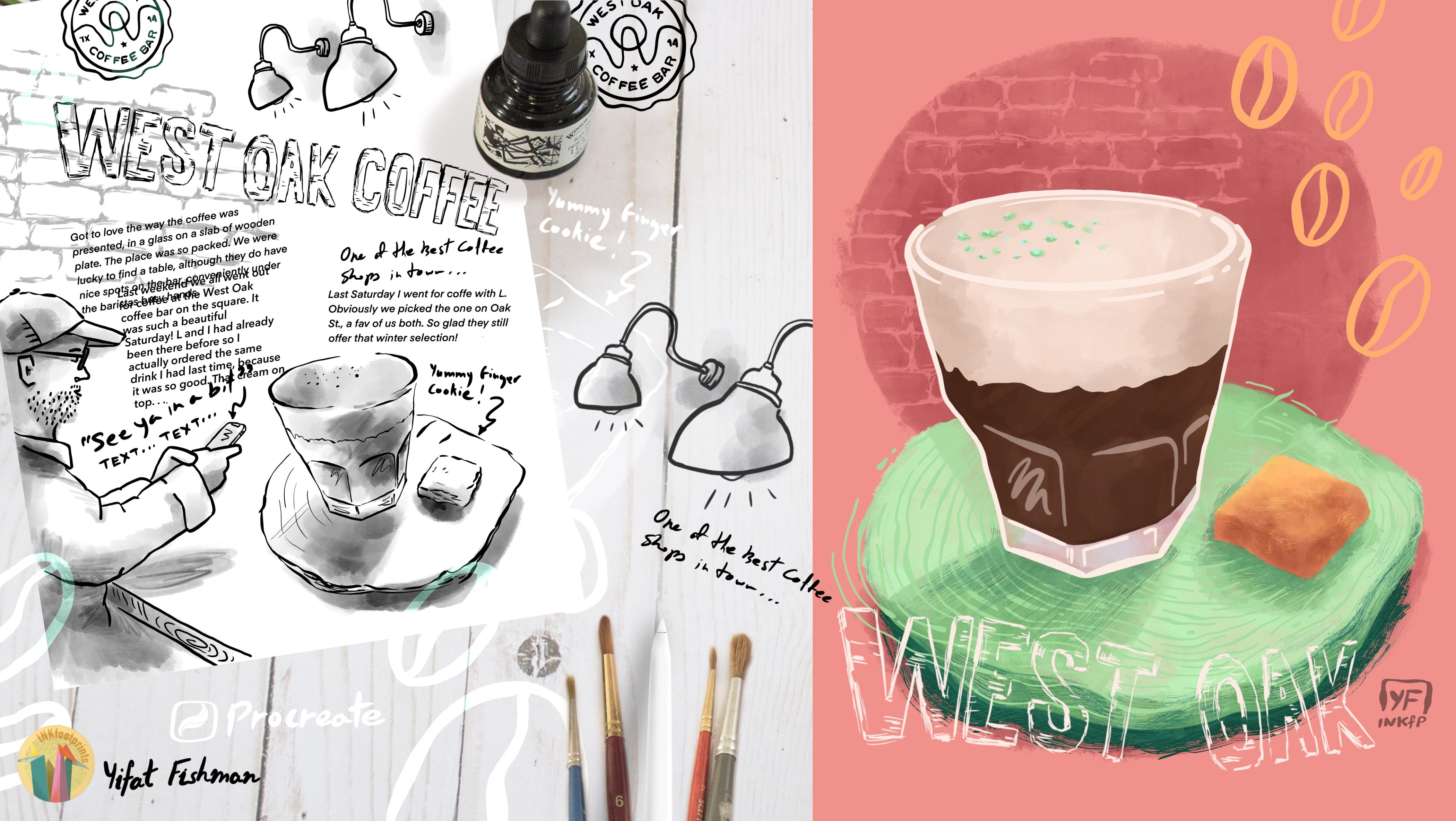
8. The Project: Sketching & Color Blocking: For your class project, choose something that is already available to
you and is fun to draw. Look around you for objects
with simple and fun shapes. I found these two elephant wooden sculpture
around my house. And I'm going to draw them. I think they're really fun. You can also draw them. Look in the class resources
for a collection of these elephants
photos if you want to follow my drawing subject. Alright, and now
we're ready to begin. So let's pick up
the six B pencil on a fresh new canvas and create a sketch of
our drawing subjects. So let's discuss a
few pointers for best practices for sketching
out your main elements. When drawing from observation, look at the basic shapes. First, find the big shapes and draw them in the
very, very basic way. Start off with drawing really gentle lines just to find all the shapes
on your canvas. When you are more sure about the direction of your drawing, then start marking down more pronounced lines to
get all the fine details in. Legs would be a major details and a major line will be
the elephant spine. Both of them will be
diagonals in this case, and those will add the sense of directions to
the initial sketch. Pay attention to
perspective and that means that elements that are far away
are going to look smaller. And when you draw, try to choose an interesting
point of view. Placing elements
on their side is the most basic perspective
that you can find. Getting elements in a slight diagonal is
more interesting. My last tip would
be: traced the photo. This is not a sketching class. If you're good at this. Awesome, but if not, don't worry, pick up a photo, place it on your canvas, lower the opacity and just trace the outline so that you will
have something to work with. Your next step for
creating the project is to choose a few basic
colors to start off with. For me, the inspiration are
the statues of the elephants, darker shade of brown and a
more reddish shade of brown. So that is my starting point. Now at this stage, what we do is we
create a unique layer for placing the colors
in and testing them. I will try to start
painting one elephant. Then I'll go ahead and choose another color and test it out on my second elephant
and try to see if these colors work together
and if I like them. Colors that you like,
save for later, mark them down on the side to create your basic color palette. The key here is to be flowing
and try and experiment. Don't stress too much
about your color choices. We can always change them. We just want to have a
few basic colors to start our work so that we can
move on to our next step, which is color blocking. Alright, so we have our
basic colors chosen, and now we're ready
to begin our project. So let's go ahead and color
block our first elephant and I'm using a separate
layer for each elephant. My brush is the Oberon brush, which I'm going to use to fill in the shape
of the elephant. And after that, I'll be
adding my texture layer. But for now, what I want us
to focus on is the texture. When coloring in my brush
is relatively small. It's about 5% for
canvas of 300 DPI. And when I'm coloring in, I'm really trying to
color in the elephant as if I were coloring on paper. I want to see all my
brushstrokes mark. And so I'm working with short brush strokes so that
the texture will be visible. If my brush was set up big, then I will see less
of that fine texture. So that's a choice
that I'm making and that is the texture that
I'm trying to achieve. For that reason, I set
up my brush pretty low. So I picked two contrasting
colors for the elephants. One is fairly dark, other one is lighter in color so that there will be a
difference in my two shapes. The subjects are
both the same color. One is slightly darker
than the other, but in the illustration, making the colors
more contrasting adds to the interest
of the piece. And I'm coloring the
darker elephant in the same way that I've
colored the lighter elephant, so that my texture is
will be coordinated. Before moving on to
adding textures, we want to go ahead and check our initial color
blocking and see if you want to make
changes, add details, refine the outlines, use our eraser to clean
up the shapes. These are all steps that we're going to take
at this stage, before we move on to adding
more layers to our work.
9. The Project: Drawing in Textures: So we have our base
layer all blocked in, and now we want to
add some textures. It's okay to change your colors. This is what I'm going to do. Once again, I can't really
work with the brown, so I've changed my other
elephant's color to blue. So the colors that
you choose for your projects can
be imaginative, you can base your
initial work on reality or your inspiration
or a photograph. When you create
your illustration, your colors can be any that
you like working with. They can be completely
made up colors. So some key things
to remember as we work through this stage
of the illustration. First thing is to
work in layers. Add a texture layer to each and every one
of your elements. For me, these are two elephants. So I'll be having a
texture layer for my dark elephant and another texture layer
for my blue elephant. So here we can definitely see the need to use the mask because the texture is going beyond the boundary of the layer
underneath and no worries, just let go tap on the
layer and make sure that we set our textures
to a clipping mask. I'm going to use three brushes for this final illustration. I have the Oberon brush
for blocking the colors. And then I have the Blackburn
brush for the texture and the thylacine brush
for erasing textures. So consistency with our brushes throughout an artwork keeps your textures very
well-coordinated. So let's pay attention to what my textures are
basically highlighting. They're not just adding
character to the elephants, but I'm using them to create light and add reflection
to the elephant. And so in that sense, the textures enhance the shape
and the help define it. Sometimes we'll use
the textures just as outlines, as in the
ears for the elephant. I might use the textures
to enhance the details. And in other times, like in the elephant's leg, I might use the textures
to create a reflection that comes off of the white
background onto the leg. The textures are placed
intentionally on the canvas. They add dimension,
but they also enhance the form and help us understand what's basically
going on on the canvas. So when I illustrate, I tend to use my eraser to add more interests and
dimension to the textures. I know that usually I tell my students not to
erase too much. But when we do
these texture work, the erasing some of the texture helps
with opening them up. And so we got to find a balance between adding textures
and removing textures. Be in a state of
mind that you are in a workflow and don't stop and stress too much
on individual details. Trust the process and trust
yourself and at the end, appreciate what you've
created and enjoy it. Alright, so I'm going
to let the music run, and we're going to just
enjoy the process. And I'll give you some
pointers later on. So far we've been using
textures to add light. In this instance, for
the blue elephant, I feel that it's very light. And actually adding
darker textures as shading textures is going to create more contrast
and interest. So like I said before, it's a good idea to sample color directly from your canvas. So I'm sampling the color
from the elephant and choosing a darker hue
as my shading color. And then painting that in and adding those
shading areas of the elephant to
amplify the shade and add dimension to
the illustration. Up next we'll be finishing
illustration with fun details.
10. The Project: Focusing on Details: Every illustration
project is brought to life by the details
that we add to it. A fun detail in this illustration
is the elephant tasks. It's an opportunity
to add a spot of color to the otherwise
blocky elephants. So let's go ahead and add
the details in a new layer. So the tusks actual
color is beige and it's very muted and
not a very exciting color. I want to add
something really fun. And I'm going to use my
sketch as a guiding and really very gently bring in the shape of the elephant tusk. It helps to uncheck the
sketch layer and take a closer look at what we've
created on the canvas. Since this is such a
nice little detail, I will work with the shape and erase it a
little bit and make sure it's really nice before moving on to adding textures. Organizing layers in groups is super-helpful
when eventually, in a project we might end up
with more than 20 layers, or sometimes it's 50 layers. And so it's a good
practice to group them up. So that will be able
to find all the layers that are connected
to this one element. So for each elephant, I will have a group layer
for the block of color, for the texture and
for any details that I've added
to that elephant. And later on, if I want to change that elephant, like
move it around, it really helps
when everything is compacted to one group. For small details like
the elephant tusks, it's much easier and quicker to use Alpha Lock for a mask. It's a small element that we likely not go through
many changes. So just really quickly masking
the layer with a swipe right, to check it
as an alpha lock and then adding the texture
with a darker color. This is my go-to approach for layering in textures
for smaller objects. Now, if you want to make changes to textures that you've created in alpha lock, it is reversible. The only thing that we
need to remember is since we added the darker color, if we want to erase
the darker color, all we need to do is sample
the lighter color like the light pink and paint on
top of the dark textures. Because we cannot erase
when we're in alpha lock, whatever we erase will erase the complete shape that
we've already created. All right, and last thing
that I want to show you for this lesson is how to make everything pop up with adding a contrasting shadow to the entire illustration. And what I mean is that
I want to add shading to both elephants and that really helps with
anchoring them and it's just a device to add more interest to
the illustration and add a spot of color. So again, it's a good idea to sample colors from the canvas. And so for the dark elephant, I'm going to sample colors
from the lighter elephant. And that helps with coordinating the colors and keeping
everything really tight. And then I can open up the
shapes that I've created for the shadows with
my textured eraser. And I really think that
these blue shadows help separate the brown elephant
from the white background. Let's add a fun color to
the blue elephant by just adjusting the color that I've sampled from
the elephant tusks, I can get a really
fun purple texture to the shading of
the blue elephant. And that really helps it
pop and come to life. And last thing that I want to mention is that I did create a slight variation to the
blue elephant tusk. It's now more of a warm shade of pink with orange shading. And this is really
something that we can do as we've created those
tasks on separate layers. So the details are
on separate layers. We can always go and make adjustments to the colors
because I think that having a slight variation
in those details helps bring a little bit
more color and playfulness to the canvas.
11. The Project: Extra Steps: So we can call it a day
and say that this is it, our illustration work is done. Go ahead and export
this as a JPEG or just take a screen grab
and share it with the class. I would like to add an extra two steps to this
project that we can take. One of them is add a background to help everything pop up. And the other is to change
the dimension to our canvas. Now the reason for
changing dimension to the canvas is saved
that we want to share this work in a
longer format like in a portrait for maybe creating a printout of our work and
then frame it on our wall. I think that the
longer format is more suited for that rather
than the square format. If you have an online
store that you want to add this
work to as a poster. This is also a good practice. So let me show you how to change the dimension
of your canvas. In Procreate, we're
going to head over to the little wrench icon and pick the Canvas and
choose Crop and Resize. We're going to choose Settings
and type in new dimensions. 3,000 pixel in 300
DPI is about 10 ". That's a good size for
printing for small poster. So I'm going to choose 4,000 pixels for my longer dimension, and that would give me a good overall ratio for
printing out the work. My illustration is now
not really centered. So I can go ahead
and drag the canvas until I have my composition
just where I want it. I think it's a good idea
for the elephants to be more in the lower
two-thirds of the canvas. So that will leave me some room for working
in a background. Alright, so now we're going
to add a new layer and make sure that it's at the
very bottom of our canvas. And now we want to pick a
color for the background. Here's a tip to
coordinating your colors. We can use a special device in Procreate that is called
a split complimentary. It's at the very bottom of the color wheel we have
a Disk display. And when we choose a
Hormone display, we get to pick what kind of complimentary colors we
want to choose from. Those complementing colors are going to complement
our main color. In this case, I picked
the main elephant color. I want to check what kind
of suggestions, basically, what kind of suggestions
the Procreate can give me for complementing
that base color. So I've already have the
purple one that I've used for the background
of the elephant. But I think the top
one, the brown one, is going to work fine, it may
just need some adjustments. So let's give it a try and experiment a bit
with the colors. The best way to know
which color works for you is just to try a few and see which
one feels right. I'm keeping my choices in the same family of colors that the complimenting
colors were suggesting. But I'm leaning more towards a brighter color than the brown. It just feels nicer to me. And now I have my color
and I can clear up the layer and start marking down the area which
I want to work on. So let's pick the
select tool and make sure we're in
a freehand mode. And what we want to
do now is mark down the area for our background. When you tap on the canvas, on points where you want your
shape to be created from, you'll get straight lines. Keep tapping until you close the shape and then drop
a color into your shape. Alright, so we can
leave it here, but I think it will
be much funner to open up this shape
with some smudges. Alright, so let's go and
pick the smudge tool and add more texture and
vibrancy to our background. It feels like we're working in watercolor at the background, but it also helps connect
it with our main subject. It adds some depth, when we opened the background
color with the smudge tool. It makes it more playful and it adds a little bit of watercolor texture to the background, which I really like. And with that my friends, my illustration is done. I really like the addition
that I've made to the canvas with the
background and the shading, everything looks really
tight and playful together.
12. Final Thoughts: Congratulations, you've finished this class and thank you for
joining me today. And now it's your turn. If you need some
ideas to what to create for your
illustration project, you can look around
your house or your studio and find something
very simple to draw. You can take a photo
of that and trace it, or use the sketching tips in class to draw it
from observation. Another project ideas
you can find by looking online and searching
for inspiration photos, or to download the elephants photos PDF that is provided
with the class resources. Here's some tips for creating
your projects are to use the step by step method
that we are following in class. Start with the basics
with just getting your outlines and then
add the block of color, and then add textures. Hearing back from my
students in other classes, I'm learning that this by
step by step, hands-on approach really helps them with creating projects that
they're proud of. Share any number of textures that you've created
following the class. It could be one, two. Amazing if you've
finished all 15 of those. Head over to the green tab
that says Create a Project, tap it and start
uploading your work. Give your project a fun name
and upload a cover image, and then type in a description
or your impression or what ever thought you want to share with the rest of
the class community. Hit the tiny Image button and upload any number of images that you've
saved on your device, a jpeg, or screenshot
directly from your iPad. When you're done, hit the Publish button
and you're all set. And lastly, I would like
to ask you to leave a feedback as a short
review at the end of class. Tell me in a few words
what you liked in this class and what you learned. I'm very happy to hear back from my students and
follow me hear on Skillshare to learn when my next illustration
class is ready for you. And occasionally, I post an email to all my
followers telling them what I'm planning out for them or just sending
out inspiration, sharing my art process, and trying to inspire my
students with their creative journey. So thanks for
joining me today and I'll be looking forward to
seeing what you create. And I'll see you in my
next class. Bye for now.
 Yifat Fishman, Artist & Illustrator