Transcripts
1. Welcome!: Hello, I am Victor. I mean, so I'm, this is my very experienced
assistant, Toby. I am a portrait artists
specializing in pastel medium. And in this class, I will
show you how to draw the beautiful portrait from
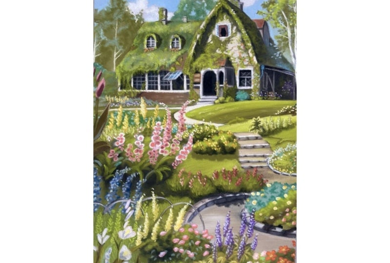
Keq is a delivery service. This is one of the
most beautiful and iconic landscapes I have drawn. So I am excited to
draw this with you. This class is best
suited for artists on the intermediate and advanced level thought to
begin this would also benefit from the class as I have provided a sketch
ready to print. So you may approach it as a coloring exercise and
practice your skills skills. We will go through
all the stages necessary to complete the story. We will begin by
creating a sketch. I will show you the
different techniques of how to create this. We will continue by drawing a smooth background
where we will learn how to layer colors
and draw clouds and trees. Next we will approach
the beautiful house. We will draw the
windows and of course, the vines on the house. Finally, we will create the iconic landscape
where we will focus on depth and perspective
and then how to draw all the different
flowers in the curved path. We will be going over the entire drawing process from the very first pencil mark
down to the very last. So it would be
amazing if he could join in and draw the
portrait with me Asda, we are working on it together. I am confident that after
this class you will not only be able to draw
this particular landscape, but create many other
beautiful pastel drawings. I hope you find this class
very informative and learn a lot about the
magical pastel technique. But I also wish she
find it enjoyable and relaxing and have
fun while learning. I am truly delighted to
present this class to you. So let's begin. See you in the first lesson.
2. PART 1: Materials : Hi everyone, welcome
to the class. I'm very excited
for you to be him. Before drawing, we'll
begin by looking at the tools and materials we're
going to be using fast. Let's take a look at the
surface we're drawing on. I use clef on time
pastel mat in dark gray. You can get both the board
and the COD version of this. I always prefer the board, but both work perfectly. I choose the dark gray
color because it makes all the pastels of PM on natural as opposed
to white paper, which makes the colors a
bit too bright and vibrant. I also like this paper for pastels because
it's very grainy, almost like soft sand paper. This holds the pesto
very well and makes sure that the drawing
lasts a lifetime. This isn't a kind I like, but you can use
any paper that has enough tooth to hold
the best style. The size I'm using today is
seven by 10 " or 18 by 25 cm. I usually put out
the size I like as the size range of this
paper is quite limited. I like to take this paper
to my drawing board to give it a clean
professional look at the end. Next we have the blending tool. I use this to blend the soft
pastels into the paper. This allows me to create
a very smooth layer. There are various
shapes and sizes, but this is the one that I use. It's great for blending
both small and large areas. Finally, we have the pencils. This is the most important tool for creating pastel portraits. I use a combination
of three brands. Vestibular, capo,
Thaler, current dash, the fabric, Estelle
pick pastel pencils. These sets can get
very expensive. So if you're starting out, I would absolutely
recommend that the stubby like cardboard
color pencils, these older materials I use. Next we will be moving
onto the drawing. Can't wait to begin to see that.
3. PART 1: Preparing & Sketching: Hi artists, welcome
to the first lesson. In this lesson, I
will show you how I prepare and sketch my portrait. If you would like
to skip this step and go straight to
working with pastels, there is a resource available where I have drawn
the outlines for you. But if you would like to
do this, catch yourself, Welcome to the lesson and
I'm excited to begin. I began by taping
my piece of paper to a backboard to keep it
supported on the easel. To bring it forth, I am using a paper size of 18 by
25 cm or seven by 10 ". So I am just picking up a light gray pencil and I
slowly build up the outlines. I am using my fingers
here to measure the distance and map out
where the main points off. A cool trick is, if you have a printed out picture or you are drawing from your
tablet like I am. Then I zoom into the picture so that it's exactly
the size of the paper. And I mark where the
key reference points. Sorry, I'm mapping
the very top of the roof and the very
side of the house. And then it's much easier to connect these points
to each other. I find it much easier
to slowly build up the line instead of during
each line in one guard, you have much more control if you slowly build the line using very small strokes
than if you just do one thick line in one go. So here I am slowly mapping
out where the porches. I'm constantly comparing
to the reference. Now I am doing the small window. I can see that it's
right in the middle. So that's where I'm drawing it. The way these lines,
they don't have to be exact because nobody
would really tell the difference if you misplace a window or you're
slightly make one section thinner than it should be with something like a house
or a landscape or any, nobody would tell a difference. And if you mess up, you can
always rub off the outlines. And over again. I am not trying to
get this perfectly. I'm just mapping out where the main points off and we can always go
back and correct. I'm trying to see where the path is in
relation to the bush. So I can see that it's almost in line with the very
top of this bush. It also helps if
the dimensions of your reference are exactly the same as the dimensions
of your paper. So if you are ever working from a photo fats not the same
size as your portrait, then just crop it up
slightly and then it's much easier to fit
everything on the paper. That was all Toby and I would like to thank you
for watching this lesson and we'll see you in the
next class where we will draw the background of
this beautiful landscape. See you there. Bye.
4. PART 2: Background: Artists, welcome. We will start by
drawing the background. These are the early
pencils I will be using. I start with the blue pencil and I will begin
withdrawing the sky. I am creating a pretty
thick of blue layer. I am observing the
reference photo, and I'm only applying this blue in the areas where the
sky is actually showing. What I mean by
that is I skip out the areas where the trees
are and the clouds. I am solely focusing
on the blue sky. I won't be mixing this
with any other color. I am pretty happy with
just this shade of blue. So I'm drawing a
pretty thick layer and we will blend this into
the paper in a moment. I'm being quiet,
careful not to go into the outlines
of the house here. Now we are taking
the white pencil and we will just start
drawing the Cloud. I'm walking in
circular motions here. I'm trying to achieve that
fluffy cloud texture. So again, we're looking
at the reference photo and copying down
where the cloud is. We don't have to follow
the reference exactly. We can add more clouds
or less clouds, or we can make them
different shapes. We can make this drawing
exactly how we like it. So yes, I'm just creating a pretty thick white layer here. Now I'm working on
the second cloud, and again, I'm
repeating the process. I'm creating a thick white layer over the entire Cloud region. I wasn't quite happy with
the shape of the cloud. So I am correcting it a little bit with the
blur and pencil. This is my blending stump. You will see me using this
throughout the entire class. I am just using this to blend the pastel pencils
together into the paper. I'm not pressing too
hard into the paper. I'm just gently drawing
circular motions to blend everything very well with
the same blending stump. I am now working the
Cloud into the paper. I didn't bother cleaning this in-between, changing the colors. I kind of liked the idea
of the blue that was previously on the blending stump rubbing off into the Cloud. So yes, we are just working
in circular motions, blending this cloud
into the paper. Now that we've blended this, the y has lost its brightness. So I'm just taking the white pencil again
and gardening or recite and areas just to bring out
some dimension in the Cloud. Again, I'm working
in circular motions just to make this a
little bit fluffy. I'm very happy with
the cloudy sky. Now let's move on to trees. So if this medium green pencil, I am first going to isolate
the tree from the house. I am just drawing a base layer. I'm covering the entire
tree region with green. I chose this color because
it's medium green. It's a very good base color. We will later add depth
using a darker green color. And we will also draw highlights
season lighter green. So this is the
perfect mentoring. You can also see it matches the color in the reference
photo pretty well. The tree in the middle
right above the house, it has a little bit
more of a blue here, but this one is very
beautiful and green. And I find this color
works very well. So again, I am using
the blending stump and just working this very
gently into the paper. I am not pressing
too hard at all. I am just drawing very
delicate circular strokes. So now we're going to do the base layer of
the middle tree. And as I said, this
one has a little bit more of a blue hint to it. So I am picking the color
pencils accordingly. Again, I'm just following
the reference photo loosely. I'm not trying to
replicate it exactly. I'm just copying down the
basic color values, IC. And now I'm just blending
all of this together. The trees in the background, they don't really
have much definition. So. It's okay if they don't
really look perfect, it will all come
together in the end. They are far in the distance. So once the drawing is complete, the viewer will not be
focusing on the trees. So don't worry if they
don't look perfect. Just have fun in the process and everything will
come together. Now we will actually
draw the tree texture. I am again creating
small circular strokes. I want them to resemble leaves. So I am drawing these
mostly on the outside of the tree just to make the
edges a little bit less even. Now I am picking up a
different shade of green and I am just adding dimension. Again. I am using small circular motions just to create the effect of leaves. Again, don't be discouraged. If this doesn't
really look good. Mine doesn't actually
look that amazing either, but we will keep applying
different colors and wagon layers and eventually everything will come together. So yes, we are just scribbling little circular strokes onto the paper and it
resembles leaves. Remember that when we look
at trees are very distant. We don't really see the details, we just see the overall texture. So we don't really have
to fix it too much. And actually drawing
the shape of a leaf, we are just going
to draw something that represents the
texture of leaves. And I find that this
little circular motion now we're doing
works pretty well. Now here I am actually
picking up white. And the reason why
I'm doing this is because when we look at a tree, there are little gaps in between the branches
and we can see the sky in certain
areas for the tree. So I am just continuing
the Cloud as though we are seeing
gaps in the tree. So I am just adding
little dots of white as though we can see the cloud through
the branches. I am also during the same
thing here with the blue. I am just trying to show
a section of the sky. Sir, again here we're just continuing with the
leaf texture we addressed during the
same circular motions that represent leaves. I am drawing this
all over the tree. Don't be afraid of
the pastel pencils. If we don't like something, we can always take the
blending stump and rub it altogether and start over. This is why I love pastels because they are very forgiving. So now we are just drawing
the trunk of the tree. In this case it is
white and I'm also just drawing little branches
coming off the sides. I am being very
careful not to press the pencil into the
paper too much. We just want a very
thin white line. We don't want this
to be too bright. So yes, we are just touching
the paper very gently. I'm not trying to create
one long thick line. Instead, I'm just adding little straight strokes until
we slowly build the trunk. So now we're basically repeating the same steps with
the second tree. We are adding blue to show
the sky for the tree. This is my favorite
thing to do when I am drawing trees
because I feel that it adds a layer of realism to it and it makes the tree
look a little bit uneven like in real life. So again, here we are using slightly more muted
colors because remember, we can see on the
reference photo that I'm, This tree is a
little bit more blue and the tree on the left had
more yellow hints to it. So yes, we pick
the right pencils. But also if you don't have these colors
in your collection, you can just use any
grains that you like, work with what you've got. Now I am just taking a
very light green pencil, almost a little bit yellow to add some highlights to the tree. Something that's very good to do when you are creating a drawing, especially a landscape is true. Look at the image and see where
the light is coming from. Sir. Look at the
direction of the shadows. So here we see that the very right side of
the house is quite dark. And also you can see
underneath the roof of the house that there
is a little shadow. This hints that the sunlight is actually coming from
the top left side. When we add highlights
to the tree, they are going to be on the
top left side of the tree. And the shadows of the tree
will be in the bottom right. Again, we are now drawing the third and final
tree of the background. I'm just starting with
the top corner here. And I am beginning to create
the leaf texture again. So yeah, it's a slow process. I am just drawing
the tool dots to build the uneven
edges of the tree. I am hoping you are finding this process very
therapeutic and relaxing. So now we are working with
a lighter green color. Again, when we
look at this tree, it's a little bit more
similar in color to the tree. On the left-hand side, we can see that it falls into
the yellow hues slightly. It's almost like
the perfect green, whereas the terrain, the middle is a little bit more blue. So we are working with very
saturated green colors. Again, I'm just kinda
reflecting the truth extra. I am drawing very
circular motions once more to build this texture. I am just picking
up another shade of green just to build
dimensionality. Really hope you
are enjoying this. I really, really loved
drawing with pastels. I find it incredibly relaxing. I can draw this for many hours and feel like I am
Liston time I already into my own world when I am drawing especially a magical
landscape like this one. I really love all these
beautiful scenery is the artists that
work on these movies do a very good job in creating very cozy landscapes
like this one. I think this one is the most beautiful one out
of all of them, which is why I'm drawing it. But there are so many more that I would
love to try one day. So yes, we continue
to build the tree. We are starting with the mid tone color and we are just creating
the leafy texture. And then we are building on top of that using lighter
colors to add dimensionality and
bring some branches forward to build depth. I hope you are finding
this lesson very useful. When I was first starting out, I loved watching incredible
artists draw in real time, whether that would be a new
tuple here on Skillshare. I am very much a
visual learner answer. It helped me a lot just
to observe the process. So we are continuing the
background over here. We're just drawing the
blue sky that shows in-between the house and the
bottom of the tree here. This area of the sky hair, it's not a perfect blue. It's almost mixed with
a little bit of grain. I think the original scenery
was actually a painting. I would presume it was
a gouache painting, but we can replicate this
effect and pastels and blend a little bit of green
into this, into this region. So again, we are working
on the tree trunk. I am just working with why? Very, very slowly. I am not trying to build
a thick single line. I am just working in
February strokes trying to build this trunk. How I like it. I am using this pencil. It's actually the Chinese
white by current dash. It's my favorite color
from the collection. I find that the Y is
very, very prominent. Unlike many other
pencils I've tried. And it's very good
to have it just for the areas that you really
want to bring out. For the trunk. I'm just
adding a final effect of highlights just
to make the trunk a little bit rough in texture. I'm just kind of drawing
broken up, thick lines. And now I am just adding
little thin branches. And that's pretty much complete. Again, just remember
not to press the pencil too hard into the paper. We want to use a very
gentle February hand. That was all for the
background lesson. I will see you in the
next lesson where we will draw Kiki is magical harm.
5. PART 3: The House 1: Hi artists, welcome to
lesson number three. In this lesson, we will
be drawing the house. So I begin by drawing the roof. This roof is covered
in vines or leaves. So we will start
by drawing those. Hey, I'm just scribbling the
base layer onto the paper. I am making very small, rounded hand motions to build the messy
texture of leaves. For this one, I am using
a medium green color. I don't want this
to be too dark or too light because it's
just the base layer. Now we are taking
the light green color and we are looking at the reference and seeing where the lighter part of the roof is. As we could see
in-between the windows, the roof was flat and
front-facing, I suppose. So. There wasn't much light
bouncing off of that. But this part of the
roof is slanted, so there is some
light bouncing off. Therefore, this section of
the roof is light green. Again, I'm just building the texture using
the rounded motion. The very top of the roof
is also lighter green. I'm interchanging between the light green and the
medium green color, and I'm just building
the texture as I go. Now I am taking another
shade of green. This one is a little
bit more blue. And I'm just adding this in some areas to add
dimensionality. I'm just adding this in certain areas to make the
roof a bit more interesting. Don't worry too much
about how this looks. Just keep on applying the
different green colors. And in a moment, we will bend it altogether and it will start
to come together. There is a little
bit of the vines that falls over the roof. It covers the windows
a little bit. So we're also not going
to forget this section. Here we have the
blending stump and we will adjust to
walk this altogether. This looks a little
bit more natural. We will keep on building the base layer and blending
until we're happy with it. Here we have a dark
shade of green. This one, again is a
little bit more blue. And we will focus in the
area that's darkest, that's in-between the windows and along the sides
of the windows. Now the leaves on the roof, I'm not covering
the entire roof. There is a small section in
the bottom right corner here, so we're just going
to leave this out. Now we are using the
very light green color. This one is almost yellow and we will just add some
texture to the leaves. I am mostly focusing this
on the slanted part of the roof and on the very top of the roof because as
we said earlier, these are the areas that
reflect the most lights or they need to be distinguished
and appear lighter. Again, with our little
blending stump, we're just going to gently
blend this together. Now that we have
established the base layer, we are going to start
building some texture. I am first using my
light green color, and I'm going over
the light areas. I am using the same
Sokoloff scribbling motion to represent the
effect of leaves on the roof. Now I am picking up a
dark green color and we will just add some
definition around the windows. This kind of shows the
side of the window because it's kind of
coming out of the VRF. So there is a small
triangular shape and we'll just fill this in and make it a little bit darker. I have applied black over
this triangular shape here. And now I am using
dark green took over. Now we are using the same
dark green color to isolate the edges of the vines
and add some definition. Now we will fill in the
corner of the roof. This little section is brown, so I am fostering a
medium brown layer. Now, I am taking
the blending tool and I'm just working
this into the paper. I'm just using the
green to kind of go over it and overlap some of the leaves
over the section of the roof to make it look a
little bit more natural. I am not drawing the
specific shape of leaves because if we are looking
at them from afar, they don't really
have much of a shape. So that's why I am using the scribbling
motion throughout. Now we will get started
on the windows. First I am using white
and I'm just going to outline the white frames. Notice also how I am changing the position of my hand
to get the right angle. Now, I am filling in the
shadows within the window. As we had figured out earlier, the light is coming from the top left side
of the picture. Even though we
can't see the sun, we can see where
it's coming from because it costs a shadow. I'm also using dark gray just to fill in the
inside of the winter. Now, I am using black to add some definition around
the edges of the winter. A very small part. Vines are overlapping
the frame here. Now we're just going to pick up a white pencil and we will
draw the inside of the frame. Again, notice how I'm not just drawing this
line in one goal. I am just starting out very thinly and making sure
I get it perfectly. Now we are drawing the little flowers that
are within the vines. Essentially we are just
drawing tiny orange dots. You can hardly see them
in the reference photo, but I think it's by adding
little details like this that we can make the
landscape look very pretty. So a lot of the
steps we are doing, they are just adding very small details that
aren't really noticeable. But if you take all of these small details that
we are adding over time, they make a massive difference towards the final
finish of the drawing. Now we'll just
drawing the chimney. I am using a dark gray hair. The right side of
the chimney is, again, it's in the shadows, so it's going to be slightly darker than the front
part of the Chimney. It also edges into
the roof a bit. So I am adding in
this little detail. Again, we're picking up our very trusted blending tool and we are working
this into the paper. I like this tool because
it smooths everything out. When we apply the
pencil over the paper, looks a little bit
grainy because it shows the texture
of the paper. So when we use the
blending tool over it, it makes the color
look very smooth. Hey, I am using a
very dark gray color to add some details
to the chimney. Again, our chimney
would not be complete with a little bit of
vines swelling around it. I am using a lighter
green color. Just to add some definition. There is a very small, cute little chimney
to the right here. Now we're on to the
second part of the house and we finally get to tackle the main
section of the home. I am using black just to start
establishing the shadow. Don't be afraid to use black. I know it looks very overpowering
when you apply up fast, but pastels are very forgiving. You can apply way too
much black and we have to do is either blended or
cover it with other colors. To turn it down. Again, we are using the
same scribbling motion just to stop building the texture of the
vines in the shadow. I'm just applying a pretty
thin layer of this. I don't want this
section to stay black. I just want it to be dark green. So this is why I'm using
a black base layout to make the green that we apply
on top of it much darker. So now we are adding
some green over it, again using the same
suburb of the motion. And we're just focusing
on the shadow pot. I am blending this
altogether just to establish a dark green layer. So as you can see, even though we had applied
quite a fair bit of the black pencil after we had blended it and mix it
with the green color, it doesn't appear
so overwhelming. So right now we're
just continuing. The vines are over
the edge of the roof. Some of the vines, they draped over the
roof a little bit. Now we are using
the darker green to continue the vines onto
the front of the house. And again, I am now using a lighter green just
to build the texture. Throughout the whole process. I'm just blending this in with the tool because I want the
layer to be very smooth. I don't want it
to appear grainy. We can see quite a bit of the wall on the
side of the house. So I am using this beige
color to draw the wall. Again, it looks quite
grainy up fast. We can kind of see the gray of the paper underneath
it, so we just spend it. Well, the tool, I suppose the main thing you have to
keep doing when you do a, any kind of drawing is continuously look back
at the reference. You have to look at
every individual inch of the reference and see the
colors that are around them, whether there are any shadows
or highlights or details. And essentially you just
copy whatever you see. Here we are again
filling in the wall. I'm drawing into the
vines just a little bit to define them. Now we're doing the
right-hand side of the roof. If you observe the reference, you will see that this side is much darker than on
the left-hand side. That's because the light is coming from the top-left, sorry, this roof being on
the right-hand side, it's away from the
sunlight, so it's much.com. That being said, I am
drawing the base layer by filling in the section
of the roof with black. Again, don't be afraid
of the black color. It seems very overwhelming
and prominent right now, but once we add
the green over it, it will appear much more time. When you combine a green
pencil with a black pencil. It makes it look like a
very dark green color. So now we are just using the circular motion and drawing
the leaves on the roof. Now I am using like rain just to draw the vines on
the edge of the roof. Right now I am just using the same pencil that we'll use to draw the
color of the wall, to draw a slight gaps
in-between the vines. It's kind of similar
to how we added some blue dots when we did the background
to show the sky, showing through the trees. Now we're doing
chimney number three. We must account for the
fact that the front of the chimney is in the light, so it's going to be
slightly lighter than the right-hand side of the chimney, which
is in the shadow. Now we've approached the side of the house where we can
actually see the wool. So now we're just applying
the phage pencil. It's actually called
the brown olive ten per cent by current dash. And if you look closely, this is a perfect example
of how you can see the gray of the paper
showing through. Because the paper
is very grainy. When we draw a white
pencil will only apply the pigment onto
the very surface. We cannot really get in-between
the teeth of the PayPal. Until we blend this in, you will see that the
color looks very smooth. In this section of the wall, the vines are actually
a little bit more thin and Scotus compared to
the rest of the house. So we're going to
use the very tip of our pencil to draw
very defined vines. Now we get to draw very
cute little flowers. The way I'm doing this is I am the tree just drawing
very fine dots. Looking at flowers from so far away you wouldn't be able
to distinguish the shapes. Or I feel that tiny little dots represent the effect as
though there is a flower. Very well. Now we're moving onto the queue open window in
the middle of the wall. I am starting with the
inside of the winter. I am doing just a
thick layer of black. There are curtains inside
of this, but don't worry, we can always draw the red
curtains over the black area. Pastels are very easy to layer. So even though we have a black base when we apply
the red cut and over it, they will still appear
very prominent. From the perspective we're
looking at the house. The viewer is Biller, the house. So when we look at the harm and when we
look at the Winder, the windows will
be angled upwards, if that makes sense. Now, I'm just using a white pencil and I'm
defining the frame. I am drawing the side
of the portrait. I am starting by drawing a black base layer and I'm going over it
with the dark green. Remember that when we mix
those two colors together, they will appear
very dark green. Now I am just drawing a pretty thick brown layer
onto the roof here I am using the same color that I used to complete the roof to
the left of this one. Now using light green, I'm going over this section of the roof to make the
vines layer over it. How are you finding
enjoying the vines? I really loved drawing them because I feel like
they are quiet. A simple way of making a house looks so much more
interesting and beautiful. Now we're just drawing
the, I suppose, edge of the roof that's sticking out on the
right-hand side. I believe the original drawing
was done using gouache. So it's quite
interesting working from a reference that was originally a painting and trying
to do it in pastels. But I'm quite enjoying the process and I
hope you are too. It looks like there is a slightly blue light falling
on this side of the roof. So we are going to start
off our base layer by doing a combination of
blue and green colors. I'm just also add a new layer of black to make this quite dark. There is a cute little
detail here because the tree is in front of the house and the leaves at the end of the tree
has a slight blue color. Sir. I am using a blue pencil
to complete this detail.
6. PART 3: The House 2: Finally, we are moving on to a different
section of the house. Now we are going to be doing the left side of the
bottom of the house. So I am starting out by
just doing this wall here. I am just drawing a
brown base layoff. I am using a couple of
different browns here just to make the wall look
like it's a little bit faded. We are finally moving
on to the window is. So just like with
the previous window, or we are starting by filling in the inside of the window, which is just going
to be all black. Again, we're just blending
this together so that we can't see the grainy
texture of the paper. You don't have to be to10 here. Once we draw the frames
over the Windows, this will look a
little bit more tidy. The vines or draping over
the windows slightly. So we're going to
draw some more vines as though they are kind of
overlapping the windows. Essentially I'm just
drawing downward scribbles. Now we're picking up with the same pencil that
we drew the wolves wave to complete the
frames of the windows. So this window is
entirely facing the sky, so it's going to be
reflecting a lot of blue. That's why I'm
using a blue pencil just to draw a base layer. Now we're just going to draw the little grid frame that's
inside of the winter. I am going to do this
on all six windows. Notice how I am
adjusting my hand angle here to get the
perfect straight line. Now we're bringing our focus
back to the porch area. There are some bushes here
right in front of the house and they connect with the vines. I am using a medium green color
to draw the base of this. Now, I'm using a
lighter green pencil to add some details. Again, notice how I'm just feathering my hand to
achieve the right shape. I am not drawing
the arch weight of the door in one go or I am slowly building this up with a very slight February strokes. Now I am working on the
frames or the archway of the porch using a white pencil. I suppose the most important
thing to do here is to continuously look at
the reference photo. Take a look at where
the white frame is and how far it continues for and what exactly it's
shapes are and how thick it is and try to replicate
this exactly. It looks like there
are some signs here to the left of the door. Sorry, I am just
working on those now. Hey, I'm just adding
some details to the frame to give it
some more dimension. Here we're just working on the
final window of the house. Again, we're starting with
the inside of the window, which is going to
be entirely black. I am adding a line of black to the left side and the top of the window on
the lung, the middle. That's because there
is going to be a shadow there that's
costed by the window frame. Remember the light is coming
from the top left side. We are using a lighter hand to then draw the frame
inside of the window. If you make a
mistake, don't worry, you can just use your
blending stump to erase that. Here we get a small glimpse
of drawing the bushes. In the next lesson, we will be drawing
a lot of flowers. So this is nice little practice
for the upcoming lessons. So I stopped by doing
a layer of black. Then I go over it with a medium green pencil just to balance this out and make it
look like a very dark green. There is a teeny tiny
little bush here, and I am using light green
pencils to draw this. I suppose the main
thing to remember is that the light is coming from the top left sides or the top left side of this little bush will be
lighter than the bottom right. Sir, I am essentially, again, just making little
circular motions as stir that all little
leaves there that helps us to create the
texture of a bush. Now onto the steps, it seems like there are only three steps leading
up to this house. I am trying to create
straight lines to represent the
steps of the house. Remember the lines don't
all end in the same place. The step that's at the bottom
will be closest to us. So it's going to edge
out a little bit more. Here we continue drawing the vines on the
front of the house. We are using fast, a medium green color
to draw the base, and now we are using a lighter green
to define the leaves. I'm also using an orange pencil just to add some floral details. I am also using, I am also using a blue pencil
to draw some few flowers. Now the area below the winter
is actually quite dark. It seems that the porch
is casting a shadow. Notice there's also a small
little bush in front of it. It has a slightly more blue
color than the previous ones. We are going to use a slightly
more blue tinted pencil. Now using a turquoise pencil, I am adding some
definition and highlights. Now onto the last
section of the house. We are almost at the very end. So we start by covering this entire area with
a black pen school. I am doing a pretty
thin layer of this. Now we are going to work
it into the PayPal to make this a very smooth bass. We can see some pipes
here in the shadows. So we're going to use a
gray pencil and we're going to draw lines to
represent the pipes. Don't worry if it looks
a little bit too bright, we will blend this in the moment. In the
reference picture. You can't really see
what's going on here, but we will do our
best and we are just trying to draw the
pipes as best as possible. It also seems that there
is a little barrel here. I am using a brown
pencil and I am drawing free very short
horizontal lines. I am using a light
beige pencil to add highlights to this
pipe that has a blur, glare turrets or I'm using a blue pencil and I am just going to draw this
very simple shape. Finally, we have a
green bush here. So we're going to use a
green pencil and we're just going to draw some scribbles
had to represent this bush. Now I am using a black pencil to draw some flowers
onto this bush. Don't worry if they
appear to light, we can always rub over it with our finger to fade
it in a little bit. This is pretty much everything. I'm really happy with
how this has turned out. I think we did a great job on the shadows and we've
added all of the details. I am very, very pleased
and I really enjoyed this. And I very much repeated too. I am very excited to show you how we will draw this
really beautiful landscape. I will see you very shortly
in the next lesson.
7. PART 4. Landscape 1: Hi artists, welcome to part one of drawing the
beautiful landscape. We are starting with the
bush here on the left. Notice the shade of this
bush has a blue hint to it. So I am using a greenish bluish pencil to
start building up the color. I'm using a couple of different
shades of green just to build up a bush that has a
variety of different colors. And I'm now blending this in. I'm also using just a bill, blue at the very top, like it is on the reference. I am slowly building up the
path and blending it in. I am adding a few
different shades of green so that the grass is
not a flat color. And I'm blending all
of them together. Now, I am drawing very small, straight to scribbles to make
this appear like flowers. From so far away, you really can't tell
the shape of flowers. So if you just draw a
small shape like this, it does a very good job of representing the
effect of a flower. Now I am just filling
in that curved path. I am using a very light
yellow pencil for this. Now, I am drawing
the grass for this. I'm just mixing a medium shade of green with a light
shade of green. And this will give us a very nice natural
shade of graphs. This hill over here, I want the top of it
to appear lighter than the button because it's
reflecting some lights. So we will try to
create a gradient die classifying
light green at the top and dark green at the bottom and a little
bit in the middle. And now using a
medium green pencil, I am drawing a few grass strokes to give the grass some texture and I'm blending it
slightly with my finger. The yellow color gives the grass a very nice delicate highlights. So I am using this just
on the very top of the grass to make it look
even more like a hill. And using the same yellow color, I'm just going to add a little bit more
texture to the grass. We are creating yet
another field here, so we have repeating
the process. First, we're adding a
light shade of green. Then similar on the very top. We are blending all
of this together. I am using a brown
pencil just to separate these two
hills from each other. And I am also using a dark green color to blend
this brown into the green. I don't want it to
stand out too much. There are a few very
tiny little flowers right in front of
the house over here. So I am just completing this. Now we are drawing a bush. I am using a pencil that is
in-between blue and green. And I'm just creating scribbles to make the
bush of pay fluffy. I am creating a few layers of this until I'm happy with it. There are a few
small flowers here, as you can see on the reference. So again, I'm using
a blue pencil to create small dots as third
day look like for that, once again, I'm creating the grass using a medium and a
light green color. And I'm drawing
some more flowers easing the downward scribbles. Remember the light is coming
from the top-left side. So whenever we draw anything including
small little flowers, we want them to repair. Slightly lighter on the left and slightly more
darker on the right. This helps the drawing
appear very consistent and natural. With these flowers. As you can see, they are
more bright yellow on the left and a darker
yellow on the right. I'm using a few
different shades of yellow to build up the depth. Now we're going to draw these really beautiful
pink flowers. They get much darker
as they go down. So first using a white pencil, I am creating the very tip. Then using a pink pencil, I use it from about the midway
point all the way down. And then I use a dark, almost burgundy color to do some details at
the very bottom. And I repeat this process
for every flower. These are still quite
in the distance, so you don't really need
to be very detailed. Once we get to the
flowers at the front, we have to be a
bit more detailed. I'm drawing the stem of a fellow right
through the middle. There is a plant that is showing through the side of the picture. And we can see that it's
actually quite close. So we have to add a few
more details to this. So it's quite dark, therefore, I am faster using a brown pencil then
I'm going over it with a green pencil to make it
look darker than the rest. The reference photo I am using, there was a streak of blue which I thought
was very pretty. So I'm also adding that I am creating an
oval Burgundy shave and I am going over its
side with a light pink. Again, this is
because the light is coming from the top left side. So this helps us stay consistent with the
rest of the drawing. Drawing clusters of dots is a very good technique
to represent flowers. Finally, there are
these two brushes here, and we can see in the reference picture that
they are darker at the bottom. So I amazing a black pencil and I will go over it
using a dark green pencil. That's because when we mix a dark pencil with a
dark green pencil, it will help us achieve a
very dark green column. So again, don't be afraid
of the black pencil color. I know if his very overwhelming, but the thing about
pastels is that they are very easy to cover up and mix. So don't worry, as you can see, it doesn't look so
apparent annual. And we're just going to
repeat the same process here. We'll draw in clusters
of black fast than going over it with a dark green
color and adding highlights, the light green to the very top. We're also enjoying
these very cute flowers. So essentially I'm just
drawing clusters of adults. And this is pretty
much everything. I hope you enjoyed this lesson. In the next lesson, we will continue with the
landscape. See you there.
8. PART 4. Landscape 2: Artists table will be
drawing landscape part two. I hope by now it's
a little bit easier to draw this because
I feel like once you know how to draw
one grass or one hill than the rest are quite
easy and self-explanatory. So I hope you have
confidence now since the previous lesson
and you are feeling inspired to create
some more flowers. Sorry, here we go. There are some
flowers over here. It's unclear what they are, but to represent them, I am essentially
drawing scribbles. And I am keeping in mind that the sunlight is coming
from the top left side, sorry, each squiggle,
I want it to be lighter on the left and
darker on the right side. There is also a bigger
bush to the left of days. And I am just
completing that using a dark green color and a yellow color to
do the highlights. I'm also just using
a little bit of black right in the middle
to make it the darkest. There is also a line
here in the Hail, sir, I'm making sure
to complete this. And I would also like to isolate this hill
from the paths, or I'm using just the very
tip of a dark green pencil. Here we are completing a leaf from the plant that we did
in the previous lesson. Remember we want this
one to be darker, so we start with a
dark brown layer and we work over it
with a green color. We are now creating the details
with a light green color. And here we are creating
more of the pink flowers. Again, the very tip of
it is going to be white and in the middle it is pink. And finally we add some dark
details using burgundy. There is another
plant over here, and I am essentially
trying to create a base layer by doing the
rough shape of the plant. The plants get a little bit
more complicated as they get closer because much more
of the detail is visible. So it's hard to get
away with just touring the approximate shapes to
represent these flowers, we actually have to
pick up on the details, draw the individual
petals and leaves. It's a slightly bit
more challenging, but I believe you already, it's still pretty
straightforward and enjoyable. I hope you are having fun. Again, we are drawing the cross. We want the bottom of it to
appear a little bit darker. At the top, it is lighter, so I am using a
combination of black, dark green, and light green. The main takeaway is that we really just have to
keep on checking the reference photo and we copy all the colors,
all the details. We really pay attention
to the reference. We look at every
single plant and we tried to replicate
it as best as we can. Remember, these flowers are actually quite close
to the viewer, so we have to draw the details. We are trying to capture
every single petal. Here we are using darker
shades of variety to draw some depth
in the flowers. Again, we'll draw a section
that the cross-hair. Once more I am using dark green and light green and I'm
blending both of them together. I would also like to emphasize
the depth in the bushes. So I am using a little bit
of black and I'm scribbling into the bottom of the brush and blending it will be
dark green color. Remember when we do
a black base layer and we go over it
with a green color, then it will appear dark green. So this is why I had
done a black base layer. And now here we are
doing the same thing. We are creating these bushes by fostering black at
the very bottom. Then we are going
over the whole thing with dark green. Over here. It's very visible how
the very bottom of it is much darker than the top. And to create some
more highlights, I am now using a light green to create more
texture in the bush. And I am a focusing this
color towards the top of the bush because this is where the
light is bouncing off. And again, we're drawing
some more flowers that are sticking out of these
pushes over Here, sir, I am essentially drawing tiny lines upwards to create
the effect of a flower. And I'm also using a lighter
shade to create highlights. Now using a light green color, I'm just drawing some
very short lines to give the bushes
some more texture. Again, here we are
drawing clusters of dots to draw the effect of flowers. These appear to be
very, very small. So again, to the viewer, they weren't have
much detail at all. So we can easily replicate the effect of flowers using
the approximate shapes. We don't actually have to
draw the individual petals because if you are looking
at them from so far away, the details are not
really visible. Again, I make sure to continue
checking the reference. I can see there are
some yellow flowers and some blues and whites and pinks or I am
copying down everything. Now we are drawing the steps. If you look at the
steps, you can see that the front part of the step is in shadow because
it's away from the sunlight and the very
top is going to be lighter. So we look at the shapes in the reference photo
very, very closely. And we tried to replicate
this methodically. I am using a few
different colors here to match the color of the
path as much as possible. Here I am using a light
pencil just to draw the very top of the step
because as we established, they are reflecting
some sunlight. And I'm blending this into the paper so that it
doesn't appear grainy. Hazing this black color, I am now drawing the
front part of the steps. And again, they are
darkest because they are facing away
from the sunlight. Now the steps, they actually
have a brick texture. So I am picking up a light
gray pencil and I am creating long horizontal lines to capture the overall
appearance of a brick. I am doing about three of
those rectangles on each step. Using a white pencil, I am going over the very edge of the step
to draw the highlights. And over here I am adding just a few more flowers so that they are
overlapping the path. And over here I am adding the same brick texture to
the side of this bush. This was it for
landscape part two. I hope this was easy and
enjoyable to follow. I will see you in the next and
final lesson where we will finally complete this beautiful
portrait. See you there.
9. PART 4: Landscape 3: Hi artists and welcome
to the very last lesson. This is landscape part three, where we will be drawing the
final plants and flowers. I hope you are excited. We are continuing the bras. Hey, again, we are starting with a dark green color and we
feel over-the-top with a light green. Over here. We would like to
create the effect of the bushes in the back, casting a shadow on the front. So we are using a light green and we're going
over the outline of the darker color and
we are trying to make it a little bit more sharp and isolated from the rest. I'm not pressing my pencil
into the paper add tool. I am going over it
very gently to make the pencil a pay as
smooth as possible. I'm also creating a few
strands of grass here. Remember this section of the landscape is now much
closer to the viewer. We are required to create
a lot more details. Now we have these really
beautiful blue plants. The way we are going to create them is we are starting with a dark blue color and we
will draw clusters of dots. Again, this seems to be a fame. But these little dots, they work really, really well when it comes to
drawing flowers. So we are drawing them towards the right-hand side
of the flower. And then we are taking
a medium blue color. And we are working towards the middle and
left hand side of it. Again, we're just drawing
clusters of adults. Now I am taking this steel
gray color from Karen dash, and I am just going to draw dots on the left-hand
side of each flower. I'm going to repeat the process for a couple of
more flowers here, we're focusing the
lightest pencil on the left-hand side of the
median pencil in the middle, and the darkest blue on the
right side of the flower. But again, remember to make this appear natural and cohesive, we are going to have to
overlap all of these colors. Now I will demonstrate how I created the
brick texture on. Sir, I am starting off
with a light beige layer. And I had to use a black pencil to go over
the very side of the brakes. And I will blend this into the paper to make
it less grainy. Now using a gray pencil, I am just going to draw lines to isolate the bricks
from each other. Over here I'm using
a black pencil because I would like to cause a bit of a shadow from the
bushes onto the brick. And again, we can't forget
about the side of the break. So I am using a gray
pencil and I am just drawing a small rectangle
on the side here. I'm just drawing a few
highlights that are peaking for the bushes onto the
edges of the breaks. In this corner, I'm
trying to draw a graph. I am just mixing all
the pencils I can to get the closest color
to the reference. We will draw some flowers
over this in a moment, but for now we are
destroying that. There are these
small flowers here. And I am essentially drawing small lines upwards
to create this. Now I am taking a lighter color and I am focusing on
the left-hand side. I'm just creating a few
more of these flowers. I believe they are the same. The other flowers that we had, the drawn in landscape part one. We are using a
medium yellow color, fast to do the very
shape of the flower. Then we take a light yellow
color and for expound left-hand side and
a dark yellow color on the right-hand side. Now we're going to draw
the roses on the bus. So essentially we are taking a dark color and we
are drawing a curve. Then we take a
lighter color and we draw a circle right
in the middle of it. This is explained very poorly, but I hope the visual
demonstration explains it better. Now we are drawing
these really beautiful, I believe, lavender flowers. So this is very similar to the other colors we
have just drawn. I am taking a purple
color this time, and I am just drawing very
elongated spirals, I guess. Then I am taking a blue color and I am focusing this on
the left-hand side. Again, this is where
the light would be bouncing off from. And finally, I am taking a very light purple color and I'm just adding a few more
highlights and details. Okay, So we already
nearing the end here. Now I am drawing the bush in the very right-hand
side colon out. And remember this is now
very close to the viewer. The viewer can see the
details very clearly. So when we draw the flowers, we have to draw the
individual petals. I am using a base red
color and I'm just trying as much flowers
as I want her. And now I'm taking a lighter red color
and I'm just adding a few highlights to make them look a bit
more free dimensional. Now we are drawing these
really beautiful red flowers here at the bottom. I am starting by using
a dark red color. Hi, I'm essentially drawing
the outline of the flower. Then I am taking a pink
color and I am adding it into the places where
there would be highlights. And until the very last
fun of the drawing, I am starting with a brown color and I'm going over
it with green. I am creating the shape of the flowers using
just one color. This is the very
base of the flowers, and I will add to it in a moment using a variety of
different colors. So here I am using a grayish blue color to add
some shadows to the flowers. And now I am just adding a few final touches and the drawing is
pretty much complete. We are finally done. This is the final piece. I am super happy with
how it turned out. I really loved the house. It has such a
special look to it. And the landscape is just
absolutely gorgeous. Sorry, now we are
ripping off the tape and we are ready to
display our work. I will see you in the very
last clip of the class, where we will
conclude the class, talk about all the steps we did to achieve this
beautiful drawing. And we will also discuss the class project.
I will see that.
10. Class Project & Thank You!: We made it to the end. Congratulations for
completing the class. This was not a simple portrait, so I would really
like to praise you for finishing all the lessons. To summarize, we began by drawing the sketch of the doubt. We learned how to lay
a pastels to draw the background and created
the clouds and trees. Next we focused on key,
keys, magical home. We drew all the vines on
the walls and roof of the house and created shadows to show depth
in our drawing. Finally, we created the
fascinating landscape and focused on perspective and drawing the different
types of flowers. I hope that by breaking them, the drawing into
these four sections, we managed to
simplify the drawing and give you more confidence
to create it on your own. That being said, for
the class project, I would be delighted if you attempted this drawing with me, or perhaps a small
section of it, like the house or a
part of the landscape. The portrait would
be beautiful to hang up to decorate your house, or give it as a gift to
a family or a friend. So follow the class
along and draw with me as though we are
working on it together. You will find all of the
project details onto the drawing references in the projects and
resources tab below. I welcome any questions
you might have. If you would like me to clarify something or explain
something further, I wouldn't be truly
delighted to help. I would like to thank you
again for joining me. I had so much fun
creating this beer. I found the drawing very
relaxing and hope you did too. I really loved drawing, especially with pastels, and I have a passion
for teaching. So truly thank you
for being here. Here's my Instagram
account on my website if you would like to see more
of my work and support me. I also create
portraits of people, animals, and other landscapes. So if you are curious
to see those, that's where you'll find them. I also have more pesto
classes here on Skillshare. So if you enjoyed this
course, please have a look. That is all. I am very excited
to see a project and answer any
questions you may have. Thank you again
for being here and a big congratulations for
completing the class. Bye.
 Wiktoria, Professional portrait artist