Transcripts
1. Introduction: Do you ever feel like you're
just scratching the surface on what you can do on
your iPad with Procreate? Maybe you have imagined
digging deeper, creating custom brushes,
designing repeating patterns, and unlocking advanced tools. Well, you're in the right place. This is Kickstart
your creativity with Procreate Volume two, where your next creative
chapter begins. Whether you want to
grow your skills or rekindle your creativity, this course will
guide you through creating art that you're excited about while fostering
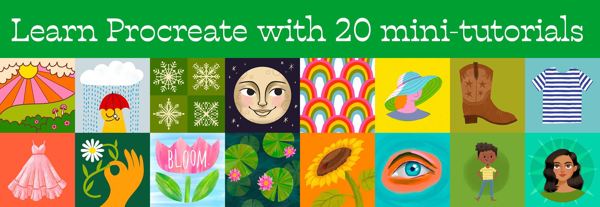
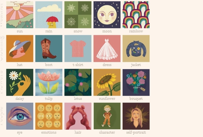
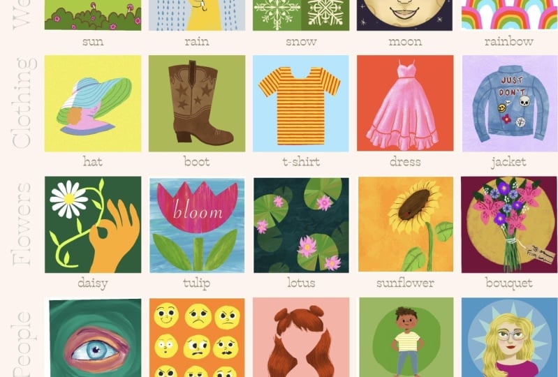
a creative habit that you can fit into your life. In this four week course, you'll complete 20
approachable mini tutorials, covering inspiring
themes like weather, clothing, flowers, even
people and characters. Each of the lessons is
just 15 to 25 minutes. Perfect for fitting
into your busy schedule while building your
skills step by step. Work through them at
your own pace and learn faster ways to color and
smarter ways to sketch. Techniques for learning
visual composition, hand lettering, and developing your
artistic style by adding personal touches. Learn how to make
the most out of Procreate's creative
tools like blend modes, adjustments, color palettes,
symmetry, even animation. And you'll also learn
how to customize and create your own
procreate brushes, opening up a whole world
of creative possibilities. As a student, you'll
get exclusive resources to help you along the way. First is the kickstart
course Progress tracker to keep you motivated and visually
celebrate your growth. The Progress tracker
is a student favorite, and it's such a thrill
to watch it fill up with artwork as you work your
way through the lessons. You'll also get a curated
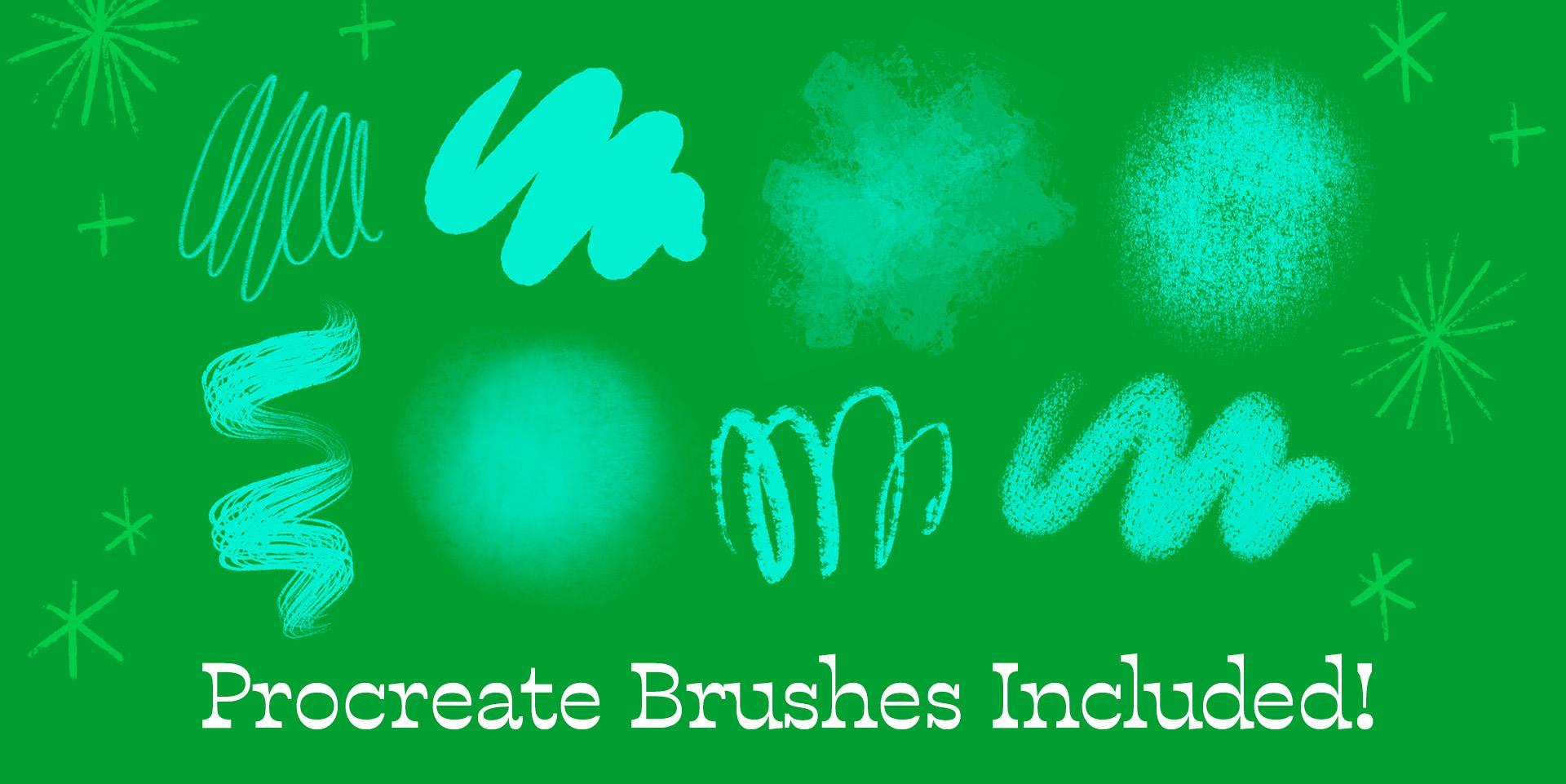
collection of some of my premium Procreate
brushes from Bardo brush to use
in the lessons. Plus, you'll get
texture overlays, inspiration sheets,
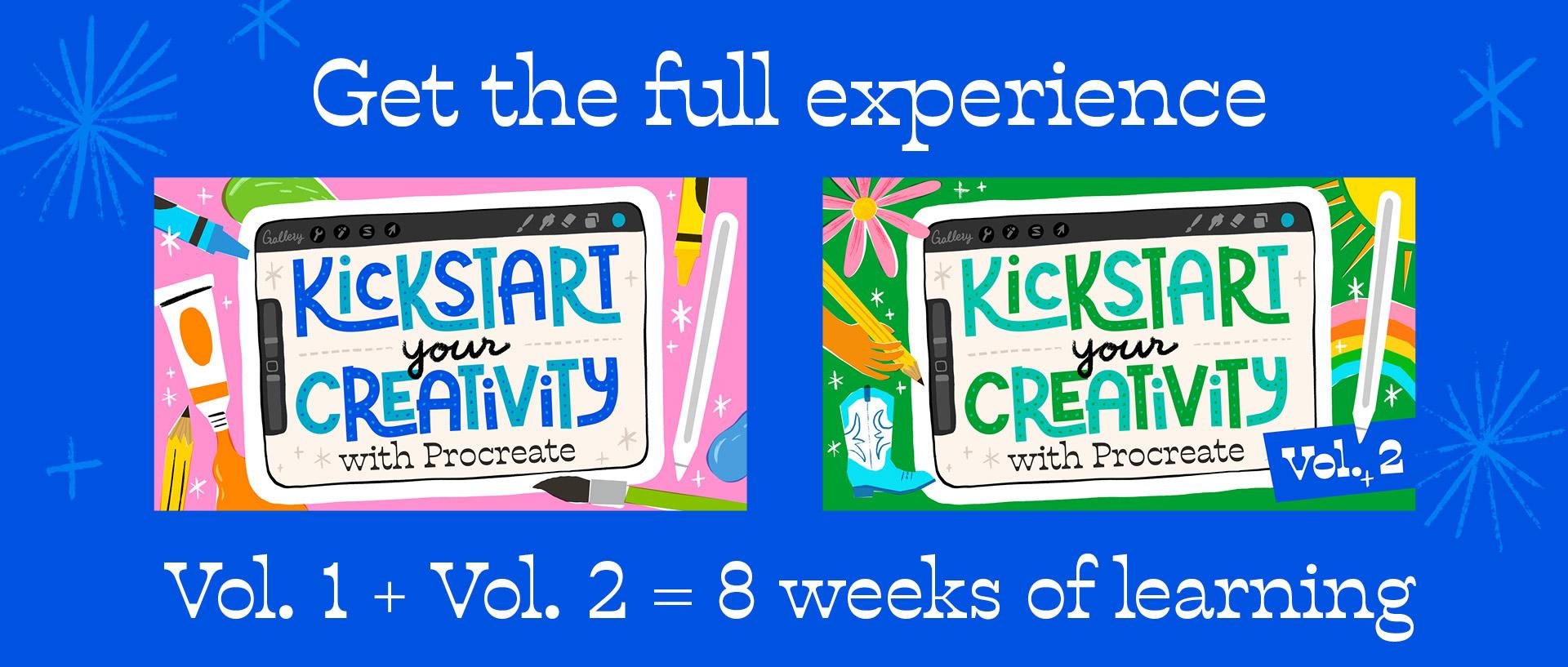
and reference photos to learn new techniques. Kickstart two builds on the foundation of my
most popular course, Kickstart your creativity
with Procreate, which has helped tens of
thousands of students build creative confidence
and transform their approach to digital art. Volume two continues this
journey with fresh themes and advanced techniques to expand your skills and keep your
creative practice thriving. If you're new to kickstart
your creativity, I recommend starting
with volume one first. It's the perfect introduction, and it will set you up to dive into Volume two with confidence. Together, these two courses provide eight full
weeks of guided lessons to help you establish your creative practice and
master procreate. By the way, hi. I'm Lisa Bardot, an
artist, teacher, and procreate expert
passionate about helping people find joy
in drawing on the iPad. I had the chance to connect with millions of artists through my YouTube channel courses and the premium Procreate
brushes I design. I'm also the author
of drawing digital a bestselling How to guide
about drawing on the iPad. I lead art retreats abroad to help artists push their
creative boundaries, and I run an ongoing
drawing challenge, providing daily prompts and
guidance to help artists conquer their creative fears and nurture their art practice. This course brings
together years of experience helping
artists grow, combining practical
procreate skills with simple strategies that help you build a creative
routine that sticks. Along with the drawing
lessons, I'll also be providing tips to strengthen your creative practice like tapping into your creative flow, staying consistent, and making reflection a key
part of the process. We'll take time to pause, look back on what we've created, and celebrate progress
along the way. So, if you're ready to
expand your skills, explore new techniques,
and create art you're proud of, kickstart
your creativity. Volume two is the
perfect next step. Grab your iPad, open Procreate,
and let's get started. I can't wait to see
what you create.
2. Class Project: Your project for
this course will be 20 mini illustrations. These will be broken up into four themed weeks and each
week will have five lessons. I design these lessons to take about 15 to 25 minutes to complete so that you can fit
them into your busy day. Now, you'll complete these
lessons at your own pace, but I do recommend not letting
more than a couple days go in between lessons in order to keep the
momentum strong. Then on the flip side of that, as tempting as it
might be to just jam through and do a whole
bunch of lessons at once, I really recommend doing
one lesson per day. Part of building a strong, sustainable creative
practice is consistency. Showing up to support your
creativity regularly is how you can keep your
creative practice going even after the
course is ended. And as you go
through the course, experiment with when you
do your drawing sessions. Try and find the time
that works best for you. One more thing. At
the end of each week, I've designed a special
lesson that gives you the opportunity to add some personal touches
to your illustrations. You'll explore
things like finding color palettes that make your heart sing while
drawing rainbows, adding meaningful symbols and designs as you decorate
a denim jacket, or creating a custom
digital bouquet of flowers for someone special. To wrap up the course,
we'll finish with something truly personal,
a self portrait. Another important part of
supporting yourself in your creative journey is by sharing your work with
a supportive community. So at the end of the week,
I'll invite you to create a class project right here on Skill Share so you can
start sharing your work. You'll be able to share your
filled out progress tracker, some of your favorite artwork, things that you learned
and other reflections. I am so excited to
see what you create. In the next video we'll
cover tools and resources, including all the
fun digital goodies that I have for you as a
student of this class. I'll see you in the next video.
3. Tools & Class Resources: In order to do this course, you are going to need an
iPad and an Apple pencil, and you'll need to make
sure that you have the Procreate app
installed on your iPad. As a student of this class, I have a resource
pack filled with digital goodies for you to use as you follow
along in the lessons. In this video, I'll show
you how to get the files, how to organize them, and how to import
them into Procreate. Here on Skillshare, you can
find the links to download your class files on the Projects and Resources tab of the SkillShare class page. Go ahead and download
all the individual files and then I'll show you
how to organize them. When you download
resources for this class, you'll find them
in the files app in the Downloads folder. I recommend keeping them all organized into a single folder, so you can go up to
this little folder with a plus sign icon, tap that and name it Kickstart
two Class Resources. Tap select in the upper right, and then we're
going to select the Bardo Brush sample pack, the texture overlays,
the progress tracker, the flower shapes,
and the eye photo. And then you can just drag them into the
resource folder that you just created. Tap done. Now, let's go ahead
and open that folder and we can take a look
in closer detail. Inside, you'll find the
Barto Bush sample pack. These are the
brushes we're going to be using for a
lot of the lessons, and I will talk a little
bit about that in a moment. We have a folder of texture
overlays that we're going to be using for one
of the lessons in week six. We have the progress
tracker that you're going to fill
up with your artwork, a flower shapes
inspiration sheet that we're going to be
using for week seven, and an eye photo that we're going to be
using for Week eight. Let's talk a little
bit about the brushes. Go ahead and open the
Barto Bush sample pack. And the first thing
you'll see is the user guide for
the sample pack. Et's go ahead and open that up. I definitely recommend
taking a look through this. It contains information
about all the brushes. The sample pack
contains eight of my favorite brushes from
some of my Bardo brush sets. We have sketching pencil, which comes from my pencil box. We're going to be using this to do a lot of our sketching. We have the inker brush
from my basic toolkit. This is my favorite all around brush for drawing basic shapes. We have the crumple
texture brush, which comes from my
watercolor wonder set, and I design that set to do
realistic digital watercolor. It has this really nice texture. We'll be using that in a
couple of our lessons. We have press fine, which comes from my
texture maker set, and this is really nice
to add a little bit of papery kind of print texture,
which we will be using. We have toothy pastels from
one of my favorite sets, the Artist pastel, lots of
yummy texture in that brush. Gritty Tilt liner comes
from my gouache pate box, and this is a fun liner brush
with a lot of personality. The soft shading brush
is one that I made to accompany certain projects
in my book, drawing digital. This is a really great resource
if you want to continue learning and especially working
on your drawing skills, we cover a lot in this book, and it's a really
great resource. And then we have
the combed brush. From my fur and left set. I developed these brushes for
my How to draw fur class, which you can take
here on skill share. And then down below that, you can learn a
little bit about me. So be sure to tap this brush set to import
it into Procreate. Let me just open up an artwork, and you'll find it in
your brush library, tap little brush icon, and it should be at the
top of the list there. You can see all
the brushes here. And the other thing
you'll want to do is to tap the Progress
Tracker file, and that will import
it into Procreate. I'll teach you all about
how to use this in the progress Tracker
lesson of this course. In the next few videos, we're going to cover a few
more things to get you set up for
taking the lessons and kickstart your creativity. So head on over to the next
video and let's get started.
4. Previously in Kickstart...: This course is the follow up to kickstart your creativity, Volume one, which you can take
right here on skill share. Volume one is
designed to give you the essential skills
and foundation you'll need to get the
most out of Volume two. In Volume one, you'll learn
about Procreate's key tools, build confidence
in your drawing, and establish your
creative practice with fun approachable lessons. Volume two builds on everything
that you've learned, adding more advanced techniques and exciting new challenges. To get the best experience
out of this course, I recommend starting
with Volume one. It's the perfect way to set
yourself up for success and make Volume two a
seamless next step. You'll notice that this
course starts with Week five, drawing 21, and that's because it picks up right where
Kickstart I left off. The next three videos are pulled straight from Kickstart one. So if you've taken
that course recently, you can skip them or you can watch them if you
need a refresher. These videos cover setting up the Canvas template that you'll
use for all the lessons, a Procreate interface tour, and how to export your artwork. If you feel like you
don't need a refresher, go ahead and skip
to the lesson on Pro Tips for Appropriate.
I'll see you there.
5. From Vol.1: Create a Canvas Template: In this video, I'm going
to show you how to create a custom Canvas
template in Procreate. For this class, all of the
drawings are going to be done on a 3,000 by
3,000 square canvas. So we're going to create
a template so that way we can just tap it and open
it up and we're ready to go. When you open up Procreate, you're going to be in what's
called the gallery view. This is where all of your Procreate artwork
is going to be stored. You can organize your
files, you can rename them. You can share them. There's a lot of things
that you can do here. But for this video,
we're focusing on how to create a new
Canvas in Procreate. And more specifically,
we'll be creating a Canvas template that you will be using for all the
drawings in this class. So to create a new Canvas, we're going to go
up to the little plus sign in the
upper right corner, tap that. And there's
some options here. These are all different
Canvas template, so different sizes that you can work with when you're
drawing in Procreate. And we're going to create our
own custom Canvas template specifically for this class. So we're going to
tap this little rectangle here with a plus sign. And that's where we can
create a new Canvas template. You want to make sure that you are here where it says pixels. You want to make sure that
the Canvas dimensions are set to pixels. And then the canvas size we're going to be using for this class is 3,000 by 3,000 pixels. So you just need to type in
3,000 under width and height. And once you've done that, we're going to give this
template a name, so we'll tap right here where
it says Untitled Canvas, and we'll call this
one kickstart course. And once you've
done that, you can go ahead and tap Create. That's going to pop you into
the Procreate interface, which we will be learning
about in the next lesson. But for now, we're going to tap right here where
it says gallery, and that's going to bring us
back to the gallery view. Every time you're ready to
start a lesson in this class, you're going to go up
to the plus sign here, and then in your
list of templates, you're going to find the one
called Kickstart Course, and you're just
going to tap that and you'll have a Canvas that's the right size and ready to go. Up next, we're going
to get to know the Procreate interface
a little bit. If you have never used
Procreate before, this is a good time to
get familiar with some of the tools and options that
there are in Procreate.
6. From Vol.1: Procreate Interface Tour: If you're brand new to Procreate or if you
just need a refresher, you won't want to
skip this video. I'm going to give you a tour
of the Procreate interface, so you can get familiar with it and you'll be ready
to follow along with the drawings without being confused about where the
different things are. I'll show you the gallery view. I'll show you where
the different tools are, how to choose brushes, how to adjust brush size and
opacity and what some of the different menus it's just a really quick crash
course in Procreate, but I think it's really
going to help you as you work on your drawings
in the further videos. And in those videos, of course, I will be walking
you through step by step of everything
that we're doing, and I won't just gloss over anything so that you can
follow along no matter what. Is the Procreate interface. Over here on the
right hand side, we have all of our
painting tools. And I always like to start by introducing this little
circle in the upper right. And this is how you select
colors in Procreate. So you tap this little circle, and as long as you have disc
selected here at the bottom, which is what I recommend using to choose
colors in Procreate, you'll see a colorful ring with kind of a disc or
circle in the middle. And this is how you choose
your colors in Procreate. You choose a hue, so, you know, like
red, yellow, green, and then you choose, you know, however light, dark or saturated you want
that color to be. But let's just move the
circle down here to black just to get
started so we don't have to worry about
colors from the get go. You can tap that circle again
to close the color picker. Next up, we're going to go through these tools right here. So starting with
this paint brush, this is, of course, the brushes. So you can tap on this brush icon and you can scroll through your
library of brushes. Procreate comes with a lot
of brushes built into it, and each one is
organized into a set. So you can kind of tap through these different brushes and just put some brush strokes
on your canvas. And just kind of see what they look like, see what they do, get a feel for
what it feels like to actually put something
down onto your canvas. Oftentimes, when you're drawing, sometimes that's
the hardest part is just getting started and putting something down on the canvas. So I often find that just
playing with the brushes and seeing what they do is a good way to just kind
of get the ball rolling. So just spend a
little bit of time just going through
these brushes, seeing what they look like. Get familiar with some of the different textures
and things like that. We are, of course, going
to be using all of these, or at least some of these
brushes to do our pieces. I've got some brush
strokes on my canvas here. Now let's introduce
you to the next tool, which is smudge, which is
this little finger icon. And if you tap on
this tool again, you can choose from any brush in your library to smudge with, and it just kind of drags the
colors around your canvas. So that's what the smudge does. The next tool over
here is the eraser. And just like with the
brush and the smudge, you can choose any brush
to be your eraser. And there's a lot of good things about being
able to do that. You can match your kind of erase strokes to
your brush strokes, so it looks seamless. I also love to use the eraser to actually
draw some of my shapes, which we're going to get
to do in this course. But that's a really highly
useful tool right there. Between the brush
and the eraser, those are the ones
that I use the most. And then the next thing
we've got is our layers, and we will get to know
layers a lot in this course. Layers are one of the
most powerful aspects of doing digital art. They allow you to
separate out parts of your artwork from each other and you can manipulate
them independently. Don't worry too
much about it right now, but layers are awesome. We're going to get to know
them a lot in this course. So make sure you tap
back over to your brush. And the next thing I want to
show you are these sliders. This is called the sidebar,
and we've got these sliders. The top one is going
to be your brush size. You can make your
brush big or little. Let me choose a
different brush here so we can see it a
little bit better. So you can make your brush size big or you can make it small. And then the brush or the other slider
here is our opacity. So I can turn the opacity down, and that just makes my
strokes a little see through or a lot see through depending on how
high you have that slider. Next, I'm going to
show you a couple of Procreate gestures. Now, Procreate was built to be a platform that
runs on touch. So gestures are a
really important part of working in Procreate. And you'll get to know a lot of these gestures as we
go through the course, but there's a few that I want you to know
right off the bat. So the first ones are undo and redo. These
are super useful. This is kind of the
benefit of working in Procreate or digitally, for that matter, is that you can actually undo whatever you want. If you mess up, just undo it. Try again. And
it's very freeing. You're not just like, Oh, no, I messed up on my
paper, now it's ruined. You can just undo.
Two fingers and tap. Every time you tap,
it's just going to undo one step of what
you had done previously. Or you can tap and hold and
that will undo multiple. And then to redo, you take
three fingers and you tap and you can redo
what you had just done. And the last thing I want
to show you in this lesson are some of the menus
over on this side. So first of all, we've
got our Actions menu, and there's a lot of
different options here. Like again, we're
going to get to know. But you can add things to
your Canvas under the canvas. There's a lot of
different options there. You don't get overwhelmed. Don't worry about that for now. There's the sharing
options when you're ready to export your artwork
and share with the world, which I'll show you
in the next lesson. And then another fun
one is the video, and you can actually watch a time lapse replay of your art. So if we tap that, I can see kind of like a replay of everything
that I just did. And there's some preferences
and things like that, but don't worry
about that for now. The next menu here is
the adjustments menu, and these are for making
alterations to your artwork. We're going to get to
know some of these. There's a lot of
really fun adjustments and filters in Procreate that you're going
to get to know. And then over here we
have our selection tool, and this is for
making selections. And then we have
our Transform tool, which is for moving and manipulating things
around the canvas. We're going to get
to know those too. So we're not going to explore
those too much right now. I hope you enjoyed this little
crash course in Procreate. There are a lot of really
amazing features that you can use in Procreate and things
that you can do with it. And we're gonna get to
know a lot of them, and you're going to
have so much fun. I'm really, really excited for all the cool stuff
that you're gonna learn when it comes
to Procreate.
7. From Vol.1: How to Export your Artwork: In this video, I'm going
to teach you how to export your artwork from Procreate so that you can
share it on the web. You can add it to
your class project. You can put it into
your progress tracker or you could print it out
and put it in your home. So once you finish your drawing and you're
ready to share it, you're going to go up
to the Actions menu, which is a little
wrench right here, and then you're going to go
right here with a share. And here in the top
half of this menu, there's a few different options, and the best option for us to share artwork if
we're just going to be sharing it on the web
or something like that or printing it out is the PNG. Choose PNG and then you'll get some options for
what you can do with it. You can save it to
your camera roll. You can airdrop
it to your phone. There's a lot of things
that you can do, but that's where
you're going to find the option to actually
share your artwork.
8. Pro Tips for Setting Up Procreate - Settings to Know: Did you know that there's a few simple settings you can tweak to make using
Procreate smoother, easier, and way more enjoyable? In this video, I'm
going to share my favorite ways to customize the procreate preferences so that you can get
the most out of it. We'll look at a few key settings that will make your
workflow faster, improve how your brushes feel and help your tools work
the way you want them to. Procreate gives you so
many ways to customize it, and these little tweaks can
really make a big difference. Let's dive in and set up
Procreate like a Pro. Let's explore some of the
Procreate preferences, tap into the Actions menu,
and then go to Press. And here's where you can set up your preferences for Procreate. There are a lot of ways
that you can customize and tailor your Procreate
to work best for you. I'm going to be showing you
just a few settings that you can do that will really enhance your experience using Procreate. So let's start up
at the top here. The first toggle is
light interface. If you tap that, your Procreate interface
will become light. So this one is totally
your preference, whether you do the light
or the dark version. I'm not a big fan of the
light version because a lot of my artwork is
so light and bright. I kind of fades
into the interface. So I like the dark version
because it makes it stand out. Now I'm right handed, but if you're left handed, you might find that your
hand gets in the way of using the brush size and
opacity sliders over here. You can tap to turn on the
right hand interface and that will put these sliders over on the right hand side to
be out of your way. The next setting is
dynamic brush scaling, and it should be on by default, but if it's not, I highly
recommend turning it on. To show you what this does,
I'm going to turn it off, and I'm using the
monoline brush, which is a consistent
line width, doesn't react to pressure. And I'm going to draw a line, and then I'm going to zoom
in and draw another line. And I'm going to
keep zooming in. And now I'll zoom out.
So as you can see, every time you zoom in, the brush stroke gets
a little bit smaller. So it can be really hard
to estimate, you know, exactly what your brush size is going to be when you
have that setting on. Plus, it can mess with some of the settings in custom
procreate brushes, like the ones that I make
that are in your sample pack. So I recommend going up to your preferences and keeping
dynamic brush scaling on. The next setting is
the brush cursor, and I always have
this turned on. And then you can
customize that even further with the
advanced cursor setting. So go here, and I have it
set to show while hovering, and then the brush outline
style high contrast. So let me show you what this is. Now, I have an Apple Pencil Pro, and I have an iPad
that supports hover. So when I hover over the screen, I see a preview of the
shape of my brush. Like that. I find this helpful for estimating
my brush strokes, and it's also really handy
if you use stamp brushes. If you have an iPad that
doesn't support Hover, I still recommend
having it turned on, and you'll see a
preview of the edge of your brush stroke
when you draw like this. Next, we have pressure
and smoothing. I'm going to talk about this a little bit more in
a future lesson, but just know that you
can adjust your apps sensitivity to your pressure by moving this curve up or down. And you can also turn on stabilization for the
entire app, which is cool. So if your hand control
is a little shaky, you can turn that
stabilization on. And we'll come right
back to gesture controls because there's a few things
I like to do in there, but I want to show you the
selection mask visibility. So I'm just going to turn
on a selection here. So I have this sun selected, and if I turn up the
selection mask visibility, it'll increase the visibility of these diagonal lines that show
where it is not selected. Wherever the lines
are is not selected. So you can kind of adjust that
based on your preference. Finally, let's go into
gesture controls. I recommend looking through all of these settings
so that you can customize your
procreate experience for your own preferences. But I'm going to
show you a few key preferences that are
really going to help you. First let's go to Layer Select. Layer select allows us to select a layer without having to
go to the layers panel. So it's really handy. I have an Apple Pencil Pro
with a squeeze feature, so I have that set to Apple Pencil squeeze and
what that looks like. So if I were to hover over
my artwork and squeeze, you can see that different
layers are selected. So I can very quickly, if I wanted to get to this
orange stripe layer, I could just hover
and squeeze on that, and that will take me
directly to that layer. If you don't have an
Apple Pencil Pro, I would set it to this one, which is this little square
is called the Modify button. I'll show you where
to find it and touch. Modify button and touch,
and I'll turn that on. So when you have that turned on, you're going to hold
this little guy here. That's called the Modify button. You can program it
for different things. So if I hold that down with a finger and then tap
somewhere else with a finger, I can select a layer. So I can tap this layer. And if there's
multiple layers that are on top of each other, you can choose
which one you want. So I'll choose the cloud layer. And then you'll see that I'm popped over to the cloud layer. So it's a really easy way
to switch between layers. Now, tap over to
the general tab. And then here where it says
enable painting with finger. I like to turn that off. That will mean that I can only paint using the Apple pencil. And this prevents making unwanted brush strokes from your hand or fingers
brushing against the canvas. Like I mentioned, you can
spend some time going through these settings and
customizing them for you. But let's go ahead
and tap done for now, and then we'll exit out
of the Actions menu. Now, if you don't like where the sliders are on your screen, you can actually customize that. Just take the modify button, that little square and
drag it out like that, and then you can
move it up or down. So if you want to have
them higher or lower, you can customize where that is. The next setting I'll show
you applies if you have the second generation
Apple pencil or the Apple Pencil Pro. If you have the
Apple pencil with the silver band here, this
doesn't apply to you. Now, there's a
setting built into the Apple Pencil Pro that
if you double tap on it, it will switch between the
brush and Eraser tool, and I often find myself inadvertently going to the Eraser tool when
I don't want to. So I'll show you where
you can turn that off if you find that
happening to you. We're actually going to
go into the Settings app. So I'm going to open
up the Settings app. And then find the setting for Apple Pencil, this one here. And we have an option
for double tap. We tap into that. We can choose
what we want that to do. By default, it's switched between current tool and eraser, but I like to just
turn that off. So it's up to you whether
you want to do that or not. Another setting I like to turn off is the scribble feature. I'll turn it off to
show you what that is. So basically what happens is
if you tap into a textbox, it doesn't pull up the keyboard, you're supposed to
write something in, and I prefer to
use the keyboard, so I turn that off as well. One more cool thing to show
you about the Apple Pencil. Down here, we have some pencil gestures that you can program. If you swipe up from
the bottom left corner, it takes a screenshot, so it'll take a screenshot, which is pretty cool
if you ever want to take a picture of
your screen to share. But let's head
back to Procreate. So that's all the customization we're going to do from now. I hope these tips enhance
your procreate experience. In the next video, I'm going
to teach you how to use the progress tracker
that comes with this class. I'll see you then.
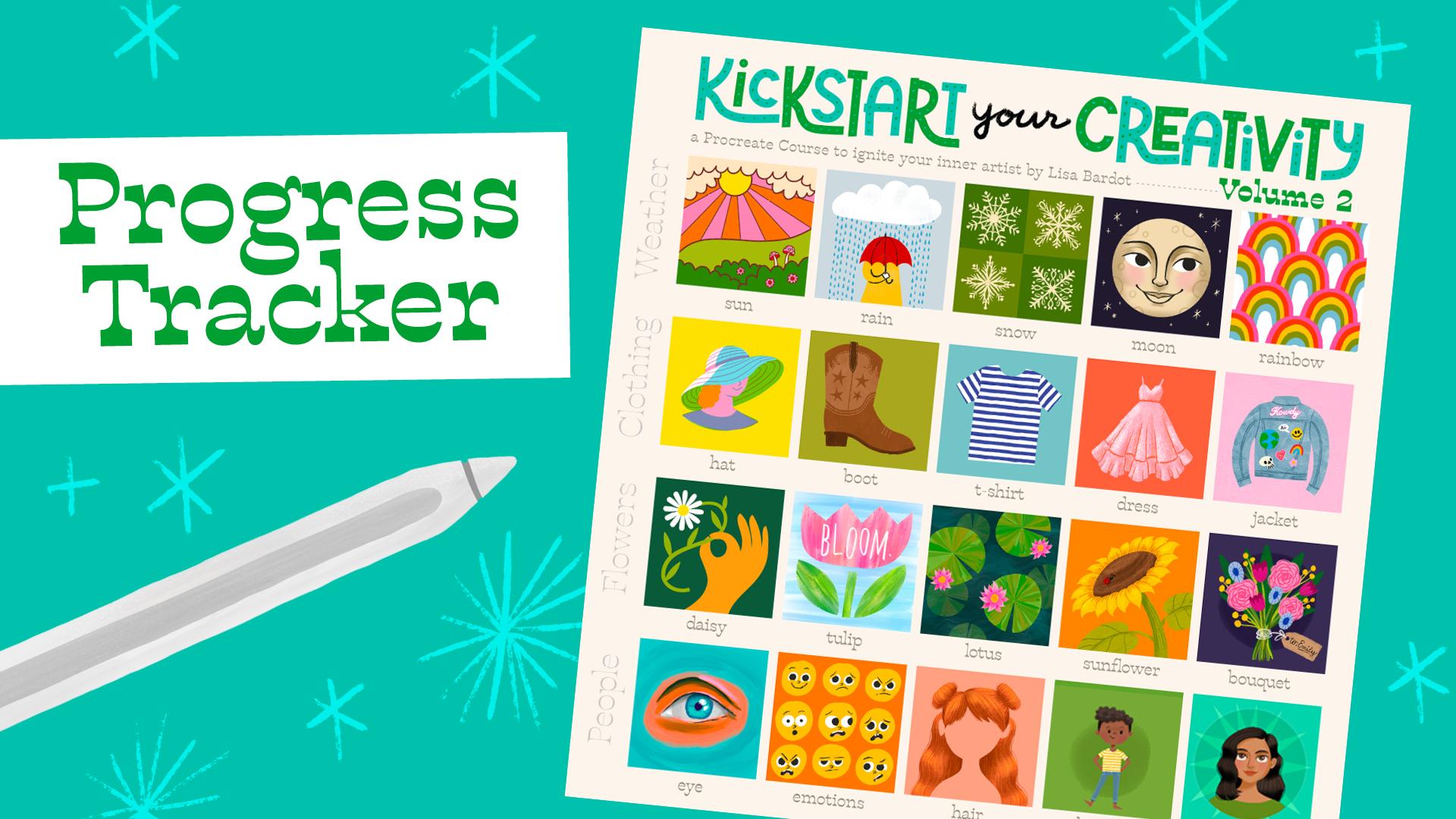
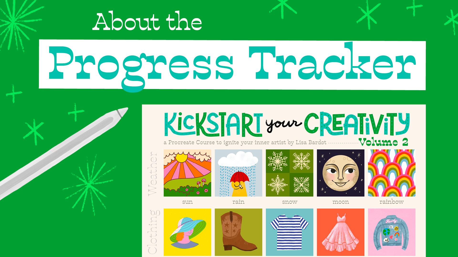
9. Progress Tracker: One of the most motivating
things about sticking with a creative practice is being
able to track your progress. Seeing everything you've
made and how far you've come is a powerful reminder of
your growth as an artist. One of the most
popular features of the first kickstart
your creativity course was the Progress Tracker. I got so much overwhelmingly
positive feedback about it. I knew I had to include
it in volume two. There's something
so thrilling about watching it fill up with
your art as you go. In this video, I'll show you
how the Progress Tracker works and how you can use it to keep inspired
throughout the course. You can download the
Progress tracker from the Project and resources tab of the Skill Share Class page. This is the kickstart
two Progress Tracker. Here in the layers, we have
the progress tracker graphic, which is just a frame
with text on it. That's a locked layer, and all of your
artwork is going to go here where it says,
place artwork here. You just want to make sure
everything that you paste in is below the progress
tracker layer. So let me show you how you
would paste in your artwork. There's a couple
ways to do this, and I'm going to go over
them both during the course, but I'll show you
one of the ways now. Go up to the Actions
menu and then go to AD and choose Copy Canvas. Go back to the gallery view, open up your progress tracker, then go to the Actions menu, add and choose paste. And then you're
going to grab one of these corner nodes
and shrink it down. You might want to zoom in so you can see
what you're doing. And you want to resize it
until it's about as big as this frame and a little bit sticks out over the
opening. And that's it. So every time you
finish a lesson, go ahead and paste it into
your progress tracker. It's so motivating to watch
it fill up with artwork and such a thrill when it's all complete at the
end of the course. So be sure to utilize
your progress tracker. I can't wait to see
it all filled up. Now that we've covered that,
it's time to start with our Week five lessons.
Let's get to it.
10. Welcome to Week 5: Weather: Welcome to Week
five, where we'll be kicking things off for
Kickstart Volume two. We've got a full week of creative exploration
centered around weather. Weather is such a
universal subject. It's something we all experience and connect with
in different ways. Because of this, it's easy
to symbolize and depict creatively giving
you so much room to express your unique ideas. It's instantly recognizable, but there's endless space
to make it your own. We'll be drawing some
weather essentials, starting with the
bright warmth of the sun followed by a rainy day, then the symmetrical
beauty of snowflakes, a whimsical face on the moon, and the colorful
magic of a rainbow, which will be your
opportunity to explore some of your
own personal touches. This week we'll dive deeper into Procreate's essential
features while continuing to build your skills. And I'm so excited because
we're going to jump right into learning how to modify and create your own
procreate brushes. As someone who's been
making procreate brushes for over eight years, I'm really excited to share
some of my knowledge with you and help you see how it can really change the
way that you make you'll also learn
how to speed up your workflow with
quick coloring methods, the symmetry tool,
exploring blend modes, and even making
repeating patterns. We even get to explore drawing
faces and facial shading. There's a lot to
explore this week, and the lessons are packed with practical information to
expand your creative tool kit. There's lots of
room to experiment and make these
projects your own, especially in the final lesson of this week when we
draw rainbows together. You're going to get
to explore colors and create color palettes
that make your heart sing. Before we continue,
I wanted to share this week's tip for building
a strong creative practice, and this one is all about trying to get to that
creative flow state. As we dive into this
week's lessons, I want you to think about
creating an environment and routine that makes drawing
feel enjoyable and effortless. Experiment with
your surroundings to find out what
works best for you. This is about picking
the spot where you want to create and setting the scene. So this could be a cozy
spot on your couch, curled up with a nice blanket and your favorite playlist of music playing
in the background. You can even add in tiny rituals like brewing a cup of tea, lighting a candle, or tiding up your workspace to signal to your brain that it's
time to create. When you find your
flow, sticking with your creative habit becomes so much easier and way more fun. Without further ado, let's jump into Week five
and get started.
11. No.21 - Sun: Uh welcome to the first lesson
of Kickstart Volume two, which just so happens to be our 21st drawing of the series. For this illustration, we're
going to be drawing a 70s inspired scene with
a shining sun, and we're going
to be diving into some incredibly useful
skills right off the bat. You're going to
learn how to modify a Procreate brush to
give it more character. You're going to learn a
couple really awesome tricks for colorizing your artwork. You're going to learn how
to save custom brush sizes, work with layers, use quickline and quick
shape, and so much more. I'm so excited for you to
dig into this first lesson. So without further ado, let's go ahead and get started. We'll begin this first drawing
by creating a new canvas. Tap the plus sign
in the upper right, and we're going to choose our kickstart course
Canvas template. We're going to start by setting a color and then
choosing a brush. So we'll start off by going to the color picker in the
upper right corner. And the color I want
you to choose is somewhere here in the
kind of a reddish hue, and then we're going
to find kind of like a reddish, brownish color. And this is what
we're going to use to do the linework of our piece. Now I want you to go
into the brush library, tap a little brush icon here. And in the built in brush sets, I want you to find the
calligraphy set and then look for the monoline brush and go ahead and tap it
so that it's selected. Now, Monoline brush is a brush that is a
consistent width, no matter how heavy you press. So it's going to be
great for the type of illustration we're going
to do in this lesson. However, it is quite a
smooth brush if you zoom in, and I'd like to give it a
little bit more character and have it be kind of
having a bumpy edge. So I'm going to teach
you how to customize this brush to give it a
little bit more character. My God, undo that with a two finger tap and head
back into my brush library. And since we're
going to be making some changes to this brush, we're going to go ahead
and duplicate it. You're going to swipe
to the right on it and choose duplicate. Now we have Md line one. Go ahead and tap that
brush one more time, and that's going to take
us into the brush studio. Now, there's a lot
going on here, and I don't want you to
get overwhelmed by it. I'm just going to
have you change just a few settings to give this brush a little
bit more character. So we're going to head
over into the Shape tab. And as you can see,
this brush's shape is just a pretty basic circle. Scroll down to the bottom of this panel until you find
this little circle here. You're going to
grab this top node, the little blue one, and just
pull it down a little bit. This is going to make that
circle a little bit squished. And then scroll back up and I want you to find the scatter slider under shape properties and turn that all the way up. That's going to take
this squish circle and just randomize the angle that it is in this stroke that we have.
That's all you have to do. We're going to just
give this brush a new name and then
we're going to use it. Go ahead and tap
about this brush and tap up here where
it says Monoline one. Go ahead and delete
that one and we can just call this monoline Roth. Go ahead and type
that in. Tap done, and then tap done up here. Let's try out our new brush. As you can see, it's got
a nice rough edge to it, and I think that'll
give this piece a little bit more character. All right, go ahead and
undo until you have a blank canvas and
let's start drawing. Now, let's start
illustrating this piece. For my brush size, I'm
going to set it in the slider here to about 60%. And then we're going to
draw a little hillside, and that's going to be a
curving line kind of like that. Down here, we're going to
draw some bushy shapes. So I'm going to draw
just some little kind of scallopy shapes like
this for a bush there. And then I'm going to
do another one here. I'm going to start it
right on this line here, and this will be one
of my bushy shapes. And then I'm going to draw
one more in between the two. We're going to add some little
flowers to these bushes, but I want to make the brush
size a little bit smaller. So we're going to actually
save this brush size so we can come back and do our sun and our clouds
and everything like that. So if you want to
save a brush size, you can tap this bar here
and then tap the plus sign, and that will save the current brush size that you're using. So I can go ahead
and make it a little bit smaller at 35%. I have a little
bit smaller line. And I can save that as well. So just tap the little
bar, tap the plus sign. And now I can go back
and forth between these two sizes just by tapping this little
line here on my slider. So let me undo that.
And then I'll zoom down here and using that
smaller size I have saved, just add a few little
flowers to our bushes. So I'm just drawing a little
circle and then kind of, like, little petals
all the way around. Maybe I'll go over to this bush and add some flowers
there. Very cute. I might even add some
little mushrooms to this to get into
the 60 70s vibe. So I'm going to draw
two lines like this, and then a little circle that
goes all the way around. And then a mushroom cap. You can even draw some little
spots on it if you want. We'll do one more
mushroom over here. So two little lines. A circle going all the way around
and then the mushroom cap. Make this one a
little bit bigger. Then add some little spots
to it. Very very cute. Okay, let's switch back to our bigger brush size and
draw some clouds up here. So we're just going to
draw some bushy shapes. Well, I guess, these
are cloud shapes, all the way across like that. Then we'll draw another one
kind of diagonally like that. Then maybe one more. Like that. Now we're going to draw the
main character of this piece which is
going to be our sun. To do that, we're going
to create a new layer. We're going to go up
to our layers panel, which is these two squares, tap the plus sign to
create a new layer. We're going to use
really cool feature called quick shape
to draw the sun. Draw a circle and then when you get back
to the beginning, don't lift your pencil
off the screen. It's going to snap
to an ovalis shape. As soon as you let go, you're going to tap
up here where it probably says
ellipse, top ellipse. And now we can tap circle, and that will snap
to a perfect circle. We can change the
size and position of the circle, so we can move it. Maybe I want it to be up here by my clouds behind the clouds. I can grab the edge of the line here and make
it bigger or smaller. So I'll go ahead and just position that where
I want it to be. And then once I'm
happy with that, I can just tap anywhere
to get out of that mode. And the reason why
I put the sun on a separate layer is
because now I can use my eraser tool to erase these lines that I don't need since the sun is
behind the clouds. So what I want you to do is find the eraser tool and
tap and hold it down, and that will select the
same brush that we were using as our brush as our
eraser, monoline rough. You can always tap
into the eraser tool and just find whatever
brush you want to use. But let's go ahead and
use the monoline rough, and we can now erase
this part of the sun, and it's not going to
affect the clouds at all because it's on
a separate layer. There's our little sun. And now we're going to draw some
rays coming out of the sun. We're going to put those
on a separate layer so we can do something similar. So tap up into your layers, tap the plus sine to
create a new layer, and then we're going to go
back to our brush tool. And we'll select that smaller
size from our brush sizes. And we're going to
use quick line to draw some lines coming out
of our sun to make a rays. So kind of starting
here in the middle of the sun, draw a line. And when you get past the hill, just hold your pencil down, and that's going to snap into a straight line that
you can reposition. So you can go ahead and decide what angle this line is going
to be at and then let go. And then we're going to start
again from that kind of center point, draw a line, hold it down, and then position it where
you want and let go. I'm going to do
that again, drawing a line from the center, hold it down, position
it and let go. And you're going to
keep doing this to create all the rays of the sun. So I'm just going
to keep drawing lines out from
that center point. Until I've filled in
all the area with rays. So this side looks pretty good. Now I'm going
to go this way. Draw a line, hold
it down, let it go. Draw a line, hold it down. Let it go and maybe
one more. Draw a line. Hold it down and let it go. And you guessed it. Since we put these
on their own layer, we can use the eraser tool and erase the lines
we don't need. So let's tap the eraser tool, and I'm just going to erase all these lines that
are inside of the sun. Going to erase those away. Then over here in the clouds, we don't need those lines that overlap the clouds,
so we'll erase those. Then down here, the ones that go into the hillside,
we can erase those. Just go ahead and erase all
the lines you don't need. And it should look
something like this. Now we're ready to add
some color to this piece, and I'm going to show you
a really cool feature so that lets you
quickly color this in. Let's go up to our
layers for this to work, we need all of our layers to be merged together into one layer. There's a couple ways
that you can do that. You can tap the topmost
layer and choose merge down, tap the topmost layer
and choose merge down. Or you can use a
really cool gesture. I'm going to undo that
so I can show it to you. You can actually take two
fingers and pinch the layers together and that will
merge them into one layer. Okay. So once they're
all merged together, we're going to tap this layer. And from the menu, we're
going to choose reference. Reference is a
really cool feature that lets you color drop into areas on your artwork
but on a separate layer. So let's tap the plus sign
to create a new layer, and I'm going to move this layer underneath my reference layer, tap, hold and drag it down. Now let's get some colors. I'm going to go to
the color picker, and I'm going to pick kind
of a yellowish green color for the hillside here. So I'm going to go ahead
and pick a yellowish green. And then I'm going
to drag and drop the color picker circle into this hillside area
on my artwork. And you'll see that it
just fills in that area, even though it is
on a separate layer from our linework,
which is pretty cool. So let's go ahead and
do the bushes now. We're going to go
into our colors, and I'm going to pick a color
that's a little bit darker and also a little bit less warm. So I'm going to go kind of
this way on the color ring. It looks pretty good. Now, we could keep dragging and dropping
into all these sections, but that is really
time consuming. So there's a really cool feature that speeds up the process. So when I drag and
drop this circle in, we're going to look up
here, and there's going to be something that says
continue filling. So I'm going to drag
this into this bush, and there it is continue
filling. I'm going to tap that. It says Color drop at the top. And now I can just tap into these different areas and it will fill
them with color. So it's really fast. And I can go ahead and
select a different color and start filling other areas while I'm in this
color drop mode. So I'm going to tap this
color picker circle, and let's choose
we'll do our sun. So I'm going to pick a nice
bright yellow for the sun. And then I can just tap into the sun and I'll color that in. And then for the sunrays, I'm going to do kind of orange
color, nice bright orange. And then I'm going to
tap every other sunray like that. Forget
that one there. Then for the other color,
I'm going to do a pink. I'm going to go down
here into the pinks, go a little bit lighter,
like a pink like that. And then I can tap into every other Sunray including
these ones back here. It's a really small space. You might want to zoom
in, so it's easier for you to tap in like that. Okay. So we did all the sun. While we're using
this pink color, let's zoom down here to our flowers and we can
color those in with that same color and
the mushrooms as well. You repeat colors in a piece, it helps it feel more cohesive. I think that's all the pink. Now I'm going to do the
clouds and for the clouds, you could leave
them white, but I want to do a nice creamy color. I'm going to go into the
yellowy oranges and then choose a nice light
creamy color like that. Then I can tap that
into the clouds. Then I'll also use this
for the mushrooms. I'm going to use it
for the mushroom stems and the little spots. Tap into those spots. Make sure you zoom in for
those really tiny areas. And then finally,
I'm going to do one last color on my
flowers and mushrooms, like a nice bright red. I'm going to go into red, choose a nice bright red
color like that. And I'm going to
use this for the underside of my mushrooms, as well as the flower centers. Just tap into there. Do.
And then you're all done. You can tap this
little check mark to get out of this
color drop mode, and now this piece
is all complete. Let's go ahead and put this piece into our
progress tracker. So to do that, you can go
up to the Actions menu, add and choose Copy Canvas. And then we'll open up
our progress tracker. So I'm going to go back
to the gallery view. I'm going to open up
the progress tracker. I'm going to go up
to the Actions menu, add and choose paste. And there's my piece. I'm going
to zoom out a little bit. And then I'm just going to
grab one of the corners and just resize it until it's the size of this little opening
for the sun piece. Can be a little bit
bigger and that's okay. And there's our first piece for the Progress tracker
all filled in, so excited to keep filling in all these little
spaces with you. In our next lesson, we're
gonna be drawing some rain. And to do that, I am
going to teach you how to create your own procreate
brush from scratch. I'll see you in the next lesson.
12. No.22 - Rain: Welcome to drawing 22. Today we are going to be drawing a scene inspired by a rainy day. In this lesson, you're going
to see how you don't need complex shapes to make an
engaging illustration, and you're going to
learn how to make your first procreate brush
completely from scratch. This is a skill that is going to save you so much time and open up a ton of
creative possibilities. Let's get started. Let's begin by opening up our Canvas template
for this course. Tap the plus sign in
the upper right and choose the Kickstart
course Canvas template. Alright, we're going to be
drawing a little rain cloud. So let's start by setting our background color
of this piece. Tap into the layers panel
and tap background color. For the background,
we're going to do kind of a grayish blue. So I'm going to move my
hue into this blue area, and then I'm going to choose
kind of a subdue blue. I don't want to go super bright. It's kind of a grayish
blue, not too dark. Now let's go into our brushes. For this piece,
we're going to be using the Bardo
Brush sample pack. I'm going to tap into the
sample pack brush set, and we're going to find
the brush titled Inc. This one's from my
basic tool kit. Go ahead and choose Ink and then we're going to choose
white as our color. So we're going to tap
over to our color picker, and we're going to double
tap close to white. So white's over here. If
you double tap close to it, it will snap to a
pure white value. So go ahead and double
tap close to white, and we can draw our cloud. Yeah, my brush size is about, let's do like 45%. And this cloud is going to
be a really simple shape. We're just going to
kind of draw sort of a flat bottom and then some brown shapes at
the top to form the cloud. Make sure it's a closed
shape like this, and then you can fill
it with color drop. Just drag and drop
right into it. Now we're going to draw a
little figure with an umbrella. We'll do the umbrella first,
tap over to your colors, and I'm going to do a
nice bright red umbrella, not super saturated. I'm going to darken
it just a little bit. So I'm going down this way. And you can always test out the color, see if you like it. And I'm going to draw sort
of a half circle shape like that and fill that
in with color drop. And then I'm going to
us the eraser tool to draw the little kind of, like, scallop shapes
on the umbrella. So we're going to tap and
hold our eraser tool, and that'll choose the
incor as our eraser. Right, eraser brush
size is about 25, 30% to Zoom it a little bit. And then we're just
going to erase away these little scallop
shapes like this. So there should be
a total of four, one, two, three, four. And now we're going
to draw a little figure under our umbrella. So let's go up to
our layers now. And we're going to tap the plus sign to create a new layer, and we're going to
move this layer underneath our cloud
umbrella layer. So just tap hold and
dig it underneath. Then for this, I'm
going to do a yellow, a primary color palette going on here with the
red, yellow, and blue. Plus, I always think of
a nice bright rain coat when I think of the rain. Go ahead and choose
bright yellow. You always test out the
color, see if you like it. For the figure,
it's really simple. It's just going to be two lines
that taper out like this. And then we're going to show
one arm, and to do that, we're just going to
draw a little curve line on one side like that. All right, so now
we're going to make it actually look like
someone's arm. We're going to do that
with some detail linework. So we're going to go
up to our layers, and we're going to tap the plus sign to
create a new layer. We're going to go to our colors,
and I'm going to choose, like an almost black, not quite all the way black. And then I'm going to switch
to a different brush now. From the sample pack,
I'm going to choose this one called gritty Tilt liner. This is a really fun liner
brush with lots of texture, has a lot of
personality. All right. Let's do about 20% for our brush size, and
I'm going to zoom in. To make the arm, we're
just going to continue this curve that we drew and it should look
something like that. Then we'll draw the
end of the sleeve. And then the other
side of the arm. Then we're going to draw a little hand to
hold the umbrella. So for the hand, we're
going to draw a line, a little wavy line on top, and then back down,
but not all the way. And then from the sleeve, just draw a little
kind of bump out, and that's going
to be the thumb. Now we can draw the
handle of the umbrella. We're going to draw
an imaginary line down to the hand from the
middle of the umbrella. We'll draw a line down like this into the hand right there, and then it's going to
come out the other side, so I'll start right
there and just draw little hook
for the umbrella. Then at the top of the umbrella, we can imagine that line
going all the way up and then draw the little poky part
at the top of the umbrella. Now let's color our little hand white so it's not the
same color as the jacket. We're going to tap
into our layers, tap the layer with the yellow and then tap the plus
sign to create a new layer. And then choose
white as your color. Again, you can double tap close
to white to select white. And then we're just going
to loosely color in the hand area like that. Doesn't have to be
perfect. In fact, I like it if there's a little white peeking through the edges. Let's add a couple details to the umbrella and then
we can add some rain. Let's go up to our layers. We're going to tap the layer with the umbrella in the cloud. Tap the plus sign to
create a new layer. And then I'm going to draw
some lines on the umbrella, but I want them to stay within
the shape of the umbrella. So I'm going to use
a clipping mask to draw my line
details for this. So to do that,
you're going to tap this new layer and choose
clipping mask from the menu. Now, you see this little
arrow pointing down. Whatever I draw in this
layer will only show up within the shapes of the layer right below
it, so it's perfect. I'm going to go ahead and choose that kind of almost
black color again. And then add these little lines kind of going down the
umbrella like this. And you can see that I can draw past the edge
of the umbrella, but it will only show
up within the shape of the umbrella because
of that clipping mask. Alright. We've got our cute little
figure with his umbrella. We're missing something.
We need to do some rain. So you might be dreading
the thought of drawing 1 million raindrops on this
piece. I definitely would. And this is where it comes in really handy to
be able to make your own procreate brushes to speed up your art
making workflow. So we're going to create
a little raindrop brush to draw all of this rain. So let's head out back
to the gallery view. And we're going to
create a new canvas to draw the raindrop that's
going to become our brush. So let's tap the plus sign. And when you're
making a brush, you always want to use
a square canvas. So we can just use our
kickstart course template for this since it's a square. Let's go to our brushes, and we're going to
choose that ink, the basic toolkit inkor. Then for the color, we want
to choose a pure black. Just like we could
double tap for white, we can double tap for black
to choose a pure black. Now let's draw our raindrop. I'm going to draw
a raindrop that's skinny and tall like this
and then color it in. You color it in by hand or
you can use color drop. And then I'm going to
use my eraser tool to make the tip of my raindrop
a little pointier. So I should already have
the inkor as my eraser. If not, you can
always tap and hold it to choose the same brush. And then I'm going to make
my brush size a bit bigger. I'll make it all the
way big to 100%. And then I can just erase away the tip of my raindrop a little bit. So it looks
something like that. And you want your
raindrop to be as centered as possible
in your canvas. We've made our shape. Now
let's make our brush. We need to copy
the whole canvas. Let's go up to our actions menu, add and choose Copy Canvas. And now let's head
into the brushes. So tap into your brush library. And here in the sample pack, go ahead and just tap this
plus sign right here. And this is how you can
create a new brush. So tap the plus sign, and we are ready to create
our very first brush. Let's tap into the shape tab. So this is the default shape. It's just a circle. We're
going to make it a raindrop. Tap edit, and then tap
import right here. And we're going to choose paste. Since we copied our canvas, we can just paste it right in. So go ahead and choose paste. And we actually need it to be like a white shape on
a black background. So you can actually invert this shape by taking two
fingers and tapping on it. See, two finger tap. So we want it to be a white
shape on a black background. And tap done. Okay. So this does not
look like a raindrop yet. You can draw with it over here. Not quite what we want. Let's go up to where it says Stroke Path. So every brush is made up of
a shape which you just saw. And essentially what happens
is in the brush stroke, it's repeating that shape
over and over again. It's stamping that shape
over and over again. And you can have the
shapes really close together to create a
really solid brush stroke, or you can space them out, which is what we're going to do. So over here where
it says spacing, we're going to increase that, and now you're starting to see the individual stamps
of this brush, each of the raindrops. Let's do about 65% for this. And you can draw with it now, and you can see all the
individual raindrops. Another cool feature in
this stroke path is jitter. And if we turn
jitter, that kind of sends them all flying in
different directions, but it does add a little
bit of variation to the raindrops position
within the stroke. So you can turn that up to about 15 or 20%
for that setting. If your little drawing
pad over here gets full, you can tap up here what says drawing pad and choose
clear drawing pad, and then you can draw again. That you can start to see how this is going to
become raindrops. Couple more settings
for this brush. We're going to go
under dynamics. Dynamics is a really fun setting that I
like to use a lot. Here under Jitter, if
you change the size, that will change the size of each individual
stamp of that brush, so you get a little bit
of variation that way. Let's not turn it up too high. I'm going to do
like 40% for that. So that way we have a
little bit variation in the different raindrops. And then one last setting, we're going to go
under Apple Pencil. You might notice if you draw very lightly
with this brush, it's kind of transparent. You can see through
it, and if you draw heavy, it's really opaque. And I don't really want
that for this brush. I wanted them to all be opaque. So under Apple Pencil, we're going to take
this opacity slider and just slide it
all the way down. And now, no matter how
hard or soft I press, they're always fully opaque. That's all the settings
for this brush. But let's go ahead
and give it a name. Go down here what it says about this brush and then tap
into untitled brush, and you can delete that. And we can just call
this one raindrop. And tap done. You can tap where it says made
and type in your name. You can sign your brush, do
a little signature there. You can even add a
photo right here, so I'm going to tap there
and go to my photos. I'll go to my selfies
and I'll use this photo. Then the last thing
I like to do on my brushes is give
it a reset point. So if you tap where
it says, create a new reset point that kind of locks in the
settings, tap Save. And if I change any of
the other settings, I can always reset it
back to that point. Don't worry about that
too much for now. Go ahead and tap done. Now you can test out your
raindrop brush over here. Pretty fun. But let's go ahead and add it
to our illustration. I'm going to undo all those let's go back to
the gallery view. Tap gallery, and then open
up our in illustration. Go into your layers, and we're going to
create a new layer, and we're going
to put this layer below all the other ones. Tap hold and drag it
underneath all the layers. Now for the color,
we're going to choose a blue that's a little bit brighter and
test out the color. I like that. That's the color that I'm choosing for the rain. You can adjust your brush size. Mine is about 60%. I think that'll be a
good size for this. And now we're just
going to draw lines straight down from
our rain cloud. And this is so much
faster than if you were to try drawing all these
raindrops yourself. So on the umbrella, I'm going to only draw them
part of the way down because, you know, the umbrella is locking the rain from
hitting our little person. So I'll draw that. And then I'll keep going
all the way down like this. Okay. Wasn't that
so much faster. Can you imagine if you had to draw all these little raindrops? So, this piece is
great. I just want to add one little
finishing touch to it, and that's a little
bit of texture. So let's actually go
to our eraser brush. Tap into your eraser, and you're going to find the
brush called Press Fine. This has a really nice texture, and we're gonna actually erase a way to create the texture. So go ahead and
choose press fine. And the brush size I'm at 30%. And very, very lightly, you're just going
to kind of brush it over the raindrops and
you'll see that erases away this nice kind of press almost papery
kind of texture. And we're going to do that
with all of our shapes. So let's go to our little
yellow figure here. And again, very lightly, just kind of brush that over, you can start to see that
texture peeking through. Let's do our umbrella
and our ring Cloud. So we're going to tap up to the umbrella ring cloud layer and just erase
away a little bit. Again, super, super light
with your pressure. And then I'll do the same
on the Cloud. There we go. So we have a little bit of
texture coming through. And one more thing,
let's go back to the gallery view because we're just going to organize
this a little bit. We're going to stack our
rain illustration and our raindrop together just
to keep things organized. So let's tap Select. Tap your rain illustration and also tap the raindrop
and then choose stack. And that'll keep those
organized into a stack. It's kind of like a folder. Tap the X to get out of
this selection mode, and then open the stack. And we can give
these names, too, because I think it's important to give your artwork names. I'm not always the best at
doing it, but it does help. So we're going to tap where
it says untitled artwork, and we're going to
call this one Rain. And then we can call this
one raindrop shape. Done. You can also name a
stack if you want. So right now it's just called stack so you can tap the name of the stack and type in RAN. So don't forget to name your pieces after
you finish them. As you can see, I've named
our sun piece, and then, of course, don't forget to paste it into your
progress tracker. And that's our little
Rain illustration. I hope you enjoyed learning how to create a
procreate brush and seeing how it can really save time when you're
drawing in Procreate. In our next lesson, things are going to get a
little colder as we draw some snow and explore
Procreate's symmetry tools. I'll see you in the next lesson.
13. No.23 - Snow: Welcome to drawing 23. It's Snow time. Today we are going to be drawing some
symmetrical snowflakes. For this, I'm going to be
teaching you how to use Procreate's drawing
guide feature to create some
rotational symmetry. This is going to make drawing snowflakes so easy
and so much fun. You're also going to learn
about the snapping feature, which we're going to use
a lot in this course, and I have a little surprise for you at the end.
Let's get started. Let's create our
Canvas for this piece, tap the plus sign
in the upper right and choose our kickstart
course Canvas template. So for this piece,
we're going to create these four squares with
snowflakes in them, and there's a really
quick way to create the kind of quadrants
using the Transform tool. But let's start by
choosing color. Tap into your color
picker circle, and we're going to choose
kind of a foresty green. So I'm going to
go over here into my greens and then choose
kind of a little dark color, not too saturated, maybe
about right there. And then we're going
to use color drop to fill the whole canvas
with that color. So just grab your color
picker circle and drop it in. Then you're going to go
to your transform tool, which is the arrow,
tap that one, and then tap down here
where it says snapping. And we're going to
toggle on snapping. So just toggle that on, and I have my distance and velocity sliders
all the way up. Snapping is a tool that
will make your content snap into place as
you're moving it around. So it'll center things
or it will make things centered kind of in relation to other things on your canvas. But we're going to use it
to create our squares. So let me show you how
that's going to work. So we're going to grab
one of the corner nodes, the little blue
circles in the corner. And if you can't grab it, you can always zoom out
a little bit like that. So grab that corner node, and then you're
going to move it to the side until it snaps. And you'll know that it's
snapped into, you know, perfectly like a quarter of the size if you see
these yellow lines. If I let go, those
lines will go away. If I bring it back out, you can see I see the yellow
lines on the edge, meaning it's snapped
to the edge. So those yellow lines are the important things
so that you know it's like snapping perfectly. So go ahead and snap it. So it's a quarter of the size
that it was before. So it's just in one
quarter of the canvas. And then we're going to
tap into our layers. So tap into your layers, tap the plus sign to
create a new layer, and then we're going
to fill that one with the green again. So fill it all the way, and then go back to your
transform tool, and now we're going to snap this one into the other corner. Grab the corner node up here and pop it will
snap into position. So now we have two squares. I'm also going to set the
background color of this piece. So this kind of white and green is a
little bit too intense, so we're going to do
a little green on green for the color
palette of this. So let's go up to our layers, and we're going to tap where
it says background color. And then we're going to
choose a green that's just, like, a little bit lighter. It doesn't have to
be crazy different. So that's the color
that I'm going to pick for the other two squares. Tap back into your layers and then tap the plus sign
to create a new layer, and we're going to use this
layer to draw our snowflakes. Now to do these snowflakes, we are going to
use a really cool feature that Procreate has, which is its symmetry tool and we're going to use radial
symmetry, which is really fun. You're going to go up
to your actions menu. You're going to go to Canvas, and then you're going to
turn on the drawing guide. The drawing guide is what gives
us this symmetry feature. Turn on the drawing guide. It's going to be a grid, which is not exactly
what we want. You're going to want
to tap where it says edit drawing guide. Now we're going to tap down here in the tool bar
where it says symmetry. Then you're going to tap
options down below that. We have some different types
of symmetry that we can use. For these snowflakes, we're going to use the
radial symmetry. Go ahead and tap
radial and you see we have it's divided in half
this way and diagonally. I'm going to tap out of that. And if we were to draw
in between these lines, it would be mirrored
on the other side. You'll see this in a second. But what I actually
want to do is I want to draw my snowflake inside
one of these squares. So we're actually going to move these guidelines up
and over like this. So just grab that yellow or
that blue dot and move it up this way until it's
centered within this square. And you'll kind of notice, you'll know it's
centered because the lines kind of line
up with the corners. It doesn't have to
be perfect, but you can get as close as you can. So it should be right there
and then tap, done. Okay. So now we're going to choose a different brush
in a different color. So let's go to our brushes, and let's choose the gritty
tilt liner for this. It's got some nice texture for these snowflakes. I
think it'll look nice. So choose gritty tilt liner and then go over to your colors, and I'm going to choose
kind of a creamy color for my snowflakes. So I'm going to go over into
the yellowy oranges and then just get like kind
of a creamy color like that. All right. So now let's zoom up
over here into this square and just kind of draw and you can kind
of see how this works. You can see how it's mirrored within each of these
little sections. So it's perfect for
doing little snowflake. So I'm going to undo all that. One thing I want to mention
about this gritty tilt liner is the more upright
you hold your pencil, kind of the more solid
your strokes will be. And the more you
tilt your pencil, the more textured
it's going to be. So that's where the name
gritty Tilt Liner comes from. So you can decide, like
how textured do you want the brush stroke to be
by changing your tilt. Okay, let's draw a snowflake. So we're going to
start from the middle and draw a line out like this. We can also use quick shape. So if you hold your pencil down, you can use I'm
sorry, quick line. You can use quick
line to do that. So I'll try that one more
time. Hold my pencil down. And then you can center
it in the middle of these sections and then maybe we'll draw a little circle
on the end like that. You can literally do whatever
you want when it comes to these snowflakes and have a lot of fun and get
really decorative with it. Maybe some little
scallops there and some lines coming off like that. Feels very snowflaky Let's see. Maybe we'll color in the
middle of this like that. We can draw another
one like that. Maybe around this, we can do a little kind of
loop or something. Just have fun kind
of filling that in and exploring some different
snowflake designs. But once you feel
like you've got one of your snowflakes complete, we're going to move on to doing a snowflake in this
quadrant over here. So we need to move our
guides into that area. So let's go up to our
Actions menu Canvas and go to Edit Drawing Guide. And now, just like before, we're just going to
move those guidelines into the center of this square. And again, I'm trying to line up the lines with the corners, so that's how I
know it's centered. Go ahead and tap done. A, let's draw another
snowflake over here. So before I drew lines kind of in between these kind of, like, dark lines that make
the different sections, but you could also just
draw right on top of one of those like that. Maybe draw a little dot there. We can draw kind of a line
coming out like that. Maybe another one
kind of curving out. You can get so creative
and have so much fun with this type of kind of
snowflake design. Let's do, that's pretty. Maybe we can have some lines
coming off of that that way. Maybe one more right there. I like that. That's
really pretty. So there's another snowflake
design right there. I'm going to zoom
down to this one now. So let's move our drawing guide. So we're going to go again
to the Actions menu, Edit Drawing Guide,
and then move that. Whoops. Move that to
our next quadrant. Line up the lines with the
corners right there, tap done. And let's draw
another snowflake. Sometimes it's fun to
just kind of, like, draw lines and see
what comes out, see what kind of designs you can make can cross over, like that. Draw one there, like that. Some lines coming out.
Oh, that's pretty. That's a really pretty
snowflake design. Help you're having
fun with this. I think it's a lot of fun. All right, we're going to do
one more in this quadrant. So let's go up to
the Actions menu, edit drawing guide, and then
move it over one final time. All right. Got it in the center, top done, and then
I'll do one more. Draw a line coming out that way. Maybe make my brush
size a little bigger. You can always experiment with how big you
make the brush size. Make your snowflakes
look more chunky. For this side, you can also do a thing that kind of swirls around and crosses back and forth, which
is pretty cool. Do a little dot there. That's pretty.
Yeah, just kind of however you want to make
your snowflake look. Once you've done
all four, you can actually turn off
the drawing guide. If you don't want
to see it anymore. You can go up to
the Actions menu and just toggle off
the drawing guide. I should note that it will continue to mirror
when you draw. So if you want to turn that off, you can go up to the layers, and you see how it says assisted right here on this layer with all
the snowflakes. You're going to tap that layer and just uncheck drawing assist, and now you can draw
however you want. But I'm going to undo that.
If you create a new layer, you can always turn on
and off drawing assist by tapping it and turning it
on, then it will work again. So that's how you can
kind of control that. But would delete that one
last thing I wanted to show you about this piece is you
might not have realized this, but you just created
a repeating pattern. Let me show you what I mean. I have this tool on my website for testing
repeating pattern, so let me show you
how this looks. So follow along with me now. So we're going to drag up from the bottom to pull up our
dock, find your browser, Safari chrome or whatever, tap hold and drag it over
to the side, like that. And then I like to resize it by grabbing this little
handle in the middle, so it's about that big. And now we're going
to go to the URL, and it's going to be
bardobrush.com slash repeat. So go ahead and go to
bardobrush.com slash repeat. And this is my repeating
pattern tester. So first of all, we need
to copy the entire canvas. So we've been going
up to the menu so far to do that, but
there is another way. You can take three
fingers and swipe down, and you can choose copy all and then you can do
three fingers again, swipe down and choose paste. You can also do it from
the menu, of course. And you can see this
has created kind of a flattened version of all of our layers, including
the background. And if you want to test
it out as a pattern, you can drag it and drop
it onto this window. And there you can see
your beautiful pattern. I think it's so pretty
and such a fun, quick, easy way to create
a repeating pattern. We're going to talk more about repeating patterns in
some other lessons, but I wanted to show this to you because I think it's
really satisfying to see. So go ahead and be sure to put this one into your
progress tracker. And in the next lesson, we are going to be looking into the night sky and
drawing a moon, learning about how
to draw a face, including a little bit
of facial shading, and it's gonna be a lot of fun. I'll see you in the next lesson.
14. No.24 - Moon: Welcome to drawing 24 of
Kickstart your creativity. Today, we're drawing something that maybe you don't
think of as weather, but it's definitely
up in the sky, and that is the moon. I am really excited about
this lesson because we are going to be drawing
a face on our moon, and I'm going to be
showing you how to use Procreate symmetry tool to make the whole process
so much smoother. I'm also going to be
showing you how to apply some simple facial shading to give your face
depth and dimension. Let's get into it. Let's create
a canvas for this piece. Tap the plus sign
in the upper right and choose the Kickstart
course Canvas template. We'll begin by setting
our background color. Tap into your layers panel
and tap background color. And we're going to choose
a nice deep, dark, kind of bluish purple
color for the sky. So you can be down over
here for your hue and then a nice kind of deep
dark color like that. Now, let's head over
into our brushes. And for this piece,
we're going to be using a couple brushes. One of them is going to
be the sketching pencil. So go ahead and choose sketching pencil from the sample pack. And then for the
color, we're going to choose kind of a creamy
color for the moon. So you're going to
be here kind of in the orangy yellows
and just choose, like, a nice kind of creamy
moon color like that. My brush size right
now is about 30%. And we're going to draw a
nice round, perfect circle. And to do that,
we're going to use the quick shape feature. Now I'm going to draw a circle. And sometimes when I'm
using quick shape, I go over the lines
another time. Okay. So another way
that you can make a perfect circle once
you've kind of entered this quick shape mode is to put another finger
on the screen, and that will snap to a
perfect circle like that. And then when I let go, I'm going to tap up here
where it's a circle, and then I can kind
of adjust the size, get it into position
a little bit. So I'm going to do
it about that big, and then I'm going to
fill it with color drop. I'm going to drag and
drop into the circle. Now, one thing that
you might notice, since this is a textured brush, when you use color drop, it doesn't fill it in completely and you
get this edge there. Let me tell you how you can overcome that by adjusting
your color drop threshold. I'm going to undo that. When you drag in your color, hold your pencil down on the screen and you'll see
this bar across the top, move over to the right
as far as you can, and that will start to fill
in those gaps a little bit. If it doesn't
completely get across, you can always undo and try
again and just go over as far as you can until it completely spills out everywhere and then go back a little
bit, like that. And that should take care of it. There's still a little bit
of texture because it is a textured brush,
but that works. Okay. So we're going to be using the symmetry mode to draw
the face of our moon. So we want to make
sure that our moon is perfectly centered
on the canvas. So we're going to use
that snapping tool that we used when we
did the snowflakes. So let's go up to
our Transform tool, go to snapping, and then
make sure it's turned on. And now if we move this around, when we have the yellow
cross hairs in the middle, you'll know that it's perfectly
centered on your canvas. So go ahead and center that. And now we're going
to create a new layer so we can draw our face. We're going to tap
into our layers, tap the plus sign to
create a new layer, and then we're going to turn
on the symmetry feature. So go up to the Actions
menu, little wrench, go to Canvas and turn
on the drawing guide, and then we're going to
go to Edit Drawing Guide. We're going to turn on symmetry
and we don't need to do any other settings because
we're going to use this mirrored symmetry
for the face. Go ahead and tap done. Then for the color, we're
going to start with our eyes. Let's just choose a pure white. For the eyes, I'm
going to double tap close to white to
choose a pure white value. I'm going to keep using
the sketching pencil. And again, my brush
size is about 30%. So when we have the
symmetry mode on, you can see that it mirrors whatever we draw
on the other side. This is going to be
perfect for drawing some eyes and other
facial features. So for the eyes, I'm
going to start by drawing a line like that. That's the width of the eye, then I'm going to use that
line to kind of draw a sort of almond shape and
then color it in. Next, we'll draw some
pupils for our eyes, but we're going to do
that on a separate layer. Tap into the layers menu and then tap the plus sign
to create a new layer. Just like I mentioned
in the last lesson, you have to make sure to turn
on the drawing assist on any new layers you want to
use with the symmetry mode. On this new layer,
we're going to tap it and we are going to choose
drawing assist from the menu, and now we can do the
mirroring the symmetry. Now I'm going to choose an
almost black for my color. And this is what
I'm going to use to draw the pupils of these eyes. So I'm going to use the quick shape feature again for this. So I'm going to draw a circle, keep my pencil on the screen, and then tap up
here where it says Ellipse, and then tap circle. Now I can resize these eyes to make them whatever
size I want them to be. But what I'm trying
to do is to make them in the middle of the eyes. I don't want them to be too
close because then it'll look cross eyed and if they're way out here, that just looks weird. Just try and center them in
the middle of the eye and then a little bit
poking up like that. Then you can color
it in. Then so that the pupil of the eye doesn't stick out
over the eye shape, we're going to use a clipping
mask. Go up to your layers. We're going to tap
this layer with the pupils and choose
clipping mask. Now you can see that these pupils are only
within the eye shape. I actually want the moon to
be looking off to the side, we're going to use
the transform tool to make it look off to the side. Tap into your transform tool and you might want to
turn off snapping. Go down here, it says
snapping and turn it off. Otherwise, they'll snap and
we want it to freely move. Then you can move your eyes
off to the side a little bit, so your moon is kind of
looking off like that. Okay. Now, let's
create a new layer, and we'll start to add some
of the facial features. Go to your layers, tap the plus sign to
create a new layer, and then tap this layer. And, of course, we want
to turn on drawing assist because we still want to be mirroring here and
doing symmetry. And now we're going
to draw kind of an eyeliner over our
moon, sort of like that. Now we're going to
draw an eyebrow into kind of a noseline. So I'm going to start here. I'm going to come
down like that. And then for the
bottom of the nose, that's going to be sort of
a round shape like that, and then another round
shape at the bottom. And then we'll draw the mouth. So the mouth is going to be a little U sort of
shape like that, and then it's going to
go up with the smile. The upper lip is another
little U shape right there, and then connect down to the mouth the
bottom of the mouth starting here and
connecting in the middle. And then I like to draw a
little tear drop at the end of this line to represent
the corners of the mouth. Then one last little line
that I want to add is a line for the eyelid fold. I'm not going to use the black. We're going to use
a darker color, a darker version
of the moon color. We're going to sample the
moon color with a finger like this and then go up to your color picker and
we're going to choose a color that's darker
and more saturated. We're going this way
in the color disc. So I'll get a darker
color, try it out. I think that color
looks pretty good. I'm going to use that to draw a line that's going to
represent the eyelid. So something like that. Now that we've drawn our facial features, we're going to add
a little bit of facial shading to this moon. Go up to your layers, and I want you to tap the
layer with the circle, the one with the moon circle and then tap the plus sign
to create a new layer. We're going to put our
shading on this layer. It's going to be a
clipping mask so it'll only appear within
the circle shape. Tap this new layer and choose clipping
mask from the menu. And now we already have kind
of a darker color selected, a color that's darker than the kind of base
color of the moon. So I think this color might be a good one to use
for the shading. But you want to choose a
color that's darker and more saturated than your
kind of moon color. We're gonna also
switch brushes now. So go to your brushes, and we're going to choose
the soft shading brush. So go ahead and
choose soft shading. And then we'll start
with, I don't know, about 25% for the brush size. We'll see if that's not too big. Maybe a little smaller, 15%. I'm going to start by
shading under the eyebrows. That's going to be oh, you know what I forgot to do
is turn on drawing assist. That way, the shading
is on both sides. Let's go let me undo that. We'll go up to our layers
on this new layer, this new clipping
mask that we made, we're going to tap it, and we're going to choose
drawing assist. That way we have the
symmetry on Okay, take two. Well, let's add a
little bit of shading. I'm just very lightly shading here right under the
brow above the eyelid. So that's going to
be the first place we'll add a little
bit of shading. And we're going to
kind of carry that down alongside the
nose a little bit. Again, I'm using
really light pressure. If I were to use heavy pressure, it would look like that, but I'm using really light pressure. And then we're going to
add a little shading on this side of the eyelid. So I'm just going to shade
that in a little bit. You can already see
it's starting to make our eyelids look like
they have dimension. Let's go down here to the nose. There's always a little bit of shadow underneath the nose. I'm just going to add a
little bit of shadow there. And then this kind of if
you feel on your face, there's a little divot between your nose and your mouth that's
called the filtrm. I'm going to make the brush
size a little smaller, maybe like 6% and add a
little bit of shading there. It's always a dark
area right there. And then maybe a little
bigger with my brush size. And right under the
lip above the chin, there would be a little
bit of shading there. So I kind of do like a little
curved shape right there. So our face is starting to come to life with a
little bit of dimension. I'm going to make the
brush size bigger now. 25%, maybe a little
bigger than that, 40%. And we're going to add
a little shading to the side of the face
or moon the moon face, as well as kind of like under where the chin would
be just a little bit. So I want to get rid of a little bit of
the shading right here. So if you wanted to
do that, you can always sample, the base color, which is this moon
color and then just kind of paint over
it a little bit. I think that looks good. And kind of the darkest part when you're shading
a face is, like, right under the brow,
so you could even get an even darker color
than you were using. So maybe I'll just sample
the dark color I was using and then go even darker and add a little bit
of shading there. And now this line it's
getting a little lost. So what we could do is we could go to this layer with the
kind of facial features. Turn on Alpha lock, and that'll lock those shapes. So swipe to the right
with two fingers or you can tap it and
choose Alpha lock. And then you can just
paint right in that area, maybe get a little
smaller and darken it, maybe go a little bit darker, so it still appears dark. Looks good. Then the
other thing I want to do is add some rosy
cheeks to my moon. Let's go back to the layer
with the facial shading. I'm going to sample
the background color and then I'm going to move down into the red so that I can get a nice pinky
color like that. So if a really light
pink selected, and make the brush
eyes a bit bigger and just add a little
rosy cheek to your moon. One more place that you can add a little bit of
shading is to the lip. The upper lip is
always a bit darker than the lower lip
because it's facing down. So let's sample one of these dark colors we
used for the shading. Make our brush eyes
a bit smaller, like eight or 9%, then kind of shade in
the top of the lip. Here you go. We don't need to
go crazy with the shading. I just wanted to show you a
few places that you can add shading to a face or
a moon in this case, just to add a bit of dimension. Now let's make it
look even more like a moon by adding a few craters. Let's go up to our layers. We are going to tap the plus
sign to create a new layer. We're going to make this
layer a clipping mask, tap this new layer and
choose clipping mask. When you have clipping
masks that are stacked on top of
each other like this, they will always be clipped
that base to this shape. Both of these layers will be clipped to this circle shape. We're also going to
turn on a blend mode for this layer because we
have all these tones now that we've added all this
shading and so I want to make sure that the circles we draw will always look dark. We're going to tap the N
right here on this new layer. Then here in the list, these are our blend modes, which we explored a lot in the first kick start
your creativity course. But let's go ahead and scroll up until we get to the
multiply blend mode. Then for the brush, let's go to our
sketching pencil again. I think the color we have
is probably too dark. I'm just going to sample the moon color and
see how that looks. I might go a little
less saturated, a little more closer to gray. See how the differences. This one's more saturated.
This one's a little less. So you kind of
experiment with color. But let's draw some circles. And these are kind
of representative of craters on our moon. So just go ahead and add
a few circles here and there on your moon. You can see we do not have the symmetry turned on
for this because we want them to look varied and,
you know, sporadic. So don't turn on symmetry for this layer. Do a couple more. Here's my moon. If your craters are looking a little too dark, you can always reduce the opacity of that layer and they'll look a
little bit lighter. You could tap this now it says, tap that M, and then on this opacity slider,
you can turn it down. If you want them to be a
little bit more subtle, you could turn the
opacity down. All right. We need to do one
last thing to make this look like it's
in the night sky, which is to add some stars. Let's tap the plus
sign to create a new layer and we can put this layer above
all the other ones. Tap, hold and drag
it to the top. And then choose, like, a very bright, kind of yellow, almost white color
for your stars. And then just draw some
little kind of sparkly stars. And I like to do little
kind of six pointed stars. You can do little kind of
cross hair stars like that. I love putting stars in my work, but it totally makes sense for this piece because
we're in the sky. It's the moon. And I like to
do lots of different sizes. So we have some big, some small, some are those other style. Zoom out to see how
everything's looking. Alright. A few more stars, and then I think this
moon is all done. So don't forget to add this
one to your progress tracker. I hope you enjoyed
drawing this moon face. For our next lesson, we are going to be
experimenting with color, and you'll be exploring what some of your
favorite colors are, creating a color
palette and using that to create your own rainbow
repeating pattern. I'll see you in the next lesson.
15. No.25 - Rainbow: Welcome to the final
lesson of Week five. This is drawing 25, and today we are
drawing a rainbow. And not just a rainbow, we are creating an
entire repeating pattern out of our rainbow.
That's not the best part. I'm really excited about this lesson because
we are going to be exploring colors and
color mixing digitally. We're going to be
combining colors and exploring different
color palettes. And what I really want you
to get out of this lesson is to explore the colors that
make your heart sing. I want you to play around with the different color combos
that just feel good to you. A part of developing your artistic style is
figuring out what tools, colors, subjects that you just gravitate to that you would
just choose naturally. Those are the kind
of things that make up your unique artistic style. So I hope you have a lot of
fun exploring colors and making patterns for this
lesson. Let's get started. Let's create a new canvas to explore some colors
for this lesson. Right top the plus sign
in the upper right, and you can choose your kickstart
course Canvas template. Before we draw anything, we're going to do a little
color exploration using a blend mode to kind of
mix colors digitally. It's pretty fun. I'm
excited to show you. Let's go up to our brushes, and we can just choose the inkor from the Bardo
Bush sample packs, so go ahead and choos
the ink or brush. And then go over to your colors. Now, we are going to be
mixing the primary colors. And I'm sure when
you were in school, you learned that
the primary colors were red, yellow, and blue, and those don't exactly work super well when you're
mixing colors digitally. Let me show you what I mean. So let's start by choosing yellow. One of the
primary colors. So go ahead and choose yellow, and then we're going to draw
a circle up here like that, and just fill that
in with color drop. And then you're going to
go up to your layers, and you're going to
create a new layer. And we're going to
choose another color. Let's go and choose the red that we imagine when we
were in school, when we were taught
how to mix colors. So kind of like this deep red. And then we're going
to draw a circle kind of overlapping part of it
over to the side like that, and then fill that
with color drop. Now we can use blend modes
to make our colors kind of transparent and mix in
Procreate or digital art. So let's go up to our layers, and we're going to tap on
little N on the red layer, and we are going to choose
the multiply blend mode. So scroll all the way
up until you get to the top and choose multiply. Now, it might not look like anything is really
happening here, and it has to do with the way that the red and the
yellow interact. I'll show you more in a minute, but let's add our other primary
color, which is our blue. So let's tap the plus sign
to create one more layer. We're going to set this layer's blend mode to multiply, as well. So tap the N and choose
multiply from the list. And then we're going
to choose that blue we were taught is the
primary color in school. Probably something
like that, right? And now I'll draw one more
circle kind of overlapping both circles to create
sort of a Vn diagram. You're already
starting to see how the colors are mixing together or not really mixing
together very well. Now, if we really want to do
some color mixing digitally, we don't want to use
this red and this blue. Yellow is great,
but we want to use yellow, cyan and magenta. So let's do that, and I'll
show you what that looks like. Head up to your color picker, and we're going to choose a
blue that's more over here. This is a cyan color. It's a really bright blue. Really saturated. We'll start with a really saturated color. And you can just drag and drop that into your blue circle, and you can see how
we're starting to get another color where
these two overlap. Red still not doing very
much for us, is it? Let's change that one too. Go ahead and tap to your
layer with the red circle, and magenta is more
of a pink color. So probably somewhere over here. And now let's drop
that onto the red. Now we're getting somewhere. Now we have some color mixing. You can mix magenta and
yellow to create red. You can mix magenta and
cyan to create blue, and then of course, yellow
and can a green color. And so when we're kind of exploring colors in this
way, mixing colors, we want to think about having a color that's a
little close to pink, a little close to cyan,
and then of course, some kind of yellowish color and then we'll get all the
primaries in there. We started with these
three and we created an entire kind of
rainbow color palette. Here's what I mean. I'm going to create
one more layer. I'm going to tap
the plus sign and create a new layer
above the other ones. I'm going to start with the red. I'm going to sample
the red here, draw a little swatch,
sample the yellow, sample the green, the cyan, the blue, and the magenta. And then we even
have this kind of really dark color where
they all combine. And so now we have
an entire, like, spectrum of a color palette with lots of different colors, like the whole
rainbow just about. And what we can do is we can
kind of play around with the different primary
colors that we have to create some other
fun color palettes. Let me show you what I mean. We're going to go
up to our layers, and we're going to group
all these together. So I'm going to have
you swipe to the right on each of those and tap group. Then we're going to go
up to our Actions menu, Canvas, and we're going
to turn on page assist. That's going to create a
little toolbar at the bottom, and you can see our group has
a little thumbnail there. Tap the thumbnail and
choose duplicate. Now we have a second copy of it. And if you go to your
layers, you can see that we've basically just
duplicated the group. But this pages feature lets you go back and
forth between the group, and we'll hide this group
and just show this group. Let me show you
what I mean. So tap over to the second thumbnail here, which would be this group. And let's choose
this yellow color. I'm going to sample that. And
then I'm going to choose, I don't know, maybe a little orange, maybe less saturated. And then I'm going to drop that. You can see how it affects
the other two colors. Let's go to the magenta,
which is really intense. So maybe we do, like, a much
lighter pink like that. And then we have some
softer colors happening. And we can even change
up this kind of cyan. We can go a little warmer, a little cooler, little lighter, a little less saturated. And we're starting to get
some other exciting kind of color combinations. So let's go to this layer
that has our little swatches. You can tap it and choose clear. And now let's sample
these colors. So I'm going to
start with this red, let's go to the yellow. And green. It's blue. Then now we've kind of got a purple color and
then the pink. And then, of course,
where they all combine this kind
of brownish color. So it's a much different
color palette. We can tap back over here
to the first version. It's really saturated. And you can see the
differences that we get when we change
these primaries, these other colors that we get. So you can really experiment
with color this way and find color palettes that
kind of speak to you. I'm going to tap this and choose duplicate and
we'll just do one more. So up here we have
our third kind of page, our third group. And let's play around
with this blue. Sample the blue and
then kind of choose maybe something a little bit brighter, more
intense like that. And then let's do
something for the pink. Sample that. Maybe go
lighter. Try lighter color. And then for the
yellow, maybe orangier. That's pretty. So I'll go to
that one with the swatches. I can tap it and choose clear. And then I can I can draw
swatches of those colors. Now we're starting
to have kind of an orange in our palette. So it's a fun way
to explore colors. And since our drawing project for this lesson is
going to be a rainbow, this really gives
you all the rainbow, at least most of the rainbow
colors to play around with. So I encourage you
to keep playing around and experimenting
with these colors. Once you find one you
like, we're going to save those colors
into a color palette, and we're going to
use them for our rainbow pattern illustration
that we're going to do. So I actually kind of like this, like, pastel one
that we did before. I might just make this yellow, like, a little bit
brighter for me. Yeah, I like that. So if you wanted to
save these colors, you could go over to
your color picker, go down where it says palettes and tap the plus sign to
create a new palette. And then choose
Create New palette, and you'll have this
untitled palette and you can tap back over
to the disc view. And then you can sample
the colors from here on your canvas and then just
tap and you can save them. I'm just going to tap them
all in and save them. Now let's go back
to the gallery view and we are going to
draw our rainbow. I'm going to tap the plest
to create a new canvas and choose the kickstart
course Canvas template. I'm going to start my rainbow
off with the pink color. I'm going to choose
that pink color and we're going to
draw this a big arch. It's going to take up as much
of the canvas as possible. Something like that doesn't
have to be perfect. But if you do want to fix it a little bit
and refine the shape, I really like the
liquefy tool for that. You can go up to the
adjustments menu, which is the little
magic wand and go to liquefied and then
go to the push tool, keep your size pretty big. I'm at 75% and you can
push it into place. If you want to make your
arch a little more perfect. I like to use that feature. So do that if you'd like. Always adjust the size of
your brush to adjust here. Then we're going to draw the
bottom of the arch as well. So that's going to be
something like that, and then you can fill
it with color drop. And then we're going to
add all the other colors inside of this kind
of rainbow arch. So go up to your layers and tap the plus sign
to create a new layer, and we're going to use
clipping masks to put the colors inside
this arch shape. So tap this new layer and
choose clipping mask. And then we're going to
choose our next color. So I'm going to choose
this kind of, like, reddish color, and this is
going to be the next stripe. So I'm just going
to kind of leave as much pink as I want to show and draw the next
kind of stripe like that. Then I can just fill
in this area with color drop in the middle and
it will fill everything in. Again, if you wanted
to use liquefy, you could nudge
things into position. I like to keep the
brush size really big when I'm nudging a
big shape like that. And then we're going
to add our next color. So you can see we have that shape inside the arch shape because
of the clipping mask. Tap to plus side to
create a new layer, and it will be a
clipping mask as well. So choose clipping
mask from the menu. And then you can choose
your next color. To choose this yellow,
and then I'll draw my next kind of stripe
like that and fill it in. And I'll kind of nudge
it into place with liquefy There we go. I do want it to look
a little wonky. It gives them more personality. Okay, next color, we're going
to tap the plus sign in our layers and then tap the new layer and
choose clipping mask. And then I'm going to choose
this green fill that in. You can also use your transform tool to move things around. I just need to scoot that over a little bit, and
I think it works. And trying to decide if I want to add the blue
or not. Let me try it. I'm going to add one
more layer, tap it, make it a clipping mask, and then I'll choose that
blue for my palette. You don't have to use
every color that you made when you were
experimenting with colors. I kind of like just these
few colors, actually. So I'm going to stick
with just these. I'm not going to
do the purple or the brown for this Okay. Once you've created your rainbow with whatever colors
you ended up choosing, we're going to use this to create this really
cool rainbow pattern. For this to work, we need to merge all of our
layers together. So go up to your layers, and instead of just
merging it together, I would love to have the option to experiment with
the colors later on. So I want to retain all of my separated layers
in case I just want to play with the
colors a little bit. So here's what we're
going to do so we can non destructively flatten all of our layers together while
still keeping the other ones. We're going to select all these layers by swiping to the right. And then we're going
to choose group. And then we are going to
duplicate this group. So we're going to swipe to the left on the layer or sorry, we're going to swipe
to the left on the group and choose duplicate. So now we have two groups. On this top group, we're
going to tap where it says New group and choose flatten. And that flattens all of
those layers into one layer. And this other group, we're
just going to close it with this little carat icon, and then we're going
to turn it off. So we don't need to
look at it anymore. We're just going to turn off. It's just there if we need it, and we have our
flattened rainbow. Alrighty. So one cool thing to know is that you
can create a pattern out of anything by
cutting it into four pieces and then
rearranging them. Let me show you
what I mean. Here I have this shape on
this piece of paper, and if I cut it into quarters and I move the ones
on the left to the right, and the ones from the
top to the bottom, you can see that the top
and bottom line up with each other and the
left and right line up with each other, and this is essentially
a repeating pattern. That's exactly what
we're going to be doing with our rainbow. Let's go up to our layers and we're going to
duplicate our rainbow. We're going to
duplicate it twice. We're going to
duplicate it twice. We're going to swipe
to the left and choose duplicate and then swipe to the left again and
choose duplicate. Now, we're going to use
that snapping feature to move this a quarter
of the way over, right into the
corner, basically. Let's go up to our
Transform tool, go to snapping and turn on snapping distance and velocity slider
should be all the way up. And now we're going to move this into the corner like this. And you'll know that
it's set up right if you see the yellow
lines like this. Then you'll know it's snapped perfectly into a quarter
of itself, basically. Just like when we
cut that paper in half and we had a quarter of it, that's what we're doing now. And let's take this next layer, and we'll move it into the corner. So we're
going to select that. Go to our transform tool, move it into the corner until we see those
two yellow lines. Very important that you have the two yellow lines or won't line up perfectly. Okay. And now we're going to move
them into two corners. So we need to duplicate
this middle one again. So we're going to again swipe to the left and
choose duplicate, swipe to the left,
and choose duplicate. Let's choose the very bottom one of the five
that are there now, and we're going to move it into the top corner. Here we go. Make sure that you
have the yellow lines. You see them right
there. Let go. And then we'll move this
one into the corner. Here we go. Okay. Now we've got basically this middle rainbow cut into four and sent
to the corners, and now we have essentially
made a repeating pattern. Now if we want to
test this out and see if it's a true
repeating pattern, there's a couple ways
that we can do it, one of the ways
you've already seen, but we first need to
merge it into one layer. One way that we can do that
is go up to the Actions menu, ad, and choose Copy
Canvas and then paste. And that will create
a flattened version of all of our layers, including the
background right there. We have already met my
repeating pattern tester. Let's try it out with this. I'm going to drag up from
the bottom, find safari, drag it over to the side, and then scoot it over. Still have my snowflake
pattern up there. Now I just drag this
flattened layer. And check out my pattern. Super fun. Kind of looks
like scales or something. Now, one thing I can see that I don't like is how the rainbow
kind of sticks out behind. I can zoom in so
you can see that. So it sticks out behind there. So I can see it right here, that I need to get rid of. So I'm going to delete
this pasted layer just swipe to the left
and choose delete. And then I'm going to find
the layer right here. It's this one. And then I'll
just grab an eraser brush. I'll use the inkor as my eraser
and then just erase that. Now, if I do that
same thing again, I'll go to the Actions
menu, copy Canvas, paste. There's my flattened layer. I like to put it on the
top. I'll drag it in there. And that's all better. I have this super fun
rainbow repeating pattern. And what I think is fun about this is you can really
experiment with the colors and create a whole bunch of different kinds of the same type of pattern, but just with different colors. You can even add a background
color if you want, like if I turn this layer off. I can go to background
color and kind of experiment with other
colors in the background. That blue looks kind of cool. And then, again, I can
copy canvas, paste. And then I can try
that one out as well. So that's pretty fun. Another way that you can
test out your pattern, I'm going to delete
this blue one and turn this white one back on. Another way that you can test
out your pattern without this pattern tester is once you have a
flattened version of it, you can duplicate this four times until you
have four copies. So duplicate, swipe to the left duplicate.
So now I have four. And as long as you
have snapping turned on, you can grab the corner, just like with our snowflake, resize it till it's a
quarter of its size, and just do that
with all of these. And you can check
out your pattern right there in Procreate. And there's my rainbow pattern. So go ahead and try that,
and this is what I want you to paste into your
progress tracker. So we'll go up to our
Actions menu, copy Canvas, go to the progress tracker and paste that in
Actions menu, paste. So I'm going to you
might have to turn off snapping to get it
to go to the right spot, so I'm going to
turn off snapping. That makes a little bit easier
to move around. Zoom in. And then you have
the repeated pattern right there in your
progress Tracker. And just like that,
we are all done with Week five of
Kickstart your creativity. Congratulations on completing all five illustrations
for weather Week. In the next video, we're going to wrap up our week by
doing a little bit of reflection on our first week of Kickstart
Creativity volume two. And I'll let you know what's
coming up for Week six. I'll see you the next video.
16. Week 5 - Reflect & Share: Congratulations on
finishing all the lessons for our week on weather. I hope you had a lot of fun creating this week's
illustrations. We definitely covered a lot
of skills over this week. So don't be worried if you
don't remember everything. We're going to be
repeating a lot of these skills throughout the
entirety of the course. What's important right now is
that you take some time to appreciate yourself for all the hard work that
you've put in so far. Now I want you to
take some time to do a little bit of
reflection on the week. This can be something
that you do in your head or if you
like journaling, you can jot down some answers. But I have a couple of questions
for you to ask yourself. First question, how might the skills that you
practice this week, such as modifying and
creating procreate brushes, using the symmetry tool, and creating repeating
patterns enhance your work? And then I want
you to think about our tip for building a
creative habit this week, which was getting into
your creative flow. How did your
creative environment impact your practice this week? Were there any changes that
helped you find your flow? So be sure to take a few
minutes to reflect on these questions and your
progress overall for this week. And when you're finished,
it's time to share your work. Now it's time to create
your class project. Head to the Projects
and Resources tab of the Skill Share Class page
and tap submit project. Upload a cover image, which should be your filled out progress tracker
for this week. Give your project a title, and then in the
description field, I want you to upload one or more of your favorite pieces
that you've made so far. And don't forget to
add a little bit about why that was
your favorite piece. And if you'd like to share
some of your reflections, you can add those to
your project, as well. I hope you had fun doing our
weather drawings this week, and you're excited to do some more because in the next video, I'm going to tell
you about what's coming up for Week six.
17. What's Coming in Week 6: I'm so excited to let you
know what's coming up for Week six of Kickstart
your creativity. The theme for the second week of Kickstart Volume two is
going to be clothing. I have five really fun
and exciting lessons planned that are
based on some of our most important
wardrobe essentials. Along the way, we're going to revisit skills from Week five, using them in new ways and introducing a whole ton
of new skills as well. We're going to be making
more procreate brushes. We're going to be looking at interesting ways to use them. We're going to be
experimenting more with digital color mixing and learning how to do a really
cool screen print effect. You're going to
learn how to draw fabric that folds and ruffles, and I have a really fun project for the end of the
week where you'll get to customize and decorate
your own denim jacket. Congratulations
again on completing this week's illustrations and showing up for your
own creativity. I will see you in
the next lessons, and until then, stay creative.
18. Welcome to Week 6: Clothing: Hi. Welcome to Week six. This week we're focusing
on clothing as our theme. Clothing has so many opportunities
to play with textures, color, and movement while exploring a wide
variety of techniques. Learning to draw clothing is such an important skill
for an illustrator. Not only can you draw standalone illustrations
of clothing, but you can also use
these skills to draw clothing for your people
illustrations and characters. This week, we'll be drawing
some wardrobe essentials, including a colorful
hat illustration, a super cute Western boot, a casual t shirt, something a little more formal. And even a personalized
denim jacket. In these lessons,
you explore a mix of fun and practical skills like creating custom
procreate brushes, exploring digital color mixing, learning about drawing
construction and adding texture and personal
touches to your work. You'll also learn how
to draw flowing fabric, design more repeating patterns, and even have a little
fun with animation. It's going to be a fun week. Before we dig into the lessons, I want to share this week's tip for building your
creative habit. And this week, I want to focus on something
really important, and that is consistency. Building a creative habit isn't about how much time you spend. It's about showing up regularly, even when life gets busy. Here's the key consistency
over intensity. On those busy days where you
don't have that much time, remind yourself
that even 5 minutes of drawing is better
than nothing. And it doesn't have
to be a masterpiece. You can doodle, you
can experiment with a brush or just sketch
something simple. Every little effort adds up and strengthens
your habit over time. Another thing that will help
you with consistency is to regularly revisit your why. Why did you start
taking this course? Why did you decide that it was important to spend
time being creative? Was it to relax, get
better at drawing or to just rediscover
the joy in creating? When things get
tough, remembering your reason can help you stay
motivated to keep going. Remember, consistency
does not mean perfect. It's about showing up
in whatever way you can and letting those little moments add up into something big. So let's show up together this week and create
something amazing. Let's dig into this
week's lessons.
19. No.26 - Hat: Welcome to drawing number 26 of kickstart your creativity. The first lesson of
our clothing week. Today we are going
to be drawing a hat, and I have a really
fun lesson for you. We're going to be exploring
and experimenting with digital color mixing like we did in the
rainbow lesson, but learning how to apply
that to a full illustration. Welcome to drawing number six, the first lesson of
our clothing Week. Today, we are going
to be drawing a hat, and I have a really
fun lesson for you. We're going to be exploring
and experimenting with digital color mixing like we did in the
rainbow lesson, but learning how to apply
that to a full illustration, and we'll do this by creating a screen print
style illustration with a color overlay effect. You're going to
be able to create an entire illustration
using just three colors. Along the way,
you're going to work on your sketching skills and learn how basic shapes
can create something more. You're going to learn how to use the noise filter adjustment to make a really
cool print effect. You'll learn how to use
color adjustments to create a completely different color way for your illustration, and we'll touch briefly
on color harmonies and how they can look when
applied to your work. Let's get started. Let's begin our first drawing of Week two
by creating a new Canvas. Tap the plus sign
in the upper right, and we're going to choose our kickstart course
Canvas teplet. We'll begin this
piece with a sketch. So let's head into
our brush library. And here in the sample pack, we're going to choose
the sketching pencil. And then for our colors, we're just going to
choose a dark gray. So we're drawing a
hat today, but we're going to draw a hat on a head. So let's start by
drawing the head. We'll start by drawing a
circle, kind of like that. Our head is going to be sort
of in three quarter view, meaning it's, like, turned
to the side a little bit. So to draw a head in
three quarter view, we start with our circle. And then starting
at the top, we have a line that kind of curves down and around to the side and then goes down past the
circle a little bit. And then from the
bottom of that line, we kind of go up and over and then connect back to our circle. This is going to form our draw. So let's do this
side now same way, but we're going to go over
a little bit further and then connect back up to
the circle like that. Then about right here, we're
going to draw the neck and shoulder and then the other
side of the neck as well. So there's our little head.
Now we'll draw the hat. I'm going to start
by drawing where the bottom of the hat as it
sits on the head would be. I'll just draw a line for that. Then continuing from that line, we're going to draw
a big wide brim. I'm going to resize this just a little bit so I have
room for a big brim. I'm going to go up
to my transform tool and just resize it
just a little bit, so I make sure I
have plenty of room. Now continuing from this line, we're going to go
and draw a big oval. And then it's going to come down around below the chin,
about right there, and then you're going to
pretend it keeps going here, and then we're going to
connect back up to the top. You can even start
here on the hat as it sits on the head
and connect it like that. And our hat is going to kind
of dip down over the eyes. So we're gonna draw a line
that starts about right here, kind of dips down,
and then connects back up to the top of this oval. So that should look
something like this, starting here, kind of dipping down, and then connect back. Like that. You can draw
the top of the hat now. And maybe there's a hat band across the middle,
something like that. Then we're going to
add a little nose kind of peeking out right there. So just a little bit. I'll zoom in so
you can see that. Just a little nose
kind of peeking out right where this line is. And then a mouth as well. So the mouth is going to come down and then go back up.
So something like that. And then I'm also going
to give a little kind of fluff of curly hair, kind of peeking out
from under the hat, so just a little bushy shape. And then add a curve line at
the bottom of the shoulders. Okay, we're all done
with the sketch. Go ahead and re position this to the center
of your canvas. If it's kind of off
center like mine, you can use a transform
tool and just center that. You can resize it if you want
to be a little bit bigger. And now we're ready
to move on to color. So let's go to our layers, and we're going to reduce the opacity of our sketch layer, tap the little N, and then
just reduce the opacity. So it's just barely
visible about ten or 15%. And then you're going to
tap the plus sign to create a new layer and move your
layer down below your sketch. Head over to your brushes, and we're going to choose
incor from the sample pack. So go ahead and choose the ink. And now let's talk about color. So we're going to
be calling back to our last lesson that we
did with the rainbow, where we use the
multiply blend modes to color mix and
create new colors. This whole illustration
is going to be done with just three colors, but we're going to use
those three colors to create a few other colors. So if we remember from
the rainbow lesson, our primary colors we're
going to be working with are yellow cyan and magenta. So those are three primaries
that we'll start with. So let's go up to our colors, and let's start with yellow. So I'm going to choose
a nice bright yellow. And we're going to actually be drawing this sort
of in the negative. So for this piece, we're going to have a yellow background, and we're actually going to
trace all the way around the outside of our entire sketch to create the background. So we're going to just trace
around our sketch like this. Just kind of trace around the entire outside
of the sketch. Essentially, we're just
creating the negative space. Once you've done the entire
outline around your sketch, you're going to fill in the
outside area with yellow. So we're going to drag and drop the color picker circle into the outside area to
fill that with color. Now we're going to add
our next primary color, which is going to be a magenta, where we can use a pink color. So let's go up to our layers, tap the plus sign to
create a new layer. And in order for the color
mixing to work, of course, we need to set our blend mode
of this layer to multiply. So we're going to
tap the little N, and we're going to find multiply in this
list of blend modes. And then we can choose
our pink color. I don't want
anything that's like crazy, bright like that. So I'm going to go much, much lighter and maybe even
a little bit closer to red. So I have this nice
light pink color. Maybe I'll go a little
bit lighter than that. Yes, I like that. So, of course, we can color in parts of this illustration
in this pink color. But also, whenever we overlap
the pink with the yellow, it's going to create an orange
color, like, right here. So we also have orange to work with, which
is pretty cool. So I think the pink would
be nice for the skin. So I'm going to go ahead
and color that part in, and I'm going to
color just that part. So I'm going to go over
the chin, come down here. And it's okay if there's a
little overlap in what I draw, like if it overlaps
the yellow or if there's a little bit of
white peeking through. I think that kind of
adds to the effect. Go around the hair here. Okay. So once I have completely
colored in that shape, I can fill that with color drop. Now, as we mentioned, because these two colors overlap
to create orange, I also have that
color to work with. So I can think about if I want any parts of this
illustration to be orange, which I think the hair
might be nice for that. So I'm actually going to
color that over in pink as well fill that in. And then I can go back to
my layer with the yellow. I'll sample the yellow from the canvas and then
draw over the hair, and those two colors will mix together to create the orange. And we'll fill that
with color drop. Now, let's add in
our next primary, which is going to be a
bluish kind of cyan color. And I think for that color, I'm going to use
that to do the hat. So we're going to
create one more layer, so I'm going to tap
my top layer with the pink and then
tap the plus sign, and I'll set the layers
blend mode to multiply. So I'll tap little N
and choose multiply. And now we're going to choose
our final primary color, which is going to be a cyan, but I'm going to choose
something a little more subdued, not crazy bright. That colors good. I have this
color blue to work with. If I overlap it with the yellow, now I have a green that
I could use somewhere, and if I overlap
it with the pink, now I have this purply
color to work with as well. Let me undo that. I'm going to trace the
outline of the hat. I'm gonna go all the way around. I'm gonna go around the face. And then I can fill
that with color drop. So now I have a blue hat. And I want the underside of
the hat would naturally be darker than the top of the
hat because it's in shadow. And so I'm going to use green for that because
if we remember, if we overlap with yellow, now we have a green
to work with. So I think that will look nice as the underside
of the hat. So let's go back to our layers, and we're just
basically going to be either adding or
subtracting from these three layers for all the colors that we
want to add to this piece. It's a really fun way to make
art. I really enjoy this. So we're going to tap
over to our yellow layer, and then I'll sample the yellow. And since we want to make green, we're just going to trace over the underside of
the hat like this. Then I can fill that in. I love the way that looks. Okay. Then I'll fill that in. And now we have the
underside of the hat. Now, we're going
to add the lines that are going to be
all around the hat. We could do them in green, or we could do them
in that purply color, which we haven't
really used anywhere in the illustration yet, and that's by combining
the pink and the blue. Let's go to the
layer with the pink. We'll sample the pink color, and now we have
this purplish color that we can use to
do these lines. I'm going to start by drawing the hat band just kind of like a thick band
like that in the pink, which will become purple because it's overlapping
with the blue. And then we can add
some lines kind of going across like that. And then also on
the top of the hat, so we can kind of draw lines that kind of scoop
down like this. And then we can use
the same color to do some lines on the inside
of the hat as well. So these lines are going to kind of fall the edge that way, then continue over
here like that. And they're going to be kind
of these concentric ovals. There we go. So now let's
draw the lips and the nose. Since the face is pink, let's use the blue
layer to draw these, and then we'll have
those features be kind of purply color. So tap over to the blue
layer and then select blue from on your canvas. And we're going to
just use that to draw a little nose and a mouth. And then we can also
use that to draw a little line under the chin
to show that there's a chin. And we can even
use this color to add a shirt to our figure. So I'll have this kind of
like purply shirt color. Fill that in. And we don't
need our sketch anymore, so I'm going to go ahead
and turn that off. Go up to your layers and
uncheck the sketch layer. Now, there's one
more color that we have not been using
yet, and that is white. If you don't use any
color, of course, the background is
going to be white, and we can use that to add
some highlights to this piece. So let's make sure
we're on a layer with the blue, the hat, and we're going to add
some highlights to the hat by just erasing
away some of the blue. So go ahead and choose
your eraser brush and make sure you have the inkor
selected as your eraser. And we're just going
to erase kind of a little curved portion
of the top of the hat. Just erase that away. Now we have this nice
little highlight on one side of the hat. And we're going to add
a little highlight to the brim of the hat as well. Start over right under
the kind of hat band, start right here, go backwards, and then kind of
curve it around like this and erase away
that part of the blue. Then we have these
beautiful highlights. This kind of pink color shows through, and
it's really pretty. So to finish this one up, I'm going to show you how to add some texture that's going to make this have more of
a print like effect. And we're going to do that
using the noise filter. So let's start with
the blue layer. I'm going to tap up
to the blue layer. And then we're going to go
to the adjustments menu, which is a little wand, and
we're going to choose noise. If you slide your
pencil to the right, you'll notice that
your area of color for that layer is going
to fill up with this kind of grainy effect. And then there's
some adjustments down here at the bottom. I'm going to turn the
scale up to about 30%. And we're going to
tap over two billows, which just has kind of
a different texture. And then this is really intense the texture
that we've added. So we're actually
going to slide back down so that we can make it look a
little bit more subtle. So I'm going to slide all
the way back until up here, it reads about 7% or so. And you can kind of play
around with the scale of it, but we're trying to achieve
a sort of ink on paper look. And I think that
looks good at 8%. So I'm going to leave that, and we're going to
do the same thing to the other two colors
in our illustration. So go up to your layers, choose
the layer with the pink, and then go to the
adjustments menu noise. We're going to slide across the screen until we get
to about seven or 8%. We're going to tap
over to Billows and then scale around 30%. So you can see the texture now on that pink layer as well. And we'll do it to the
yellow layer next. So we're going to tap down to the yellow layer in
the layers panel, go over to our adjustments
menu, choose noise, slide over to about seven or 8%, tap belows, and then turn
the scale up to about 30%. I think that has a really
nice printed effect. You can always play around and experiment with the
different, you know, scale or octaves
and see if you like the effects that you get when you kind of play
around with that. But I think that
looks really good. So there's our finish
hat illustration with a three color print effect. Now, this piece is really
bright and colorful, and if these colors are
not exactly to your taste, I'm going to show you how you
can experiment with it to create something that maybe
like a little bit better. So let's exit out to the
gallery view, top gallery. And we'll just give
this piece a name. So I'm going to tap on the name, and we'll call it hat, tap done. And then we're going to
duplicate this so we have another copy of it to
kind of experiment with. So you're going to
swipe to the left on this piece in the gallery
view and then tap duplicate. And now we have two copies, and just go ahead and open
up one of those copies. And in your layers, let's start with the
blue layer at the top. We can start to play around with these
colors a little bit. Let's start with the blue layer, and then you can go up
to the adjustments menu, hue saturation brightness.
This part's really fun. On the hue slider, you can slide it back and forth to play around
with that color. You'll see as you change it, it totally changes the piece because the colors are
interacting with each other. So if there's a color that you like a little bit better,
you can try that. You can also play around
with the saturation slider. You can make it more
or less saturated. So it's like totally
up to you, brightness. You can play around
with that as well. And let me go to my layers, and I'll choose
layer with the pink. Now I've kind of made
my blue layer pink, so let's change up the
pink layer a little bit. Then we go up to the
adjustments menu, hue saturation brightness, and then play around
with that color. Maybe I'll do more of
like a peachy color, a little more saturated. And then I'll play around with
the yellow layer as well. So I'm going to tap down
to the yellow layer. Go to Adjustments venue, hue saturation brightness, and then play around
with that as well. I kind of like it more of
this kind of peachy orange. So now, instead of
having kind of like a palette that is all the
colors of the rainbow, now all the colors are really close to each
other on the color wheel. We have, like, you know,
red and pink and purple. So that's more of an
analogous color palette, meaning they're all,
like, right next to each other on
the color wheel. If we look at our
color disc, you can see those colors are all
right next to each other. So we're going to
create a piece that feels a little bit
more harmonious by choosing colors that are close to each other on
the color wheel versus, like, opposite to each other. So feel free to duplicate this again and keep
experimenting with colors until you create palettes that are
pleasing to you. I think it's a really
important part of your creative process to find the colors that you love that you want to use
in your artwork. Hope you had fun doing this one. Don't forget to add it to
your progress tracker. In our next lesson, we're
going to be drawing a cowboy boot that
is super cute, and you're going to
be learning how to create another procreate brush. I'll see you in the next lesson.
20. No.27 - Boot: And welcome to
drawing number 27. In today's lesson, we're
going to be drawing a super cute Western style boot. A lot of this lesson focuses
on drawing construction, which is how you can start with really simple
shapes and then add or subtract to them to draw
something more complex. We're going to do this both
in the sketching phase and in the coloring phase. You're also going to learn how to add texture to your work, how to draw with
the selection tool. And then finally, we're
going to wrap things up by creating another custom
procreate brush. So excited to get started. Let's begin our
boot illustration by creating a new canvas, tap the plus sign in
the upper right and choose your kickstart
course Canvas template. Piece off with a
really simple sketch. So let's head into
our brush library and choose the sketching pencil
from the sample pack. And then for my
color, we're just going to choose dark gray. So a boot can be a
very simple shape. This is kind of the most, like, cartoon version of a
boot super simple. And what we're going
to be drawing today is going to start very
similar to this. But then we're going to add
some more complex, like, shapes and curves
to it to make it actually look more like
a Western style boot. So let me undo that. Zoom
out just a little bit. So our boot is the shaft of the boot is kind
of like a tapered shape. So we're going to
start by drawing some lines that kind
of taper in together, and I'm going to go all the way from the top to the bottom, and then I'll do
another one over here. So you see how they kind
of taper in like that. And then I'm going to
draw a line to kind of indicate the bottom of
the boot, like that. And then I'm going to think about where
the foot would go. So this part of the
boot, the front of it, I'm going to draw
a line to kind of indicate where the boot ends. And then I'm going
to connect back up to what would be like
the shaft of the boot. So now we have a shape that's
pretty similar to that, you know, cartoon boot that
I drew for you earlier. So we're starting
there. We're going to add our curves to
make it a little bit more complex to be more in the style of,
like, a western boot. So let's start with
the top of the boot. We're going to draw
a curve like that. And then we're going
to have a little bit of a heel on our boot. So I'm going to draw
kind of a line to indicate where the top
of the heel would be, and then a line down, and that would be our little
heel for the boot. And then we're going to go diagonally down until
it touches the ground. And then the toe of
boots and shoes as well, they also kind of scoop back up. They're not completely
flat, so we're going to draw a line
that goes back up. And now our toe part's going to kind of curve
around like this. Go back and then curve back up until it touches
the shaft of the boot. So it should look
something like this. So now we have a
boot shape that's a little more like a
Western style boot. So we're going to use
this basic structure, and we're going to start
coloring from this. So let's go ahead
and jump into color. We're gonna go up to our layers, and I want you to tap the plus sign to
create a new layer, and we're going to move
this layer underneath our sketch so drag
it underneath. And then we're going to reduce
the opacity of the sketch. Tap the little N here
and then just go down until you're at
about ten or 15%. And then we're also going to set our background
color right now. I'm going to tap
background color, and I'm going to do
a yellowish green. I'll be right here
in the hue and then be a little more
yellow. Color like that. Then I'm going to go
over to our brushes, and let's choose the
ink from basic toolkit. And then finally, we'll
choose a boot color. So go over to your colors, and I'm going to
do a brown boot. So brown is basically
like a dark orange, so I'm going to
choose orange and then choose kind of like
a camel brown color. Kind of test that out.
Be a little darker. I think that looks good. And now we're ready to start
drawing our boot. I'm going to zoom
out a little bit, and we'll start by
drawing this line here. You can use Quick
line if you want. Just hold your pencil
down and a little snap, and then you can line
that up perfectly. We'll do the same thing
on this side of the boot. Like that. And then I can fill that with color drop because it goes all
the way up and down. And then I'm going
to draw where the bottom of the boot
is going to be. Again, I can use Quickline that. Then I'm going to trace
the curve that I drew all the way down like that and fill that in with color drop. And now we're just going
to add and subtract, kind of like we did
for the sketch. So I'm going to tap and hold the eraser tool so I can choose the Inker
brush as my eraser. And now I'm just going to erase away the bottom of
the boot like that. Then I'm going to erase
away this part as well. I didn't forget about the heel. I'm going to come back to that and put it on a different layer. And then I'm also going
to add a little bit of curvature to this
side of the boot. So I'm going to add a
little bit of a curve here, which would be like the back
of the foot, like the heel. So add a little curve
there, like that. And then of course, we need
to erase the top part. I'll show you a fun way to erase really quickly a
part of your illustration. You can actually grab
your selection tool, and as long as you're
in free hand mode, you can just kind
of draw a selection around what you want to delete. Go to your Transform tool,
and then just, like, drag it off this canvas, and it will go away.
I will disappear. Okay. Now, let's start adding a fun little
two tone effect, which will give this boot
a little bit more style. So let's go up to our layers. We're going to tap the plus
sign to create a new layer, and this layer is going
to be a clipping mask. So we're going to
tap this layer and choose clipping
mask from the menu. And then just choose
a color that's a little bit darker
and more saturated. I think that looks good.
Maybe I'll go a little bit darker. That looks good. And now we're going to draw a shape that kind of
starts right here, kind of curves
down, scoops over, and then goes back up like that. And then we're just going to create a fully enclosed shape. I'm just going to kind of trace around the edge of the boot, and then I can fill
that with color drop. So now we have the
bottom of the boob. And then for the
top of the boot, we're going to do
kind of a fun design. So we're going to kind of draw a shape that follows
the curve we already drew and
then color that in. And then we're going to
draw this fun design. So we're going to start and
make a curve that goes here. Just kind of watch real quick. Kind of curves around and
then comes back in like that. And then we're going
to make a little kind of pointed curve on both sides. That. And then sort
of a leaf shape here. We'll do that on both sides. So we're kind of making
this symmetrical design. And then over here, we're just going
to kind of make it curve down and go to the side. So it should look
something like that. And then I would love to see really pointed shapes on these. So I'm going to use my
eraser tool and just kind of come in here and erase
part of it away like that. Now I have nice pointed shapes. I'll do the same for this
kind of leafy shape. I got. Okay. All right. So now let's do the heel of the boot. We're
going to create a new layer. We're going to go up to our
layers, tap the plus sign. We're not going to do a
clipping mask on this one. We're just going to
leave it as it is. Grab a color that's
a little bit darker. That looks good. And we're
going to draw the heel. So for the heel,
we're going to kind of trace the curve
we have here but kind of extend it a little longer than we need it because then we can kind
of erase that away. My brush size right
now is at 14%. So if your heel is looking
really thick like this, just move your brush
size down to, like, 14%. And then we're going
to kind of just use full heavy pressure and
trace that curve like that, and then you'll get a
consistent line width. And then you can use your
eraser to just erase away what you don't
need. There we go. Then we can also do the
heel in the same way. So just draw a line down a little bit bigger
than you need it to be. Fill it with color drop, grab your eraser and erase. When you do this method, you get nice pointy corners, too. That's another reason
I really like it. We're also going to
add a little tab here, the one that you kind of
grab to put the boots on. So I'm going to go
back to my brush, and I'm going to draw just
like a rectangle like that. And then I'm also
going to make it kind of pointed at the bottom. And then I'll use my
eraser tool to refine that shape and make it nice
little point there like that, and then erase part of the top just to make that
nice sharp corners. Alright, our boot
is looking good. Let's add a fun design to
this part of the boot. You could really
do whatever design you want in this boot, and you can maybe
look some boots up online to get some ideas. But I'm going to do
some stars there. So we're going to go ahead and
select the layer that has, like, the main boot shape. Tap the plus sign to
create a new layer. And since this layer is
between a clipping mask, you see it's in
between this and this, it'll become a clipping
mask automatically, which is exactly
what I need here. So go ahead and create
that new layer, and then I'm going to select this brown color that
we've already used here. And I'm going to
draw a line kind of straight down the middle
of the boot like that. You can also use quick line if you want it to be
nice and straight. Just kind of put
it where you want. You can tap line up here
and you can really get in there and make it where
you want it to go. And then we're actually
going to not draw the stars. We're going to use a selection tool to
draw the stars because drawing stars can be
really difficult, and then you never get, like, really pointed, you
know, shapes there. So we're going to use a
selection tool to do that. So we're going to tap
the selection tool, make sure you're
in free hand mode. And we're just going to start
tapping to draw our star. So tap, and then go tap down. And we're going to
create the star shape. And it doesn't have
to be perfect, so don't worry if it's
not a perfect star. And I also have this color
fill option turned on. If I turn that off, it'll just be like a normal selection. But if I turn on color fill, it'll fill my
selection with color. And that's really handy. I can actually keep tapping
to draw another star. So maybe I'll do
another star here. So just tap, tap until you
have the full star shape and then tap to close the selection by tapping this
little gray circle, and that'll fill it with color. And then I'll do
another star over here. Just tap, tap, tap and then fill it by
closing the selection, and I'll do one more right here. Then I'll exit out of the selection mode by
just tapping the icon, and now I have some
cute stars on my boot. Now, let's give this piece
a little bit of texture. Let's go to our layers. We
can turn off our sketch. We don't need anymore, so just tap to uncheck
the sketch layer. And we're going to turn
on Alpha oc on all of our layers because
we're going to use a brush to add some
texture to this piece. So a really quick way to turn on Alpha lock on multiple layers is to just do the
two finger swipe. So take two fingers swipe to the right on all
of those layers. So they should all have
a checkerboard pattern. If the gesture is difficult, you can always tap a layer and choose Alpha lock from the menu. Let's start by selecting
this layer here. It's the one with these two kind of like darker brown shapes. So select that layer. And let's go over to
our brush library. And we're going to
choose a new brush. So this one is called
crumple texture, and this is a brush from
my watercolor wonder brush set to watercolor set. And it's kind of, like, made
by I made it by crumpling up paper and stamping it
down into watercolor paint, and that's how I created
that brush texture. So let's select this
crumple texture brush. And then just make sure
we have this brown selected so you can eye drop it. And then we're going to
get a color that's just a little bit darker
than that color. So we're kind of going this way, darker and a little
bit more saturated. And then I'm just going
to kind of tap into that area a few times, and then I'll get this nice
texture on that flat color. Do the same thing up here
like that. Looks really nice. Let's go to the layer with the stars because
that's the same color. I don't need to
change my colors. And since this is kind
of a smaller area, I might make the brush
size a little bit smaller, so you can really
see the texture. It's really subtle, but it actually makes a
really big difference in making your piece look
not so, like, computer flat. Let's do the layer
with the kind of, like, bootstrap and the heel. So I'm going to sample
that dark brown color and then get a
color that's a bit darker and then just kind
of tap that on Looks good. And then finally, this kind
of lighter brown color. So that would be this
layer with the boot shape. And I will sample that
color and then choose a color that's a bit
darker, more saturated. And maybe I'll go a little bit
bigger with my brush size, like 40%. And then tap that in. So we've got some
very nice texture on our boot illustration, but I feel like it's still
missing something that is very characteristic
of a leather boot. And that is some stitching. Now, we could come
in with a brush and draw little tiny
stitches all over, but that would take
a really long time. And this is one of those cases where just like when we
did the raindrop lesson, I could just make a brush that
does a little dashed line, and it would save
me so much time. So I'm going to teach
you how to create a little dotted line brush
that we can use for stitching. Let's exit back out
to the gallery view. And we're going to
create a new canvas, so tap the plus sign. And since we're making a brush, we need to make our brush shape, and it has to be
a square canvas. So let's choose the Kickstart course Canvas template,
which is square. And our little dash is going to be just like
a little rectangle. So here's a quick way we
can draw a rectangle. Go up to your colors, and we
need to choose pure black. So we're going to double tap close to black to
choose pure black, and then fill the entire
canvas with black. Go up to your transform tool. And make sure that you're
in free form mode. And now you can grab one of the side nodes
like this one down here and you can basically turn it into
a rectangle like that. So it should be a shape
kind of like this. And then for this shape to
work really well as a brush, we need it to be centered
vertically and then only take up about half
of the canvas size. So we're going to use
the snapping tool to move that into position. Go down here to snapping and choose snapping,
toggle on snapping. And then we can
move this. You can see it snaps to
halfway vertically, and then we're going
to move it until it kind of clicks
into the side here. And then I'm also going
to shrink it until it's half the size or half
the width of the canvas. It should be
something like that, and you see that yellow line, that means that it's
half the width. And again, I'll just move it to make sure it's in position. I have the yellow line this way and the
yellow line this way, and I'm good to go. All right. So we're going to
copy our canvas so we can use it to create a brush. So we can do this by
taking three fingers and swiping down and
choosing copy all. We want to make
sure we choose copy all and let's go
into our brushes, and we can create a new brush. So again, we're going
to tap that plus sign so we can create
a brand new brush. And we're going to start
by setting our shape. So go over to the Shape tab. And here under shape source, tap edit, then go to
import and choose paste. And there's our
rectangle that we made. But if you remember, we
need to make sure that our shape is white and
the background is black, so we're just going to
invert the selection with a two finger tap. There we go. And tap done. Okay, so as you can see, this does not look like
a dotted line. We need to change a
couple of things. So we're going to start here
under touch properties. There's a rotation slider, and you're going to slide
that all the way to the right until it
says follow stroke. And now this makes the shape, this little rectangle
shape kind of follow the angle wherever you
whenever you draw your stroke, you'll see a little bit
better in just a second. It's kind of hard
to see right now. But let's go over
to stroke path. And we need to have spaces in between these little rectangles
that make up this stroke. So we're going to
turn up the spacing and now we're starting
to see our dash line. Looks a little bit better. So I'm at 55%. I wouldn't spread
them out too far. Just kind of leave
a little bit of space in between each
of the rectangles. Mine's at 55%. And just like with the raindrop, I don't want to
have any opacity. Like, I want it to be fully opaque when I draw
with this brush. So let's go over to
the Apple Pencil tab and turn this opacity
slider all the way down. All the way down. There we go. Now it's always
going to be fully opaque. Then we'll go over to
the Properties tab, and we're going to uncheck the option that says
orient to screen. There is a purpose for that and I'll show you in
a different lesson, but we'll just turn
that off for now. Then you can go over
to about this brush, give your brush a name. You can call it stitch brush or dotted line,
whatever you'd like. Type in your name, give
your brush a name. Give it a photo if you prefer. I'll go ahead and choose
that selfie again. You can sign your brush, create a new reset point,
and then you're all done. Go ahead and tap done, and we can try out our stitch
brush. It works great. Let's go ahead and undo our little test and
we can go back to our boot Illustration and we
can put some stitches on it. Let's go to the layer
with the darker brown and we're going to tap the plus nine to create a new
layer right above that, and we're going to
make this layer be a clipping mask as well. Tap this layer and
choose clipping mask. Now we can draw the
stitching within that shape. And then we're going to sample the brown color
that we have here. And then we're just
going to choose a color that's like a lighter
version of that color, so it's kind of like a
creamy color like that. And obviously, this is way
too big for stitching, so I'm going to decrease the brush size to,
like, 10%, maybe. That maybe a little
bit too small. 12%. Kind of experiment until
you have a size that works. I'm at 15% for my brush size. And then I'm going
to start right here on the boot
and just kind of, like, trace along
this curve like that. You can do two lines of
stitching like this if you want. That looks good. And we can
add some stitching lines on the toe like this that you
often see in a cowboy boot. And let's add a line of stitching along this
kind of design here. So I'm just going to kind of trace all the way along that. Then start again over
here. There we go. Then I'm also going to
add a little stitch to this the bootstrap. I'm going to go to that layer
with the bootstrap on it, tap the plus sign to
create a new layer, and then we'll make this
layer clipping mask, tap it and choose clipping mask. Then we can draw our stitching
on that as well. Perfect. And now that we've
added our stitching, I think this cute
boot is all done. I hope you enjoyed this lesson and had fun learning how to
make another procreate brush. Don't forget to add
this piece into your progress tracker and be sure to join me
in the next lesson where we are going to be
exploring more brush making and more pattern making to create a simple t shirt with a lot
of creative possibilities. I'll see you in the next lesson.
21. No.28 - T-Shirt: Welcome to your third
drawing of clothing week and drawing at number 28
for the kickstart series. Today we're going to be
drawing a simple T shirt that has a ton of
creative possibilities. Today we're going to
be really digging into the brush studio and creating another new procreate brush. But before we do that, I'm
going to show you how to make another repeating pattern
to create your brush. And then you're going
to learn how that one simple brush can create a ton of different t shirt
designs based on layering it, changing the direction, or changing the size of the brush. There's so much room for
creativity in this lesson, and I can't wait to see what you create. Let's get started. Let's kick this one off
by creating a new canvas, tap the plus sign
in the upper right, and choose the Kickstart
course Canvas template. And we'll start by setting
our background color. Go up to the layers panel and tap into where it
says background color. And for this piece, we
are going to be choosing just kind of like a nice light blue color,
something like that. And then you're going to
go over to your brushes, and we're going to
choose that inker brush from basic tool kit. And then for the color that
we're going to paint with, we're going to start
with a pure white value, so double tap close to
white to choose pure white. So let's start
drawing our T shirt. We're going to draw the body
of the T shirt on one layer, and then the sleeves are going
to be on a separate layer. So let's start with the body. We are going to
draw a basic shape, and then we're going to use
the eraser tool to refine it into our T shirt shape. So let's start by
drawing a big rectangle. This is going to be
the body of our shirt. And then once it's
a closed shape, you can fill that
with color drop. And then you're going
to want to tap and hold your eraser tool to choose
inker as your eraser. And let's start
refining this shape. So we're going to erase the top of the shirt into sort of
like a curve like this. And then we're also going to
erase a couple arm holes. I'm going to start
about right here and just erase a little
curve out of the side, and we're going to
do the same thing on the other side as well. Then I'll also erase
a little bit off the bottom to make
it straighter, then that also gives
me nice sharp corners. There's the body of our shirt. Next, we're going to
add some sleeves. Let's go to our layers, and we're going to tap the plus sign to
create a new layer, and I want you to
move this layer underneath the other layer.
Now it's on the bottom. We're going to draw the sleeves. They are going to
end up being white, but's little hard to see when you're drawing white next to white, what you're doing. Just go to your colors and just choose any color,
doesn't matter. I have an orange. And now we're going to draw
the sleeves like this. You're going to draw
some lines that kind of line up with the corners
of this arm hole. So something like that, and then close off the shape and
fill it with color drop. Then you're going to
use eraser tool to kind of just erase a little bit away, make sure it lines up
with your arm hole, and then kind of chop
it off like that. There's a sleeve. We'll do
the same thing on this side. So I'm going to kind
of draw a line there, and a line there, close this shape off and fill
it with color drop. And then grab my eraser tool and just kind of erase away
what I don't need, refine this shape a little bit. And try to make it about the same length
as that one there. So there we go. All right. And like I mentioned, we are going to
make these white. So go back to your
color picker and double tap close to white
or you can just sample the white that's already
on your canvas and drop that into the sleeves, and now we have white sleeves. Alright, I'm going to re
center this a little bit. So if you go up to your layers, you can select both layers by swiping to the right
on the other one. So now we have both selected, and then you can go up to your transform tool and
just recenter that. Like that. I might
straighten out the bottom of my shirt a
little bit more. Here we go. Once you're happy with
the shape of this shirt, it's time to make it
a little less boring. Right now, it's a
plain white t shirt, which is very classic, but not very fun in
an illustration. So we are going to
add a pattern to it, and we're actually going
to create a pattern and make that pattern
into a procreate brush. And it's a lot of fun
and a really cool skill, and I'm excited for you
to learn how to do it. So we're going to put a pause on this piece and go back
to the gallery view. And we are going to tap the plus sine to
create a new layer, and we're going to
choose the Kickstart course Canvas template because we're always working with square shapes when we
make procreate brushes. And what we're going to be
doing is we're going to be creating a stripe brush. So this is going to be a
repeating pattern that's a stripe that we're going
to use to make a brush. So let's start by going to
the Actions menu Canvas, and we're going to turn
on the drawing guide. And then we're going to
tap Edit Drawing Guide. And we just want to
make this grid bigger. We're going to use
it for a stripe, but we need it to
be a bit bigger. So we're going to go down
here to the grid size slider, and you're going to
increase it until you have let's do eight
squares across. One, two, three, four,
one, two, three, four. And what we're looking for
is we want to make sure that this line here kind of lines up with the edge of the canvas. So you want to adjust it until you just have those
four squares there. And if it's hard
to get it precise, here's a cool trick that works with any slider in Procreate. When you're sliding around, move your pencil away
from the slider. Like, the further away you
move it, the kind of, like, slower you can do
the adjustments and you can adjust in
smaller increments. So now I'm like way far
away from the slider, and I can go back and
forth, and it just moves a little bit. In there. And now I have four
squares across like that or eight squares across. So if yours looks like this,
go ahead and tap done. And now we're going to use
this grid to draw our stripes. Go up to your colors, and we're going to
choose a pure black, so double tap close to black. And then for the brush,
we're going to choose the inkor from basic tool kit. And what we're going to do
is we're going to kind of color in one of
these grid sections. But one of the most
important things when you're creating a
pattern is that nothing you draw should touch or go over the
edges of your canvas. So let's increase our
brush size to 100%. And then when you
draw these stripes, you're just going
to stop short of actually touching the
edge of the canvas. So I'm kind of just
trying to fill in, like, one of these grid
sections like that, and then I'll come over
here and do another one. And it's okay if they're
like a little wonky. I think it adds to the character of the kind of stripe pattern. So go ahead and start
filling that in like this. And then of course,
we'll skip this section. And then this one does touch
the edge of the canvas. So we're going to actually come back to that one
in just a minute. So to make this pattern repeat, here's what we're going to do. You're going to draw
little just a little bit of the black in each of the
four corners of your canvas. So let's go to our layers, and we're going to
duplicate this layer. So swipe to the left
and choose duplicate. Now we're going to go up
to our transform tool. We're going to go to snapping
and we're going to turn on snapping and make sure your distance and velocity
sliders are all the way up. So we have two copies of this. We're going to move one to the
left and one to the right. So let's go, again, to
the transform tool. We're going to move all
the way to the right, and you'll see that
it's perfectly halfway off the canvas if you
see all these yellow lines. Oops, there we go. And then
go to the other layer, and we're going to
move it to the left. So it should look
something like this now. And then go up to your
layers, and we're going to merge those two
layers together. And now you can see that
stripe that was kind of like touching the edge is now here in the middle because of the
way that we moved things. So get your eraser
tool and erase our little guides and then
draw this stripe right here. Here we go. So now we need to connect our stripes
at the top and the bottom. And we're going to do
the exact same thing that we did when we
move left to right, but we're going to
do it top to bottom. So let's draw little tiny
marks in each corner here. And what these marks
do is it kind of helps procreate when you
do the snapping to know that this shape
is like a full square. Don't worry about it too much,
but that's what they do. Go up to your layers and swipe to the left
and choose duplicate. Grip your transform
tool and move one of the layers up
until it snaps halfway, and we have all
these yellow lines, and then go to the
other layer and move it down until it snaps. Those marks should line
up with each other. You shouldn't have
any white gaps there. And then go to your layers and merge those two layers together, and then we're going to
erase those little marks. And we can connect our
stripes together now. So because they're not
touching the edges anymore, we're just going
to connect here. So we're just kind of
making the stripes full fully all the way across. And then this one, I'm going to leave I'm not
gonna touch the edge. Remember when we make a pattern, we never want to draw on
the edge of the canvas, so I'm just going to
leave that open here, and we'll come back
to that in a minute. If you wanted to use
your eraser to kind of refine any of these stripes
because maybe there's, like, a fat part right here where you connected the
two, you can do that. Just make sure you don't erase anything that actually touches
the edge of your canvas. That looks good. All right. And now we're going
to move left to right one more time, and
then we'll be all done. So we're going to duplicate
this canvas or this layer, swipe to the left and
choose duplicate. We don't need to make any of those little guide
marks anymore. We're going to get to
the transform tool, move this one to the right, go to the other layer,
move this one to the left. And when we do that, well, let's merge these together. So pinch to merge them together. Now we have access
to this little area that we didn't have access to before because it was
touching an edge. So now I can refine
that little area. And now I have a fully
repeating stripe pattern. You can always test
your pattern in the pattern tester I have
on my Bardo Bush site. So I'm going to
bring up Safari over to the side, and I
already have it up here. But if you want to get to it, it's bardobrush.com
slash repeat. And since this pattern
is already on one layer, I don't need to do that,
like, copy all thing. I'm just going to
drag this one layer and drop it into
the pattern tester. And there I have my really cool striped repeating pattern. Alright, so our pattern
works. It's successful. Let's make it into
a brush because that's where the really
fun part comes in. So we're going to go up
to our actions menu. We're going to go to add,
and we're going to choose Copy Canvas and then
go into your brushes, and we're going to
tap the plus sign to create a new brush. I'm going to go ahead and close the safari over
here on the side, so just drag this little
little gray handle here until it goes away. And we are not going to go into the Shape tab
like we have been. We're actually going to
go into the grain tab. Now, it's important to know that every procreate brush is
made up of two things. One, a shape, which you've seen, and we played around with
a little bit and a grain. Now, by default, the grain
is just completely flat, but you can add
textures and patterns into here to create different
effects for your brushes. In our case, we're
going to add a pattern. So under grain source,
let's tap Edit. And then we're
going to tap import and then paste. And
there's our stripe. Now, for this brush,
since it's T shirts, I thought it might be better
to have a horizontal stripe. So you can actually rotate this, take two fingers and
then twist like that, and now we have a
horizontal stripe. Let's go ahead and tap done. And you can already
see we've got the pattern here in our brush. But let's adjust a few of
the settings down here. So the first one I want to
point out is the scale slider. You can move that up or down to adjust the scale
of your pattern. Let's keep that around 20%. The next setting is
the Zoom slider, and we're going to
slide all the way to the left until it
says follow size. What this setting does is
it allows us to control the scale of the stripe pattern by changing the brush size, which you'll see in
just a little bit. And then there's
one more setting I want you to check out down here, and it is this one with a
toggle called Offset Jitter. And let me show
you what that is. If I were to draw
with this brush and then pick my pencil
up and draw again, my stripes aren't going to match up. You can see that right here. If I turn off offset jitter, they will always match up, even if I lift my pencil up. So that's a really handy
feature for a pattern brush. Okay, let's go into
the Apple Pencil tab, and we're going to turn
the opacity slider all the way down because we
don't need it for this brush. And then let's go to properties. And we're going to adjust this maximum size
slider to about 400%. If it's hard to get exactly
where you want it to be, you can always tap
into these numbers, and then you can type in 400. And then one more thing
I wanted to point out is this orient
to screen toggle. It's on by default, and
we're going to leave it on, but I just want to point it
out because I'm going to show you what that does
in a little bit. Let's go down to
about this brush, and we'll give our brush a name. You can call it stripe
pattern or whatever you want. And then you can add
your photo, your name, your signature, and
create a reset point. I'm going to just go
ahead and keep going, but feel free to pause
and input all of that info in. Go
ahead and tap done. All right, we have our beautiful stripe pattern
brush right there. Let's exit back out to the gallery view and
put it into practice. Tap gallery, and then let's
open up the T shirt artwork. Go into your layers,
and we're going to turn on alpha lock on
these two layers. So take two fingers, swipe to the right on both
of those layers. We should have the
checkerboard patterns. And let's choose a
color for our stripes. I'm going to do
just kind of like a cobalt blue for my stripes. Then of course,
for your brushes, make sure you have that
stripe pattern selected. And then take a peek
over at the brush size. If you go up or
down, you can see that you can change the size of your stripes or the
scale of your stripes by increasing or
decreasing the brush size. So I'm going to go
to, like, about 75%. And now I'm going to paint
on my stripes like this. Just paint over the
whole T shirt shape, and now you have
stripes on your shirt. Let's do the sleeves. Go to your layers and choose the
layer with the sleeves. And we could just, you know, paint those in like that, but that looks very unnatural. Stripes on a shirt sleeve would actually go
this direction. So let me show you how we can control the angle
of our stripes. All you have to do is
rotate your canvas. And we're going to make
the kind of bottom edge of the sleeve line up with the edge of the iPad
screen like this, so they're parallel
to each other. And then paint pain fate and now our stripes are
in the right position. And if you recall back
to the brush settings, when I pointed out this orient to screen toggle, that's
what that's doing. It's so it's making it so the brush is oriented
to the iPad screen. So let's do that for
the other sleeve. Again, we'll make it parallel
to the top of the screen, and then we can paint
in our stripes. And in no time at all, we have a fully filled
out striped T shirt. It does take a little bit
of time to, you know, create the pattern and
get the brush set up. But once you've done
that, you can add stripes to any of your artworks
super quickly. Now, we could end it here, but I thought it
would be good to have a little bit of fun
and show you some of the creative possibilities
that you can do using a striped
brush like this one, and also do a little
bit of animation. So let's start by going
up to your actions menu, Canvas, and we're going to
toggle on animation assist. And we're not going to go
too deep with animation, but one thing I wanted to point out is if we
go up to our layers, the way the animation works
in Procreate is it takes every layer and it turns it
into a frame of animation. So if you wanted the T shirt, and the sleeves to be
one frame of animation, we could put those
together into a group. So I'm going to swipe to the
right on the other layer. So we have both layers selected, and then we're
going to tap group. And now you can see
Procreate sees that as a single frame in our animation. If you need a refresher
on animation, you can go back to
kickstart your creativity Volume one and check out
the lesson on socks. Now, if we go down
here to the timeline, we can tap this frame and
we can choose duplicate. And now if we go
up to our layers, we can see that we have a
duplicate of that group. So we're going to
take this duplicate and do another fun
stripe with it. So first, let's
change the color. Well, let's tap the
layer with the body, and then choose another color. I'm going to do, like, a yellow shirt with
an orange stripe. So I'm going to choose
a nice bright yellow. I'm going to tap the shirt body, and then I'm going to
choose fill layer. And since we have
Alpha lock turned on, it's going to just fill
that shape with the color. And I'll do the same
thing for the sleeves, tap the sleeves layer
and choose fill layer. And now we have a yellow shirt. Let's tap back to
our body layer, and let's choose a color. I'm going to do
an orange stripe, like I said, so go ahead
and choose orange. And now for this
shirt, maybe we'll do a much smaller stripe. And I can paint that in. And remember, because
of that offset jitter setting that
we have turned off, I can lift my pencil
off the screen and then bring it back and
keep coloring it in. And then I'll do
the sleeves now. So we're going to turn the canvas so that it's parallel to the
top of the screen, paint our little stripes in. Same thing here. And there
we have another T shirt. And we can tap play, and it's kind of crazy.
Let's pause that. It's going to cycle between
the two different t shirts. But since it's so fast, we're going to
adjust the settings. Let's go down here to settings, and we're going to change
the frames per second to let's do two
frames per second. That means each frame will be
half a second. There we go. So there's two t shirts. Let's do another one and do something else fun
with our stripes. So tap your layer with the yellow shirt or
yellow orange shirt, top it and choose duplicate. For this one, we'll do, like, a green t shirt. So let's choose a green color. We'll do a yellowish green, top the body layer, top it and choose fill layer, top the sleeves and
choose fill layer. And then for my color,
I'm going to choose a color that's just
a little bit darker. Like that. So let's tap on
the layer with a shirt body. I'm going to make my brush size, you know, about 50%. And I'm going to color the whole thing with
this stripe, like that. And then I'm going to
turn the whole canvas 90 degrees like this and
do it one more time. And that's going to give
us this fun grid pattern. Let's do the same thing
with the sleeves. Tap over to the sleeves. We're going to orient our sleeve this way so that the stripes are going that way. And then we're going
to turn it 90 degrees. So now the side of the sleeve is parallel
to the top of the iPad, and then we can paint over
and get that little grid, do the same thing over here. Kind of like a vertical
stripe and then turn it and add the
horizontal stripe. And now I have a shirt with a really fun grid pattern by layering the stripes
in different directions. Let's add another T shirt, and I'll show you a fun
thing you can do with scale. So tap this t shirt
and choose duplicate. Go up to your layers. And for this one,
let's choose, like, a light pink color. Tap the layer and
choose fill layer, tap the sleep layer,
and choose fill layer. And then the color of the
stripe, I'm going to do, like, a red and pink kind
of color palette. So I choose a red. That. And now for this stripe, let's go to like 80% or so. I'm going to do a
vertical stripe, so I'm going to turn
the T shirt this way. And then, oops, then let's
go to the body layer. Start with that. And I'm going to create a vertical
stripe like that. And then I'll do the
same for the sleeves. So I'm actually
going to turn them this direction to create
a vertical stripe. And then the same thing here. Like that. Then I'm going to go back to the
layer with the body. And now we're going to decrease the brush size a
bit at like 25%. And now I'm going to paint
over the shirt one more time. So now we have horizontal
stripes that are much smaller, and we get this
really cool, like, dashed stripe kind of pattern, which looks really neat. I'll do the sleeves now,
although it kind of looks good with two
different patterns, but you can kind of play
around and do whatever you want. So I'll go this way. And then I'll do this
sleeve as well. Super fun. There's so many possibilities when you start to play around with layering stripes in different sizes and
different directions. But let's go ahead and
play our little animation cycling through our different
T shirts that we made. But I definitely
do encourage you to keep playing, you know, with different colors,
different sizes, different angles, and see what kind of patterns
that you can create. So I'm going to copy this t shirt out and put it into
my progress tracker. So I'll go to the Actions menu, add copy Canvas and go to my progress tracker
and paste that in. Feel free to put in your favorite shirt out of the
bunch that you've created. I hope you enjoyed this
lesson learning how to make both the pattern and a
brush using that pattern, and I hope it helped
you see the many, many possibilities it opens up. In our next lesson, we're
gonna draw a beautiful dress, and I'm gonna teach you about
how to draw ruffles and fabric and create a really
fun, shimmery, sparkly effect. I'll see you in the next lesson.
22. No.29 - Dress: Welcome to drawing 29 of
the Kickstart series. Today we are going
to be drawing a beautiful, sparkly ball gown. This lesson focuses heavily
on your drawing skills. I'm going to be teaching
you how to draw fabric that looks like it's hanging,
folding, and flowing. We're gonna be drawing
ruffles to create this beautiful, elegant ball gown. And I'm going to be teaching you a simple rendering technique to make it sparkle and shine. Let's get started. Let's start our next piece by
creating a new canvas, tap the plus sign
in the upper right, and let's choose the Kickstart
course Canvas template. We'll begin by
sketching our dress. So let's go into
our brush library and choose sketching pencil
from the sample pack, and then we'll choose a
dark gray for our color. Instead of trying
to draw the dress, we're going to draw
a structure that we can kind of build
the dress upon. Sort of like you might have a dress form if you are a soist. So let's draw that. The upper body, the upper torso, we're going to draw a
trapezoid shape like this. It's kind of bigger at the top. And then I'll connect the
top with a curved line. So it's a bit similar to the T shirt shape
that we drew in our last lesson, but a
little more shapely. You can also indicate
where the neck might be. And then I'm going to
add little triangles to the sides of the torso. And these are just going
to kind of show where the arms would be if
this shape had arms, but it'll let us know
where we're going to put the arm holes on our dress. So you'll see that in a minute. And then we'll draw the
bottom of the torso. So those are going to
be a couple lines that go out depending on how big
you want the hips to be, and then we'll come back in. If this had legs, this would be where the
legs would connect, and we'll just
connect down there. So there's our
little dress form, and I'm just going to shrink this down a little
bit because I want to make sure that we
have plenty of room to draw a nice full dress. So I'm going to go to
the Transform tool and just resize that a little bit, put it near the top, make sure there's plenty
of room down here. So let's start by
drawing the bodice. I'm going to divide the form down the middle so we know
kind of where the midpoint is. And then I'm going to
draw some straps for my dress I'ma do kind of like a spaghetti strap situation. And then starting
from the bottom of this kind of arm shape, I'm going to draw
lines that connect to the straps and then
kind of a V neck. So that's going to be
the bodice of the dress. And now let's work on the skirt. So we're going to start
with simple shapes. So we're going to just basically sketch out from the hips a nice, big, kind of triangular shape, however big and full you
want the dress to be, and then kind of draw a curve line along the
bottom like that. I'm going to reposition
this one more time, so it's a little bit more
centered. There we go. And the type of dress that
we're going to make is a ruffled dress with lots of gathers and we're
going to do this kind of, like, tier to gather situation. So I'm going to just
kind of indicate where that tier would be with
another curved line like this. So this is going
to be what I would call the rough sketch. Now we're going to take this
and create a refined sketch that has all of the curves and ruffles and
everything like that. But before we do that,
we're going to do a little fabric drawing practice over here off to the side. Let me show you how you
might draw a piece of fabric that's hanging
from a point, like a hook or
something like that. Draw a dot like this. Then right below the dot, we're going to draw
a snaking line that starts wide and gets narrow. I'll look
something like this. So it starts wide and then it gets narrow
down at the bottom. Now if we wanted to make
this look like it's fabric that's hanging off
of this little point, this little hook, all we have to do is from
the apex of the curve, the outermost part
of all these curves, draw a line back to this point. That would look something like
this. Starting from here, we draw a line back like that, and then from the outermost
part of this curve, draw a line back to
that point there. Then from the outermost
part of this curve, I'm going to sketch
this in lightly. We're going to draw a
line all the way back to that point and then just
darken this part of it. And then same thing
from this curve. So drawing a line to
that point and then we'll darken just this part of it. And then same thing here. Just go to sketch that in and
then darken it right there. And then finally the
final point here, I'm going to try and sketch
that all the way back up. Then you kind of darken some of these lines so you can
see them really well. But now we have a
drawing that looks like it's fabric that's
hanging off at this point. So when we're drawing folds,
fabric that's hanging, all of these kind of lines point back to wherever
it's attached to. Another way we can show that.
Let's draw another point. And then we're going
to draw, like, a curve line down here, and then we'll connect the edges like that just very lightly. And now I want you to
draw another curve kind of in the middle like that, and then we're going to
very lightly sketch back to that original
point at the top. And then just darken some of
the way up, not all the way. Then if I draw
another curve here, and then another one this way, now it looks like we
have a bit of fabric that's hanging over a hook
or something like that. But if we don't see
the edge of it, we see the front of
this piece of fabric. Let's do one more. Draw
a little dot here, and we'll do one more kind of triangular shape
with a curve bottom. And this time, if we
want the fabric to look kind of like
folded in and out, we're going to draw two curves like this with a
little gap in between. And then we're going to
connect these back to that point from the
edges of those curves, just doing it really lightly. And then we're
going to darken it just a little bit,
part of the way up. And then in between those
shapes we just drew, we're going to draw a curve
that goes the other way. So it's going to go this way. And then on the outside, we're going to just
draw lines that go up, and then kind of curve
and connect to the top. So now we have kind of a
different look for this fabric. You can kind of look at
the three different ones. So we're going to be doing
something similar to what we did here for our dress. So now we're going to
create our refined sketch on a new layer. Let's tap into our layers panel, and we're going to reduce
the opacity of this sketch, tap the and reduce the opacity. And then we're going
to create a new layer, and this is going to be where our refined sketch
is going to go. So I'm going to zoom up here,
and I'm just going to draw this part of the dress one more time to make it a
little more curvy, if you want, draw on the straps. Then I'll draw what's probably going to be
a waistband there. Now let's work on the skirt. Just like we did here,
we're going to draw some curved lines and then make them connect up to the point
where they're hanging from, which would be the waist area. We're going to start
with this line because we're doing
this two tiered design. I'm going to draw a curve
that follows this line. Then I'll do another one
a little bit smaller. I like my curves to
be different sizes because it makes it look a
little bit more natural. I'll do one more right there, leave some space on either side. And then we're going
to sketch lines that kind of go back to
the waist like this. So I'm going to sketch them
in really lightly. Like that. Then I'm going to draw
them a little heavier. These lines aren't going
to go all the way up. They're going to all go up at different heights just to make it look a little
bit more natural. You can vary the height
of these lines like that. Then in between,
we're going to draw a curve that goes the other way. It's going to look like that. We have those two. Then
on the very outside, we're going to go
up a little bit and then we're going
to draw curve that sticks out like that and
then connects to the skirt. There we go. Then I'll do the same thing
on the other side, kind of go up a little bit, and then connect that to
draw the side of the dress. So you can start to see
this is looking very roughly already. All right. Since we're doing this
two tiered dress design, we're going to do
basically the same thing, but in each of these
little sections. So here's what I mean by that. We're going to draw a
line that keeps going, kind of follows this line,
but keeps going down. We'll just sketch that
in really lightly. There we go. So it should
be something like that. And now along this bottom curve, we're going to add
those smaller curves. So maybe I'll do
two right there. Maybe I'll just do one
there in the middle. Maybe I'll do two, a big one and a little one. And now we're going to
connect these lines back up to this seam on our dress, the first tier in our ruffles. So from the edge of every one of these little curves,
goes back up. And then you can draw
them a little bit darker, but make sure not to draw
them all the way up. These darker lines
are going to be the final lines
in our final art. They don't go all
the way back up. And now in between, we're going to draw a line curve that goes the other
way like that. And then on either
side, we're going to draw a little curve
that goes up. And then instead of drawing a straight line down like that, let's draw a line that's a
little more curvy to give it a little bit more flare there. So we'll do the same thing here. So I'm going to
draw a line curves up and then kind of a little
S shaped line to connect, draw the sides of
that kind of ruffle. Here I'm going to draw
a curve that goes up and then the ones on the sides. And then here in the middle, we're going to draw
a curve that goes up in between each of
these little sections. And then on the side, of course, we're going to draw a
line that curves out that way and then draw the
side of it as well. So essentially on all
these little sections, we're kind of just
doing the same thing, and it's going to
result in this really beautiful ruffled
look for our dress. We can also add
some little kind of ruffle lines because
the fabric wherever it might be gathered might show these little lines like
this show little gathers. There we go. All right. And there is our finished
sketch for our dress. Now we get to add color. So we're going to go
up to our layers. We can turn off
our rough sketch. We'll just uncheck
that, turn that off, and we're just going
to be coloring based on our refined sketch. And then, of course,
we're going to reduce the opacity of
this sketch layer. So about ten or 15%. Create a new layer and put
this below your sketch layer. And then we'll start coloring by setting our background color. And for this, I'm going
to choose kind of like a coral orange color. And then for the dress itself, I'm going to do a
really light pink. So I'm going to go up to
my color picker circle and choose a light pink.
Something like that. You can always do a test,
see if you like the color. Let me go a little pinker. My bee a little darker.
Maybe a little later. Okay, that looks good. Let's switch to a
different brush now. Go up to your brushes,
and we'll stick with our inker brush from
the basic tool kit, and we can start
drawing our dress. And we're actually
going to draw the entire thing as one shape, and then we're going
to come back and add our linework over to show
all the ruffles and things. So starting up here,
I'm just going to trace over my sketch like this. Basically go around and outline the outer
shape of the dress. I'm going to go down here. I actually think it's
easier if you go in and do all the same curve. I'm going to go ahead and do all these curves
that face this way. And then I'll go back and draw the lines to kind
of connect like this. And then also do these
lines in the middle. It's okay if the lines
overlap like inside of where the dress would be
because we're going to end up filling it
all with color drop. So it's okay if you
overlap things like that. You just want to make
sure you're drawing a completely close shape. Okay, so just closing all of
these shapes and one more. And now, and we have to
do this edge as well. So let's go ahead and do that. And then finally this side. Okay, so now we've got a
completely outlined shape, and it's a closed shape, so we can fill it
with color drop, drag and drop the color
picker circle in. And now we're going
to add our linework. So let's go up to our layers. We're going to tap the plus
sign to create a new layer, and we're going to
do the linework on a clipping mask layer so we can draw within the shape of the dress, but on
a separate layer. So tap this new layer and
choose clipping mask. And then the color that
I'm going to do for the linework on this dress is actually the
background color. So you can just sample
the background color. And now we can come in and
start doing our linework. So I'm going to start
here at the waist. My brush size is about 10%, and I'm going to start by
just drawing the waistband. And then we're just
going to kind of just draw over all the
lines from our sketch. So I'm going to start
with these curved shapes on the first tier of the dress. And then the lines that go
back up towards the waist. And for these lines, I am trying to get a
tapered end to my line. And in order to do that, I'm kind of using medium
pressure down here at the bottom and then light pressure as I go back
up towards the top, just kind of lifting my
pencil off the screen, and then I can get a
nice taper to my line. Now, this is something that requires a little
bit of practice. This is a skill that
requires practice for sure, being able to control the
pressure of your lines. The more you practice at it,
the better you'll get at it. Now I'm going to do
these lines over here. The ones that kind of
like curve the other way. And now I'm going to start on the second tier of the dress. So do these kind of like
outer curves. Like that. Then we'll do these
little ruffles that are inside this second
tier of the dress. Again, I'm going to try
and do the pressure trick, the pressure skill to decrease my pressure as
I get towards the top. I'm going through and just doing all these little ruffle lines. I think I've done them
all. The last thing is to do these little tiny
lines for the gathers. I might make my brush size a
tiny bit smaller at 8% now. I'm just doing
these little flicks to make these short little
lines that have a taper. I'm trying not to make
them super evenly space, so spacing them sporadically or doing little groups of them. Not trying to draw every
single little gather, but these little lines just
kind of help indicate that, yes, this fabric has gathered, gathers on it, since
it, you know, ruffles. I don't know if any of you
guys sew, but I love to sew. And I'm slowly getting better at doing gathers in my clothing s. There we go. Now we can turn off our sketch and
see it all finished. Go up to your layers, and
you can uncheck the sketch, and you can see all your beautiful line
work that you did. I really, really love how
this is coming along. But I think we could add a
little more pizzas to it. So I'm going to show
you how to very quickly and easily
turn this kind of, like, flat dress into
a sparkly ball gown. And there is a brush that is built into your procreate
that makes it really easy. So let's go up to our layers, and we're going to select the layer with the pink
with the pink dress, and we're going to
turn on alpha lock. So you're going to take two
fingers and you're going to swipe to the right, turn on alpha lock, and
then sample the pink color. Now we're going to go
into our brush library, and we're going to
look for the built in procreate brush
called luminance. And in luminans, I want you to find the brush called glimmer. This brush is really cool. It actually has a blend
mode built right into it. So when you draw with it, you have this really
bright glowing effect, which is going to be
great to do a shimmery, sparkly kind of sequins
effect for this dress. So I'm going to undo
that. And my brush size right now is about 10%, and we can try and just see what it's like to
just use this brush. I think it's a little
bit too intense, so I'm going to reduce the opacity of this
brush a little bit. So let's go down to, like, 60%, and now it's a
little less intense, so I think that's gonna
work a little bit better. I'm going to go a
little bit bigger with the brush size, 24%. And then I'm just going
to kind of lightly draw down the skirt
area and then kind of brush over the
bodice area as well, just to kind of give
it some base texture. And then I'm going to increase the opacity of the
brush all the way, go a little bit smaller. Let's do, like, 14%. And now I'm going
to kind of localize this shimmering effect,
create some highlights. So if I imagine that there's a light
shining on this dress, I'm going to imagine that it's coming from this direction. And so it's going to
hit, like this side of all the folds of the fabric. So here's what I mean by
that. Like this side. So I'm just going to brush
on a little bit right there, and then on this side of that, kind of like ruffle
or that fold. And then on this
edge a little bit, you can see the shimmery effect. Maybe a little bit there. And then also on the
bottom part of the dress, I'm going to reduce the size a little bit more just
because these are, like, small little,
you know, areas. So I'm just going to
kind of brush that onto the left side of all of these
little folds of fabric, that's going to give me a
little bit of a highlight. And the dress is
starting to have a little bit of dimension. And then up here on the bottice, I'm going to add a little bit
of highlights to one side, kind of the upper
area. There we go. So we've got some nice sparkle
happening on the dress. We're going to add a little bit of shadows with
this brush as well. So let's go up to our layers, and we're going to tap the plus sign to create a new layer. And we're going to set
this layer's blend mode to multiply because to make
something really look sparkly, you need bright brights and
then kind of some dark darks, and that will make it look even more glittery and sparkly. So I'm going to
set the blend mode of this layer to multiply. And let's select the
darker of the two colors, like the background color, and we'll just try that out and see. So that kind of works, but maybe it's a little
bit too dark, but we can always
adjust that afterwards. So I'm going to now
brush this kind of into where the shadows
might be on this dress. So kind of these,
like, inside folds, maybe a little bit
over here on the side. These little inside folds here. Maybe, like, on this
side of the dress. That's looking good, maybe along the waist in this
side of the bodice. It's looking really nice. Okay. And now I think that these darker sparkles may be
a little bit too dark. So if you think it's
too dark on yours, you can always go
up to your layers, and you can just reduce
the opacity of this layer. So tap the M and then reduce it. I'm gonna do like 75%. Then if we really wanted
to make this sparkle, I recommend adding some
individual little sparkles to it. Let's create a layer that's
above all the other layers, and we'll choose
white as our color. Then let's go back
to the sample pack, and we'll choose
the anchor brush. I'm probably going to
go a lot smaller with my brush size, so
it's nice and thin. Let's do 4%. And then you can add a few extra little
sparkles here and there, just draw little stars
kind of like that. Wherever you think it needs
a little bit of sparkle. These would be kind of like
the individual little pieces of sequin or whatever that
kind of catch the light. Can zoom out and see how
that's looking. I like it. So go ahead and keep adding those wherever you'd like them to be. We'll do some up here. I kind of like it when
they go over the edge of the shape or over some of the linework because then you can
really see them. That one, we'll do
it right there. I hope you had fun drawing this beautiful ball gown
that's all ruffly and sparkly. Don't forget to add it to
your progress tracker, and then be sure to meet
me in the next lesson for our final illustration
for clothing week, where we are going to draw
a customized jean jacket. I'll see you in the next lesson.
23. No.30 - Jacket: Welcome to our final
lesson of Clothing Week, which just so happens to be
drawing 30 of this series. Congratulations for
making it This far. In today's lesson,
we're going to be drawing a denim jacket. Now, this is a lesson that
I've designed for you to be able to add your own personal touches to your illustration. So you're going to have
the opportunity to draw whatever symbols and designs you want to decorate
your jacket. I'm also going to be
teaching you how to add fonts and text into your
Procreate illustration, and we're going to
be using that to create a hand lettering effect. I'm going to also
introduce you to a mystifying but really
important procreate feature, which is the curves adjustment. This is something I
use all the time, and I'm really excited
to teach you about it. Then I have one more really
fun skill to introduce, and that is using
texture overlays to add photo realistic texture
to your illustrations. It's going to be a lot of fun, so let's go ahead
and get started. Let's create a new Canvas, tap the plus sign
in the upper right and choose a kickstart
course Canvas template. And we'll begin with a sketch. So let's go into our brushes. We'll choose the
sketching pencil, and we'll choose kind of
a dark gray as the color. So a jacket shape is a lot
like the T shirt that we drew. So we're going to
start by drawing a rectangle, kind of like this. And then a curved top like that. We're going to indicate
some arm holes like this. And now we're going
to draw the sleeve. I'm going to just kind of draw
a line that kind of curves down and goes a little bit further than the
bottom of the jacket. Same thing on the other side. So it should look
something like that. And then I'll draw this
side of the sleeve. So I'm going to start here
at the shoulder and come on down until it meets up with the other line
and then close that off. And then same thing on
this side. Close that off. And there's going to be
a color on our jacket. So I'm just going to draw a line kind of wide like this, kind
of where the neck would be. And then it's sort
of trapezoid shape, so it looks something like
this, and that's going to be the color of the jacket. We're looking at the
jacket from the back, so we don't have
to worry about the lapels or anything like that. Now, some of the detailing on
a denim jacket are there's a seam that kind of runs across the back at the
shoulder level about there. There's going to be a
cuff, so we'll just draw a line at the bottom
of the sleeves like that. And then there's a line
that kind of connects from this point down the
back of the sleeve. So I'm just going to draw
a line down that way, and then the same thing on the other side. Sketch
that all the way down. We're going to add a kind of like the waist
area of the jacket. We're going to draw a line
like this across there. And then two lines, like two seams that kind
of taper into the middle. So kind of start
here, and then they taper into the middle
and down to the, you know, waistband, like that. And then finally, down
here on this waistband, there are some little some
little flaps with buttons. So I'm just going to draw like
a little kind of flap with a button like that. There we go. Alright. So that is
our jacket sketch. I'm going to re center this. So I'll just use the transform
tool to center that. And now we can start
drawing it in color. So let's go up to our layers, tap the plus sign to
create a new layer. We're going to move
it below our sketch and then reduce the
opacity of the sketch. Okay. And let's choose a
color for our denim jacket. Go into your colors, and
let's go into the blues. And we're going to choose kind of a grayish blue
color for our denim jacket. Maybe it's like light
wash. That's a good color. And then for our brush,
we're going to choose that inker brush that we've been using for our
lessons this week. And now let's draw
the outline of the entire jacket like
we did with the dress. So I'm going to start
with the collar. Oops. Let's go a bit bigger
with the brush size. I'm at like 20% ish. Well,
that's probably too big. 10%? Alright, so
now I'm going to draw the outline of
my entire jacket. So just trace around the sketch. Down here on the sleeve,
I'm going to make it go a little bit longer
than it needs to be, and then I'm going to cut
it off with the eraser. We did a lot with that
boot illustration. Drawing the sleeves.
Close that off. And then the side of the jacket, I'm also going to make that
longer than I need it to be. And then cut it off
with the eraser. So I have nice sharp
corners. There we go. Do this sleeve now.
And that side. Close that shape and
then one more line, and we're all done
with our outline. So our jacket shape looks
something like that. Let's go ahead and fill
it with color drop. And then we can tap and hold the eraser to choose that same anchor
brush as our eraser, and we can erase away
these parts we don't need. Just erase that away. Make a little bigger
with my brush size, erase the bottom of the jacket.
And this sleeve as well. Now we're going to add some
line details to the jacket. Go up to your layers, tap the plus sign to
create a new layer, and we're going to do our line details on a clipping mask. So tap this new layer and choose clipping
mask from the menu. For the brush, we are going to switch to the
gritty tilt liner. This one has some really
nice texture to it. I think it's going to look
really nice for our linework. And then for the color, we're going to choose
a color that's darker than our current color,
which is the jacket color. So I'm going to
kind of go, again, that way on the color wheel, and I think that color will
look nice for our details. So I'm going to make my
brush size at smaller. What am I at L 12%, 13%. I think that's good. And again, if you remember
about this brush, if you hold it upright,
it's really solid. If you hold it to the
side and tilt it, it's a little bit more textured. So you can control it that way. But let's start by
sketching over our collar. And then we'll do the
arm holes like that. And then this kind of seam
that goes across the back. And I'm actually going to
draw that with two lines. So I'm just going
to kind of draw a parallel line
across like that. And then we'll do the
line across the bottom. So I'm going to do that again
with two lines like that. And then these kind of seams that taper down
towards the bottom, I will also do those with
two lines. There we go. All right. This is looking
really good so far. A few more things.
We're going to draw these kind of
like tab things. So I'm just going to
draw those in and add a little button and do it
on the other side as well. And then we have
to do our sleeve, so I'm going to
draw the cuff part of the sleeve with two lines. And then this kind
of back seam on the sleeve also with two lines. There we go. And then this
one will do the cuff. To lines. And then
this other seam. Okay. So we've done all the
linework for our jacket. So let's go ahead and
turn off the sketch. We don't need it. Tap into your layers and just
uncheck the sketch. And while we're
here in the layers, let's go ahead and set
a background color. I go to tap into
background color. And you can do any
color you want. And I do encourage you to think about maybe what
your favorite colors. The great thing about denim
is it goes with anything. So you really could pick
any color that you want. I'm going to pick a pink, so I'm going to choose a pink light pink color
for my background. So now is the part where we
get to have fun and really customize this jacket to
be what you want it to be. And we're going to
start by adding some text at the
top of the jacket. So I'm going to zoom in up here, and you could hand
letter the text in, but I'm going to show you how
you can import a font into your illustration and then use that to create
some hand lettering. So let's go up to
our Actions menu. We're going to go to Add, and we're going to go to Add Text. Before we type anything in, we're going to tap
this little A icon here to change the
style of our text. So I want you to find
when you should have this one built in to your iPad, find the font called
Snell around hand. Okay? It's a very script defont a little maybe too
formal, but don't worry. We are going to make it less formal, so don't
worry about that. And now you can tap
into this area here, delete the text, and
type in something else. So you can do whatever kind of word you want on the
back of your jacket, but I am going to say, howdy. So go ahead and
type something in. And then you can
use your transform tool to move it into position. So I'm going to tap
the transform tool and I'm going to
move it down here onto my jacket and resize it. There you go.
Something like that. I want to kind of fit in
this area of the jacket, but my line works kind
of getting in the way. So I might move it, but for now, I'll just
leave it there. Okay, so now we're going to do some hand lettering
using this font. So let's go up to our layers, and we're going to reduce the
opacity of this text layer. So this one that
says Howdy, tap the, and just bring the opacity down and then
create a new layer. And I'm going to choose
white as my color. And then I'm going to choose
the inkor as my brush. And then I'm just
going to zoom in and basically trace over this text. Let's see. My brush
size is about 12%. And maybe that's a
little bit too big. I'm gonna go a little
smaller. Like, 10%. Trace over that, and it can
be a little, like, chunky. I think that actually looks
pretty good that way. There we go. Love it.
That looks great. And what we're trying to do
is make kind of text that looks sort of like a
patch that might be on the back of the jacket
or it's, like, stitched on. So I'm gonna actually create
another layer and put it below the white text that
we just drew and then do, like, sort of a little outline around that, so it
looks like a patch. So I'm going to choos a
different color for this. I'm going to do this, like, a darker pink,
something like that. And then I'm just
going to basically outline over this text. So that some of it kind of peeks out from behind it like that. So just kind of tracing
over it one more time. And I think the more
imperfect this looks, the more character your
illustration will have. So don't worry if
it's, you know, not, you know, the same width of an outline around the whole
thing, that's totally okay. Okay. There we go. Almost done. Do this Y color in the middle. And there is some text
that looks kind of like it's a patch.
Looks really cute. And then I said I
kind of want to I don't really want
it to overlap this, you know, seam that
I drew, so I'm just gonna use liquefy to
kind of push that down. So I'm going to go
to the layer that has all of my linework on it, and then go to the
adjustments menu, liquefy push and adjust my brush size so that I can,
maybe a little bit bigger. I'm gonna try and just push
that down a little bit. There we go. And then maybe I'll also push the collar
up a little bit, too. There we go. That looks good. And then I can always reposition my little Hudi by
selecting both layers, going to the transform
tool and moving it. Maybe I'll tilt it to the side, and then it fits in there
a little bit better. Cool. And then you can turn off the layer that had the
text that we input it in, so you can just uncheck that. So now down here in the
bottom part of the jacket, we're going to decorate
it with patches, and you can create
your own patches. It can be whatever you
want, little symbols, little tiny illustrations.
Have fun with it. You can follow
along with me now, but I definitely
encourage you on your own to kind of think of some of your own little symbols and things
you want to do there. So let's create a new layer and we can start drawing
some patches. I'm going to start with a
nice bright, smiley face, so I'm going to
choose nice bright yellow and then
just draw a circle. Take that. And then I'll get
black and draw some eyes, little ovals, and then a big
smile with little lines like that in the corner of
the smile. Let's see. I'm going to add a rainbow. So I'm going to choose, like, a red color to start
off my rainbow. And we can think back
to our lesson with the rainbow and just
draw an arch like this. And then I'll use my eraser tool to chop off the
bottom like that. And then I can
turn on Alpha lock and I can draw the other colors. So I'll get, like an orange, then draw the orange
part, color that in. Then I can grab a yellow.
Draw the yellow part. See how many colors
I can fit in here. Maybe I'll skip
right over to blue. Don't always have to have all the rainbow colors
in your rainbow. There's a cute little
rainbow patch, and then I could maybe
do a little heart. I'm going to go up to my layers. You want to make
sure you turn off Alpha lock so that you can draw something
new on that layer. Just take two fingers and
swipe to the right again and I'm going to choose a nice
pink color for this heart. I'll just draw heart shape. And then maybe use a
different color, like red. I could draw some details
inside the heart. So we could do like
some concentric hearts inside this heart to make our little heart patch Very cute. Let's do a globe, like
the planet Earth. So I'm going to
choose a blue color, or I can actually
just sample the blue. I use it by rainbow. I think that one will work well. And then I'm going to draw
a big circle like that. Fill that in with color drop, and then I'll turn on
Alpha Lock and I'll add, like, the continence, so
I'll get a green color. It's a little bit darker,
maybe. That's good. And then I'm just going
to really loosely draw in some shapes that are
vaguely continent shape. So this can be Europe. This can be Africa, not getting super
detailed with that. This is going to be,
like, North America. This blob is North America, and then like South
America. There we go. So there's our little Earth. How about we add
some more things? I'm going to do I'll turn
off Alpha lock again and do a little
talk bubble here. So that's kind of like an oval. And then the little kind of
curved pointed part of that. Maybe it's like the happy
faces I was talking. And then I'll get black. Make my brush eyes really small, and then I can put some
lettering in there. Hi. There you go. Very cute. Oh, what
else could we do? Oh, I think it would be cool
to do, like, a little skull. So I'm going to do it over here. So I'm going to move this heart. I'm just going to grab
my selection tool and select the heart and kind
of scoot it over that way. And let's do a skull over here. I'm going to choose kind of a
creamy color for the skull. And then it's a
really simple skull. It's just kind of like
an oval and fill it in. And then the teeth
shape is kind of like a trapezoid. Color that in. And turn on Alpaloc and we'll draw, like,
the eyes and the teeth, so get a black color,
and we'll do teeth. And then the nose
is going to be like a little kind of
upside down heart. And then we'll draw
one eye here and then one eye over there. I got a cute little skull. And then maybe just a
little flower over here. How about that? Turn alpha oc back on or turn it back off, and I'll grab a pink color for my flower or maybe
we'll do I don't know. Maybe I'll do an
orange for the flower. A super simple flower design. Actually, I'm gonna
make it pink. I just drag and drop that in. And then I'll draw the center of the flower in yellow. Oops. Very cute. Like I said, you can do whatever
kind of patches you want on your jacket,
have fun with it. I can't wait to see what you do. So we're going to do one last final touch for
this illustration, and that is to add some
texture using photo overlays. And this is a very fun
effect that is very easy to do and adds a
lot to an illustration. So let's start by
creating a new layer, top the plus sign, and right now this layer is going to
be above all the others. As a part of this
class, I provided you with some texture
overlay files that come from a couple free to use stock
photography websites. One of those websites
is unsplash.com. If you wanted to find
your own texture files, you could always just search for texture is a
good search term. And you'll find lots of different textures that you
can use as photo overlays, just download them, and
I'll show you how to import them to your Canvas and
manipulate them in just a moment. And another website
that I use to get freetockPhotos
is pexels.com. Both of these sites
contain free to use stock photography so you can download them and use
them however you'd like. Just be sure to always check the license on the sites to see how you can
use these photos. Alright, back in our image, let's go ahead and choose
one of the textures that I provided as
part of this class. So we're going to go up
to the Actions menu. We're going to go to add
and choose Insert a file. And you're going to navigate to the kickstart to class
resources folder, and then open up
texture overlays. And we have a few
different textures here. We're going to choose the
one called brushstrokes. And we're just going
to resize this so it covers the entire jacket, so just make it a little
bit bigger like that. Now, in order for a photo to work well as a texture overlay, we need to make sure that
it is in black and white and that it has the right
balance of value and contrast. Here's how we can adjust this photo that we just imported. First of all, let's
make it grayscale. We're going to go up to
our adjustments menu, go to hue saturation brightness, and then we're going to
take the saturation slider and turn it all the way down, so we're taking out all
the color from this image. Now, it's still overall
really dark image, and texture overlays should
be a middle gray color, not too dark, not too bright. We could adjust it with
the brightness slider. But when we do that, we start to lose some of the texture, we lose some of the contrast. So that's not the best way to adjust the brightness of an image to use as
a texture overlay. So go ahead and just turn the saturation down and
don't do anything else, then you can tap out of that. And now we're going to
adjust the brightness of the image using the
curves adjustment. Go to your adjustments
menu and choose curves. Now, if you're
unfamiliar with curves, curves is one of my
favorite settings. I use it to adjust the
contrast of my artwork. You can adjust the
different values in your artwork by
moving this line. If you move this
side of the line up, grab this little blue node
on the left and move it up, that's going to brighten
the darkest parts of your illustration
and make them brighter. And if you grab this
node and bring it down, it's going to take
the lightest parts of your artwork and
make them darker. And then you can grab
anywhere on this line to kind of adjust the
values in between. So, for example,
if I just grab in the middle of this line
and then move it up, it's going to make the
image overall lighter because I'm moving it up while still retaining some
of the contrasts, I'm not losing this texture. You can also increase
contrast by moving the right side of
the line up and the left side of the line down. So I'll undo that and show you
what that would look like. So I'm going to grab this
side and move it up. On the right and then grab the left side and move it down. You can see it's much
more contrasty now. You can do it before
and after by just tapping on the screen
and choosing preview. See how there's more contrast. I'm going to go ahead
and tap a reset. And overall, I just really
need to brighten this up. So that's what I'm going to do. I'm going to grab the middle of the line and just
make it brighter. So it's kind of
like a middle gray, not too bright, not too dark. And then I can tap out of that. And now let's use it
as a texture overlay. We are going to move
this layer so that it's right above the
layer with the jacket. So tap, hold, and drag it down. And because it's between that
layer and a clipping mask, it's going to become a
clipping mask automatically. And now we're going to
set the blend mode of this layer to overlay to
create the texture overlay. So tap the N. And then from
the list of blend modes here, we're going to find the
one called overlay. And now you can see that we have this texture interacting with
the color of the jacket, and it looks really cool.
I love this effect. Let's go ahead and do
like a before and after. You can uncheck the
little checkbox for the texture layer and kind
of see the before and after. If you still feel like
adding the texture is making the color too
light or too dark, you can go back to your curves adjustment and move it up or down to kind of adjust how
bright you want that to look. I'm going to put it
about right there. And I really love
the dimension and texture that this adds
just by adding a photo. We could add another
texture overlay to our patches layer. So if we tap the plus sign
to create a new layer, and then we're going
to tap this layer and choose clipping mask, and now we can import a photo. So we'll go up to
our actions menu, add insert a file. And let's choose one
of the other ones. I'll choose this
one called Flex. And resize it. So it just takes up this part of my artwork where
the patches are. And then I'm going to set
the blend mode to overlay. This is a very bright
image. It's very white. It's not like middle gray.
It's very, closer to white. So it's going to
brighten everything up, but we'll adjust it. So tap the N and then
let's choose the overlay, and you can see how much brighter that's
making everything. So let's go into
our adjustments. We'll go to the hue saturation, and we'll just reduce the
saturation all the way down. And then we'll go into curves. And I'm going to grab this
middle and bring it down. And it's not really doing too much because this
image is so bright. So I'm going to grab this side, which controls the brightest
areas of this photo, and I'll bring that down, too until it looks the right color. So now we have those flex
overlaid on the artwork. And if you want to
add one more texture, you can add it to
the background. Let's create a new layer, and we're going to
move it all the way down underneath all the
other layers like that. And then we'll go to the
Actions menu, insert a file. And this time, let's
do the plaster image. And then just make it bigger, so it takes up the
whole canvas like that. Go to your blend modes, tap little N and choose
the overlay blend mode. Again, this has a real
brightening effect because it's such a light image. So let's go to our
adjustments menu, curves and drag that down, and now we're
starting to see some of the texture, but it's
still really bright. So I'm going to grab this
note here and drag it down until it's about
the color that I want. There we go. That looks good. It's like a nice, subtle
texture over that pink. You can always go
to your layers and do a before or after to see how it looks. Alright. Our cute little jacket
is all finished. Thank you so much for
following along with this one. I hope you take the time to
customize it to your liking, make patches that
are more personal to you. Change out the text. Just kind of make this
illustration your own. And when you're all done, we'll add it into our
progress tracker. I'm going to take three
fingers and swipe down, choose copy all, open up
the progress tracker. Take three fingers, swipe
down again, and choose paste. And now I can move this
into position, resize it. And we are all done with Week six of Kickstart
your creativity. I hope you had fundraling
clothing with me this week. In the next video,
we're gonna take some time to reflect on
all of our progress, and I'll let you know what's
coming up for Week seven. I'll see you in the next video.
24. Week 6 - Reflect & Share: H. Congratulations on
finishing Week six. You accomplished
so much this week. Your progress tracker
should be filling up and I hope you're feeling proud about everything
that you've created. This week, we explored a very diverse range
of skills that should help push your
creativity even further. We started with color
mixing and blend modes, where you got to see how colors interact and that different
colors have different values. This is a very
important concept, and it's something that
we're going to dive deeper into in Week eight. We spent a lot of time in
Procreate's brush studio, where you made not one but two Procreate brushes this week. You also got to put your
repeating pattern skills into practice as we made a
pattern brush in Procreate. We also go to see in the
T shirt lesson how you could use one pattern
brush to create many, many more patterns and designs. By now, you're probably
starting to realize how valuable a skill it is to be able to make your
own procreate brushes. Not only can you make
brushes that save you time, but you can open up new
creative possibilities. I've been making
procreate brushes for over eight years now, and I can't tell you how many times I'm working
on an illustration. I think to myself,
you know what? If I just had a
brush that did XYZ, this would be so much better, and then I make the
brush, and it is. And now you're gaining the
skills to do that, too. We also focused heavily on
your drawing skills this week. You got to learn about
drawing construction. This is where we take
really basic shapes to kind of lay out the
structure of our piece, and then we add curves and more shapes to make something
that is more complex. You also learned how
to add text into Procreate and get personal
with some hand lettering. Speaking of personal, I hope you enjoyed our final project
this week where you got to decorate a
denim jacket with your own special little
symbols and designs. I think it's super
important to add personal touches to your
work any chance you get. We also learn how to
add texture overlays, which is something I definitely encourage you to keep exploring. Sometimes when you
finish a piece and it just needs that little
extra something, adding a texture overlay to it can be something
you were looking for. Let's take a moment to
reflect on the week. You can jot down your answers in a journal or just think
about them internally. Did drawing clothing spark any new ideas or inspire
you to try new styles? Think about if there's
another article 0F clothing that you're
excited to draw next. Also, how did you feel about sticking to your
creative habit this week? Was it harder or easier, and what helped you
stay consistent? And finally, what are you
most proud of this week? And how is that motivating
you to keep going? Now that you've done
a little reflection, it's time to share your work. I want you to go to
your skill share class project and edit it. Replace the progress tracker with the current
updated version, and then add a few of your reflections that
you did this week. You could talk about what
your favorite piece was for Week six or some of the thoughts that you had
when we did the reflection. I am so excited to check
in on your progress. Up next, I'm going to tell you a little bit about what's
in store for Week seven.
25. What's Coming in Week 7: I'm so excited to tell
you what's coming up for our next week in
Kickstart your creativity. For Week seven, we
are going to be drawing a very popular subject, and that is flowers. And there are so many great skills you'll get
to learn as well. You'll do things like explore your brush library and layer strokes to create interesting textures
in your work. So really creative ways
to use the liquefy tool. You'll explore drawing in three D as we learn how to
draw a flower from an angle. And I'll give you some
tips about how to improve your visual composition as we draw a beautiful
bouquet of flowers. Plus, you'll get
plenty more practice using all the skills
you've learned so far. Again, I am so
proud of you and I can't wait to draw flowers
with you next week. Until then, stay creative.
26. Welcome to Week 7: Flowers: Hi. Hello, and welcome to Week seven of Kickstart
Your Creativity. We are diving into one of the most timeless and
beautiful subjects, and that is flowers. Flowers are the perfect
theme for practicing both structure and
creativity in your art. It's so much fun to play with the different shapes,
colors, textures, and details as you create your own interpretations of the different kinds of flowers. We'll be drawing a variety of different flowers in various
art styles this week, starting with a
minimalistic daisy, followed by an expressive tulip. A serene set of lotus flowers, a cheerful sunflower, and we'll finish the week with a
colorful personalized bouquet. And along the way,
we're going to explore some new tools and techniques. You're going to learn
how to smooth out your brush strokes by modifying
the streamline settings. You're going to be exploring the various brushes that are in Procreate and ways to layer them to create some really
interesting textures. We'll explore some new effects
in the adjustments menu. You'll be learning a
few interesting ways to use the liquefy tool, and I'll also introduce
some concepts related to visual composition to help make your illustrations
even more eye catching. Then of course, at
the end of the week, I have a lesson I
designed to give you the opportunity to add some personal touches
to your illustration. You'll create a bouquet
with colors you love, flowers that inspire you, and you'll even get to dedicate
it to someone special. Before we jump in,
I want to share this week's tip for building
your creative habit, and that is to keep the
inspiration flowing. Having a steady
source of inspiration makes it easier to show
up for your practice. Most people don't
know that even being inspired is a skill that
you can build up over time. Once you become attuned to
the things that inspire you, the things that make
you light up inside, you start to see
them everywhere, and it's really easy to find things that fuel your
creative practice. We all go through those
phases where it doesn't seem like we can find
inspiration anywhere, which is why I have a
couple tips to help you keep your sources of
inspiration close at hand. Create a collection of images
that spark your creativity. You can use sites
like Pinterest. You can save Instagram
posts into collections. You can even create an album in your camera roll
on your phone. Can organize these into
categories like I do. I have a board for
colors that inspire me, one for people and characters. I have a flower
inspiration board. The list goes on and on. Every
time you sit down to draw, you can go through your
inspiration images and just pull out one or two things about these images that inspire you. It could be colors, it could be the way
that a texture is rendered or a
particular art style, and use that to fuel
your creative session. Another thing that I
recommend doing is keeping a running list of ideas of things that you're
excited to draw. This could be written
down in a notebook. It could be a note
on your phone. But anytime you think
of, like, Oh, my gosh, I would love to draw XYZ, write it down on your list. Inspiration ebbs and flows, and there'll be
times where you have a ton of things
that you're excited to draw and you
write them all down. And then there'll be times where you can't
think of anything. And that's when these
lists come in handy. Go to your list, revisit some of these things that
you're excited about, pick one of them, and
then you can get started. I find doing this so helpful to keep me
excited about drawing. Work through the
lessons this week, I want you to spend
some time thinking about the things
that inspire you, the things that make
you excited to create. And now let's get started with our first lesson
of flowers Week.
27. No.31 - Daisy: Hello, and welcome
to drawing number 31 of this course and our first
Lesson of flowers week. Today, we're going to
be drawing a Daisy. This piece is in a
minimalistic style. Now, minimalism is
deceptively simple. Because there are so few details included in the illustration, it takes a lot of
thought to choose which details to include or not include and
how to depict them. This style is characterized
by very simple shapes. Everything is usually
very neat and orderly, and there's often a limited
color palette involved, so not a lot of
colors used as well. I'm excited about
the skills that you're going to learn
in this lesson. We're going to be
exploring brush customization a little bit more. I'm going to talk to you about Procreate
streamlined settings which will help smooth out
your lines as you draw, which will be great for
this minimalistic style. I'm also going to
show you a quick way to create flower petals and a fun way to use the liquefy
tool. Let's get started. Well, let's create a new canvas, tap the plus sign
in the upper right, and choose the kickstart
course Canvas template. And we are going to start
this piece with a sketch, so let's head into
our brush library and choose the sketching
pencil from the sample pack. And then we'll choose a
dark gray as our color, and we can start sketching. Now, we're going to be
creating a stylized hand that's going to kind of
be in this position, holding a flower between
these two fingers. And if you look here, this shape that your fingers make
is very circular. So we're going to base the shape of those fingers as a circle. So let's start up some
really simple shapes, kind of just lay out the
structure of this hand. So let's start by sketching
a circle very lightly, and then we'll
sketch a shape for the form of the
other three fingers. So we're going to sketch
a curve this way. And then it's going
to come back and down curve around and
then kind of swoop down. And then on this side,
we're going to kind of curve in and then
over to the side. I know this looks kind
of weird right now, but let's trust the process. Inside this circle,
we're going to draw another circle that's
kind of off center, a little closer to this side. And these are going
to become our two little pitching fingers. Divide this area with a line, and then I'll zoom in and these are going to become
the thumb and the finger. We're going to draw a curve that goes this way and this way. Then we can darken
this area here. And then we can draw this curve down here and
that's going to be our thumb. Then we'll draw
this curve here and that's going to become
our pointer finger. Now we have this
shape. We're going to divide into three fingers. I'm just going to
draw a line like that and then another line like that and then we'll
divide it once more, and these will
become our fingers. Here on this finger,
we're going to draw that same type curve. Like that. That's one of the fingers.
We'll do one more. Draw a little finger curve, kind of curve around like
that, and then connect down. And the pinky is much shorter
than the other fingers. So I'm going to start it right
there. Draw that same kind of curve and then connect
down to the hand. Then I'll also draw this
edge of the hand, as well. A little bit darker. Okay. So
now we have our hand shape. We're going to draw our flour. So over here is where our
daisy is going to be, so we're just going
to lay that out with a circle and then draw another circle inside
for the center of the Daisy. Don't worry about
drawing the petals. We don't have to draw
those in our sketch because I have a really easy
way for you to draw those. Then we're going to draw a
line that curves and then comes in between the two fingers here and then kind of
curves back around, form a nice kind of S curve. So let's go ahead and sketch a line that kind of curves up, comes down between
the fingers here, and then crosses over, and then kind of curves
around something like that. We can also add some leaves. This is going to be our
stem. So we can add some leaves like that. Do one here, just
kind of wherever they seem to fit well. Do one there. Another one kind of
going into this space, and then one right here. As well. So there is our sketch. It's pretty messy, but
don't worry about it. Let's go ahead and start
working on the color. Go up to your layers and tap the plus sign to
create a new layer, drag it underneath
your sketch layer, and then reduce the opacity
of the sketch layer, tap the, and move the opacity
down to about 15 or 20%. And we're going to
start by setting the background color
of this piece, so tap background color. And we're going to do
like a deep emerald. Let's move over into the
bluish greens and then choose a nice deep color. Like that. I'm going to bring up the opasiu my sketch so I can see it
just a little bit better. And now let's go to our brushes, and we'll choose the anchor
from the sample pack. And then for the
color of the hand, I'm going to do this in kind
of a yellowish orange color. So something kind of like that'll look really
nice against the green. I'll test out a little
swash. That looks good. And then my brush size, I'll do around 10%. All right. Now before we draw anything, I just wanted to talk
a little bit about the style of illustration that we're doing for this piece. It's very minimalistic, flat
color, and very organic. And leans a lot
more towards, like, sleek and smooth than
expressive and messy. So when we draw the shapes of the different elements
of this piece, we want our lines
to be very smooth. Now, if you have
practiced a lot, you can probably draw
really smooth lines. But we also have some tools in Procreate that will
help us out with that. We can modify a brush to kind of smooth out our lines
for us as we draw. So let's go into
our brush library, and we are going to duplicate this inker brush from
the sample pack. So to do that, you're going to swipe swipe to the left
and choose duplicate. And now we have a copy of that. So let's go ahead and tap into this copy to get into
the brush studio. And we're going to go to the setting called
stabilization. Now, this is a
brush that I made, and so it does already have a bit of stabilization
built into it, but we can turn it up to
make it even smoother. So in order to see
the effects of this, let's go ahead and just draw
a squiggly line like that, and then one that's kind
of a little bit more fast like that so a little more
expressive kind of stroke. And you'll notice if you turn
the streamline setting up, kind of smooth things
out a little bit. I'll try to move my arm
so you can see that. You don't want it to
be all the way up, but you could turn it up a
little bit to maybe like 75%. And then here under
stabilization, you can turn that up as well, and you can really
see the effects when you turn that up past 70%. It really smooths
out your lines. Now, that is definitely
not what we want. We don't want it
to be that smooth. So let's turn it to maybe 30%. And you can see how
it really smooths out your lines for
you quite a bit more. There's also a pressure
slider and that will streamline or smooth out the differences in pressure
that you apply when you draw. That's another slider that
you can play around with. I'll turn that up a
little bit too, 47%. Then we'll just give
this brush a name. We'll just call it streamline. We'll just add that to the
end of the brush name. We know that's the
version that's a little bit more streamlined. And tap done. Now, when
we draw with this brush, our lines are going to smooth
out just a little bit more. Now, there's another setting
in Procreate that will apply this streamlined setting to all your brushes
so you don't have to go in and change
them one by one. And you can find that here
under the Actions menu, prefs, pressure and smoothing. And there's a stabilization
slider that you can turn up, and that will apply
stabilization globally, so across all of your brushes. So if you find that
you have, like, a really shaky hand or you don't have as
good a hand control, you can always play around with that slider and turn it up, and that's going to control the stabilization for
all of your brushes. But I'm going to go
ahead and turn it down, and I'll just use this
brush that I made. So let's go ahead and
trace over our hand. My brush size right now is 25%. And now I'm going to
trace over the outline of this entire hand using smooth continuous lines
as much as possible. So you're going to want to
start, where there's a corner, like right here and then draw each curve with a
continuous flowing line. So I'm going to
start here and just draw a continuous line that way. And then I'll do this
kind of inner circle. Then I'll come over
here and do this one. And then this finger over
here starting again, like at this corner and
drawing down like that. And I'll do this one. And then finally the pinkie. And then this side of the hand. Okay, so now that I've
fully outlined the hand, I can fill that with color drop. And we can work on our flour. So let's go up to our layers, and we're going to tap the plus sign to
create a new layer, and we're going to draw the
stem of our flour next. So for the colors,
I'm going to choose kind of a yellowish green to contrast the kind of bluish
deep green that I have. I'll do, like, a light
yellow green like that. Test a little swatch.
That looks good. And I'm going to use
consistent heavy pressure and a continuous line to make a smooth flowing
curve like that. Might take a couple
tries there you go. So there's my flower stem, and I'll use the eraser to
kind of chop the end off, make a nice kind of
squared off end to that, and then I'll also erase this part right where it meets
the center of the flower. And then we can use our brush
tool to draw in our leaves. So I'll go ahead
and draw those on. And then I'm going to use the eraser tool
with the same brush to chop off the tops and make these leaves
kind of pointy. Here we go. Okay. Now
we can draw our daisy. So let's go to our layers. We're going to tap the plus
sign to create a layer. And I mentioned that I
have a really easy way to draw these petals that kind of fits with this
stylized minimalistic style. So let's go over to our colors, and we're going to
choose a pure white, so just double top
close to white. And then we're going to
increase the brush size a bit. Let's do 28%. And we're going
to start here and draw a line all the way down. So let's go a little
smaller than that. 21%. And we're going to use heavy pressure to
draw a consistent line, and we're going
to use quick line to make it perfectly straight. So that's going to look
something like this. Hold down heavy, draw your line, keep holding, and now
you're in quick line. And before you let go,
I want you to take one more finger and press it down anywhere on your screen, and you'll notice
that it will snap your line to be
perfectly vertical, horizontal or a few
different areas, a few different
degrees in between. But we want a perfectly
vertical line. So go ahead and do
that and then let go. And now we have a
perfectly straight line. Okay, to make our petals, we're going to go
into our layers and we're going to
duplicate this layer. Swipe to the left and
choose duplicate. Then go to your transform tool and we're going to rotate this. There's a rotate
45 degrees option, so go ahead and tap that twice so we can rotate it 90 degrees. And then go to your layers and you're going to merge
these two layers together. You can tap the top layer
and choose merge down or you can pinch them together,
whatever's easier for you. And now we're going to
duplicate this layer. So swipe to the left and choose duplicate and then go
to your transform tool. And we're going to rotate this about a third
of the way over. So we're going to grab this
green node and rotate it. So it's about a third of the way between these two spaces
here, these two petals. Okay. And then you're going to duplicate
this 11 more time, so swipe to the left on that
layer and choose duplicate, and then go to your
transform tool and rotate it to fill in the
other space like that. So this is going to make a
perfectly symmetrical daisy. Go to your layers and merge all three of those
layers together. And then we're going to
use the liquefy tool to make our petals look a
little more petal shaped. So let's go up to our
adjustments menu, liquefy, and we're going to
choose the pinch option. You might have to
adjust the size slider, but you want the size of
this to be just a little bit smaller than the
total size of the daisy. And then you're just
going to tap right into the middle and hold it down, and you'll see that's going to pull the petals and pinch
them down into the middle, creating this kind of petal
shape on all of the petals. If you hold it down and it
shrinks the whole flower, you might have your
brush size too big. And if you have your
brush size too small, it's not really going
to pull anything, so you might have to
kind of experiment with the brush size to get it to do exactly
what we want it to do, which is pull those
petals to the center. And now we need to add
a center to our daisy. So I'm actually going to make
this a little bit bigger. I want my flour to
be a bit bigger, so I'm just going to
increase the brush or the size of the daisy
just a little bit, and now make a new layer
in our layers panel. Grab a yellow color
for our daisy center. You can use quick
shape if you want. Draw a circle and
then hold your pencil down and then put another
finger on your screen. I will snap to perfect circle. And then you can fill
that with colors. Just make sure it's
centered on your daisy. And let's go ahead and
turn our sketch off now. Go to your layers and
uncheck the sketch layer. And we need to address
this area right here. The flower stem, we're
going to want to go like, over one finger and then
under another finger, so it looks like it's
actually being held. So we'll use a layer mask to
erase away part of the stem. So go to your layers and find
the layer with the stem. Tap it and choose mask. And then you're going to go
to the layer with the hand and tap it and choose Select. Now, we made a selection that's the same
shape as the hand. And if we go back to this mask, this layer mask and
choose the eraser tool, we can erase part of this stem away right
where the hand is. So it looks like
it's going behind. And because we're
using a layer mask, we're not actually
erasing anything. We're just kind of hiding
that part of this stem. And there's our completed
Daisy illustration. We definitely touched on some
really useful features like adjusting the
streamline settings and introducing a new
way to use liquefy. Be sure to add this piece
into your progress tracker. And in our next lesson,
we're going to be exploring some painterly textures and draw a tulip. I'll see you then.
28. No.32 - Tulip: Welcome to drawing number 32. Today we're going to
be drawing a tulip. This piece is a lot of fun. We're going to be doing a lot
of brush exploration today. So we're going to be
digging into a lot of the Procreates default brushes, exploring the different kind
of marks that they can make, layering them together with
different hues to create these really fun
textured effects within our flower shape. I really think you're
gonna enjoy this lesson, so let's go ahead
and get started. Well, let's create a new canvas, tap the plus sign
in the upper right and choose the Kickstart
course canvas template. And we will not need to be making a sketch for
this illustration. We're going to jump right into color and playing with brushes. So we're going to paint
the background first. So let's go to our color picker, and let's choose kind of like a nice light sky blue color. I like that, and then head
into the brush library. We are going to be playing
around with some of the built in procreate brushes. Let's start in the painting set. So go ahead and find
the painting set. And then at the bottom of that, there should be the
watercolor brush. Go ahead and select
that. Now you can draw a little swatch with that brush just to kind of
see what it looks like. I wouldn't call it like a truly authentic watercolor, you know, kind of effect, but it
is nice and painterly, and it's going to create
some nice effects for our illustration today. So
I'm going to undo that. And we're going to
fill in the background with some horizontal strokes. So let's go pretty big
with the brush size. I'm at almost 80%. And then I'm just very
lightly going back and forth. And sometimes I'll press
down a little bit heavier, and I'll get more darker
strokes because of that. And we can also
shrink our brush size down a little bit more and
then kind of do more strokes. We can also go into
our colors and change up the hue a little bit so we can have some
mixtures of colors. So go into your color picker, and we'll get a blue
that's a little cooler, so that's closer to purple. And then you can layer on
with that color as well. But just go ahead and keep
layering until you feel the background is
sufficiently full. I think that looks really nice. So now we can draw our flour. Let's go up to our layers,
and we're going to tap the plus sign to
create a new layer, and then we're going to
choose white as our color. So we're going to
go to our colors and double tap close to white. We're going to be drawing
our flower shape in white, and then we're
going to be filling that shape with lots of
brush strokes and color. So choose white and then
go over to your brushes, and let's go into
the inking set. And choose the studio pen brush. This has a nice smooth edge so we can get a really
smooth shape. So we're going to be
drawing a stylized tulip, super simple flower. So for the flower part, we're going to draw a big arch. It takes up about
half of the canvas, so that's going to look
something like this. And then we're going
to draw, like, the petal part with
some zig zags. So let's draw about
four petals like that. And then once it's
a closed shape, you can fill it with color drop. And then we want to
make the tips of our petals nice and sharp, so we can use the
eraser tool to do that, tap and hold your eraser tool, and that we'll select
Studio Pen as your eraser. And then just erase part of each of these
little points away. Like that. And this
one as well. Okay. So there is our tulip. We're also going
to draw the stem and the leaves down here. So go back over to
your brush tool. For the stem, we're
just going to draw a narrow rectangle,
kind of like that. Fill that with color drop, and then use the
eraser tool to kind of just chop off
the top and bottom. So we have nice sharp
corners on this shape. And then go back to
your brush tool, and let's draw some big
almond shaped leaves. So those are going to
look something like this, and fill that with color drop, and then we'll do
this side as well. And fill that. And
then we'll get our eraser tool and sharpen
up this shape a little bit. I just kind of erase
away the corners. There we go. So now that
we have our tulip shape, we are going to use
alfaloc to lock this shape and fill it with
colorful brush strokes. So go up to your layers,
and you can take two fingers and swipe to the
right on the tulip layer. You can also tap that layer and choose alpaoq from the menu. And then we'll choose a color. So I'm going to go over
to the color picker, and I'm going to
do the tulip flour in a lot of pink colors. So I'm going to start
over here in pinks, choose kind of a
light pink to start. And then we'll go
over to our brushes. And let's go back
into the painting set and find that
watercolor brush. And now we can start
painting on our flower, and you want to do big
strokes like this. However, you might notice
that when you do that, your brush strokes carry
into the stem and leaves. Let's actually use the selection
tool to just isolate out the flower part of this
so we don't have to worry about painting
into the leaf part. So I'm going to undo
that and then go to the selection tool and
make sure you're in free hand mode and just draw a selection around
the flower part. Make sure you close
the selection by tapping the
little gray circle. And you should see all
these diagonal lines. That means your
selection is active. If your selection fills
up with color like this, make sure you don't have this color fill option turned on. If it's blue like
that, just tap it. Okay. And now let's tap back
over to our brush tool, and now we can start
layering on a few strokes. So I'm going to mostly make
these vertical strokes. We'll layer on a few. Some are going to be a little bit
heavier than others. Some are long, some are short. We can also adjust
the brush size. We can have narrower
strokes like that. I don't have to fill it
in all the way because we're going to be layering
on lots and lots of strokes, different brushes,
different colors. In fact, let's go over
to our color picker now, and maybe we'll
choose a warmer pink, so a little closer to red, maybe a little bit
lighter as well. We can layer on that color. I'll go a little bit
darker than that. And then maybe I'll get a
pink that's a little cooler, so closer to, like, purple, a little darker, more saturated. Maybe do some heavier strokes so I can really start
to see the color. And I'm just kind of
going back and forth, layering on colors like
this. There you go. Now let's start to
experiment with some other brushes as well and see what kind of
different textures we can make. Let's go into our brushes again and we can try out
a different brush. Let's actually go
into a different set. We'll go into this artistic set and try the leather wood brush. So go ahead and choose
leather wood from Artistic. And then my brush size is 30%, I'm just going to very
lightly brush that on. If I do it really heavy,
it'll get really intense, but I'm going to
go very lightly, and that's going to give
this nice canvas texture. It's really fun. So do a few
strokes with that brush. And you can always change
up the color if you want, but I'm happy with that. So let's choose a
different brush now. Let's go into the drawing set, and we'll try this
brush called sticks. Bunch sticks from
the drawing set, and I'm going to switch
up my color a little bit, kind of going back and
forth between, like, a warm pink and a cool pink, so I'll do, like,
a warm pink now. And this one's cool.
It's kind of streaky. We go a little bit darker so
we can see it a bit better. So you can see that it's a little bit streaky.
I kind of like that. We'll do a few strokes
with that brush. Then maybe we'll do one more. Let's go into the charcoal set, and we can try the
burnt tree brush. I can try a few
strokes with that. My brush size, not super big, but I could try it with a
much bigger brush size, and then I can get
even more texture. I really like that.
And then one more. Let's go back to
the painting set. And I want you to find the
brush called dry Brush. And I wanted to point
this one out because this has kind of some color
pulling properties, meaning it will kind of smudge the colors around
on your canvas. So go ahead and
choose dry brush and then try that one out. And you'll see, especially if you drag it through
some of these, like, really textured areas, it'll drag the colors around and you kind of smudge them out, make them look a little
bit more painterly. We can do a few strokes
of that as well. Just keep playing around with the pinks and the
different brushes until you're happy with
the way that it looks. If you draw a little bit
heavier with this brush, it'll also deposit a bit of the color that you have
selected in the color picker. If you just go really lightly, it just smudges things around. Alright, so I'm pretty happy with how the flower is looking. So I'm going to move on to
the leaves and the stem. Now, we want to do the same
thing where we only have the leaves selected
so we don't get our color into the flower part. So we're actually going to
just invert the selection. If you have a selection
active and you want to get back to your
selection tool bar, all you have to do is tap
and hold the selection tool, and then the tool bar will
appear at the bottom. And now I can tap invert, and this is going to
select everything except what I just had selected. So I have this area active now, and I can start playing
some color there. Let's go to the brushes,
and I'm going to start with that watercolor brush that
was in the painting set. I think kind of keeping things consistent
a little bit will help the piece feel
unified and not make it. So it's just like a
bunch of random brushes. So let's go into our colors, and I'm going to choose, like, a nice spring green, kind of a yellowish green. And here on the leaves,
I'm going to do some kind of diagonal strokes. This. And then on the
stem, we'll do vertical. And let's try a different color. So I'm going to choose a cooler green that's closer to blue, maybe a little bit darker layer on some of that color as well. And then we can start thinking
about some other brushes that we might want
to apply as well. So let's go into our brushes, and we can choose
some of the same ones that we used in the flower part. We can choose different ones. Let's go into I'll go into the charcoal set and choose
that burnt tree brush. You get a little
bit darker green. Kind of layer a little
bit of that on. And let's go into let's
try the spray paint set. There's some really
cool brushes here. The one called flicks
is really nice, so I'm going to choose a little bit darker
green for that. Kind of add these
little flicks here. And maybe we can find something that's a little
bit more streaky. So et's go back into the
painting set and we can try. We'll try this turpentine
brush and see how that looks. So that's one of those brushes that's going to drag
colors around a lot. So it's kind of like smearing the strokes that
I already added, but I kind of like
the way that looks. And maybe we'll try
this squash brush. I'm gonna go even
cooler with my green, so even closer to blue. So it makes kind of like an
emerald color. There we go. We have some really
nice textures happening in our leaves and
our stem, and I like it. So I'm going to
tap to get out of the selection tool mode. So just tap the little
selection tool. And I love all the textures
that are happening here, but it is kind of
a simple piece. So I thought it might
be fun for this one to add a little bit
of hand lettering. So let's go up to our layers, and we're going to tap the plus sign to
create a new layer. And then we're going to
choose white as our color. So go to your colors and double tap close to
white to choose white. And then we're going to
choose a different brush. So let's go to our brushes
and go to the calligraphy set and find the shale brush. I really like this brush. It has some really nice texture to it. So let's zoom in here. So we could do some cursive
lettering like this. And this brush is
really nice because it has some streamlined
settings built in, which we learned about
in our last lesson. So we could do that, or we could do some, like,
tall and skinny kind of quirky lettering. So I'll just create a new layer, and then I'll turn
off this other one, and we'll do a different
lettering style. So for this one, we're
going to do really, like, tall and skinny letters. So I'll do B, kind like this, L, then an O. I'm trying not to make anything like line
up or be the same size, just to make it really
quirky looking. So there's another option. I kind of like that one
a little bit better. And now we're all done. I hope you enjoyed this one, and it inspired you to maybe explore brushes
in a new way. This is a really fun
technique where you can just draw some really
simple shapes and then have fun layering on
brushes and colors and experimenting and
seeing what kind of cool textures you can get. So definitely keep experimenting and seeing what else you can do. Don't forget to put
this piece into your progress tracker and
be sure to join me in the next lesson where we
will be heading to the pond to draw some lotus
flowers and lily pads. I'll see you in the next lesson.
29. No.33 - Lotus: Hi. Welcome to your
next flower lesson. This is drawing number 33, and today we are
going to be drawing a little grouping of lotus
flowers floating on wie pads. There's a lot of
elements to this piece, so I'm excited for
you to explore an illustration that has a
little bit more depth to it. We're really going to be working
a lot with layers today. To show you how to create depth using the opacity setting. We're going to do some
more brush customization to create the perfect
brush for creating petals. I have another really cool way for us to use the liquefy tool, and we're going to be using
some new adjustments today. We're going to use
the motion blur tool in combination with liquefy to create a really
cool rippled water effect. Let's go ahead and get started. Let's go ahead and
create a new canvas. Tap the plus sign. Let's go ahead and create a new canvas, tap the plus sign
in the upper right, and choose the kickstart
course Canvas template. We will not need to be making a sketch for this illustration. We're going to jump
right into color, and we're going to start by
setting our background color. Let's go up to our layers panel
and tap background color. And then here on the
ring, for our hue, we're going to choose kind
of a bluish green color and then something really deep
and rich about right there. And then we'll go
into our brushes. And here in the
sample pack, we're going to choos the ink or brush. And then for the color,
we're going to choose the color that the lily
pads are going to be, so that's going to be a green
color, not too saturated. Test that color out, and I
think that will do nicely. So we'll start by
drawing a few lily pads. I'm going to zoom out a little bit. And we're going
to draw three. We'll do one up
here, one over here, and then one kind of over here. So I'll start by
drawing this one. So just a circular shape like that and then fill
it with color drop. And then we'll do one up here, kind of going off the edge
a little bit like that, fill it with color drop, and
then one more right here. Now we're going to be drawing some lily pads that
are going to be underneath those lily pads and also a little
deeper in the water. So let's go up to our layers, tap the plus sign to
create a new layer, and we're going
to put this layer underneath the other layer. And then we'll draw
a few more lily pads that are kind of,
like, overlapping. So we'll do one right here. Fill that with color drop. We can do one right here. I know this is kind
of turning into a blob, but trust the process. We'll do another one down here. And then one that's kind of going off the edge right there. So now let's go back
into our layers. And in order to make the second layer of lily pads look like it's a little bit deeper
in the water. We're just going to reduce
the opacity of this layer. Tap the letter N and then
just reduce the opacity. I'm going to do it to about 40%. And then let's tap back over to the top layer of lily pads. And we're going to use
the selection tool to cut out the little slits
in the lily pads. So let's go ahead and tap into our selection tool and make sure you're here
in free hand mode. And then we're just
going to tap to kind of make a really
skinny triangle shape. And we're going to
use that to erase away the slit in our lily pad. So I'm going to tap right
here in the middle, come out to the side, go over a little bit, and then tap back to
the middle, like that. And we're going to make
all of our selections, and then we're going to erase. Let's do one over here. So we'll tap in the middle. Maybe I'll do a little bit
different angle this time. We'll tap there, tap over, and then back to the middle. And then this one down here, maybe I'll have it
pointing that way, tap to the middle, tap out here, go over a little
bit, and then back. And there's a couple
ways that you can clear out and erase what's
in our selection. One of them is by going
up to your layers panel, tapping the layer you have selected and choosing
clear like that. And I'll show you the other way when we do our bottom
layer of lily pads. So let's go back to our layers, and we'll tap the bottom
layer of lily pads. Choose our selection tool, and then we'll cut out some of the little slits from
these lily pads. So we're going to tap, tap, tap. Maybe this one I'll
do this direction, tap into the middle,
tap outside, tap over, and back
to the middle. This one can go this way. I'm trying to kind of vary the direction of all these so they're not all facing
the same direction. Then I'll do this one as well. Okay. So the other
way that you can clear out a selection
is with a gesture. You can take three
fingers and then do like a Z motion that
looks like this. And that's another way
to clear your selection. All right. We've
got our lily pads. Now let's get to the
flower portion of this illustration and
draw some lotus flowers. So let's go up to our layers, and we're going to tap the
topmost layer and then tap the plus sign to create a layer on top of all the other layers. And then we are going to choose a pink color for
our lotus flowers. Let's choose like a light pink. And then over in our brushes, we still have the ink selected, and a lotus flower like characteristically is
really pointy petals. And you might notice if
you try to draw, like, a pointy petal with this
brush, it's pretty rounded. It's a pretty rounded brush. So I'm going to show you
how to modify this brush to create pointy tapered ends.
So I'm going to undo that. And let's go up to
our brush library, and we're going to
duplicate this inker brush, so swipe to the left
and choose duplicate. And then we're going to tap into the duplicate to enter
the brush studio. Now, the settings we want are going to be found under taper. So go ahead and tap into taper. And I'm just going to draw
a few little swatches so you can really see
the changes in action. So here under pressure taper, we're going to grab these
little nodes and drag them as far as you can towards
the middle of this line. And you'll notice
when we do that, you can see how the stroke
changes and it becomes a really pointed shape at the beginning of the
stroke like that. So this is going to be much more useful for drawing
really pointed petals. But it's probably a little
too pointy and thin. So let's make some adjustments so it's a little
more petal shaped. So we can adjust
the size slider, so it's a little bit
bigger like that. We can turn the opacity slider all the way down.
We don't need that. Let's try out the pressure. And that will make the strokes
just a little bit thinner. And let's skip down here to the tip slider so you
can see what that does. Slide it all the way to the
right, and it's more of a blunt taper and then all the way to the left,
and it's nice and sharp. So I'm going to increase
that a little bit, maybe 15, 16%. You can also play around with the actual length
of the taper as well. I'm about right there. Now, I've got something that I
think is going to work a little bit better
for our brush. Alright, let's go over
to the properties tab, and we're just going to
increase the maximum size of this so we can so that way, we can create some larger
petals if we need to. And then go to about this brush, and we can call this pointy or tapered or
something like that. I'll call it pointy.
And then tap done. Now we can try out our
brush and you can see how it makes these very
nice petal shapes. You just want to make
sure you don't press down too heavy at
the beginning of your stroke or you won't get that point or get
too big too fast. Light pressure. A flicking
motion works really well. You can practice with
that a little bit. And then once you've
had enough practice, we'll use it to
draw our flowers. So we could tap and
undo all of these, or we could use that gesture I just showed you and just
clear out the layer. So take three fingers and do a little Z motion
and clear out the layer, and now we can draw
our lotus flower. So first, we'll decide
where we're going to place our flowers. I
think we'll do one here. So I'm going to draw
a little dot there. We can do one right here and then maybe one
more right there. Let's zoom into this one here, and we're going to draw
some petal shapes that all converge to this center
point like this. So there's one. We'll
do this one as well. And then we'll do
the one up here. And then our lotus flowers
are going to be layered. So we're going to do another
layer of petals underneath. So go up to your layers menu, tap the plus sign to
create a new layer, and then we're going
to put this underneath the other flower layer. So it's right there. And then get a color that's
just slightly darker. And then we're going to add
petals in between, like this. We'll do this one next.
And then this one. And then the final layer of our lotus flowers
will be the centers. So let's create a layer
on top of the other two, so you can just
tap the top layer and then tap the plus sign. And then we're going to choose a yellow color for
the flowers centers. And let's switch back to
the original inker brush. I'm going to tap that brush
from my brush library. And we're going to
draw a circle in the middle and make it a little bit irregular by
tapping some dots kind of along the edge of
the circle like that. And then we'll do this one.
So we're going to draw the circle and then tap along the edge to make
it a little more irregular. And then we'll do this one.
Draw a circle and tap. And tap. Here we go. Okay, so we've drawn all the main shapes
of this illustration. Now it's time for the next step, which is to add texture and
a little bit of shading. So let's go up to our layers, and we're going to turn on alpha lock on all of our layers, so we can add some texture
inside these shapes. So just take two fingers and swipe to the right
on all these layers. And we're going to
start by adding some texture to the background. So let's actually
create a new layer, and then you're going
to drag this layer to the bottom of the list. So let's go to our brushes, and we're going to
choose the crumple texture brush from
the sample pack. And then sample the
background color and choose a color that's a little bit darker
than that color, darker and more saturated. So we're gonna go
this way. And then let's do about 70%
for our brush size. And then we can just
tap this brush. We over the canvas
in a few spots. You can also do brush
stroke with it like that. And maybe we'll also layer on a color that's a
little bit lighter. So we'll go this
way. Oops, maybe we'll do the brush size all the way big for this lighter color. Just tap that in a few places to give our water some texture. Let's texturize our lily pads. Let's go to our brushes,
and for the lily pads, we're going to choose
the press fine brush from the sample packs, so
go ahead and choose that. And let's sample our lily pad
color with our finger and then choose a color
that's a little bit darker and more
saturated like that. And then make sure in
your layers you have the top lily pad layer selected. And then you can brush on
this kind of press texture. So go ahead and draw over that. Brush over all the
different lily pads. O. And then go to the bottom layer of
lily pads and do the same. We don't need to select
a different color to do these lily pads because
these if you remember, are the exact same
colors the top one, they just have the
opacity turned down. Okay. So we've got some
texture on these. Now we're going to add even
more color and texture to these lily pads with a really fun use of
the liquefy tool. So let's go up to our layers, and we're going to
create a clipping mask to add this other texture. So tap the top
layer of lily pads, tap the plus sign to
create a new layer, tap the new layer and choose
clipping mask from the menu. And let's switch brushes, too. So go to your brushes, and we're going to go
into the artistic set. This is one of the
built in brush sets and find the brush
called Aurora. So go ahead and choose aurora. And the cool thing
about this brush, and you can just brush a little bit over one
of the lily pads is it has all this color variation
built into the brush. So every one of the
stamps that makes up this brush stroke is a
little bit different color. So let's zoom out.
I'm gonna undo that. I'm gonna make the brush size
a little bit bigger, 40%. And we're gonna brush along the outer edge of the lily pad. I'm going to do that
on all the lily pads. Just around the outer
edge like that. So now we're going to
go into the adjustments menu and choose liquefy. And we're going to tap
over to the pinch setting. And you might remember this
from the Daisy lesson. We used it to make
all the petals kind of converge
into the middle. And we're going to do the same
thing with our lily pads. So you might have to adjust
your size a little bit, but what we're going to be
doing is we're going to tap right into the
middle of the lily pad, and that's going to drag all of that to the center
and create this cool, like, striping
effect, like that. If your brush size isn't
big enough, like, here, I'll make it
smaller, it probably isn't going to do
anything at all. And then if it's too big, it's just going to
shrink everything. So you kind of have to
find the right size. So your brush would be about the same size
as lily pad itself. My iPad model has
the hover feature, so I get this little
preview of my brush cursor. So let me go and do that again. Just keep dragging
into the center until it looks like
you want it to look. Think about that is good. So I'm going to
do this one next. If I turn up the
pressure slider, that's going to
make it go a little bit faster, so we
can turn that up. There's one, and then
I'll do this one here, tapping into the middle and
pulling all that color. I probably have the brush size a little bit too
big for that one, so I'm going to
shrink it back down. There we go. That's good. Okay. Now I'll tap to get
out of liquefy mode. And now we have this really
cool effect on our lily pads. We're going to do the same
thing for the lily pads that are on the second layer, the
ones that are underneath. So let's go to that layer. We're going to tap
the plus sign, and then we'll tap
this new layer and choose clipping mask. I'm not sure why it's making
them even more transparent. That's weird. I've tried
it a couple of times. But I'm not sure why it's
doing that as soon as I add the clipping mask. But
we can compensate. Let's go ahead and turn the
opacity up on that layer, so tap the N and then just increase the opacity
a bit, like that. And now we can use
that aurora brush and paint around the
edge of these like that. Do this one here. And
then this one over here, maybe a little smaller with my brush size since that
one is a bit smaller. And then we'll go to
the adjustments menu, liquefy, and use the pinch tool. I'm going to make my brush
size a little bit smaller here and pinch that
into the center. Do the same thing here. We're going to kind of estimate where the
center would be. So here, and we'll do this one. There we go. And then
this one over here. Oops maybe decrease my brush
size a little bit. Okay. All right. We've added some
fun effects to our lily pads. Now, we're just going
to add a little bit shady in detail to our flowers. Let's go to our
layers, and we're going to choose the top layer. There's two layers
for the flowers we're going to
choose a top layer. We're going to go to our
brushes and go back to the sample pack and choose
the soft shading brush. And I'll zoom in on this one. I'm going to sample
the top color. And then I'm going to choose
a color that's a bit darker, more saturated, maybe
even a little bit cooler. And now I'm going to make my brush size a little
bit bigger, 25%. Yeah. And then I'm just going to brush this color into the
center of this lotus. Then I'm going to do
that on all of them. So I'm going to
brush this darker color right into the middle. Like that. There we go. Then we're going to do the
same for the bottom layer. So we're going to go to the
bottom layer of petals, and I'm going to get
just a little bit darker and then use that
to paint underneath. And that'll show some separation
between the layers of petals. There we go. And you can also add some line
details to these flowers. So let's choose we can do the gritty tilt liner
from the sample pack, and we can draw some lines
on the petals like this. And you want to go around to all your petals and add
these little lines. You do not have to be perfect. Once you've done all the
petals on the bottom layer, we can do the ones
on the top layer, so we're going to select
the top layer of petals, and I probably need a
color that's not so dark. So I'm going to sample the
darker color I have here. Maybe just go a tiny bit
darker than that and then draw some line
details on these petals. So go around and add some
little line details to all your petals. Okay. And then finally,
we're going to add some detail to the
centers of the flour. So we're going to
select that layer. I'll zoom into this one. I'm sample the yellow color. And then I'm going to choose
a color that's a little bit darker and orange, like, more closer to
orange like that. And I'll choose that
soft shading brush from the sample pack and maybe make that brush
size a bit smaller. And then we're just
going to shade a little bit into the center of the flower or the center of
the center of the flower. I'll do that on all
three. There you go. And then we'll add some line details with
that gritty tilt liner. So I'm going to go even
more closer to orange here, a little darker, and then draw some little dots kind of
along the outside, like that. Just to give it a
little bit of texture. I'm just kind of like
dotting the brush. My brush size, by
the way, is 13%. And then this one over here. Et me go. And then you could be done with this illustration if you want, but I'm going to show you
one more thing just to add a little bit of ripply
texture to the water. So we're going to
go to our layers, and we're going to
put a layer that's in between the two
lily pad layers. So I'm going to tap
this layer with the clipping mask for the
lower lily pads and tap the plus sign because our water ripples would
be at the water surface, and these lily pads are
kind of below the surface. So that's why we're putting
it there. Let's sample the background color and then choose a color that's
a lot brighter. So almost like a really,
really light blue. Then go to your brushes,
and we're going to go into the spray paint set and choose the brush called flicks. And my brush size, let's do, like, 35%. And we're just going to brush. This is going to
look really intense, but trust the process. We're going to brush just
some little areas of flicks kind of sporadically
on the surface like that. Once you've done that, go
to your adjustments menu, and we're going to
choose motion blur. So go ahead and
choose motion blur, and then you're going to
move your Apple pencil across the screen over
to the right like this. And you'll notice
when you do that, it kind of stretches
everything out. If you move your
pencil up or down, it kind of changes the
direction of the motion blur. So maybe we'll do some blur that's kind of
diagonal like this. So something like that. Now, because all these
lines are really straight, it looks more like
ice than water. So we're going to add some
ripples with the liquefy tool. So go up to the
adjustments menu, liquefy, and we're going to choose
twirl right or twirl left. It doesn't really matter.
Let's turn the pressure up to, like, 60% and turn the
distortion up a little bit, too. So like, 35%. And then the size, I'll start with, like, 65%. And then you're going
to just basically drag very slowly across to
create a ripple effect. And now we're just
going to very slowly move the Apple pencil
across the screen. And as we do that, you'll see
that these lines will get ripply If you recall back to the lesson from
kick Start version one, where we do the poppy. We use this effect to create
kind of ripoly petals. It's kind of soothing to just slowly move your pencil
across the screen. The longer you hold your pencil in place, the more
ripply it will get. So you can kind of
control it that way. But now we have this beautiful almost like Marbly
kind of effect. And one thing I
wanted to mention is if you have the
Apple Pencil Pro, it might not respond
to dragging across. You actually have to twist your Apple Pencil Pro in order to get this kind
of twirl to work, or you can turn that setting
off in your preferences. If you don't have an
Apple Pencil Pro, you can just ignore this. But if you do, go up
to the Actions menu, press and then go to
gesture controls. And then here under General, you can turn off rotate liquefy with the
Apple Pencil Pro. So that just allows you to twist your Apple pencil in
order to do the liquefy. I turned it off. Okay. So there's our ripple effect. If it's looking a
little too intense, you can always go
to your layers, tap the end, and then just
reduce the opacity of that. And there is our final lotus
and lily pad illustration. I think it's such a fun one with a lot of really cool effects. So go ahead and add this
to your progress tracker. In our next lesson, we are going to be drawing
a sweet sunflower, and in that lesson, you're
going to learn how to draw a flower from an angle. I'll see you in the next lesson.
30. No.34 - Sunflower: Welcome to our next lesson. This is drawing number 34, and we are going to be
drawing a sunflower today. In this lesson, you're
going to be focusing more on your drawing skills
as you learn how to draw a flower in three D. You'll
learn how you can use simple shapes and lines to set up the framework
for your flower. You can use these
techniques to draw a flower at just
about any angle. And then I'm going to
introduce a new brush from the sample pack that
we're going to use to add a little bit of texture and shading to our sunflower.
Let's get started. Let's create a new canvas, tap the plus sign
in the upper right and choose the kickstart
course Canvas template. And we're going to
be sketching today. So let's go into our brushes, and we'll choose the sketching pencil from the sample pack. And we'll choose a
dark gray for a color. So far, we've been
drawing flowers that are just like flat,
like, straight on. So if we were going
to sketch kind of a structure for a
sunflower at that angle, it might look
something like this. A circle in the middle, and then the circle on the
outside to kind of represent all the petals, just kind of drawing
that very quickly. So it looks something like that. But since we want to draw
our sunflower from an angle, we're going to draw all
these circles at an angle. And let's draw an oval, which essentially is
a circle at an angle. So that's going to be
our flowers center. And then for the
petals, we're going to draw another oval around that. It should look kind
of like a ring or a plate or
something like that. Now, our flowers center is going to be kind
of like a mound. So we're going to draw a kind of mound shape on top of it
edge to edge like that. And now we can start
drawing in the petals. I'm just going to
reduce the size of this just a little
bit. There we go. Okay, so starting with the petals on this
side of our flower. So we're going to find the
center point of this side of the oval and draw a line
straight out like that. And this is going to
become our center petal. So I'm just going to draw a petal shape. Kind
of like a tear drop. And then we're going to
keep adding lines to form all the other petals on
this side of the flower. So that's going to look
something like this. We're going to draw
a line that kind of curves around like that and go over a little bit and kind of
curve around like that. And then maybe one more. So it should look
something like that. And then we're going to do
the same thing on this side, so I'm going to draw
a line that kind of curves down like that. As you get closer to the
long side of the oval, these curves kind of stretch
out a little bit more. So it should look
something like that. Should start to
look a little bit like a doughnut
or an inner tube. And then we're going to
use these lines to be our guidelines to draw
the individual petals. So I'm going to draw a curve
kind of around this one like that and then do like an S
curve back in, like that. And then the same
thing for this one, so we're just going
to kind of draw up and then connect to the tip of that and then
like S curve that back in, and then keep going and do
all the petals in pretty much the same way. Like that. And then we're gonna do the same thing for
these over here. So like that. I'll make that one a
little bit longer. We'll do this one. And then
this one. And then this one. So it should look like little
scallopy shapes on the top. And then, of course, pointed
petale shapes on the bottom. And now we're going to do
the petals on this side. So kind of starting
from this middle petal, we're going to draw
an imaginary line back and draw a
straight line there. And then we'll turn that into
a petal shape like that. And then we're going to
draw lines that kind of curve around in the same way. So I'll start one
here, do another one. In the end, this
should look kind of like that doughnut
inner tube shape. And then we'll keep going
and do these on this side. We go to curve around this
outer oval like that. Now we can turn
those into petals. We'll do one here. I'm going to skip one, and I'll
come back to it. I'm gonna do this one. And
then I'm going to come back to this one because this
petal might be like underneath these petals,
so I'll draw it last. There we go. I'll skip
this one and do this one. And then I'll do this
one in the middle. Here we go. And let's do the same
thing on the other side. So I'll start by drawing
this petal. Skip this one. Do this one here, and then come back to this
one in the middle. And then I'll do I think I'm going to add
one more right there. And then this one in the middle. So there's all our petals. We're also going to add
a little ladybug here, and we're going to
build it using ovals that are the same angle
as our sunflower. So I think I'll
draw it right here. And our ovals were
kind of that angle, so draw a little oval, and then we're going
to add a mound to it just like we
did for our flower. And then we'll also
add a little head, a smaller oval, and then
add a little mound to that. And that's going to end
up being our lady bug. That's all we'll add
for now. Well, you can draw little legs
on if you want, but we'll come back to
that in a little bit. Okay, so we need to add a stem and some leaves to our sketch. I'm going to make my
sunflower just a little bit smaller so I make
sure I have room for a stem and some leaves. And then our stem is gonna come out from the center
of the flower. So if you want to find
the center of the flower, you can just draw a line kind of from this
side to this side, and then this side to this side. And there is our center point. So we can draw our
stem coming out from that point like this and then
just thicken it up a bit. There we go. And then we're
going to add some leaves. So I'm going to do one leaf that's going to
be about right there. And then the other leave is probably going to be
about right there. We'll start with these
basic shapes and then add some curves to them to make them a little
bit more interesting. I'm going to show where
the leaf is going to connect to the
stem with a line like this going down
the middle of the leaf. And then same thing
for this one. There we go. And then
we'll make the leaves look a little more like heart shaped like a sunflower leaf. So just kind of add
another curve like that. And then we'll do
the same thing here. There. And then, of course, you'll end up making these stems a little thicker, as well. But there is our
finished sketch. Now we're ready to color it. Let's go to our layers,
and we're going to tap the end and reduce the
opacity of our sketch. Create a new layer, then move the layer underneath
the sketch layer. And then we're going
to go to our brushes, and we're going to start
by drawing our petals. And we're actually going to use the pointy version
that we made for the lotus lesson to
draw our petals. So go ahead and
choose the ink pointy or whatever you call
it. I called it pointy. And then go over to your colors, and we're going to choose
a nice bright yellow for our sunflower petals.
And let's get started. So we're going to start by
drawing just the petals that are in front of the
middle of the flower. So we're going to start
with this one here. So starting at the kind of
pointy part of the petal, because we have this brush that creates points at the
beginning of our strokes, we're going to draw the
petal shape like that, then start there again
and do that side. My brush size is a little big. I'm going to make it
smaller like 20%. So I'm going to draw a
line that goes all the way down into the next petal, and then I'll do the next one, starting here at the point. A like that and do that
side. Now this one. There we go. Then keep
going all the way down. I'll draw this center petal. And now the other side,
I'm just going to keep going the same way. We're going to end up filling these all in with color drop. Just keep going drawing
all the petal shapes. And I think that's all we're
going to do on this layer. So now we're going to fill
these all with color drop. So we're just going to drag
and drop into these spaces, and then you can tap continue
filling up at the top, and then you can just
tap, tap, tap into Oops. That one maybe I didn't
close it completely. I'll come back to that one,
but I'll do the other ones. And then I'll just make sure this is a fully closed shape, and then I'll fill it with
color drop. There we go. Okay, so we've done
the front ones, and now we're going to do the back ones on
a separate layer. So create a new layer and drag it underneath the
other layer of petals, and we're going to do the
same thing with these petals. So we're just going to
do the outer outline of these petal shapes. So starting at the tip
and going backwards. Keep on going all the way down. I love that we have
this brush now because its making these pointy
petals so much easier. Almost done. Okay. And then we want
to make sure that this is going to be a
completely closed shape. So it might be helpful to turn off your other layer of petals, and then you're just
going to connect those two together and fill
that in with color drop. And then turn back on your
previous layer of petals. Then add another new layer, and we want this layer to be in between the two petal
layers because now we're going to draw the
center of our sunflower. So go into your colors and
choose a nice brown color. So go into the orange hues, then brown color
about like that. And then go over
to your brushes, and we'll choose just the
regular ink for this. And then we're going to draw
the center of our flour. I'm going to do that in
one continuous stroke so I get a nice smooth line. You could also choose
that streamlined version of the inker. If you want to smooth
things out a little bit more. There we go. And then just make sure it's a closed shape and then
fill it with color drop. Hey, it's coming along nicely. Let's go ahead and
do our stem now, create a new layer, and then move that layer
underneath all the other ones. And before we draw
our stem and leaves, I'm going to set the
background color because I want to
make sure the green that I'm choosing for the leaves doesn't clash with
the background. So let's tap into
background color, and I'm going to
do a nice orange for this one to give
it like an overall, very warm kind of color palette. So choose a nice orange for your background,
something like that. And now we're going to
choose a color for our stem. So I'm going to choose
a very warm green, so a yellowy green, maybe
something like that. Try that out. Maybe
I'll go a little bit lighter. Looks good. And let's draw the leaves first. I'm going to draw
the leaf shapes like that. And then the stem. I'll just go past where
I need it to because I'm going to cover
that with the stem. Do that little stem for the
leaf and then leaf shape. And fill that with color drop and fill this one
with color drop. Alright, got the leaves. Now
we just need to do the stem. Let's tap the plus sign
to create a new layer and draw the stem. Make sure it's a close shape, and then fill that
with color drop. Gonna make my leaf stems just a little
bit thicker, I think. Sunflower is very heardy
flour. It's not dainty. All right. We've drawn the main shapes of
this illustration. Now we're ready to add
texture and details. So let's go up to our layers, and we're going to
turn on alpha lock on all these layers so that we can add texture inside these shapes. So take two fingers and swipe to the right on
all these layers. And let's start with this layer, the one that has the petals
that are in the back. So go ahead and
select that layer. And then for your brush, we are going to choose the toothy pastel from
the sample pack. This brush is from my artist's pastel set and it has some
really nice texture. So go ahead and
choose toothy pastel. And then we're going to sample
our yellow petal color. And we're going to choose
a darker version of that color to add a little
bit of shading and texture. Let's go to our colors. Now, when you're choosing
a darker yellow, you might think to just
kind of go darker. But if you use that color, it's going to look
really muddy and yucky. So when you're choosing
a darker yellow, you actually want
to go a little bit more oranger closer to red. So we're going to go
a little bit oranger, a little bit darker like
that and try that out. You see how that
looks so much nicer. Choose a little
bit oranger color and then my brush size
is all the way up, and we're just going to kind
of brush in a little bit of this darker color along the inner part of these
petals like this. Let's go all the way
around like that, and then you can also
add a little bit kind of in between the
petals a little bit, like that. There we go. And then we're going to
do the same thing for the petals that are
in the front as well. So let's go to that layer.
It's this one here. And then we're going
to add a little bit of this darker color kind of along the inside edge. Like this. The kind of you can also
add a little bit of this darker color
where the petals might overlap a little bit. Like that. Miss a spot there. And then you can also add in a little bit of a
lighter color as well. So you can sample
this yellow again. And then if you want to choose a lighter
version of yellow, you might just go make
it closer to white. But that again, will make it look kind of like washed out. So instead, let me
sample that color again. You're going to go
a little lighter, but then also a little
closer to green. And you might think that's
going to look too green, but if you try it
out, you'll see that it actually looks
pretty accurate. So I'm going to
brush a little bit of this lighter color into some of these petals kind of towards this upper
side of the petal. I just brush that on lightly. It's looking nice. And then we will do the
petals in the back, so choose the layer
with the back petals. And then we'll add
a little bit of this highlight to
the petals, as well. There we go. Alright. Looking good. Looking good. Let's add some texture to
the center of our flour, so tap into that layer. Sample the brown color. And we're going
to choose a color that's a little bit darker. And then we're going
to add our texture in an oval shape that's similar to the oval
that we used in our sketch. And that's going to
give us a little bit of contouring and a little bit of shape to
the sunflower center. Darken this area down
here by the petals. And then I'm going to go ahead and go even darker
with the color, and we'll do kind of, like, another ring of this kind
of darker color like this. We have kind of like a patch in the middle
that's lighter. Then we have kind of a stripe
down here that's darker. And then down here
by the petals, we're going to darken
that up a little bit, those would be in shadow
because the petals are right there. There we go. So add enough of the darker color to make it look like it has
some nice texture. I think that looks
good. And let's do the same for our stem. So let's go to the
layer with the stem. We'll sample that color, and I'm going to choose
a color that's a bit darker and also a little cooler. When I'm choosing a green
that I want to use, like for shadows or
something like that, I go cooler as well. And then we'll kind of
brush that on. Like this. Go add a little bit
of darkness right here underneath the flower because it would be casting
a shadow onto the stem. There's our stem. You can also add a little bit lighter
colors in there. Just kind of mix it
up a little bit. And then we'll do our leaves. So go to the layer with the
leaves and sample the color. Go a little bit darker
and just kind of brush some all over
texture onto the leaves. There we go. Just kind
of all over like that, and then get a darker
version of that color. Kind of brush that in along
the middle part of the leaf. There we go. Don't need to
add too much to the leaves. Alright, now we're going
to add some line details. So let's tap the layer
with the top petals, ones that are in front, the tap the plus sign to
create a new layer. And we're going to
switch brushes. We're going to choose
the sketching pencil to do our line details
for this illustration. And then for the color, let's
sample our petal color, and then we're
going to get a much darker version of that color. So if you remember, we're going to go down
a little darker, but then we're also going to
go closer to orange and red. And you can try that out
and see that looks good. I'm going to go a
little bit darker. So it ends up being kind of like a brownish color.
That looks good. And we're going to use
this brush to do all of our little line details. So
we're just going to use it. My brush size is 33%. I kind of just outline the
edge of the petals like this. So we're kind of just
adding definition and showing where each
individual petal is. I'm not using a clipping
mask or anything, so I'm just kind
of making sure to stop when I get to
the edge like that. So go around and draw the
edges of all your petals. Almost done. Okay. And then we're going to
add some little lines. You know, petals are a little ruffly so we're going to add a few little lines kind of on the inside of
each petal like this. And you kind of want
these lines to follow the same curve of the petal. Remember that guideline
we originally drew, I had a particular angle,
a particular curve. So we're kind of making these
lines follow that curve. There we go. And a few more. There we go. Almost done. Just a few more to go. And last one. All right. So we've got some nice line
details on our petals. We're going to add
some line details to our leaves and stem as well. We're just going to do those
directly on the layer. So we're going to
sample the stem color. So we're going to
sample the stem color and then get, like, a darker and cooler
version of that. So a little closer to,
like, towards the blues. And that's probably
not quite dark enough, so I'm going to go a little
bit darker, a little cooler. Probably a little too saturated. I'm gonna go a bit darker. There we go. That's
it. Then we're going to draw some lines that go down along the
stem like this. There we go. Then we're going to go to the layer with
the leaves and we're going to draw a line
down the center of our leaves and then some lines
that come out like this. These would be the
veins of the leaf. I'll do the same
thing on this one. It's kind of like an S curve. There we go. One more. And there is one
last little detail we're going to add to
this illustration, and that's our little
Ladybug friend. So it's somewhere around here. So I'm going to turn the
opacity of the sketch up a little bit
so we can see it. There's our little Lady Bug. And then create a new layer
above all the other ones, and we'll use that
to draw our ladybug. Let's switch back
to the Inker brush. And then we're going to choose a nice deep red for
our ladybug color. And then we're going
to draw the shape of the ladybug like
this, color that in. And then we'll also draw the
shape of the head in red, but we are going to end
up making it black. I'm going to turn the opaqity of my sketch down a
little bit more now. And we're going to turn on Alpha lock on this
ladybug layer. So just take two fingers
and swipe to the right. And now we're going to
choose black as our color. And we're going to draw a line back the center of
our ladybugs back. And then we'll color the
head in black like this. And then a part of the back
is actually black, too, so I'm going to draw kind
of like a little curve there on that side of the line and then on the
other side of the line. And now we can draw some dots. Ladybug has got to have spots.
Do a couple on that side. And let's grab a little
bit lighter gray. We'll add a little tiny
highlight on the top of our ladybugs head a
little bit on the back. And now let's turn off Alpha, and we'll add legs and antenna. So take two fingers and swipe
to the right on that layer, and then select black
again as your color. And we're going to draw
some little antenna, so you might want
to make your brush size a little bit smaller. There's one. G one there. And then legs. Do really simple
little ladybug legs. And now we can turn off our
sketch, go up to your layers, tap the checkbox to uncheck the sketch layer and admire
your beautiful sunflower. Now it's definitely a
bit more effort to draw a flower from an angle
versus straight on. But as you can see, the result is something really special. So be sure to add this sunflower to your progress tracker. In our next lesson,
we're going to be drawing a beautiful
bouquet of flowers, and this lesson is going to give you another opportunity to create an illustration that has some of your own
personal touches. I'll see you in the next lesson.
31. No.35 - Bouquet: Hello, and welcome to our
final lesson of Flowers Week. This is lesson number 35, and today we are
drawing a bouquet. This being our final
lesson of the week, I designed it so that
you have plenty of opportunity to add your
own personal touches. You'll really be
able to customize this bouquet with flower
shapes that you love, colors that you love, and
you're going to be able to dedicate this piece
to someone special. I made you a special resource
just for this lesson, and you'll find it in your
Kickstart two class resources. I have a flower inspiration
sheet with lots of different flower
shapes that you can choose from to create
your own bouquet. And you'll also want
to think back to our rainbow lesson where
we explored colors. Think about some of
those color palettes that you made that
really made you happy and use some of those
colors in your bouquet. We're also going to
be talking a little bit about visual composition. So this is how you can lay out the details of your piece so that they're
pleasing to the eye. Without further
ado, let's go ahead and get started with this
bouquet illustration. Let's begin by
creating a new canvas, tap the plus sign
in the upper right and choose the Kickstart
course Canvas template. We're going to
start by sketching a basic structure that we can use to create our floral
arrangement for this bouquet. Let's go up to our
brushes and we'll choose the sketching pencil
from the sample pack, then we'll choose a
dark gray as our color. The bouquet is going to
be a triangular shape. So we're going to
draw that basic form. Draw a little line down here, and this is where all the stems are going
to come together, and then we'll draw some lines
going up to form sort of a triangle shape and then connect at the top with
a curve line like that. And then down here
on the bottom, we're going to draw kind of a triangular shape
going the other way, and this is where all the stems are going
to kind of come out. And now we're going to
use some basic circles to kind of lay out our
floral arrangement. We'll start with our
focal point flowers. The focal point is where your eyes are
going to look first, so these should be the biggest. So we're going to
draw some circles to designate where these
focal point flowers might go. Now I did three
flowers for a reason. In visual composition, there's something called
the rule of odds. And essentially, that means an odd number of objects is
more pleasing to the eye. And the reason for
that is because our brains love
patterns and love to pair things together to create order and give it
a chance to relax. When there's an odd
number of objects, we can't easily
pair them together, and there's always
one left on its own, and our brain doesn't exactly
know what to do with it, so it's going to
keep looking around the composition in order to
try and make sense of things. Which is actually a good thing. When you're creating
art, you want your eye to travel
around the composition. So that's why we're doing
three focal point flowers. I'm going to label these
with a number one, so I know that they're
all the same flower, and then I'm going to add a
different kind of flower now. Now we're going to add a second flower to
our arrangement. So we're going to draw some circles that are
a little bit smaller. So maybe we can put one here. Put one over here, and then
maybe one right there. And then we'll call
these flower number two. And let's add a third flower. So this one can be
we'll do it up there. Down here and right there. And we'll mark these as
flower number three. And then finally, we're going
to add some filler flowers. These are going to be
really small flowers to kind of just
fill in any holes. So we'll do some small circles to designate where
those might go. Maybe over here. We can have some kind of
peeking out over there. I think that looks good, and
I'll mark those as four. Okay. We're not going to sketch the individual
flower shapes, we're just going to
jump right into color. So let's go up to our layers. We're going to tap the plus
sign to create a new layer. I'm going to move
this layer below the sketch layer and then reduce the opacity
of the sketch. Then we'll also select
our background color. So tap down to background color. Now, one thing I want
to mention when it comes to coloring this piece, I want you to think of what
your favorite colors are, what your favorite
color combinations are, and choose colors
that speak to you because I want you to make
this as personal as possible. If you're not sure
what colors to pick, you can always follow along
with me and then maybe try this illustration again
with some of your own colors. So for the background, I'm
going to do a dark background so that the kind of bright
flowers really pop. So I'm going to do
kind of a purple, but, like, a really
deep dark purple. Kind of like that. And if it makes it hard to see your sketch because the
sketch is also dark, you can go back to
your sketch layer, tap the little N, and try out
one of these blend modes, and see which one maybe makes
it easier for you to see. I'm going to do the
multiply blend mode, and then maybe just
turn up the opacity a little bit so you can see it a little bit better on the camera. All right. We're ready to
start drawing our flowers, and we're going
to do them in the order that they are numbered, starting with our
focal point flowers and then working our way
down to the smaller ones. If you're not sure what kind
of flowers you want to draw, I made you a handy little
resource to help you out. So let's go ahead
and open it up using the split screen feature. So I'm going to drag
up from the bottom to pull up the dock and
I'm going to find the files app and drag it
over to the side like that, resize it, so it's
a bit smaller. And then navigate to the Kickstart two
class resources and open up the
flower shape file. There we go. And so I created this little reference sheet with some flower shapes
to inspire you. So you can choose any
of these flower shapes to create your flowers. It's totally up to you
what you want to do. So I think I'm
going to start off with this one right here. So I'm going to choose a brush. For this illustration, we're
going to use the brush, the toothy pastel brush
from the sample pack, and it's going to
have this beautiful pastel look to
this illustration. And let's choose a color. I'm going to start off
with a pink flower. So I'll just use a
light pink to start. My brush size right now, let's do about 30%. And now I'm going to draw
this, which is essentially a very round shape with some little scalloped
edges like that. So I'm just going around and adding little curves
all the way around like that. Fill that in. And then I'll do
the next flower, wherever I have those
number one circles, draw another one
of these shapes. So a circle with
some kind of like scallop shapes around the edge. Do that one a little
bit smaller. Okay. And now we're going
to add the line details to this flower. So go up to your layers, and you're going to
turn on alpha lock. So take two fingers and
swipe to the right. And then I'm going to choose
a color that's a bit darker. For my line details.
That works nicely. So I'll start with
this one. Gonna go smaller with the brush size, maybe like 10%, maybe
a little smaller. And then I'm going
to draw kind of a circular shape in the middle. And then I'm going to
draw these kind of, like, curves going around. And once I finish a curve, I'm going to start
the next curve by attaching it to the
previous curve. So that'll look
something like this. So I'm not going to start here. I'm actually going to
start on the other petal, and that will help
them look like they're kind of
overlapping each other. So starting on this petal, go back to this petal, and then just kind of keep going like that all the way around. The petals should get kind of bigger and bigger as you go. Then you can keep
going until you fill in the whole flower with that. There's one of our flowers. Now I'll do the same
thing over here, add a center, and then
start doing petals. Again, starting each new petal attached to the previous petal. This has a lot of nice movement because essentially
you're making a spiral design out of
these curvy petal shapes. Keep going around. There we go. And then one more, draw our little round center and then get started
with our petal shapes. I think this petal drawing
can get a little therapeutic, kind of, like, get
in the zone with it, drawing curves and going
around and around. Okay. All right, so we have
our first three flowers. Now we're going to move
on to flower number two. So we're going to
create a new layer. And then for that one, I think I'm going
to do this kind of like tulip sort of shape or
like a bowl type flower. So I'm gonna do
something like that. So I'm going to do
this one a little cooler pink, a
little bit darker. Yeah, maybe something like that. That looks really pretty
next to this other pink. So I'm gonna find
flower number two, which there's one right here, a little bigger with
my brush size. So this one's going to be
like a little cup shape with some scallops inside of it. So I'll go around and do all of those. Here's the next one. Just go to color those in. And then I have one more here. It's kind of overlapping
my first flower. There we go. All right.
Color those in fully. And then we're going to add
some detail to these now. So we're going to
turn on alfalo. Go to your layers and turn on alfaloc with the
two fingers swipe. And then I'm going
to choose a color that's darker and
more saturated, and this is going
to be the color of the like inside of the flour. So to draw that, we
just draw another. I'm gonna go smaller
with the brush eyes. So it's a little more precise. Another kind of scallop
shape like that, and then color in the
top part of that. I should look
something like that. And then I'll do the
same here. There we go. Color that in. And then
this one over here. Oops. Color her in
the wrong side. Do that one more time. Make sure you color
in the top part. There we go. And then you can also add a few little
line details to this. Just have some lines
that kind of go down the cup shape of the tulip. I don't know if it's a tulip. It's tulip like. There we go. And then this one.
They're kind of curving around following the
contour of the shape. Alright, so we've got our
second bunch of flowers. Now let's add a third. Go up to your layers and tap the plus sign to
create a new layer. And for this flower, I'm going to do this
one right here. That's kind of like
a circle with, like, little lines coming
out of the middle. They don't have to be
like real flowers. They can just be flower
like, and it still works. So for this one, let's
do, like, a nice blue. Nice, like, light blue color. Try that out. Oh, that looks really pretty with
the other colors. Right. And this is
flower number three. So I'm going to start
with this one here. Like that. And then I
have one down here. I'm just kind of
drawing ovals for these ones. I have one here. Color that in. Good. And then we can turn on Alpha lock and
add some details to these. So I'm going to
choose a color that's just a little bit darker
and more saturated. Maybe a little bit
darker than that. And I'm going to draw the lines that come out from
the center first. And we can do this
really easily. Maybe it'll be a little
smaller with the brush size. We can do this really easily
by just drawing lines that kind of intersect at
the middle like this. There you go. And I'm
going to make my sketch a little less little less
a little more transparent. Alright. So go ahead and add some lines to
this illustration. There we go. Now
this one. Very nice. And then we'll draw
the flower center, and I'm going to
make this kind of a brighter but darker blue. Try that out. Maybe a
little bit more saturated. Maybe too bright. There we go. Okay. I like that color. And we'll do this one over here. So just kind of
drawing another oval where all those lines intersect, which should be roughly in
the middle of the flower. There we go. It's
looking very nice. And now we have our
filler flowers. So let's make one
more new layer. And for those, I'm going
to do a nice bright yellow I think that'll contrast nicely with
all the other colors. So for these filler flowers, I'm not doing really anything
from this sheet here. I'm just going to draw
these kind of groupings of three little circles. Fine. They're like,
little pops of yellow like that.
There's one over here. These remind me of
Billy button flowers or Truspedia I think is the pular like the
floral name for it. We'll do one more down here. But they're one of
my favorite flowers. I have a bunch in my house,
and they were actually in my wedding bouquet.
Really like them. Now I'm seeing that I didn't
do an odd number for these, and it's kind of like
throwing my brain, so I think I'm going to
add some more over here. Okay. Lovely. All right. So
we've got our flowers. Now it's time to draw our stems. So let's go up to our layers, and we're going to start with our biggest flowers
and then work our way down just kind of like
in the order that we drew them. So let's
start with these. We're gonna tap the plus
sign to create a new layer, and we're going to
place this layer underneath that flower, so underneath this big
kind of rosy type flower. And then we're going to
choose a green color. So I'm going to choose doel
that color looks good. I'm going to start
with that color green. I'm going to use the
method where you draw with heavy pressure to get a
consistent line width, but I'm going to go a little
bit bigger, maybe 16, 17%. Then we're going to
start from the center of the flower and just
draw a line that goes, that's too big, a
little smaller. Start from the center
of the flower and draw a line that goes
across like that. Do the same thing
with this flower, crossing. And then
that one there. So we've got our
first three stems. Now let's go to our next set of flowers. So this one here. I'm just going to tap the
layer right below it and then tap the plus sign
to create a new layer. And I'm going to choose
a different color green, so that way, we have
a lot of variety. Choose that one. And these are kind of like
tulip shaped ones. So I'm going to draw
my stems for that. And then I don't super
love how this stem is in front of this flower. I want it to be behind. So I'm going to
try and just drag that layer underneath and see
if I like how that looks. I think that works. You can always put your stems on different layers depending on if you want things in
front or behind. But let's do the next
set of flower stems. So I'm gonna go to
this layer right below the blue flowers and tap
to create a new layer. Then maybe I'll do, like, a
darker green for this one. Let's try that. That works. Okay, so we've got one here. Got this one here. Then
I've got this one here. And here's another case where I don't like how it goes in
front of the other one. So maybe I'll just put a layer. Actually, maybe
I'll just chooe one of these layers
that's down here. Oops. Me this one
here. There we go. And then finally, we
have these little, I don't know, Billy
button kind of flowers. And I also want those stems to be kind of
behind everything else. So I think I'm going to
use this layer here. And maybe I'll do a light
yellowish green for those. Looks good. All right, so we're going to
do one stem that goes into the main
bunch like that. And then these stems attach
to that stem like that. So we'll do the
same thing up here. One stem that goes all the
way into all the rest, and then little stems to
attach that to itself. Let's do this one. Maybe I'll maybe I'll
do some on this layer. So it looks like some of these stems are in
front of the ones. Yeah, that looks good. Kind of experiment with what
order you put your stems. There you go. Okay. All right. And I'm going to go and
turn off the sketch now. So go up your layers and tap a little checkbox
to uncheck the sketch. And then to really make this
bouquet look very full, we're going to add some kind
of filler greenery to it. So let's create a layer
below all the other layers. So tap the plus
sign and then drag this layer underneath
all the other layers. And I'm also going to re crop this because I want a
little more space on top. So I'm going to go up
to the Actions menu, canvas, crop and resize, and then go into settings
and tap this little link, and that's going to lock in the ratio so that it will be a square,
even if I resize it. So I'm just going to add
a little bit more space like that. Nice. Okay, so we're on
that bottom layer. And for the color,
I'm going to choos a really dark green because I don't want this greenery to compete with all
the other stems. So I'm gonna choose
a really dark green, maybe go a little cooler
green, so closer to blue. Then try that out,
see if I like it. Maybe it's a little too dark. That looks good. Okay. And then we can add in kind of some big leafy shapes behind
everything like that. Whatever kind of, like,
shapes you want to do to make it seem a
little bit more full. I like these big kind
of leafy shapes. You can even have some things kind of sticking out
the side a little bit. It's up to you. Here we go. Ar Bouquet is
looking very sweet, but there's a couple
little final touches we're going to add. We can go ahead
and close this now that we're done drawing
all of our flowers, so just grab the little handle and swipe it off to the side. I'm going to add just
a little dark circle behind everything just to kind of give it a little
bit more framing. So let's tap the plus sign
to create a new layer, and we're going to put this
underneath everything else. Tap hold and drag it
under all the layers. Sample our background color, and then just choose a color that's darker and
more saturated. Go really big with
the brush size. And then just draw a circle in the background like
this and color it in. And then we're going to add a little something
special down here. So let's create a new layer, and we'll put this above
all the other layers. And then we're going to
add a little tag on here. So I'm going to choose
a color that's kind of like a brownish, almost like craft paper
and draw a little rope, maybe a little smaller
with the brush size. Draw a rectangle. Color it in. H. And then on this side of it, we're going to add a
little trapezoid shape to make it look like a tag. And then a circle. That'll
be the whole of the tag. Color it in. Okay. And then let's grab
white as the color, and we'll do a little string. So I'm just going to draw
some kind of loopy lines, and that's like the string
that's around the bouquet, and then a little string go into my tag and into the whole. And then we can add kind
of a little bow to it. And then I'm going
to grab black. And let's write two. And then here, I want you to write the name of
someone that is special that maybe you would want to give this
beautiful bouquet to. I think that's something
really cool about art and illustration is you can make something for somebody
and send it to them, and it will show that
you're thinking about them. So I'm actually going to write the name of someone that's
really special to me, and that is Emily. Emily is the name of
my great grandma, and she is my favorite relative. She's just an amazing woman. I used to live with her
when I was in college, and she was always
really supportive of all of my creative projects
and things that I do. I'd like, make a big
mess in her house, and then she'd walk into
the room and say, My, aren't you ambitious? And
I always remember that. So I'm gonna dedicate
this to her. She's been passed away for
quite a few years now, but if she were here, I would definitely send this to her. So definitely think of somebody
that's special to you, and then I encourage you to take the next step and
actually send it to them. I'm sure it would make
their day. Alright, we've completed the final
project for flowers week. So let's go ahead and add
it to our progress tracker. Let's go to the Actions menu, add Copy Canvas, and then go
back to the gallery view, open up our Progress Tracker. Actions menu and paste. And now we're going to
resize that and put it into its little spot. Go. So, congratulations on finishing all the lessons
for flowers week. You definitely learned
a lot this week. In our next video, we're
going to take a moment to reflect on our
progress for this week. And then I'm gonna let you
know what's coming up for the final week of
Kickstart Volume two. I'll see you in the next video.
32. Week 7 - Reflect & Share: Congratulations on making it
to the end of Week seven. I hope you enjoy drawing
flowers with me this week. In addition to getting to draw
some fun types of florals, you also got to learn a lot
of great skills this week. We explored more brush
modification this week. You got to learn how to
make brushes that smooth out your strokes and create
perfect petal shapes. You explored the different
brushes that are available in Procreate and interesting
ways to layer them together. Got to explore the adjustments
menu a little bit more using motion blur and some really fun ways to
use the Liquify tool. We did a little bit
of hand lettering and you got to learn
about visual composition, the rule of odds and creating a focal point within
your illustration. I want you to take
some time to reflect on everything that you
learned this week and I have a couple of
reflection questions for you to ponder over or you
can journal about them. Which of the different skills that you learn this week like brush modification,
brush exploration, visual composition or using
the adjustments in Procreate, Did you find the most exciting or impactful
on your illustrations? Also think about why
the skills that we learn can help keep us
inspired for future projects. And then speaking
of inspiration, I also want you to do a little reflection on the
process of staying inspired. Hopefully you had a chance to maybe start your
first Pintresbard of things that inspire you or start that list of things
that you're excited to draw. If you haven't yet,
definitely give it a go. And then I want you to
think about how having these things might help keep you motivated to keep
creating in the future. Think about what types
of things inspire you. Is it colors? Is it textures? Is it particular art
style or subject matter? Really getting ahold of what inspires you is going to keep
you going in the future. So take some time to reflect, and when you're done,
it's time to share. I want you to head over to
your skill share class project and replace your
progress tracker with the newly
updated version and also share which piece you enjoyed creating
the most this week. You can write a little bit about why it was your favorite piece. What was one of the skills you really enjoyed
learning this week. You can also share some
of your reflection, whatever you would like to
share. So please do share. I can't wait to check in on
your progress this week. In our next video, I'm
going to let you know about what's coming up for Week
eight. I'll see you then.
33. What's Coming in Week 8: A. I'm so excited to talk to you about what's coming
up for Week eight, which is our final week of Kickstart your
creativity Volume two. Next week, we're going
to be drawing people. I have five really fun
illustrations for People Week that will take you through
learning some of the most essential skills
for drawing people. We're going to
start out by doing a little value study and play with gradient maps as we draw an eye from a
reference photo. We're going to explore drawing facial expressions as
we depict emotions. We're going to take
it to the top as I show you my technique
for drawing hair. Then I'll share with
you my easy method for drawing cute characters
before we finish out Kickstart two by
putting all your skills to practice as you draw a
personalized self portrait. I'm so excited for you to
dig into these lessons. I know you're going to have
a ton of fun with them. Until then, stay creative.
34. Welcome to Week 8: People: Hello, and welcome to our final week of
Kickstart Volume two. This is Week eight, and we are drawing people. Drawing people can be one of the most intimidating
challenges for any artist, but guess what? You are far more prepared
than you might think. Throughout this course,
you've already been practicing many of the building blocks needed to draw people. Remember when you drew
a figure standing in the rain or when you practice facial shading
while drawing the moon, you drew a head during
the hat lesson. You practiced a whole week of drawing clothing
in great detail, and you even drew a hand
during flowers week. Not only that, but over
the past few weeks, you've been sharpening
your overall drawing and procreate skills, setting you up for success as you dive into drawing
people this week. Don't worry, we are going
to ease into it gently. We'll start the week
off by focusing on a single feature, the eye, and we'll be drawing that
from a reference photo in order to gain information
that we'll use later on. Then you'll learn
how to manipulate facial features in order to depict emotions through
facial expressions. Then I'll teach you my
step by step method for drawing and
rendering stylized hair. After that, we will progress
to drawing a full body. I'm going to teach
you my easy method for drawing cute characters. Then finally, we'll
wrap up the week and the course with
a personal project, drawing a self portrait. This will be your chance to
create an illustration with lots of personal touches
as you draw yourself. Along the way, you're going
to put into practice all of skills that you've learned so far and learn some
new ones as well. Before we get into the lessons, I wanted to share
this week's tip for building a creative habit, and that is something
I like to call four Rs for a lasting
creative practice. Week, focus on celebrating
your progress and reinforcing your habit
with these four Rs. Reflect, report,
reward, and revisit. Reflect on your journey. Take a moment and look back on your creative journey
during this course. What have you learned? What
skills have you improved? Reflecting on your growth, whether big or small, helps build confidence and
motivates you to keep going. Report your progress, share your accomplishments
with others, whether it's through
a post online, a conversation with a friend or within a creative community. Reporting on your progress gives you a chance to celebrate your wins and inspires others
to celebrate theirs, too. It's also a way for you to stay accountable and acknowledge
how far you've come. Reward yourself. Treat yourself for
your hard work. This could be buying yourself
some new art supplies, taking one of the
illustrations you made, and ordering it as a
sticker or a print, taking yourself on a creative
field trip and surrounding yourself with inspiration or just taking some
well needed rest, drawing yourself a bath, or curling up with a good book. Rewards can make the process even more fulfilling and give you that positive reinforcement that will help you
stick to your habit. Revisit your goals. Go back to the goals you set at the beginning
of this course and give yourself a chance
to reconnect with your why. Why did you decide
to take this course? What were you hoping
to accomplish? Where do you hope to
take your creativity? Keeping your goals
at top of mind will help you transition
from something structured like this course to being able to maintain
your habit on your own. This week is about
celebrating your progress and setting the stage for
more creative success. Let's celebrate and look
ahead with excitement. Let's jump into our first
lesson for People Week.
35. No.36 - Eye: Welcome to our first
lesson of People Week and drawing number 36 of
Kickstart your Creativity. Today, we are drawing an I. For this lesson,
we're going to be drawing from a reference photo. I know many artists feel
like the goal is to be able to draw exclusively
from their imagination, not to have to look up photos. But looking at photos to
gain information about the way something looks is so important to your
creative process. When you study or draw
closely from a photograph, you get so much information
about the way something actually looks instead of relying on what you
think it looks like. You can take that
information and apply it to your
future illustrations, which is something that we are going to do later on this week. My favorite artworks
are ones that I've drawn directly
from photographs. You'll find the reference
photo we're going to use in your Kickstart two
class resources. This is a photo that
comes from pexels.com, which is a free to use
stock photography website. It's a great place if
you want to go and look up additional reference
photos to draw from. And then finally,
for this piece, we're going to be
drawing in gray scale, meaning black, white
and shades of gray. This is going to give you
the opportunity to pay close attention to the value of the different
parts of the drawing. Value is just a word that means how light or dark something is, and it's actually one of the
three properties of color. There's hue, which is
the color your color is, so like red, white,
blue, orange, green. And then there's the saturation, which is how vibrant or
intense the color is, like, a really saturated red or a really desaturated
kind of muddy red color. And then finally is your
brightness or value, and that's how light
or dark the color is. Every color is made up
of those three things. So all we're going to do is
we're going to take two of those things out of
the equation so we can really focus on value. But don't worry,
our drawing won't be staying in black
and white because I'm going to show you how to use Procreate's Gradient Maps tools to add some fun color
to this illustration. Let's go ahead and get
started with today's drawing. Let's create a new Canvas, tap the plus sign in
the upper right and choose the Kickstart
course Canvas template. Going to be drawing I
Illustration using a photo. So let's go ahead and
import it into our Canvas. You're going to go up
to the Actions menu, add and choose Insert a file, and navigate to the Kickstart
two class resources folder, and choose the iPhoto. This is a photo that
comes from pexels.com. It's a free to use stock
photography website that we've gotten some
other photos from. Let's go ahead and import
it into our Canvas. And we don't need to resize it or anything, leave
it where it's at. Go to our layers, and we're going to reduce
the opacity of this photo. So we're going to
tap the little N and then just
reduce the opacity, so it's a little
bit lighter at 33%. And then tap the plus sign to create a new layer
right above that, and we're going to
sketch on top of this. Let's go to our
brushes and go to the sample pack and choose
the sketching pencil. And then we'll choose
gray as our color. Now we're going to start
tracing over the photo. So we're going to be outlining
some of the main shape. So I'm just going
to, first of all, trace over sketching the
shape of the eye like this. And then where the eyeball
meets that tear duct, we're going to just kind of
indicate that with a line, sketch the pupil and sketch
the iris and the pupil. And then any other parts of the illustration that
really stand out. So for example, we have this really kind of
dark line up here. So I'm going to just
draw that with a line. There's a couple
wrinkles down there. And once you've kind of
got the main shapes of it, now we're going to kind of circle around any
parts that are really, really dark or really,
really bright. So we know where the, like, different values
of this piece are. So, for example, there is a really dark spot right under This would be
the eyelid fold, so I'm just going to draw
a circle around that. There's a really bright
spot right here, so I'm just going to draw
a circle around that. And there's also a
really bright spot here. And this area overall
is pretty dark, so I'm just going to
circle around that. And then maybe it's
darker about right there, so I'll indicate that. Just anywhere you see kind of
like bright or dark spots. There we go. Okay, so
I think that's good. We don't have to go
too crazy with that. Let's go up to our layers, and now we're going to turn off the photo layer and reduce
the opacity of our sketch, tap the, and bring
the opacity down. And it would be
really helpful to be able to see the photo at
the same time in order to kind of see where the different values are and things like that in
the original photo. So we're going to use a feature called
reference Companion. We're going to go up to
the Actions menu, Canvas. And then toggle on reference this little window will pop up. You can move it
off to the side by grabbing that
little gray handle. By default, it's going to show
you what's on your canvas. This is cool because
you can zoom in, draw, and then it'll show you what
the whole thing looks like, but that's not what we're
going to use it for. We're going to tap
over here to image, and then we're going to
go up to our layers, and we're going to actually drag this photo into this
window like this. That will import the image
into the reference companion, and now we have it to look at as we work on
this illustration. Can resize it, you can
zoom in if you need to. There we go. I'm just going to reposition my sketch
to center it. Let's create a new layer, and we're going to put this
layer underneath our sketch. And we're going to
be drawing this eye, but we're going to
do it in gray scale. And this really helps us to see the different values
of the original photo, so we can really pay attention to what's
light and what's dark. So let's choose a brush first. We'll go into our brushes, and
let's go into the painting set and find the brush called oil paint. This is
really fun brush. It's very bristly. It kind
of drags the colors around. So go ahead and choose oil paint and now go over
to your color picker. We're going to be
only using shades of gray for this part
of the illustration. So instead of trying to pick
them from the disc here, we're going to tap
over to value. And value gives us sliders
where we can adjust the hue. We can adjust the saturation, and we can adjust
the brightness. So we just want to make
sure that the saturation is all the way down to 0%, and we can control the
color or in this case, value with this slider
here, brightness. So go ahead and let's
just start with kind of a lighter gray. I'm at 66%. And we're going to draw
the outline of the eye. Oops, let's go maybe like
17% with the brush size. So I'm going to use this brush, and the style is going to be
very loose and painterly, so it doesn't have
to be perfect. But trace around the outer
shape of the eye like that, and then we'll add more
strokes to kind of color in the area around
the eye like this. So I'm using lots of strokes, want it to feel very expressive. And we don't have to color in the whole area around the eye, just maybe kind of like
an oval shape like this. Okay. We've got a base color down. Now we're going to
paint in some of these lighter and darker areas. Let's start with
what's most obvious and that's this area
under the eyelid. Let's go ahead and choose
a darker gray now. And we'll draw in that fold
there. Kind of like this. Then we want to blend this
color down a little bit. So you can choose a color that's a little
bit lighter gray, and then kind of like paint
that down a little bit. See how it kind of fades
off gradually. There we go. So we want kind of
like a softer edge along this edge and a little bit more of a harder line there, not a little bit more
of this gray up here. Overall, this whole eyelid is a little bit darker
than the skin color. So I'm just going to
sample the skin color, and then we'll get a color
that's a little bit darker, kind of just darken that
whole upper eyelid. Like that. There you go. And now we can look at some
of these bright spots. We have this really
bright spot right on top, so I'm going to
choose a very light gray and add that here. Like that. And we also have a very light area right on the bottom of the lid, so we'll draw that in. I'll get even lighter.
I have, almost white. And then we have some
darkness down here. So we can actually maybe
we can sample this gray. We're already using uptop. Kind of paint that in down
here. Get a little bit darker. Now, if you don't want
to have to keep going up to the color picker
and sliding it over, you can actually detach this and have it as a standalone window. Just grab this little handle
here and drag it off, and then it will remain
on the screen so you can more easily go
between choosing colors. So that's really
handy little thing. Let's see. I'll go a
little bit darker. And so I want you to look at the photo and find spots that might be lighter or darker
and kind of paint those in. Be like here, it's a
little bit darker. Kind of use light
pressure to blend areas in. There we go. Okay. That's pretty good. Now some of the darkest
areas are where the eyeliner would be where
the eye line would be, so I'm going to choose
a much darker color, darker gray, smaller brush size, and just kind of line
that area in a bit. You don't have to make
it look exactly like the photo because I'm kind of darkening this up quite a bit. I'm probably not going to
draw in all those lashes. You can draw a few,
but I'd rather not. Then maybe a little bit here. There we go. And we're going to come back to the inside of the eye in just a moment. So really bright. There we go. Okay, so I think
that's pretty good. Let's work on the
actual eye itself. So let's go to our layers, and we're going to tap the plus sign to
create a new layer, and we're going to put
this layer underneath the layer that we
were just drawing on. And then I'm going
to choose a really, really light gray for the
overall color of the eye. Just kind of paint
that in because it's definitely
not a pure white. So I'm just using a gray, just kind of coloring
that in overall. And then I can see that
it's a little bit darker here kind of near the
corners of the eye. So I'm going to get a darker
color and kind of paint that in a little bit darker. Okay. And then this little area over here is quite bright. So I can get a pure
white and kind of tap in a few little strokes,
brighten that up a bit. There we go. Looks good. And I'm just going to blend
this a little bit more. Just go to use light pressure. It can be a little messy. It's okay to see
the brush strokes. I think it adds to the style. Okay, let's create
another layer, and we're going
to use this layer to draw the iris and pupil. So go ahead and
create a new layer. And then let's choose
a value for the iris. I think something about
right there would look good. Yeah. That's good. Okay. And then we'll
paint that area in. And then we can see that there's a dark area kind of around
the outside of the iris. So let's get maybe
a lighter color, and we'll just use this lighter color kind of in the middle, leaving that outside
a little bit darker. Maybe a little
lighter. There we go. And then right in the middle,
it's a little bit darker, right next to where
the pupil is. So I'm going to go
quite a bit darker. And then right where the pupil is darken the area like that. Then we can use the same
value to kind of add some strokes, like
an eye would have. We'll just add some strokes. Give the iris a little texture. I'm doing very light
strokes here and kind of going back and forth to kind
of pull the colors around. Very cool. Okay.
Feel free to get, you know, very expressive and
have fun with your strokes. Okay, I think that
looks pretty good. Now I'm going to draw the pupil, so I'm gonna go almost to black, almost all the way down and
draw the pupil of the eye. There you go. Good. And then one cool thing to kind of notice about an eye is that the eyelid itself
actually cast a bit of a shadow on the eye ball. So let's use a blend mode to add a little bit of shading
right under the eyelid. Go up to your layers and tap the plus sine to
create a new layer. That should be above
the two e layers, and then change the
blend mode to multiply. So tap N and scroll
up to multiply. And then we're going
to choose a very light gray like 70% brightness. A little bit bigger. And then we're going to use
that to add a bit of shadow, and you can see it has
the darkening effect. So I'm going to paint
that on kind of across the lid or across
the eye under the lid, maybe get a little bit darker. C do it a little bit darker, closer to the lid up here. And then also we can darken
the sides a little bit more. There we go. H, right. And then finally,
we're going to add a little highlight to
the eye right here. It's a little reflection. So eyes are shiny. They're shiny and
they're smooth. So naturally if there's
light around them, they're going to have a
little bit of reflection. So let's create one
more new layer, and then we'll
choose pure white. So go all the way to 100%. And you can do
them like it is in the photo and add some
highlights there. But I'm going to kind
of add a couple extra. Usually, when I do a highlight, I do like a couple circles like that I want it to be
a little more stylized. So however you want to do your highlights,
you can do them. So if there's anything else
you want to kind of add, I think I'm going to darken this area just a
little bit more. Now that I'm looking
at the photo again, go almost to black. You kind of keep
messing with it. Sometimes that's
the hardest part is, like, knowing when to quit. But I think this
looks pretty good. Maybe I'll add a little
bit of highlight to up here. There we go. It's always good to zoom way out because then you can really
see how things are looking, and you might know
where you need to add more lightness or darkness. Okay. All right, so I'm going to
stop messing with it now. I'm going to go ahead and close the color panel,
tap the little X. And now we're going to
have a little bit of fun with color using gradient maps. Maybe you like it in black
and white, but you know me. I love color. So let's
incorporate some color. So I'm going to go ahead and
group all of these together. So that way I can play
around with a copy of that, but I still have the
original layers, kind of like we did when we drew the rainbow in that lesson. So let's select all the layers
with the painting on them, and we're going to group
them together, top to group. We're going to
duplicate this group, so swipe to the left
and choose duplicate. And then the bottom
copy of the group, we're going to go
ahead and close that, and then we're going to turn
it off, just uncheck that. And we're going to
select the top layer, the one that's
basically the skin. So go ahead and
select that layer. And let's also close this
reference companion. We don't need that anymore, so tap it and then
tap the little X. Okay, so we have the
skin layer selected. We're going to go
to the adjustments menu and choose Gradient Map. And as soon as we
enter this mode, you'll notice that the colors are going to change
a little bit. There are some gradient maps
down here at the bottom, and I'll explain
exactly how they work. But for now, go
ahead and just slide through and see what they do. Each of them is going to apply
a different color effect. Some look good. So maybe
don't work so well for this. But let's go ahead. In order to really explain
what's going on here, we're going to create
our own gradient map. Tap the little plus sign here. And so the way that
gradient maps work is, we're basically
assigning a color to each value of this layer. So for now, the lightest
values are white, and the darkest
values are black, and then everything in
between as it kind of like gradients between
those two colors. But if we were to
change like this black, we can tap it and choose
a different color. Like a yellow or maybe
this is an orange. Now it's saying that all of the darkest values in this
piece are turning orange. So let's maybe choose
something that's darker, since it's a dark value, maybe I'll choose
a deep blue color. I like that. Then over here on the white, maybe I'll choose
something else for that. Like a light yellow. You can see it transitions
between those two colors. Let's maybe make it a
little bit brighter. Here we go. You can also tap into this bar to assign a
color to a different value. So this value here, we'll tap that, and
maybe this one, we'll tap it again
can be a green color. It's fun to experiment
and play around and see how the changes
affect the drawing. Let's tap over here, and that's going
to turn it green, but let's change it
to another color. Let's do a light pink,
something like that. And then maybe over here,
we'll do one more tap. Oops keep turning to green. Tap in and do like an orange. You can really, have fun with the colors and see what
kind of effects you create. That looks pretty
cool. You can also move these little
spots back and forth, and that will, you know, assign the orange color to a much darker value,
if that makes sense. So maybe we'll put
that one over there. Then we can move this
one a little bit. Move the green.
Something like that. So there's our gradient map. Let's go ahead and tap done. And let's go to our
layers, and we will colorize the iris using
the gradient map. So go ahead and select the layer with the iris in the pupil, go to adjustments
menu, gradient map. And by default, it's going to choose the one that we had
last, which is this one. But let's go ahead and slide over and see what
kind of effects. Oh, that one. This one. The breeze one
looks really cool. I really like the
way that it looks. So let's tap into that one so you can see
what's going on here. So the darkest values
have been assigned to, like, this kind of
deep navy blue. The lightest values are this
kind of greenish color. We've got, like, a teal here, and then another kind
of purplish color. So you can see all
those values here. See how this color is the
darkest black that we use. And there's not really
much of a very, very light value in this
but it looks really cool. So I think I'm just
going to leave that one. Another reason why this looks so appealing to me is that we have warm colors paired
with cool colors, and they contrast each
other and contrast is really eye catching,
pun intended. So that looks really
cool to my eye. Let's maybe add some color
around the background. So let's just change
the background color. We'll go to background color, and maybe we choose, like, a blue very similar to the eye. Actually,
I really like that. So I have, kind of a
bluish teal selected. And then let's also
add a little bit of this painterly texture
to the background. So let's create a new layer, and we'll put this layer beneath all the other eye
layers like that. And then I'm just
going to sample the background color
and maybe choose. I'm going to go
back to disc view because that's my preferred
way to pick colors, a color that's a
little bit darker, more saturated like that. And then with this same brush, the oil paint brush, it
was just like, Woops. Let's brush some brush strokes. Onto this layer. Just give
a little bit of texture. Kind of making these strokes in sort of a circular motion
will give the piece a lot of movement and guide
your eye around the eye. Maybe get a little bit darker. A few more strokes. There we go. I can really see
those brush strokes. Nice. So this was a
fun little exercise. It's definitely a good idea to draw from reference
photos because it gives you so much more
information about how a thing actually looks,
like, really observing, you know, how the eye has all these different
colors within the iris, how it's darker
around the outside, how it's even a little bit
darker near the pupil. This shadow that's
cast by the eyelid, this part of the
eye, the tear duct, like how that works and just really getting a chance
to observe, you know, exactly what a thing looks like because then once you
have that information, you can take that and choose to stylize it in your
own ways in a more, like, stylized type art. So I hope you had fun
doing this little eye, and you feel inspired to maybe
find another photo and do a similar process and play with gradient maps because I think it
is a lot of fun. Let's add this to our
progress Tracker. I'm going to go up
to the Actions menu, add, choose Copy Canvas. And let's go back to our gallery and open up our
progress tracker, which is getting pushed
down now, isn't it? After we've made all
this wonderful artwork. Go to the Actions menu
and choose paste and resize that into this
little spot. There we go. Alright. Congrats on finishing the first illustration
for People Week. In our next lesson, we're
going to be drawing some faces and
exploring the way that different facial features change when they're expressing
different emotions. I'll see you in the next lesson.
36. No.37 - Emotions: Hi. Welcome to
drawing number 37. Today, we're getting
a little emotional. I'm going to teach you
how you can manipulate the different facial
features in order to depict different emotions
through expressions. This lesson is very
fun and exploratory. We're going to draw a
whole bunch of faces, and we'll start with
some of the essentials. So happiness, anger, sadness. And then you're going to see how making small adjustments
to the facial expressions, even some really
minor adjustments can create some more
complex expressions. So things like betrayal, confusion, even a cheeky,
kind of flirty face. It's going to be a lot of
fun, so let's get into it. Let's create a new canvas, tap the plus sign in
the upper right and choose Kickstart course
Canvas template. And let's start by setting
our background color. Go up to your layers,
tap background color, and we're going to choose a nice bright orange
for the background, and then go over to
your brushes and choose the Echer brush from
the sample pack. And then for your color, we're going to choose
a nice bright yellow. We're going to use that
to draw some faces. So we're going to draw
a row of three circles. One, two, three, and then
another row of three circles. They don't have to
be super perfect. And then one more
row three circles. And then we're going to fill
them all with color drop. So drag into one of the circles, let go and tap continue
filling at the top. And then you can just tap tap, tap into all the other ones. And I'm just going to re
center this a little bit. Alright, now we're going to
add some eyes to these faces. So let's go to our layers, and we're going to
create a new layer. And we're going to choose
white as our color this time. And on each of the eyes, we're going to draw two circles, and these are going
to be the eyes. So just go over each of these
faces and draw some eyes. Lots and lots of eyes. Almost done. One more. Okay. So they all have eyes. Now we need some pupils. So let's go up to our layers, tap the plus tint,
create new layer. And this layer is going
to be a clipping mask. So we're going to tap it
and choose clipping mask. And then for the color,
we're gonna choose, like an almost black and we're going to
draw pupils inside the center of each of
these set of eyes. They should be
pretty big pupils. So it should look
something like this. Just kind of adding a default expression
for all of these faces, and then we will
add some emotions. Get a little emotional today. Go through and add
pupils to all your eyes. Then we're going to create
one more layer and this is where our facial features
are going to go the nose, the mouth, and the eyebrows. Go up to your layers, tap the plessin to
create a new layer, and then we're going to switch brushes too because
we're going to use a different brush for
the nose and the mouth. Let's choose the gritty tilt
liner from the sample pack. My brush size is about 12% and we're just
going to add the nose. I'm going to do the
nose very simply, just like a little
sideways U shape, and we will add the mouth and eyebrows on a face
by face basis. There we go. So now we're ready to take
these emotionless, mouthless, eyebrowless faces and create
some expressions of emotion. So essentially,
what we're going to be doing is we're going to be changing the eye shape by erasing parts of
these eyes away. We might also be changing
where the pupils are looking, the size of the pupils, what the eyebrows are doing, and then of course, what
the mouth is doing. And all the different
combinations of those things create
these expressions. So let's go up to the first one. And let's go to the layer with the eye shapes, so
the white eyes. And then let's go
to the eraser tool, and we're going to choose the
Inker brush as the eraser. And we're going to erase the bottoms of our
eyes like that. And then we're going to draw a nice big smile can draw little lines on
the corners of the smile. And then some eyebrows, just kind of like in
their standard shape. So with the mouth smiling
real big, it might be like, pushing the cheeks
up into the eyes, so that's why we erase
a little bit away there. So there's a happy face. Let's go over to the next one, and maybe for this one,
we'll do a sad expression. So let's go to the
layer with the eyes, grab the eraser tool. And when you're sad, your eyes are kind of tilted this way. Like that. So you kind of erase a corner of
these eyes like that, and then go to layer
with the noses, grab your brush,
and the eyebrows are also kind of
tilted down like that. So the inside of the
eyebrows kind of point up. So sad. And then a frown. Mm So there's a little sad face. Let's do another one. Let's get angry with this one. So we're going to go
to our eye layer. And instead of erasing
the outside of the eyes, we're going to erase the inside, it's going to look
something like this. Angry. It's already looking angry and we don't have
any other facial features. Go to the layer with the nose
and grab your brush tool, and we have eyebrows are also pointing down
that same direction. And then for the mouth,
we could do just like, so mad, little frown face. So there's a
frowning expression. Let's go do our next one. For this one, let's do surprise. Now, we're actually
going to go to the layer with the
pupils this time, select the layer
with the pupils, grab your eraser, and
just erase these pupils. And then grab your anchor brush. And draw some tiny
little pupils like this. When we're surprised, our
eyes, they get really small. Then let me go to the layer with the noses and switch back to
the gritty tilt liner brush. Then eyes raise up, your eyebrows raise
up, you're like, then. Just surprise look, mouth open. There's our surprised face. And let's move on
to this one here. And let's show a little fear. This face is going to be scared. So when you're scared, you might be looking
off to the side, looking to wherever the
danger might be coming from. So let's go to the
layer with the pupils, and we're going to
select these pupils. So just grab your selection tool and then draw a
circle around them, grab your transform tool,
and we can make them, looking way off to
the side like that, trying to see where the
danger is coming from. And then go to the layer
with the facial features, the noses and the eyebrows. And the eyebrows are
a little close to, like, what sad
eyebrows look like. Like, this person is fretting. It's not It's not angry. It's like a little
closer to Sad. And then the mouths kind
of turned like this, and we can do little open mouth sort of like a
bean shape like that. So that's a pretty
scared expression right there. Let's go to the next one. And this one we'll do
another expression of fear, but maybe this one's a
little more worried. So we can do a mix
of sad and fear. Let's go to the eyes layer. Use the eraser and maybe we
give it sad eyes like that. And then let's add our
mouth and eyebrows. So we can try that kind of eye. We can try that kind of eyebrow. And then a mouth's maybe
open like this one. This one, I think
this expression is a little more like
disbelief. Like, what? No. You know, like, sad and scared at the same time. Maybe that feels like disbelief. We're getting. We're just
kind of experimenting. You can just kind of, like, erase part of an eye away and see what kind of
expressions you can make. Let's go really
angry for this one. Go to your eye layer, and we're gonna do angry eyes. And go to the other layer, the one with the
mouth and the noses and angry eyebrows,
angry eyebrows. And then maybe,
like, open mouth. Like this is they're
shouting at you. They're so angry, they're
yelling. There we go. Really angry. And then,
what if for this one? Let's go to our
eyelayer. What if for this one? Give it a eraser? What if we just
chopped off the top? I can already start to see
what that expression might be. Like, it could be
a little sinister, especially if we made it a
little angrier like that. Could also be boredom, because you're just
going to, like, you know, dead flat eyes. So let's add our
mouth to this one. Maybe we'll do like
kind of a board face. So we'll do kind of, like,
flat eyebrows to match the flat eye and a
flat mouth as well. A little bit smaller.
Almost looks kind of like, Hey, you know, like a tiny
change to the same expression. Like if we did this
and maybe, like, made the mouth go that way, now it's kind of
like, Hey, what's up? What's going on? Like, it's
that kind of expression, but if we were to kind of make
everything level and flat, it's kind of like a
bored expression. Like, tiny, tiny
changes really make a big difference when you're
depicting expressions. Alright. This one, let's
have a little fun. Let's get, like, a kind
of confused sort of face. So go to the layer
with the eyes. Tap into your racer and we'll chop off the top that way and then also
a little bit there, and then go to your layers
with the mouths and things and we can have one
eyebrows go to the brush, one eyebrow going that way, and the other one like that
feels confused, doesn't it? Then a mouth that's
to the side a little bit. Something like that. He. You'll change the shape
just a little bit more. A little more flat. Yeah, I think that definitely has
a confused kind of vibe. Especially if we make this
look off to the side. So let's go to the pupil
layer and we can draw a selection around
these eyes there we go. Yeah, I think that's
it right there. Like, confused, look into
the side, like, What? What is going on? So we have a whole array of
expressions there. One more thing
that I like to do, especially when I draw these, open mouth like this is to
add a tongue and some teeth. So let's go to the layer
with all the mouths, tap it, and we'll turn on alpha
lock, swipe to the right. And then we'll get a pink
color for the tongue. And then I just kind of draw a little curve shape like
that for the tongue. A little curve shape
for the tongue. This one needs a
little tongue there. Then the tongue maybe
would be down here because the mouse
tilting to the side. Then I like to
give it teeth too, so I'm going to choose white. I do teeth a couple
different ways. I could do a little line
like that, full teeth. Sometimes I like to do these these two little round teeth like that, which is really cute. You can decide how you
want your teeth to look. Maybe there's a missing tooth
like that. There we go. So there is a page
of expressions, and I highly recommend that
you keep going with this, make another page
of faces of eyes, erase away part of the eye, see what kind of expression is starting to form
when you do that, and then add in the mouth and the eyebrows and really see where you can take
that expression. I also recommend looking at your own face in the
mirror and seeing what your facial features do as you create
different expressions, and not just like the simple
ones, like angry, sad, fear, confuse, you know, like disbelief, like betrayal. Like, what would
your face do and, like, really pay
attention to, like, what is happening with
your facial features and then try to simplify
it into little kind of almost emoji
style illustration and see what you
can communicate. I hope you had fun
with this lesson. We went on an emotional journey. Don't forget to add it into your progress tracker
and join me for the next lesson where we
are going to learn how to draw here. I'll see you then.
37. No.38 - Hair: Welcome to the next
lesson of People Week. Today we are drawing hair. Now, hair is one of
those things that I always used to struggle
so badly with drawing. Whenever I try to draw hair, it never looked right, and
I couldn't figure out why. But after doing a
lot of research, looking at lots of
reference photos, experimenting with my process, and drawing a ton, I came up with this system of how I like to draw
stylized hair. And I use this to draw
all sorts of hairstyles, hair types, and textures. So the process in a nutshell involves drawing the
base shapes of the hair. Adding some loose or
stray hairs to the edges, then adding some shading
highlights and shadows, and finally, adding
some line details to depict the texture and
direction of the hair. I'm really excited to
teach you this method, so let's get into it. Let's create a new canvas, tap the plus sign in
the upper right and choose the kickstart
course Canvas template. And we'll begin with the sketch. Go into your brushes and choose the sketching pencil
from the sample pack. And let's choose
gray as our color. So let's start by drawing a
head shape and draw a circle. And then we draw a line
down the middle and kind of define sort of a
jaw line like this. That's going to be
our head shape. And we're not going to draw
any of the facial features. We're really just going to focus on the hair for this one, but we will be showing where
the ears are going to go. So we're going to draw a line about halfway through the face, and this is where
the eyes would be. And the ears start about
where the eyes are. They kind of go up
and then down a bit. So you can kind of estimate
where the ears might go. Let's draw a chin and some
shoulders. Here we go. And now, the first
thing I do when I'm drawing hair is to define where the hairline is on the head. So I'm going to draw
where the hairline would be. Like that. And then the hairstyle
we're going to do for this little faceless character
is going to involve bangs. It's going to have hair
tied back into a bun, and there's going to
be flowing wavy hair. So we're going to
get to draw hair in a lot of different forms. So let's start with the bangs. The bangs are going
to start right here. So I like to draw that line. And then they're
going to kind of scoop across and go
down by the ear. Same thing on this side. So these are going to
end up being the bangs. But I also like to draw
kind of some zig zags in there to show that it's not like a
completely solid shape. It's hair. So that should
look something like that. And then we're going to draw these little space buns
on this character. So I'm going to
part the hair here. I've kind of already
defined that by drawing the
bangs in that way. So this is where the
hair is going to part. And then here is going to be where these like space
buns kind of attach. So I'm going to draw the
hair kind of coming up and away from the head
hair has volume, so it's not like flat
against the head. So there I'll do
that on one side. Then same thing kind
of on the other side. And then we can draw our little
space buns. There we go. And then this hairstyle
is like a half up, half down thing, so
we're going to have hair kind of flowing in the back. So starting from
here above the ear, we're just going to draw kind of like a wavy shape like that. And the hair is going to
go behind the shoulders in this case. Okay. And another thing that you can do in your sketch
is kind of just define the direction of the hair by just
drawing a few lines. Like, it's going to
kind of go this way, we'll end up adding these
into our illustration. So it's nice to kind of set
that up from the get go. We have wavy lines. I'm not going to do
too much with that. Okay. All right, so now we're
ready to move on to color. So let's go to our layers, and let's set a background
color just to kind of start. I'm going to do kind of like a peachy color for the
whole background. And then I'm going to
reduce the opacity of this sketch layer and then make a new layer and put it underneath the sketch layer. And now I'm going
to start drawing the different parts of the hair. So I'm going to
go to my brushes, and let's choose the basic
toolkit inker brush. And I'm going to do red hair. I love drawing red hair
because I have red hair. So I'm going to
choose kind of like an orangish color and draw the base shapes that
make up the hairstyle. So I'm going to start
with the bangs. I'm going to draw just kind of like outlining the shapes
that I made in my sketch. Like that actually goes around, all the way, like that, and then comes
down on this side. There we go. So
that's the bangs, and I'll fill that
with color drop. And next, I'm going
to do the space buns. So I'm going to create
a new layer for that. I'm going to put that
behind the bangs layer, and I'll do these fill
them in with color drop. So they're just going
to start out as like an oval shape like that. The hair that's being pulled
back into the space buns, we'll put that on its own layer. So tap the plus sine
to create a layer, and we'll put this underneath
the layer with the buns. And then we'll draw
that shape as well. And you can color that in Okay. All right. And then finally, we're going to do this hair
that goes behind, and I'm going to create
a new layer for that and put that underneath
all the other layers. And then I'm just
going to kind of outline around the ears and around the face and the neck. There we go. There's one side, and I'll do this side as well. Okay. And this is not a
completely closed shape. I just need to close off this area here and
this area there, and then I should be able to
fill that with color drop. Here we go. So we've laid out
these shapes of our hair. The next thing I'd
like to do when I'm drawing here is to add a little bit more texture
to the edge of the hair. So I'm going to do a lot of my line details not
with this brush. I'm going to end up using the gritty tilt liner to do that. So I'm going to go
ahead and select that now and use it to draw some loose hairs on the
different parts of my hair. So let's start with the bangs. So go ahead and select
flair with the bangs. And I'm just going to basically draw some loose hairs
kind of in between, just so it doesn't look like
such a like a simple shape. Here we go. So we add
some hairs there, and then we'll go to
layer with the buns, and you can have some kind
of going in and out like that just to make it
not such a solid shape. So you would naturally
see hairs kind of poking out. So there's that. On this part of the hair, I don't think we need any. So let's go to the
back part of the hair, the kind of down wavy. And here, especially when
I'm doing wavy hair, I like to kind of go in and
then reconnect like that. So just kind of follow the curve and then like reconnect it. And you can layer multiple
of these little hairs. The more you add, the
kind of messier it looks. So you can kind of do
with that what you will. So we'll just add a few here. You can even have
them kind of, like, be away, show the ends, but there we go. Okay. So we've added a little bit of texture to the edge of all of
our hair shapes. Now we're going to
add a bit of shading. So let's go to our layers. We're going to turn on alpha
lock on all these layers. So just take two fingers and swipe to the right
on all the layers. And let's start with our bangs. We'll start at the top
and work our way down. And for the shading, I'm going to use the crumple
texture brush. So go ahead and choose crumple texture from the sample pack. And we're going to start
with the base color, which is this orange color. And then we're going to get
a color that's a bit darker, more saturated a little bit. And this is going to be
kind of the shadow color. I'm going to do, like,
34% for my brush size. And then I'm going
to kind of brush this along the
bottom of the bags, kind of here in the
part, like that. And then I'm going to
do all the shadows on all the layers and then we'll go back and add some highlights. So let's go to the
space buns layer. And the shadows will be down here at the bottom of the bun. So we're going to just
kind of brush that in. Here we go. It's starting
to have some dimension. And now this layer, which is the hair pulled back. So we might see
shadows down here by the ear like that in
the part, for sure. Definitely underneath the bun, because the bun would kind of be casting a little
bit of a shadow. And go a little bit darker here, maybe down here by the ears. There we go. And now let's do the kind of wavy
like hair down part. And here on wavy hair, we're going to place
the shadows kind of on the underside of each curve. So if you imagine the
light shining down, this top part of the
wave would be in light, and then the bottom part
would be kind of in shadow. So that's going to look
something like this kind of on the bottom edge of all
these waves. Like that. And then also behind the neck, especially when
the hair is behind the head, it would
be pretty dark. So I'm going to
darken that area up, maybe even get a little
bit darker color. R darken that up. So we've
done all of our shadows, so let's do our highlights. So let's sample our kind
of, like, base color. And then we're going
to choose a color that's a bit lighter and
also a little bit warmer. So closer to yellow. To be something like that, and I'll start with the
bangs layer again. And there'd be a little bit of a highlight kind of at
the top of the bangs. Maybe that's a little
bit too yellow. I'm gonna adjust
that a little bit more. A little brighter. Imagine where the
light might be shining down on the hair and you're probably going to put
a highlight there. Let's do the space buns. That would be the
top of the bun, a little bit of a
highlight there. This layer with the hair
that's pulled back, a little highlight right there. Then down on the wave, remember how I said the
lights coming down, it's hitting the
top of the wave. So we're going to add
a little bright spot right there on the top
of each of those waves. So this is definitely
starting to come to life, and it's looking like it has
some form and dimension. Now we're going to take it up a notch by adding
some line details. So for each of
these hair layers, we're going to create
a clipping mask for it to do our line details. So select the layer
with the bangs, tap the plus sign, and tap the layer and
choose clipping mask. And we can just go ahead and set up all the clipping masks now, and that will make things
go a little bit faster. Let's do one for the buns. So tap the layer, tap plus sign, create a new layer, and
choose clipping mask. This, you know, the
hair that's tied back, the hair on top of
the head, that one. Choose that layer,
tap the plus sign, tap the layer, and
choose clipping mask, and then tap the bottom layer, tap the plus sign, and
choose clipping mask. And we're actually going to use a blend mode that's
going to allow us to apply both light and dark
linework all over the hair. So we're actually going
to set the blend mode of all these clipping
mask layers to overlay. We really got to explore
overlay a lot in the previous version
of Kickstart your creativity in the lesson
where we drew an acorn. So if you want a
refresher on that, you can visit that lesson again. So let's tap the N on all these clipping mask layers and choose overlay from
the list of blend modes. So let's choose overlay. On all the clipping
masks. Great. Let's go back to the layer
at the top that's right above the layer with the
bangs. So that clipping mask. Now, the way that the
overlay blend modes work is any color that is
lighter than middle gray, which middle gray is right
here in the color wheel, we can double tap close to
middle gray and it will snap. Any color that's lighter than
middle gray will lighten. Oops. You got to switch brushes. Let's go to the
gritty tilt liner. As I was saying,
any color that's lighter then middle
gray will have a lightening effect wherever
you draw it on that layer. And any color that's darker than middle gray will have kind
of a darkening effect, quite a bit darker,
something like that. So you can use this to add light and dark lines
on all of this hair. So that's what
we're going to do. I'm going to clear
that layer out. And we'll start with
the dark lines. So go ahead and choose. You can double tap
to middle gray and then just kind of choose
a darker version of it. And always use shades of gray, and you can kind of see
the effect that that has. If it feels too dark, you can always go a little bit lighter. Like that. It'll be a tiny bit darker for me. That's good. Then we're just going to kind of draw some of those lines that we
establish in the sketch. It's going to show
the hair's direction, and it kind of gives the
impression that there's, you know, individual hairs. So we're just going
to add some lines. For these dark lines, it's good to add a
little bit more of them kind of wherever
they're shadows. So I'll do this side. I'm kind of adding more in
towards the bottom here where there's
shadows. There we go. So we're starting to see that. I'm going to do all
the dark lines, and then I'll come back
and do the light ones, so we don't have to
change colors too much. So let's go to the clipping mass that's above the space buns. And the lines are going
to be kind of, like, straight up and
down in the middle, but then they're going to
curve around like this. So imagine these
lines are kind of like wrapping around this bun. And when I'm doing my lines, I like to have some that are closer together
and some that are farther apart to give it
lots of visual interest. Then we'll add more kind of down here in the shadowy part. Here, it looks nice. And then we'll do the
same thing on this bun. So in the middle, it's
kind of straight, but then it starts to
curve around like that. It's almost like it's
like a squashed globe. And this is what
the latitude lines. And then we'll add some kind of so there's some close together and some a
little farther apart, and then more towards the bottom to make it kind of a little bit
darker down there. Nice. There's our buns. Let's go to the clipping mask above the layer with the
hair that's pulled back. And then I'm going
to start here. What hair does when it's
pulled back is it starts at the hair line and then kind
of goes down and scoops back. So it's going to look
something like this. And remember, these lines should all pull back to where it goes into the bun because
the hair is being tied back. So here, the hair is coming from the part and going into the bun. I should look
something like that, and then we'll add a few
more here and there. You can add some
extras like down here where the bun
touches the hair. And then we'll do the
same thing on this side, so kind of scoop it back towards where it goes
into the bun, like that. And then from the part,
should go over to the bun, as well. Then add a few more of
these lines. Nice. Okay. So that's looking really good. Let's go to the layer that's
right above the long waves. So we'll tap that layer. And now we're going to add
some lines that kind of go like this and
follow the waves. We're kind of defining
the texture of the hair, the direction that
these hairs are going. That's what these lines are for. We'll have some close
together, some far apart. We can add more into
the shadowy areas, so that would look
something like this. We just have kind of more of
these dark lines in there. Back here behind the head
would be nice and dark. Behind the ear as well. Okay, so that's looking good. Just trying to give
it some texture. And then I'll do
this side as well. Kind of following the wave, kind of pattern that we've established for this hairstyle. Then we'll add some
waves back there. A few more of those. Add
some into the shadowy areas. Mm Okay. All right. That
looks pretty good. So now we're going to
do the same thing, but with a color that
is a little bit lighter than middle gray to add kind
of like highlight strokes. And I think we can turn off our sketch layer so we can
really see what's going on, whether we need to make
things darker or lighter. So let's go back to
layer with the bangs, and I'm going to choose a
color that's lighter than middle gray, and
then try that out. So that seems really bright, so I'm not going
to go that light. There we go. I just want
to be nice and subtle. And we're going to
do the same thing. Just kind of add some hairs following the
direction of the hair. You can add a few extras like
wherever there's kind of, like, the hair is in highlight. That looks good. Let's do
the one with the buns. Oops. We'll add a few strokes
of this lighter color. And then on the other
side as well. Looks good. And this part, so we'll go to the next
clipping mask layer. And that's going to be here.
We'll add a few strokes of this lighter color.
Don't need a lot. I feel like the darker lines do more of the heavy lifting, and then the lighter lines
are kind of like an accent. And now we'll choose the one
with the long flowing hair. So add some lines down there
following our wave pattern. A few more into the
highlighted areas. And then we'll do
the same thing on the other side. Okay. I think this hair is
looking pretty great. So it really only takes
a few steps to make hair that looks not realistic. This is definitely a
stylized type of hair, but it has, you know, the air of realism because we're adding shadows,
we're adding highlights, we're giving dimension to
it while still being this, like, fun, kind of
stylized hairstyle. And this method works
for all types of hairs. You just kind of
change the shape. So if this was really,
really curly hair, we'd have, like,
really bubbly shapes, and we'd add lots of
little, you know, kind of curvy stray lines
to it for the stray hairs. And then all of our
linework would, of course, be like curly bubbly
kind of lines. So it's a really
great method to add, like, some really fun
hair to a character. So definitely keep
experimenting with drawing different hair
and different hairstyles, different colors and
things like that. There's so many
different possibilities when it comes to hair. Be sure to add this piece
into your progress tracker. And in our next lesson, I'm going to teach you my
quick method for drawing a full body character.
I'll see you then.
38. No.39 - Character: Welcome to drawing
number 39 of Kickstart. In this lesson, you're going to be putting so much of what you learned to work as you draw
a full body character. I'm going to teach
you my easy method for drawing cute characters, which starts with
a simple rectangle that we build our entire
character within. We're going to talk about body
and facial proportions and how to make a character look more like a kid versus an adult. You're going to see
during this process that it's going to start off looking kind of like
a stick figure, but it's going to transform into something
that's so much more. I'm so excited to see the
characters that you draw. So let's get started. Let's create a new
canvas for this piece. Tap the plus sign
in the upper right and choose the Kickstart
course Canvas template. And we're going to start
this piece with a sketch. So let's go to our
brushes and choose the sketching pencil
from the sample pack, and then we'll choose a
dark gray as our color. And this quick
method for drawing a full body character starts
with drawing a rectangle. So we're going to
sketch a rectangle which should look
something like this. So about that size, and then we're going to
divide it into thirds. So sketch a line
across like that. This is defining the
proportions of the body. So this is going to
be the head. This is going to be the torso, and this is going
to be the legs. Add one more line right
below this top one, and that's going to be
the space for the neck. Alright, let's zoom up
to the top section. This is going to be the
head, so we're going to fill it with a big circle. We're going to do
a circle shaped head for this character. And then we're
going to add a neck like that, skinny little neck. Then below that,
we're going to draw a rectangle and this is
going to be our torso. Then we're going to shape
the torso just a little bit. We're just going to add
lines from the neck to the edge of this rectangle
to form shoulders like that. Now we're going to do the leg. So let's zoom down here. For this pose, we're going
to have one leg that's just going straight down like that so you can sketch
it all the way down. And then one leg is going to be kind of out to the side a little bit with the foot kind
of turned up like that. And then this straight
leg is going to have foot that's just going
straight out to the side. And then for the arms, we're going to do kind of like
a hands on hip situation. So we're going to draw kind
of a triangular shape, leave a little bit
of room right there, and we'll do the same
thing on the other side. We'll leave a little
room right there. Okay. So I like to draw
the pose in kind of like stick figure
legs like I did here, and then I'll add some
thickness to them. So I'll start with these arms. I'm just going to draw kind
of like a tapered shape, so it's a little bit wider
up here by the shoulders. And then it also tapers down
to where the hand would be. I'm just going to mark this edge a little bit more clearly. And then for the hand
that's on the fist, we're going to draw a line
that's pretty much horizontal. And then this kind
of continues down, but angles in just a little
bit more than the arm. So I'll do that same
thing over here. So we're going to
have a tapered shape for the top part of the arm and the bottom part of the arm, and then we have the
fist coming straight in and then a line that
goes in towards the body. Then for the legs, we're
going to do the same thing. I'm just going to basically add some thickness on either
side of this line, and the leg is overall going
to be a tapered shape. Legs do have lots of
curves and things to them, but we're going to do
really simple character. Thicken up those legs. And then we're also
going to define where the bottom of the shirt this character is
going to wear is. So that's going to
be about right here, and the rest is just
going to be pants. You can also go ahead
and draw on a neck line too and define where the
edge of the sleeves are, but we're not going
to get too much into sketching the clothes. You can also do the
bottom of the pants, but that's probably good. Now let's focus on the head. So as I briefly explained
in the last lesson, if you divide the head from
top to bottom in half, this is about where
the eyes would be. But that is on an adult. And since this character
is more like a kid, it's actually going to be
a little bit below center. So draw a line a
bit below center, and this is going to be our
eyeline for our character. So we can draw ears, starting from that line, like I mentioned in the last video. And then we can go ahead
and put some eyes on it, too, and we're just
going to do really simple dot eyes for
this character. And then a cute little kind of button nose like that
kind of pointing up. And then a little smile. We can make it kind of
smirking a little bit. And then we'll kind
of just define where the eyebrows are going
to go. I think that. And then define where
the hairline on your character is going to be just by kind of drawing that in. And then you can draw a
hairstyle around that hairline. So I'm going to do a
short hairstyle with, like, curly hair that
kind of has a fade. So I'm going to define where the part is, which is
going to be right here. And then I'm going
to draw kind of scallopy shapes and do, like, a big puffy kind
of hair like that. And then there's going to be
a little bit on this side. And then the rest of the
hair is going to kind of just be like a fade
down to the ears. So it should look
something like that. Maybe make it a little
bigger right there. Now, I mentioned how proportions of a child are different
than that of an adult. Like when I said, the
eyes are a little bit lower down on a child's
face than an adult. And the same is
true of the body. If this were an adult,
the head would be much smaller in relation to
the size of the body. So that's why this is
coming across as like a childlike character
because the head is so big. It's about a third of the
size of the whole body, whereas an adult is about the eighth of the
size of the body. Don't worry about that
too much right now, but just know that's why this
is coming across as a kid. Well, I notice down here, I forgot to draw the feet, and I'm just going
to do really simple triangle shapes for the feet. So that's what that's
going to look like. So if there's any adjustments
you want to make, I'm kind of making my
arms a tiny bit thicker. They're looking a little thin, so here we go. So there's our little
character sketch. Now we're going to
move on to color. Go up to your layers and tap the plus sign to
create a new layer, and then we're going
to put this layer underneath our sketch. And then we're going to reduce
the opacity of the sketch, tap the little N and move the
slider down to 15 or 20%. And then let's go ahead and
set our background color now. So tap into background color. And I'm going to do a green
color for this background. So kind of in the
almost yellowy greens, nothing too crazy, dark, so that's about where
I'm at for the color. Now let's choose the brush
that we're going to use to color all the main
shapes of our character. We are actually going to choose a brush that is one of
the built in brushes. Let's go ahead and
find the drawing set. In the drawing set, there's
a brush called Oberon. Go ahead and find Oberon. This brush has a really
nice edge texture, and I think it'll
be nice for this character to do
something a little bit different than we've done
before. God and chooseObern. Then let's go to our colors, and we're going to start
by drawing some of the skin parts of the character. So we're going to
pick a skin tone. I'm going to do a
darker skin tone. I'm over here in reddish orange. And then I don't want to go
like crazy saturated over on this side or like
crazy crazy dark. I'm going to try and find
something right in the middle. Then I can test out that color. I'm going to go a little bit
more saturated and brighter. There, that's a
really nice color. So I'm going to
choose that. And I'm going to start by
drawing the head. So I'm basically just
going to use this brush, which right now my
brush size is 6%, and I'm just going
to trace around the outline of my
sketch like this. And then color it in. This brush has some nice
texture built into it. So we don't want
to use color drop because then we would lose
some of that texture. There we go. Then
you can also do the ears. Draw over the ears. That's all we're going
to put on this layer. Next, we're going
to draw the body. So we're going to go
up to our layers. We're going to tap the
plus sign to create a new layer and the body layer is going to go beneath the head layer, drag it underneath. And we'll start by
drawing the neck. So I'm going to do the neck and shoulders and then
the arm as well. So I'm just kind of essentially
coloring in the sketch. Make sure these are
tapered shapes. Then I'll do the fist, which kind of comes out
this way, like that. Then I'll do the same thing
over here, draw the shoulder, and then the arms And I'm just checking to make sure they're about
the same width, the arms on both sides. Okay, there's the arm
on the other side, and then I'll draw in the fist. And then I'm also going to color in part of the body, but
not the whole thing. If I know I'm going to
be putting clothes on a character and I can see exactly where the shirt
is because of my sketch, I don't have to color
in all of the body. I'm just going to color
on the skin that shows. So I'm going to zoom
down to the feet now and draw the bottom of
the legs and the feet. So I'm going to do the legs. Remember, our legs
are tapered shape, so we'll make sure they're
tapered. We'll do this side. And then for the feet,
I'm just going to draw the top kind of
edge of the feet. And then the rest,
I'm going to, like, color in very haphazardly
because we're going to use the eraser tool to erase that shape away and
get nice pointee feet. Doing pointy feet is
definitely an artistic choice. You know, there's so
many different ways that you can draw people and decide how you're going
to draw the feet and the hands and the head and
all those different things. So I did that on both sides, and now we're going
to tap and hold the eraser tool so that we can select Oberon as our eraser. And then just erase away the part of the
foot we don't need. And this is a textured brush so you might see some
leftover color, and you'll need to
go over it a second time to really erase all of it. Here we go. I'll do the
same thing over here. Go over that a second time
and just erase. That's good. Then I just want to look
at the two feet and make sure they both appear to
be about the same size. I think I did pretty good there. That's all that I need to do
on the layer with the body. Next, we can start
drawing in the clothes. Let's go up to our layers
and we're going to tap the plusin to create a new
layer above the body layer, we'll start with the shirt. For the shirt, I'm
going to choose white. Double tap close to white to choose white as a pure value. Then if you recall
our T shirt lesson, drawing this is going
to be a lot like that. So let's start by drawing over the shoulders and
making the neck area a little bit bigger than it
needs to be because I can go in and erase away
the neck opening. And then I'm going to come
down onto the arms and again, make them a little longer
than they need to be so I can just erase to
get the shape I want. Do the same thing over here. And then I'm going to do the
whole side of the shirt, draw it a little longer
than it needs to be, and then just color
that in by hand. There we go. So
there's the shirt. Now I can get my eraser
tool and refine it. So I'll erase the bottom
of the shirt like that and go over a second
time if you need to. You could also choose a brush
that's a little bit more solid and has less texture
to do your erasing, but I like the texture of the eraser marks to match
the texture of the brush. So there we go, and we'll do the neck opening. Oops. Here we go. And then this side.
Trying to make my sleeves the same
length. Looks good. Okay. So we've got
our T shirt all done. Now we're going to do the pants, and we're going to put
those on a separate layer. So go up to your layers, top the plus sign, and put this layer underneath the shirt. If you are going to do
like a tucked in shirt, you would want the jeans
on top of the shirt, but I'm going to do, like, the
shirt on top of the jeans, so that's going underneath. And let's go to our colors
and go into the blues, do a nice blue jean color. Like that. Be a little darker. Looks good. So that's the color
that I'm going to choose. If you want to take
a peek, here it is. And now we're going
to do the pants. So for the pants, I'm just going again, just
following my sketch, drawing them a little longer than I need them
to be in the end, using the racer to create
the ends, refine that shape. Then I'll draw across this way. The body doesn't naturally
have that much space there, but I'm doing a
stylized character, so I'm choosing to
do it that way. Grab the eraser and then chop off the
bottom of the pants. I'm also not doing shoes on this character just
to keep it simple, but you could add shoes. But a cute little
barefoot guy is pretty cute. There's my pants. Now we're going to move on to the top of our illustration, which is the head, and we're going to
start with the hair. Tap your layer with the head
and then tap the plus sign. We're going to put that
on a layer above it. And then go into your colors
and we're going to choose a nice dark brown for the hair. Not too saturated. You can always test it out. I think that color
looks really nice. There's my color that I'm using. The cool thing about this brush, if you use it with a
bigger brush size, it gets really soft and I think it will look really
nice for this hair texture. I'm going to do 17% and use really light pressure and draw circular shapes to create the bubbliness of
the curly hair. And go a little smaller if you need to with
your brush size. You'll notice when you do
really light pressure too, it is a little transparent and that's due to
the way the brush is made. You might have to go
over these areas a second time to make
them a bit more opaque. There we go. And then we'll
do the sides of the head, too, but I'm gonna
go smaller with the brush size
back to, like, 6%. So that way, I can be a
little more precise with my strokes. There we go. It's always good to
zoom out and see if you're liking the
overall, you know, shape of the hair
or if you want to, you know, make any
part of it taller. I think it's looking
pretty good so far. I love the texture this brush gets when you do really
softly at a big size. All right. Like in the hair. Now we've pretty much got all the base shapes
of this illustration. Now it's time to start adding our line details and texture
and things like that. So let's start with the
face of our character. Go to your layers, tap
the layer with the head, and then tap the plus sign
to create a new layer. We're going to use this layer
for our facial features. And we're going to switch
to a different brush now. So go into your brushes. And then also in this
drawing set that we're in, we're going to find a
brush called Little Pine, which would be up at the top. This brush has a
really fun texture, especially when you use
it as a small size. So eye size is like 10%, and I think it complements the texture of the other
brush really nicely. So that's what we're going
to use. And then we're going to choose a black to
do the facial features. So I'm just going to maybe go a little bit bigger
with the brush size. I'm just going to
color in the eye, kind of like an oval
shape. There you go. And then for the nose, I'm going to do kind
of a light pressure, heavy pressure, light
pressure to get nice tapered line work. So for example, what I mean by that is if you
do light pressure, heavy pressure, light pressure, you get these nice tapers. It's always good to
practice pressure. It's a skill that you have
to build up over time, being able to control the width of your
lines with pressure. So that's what I'm going
to be doing for the nose, and that's going to look
something like this. And then I'm also
going to do the mouth. That's going to be
in the same way. This cute little smirk. And then also do the eyebrows, but I'm going to
sample the hair color, so that way they
match the hair color. And then finally, the last thing I'm going to do on this layer is a little bit of
detailing on the ears. So for that, I'm going to
sample the skin color, and then I'm going
to go quite a bit darker and more saturated. Yeah, that looks pretty good. And then here's how I
like to do my ears. So I like to draw a tiny line to kind of separate the
ear from the head. And then I draw a
little kind of, like, backwards C shape and then curve it back around
towards the top, like that. Do that on the
other side as well. So kind of draw a little line to separate from the head and
then a little you know, that little flap part of your ear and then scoop
it back around like that. Okay. And those are the ears. Now while I have this color, I'm going to add a little
bit of shadows to the body. So let's go to the
layer with the body, and we're going to turn on
Alpha lock on that layer. So take two fingers and
swipe to the right. And one of the most important
shadows on a character on a person is the shadow
underneath the head on the neck. The head sticks out, you know, way out over the neck. So there's always going
to be a shadow there, and if you don't add it,
it looks really weird. So I always make sure
to add that shadow, and it usually looks
something like this. It's just kind of like
a curve like that. Then we can also
add a few shadows under the shirt
sleeves like that, draw a little shape like that. Then the same thing
under the jeans, we can add a little
shadow there. That just helps make things stand out a
little bit better. Then while we have this color, we can also add some
finger details, which we're not
going to do a lot, but we'll just add a
couple lines there to show that there
are fingers there. We're not getting too crazy
into detail with the hands, which is one of the
reasons why I chose to do a fist instead of hands. Hands can be tricky, so we're just going to keep
it simple for this character. All right. So at this point, we do not need our
sketch anymore, so we're going to go
ahead and turn that off. Go up to your layers menu and
uncheck the sketch layer. But we do need a
few more details. We're going to add a pattern to the shirt and some details to the pants and a few
more details to the hair. So let's go to the
layer with the shirt. And we're going to add the
pattern with a clipping mask. Tap the plus sign, and
on this new layer, tap it and choose clipping mask. And I thought we could
do a striped shirt. You can use the
stripe brush that we made back in the T shirt lesson. So if we go back to
the sample pack, you should have your striped
pattern brush there. And I thought we could do a
yellow for the striped shirt. So adjust your brush
size so that you get the size of stripe
you want at like 30%. And then draw that over
the whole T shirt. I'm gonna try that
one more time. Might have to adjust even though I have my iPad screen
completely horizontal, the stripes are tilting
down a little bit. So you could always get
your transform tool and just kind of rotate them so they match the
angle of the shirt. Since the stripes are
on a clipping mask, we can manipulate this layer. Like we could change it to
vertical stripes if we wanted. And then if you remember, it looks really unnatural to have the stripes going
that way on the sleeve. So we're actually going to get our eraser and erase away
like where the arms would be, which should look
something like that. And then tap the T shirt
again and create a new layer, and that new layer will
automatically be a clipping mask. And now we can rotate
our sleeve this way, draw in our stripes, grab the eraser and
just kind of erase the extra that you don't need, and then do the same
thing on the other side. There we go, and then
just a race where it's overlapping the
shirt. There we go. Let's add a little bit
detail to the pants. Go to lay with the pants
and turn on Alpha lock. We'll do a two finger
swipe to the right. And then let's go back
to the little Pine Bush. Now, one thing I wanted to call to your attention if
you're bouncing around between different
brush sets as you're doing an illustration and it's
just taking a lot of time, I wanted to mention
the recent brush set. If you scroll all the way up to the top of
your brush set list, there's a set called recent. If you tap that, you'll see your most recently
used brushes. Here I can find the
stripe pattern, the little pine Oberon, the sketching pencil, all the brushes that I've
been using recently. And what's really cool about
this is not only do you have all those brushes
here together and I can just tap between
them really easily, but you can also
pin brushes here and create sort of like a brush set of your
favorite brushes. So if I find that I'm using, you know, this ink a lot, I can actually swipe to the
left on it and choose pin, and it will always
remain in this set. So if I'm always using, you know, my sketching pencil, I can swipe to the
left and choose pin, and it will
always be there. So if you have, like, you know, five brushes from a
few different sets that you're using consistently, this is a great way to kind
of have them all in one set. Another cool thing is you
can swipe to the left, and there's this find option. And if you tap that, it will take you right to the
brush set that it's in. So there's some really
cool stuff in that recent. Alright, so let's go
to the recent set and I'll find the little pine brush that
I was using before. And then I'm going to
sample the jeans color and then just get a color
that's a bit lighter than that. Maybe a little bit
lighter. That's good. I'm going to use this to
draw some simple pockets, just kind of like
a curve like that, and then the little fly,
where it buttons up, and then a little kind
of seam or cuff line, as well as a line
kind of going up the side that road present
like the seam of the jeans. So that's looking good. And now let's focus our
attention to the hair. So go to the layer with the hair and tap the plus sign
to create a new layer. We're going to have a little
bit of detail to the hair. So select the hair color, and you're going to choose a
color that's a bit lighter, a little less saturated, too. Maybe that's too desaturated. Looks pretty good. And we're going to
use this to add some really simple hair texture, and all that's going
to look like is some little puffy lines, little loops that just to show that there's some
texture happening there. Now, I feel like
these lines are just a little bit too light maybe. I could do it again or you can go up to the
adjustments menu, go to Hue Saturation Brightness and play
around with them there. I could see what it looks like
to make them less bright, more saturated,
definitely not that. I think if I just darken
them a little bit, maybe desaturate them a tiny
bit, looks a little better. I just want them to
look very subtle. Then if we were add to add just a tiny bit of
shading to our hair, we learned in our last lesson, here's what that
might look like. Go to the layer with the hair
shape, turn on alpha lock. Let's sample the hair color and then choose a color
that's a bit darker, more saturated, like that. Then find the brush we
used to draw the hair, which would have been
that Oberon brush. And maybe we'll do a
bigger brush size. And I'm just going to add this darker color kind of to
the underside of the hair. And then in a few places
kind of here or there. When you're doing really,
like, curly, coily hair, you think of that
as, like, one shape, and you're kind
of, like, shading the underside of that shape. And then also down here
along the sides of the head, there'll probably be a little
bit darker there as well. And then I'll go even darker, just right here on the
sides of the head. Good. So that gives him just a little bit of
dimension to his hair. Finally, I'm just going to add a little bit more to the face. So let's go to the layer with the head and turn on alpha lock, take a two finger and
swipe to the right. And I thought he could
use some rosy cheeks. I'm going to sample
the skin color and then go to your color picker and just move it a little
closer to red. And then you can try
that color out and see if that would work
for, like, a rosy cheek. I feel like that's pretty good. So I'm going to draw these big rosy cheeks for this character. Usually, I put them, right
in the middle of the cheek, but it's kind of
fun to try them, like, hanging off
the edge like that. And we can even use this
kind of rosy color a little bit on the
nose like that. And then maybe just the
tiniest bit of facial shading. So if I select the skin color, just go a little darker, a little more
saturated, like that. You can maybe add some shadow
under the brow, like that. Just a little bit.
Under the hair because the hair would be
kind of casting a shadow. It's usually shading, like,
along the sides of the head. If you think back
to our moon lesson, this is kind of where
all this is coming from. Ad, you don't have
to do too much, but it really makes a
big difference, I think. The last thing I'm going
to do on this piece is add a little
background circle like we did for our
bouquet because I think when you have a really
simple subject like this, it's just like the subject
on a plain background, adding something to
frame it is nice. So let's create a new layer and move it underneath
all the other layers. And then we'll select
this green color and just choose a
color that's darker, a bit more saturated. And then let's make the
brush size really big. Maybe 100%. Yeah, let's do 100%. And then very lightly
draw a circle so we get lots of nice edge texture to the shape that we're drawing. There we go. So I have this really beautiful
textured kind of circle behind our character. If the circles looking too dark, you can always reduce the
opacity of it to the little N. Be something like that.
Or you could go to your hue saturation brightness and brighten it or darken it. But I think this little
character is super cute, and you should definitely feel accomplished after this lesson. Drawing a character, a full body can be a
little intimidating, but I hope this really
simple method helped you see how simple it can be when you just use really basic shapes to kind of build your character. Let's add this piece to
our progress tracker. I'm going to go to Actions menu, add Copy Canvas,
exit to the gallery, open up the progress tracker, and let's do a swipe down
with three fingers and paste and add this
little guy down here. And this is a really exciting
moment because we only have one more space to fill for this edition of Kickstart
your creativity. In our next lesson, we're
going to be putting so much of everything that
we learned into practice, and you're going to get
to draw something that is super personal because we are going to be drawing
self portraits. Get excited, and I'll see
you in the next lesson.
39. No.40 - Self Portrait: Hi. Welcome to our final lesson of kickstart your
creativity, Volume two. Today, I have a very
special project for you. You're going to be
drawing a self portrait. This being our final
lesson of the week. I've designed it to give you opportunity to add your own
personal touches to it. And, of course, this
being a self portrait, there are ample
opportunities to do. Now, I don't want you
to get too hung up on making it look
exactly like you. You can think of this as more of a cartoonified
version of yourself. Focus on getting things
right like your skin color, your eye color,
hair color, hair, style, and texture, and it's
all going to come together. You're welcome to
follow along with me and draw the character
that I'm drawing, and then you can
rewatch the lesson and create a character
that looks more like you. This is also a great
way to reinforce the skills that you're
learning through repetition. Alright, if you're ready, let's jump in and draw
some self portraits. And one last time
for this course. Let's create a new Canvas, tap the plus sign in
the upper right and choose the Kickstart
course Canvas template. We are going to start
by sketching today, so head into your sample pack and grab the sketching pencil. And then for your color,
choose a dark gray. And we're going to
draw a big circle that our face is going
to be inside of. So let's go ahead and do that. You can use the quick
shape tool if you want. Just fold down your pencil, tap ellipse, and
then tap circle. And then you'll just want to
center it as best you can. Probably about
that size is good. We're going to use a couple layers to
do our sketch today, go up to your layers and tap the plus nine to
create a new one. For sketching the face, we're going to use
the symmetry tool. Let's go up to our Actions menu, Canvas and turn on
the drawing guide, and then we're going to
go to Edit Drawing Guide and then tap over to symmetry. And then tap done. Start
by sketching a circle. It's not the easiest to do with this mirroring on,
but it does work. And then we're going to
define the jaw line, so that's going to be
something like that. Kind of think about
what the shape of your jaw is and try to
draw a shape like that. Let's define the eyeline, which is halfway from the
top of the head to the chin. So that's going to be
about right there. And then we can use that line
to draw our ears like that. Next, we'll do the eyes. We're going to
start a little bit below this midpoint line and then draw an arch
shape like that. Then I like to make it a
little rounder on this side, and then come back to
the starting point. There's the eye shape. And now we're going
to define our iris, so we're going to use
quick shape for that. Draw a circle, hold down, and then tap the
screen somewhere else. Let go, and then tap up
here where it says circle. And now we can move
it into position. Remember, we don't want too far out or too far in the middle, somewhere where it
appears like it's in the center of the
eye, right there. And then the top of the
eye should be cut off a little and have a little
space underneath like that. And then you can add a
pupil in the middle. You can use quick
shape to do that, or you can just free hand it. There you go. If you want to, you can erase the top part
of this. There you go. All right let's
define our eyebrows, we're just going to sketch
in an eyebrow shape, and that's going to come
down to the nose as well. The nose is about right here, we're just going to draw a
basic shape for the nose. This is not going to
be the final thing. We're going to do the
nose in a different way, but this is just to
show us where it is, and then we're going
to do a nice smile. Again, that's just
another placeholder. We're also going to define where our hairline
is going to be. Go ahead and draw that in. You can draw in bit
darker if you need to. Now we're going to
come down here and do the neck and shoulders. I go to come down
that way, like that. That's all we're going to
do with the symmetry mode. The rest of the sketch,
we're going to do on another layer with
symmetry turned off. Just go up your layers and tap the plusign to
create a new layer. So I'm going to
define where the part of this hairstyle is going to be. I'm going to
do it over here. And I'm going to have
hair that's kind of like swooping over and then kind of goes in front of
the face a little bit. So I'll do this side
of the hair first, kind of have it come around
and then wave down like that, and it goes behind the shoulder. But this one I want to come
in front of the shoulder. So I'm going to start
by having the hair. Oh, and then we have to draw the hair that goes in front
of the head, too, like that. And then the hair on this
side is going to go down, but then it's kind of go up and over and kind of swoop down
over the face like that. And then this side's going
to come up off the head a little bit, go around. And then make a little wave. Then I can connect
back to this hair. I can add a couple little marks like that to show that the hair is kind of separated
a little bit. But I think that's pretty
good for the hair. On this layer, I'm
also going to define the way that I'm actually
going to do the nose, which is going to
be something like this instead of
what I drew before. So just kind of mark that in. And then I think we're
ready to move on to color. Merge the two the hair and
the face layer together. Then if you want to, you
can move it a little higher or recenter it
within your circle. I think that looks
pretty good right there. And then you can merge
all those layers together, pinch
them all together. Tap a little N and
reduce the opacity, create a new layer, and move it underneath your sketch layer. We're going to start by
drawing the face shape. Let's go into our brushes now, we're going to use
the inker brush with the streamline feature just so we can get really
nice smooth lines. So go ahead and choose the
ink streamline version. And then you can
choose your skin tone. I'm going to choose
kind of a medium skin tone for this one, like that. That's good. And I'm going to start
by drawing the head. I'm just going to trace
over my sketch like this and then fill it with
color drop, draw my ears. And then I'm going
to do the neck. So we're going to
create a new layer and put this layer
below the head. Draw the neck. And then we're just
going to close that shape off at
the bottom like this and then also close
it up here under the chin, and then we can fill
that with color drop. And now let's do the hair. Let's start by creating a new
layer above the head layer, the face and then
choose your hair color. I'm going to do the hair is going to look
like almost black. But if you want
to do black hair, make sure not to choose completely black black because you won't be able
to add any shadow. So I'm going to do, like, a really dark blackish
brown. That's good. And then I'm going to do then I'm going to do
this side over here, the hair that kind of
goes over the face. Got. I'm just doing one
side of the hair for now. And then here I'm
going to kind of draw these Vs just to kind of break
up this edge a little bit. And then go ahead and
drop in your color. And then while we're here, we can also add
some stray hairs. You might want to make
your brush side a little bit smaller if it's too big. Do a couple there, maybe some kind of coming
in between here. That looks good. You don't
need to add a lot to it. And now we're going
to do the hair that goes behind the head. So we're going to
create a new layer. So let's draw this side first, and go all the way down kind
of below the shoulders. And then on this side, I want you to just
kind of color in this whole shape like
that and fill that in. It's gonna look really
weird, but don't worry. And then also color
in this little spot here, fill that with color. Okay, trust the process. We're going to move this layer behind the shoulders layer. Okay? So we're
getting somewhere, so the hair is going behind
the head and shoulders. And then so that the
hair looks like it's, you know, behind the shoulders, but in front of the head, we're just going to use a mask to mask away part of this head. So tap the layer with the head and then choose
mask from the menu. And then grab your eraser brush, and you're just
going to erase Oops. Let's use the inker
streamline for this. So use your eraser
brush and just erase the part of the head away where the hair
would be like this. And you're not actually
erasing anything. You're just hiding that
part with the mask. So if you ever decide to change the hair or something later,
you can always go back. Let's go back to the layer
with the back here and just add a few stray hairs
Doops with the brush. Add a few stray hairs to
this as well. There we go. And now let's start doing
our facial features. So let's tap the layer with the face and then tap the plus sign to
create a new layer, and we'll start with the eyes. I'm going to choose white for the eye color for the eye shape. And then I'm just going
to trace over this. I'm gonna simplify the
shape a little bit, kind of make it a little
bit more ovulish. Do the same thing over here. When I use the symmetry tool, I like to sketch with it
and then draw free hand, and then everything
just feels like it has a bit more character, like
it was drawn by hand. So those will be the eye shapes, and then we're going to add
the iris and the pupil. Tap the plus sign to
create a new layer, and this is going to
be a clipping mask, so we're going to tap it
and choose clipping mask. Then we're going to
choose our eye color. I'm going to do brown eyes. Go ahead and draw the
iris. On both sides. Tap the plus sign again and
make this a clipping mask. Tap and choose clipping mask, and now we can draw the pupils. You can get like an almost
black and draw the pupils. And then create a new layer. And on this layer, we're
going to choose white, and we're going to add a little highlight to each of the eyes. Like that. And then we're also
going to use this layer to draw kind of an eyeliner, so you can get, like, a dark
brown works well for this. And then draws a little bit smaller with the
brush eyes. I'm at 18%. Maybe even smaller than
that. 13. And then draw kind of an
eyeliner like that. And then we can also
draw the eyebrows. So let's sample the hair color, and we can draw eyebrows. I'm gonna go a little bit bigger with my brush so that I can do kind of heavy pressure
and then light pressure as I go back towards
the side of the head, so that looks
something like that. So I'll do whoops. So I'll
do heavy pressure here and kind of lighten pressure
to make the brow shape. And now I'm going to do
the nose and the mouth, but I'm going to put those
on a different layer. So I'm going to tap the plus
sign to create a new layer, and I'm going to put this layer underneath the eyebrow layer. And sometimes it'll
do this where if you put it next
to a clipping mask, it decides it also wants
to be a clipping mask, but I don't want it to
be a clipping mask, so just tap it and
uncheck clipping mask. And I'm going to do
the nose. I'm going to sample the skin color, and then I'm just
going to get a darker, more saturated version
to draw the nose. That should work. Then
I'm just going to do, like a simplified
nose like that. Think about the
shape of your nose and kind of try to match it. And now let's do the mouth. So we're going to
choose our lip color. Maybe a little
darker. That's good. So for the mouth,
we're going to kind of draw where the opening
of the mouth would be, and then a small shape, like a small curve on top
for the top of the mouth. Then one that's a
little bit bigger for the bottom of the mouth should
look something like that. Then I'm going to
turn on alpha ac on this layer and make the top
lip just a little bit darker. So I'm going to choose a darker, more saturated version and color in the top of the lip
and this kind of, like, line that's
poking out the sides. It can be in this darker color. There we go. All
right. All right. I'm going to turn
off Alpha lock now. And I'm going to
also do the ears. So I'm going to choose the same color that
I use for the nose. And so for the ears, I'm going to draw a
little line here. Kind of separate the
ear from the head. And then for this ear, I'm going to do it a
little more detailed than the ones I did for
that last character. You can draw a line here for that part of your ear that folds over and then draw the little kind of little
part that sticks out. And then a line that kind
of goes up like that. That's another way to do an ear. All right. Let's start to add a little bit of
shading to this now. So let's go to the
layer with the face, and we're going to
turn on Alpha lock so we can two fingers swipe
to the right on that. And then we still have
this darker color selected that we're using
for all these features, so we can use that for shading. Let's choose the soft shading
brush from the sample pack. And then we're going to add
a little bit of shading here under the brow, like that. And then also on this side. We're going to add a little
shading below the mouth. Kind of like that
above the chin. G add a little bit under
the nose, not a lot, really lightly. No more time. And then we're going
to add a little bit of shading on the side
of the head here. I'm just doing it
really lightly here. And then a little
bit on this side, especially because this
hair would be kind of casting a little
bit of a shadow under the hairline.
Looks pretty good. If you ever want to
undo your shading, you can always sample
the base color and paint some of it away or you can soften it up a
little bit that way. Let's add a little bit of
rosiness to our cheek, you can sample the
base color and then go into the reddish color. Kind test that out. That usually works just making it more red. But sometimes you need
to make it lighter or darker to get a
nice blush color. So you can softly paint
in a rosy cheeks. Then you can add a
little rosiness to the nose because that's
naturally a little pinkish. It's looking too pink, maybe go a little closer to orange. Yeah, it looks good. Then let's add some
shading under the chin. So I'll sample that
color, choose a darker, more saturated version, and then go to the layer with the
neck and turn on Alphaloc. Then we'll add a bit of
shading under the chin. It's okay for that to be kind
of dark because that's kind of where one of the darkest
shadows would be. Okay. It's looking pretty
good. I'm going to actually maybe we can
turn our sketch off now. Let's go ahead and
uncheck this sketch and get a really good idea
of how things are looking. I'm really liking it so far. And then we can also turn
off the drawing guide. If this line is,
like, bothering you, go up to the Actions
menu canvas and then toggle off the drawing
guide. Looks good. I think we could probably
use a line for her eyelids, since we kind of
shaded it that way, but you don't have
to have that line, but I'm going to go layer with the nose and just
use that color, I think, go back to
the inker brush. Yeah, I think that looks good. So if you want, you
can add a lid line, but it's totally up to you, what kind of details you want to add in your people
illustrations, whether you decide you want to have that, be a
part of it or not. She's looking
pretty good so far. Alright, let's start
to work on the hair. So let's go to the layer with the hair that's in front,
the one on this side, and we're going to
turn on alpha lock on that layer and sample
the color here. And if you think back
to our hair lesson, we're going to add a
little bit of shading and then add some
linework on top of that. So let's go back to our
soft shading brush. We're gonna do our
shading with that. And since she has
kind of wavy hair, we're going to a
little bit smaller. Oh, we're going to sample this color and then
choose a much darker. This time, it's
almost going to be black for the shadow.
She has such dark hair. And then we're going
to kind of shade the underside of
these waves like this the underside of
this kind of curl. Also in her part,
that would be shaded. Kind of the hair under here, where swoops over.
Yeah. Looking good. And then we'll add some shading
to this part of the hair. So let's find that layer, which is down here
at the bottom. You can turn on alpha lock. And then shade the
underside of each of these little waves like that
behind the neck for sure, especially this one back here, that's going to be really dark. So make sure to shade
that little area. And that's pretty good. We don't need a lot of shading for this. Now we get to add those
line details to our here, so we're going to
use a clipping mask and the overlay blend
mode to do that. So tap the plus sign,
tap the new layer, choose clipping
mask, and then go to little N and choose the
overlay blend mode. And then we're
going to keep using the Inker brush, the
streamlined version. So we'll start with
our dark lines. Remember, when we use overlay, we're going to choose
a color that's a little bit darker than middle gray and a
little bit lighter. So double tap to
choose middle gray, and then just go a bit darker, and then you can test it out and see. Make sure you can see that. Oh, you know what?
I also need to, like, darken the
part right there. So I'm just going to go
do that really quick. I'm gonna go back to that layer. We've got to add a little
bit of shading in the part. There we go. We go even darker. Good.
Okay. Let's try that again. So I'm going to go
to middle gray, get a color that's a bit darker. Make sure I have my
ink streamline brush. Okay, that looks good. So now we're just going to use
that brush to kind of draw some lines to kind of define the texture and
direction of the hair. We've got one that kind of
comes down here by the ear. Okay. That's good. And let's do a color a little bit lighter
than middle gray. So that's good.
We'll try that out. Maybe a little bit
lighter than that. That's pretty good. And then we'll add some
strokes of this lighter color, especially here in
the highlights. You'd really see that
lighter color even more. Only need a few of
these. Looks great. Okay, we're going to
do the same thing on this layer of our hair. So tap it, tap the plus
sign, tap the new layer, choose clipping mask, go to
the N and choose overlay. And then for the color, we're going to go darker than middle gray first. That's good. Okay, so for this one, we
have a hair that kind of, like, comes down and
swoops around like that. So I'm going to start with
that. Let me do that again. So it kind of comes
down and swoops so add your lines to kind
of define your hair. Maybe you don't
need a ton of them. Maybe we have some lines
that kind of go like that. Show that the hair
kind of swoops over on itself a little bit. Alright, that looks good. Now let's get a lighter gray.
That color looks great. So now we're going
to add some lines, especially like here
in the highlights. Okay. All right. Let's do
the eyes a little bit. We're going to add a little
bit of shading to the eyes. So zoom in on to the eyes. Let's find the layer
with the Iris, we're gonna turn on Alpha oc. Swipe to the right
with two fingers. Let's choose the
soft shading brush and then sample the eye color. And remember how eyes are a little bit darker
around the edge. So we're going to kind of
shade the dark area around. Or if that's hard to kind
of shade the outside, you could just color the whole
thing in dark and then get a lighter color and just color
in the middle like that. That's probably a
little bit easier. It looks really nice. Okay, that's good for the eyes. The other thing
that if you recall, eyes have a little bit of a
shadow underneath the eyelid, kind of cast onto the eye. So whenever I do eyes, I always try to add that in. So let's tap the layer with the pupils and then
tap the plus sign, and then tap that and
choose clipping mask. And then we're going
to tap the N here, and we're going to
choose multiply because we want it to
have a darkening effect. So choose multiply, and then we're going to do a light gray. We can kind of try that out. What brush do I have right now? I have the shading brush, so I'm going to just shade the corners of the eyes a little bit just to give them
a little dimension. So I'm just shading in
the corners of the eyes. Eyes are round, so they do have shading to
make them round. Then I'm going to switch
back to the inker brush, and I'm going to use
that to add a harsh, like a hard shadow
cast by the eyelid. That should look something
like that. Looks really nice. Let's give her a
shirt, shall we? I'm going to also turn on this sketch one more
time because we're going to draw our
background circle. So go ahead and turn
your sketch back on. But before we draw
our background, we're going to tap the
layer with the shoulders. Tap the plus sign, and we'll
do a clipping mask for this. So that way, it's, like, within the shape of her shoulders. Tap it and choose Clipping mask. Now, you get to
choose a shirt color. I'm gonna do kind of a
green color for the shirt. And with the inker brush, you can just draw a neckline like I'm go a little lighter. Be a little whiter.
And then just draw a closed shape like this. Just make sure it's
a closed shape, and then you can fill
it with color drop or you can color it in by hand. And now we're going to do
our background circle. So let's create a new layer, and we're going to
put it underneath all the other layers. And then we're going
to choose a color. So you can think about
your favorite colors or maybe a color that complements the shirt, goes well with it. I'm going to choose a teal. We'll see how that, that
looks good. I like that. And then you can draw your
circle using quick shape. So just draw circle shape
and hold your pencil down, and then we're going to let
go and tap ellipse up here, tap over to circle, and
then we can resize it, so it goes with where we
wanted it to be in our sketch, and then fill with color drop. Now, we want the shoulders to kind of look like they're
inside the circle. So we can use a layer
mask to kind of mask away that part of the shoulders.
Here's how we do that. Tap this circle. Tap select. It's going to select
that shape of the circle and then go back to your layers and tap the
layer with the shoulders. Tap it again and from
the menu, choose mask. And it's going to create a
mask using that circle shape, so it's going to hide whatever's not within that
selection, essentially. Alright, let's turn
off our sketch again. We don't need that. And then let's go to
the background color. Then we can chos a
background color. I'm going to choose kind of
like a lighter teal, I think. Something like that. I have the selection tool on, so
I'm gonna turn that off. There we go. And I'm
liking that color. Looks good. And then I have
one more little fun detail for this piece just to
kind of make it seem a little bit more
special and celebratory. We're going to tap to
create a new layer, and this layer is going to go right in front of
the circle layer, okay? So right there. And then we're going to draw with
the selection tool now. So go to your selection tool, and we're going to tap to
create kind of a starbr shape. So we're going to tap here, and then tap up and
then back down. And then we'll kind of go over
a little bit and then tap back in behind the
head and then tap out. So we're kind of
creating this fun like Starburst kind of shape. So go all the way around adding these fun shapes. Do one more. Then we're going to
fill this with a color and we're
going to choose just a nice bright yellow
and fill that in, and that's really intense. We're going to do a
couple of things. We're going to tap
the N on this layer. I'm going to go out
selection mode. Tap the N, and we're going to
set the blend mode to add. That has a really intense
lightening effect. We're going to actually
turn the opacity down now. And that yellow is going
to kind of mix with these bluish greens and it just creates this
really nice color. So reduce the opacity until
it's just visible enough. I'm out like 12%, and I think that
looks really nice. And I might brighten up my
background a little bit. There we go. Looks good. All right. Now, the only
thing I might tweak here is I feel like her smile could
be a little more smiley, so I'm going to go to
the layer with the lips, and I'll just use
the liquefy tool under the adjustments menu, and we'll use a push feature, and we can kind of just
kind of push the corners of the mouth up a little bit to create a little
bit more of a smile. Yeah. We want to look nice
and happy in our portraits. And with that, we are all finished with this super
fun self portrait project. I am so excited to
see what you created. Let's go ahead and add this
into our progress tracker. So I'm going to do a
three finger swipe and choose copy all. Then we'll open up
our progress tracker. Swipe down with three
fingers and choose paste. And then put it into
position down here. Yay. Such an exciting moment. Our Progress tracker is all filled up with
beautiful artwork. I'm so excited to see what your progress
tracker looks like. Definitely take a moment right
now to admire everything. You should be super
proud of yourself. In the next video, we
are going to reflect on everything that we've done in Kickstart your
Creativity Volume two. And then I'll give
you some tips about where you can take your
creative practice from here. I'll see you in the next video.
40. Week 8 - Reflect & Share: Congratulations on all your
hard work drawing people this week and for making it to the end of
Kickstart volume two. I know this week
involved a lot of pushing yourself out
of your comfort zone, which can be a little bit scary, but you should be really,
really proud of yourself. You learned so many
things this week, including how to draw
from reference photos, how to observe value
in your artwork. You learned how to
draw facial features to depict the
different emotions. You learned how to draw hair, which is no easy feat. You drew an entire full body character from
top to bottom, and you focused on yourself a little bit drawing
a self portrait. I hope you're excited to
take the skills that you've learned this week and keep experimenting with
drawing people. Now that we've reached
the end of the week and the end of the course, it's time to do a little
bit of reflection. And since we are at the end, I really encourage you
to take some time, grab a journal, and
write a few things down. Let's start by reflecting
on this week's lessons. Do you feel more
confident about drawing people at the end of this week than you did at the beginning? What aspects of drawing people do you want to
continue to work on? Then looking back on
the entire course, what moments or lessons do you feel were most impactful
in building your skills? How has your confidence as an artist grown since
starting this course? In what ways do you see
your creative practice changing or evolving after
completing this course? And where do you want
to take it from here? On over to the Projects
and Resources tab of the Skill Share Class page and edit your project
one final time. Replace your progress
tracker with your fully completed version and post your favorite
Illustration from People Week. And since we're at the
end of the course, I would love to
read about some of your insights and reflections
from the course as a whole. You could talk about some of the favorite things
that you learned. You can share the
reflection questions, and you could talk about where
you hope to go from here. I can't wait to check
in on your progress, see your beautiful artwork and read your insights
and reflections. Up next, I'm going to share some tips and advice
for some things you can do to support
your creative practice now that the course is done. I'll see you in the next video.
41. Beyond Kickstart Vol.2...: Congratulations
again on finishing Kickstart your
creativity Volume two. You should be so
proud of yourself for completing all 20 of
these new lessons. Now that you're finished
with this course, you might be wondering
where to go from here. By now, you have eight
weeks of building your creative practice
under your belt. So you're off to a really good start for
keeping things going. I mentioned this at the end
of Kickstart Volume one, but I have a really
great resource to help your creative
practice thrive. And that is making
art every day. Making art every day is a series of daily drawing prompts, tutorials, and motivation to help you nurture your
creative practice. Month, we pick a
theme, and there's a drawing prompt for every
single day of the year. I've been writing this
drawing challenge since 2019, making this our seventh year
of making art every day. We've done so many fun themes over the years, like nature, food, travel, fashion,
buildings, people, characters. The list goes on and on. I send out a weekly newsletter every Sunday with the
week's drawing prompts and related tutorials and other resources that might help you out with your
art making that week. Can also access the prompts
at making rtverday.com, where you'll find the
entire month's prompts along with links to
related reference photos. So every day when
you're ready to draw, just head to making
rtverday.com, tap the prompt, check out the reference photos
and start drawing. Also on this page,
you'll find a link to download the monthly
drawing journal, which helps you plan out
your month of art making, and you'll also
find a section with tutorials related to that
month's drawing prompts. And remember, you
don't have to draw every single day to be a part
of Making Art every day. The goal is to make creativity a part of your everyday life, so it becomes a
regular thing for you. I also run a membership
called Art Makers Club, which is a joy filled creative community and learning hub for digital art makekers. There we host live
tutorials every month. We have a whole
library of courses. We have a ton of
brushes that are just exclusive to the club,
and so much more. Plus, we have the most
amazing community of art makeers for you
to share your work with, connect, get feedback, and
just have a good time with. Becoming a member
is a great way to keep your creativity
going month after month. Learn more at rtmakersclub.com. Wherever your creative
journey takes you next, don't forget to remember
how far you've come. What you've built isn't just
a collection of drawings. It's proof of your dedication, your growth, and
your creativity. What you've built isn't just
a collection of drawings. It's proof of your growth, your dedication, and
your creativity. This is only the beginning. Keep exploring,
keep creative and keep sharing your unique
voice with the world. The greatest achievement in your creative journey is the
confidence to keep going. You've already started
something so special. Don't stop now.
Until we meet again, happy art making
and stay creative.
 Lisa Bardot, Happy Art-Making!