Transcripts
1. Introduction: Something really special about creating things with your hands. The way paint drags
across paper, the texture of crayon, the imperfections you
can't quite control. I love working digitally
and procreate. But I also really
love analog art. Painting, sewing,
block printing, crafting, anything where I get to use my hands to make
something physical. And lately, I've been
thinking about how I can bring those
two worlds together. Digital art is powerful, but it can be a little
too perfect sometimes. And I think a lot of us are craving something more tactile, more human, and a
little less polish. Hi, I'm Lisa Bardot, and I help people like you find their creativity through
drawing on the iPad. Spent the last decade
pushing the boundaries of what Procreate can do
and sharing with others. In this class, we're going
to explore how to bring that analog tactile feel
into your digital artwork. We'll do that through
three projects, each one building on the last. We'll start by creating handmade
textures and using them as overlays in Procreate to bring in more
analog character. Then we'll paint
papers in a range of colors and turn them into a
collage style illustration. And finally, we'll use hand drawn shapes
as building blocks, combining them with illustrated
details and Procreate. Each project also begins with a quick analog warmap a few
playful minutes to loosen up, experiment with materials,
and get your hands moving before we jump
into the final artwork. Along the way, I'll show you how to digitize your analog work, clean it up, and use
it inside Procreate. You don't need any fancy
supplies for this class. In fact, I encourage you to use whatever
you already have. Cheap pt, crayons, printer
paper, it all works. It's all about experimenting, making a mess, and
seeing what happens. This class is for anyone
who enjoys digital art in Procreate and wants to make their work more textured
and expressive. If you've ever felt
like your digital art looks a little too clean or you're curious about mixing traditional and
digital techniques, or you just want to
try something new and playful, this
class is for you. Working with your hands
changes the way you think. It slows you down. It
introduces surprise. It gives you textures and imperfections that you couldn't
have created on purpose. And those little
imperfections are often what makes artwork
feel the most alive. Combining analog and digital, you really do get the
best of both worlds. I'm really excited to share
this process with you. So gather a few simple
supplies, bring your iPad, and let's make something
a little messy, a little unexpected, and a lot of fun. I'll see you in class.
2. Tools & Materials: For this class,
you're going to need some analog art supplies
and your digital tools. On the digital side of things, you're going to need an iPad
running the Procreate app. I recommend version
5.4 or Later, and I also recommend
having an Apple pencil. It's definitely the best tool to use when drawing on the iPad. And you also need something for digitizing your analog work. This can be just
your phone to take pictures or if you
have a scanner, that's a great way too. For your analog art supplies, I encourage you to use whatever you currently have on hand. You're going to need
some paper, and printer paper works just fine. If you have other textured
paper, watercolor paper, that might be a
good option too for some of the different textures
that we're going to do. And then you need some
materials, some media. So again, use whatever you have. You can use crayons,
colored pencils, markers, ink. The
sky's the limit. If you have something
that makes art, makes marks, use it. You could use dirt
and rub it on paper, and that would
also be fine, too. For one of the projects, you're
going to need some paint, and you can use really cheap
paint. It works great. This is just little paint
bottles from the dollar store. If you have the three
primary colors, red, yellow, and blue plus
white, that's perfect. If you have other
colors, that works, too. A cup with some water in it, maybe a paper towel and
also some paint brushes, and any kind of
paint brushes work, especially like the
really old ones that are kind of
gross and messed up, or, like, these are cheap
kids paint brushes. Here's an old big one. And
you can get creative because you don't even need a
paint brush because you have your fingers. You
could do finger painting. I recommend, like, not going
out and buying anything, using what you have, and
experimenting and seeing what kind of marks you can make when we get
into the lessons. So get ready, gather
up your materials, and I will see you
in the next video.
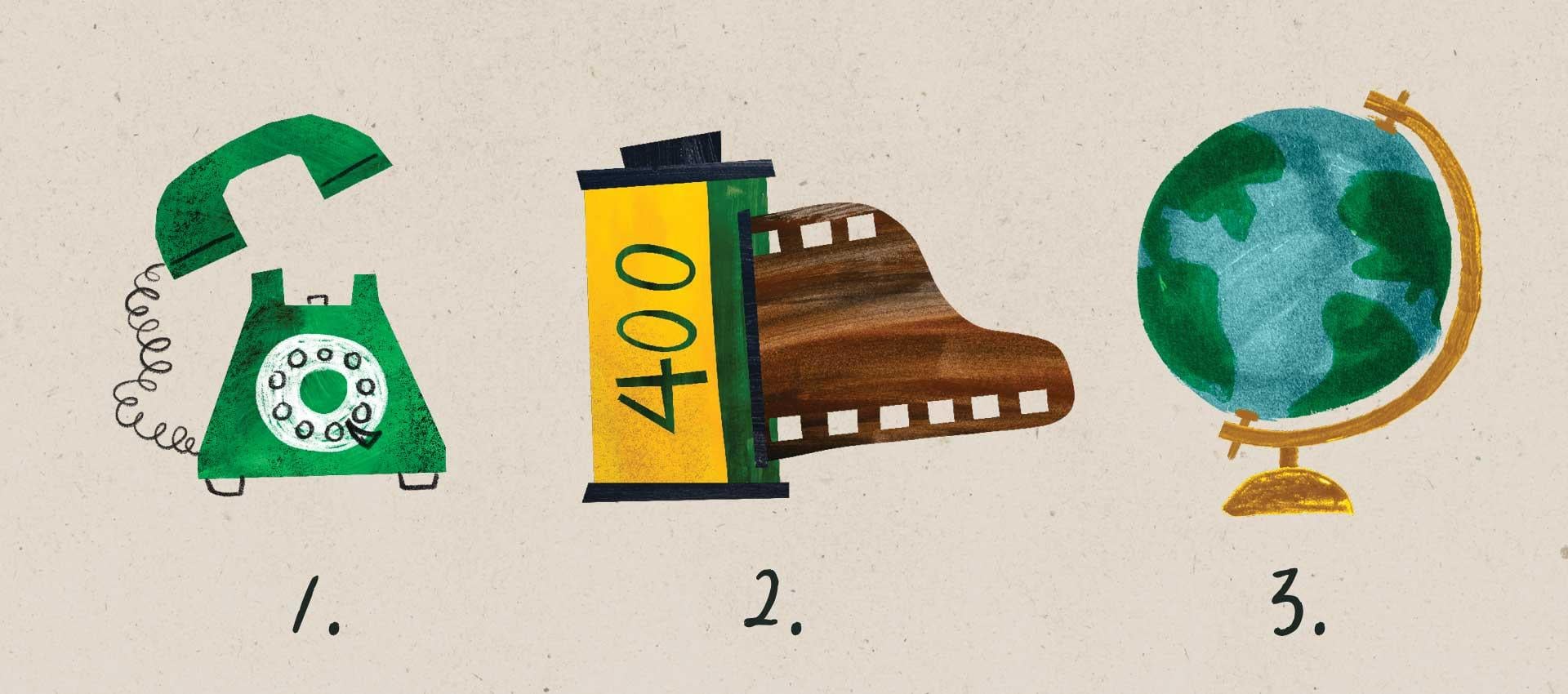
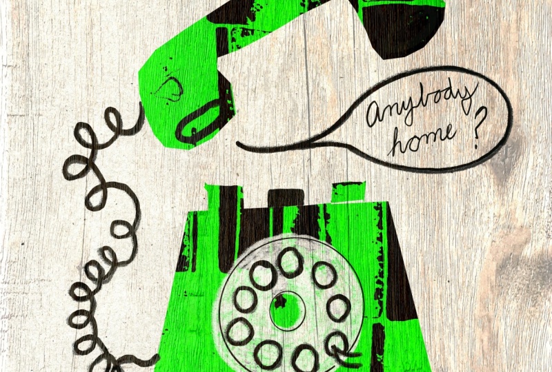
3. Class Project: You class project is actually
three different projects. So in the spirit
of analog media, we're actually going
to be illustrating all fun analog things, like the first one is
a rotary telephone. Then we're going to be
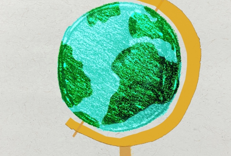
doing a roll of film, and then we'll finish
it up by doing this globe that's really cute. And before we start
each project, I have an analog
warm up for you. These are just quick exercises that only take a few minutes, and the purpose is to
just get you warmed up, loosened up and ready to play
and get a little bit messy. I can't wait to see the
artwork that you create. After you finish
your first project, be sure to head to the
Projects and Resources tab of the Skillshare class
page and create a project. There you can post
your first project, and you can edit
this project and add more of your artwork as you make your way through the class. You can also share any
discoveries that you make, things that you learned or
other insights as well. I'm so excited to
see what you create. Let's head into the next video where I'll give you
some tips about how to digitize your analog
artwork to use in Procreate.
4. Digitizing Analog Media: Before we get started
with the projects, I wanted to talk
about how to bring analog artwork into Procreate. So the process of digitizing
your analog media. And there's two primary
ways to do this. First is you can take a
picture with your iPhone. That works great, or you
can scan it with a scanner. So some tips if you are using your phone
to take pictures, you can also use a nicer camera. It doesn't have
to be your phone. Yield a better
quality if you have a nice camera, but
the phone works. That's what I'm going
to be using for all the projects today that I demo for you. I'll
just use my phone. But you want to
photograph them in nice, even bright light, nowhere
that's too dark or has, like, weird shadows or
anything like that. You want to be able
to take pictures of your pieces of paper. Like this is, well, that's here. We've got some textures
that I'll make. And you want to be able
to lay it flat and then shoot it directly on and
not at an angle like this. So that way, it
doesn't mess with the perspective and warp things. So nice bright, even light. If you're by a window,
that works great. Even if you're outside
with direct light, that can also work great, too. And sometimes even side
lighting can work well. If you're photographing
something like crumpled up paper and you want to see all the little folds of it, that can work well, too. So like being next to open door window or
something like that. If you have access to a scanner, that is also a great way to digitize your work at
a really high quality. So you want to put it
into your scanner, and I recommend scanning
it at least 300 DPI. And actually, I would recommend going even
higher than that, 600 DPI or even higher. Sometimes you can take a small little swatch
of a texture, and using by scanning
it at a high DPI, you can enlarge it really big
and just have that whole, you know, on the
cereal box where it's like enlarged for texture. You can do that
with your textures, and it's a lot of fun. So just make sure you scan
it at at least 300 DPI, 600 DPI is what I would really
recommend and even higher have the capabilities and
the patience to do that. Inside Procreate,
we're going to be able to adjust the contrast, the brightness, the
hue and saturation. We'll be able to do all those adjustments
right inside Procreate. So all you need to do
is to digitize them, airdrop them to your iPad, or transfer them to your
iPad in some other way, and then you will be good to go. I hope you enjoyed those tips. In the next video,
I'm going to give you a few more tips about sharing your artwork
on social media.
5. Sharing Your Work on Social Media: In this video, I want
to give you a few tips about sharing your
artwork on social media. The process you're about
to learn is so much fun, and there's so much that goes
into it that people might not recognize when they just
look at the final result. They're going to see that
it looks really cool, but not really understand why. So while you're working, it's really fun to take some behind the scenes shots of the process
of creating the artwork. So whether you're taking
photos or videos of, you know, creating the textures, creating the shapes
you're going to create, painting the papers, things like that, or showing the art supplies that you use. Like to set up shots that
include both the iPad and all the art supplies
that I use, the papers, with the textures that I made, pretty much anything that goes
into the process can make for a really interesting behind
the scenes kind of shot. So as you're going through
the projects of this class, definitely recommend
making a mess and then taking a picture of it. Zoom out far, get
the whole scene, show all your messy middle. It makes for a
really interesting kind of behind the
scenes moment. And if you do share your work on social media, I would
love to see it. Please be sure to tag me, Lisa Bardo. All right. Without further ado,
let's head into the first project for this
class. I'll see you there.
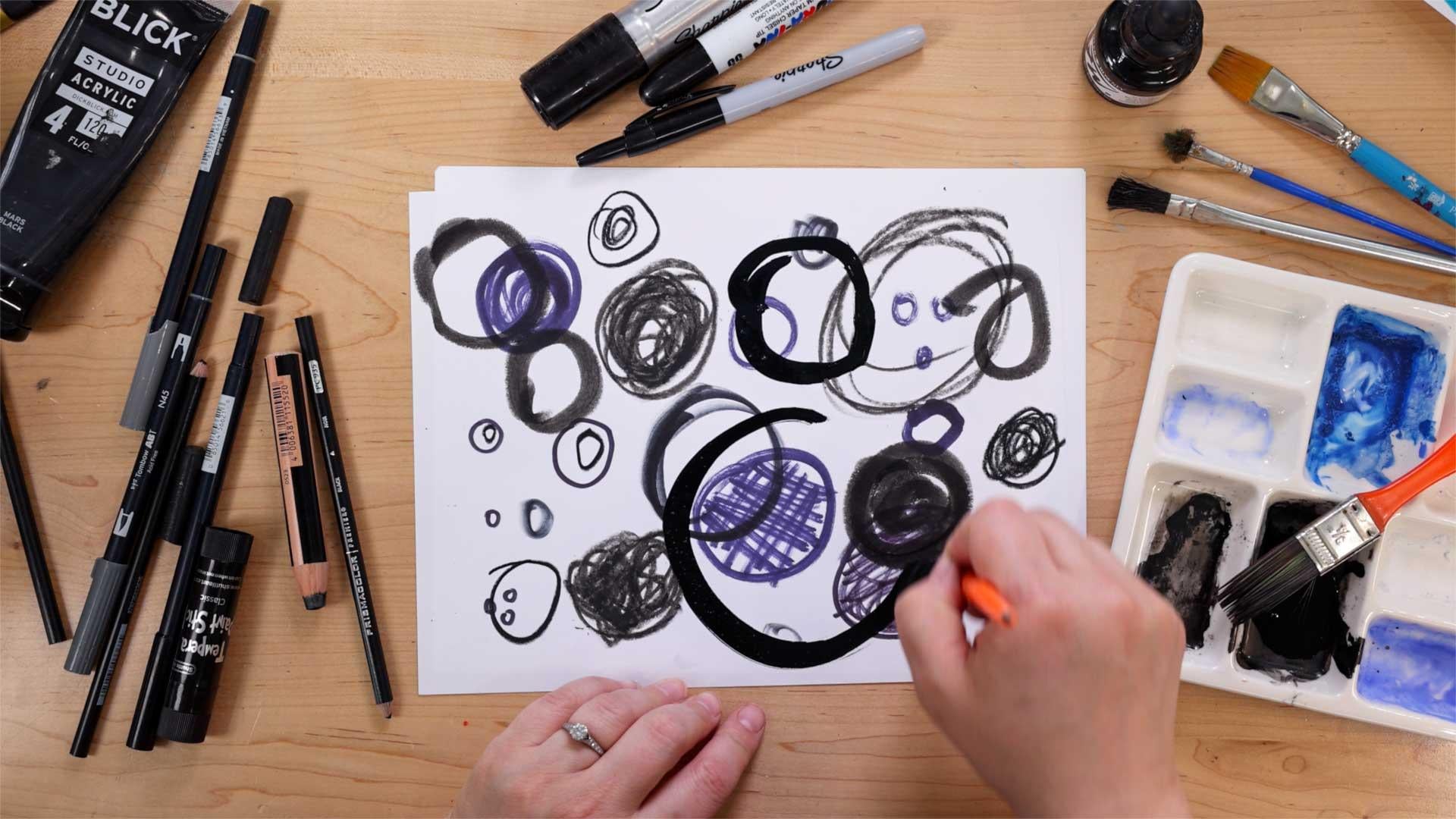
6. Analog Warmup 1: Texture Play: Welcome to your first
analog warm up. These exercises are
meant to just help you loosen up and kind of get into the group of using
your art supplies, not afraid to be a
little bit messy, get experimental,
and just have fun. For this first warm up, you're going to want to collect
some art supplies, and these can be
literally anything goes. You can borrow crayons
from your kids. You can use colored
pencils, markers, paint. Anything really works. So go ahead and gather
up some art supplies. You're also going
to need some paper. This is just regular
printer paper, just a few sheets is fine. And what we're going to
do for this exercise is we are going to fill the paper with as many
different kinds of textures as we can in 3 minutes. So I'm not going to say
any more than that. Let's just go ahead
and jump in and I'll kind of explain what
I'm doing as I go. But I'm going to start the
three minute timer now. So I am going to start with this big fat sharpie
marker here, and maybe I'll just try
kind of dotting it on the page like that to create kind of an interesting texture and just kind of like a little, you know, splotch of texture. You don't have to
fill up a lot of space. So that's
pretty interesting. And I could probably
use this again, maybe just to do some marks like that or go over it
again that way, and I get some cool, like, I almost cross hatching
kind of effect there. I've got some crayons here, so I can, you know, do some scribbles like this. I can, you know, shade or do a
little bit lightly, a little bit more uniform to get kind of a different sort
of texture from that. Let's see. What else can we do? I have some markers here. These are Tambo markers, but, you know, crayola markers work
good, any kind of markers. Let's see. What if I do some
long strokes like that? I would be interesting.
I'll go over it again. And then maybe I'll do
another one with this. Something just
kind of like fast. Like that one was slow, and
this one's kind of fast. So it kind of I don't
know, go crazy. Why not? I get kind of
like a scribbly effect. I also have these
Tempa paint sticks, and this is a really
fun art material. If you ever get
your hands on them. They kind of feel like
drawing with lipstick. They're very silky and smooth. And they fill in
areas very nicely. Like, you can get a
pretty smooth, you know, overall texture, especially if you use, like, heavier pressure, but then I could do light pressure and
that'll pick up some of the, you know, texture of the
paper, which is pretty cool. These are so fun. I love these. Let's see. I've got some
colored pencils here. And maybe what if
I just do, like, a bunch of little
lines like that? Like, they don't have to be
scribbles and haphazard. You could do, like,
a little pattern. I think that's kind
of interesting. You could do, like, little
dots really close together. Those are a little
time consuming, so my little swatch of this
texture is very small. You know, I can shade
with it like that. It's kind of similar
to the crayon. Wins. Cool. What else? I have some paint. This is, like, really cheap
paint from the dollar store, maybe since I don't have a
plate or palette to put it on, so I'm just going to I'm just gonna do a little
dab on the paper, and then I'll grab a brush. Let's see. I have this kind of really stiff brush here and I can kind of move
it around like that. Kind of like sponge painting. Oh, my 3 minutes was just up. Okay. Well, I'm almost full of it, but I really
want to keep going. And if you feel
like you do want to keep going after the
3 minutes is up, like, feel free to just go
ahead and fill up the page. I think that's
super interesting. I'll pick up some more
of this paint, like, do some little swirly
kind of marks there, which is really kind of
an interesting texture. Yeah. The whole point of this is
just again to loosen you up, get you experimenting with different supplies that you have because you'll find that you can create more
textures than you maybe would have thought originally with just a single art supply. You probably have gone
I could have gone with this same Sharpie and done a
lot more different things. That's another thing that's
fun to explore is to see how many different
kinds of textures you can get out of one art supply. These different textures that
you made might even inspire you for what's to come in our first project
for this class. If you're ready to
jump into that, I will see you in
the next video.
7. Rotary Phone: Analog Textures: Hi. Welcome to the first
lesson of this class. We are going to be creating
analog texture overlays for digital illustration. So the first part of that, of course, is to
make some textures. So supplies that you're
going to need are a lot of different art supplies.
Really, anything goes. You know, you can use
crayons, colored pencils, markers, paint, whatever. Like, there's so many different
ways to create texture. And, of course, you're going
to need some paper, as well. Again, this is just
some printer paper. But if you do have
other kinds of paper, like watercolor paper
or something like that, you might pick up some
interesting textures just from, you know, the texture
of the paper itself. So that's fun to
experiment with. Um, so let's go
ahead and jump in. I think I'm going to start with I'll start
with the crayon here. So this is just,
like, a black crayon, and I'm going to start by just kind of like
shading this in like this. And when we're
creating a texture, we want to have a pretty
big area of the texture, so you can fill in
an entire sheet of paper or just
like half the paper. When we photograph
these or scan them, it's nice to get a little
bit higher resolution, so you can zoom in on a texture
to enlarge it and stuff. But if you watch the
video about scanning, you'll know all
about that. Okay. I'm going to fill in half with this coloring crayon texture. Then maybe on this side, I'll rub the crayon across and
get something interesting. You can also try this by putting the paper on top of
a surface that's textured, like the concrete or a wall
or piece of wood or something and taking a rubbing
you could get some really interesting
textures that way too. That's kind of a fun. I get these little kind of
little freckles in there. So there's a couple textures
using a crayon. Pretty cool. Let's go ahead and do some more. I'll use my big Sharpie.
This one's fun. I can do maybe some
long lines like this. And I'm using kind
of heavier pressure. So I get, you know, filled in a lot more than if I were to go
with lighter pressure. Go over some places
a second time. This is one of those
really smelly markers. Okay, so there's half the sheet. And then maybe on this side, I can do I'll do like
lighter, like this. So I'm kind of going at
it with light pressure. And then I get more of the
white peeking through. And why not go the
other way, too? And then I get kind of a grid, almost like plaid sort of texture, which is
really interesting. There's a couple textures
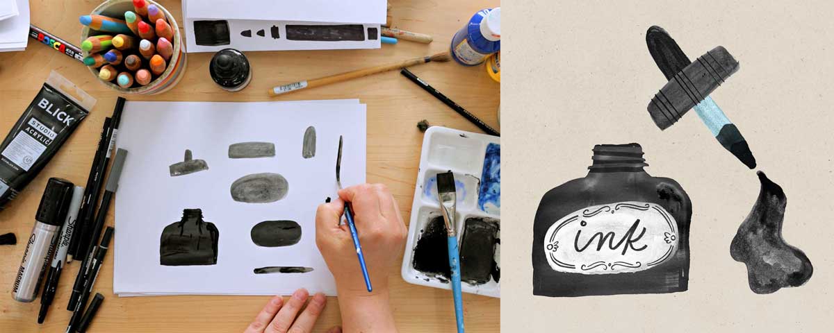
with this big sharpie marker. I also have a little
bit of This is ink, like for like, click a
few pens or something. But you could also do this with watercolor or
something like that, but just doing, like, a
wash on a piece of paper. So I'll use this brush here,
get a little bit of this. Probably put a little
bit of water into it, but I'll give it a go. And then I'm going to Ooh, then I get this really nice
dry brush, which is cool. So I'm kind of getting, like, a nice dry brush
effect with this. I know I said I was
going to be washed, but I think the ink needs to
have some more liquid in it. It's kind of dry. Whoops. So I've been doing a lot of
linear kind of textures, going back and forth,
but by all means, that's not the
only way to do it. In fact, let's do another
one with this kind of, like, dry brush that's a little bit
more I don't know, crazy. Just kind of doing
little sorely things. This is what I would call a
high contrast texture where there is dark dark blacks and white whites right
next to each other. Whereas this one is lower contrast texture
because it's mostly one value, one shade. They both have different feels, different moods when it comes to the digital
part of this. That's fun. Okay, I want
to do one that's a wash, so let me put a little bit
more ink in here. Okay. I've added some
more water to that, so now I'm getting,
like, a wash. This is really watered down ink. Again, you could use, like, a watercolor or even, like, really watered down paint. And I'm just wedding
that wedding that kind of pull around
and stuff, move around. I'm just trying
to fill the page. And I'm also seeing, like, the brush strokes. What if I don't know if I do these kind of
haphazard marks, it's a little dry that way,
or we'll see. I don't know. Okay, so that's a cool
little washy texture. Wow. Okay. Kind of wet. That's fine. I'll
put that over there. And then I also have these tempera paint sticks,
which are really fun. You saw the warm up,
I was using these, and they behave
just like lipstick. It's like drawing
with a glue stick. They're just so smooth and such fun textures
that these create. They're really fun to make
art with. I love them. So I'm just kind
of coloring that in kind of with medium pressure so I get
some of the texture there. What if I did just, like, kind of dotty shape, so
I'm just kind of, like, drawing in sort of, like,
circular patterns like that. It takes a long time,
but hopefully it'll be cool. I'm getting messy. And you know what I could
also do if I wanted to. This is another one of, like, more of a high contrast
pattern because it's like the white is
really showing a lot, but I could add
in another color. Again, color doesn't
really matter for these. We're going to end up
making them black and white when we turn them into overlays in procreate. Use
whatever color you want. What you really want to pay
attention is the value, how light or dark
it is on the paper, if you have the white
peeking through. Again, this is all about having fun and experimenting anyway, so don't overthink it
as far as that goes. Pick whatever color you've got and then we'll
see what happens. There's some more fun textures. And maybe I'll do one
more with a marker. So I have these
and maybe I'll do, like, a swirly kind
of pattern like that. Just lots of loopy swirlees. And if I wanted the pattern
to be less contrasty, I could even come over it with, like, a wash of this ink. Oh, that's doing
something interesting. Actually, these tambos
are like water soluble. So if you add water to them, they behave a lot
like watercolor. So this is really interesting. Like, again, just experiment. Like, I have no idea how things are going to come out sometimes, but now I'm getting
kind of this, like, blooming bleeding effect
there, which is really cool. It makes me want
to, I don't know, do some, like, stripes and then do a wash over it. So
I'm gonna try that. You can spend as much or
as little time as you want doing this step of the process, but I think it's really fun. It's one of those things that
I just kind of get lost in. Alright, let's go
this way, maybe. So I'll have these almost, like, soft kind of stripes,
which are interesting. Oops. I think I'm
starting to run out. That's okay. All right. And then one more
thing that you can do even if you don't have
any art supplies at all, is to just take a piece of
paper and crumple it up. Crumple it up, really
squish it good, then open it back up and decide if you want
it more wrinkled, you could always, you
know, crumple it up again. Pull it back out
and then kind of, like, flatten it
out a little bit. And this is also a really
interesting texture. When you, you know, want to digitize this one, you'll probably
want to do it with a photograph versus a scanning. And if you hold a
light, kind of, if you go by, like, a window
or door or something, you have light coming
in from the side. I'll pick up on all the
little wrinkles and stuff. So that's another fun little
thing that you can do. But, yeah, we have lots of different fun textures
to play with now. Um Again, there's no set
amount that you need. Just kind of go
until you're done. You feel like you've done,
and you've got plenty. And yeah, the next
step is going to be to digitize these by either scanning or
photographing them. If you need some tips
on how to do that, check out my previous
video on this class all about scanning or
photographing your work, digitizing your
analog media here, and then we'll be ready
to head into Procreate.
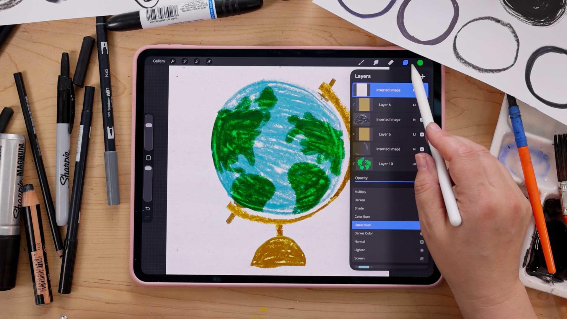
8. Rotary Phone: Digital Overlays: Okay, here are all
the photos I took of the different
textures that I made. But we're going to
get back to this. First, we're actually
going to work on our illustration, and
then we will return. So let's go ahead and
open up Procreate and start by creating
a new canvas, tap the plus sign
in the upper right. And the canvas size
I'm going to be using today is one of my
favorite sizes to work in 2,800 pixels by 3,500 pixels. I do have a template
for that size, but if you don't can tap the little plus sign with
this rectangle icon. And again, it's going to
be 2,800 by 3,500 pixels. You don't need to
worry about the DPI, as long as you're set
to pixels down here. You can give your
template a name and then hit the check
mark when you're done, and then I'll open
it up, but I'm going to use my template. So we'll start with a sketch. We're only going to
be using Procreate's default built in brushes, but you do want to make sure
you have Procreate version 5.4 or later to use the
same brushes that I have. And let's open up our brush
library because if you don't see the particular sets that I'm going
to be getting into, you might need to pinch out. So just kind of do a
little pinching gesture like that, and look for the one. These are all different
brush libraries you can use to organize your
brushes in Procreate. But we're looking
for the one called Procreate Library. So I'm
going to open that up. And then we'll go into pencils, and you can use any of the
pencils to sketch with. But one of my favorite
pencils from this set, I really like Huntsman,
which is this one. Pilon has also got
a nice texture, but literally any brush
works for sketching. So I'm just going
to choose Huntsman, and then I'm going to
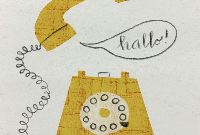
choose black as my color. And this is a really, really simple illustration
of a rotary phone. So we're going to start with just kind of like a
trapezoid shape like this. And there's going to be a circle in the middle like that
that's going to be, you know, the dial of the phone. And then the little
receiver hooks, you know, you put the phone on,
and then the little, you know, thing that
actually hangs up the phone. There will be little feet
on the phone like that, maybe a circle in the middle. And then there are
going to be like little numbers going
all the way around. I'm just really
quickly doing this. I probably have too
many. I didn't count. There should be ten or no, zero, one, two, three, four, five, six, seven, eight, nine, ten, and then, like, a little that thing,
little metal thing. Okay, and then we also
have the phone itself, the receiver, I
think it's called. So I'm going to draw that. It's kind of like a
curve shape like that. And then draw a little
line on either side like that and then draw a
smaller curve inside. So it should look
something like that. We'll draw a line
there and there. Again, I'm going really,
really basic here. And then we're going
to have the cord, and the cord can go in
all kinds of fun shapes. We will end up making, like, a swirl cord, but for now, you can
just draw it like that, and it should go
into your phone. And then you can also
for your sketch, we're going out a little
talk bubble like that. Hello. You can have it say
something else if you want. Okay, so there's our
little phone sketch. You can use the transform tool
here to whoops to kind of resize it if you want.
But that's great. Okay, so now we're
going to create shapes to be the main parts
of this illustration. So let's go up to our layers, and we're going to tap the plus sign to
create a new layer. We're going to move this layer underneath the first layer. So we're going to tap
hold and drag it. Whoops, tap hold and
drag it underneath. So the sketch layer is on top. And then we're going to reduce the opacity of our sketch layer, so it's just barely visible.
So it's just like a guide. Whoops. So you're going to tap the little N on
the sketch layer, which is down the top layer, and then bring it
down till it's like, you know, 10-20%, just
so you can see it. I might have it up
a little bit so you guys can see
it on the camera, maybe a little bit, you
know, darker than that. Okay. So now comes the fun part. We're going to start
drawing our shapes. Make sure you're on
the bottom layer, the one that doesn't
have the sketch, and we're actually going to use the selection tool
to draw today. So you're going to go up
to the selection tool here and make sure you're
in free hand mode. And we are just going to
tap tap tap to create some really This is
really basic shapes. Just going to end up being
a trapezoid like that. And then we're going
to tap up here to create the little receiver
thing to hang it up. Oops. And we're going
to again, tap, tap, tap to add another one and close the selection by tapping
on the little gray circle. Whoops. And now we
have that phone, and there's a couple ways that
we can fill it with color. You can go up to
your color picker, and I'm going to do a
nice green for this one. You can drag and drop to
fill it in like that. The other way that you can do color fill something color is by tapping the
color fill here, and then you can
actually go in and change the color on the
fly, which is pretty cool. So go ahead and I'm going
to do this nice deep green. That's pretty good.
And then let's do this part of the phone
here, the receiver. So I'm just going to since
this is a curve shape, I'm going to do,
like, a lot of taps. It'll end up looking
pretty like angular, but I kind of like the
way that it looks. It almost feels kind of
like paper cuddy to me. Like you're cutting
out shapes from paper. So just kind of like tap
to follow the curve so, you know, you'll have like these kind of, like, pointed edges. But as soon as you
close the selection, and if you have
color fill turn on, it'll fill with that color. So, that's already
good and done. And that is really all that
we need to do for this piece, as far as, like, drawing shapes. So I'm going to get out
of the selection tool. And now we get to add some
texture. Well, let's see. Let's do our little
pencly details. We're going to do the rest, and then we'll add the texture. I think that'll be
more satisfying. So let's go up to our layers and tap the plus
sign to create a new layer. And now we're going to go into
our pencils and just make sure you have the I think
the Huntsman will be good. I'm going to try out. You
can kind of play around with the different brushes
to see which one has a texture that you
like. That's Huntsman. Yeah, I think I'm going
to stick with Huntsman. There's some really
nice pencils, you know, just in the built in brushes. But let's choose Huntsman. Again, this is in
the pencil set. And let's do black as our color. Let's go
and choose black. And we are going to add some little feet
to that at the bottom. And then the little
thing that hangs up the phone for the dial, we're going to probably
do that in white. So I'm going to
come back to that, and then I'm going to do the little talk bubble and then do this a
little neater this time. Hello. Again, you can have
it say whatever you want. And then for this part, we're actually going to choose white. So go ahead and go to
your color picker, and if you double
tap close to white, it'll choose a pure white
value for your color. Works around a few
different places here, but I like to use it
for choosing white. So go ahead and choose white, and then we're going to draw
the circle part of this, and then we're going to
draw the center circle. I'm doing it a little bit
neater than my sketch now. And then we're going
to color this in, and I like it to look like
you colored it in by hand. So I'm kind of going
around this ring, this dial, you know, in a circular way, that makes
sense and letting you know, the green peek out underneath. So it just feels
like more realistic. Like it's been colored by hand because it is being
colored by hand, just with a digital brush. But we want to have
that analog feel. That's why we wouldn't
use something like color drop to fill this in. We have the computer
perfect shapes. Well, I wouldn't even call them computer perfect these green, the phone part because they're so angular,
they've been cut out. But the color inside them, that's computer perfect and
that's what we're going to add texture to using all those beautiful
textures that we make. I'm finishing coloring this
in it looks pretty good. I want it to be full,
but still again, have some of that
green poking through. And then I'm going to switch
back to the black down here, and then we can draw
the little metal thing, and then the circles that represent the
numbers on the dial. I'm not going to put
the actual numbers in. I'm just going to keep
this very simple. But you're welcome to, you know, jug it up however you want. I don't even know if I
have the right number of But that's fine. I don't think you have the
right number of dots. And then the last thing
is a little phone cord. So I'm just going
to start here and then just kind of do loop, be loop, be loop as I follow the shape of the line
that I drew in my sketch. And this might take some practice to kind of do
it all in one go like that. So don't feel bad if you need to undo it and try it again. You just want to
get it to a place where you're happy with how it looks because then we can turn the sketch off and start
adding in some texture. So I'm going to go
up to my layers, and I'm going to turn off this sketch layer because
we don't need it anymore. Uncheck this little
checkbox there. And then tap the layer that
has Oh, I forgot something. Okay. I lied. One more thing. Tap up to the layer that has all these line
details that we did. And then I forgot, I got to add, like these little lines
that I had in my sketch. Okay, now we're done with that. So thank you for
bearing with me, let's tap down to the layer
with the green phone shapes. And then we're going
to tap a layer. I'll tap the plus sign to create a layer right above that. Now, let's go ahead and
add one of our textures. So I'm going to go up
to the Actions menu, add, and I airdrop
them to my iPad, so I have them in
my camera roll. So I'm going to go
to Insert a photo. And then I'm going to choose
one of these textures. I think I'll start with
this one right here. Can zoom in a little
bit, so you can see. It's this one. I think
that was like a crayon, where it's like, like that. Okay? Okay, so it doesn't
look like much yet, but it will in a moment. Now, the first thing that we're going to do is
we're going to set this layer with the texture
to be a clipping mask. So I'm going to tap the layer
and choose clipping mask, and that will make
it so, you know, the contents of this layer is only visible within
the layer below it. So basically, our texture is contained within these shapes. And already, it's
looking pretty cool. I kind of like the way it looks like it's a
black and white, but I want the green back. So we're going to set this
layer to be an overlay. So to do that, we're going
to tap the layer or sorry, tap this little N on the
layer with the texture. Then we have this
list of blend modes, and all the blend modes
do different things. A blend mode basically
just dictates how one layer interacts
with the layers below it. Sometimes some blend modes
have a lightning effect, some have a darkening effect,
and there's other things. But we're going to
choose one that has a lightening and
darkening effect, and that is the
overlay blend mode. So it's right there. So go
ahead and choose overlay. And you can see now that the
color is coming through, the texture is interacting with the color, and it
looks really cool. You can make some adjustments to your texture if you find
it gets really bright, maybe your texture
is very light. So you can make some adjustment. So I'll show you how to do that. So with your texture
layer selected, go up to the adjustments
menu and go to curves. And this curve
affects the value of, you know, whatever
layer you're on. So if you grab this curve
and you move it up, it makes the whole
thing lighter. And if you grab the
curve and move it down, it makes the whole thing darker. So you can use that
to kind of adjust, you know, how light or
dark you want it to be. You can also move
these side notes over, you know, up or down and kind
of play around with that. And, you know, the
more that you move it, the more subtle or intense
your texture will look. So you can play around
with those as well. Like, that'll make it a
little bit more subtle. I've kind of taken the
contrast out of that texture, which I kind of like the
way that that looks, maybe a little bit more dark. This side controls
the dark values, and this side controls
the light values. So yeah, just kind of
play around with that. The other thing is
if your texture happened to have
some color in it, you might need to desaturate it. So I'll show you that next. I'll just do one more
texture to show you. I'm going to create a new layer and I'm going to set this
layer to be a clipping mask. And I'm going to turn
off this other layer here just so I can
add one more texture. So I'm going to go to the
actions menu add insert a photo and choose one that
has color like this one here. Okay, so I mean, that
looks kind of cool, too, actually, without
changing anything. But I'll set the blend
mode to the overlay. So again, top the end
and then choose overlay. Oh, I love the way
that's looking already. Even without doing anything, it has this really great
analog looking texture, which is beautiful. But if you need to
take the color out of your if it's interacting
with the color of, you know, your illustration, you can
go up to the actions, sorry, the adjustments menu, hue
saturation brightness, and you can take the
color out of it. You can see now it's kind of gone back to that original
green that I had. But when I added the blue, it made almost like a
brighter blue or green. So it's up to you whether you want it to
affect the color or not. But I took the
saturation out of it. Now if I go back to my layers, you can see it's just a
black and white image. If I turn this back to normal, now that's what the photo
actually looks like. It's just black and
white. For the most part, texture overlays work best when they're in black and white. You can play around
with that too. I'll go back to overlay. I really like that. So if
you wanted to keep going and experimenting with different
textures on your phone, you can just kind of turn off this layer,
create a new one, add a new texture, play around with it and see what kind
of textures that you like. I'm going to try
one more because I just want to
play and have fun. So I'm going to turn off
that one, tap this new one, select clipping
mask, tap little N, and just set it to overlay. And then I can add a photo. I'm going to do one
that's like one of these high contrast textures, which is kind of interesting. So this is that, you know, dry brush, kind of swirly one. And it's quite intense because
it's such a high contrast. Like, it has the
black blacks and the white whites all
within that texture. So the texture can
look really intense. So maybe you like it, maybe not. But if you want to
adjust the contrast, that's where the
curves adjustment can come in really handy. So if you go up to
the adjustments menu, go to curves, again, you
can play around with it. If you wanted something to appear like it has
less contrast, basically, all you have to do
is flatten out this curve. So if I take this
one and move it down and I take this
one and move it up, now there's almost
no contrast at all, and you can't even
see the texture. So you want to kind of you know, have some contrast so that the
texture actually shows up, but you can adjust how much by moving these kind of nodes. And then you can even continue
on and grab the middle, move it up and down and kind
of see how you like it. But that's also an
interesting texture as well, that kind of high
contrast, dry brush one. Now, this piece is
looking good already, but I think to give it
another analog touch, it would be great if it
had a paper texture over the whole thing
versus like this just stark white, computer
white backdrop. So let's add a paper texture. You can use the
textures that you made, but I think what works really well for an illustration
like this as the finishing touch is to get just like a nice
paper texture from, like, a stock
photography website. So here I am on unsplash.com. This is a free to use
stock photography website, so you can review the license, but you can use
these commercially. You can use them however
you want for the most part. So I'm going to search
for paper texture. And there's some great
options already. If they don't have the plus
sign, they're free to use. I think the plus sign
are premium ones, but this one looks
really good right here, so I'm just going to tap
the arrow to download it and then tap Download
and then download again. That's going to
save to my download folder in the Fils app. I'm going to go to the Fils app. Let's close that and
go to Downloads, and there's the image
that I downloaded, so I should just be able to drag and drop that kind
of tap and hold, then head here and
then drop it in like that and resize it, it takes up the whole Canvas. There's another way that
you can import a texture, and I'll just show you that real quick that you've downloaded. You go up to the Actions menu. This time, when you
download something, it goes into the Files app, you want to insert a file. And then you go to
your Downloads folder, and there's the file
that I downloaded. And so that's another
way that you can insert a photo that
you've downloaded. But it's in the wrong spot. We're going to actually
move this to the top. So I'm going to tap,
hold and drag it above all the other layers.
So that's good. And then we are going to set a blend mode for
this layer, too, because right now you
can't see through it, but we want to be able
to see through it, and we want all the texture to appear on our illustration. So we're going to tap the N,
and we're going to chooses. We're going to choose multiply. Multiply has a darkening effect, so it'll all the light parts of what's on that layer will become transparent so
you can see through, and then you just see,
like, the darker textures. So it works really
well for, like, adding a overall texture on top. So I hope you enjoyed doing this first simple
little illustration of a rotary phone and playing around with the
different textures. I think I really like
this marker one. I think it was, like, the
swirls and the wash over it. It's just really beautiful.
And like unexpected. Like, I wouldn't have expected combining those two things to
create a texture like this, but I really, really like it. So I hope you had fun with that, and please keep experimenting
with different textures. In the next video,
I'm going to show you some more artwork that I've made using texture
overlays to give you a little bit more
inspiration. See you there.
9. More Texture Overlay Examples: In this video, I have
a few more examples of artwork I've made
using texture overlays. For this fun torn paper hot dog, I took some scans of some tissue paper
that was kind of wrinkled up and some crumpled up paper for the background, and I added a torn paper effect using some procreate
brushes that I made. There's a butterfly that I
did in digital watercolor. I have a brush set called
Watercolor Wonder, and it comes with some
textured canvases that are all created by using different blend modes
and some watercolor washes that I created using, you know, analog, watercolor. Here's another little set of illustrations that I did
in digital watercolor. You're doing watercolor
and procreate, a lot of it has to
do with the process of how you paint it, but the texture overlays
are really what gives it the realistic
watercolor look. This is a piece from one of
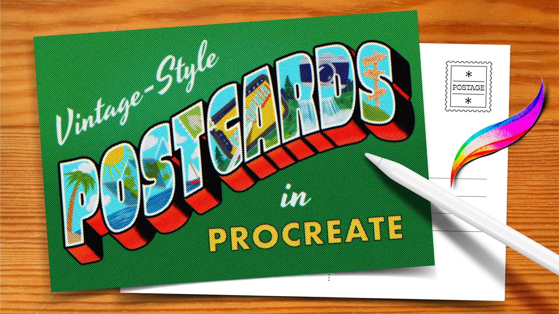
my most popular classes. Kickstart your
creativity Volume two, where I teach you more about
using texture overlays. We illustrate this denim
jacket and then add some texture overlays on top to give it a realistic
texture effect. If you want to draw
this, you can take that class right
here on Skillshare. Here's a little doggie with some really fun
watercolor washy texture. I have a product that I sell on my Bardo brush site
called magic paper, and it's these textured
canvases that come preloaded with all the
texture overlays on them. So all you have to do is draw on them, and they're
a lot of fun. The next few pieces actually
use the magic paper. Like, this pair has a really
cool sort of canvas texture. Same thing with
this fruit piece. You can see all the,
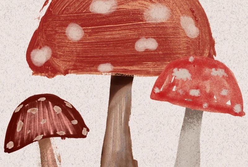
like, watercolor brush strokes peeking through. And this set of mushrooms. I think I made this
texture by drawing with marker all over a
piece of watercolor paper. And here's a different
take on mushrooms. This is using another kind of watercolory wash texture with lots of fun brush strokes
used as a texture overlay. And this illustration comes from my book, drawing digital. And this is another really
cool use of texture overlays. This is from my stunning
stained glass class, which is also on Skillshare. And for these, I bought a bunch of pieces
of stained glass, and I photographed them on a light table so that
light shines through. And then I use those as texture overlays to create this realistic
stained glass effect. And I just love
the way it looks. It's such a fun effect.
Head on over to the next video to start our second project
for this class, and we will begin with
another analog warmup. I'll see you there.
10. Analog Warmup 2: Color Mixing Fun: Welcome to your next
analog warm up. This time we're gonna be
playing around with color. For this exercise,
you're going to need some paint in the
three primary colors, red, yellow, and blue. And this is just really cheap paint that I
got at the dollar store, so you don't need
anything fancy. You'll need some paint brushes. Again, nothing fancy. Whatever you have
on hand is good. Something to mix colors on. These are just some
disposable plates and some water to
rinse your brush. I also like to have a
paper towel to kind of dab off any extra water, and
then you'll be ready to go. So this is our color
mixing playground. We're going to mix our three
primary colors together and see how many
different shades that we can get on a sheet
of paper here. So I'm going to start by doing a few dabs of the
different colors. I'll do a few dabs
of blue like that. So I just have some
colors to mix from. I'll put the over here, too. Okay, that's good. And now I'm going
to get some yellow. Do yellow over here. Boom, any yellow over here? I think so. And some red. Okay. So I have options. Let
me put those over here, and now you can start mixing. So I'm going to choose one
of my smaller brushes here. And I'll start by mixing
some yellow and blue. And this is, of course,
going to create green, and we will just dab some
of that green on there. And then if we kind of
keep going over here and mix a little
more of the yellow, we'll get, you know, a nice lime green right there. You can even keep
going. Just see what kind of colors you can get. Over here, I'll mix
in some more blue. Then we get a nice blue
green, which is really fun. All these different kinds of greens that we can
get just from, you know, the different
kinds of colors that we mix. Different amounts. So there we go. We've
got some green. So let's do another one now. I'm just going to I'm just going to grab another brush
so I don't have to wash them. Okay, so I'm going to do let's do yellow or sorry,
blue and red. And this is going to make
sort of a purply color. So I'm going to mix
those together. Got this nice deep
kind of purple. It's really pretty. I'll do a little bit more red over here. That's kind of more
of a, you know, red violet, which
is really nice. It's pretty. Let's do more blue. That's going to be a
very bluish purple or maybe a bluish purple. It's very blue, very deep. I can grab some of this
too and mix it around. There we've we've got our primary colors,
red, yellow and blue. These are secondary colors, purple, green, and now
we get to do orange. So we're going to mix
together yellow and red. And that's going to
make orange like that. That's a very reddish orange. Let's get more
yellow on this side. That's looking more
of a I don't know, true orange, you would say. I'm gonna do, like, a
really yellowy orange here. Give me more yellow. Oops,
I dabbed into that red. That's okay. We'll do a
bit more yellow over here. Da da da. Okay, so we've got a bunch of different
kind of oranges as well. And now let's grab
a little bit of the blue and mix it
into the orange. And then we get
kind of this more, like, muddied, yellowish green. Like, that's actually how you can desaturate your
colors and tone down the saturation on them is by adding their compliment, the other primary that's
not already in them. So I'm going to add some
yellow into this lu. Let's see what I get. A
little bit of the red. Ooh, that's a really
interesting kind of blue. So just start mixing and seeing what other kind of
colors that you can make. It's also really
interesting to see when there's lots of
colors on the brush, you'll end up with
lots of colors in your brush stroke,
which is kind of cool. Let's do but Oh,
that's more reddish. So I'm kind of getting a brown when there's a lot
of red in there. It's kind of like
a brownish color. Let's just keep on mixing. What else? More yellow. Let's get more yellowy. Almost like I don't know. Is that chartreuse kind of
color, kind of interesting. So you can see, like, as you
keep mixing together, like, things start getting kind of muddy and messy,
but that's okay. See something really reddish. That's kind of
pretty. Oh, that's, like, a really nice brown. So this exercise is just all about kind of having
fun mixing colors and seeing what kind of
colors that you can create with just these
three primaries. I mean, you can do
just about any color using the three primaries, and we are going to do some fun, colorful painting in
our next project. So I hope you had
fun with that one. Again, this is very,
like, chill, no pressure. Just have fun playing
around with colors. No expectations, and I will
see you in the next video.
11. Film Roll: Analog Painted Papers: Fun. Welcome to the second
project of this class. For this piece, we're
going to be creating sort of a painted paper collage. So we're going to need to create some painted papers to
use in our digital work. So you're going to do a
lot of the same supplies as we use for the
digital warmup. So you're gonna want some paint. Again, this is,
like, really cheap paint from the dollar store. Um, works great. You don't need anything fancy. I would recommend,
like, at least red, yellow, and blue so you
can mix more colors, but you're welcome to also get some other colors if you didn't want to have to
worry about mixing. So we've got some colors. We've got a nice stack of paper because you
end up painting quite a few of these and
something to mix paint on, like this plate, some water, and some paint brushes. So we're going to create
some painted paper. So I'm going to start by picking one of these
colors. I'll do this blue. And when I'm doing these, I don't like to just start
with just one color. I like to mix it in with
different value of that color. Like, I also happen to
have this lighter blue, so maybe I'll put some
of that on there. I also have some white. So I can put that.
And then maybe, I don't know, I'll put some green on there just in
case I want to use that. So that's a good place to start. And then I'll grab one
of my paintbrushes here and I'll kind of mix them together a
little bit, but not fully. So there's, like,
a little bit of each color on the paintbrush. And then I will start painting. And so, hopefully, both
colors will start to show up, and I'll get these maybe I'll
get a little bit of water. I'll get these nice
variations in the color. Um do a little bit of that, and then get some lighter color. Yeah. I'll get these
nice variations within the paper as I go
through and paint. Kind of like fill it
all in like that. I usually try to
do like one color, you know, one per sheet. Not trying to fit in multiple, you know, color ways
on one piece of paper, but try to get it
full 'cause you have a lot of area that
you can use to use to colorize what we'll
be using these for us to colorize our
artwork using these, like, analog painted textures. Maybe I want to, like,
pop in a little bit more with this darker
blue and kind of, like, move it around. And I don't know, just
kind of playing around. Um so that one's pretty
good. It's a nice paper. There's a lot of different
kind of values of the blue in there and liking
the way that that looks. So I will set this
one to the side. And I will work on another one. I'll clean up my brush. I've got some paper
towels under here because I like to kind of clean it and then just kind of
dab off the extra water. I'm going to do this green. And then I'm actually going
to grab some of the blue, just to kind of make it
a little I have, like, a light and a dark green now, so I can grab from there. And you can do other
textures, too. You don't have to
just do painting all the way across like that. This is kind of
just like dabbing, dabbing some of
this lighter green. Uh, these kind of textures
are fun for, like, doing bushes and grass
and things like that, things that have, like,
this kind of texture. Make a little bit
more of that green. So I'm just gonna keep going. I kind of fill in the
page. Lots of dab. I'm trying to get more of
that lighter green so I again have different
kind of variations. You can let some of the
white peek through. Sometimes that can be good. Sometimes you don't want that. I don't know. I kind
of I prefer, like, a fully filled in kind
of color on these. Starting to run
out, that's okay. So I'll come in and fill in
all those little white spots, but they're not that big
a deal if you have them. So that's a really fun kind of painted paper
texture, screen. That's really cool. So
let's do another one. Let's see. I'm going
to do a yellow color. And I'm running out of room on my little plate here, so okay. Don't judge me. This one has confetti on it, I ran out of the clear ones. But you know what?
It's all good. You use what you have,
and that's fine. Is it hard to mix colors
on a confetti plate? I don't know. It's fine. I did a little orange, so I'm kind of, like, doing
warm colors, I guess. A little bit of
orange down there. Get out of there. Okay. And
then I'll get my brush. What's this brush here. And we'll try these colors. Again, I'm mixing them, and maybe I'll do little swirls. The brush is a little dirty, so it looks like there's
some darkness to it, which actually isn't bad. There's no rule when it comes to what's
going to work well. When you know that you're
going to make an illustration, I did a piece of
painted paper piece once that was apples. I painted some papers
that looked like apples, like a red and green and stuff. You can create painted papers with illustration
in mind, like, Oh, I need a paper that's you know, gonna be grass, so I'll do some green or
something like that. But you don't have to,
because you can always adjust the colors later in procreate
and change a colored paper, you know, painted
paper into whatever color you want it
to be in the end. So I've got this nice orangy yellow moment
happening here with some little bits of dirty paint
water, but it looks cool. It's got a nice texture. I kind of like I'm like, squeezing out the
dirty paint water now and kind of incorporating
that in because it's, like, interesting, an
interesting texture to me. So that one looks
pretty cool. I like it. Again, this is just
like printer paper. You don't need anything fancy. You could use
thicker paper and it would hold up better,
but it's fine. I like to have a
page that's full of a darker color in case I need some black and I know
for this illustration, we do need some black. I'm going to use
this paper plate that I use for the warm up. And hopefully there's still some black paint left in this tube, if not, I don't know,
do something different. Uh. Oh, gosh. There's almost nothing
left in there. I'm telling you guys,
I didn't go out and buy anything
special for this, and that's kind of the approach I want you guys to take is just, like, to use what you got. It doesn't even
have to be paint. Like, you could maybe we'll do one in a minute that's like, we can fill it with a different material, a different medium. Okay, so I'm just kind of mixing this black into
these other colors. And just I don't
know. We'll see. It's kind of greenish.
That's okay. I can always mix in
I've got some red here. I can mix in red, so
it's not so green. It's a little more brownish. So it's kind of black, but it's, like, not fully black. So I'm going to paint
that on. Got some black. I've got some greenish
color kind of up there. And I'm just kind of, you know, Oh, this is pretty texture. I'm gonna fill it
in, but I really like that dry texture there. So maybe to do a
little scrubby scrub. And then I want
to get maybe I'll grab some of this I had
some white on here, and then dab that
on. Dab some yellow. This is very loose and free. And then I'll kind
of swipe that in. So that way I have some nice. It's not just,
like, solid black. I've got some,
like, variation of colors in there. It's too light. I'll had some more black.
Looking pretty good. Another thing you could do
if you have a brush for it. I set this one down. Like, I have this
big brush that's really bristly likes to shed, is use that dry
and then kind of, like, brush on maybe one
of these lighter colors. I need a much lighter color. Maybe I'll get some of
this yellow from this one. No, that's probably too much. Okay, let's see. And then we have some lighter values
that kind of peak up. If you ever need illustrating something
that's made of wood, you can make a wood grain
texture this way, too. It's just really cool. Okay, so I've got a black
I think I'm happy with. It's got a little
bit of different values and colors in there, and I think that will
work really nicely. Let's do maybe one more using another material just in case
you don't want to do paint. I showed these in my when
we did the last project, but these tempera paint
sticks are so fun. They usually come in like big
packs with lots of colors. So you could, you know, fill in just like when
we made the textures, you could grab a
color and fill it all in with this material as well. Doesn't have to be paint. You could go mixed media, add some paint over
the top of this, which could be interesting. That's what I love about this type of art is
you're just like, Hmm, why don't I try this? And why don't I put
some of this on top of it and see if it's
going to work out. So you can end up with a whole, library of these painted
papers that you can use in various ways in your
digital art, and it's so fun. Okay, do this green. I'll do this maybe light
green. Kind of with it. It's kind of showing in
all the white spots, which is kind of cool.
That's kind of interesting. And I wonder if any of
the paint will show up. I don't have a clean
brush. Let's see. Well, I'll use this brush here and maybe I'll get some
more of this green paint. These painsticks
are kind of waxy, so I don't know if
it's gonna work. I don't know. We'll see.
That's kind of interesting. Go back and forth.
Maybe this way, too. Oh, it's almost like
Marvel. It's kind of fun. So there's another color, a second green, I guess. I did another green,
but that's okay. Like I said, you can adjust the colors later so
you have more colors. Maybe I'll do just one more. And this time I'm going
to take the red and just put it right
onto the paper. And do I want to mix
in another color, a little bit of orange, maybe? Just kind of plop
that on. Good man. A little bit of orange. And I have these really
stiff brushes for, I think 'cause they're
meant for paste. They're super stiff. Okay, what are we gonna do? Circular. You know what
you could even do, which is fun is ditch the paint brush altogether
and nese your fingers. If you want. I'm gonna
stick with the paint brush, cause I want to get my
fingers messy right now. Um, there's kind of a red. Some of the orange just
kind of peek through, but not a ton. I could also do a little I don't know if
I'll regret this, but how about some white. Oh, it's that gonna come out? Little blob, and
there's another blob. And this will actually end
up being, like, a cool pink. So you don't even need to
mix colors on the palette, just like mix them
right on the paper. Oh, this is a fun texture. Adding this white
and kind of just doing these little motions. Lots of texture. Even leaving
some of the paint, like, really thick. That's cool. Alright. So like I said, you could keep
going with this for a while and just have
fun painting papers. Like, you just spend
a whole day painting papers before you
even touch Procreate, and I think that's a
good way to spend time. But once you've done,
you know, do a few, and then you'll want to scan these in or photograph them.
Either way, it's fine. Again, refer back
to the video on digitizing your analog artwork, and then we can head into Procreate and create
some artwork with these.
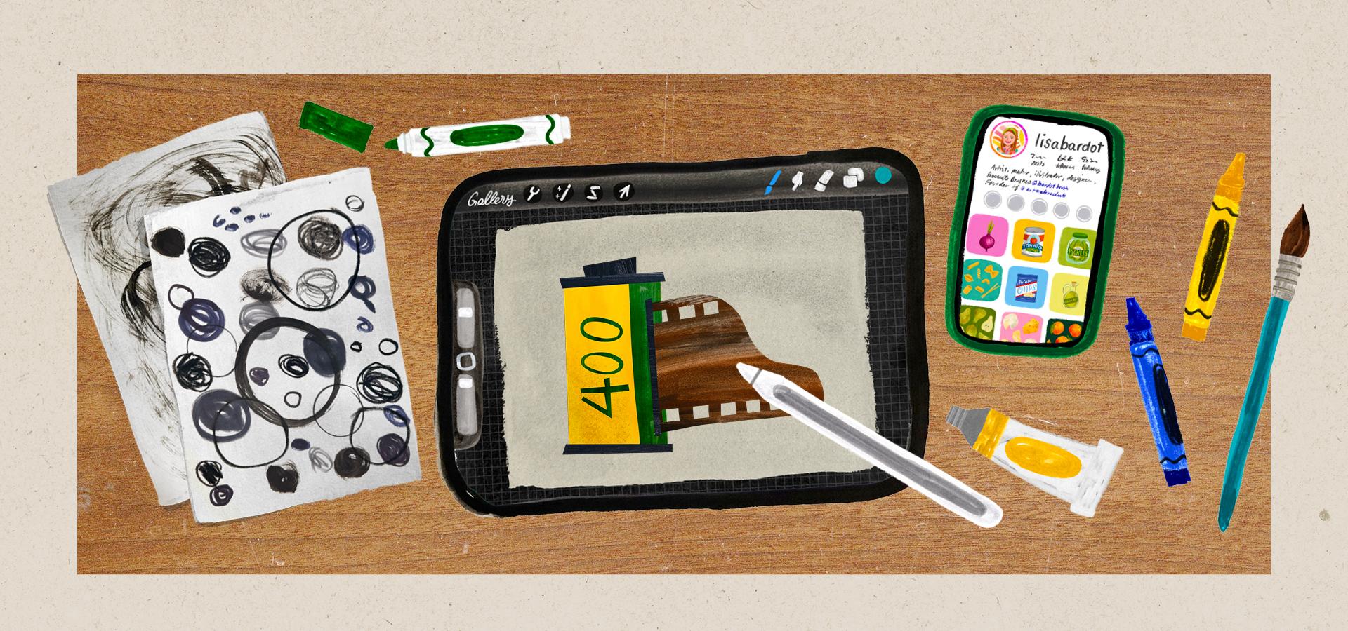
12. Film Roll: Digital Paper Collage: Alright, here we am Procreate. We're going to
create a new canvas. Tap the plus sign in
the upper right corner. And this time, we're going to do a horizontally oriented canvas. My favorite size for horizontal
is 3,800 by 2,800 pixels. I have a template
saved for that, but if you don't can
tap the rectangle here. And again, the size
is 3,800 by 2,800. Again, DPI doesn't matter. If you set it to pixels, you can give your
template a name and check the little
check mark there. I'm going to tap Cancel
and choose my template. Alright, just like
with the rotary phone, we're going to start
this off with a sketch. We're going to be
drawing a film canister, like a film roll today. So a little photography theme. We're going to go
up to our brushes and head into the pencil set, and we'll choose the
huntsman brush again. But again, any brush
works for sketching. And so a film roll
is essentially just a rectangle like this. Tall rectangle. We've got kind of a small rectangle that's a little bit longer
on the top and bottom. And then the like middle of the roll that kind of
sticks up like that. So that's the film canister. Roll, Caster. I don't know. Then we're going to have the end of the roll of
film sticking out. So we're going to
draw a line here, and this is where
it's going to kind poke out from the can. And then we'll draw a line
that way and a line that way, which will end up
being our role, but the end of a film role
actually has a little tab. So we're going to draw kind of a curve that'll go
something like that. Oops, different every time. Okay, so you want to have
a little kind of tab, and so this will end up being the film, like the actual film. And this part we can erase here. So it'll be kind of
coming out that way. Okay, I'm going
to move that with the transform tool center
that a little bit. And then the other thing is
we have the little kind of rectangles that are the
perforations in the film. So we're going to draw
some guidelines here. Just two lines like this there. And then also, again, whoops, at the bottom. Try and keep them kind
of the same with a part. Mine aren't perfect, but
hey, who needs perfection. Okay. And then there's gonna be like little rectangles
inside here like that. And then down here as well. Try to have them evenly space, but they're supposed to line
up with the ones on top. I'm not doing that great
of a job, but that's okay. That's okay. Analog is all about imperfection
anyways, right? We don't to be perfect. And then the other thing
we're going to do is we'll have a design, very simple design
on the film can. So we're going to draw kind of a line here going
all the way down. And this will be one
color on this side. And then this will have film
has numbers on the cans, that's the film speed. It's, you know, it
has to do with light, how much how, you know, good it is at different
levels of light. Anyways, I was a photography
major in college, you guys. I was actually a photographer, professional photographer
for, like, 11 years. My husband and I were
wedding photographers, and I loved going in the
dark room in college. It was a lot of fun. So
we'll put a number there, 400 you can put something
else there if you want. So there's our
little film sketch, and now we're going to draw
the main shapes of this, and then we get to
bring in all of our painted paper
to colorize it. All right. So let's
go up to our layers, and we're going to reduce
the opacity of our sketch, tap the little N here, and then reduce it down to, like, like 15% or so. Make sure you guys can
see that on camera. And then create a new
layer, tap the plus sign. And then we're going
to move this layer underneath our sketch layer. So we have the sketch on top and our new layer underneath. And then just like we
did with the phone, we're going to use the selection
tool to draw our shapes. So let's go up to
the selection tool. Again, make sure you're
in free hand mode, and we will begin with
our film canister. So I'm going to actually draw it a little bit bigger
because I'm going to have these kind of
these shapes overlapping, these longer rectangles, so I'm drawing it a
little bit bigger. But I'm going to tap tap tap, tap here and then tap here, and then tap this circle two. Select it. I happen to have color fill turned
on, which is great. Like, that'll make
things easier. But if you don't
it's not filling in with the color like it
is, you can tap color fill. And I'm just going to choose, like, a gray for now. We're going to add all the
color with our painted paper. So the colors you choose for these shapes doesn't really
matter at this point. So there's one. And then I'm also going to put this shape on this
layer as well. Again, I'm drawing
it a little bit bigger than I need it to be because it's going to
be underneath Whoops. I'll do that one more
time. It's going to be underneath
this rectangle shape that's going to be on top of it. I think that's all that
I can put on this layer. The most important thing is that any shapes that
overlap each other, there'll be this
rectangle overlapping or touching this giant
rectangle here. You want to put those
on separate layers. Right now, everything else is going to touch in
one way or another. I'm going to go up to my layers and tap the plus to
create a new layer, and then I will do these
long rectangles here. I'm going to just tap in all the corners to make
a rectangle shape. And whoops I accidentally
turned color fill off. So color feels on. I'm going
to make this a little darker just so I can see the different shapes when
I'm looking at it. But again, the colors are
not going to matter, really. We're going to add that. So I'm going to do this rectangle here. Awesome. And then
also on this layer, I can do the actual film itself. So for that, I'm going to take a slightly
different approach here. I am going to tap
this end, so tap, tap for this side.
I'll tap here. And then here I'm
going to just draw it. So I'm going to
just kind of trace that over until I get to, like, where the
curvy part stops, and then I can close it off. So tap one more time. And then I have
my piece of film. And I'm going to tap out of the selection tool just so I
can get out of that for now, but I actually need to cut out these little rectangles that
make the film perforation. So we're going to go back into the selection tool to do that. So tap the selection tool. And here's a little kind
of easier way to do that. We're going to select this
whole area like this, so I'm going to tap Tap, tap, and I'll have
all of those shapes be like one big
rectangle. Like that. And then I'm going to
tap remove down here. Well, actually, before I do
that, let's do this one, too. So tap, go all the way down, tap, tap, and then
all the way back. So there we go. Now we're
going to tap remove here. Tap remove and actually switch over to the
rectangle mode. Trust the process here. So hit rectangle. And then we're going to
just draw rectangle over the spaces in
between, like that. And that will now
refining the selection. So it's just these
little rectangles, and they all line up with
each other a little bit better than if I had free
handed it, which is fine. So they're still not going
to be super well spaced out. We're just drawing
little rectangles. That's okay. Fun.
Now you can see our selection is just these
rectangles and now we just need to delete
from this film shape. There's a couple of ways
that you can do that. You can take three fingers and do a Z motion on your
screen like this. And that will clear
out that selections just deleting what was selected. So that's one way to do it. But another way if
that gesture is difficult is you can
go up to the layers, tap on the layer that you have selected this one, and
then choose clear. And that will do the same
thing. So now we have our little film perforation. Okay, let's do a
couple more things. We're going to tap on
the layer with the film, this rectangle, like
the main film canister, tap the plus sign. And we are going
to do this part, but we're going to
use a clipping mask. So we're going to
tap this new layer, and we're going to
choose clipping mask, and then we're going
to make a selection. So we're just going
to tap over this one. And you can make it bigger than you need to. Like, I am here. You can see that's,
like, bigger than it needs to be. Where's
the end of that? Hm. Oh, because I'm in
rectangle mode. Okay. Let's go to
free hand mode. I'll try that
again. I just undo. Take two. Let's do
free hand mode. Tap Tap. Again, I'm making it
bigger than it needs to be because it's a clipping
mask, so it'll be fine. You can turn color fill back on. I'm going to make that a
little bit darker so I know it's like or maybe I'll make it lighter. I don't
know. It doesn't matter. I just want to know
that it's like a different color and
that I can see it. And then for these.
It's kind of fun. There's a lot of ways that
you could do the numbers, but I'm going to just tap them out kind of as if they
were block letters. So I'm just kind of,
like, tapping around but a little bit bigger
than the number of shapes that I
had drawn before. Takes a bit of visualizing, but, you know, I think
you kind of get it. And then for these, I
will kind of just draw a circle and then I'll
draw another circle. And then I'm going
to hit remove, and then I'm going to take out the middle of it, so watch this. Hopefully, I get it on
the first try. Boom. As long as you close,
you draw the circle, and then you close
it by tapping the gray like dot, it'll
clear that out. So now I have my
numbers as well. And so those are all the main shapes
for this illustration, and now we are ready to start
adding our painted paper. So let's go up to our layers, and we're going to
turn off our sketch layer, uncheck it here. Alright, so now
we're ready to add in the color using
our painted paper. The way that this works is
using a lot of clipping masks. So we've been using
clipping mask quite a bit already
in this class, but that's how
we're going to add the color into the shape. So let's start with
the main shape, like this big film
can, the rectangle. We already have a clipping
mask right above it. So if we tap the layer
that actually has the big rectangle and
tap the plus sign, it'll create a it'll create a clipping mask
automatically because it's between another
clipping mask. So that's easy. Our film canister is going to be yellow because it feels very
nostalgic like Kodak to me. Okay, so we're going to go
to the Actions menu at, and then insert a photo. I have airdrop them
to my camera roll, so that's where they
are. Insert a photo. And I'm going to choose this yellow kind of
painted paper that I made. And I'm going to basically just drag it into position
where I want it. I can resize it
to kind of, like, adjust the scale of
the painted paper. You can also pinch it in and out like that and
kind of just, like, get it how you want it, and then you can
tap the selection tool to kind of get out of that. Now, a couple of things. I don't want this to be the um yellow that's going to
end up being black for me. So all I need to do is just erase or delete that
part of the painted paper. So you can actually, use your selection tool to
kind of select around it. And then if you have
color fill turned off, you want color field turned off, and then you can, like, do
that Z motion to clear it out. And you can see I've
just deleted that. So it's not in the way. It's not in that. That's going
to need to be black later. And then the other thing is we want I might want the yellow
to be a little bit brighter. So let's make some
adjustments to kind of gouge up the painted paper. The first thing I like
to do is kind of bump up the contrast a little
bit using curves. So if you go up to
the adjustments menu and go to curves, again, you can adjust the
brightness of it this way is probably better than using
if you're used to using hue saturation
brightness adjustment to adjust brightness. I would recommend
this because it retains the texture
a lot better. So you can do, you know, make
it brighter or less bright. If you tap this, you can
delete it to kind of reset it. But if you wanted something
to be more contrasty, you could bring this side of the curve up and this side down, and you can see that like, increases the contrast a lot, also makes it a little
bit more saturated. But, um, you know, I don't know if I
like it for this, so I'm going to undo and maybe just make it a
little bit brighter. Maybe just bring this
side down a little bit. So you kind of play around with the curves until it looks like something
that works for you. And then the other thing
that you can adjust is actually the hue
saturation adjustment. So if you go back up to the adjustments menu, hue
saturation brightness. One, you can adjust the hue. You wanted to do it
a different color. I am going to stick
with my yellow, though. You can make it more
or less saturated. I'll bump that a little bit. And then I don't recommend using brightness because it kind of makes it look kind of
faded or I don't know, it just like lightens it and darkens it in not a nice way. So I don't recommend
using that for this. But I'll bump up the
saturation just a little bit. Okay, so that's
looking pretty good for that part of my film can. The other thing
that's on this layer is this little bit here. So actually, I'll
come back to that. Let's tap up to the layer
with these rectangles and the piece of film and then tap the plus sign to create a
new layer right above that. And then we're going
to tap that layer, that new one and
choose clipping mask, and then we can drop
in our painted paper. So we're going to go
up to the Actions menu, insert a photo, and we film is kind
of brownish color, so I didn't make a brown one, but I could use a different one and kind
of change the color. So maybe I'll try using this blue and kind of just
see what happens. They don't always
adjust the best, so I'm going to rotate this because I want kind
of it to go this way. There's kind of like a linear
sort of pattern to it. I'm not worried
about these sections here, just what's on the film. And then I'll go up to
the adjustments menu, hue saturation brightness
and kind of play around with that until I get kind
of a brownish color. Brown is really just
like a dark orange. So I'm going to go to,
like, something orangy and then and then I'll probably
I'm not going to actually, the brightness is
not too shabby here. You can try brightness. I don't always love it,
but here it's not too bad. It's kind of giving a very
kind of film sort of color, which has a brown tint to it. So that actually works pretty good for the film. I'll do that. And then I'm going to get
my selection tool and get rid of these areas
because I'm going to put a different texture there. So I'm selecting around those
shapes and then just do my little Z motion
to clear them out. And so now if I wanted to bring the right
color that I want, which is like a black
into those areas, I would use a second
clipping mask. So I'm going to tap
the layer that has the shapes of the film in those rectangles,
tap the plus sign. And since it's between
another clipping mask, it'll automatically
be clipping mask. And now let's import
one of our papers. So I'm going to go up
to the Actions menu, add sort of photo, and I did one that was black. So I'm going to select that. Now, when I photograph this, it ended up looking
kind of gray. So we'll adjust it to make
it a little bit more black, but I'm going to adjust the size and move it
to where I want it to be. It looks pretty good. And then I'll I'll probably go to
the curves adjustment. So dJustinpnu curves. Bring that down a bit, so I'm getting it looking
a little bit more black. I think it looks pretty good.
I like how you can kind of see a little bit of yellow
in there, which is nice. So bring the lights down, play around with
that a little bit. Okay. And that's like
almost all the way black. Okay, it looks pretty good. And the other thing I
know is going to be black is this little bit on
top of the film roll. So I'm actually going
to just duplicate this adjusted painted paper that's already
black and already, like, I've done all
the adjusting on it. I'm going to swipe
to the left and choose duplicate. Now
I have two of them. And then I'm going
to move that down underneath the yellow
painted paper layer here. It's going to automatically be a clipping mask because it's in between other clipping masks. And now you can just
move it around. So I'm going to go to
the Transform tool, little arrow and maybe find
a different spot in it. I like how you can see some of the yellow kind of
poking out there. That's cool. Yeah, so that kind of saves a
little bit of time there. Okay, so the last thing
we're going to do is add the This is going
to end up being green. This will be a little green
stripe and a green 400. But it's a little bit different. We can't do a clipping mask to this layer because it is
a clipping mask itself. So we might do this one a
little bit differently. You'll see. Let's go ahead
and tap the plus sign, and we'll still make
it a clipping mask. I'm going to tap this new layer
and choose clipping mask. And then we'll import our green. So we're going to go up to
Actions Menu insert a photo. And I think I'm going
to do this one that's like I did it with
the paint sticks, the temper paint sticks. And then I'm going to
move that into position. Maybe I'll flip it around. I don't know. Okay.
That looks pretty good. And now, essentially what I
need to do is kind of cut out the shape of this
400 and this rectangle. So here's a quick
way to do that. If you tap this layer that has
the 400 and the rectangle, tap it again to pull up this
menu and choose Select, and then tap invert. So when the toolbar
pops up, tap invert, and that'll select the
area around those shapes. Then you're going to go
to layer with the green. Or whatever color it is for you. And we'll do our
little three fingers D and clear that out. So now you can see
it's the same shape, and it's all good. So now we can keep
working with that. The only thing is you
can't you do it this way, you can't, move it around or you're moving, you know,
the shapes around. But I'm going to make
this a little bit darker, so I'm going to go up
to my adjustments menu, curves, and darken
that up a little bit. Just kind of pull
the curve down. And I like that kind of dark
green against the yellow. I looks really good. And let's also go ahead and add a paper texture background
or overlay to this one, just like we did with the phone. So I'm going to go
up to the top layer and just tap the plus sign
and create a new layer. And let's go back
to Unsplash and find a new image to use
for a paper texture. Now, there is another great
website you can check out for doing paper textures
called pexels.com. That's another one that I like. Unsplash and Pexels are my two favorite for getting
stock photography. I like this one here. You can have some little
wrinkles and stuff. So I'm going to go ahead
and download that. Download. And it will go
into my Downloads folder, so I'm going to go
back to Procreate. I'm going to tap the
actions and then insert a file this time since
it goes to my files app, and there's my paper texture. I can do rotate 45 degrees. I can do fit to
Canvas and then kind of make that a
little bit bigger. And then I'll set the blend mode of this paper
texture to multiply. So we'll tap N and
then multiply. And it has a little bit of a
darkening effect overall on the piece because it's
kind of a grayish color. So if you don't like the way that that looks in this case, you can instead of doing, multiply blend mode
over the top of it, you can just put it underneath everything and see how I
don't know if you've noticed, but you can kind of see it here. So because that's kind of
a darker paper texture, it ends up darkening, see? So if you don't like that and you want to retain the colors, you can just put it
underneath everything. And I think for this piece, it definitely works it being
underneath versus on top because we have
all this beautiful analog texture
going on, anyways. So yeah, I really
love this technique. This is kind of one
of my favorite ways to make art is to draw stuff with a selection tool and put in a painted
paper texture. It's just really satisfying.
I love it so much. And it really has that almost like paper cut collage feel. If you want to learn
more about doing a paper cut effect in Procreate and adding
realistic shadows, so it really looks like
you cut out of paper. Check out my realistic
papercut class. It's a really fun class
and the technique, the results of the technique are mind boggling how
realistic they look. You'll find that available
here in Skillshare, if you want to take
my papercut class. In the next video, I'm going
to share some more examples of painted paper artwork that
I've made. See you there.
13. More Painted Paper Examples: In this video, I'm going to show you a few more examples of painted paper artwork
I've made in Procreate. This first piece is
the Apple Illustration that I mentioned when we were
doing our painted papers. For this one, I did
grab a couple apples, and I tried to paint them in colors that were
like the apples. So I kind of had something
in mind going into this one, but I really love the
way that it turned out. Here's a little
grouping of veggies. I sketched everything
out, and then I drew all the shapes using
the selection tool. And then I colorized them using a whole bunch of
different painted papers. There is a striped
painted paper, which you'll see make
multiple appearances here. It's in the melon, the pumpkin, the onion, and the mushrooms. I just used procreate to
change the colors of it, and then I use liquefy to make the striped contour around
the shapes of the vegetables. The next few pieces all stem from my art retreats that I do. I've done this art retreat
in France a couple times, but this is a piece
that I use as sort of, like, the branding
of the retreat. I use pen and paper to color
many of the main shapes, but I also used a lot of
illustration in this one. So there's a lot of, you know, procreate brushes
and things to do the illustrated details
like the castle, little knight, the
little details on the trees and
things like that. I love this combination
of analog and digital. At this retreat, which
took place in France, we spent a lot of time doing
painted paper projects. So we had fun just, like, painting all
kinds of papers, and then we use these to create these beautiful
tabletop illustrations. Here's the first one I did as the kind of example
before the retreat. And then I created this one, and this is using all
painted papers that we made together as a group during the retreat,
which is really special. Lots of use of the selection
tool to draw everything, but I also use some
fun textured brushes for all the illustrated
details on the plate, cup, the vase, the
fork, and on the towel. And here's the version I did the second time I
hosted this retreat. This is using all
new painted papers because it was a new
group of people, so everybody contributed some really beautiful papers,
and I came up with this. And here's a very simple
version of that project. I also illustrated
the chateau that we stayed at using
painted papers, which this is a really
meaningful piece because this place brings back so
many wonderful memories. And I love the
grass on this one. I think the person who made
this painted paper used a stick or maybe even a fork or something to create
all the little marks. Here's a few sticker
designs that I made using painted papers.
Here's another piece. This is a little
bit different I use both analog painted papers
and digital brushes. So a lot of the kind
of rough texture on these all comes from
procreate brushes. So you can also make painted papers right on your iPad, too, although doing the analog
part, I think is the fun part. So don't skip out on that, but you can use different
kinds of brushes to create sort of a painted paper effect and achieve a similar look. Here's another piece using
digitally made painted papers. And this radish piece, I also use digital
painted papers. One more with digitally
painted papers, but this one I added the paper cut effect that I
mentioned during the lesson. And I really think it
takes the whole thing up a notch when you have all
those really great shadows. It really sells
the collage look. There's another piece that I did using some painted papers, some just paper textures. And then I added all the
papercut shadows on this piece. And I just love the texture. It feels like you could just
reach out and touch it, but it was all done digitally. I hope you enjoyed seeing some more artwork using this
painted paper technique. It's really one of my
favorite ways to make art. It's so much fun piecing
all the colors together. Up next, we'll move into our
final project of this class, and we'll kick it off with another analog warm up.
I'll see you there.
14. Analog Warmup 3: Circle Party: Welcome to your
digital warm up for our final lesson of this class. We are going to be doing a
little circle party here. What you're going to need
are some art supplies, and I recommend
collecting as many as you can that are black. So
this can be anything. I've got sharpies, I've
got crayons, markers, colored pencils,
paint, ink, anything. And if it's close to
black, like dark blue, I'm not going to
fault you for that. Like, use what you got. So what we're going to do
is we're going to have 1 minute to fill our paper with as many
different circles as we can, using as many different
art supplies as we can. And this can be messy and very imperfect.
Just kind of go for it. Again, this is to help loosen you up and get you
ready to make some art. Okay, I'm going to
start the timer now. All right, so I'm just
going to grab a pen and draw a circle and color it in and then maybe do a
smaller one over here. They can be outlines or they can be filled in in
whatever way you want. But I recommend working quickly. And then moving on,
let's grab this sharpie. Oops I marked my hands. Then you can color them
in, let it be messy. What kind of different ways
can we call it that in? Maybe some little dots here. Alright, let's get a crayon. Color this one in
sort of a swirl way. We do another one here, and I can get in there.
Kind of haphazard. Do a really big,
messy one like that. Oh, let's grab this Tambo pen. And I think I'll just leave
that one as an outline. I can do one over here. That's kind of fun.
What else do we got? I have this woody
vestibulo woody. I love these things. They're
actually water soluble. You can water stem, and they activate, which is really cool. Oh, there's like a circle in a circle. That's interesting. Okay. What I did the crayon. Oh, I have these paint
sticks, which are really fun. I'll do a couple of those. Whoop. And I also have some ink. I think I've gone over
a minute, you guys. But it's just so fun. So do as many as you want. You don't have to stop after a minute if you're like,
getting in the flow. Oh, these are fun. Okay, so that's probably almost 2 minutes,
but that's okay. So there's our circle party, just a page filled with circles. Here's another one that I did previously, and I
think they're so fun. There's a lot of really
cool textures there. So now that we're all warmed up, we're going to move into our final project for this class, which is the process of taking basic shapes and using them as building blocks
of an illustration. So if you're ready, I will
see you in the next video.
15. Globe: Analog Drawn Shapes: Welcome to our final
illustration for this course. Very excited about this one. What you're going to need today is you're going to need
some art supplies. Collect as many different
kinds of art supplies as you can in black or
something really dark, like a dark blue, dark purple,
something that's dark. So I have colored pencils. I've got some crayons. I've got these.
This is bistiblo. They're like, giant crayons that are water soluble. Markers. I've got sharpies big and small. I've also got some ink here that I've diluted with water
and some paint brushes. Again, just use what you have,
and you'll be ready to go. So we're creating a globe
illustration today, and it's made up of
a few simple shapes. We're going to
need some circles. We're going to need
some circles that are kind of like outlines, and we're going to need some
lines and half circles. So we're going to start with the circles, filled in circle. So go ahead and pick up
one of your art supplies. I'll start with
this marker here, and you're going to draw
a circle like that. Not too big, and then you're
going to color it in. And you can color it in
in whatever way you want. I'm kind of doing a sory
sort of color in here. Go. Okay, so that's pretty good. And then I'm going to
grab something else. I will choose this Tambo marker. And these don't have
to be perfect circles, like if they're a little off, that's actually
something that we can adjust in procreate. So don't worry if they're
not perfect circles. That's totally fine.
It's impossible to draw a perfect circle by hand unless you're using
a stencil, I guess. There we go. So
there's another one. I'll use this crayon now. And we'll do a swirly kind
of circular coloring in. Try to fill in all the
white spots as best I can. It's okay if there's, you know, some kind of peeking through, but it'll look better if it's more kind of filled
in for the most part. Okay, so that's pretty good. It's still rough,
which is great. So that's crayon.
What haven't I use? I have these tempera
paint sticks, so I'll do like that. And we probably won't use all
of these different styles, but we're just kind of having
a variety of, you know, mediums to choose from when
it comes to making our globe. And you can pick
whatever one works best. Okay, so let's do I'm
going to do my ink here. Actually I'm use
this smaller brush. They're just like kids
brushes. Very cheap. Um, it's very solid filled in. I'm going to dip into some
water, kind of water it down, and do another one that's
a little bit more grayish, so I can really see, you know, the paint or the ink
kind of pooling. That's really good. I can also
do I have this brush here. Maybe I'll make I don't know. One that's kind
of wonky and dry. Again, just have
fun, experiment. Maybe it'll work well for
your illustration, maybe not. Maybe it'll work well for
something down the line. You never know. Okay, that one's very dry,
but it looks cool. And I'm going to do one more.
What haven't I used yet? Oh, I haven't used
a colored pencil, so I'll do a colored
pencil one right here. And then I'm gonna
color it in like this. And honestly, this is
the hardest part of the entire process is coloring in the circles,
the big circles. Everything else is
pretty easy breezy. And that says something, 'cause this is not super hard. Alright. Almost colored in. I'm trying to fill in
all the white spots, but leaving a
little bit visible. Okay. So here are
all my circles. So I did this previously, and I actually wrote down
what medium I used for these. So I thought it'd be
interesting in case I forget what
material that I used. So like, here's this
tablo. It's this one. And I did one where
I added water to it the water activates
it, which is pretty cool. I also have some oil pastels. This is what we're going
to do in a second. Here's another sheet. And I wrote down the
different things I use. This is really like
water down ink, which looks really cool. And then this one's
on watercolor paper, so it actually gives
all the colored pencils end up having a totally
different texture. So you can also play around with the paper type
because you'll get, different textures depending
on what kind of paper you use. Okay, let's keep going. We are also going to need some outlined circles that
aren't filled in. So let's go ahead
and do that next. I'm going to start with
this big marker here, and just like that. That's all that it needs to be. Then I'll do another one here. And as far as how thick the line should be,
like, this is pretty good. We don't want it to be
super thin of a line. This one's very kind of messy because I'm trying
to make it thicker, but that's okay it
adds character. And if they aren't
super perfect circles, that's fine, too.
I'll do a crayon. Here. Dah, dah. And what else do I have? I will do this marker, Tombo. It's pretty dry, so
there's a bit of softness to this mark here. I don't need brand
new art suppi. Sometimes, the old crappy
ones work even better. Okay, so we've got some
filled in circles. I've got some outline circles. Want to have a variety
to choose from. And then we have two more
shapes that we're going to do. So I'm going to put
this one off to the side here. And then. And then we are going to
get this one bled through, so I'm gonna I'll put that underneath in case it decides
to bleed through again. Okay, so now we're going to fill this one with our
next building block. So we need a line
for the next one, so I will and kind of
like a thick ish line. This is like how the globe is going to attach to the base. So that's a good
line. And they're longer than they're gonna
need to be in the end, but we'll cut them down sort of when we get them into Procreate. So kind of these long rectangle
sort of. There's one. Oh, maybe I'll do an inky one. That's good or maybe water
down my ink a little bit more. Nice. Well, what else? This is kind of thick, but maybe if I use it at, like, on the edge, do
something like that. And I think I did colored
pencil, so crayon. Oh, that's really
thick. I'll just do another one. There's
no messing up here. Just like do another one if you don't like
how it came out. But it might surprise you
and you might actually end up liking it in
the end Oops See, I messed that one up top. That's okay. Maybe I'll
do thinner one like that. Okay, so there are lots of
lines for me to choose from. And then the last thing that
we're going to need for our globe illustration
is a half circle, and that's going to end up
being the base of the globe. So just like before, grab a material and draw a half circle like
this and color it in. There's a shirpie. I'll do this other marker. Even like these
different markers have sort of a different effect. The size don't matter. Like, these are two
different sizes, but that's okay
cause in procreate, we can resize everything. So here's the stabil woody. Color it in. I definitely
want to do an inky one. I like how you can see, like, it's like lighter gray in
spots and darker gray. Kind of a messy half circle, that's right. What else? Let's do Tombo. This
is a gray tombo, so that could be an
interesting effect. Who's see? Okay. And then maybe I'll do, like, a colored pencil one. Okay. So I think that's
pretty good for all of my shapes, and
that's all we need. So again, we've got
filled in circles, open circles, lines
and half circles. And so the next step is going
to be to digitize these. And a couple of things
to know here when you're digitizing these is especially if you're photographing them, you don't want to photograph the whole pages the whole
page at once, like this. Instead, I would zoom in on each individual shape and
take a picture that way. The main reason being
that you'll get a much higher
resolution, you know, digital version of these if you do them one
at a time versus, like, do them this and then
kind of cut them apart. So there's that one. So I'm just going to go
through and do all of them. And I'm using a two
time Zoom right now, so you could use a one
Zoom and then get close. As long as the focus is good, that's going
to be the main thing. And then, of course, like
I mentioned in the video where I teach you about
digitizing your analog work. Make sure you have
good lighting. I have studio lights on so that I can light all
this up for this video. But, you know, you can use
window light, indirect. Sometimes direct light, like bright sun lights
them up really good. So that works. Then I'm
going to move this one. Put it here. Okay. And then for these, you can
do just like a few at a time, you know, you don't have to
do each individual line. I guess you could go
this way and get even closer or do a two time Zoom. But, you know, you
can do a few at a time and then cut them out. And those ones. But you do want to make
sure that you don't have your phone like at
an angle like this. You want to be
right on top of it so they aren't
all, like, warped. And then these guys here, maybe I'll do like
two per photo. Of course, if you
scan them and you do it at extra high resolution, like 600 DPI or higher, you can crop in, and, you know, they'll be enlarged in
lots of resolution. So that's another way to do
it. Me close to that guy. Okay, so I've digitized all of my photos there. Got them all. Okay, so once you've
digitized all of your little shapes, we
can move to the iPad. So you want to,
you know, airdrop all the photos or your
scans to your iPad, and we'll get started
with our illustration.
16. Globe: Digital Shape Illustration: All right, so here
we are in Procreate. Let's start this piece by
creating a new canvas. We're going to tap the plus
sign in the upper right, and we're going to do another
vertically oriented canvas. I'm going to use my
template that is 2,800 by 3,500 pixels. Sit ahead and start
a new canvas. And we're actually going
to back right out into the gallery view in order to prep our shapes to be a
part of our illustration. So let's tap back to gallery. And I've airdropped
all those photos I took of the different shapes. They're on my iPad
in my camera roll. So I'm going to tap
where it says photos. If you transferred them through Airdrop or maybe they're
in your Fils app, you want to tap Import if
it's in your files App. But if they're in your
camera roll, tap photo, and you can see
they're all here. I'm going to pick one of
these to start with to be my main part of the globe. I think I'm going to
use this first one that I did right here, so
I'm going to tap that one. And so what we're going to do is we're going to be
selecting shapes, the shape out of here and
pacing it onto the other one. So the first thing
that makes doing the selection part a little bit easier is if we touch up the background and just
brighten it a bit. So we're going to do that
using the curves adjustment. Go up to the adjustments
menu and choose curves. And again, on the
curves adjustment, this side of it adjusts
the light value. So if we grab this node
that's over here on the right and then push
it towards the left, you can see how it
takes those kind of grayish background and
makes them pure white. If you keep going all the way,
it turns everything white, so you don't want
to do that, but just enough so that the
background is white. Just makes the selection part
of it a little bit easier. And another thing if you know this marker I use
is kind of purplish. So I'm just going to desaturate
this too while I'm here. So if you go up to the
adjustments menu and choose hue saturation brightness and just on the saturation slider, you just move that
all the way down. Okay. So now we're
ready to select. So we're going to go
to the selection tool. And this time we're going to
use the automatic selection. And what we're going to
do is we're going to tap somewhere outside
of the shape, but don't lift your
pencil off the screen. So I'll do that. So I'm
going to tap and hold, and then I'm going to
slide back and forth. And you'll see as
I slide this way, it kind of starts
picking up bits of the background, which, you know, if you go all the
way to the left, but if you slide all
the way to the right, it starts selecting
inside the shape. So you kind of want to
find the sweet spot where it's not getting
anything of the background, but it's also not
going into the shape. So I think that's pretty
good right there. And then we're going to delete what we have selected,
which is the background. You can use the three
finger methods, so three fingers like that. And you'll see in the layers that the background has gone, if the gesture is difficult, you can always tap the layer and choose clear to clear
out the background. And now we can take this shape and we can put it
into our artwork. So we're going to tap the
selection tool one more time, and we're going to go to
the free hand mode again. And then we'll just do
a selection around it because there happened to be some other things in this photo. So I'm just going to
select what I need, and then you can use copy paste. So there's a few ways
to do copy paste. I like to do the gesture, which is three
finger swipe down. We'll get the copy paste menu
and you can choose Copy. You can also go into layers, tap the layer and choose copy. Or you can go to
the Actions menu, add and choose Copy. Always work whatever's
best for you. And then we're going to go
back out to gallery and open up the canvas that we made
and then paste it in. So three fingers swipe
down and choose paste, or you can go up to the
Actions menu and choose paste. There is no paste in
this menu in the layers, just so you know,
I don't know why. The only one there's
in that is copy, but there's not paste. Okay, so we've got our
circle that's going to make up the main
part of our globe. I'm going to just use
the transform tool to kind of move
it into position. I'm going to make it a
little bit smaller and just make sure
there's enough room to do the base of the globe, as well. So that's pretty good. But I do notice that my circle I drew is a little I don't know, little squished, and
I want to make it a little bit more closer
to a true circle. So to do that, it's really easy. You can do it using liquefy. If you go up to the adjustments
menu here, find liquefy. Choose the push option, and then you also
are going to want to adjust your brush size
to be pretty big. I'm at like 72% or 80%. And then you can just slowly
kind of drag the edges out, push them in wherever you
need to to kind of make it more of a perfect
circle like that. I mean, it's never
going to be perfect. Just a little bit more round. So that looks pretty good.
So I'll get out of there. And you can to see if I
undo before and after. There you go. So
that looks good. Alright, next we're going
to add we're going to bring in all the
different shapes and then we're going to add color
to them afterwards. So next we're going to do
this kind of the, like, metal part that's a
part of the base, the stand that actually holds
the globe at on its axis. So let's go back out to gallery, and we're going to tap the plus, no, sorry, we're
going to tap photo. And import another photo. And this time we need
our outline circle. These one's right here. I'm going to choose this one, which I believe is this one. And we're going to go through
those same steps again. So we're going to go to our
adjustments venue curves. We're going to brighten
up the background by dragging this node that's
over on the right, drag it to the left until the background turns
white like that. And then we're going to
go to the selection tool. We're going to choose automatic and we're going to
select somewhere. We're going to select somewhere
outside of the shape. This is a shape that
has an opening, but we'll get to
that. Don't worry. So again, tap outside
of the shape, move it back and forth until
you have proper selection. Not too much of the
outside. That's good. And for this one, after
you lift your pencil, you're going to also
want to tap inside, and that'll select inside. And there happens to be
two circles on this photo, so I can do both of
them at the same time. That way, if I want to use
that one, it's ready to go. Okay, so now I'm going to
clear out the background with a three finger scrubbing
motion, little Z motion. And now I can select this. This also kind of
has a little bit of a bluish purple tint, so I'm going to go up to the hue saturation brightness and kind of desaturate that. Okay. These ones didn't I wouldn't have needed it
for that, these ones I do. Anyhow, now I'm going to go
back to my selection tool, tap back over to free hand and just draw a selection just around the one
that I want this one. And then I can copy paste. So I like the gesture, swipe down with
three fingers, copy. And back out to the gallery
view and back to our artwork, and we're going
to paste that in. So I'll swipe down with three
fingers and choose paste. And then I'm going
to resize this so that's what we want is it to be a little bit
bigger than our circle shape, but it's also kind of
squished when I drew it. So we'll use liquefy
to kind of get it into the right position
and the right shape. So I'm going to go up
to the adjustments menu and choose liquefy. And then I'm just going to
push this so that there's kind of like an outline
around the whole circle, like a little gap in between,
something like that. So that looks pretty
good. You can see there's like a
white gap in between. Okay. So again, this is the part of
the globe that's like, you know, holds it. If I had a picture of a globe. Hopefully, it makes sense.
You can always look one up. Let's maybe even
look one up here. Globe. Okay, here we go. So that's a great example. This is a lot like the
globe. So it's this part. This around part with
little like I don't know, little numbers on it.
That's what we're making. Okay, so we only
need half of this, so we're actually going
to use a selection tool to erase half we don't need. So you're going to go
to your selection tool. Make sure you're free hand. And then we're going to it's going to be at an
angle like this, so I'm going to start here, tap, and then I'm going to
stretch it across to there, and then come back around this way and close
the selection, and then I'll clear
that out with my little three finger Oops. There we go. So now you can see now you see what
we're doing here, I think. Okay, so that looks good. The next thing is
to add the base. So we need our next two shapes. We're going to be the
line in the half circle. So let's go back out to Gallery. Let's tap the plus sign, and we're going to Oh,
no, I keep doing that. It's just a force of habit. We're going to tap photo,
not the plus sign. So tap photo. And we're going to choose one
of our lines now. And I'm just going to
decide which one I want. I kind of like this one here, so I'll choose that
one, this one. Okay, so I'm going to go
to adjustments, curves. And white in the
background like that. And then I'm going to go
to selection automatic. And then adjust the selection
by sliding back and forth. Now, this line over here is a lot lighter
than this line over here. So, you know, even though this selection
looks pretty good, this one's kind of, you know, leading into itself,
and that's okay. Like, I'm just going to
focus on this one for now. If I want to use
this one, I might go back and redo the process, but it's just because
they're kind of, like, two different values. Okay. So I think it looks
pretty good for that one. So I'm going to clear
out the selection. Actually, it doesn't
look half bad. Then I will select just that
one with the free hand mode. And copy paste. Copy and go back here
and choose paste. And then we're going to
resize and reposition. And it's way longer
than it needs to be, but that's okay because
we're going to cut it apart just like we did
with the half circle, this outline of a circle. But what do you want
is a good thickness. If you make it really
big, it's going to be a very thick line. If you make it really small, it'll be a very thin line. So that's kind of what
I'm adjusting for is like the thickness
of that line. And you want it
centered in the circle. So probably about
right there is good. And then we will erase parts of it, but we'll
come back to that. I want to add the last bit. So let's go back to
the gallery view and tap photo and do our last one. I think I'm going
to do this one, if you want to, though, you can grab your actual image, like the actual paper and
see which one you like. It might be easier than
looking at it on the screen, but I kind of like this one, that's the one. So I'm
going to choose that one. Alright, let's lighten
the background. Adjustments curve, grab this
node, pull it to the left. Looks good. And then we'll go to our selection
tool, automatic. Just the selection. That
looks good. Clear it out. And go back to our
selection tool and go to free hand mode and select
the one we want. Copy paste. As you can see, once you
kind of get the process, it can go really quickly, but it goes a little bit slow when I'm explaining every step. But these things do
really come together quite quickly when you're
just like in the moment. Okay, so I'm going to
paste that one in paste. And I'm going to rotate it so that it's
flat on the bottom, and move it down here
and kind of resize it to whatever kind of size
I want this base to be. That looks pretty good
right there. Okay. Now we need to do a little
bit of cutting and rearranging of our layers. I'm going to move the layer with the line underneath
all the other layers, and then I'll just use the selection tool to erase the part I
don't need here. There we go. I also need
to erase Whips right here. I'm going to get the
selection tool and just erase this part of
the line because the line only goes into
where that round part is. I'll clear that out. I should look something like
that with the line just being between the outline circle and
the half circle. Okay. So we've got
all the pieces of the illustration ready to
go, ready to add some color. So let's do that part next. Let's go up to our layers, and let's start with
the main globe, like the actual globe part. So select the layer
with the big filled in circle and tap the plus
sign to create a new layer. And we're going to
use a clipping mask, so we're going to
tap that new layer and choose clipping mask. And now we're going
to fill that layer with the color that we
want the globe to be. So let's go up to our
color picker circle and pick a color. I like a kind of greenish
bluish color like that. Don't want a color that's
like all the way over here. These are super saturated. There's no black in it
at all, no darkness. Come in and I like a little bit of a
muted color because it complements looks a little bit more realistic with the
analog textures, I think. So maybe I'll pick
that for my color, and then I'm going to just grab the color picker circle and
drop it onto the canvas, and that'll fill the
layer with color. So you can see in the layers that whole layer is
filled with color. Of course, it only
shows up where the actual shape is of that circle because
of the clipping mask. And now we get to choose a
blend of mode to colorize it. There are multiple blend modes that'll work
well for this, so you kind of play around
with it but tap the N. And these ones up at the top, they have a darkening effect? They're not my favorite
for this technique. I kind of like to go
down from normal. Screen is nice if you
want to have, like, a very light airy kind of feel, especially if the
color that you've chosen is a light color. So that's not too bad, but
I'm going to keep looking. That's overlay. It's really
contrasty. Soft light. That one's kind of nice, too. Even hard light is really nice. Like a lot of these will work. So I just kind of like recommend going through and experimenting. Color is also a really
good option that just takes whatever color
you have and colorizes, you know, the shape that's below it or whatever's on
the layer below it. So that's kind of a
good one. So let's choose color for now. And then I also want to show you that if it's feeling
a little bit dark, you can make some adjustments. So if you choose your
layer with the big shape, the big circle shape, you can go up to your curves. So go to adjustments, curves. And you can play
around with that. You know, maybe I want it
to be a little lighter, or maybe I can move
this node over. Oh no, I don't want to maybe
I can move that down if I wanted the bright parts
to be a little darker. Um, you know, I can move both this one
down and this one up, and it's a little
less contrasty. So just like we were doing with the first illustration
with the phone, kind of adjusting the
levels of the texture, you can do that for this, too. So I think that
looks pretty good. I'm going to leave that as is. So now let's go ahead
and colorize the rest, so the actual stand itself. So let's start with this one
that's kind of going around. So I'm going to select
that layer with the kind of half
circle outline shape, tap the plus sign, and then tap the new layer and
choose clipping mask. And then I'm going
to choos a color. I'm going to choose
kind of a gold color. So gold can be somewhere in the yellow orange
kind of colors, but it's kind of like a dark, yellowy orange kind of color. So I think that would
probably work well as a gold. So I'll give it a try and
drag and drop that on, and then we'll change
the blend mode. And I'm going to use a
different blend mode than I did for the other one. Let's go ahead and
tap the N. And again, scroll through and see
what looks good to you. Like, you know, add
doesn't look bad. A lot of these have a
real darkening effect. The one I really
like is linear light and it looks pretty dark, but that's mainly because
this shape here is so dark, so let's adjust
that with curves. Adjustments menu curves. There's a lot of tweaking that you end up doing. It
looks pretty good. So if I really brighten that up, and I can also choose a little bit lighter
of a color, too, and that'll kind of change the way it looks like that looks really a little bit too bright. So you can kind of choose a
little bit darker of a color, and that will have
a different effect. You can also go to the
hue saturation brightness and just kind of
play around with the saturation and the
brightness to kind of get it the color that you want it
to be a little bit darker. Looks pretty good. So once you get it the way
that you like, we're going to use
that same layer to actually colorize the
half circle in this line. So we're going to
duplicate this two times. So we're going to swipe to the
left and choose duplicate, swipe to the left and
choose duplicate. Don't worry that it's making
this look a little crazy. But let's drag this one and put it on top of the half circle. When I move it, it kind of
gets rid of the clipping mask, so we have to set
that back up again. So tap this layer and
choose clipping mask. And there you can see I
have my color on there, and then I'm going
to move the other duplicate down to the
layer with the line. Tap it and choose
clipping mouse. So now I've colorized everything pretty quickly using just duplicating that layer. And again, if you want to make
any adjustments, you know, feel free to use the
curves to, you know, make some adjustments to
these shapes if you want. That looks pretty good.
Okay. So now we get to add some illustrated details to this piece using some
procreate brushes. So there's a couple of
details that we want to add. There's going to be
a little metal rod that kind of connects
this curve shape, this curve metal shape to
the actual globe itself. So we'll illustrate that
and we'll draw it in. And then the actual countries are the continents of the globe. So let's start with that
little rod, metal rod. We're going to tap the plus
sign to create a new layer, and I'm going to move this layer underneath all the other layers, so it's all the
way at the bottom. And then we're going to select the right color by
selecting something off. You know, there's
a lot of tones. There's like, really,
you know, dark, dark, brownish, gold color,
and there's lighter colors. So just kind of pick something
that seems like it works. That's pretty good. But we also need to choose
a brush that's going to kind of complement
what's already there. So when you're choosing
brushes to go with, you know, analog media that you've brought in
photographed, you know, you want brushes that
have an analog feel too that usually complements
it a little bit better. So, thankfully, there's a lot of good procreate brushes just in the default brushes
that emulate, you know, physical
media really well. Pencils are a fun choice. I like to combine, like,
pencil with this kind of, like, I don't know, it
almost looks markery to me. There are markers that
you can try as well. You can just, you know, make some marks with it
and see what you like. This one's called Sleepy Head. I'm going to make this a little brighter or, like, more gold. There we go. What else? We can try some
painty kind of brush. Is like Guash has
a good one called loyalty if you want something
a little more textured. So you can kind of play around
and see what works good. I love this brush called
nowhere else from the ink set. That's a fun brush.
I a different color. So, you know, that's an option as well. I
think I'll use that one. So I'm choosing nowhere else, and it's from the ink set. So I'm going to clear out
all these marks that I made. And now we're just going to draw a line that goes all the way
through the globe like that. So I'm going to just draw
something like that. I'm actually going to
make my brush size a bit bigger. So I
want that to look. Maybe I'll go over a second time to make
it thicker like that. This brush has very much
like a marker kind of feel, so it really works well, you know, adding it into this very marker
looking illustration. I'm going to add a
little I don't know, a little detail
there, where the rod actually goes through the
globe, it looks pretty good. So that's all we really
need to do for that. But the next step is to add our land formations
in the globe. So go up to your layers, and we're going to choose
a layer that has the blue, like the filled in blue color and tap the plus sign to create
a layer right above that. And we're going to make
this clipping mask, so tap it and choose
clipping mask so we can only draw
within that shape. And we will be using a
blend mode for this, but let's we'll do
that in a moment. For now, let's go ahead
and choose a color. So I'm going to
do a nice kind of deep green for the land part. Kind of see how it's looking. There you go. And you can
always adjust colors later, but I'm also going to choose
a different brush this time. So let's go up to our brushes, and I'm going to use, I think, from the gouache set,
there's the brush, the loyalty, which I think is just like a really nice brush. And this is a little hard to see. So I want
to show you this. So go ahead and make some
marks without drawing all, you know, the land
and stuff like that, just so you can kind of see how the blend mode
is going to work. So just do a mark with loyalty, and then let's go to
our blend modes and just kind of see what one works. I was thinking multiply
would be probably the best one here because it
has a nice darkening effect. Everything else is not ideal. So let's go ahead
and choose multiply. It's at the very
top of the list, and that'll be a good, you know, color for our land, and that the brush looks really nice with these
textures already. So let's clear that out and then draw our texture or our land. And, you know, I'm going to do a very terrible job here because I don't have an
image in front of me. If you're worried about
how things are looking, you can always look up a map of the world and make
sure you get it right. But I'm just going to
kind of go for it. I like to always,
like, I don't know. Just kind of draw my memory. And we'll see how it goes.
We got Africa there. And then, you know,
United States. Good to do. It's South America. And it's totally fine
that it's, like, messy and imperfect
cause that, like, meat like matches
the whole vibe. I think there's, like,
Greenland up there. But yes, I'm very good
at geography, friends. So, you know,
that's pretty good. Now I'm worried about Greenland. Let's look. Okay. I can't see. Yeah,
it's way up there. Okay. I'm not too far off, so I'll just kind of do that. But that's really all
you need to do is just kind of like
loosely lay in, you know, your different land formations and things like that. And you could keep
going with it. You could add other details. Like if you want
to add longitude lines and latitude lines, that could be a fun
little addition. You know, if you
used a clipping mask to do that, that would
work really well. So you would just
create a new layer and then choose
clipping mask and then maybe a pencil brush or maybe even that nowhere
else in, like, white. I don't know if it'll
look too stark. Okay. Let's see how
well I do with these. I don't know. It's
feeling like visually very busy with these
lines, so we'll see. I think it's because
they're so bold and white. So maybe if I move the opacity down or something
that could look good, I'll tap the little N, and, you know, that's an option. I'm not sure if I like it. So I'm just going to
uncheck the box and turn it off. But, you know,
you can keep going. And then, of course,
if you want to add a paper texture
over the top, that's also definitely a fun
option we've been doing. So I'm going to go
back to Unsplash. Another site I like for
stock photography is Pexels, so I'll go there,
pexels.com, PX ELS. And let's search
for paper texture. A lot of crumpled papers, something a little more smooth. These sites all have
different stuff. There's some paid ones too, which are better quality. But you can get
some good quality options just in the free. I'm not finding any that I love. I might just go back to
our loyal Unsplash here. Unsplash. Unsplash had a
lot of options for paper. I bet if I just search paper,
you could find things too. Okay. Which one do I want? This specly one's kind of
nice. I'll download that one. And now it's going
to be in my Fils app in my Downloads folder, so I can just go to
the Actions menu, insert a file because it's in my Fils app, and there it is. And I'm going to make it cover the entire
canvas like that. And I think I'll try putting
this one at the top with, like, the multiply blend mode. Whoops. I became
a clipping mouse. Undo that and tap a little N, and we'll try the
multiply blend mode. That has a nice effect. So it's adding texture
to the background, but it's also kind
of also adding texture to the rest of it, as well. So it
looks pretty good. And there is our finished
globe illustration all made of analog shapes that we
created on real paper, photographed and manipulated to create this really cool
globe illustration. I think it's such a fun method, especially breaking an object down into these simple
shapes, and, you know, what's the most simple
shape that I could use to depict something like a globe or a camera or a book or whatever kind of thing
that you want to draw. In the next video, I thought it would be fun to go through this process again using
some of the different, you know, different
textured circles and shapes that, you
know, we made together. And I'm just going
to go through it in real time without explaining
things so you can kind of see how fast
it goes and also how different the vibe of
the illustration could look, depending on what, you know, medium that you use
for your illustration. So if you want to watch that, I'll see you in the next video.
17. Extra Globe Demo (Real-Time Process): So in this video, I'm gonna
go through the process of creating another Globe
illustration using some different
circles and shapes and things that we made during the analog part of this project. I'm gonna do it in real time
without talking over it, so you can kind of see
how fast the process goes. So let's get into it. H Yeah. Oh So here is my second globe illustration. It has totally different
look and feel to it. I decided to use all the circles and shapes that were kind
of more crayon looking. Actually, this was with
the colored pencil. That was the main shape, and I used this one for the outline and I think
the colored pencil. This colored pencil
one for the base and then this crayon line.
And I love the look. It looks so fun
and kindergarteny. Like, I really
love how it looks. And I ended up using linear
burn to do the countries. I had multiply, which is okay. But then I did linear burn, and it looked more
fun. I don't know. I just like the way
it looked. So yeah, I'm really happy with
how it turned out. I added a paper
texture over the top. It was the same
one I think that I used for the phone piece. You can get a whole
different vibe of an illustration
just by changing up the media that you use to
do these simple shapes. Here are a few other globes that I've made using
the same method. So this one has kind of
a marker sort of feel. This one is a little bit
more colored pencilly. I added the latitude
and longitude lines. I also did all of the
countries using, like, a pencil instead of
a different brush, but it was one of
the pencil brushes. This one, I think was with
a crayon or something. It looks really glittery.
I like how it looks. And then this one I did
using like an inkwh, I believe, one of these here
probably maybe that one. Oh, no, it's this one. So kind of an inky, you have the, has a darkened edge around it,
which looks really cool. And these are a little
bit more painterly washy. Yeah, so you can get a lot of different different
looks and feels, and it really only
took me, I don't know, ten or 15 minutes to, for the full illustration
to come together. So feel free to use these, circle shapes for other things. Maybe they maybe it's
like a lollipop. Maybe they are
wheels on the bus. You know, you could have fun just seeing what you can do
with the different shapes. It's almost like those things
you had as a kid that were, I forget what they
called tangrams, but you would like, arrange them to create different shapes. And, you know, it's
just a lot of fun. And that's kind of the whole
idea with this class and, you know, bringing
the analog art into your digital workflow is
just to play and have fun. In the next video, I've got even more examples of this
shape illustration technique. I'll give you a peek into
my process of creating all the artwork for the
different lesson thumbnails. See you there?
18. Shape Illustration Examples & Tips: In this video, I'm going
to show you the process of creating all of the
graphics for this course. So these are all the
illustrations you see here on this lesson thumbnail and all the other
lesson thumbnails, I had a lot of fun using the shape illustration
method to do these. So for all of these, I started
out by drawing the shapes in sort of a silhouette using
my different analog tools. So here I'm drawing
an Apple pencil, the kind of flat part
of the Apple pencil, and then lines to use for
the Apple pencil tip. I use this to be it
Woodies which are sort of like crayon texture to
draw some crayon shapes. And I'm just drawing all
the different parts. The main part of the crayon, the labels, little, like, squiggly line for the labels to, every single little
piece I draw separately. Here I'm drawing some shapes that will become
a colored pencil. I'm also drawing a paint
tube and a paint brush. I drew the bristly
part of the brush a few times just so I have
options to work with. Now I'm drawing a marker, drawing the barrel, the tips, little design of the label. And the rectangle here that I'm drawing is gonna be
a piece of paper. And I drew a couple more
options for the paper shape. And then I decided I
needed to draw an iPad. So I've drawn iPad
so many times, but I've never done one
using analog media. So I'm drawing the bezel, all the little procreate
interface elements, you know, the brush sliders, the tools, all the little icons. I don't know what
it is, but I really enjoy drawing the
Procreate interface. I've done it many, many
times over the years. So I digitized all these
little shaped silhouettes by taking photos with my phone, and then I airdrop
them to my iPad. And then I went through the process that
you have just gone through and started assembling all the little pieces together. Here's my Apple pencil. Now, few of the objects
that I'm drawing are white. And since the process that
we go through drawing the shapes in black can
be a little tricky. So, the best way I've
found to do something in white is to simply
invert the shape. You can try adjusting
it with curves, but it really works
much better if you just tap on the layer and choose
invert from the menu. And then you can kind
of tweak the colors, but it looks a little
bit more realistic. So if you're ever
illustrating something white, invert it first, and then adjust the value and saturation
and everything after that. One of my favorite things
about doing this sort of analog digital hybrid is how you can make multiple
colors of the same object. So, for example, this crayon, I went and made a blue one, and then I simply duplicated it, adjusted all the colors, kind of moved the labels around just a little bit to make
it look kind of different. And now I have a
whole new crayon, and it didn't take
me very long at all. I didn't have to
redraw anything. And you can do that for
just about anything. Like, feel free to
duplicate your artwork, start adjusting colors,
and you'll have multiple versions of
the same illustration. Here I am building the iPad
and the Procreate interface. For most of these little
mini illustrations, I did very little
illustrated details using any procreate brushes. This piece had a lot of moving parts, so to speak, so it probably took me a little bit longer
than all the others. I love being able
to use select and transform to kind of make
adjustments to things. Feel free to keep
adjusting as you go to make sure you
get it just right. I ended up using one of
the shapes I drew to be paper as the background
of the Procreate interface, and that worked out pretty well. And another one of those paper
shapes to be the canvas. I added this grid pattern using a brush from my
imperfect patterns brush set in order to create that kind of gridded background you see behind your
Procreate canvas. And now I can place whatever
artwork I want on the iPad. Here I am adjusting to
create some pieces of paper, and I'm really pleased
with how these came out. I didn't quite know what to
expect when I made them, but they look so good. I just love the texture of them. I added some really
subtle shadows just by kind of duplicating the same shape and making it black, kind of reducing the
opacity a little bit. And then I decided I needed
a camera and a scanner. So I started drawing those out. And the scanner, I really didn't know exactly what it was
gonna look like in the end. I just kind of drew a lid in what I thought
was like a flat bed. These little dry
strokes are gonna be like shiny marks
on the scanner. But I don't always know exactly
how it's gonna turn out. I just kind of guess. This rectangle is
gonna be an iPhone, and then I'm looking
over at my iPhone so I can draw all the little details
for the camera interface. I love this technique because
you don't have to be exact. And I can't tell you how
many times I'm like, Oh, I need this thing. And I just draw it real
quick, take a photo, airdrop it to my iPad, and then make something with it. I'll be honest, I
was feeling kind of stressed out the
day that I made these. I'd been working on this
class and editing videos, and there's a lot
of work and a lot of hours that go
into making a class. So I just decided I needed
a little art making time. And even though I knew it wasn't necessary to make all of these for all my
little thumbnails, it was beyond worth
it for my sanity. I spent a couple
hours doing this, and it totally
lifted my spirits. Making art always tends
to do that for me. So here I am figuring out how to make these two shapes
look like a scanner. Played around a lot with
the different blood modes to kind of get
something that was, like, blue with a little bit of light kind of shiny marks on it. I ended up using distort and
transform mode to kind of change the angle of the lid of the scanner, and
that worked pretty well. And then used the nowhere
else brush to add a little bit of
shading to make these look a little bit more
three dimensional. And then liquefy again, just to kind of joge things up. And I also like erase
little marks and details on the edges that
don't quite need to be there. Yeah, I'm not quite
pleased with that one. Here's my little iPhone
camera coming together. I used a shape that I'd
drawn for a tube of paint to add this little kind of black block to the
iPhone interface. Once you've done a lot
of these analog shapes, you'll have a whole library
of different kind of shapes you can use for whatever
illustration you want. Lots of little icons
for this phone. I could have probably
drawn these, you know, in Procreate, but I was having fun making
everything on paper. I think it looks I think it
has a different quality. It looks cooler. And then I decided I didn't have enough art supplies
and had to draw some more, and I really wanted to
draw a bottle of ink. So, I got to work. This time, I used ink and a brush to draw the bottle of ink because I thought that
would be appropriate. So again, I'm just sticking with silhouettes here,
drawing the outline, kind of the yeah, like the silhouette
shape of the bottle and, you know, some ovals to
try and use for labels. Got the little lid
with the kind of squeeze little rubber
thing and the dropper. These little lines are
texture for the lid. And then I love
this big sharpie, so I used it to draw it. Here I am drawing this giant
sharpie using the Sharpie. And all these pieces are
gonna be layered together. Of course, I had to
draw the lid, too. And the logo, doing my best. Of course, taking pictures,
trying to get close up, so I get nice high resolution
photos of everything. Here, drop them to my iPad
and start assembling. I started drawing
this blob of ink coming out in Procreate,
but then I decided, no, I took I just grabbed
a piece of paper and quickly painted a
little ink splot, photographed it, and
sent it over to my iPad. Then I use procreate brushes to draw all the little
details like the label, making it nice and
fun and decorative. This is the nowhere
else brush again. And then for the
gray silver Sharpie, I didn't invert it this time. I just use the curves
to kind of lighten the darkest parts of it. I
think it looks really good. So here are all of my fun
analog digital art supplies. I do all my design work
and in design on my Mac. So once I got these
onto my computer, I popped them into
Photoshop to make even more versions of
the different colors. So I have lots of different
colors of colored pencils, markers, crayons, and
whatever else I needed. I love them so much. They have so much
personality, so much texture. Honestly, I couldn't
have created something like this
with Procreate alone. And that's why I love
doing this process. You never know exactly
what you're gonna get, but you're always a little surprised and delighted
by the results. I hope you enjoyed getting
a peek into my process. In our next video,
we're gonna wrap things up for this class.
I'll see you there.
19. Conclusion: So proud of you for making
it to the end of the class. You should have three beautiful illustrations
to show for it and lots of new techniques
and things to try as you continue on in
your art making journey. More than anything,
I want you to take this as an imitation to explore. Try things, make a mess, use materials you already have, and see what happens when you combine things you
wouldn't normally do. Not everything you do needs to turn into a finished piece. Sometimes the most fun comes from just experimenting
and playing around. The more you do that, the more you'll develop your own style, your own textures, and your
own way of making art. Whether it's your
finished illustrations or just your texture
explorations, it's all part of the process. Keep playing, and of
course, keep making messes. Until next time,
happy art baking.