Transcripts
1. Course Overview: This course is the second part of the series I made for jewelry design. So if you didn't watch part one yet, I highly recommend that you do because it has the basic knowledge you will need to follow the second part, we're going to paint gemstones, Cabochons, beads and pearls. We will then create jewelries and paint them together. I'll be creating jewelries from a source of inspiration and take you with me through the process. From the brainstorming, sketching till the painting. We're going to have exercises to practice what we learned all along the class. And as a final project, you're going to design and paint pieces of jewelry from your own imagination. So if you're interested in this course, Let's dive into it.
2. List of Materials: Let's talk about the list of materials we'll need for this course. Watercolor paper, which is a heavy paper that absorbs water. You can use 200 grand paper or heavier. I am using two small brushes. Number 1, and 5/0 for precision. I use a 1950 vintage pelican watercolor that I got from a dear friend. You can use any watercolor, but remember that the cheaper it is, the less pigments it will have. A mixing palette to get different color grades. Two jars of water, one to clean the brushes, and the second to pick clean water and not have color changes. Tissue paper to remove any water excess and test the colors if needed.
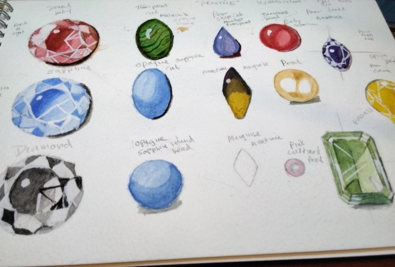
3. Round Ruby : I am dipping the brush in water and using it as a kind of spoon to hold water and put it into the color. I rub the brush gently to get red pigments interact with water and transfer it to my palette. I will use three little areas. The first one with concentrated color and add more water in the two others to have different grades and transparency. I will be painting a round Ruby. I'm removing the excess water that is in the tip of the brush with the tissue paper in order to have a smooth pigmented red. We neither need a lot of water nor a dry brush. I'm painting the table starting by the darkest color. And then I clean the brush, dry it, and take from the diluted red and paint from the opposite direction until I meet the other side and mix it and remove the excess of color in the tissue paper. I continue until I'm satisfied with a soft transition. It is also possible to start going the other way around as I am doing right now. Put a first diluted layer and then add more layers on the areas where you'd like to get pigmented values. I intentionally left the highlight spot non painted because it prevents me from having a tanned white When I add it in the end. I'm using the summit of my brush to direct the color and moving it gradually. So I do not leave very visible transitions. Watercolor dries very fast. That's why you need to make quick but steady movements. Controlling the brush needs practice. So if you're not very familiar with it, take it easy because it's gonna take some time. Hold the brush gently and remember that the paint is concentrated in the summit of your brush. Avoid pushing the brush against the paper when focusing on details. I assume that you already watched the first part of the course so you can understand the choice of colors position. If not, I highly recommend to see it first because it has the basic knowledge that you need to follow easily what's coming up in this second part. You'll notice during the video that other stones are suddenly colored. It is because sometimes I need that the first layer dries before I paint on top of it. So I use this time in coloring other stones, since the color is already mixed in the palette. Right now, I added a tiny bit of brown to the red in my palette so it gets darker values and I keep adding several reflections until I feel satisfied with the result. next step is to cast shadow. I'm using an amber brown and draw a very thin layer with this summit of the brush next to the stone. You can also use a very light gray color. For highlights. I use acrylic or gouache white paint because it is thicker and opaque and allows to stone to get more sparkle and volume. I have put a tissue paper underneath my hand to not mess up the other paintings in case they're not 100 percent dry. So that's it for the Ruby painting. I will draw more faceted stones. You can watch till the end and then start painting or paint along with me.
4. Round Sapphire: I'll paint a sapphire. So I'm using blue and making three different grades of it in the palette by adding a bit of water. So right here, I started painting the lightest values first. So you understand that there is different methods possible. Either you start from the darkest to lightest values, or from the lightest to the darkest. Try and find out what you like the most and what works the best for you. The first layer will show a saturated color already but when you keep adding more layers after it dries, the first layer looks very light compared to the first time you saw it. I had way too much water in my brush. In this case, I use the tissue paper to dry the brush and remove the excess from the paper. I added the cast shadow but I still felt that the stone needs some more color. So I added more blue to give it more depth. And now the highlights to make the stone shiny and with more volume. As you can see in the left bottom side, the line wasn't as straight as it should be. In this case. I wanted to correct it without messing it up. So I added the pavilion highlight there.
5. Pear Amethyst: I prepared three different grades of purple. And I will start by adding the first layer. Amethysts are one of my favorite gemstones in this pear shape stone. I decided to paint facet by facet and leave some non-painted. I added afterwards a very light purple, and then I added the shadow and the highlight.
6. Pear Citrine: I'm coloring the citrine the same way I did with the amethyst. Please do not forget to share your project with us. I would like to see a result and kindly interact with the other students. And tell them your opinion about their work as well
7. Round Diamond: And one more faceted stone, a brilliant diamond. For this stone, I am using only black and a lot of water, and then adding white acrylic paint for the highlights.
8. Round Ruby Cabochon: For this first cabochon, I'm starting with a layer of red. You can use a bigger brush if you'd like to. It will make the painting easier, since the cabochon is a bit big. I keep removing the excess and I add a little bit of color in the shadow because it is a transparent cabochon, as I explained in the sketching course already. I'm making the borders darker because the distance is smaller and fewer light passes through it. Allowed the paint to dry between each layer and another. I'm adding in the end, the shadow and the highlight.
9. Round Sapphire Cabochon: The second cabochon is an opaque one. That's why the darkest values are from the side where the light is not hitting. You can always add more colors if you feel that you need it, but until it dries so you make sure that you are seeing the colors correctly.
10. Pear Amethyst Cabochon: Here is a pear shape transparent amethyst cabochon.
11. Pear Opaque Cabochon: Here is a pear shaped opaque yellow cabochon.
12. Ametrine Marquise Cabochon: This is an ametrine It is when an amethyst meets a citrine, I wanted to make it faceted stone, but I then turned it for no reason into a cabochon I started with purple and then yellow. There is no actual order. Just pay attention to make the borders look darker than the center, as I explained in the first part of the course.
13. Malachite Cabochon: And as a last cabochon I'm making a Malachite. Malachite cabochons vary a lot from one to another. Since the stones are natural, I recommend using a reference while painting one. After drawing several dark and light layers . I make the borders and the parts that receives less light, darker. It is because malachite are opaque stones. And I add the highlights in the end.
14. Bead: Painting beats is similar to the most visible difference is the cast shadow.
15. Pearl: Firms are painted in different ways. And the one I use is imagining two different lights but close to each other. I started with a light layer of skin color, which is a mixture of ocher and a bit of Fred. First have different colors. So you can always try and experiment. And don't forget to put the cast shadow, which is similar to the beach shadow.
16. Exercise n°1: I want you to paint three faceted stones, three cabochons, three beads, and three pearls in any shape and color you want, and please share your work with us. Please note that practicing is the most important part of the course. And doing the exercises is very crucial to get benefits from the class and see any improvement of your work.
17. Earrings Composition: The seashell has a structure, so you need to pay attention. How does the light hit the little shell or any object you choose? Think about shadows and lights on the object. The best way to do it is to look for references. For the gold color. I start by painting the first yellow layer and avoid the highlight spot. And I use ocher color afterwards for darker areas. Any combination of stones leads and make them into truly am painting on a white paper, which is different from gray or brown color paper. The base is already white, so I tried to leave this Bots does are going to be highlighted non painted. Okay. I chose golden. These beautiful curves are mostly from Indonesia and the Philippines. They are among the most expensive of all types. Hi, used orange red beads and culture shock. I wanted to keep the warm feeling inside. Hi, the shadow using black paint with a lot of water. Hi. And in the end I add white highlights.
18. Brooch Composition: I'm painting a brush. We call the sitting in the cloud above a sitting amusing, elusive fires and silver. The colors tries gave a cold feeling. I will let you watch the time-lapse up to painting and I hope you enjoy it. Okay. Hi. Hi. Okay. Okay. Okay.
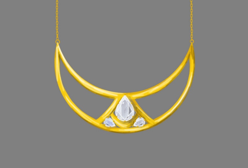
19. Necklace Composition: I used in this necklace. They can contain various undertones and other challenge of green, purple fill till they're in yellow. I started with a purple layer and added some green. And then adding gradually both colors. Paying attention to lead to light spots and add some darkness in between and around the pair. I want record the painting of all of them. So the video doesn't get so long. And add the shadows and highlights in the end. Hi, okay, for the class, I'm using yellow ocher paint and diamonds. Okay. Hello. Hi.
20. Exercise n°2: I want you to draw three jewelry pieces by combining what we learned before and paint them and kindly share your results with us.
21. Inspiration for my jewelry piece: I want to create a jewelry that reminds me of something that I love a lot. Since my childhood did see was a big part of my life. It's where I enjoy my time, the most. Collecting little stones in different colors. And the beautiful seashells was a beloved activity for me. Touching the send and watching the sunset while hearing the wave sound has always been so amazing. Not to forget the campfire and its sparkles in the air.
22. Brainstorming: So the first step is the brainstorming. I start by putting several words that come into my mind. What do I remember when I think of the sea? Seashells, campfire, touching the sand, the sunset, the sound and color of the waves, and pearls. Now concerning the materials I may use, I think an orange Citrine will be good for fire, a golden seashell, and orange citrine for the sunset as well, aquamarine for water. A round stone for the sun, or maybe a half circle facetted citrine will represented better. An oval-shaped stone is close to the fire shape. And I'll choose for water aquamarine beads. Or maybe round stones.
23. Ideas Elaboration: Ideas elaboration. Let's start by expanding the campfire idea. I would like to have the fire and some sparkles. I think that the oval shape is the closest to the fire shape. This is going to be a pendant. So I'm going to set the stone in a bezel and add the flame in the left side. And prongs to the right side as sparkles. So this is the top view. And now I sketched the bottom view where we can see the pavilion. And the bottom side of the bezel. To mention that it won't be a closed bezel. It means that it allows the light to pass through the stone and give it a beautiful orange color. I would like to have the flames and sparkles in gold. Because of the fires warm temperature. The second idea is another pendant, but this time a citrine bead, which is the fire. I put it inside of a cage, which is actually the flame I used four axes. Then I felt like it needs two others. The bottom view will show that the bead is going to be secure. And I want that the flame is gold as well. Now to the sunset. A half circle is actually a good idea to represent the sunset. But I think a cabochon will be better than a faceted stone. I tried this simple golden bezel. I think it fits better than prongs, like a kind of sunset colors transition. What if I add some little dots all around? Just draw anything that passes through your mind. Try different shapes at anything you would like to and filter later. Why not another version with short and longer rays.
24. Discover: Discover. In this part, I want you to discover how does the pieces you choose look like when you combine them together? I chose the third sunset. But as a pendant, it didn't look very comfortable to my eyes to put the loops in that position. It is technically not very stable. And if hung in the necklace, it will probably turn upside down. So I tried to make a better structure and drew a stick with aquamarine beads that represents the water horizon. And hung the second fire pendant, I think that it's going to make it heavier and prevent it from turning at any case. And I will jump now into earrings and try two different combinations. One with Sun, water and fire. And the second with sun, pearls and a seashell.
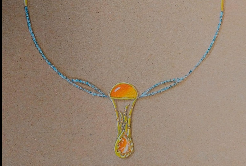
25. Final Sketch: Now to the final piece. I started by drawing a circle and then placing my sunset in the middle of the necklace. I wanted to give it more volume, so I added some waves in each side of it. I didn't use the first fire pendant with oval shape. So I'll try how it will look like here. I'm adding flames and sparkles. And try to adjust the waves a bit. I am adding stones all around the necklace And as a clasp I would love to have a golden seashell. Remember that's just a sketch to discover and try out what I would like the most. It doesn't have to be perfect. And I can always erase and draw something else instead. I'm using color pencils to get an idea about the color combination. The orange and blue are complimentary colors. And I personally like this combination. I'm so far satisfied with the designs. So let's bring some watercolors and color them together.
26. Exercise n°3: In this part, I want you to think about what you love the most. A place, a person, a hobby. Make a brainstorming, get inspired from nature and internet. Write down all what passes through your mind and try different compositions until you're satisfied. Sketching your ideas doesn't have to be perfect. It is a way to put what's behind your eyes, in front of your eyes. So don't waste time drawing nicely with beautiful lines. The important in this part is to put the maximum of ideas and expand them more and more.
27. Earrings Sunsetbeach: Since the paper is brown, I like to start by painting the light areas first using white acrylic paint. I will keep painting layer by layer. And now we'll add the highlight and the cast shadow in the end. The videos are two times faster, but the details are still visible. So I will let you watch the time-lapse of the painting projects of the Tuileries we sketched before. Okay. Okay. Hi. Okay. Okay. Hi. Hi. Hi. Hello. Hi. Okay. Hi. Okay.
28. Pendant Sunsetbeach: Hi. Good. Hi. Okay. Hi. Hi. Okay. Okay. Okay. Hello.
29. Necklace Sunsetbeach: Hi.
30. Thank you so much !: If you made it until here, I thank you so much for taking this course and support in me. Please share your projects with us. You will make my day and I will certainly feel that the course was useful to you and make sure to follow me if you're interested in the third part of the jewelry course.
 Soundous Bouhandi, Jewelry Designer