Transcripts
1. Class overview: This course is the third part of the series I made
for jewelry design. I highly recommend that you watch the previous ones because you will learn the
basic knowledge you need to follow
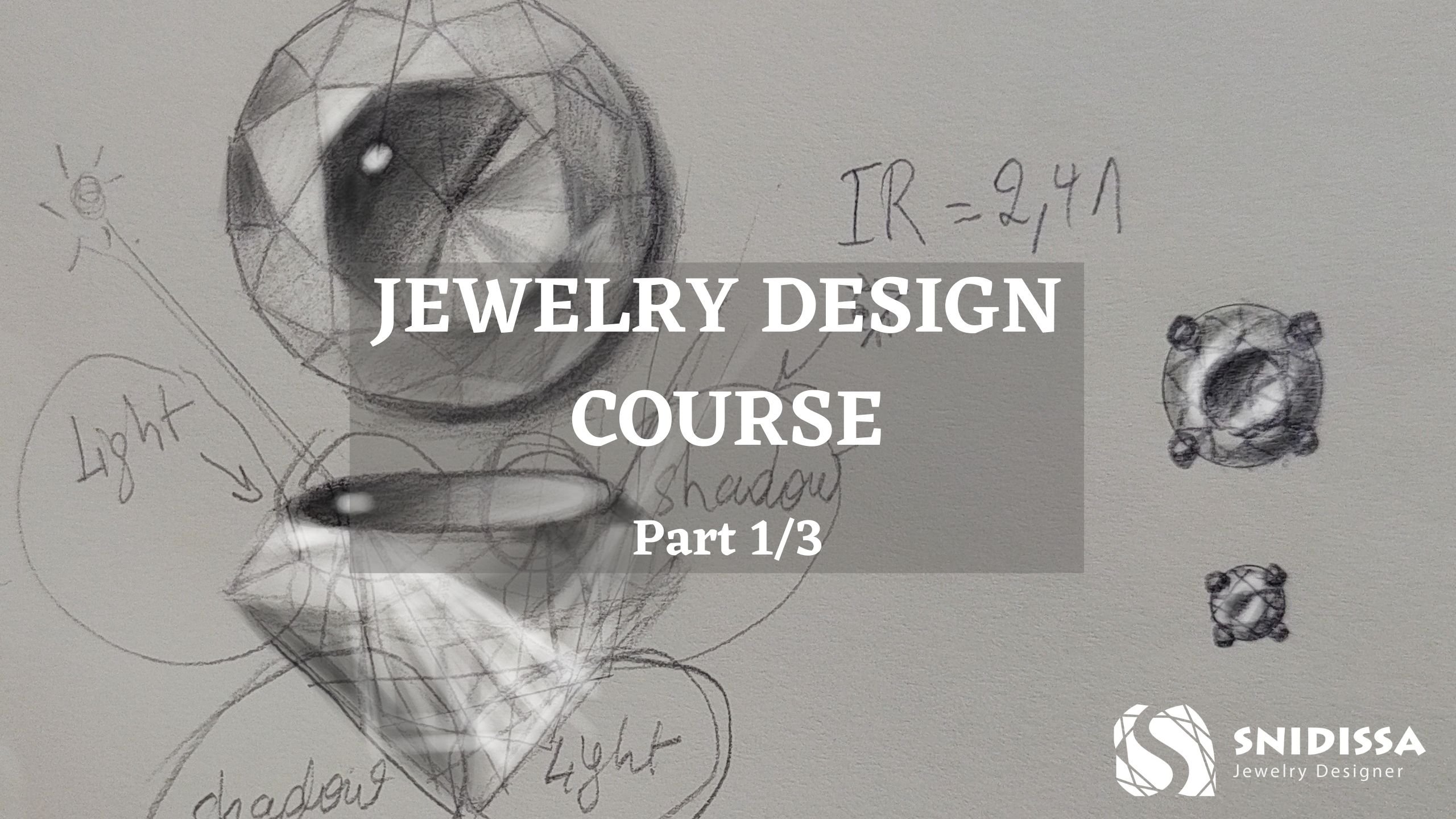
this third part. Part one is about sketching
and designing jewelries. Part two is about painting them and designing from a
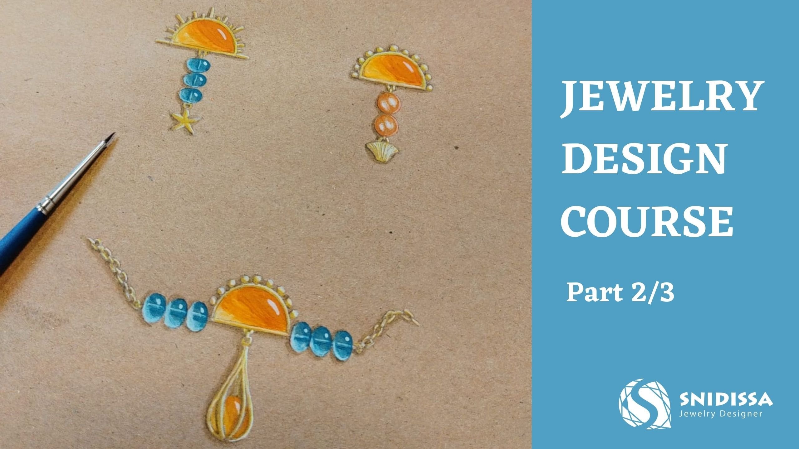
source of inspiration. We're going to paint gemstones, Cbuchons and pears digitally. I'll show you how to paint a chain and I'll take you with
me through the process of working on an order for
a customer who wants an amthy string and a
pair of nx earrings. We will then create a
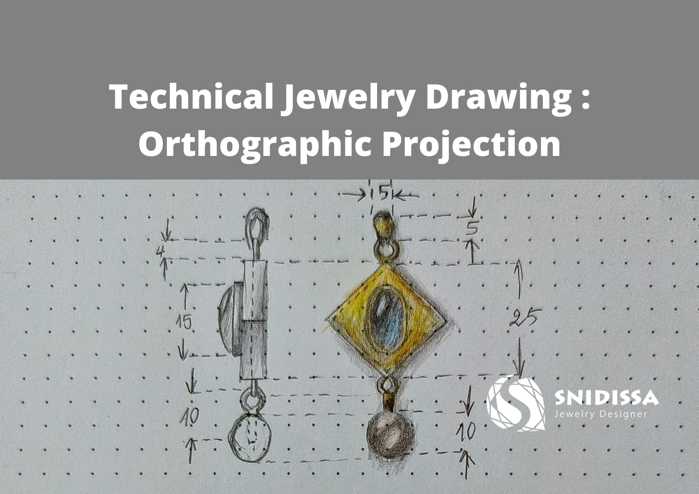
technical drawing for a pair of earrings and
paint them together. If you're interested in this
course, let's dive into it.
2. First layer: We will start by painting
a round shaped stone, and I will show you how
I personally color them. I'm using a Wacom tablet
to draw and Medi bang. It's an open source software. There are several
alternatives you can use. Maybe a photoshop or procreate
if you have an iPad. Start by drawing a blue circle or any other color you like. Then add a new layer and select
the clipping mask option. This will allow you to
paint over the circle only and not affecting what
is outside of the circle. I consider the light source from the top left and I follow the light and shadow rules that we saw in the first
part of the course. I'm using a watercolor
wet brush with very low opacity and the size of the brush
changes by pressure.
3. Facets drawing: After coloring the
first layer of shading, I will use a white pen
to draw the facets. I enable the criss
cross snap to draw straight lines and draw a first square and then
use the parallel snap to draw a second square that
is 45 degrees rotated. I attach the corners
to the borders of the circle and then add V form.
4. Facets painting: I make selections for some facets and color them in different grades of blues. The high index of refraction of a diamond is what's making it look so shiny. When light enters the surface of a diamond, a portion of it is reflected back out of the table. We talk about the reflection and the remaining rays of light travel into the center of the diamond and balance of its internal walls. We talk about refraction. As light exits the diamond dispersion causes the white light to be separated into multiple colors. Light is directed to the sars facets top-left. The stars in the other side will have shadow. And I add some pavilion in the table as well. Light that enters the diamond made the pavilion lighter from the left, bottom side and darker from the right. Due to the diamonds high index of refraction, who would see from the top view the sparkles in the pavilion facets as well as darkness. I add a highlight on the table to make it look sparkling. I keep selecting different facets and color them with different shades of blues. I'm not following a specific rule in this step. It is important for me is that the top-left side of the crown is mostly lighter, while the bottom right side is mostly darker. And for the table, the top-left part is mostly darker, while the bottom left side is mostly lighter. After this lecture, I would like you to draw around shaped stones in different colors and show them in the project section. I add the final highlight reflections for this tone.
5. Different colors: Right now, I added a
dark gray background and selected and inverse the selection and then
create a new layer and painted black, which
is the shadow layer, and put the layer
underneath the stone layer. I add a Goshen blur filter to the shadow and
reduce the opacity. I copy paste the stone and change the hue to
change the colors. I made the red, a
yellow, and a green one. For the diamond, I reduced
the saturation to zero. And yeah, that was the
faceted round stone.
6. Oval shape: The steps are actually the same. So start by drawing a blue circle or any other color you like. Then add a new layer and select the clipping mask option. This will allow you to paint over the circle only and net effect in what is outside of the circle, I will use a white pen to draw the facet. I enable the crisscross snap to draw straight lines and draw a square, and then use the parallel snap to draw a second squared that is 45 degrees rotated. I attached the corners to the borders of the circle and then add v form. I guess it then the light source from the top-left. And I follow the light and shadow rules that we saw in the first part of the course. I'm using a watercolor wet brush with very low opacity. And the size of the brush changes by pressure. The high index of refraction of a diamond is what's making. It looks so shiny. When light enters the surface of a diamond, a portion of it is reflected back out of the table. We talk about the reflection. The remaining rays of light travel into the center of the diamond and bounce off its internal walls. We talked then about refraction. As light exits the diamond dispersion causes the light to be separated into multiple colors. Light is directed to the stars facets top-left. The stars in the other side will have shadow. Light that enters to the diamond, made the pavilion lighter from the left, bottom side and darker from the right. We would see from the top view the sparkles in the pavilion facet, as well as darkness. I add a highlight on the table to make it look sparkling. A make selections for some facets and color them in different grades of clues. Right now, I added a dark gray background. And I add some pavilion in the table as well. And I add the final highlight reflections for the zone. And then create a new layer and painted black, which is the shadow layer, and put the layer underneath this tone layer. Add a Gaussian blur filter to the shadow and reduce the opacity. I copy, paste the stolen and change the hue to change the colors. I made a red, yellow, and green one. For the diamond, I reduce the saturation to 0.
7. Cabochon: After making a circle, add a layer and select
a clipping mask. Paint the first layer and
choose the color you like. I'm using yellow and adding
orange for darker colors. And in the end, I add the
highlights in different spots, considering that the room has several lamps or light sources. And I add the reflective
light from the bottom side. And then add the shadow and
place it in the right side, blur it and reduce the opacity. I copy paste the Cuch and change the e
and the saturation. And, yeah, that's
it for the Caboc. Okay.
8. Pearls: For the pearls, I'm imagining two different light spots close to each other and some darkness in between. I'm using a watercolor wet brush with very low opacity. Add the reflected light in the bottom right side and darkness in the top-left side. There are different ways to paint a peril. And it depends actually on the last term, which means how shiny is the pearl. It depends also on the environment where the pearl is. So if, for example, we're talking about a jewelry photo studio bugs with a LED light, then the PR will be more shiny. I keep adding some different shades on the Perl. I want to have a smooth shading. I advise you to watch different references of pearls on the Internet and try to compare different pictures. If you have a real Perl, then that would be great. So you can experiment by changing the position of the light source and discover how does the light effect the last year of the pearl. By the end of this lecture, I would like you to draw three to four pearls and share them in the project section. So I keep adding different values on the pearl until I'm satisfied with the final results. When you keep looking at the painting, it may look a bit weird, but it's okay because it's zoomed in right now. And when you make a zoom out, you will see that the pearl looks more realistic than before. And of course, when we add the shadow, it's going to be better, which is the next step at the cast shadow, blur it and reduce the opacity. A little trick is to set the pearl as a brush and edit the spacing in a way to be able to draw pearl necklaces or bracelets. And you can set the size of the brush to change by pressure. This will allow you to make very easy pearl necklaces that has a gradient of sizes.
9. Chain: We're going to learn how to make this simple chain. I start by drawing a yellow oval shape. Add a new layer and select clipping mask. I'm using a watercolor wet brush with low opacity. I consider that the light source comes from the top-left side. I'm using darker values in the bottom right side and lighter ones in the top-left side. In order to know the distance between each piece. Copy paste to others, and draw a rectangle in a new layer. And delete the one before. And then place it on top of the other layers and make it round from the sides. And I turned on the crisscross snap to draw straight lines. I draw lighter values in the tub and darker values in the bottom. And then I highlight the left park and darken the right. I copy paste and merge the two layers. Then copy paste again and send a new layer to the bottom. I base to others and scale them as extensions for the bracelet.
10. Receiving the order: The clients wants to have
a technical drawing for a very simple ring
with a novel amethyst, 18 rat gold,
minimalistic earrings with expolet in three
different examples, using a little sphere or square. She mentioned that she sent the stones and asked if I
have further questions. I thanked her for the order and asked about the stone sizes, the number of the prongs
for the amethyst, the drill, for the Brile and
the metal for the earrings. She answered me for
the questions and I confirmed that I received the stones that she
sent with a friend. Here is the Ameths. And Onyx.
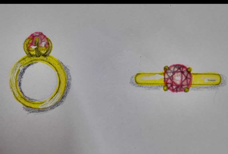
11. Sketching the order: The costumer was very clear with her order. She didn't ask me to imagine anything unique or sell. She wants to see that minimalistic jewelry pieces that she has in mind into paper. Minimalistic earrings with unexplainable let in three different examples. Using a little sphere and, or a square. I started by sketching the earrings way to variations as fear and a square. And I'm showing the side view. So we understand that these are stud earrings with a drop. And I combined both shapes together in case she wants to create longer earrings. Now to the rink, I'm making my hand as a guide to get a realistic size for the ring. And I draw the ring from a top view with the six products as she asked. And I extend the lines to draw the front view. I extend the lines from the stone as well as the prongs. That's a quick view of this catch after I colored it.
12. Finishing the order: The recording didn't
work unfortunately. While I was making this order, I will show you the last
step that was saved only. But it's fine. I will show you another drawing of a piece of jewelry later. Right here, I'm making
extension lines to show the size of the stones, and I'm writing down the
measurements in millimeters. If you have a logo, you can make it as
a water mark with a low opacity
behind your design. I mentioned the type
of material as well as the name and the
shape of the stone. For the thickness of the ring, I use the arrows from the outside because the
space is too tight. And I'll be explaining this
in an upcoming very soon if you're interested on how to technical drawings
for jewelries. Here is the final drawing of the ear rings with
four examples, and I mentioned that
there are stud earrings, 18 art gold, name, and size of the stone. And I sent the results
and asked her if she needs me to do any
revisions for her order, but she didn't and was
satisfied with her order. So I thanked her for the
trust, confirmed the payment, and told her that I'll be sending the stones the next day.
13. Color palette: The first step is
that I downloaded a real picture of an 18 ret
cold ring from the Internet. I want to use it as a reference to prepare
my color palette. This helps keeping the painting in a realistic color frame. I pick different
colors from light to dark to use them in
my painting later. You can pick 3-6
colors as you like. And then I delete the ring
and keep the color palette in a separated layer that
I named color palette, so it's easier to get back
to it afterwards. Okay.
14. Front view: I create a background layer with a light gray color. It allows the highlights to show better. I took this annexed stones from the Internet. I enable the color palette and I create a new layer to start painting the golden park. I enable the crisscross snap to get straight lines using the pen brush. 100% opacity with the base color. Draw the connections to the stone, which are very important. And I'm making a kind of flower on top of this tone. Now I create a new layer and select clipping mask and change the brush into a watercolor wet brush with no opacity. I'm making parallel diagonal lines Show that the metal is twisted. I'm using dark values first to get a general idea about shadows places. The light source is in the top-left side. So I use the highlights from that side. I then take the midtones from the palette and keep painting until I have a smooth transition between shadow and highlight. And I'm always paying attention to the light source. And in the end, I add the white color for the final shape. And more darkness in spots that receive less light. And then I merge it with the layer underneath it.
15. Side view: Now to the side view, I create a new layer and extend the lens of each part of the earring to get similar measurements and reduce its opacity. If you have a stone already, you can take a picture of it on a white paper with your phone and transfer it to your computer or tablet. I'll create another layer and place the side view of my stone. It's all about layers. So I'm creating a new layer again and drawing with the pen brush 100% of the base color. Draw the flower with the little circle, which is the connecting part. But in this view it is just a line. And the line in the front view is what looks like a circle in the side view. And then areas. I create a new layer and extend the lens of each part of the earring to get similar measurements and reduce its opacity. Now I create a new layer and select clipping mask and change the brush into a watercolor wet brush with no opacity. I'm making parallel diagonal lines to show that the metal is twisted. I'm using dark values first to get a general idea about shadows places. The light source is in the top-left side. So I use the highlights from that side. I then take the midtones from the palette and keep painting until I have a smooth transition between shadow and highlight. And I'm always paying attention to the light source. And in the end, I add the white color for the final shape. And more darkness in spots that receive less light. And then I merge it with the layer underneath it.
16. Details: Right now, I went to make a zooming for the giant of the earring. I copy, paste apart and scale it bigger. Create a clipping mask and painted to show more details. So I'm creating a new layer again and drawing with a pen brush 100% of by city the base color and change the brush into a watercolor wet brush with no opacity. I'm using dark values first to get a general idea about shadows places. The light source is in the top-left side. So I used the highlights from that side. I then take the metals from the palette and keep painting until I have a smooth transition between shadow and highlight. And I'm always paying attention to the light source. And in the end, I add the white color for the final shape. And more darkness in spots that receive less light. And then I merge it with the layer underneath it. I'm making a selection to the stone and coloring it wide to show that it is half drilled. And that there will be a golden stick attached to the flower. And getting inside of the stone. In technical drawings to usually write down measurements. So it is visible to the metal smith to produce it. To do this, I enable the crisscross lab an extended lines for the parts I want to show measurements for. I make dashed lines and use arrows inside them for the big distances. When the distance is too small, use the arrow from the outside and write down the number in between. And add details about the materials. And also in case you have a story behind, you can write it down as well. And the title, if you'd like to.
17. Outro: If you made it until here, I thank you so much for
taking this course. Please share your
projects with us. You will make my day and I will certainly feel that the
course was useful to you. Make sure you follow me
for upcoming courses, and I'll be glad to
receive and answer your messages on my
Instagram as well.
 Soundous Bouhandi, Jewelry Designer