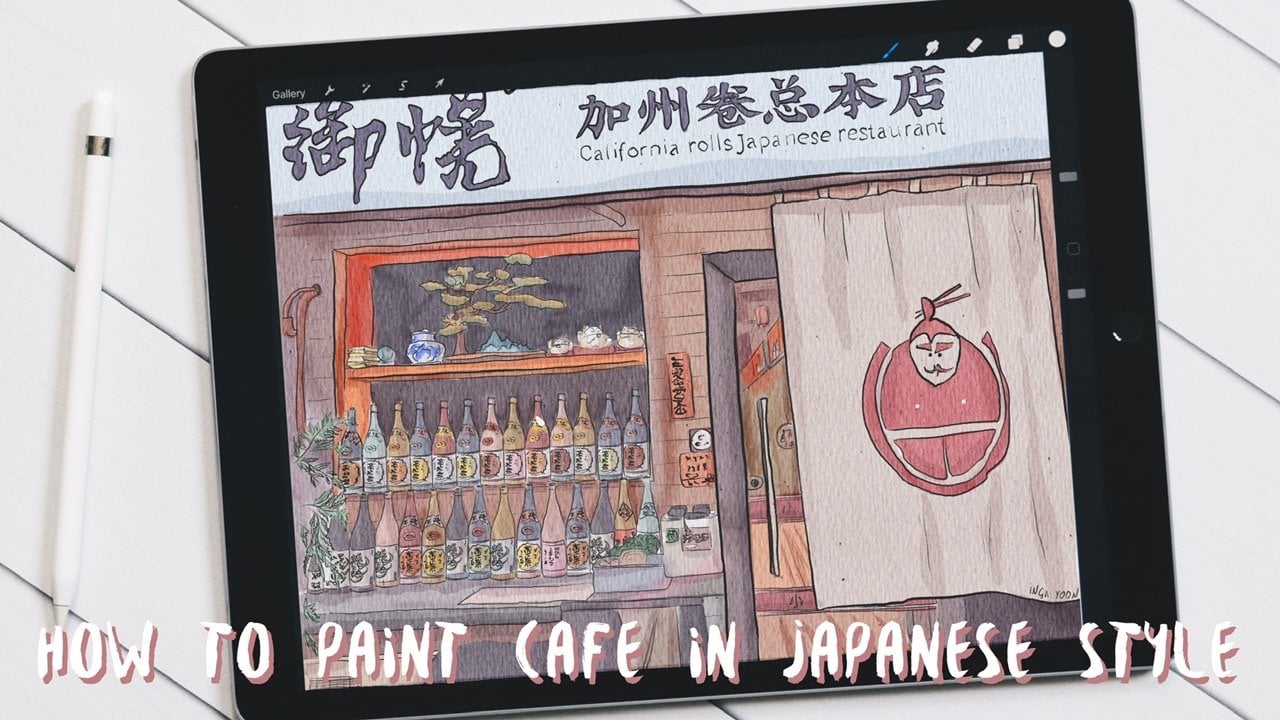
Transcripts
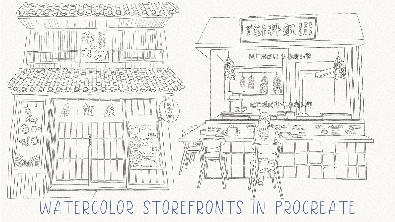
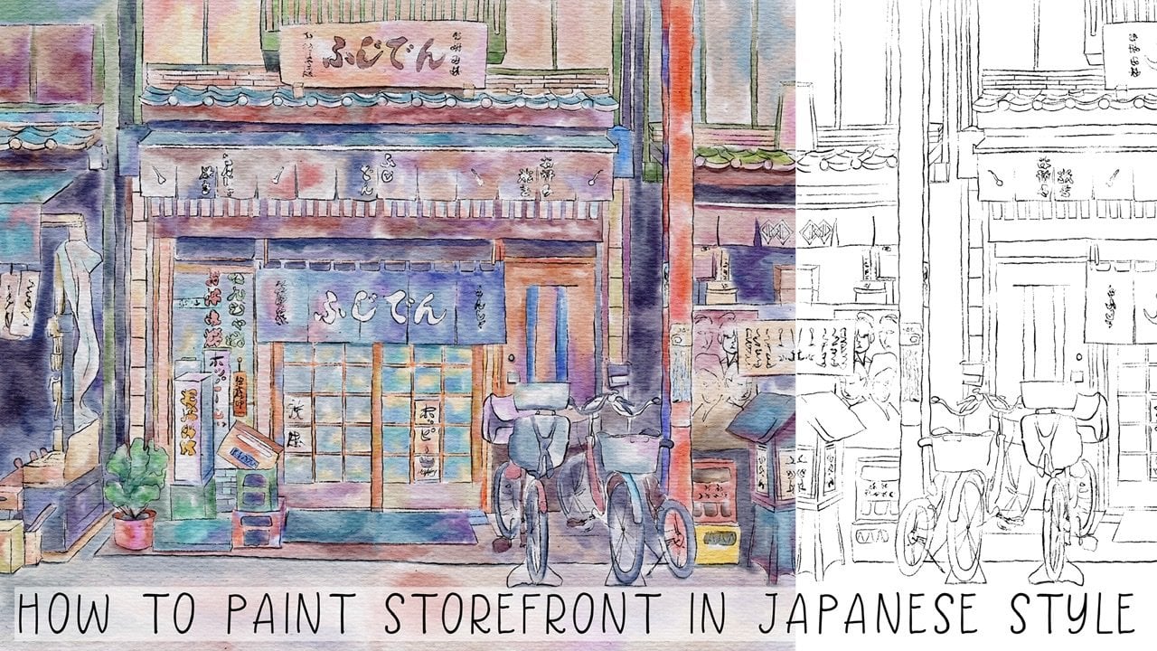
1. Introduction : Hello everyone. Welcome back to my class. During today's tutorial, I'll teach you how to paint tool store brands in a worker in procreate in Japanese style. And I have a new watercolor brush sets, new technique, and you colored palette, new texture paper. So I hope you're already an IV. So let's go. Guys, am a freelance illustrator. Welcome back to my class and let's play it all together. Cool illustrations of door Japanese storefronts in watercolor. In different time of the day. I prepared for you laws of freebies. Add in Zander My class, you will learn more about Procreate, especially how to use layers, clipping, mask, selection tool, and how to add color variations to your picture. You can use the illustrations you create for posting on Instagram, added to your portfolio or sell it on Etsy gum road and so on. Or just share it with someone whom you really like. I am sure they will be so happy to get an illustration that is created by you. Today. I want to show you that vertical. It's so simple and it's a real fun. And in Endo my class, you can see it. Today. I will teach you how to create texture paper. And they have two papers. How to use reference option, how to paint a picture of Brahms, a sketch. You can draw your own sketch or use mine. How to use my default Procreate brushes for watercolor painting. How to apply my new watercolor technique and use stem brushes. What as a new answers you need to know if you want to create watercolor illustration, how to use selection tool. I will explain what is clipping mask and we're going to use it a lot of times today. I will also show you different techniques of adding shades and highlights. I will show you my whole process from start to finish. And as a bonus, I will share with you might do texture papers, new custom brushes, color palette, sketches that I created. I will also add files of my pictures that I drew. Feel free to use for your own art projects. This class is great for intermediate level, also can be fined for beginners. If you've watched my previous classes and can be useful for experienced artists, probably here you can find an inspiration in new ways, how to pay in storefronts. Your class project, you'll be next. Paint a storefront using the tips and brushes that I gave you today. Or you can even paint all of them. I will use Procreate for this class with iPad and Apple Pencil. So if you have it also Maza drawing pets or just regular watercolor paper and pains. Please join our class and good luck.
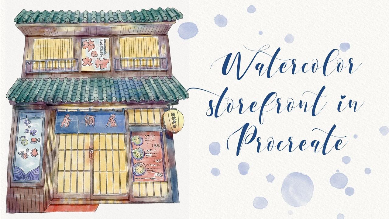
2. Creating textured paper: Wow guys, let's start in. I'm going to tell you what you're going to pay in today. And it will be storefronts in Japanese tile. And they already created some sketches clear, this is the first case that you're going to pinned. And the second one is this one. So as you see, you have a lot of work to do. And I guess for this class I prepared does't extra papers. I'll show this is the first one. It's pretty rough. So you see all those rough lines. And the other one, It's a smooth texture paper. So you'll have an option. And actually, I think I went to pay into different illustrations though illustration say on a different texture papers and gaze. Also one of the main features of our today's class is that we're going to paint our illustrations in two different times of day. So Z's paint and you're going to create in at night. And as we were going to paint it in a day light here. Well, today's class I prepared for you a brush set. Wherever you have poor oriental dry brush after for regular watercolor pool, which color background? Watercolor stem, simple biological stem. And as it brushes from procreate brush set of sketches, all brushes, colored palette. As this one storefront, I'm going to go and leave in sources and project section in the right corner under the headline, sources, you might go and the Lord, all my freebies. Guess you might use your own pictures. Probably you have some pictures in Japanese styles at you. You are dreaming to pain. So this is a right, Jose, or you can just simply use my my pictures that I took. Actually, this one is it's gross pictures that I took. And this is the second one. So guess it's all up to you. If you'd like, you can take this picture or you can use my other picture or you can just go ahead, use pictures that you like. You also can go to the website unsplash.com and law and there are some pictures that you like. You can use them for your personal and commercial purposes. And I think now it's time to create texture pain. Also keep in mind, if you need to download them, you need to do is it prompts a browser. So if you are using Skillshare app, you might not see this option. So once again, you go and download our texture papers to Downloads folder. And I have to say it, you need to press action. And after press, Add, Insert a file. And in downloads folder, you will just automatically insert it in Procreate. I already have our texture papers here, so I don't need to use it. But I hope you understood what is the process of downloading texture paper. And let's just duplicate our first texture paper. After the, change the mode to Linear Burn mode. And color burn enough to duplicate it one more time. Linear Burn and one more time Color Burn. Merge together and merge together. Lowers opacity. And after this group it. And I, I want to rename it and I wanted to write something like texture paper one. So is our second texture paper. We need to turn it on, then replicated, change the mode to Linear Burn mode and Color Burn. After that, they complicate Linear Burn and replicate colorbar, merge together and merge together. And Linear Burn mode, we can lower the opacity to 40 percent and after group it and also rename. So if you have texture paper 1 and texture paper towel. And guys, let's start with a daylight. And I'm going to use this sketch and guess my suggestion, it's better to lock your sketching layer in case. For example, if you paint and you mistakenly can start painting on the layer with our sketch. So don't use it, try to avoid it because later you might delete some bars or so on. So you actually need to stay away from ours kitchen layer and paint on the layers that are on the niece of our sketch layer. And guys are. Now I want to show you how to use a reference layer. What we're going to do, we'll go to Actions, button, press Canvas, and after press reference. So as you see automatically we have a reference picture of our sketch, but we need to have reference picture of our reference picture. So in this way you just need to press Image. And after press Import Image. So this our picture. We can zoom it a little bit like sad. And now we can start using hours kitchen layer. And I'll reference picture and we can add some colors. So let's go.
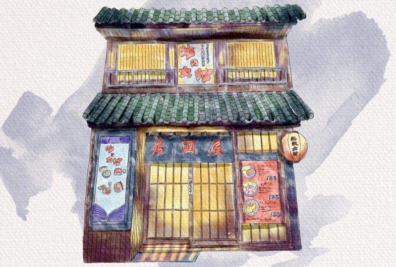
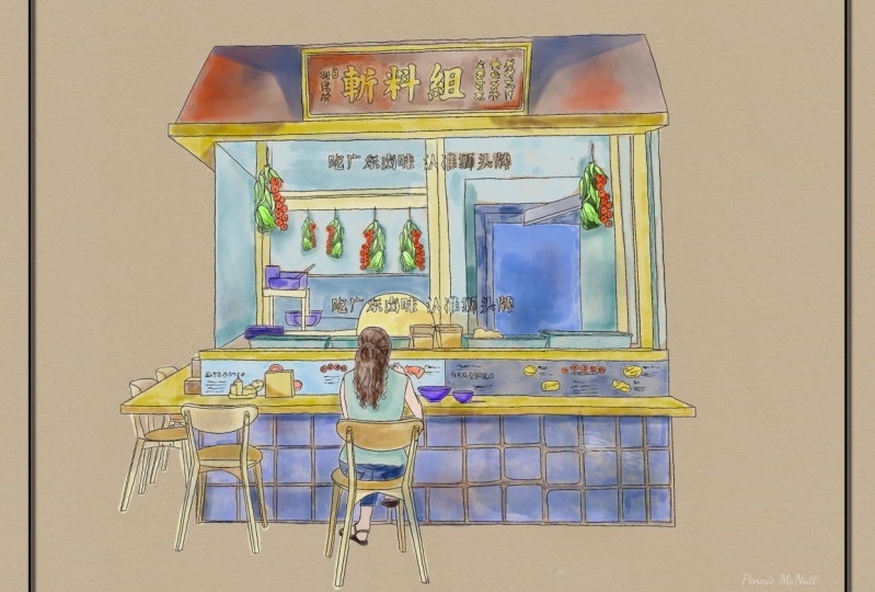
3. Painting storefront in daylight pt.1: Well guys, you go to our brush set and Greg will regular watercolor brush. Yeah, on a new layer that is underneath of us cage. And speaking about color, I'm going to go and grab this slide blue color. And I'm going to start painting Zai swapped. And guys as a blend into and we'll use Terrell a rash. And let's just say you see here we also have this color story if you overlap because later when the blended, it will add more than Lq will add some other shades. So you're going to use it even in Japanese style, but we will change our style a little bit. So I hope you like that. Again. Next theme, you're going to go and grab a little bit darker color. And from suicide, you're going to add some dark shades. Because he's part of a store is in shadow, blend into tera layer brush. Once again, you don't need to blend everything entirely. Just heard a very sharp lines. Why are great ones? Again? You're going to pay in this picture kinda in under the old daylight. So as you might see, this picture is a little bit dark, so we're going to lighten our one. And how can you do that? You can go to hue saturation, brightness. If you want to do so, press layer and go to saturation and increase the saturation a little bit. And I'll say can increase the brightness, make it a little bit brighter. And you can play with color variations. It can be direct care lighter. I want to have it like this. Next part I want to paint this part shouldn't be blue as you see on a picture like that. So as you see, I don't blend everything because I want to leave so some watercolor splashes and errors and so on. Like said, it's pretty cold. And now I'm going to go and start froms at top. And after we can return to the main part. And I'm going to go and grabs his brown color. Speaking about our brush set, why I decided to leave. I have tinderbox is a brush that I use for sketching layer, but probably you might use dry ink brush. This brush is also cool for Add-ins at like SAS kitchen lines. It's very sensitive. You can see these kinda very thin up tibia press harder, seek. So it's up to you. I like thin their box because E from S For me, it imitates brush. Next thing, I will go and grab gold color. And this part will be called Guys. You can paint all over it on different layers, but I'm trying to imitate an actual wood color. So that's why I tend to paint everything on just one layer. Yep. Inside. They also have this cold color, white. Now it's color here. I also have called color. I will change some of the colors because I think this color would be most suitable. Dark blue color. I want to show shade, light beige color. And I need to start coloring tabled. I removed some chairs and people because I think our main idea, our main focus should be on storefront, not on the people. So I didn't pay and the actual phase of a girl, I just bend her froms a bag. In this way, our main focus will be focused just right on the center of storefront, not on a people that are in Pronto said it's like the law or darker beige color. And let's paint sheet. This is like pretty dark time, but we need to paint it in a light like in a datetime. So I'm going to pay in cheers also pretty light. So I will use this light beige color. Now let's switch to a darker color. Okay? Okay, if data is chairs, now here underneath the table, we have such boxes. Think is like for the curation, but probably it's kind of storage boxes. So I just need two fields. It is this part with brown color and not as a rest. I will go and grab blue color. I know on the picture it's everything is brown, but I think Ed and blue color a little bit better. Next, as I told you, I'm going to go and grab and change the color to blue color, lighter blue. And here I want to paint everything on different layers. Hockey nautical or corrupt blend tool. That's why I did it on a new layer because I don't want to blend this brown color. I want to blend just blue-colored. So I separated picture from two, from one layer to another. Sad key and my kid. And now you have this watercolor splashes. And it looks perfectly. And now it's just merge it together now again on just one layer. Thanks. So next theme is, I'm going to go and pansies part. And as you see on ours cages, black and white. So I obviously I'm not going to use black color. I'll use dark, dark blue color, something like that. And same here. I'm going to go and grab light blue color because obviously I'm not going to leave it just wide. Now blend into just blend sharp highlights. The key print. There's just have just small details and I think we need to paint his buys into work. And also I hadn't gone craps is dark blue color. This is blue, this is dark black. Makes it some kind of soups. C can be red. It can pane right here. And now it's moved to go. She has brown color. Sometimes. And he held mics, light brown color and dark brown colored gland. And, and formulate through, you'll add more sheets. Now skin and darker. Because this part is in shadow. Green and blue like this. And you remember guys in the areas where we have two objects close to each hazard, we have shadow genes into purple color because he have a blue color behind her. So I don't want to turn every single one, just one shade. So let's start froms a light green. Here. You can grab slide the dark color and add some shades. This orange line here to Title II is white, so there's just sort of move some parts here and here to show some sheets blend into the nature of the way. And as we've done with this part now, let's just duplicate it one time. And as you see, it's so saturated right now, either Laura's out positive to 50 percent and after Island merge it together. Globulin, I want to have a brighter side who go to hue saturation brightness increase the brightness and increase situation. Now it's so bright. And a Guys, our next step is, I'm going to go and add some shades.
4. Painting storefront in daylight pt.2: Well guys, for shading layer, we need to create a new layer that is underneath of this layer. And my suggestion is just makes this layer not transparent in order to add more volume, more saturation to our shades. And as this way, I will go and create a new layer. And I will choose a layer that is underneath our office hour like regional layer off to go to Adjustments, Hue, Saturation and Brightness and press layer and turn our brightness to maximum to white, white-collar. And after merge it together and merge together and merge together. So now as you might see, our painting is not transparent. Same animal. And by the way, if you wanted to see As, Asit extra paper, this one is here. So as you see, it's a furnace slightly different. So I guess our next step is I will create a new layer that is on a top and a half to either press clipping mask. What does it mean? It means that I can pay in jazz and our area which is selected for. Here you see that icon go beyond the lines. This very convenient, especially if you paint on different layers. But for me it's convenient because I will not go beyond the edges from our painting. You see it here? Yep, I exist and are first of all, I'm going to go and grab your watercolor background brush. And I want to add some, some shades. So I grab dark blue color. And I just wanted to show some shades here at some volume. And also my situation, play around with some color variations. You might add some shades, it would be even more beautiful. But once again, remember about different colors. So as you see you when you add some like Ozzy color variations, it might add something to our paint in it. It looks very good. Same here. You might go and grab color, and that's some blue shades to chain, for example. Thanks, Nice. I like said. So we have now is our shadows, if you wanted to replicate them, makes them even more saturated. And I like it. I go to slower SAP ICT till 50 percent and often merge together. And I want to create a new layer that is between our original layers, the swan and such as between our sheets. And as you see as a slayer also in a Clipping Mask Mode. It's, it's great because it will help us to add more sheets. And in this way, the Quantico and Graph2d regular watercolor brush. And as you see here, and the knees like on an area where two parts are connected with each other. We have shades and I will show you how to shows us shades example here. So you go and go and grab this dark blue color. Once again, we own a new layer. So there's a part where two objects are close to each other or some areas that are in the shadow. So we need to place him to throws him into shadow from a chair. Sandra gives you like you can go to hue, saturation, brightness. I can make it more saturated. You can play this color variations, make it purple. I think I want to keep it purple. Make it lighter or darker to whatever you like. Okay, is this part I will have shack. Hello guys also, you might ask me a question. What can we do if you want to maybe change the opacity or if you want to change the color variation because we paid on the same layer where we just pay and our shade from a table and we don't want to change it. So there is an option. You go to the selection tool, press free hand, and we select our areas that we need to change. And after we go and press Adjustments, Hue Saturation and Brightness layer. And here you can play this facility and collaborations, whatever. So same, I want to show some shades in this part as well. Now you know how to show those shadows enough to chess ended. I also want to show you one other option. How can we add sheet? So the underlayer ways, our girl here and grab Selection Tool. And we need to select the area where we want to add some shade. Like this. We don't need to press phasor, we just go to Adjustments, Hue, Saturation, Brightness. And we can lower overseas part, increases duration for example. And it seemed the simple, ETC, It's so easy. Dark blue color. You can even grab a darker one area. We go to our girl area where we have our hair and show closes. This part will be in the shadow. Also in this part we'll have a shadow. Geisha. The other option that I also prefer, I like it. I will show you recall, we can just merge it together step-by-step. Let's add. And now I want to show you things to selection to how can we add some lines, highlights, and how can we add different shades and color variations? So first of all, we go to our cheer, press free hand. And this part will be in the shadow. Press Add. And you have to be careful and select areas right to court. And it was Alliance and and and don't press feather or whatever. Go to Adjustments, Hue, Saturation, Brightness layer. And now you go and grab, you see replay this brightness. So convenient. You can play this color variations, can be blue or purple. I want to have it read. And here we have shaped and it's so convenient. So you have two options. You might use our selection tool or you might use our brush. And I went to blend some parts like here. I don't want to have it such sharp. Let's keep it in some shades. Wherever you have a last details. And you go and grab selection tool, press freehand, and you have shade from the leg, from the chair here, press Add to suppress, add heres, foul. Same here. Again, I also wanted to show a shadow from objects. Here. Shadow. And Aki create some shadow here and here. So remember when two objects are close to each other, we will have insist parts shadow, shade, shade here at death. And, and also same as this part of the ball will be in the shadow. We also have a shadow in this part. And tiny shadow here. Shadow, shadow. So it's so simple. Ad and a shadow ends this part. Okay, Dan, Press hue, saturation, brightness layer, loggers, uprightness. You see it's so cool and increase the iteration. And once again, you can play with color variations. And well and final details, guys, I will create a new layer and press clipping mask. Now I can add some shades, whatever I like. My last final detail, I will go and grab both temp watercolor brush. And after that, I went to decide where it's good place to put it. Somewhere like sad herself, positive. Hence it looks good. And if you don't like something like that, you can erase all the other options, press lignified, and just push it flexible. And after sad, lover simplicity. And I'm going to go and create a new layer, press this orange curve, and think I wanted to change the cloner. Something like nafta lover, SAP ICT. You can grab both simple and also probably a light yellow color and legs. A stamp you see it can help us to reach. So what Elaine and I want to place it also summary here. This is pretty limited. And guess I like the way how it looks. I don't create less layer and last shade. And political stem simple. I want to change the color a little bit. Thinking grabs a part. Thanks to Selection Tool and thin gray you want to place it, makes it nice, nice. And afterward I will just merge it together step-by-step. And final detail I want to add highlights and I will go to the selection tool press free hand. And we'll have highlight is this area. Press Add, also some highlights here, press add. Highlights since this part. And press pad Pfizer, like 10 percent press Adjustments, Hue, Saturation, Brightness layer. You can increase the brightness. Increase situation because I like to have some bright colors. So we've done with our first illustration and now I think it's time to move to the next one.
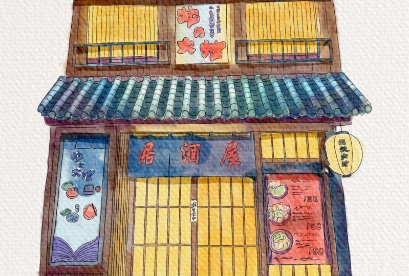
5. Painting storefront at night pt. 1: Barely already Japan in your picture and I have my reference picture here and my sketch layers in this part. Then guys keep in minds as this picture will be in the shadow. So I need to create a new layer that is underneath of us kitchen layer. And same as our picture, we'll have surroundings is pretty dark and then size the Shapiro-Wilk a very light. So I think first of all, we need to go and grab regular watercolor brush and start adding some lights. I came blending tool and some parts. How can we show some light side? How can we showed that light is going from zinc oxide? We need to add some elides. Also some like beliefs for collections, the surroundings, or the areas around main entrance. Like somewhere here. No. So age will be here in this part as well. Okay. Also, what I wanted to tell you is that you have some lights here. And I'm going to go and add some eyes to this part as well. So I wanted to create a feelings. It's, this part is also in light. Seeing here. In this part we'll also have some reflections in this parts like somewhere in the middle. Cause underneath you'll have pretty huge shade. And also some shades will be here. Likes his light side and light reflections in here. We'll be right except for k. Perfect. Now let's finish beans and then we need to grab a brown color, a little bit lighter. We can create a new layer because I want to paint our light side on separate layer. Controls are positive. I like this brush because it gives you a watercolor effect here. See you don't need to do anything actually. How do you greet? Also called color here in this area. Still because we need to show some reflection prompts aligned and basically also have some live here. Thanks. In this part. And just chance that blended plans, gaps between colors. Make it more watery. As you see, say F01 is pretty dark. So I need to go and grab a dark blue color, like sad. A spike here we have dark brown color. And I will go and grabs his talk. Other likes add, given start carer. So once again here we'll just saying what we didn't before. You need to fill this area, please. All area with some particular color. Same hearing, laughter, sagittal, just blend that part. Yes. So dark brown shade since this part. Just those gaps in a yellow color and brown. Key die, I like it now and to go and grab dark blue color and draws a frame here. And after sad, purple colored increases size a little bit. It seemed can add coloring purple plate. Excuse me. Now, our next step is, I think we need to paint these part. So, so from whom we saw, I'm going to go out and grabs his dark brown color. Hey, I'm going to go and grab this dark purple color. And now I need to grab a light brown color. Practice it down. We're going to go and grab this dark blue color, lowers the size of my brush and create a new layer and paint it on any layer. Because later you're going to use blend into and I don't want to blend some whole milk. And last theme, I will go and graph is this dark purple color returned to my layer. And I'm going to go and add purple color. Probably even darker one. Carolyn rush. Plan some sharp point. Nice. And same here. Increase the size a little bit. And when some sharp lines, these are fence. Now you need to grab red color plus 2. I'm going to grab a light blue color. And I want to add some shapes, plant and tolls. And you can blend some sharp lines. I have a color you can do as far as this part, this poster. They have a pretty warm color palettes at it. Mostly it's yellow and brown. And we also have some like variations or blue color. And that's enough. If you watched my previous classes, I told you that it's very important to keep three main colors. And no more than three colors. You can paint some details, visa shades, of course. But your main colors should be counted as three. So actually it will be brown, brown, yellow, and green here. I will add some green lines. So I just wait a little bit. Okay? Actually something between blue and green. And I decided to grab these two colors. So we need to have pretty saturated colors. I've damaged this part now guys, Look, you're going grep selection tool press freehand. And now I'm going to choose this part. Just selected. And press Edit. Same goal here. Press Enter. Okay, great. Now go to Adjustments, Hue, Saturation, Brightness layer, and lower the brightness increase situation. If you like, you can move a little bit too. Green or blue color like sais who seek increase situation. I like it so called. And now you can paint audit top with our brush and it will go lighter. Let's do it. Okay guys, cool. Our next step is let's just altogether add some shades and highlights.
6. Painting storefront at night pt. 2: We can turn off reference picture grade like sad and our first step E, so we need to get rid of transparency. How can we dose it? By? First of all, the corner, mix two layers together like sad, not duplicated it after that's our lower layer of your move tool. I think around 10, 12 percent after merging together, replicated one more time, go to lower layer, press Adjustments, Hue Saturation and Brightness, and turn brightness to maximum. We case that if you merge two cans and replicated again, merge together and merge together. Now, our picture is not transparent anymore. So I'll next to these guys, I will create a new layer audit top all of our storefront. And I will press clipping mask. That means that now I can pay in jazz and Alice selected area. And I want to add some sheets and I will start with a simple word counts, ten brush, CS1, yellow color. And I will use my yellow stem summary here, x lnx away, how can duplicate it? And after a nozzle layer, I'll just move a places celery here, here to like it. And drums the other side. I'm going change the stem to watercolors stem simple. And or something like that. Now guys, I want to oversell positive of hours temps. Maybe you're 80 percent something like that. I wanted to merge all of it together. And let's keep adding some steps. Create a new layer, press clipping mask. And I want to add some stamps summaries here. You can play this colors if you like. Is this way go to Adjustments, Hue, Saturation, Brightness, press layer. In After allover set transparent is have pasta a little bit. They need to return to our original layer, create a new layer. And automatically this layer will be in a Clipping Mask Mode. I except actually I want same stamp here. And I said just erase a part such as overlapping like this. And now worth tens tampons is hard enough to logger SAP pass it in this way. So as you said, thanks to clipping mask, you don't go beyond the alliance. Second, Stan, going here. And think about. A place where you want to place it. You can press, distort and move us Tampa, little bit lakes head. You don't want to place it here? Yep. Now changed to uniform velocity in razor. Create a new layer, red color. Remember, SAT passage here. Okay, great. Now let's just merge all of it together like sad. And I want to make our picture little bit brighter. I go adjustments, hue, saturation, brightness, increase a situation like that. And now it's time to start adding some shades. And guys, I wanted to tell you is that you have two options. Once again, first option is that you can go ahead grab your regular watercolor brush by survey. I will use for watercolor background brush or is it as an option? Is you can go and grab selection tool, select the areas that you want to change. And after zed go to Adjustments, Hue, Saturation and Brightness and uptake and start adding some sheets. It's telling it to create a new layer. If you want to add some shades and press clipping mask, I will. I grab bruit current background brush. Well, I like this brush because shade insects is precious. Create an app like perfect. I've key color in this carrier. Okay, great. Now we're ready to start adding other shapes. And let's just merge it together. And let's move to the selection tool, our layer. Now guys, I'm going group selection tool, press freehand. And by example is this area in shadow. This is like run Bride Andre. And after press at last to same here. Press. To create nafta said have shape here and shade here. So in areas that are close by are two objects are close to each other. You remember said, we will have a shadow. So here we have carpet, the main entrance effort close to each other. So in this part fetal have shadows out. Same here because we have dork. And an area you see under zip poster. I'll say you'll be in shadow. And the shadow because of zeros at the back. And also you have some shade here. So my next step is I will go to Adjustments, Hue Saturation, Brightness layer, and after that lowers the brightness you see like sad and increased situation. This will help us to love herself positive of our objects at the same time, you don't need to change the brushes and do whatever you like. You just need to have just one tool and select the areas where you want to add some shades. If you have some sharp lines, just blends them. Again. After that we have shade, you see promises fans, how to do that. So simple, just draw small lines here. Don't forget all objects a1 have shaped. And we need to show it like I did here. At J grade. After that you go to hue, saturation, brightness, press layer, and longer surprise as increased situation, like said. After that. I have a shade here. Press add a shade here. And shade in this barked at after zed. Little versa brightness increase saturation, and remains as shit. Again, lab and Nagasaki also forget about one part here. I want to have a tiny, tiny like Chris collections. And at our key called Hue Saturation and Brightness layer is this part you'll be lied to her. This amaze will be like this. And tiny is a small part is I wanted to show some sheets here. We can feather it a little bit. Is Trisha and brightness. And you see you can lower it. Now it looks pretty like they mentioned. So once again, I will show you how can you do as its selection tool. Select a small area, press Add, and Pfizer. 5% She's attrition brightness layer and lower the brightness increase saturation just a little bit like that. See you can get darker. I went to have it's lighter, like six. And same I went to do here in setup is an ENT Pfizer 5% situation. And this player over prices increase saturation like things that are done with our second paint. And now is you see would be into beautiful storefront as night. I hope you enjoyed my today's class. This is the end of our class, guys, but now you know how to play and cool storefronts in Japanese style into Procreate. I will look forward to see you what you're going to create and if you have any questions, suggestions, you can leave them in a discussion session. And let's see as any new video, Bye bye.
 Inga Yoon, Digital illustrator and teacher