Transcripts
1. Intro: Hello and welcome to this course on creating isometric art in Affinity Designer version
to my name is Ben Nielsen. I'm immediate design
educator with over seven years of experience teaching creative programs. And I'm very excited to
welcome you to this course. In this course we're
going to be going over the basics of how to create isometric art in a
fashion designer version to a feed designer. V2 is a really perfect
program for creating isometric vector art because it has special isometric tools
that are built right into it. So it's gonna be a lot of fun to be creating this art with
you during this class. Now, you might be
wondering if you need to already know something about isometric art in order
to take this class. And you don't, There's no
prerequisite to this class. And you don't need to
know anything about how isometric art
is created because we're going be going
over all of that and how to do it in
a fashion designer. But what you might
want to already know, because we won't be going over it specifically in this course, is how to use the basic tools. And if e1 designer, like the shape tools
and the pen tools, or you might just know
how to do that from some other vector
art application that you've used before, like a vector Nader
or Adobe Illustrator. They work very similarly. If you don't feel like you have that basic understanding
yet, don't worry, you're welcome to pause here and just go
to my profile page and find the intro course for a fiend design
your version two. And you can kind of get
up to speed that way. That course uses
the iPad version, but it's very similar
to what's gonna be happening in the desktop
version as well. Now speaking of different
versions of a famed designer, I'm going to be using
a fashion designer, virgin chew on desktop
for this course. You might be able to
follow along, okay, in version one because it does have the
isometric features, but not everything went be
in the same place, exactly. So it might take a little
bit of translation. You'll also be able to
follow along if you're using your theme designer version
two or one on the iPad. But things of course will look a little bit
different on the iPad. Don't worry though,
if you're using an iPad because I'm
going to have a video that shows you specifically
where on the iPad to access the isometric
functions there on the iPad. Now, it is a little bit
more difficult than the iPad because of the way
the interface is laid out, which is why I'm going
to use the desktop for the demonstrations
in this course just because it's easier to see and to follow along on the desktop, that's pretty much all you need. Just make sure that you
have a device that's running a fiend
designer version two, you can use version one, but it might be a little
bit more difficult. Okay, let's go ahead
and get started. We'll dive in and talk
about the project for this course in
the next video.
2. Project: Every course that I teach has a project for you to do as
you go throughout the course. This really helps
you to actually learn the skill that we're
talking about in the course. If you don't complete
the project, then it's much harder
for you to solidify the information that
you are learning. So please do take the time
to complete the project. The project for this course
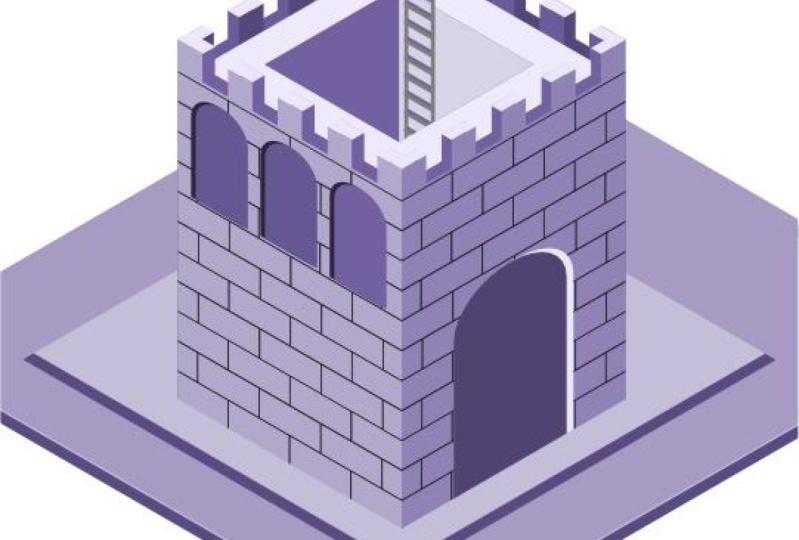
is going to be to create an isometric castle
seen a castle keep is a really good initial way
to learn isometric art because it is very rectangular
and straight in shape. So it's an easy kind of on-ramp into the world of isometric art. But don't worry if
you feel a little bit intimidated by that project
assignment right now, because I'm going walk you
through every step of the way. If you follow along
with me in each video, by the end, you will also
have a completed project. Now when you complete
the project, makes sure that you
export it as a JPEG, as I'll show you
how to do in one of these videos and then upload it into the project
section for this course. When you do that, it's really important that you make sure you upload it into the body section of the project rather than
just the thumbnail. Thumbnails at the top, the body section is below. The thumbnail doesn't actually show me the entire picture. And so it's harder for me
to get feedback when you only upload it into
the thumbnail section. But if you upload
it into the body, I'll be able to see the
whole thing and then be able to leave you the
best feedback possible. Now remember, it really, really helps us all to learn
when we share our projects. So make sure you do
take the time to export your final project
and then upload it. This also really helps me as a teacher to know if
my instruction is working as I see
what you're able to produce after having
taken the course. As always, if you have any
questions along the way, feel free to reach out to me in the discussion tab
for this course, and I'll do my best to answer those questions as
soon as possible. Okay, in the next video, we're going to go
ahead and talk about what isometric art is.
3. What is Isometric Art: At this point you might be wondering what isometric art is. Now, you probably have some idea what isometric art looks like or else you probably
wouldn't have searched for this course
in the first place, but you still might be just a little confused
about what it is. Well, there is a technical and a mathematical definition
to isometric art. And while that's useful, It's not really something
that we need for this course because
if feeding designer has features built in to do the isometric
projection for us, that's kinda the technical
name for isometric art is an isometric projection and it involves a bunch of different
math and scaling things. Affinity Designer
can do it for us. So we're just gonna use a simple definition for this course. For our purposes,
we're going to define isometric art as being
two-dimensional art that is giving the appearance of three-dimensional art by being drawn on three different planes. There's going to be a top plane, a front plane, and a side plane. Now if you've ever
sketched out a cube where you could see like three
different sides and you've shaded each side differently
than you've already done something very similar
to isometric art. Isometric art can be very, very useful for things
like maps, buildings, and diagrams because
it can help us to visualize things in a close to 3D environment without
all of the work that goes into actual 3D rendering, it also just looks really cool. So you've probably
seen on social media some really awesome isometric
art drawings because it's just a great way to
kind of envision fantastic worlds or
particular spaces. It's just a really
great art form. Well, now that we know
a little bit more about what isometric art is, we're going to go ahead and get our document setup and Affinity Designer with an isometric grid.
4. Document Set Up: Okay, so here we are inside of a designer and we're
going go ahead and make ourselves a new
document and set it up for working with
isometric art on this new document
screen that you can see by either going up to File
and click New Document, or you'll see something
like this when you open up the app for
the first time, you're going to see
that we can choose from a bunch of different
layouts over here, but we want our own
custom layout here. So just where it says page
width put in 1,000 pixels, and where it says page
height put in 1,000 pixels. Now there's nothing in
particular that says the isometric art should
be in a square format. I just find that this
is a useful canvas size to work on when creating
the isometric art. And it makes it easy to share to a variety of places if
you want to do that. The only other thing
that we need to worry about here
on this screen is to make sure that this create
art board box is checked. That needs to be checked
so that it will make an art board that's
just going to make it easier in the future to create new art boards because we'll already be
starting with one, and then we'll be able
to use those art boards for different iterations
of our final design. Okay, so go ahead and
click Create now, and then we're going to
get our new document with our new art board here in
the center of the screen. Now that we have our document, all we need to do to
finish setting up is to go ahead and turn on
our isometric grid. Go up to the View menu. You can't see it in
my screen recording, but it's at the top left. You want to see view. And then you're going to
come down here to show grid. When you do that, the grid
is going to be turned on. Now this is not an
isometric grid right now, so we need to adjust that, go back to the
view menu and then come down to grid and axis. This is going give
us the options to change what the
grid that looks like. So here we're going
to switch our mode from automatic to advanced. And under the grid type, we're going to switch
that to isometric. Yeah, you can see that
our isometric grid is laid out in front of us. And so we'll be able to use
that to guide what we do. Don't worry about all
the other settings that you see here in this menu. There are a lot of them,
but they aren't important for what we're gonna
do in this course. So let's go ahead
and click Close. Now at the document set up, we are ready to start learning about the isometric studio, which we will do
in the next video.
5. Isometric Studio: Okay, In this video, we're
going to go ahead and set up the isometric
Studio panel. Now the isometric
studio panelists, what makes it so
we can avoid doing all that math that's involved
in isometric projection. To open it up, you
wouldn't go up to the Window menu, which again, that's one of those
taught menus that you can't see in the
screen recording, but it's just in the top-left
corner of your screen. Open up the window menu. Now you can see this here. We go all the way
down to the middle of the menu and choose Isometric. This is going to open
up a new studio panel. You can see this
studio panelists free floating right now, just here in the workspace. Now just like RStudio panels, you can go ahead
and drop it into these different zones over
here on the right-hand side, I'm just going to leave
it over here for now because that will leave
it very accessible as we are using it a lot while we're
creating isometric art. Now the isometric
Studio panel is divided into two
different sections. The first one is the planes. You're going need to click
Enable planes to turn that on. And now you're
going to be able to cycle between the
different planes. So remember when we're talking about what isometric art is, it's artwork that is projected into three different planes. So we have our top plane, which is what we're on right now. And now if we switch
this to the side plane, you will see the grid adjust accordingly or to
the front plane. So you can determine which
plane you are working on by choosing from
these buttons up here. And so you'll be
switching through these periodically throughout
your project. The second section down here is the plane editing options. So these are all of the
actions that you can take on different objects
in whatever plane you are currently selected on. The first one is just gonna be a toggle
that you've turned on or off to let you
edit in the plane. The second is a button
which will take whichever objects you have selected and project
it into the plane. We don't have an
object selected, so it's not doing
anything right now. So let me go ahead
and get an object so I can show you how
these two work. First, I'm going to grab
my rectangle tool from the left-hand side
and then I'm going to turn on Edit in the plane. Now when I drag
out my rectangle, it's going to drag
out in the top plane. You can see it there
and it will snap to different portions
of the grid as well. So that's Edit in the plane. Let me turn that off. And now if I grab my rectangle tool and drag
out another rectangle, you can see that it is
not in the top plane, even though I have the
top plane selected here. To put it in the top
plane, I can now click the fit to plane. And now it just like the other one is in
the fit to plane. And if I switch
to my arrow tool, I can move it around
within the plane. In a later video, we're going to talk about the
difference between these two methods
and when you might be choosing one over the other, but we'll be using both of
them during this course. The other four
buttons here are all of your flip and rotate options. So it's going to
be very similar to these buttons they find
out here only this one will flip and rotate
based on which plane urine. The last thing in this studio
panel is the grid settings. This is just going
to open up the exact same box that
we saw before. And so you don't have
to worry too much about that except that occasionally
when you are drawing, you may want to switch back to the standard because
then you'll have standard snapping as opposed
to isometric snap things. But for now you can just
leave this closed and that's it for opening up the
isometric Studio panel. I'm going to go ahead and delete these rectangles now so that we can start off fresh
in the next video. And we'll learn how to do the isometric actions in
order to create a cube.
6. Isometric Actions on iPad: Okay, This video is to show you how to get the isometric options on the iPad version of
Affinity Designer version two, if you're not going
to use an iPad, you can go ahead and
skip this video, but just like the
desktop version, after we've made a new document, we then need to enable our grid, but we enable that grid from
actually the preview mode, sub-menu preview mode
is right up at the top. It looks like a
little windshield wiper in the right-hand corner. And we need the sub menu
which is just to the right. Go ahead and tap on that, and then you can
turn on the grid. So once the grid is turned on, you can see that
it appears here, but we need to go into
the grid settings, which are also found
under that Preview menu. We're going go to Grid settings, and that's going
to open up at the very top in the
context menu bar. And that's where we can go ahead and choose our grid mode, which in this case is
going to be isometric. And so now we have our
isometric grid here set up. Now we also need to be able
to access our actions. So once we've turned
on the isometric mode, we can access our isometric
actions from the Edit menu, which is the three meatball
menu here you can see we now have two new menus that appear here on the
right-hand side. This Edit menu, the
first one is planes, which allows us to
enable the planes and then choose which
plane we're in. And then we have the isometric, many of which has
the edit in-place, fit in plane and the
flip and rotate options. So let's go ahead and
enable the planes here. Once we've enabled the planes, you can see we can choose
which plane we're working on. So this is a little bit
less convenient than the one on desktop where we actually have that menu
that we can drag out. You do have to end up
coming up here a lot. So let me just show you. I want to grab my
rectangle here. I can drag out my rectangle
and make it a square. Then I can go ahead and I can choose to fit it in the plane. Now of course, if I
go ahead and turn on Edit in-plane and I drag
out a new rectangle. We can do that as well. If
I want to change my plane, I can go ahead and switch
to the side plane. And then I could drag out a new rectangle in
the side plane. So it's not as convenient
as it is on the desktop, but it can still be done. So you can follow along with the other
videos on your iPad. Just remember that your options are up here and you enable the grid over here from
your preview sub-menu. Okay, let's go ahead and in the next video we're
going to learn about these two different methods
of isometric drawing.
7. Making a Cube: Okay, so as you might
have been able to tell from the top two options
in the isometric studio, there are two different
ways to go about drawing the parts of
an isometric picture. The first option is
to edit in the plane. This means that you can draw
out each different element on the plane where it will
be in the final picture. This is the first way that
we saw in the video where we were talking about
how to use this studio. The second option is to fit an existing shape into
the selected plane. In this way, you will draw
everything out flat like a normal 2D artwork and then fit each piece into
the correct plane. We also saw this in
the previous video. So to illustrate
how these methods actually work when you are
creating something though, we're going to go ahead
and create a cube. And we're going to start out
by editing in the plane. We're going to go ahead and grab our rectangle just
like we did last time. And we'll just go ahead
and go ahead and drag out just one single
grid space here. And now we have our top plane. In order to illustrate this, we're going to need
to be able to change the colors to different
shades of gray. So I'm going to change
my colors here in my swatches panel over to grace. So now let's go ahead
and do one in the side. So we're just going to
swap our current plan, decide and make sure edit in
plane is still turned on. And now we're going to
drag in our side one. Let me make this one a little
bit darker shade of gray. Then we're going to go ahead and we're going to do the same thing on the front and
drag this out here. And we'll go ahead
and make this an even darker shade of gray. I'll click off here
with my arrow tool. You can see that we now have
eight cube designed here. And that works pretty well because we were just
able to draw it out. Now if I turn off edit in plane, now we're going to see
how it works when we do the fit to plane. So in order to do this,
I'm just going to grab my rectangle tool again, and I'm going to drag
out another square. But you can see that it is flat because I no longer have
edit in the plane turned on. So there's just a normal square. Now I'm going to duplicate that twice the way to duplicate this, to hold down Option on your
keyboard, click and drag. I'm going to duplicate
that twice to create the three
squares that I need. Now I'm going to project them
into the different planes. Let's go ahead and change
the color of them first. So my top one, I'm going
to make this light color, my side one I'm going to make
the second lightest color, and I will leave my third
one as the darkest color. Okay, So let's start with the front plane because that's what we're
already on front is selected and I'm going to with my darkest one selected
click Fit to play. Now I have the first
side of my cube. Now let's go ahead
and do the side. Let me switch to the side, select our middle gray
square and fit to play. Now let's go ahead
and drag these together and snap them together. We can zoom in by holding
down Option and scrolling and just make sure that we
have those snapped together. Now we will do the last one, change to top, and then
choose Fit to play. Now let's go ahead
and drag that in. And we now have a cube again. Now you can see to
make it the same size, we're going to have to go
ahead and scale it down. Holding down Shift. I'm going to scale
this down to be about the same size
as the other one. And now we've made
two identical cubes using two different methods, the edit in the plane and
the fit to plane method. So you can use these same two methods to
deliver the same results. But depending on
what you are doing, you may favor one
over the other. The benefit, the edit in
the plane method is that you can work in the final form so you don't
have to figure out as much. You can kind of be more free flowing with your
creation process. Whereas when you are
working flat first, you have to figure out how
each piece is going to fit into the overall
structure without seeing it. But the benefit of working
that way when you're going to projected in or fit
it into the plane, is that you can plan
everything out ahead of time. And it is much easier to create duplicate objects like we
did for this cube than it is when you are drawing in
the plane because you can't just duplicate from
one plane to another. There isn't a way to
do that. So being able to just duplicate that square several times or say if you're
doing a building, you might have windows
that are going to appear on different
sides of that building. You if you wanted to be able to duplicate them all
ahead of time, then it's really easy to do that flat before you actually
get into the plane. So we'll use both
of these methods at different times
throughout the course as you're working
on your project, feel free to use either one, whichever one you
think is going to help you accomplish
your purpose better. So now that we know how to
use the isometric actions, we're going to go
ahead and sketch out our ideas for our castle
in the next video.
8. Sketching: Okay, so now we're
going to go ahead and start working on our
castle keep project. And now that we know how to draw in the different
isometric methods, but in order to do this, we need to sketch
first always, always, always when we're designing, we must sketch first. So I always go ahead and
just sketch know normally I will sketch on paper on a sticky note or
three by five card. But in order to make this
easy for you to see, I'm screen casting
here from the iPad, and I'm just using a free app called concepts
where I can sketch. It doesn't need to
be anything fancy. You just go into very, very
roughly sketch things out. Again, I would normally
do this on paper, but for ease of you guys
being able to see it, I'm doing it here,
so I'll just do a thumbnail and then I'll
just sketch out my ideas. So my idea is to have a castle, and I'm not necessarily going for really getting in the
isometric plane here, really just getting out my idea. And it can be very, very rough. It doesn't need to
be good at all. I'm just roughing out the idea of what my castle
keep might look like. I might have doors, might have arrow slits, might have some
windows on the side. I'm just kind of
getting out that idea. And then I'm thinking,
well maybe I want to put a moat around it. So I might sketch out a
little bit of a moat here. And then I go, oh, well if I want a moat and then I might
want to have a drawbridge, and I just add that in there, even though it might
not make a whole lot of sense with the door that I
have in this current sketch. I can just kind of
rough out my ideas. Then I'll move on and I'll
get onto the next one. Again, it's gonna be a key. So these are going to
look fairly similar. But in this one I
want to try out a different idea for my key. And that is I want to have
another wall surrounding it. So I want to have
another castle wall that surrounds the Keep. And I'm just roughing it out. And the reason that we sketch is because this allows us to get ideas out far better than just thinking about
them in our heads. Again, I might want
to add in emote here. We can do this so much
faster than we can if we just try and ideate
in Affinity Designer, we can ideate on paper
much, much faster. You can get out our
ideas and really think about them and decide what
we'd like best and what we don't like and we
don't have to worry about color or anything. We're just sketching these
concepts, these ideas. That's where you go in from. So I've got a couple of ideas here. They're
pretty similar. You might want to
just try and do maybe 34 or five of these and
really get your ideas out before we jump in
and we start designing. Okay, so that's sketching. Make sure that you do
not skip that phase. It's very important. And in the next video, we're going to go ahead and
talk about making the castle structure using
the isometric tools.
9. Making the Castle Keep: Okay, so now that
we've done our sketch, we're ready to go
ahead and start actually making our castle. I'm going to go
ahead and just move these cubes that
we made over here. And we're going to go ahead
and plot out the castle. For the castle, I'm going
go ahead and start out by making my walls in the
two-dimensional plane, not in the isometric plane. I'm going to go ahead
and turn off in plane because I want to make one wall and then
I wanna be able to reuse that wall for
all four sides. So I will need two
walls that are front sided and two walls
that are cited, cited. Let's go ahead and do that. Walls for castles
are pretty easy. All we need is our
rectangle tool here. I'm just going go ahead
and drag that out. Now you can make this longer or shorter depending on what kind of castle keep you're going for. I'm going for kind of a
mid-sized one right here. So I'm going to do that and let me go ahead and
change that over here now you can see that I have my color set to grades
because working in gray is the
easiest thing to do when you are designing
for you adding color. The reason I like to work
in grades is you don't get confused by color and color can be a very emotionally
driven thing. I like to just work in
the grace to begin with, because then I'm able
to work faster and I can try out lots of
different colors later. So let's go ahead and I'm
going to change this to my light gray here and I'm
going to get rid of my stroke. I don't want a stroke on that. So just using the
rectangle tool, I've gone ahead and
drawn that out. And now I have this
rectangle here. And now I'm going to
use rectangle tools to do the battlements
across the top. I just zoomed by holding
down Option and scrolling. And I'm going to do my
battlements kind of like that. Now in order to just make
many of those battlements, I'm going to hold down Option and click and drag that will duplicate on hold down Shift
to keep it in alignment. So I'm going to put
that right there. And then I'm going to get
several of those by just hitting Command J,
which is duplicated. And so it will just redo
what was already done. Okay, So then let me drag
this one to the end, select over all of them. And then up here in
my Alignment panel, I'm just going to go
ahead and distribute them horizontally so that everything
is even between them. And I've got this nice
little castle wall here. Now, the more work that I do here in the
two-dimensional plane, the easier it's going
to be for me to make all four walls later because
it will already be done. So I'm going to use my
rectangle tool to actually drag out rectangles to
make the bricks here. And the reason that
I'm going to use a rectangle instead of
just doing lines with my pen tool here is
because the rectangle will skew better into the
isometric plane then a line, well, just because it has
four points that make it up. So let's go ahead and
drag out a rectangle. I still want it to look pretty much just
like a grout line. And I'm going to fill it with one of my darker
shades of gray here. I think I wanted to
actually be even thinner. I'm just going to go ahead
and make it nice and thin. And then to duplicate
using my Move tool, I'll just hold down
option and drag. And I don't want there
to be too many breaks, but I want there to be kind of a fair number of breaths here. And then Command J
to duplicate all the way down until I'm
right about there. Good. Okay, So next I think I'm
actually just going to duplicate this one
so that they're exactly the same width. And we're just going
to rotate that 90 degrees so that we can easily come in here
and do the sides. I just wanted to make
sure that they're exactly the same width. Okay, now we can go ahead and
duplicate that Command J, Command J, Command J. And then let's go over
here and our Layers panel, we're going to select all of our vertical lines
here, just like that. Got it, vertical lines. And we can duplicate
them, right like that. And then what we
wanna do is make sure we've gone all
the way down and then we're just going
to drag them over just so that they
fit right there. Let me go ahead and
drag this one back. Okay, So with that in place, we can go ahead and
we can select all of our verticals here. And we can duplicate down. So we will duplicate
down and then do it again and again and again. One more time to the n there. Okay, now all we
need to do is select these ones and bring those up. Okay, so now we have our
castle wall all ready to go. So let's go ahead and select over that entire castle wall. Let's hit Command G on our
keyboard to group it together. And let's drag it off
here onto the side. So that's our wall.
We're going to keep that so that we always
have that to come back to. And now let's duplicate this
down here option and drag. So with that one ready to go, we need four of them. So let's go ahead
and do one too. 3.4. And then we're just going to go ahead and put them
into the plane. So let's start with
our side point, fit into plain, plain y, and we'll do our front
plane fit into plane. And this one will be our
front plane fit into plank. Now turning our snapping back on so that we can line
these up correctly. We're going to just get these to snap into place to gather here. There we go. And there we go, and there we go. Now I can select over
the top of all of these. And we can just scale
that down a little bit to make it a little bit of
space here on our art board. You can see that we've got our castle keep going on
here, which is excellent. This is exactly what we want now that we've made
the castle structure by drawing out the 2D elements and then projecting
it into the plane, we can go ahead and decide on our lighting
source and then we can light these walls to give it a little bit
more of dimension, which is what we will
do in the next video.
10. Lighting Source: Okay, so now that we've
got our structure here, we can go ahead and
decide on our lighting. And a lot of times
I'll just grab a circle to represent the light. If we try to use
the same structure for lighting that we have
here with our cubes. We will have light
coming basically from the top left-hand side. So I'm, we go ahead and
drag out a circle here. Normally I'll just set this off the art board
and I'll make it light so that we can see that that's
bringing the light down. So if the light's
coming this way, it's going to want to drag that just a
little bit over here. It's going to light up the top and what we call the side face. That means that the front face is going to be the darkest. The side face is going to
be the medium or mid tone, and the top face is going
to be the highlight. So let's go ahead and adjust our castle so that it
looks correct now. So grabbing this
first group here, which is going to
be a front plane, that means it should be dark. We're going to go ahead
and open our group, scroll all the way down to
the bottom of our group. There are of course,
a lot of colors here. Let's make a subgroup for
just our grout rectangles. Group there. That way we can change just
those colors all at once. And we will grab all of our other rectangles here
and we'll group those. And now we can change that
color with just one click. I'm going to go ahead
and change that to our darkest color here. And of course now we can't
see our grout lines anymore. So let's go ahead and we want those grid
lines to be darker. So we're actually going
to make them black on this face because this
is the darkest face. Now we just need to
adjust the other ones. So let's go ahead and actually, it's going to be a
little bit easier if I just duplicate that one. So I'm going to
delete this back wall here and just click and drag this one over and make sure that I snap that
into place there. Now I can take that
group and I can just drag it beneath the others. Now, these ones here, we need to change their fills. So let's go ahead
and make groups for the lighter rectangle
here as well. And we want to change that
to our mid tone gray. And it's fine if
we keep the dark gray as the grout lines there. Same thing here with this one. I'm going to go ahead and
delete this back wall and drag this one into place just so that you don't have to
change the color twice. So now we've decided
on our lighting. And so you can see how
this is working out. Anything that is going
to be on the side face. We are going to use
our mid tone color for anything that is
on the front face. We're going to use
our shadow color for anything that's on top, which we don't currently have, we are going to use our
highlight color for. Let's just see how
that would work. Let's go ahead and
edit in plane here and use a rectangle to draw
out a top for this tower. Go ahead and make sure
we're in our top plane. Come here to our corner
and we're going to drag out a top for the tower. Now one thing that is
critical in isometric design, a stacking order things
stack on top of each other. So let's go ahead
and set this to our highlight color and then closing down
our groups here. And let's make sure
that we can drag this back behind our walls here. Want to have these walls
in the proper space here, checking on her stacking order. This one in front and
this one in back. Alright, and now we can
position this rectangle into its correct spot
so that it looks like this tower has a top on it. And that's how we go
about lighting it. The next thing that we
wanna do is give it more of a three-dimensional field by actually building
out these walls. These walls are exceptionally
flat right now. We want to build them out. So we're gonna go ahead and
do that in the next video.
11. Building Walls: Okay, so now that we have our lighting source
set and we kind of know what angle
we're coming from. We're going go ahead and
build out this castle walls a little bit
more so that they look a little bit more
three-dimensional. Particularly we want
to get some sites onto these battlements
here and tops onto them. So we're going to try and
build those out a little bit. The first thing that we want to do is duplicate our walls. So we're going to use
Option drag to do that. And we're just going to
drag these in a little ways to provide basis for the
thickness of the walls. So as we do this, you can see that we have these two sides of the
wall here and we'll be able to edit in the plane on top to build out
the top of the wall. Now we do want to
change the color of this base wall here. Let's go down to
that group and we need to change that
to the correct color, whatever it would be. The part of this that
we're going to be able to see is actually going
to be a side plane. So we're going to change that
to D darker color for now. Now, it's on top, so
that's not working out. So we're going to
need to go ahead and drag that below our other group. So let's go ahead
and drag that below. And now you can see how we're
getting that side here. But in order to make
this really complete, we need to go ahead and drag out top planes for this and
edit them in the plane. So make sure that
we are selected on top and edit in the plane, just like we worked
for this roof. And now we're going to go
ahead and create these sides. Now, grabbing our rectangle tool is how we're
going to do that. It's a lot of rectangles here, which makes it pretty simple. Income in, snap to the
corner and then drag out. And you can see that
our color is not right. So we need to change that
to our top-level color, which is our light gray. Now we're going go ahead and
do that with the others. So I'm just using our snapping
to get in place here. Alright, there we go. Now one thing that you
might be wondering about is this part right here, that's kind of the bottom
of the battlements area. And why is that dark? Well, that would be
likely darker because it's being shadow as the
light's coming down, it's hitting the
tops of these and then it's casting
that part in shadow. So we're going to
leave it like that for now because I
think that works, but you could come in, you could do another
edit in plane and try and make that
a different color, which we might do when we reach the coloring
portion of this. But as far as grayscale
goes, that's fine. So now we just want to
do that for more times. There is a lot of repetitive
work in isometric design. That's just part of it. So we're going to go ahead and just work on that doing this. So I'll speed this
up, but you can watch me go ahead and finish this off. So this one is a little
bit funny here in that the sidewall
that we started with has now become
the front facing wall because that's
creating this portion here that would be on the front. So we have to change that
actually to the dark color. So rather than changing
the duplicate, we need to change
our original here. So let's go ahead and do that. And that then creates that
three-dimensional fight there. Sometimes you have to come in and just adjust
these a little bit. When there are
this many objects, there can be a lot of snapping
targets and it can be hard to make sure that you've
snapped to the right thing, especially if you haven't
changed the color yet. So just coming back
in here and just revising those a little
bit can help a lot. Just slightly off the edge here. Okay, we just have
one more to do here. And this is a fairly
common technique in my isometric design is to do a duplicate like this
to create basically a, another object onto
which you can then use a snapping targets to
draw out even other side. It's a pretty useful
technique in that it makes it easy for you to kind of
know where you're going to. So I'll do this with left and right sides and
also with top and bottom. It does require a
little bit of cleanup. And it's not as fast as doing the plane technique because I can just duplicate everything, but I find that it's easier to work on for things like this. You can see we're having a slight problem here
with stacking order. This is why stacking order is so important to
pay attention to. We need to get this one in front of our other back wall here. So let's go ahead and we will
drag this up to right here. And then we need to get this
rectangle up above that. Nobody can go ahead and fix it. And now we want to
change the color of this back one to be a sidewalk. Let's go ahead and grab
our color here to there. Now I'm noticing one thing
here where this one, you can see an extra
line coming through, which is not really what
we want to have happening. So we're gonna go ahead and turn the lines off for that group. And that's fine. Now we just need to
make sure that we fix the stacking
order here again, we pulled this one up to
the front because it should be on top to create that corner. So that's how you're
going to use the edit in the plane to create the tops. You could also do
this with the sides depending on what
you are working on. Now you can see that there are parts here where
they kind of disappear. The edges just aren't there. Now we can go ahead and
take care of that in the details later if we
really want to see the edge. But there are things in life that just disappear
because they're being hit by the same light and you can't really see the
distinction between them. So I'm going to say that
that is okay for now. And now we have considerably
more thickness to our walls. They feel more real. They feel like they have
more weight to them. Then just flimsy paper
walls that we had before. So we're having a slight issue
here with stacking order. And this is a good
example of where we might need to use a vector crop. The vector crop tool is right
here above the rectangle, and this allows you to crop
out part of an object. It doesn't get rid of it,
so it's non-destructive, but it allows you to
just take part of it a way you can do this
from either side. So I'm going to
go ahead and just roll this back here like this. And I've just cropped
out the edge of that one castle wall so that we can see the correct
lighting here. So using the vector crop is a great way to hide
part of an object, particularly if you
don't want to have to take the time to get rid of that object and the vector
crop can solve your problem. So let's go ahead and
click off of here. And that worked
pretty well on there. So we're just going go ahead
and leave it like that. Now in the next video, we're
going go ahead and move on to adding in details to this to try and fill out
the life of the castle.
12. Adding Details: Alright, now that
we have our castle built and have it shaded correctly and have built out the three-dimensional
wall to it. It's time for us to go
ahead and start adding some details to this
basic model here. And the first thing that
I'm going to do when adding details is reference back to my sketch and see that I want some doors
and windows here. So we're going to
go ahead and do probably some kind of a
door here and the base, and then some windows
up along the top to try and show that there's
at least two levels here. The other thing that I
want to do is open up this area at the top here
so that there's kind of a way up through it and we might even build a
ladder to go in there. So let's go ahead and start
building out these details. And a lot of this is going to be stuff that we've seen before. So I will speed up part
of it so that you don't have to watch me do
everything in real time. So I'm going to go ahead and
build this not in the plane. So I'm going to turn
off at it in the plane. And then using my
rectangle tool, we're gonna go ahead and
we're going to build it and we want it to be a door that is rectangular but then
has an arch at the top. So we're going to go
ahead and combine a circle and a square
together for this. That's gonna do it. It's slightly off here. We just need to pull
our midpoint of our circle up to the
edge of our rectangle. So now we have this
shape that we can use, and we will probably
be able to use this for both the windows
and the doors. Let's go ahead and
drag this one off here so that we have
our shapes for later, before we combine them. And I'm going to
drag it back with an option drag to duplicate. And then I'm going to go up
here to the top right and merge them together
using the add command. We could use the shape
builder tool for that, but it's faster to just
do the add command rather than switching to another tool and that doing the draw lines, the shape builder is
really better for more complex things where you have lots of overlapping shapes. So we want to build this door and we want there to be
some dimensionality to it. So I actually think
looking at this now that this shape is going to
be better for a window, so I might save that
shape before later. I'm going to just make
this door a little bit more thick like this. Now to give it some kind
of dimensionality to it, we want there to be
some shading inside it so that it looks like it's
recessed a little bit. And in order to do that, we're going to
duplicate the shape. Again. We want to change the
other shape to black. So we can create
that dimensionality by offsetting them
a little bit here. And that's okay, but really it's going to work
better if the shadow is on the inside of the door and it feels like they are in
line with each other. So in order to make
that actually work, we're going to need to
use a clipping mask. So first we're going to go ahead and duplicate our
original shape again, right on top of itself by hitting Command C and Command V. And then we're going to flip the black inside of that shape. So we will need to use three of these identical shapes in
order to create this effect. Because we need one shape
to be the base color, one shape to be
the darker color, and one shape to use to clip, because we want to
be able to clip it into the shape to offset it. That's probably a
little bit confusing. So let's just see how it works. We want to align these shapes up so that they are all
in the same spot. Let's go ahead and
select them all. And we'll just use the
alignment tools to align their centers
and their middles. Now, what we want is for the black shape to be
kind of on the base. And then we want
to be able to clip the gray shape inside
of that shape to offset it a little bit to
create a clipping mask click and drag onto the thumbnail
of another layer, and then that will
be clipped inside. Then within that
new clipping group, make sure you're selected on the mask layer and then
you can move it around. So in order to make this work, we can create this kind
of shadow effect here. Now, we can take this shape and we can go ahead and we
can put it into the plane. Now I'm going to
save this outside of the plane just in
case I need it later. So I'm going to drag
this over here. And again, when you're working, it's okay if the area around your art board gets
really littered with stuff because you might
need those things later. So let's go ahead
and make a group and G to group them and then choose fit into plain
hopes were on the wrong plane. Change the plane to front
and shoes fit into play. Then we can drag this over
here and it can fit on top. Let's go ahead and
scale it down. Now. That looks pretty good. I think we can probably
adjust it a little bit. We're just going to
reassess that a little bit further so that it looks like
it's sitting further back, probably change the color here. So let's go ahead and change
this color to the dark. Because it's already
on the dark, that doesn't feel quite right. So we may need to change
this one to black and change our shadow color to be more
of a highlight to set it off so that there's more like light glinting off the edge. So let's try that
with our Grace. Okay, that looks a
little bit better because now you have
this feeling that it's going back into there and you can't really
see what's happening. There's definitely
more that we can do to this and we may come back
and add finer details later, but let's go ahead and add some windows to the other side. And we're going to do
this in the same way. So grabbing our base shape here, I'm going go ahead and
make a few copies of it. Command C, Command V,
Command V. Now we have these two copies and we
can color one of them to black or dark gray in this case because we're
going to do the side window here and we can turn the
other one into a light gray. And now if we clip it inside, will be able to move it around. So then we can grab this, of course, and duplicate it. Group these together, command G, and then choose our
side plane and fit into play how we can bring this over here and scale it. Let's change the color. And now we've given some
windows to this top-level here. The other thing that
we want to do is add in that trap
door effect here. So we're just going to do
that by editing the plane. We can see it's just gonna
be squares to change this back to top in the plane. And we're going to go ahead
and drag out a square here. Kind of give us the feeling that there's something
down in this area. Now in order to really
make this work well, we really need to have
this show two walls, darker wall on the back and
a lighter wall on the right. And that will create the
appearance depth there. Let's go ahead and do that
by using the Pen tool to create a triangle over
the top of this square. So at that triangle in place, we can now change that to
the gray of the wall there. And we can change
the bottom square to the dark gray, the wall there. Okay, and that gives
us the appearance. Now we can adjust this
to change how it looks. And that's why we use
the pen tool here, because we can
adjust the angle of the wall based on where
that point false. So I'm going to place it
right there because I think that makes it look more
like it's going down. So now we have that in place. The last detail that I
want to add in this video, because we could go
crazy and we could go on forever with details. But the last detail
that we're going to do in this video is
going to be the ladder. We're going to be
building out a new shape and construction to just
add a little bit of detail that will show
this ladder going down into this space here. And that will just
help viewers to feel like it actually
is going down. So to make it louder, What
do I need the rectangle? And of course we're going to
do this not in the plane, so that we can project
it into the plane later. And a ladder is just a couple of rectangles with
rectangles in-between. So not a very
complicated shape here. And then we'll just
use Command J to duplicate through the
rest of the ladder, duplicate it so that we have a copy merger together
with the add command. And now we can go ahead
and put it into the plane. So let's go ahead and say Fit to plain ups on plane again. Oh, he's got to make sure
you're in the right plane. So we want this to come up through here on this light side. So we're going to put that on the side plane and
then fit into play. Now we can drag it into here, and obviously it's too big, so we'll scale it down
and put it right about. They're still too big. So when I scale it down
further, right there, I don't really care that it's showing over the top
here because we're either going to hide
that orbit when a vector crop it
out in a second. Now we need to work with
the ladder a little bit to get it to look
three-dimensional. So let's go ahead
and option drag, just like we've done before, to give some
dimensionality to this, drag that behind and change
its color just so we can see the contrast as
we're lining things up here. So this is very similar
to how we did the walls. And now we just need to probably
add in a top piece here. So let's go ahead and
using the top plane, we will edit in the plane and make a rectangle between
these lighter color for now. And now we have
this ladder here. So in order to
complete the ladder, we need to group all of these together and then try
to do a vector crop. If we can't hide this part of the latter with
a vector crop, we will hide it
with another shape. Let's go ahead and
group them together, change to our vector
crop tool and see if we can get
it to look right. And we aren't going to
be able to get it to look exactly right
with the vector crops. So we'll vector
crop it that far. And then we will use a hiding shape to hide this out using the shape
of the same color here. So this is a technique
that we use just to hide parts where we can't quite
get them to layer correctly. If we wanted to layer this, we would need to make a
cutout of this top piece and then bring that in
front of the ladder. And that would complicate
our layer stack. So I'm not going do that right now because I
don't think we need to. I think we can just hide
it with this piece. So just drawing a
triangle around that. We will then grab
the same color here. And now that is hidden
and it appears to be going down into
the castle itself. So just so I know
what that curve is, I'm going to make
sure that I name it. I'm just going to call it
hiding ladder so that I know what that shape is doing
there in the layer stack. Okay, so we've gone in and
we've added some detail. We've added a door,
some windows, and a ladder, as well as this interior space
of the castle. So you can spend a lot
of time adding details. So that's all I'm
going to add for now. And in the next video we're going to go ahead and
we're going to start adding color to this
grayscale image to just bring it to
life a little bit.
13. Adding Color: Alright, so now that
we've gone ahead and added some detail
into our work, we're now ready to go
ahead and add color. And I just copied this color
theme from color.adobe.com. So I'm just going to use that to Eyedropper in some colors here. Before we do that,
There's a couple of things we need to do
to set up correctly. First, we need to take all
of our shapes that are off the board and we need to
make them on an art board. So I'm going to
grab the art right under the Move tool and drag on an art board to
hold these extra shapes. We're going to need that because it will
make it easier in the long run in order for
us to add in the color. So let's go ahead and drag this extra circle just
onto this board for now, that was showing us where our
lighting was coming from, but we don't need that anymore. The next thing that we
want to do, of course, is duplicate our art board here. So by collapsing this down and then selecting
art board one, we can hold down Option
click and drag to duplicate that art board because
we still want to have our great match
when we need it. So we're going to
take my first cube here and I'm going
to select the top. Then I'm going to choose one of these colors
to be the top. I think I'm going to
start off just by using the blues here to be the colors. Switching to the
color picker tool is what they call it here. We're going to use like
that and that's great. Then we'll select this
side and we'll go forward. The next darker shade hit I on my keyboard for
the eyedropper tool, and I on the keyboard again. And now we have
earths to test how those tones look
next to each other. And I think that's
going to be okay. Well at least try it. We can always make another
iteration if we need to select everything on our first art
board and group it together. Now let's give our second
art board here a name. We're going to
call it color one. Just in case we want
to do multiple colors. We want to go ahead and
select all of this here. We're going to
ungroup everything. And the reason that
we're going to ungroup everything is because we want to be able to modify if
everything simultaneously, that's more difficult to
do if it's in groups. So we're going to come
up to our Layer menu, which I know you can't
see in this screen cast, but it's right there where
this menu has now appeared in the Layer menu and we're
going to go to ungroup all. And that should make
everything its own thing now. So it was really useful
to have groups before. It helped us out in
positioning things, getting things in
the right place. But now we have
ungrouped at all here. We may need to fix a couple of things just because
you can see that the ladder is now appearing
in the wrong spot and that's because
the vector crop has been released on it. So in order to fix that, we can of course just
come down here and adjust where our little
rectangle is here. To hide that. Now we can do some
repositioning if we need to, but let's try adding in the color first and
seeing how that goes. So looking at our cube, we now know exactly what we need when we select
our top color here. Then we're going to
go ahead and go up to the Select menu in
the very top menu, which you can't
see on my screen, but you can see it appear here. So go here and
choose Fill color. Now, you can see that
it reaches out and it tries to grab other things
that are that fill color. But because we've grouped
all these things together, it will be easier to
de-select them now. So come up to your other
art boards and just hit Command on your
keyboard and click on it to de-select that art board. Now that we have
that ready to go. Once you go ahead, use our eyedropper tool to just select the color that
we're using for the top. So switching to I, we will click on the top. Now all of our top
colors are in place. Now switching back
to the move tool, we can go ahead and
select Art site. Now with that done, we have done almost everything that
needs to be done, but we still have
some black in there. At this point, we need to decide if we want the black to be there or not be there because we added in black as
a fourth color. So we may want to try something
a little bit different, to adjust things a little
bit with a different color, we may want to try using one of these other colors
for our highlight color and then use this darker color for the part that
is currently black. So let's go ahead and try that. In order to do that, we're going to go ahead
and group everything on this art board together by
selecting over all of it, command G, group
that all into one. Then we are going to duplicate
just like we did before, Option click and drag. And now we're going to ungroup all hidden layer and group all. And now we'll do
our test tube here, beige color as the
highlight color here. So I dropped her that and
then with the side color, we'll go with the lighter blue. I dropped her that. And then for the front color, we'll go with the medium blue. And we can compare
that with the cube below it to see
how we like that. And then we can keep
this darkest color for what we had done in black. So let's go ahead
and try this again, selecting our first
rectangle here. We will go up and go to
Select Same Fill color, just like we did before. In this case, it wants
to select things over on color. One. We're going to go and make
sure that we undo that. That's the whole thing. That's like nothing
makes sure that we de-select this side here. And then we'll go
ahead and I drop it. Now we just need
to get our blacks by selecting one of these. And then we'll do Select
Same Fill color on that. And we'll Eyedropper in
our darkest one here. Okay? And then we can compare these
two color schemes together. And we can decide which
one we like better. And we can make any individual adjustments that we need to e.g. I. Might try the lighter
color on these ones here because I think that might
look a little bit better. I just gives us a little
bit of a different vibe. And so you can see how
you can go ahead and add color into your existing model and you can look at
all of them to see. So go ahead and set up
your color theme and then try color variations
to get what you want. I know the process
for using Select, Same as a little
bit complicated, but it does save you
a lot of time in the long run over actually going through and selecting
each object individually and
resetting its color.
14. More Details: Okay, so now we have this
mostly completed here. We've done the castle keep and really we could end
this project here. But I wanted to just
go through and show you how I would add
in more detailed, more flavor, more vibrance
into this particular project. So I'm gonna go
ahead and do that. But you already
know all the basics about editing the plane and
fitting into the plane. So I'm just going
to let you watch me just so that you
can see me do this. And of course I'm going to
speed it up so that you don't have to watch
it in real time. Okay. Let's go ahead and get started. Okay, One of the
things that I'm doing here is I'm adding in these little highlights on this remote area just to
kinda show that it's water. Of course, using a limited
color palette like I am, I don't have as much control
over what the colors look like because I'm really
just doing the sides. But one thing that I can do
is adjust the Blend Mode. So I'm using the
same color here, but to create the
highlight that would kinda be shimmering
on the water, I'm using the Screen
blend mode here. So for highlights,
I'll use screen and if I want shadows,
I'll use multiply. So that just kind of gives you a little bit more flexibility
in how your stuff looks. So we've kind of created
this moat area here. I've given these windows, little ledges just so that they have a little bit
more depth to them. I'm just going to add
in a few more details here as I go along. So now I'm trying to create this bridge element here just to add a little
bit more detail. And this is one of those
things that's going to require a little bit
of manual fudging care just to make it work
when you want to change a regular shape
and adjust its points, which I was doing with
these windows cells here, you have to convert
it to curves. When you have it selected with your Node tool that you can
adjust the individual points, come up here and click
convert to curves. So once that's been
converted to curves, you can then adjust
the individual points. So you can see here, one of the things
that I need to do is really be able to move these points in to attach
them to the semicircle here, because I want it
to appear curved. So it's a little bit
more tricky than working with flat shapes
if I wanted to at least give you a little
bit of exposure to the way that this
is. So let's go ahead. I'm going to change this to my top color for now so that
we can see what's happening. And we're using this
semicircle as a guide here. But we're going to make
the manual adjustments to each of these planks
as we put them in. I know there's some gaps here between these
boards. That's fine. There would be gaps
between real board. So I'm not really worried about that matching up perfectly. But this just gives
you basically some idea how you would go through the manual process of doing something
that's more organic, less rectangular shape here. We can go ahead and
see what this looks like without the semicircle. Let's go ahead and grab our entire block
of curves here and just see if we can place
them in a different area. I think we can delete
these semi-circles and then we will want
to come along and just add a little
bit of dimension to the boards here in
the side plane. So make sure that we are on
our side plain color here. We'll go ahead and
convert this to curves and adjust
our actual points. Sometimes what I'll do is
I'll just hit Command C, Command V to paste in place. And then taking my point, I'll leave these right
to most points in place and then drag
these out to match them. That can make it a
little bit easier. Just copying and
pasting each thing. They're just bringing
it down here. That a little bit of
depth to it there. And you give a little bit more
definition to these planks. I could try adding in
a stroke on them here. Give them a little bit
more definition there. Then we have this
little bridge that's going over the mote that is giving us a little bit more
detail into our castle here. And now we have our castle here with a
little bit more detail, a little bit more life to it. Obviously, there's a
lot more you could do. You can spend a lot of time on your isometric designs,
adding in details. We're not going to get into adding in plants or people here, which is how you often fill
out kind of the scope of an isometric design because those are a little bit
more difficult topics. And this is just the
beginners course here, but this will take you far enough and I'm very excited
to see your castles. In the next video, we're
going to learn how to export this image so that
we can share it.
15. Exporting: Okay, Now that we
have a completed little castle scene here, It's time for us to go ahead
and export this project. Now the first thing that we're going want to do
is make sure that we can easily find it
when we're exporting it. So let's go ahead,
will collapse down our art boards here
so we can easily find the one that
we're working with because that'll make
it easier to export. And we're going to
change this one to be called color tube because it
was our second color scheme. And then we're going
to go ahead and actually export this art board. But before we do that, I want to select these cubes here and just move them off because I don't
need them to be exploited. I just want this
scene to be exported. I'm going to go up to
File and choose Export. And the export dialog
box will open. You can see that it's showing
us what has been selected. You can see here
where it says area that the area that's being
exported is colored two. Now if we wanted to
do one of our others, we could select a
different art board. We're just doing
color too for now. You can see that
our size is set to 1,000 pixels by 1,000 pixels, which is what we set
up at the beginning. Of course, we could adjust that here if we wanted to
change our file size. And you can see that our
estimated file size is 316 kb, which is really, really
tiny because this is just a very simple
vector object. With all of that
set accordingly, we can go ahead and export this. We don't need to
worry about these advanced settings right now. Go ahead and click Export. You're then going to get
a chance to save this onto your computer,
give it a name. I'm going to call mine
isometric castle. Keep. And go ahead and click Save, and that's all you need to do. Then you can go ahead
and open it up. And here's the opened
up file in preview. You can see that it has
been completely export it. And now we could use
this wherever we want, including bringing
it into our project. So make sure that you do. Go ahead and do that. Alright, in the next
video, we'll go ahead and talk about your next steps.
16. Next Steps: Alright, you made it here
to the end of the course. I hope that you've enjoyed
learning a bit more about isometric art and how to make it in Affinity
Designer version two. Now you might be wondering
what your next steps are. Well, first off, if you haven't already go ahead and
turn in the project, make sure that you
export your castle as a JPEG and then upload that into the project
section of the course. Again, remember to
put your image in the body section of the
project so that I'm able to see the whole thing and not just the thumbnail
area at the top. Now what do you do after that? Well, you probably
want to keep learning some more about the
affinity programs. Fortunately, I have quite a
number of courses here for you both for affinity
version one and version two, depending on what you're using, what you want to learn. So I have courses on
a theme designer, but I also have courses on Affinity Publisher and
a fee photo as well, so that you can learn to
use the entire suite. So make sure that you go
to my profile to check out more of those courses that
you might want to take. There's also a number
of different classes in isometric art here on Skillshare that are taught
by different teachers. So you might want
to go ahead and check those out as well. If you want to keep leveling
up your isometric art, some of them might
not use affinity, but now that you have the basics for how it works in infinity, you should be able to take
the skills they teach in those courses and apply
them to Affinity Designer. As always, if you
have any questions, go ahead and ask those
in the discussion tab. Thank you so much for watching, and I'll see you in
the next course.
 Ben Nielsen, Good design is the beginning of learning