Transcripts
1. Introduction: Hi, and welcome to WPhone
Photography one oh one. My name is Basil, and I
have over six years of experience in travel and
lifestyle photography. In this class, I'm
going to bring all of that knowledge and
experience online for you, so you can take your
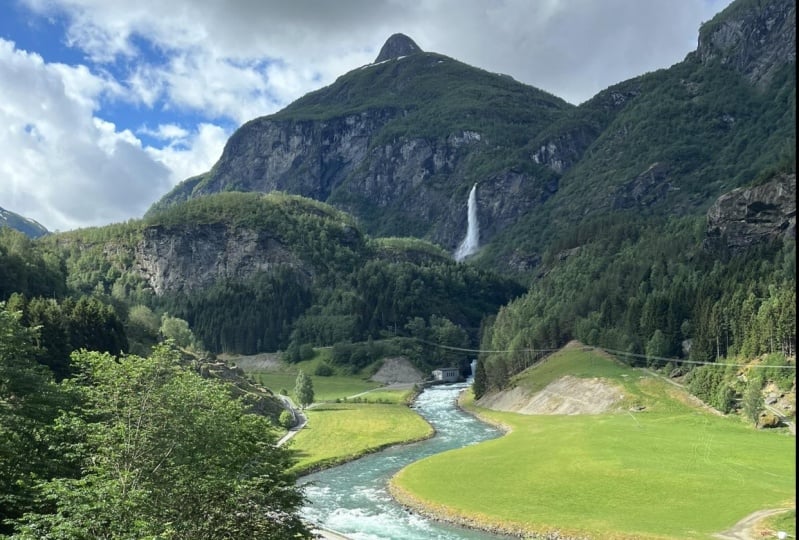
photos from something like this to
something like this. And who said that you need
fancy camera lenses and expensive equipment to
capture stunning photos? Here are a few of
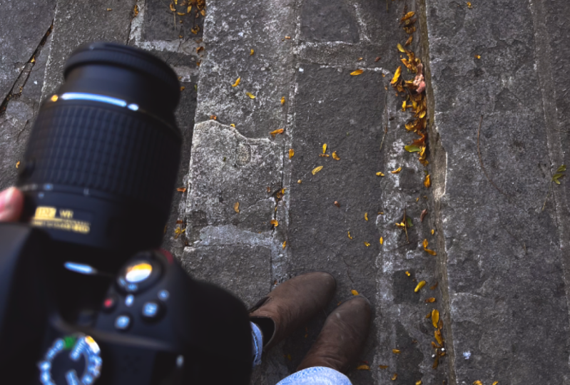
the photos that I shot entirely with my phone. The phone, the whole phone, and nothing but the phone. You see, it isn't as much about the tools as it is about
the way that you use them. So you can use any camera or phone to follow
along this course. Remember, it's all up here. If your goal is to become
a great photographer, to artistically capture
beautiful memories, and to level up your
portfolio or social media, then you're in the right place. Because in this class, I'm
going to equip you with all the necessary
skills to become a brilliant photographer
with just your phone. Here are just a few of the things that we're
going to cover. Here you're going
to learn how to optimize your iPhone
camera from the settings, the timeless rules
of shot composition, the essentials of lighting, and its best kept secret. Storytelling and
photography, and why a picture is
worth 1,000 words, editing your photos with
light room to make them pop, and everything in between to
make your photos stand out. So whenever you're ready, let's get right into it.
2. Settings: Turn On HDR: Okay, now, before you go outside
and start taking photos, you have to set up your iPhone camera to get the
most out of it. First, turn on HDR. HDR stands for high
dynamic range. And put simply, it optimizes
the lighting of your photo. What basically happens is that your phone takes three images. A bright one to expose
for the shadows, a neutral one to
get the midtones, and a dark one to
get the highlights. Then it combines
all three photos into one perfectly lit photo. To turn on HDR, just go to your settings. Screw all the way
down to camera. And then find and
turn on Smart HDR.
3. Settings: Turn On Grid: Next, turn on the grid. Later in this course,
we will learn all about shot composition and something
called the rule of thirds. The grid plays a
crucial role in that. So let's go ahead
and see what it does and how we can turn it
on from our settings. The grid is, well, a grid that divides
your shot into three columns and three rows. This will help you a lot when
arranging the elements of your photo and leveling
your shot horizontally. The grid doesn't
appear in your photos. It's just there to assist
you while you take them. To turn on the grid, just
go to your settings, click on camera and then turn
on the toggle for the grid.
4. Focus & Exposure: Mastering focus and exposure are very important for
taking a good photo, so I'm going to make sure that
you understand them well. First, let's start with focus. Put simply, when an
object is in focus, this means that this
object appears sharp, just like the bird right here. It's possible to have the
whole frame in focus, one object in focus or just
the background and focus. To better illustrate this, take a look at this scene from the opening song
of the Lion King. 42 the can be done. Did you see how
the focus changes? Here, the ants are in focus, whereas the background
is blurred. Here, the background
is in focus, so we can see the
zebra sharp and clear. While the ants are blurred. Fortunately, controlling
focus has never been easier, and this is because
most phones have an integrated auto
focus feature. If you'd like to change the
focus at the background, just tap the screen
in the background. In the same way, tapping the screen on the
subject of your image will shift the focus
to the subject and blur the background. Next, exposure. Exposure is just
a fancy term for how bright or how dark
an image appears. To adjust the exposure, all you have to do is tap an object to set the focus to it, and then slide your finger
down the screen if you want it to be a dark image
or slide it up the screen, if you want it to be
a brighter image. Most of the time,
exposure is set automatically by the auto
exposure feature on your phone. And if you'd like to maintain the exposure or focus that
you've set to an object, then you can use lock
focus and exposure. To do that, simply tap and
hold your finger on the object until you see this yellow
box that says A E AF lock. This is short for auto
exposure and auto focus lock.
5. Shot Composition: Now we're moving into
probably my favorite lesson in this course,
Shot composition. Mastering shot composition
is considered by many professionals that
do or die a photography. What does it even mean? You
probably know what a shot is. It's the frame of your photo. Composition is basically all the elements
that fill that frame like trees, mountains,
people, anything. Shot composition is arranging these elements inside
the frame with purpose. This is important because
when we look at a photo, all we want to find is the
subject of that photo. This is what our eyes
are looking for. And so if that photo
is poorly composed, the elements will be
randomly scattered, and it will be difficult for
us to locate the subject. So we think of it
as a bad photo. On the other hand, a
well composed image allows us to quickly
locate the subject, which makes it pleasing to look at and an overall good photo. In the following
couple of lessons, we will learn all about driving people's eyes towards what
you want them to see, so let's jump right into it.
6. Rule Of Thirds: The first technique
for composing your shot is the rule of thirds. This one is actually
very simple. Remember when we turned on
the grid a few lessons ago, now we're going to use
these two lines of the grid to divide our
scene into three columns. The rule of thirds
tells you to put your subject on either
of these lines. This way, you can
draw attention to both your subject
and the surrounding. Let's look at some examples. When the subject is
placed in the center, we tend to ignore the
background for some reason, and our eyes shoots straight
towards the middle. That's not necessarily bad, but sometimes you just have a stunning landscape behind and you want people
to notice that. In that case, simply shift the subject to one of
the vertical grid lines, and all of a sudden, the
ph will look complete, and you'll feel the harmony between the elements of the ph.
7. Leading Lines: Now for the second
technique when it comes to composing your shots.
Leading lines. Leading lines are very helpful for photographers because they help guide the viewer's eyes towards a single point of focus. The good news is you can
find these everywhere. Streets, buildings, rivers, mountains,
and the list goes on. What you're looking for are lines that go from
the outside of the frame and then move inside towards a single point of focus. Some of these lines can be
straight and well defined, while others tend to bend and are less obvious
to the viewer. But at the end of the
day, they all have the same effect and they
work wonders in your photo.
8. Perspective: The third and final
technique for composing your shots has a lot to do with the angle from which
you take the photo. Perspective. Taking a photo from
different angles can change how the viewer
feels about your photo. There are four
very popular types of perspective, low angle, high angle, sideways positioning and first person point of view. Let's start with low angle. Low angle makes the viewer
look up at the subject, like how a child would see it. Everything seems bigger
and more superior. To capture this perspective, all you have to do is
get lower to the ground and point your iPhones
camera up at the subject. Most photographers
use this angle when they want to give
value to their subject. Then we have high
angle, which is quite the complete opposite
of the previous one. High angle is used to
give depth to the image. Alternatively, it
could be used to emphasize the surrounding,
more than the subject. Making the subject look
smaller and more inferior. To get this shot, you have
to try to stand somewhere higher than your subject and point your
camera down at it. Next, we have
sideways positioning. Here, you move horizontally to capture a subject
from different sides. Let's look at London's famous
tower bridge, for example. This photo is taken
from the left. This one from the center,
and this one from the right, each changing how the
viewer sees the bridge. Finally, there's
first person POV. Here the photographer
is inside the photo, so the viewer can see exactly
what the photographer sees. It makes the photo look more natural by showing
holding hands, objects, or dangling legs.
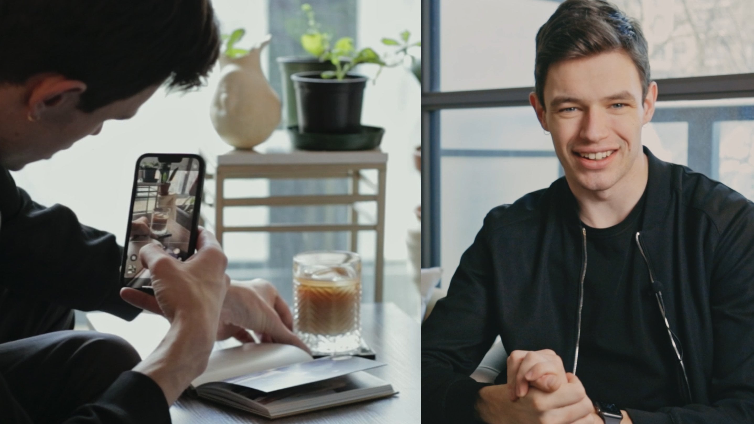
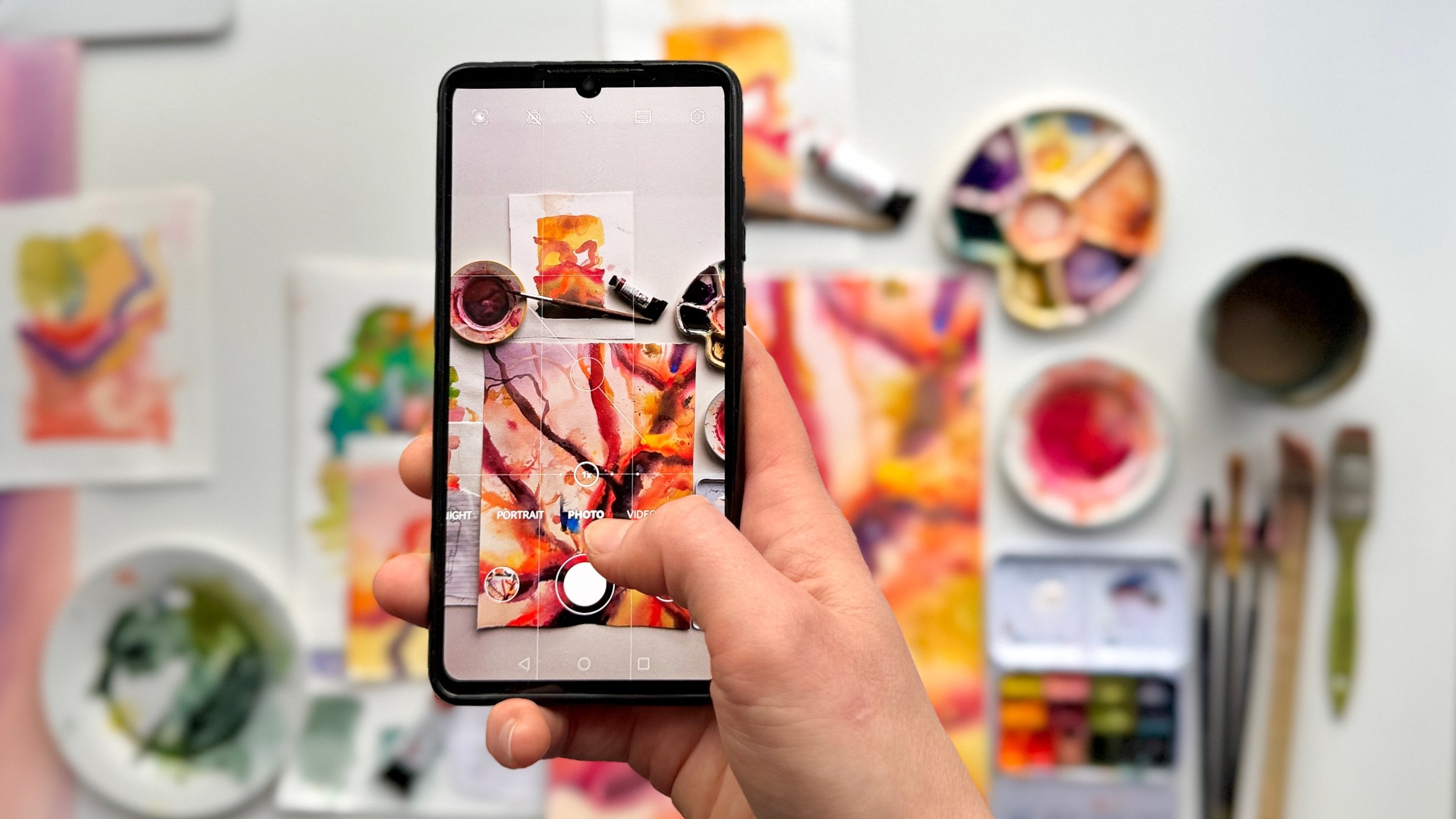
9. Using The Foreground: Using the foreground.
Sometimes, you might take a photo where
your subject looks terrific, but the overall scene, for some reason, looks
bland, or uninspiring. The reason for this is
most probably due to what we call an
excess of dead space. If you want your
subject to really pop, all you have to do sometimes
is add some elements to the foreground that
could help draw the viewers eyes towards
what you want them to see. This makes the shot a
lot more interesting, there really is no limit
to how creative you can get when you choose what you want to fill the
foreground with. Let's take some examples. Here, some dangling
branches are used to fill the empty sky
around this tower. Here, sunflowers are
used in the foreground. Notice how they were
left out of focus. This puts more emphasis on the subject and adds
depth to the photo. You can even use people
to fill the frame. Here, we get a sense of
mystery as if there's an untold story the viewer
has yet to discover. Keep in mind that this
is really only a style. Not all of your photos
out to look like that. But when you feel like one of your pictures is lacking
a bit of flavor, you know exactly what to do.
10. Essentials Of Lighting: Using ambient lighting. Primary school physics tells
us that light is energy, and that couldn't be more
true for photography. Lighting is what determines
the energy of your photo. In other words, it sets
the mood for your photo. The good news is there's
light everywhere from the sun all the way to the table lamp
next to your bed. You just have to know
how to use it properly. And this can be
tricky sometimes, so here's some
guidelines to help you. To brighten up your subject, you have to point your phone
with the direction of light. This means that you will stand between the light
source and the subject. This way, you can capture
all the detail of your subject that would
otherwise be lost in shadows. Sometimes, you might want to achieve the exact
opposite effect. You're more interested
in the figure rather than the detail. Take this picture, for example. We can't see the giraffes
size, nor it's yellow, black pattern, but you can
see a brilliant silhouette. To do that, you have to point your phone into the
direction of the light, which means that the subject stands between you
and the light source. This will make the
subject look dark. So to summarize, for
a bright subject, keep the light
source behind you. For a dark one, keep the light
source in front of you. M.
11. The Golden Hour: Photographers have a term for the best time of day
to take a photo. It's called the golden hour. The golden hour
comes twice a day. That's 1 hour after sunrise
or 1 hour before sunset. The reason photos
taken at golden hour look so good is because
at that time of day, the light coming from the sun is soft and slightly tinted. Plus, the sun is not
so high up in the sky, so the light appears
to come from one direction that is horizontally level
with your subject. Let's look at some examples.
12. Creating Depth In Photography: Creating depth in photography. This is far more important
than many people realize. That's because creating
depth in your photo is what takes your photo
from being a boring, two dimensional image to a very interesting and
immersive three D image. The foundation of
this principle is to emphasize just how far
away your subject is. You want the viewer
to feel the distance. So how do you do that? Well, it all comes down to
one simple trick, capturing the ground
in your frame. This way, the viewer
has a realistic idea of the distance that separates
him or her from the subject. Let's look at some examples. Here, we have a photo
of a stone gate. By showing some
more of the ground, we automatically
get extra depth, and we can feel the distance. Here are some more photos that show the ground to create depth. To get the ground in your photo, sometimes all you have
to do is to rotate your phone 90 degrees from
horizontal to vertical. This will help
better expose what stands between your
phone and your subject.
13. Pano Mode: Enhancing pano mode. Pano mode or panoramic
mode is used to capture a 180 degrees
image of your surrounding. It basically takes
several images as you move your phone from
one side to the other. Then it will line
up these images to form one wide angle photo. Let's see how it's done. First, lock focus
and exposure at the brightest part of your scene before starting your pano. This will ensure that
your photo is well lit and that your colors
are properly exposed. Next, point your phone
to the starting point. Tap the white hutter button and move slowly from one
side to the other. Then tap the white hutter
button again when you're done. For the best results, try to keep your phone as
sable as possible while you move and try to keep the scene
level horizontally. You can also get vertical panos, rotate your phone 90 degrees
and move up or down. This is usually used for tall
buildings or narrow spaces. Now that you know how
to enhance pano mode, you can take stylish
wide angle images that even your 0.5
lengths may be cut. Let's look at some examples. This photo was taken using
the vertical pano technique. Notice how it's a
low angle shot, making the tower look mighty and grand as we learned earlier.
14. Macro Photography: Macrophotography,
shooting up close. Macro is derived from the Greek word macros,
meaning large. Macrophotography is finding
something very small, like a bug or a tiny flower
and taking an up close photo, so it seems large. You're going to have
to be brave here. The closer you get your subject, the better your photo will look. A good tip here would be
to avoid digital zoom, because it will give you an
image with low resolution. This means the photo will
appear blurry or pixelated.
15. Storytelling & Artistic Expression: Storytelling and photography. A great photograph does so much more than just
capture a moment. It tells a story,
evoking emotions and sparking imagination. So how do you infuse your photo with
meaning, a narrative? Well, first things first, find a compelling subject. Look for people, places or objects that
pique your interest. Now that you have
the central element that anchors your story, we're going to have to make
the viewers connect to it. To do that, we're going to use everything we've used in
the previous lessons. Remember what you
mentioned that light determines the energy
and mood of the photo? If it's a happy moment, try to take bright images, showing full detail of faces to highlight eyes,
smiles, and emotions. If you want a more
melancholy picture, maybe you want to opt for
the silhouette effect. Highlighting darker shadows
and more somber emotions. Next, think about shot
composition and depth. Do you want your object
to look big and powerful? How about you go for
a low angle photo? Maybe you want
lost and helpless. Try a high angle photo. Don't forget to use
leading lines to draw the viewer's eyes towards
certain parts of your story. And how about you layer, you're afraid to make it more dynamic? Just keep trying
different things until you get what
feels right for you.
16. Photo Editing in Lightroom: If you want to take
your photography to the next level from here, the editing is the
next step for you. By editing the photo, you can adjust the
colors, the lighting, and the general feel
of the photo if you couldn't get them
right the first time while you were shooting. Here are a few photos
before and after editing. A great application to edit your photos is Adobe Light room. It's available for free on the App Store and the Playstore, and it has pretty
much everything you need to edit your photos. By the way, they're not
sponsoring this class, but I just think it's
a very useful tool. All right. So first,
you have to download the Adobe Lightroom app
from the App Store. When you first open the app, you'll be asked to sign in. You can do that either
with Adobe, Apple, Google, or Facebook,
whichever works best for you. As soon as you sign in, it will ask for permission to
access your photos. Tap allow access to all photos. Now, you can import the
photo you want to edit by clicking this blue button with
a picture and a plus sign. Then you can tap
from camera roll and then choose a
photo from your phone. This is the photo I chose, so we can edit it together. T import it, just tap on
this white checkmark. You'll get a message
that says the photo was added successfully
to all photos. To start editing,
just tap all photos, and then tap on the photo. All right. Now we're
ready to start editing. First, let's explore
the light tab. Here, you can adjust
the exposure, contrast, and so much more. Let's start with exposure. We mentioned earlier that
exposure is a measure of how bright or how dark
an image appears. If you want to adjust
the brightness, this exposure slider is
what you're looking for. I think the exposure
looks fine here, so let's move on to contrast. Increasing contrast
makes the shadows darker and the highlights brighter so that relative to each other, there's a visual difference. I usually increase the
contrast when I have a picture with the silhouette effect we talked about earlier, because it makes the subject darker relative to
its surrounding. On the contrary, decreasing the contrast evens out the
shadows and the highlights. You feel less separation
between them and the photo gets an
overall grayish feel. For this photo, I'm going to increase the contrast
just a little bit. This looks okay. Next, we have
highlights and shadows. Highlights are the brightest
part of your photo, like the sky in mind, shadows are the darkest part, like these rocky mountains here. By ajing them, you can brighten up certain parts
of your photo to make more details visible or darken them if
they're too bright. The highlights in my
photo are mainly the sky. As you can see, if I shift
the highlight slide this way, we brighten up the
sky and we lose some of that intensity
of the blue color. But I actually really
like that blue color, so I'll be shifting
the slide the other way to get
things just right. Now for the rocky mountains,
which are the shadows? By bringing the slider this way, we darken them and we
lose a lot of detail, but I prefer to keep them nice and right to show
the rough texture. I'll be moving the slider this way to better expose for them. Then we have whites and blacks. These are pretty similar
to highlights and shadows. They just give an extra
touch adjust lighting, I'll be adjusting them
in a similar manner to highlights and shadows. When it comes to lighting,
there really are no rules as to how you
should edit a photo, because it all depends on how
you want the photo to feel. Just keep shifting the sliders until you get what
feels right to you. Now let's look at the color tab. This is going to be
a lot of fun because color is what brings
life to a photo. First off, you can
make your photo black and white with
this button right here. Obviously, I won't be
using it right now, but I just wanted you to
know that it's there. Next up, we have the
temperature and tin sliders. These are pretty much
the same conceptually. They just use different
color gradients. Temp has a blue,
yellow color gradient. Shifting the slider
can make your photo appear colder or warmer, depends on the side you choose. This is a desert
scene, so I'll be choosing a slightly warmer tint. You should generally
avoid shifting these too far as they give
an artificial look. The tin slider works
in the same way, giving the picture a
green or a purple tint. But we don't have any
green or purple in photo, so it's pretty
much useless here. Now let's move on to
vibrance and saturation. To understand vibrance, you have to understand saturation first. Saturation is the
intensity of a color. As you can see, by
increasing the saturation, your photo will look more alive, and the colors will
look more intense. The blue, yellow, and
brown, really pop hear. Shifting it the
other way decreases the color intensity until you eventually get a
gray scale image. I usually increase the
saturation of a photo, but not too much to keep
it looking natural. Now vibrance is basically
the smart saturation slider. Increasing vibrance will only
increase the intensity of colors that are fainted and
that actually need a boost. This gives the photo more
natural look and only adjusts for the saturation
where it's needed. I usually apply a small base of saturation to enhance
the whole photo and then increase the
vibrance as appropriate to ensure all the colors
are well balanced. Now, if there are still one color that
you're unsure about, whether it's too intense
or not intense enough, you can adjust it individually for the mixed feature over here. For example, I'm not too sure about the yellow
in this picture, so I'm going to choose
the yellow color here, and then adjust and play with these toggles until I
get what feels right This makes the lighting of
the photo a lot more natural. Let's see the blue,
for example, as well. There you go. And
when you're done, tap on this done button that will bring you
back to the color tab. Another option you can explore
is the grading feature. Here you can assign a
color tint to the shadows, the midtones, or the
highlights individual. For example, if I wanted
to give the shadows, which are the rocky
mountains here, a red tint, then I would have to move this slider slightly
towards the red side. As you can see, the mountains
become slightly more red. Then for the highlights,
which is the sky here, I can give it a
slightly bluer tint. But to be honest with you, I rarely adjust grading. I just thought it
would be nice for you to know how to do it
in case you need it. Now that you know what
the color tab does, let's move on to the effect tab. As you can see, the
effect tab is further divided into effects,
vignette and grain. Let's start from the top, where we'll look at texture first. Now, if you slide this
texture slider to the right, then you can see that
the image becomes a lot sharper and more crisp. The edges are more pronounced. But then when you move
it the other way, you get a more faint image that appears to be very
blurry and hazy. I usually add just a
little bit of texture. Then we have clarity. Clarity
is very similar to texture. It just affects the
contrast as well. Here we get a sharp image
with increased contrast, and here we get a fainter
image with decreased contrast. I usually keep clarity
as it is or increase it just a little bit because I'm satisfied with the
contrast I have. Finally, we have dehaze, which isn't exactly
useful in our case, but what it does is, it adds or removes fog or
mist from a photo. We don't have any
fog or mist here, so shifting the slider, we'll just distort the
photo as you can see. So I'll keep that at zero. Now let's move on to
the vignette section. Here we have a
slider that either darkens or brightens the
corners of your image. We usually apply a vignette to draw attention to the
center of our image, and this is usually effective
for portraits of people. As you can see, when
we apply a vignette, we get some extra
sliders that help us adjust the details
of this vignette. To show you what they
do, I'll go ahead and increase that vignette
so it's nice and clear. First, we have the midpoint. As you can see, we can push back the darkened corners
just a little bit by moving it this way or draw them closer to the center
by drawing it this way. But I'm satisfied
with it as it is. Feather is mostly
about how sharp or how faint the transition
between dark and light is. As you can see here,
it's very faint and here it's really a
circle inside a square. I usually like a
fainter vignette. Then we have roundness.
This determines the shape of the vignette. It can be a bit more square
or a bit more circular, that depends on the effect
that you want to achieve. I'm going to go with a bit
more of a square vignette. Then we have highlights,
which affects the top two corners. It brightens them up and keeping the bottom
two seal dark. But I'm pretty satisfied
with it as it is. I'm going to bring that a
bit down this way to give that cinematic look
without making it to artificial Then finally, we have the grain section. The grain section
makes your photo more grainy and to show
you what that does, I'm going to increase
the amount size and roughness to the maximum. If we zoom in, you can see that we have this grainy
texture to our photo. To be honest, I really
don't like this effect, so I'm not going
to be adding it. I'll just reset
everything to zero. We're almost done, just two
tabs left, detail and optics. To be completely
honest with you, these aren't very useful for our photo because they're
mostly used for correction, but I'll go over them very quickly to show
you what they do. Let's start with detail. As you can see, the detail tab is split up into sharpening, noise and color noise. The sharpening section makes
your photo more crisp, but our photo is
already in focus, so doesn't really
have an effect, as you can see if
we take the slider this way, it's unchanged. There are some extra sliders here to help you
adjust the details. Then we can see that the
other two sections are about noise and color noise,
and very simply, when certain parts of
your photo have noise, that basically means
that they appear gray or optically distorted. You can fix that by using these
two sliders, but luckily, our colors look perfectly okay, changing these won't
really make a difference. Finally, for the optics tab. Here, we have one toggle that says remove chromatic
aberration, it's very difficult to explain
what this is in words. But if I show you this photo, then you'll instantly
understand what I mean. If you do have that, you
have to turn on this toggle, but again, we don't, so there really is no
difference. There you have it. You have a photo
with amazing colors, amazing lighting, and
a very cinematic feel. If you want to
compare what it looks like now versus what
it used to look like, you can just tap and hole on the photo and you can see the great difference
that that makes. This is before,
and this is after. At.
17. Class Project : I strongly believe that
the best way to learn a skill is through project based learning and
practical work. To conclude this course, I want you to consolidate
everything that you've learned and capture a photo that lets your
creativity come through. I want you to think
about the story you want to tell and then use the techniques that
you've learned to por cray this story. The theme of this project
is entirely up to you. It can be anything from
architecture to nature, to people, and even pets. Once you have that photo, I want you to upload
it to the projects and resources
section down below. And if you want to
go the extra mile, then why not add a small caption that states how you
took the photo? What techniques did you use? Which angle did you
take the photo from? What about the time of
day or the lighting? And by the way, feel free to upload as many
pictures as you like. This is your time to shine. So good luck, and I can't wait to see what
you have in store.
18. Conclusion: As we reach the end of
this journey together, I'd like to take a moment to reflect on the incredible
progress that you have made. Photography isn't just
about capturing images. It's about capturing moments,
emotions, and stories. Remember, every
single photo you take is an expression of your
creativity and perspective. As you continue your journey, I want you to keep
experimenting. The best hots come from
unexpected angles and moments. Don't be afraid to try new techniques and to step
out of your comfort zone. If there is one last piece
of advice I can give you, it's to find your unique style. Explore different
genres and techniques, but always try to let your
individuality come through. Your perspective is what
makes your photo special. I really hope that this
class has inspired you, equipped you with new skills, and ignited your passion
for photography. Remember, the journey
doesn't end here. Actually, it's just
the beginning. Keep capturing the world through your lens and let your
creativity flourish. Thank you for joining
me on this adventure, and I can't wait to see
all the incredible stories that you'll tell
with your photos.
 Basil, Award-Winning Educator