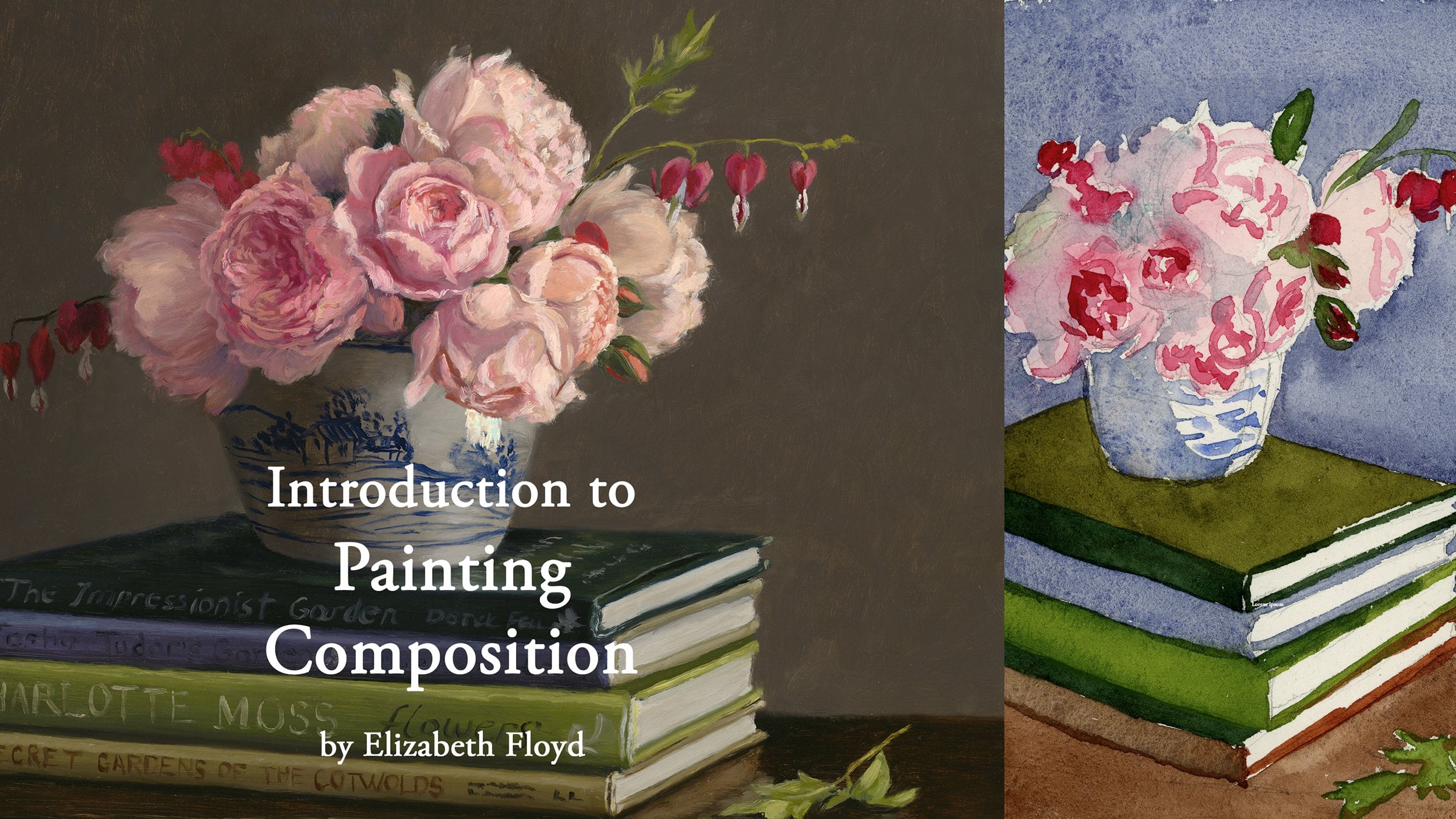
Transcripts
1. Introdution to the Class: Hello, and welcome to this introduction to values
in oil painting class. My name is Elizabeth Floyd and I am so excited to
be here to teach you about values
in oil painting, and it is my belief that painting values
is probably one of the most effective ways to improve your paintings if your goal is to
paint realistically. Getting spot on values is what creates that sense of
three dimensional form and and weight and heaviness that you can express
in your oil paintings. In this class, we are going to discuss aspects of the
value gradient and how in nature we see an infinite levels of darkest
darks and lightest lights. But as artists, it is our goal it's our responsibility
to constrain those values within the limitations of
our paint pigments to create a very evocative feeling of three dimensional form
in our paintings in art. In this class, we will dive deep into our value gradients, how we as artists
can constrain and decide on what type of
value gradient we want to apply in our art so that way we can better express what we want to be sharing
with the viewers. I will also be talking
about some tips on really good rules
with them of how to make painting values
easier while you're painting and the role that the value gradent
has on creating three dimensional form,
that's pretty much it. This class is designed to specifically focus
only on values. That is because I believe
when you can strain down what you're focusing on to improve when
you're painting, what it does is it
creates construct a a situation where
it's more measurable. When you finish that painting, it becomes more
measurable and you can see the areas of what
needs to be improved, what's gone well, and then
you can actually more rapidly improve and grow
with your skill set. Let's jump in and
let's dive deep into an introduction to values with oil painting.
Thank you so much.
2. Introduction to the Basic Concepts of Values in Your Paintings: Values and total
quality in your art. And this is going to be a
lesson that we're going to dive in deep and talk
about the subject in depth, and then you can go
home and immediately start applying exploration
to your own work. Okay, so, first off, values and total quality
in your art within nature, we have an infinite
choice of values. And the decisions we
make with regard to the value relationships is crucial to creating
engaging paintings. This is because in nature, there's a variety of value
shifts, and it's infinite. However, in painting, we artists must reduce the number of values that we observe and then interpret and put
into our painting. For two reasons. One
is that our pigments limit our lightest light
and our darkest dark. And then two, it helps
and makes it easier for the viewers to perceive those value
shifts in your work, which then the more
you can engage sevier the more you increase the likelihood
of you getting them, enraptured in your work. And as artists, we are
creating connection. I think that's the number one
goal as being an artist is to figure out ways to create
connection with your viewer. And the easier you can find ways to connect
with your viewers, the easier it will be that and mastering value
is one of those ways. As artists, we use the gray scale or
graduated gray scale. And that is it's a simplification
of our value continuum. So, you choose to put them into specific steps and you are
organizing your value shifts into these steps in order
to create that easier to perceive and easier to
express your subject matter. The first order of
business as artists is when we're looking
at our subject to paint is to decide how we want to organize
our value continuum. Found in nature and then simplify it so it's
easier to understand. And so that's your
value gradient. And, you know, the easiest
that we can start off with is a two value gradient
where our lights automatically are white and
our darks are just black. You know, that leaves for
think something very graphic. Black and white, like a black and white
wood block would be, you know, you know, that value gradient
is two values, white, the color paper,
and the black ink. And then your next one
that you have choice, which is also very
easy to choose from is a three value scale, which is you have a light, you have a middle tone, and then you have a black tone. And again, that's
very simplified, and it will be perceived as
a little bit more flattened. So say we chose to use a classical scale
painting gradient. That is one where we provide equal steps within
the value gradient. Okay, so our, you know, the simplest gray
scale that we have available to us is
the black and white. It's also called a No ten, which means, I think in Japanese light black
or light dark. And then the next one is
our three value scale, white, middle tone
gray, and then black. And then one of the cool things about the values that
we see as artists. We've got the full
value spectrum available to us is
that we as artists, then get to choose,
how do we want to organize the values we see
and how do we want to convey? And that is, like, why we want to
organize our values. Why we want to simplify and constrain is because
the way we use our values influences
the emotions that can also be
conveyed in our art. So like this Vermeer
painting is you know, Vermeer used a classical
scale gradient. Rembrandt was prone to doing
these low key paintings, which, you know, you would have a very small percentage of your value gradient
would be light. And then more black
to your mid tones. Your high key is where
you have more lights, more mid tone values. But your Blacks take up a very small percentage
of your painting. And then the impressionist
model, which you know, it's not always impressionist, but the impressionist values is where middle values prevail, where essentially you
have maybe a little bit more white or your
lightest lights values, but you would have
less dark values, but your middle tones, those midtons really
prevail and take up the majority of
the square footage or the square inch
coverage of your canvas. Okay. Now, light and shade is always we're always
having to organize that. And so adding light and shade makes your
objects look real. And when you think
about you're creating a painting and you have
the outline of the object. Now, immediately adding
light and shade to that outline starts to give it three dimensional
form, that sense of form. And form is the look of three dimension on
the flat surface, but form also is in art, conveys a sense of weight
and visual sense of touch. So you can create
three dimension, but if you're not rendering
it in such a way that you're also giving that sense of visual weight and a sense of touch, it will start to look flat. And to avoid breaking
up your main values, you must first establish the local values of your
subject first and then superimpose the
sense of order on the shapes by adding the
light and shade effect. Does that mean? That means
that say you have a lemon. A lemon is light in value, but you have right
next to it, an apple. Well, that lemon object
will always have probably lighter values
to your red apple just because of how light the
local color of yellow is versus how light or how dark
in comparison to yellow. What it means is, like,
when you're mixing paint, that means you do not
want to be always using the same paint
puddles that you used to say the same like if you're doing a
gray scale painting, you're not going to use the
same values that you used for a dark object for a light optic because
essentially, you know, it will confuse the
viewer because we rely on the value to provide us with
a sense of light and dark. Okay, so one of the things
that I want to talk about is that as artists, we have the choice to either use a simplified order of light, which when I first started
painting years ago, I was prone to
using a three value or a six value simplified
order of light. I try to organize everything to make it just easy,
and it works great. So like, at the beginning, if you're having difficulty with making sure you're getting
your value spot on, I suggest you create some exercises where you've
simplified your values. Your value groupings into
less depths, less gradations. And that will help you get better at organizing
your value shapes. However, one of the issues with using a simplified
order of light is that you do start to lose that sense of visual weight and, like, sense of touch. It has a tendency to flatten your three dimensional objects
on your picture plane. Using a simplified order of light is a fantastic way to plan all the composition to
figure out how you want to organize your shapes of
value on your picture plane. Where a classical
order of light, especially if you want to paint realistically is a great
way to really think about your objects because it's easier for you to
express a graphitasa form. You have greater
variety. So therefore, you have more nuance in your expression in
what you're painting. And I think Like, I just think of Rome painting. It just helps that
painting jump off. You know, that subject matter
just engage the viewer. I want to talk about like, let's talk about when you use
a classical order of light, and you're thinking
about your shape. And when you're painting, you have half you have lights, half tones, and darks. And the line between your
half tones and your darks, half tones shift to your lights and your
darks or your darks. So like, for example, here
in this image right here, you choose where your
half tones are, and, like, this is a decision where you just make it
while you're painting. It's not so much as an artist, we're always in charge of how we're interpreting
what we see. And so it is important at the beginning of a painting to make certain
decisions of, like, this is where my half tones start and that go
off to my lights. And then this is where
my shadow shapes, my darks start and go to darker. And what I want to
point out in this, when you're painting a
three dimensional object and you want it to look
three dimensional, you have what's called
a coarse shadow. And the core shadow is
essentially the place. Like, so the area,
the the plane, the area of the object that is directly facing the light source will be your lightest value. And as it rolls away,
it gets darker. However, your darkest dark in your dark areas
is your core shadow. And that core shadow is the place where it is perpendicular
to your light source. So therefore, it is receiving the least amount of direct light from
the light source and also the least amount of reflected light that
bounces off from any of the adjacent services
to create a core shadow. So when we look at this
ten value gradient, the core shadow is
your number nine, but it goes one, two, three, four, five, six, seven, seven is your
dark half tone. It's your darkest light
value, essentially. And then you don't go to eight, which is your light shadow. No, it switches to
your core shadow. And then your light shadow
is usually the part of the shadow shape that is receiving
some reflected light. And your darkest
darkest dark is usually the area where there
is absolutely no light whatsoever. I received no light. So therefore, it's
often your crease of an object in the shadow and so when we're
thinking about values, it's always a good idea to
be thinking about how you're separating your lights
from your darts and looking for where that
core shadow would go, especially in a round object
or a cylinder object.
3. Some Tips When Considering Value Decisions: Okay, so with that, I want to talk about some tips. And that is when you
start a painting and view the scene and consider
all the values within the value continuum
and adapt them into the graduated value scale that you're planning on using, it's important to
really think about that your painting is not going
to be as dark as you see, nor is it going to get
as light as you see? And one of the reasons
is actually, in nature, it's important to notice that like what you're
observing in nature, you cannot replicate
in painting. And one reason is that your
whites and your pure colors, your lightest lights
that you see in nature always have a little
bit of color to them. And so that automatically means that you can't use
pure white pigment. You have to shift it in
just a little bit in your value scale to make your lightest light will be
just a smidge inside of, like, the whitest white that your pink pigment white
is capable of getting. And then your darkest dark is also going to be smushed in
just a little bit as well, because all darks do
have some color, too. They have a little bit of color temperature to
them and everything. So they are not also going
to be a pure, pure black. They're going to
have a slight color. And in order for our eyes
to perceive color in paint, that means the darks have to
be lightened just a smidge, and the lights need to be deepened in value just a smidge. And so that means
value the value continuum that we
are working in as artists is just a bit smaller. And so we always you start
a painting looking at that. Look at your lightest light and look at your
darkest dark and realize then that
everything else that you go into
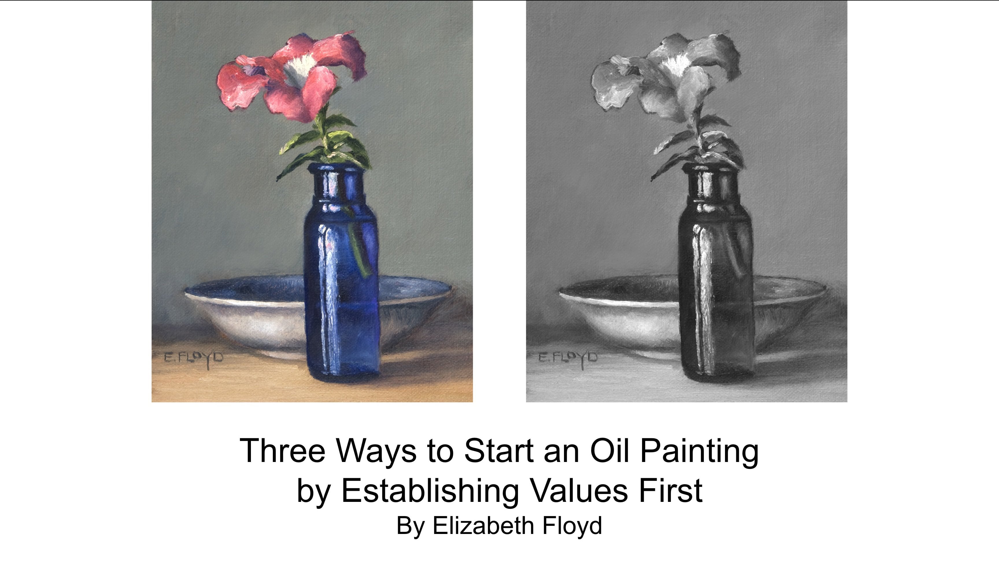
goes in between. And like I love this
painting here is because there isn't
really a true black. Like, for example, the lightest
light is probably, like, right there, but it's
not or even right there, but it's not a pure white. But when we look
at the gray scale, we can identify it as
the lightest light. Because we have a comparison. And then our darkest
dark is down here, but it's not a
pure black either. Another tip is the correctness
of value goes hand in hand with how it interacts with its adjacent areas
of the painting. If the areas do not harmonize in value relationship,
then something is off. And one of the things that I
also want to talk about real quick is that if you're painting and you
keep encountering, like a muddy area, muddy colors, it is my experience that it's typically not the
color that is off. Most oftentimes it's an
error in your value than your color that you've somehow got your value
relationships off. But we think it's the color, but it's probably
the color either needs to be darkened
in value or lightened in value to help
that because we as our eyes have like four
times the receptors to see value than color. And so with that, we always
have to make sure that our value is more spot on than our color
accuracy is spot on, which as a colorist, I kind of find that very sad,
but it is true. And that's also why having a value plan when you're working on a painting
is so helpful, too, because then you can if you're
experiencing muddy colors, you can be looking
at your values, and then you can decide whether or not your
values are on or off. Another tip. The main
division between lights and darks usually occurs between
the half tones and shadows. By keeping the half tones
within the light areas, you give yourself more room
to add variation and interest while also giving the object
a sense of mass and volume. This also makes sure that the
highlight value is special. Your highlight is
the only object that's directly opposite
to the light source, and it is the lightest value. So with this painting, your highlights are your
lightest values right there. And also on that flower petal and that
petunia right there. And all the whites in this
bowl are like your mid tones, and it helps create volume, but it also makes those
highlights special. Another tip. Be careful about making the shadow
areas too light. If you focus too much on
them when you're painting, your eyes will
dilate and adjust, thus making it easier to discern more variation
in your shadow shapes. When this happens, focus on
the light areas more and flick your eyes back and forth to assess
the shadow shapes, but not lingering on
those shadow shapes. This will also help
in simplifying your shadow shapes because the more simpler your
shadow shapes are, the better the design and organization of your
composition is, as well. And it also will help you
create more visual unity. Shadows play a
supporting role in art. They are meant to
recede and fall back in contrast to the light areas that are supposed
to come forward. Reflected lights in the
shadow should never ever be as light as
your dark half tone. So I'm going to scroll back just real quick, and I
want to look at this. So, for example, your reflected This is what this vertical line is too,
is like, for example, you your reflected lights and your shadows
should never cross this line in your value continuum that separates
your lights from your darts. And that just helps you
control and make sure that you have that everything
gets organized so that the viewer can
immediately tell that, Oh, this is, you know, that form turns, and
that's the shadow side, and this is the light side. And it just makes it easier for the viewer to engage
in your work. And then my final tip when looking at
values is to squint. Squint and squint and squint
at what you're painting. It's the easiest way to make your eyes work in your favor to discern your value
shapes because we have so many more rods. It's rods that discern value. And our eyes than cones do. And cones to discern color
require like flan light. But when you start to squint, you are reducing the
amount of light that hits the back of your eyes. And so your cones have to start come to the forefront
of your perception, your visual perception,
and therefore you start to see the big shapes. And one of the best ways to organize is to squint,
and that's how, if you see one shape that
you think is a light value, but when you squint at it, it starts to shift into
your shadow shape, then that probably is
one of your light darks. You know, it's it would
be your light shadow, like your number
eight, if you're using a ten scale gradient.
4. Exercise: Developing Form Through Value: I really want to encourage you guys the best way to get better at understanding
your values is to practice drawing or
painting with just, like, white and a dark. So with drawing, you would start with the color of
your paper is your white, and then whatever your
drawing material is if you're using
charcoal, graphite, int. And then when you're
painting, choose two colors a white and a dark. An ivory black, a
burnt umber, or hombr. Like, so for example, this
portrait study right here was done was done with burnt
umber and lead white. And in fact, actually, I would
encourage you not to use Ivory Black because most
times when you're painting, you don't use Ivory Black. You know, your darkest darks
and most paintings probably never ever get much darker
than your burnt umber. And it helps you learn how to constrain your value
scale just a little bit more by starting with a dark that is not as
dark as dark as black. And the more you work in just
a two value subject matter, you get better and better at
discerning the value shifts. And then when you do return
to a full color palette, it's so much easier for you to incorporate and
interpret value as well.
 Elizabeth Floyd, Artist | Elevating Everyday Moments