Transcripts
1. Introduction: Hello and welcome. I am
so glad you are here. In this class, we are going
to talk about how you start your oil painting by
establishing your values first. Establishing your values first is a great way of establishing
strong compositions, expressing what you want to express emotionally
in your work, and just overall having a
strong start to a painting. As artists, this is
such a helpful thing. In this class, that's
what we're going to do. I'm going to talk about three
different ways that you can start your oil painting by establishing
your values first. Then I'm going to go over and
share some favorite art of mine by other artists
and we're going to look at these paintings, both in their color
version and in their black and white
grayscale version, and we're going
to talk about how the values of that painting establish and strengthen the
composition of the painting. Then I'm actually going
to look at some of my own work and we're going
to discuss and I'm going to present ideas about how the values reinforce and emphasize and strengthen
the composition. I am so excited to be teaching this class with you
and let's get started.
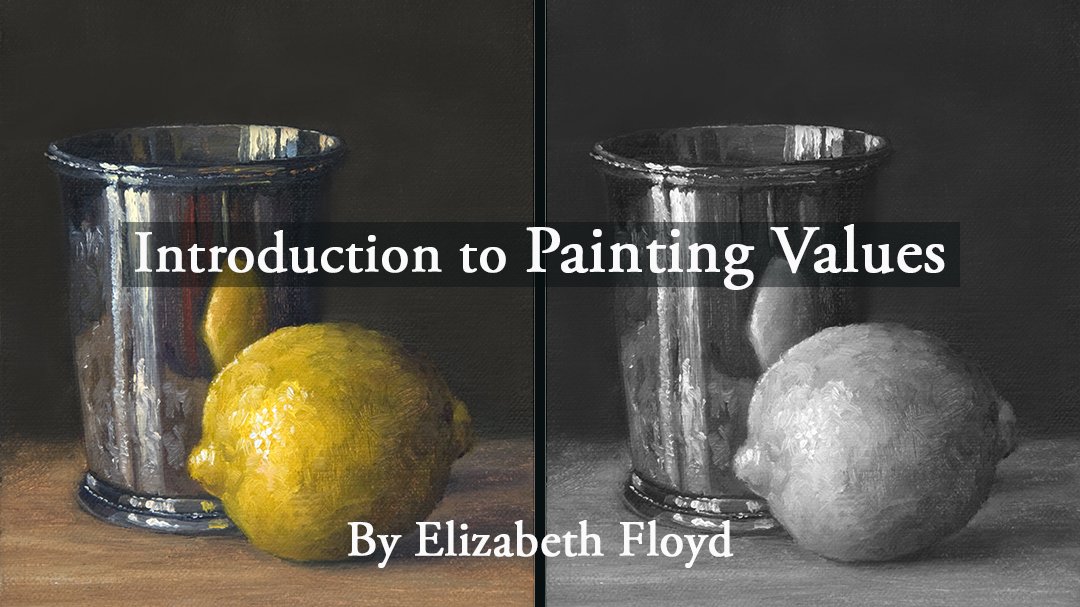
2. What is a Grayscale and Why it is Important: Decisions we make with regard to our value relationships in our paintings is crucial to
creating engaging paintings. You have to simplify the infinite variety of value shifts that we
can observe in nature, and we need to constrain and simplify those value shifts into an organized system that makes the way we render and create three dimensional form within our picture plane
that makes it easier for the viewer to perceive
that sense of three dimension or that sense of form and, you know, when you
make it easier for a viewer to understand, you heighten their
engagement in it. And so the simplification of that infinite value
continuum found in nature is called the
graduated scale or a gray scale. And selecting the type of gray
scale that you're going to use is fundamental in maximizing the values
and, you know, the values in your
painting in your art, which then the result
is that it improves your ability to communicate and connect with the viewer,
with your audience. First order business as
artists, is that, you know, when looking at our
subject matter is to decide how we want to organize
that value continuum. And, I mean, like,
we can go from the most simplest value, you know, organization
of a two value system, which is a light and a dark. So I like to think of
Leno cut or wood blocks where the value of the
paper and the black ink is, you know, those are
your two values. The next easiest is a
three value choice, and that is, you know, white, mid tone and dark. And, you know, that methodology is really great for organizing
your composition. I don't think it's I think
that simple when you simplify your value your value nuances
to only three values, I think you lose
some visual depth, you lose some nuance, but it's great for you to
help you organize the design, the composition of your piece. And then, like, the
classical painting scale, that is a classical scale. Endeavors to create a
multi step gradient that goes from the lightest
light to the darkest darks, and then it allows
you to incorporate nuance into your painting.
3. Three Ways to Start a Painting: Okay, there are
three ways to begin a painting when you want to present a strong,
brilliantly lit scene. The first way is you start with painting
your lights first. The second way is
you start with you paint an area of your lightest lights
and your darkest darks. And then the next one is you
start with your darks first. It's a good practice to explore each starting paintings
with each of these methods. And what do I mean
by good practice? I mean, you set a
personal goal and say that for the next
three to five paintings, I'm going to start
my compositions with laying in my darks first, or I'm going to start
my compositions, laying in my lights first, and then work out from there. Or which, like, starting
from your lights first, that usually means
you're starting from your focal point and then working out to your
supporting elements. We're working with your darks first could be you're
starting with, like, everything that is
your backgrounds, you know, the secondary items, and then you work up to the crescendo of the lights
of your focal point. And then when you start with the lightest lights and
your darkest darks, that one is you're evenly covering your entire canvas
kind of at the same time. And it is a really good idea. So, several years
ago I did this. I painted like five or ten
of each method in a row. And so what that does
is also set it gets you more and more
with repetition, learn at a more intuitive level. And by doing ten
of one and ten of another and ten of
the third version, what that does is you give each start type an opportunity. You become equally
good at each one. And so then you can in
an unbiased manner, choose which one
actually works best or when you come
to a composition, because you have
those three methods and you are equally
good at each one, certain compositions work better by starting with the lights. Certain compositions
work better, starting with laying in
your lightest light and your darkest dark or starting
with your darks first. And by being familiar and
competent in all three types, it helps you make sure that you start your
painting composition, you know, the composition, the painting, on its on
your strongest footing. You will likely identify one
that you prefer the most, and it usually is probably
it's in sync with, like, your natural
artistic voice. It's been a long time since I remembered that I
did this exercise. And, what I've learned is that I tend to start my paintings
with my darks first. This slide is
talking about, like, your artistic voice, the aesthetic conventions
in witch artists sees. And that, we do have our
natural inclination. And so, for example, Vermeer painted in a very
classical scale painting, where Rembrandt, his
silk portraits were definitely tended to be low key, where Ann Redpath, who was an Australian still life
artist that I really admire, she painted a ton in high key, and then we've got the
impressionist Monet Pizarro, even Cezan even though he
was a post impressionist, they tended to
create compositions where the middle
values prevailed. And you didn't ever get truly to you didn't get a
ton of dark dark dark, and you didn't get a ton
of light light light, but the majority of your values prevailed in the
middle value ranges. Let's talk about what happens when you start with
laying your lights first. Begin by laying your
lightest tones first. Take special note to lay the closest to
pure white down first. After the lightest
light is laid down, begin to work and only the value relationships on the light end of
your value spectrum. When you're working
in the lights first, what will happen is that
you'll notice that you get very quickly to
your darkest value of what is possible in your paint pigments to
provide you because remember, our value in nature, we have an infinite
value spectrum. But with our paint pigments, even every black
is not as dark as the darkest dark, or what is it? I nature, the darkest dark has a little bit of color to it, and in nature, your litus
light is not pure white. It has, you know, a color tint to it, maybe a little bit orange, a
little green, a little blu. And so that means
with our pigments, when we're looking
at our pigments, we have, you know, they have to come in just a little
bit from your litus light. And then because you
have a little bit of color and your darkest dark, they have to come in
from absolute black. And so from there, your pigments
are already constrained. And then, because of the
pigments that we have, and when we're working
from litus light, we get to our darks, like, what's the maximum
possibility of what our pigments are able to
give us in our darks. We hit that really
fast when we focus on, starting with our
litus lights first. The majority, what
will happen is that the majority of your
canvas will end up being dark in value just because you go through your light value so very quickly, so rapidly. Rembrandt's work is a
great example of that. And then, and so therefore, your painting will often end up being low key in
painting composition. Okay, starting with
your lightest light and your darkest dark values. You begin by laying in your lightest light and your darkest dark values
at the beginning. And then you work within
that value scale in between. You will find that the
majority of your color notes fall in the mid tone
range of values. And in order to maximize
the brilliancy of light, you'll need to be
careful and really plan your shifts in your values. And, like, there is
a chance that you could likely create a
weak painting this way. If you are not carefully and very consciously making
plans for your value, you know, your value shifts in the design of your composition. And that's where, like, you
look at Premier's work. His work is still fantastic, even though a lot of his work, there's a lot of values
in your midtones. And then, even the work of
the impressionists work, with all your values being so
stuck in the midtone range, you would think that the paintings they lose
a little bit of form because they're so color oriented or midtone oriented, but at the same time, they are
still fantastic paintings. And so you just have to make sure that when you're
using this methodology, that you're constantly thinking
about your composition and planning your values in a way that supports
your composition. Okay, starting with
your darks first, but begin by laying in
the darkest values first. Proceeding towards the lightest
tones with this method. You arrive at your lights
and your paintings before you arrive at
the lightest lights that is found in nature. The light masses will
dominate your painting, and all the variety of
light tones will be adapted to still fit within
your graduated scalar values. This method produces
high key paintings that are very effective at representing
brilliantly lit scenes, and Anne Red path is a
fantastic example of. She does phenomenal
high key paintings.
4. Discussion of the Importance of Values Part 1: I have a series of slides that I just kind of want to
open up to discussion. This is a fenton Latour painting and created a gray scale of it, and then I have
the color version. And I really want to
just talk about how the values of this painting
support the composition. And like this painting by Henry Fenton Latour
is a wonderful example. Like, for example, wherever
you have high chroma, passages in your painting. Oftentimes, those
are in the midtones. And so, yes, the
value is spot on, which makes it visually still feel very
three dimensional. But it's the color saturation
and the colors that make these passages in a
painting read so well. And then the chrysanthemums
in this painting, the whites and their values is what drives that part of the composition. And
so it's a wonderful. Looking at paintings
that you admire in both color and then
right next to it, the values, it helps. I think it's a great
example of how you can it's another way of it's another way of analyzing the paintings that
you admire and learning how to
make them work out, you know, like, you
know, take ideas, and how do you want to apply
them to your own work? So I love this
painting by Nicholson. Still Life with apples and
a fantin Latour painting, and I have the grace. I created a gray scale of it, and then I have
the color version. And this painting by Henry Fenton Latour is
a wonderful example. Like, for example, wherever you have high chroma passages
in your painting, oftentimes those are
in the midtones. And so, yes, the
value is spot on, which makes it visually still feel very
three dimensional. But it's the color saturation
and the colors that make like these passages in
a painting read so well. And then, like the
chrysanthemums in this painting, the whites and their values is what drives that part
of the composition. And so it's a wonderful.
Looking at paintings that you admire in both color and
then right next to it, the values, it's another way of analyzing the
paintings that you admire and learning how
to make them work out. You know, like, you
know, take ideas, and how do you want to apply
them to your own work? So I love this
painting by Nicholson. Still Life with apples and
knives. And what I love it? There are several
things I love about this painting. I like
the composition. In fact, one of
the things is it's one of the early paintings, life examples that was done, where it's obvious
that they were using artificial light to
light this composition, which as, you know, you know, artificial light in a house was relatively a
new technology for. And so it's always fun to
see how that started to get interpreted and
incorporated into paintings. But what I also like is that
your colors are flattened, but you can see, and this is
a high key painting, too, because as a whole,
the percentage of dark values are
minimal in comparison to the large swaths of midtones
and your light values. And then this tulip and fruit trees in bloom
by Anton Coster. Now, in this one, this is a wonderful example of a probably started with
the lightest light and darkest dark and
worked in between, and where the majority of this painting are
your mid tone values, the value gradient that
you're working on. And it and you get
to see the pattern of light and dark and
how strong it is. And what I always like to do when I'm looking at a painting
and analyzing it is to, I'll take my thumb and cover. And if I cover these three
squares of white linen, the composition starts
to disintegrate. But those three light values are very important
to making sure that, you know, when I look at it, compared to the lights
of what's going on in the flowering tree with it's either I don't know
what type of tree it is. The whites in here are not as light as the whites in these. That one's a little
bit deeper in value. I have always loved
this painting, Poppies by the Coast
by George Binet. And I thought it was my love of flowers that always drove
me to love it so much. But when I was making
this slide show, I was struck by what a fun
value composition this is. So one of the things that I
noticed is, so for example, we have color that tells us when the sea changes to sandy shore. But in value wise, that's all one big shape. And so it creates something
that embraces and kind of, like, hugs and
surrounds the poppies. I was struck by
how the black and white value shifts and jumps. Are so narrow that they
actually come across as much more darker value shapes when you take the
sense of color away. And then how the red and the green and become
one shape value wise, where in the color version, we identify because
of, you know, their color compliments, red and green are color compliments. And red is a warm color. Green is a cool color. And when you're dealing
with color compliments or color temperatures warm
comes forward, cools recede. And so we still have
a visual depth, but when we're looking
at it purely as a black and white
grayscale image, how design wise, they become they really become
one unit. Compositionally. And then the very
soft subtle shifts of values of that
receding shoreline. And I really encourage you
if you like a painting, to check it out and analyze
it as a black and white. This is a John Lafarge. This one is at the National
Gallery of Art here in DC, and I love it. The flowers are back lit, so the flowers
become very dark in value that are the
reds and the Nble. And then we have these
wonderful lights, the slight Zina and
this light rose, and how what I thought
was, you know, it is a mid tone, but it's a dark midton of the
landscape in the back, how it counters to
the white drapes. But this is one thing that always this is a perfect example of your value scale in a
painting is like infinite. It's gigantic. In
nature, it's gigantic. But in painting, you are limited to what
your pigments can do. So that means it's going
to be a lot more narrow. And so all of these, like, high key whites, actually,
they're mid tones. I love breaking
apart a painting and looking at that and then
thinking, uh, okay. So that way, the next
time you go out and paint something that's
got a ton of white in it, realize that you're
probably going to be at, say, level four, five, six, seven, if you're
doing if you have a 20 scale graduated gray scale. Yeah, it's just
fascinating. So okay. And then, turning this one into a black and white struck me to realize that this very, very light background
is a mid tone. And then, of course,
the orange and fuchsia are darker in value
than I anticipated they were. And then the pink and
white and yellow Zenas are some of the lightest
areas of the painting. And then your spectral highlight is the closest to true white, where the rest are lights, but they have they're
probably at value level two, three, you know, four,
five, six, seven. Yeah, and then you got some
of your darkest darks right there and right there
in your coarse shadow.
5. Discussion on the Importance of Values Part 2: These are some paintings
that I've done. So I thought I would talk about some very direct
examples of my work. Value wise. When
you're painting, I don't always even
realize what I'm like, what's accomplishing,
what's happening. But to get my ltus light, my spectral right there in that inside of the
petunia, right here, on the lip of the bowl and then the spectral highlights
on the cobot glass. Now, because the base of the cobot blue glass is
so much darker in value, those spectral
highlights will not be as brightly white as, say, in the petunia or even
on the lip of the bowl. However, when we
look at it in color, it feels so dramatic.
And why is that? Because when you have a dark
value next to a light value, it's going to create more visual it's visually a
stronger strength. And some of the
darkest values in this painting composition are this side of that
cobalt blue glass, and then right here where the
stem and the bot blue meet. But, the bowl doesn't have got a little couple of
dark areas right there, too. This one, is this one
was like, what is it? Remember the rule
that I said that when you are
creating a painting, you have to choose and
simplify your values. And some values, you'll
push them darker, some values, you'll
push them lighter. So for example, these three flower petals and
then that connects, there's a slight bridge,
visual bridge there. They are they probably
were not as dark, but I probably created
that unification to make for a more interesting space and also more interesting
negative space. And then it goes through. It's interrupted by this
very light pansy right here, and then it's continued on. And that creates visual
unity in your composition. The silver is we've
got silver highlights, but then we have some
dark shapes as well. And then here's a painting. God, I love this one. And so, also, I
want to point out, all three of these paintings
were painted from life. When you paint
from life, you see values so much better than when you work
from photographs. And that's one of the reasons
why it's such a good idea to spend time
painting from life is because you discern values. It's just so much easier to discern values and color, too. And this one I started with my I started with my lights
first on this one, because I remember when I
remember painting this one, and it was the first time
I had painted for Cynthia, and I decided instead of looking at the
individual flowers, I painted in, like,
yellow masses. And I'd paint the whole yellow mass kind of of, like, say, this color right here or
this kind of greenish color. And I would paint the mass in, and then I went
back in and then, added the lighter values or
added the darker values. Now, this painting this painting is one where I started with my lightest lights
and my darkest darks, and I started in the middle of the bouquet,
and I worked out. And I probably started here. And I was able to get
the brilliancy of light because I also always kept When you work with your lightest
light and darkest dark, you have to always also
think about making sure that you leave room enough
for your highlights and that you leave room enough
for your darkest shapes. All right, I got one more. And then this painting is
a painting where, again, I started with the idea of my darks and my lights
adjacent because I remember painting this
painting and it was a great day. It was a super great day. It was like, I was so
great that I was afraid I wouldn't even have good
enough light to paint that day. I remember with this piece, I wanted to explore the idea of all the different
colors that you can see in the shadow
shape of the apple. While capturing the
different highlights you can find within the apple, too, like, on the hind and also on the
white of the apple. And it was an exploration of it purely was an
exploration of midtones because the white of this
apple it's not white. I mean, look how
dark it is in value. So we can always
explore our values, and we can always
test things out by deciding how do we want our values to land
in our paintings. And one thing I want to
point out is that if you are encountering muddy
colors and colors that just don't seem
like working out right, in all actuality, you probably
have a value problem. Now, granted, I've talked
about color before in that, you know, if your values
are incorrect, you know, it's like your local color,
you check your values, you check your
color temperature, and you check your
color saturation. But I would say
that the majority of your issues with
a color that is off, I would say more than
50% of that time has got to do with the fact
that your values are off. And sometimes, even
if you can have wrong color saturation and
wrong color temperature, but if your values of that color mixture is right
on track, it will still work.
6. Simplying Value Shapes Example: If brilliancy of light is to
be conveyed in your work, the relationship between some of your tones must
be sacrificed. You do this by choosing to shift some values lighter
and some values darker in order to create a more defined value shapes
within your composition. So for example, in
this composition, one of the things that I
did to create a little bit of unity in my darks on this is that the the
reflected lights in the side of the ginger jar,
I essentially eliminated. I create, you know,
there's a little bit the value of the terra cotta, the cream bottom,
the unglazed bottom is a little bit
lighter in value. But up here, where there probably were a little
bit of nuances, but I simplify that. And again, like in
the leaves here, I chose to simplify and unify those values to create it
creates pattern and unity. So I sacrificed some nuance
in the values in order to create a stronger composition because your shadow values are there to support the lights, which is where the interest
plays in your composition. And by simplifying
my darker shapes that enabled me to put more variety and nuance into my color into my that
includes the buds. This leaf right here, so
it creates a transition, and there's such a wonderful
movement because of that. And so it reinforced what
was going on in the light. So therefore, it reinforced and made the
composition stronger. Now, if I had put a whole
bunch of values back in the dark leaf shapes, I probably would have
it would have taken away from the focal point
of the composition. And so with that in
mind, I did simplify.
7. Homework: Okay, for this lesson, I want to encourage you
to do some homework. And that homework is it's
a two part homework, and that is you are to go out and gather
art that you admire, similar to earlier in
the lessons where we had I had paintings from
a variety of artists. And I had a color scale
and a black and white. And what I want you to
do is take that art that you really admire and take a screenshot and adapt it
into a gray scale and really analyze that piece of work
as a black and white. Assess how the artist used
that painting's values to emphasize and improve and strengthen the composition
and, you know, make a point to analyze and make an assumption that
potentially this artist chose to do a low
key color scale or a classical or an impressionist
or a high key scale, and make that decision
about what you think that artist used as
a value skill to help strengthen their expression as an artist using their values. And then the second part
of the homework is to commit to practicing the
three different ways of starting a painting, with an emphasis on values. Your values start.
So choose whether or not you're going to lay
down your lights first. So therefore, you're
going to probably end up with a low key composition, or if you're going to do a half and half
where you lay down your lights and you
lay down your darks and you kind of build them up. And that tends to set
you up either for probably impressionist where
you have a ton of mid tones, and you have some
lights and some darks. But the majority of your
spectrum is in the midtones, or it can be a classical
setup, think of Vermeer. You have a graduated
value scale through and all aspects of that
graduated value scale is presented and recorded
in your painting. And then lay down
your darks first. And that tends to
create a hike painting. And here I made a couple
of I did a slideshow. So for example, here's
an example of laying down your lights
making sure that your lights are the predominant, then it sets up essentially
a low key setup, a low key composition. This is a classical value scale where I probably
well, looking at it, I laid my lights in my
darks simultaneously, building the composition up together at the
same time so that way I could create a sense
of the full value spectrum. And then I don't make a
ton of high key paintings. And this is an example
of my work that I've created that does fall into a high key level
where, you know, the majority of the area of the composition are my
lights to mid tones, and then the darks have a lesser percentage of area
on the painting canvas. So that's what I'd like
y'all to do is take some time to explore starting a painting with one of those three types of
value scale organization. And what that does is
that helps you set up. And that way, you're
very familiar with the different types. And then that allows you to know how you want to start a painting when
you start a new setup. And, you know, just makes
you paint more confidently. It helps you paint
more confidently. And yeah, that's it. So good luck and thank
you for being here.
 Elizabeth Floyd, Artist | Elevating Everyday Moments