Transcripts
1. Introduction: Hi. I bet you in love with urban sketching, but maybe you don't know where to start. In this class, I will take you through a very easy drawing, this Japanese storefront. We will paint along step-by-step. In this class, you will learn how to choose a reference image, how to simplify to sketch with pencil, first and a pen later, and then to add watercolor washes. It's an easy process if you break it down in simple steps. I can't wait to start sketching with you. Hi, I'm Elizabeth. An Italian artist based in Turin. I love sketching. Food and urban sketching are my favorite subjects. Today in this class, I will take you through the process of urban sketching with a very easy subject, this Japanese storefront. It's easy, you'll see. What are you waiting for? Grab your supplies and let's start sketching with me.
2. Supplies: Now about surprise, the most important thing as usual is watercolor. You must make sure to use watercolor paper. I have used cotton paper for this project, but you can use cellulose paper as well, for instance this Canson Watercolor XL, which is watercolor paper. Just make sure that the paper you use is for watercolor. We will not be using a lot of water in this project, so cotton is not really necessary. You can use cellulose, but 300 GSM at least or 140 pounds. Then you will need some paint. I use some colors that dye bind tubes, and squeeze into my go-to palette. This is my travel palette, but I use it at home as well. Or you can maybe, if you don't have one, buy these very cute student grade palette, which is very good quality for price. It is Cotman series by Winsor and Newton. Or if you don't have anything else for this particular project, you can really use also children paint, you will have a lovely result as well. Of course, it's better if you have at least a student grade quality. Then you will be needing, of course, a HB pencil, because you need to draw with very light pencil lines, because we will be erasing them. So you need an eraser as well. Then we'll need some pens. I have plenty of pens. But for this particular exercise, we will be needing a waterproof ink pen. It's very important that it is waterproof because you will smudge everything if it is not waterproof or once you add the watercolor. Also, you can need the white gel pen. I'm not using it in this particular project, but it's nice in the end you can, if you wish, add some highlights with your white gel pen. Let's talk about the water. You will need two cups of water. I always use one for clean water and one for dirty water to rinse my brushes. It's very important that you have two cups because you don't pollute your water and you don't pollute your pain. Also, you will be needing a little spray bottle like this because before painting you will spray your paint to reactivate it. It is not really necessary, but it's nice to have. Last but not least, our watercolor brushes. I always use synthetic brushes, I like them better. I like to have a brush with a very fine point like this. You can use just one brush if it has a very fine point. Or you can also use a medium brush like this one, and this is number eight, number eight. You can use a larger brush for larger areas and then you use a smaller one with very fine point for this case. Let's see for a surprise.
3. How to Choose a Reference Image: When I want to find some reference image for free on Internet, I usually go to sites like Pexels or Unsplash where I can find images that are free of rights so that I can use them without worrying in my sketching or in my online classes. Here, I'm looking for a storefront. I search Japan storefront on Unsplash and I find a lot of nice pictures. Some are very interesting, but I need to find one that is easy with the front view so that we can easily sketch it together. Let's see if I can find one. Too many images that I can use next time. Here. Here is a beautiful image. Here we are. I can download it and use it for my class.
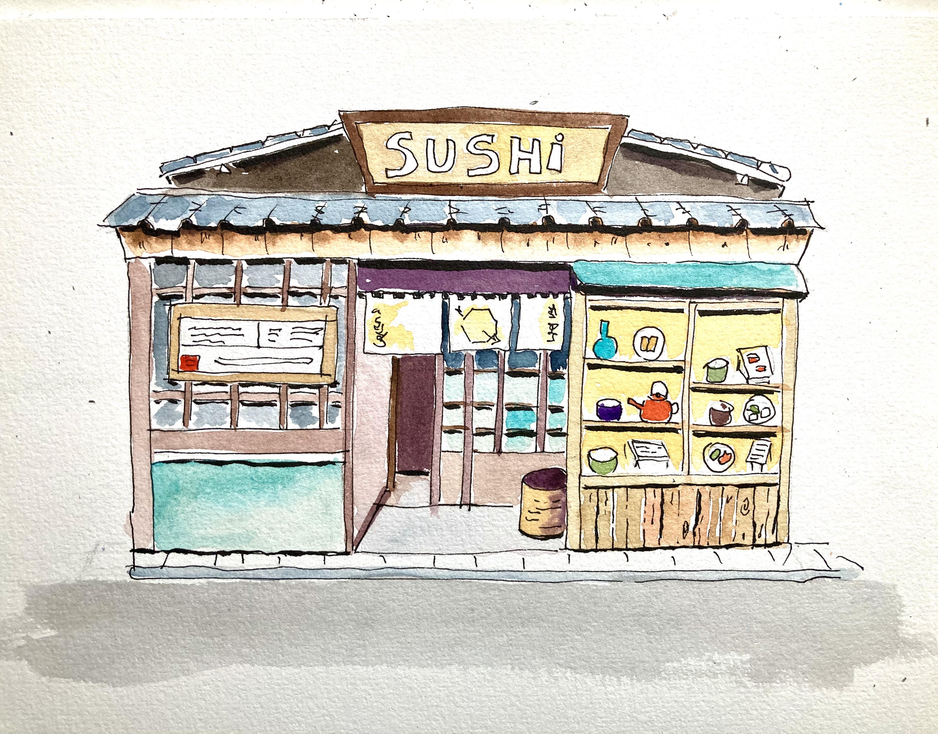
4. Pencil Sketch: Let's start drawing our Japanese store. The real secret in sketching is capturing the detail but don't get lost in details, so we need to simplify a little. Let's start with the big shape of the store. I use a ruler for the pencil stage, I start with the pencil but then I will use a pen without a ruler. I start with a ruler for the big shape. I need to eyeball proportions. I'm not measuring real sizes, it's a sketch, we don't need to be too realistic. We have this rectangle, and we have a rectangle like this or less. It's much larger than tall, so we will put another line for the roof, possibly straight. Exactly like this. Then I'm trying to copy my reference photo without worrying too much of being exactly the same. We have this little rectangle on top. I should use a longer ruler. Then we have more or less, it's three parts. One part here, smaller, not exactly one-third, then a big door, and then a window. It's not really important to make it exactly the same. The window has a wooden here. I can freehand a wooden part in the bottom, and then a little curtained like this, and a wooden frame. You see proportions are not exact but I don't really care. Also, it's nice to note is that they're not very symmetrical the little windows, they are bizarre the way they are, and then we can draw the little things inside but later. Then we have this rectangle, a line here. Then we have this roof that goes like this and it is straight. Here I can really freehand. I can erase some lines that is disturbing me at the moment like this one. Then I have right right the middle, here I can measure to be sure it's in the middle, it's here. I have this sign that is larger on top and a little smaller here, and another roof behind eyeballing. Here, it's some signs, here we don't need this any longer. Here we have some closed curtains, then we think we can refine this one we have here, and let's put these small squares here, and in the bottom the same. Then we have here a door that stops. Here we don't have a line, not really. Here we have a door, here is the entry, and this store also have little squares like this. Japanese clean style. Then when we use the pen we would be even neater. Then we have a little line here. We can also draw some squares here, but these we can do later. We have back this small step here. This is some signs here at regular or less intervals. Then our roof is typical Japanese, so it's like this. With some signs, it's like we can just have a hint of these signs. This is typical Japanese also. Here there is a frame. I will do everything in pencil, I don't wait, and here we have a frame for this roof. I didn't put all the details, just some of them. Here, we have a sign which I think is the menu. We can draw this sign and erase what's inside. My pencil is heavy because I want you to see it, but otherwise, be very light with the pencil. I think we've done most of things. I can put this very pretty basket here, just put some. A basket is enough to show there is something. Now we can maybe draw the dishes that are in the window, so we can put some example. Here we see a bottle, here we see a dish for instance, and then we can fill it with ink. Here we have some other tissues, they're just examples. Here we can put a teapot with a teacup, some other dishes. Here there is a square with some signs, we can put this. Here is a ball, another dish, some food unit, and here is a sign. Let's put another sign, so here it is. I think we've done with the pencil drawing, now we have to sketch it with ink.
5. Ink Outline: Now, I will outline everything with my ink. First of all, I do the bigger lines so I don't make mistakes. Here I go without a ruler. That's important to go without a ruler. Like this. You can cross lines at angles is very nice. You can also be a bit wavy. It's not really important. Here it goes a little further like this up to this angle. Then I see there is a double wooden line here, so I do this. I do the bigger lines, the bigger shapes. Here there is the small curtains. It's not too straight. It's nicer if it is a bit wavy. Then I have this here. It goes outward a little. Then I have my roof. For the roof, I have this small arches. Then it goes inward. Then you have this line, and this line. The sign here with a larger top, a frame. Then I have this line also, this menu. If you're not sure, you can really cross this line. You see, it's pretty to see. Then we have this [inaudible] inside for the door. Here here we have a wooden sign, and also we have the three closet and they are on a wooden bar like this. Here, this goes up to here. We have the basket. The basket has some signs like this. Here is the other door with the squares. Here we have a corner, it's articulated. What can we have then? Here we have this wooden frame, goes down. Here we have the bottom of the window. We have some wooden, to give the idea wood it's a very broken line. Irregular because wood is a living thing. This is wooden also. Then we have this regular lines that we were seeing before, the regular intervals, and you have also some lines in between. Then I have the indented. Here we have also a frame like this. Little perspective from the top of the arches inside like this. The small signs here and there. Pretty regular. Makes some Z. Here we are. Then we have two, these are tiles. Let's put them here, the tiles. We have slightly changed with the panel we've done with you. What we've done with the ink, so this is it. Some details to add some realism. Then in the end, we will put the written things. Now, the wooden squares here is the base. Just replicate. It's bit boring, but it's necessary. Maybe we forget something, but it's not important if we forget. Now, let's draw some food here. Or maybe we can put some stone here. You see the stones that they have here, they're straight. Then maybe a step like this. Let's put now some food. This is steep. Forgot to put the frame of the window. Here a dish, some spring rolls. Our teapot handle. Larger bowl. Here, maybe a menu, some writings, another bowl, some food. Any food will do. I correct some positions. Maybe here I can put a square dish. Here we are. It's everything we need. Let's finish.
6. Let's Add Paint!: You see, I have added the writing sushi on top of because I can't write in Japanese or Chinese and I will erase the pencil signs. I have erased pencil signs all over. I see that I forgot to draw some food here, but that's easy. Like this. We erase, we are ready, I have erased everything. We will also put some signs here, but we will do it late, we don't need to do this right now with ink. Now the fun part, let's start painting. I love this moment, I really love it. First thing I do, I take my watercolor set and I spray it with water so that I reactivate colors. I use this small sector. I also have my other set just in case I need some special color. But you use the colors that you have, you can always replace, it will be really lovely in any case. So I have my two sets, I have reactivated them. So now I'm taking a medium-size brush like this, also a smaller one like this for details and I will start painting from top, but I can start painting for instance the roof in gray. I will use for these pen gray that I have in my larger palette. If you don't have it, don't worry, you just mix some brown and some blue and you will have a lovely gray. The important thing to remember now is that I don't ever clean my watercolor palette, because I like my colors to mix with the colors that I have already used, so they become more organic. If you use colors straight from the palette, they're a bit artificial. If you leave colors from previous paintings on the palette, they will mix and the result is much more natural and organics. I will take some paints, gray mix with what I had before and I start coloring. Just maybe that bit on the cloth, water it down just a little bit more. I will start painting the tiles smarter like this, one by one. Also here the roofer and I will paint it leaving some white because it's nicer if you leave some white, it's the highlights because in water color you don't really do highlights with white, you just leave the white of the paper and if you don't paint everything but leave some white of the paper, that's more interesting. Here we have a continuous line. Here it is. Somewhat hearing they're to indicate highlights. Then we will paint the wooden bar here. Be careful not to touch the gray because if you touch the gray, that will bleed into each other. Maybe we can start from the lighter wood here. For this, I can take a smaller brush and I will use some yellow ocher like this, mix with what I had on my palette, so we have some color variation. I don't know what I had, I had some gray, some green, I don't know. Here also, if you don't paint everything that will be nicer. I will add some more yellow ocher to give lighter lookup. I don't have too much water and I paint the wooden frame like this. Be careful. If you follow the wood it's nicer. You don't have to arrive to the edge, you can leave some parts near the edge lighter and here you really follow along the wooden boards. You see like this. You can also add some color variation. For instance, some, you can add some burnt umber, or some of these may be orange we do have here, some of them slightly darker because wooden is a living material and it can vary. You see? Also you can drop some of these wooden here where you have some shadow and also here you can have. Just change what you take, you can pick some pure yellow ocher or some darker mixture like this. Remember that you can leave some white of the paper and some can be very light here and you can go like this here also and in between you have some white. Let's see where we have some wood. You will have some light wood also on the menu here, so let's paint it. I paint things that are far away from each other, so they don't bleed the paint because if I painted these wooden part right away, you might have bled into the roof. Here it is. It's quite easy, right? Now we can paint the wood around the word sushi. It's not so easy, but we can do it. So I will dry some water because we need to have some control on this. We could have put some masking fluid, but I'm too lazy, so I never do it, but if you have it, feel free to use some masking fluid. Also, if we make mistake here, not really important because we can also use the white gel pen in the end and fix some mistakes. Also, mistakes are lovely thing in watercolor, because there are not many ways to fix them. Let's use some pure yellow just to lighten it up. So you have to embrace your mistakes. This is a very nice learning for life I think, embrace your mistakes. We are not meant to be perfect, I'm not a perfectionist and I think that has helped me in life, not to be a perfectionist. That's enough. You'll see that little piece at a time, it will become really, really nice. Now, we can use a darker color and paint these wooden frame here, it is half rustic, half wooden, so we should take some burnt umber, mix it with our yellow ocher, I always use the same colors to give some color harmony, and I will also take some of these red. I will start from below the roofer, like this because there is a shadow below the roof and then I will blend it towards the bottom before it dries. It's important to be very quick before it dries because once it dries, you cannot move it any longer. Now I rinse my brush and with water, I just blend it a little, I think, do a second layer afterwards, but for the moment be perfect like this. We want it even more irregular, we can take some burnt umber, so a brown basically or any brown that you have, and just dab it below the arches like these, you see? Here and there. Just in the ring here, just below. Because it's still wet, it will nicely blend on its own, just let it do it what it must do.
7. Perfecting the First Layer: Now it's time to put some signs here. I don't know what to put because I don't write Japanese. But we can look at the picture and try to do what we can. Maybe we can put some lettering here. Here we can put a little drawing, I draw directly with pen. Here is an arrow and here is also some lettering that I'm not very good at doing. I will let this dry. Now, what we can do, we can paint the darker wood that is in the windows, and in the door, and also in the wall. We can use for this a darker sepia or even a purple. I will take burnt amber and add some purple in it because purple added to burnt amber gives a very nice dark chocolate, and also purple, is color of shadow. So it's always very nice for things that are in shadow or behind. For everything that is in the front, we will use a lighter version of this color. Let's see, we have it here. It's too much, just water it down a little. Okay, Like this. We'll water it down also on this part. You give it everywhere you see this dark wood here. Of course, this is simplification because what I like to do is to be inspired by a picture and then simplify what I see. Here, here, and then we will put a color on the squares. If it is too light at this stage it's not important because remember that you can always do a second layer for darker colors. Now, let's go in the back. Here we can go a little darker so more purple. Everything that is receding, we can do. So here, even more purple. We can dare and exaggerate with colors in watercolors because they always dry lighter. Here, you see we have this very dark bottom here and it's the only very dark thing that we see. Also here, we use this very dark, but this part will be slightly lighter so we make a lighter version of this. Here it is light so we water it down a little and we put it and then just with water, we will spread it. So this is lighter. Okay, this also will be lighter. Here we will put just a suggestion of color because it's just some gray here. We'll put some gray and just some water, just let it spread with water. Then we can fix it with the second layer. Vary the color so you see the different parts of this window. Here also I think that you need to put something. Let's finish with the teal color. Here also. Every time we see this blue, we put our nice blue that we have chosen. Doesn't have to be all the same. You can have some color variation. For instance, lighter towards the bottom. So you just use clean water to spread the color, and also we need some light blue here where we have the glass, and we can use the same blue that I have used for the curtain. I will put some blue just to give the idea of glass, just in the bottom. In the top squares we will put some gray maybe. Here also, we need to put some lighter wood. So for this lighter wood, I will take some water down of my purple chocolate mixture. You see I change it every time. So you see the different parts of our shop stand out. Now we put some dark on top squares of glass. I will take some of my previous gray, so I can go quite dark with this because this is what we see. You can also use some ink in the end for this. Up here, made a mistake, which is very good. I can teach you how to fix this. Basically, you take some clean water and you try to take as much as possible with your brush, and then you just use your paper towel. You let it dry. Just some clean water. You let it dry. You see, it's magical, nothing happened. Now we'll let this dry and we go to this square. Also behind here, it's dark. Here it's dark. Okay.
8. Details: Now let's see the details. First of all, we can put some color on these signs like this. They're in the light, and we can see light bouncing on them. We'll take some pure yellow, I mix it with some of the orange that I had, and then we just put some on the signs like this just to make them cheerful, like this. Then we will have these other signs here, and we can put just some words with ink but maybe. You see there is a little red square, so we can put some red there just to add some details because the details may keep them lively. All right. Then I can do the background of our window and we can use a generic yellow to show that there is light inside. We could use different colors, but I would love to use some yellow-orange. Yellow, just my palette is not clean, but I will use this yellow to give some light and put some yellow in every window, especially on top like this, take the yellow. They go around the cutlery and the dishware to show that there is light inside. You do all over. You can do this on your own. We don't need to paint this long, so we'll speed up this. Now we need to wait these dries before we paint the food and we can paint this little basket. For this little basket, I will use some, sorry, I have cats so I have cat hair all over, I will take some burnt sienna, it's a warm, earthy color, and I will, here, where is shadow, I will put some darker color and continue with some yellow here. Put some yellow here and blend them. Inside it will be darker, so we'll take my usual purple-brown mixture and paint it dark here. Inside will be dark. Maybe even here it can be a little dark. It's wet so it blends nicely. We can also help it to blend a little. Let's make it dry and then we will fix it. We could also put some very light gray on this step. We just take some light gray and [inaudible] this. We also need to I think, paint some dark here because it is too white. You see actually, it's dark. What I will take is taking my usual Payne's gray. But we have Payne's gray on the roof so it needs to be something different. We'll take some sepia and add a touch of sepia, otherwise it's the same color of the roof the rules and they have to be different. We know around we need to make it dark. Here we add these signs. Mistake here. Don't worry. When it's dry, we can go over with the white [inaudible] I don't know what I was thinking. I wasn't looking. Maybe we can add a second layer to make it even darker. The sushi sign stands out a little more. Now, we can go back to our window and choose some colors for our cutlery and dishware. So I will put some red that stands out. I can do a red teapot. I always like the red teapot. It's important to have control or water because and I have the red. I can also paint something as well I have red on my brush. Then I will add some green because surely some salad, so I will take some of my sap greens. I have already some green on my palette, but it's too dark. I don't like it. We'll take some sap green, pure sap green, not too watered down because it's a small design. Then we'll put some vegetables on display here also. We can make these bold green also. Here we will have some baked goods. We can put some earthy color like for instance, in the corner here, I can put some yellow ocher like this. Here we can have a brown or dark, so I use my dark cup like this. Now we would like to choose a nice color for this bottle and I will choose my teal once again. I love teal. Not too watered down, so very little water. Now we put this. Now, I can use the same teal for this cup. Maybe I can put it, another blue or purple because we have used purple. I don't want to use too many colors, so we have used purple in our dark, so have the right to use purple here. Now we need to choose a nice color for this cup. I think I will have another green. Green is also nice. Here we have everything. Now we need to put some darks behind these squares of the window. We'll take my Payne's gray and just dilute it a little. I will just put some here between the squares. You don't really have to cover everything. Just a hint. You can also move like this from one corner to the other. It's even nicer. Let's look. Maybe here we have some darks also. I take some purple and here we put some darker. Also here, we'll have some darker though this little curtain. Also here I think that we can have more dark. We can have more dark. Also, here you see? It can be even darker because it is below the roof. This can be darker. Now, if we want this not to fly, we maybe can put some street here. For the street, we take some of our sepia that we have mixed with the gray, very watered down, and just pass your brush just like this.
9. Final Touches: Now for the last details, you can take a picture of your shop, of your store, and see what you would like to add. I think that this is cute, but it is a little flat, so we need to add some shadow. For shadow, I can use a pen. I can either use a pen with a thicker nib. You see this is 08, or I can use these brush pen from Pentel. This is India ink and is waterproof and is very nice for shadow. I think I will use this one, to begin with. With this pen, I will just underline what's directly in shadow. Below the roof, below here. I know I've done it with watercolor, but it's even nicer if you can make it with ink. It's just an option, it's not compulsory because it stands out better. Also, I can underline this glass here, and also below the wood here, I can just put a thicker line to indicate shadow. Also here maybe I can have a thicker line and also between some of these wooden boards, maybe I can have some. Just somewhere. Here also have a thicker line. Here I have the stick between the curtains. This is important because they're not flying. Here we'll have shadow. It seems much darker than it is once it's drier. Once it's dry it's not this. There also. Right there also. I think we're done. Just put it where you want. Here we are. Just makes them pop out. You see? Also, we need to write something here. I think we're done, I don't think we need anything else. Let's leave it like this. Our cute Japanese storefront.
10. Wrap Up: Congratulations. You have sketched your Japanese storefront with me. I hope it was easy and I'm sure you had fun. Upload your project in the gallery so that I can give you my feedback. Also, if you post your sketch on Instagram, please do tag me so that I can connect with you on Instagram as well. Don't forget to follow me on Skillshare. You will find all the information in my profile section. Thanks for painting with me and I'll see you in my next class. Ciao.
 Elisabetta Furcht, Anyone can paint!