Transcripts
1. Introduction: Hey, hey, do. It's clean here. And in this lesson, what we're going to be
learning about is how to draw forest environments. I'm going to show you
how to build them from the ground up what to include, how to represent it. Things like trees, grass and foliage in that comic
book styled format. In fact, we're going
to take a look at some examples of how
other artists within our field have represented these types of
mother natuy assets, if you will, I guess that's something you could call them, something you could
categorize them as. And most importantly, we're
going to have a lot of fun because the most wonderful thing about drawing forest
environments, really any sort of natural environment
is that it's organic. It can kind of be structured
and built however you like. And a lot of the time, that's why these sorts of
environments make for such wonderful
compositional aids to frame your characters and to give them platforms to stand on. So we're going to be
talking about all of that in this lesson, and I can't wait to
jump into it with you. Without further
ado, I see we jump straight into this
and get started.
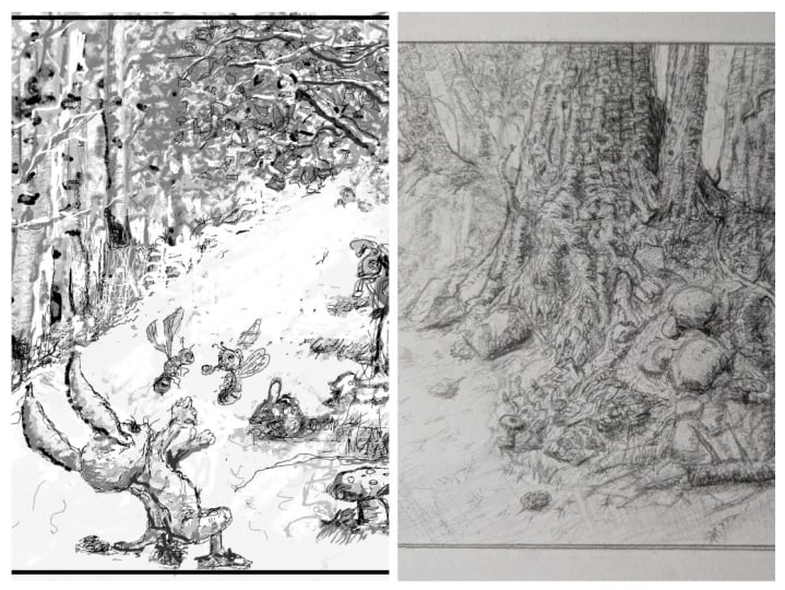
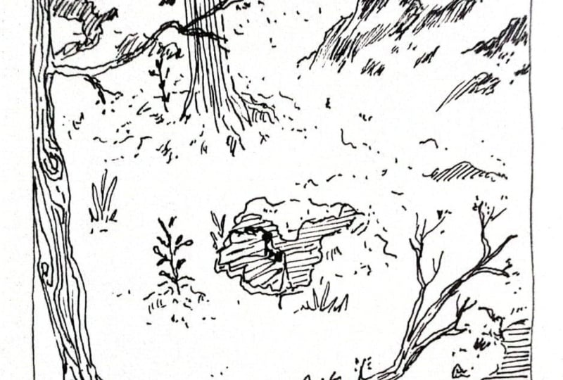
2. Forest Environment Examples: First thing that I'm
going to show you is some examples from other
artists of how they've actually represented these more natural
forest environments within their own artwork. So let's take a look at them. So as you can see here, we have one by Frank Frazetta, right? And I want you to just take
a look at how Frank has used a combination of shadow and negative space in order to
represent the leaves up here. Look at that. You know, it's important to understand
that when it comes to drawing forest environments, a lot of the form that will
come about from things like leaves is going to be shown through the drop shadows
that we place underneath. And what is this going
to give our foliage? It's going to give it depth. It's going to give it solidity. It's going to make it look
more three dimensional, and most importantly, it's
going to break the image up. Now, when we think about drawing environments such as this, we consider that we might be
drawing individual leaves, individual blades of grass, but if you look real closely, what you're going to
see here is that, in fact, well, a lot of
these things are suggested. Like, if we look at the
grass here, it looks grassy. It feels soft to walk on. It's certainly not made of
concrete or dirt necessarily. But at the same time, you'll notice that there's
very minimal amount of detail that are
needed in order for that grassy feel to come across. It sort of all blends together. This is a really neat trick. Hinting at various textures
and materials within an environment sometimes is all that's needed
for it to really come across in the
way that you want. You'll notice the same
thing with the leaves. Now in this particular example, we can see that the
individual leaves are in fact somewhat defined. If we go down here though, you can see that there's
mushrooms over here, little plants and
weeds and whatnot. They all blend together into these silhouettes that we
see appearing on the ground. And blending these elements
together, by the way, it once again just makes it
look that much more natural. So we're going to be
particularly interested in trying to replicate
that within our examples. Now, if we look over here, we can see some more stuff
from Frank Frazetta. Once again, we're looking
at a lot of blending. Now, we might have around the tiger some individual
blades of grass that are shown. Now just look at the way that this grass has been
created, though. You can see that we've got
some whites laid on blacks, and it's through
those separations of value that we get the shape of grass start to
come into focus, start to appear on
the page. Okay? We've got these beautiful
environmental elements, the tree that's been
struck by lightning or I guess it's more dead
tree of some kind. And you'll notice that the
grass sort of blends into it. Now, if we look at
the bottom portion of this particular this
particular natural element, it sort of just blends out
into the negative space. Okay. Same thing here
with the foreground. Blends out there. All right. And once more, some
more frozetta stuff. Look at these plants,
all blending together, some suggestions of
weeds and whatnot, but some moss over here, some nice texture
on the tree trunk. Beautifully done,
wonderfully executed, and some more examples
there as well, right? So I want you to just take
that in for a moment. We're going to jump back over here and have a look at some Oh, this is Frank Frazetta, too. I thought it was Alfredo
Alcala, but there you go. So Frank Frazetta is
obviously, you know, a master of drawing natural environments within
this comic book style format. And just look at the variety that we see here. It's
not all the same. It's not all the same leaves. It's not all the same
plants and grass. It's a variety because that's sort of what mother nature gives you when we're talking about
non man made environments. It's somewhat random. It's mixed up. It gets
mixed up a little bit. It creates some
variation. All right? So should give you an
idea as to the sort of environments that we're going to be illustrating here
throughout the demonstration. Keep those in mind.
Take a look at them. Really, if you need
to pause the video, do that and even jump
online for yourself. Look up Frank Frazetta, black and white, natural environments or
forest environments. And you'll find many of
these same examples. Like I said, Alfredo
Alcala is another really good one Bernie
Wrights and two, depending on the style
that you like to go for with your comic book art, but I do find these
to be very inspiring. And like I said, if
you're ever wondering, you know, how do I depict grass? How do I depict a tree or a
mushroom or a tree trunk? Well, guess what? There's plenty of examples
out there that you can look at in order to determine how you might
go about the process, what sort of finished
presentation you want to be striving toward. So I highly do
recommend that you find those references because they're going to show
you how to do it. They're going to
tell you what to do. And that's much better
than just guessing and ending up with something
that looks unprofessional. If you want to do
professional work, find professional
examples of how it should look in terms of the subject matter that
you're trying to portray.
3. Framing, Perspective and Composition: All right. So like I said, the main thing here is
that we want to have fun and you can have so much of a great time actually drawing these more natural
environments because they don't need to look
any particular way. We're going to zoom right in
here and Clip Studio Paint. That's the drawing
application of choice that I've got going here. Using the Mark Brunt
legendary Line art brush. You can download that
from Mark Brunt. It's free, and it is a wonderful brush to use for
sketching in particular. Now, we could ink this out, but I think we're
going to keep it with just the pencil tool here, some sketching, nothing
too finished, too refined. And in a later lesson, we'll get into more specifics. So, you know, really
zooming in on how to draw just a tree or just a weed, you know, really drawing
an assortment of different environmental
elements that you might use in a forest scene. For now, we're going to
go for a macro approach. We're going to be having a look at the overall representation of a forest environment
with all of those elements
thrown into the mix. The first thing I'm going
to do here is I'm going to jump over to the
ruler tool and we get our figure ruler selected
and then I'm going to lay down a frame that we're
going to be working within. That'll just about
do it. Then what I'm going to do is
grab my pencil tool, and we're just going to
run around excuse me, we're going to run
around the outside edge of this frame and define it. Like so. There we go. Once that's done,
we'll get rid of the ruler, right click, delete, and then we're
going to reposition this frame on the canvas
right in front of us there. Wonderful. We'll make a
brand new layer up here. We can label these
layers if we want. We can just call this frame
so we don't get mixed up. I should probably show you
how to do this properly. You don't want to be taking on these bad habits of
not naming your layers. We can just call this sketch. Okay. Now, I'm just going to
show you one example here. We're going to take
some time on it. We're really going to try to
get that rendering in there, the details as opposed to just drawing up
a bunch of roughs. We can of course, do that
in another lesson, too. But for now, we're going to really take our
time on this scene. We'll start out by
determining what, of course, the perspective is going to be simply by placing down
a very light horizon line. Let me make a new
layer for that one. We'll call this perspective. And really, you don't need a perspective grid for
a forest environment, as you might imagine
simply because well, you know, we're not
drawing any buildings. There's not really anything that needs to be aligned
to perspective. But what we are going to do is we will at least place down a horizon line,
like so. All right? So we're going to click
from one side to the other, and we're just going to set
that horizon line at about the midway point of this frame. We're going to try to get
it as straight as possible. Well, my sticky keys turned
on there for no good reason. Love when that
happens. There we go. There's our horizon line. Now what's the horizon line? It's just our eye level
within the scene. It's not going to be
too crazy and dynamic. We're keeping it relatively
just at the midway point. We're not looking down.
We're not looking up. We're just looking at a
standard head level view. We're in a sketch layer now, and it's time to
just start a sketch, and this is the hardest
part is getting anything, something down onto the page. I'm going to look at
my references here to try and give me some ideas. And I like to start out with just large shapes to begin with. Now, we can break this scene
up into thirds, of course, I know these aren't
very equal thirds, but the thing about breaking
a scene up into thirds is that it helps with
composition, okay? So you don't actually have
to draw these thirds down, but it is nice to visualize
them just inside your mind.
4. Drafting the Scene: So with that said,
we could say, well, this third over here
is going to be taken up with maybe some
rock formation. Look how light that is. Look how sketchy and
rough we've got that. It's working
beautifully for now. That's working good. Now, what we want to try to do
with every scene that we create is we want to produce depth within the
scene and what that means, the easiest way to do that
is to have a foreground, a middle ground, and of
course, a background. So this here that I'm adding in is probably more of a
middle ground element. And then what I'm going to do is I want to create
a bit of a path. I always like to have a
path for the eye to follow. I'm going to sketch
that in real rough. It's probably going to go over into the third on the left, and it's going to twist
back around like so, and we'll have it go
into the horizon there. Okay? Now, you're probably looking at
this and you're going, Clayton, this looks so messy, I can't even tell
what's going on. What are you placing
down here on the page? And I'm telling you this is
going to come into focus. We're going to dial
that focus knob, and you'll start to see
a clearer representation of what's happening here. But this is a lesson
in and of itself. Keep your work as loose
as possible at the start. Alright Keep it loose and
make sure that you're giving yourself room to sculpt
out the image. All right. I'm going to come over here and create a tree that's probably going to sit on this third
division on the left, and I'm going to
scribble that out. We might make a bit of a silhouette here for the
tree too, by the way. Now, it's not entirely framed as nicely as I would like
this particular tree, but that's right.
I'll do for now. I want these roots
to come down over the land formation that
the tree is sitting upon. It's going to come all the
way down there to the ground. Like, so, we'll get
our eraser out. I want to get rid
of some of that. Now, like I said, what
you're looking at here, I know, I know. To you, it probably just looks like a whole bunch of scribble. What do I focused on first and foremost
as I draw this out? I want large shapes, okay? I want to get a lay of the
land. I'm blocking it out. Large shapes that represent the land formations,
the trees here, so you can see these
giant roots that I'm placing down for the tree, having them run down and
along the cliff there. And into the middle
ground, the foreground. And these leaves up here, I want to have them basically creating a bit of a tunnel actually around this
section I've decided. It's a very large tree
that I'm creating there. This might even be a
primary focus of the image. So it's good to
have a focal point, of course, within
anything that you draw. We might come down here and create another
land formation.
5. Rendering the Tree: Now, this is even going to get a little complex for me
to look at in a moment. So what I am going to do just so that we're
not getting too confused here is I'm going to start to maybe refine some of
what we're seeing. So I'm going to go ahead here and lay in some more
details for the leaves, and I'll also determine where the light source
is at this point. I'm just going to have it
coming in from the top left. What that's going
to mean is that the details of the trunk, the tree are going to be more prominent and darkened on
the right hand side of it. You can see those textures running down and around
the roots there. In terms of a finished drawing, this is really going
to be a sketch. That's where we're
going to keep it as far as the polish is concerned. Simply because it would
take us a while, in fact, to fully detail everything
out and clarify it. But we will show some
individual examples of how to draw trees to their full level of polish in another lesson. And maybe even do
a proper workshop on a full environment
from start to finish, where we spend like eight to
9 hours actually drawing out a full blown environment and bringing it through
to a finish level. But for now in this lesson, consider this as an introduction as to how you would
approach the process. So what I'm doing here with the roots is I'm just trying to capture a little bit a
texture within them, okay? And what we really
are striving to achieve there is
the sort of effect where it feels as though we might be
able to run our finger along this particular area of the tree and
feel some roughage. Now, the other thing
that these textures do is they help to describe the surface form
of the tree, okay? So you can see how as I lay in these textures around the roots, they actually running around the cylindrical
form of the roots. Okay? And you can
break everything down in these very simple
forms, by the way. You know, a tree is really just a cylinder at the
end of the day. The roots coming off the
tree are just cylinders. Worms, basically, you
can think of them as. We're going to do that. As you'll notice, it can take some time to draw these
natural environments, but they're really fun
because you get to add in these details that really do build up the environment
as you continue to work, the more details you add in, the better it starts looking. Once you got those
texture details in there, you can if you want to even start to add
in some rendering. Like so. Now that might be a little early to start adding rendering, but I do want to just show you how we might
begin that process. And this rendering is really
just little cross hatches that I'm placing
down onto the page. Okay. And you don't even have to necessarily add
these cross hatches in if your style
doesn't lend toward it. I mean, at the end of the day, we all have different levels of detail that we like to
incorporate into our art, and there's just some
styles out there that aren't going to
require that much detail. I don't feel like
you need to add these cross hatches
in necessarily. This is just something I
like to do with my work. I am somewhat of a more
detail oriented artist, especially for these
forest environments, I enjoy the process
of making some of those details sing some drop
shadows in on that trunk. This rendering
really does help to complete the three
dimensional look that we might want to go for. Now, the thing is that we're
very far from done here. I'm just sort of honing
in on the tree at this point of time
so that we can see a more clarified
presentation for at least one
environmental element as we build out the rest. I'm going to go through here
and very quickly add in the rendering for this root. And once you get a hang of it, and you really start to develop a technique for how you go about this stuff
and maybe copy mine, maybe you decide to
experiment for yourself, figure out what works for you. You'll notice that this can
come together quite quickly. Especially if you're
not overthinking it. And I would say with
natural environments, yeah, you know, you don't
want to overplan those. You don't want to
overthink them too much, simply because they
don't really require it. You know, it's not like
you need an architect. You really just want to lay
something down onto the page that feels good to
you that looks nice. And as long as you're
able to get that down, then you'll be good
to go. All right. Next, we're going to jump
over here to this route, and I am going to start
to speed up simply because we've got
a little bit of a time limit on this lesson,
and we don't want to dawdle. We never want to
dawdle with our art. That makes us overthink
things, overwork things, and that's never going
to be a good sign. It's not going to necessarily lend to a
better finished product. Over here, we're
going to start to add in a little bit more grass and foliage around the base of this mound that the
tree is sitting upon. Some grassiness, let's say. And look, I'm going to
look at frozetta in order to determine how we
might want to make this look. You know, we might
have some grass there coming out and down. And then we'll have it sort of thicken up
toward the bottom, creating that nice
sort of natural feel. All right. And you can see
how that just, you know, it really does start to stand out in a nice way
is something that feels very much organic. That's really what we want
to be going for here first and foremost is organic. All right? What do
I mean by that? I mean that we don't want to
make it look too contrite. We don't want to
make it look man made or fake or artificial, creating a certain amount of randomness in what it is we're placing
down into the scene, in other words, we want the leaves to somewhat
be non uniform. We want those roots
to be running in all different directions and want there to be
that randomness. Now as we get toward
the bottom here, around this section,
we're going to have, let's draw in a bit of a
rock along the path, right? And once more, we're going to
have a little bit of grass there around the
base. There we go. So now that I've
sort of shown you a more detailed
presentation for the roots, as an example, we're going to continue the process of plotting
out exactly what it is. We're going to be
showing in this scene. Don't be afraid to
use your eraser. It's there for a reason,
especially during that all important
penciling stage. Yes, we want that there. We want the eraser there to lean on when things need to be adjusted, need to be corrected. All right. So this is a rock that I'm
adding in along the path. You can see there that I'm
adding in some rendering and trying to make it
look once more textural. Adding in those details, you know, they make
all the difference. Now, if you got a style
that's a little bit more Joe Madish or
Michael Turnerish now, Michael Turner actually did some pretty crazy
detailed environments, but, you know, consider what sort of style
you enjoy working in most. Maybe you're not going to go for that insanely rendered
ultra realistic look. That's totally fine, you know? Normal environments or
natural environments, they can look very, very nice with a minimal amount of detail. Of course, I'm showing
you an example of a pretty detailed one. But Certainly, I think that you could appropriate some
of this, you know. And, of course, finding
examples of environments, like I said at the beginning, from artists who draw in
the style that you like, of the environments
that they create, that's going to be
something that aid you in a very significant way. So you can see here
I'm not detailing across the entire region there. What I'm doing is I'm
sort of you know, leaving it at certain points, fairly blank with
a decent amount of negative space just because, hey, you know, like, I want
to create some depth here. If I shade along
the entire area, it's going to flatten
everything out. Right? So contrast is key if you want readability
within your art. Alright. So we've
got the rock there. We got the tree roots. I see that we jump over
here and we start to lay in some of the details that we might witness
with the leaves. And check this out. This is going to be a lot of fun, okay? I'm going to show you a
real nice trick here. We're, in fact, going to leave all of this
stuff up here, okay? All these leaves, we're
going to leave them nice and blank, okay? It's all going to
be negative space. We're going to really
only be laying in detail around the underside of
these clumps of leaves. Now, why is that? Well,
it's it's basically the same reason we approached this area in the
way that we did. It's, it's going
to save us time, obviously, because
we're not going to need to lay in as much detail, but it's also going to produce more contrast, more three das, more clarity and readability within what it is we're seeing. So sort of breaking up these leaves into
little clumps and, you know, as we get
toward the bottom, yes, I'm adding more detail in. I'm breaking them
up more and more. And I might add in some
more branches as well, so we could have those
coming in through there. That'll work good for us. That's what we want. Okay. And I'm lacking that. Next, we'll do the
same thing over here. I treat leaves like
hair in this way. It would be a bit of a
hairstyle for the tree, I guess, when you
think about it. Adding in those textures and we'll get this tree
branch coming up over here. Get the eraser out. Get rid of some of those lines that we don't want necessarily. Another branch over here. There we go beautiful. And then, hey, why don't we add in some branches up there? That's good. Wonderful. Okay, there we go. And once again, get
the eraser out, do the same thing up here. Look at that. That beautiful negative space. And look, we can
blend some of these together if we feel that
there's an option to do that. I'm liking what
I'm seeing there. I think we're ready to
render some of that out. So here's how that's
going to look. We just start to get those
cross hatches in there. And check out this trickery. Now, these lines
I'm laying down. They're just uniform, fairly straight lines that
run parallel to each other. And the way that I
get the varying tones that we see throughout this
tree is I simply Well, I'm going to undo
that, by the way. I feel like they
need to be finer. The way that I capture these is I just sort of
stroke them in there, and I do it quick, okay? So I'm not trying to be
too careful with them. I want to get a bit of a rhythm happening within my
stroke as I work. And I guess I'm pulling toward the general direction that I want the leaves to
move in as a whole. But sometimes I really
just I place them in in a way I guess is going to
just look good on the page. That's the other
thing. I mean, you can follow all the rules in the book and still end up with something
that looks terrible. You have to develop
your artistic intuition a little bit as with anything. Now, here we're going to
combine some of these hatches. Sometimes there's
going to be moments where we break them
up a little bit. So check this out. Like we can break some
of these hatches off and run them up into the main
clump of tree up here. Okay, see that. That's looking really nice. The thing is that
with this tree, we're thinking about the
overall shape and form that those leaves are coming together to create yet at the same time, we're also considering
the smaller sub forms that we're able to make too. Now, notice how I
change the distance between these hatches as
we make our way down in the lower regions of this leafy hairdo that we
got going on for our tree. We keep on adding
in these hatches. At first, it doesn't
look the best, but then as we keep
on going here, as we continue to lay
these hatches in slowly, but surely it all starts
to come together. Before we know it,
we're looking at something that looks
pretty damn epic and it's hard to believe that we are the ones who are actually responsible for creating it. But that's just the thing
every drawing is created. One line at a time,
one line at a time. Even though sometimes
it might not be obvious exactly
how it's going to go, as long as you keep on working through it, you don't give up, you don't throw in the
towel too early on, you will end up with something
that looks pretty awesome, hopefully by the end. Okay. So we'll add
these ones in up here. And you can see there's a
certain amount of solidity now that we're seeing in this beautiful foliage that
we've created for the tree. I mean, I guess the tree
is foliage, isn't it? Let me come up here, maybe
add in a few more hatches, just to complete the effect, if you will, and we'll
add some hatches in here. There's no reason why
you can't have some of these clumps of rendering run in different
directions as far as the hatch hatching
is concerned. You can see some darker
leaves, some lighter leaves. But that'll just about
do it for that side. Then over here, look, this is actually closer to the
light on this side, we're going to be a
little bit more careful, a little bit more picky
with where we lay these hatches because we want this side to be
more illuminated. And it's important to really consider this stuff to
really think about, okay, where are the
hatchets going to sit? And how are they
going to describe this particular portion of the tree as a whole,
Because look, if we mess this up,
we're going to end up with something that isn't quite reading the way that it should. Okay. So we're gonna get some darker hatches happening around there. That's
looking okay. You know, I don't want to overdo it on that side of the tree, so I'm probably gonna
leave it as is. Look at that. Beautiful. We're getting
pretty close actually to the look that we're
after there for the tree. Now we'll jump over to these roots on this side
and detail those out, describing their cylindrical
form once again with the texturing and
once that's done, we're going to get in
there with the rendering. Like so. There we have it. Now, I'm not quite
happy with that, so I'm going to go
back in here and take another look. Wonderful. Sweet, that pretty much
completes the tree, which is sort of like our center focus here for the
entire environment.
6. Rendering the Foliage Covered Rock: Let's work on the
other stuff around it. We're going to have this, I'm going to say a grassy
rock mound in the foreground. I think that it'd be
nice to maybe get some plants growing
on it, potentially. Okay. So we'll have
some, I guess, almost like what would you call these vines or weeds
growing up the rock? I'm going to get rid of
this perspective line for a moment just because
it's distracting me. We generally know
what perspective we're going for anyway, so we don't necessarily
need that there anymore. But this would be like a cross
between moss, I would say, and some shrubbery
mixed with rock. So we're combining a
few different things here with this
foreground element. All right. And this will be
another primary I guess, asset that we're including
within the scene. So we're going to
want to spend a little bit of time on this one. And then, you know,
we're going to be able to get away with leaving these areas fairly
sparse, I would say. We'll see how we do, but we do want to get through
this fairly quickly. So I'm just going to start going in there,
laying in the leaves. You can see that
I'm getting real nice and scribbly with it. This is why I love
natural environments as you can just I don't know, it's almost like therapeutic, I feel to be able to work on these sorts of
environments as an artist because you get
to let the pencil move on the page and let
it loose a little bit. Let it go wherever
it wants to go. Now we're going to
have some grass and maybe some plants around
the base of the rock there. Okay, so we'll get those in. That's gonna look
nice and natural. Okay? We sort of got this road here that I'm thinking we're gonna leave that
fairly bare, actually. You know, we might
even get rid of it. Around that section and just
have the rock here blend into the path that we're
sort of suggesting that will ultimately be really only
represented as negative space. All right. And yeah, you know, we could get
some mushrooms in there. Let's get some
mushrooms happening. I like mushrooms. Mushrooms are good to have in these more natural environments, so we'll get one in there. And let's see. Get another one in here. You know, mushrooms sort of they grow together, don't they? Grow another mushroom here, Frank Frazetta style mushrooms. That's what we're going for. All right. There we go.
Beautiful. Get the eraser, get rid of all this
background stuff that we've essentially overlapped with the mushrooms
and get rid of that bit. Then we have it. Great. Now it's time to go in there and really begin laying in some more leaves on the dark side
of the plantation, the moss that we see there
growing up the rock. I call it shrubbery. Really, it doesn't
really matter what you call it as long as you
get to look right. Get some more here and we can even start adding in some
rendering if we want to just to get a general
feel for the plants that we want to go for and the way that it's going to
read three dimensionally. Okay, there we go. Beautiful. I want to add in
some more details there. You know when I see
environments like this, especially those created
by Frank Frazetta, I just get so inspired. I think the reason for that is it really does feel
like you're being pulled into this
completely other world, and that's always
what I'm striving to achieve in the work
that I create is I want to make it so
that when the audience sees the illustrations that
I'm presenting before them, I want them to feel like
they can step right into it. And that's really a good
motivation to have, as you can imagine,
as an artist. Okay. Now remember, in
these lighter areas, you don't need a
whole lot of detail. The lighter an area is the
less detail that's required. In fact, it would be bad. It would be a very bad
thing to add more detail in these lighter sections because we would then
lose the contrast. Unfortunately, we wouldn't have that nice readability there anymore and it'll
lose its depth. It all blend into one flat thing that's definitely
not what we want, right? If I was inking this
out by the way, there'd be a heck of a lot more shadow that I'll be placing in, but because this is a sketch, we're really depending
on the rendering here, first and foremost to
get our depth happening. And our texture
at the same time. We have a mushroom here. Let's get him drawn in. We'll see that mushroom is casting a shadow onto
itself, as well. Creating a bit of a shadow. Do the same thing here.
There we go. Done. All right, next, we're
gonna get the eraser out and get rid of some
of that line art. Once that's done,
we'll draw in some of the rock texture that this moss is
actually growing on. I want you to once
again just try to be in the moment as you're
drawing out your environments. Relax. Use it to relax and try to remember
that it doesn't need to look any specific
way as long as it somewhat represents the element that you're attempting
to present on the page, you'll be okay, you'll be fine. Look at that. It's beautiful. It's looking real nice now. You can see that I've
somewhat blended the grassy area into
the rock area here. That blending is so wonderful. It works really well, actually. We'll get a little
bit of grassiness happening over here and just notice all the leaves that
we've created on this side. Now we can render those out. There we go. Those in? Boom. And notice the stair stepping
look that we have there where we've got the negative
white against the black. It just helps to separate
those forms gorgeously. Okay, I'll get the eras route, get rid of some of that. And now, what are
we going to use to then divide this grassy
area off of the rock? Well, we're going to
use the rock instead. Okay, so it's going
to come down. And around. Okay. Look at that. Beautiful. And then, of course, we get some rendering
in there for said rock. Now, the darker
that rendering is, the more stark the division of value is going
to be in that area, so just keep that in mind. But notice how the
rock texture sort of stops at this grassy portion, and that's what's creating
the division there. So it actually
works really well. Now, we might still
get some grassiness happening around
the bottom here. If we wanted to get real fancy, we could even add in some more hatches
on the rock itself. But that might be taking it to a whole other level of detail that we might regret if we've got to bring everything to that same level of density. So let's not go too
overboard there with that. Now we have got some more
rendering to place in up here, so we'll go ahead, add that in. In fact, we might have some of this mossiness occur around
the top section, too. I'll undo that. Okay.
Because, you know, that just wasn't balanced. So more isn't going to work
out for us, unfortunately. Add some rendering
around this area. That's looking fairly good. That's working for us, I think. Okay. And hmm. You know what? I think that this rock area is actually
looking pretty good. I don't think we need to add
much more to that, you know? We don't want to overdo
it, like I said. And we already have
sort of done that, I would say, by adding
in that rendering here. So I'm going to take that out. I go to get rid
of that. Like so. Cool.
7. Sketching Foreground and Background Elements: Okay, next, we're going to sort of do a little
bit of a dodgy here. All right. We're going to keep this area around the bottom
fairly sparse, in fact. So let's see. We can add, let's say, well, let's add some plants
and mushrooms in here. Now, I'm going to be
kind of making this up. I'm not a professional
or an expert when it comes to mushrooms. So we'll just add a few in here and we're going to use
those to take up this area. Sort of, you know, following in the footsteps
of Frank Frazetta there. Alright, the stalks, the
mushrooms will go right here, and heck, we might
even add another one right around the top. Beautiful. So now we have a stack
of mushrooms going on. And then as for this road
here that we're creating, I think that one thing
that we could add in is is a falling down tree a log maybe that's
running along this area. Heck, it could be connected, in fact, to this tree up here. I don't know, maybe. That's a little bit of a
straight route though. Why don't we bring that down here and around to over there? How about that? There
we go. Could that work? Maybe. It might be going a
little bit too straight there, so let's have it run on more of an angle into the foreground. Wonderful. Take another
drink coffee here. You know, coffee is an important thing to
have as an artist. Although I should
probably, I always say it. I got to give up coffee. It's not a good thing to be
drinking it as much as I do, but you know, I went
out the other day. I went to the coffee
stall and I said, Hey, can you give
me a large coffee? But with one shot of coffee
and three sugars? Thank you. And the coffee shop dude, he just It's like he
couldn't believe the order. It's like it was I was a sinful order to
make at a coffee shop. Probably because, you know, it's there's barely any coffee in it, and there's
much more sugar. But what can I do? You
know? That's what I love. That's what I enjoy. I
like the heater caffeine, but I like the taste of sugar. I try to get the
best of both worlds when I go out for a coffee because oftentimes I
find that the coffee at coffee shops is just
way too strong for me, you know, puts way too
many hairs on my chest. So I try to tame it down
a little bit. All right. We've got the makings of
some mushrooms over here. Keep in mind, try to remember
that this is how it starts. This is how anything you add
into your scene is going to begin is basic blobs. I've got a bit of an outline
and that's all we really need to progress the
artwork forward after that. What we're going to
do over here Okay, round this section is we're
going to start from the top, and we're sort of going to run some detail down into this
region where the tree is. Alright. But at the
bottom, guess what? We're going to leave
that fairly sparse. Yeah, we're going to create
a call it like a fog, sort of a fog effect. We can do the same thing
over here, actually. You know, let's get rid
of some of that detail, and we'll just let it run into
nothingness at the bottom. And for some reason,
that just looks good, especially when we're talking
about natural environments. Over here, we're going
to pretend like this is a really grassy area up here. We could create some bushes. So weedy areas. But, you know, I
don't want to just make everything rocks
and cliffs here. We'll save that
for another lesson on how to draw
rocky environments. For this one, we want to
really lean into the plants. Lean into the more the greenery that you'd see in a really dense
forest environment. Okay, and there we go. That's looking pretty good. Have that grass running
to the roots there. And then, you know, I'm just
plotting out how the rest of this scene is actually
going to play out. All right? We're going
to erase this area. Okay. Like so. And then, you know, over here, we'll probably have
some more grass. You know, we'll have
that rundown over there. Like so. That's done. And just look at this. This
is looking really nice. It's coming together
beautifully. And we'll also, of course, you know, we want trees, right? We want a lot of trees
in a forest environment, so we're going to add
more of those over here. You know, just sort of occupying this area
of the backdrop. Do some erasing there. Okay, you can see those tree trunks that we've got going on. All right. Now again, you're looking at this, and you're
like, What the heck? This is so abstract right now. How does Clay bring it
all together in the end? Look, I ain't no
magician, all right? I'm just here following
through the process, the workflow of how I like
to tackle this stuff. Notice that I never start
out with anything detailed. I always this is called
blocking things out, right? I block it out first and
then I move along with it. That's exactly what's
happening here. I'm just blocking it out and crossing my fingers that
it all works out in the end. But the wonderful thing about
this particular approach is that there's no excuses.
You start blocking it out. You just start laying
down anything. It could be any basic,
weird looking shape. You just get to work and
build on top of that. You build on top of
it. Check this out. We can really pull a Frank frisa of here and just add in some roots running
around the root. That we've got here. Okay, there we go. Look
at that. Beautiful.
8. Rendering the Foreground Elements: Now it's a simple matter
of just going in there and adding in those textures. Like so. As you can see, it's actually fairly easy as long as you're trying to keep in mind that you're working over the
top of a cylindrical form, it's probably going to work
out just fine in the end. Okay, now later on, we'll
want to define, of course, this area with maybe a more
starker primary contour. But for now, this is
just where we want. Try to, I guess, keep your hand loose
as you're working, whether you're using
a stylus or a pencil. And don't be afraid
to, you know, explore various shapes and directions for the
line to follow. You never know where
it could lead. Like I said, you're dealing with very organic shapes here, especially for the textures. You know, drawing in the
wrinkles around the roots, just reminds me of it's
almost like drawing wrinkles around a really um, wrinkled hand, you know, the knuckles of a finger. That's what I'm thinking
about right now. And really, I guess, the roots and the branches are the
fingers of the tree. Aren't they? Okay, there we go. So we've got those in there. And now we're just going to really incorporate
the rendering. So we can come in around
here and keep in mind that we are going to be seeing this root somewhat
blend into the ground. So we need to consider
that as we work. All right. So it's not
going to be a clean cut off of the ground that this
root is running along. It's important to
keep that in mind. And notice how almost
immediately we get this really nice looking three dimensiality
start to come about. You might be seeing
more Clayton. You know, this is the left
hand side of the tree root, and, you know, that's the side that the light
is coming through on. And you would be correct. But the thing is that we're
lower to the ground here, and we're looking at the
bottom of that root. So there will be a little bit of rendering that we see
around that area. And not to mention
the fact that this is quite close to us
now this tree root. So we are going to
see a little bit more detail occur throughout it. All right. Now,
the other thing to keep in mind is that
we don't want to make this too smooth
looking, right? Like, it's still supposed
to be a rough looking root. So we might want to break up this rendering a
little bit from time to time. Alright. That's looking good. We probably don't
need more than that, if I'm being quite
honest with you. We can even go in with
your eraser there. We can get rid of some of
that rendering if we want the leaves and the grass to come up into the
root and around it. All right. So next, we've got our mushrooms
here in the foreground. Let's draw those out. We don't need too much
going on with them. Ultimately, a lot of the
rendering that we see on those mushrooms is
going to come from the drop shadows that'll be projected down
onto the stalk. Alright, look at that. Just some very light
rendering there. Now, if you look at
Frazetta mushrooms, I mean, they're certainly
not that detailed. They don't have that much
rendering applied to them. So this is all a personal
preference of mine. And we could even have a few little dots
placed on these mushrooms. Just to show they're the
ones that you shouldn't eat. Okay. And then we'll jump over to the other
mushroom over here. So this one, we could
even say that, Hey, maybe this mushroom in front is projecting a drop
shadow onto it, would be pretty cool
just to create depth. Drop shadows are lovely. They're wonderful when it comes to suggesting depth within
anything that you draw. And just like before, we're going to take this mushroom here and we're going to add in
some very subtle rendering. Like so. Look at that.
Isn't that gorgeous. Just some very light,
fine lined rendering. That's all we need
there, and you can see that it describes the form absolutely beautifully. And if you feel like, you know, this mushroom
over here in the front, maybe it needs a little bit
more focus brought into it. We just add in
those darker tones, and that'll certainly do
the trick in that regard. Now look at that. We can turn up the rendering at any point. And really get the focus
in on that mushroom. Okay. And then we got
another one over here. So let's check this one out. We'll add in a drop
shadow onto it, too, breaking up these mushrooms and they're layering
against one another. See that? Beautiful.
Get the eraser out. There we have it. And now, once again, we'll go ahead and we'll lay
in that rendering. Another mushroom down. One more to go. And, hey, why don't we add some
spots to this one, too? Jump over to this
one, off to the side. There's a nice, big, mushy get the eraser out, get rid of that little bit. And, you know, as I'm laying in the rendering around the
top of this mushroom, notice the direction that
the hatches are going in. I'm trying to make it so that I'm describing the
form as I work. Okay. It's a rounded
form, for sure. We're describing the
top of that mushroom. I think that is describing
it pretty well. It's running along
the curve there. You can see I'm
adding a little sort of ridge at the base
of the mushroom top. There we go. I'm thinking
about a band that I used to like back in the day right
now called mushroom Ed. Alright, now, once that's done, we'll add another drop
Shoda in under this one. And there's a little cluster of mushrooms will be completed. There we have it. Mission accomplished
with the mushrooms. You can add in some
textures around this root. For the root. Okay.
9. Rendering the Background Elements: So we're going to get a
little bit of rendering potentially up here,
but not too much. Okay? Remember that we don't want to render
everything out here. If we render everything out, it's just going to
lose its effect. It's not going to it's going
to flatten everything out. So we want maybe
some suggestions here and there of
some rendering. But ultimately, that's
probably even too much there. So we're just going
to leave it at that and that'll work
absolutely fine, we could potentially
come over here and Maybe add in
some other grass. Okay. And that could work. All right, there we go. Notice how I'm pulling that rendering back away
from the mushrooms. I don't want it moving
into them too much. We're going to get some
nice separation there. Get rid of this area, this area. As we move toward the tree
here in this section, we can start to increase
that rendering once again. Actually, let's undo. Okay. Okay, beautiful. That's looking good. And now, over here where
we see these other trees, are we going to add some
rendering to their tree trunks? Like so, and we might even come up here,
add some branches. Well, you know what?
I think that's going to be too distracting. So let's just leave them as silhouettes that are somewhat
blank and not filled in. Look, what I'm
going to do around the top here is I'm going to add in a more defined
line for this section. And with these trees over here, we can add a little
bit more detail just to break up
some of the leaves and to show that
it's a semi it's at least as finished as
the rest of the drawing. And sure, we could add in some, like, drop shadows potentially
onto the tree trunks. That the tops of these leaves sitting on these leafy heads. You can see that added detail it brings those trees in
the background to focus. Makes them look a
little more done. You're thinking Clayton,
how would you ink this out? Well, we could certainly talk about that in
another lesson. It's a bit outside the scope of this one just because
of time wise, but it wouldn't be
dissimilar to this. Like I said, I would probably
add in a few more shadows, especially just
pure black shadows into the leaves and whatnot. But for the most part, I'd still very much take
the exact same approach. You know, I mean, this is definitely something that
you could give an Inca, and they would go
in there and they would go to town
on it, basically. But I think it's important to understand that you
don't need to define every single thing within the scene to have something that looks
really, really nice. You know, you can see here that a lot of the
trees and whatnot, especially the ground, like, isn't it funny how the ground
it kind of looks done. It looks like there is
a forest floor there. It's just that, you know, we've been very smart in the
way that we've approached. All right. We haven't needed
to necessarily go in there and detail every
single aspect of it out. And then in the far backdrop, we could just potentially add some sort of
additional forestry, you know, this could be trees way off into
the distance here. Now, we definitely don't want to add too much detail to that. Why? Well, ultimately, that's going to bring it forward if we add any more detail. We'll define these little bits of plant shrubbery over here, a tiny bit more and that'll be enough to complete that background
portion, essentially.
10. Adding the Finishing Touches: All right. Now, what else? Let's take a look here. Maybe there's something more
we can add in potentially. All right. Just think about
the foreground elements. These mushrooms are really wonderful foreground element
that we've got in there. We've also got this
rock here as well, and by the way,
once you're done, once you're happy with what
you've got there on the page, go back over the top of some of the key elements
like I'm doing here with a tree and just
embolden the outline, define it with more clarity because it can start
out pretty rough and it's important
to tighten things up as you move along and
develop the drawing. So here with this root that's coming into
the foreground, yeah, we want to get our
pencil in there and outline it
properly, like so. Okay. There we go. Done. It's just leading
into this little patch of grass here. Alright. I think that might be looking
pretty darn good, honestly. I mean, we could add in little
bits of texture detail, but again, I think
that's going to be potentially
even overdoing it. Maybe you could have a
different plant species in the foreground there, just coming up
into this section. Maybe there's a weed here or something
growing in the grass. Okay, so we could add that in. That'll work. Look at
that. That's beautiful. There we go. Done. It's just a little
bit more detail that we can add in there and heck we could do the
same thing here, add in a bit more of a plant or another plant species in this region. Coming
off of the rock. You know, you look at the scene overall and you feel it out. You think, what
could I add here? What more do we need to
really make this complete? And I'm thinking that
we're basically done. I think that looks really
good for something that took us maybe an hour or so to draw, you know, maybe an
hour and a half. So the main things to keep in mind, at the end of the day, you just start out loose, stay out big, have fun with it. Explore, see what potential
directions you could go in. And if you just continue to stick with it and develop
it, you will be okay. You'll end up with
something that looks pretty darn
good in the end. Let me just get rid
of that a little bit. Cool. There we go.
That's lovely.
11. Outro: And that wraps up our lesson on drawing forest environments. I hope that you got a
heck of a lot of value out of that one and that
you had some fun with it, that you created
something that looks cool and interesting
and maybe even potentially could
serve as a set for whatever comic
book project it is that you're working
on right now. You know, there's some really interesting aspects
to environment design that we can really
hone in on, particularly in regards to what we learned
from this demonstration, which is just to start out, Mercy, start out rough, get those basic abstract looking shapes down
onto the page. And as you saw, we
can kind of turn them into anything as long
as you just, you know, you think about the general forms that you want to go with, the composition really is one of the most important
aspects to consider. Have that focal point. Think about the rule of
thirds as you're placing down the primary assets that you're going to include
within the environment. Consider the foreground,
middle ground and background elements,
and by the end, you should have something that has depth to it that
looks three dimensional, looks like a world that
you could walk straight into a world that's
living and vibrant. Also, on top of that, the
other big takeaway is to find artists who have done the thing that you're
trying to do already. In this case, it was drawing
foresty environments. So find some artists
whom you admire, whose style you sort of want
to lean toward with your own and get some examples of their workup of those
specific things that you want to draw, and that will serve as a
compass for you a guide to direct how you approach your
own forest environments. Please do try to implement some of what we talked about
here in the lesson. Create your own
forest environments and be sure to post them up. I'd love to see them until
next time, keep on drawing, keep on creating,
and I'll see you again real soon.
Bye bye for now.
 Clayton Barton, Harness the Power of Dynamic Drawing