Transcripts
1. Introduction to architectural sketching: Pick up your pencil because
you're about to learn how to turn your architectural
ideas into reality. Hi. I'm Moshe Katz and welcome to the introduction to Architectural sketching Cork. Think about it. Every
great building, every iconic structure
started with a simple sketch. Sketching isn't just a skill. It's the first step in turning your imagination
into something real. It's how architects communicate their ideas and solve
design challenges. Maybe you're dreaming of
designing skyscrapers, luxury houses, or
reimagining entire cities. It all begins with a sketch. And the best part, sketching is something anyone can learn with the right
guidance and practice. That's exactly why I have
designed this fun course. I want to teach you practical techniques and share tips and tricks I've developed over the years as an independent
international architect. Maybe you're getting ready to
start architecture school, already studying
or even working as an architect and want
to sharpen your skills. This course is for you. I'll start by teaching you to see the world like an architect, breaking it down into shapes, spaces, and perspectives you
will bring to life on paper. Then we'll move
on to the basics, sketching three D spaces
and drawing everything from interiors to exteriors
and urban scenes. You learn how to use light
and shadow to add depth and details like people and trees to make your
sketches come alive. But this isn't just
about techniques. It's about teaching your hand
to follow your imagination. We'll begin with
simple exercises to help you gain
control and confidence, then gradually build towards more dynamic sketching projects. You'll sketch alongside
me step by step and at your own pace until
we're ready to turn blank pages into sketches
that tell your story. So if you're ready to surprise yourself
at how good you can sketch and have some fun along the way, let's get started.
2. Warm-up exeercises: Hi, everyone. This is
Lesson number nine, the warm up exercises. So grab your tools,
pencils or pens. This time we're
going to have fun. Let's try some nice warm up
exercises together and just feel the effect of the different tools when
we start sketching. So before we start sketching, let's synchronize our hands, our eyes, and our hearts. With some warm up
exercises that help us. Before we go directly into
the architectural sketch, I usually start with some warm up exercises
to have a moment of gathering my energy
together and feel confident to start sketching
structures and spaces. So make sure your workspace is equipped with anything
that you might need, put some music on,
change the light, create some nice mood, and, yeah, let's have
fun. Let's start. So the first exercise
is the straight lines. We will start with sketching parallel lines to each other. Either vertically,
start with them, then we'll do the
horizontal ones. So we start with one
line which is straight, and then all the rest
of the lines that come after are going to be
parallel to this line. First, you do it slowly, then change the rhythm and make it faster
and faster each time. After you finish with
vertical and horizontal, try to do the same thing
with diagonal lines. Same thing, try to do
with crossing lines. So we'll do diagonal, then we'll do vertical,
and then horizontal. We'll put them all
together one on top of the other and do as many
lines as we can. The second exercise are the
circles and the round shapes. So first, let's draw
some circles in an echo. We start with one circle in the middle and other
circles that are echoing outside from that center with bigger and bigger
and bigger circles. Extend the field of
those circles and create a certain extension of that
small circle in the middle. Try to start slow
and be accurate, but as you go along, start to be more fast and fast until you feel more
confident to create circles. The next stage, try to do
some elliptical shapes. Start with small ones, and then slowly echo bigger and bigger ones
extending from the middle. Once you've done that,
let's do some spheres. So basically, a sphere is
designed by a circle and an arch that shows us the
direction of a sphere. So do some different sizes, experiment with those
spheres, play around, and see how you can
be more and more accurate and clear
about the shape of it. Our next exercise is sketching
cubes and cylinders. So let's focus on
creating one cylinder. It's elliptical structure with vertical lines coming
down and then closing on the bottom with an arch which is a half elliptical shape because the other half is
invisible to our eyes. It's somewhere inside. So
there are two elliptical, one on top, one of the bottom, and two straight lines
connecting them vertically. Try to draw at least
five to ten cylinders, create those vertical lines that express the different movement, the circular movement
of the cylinder. So you fill the vertical part with a hatching line technique. It's a parallel
hatching until you feel the movement of the
circular surface. After you've done that, let's
try to create the shading. So it's a bit of
a smudging work. So the part that is more on the extremes
of the cylinder on top and on the bottom
will be more in shade while the front part is going to be
more in the light. So the more you distance
yourself from left to right, you will be more and more
and more in the shade. So it's do the smudging, and as you go from
right to left, start smudging more intensely. So when you see the
gradient of the shading, this is how you feel the round
surfaces coming to life. Same thing. Do with the cubes, try to create some
different sizes of cubes, different shapes, and try to work with different hatching
technique on the cube, but also with the
different shading. And the last most
interesting and fun exercise is the free forms
and free lines. This is where you can go a
bit crazy with fast strokes, and you build your
shapes really fast, go all the way on
top of your paper. Just make sure that you're
in continuous motion, and slowly you build your
shapes, your circles, your elliptical, your
cubes or your cylinders. You can play around
with all the shapes that you have created before, but do them now in a very
fast mode and free form, extend yourself on all
of the paper without any limits or any
thoughts about it. Just play around, have
fun with it, and be free. So these are our
warm up exercises before we start
sketching architecture. It's just to make
us feel a bit more comfortable and more confident
with our hands and eye, just to know that we are
synchronized and we are ready, and we're ready to go over for the important sketching part
of architectural spaces.
3. 1-point perspective: Hi, everyone. This is
lesson number ten, the one point
perspective sketch. So the one point perspective
sketch is used for interior drawings
and central views, which all lines, all horizontal lines end up at the same point
in the horizon. The grid structure of the
interior sketch is a cube, as we saw it in
the first lessons. It extends towards the outside, towards the side of the viewer, and on the other end, it ends up with one
point on the horizon. This cubicle grid is made only for spaces and structures
that are linear. For those structures that
are round and curved, we're using the grid
of an elliptical form. All the ellipses meet at the
same point in the horizon and folding outside with the structure extending
towards the viewer. So basically, the
whole horizontal lines become arches and the vertical lines remain 90 degrees connecting the
ground and the ceiling. As you see here in this example, based on the view point and
how much the space opens up, the ellipses change
their size and form, based on how big and how open, do we keep our viewpoint
and perspective? So let's get your tools together and start sketching
a one point perspective. Hi. So this lesson is
about perspective drawing. The first thing that we
draw is a horizon line. The horizon line is the one that divides the bottom and the top, the floor and the sky. This is how every
perspective drawing starts. In this lesson, we're going to work on an interior sketch. That means one focal
point perspective. In this perspective structure, we actually build everything, all the lines all the lines
connect to the center. This is just one example. You can just draw some
lines starting from the central point and in different angles
towards the sides. As you see, the more
lines you draw, it opens up our view. Once I reconnect those
lines with vertical lines, you'll see that these
surfaces are the ones that represent our view
towards the center. So if we close them, we create an interior space, and this is where we draw. This is the frame of our work. Basically, this is the
structure of our joint. All lines go all the way
towards the focal point. The more we open our
lines from the center, the more wide those lines are and the angle is more sharp. Our view will be more open. Here are some examples. You have that frame, we have the horizon line, we
have the focal point. If I open it up like that, The view of the street in this example is
more wide and open. If I create other lines and close them. Seems for us like
a narrow streets where the surfaces are
almost closing up on us. These four lines that we create
from the center determine how open our camera view is or how open the street
or the walls are. If we want to create a big room, a sensation of a big room, we will do wider
and smaller angles. Yeah, so if you want to
create a narrow room, you create different
lines that are more close to the center
of your frame. Let's begin with an interior
sketch, interior view. And as we go along, you will
understand the principle of the one focal
point perspective. Let's start again with
the horizon line, we'll do it with
a lightweight pen so we can make many
mistakes and then we'll emphasize
with the wider pen. The focal point
somewhere on that line, you can write F
as a focal point. And then we just
start by bringing out four lines and four angles
starting from the center. So it's more or less
45 degrees line. Once we reconstruct and close
them with a vertical line, we already establish the
two surfaces on the side. If we close them as a square, this is where we have our
basic scene of the sketch. All horizontal lines eventually
meet at the focal point. If we divide and
create the structure, we will see that these lines, the more we reach, the focal point becomes smaller
and smaller and smaller. That gives us the sense of
depth and the sense of space. Let me emphasize
some of those lines. Imagine these are
beam structures and walls or columns. We'll leave one empty, and then the other one
we'll just mark them. Next one as well. So this is an interior view of
a structure that is going towards the final pointee and a structure that goes
towards the horizon. We'll draw some
lines next to those that give us the sense of
depth of the material. I'll do it with a
very thin line. We can hatch it Or we can fill it with the shading. Once we shade it, it
gives us a sense of that. On that side, we can decide if we want to fill
it or leave it open. In this case, I'm
just leaving it open. If I add a figure just
for the scale of it, I'll have a sense of
an interior space created by the structure of
these beams and small walls. If I want to add, let's imagine that in
between those beams, we have a void, so we can pass through a tree, maybe even on the
other side as well. So I will do the whole
tree as a whole, and then you'll see which lines are hidden and which
lines are not. So basically, I'm
creating another circle. As you see some of that lines of a circle go on top
of the structure. And eventually, when we make the lines stronger,
we won't see them. So what we strengthen is only
the lines that go outside Outside our drawing. Once we put the color just
for the feeling of the tree, you will see some parts
are visible to us, some parts are hidden. Sometimes we just emphasize
the floor by working from the central focal point and then expanding
towards the back. And then just
continue the lines on the bottom of the structure
of the walls and beams. So you'll have this grid. Now, imagine the sun comes
from that direction, which means that all
of these structures, they reflect a
shadow on the floor. So just to make it easy, we will have a lesson
on light and shadow. But just for the fun of that, we fill these lines which
connect our structure as the shade of our
walls and beams. So that's an interior view
with one focal point. As you see, all the lines meet in the horizon
and the focal point, all the horizontal lines. The vertical lines,
they stay as they are in all places. They
just reconnect. I 90 degrees, you could actually reconnect these lines as
well, but we don't see them. It's not part of our design. If you want to
complete this design, especially when you do conceptual sketching and you want to understand what it is, you just put some lines
out and write some text, what this material is about, which tree it is, the floor, what material
it's made of, and so on. Another thing that
helps us emphasize that sketch is our
environment and background. So I imagine we have
some some hills or mountains in the background, maybe we'll have some trees. So if you want to
know how to make a tree in the same
scale of the design. So in this tree, which is closer to
us and this figure, it's such a big tree. Imagine that this tree is going now towards
the horizon line, so it becomes smaller and smaller and smaller and smaller. So at that point, the
trees are really small. That gives you the feeling of
the distance to our design. So I can just work with more or less same size trees I will emphasize the
mountains only in the places where we have the
voids instead of structure. As you see here at this
place, we have the voids. If this is the mountain line, this is the structure,
void, structure, void. Here it's all void, so the mountains are visible. Then I can just fill it up. Okay. And that gives us the sense of the surroundings and emphasizes the interior view that you've
created in a better way. Okay, so let's sketch
a curved perspective. We already tried the
linear one, the cubicle. So let's work with the
curve perspective. So it's the same idea. We draw a horizon line and a vanishing point in
the center in this case. As we work with curved lines, we are basically working with
elliptic shapes or arches. So a circle in three D is well, circle is a shape that can
be enclosed in a square. But in three D, as you see, the square becomes a
rectilinear and then the circle is an
elliptical shape. When we are creating our perspective, our
curved perspective, we work with arches
and elliptical shape. We'll start with an
arch just to see. This is one arch, and let's do a second one that is reversed. This is our space. Once we draw a person
inside, we feel it now. You see how this space is
extending from the horizon and slowly becoming bigger and bigger and round as it
extends towards the viewer. So our our ceiling is
an elliptical shape, as same as the ground. So whatever connects them
is basically the lines, the vertical lines that
connect the two shapes. So this is the main structure
of a curved perspective. So what you have to do is
just work with the arches. All the horizontal
lines are arches. They're not straight lines. They're going from
the vanishing point and then they start curving. So it's either curving straight, which makes our space
more high or low. So basically, this
is the ellipse, and this is the second one
and the third one and so on. So I just see the space is now more narrow. The narrow the ellipse, the narrower is also
the space inside. So you see that now
this is our wall. This is another wall. This is the ground, and
this is our ceiling. It's much narrower. Or
if you use the second, so the wall is more open. Or the third, the wall
here is more open. Or the last one much open. So the bigger the ellipses, the more of a wide space
we have an open space. So if you try to connect
these lines together, you have the image and the understanding of
how big or how small. So the arches are
defining the space. When I was a student,
I lived in Florence, and some professor
used to say that you could skip my class and not come altogether on the condition
that you would walk in the streets of the city
and sketch and learn from it. I happily did that, skipped the classes and made the city my biggest
teacher and mentor. The power of a place is
something you should also find. The inspiration is
always around you in every corner, window or square. It's your responsibility
to find beauty everywhere. You choose to be an architect, so there must be a
poet within you, and that poet wants to see the world through
different eyes. So as I fell in love with
the city of Florence, I hope you will find that, too, in your city and make her your
partner in the journey. Just open your eyes
and your heart because beauty is all of those places where eyes
are not necessary.
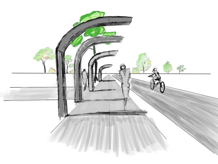
4. 2-point prespective: Hi, everyone. This
is lesson number 11, the two point perspective. In this lesson, we
are going to see how the two point perspective is actually the most
famous perspective drawing and sketch that we
are doing as architects. It shows the extension
of at least two facades of our building into different
points in the horizon. It is usually used
for exterior views of buildings or street views in
a certain angle in a city. So the structure of a
two point perspective is created through
the horizon line. And on that horizon line, we find in the left part and the right part two points which
are our vanishing points, and all the horizontal lines will meet that vanishing point. It determines the position
of the viewer's eye. So if we want to
show a bird view, a street level view
or a human eye view, or an ant view, it changes completely the
structure of our perspective. So in a case of an ant view, we will see our
object or building or structure on the top part
above the horizon line, which means we will
see the bottom, the ground level visible to us. On the contrary, when we want to establish a bird
view perspective, we will see the structure and the element on the bottom
part of our horizon, and we will have a clear view of the
roof of that structure. While a street level or a human view of a
building gives us only two facades extending towards the outside towards
both vanishing points, we don't see neither
the ground or the roof. So general, in a two
point perspective, when our building extends
towards the environment, we tend to add some figures,
some environmental elements, some nature trees,
or the coloring of the background to enhance the sketch and the
quality of our space. So let's see how it's done. Take your tools,
prepare your workspace, and let's have some fun and create a two
point perspective. Now, we will create
two point perspective. So we always start
with horizon line. And two vanishing points. Let's understand the basic
structure of that perspective. Horizontal lines of the surfaces connect and extend and meet
at the vanishing point. So if you wish to, let's
take a very simple shape as a cube and try to draw it with different heights
of the perspective. So if you look at
the different lines, so let's draw two
lines that go up. Imagine this is
the middle point, the corner of our cube. So let's draw these
lines and connect them with a line in the middle and connect them back
to the vanishing point. So this is the
structure of our cube. If you're looking from
an end point of view, from a very low point of
view, and we look up, we see that our cube is
seen from the bottom. So we will see the ground
floor of this cube. Let's draw these two lines and connect them with
the vanishing point. Then again, from these corners, connect them to the
crossing vanishing point. And this is our
view of the cube. This is the ground floor. So basically, when we are looking at a cube from
an ants perspective, and the cube is flying in the air or we see it
from the bottom towards up. This is this is the shape of the cube when we have
a lower point of view. Now, let's do the
bird point of view, which is exactly the opposite. So we go with these
lines on the bottom. We create another set of lines, and from the corners, we go to the crossing lines to the other vanishing points. Now this is the view of the roof because a bird
view looks from the top. So what we'll see in
this case of our cube, we'll see the roof of the cube. So this is a perspective, a two point perspective looking from a bird's
point of view. But if we look at the cube
from a human point of view, so it's from the middle
of the horizon line, which is our eyes level. What we see is just the facades, just the two sides of the cube. So basically, it's just
this This is our cube. We don't see the ground,
we don't see the roof. We just see the
facades of the cube. So this is our cube when it when we look at it
through a human eye level. So this is an ant. This is a bird, and this is a human.
5. 3-point perspective: Hi, everyone, this
is Lesson number 12, the three point
perspective drawing. The three point perspective
is used for exterior views or more environmental landscapes and sketching of environments. With that view, we
are actually showing a real life perspective
as our eyes perceive it with a sort of deformation or distortion of the
view because we have at this 0.3 vanishing points
that change our structure. So as the two point perspective, we have on the two
sides of our horizon, we have two vanishing points. But on top of that, we have a third one on
our vertical scale. We have a third
vanishing point that determines the vertical
lines of our building. Up until now, all
the vertical lines were 90 degrees all the same. In this case, we're going to
see how the vanishing point number three changes
all the vertical lines, and they all meet
at the same point. The three point
perspective is usually used for bird views and sketches of big environments or city landscapes
seen from above. So we have a triangular grid, and as you see in this image, this is how we're
going to build it. In the three point
perspectives, in some cases, we show a partial
view of the ground. It's almost like an extension that is not going to
be part of our sketch. It's a partial sketch because the three point perspectives is a sort of distortion of
our architectural space. And the further we go
down in this case, the further it extends and becomes bigger and
bigger and bigger. So we keep it cut or partially just for
the purpose of the dramatic feel of the view. Whenever we want to
use a dramatic scene, a dramatic render of our
building of our design, we use the three
point perspectives. It gives us an extension, a dynamic flow towards
the vertical plane. So the building extends
right and left, but another extension
towards the top creates a very powerful and
dramatic view and effect. So let's see how it's done, get your tools together, and we'll sketch a three point perspective
architectural space. Hi. So in this lesson, we're going to learn the three point
perspective technique. We start with the same
famous Horizon line as we did in the lesson before. We'll establish the
two focal points. Do you remember from
the other lesson? And the addition here is the third focal point
somewhere in our sky, and we'll just see
what it means. So if you remember, where
we created really fast, all the horizontal lines should reach focal point
number one or two. But here, instead of having a vertical line which
is 90 degree line, these lines, all
our vertical lines connect with focal
point number three. Okay. So imagine we connect focal point number one to that line and from that corner
focal point number two, as you see, we have
a slanted surface. Our structure is now connected
to the three points. Imagine we take another
line coming from the third focal point
and we bring it down. Let me emphasize the lines. This is what our cube
would look like. We are standing here. The cube is stretched towards
focal point number two, towards focal point number one. And that line and
these vertical lines, they all stretch towards
the third focal point, which makes it a
little bit distorted. Instead of seeing a whole cube, you see some slanted surfaces. But in real life,
this is what we perceive as perspective view. When we're standing in
front of a skyscraper on the bottom on the street and look up, this is what we'll see. And we'll see a we will see a distorted
view of the skyscraper, which means that all
his vertical lines are going to a focal
point in the sky. So same structure
works here as well. If we want to recreate windows
or divisions or anything, we just recreate
the grid structure. So whenever it meets corner, we bring it to the other
focal point. Same thing. With focal point number three. Now we have our grade on
top of that distorted cube. All that's left is to
emphasize the elements and the parts we wish to show
as visible on our sketch. The more we want to go on, if we would like to
go to another floor, we just choose lines, focal point number
one connects them, focal point number
two connects them, and this is our Next floor and so on and so on
until we reach the top. Same thing in the bottom, if you want to have a
street or a bottom view. This is how it goes. Remember
that if you add trees, you can't create them vertically because then
it seems as a pyramid. The trees also have
a distorted view, so all the lines
of the tree go up. It will feel a bit strange
looking at the tree like that, but this is actually how
we will perceive it. The whole plane is
stretched towards the top. In this case, I wouldn't
show the tree as it is because the image will
be a bit distorted. One point perspective you use usually for interiors
or when you want to show a street in the middle of a city that takes you towards
the infinite horizon. The two point perspective
we usually use to show an exterior view of a building from different
sides, from its corner. So we see at least
two of its surfaces, like a three D vision of it. And the three point perspective, which is the more complex
and distorted perspective, we use where we want to see the realistic view of a building with its
distorted planes. This is how our eyes would perceive if we're
standing right next to a building and looking towards a certain
angle in the sky. When I was a teenager,
I was a bit of a rebel. I had my pack of friends
at my skateboard. We used to ride
in the streets of Berlin and every
once in a while, paint some graffiti on
the streets corner. One of my favorite places
to ride a skateboard was in this beautiful open area just in front of
a glass building. Every day, we would pass
through it and enjoy the smooth feeling of the
wheels and the pavement. Sometimes I would have to go to the bathroom and there
was no one there, and I used to pee in the
garden next to the building. Many years later, in a big
class in architecture history, the professor showed
us a slide of the most important monument Noya National Gallery in
Berlin by Miss Vander. And I understood that this was the place
where I was peeing, and I didn't realize that
I spent my childhood next to the most influential building in the modern history. We were living next
to important places, and you may not know
how important they are, but they do leave an impression. And maybe they weren't
meant for skaters, but for me, it was the
most beautiful place. And I remember it all my
life just because I'm still fascinated by how smooth my
wheels run on that paper. So sometimes it's all
about the invisible, unnoticeable details that can carve a memory in your mind. So look for them,
find them near you, or create them for others.
6. Light and shadow: Hi, everyone. This
is lesson number 14, light and shadow in
architectural sketching. So light and shadow are fundamental elements that we use in our architectural
sketching. It's a fast method that
we need to apply to ourselves when we sketch
spaces and structures. It helps us understand
immediately either the depth of the
structure or the shape of it. So in this lesson,
we're going to learn a very fast method and a
tool to understand where the light source
is coming from and then how that light
source establishes the different shades
and trajectories of the light and shades
on top of our objects. So here are some tips and tricks on how to make
your sketch look more real and how to bring more life into it through
lights and shadows. In architectural
sketch, we need to show the light effects and the light emphasis on the
different structures, the walls, the ceiling, and the ground when we have
especially interior views, but also in exterior views, how the sun affects our facades. This gives a very powerful
sensation in our image. So the light glows and the light points that are
spread in different parts of the sketch enhance its realism and the effect of the space that is
created on the viewer. We use a lot of those
light and shadows, especially in architecture and plants, sections and elevations. As we represent those different
details in architecture, we are showing it in
a very subtle way, but it brings all
the drawings into life and show a very professional
approach to sketching. So it feels almost
that the sketch leaves the flat plane of the paper and becomes alive in the
three dimensional space. So the light effect
and the shadows in an architectural drawing are bringing all the
volumes to life. They give them a very strong
sensation of a gradient, of a gradual change
of a structure. It helps to understand the complexity and the
dimension of the space and the shapes and enhances the connection to the
three dimensional field. When we want to
observe how it's done, we usually take an image
or an object and then play with different
high contrast filters, and then we see exactly where are the strongest shades and dark places and where is the strong light coming from or where does it
hit on the surface? So in the black and white
pictures and sketches, the light is carving the shape
outside of the darkness. It's such a beautiful
way to see and to take a black
paper, for example, and then draw with white
charcoal and see how the structure and the
building is almost carved out of this
dark background. So in this case, light operates almost as a sculptural action. Try to do that exercise, take a black paper, take a white pencil or
a white charcoal and draw a basic structural
element like an arch or a cube or one of the forms
that you have designed and see how from the shades and the darkness this beautiful
structure comes to life. In this lesson, we will
go through light and shadow and a very
quick technique to be used as architects and
designers when we want to show some building sketch
or some exterior sketch, and how do we apply some rules which are
not too scientific, but just as a feeling
of light and shadow? So let's start with the basic. Imagine a cube. Let's build it in perspective. If you remember the two
focal points corner. Let's create a cube. Okay. So this is our cube. Now, let's imagine
our source of light. This is where we have to start. Once we know where
the light comes from, this is where we can build and recreate the shadows and the depth effect of
light and shadow. Let's imagine the sun
comes from the back. What we do to make it short and not go into a scientific rule of
light and shadow, we look at the corners
of our building, the edges, and then connect the source of
light with the corners. Continue the lines. These are the rays of light
that are hitting our cube. As you see here,
when the light is hitting the surface of the cube, we know that on the floor, there will be a shadow
based on the surface. So we just continue
the same line given given by our rays, and then we reconnect them with the same angle of the floor. Imagine we go further and
we just reconnect it. All of this area here
is the shadow given by the surface of the cube due to the source of
light in that position. If we have a different
position, let's say, on the other side, so
this is our sun, again, we take the rays of
light hitting through the corners we
choose one of them, let's say this one, this
corner on the bottom. All we have to do is just see the lines bottom on the floor and just reconnect
with the same angle. This one here, same
line here, parallel. All we have to do is emphasize
this shadow on the floor. If the light comes from
a really low angle, it will hit directly one of
the surfaces and means that the other surface has
no light whatsoever, which means that this surface here is filled with
a full shadow. All you have to do is play around with the
different light sources. Imagine you have
a cube and start putting your sun in
different directions, and then just recreate
the shadows as we work here on these
three examples. Always imagine that if the light doesn't come directly
from the top, but on the sides, there will be more than one surface filled with some light. So if you reconstruct
two surfaces, remember that some of the light will also hit on the other side. Another principle of
light and shadow, let's recreate the same cube, and imagine we have an
opening in our surface. Always, as a rule,
put the shadow inside the depth of our surface. It gives our design
a true feeling. So as you see here, when I add just a small
part of the shadow inside, I immediately understand
the depth of the structure. So if you have a lot of windows, if you have arches,
it doesn't matter. Just add if I have an arch, you start from the middle and go with the line
and reconnect it. So this gives a sense of
depth in your design. It doesn't matter where
the light comes from, just give it some
depth with a shadow. I will highlight in
three dimensional space. Imagine you look at a
structure from the top. Let's draw a nice curved wall. Imagine this is a curved
wall and you want to show the light and shadow
of that wall in a plan view. Imagine the light comes
from this direction. This is this is basically the wall if I'm
standing here as a person. As we said, imagine
this is a plan. We connect our sun with rays
of light to the corners, and now we see the expansion of the shadow from the structure
towards the ground. So if I would have to
reconstruct the shadow, it means that this part inside
is filled with sunlight. This part is all in shades
and it throws the shade down. So if this is the sun, then the interior
direction within the wall is filled with light. This surface is
filled with shadow, and this is the shadow that is expanding
from the structure. So I'm just recreating the
same arch of our wall. So basically, this is
all surface of shadow. So just to show
how it looks like, this is the shading structure on the floor here in
three division, Let me see how it creates
that feeling of a shadow, and this is our wall
structure that stays. In plan, this is
what we will see. If we would have a
window inside that wall, let's say somewhere
here in the middle. If this was a window here. We will probably see
the sun rays coming from the window towards
the floor. We will see it. Again, just connect the sun rays to the corners until
it meets the floor. Then basically, this is
what you will see as a As a light, all the rest will
remain as a shadow. But this is the window.
Through that window, the sunlight goes all the way
to the floor and lights up. Same thing on the plane. Through the window
with the height, we will see somewhere around here the size of the
window on the floor.
 Moshe Katz, Architect, Book Author & Artist