Transcripts
1. Course Overview: Hi everyone. I'm Moshe Katz and welcome to Advanced
Digital Sketching course. Have you ever looked at
an amazing digital sketch and wondered how they did that? Well, you're about to find out. This course takes your digital sketching
skills to the next level, helping you turn your ideas
into beautiful designs. Whether you're a
student working on a design project or preparing
client presentation, this course will give
you the tools and techniques to create
amazing sketches. We'll start with the basics, how to set up base grid, choose the right brushes, line weights, and
understand perspective. Once you've got the foundations, we'll explore some
advanced techniques that bring your
sketches to life. Learn how to create texture at depth and set the
mood with light, shadows, reflections and colors. Each exercise is designed
to build your skills step by step and help you
develop a unique style. Then we'll move to
sketching interiors, exteriors, and urban landscapes, and we'll add life to your
work by incorporating nature, people, and other
environmental details. I'll share the tips and techniques that I've developed
through the years of experience as an
international arch and because we know how
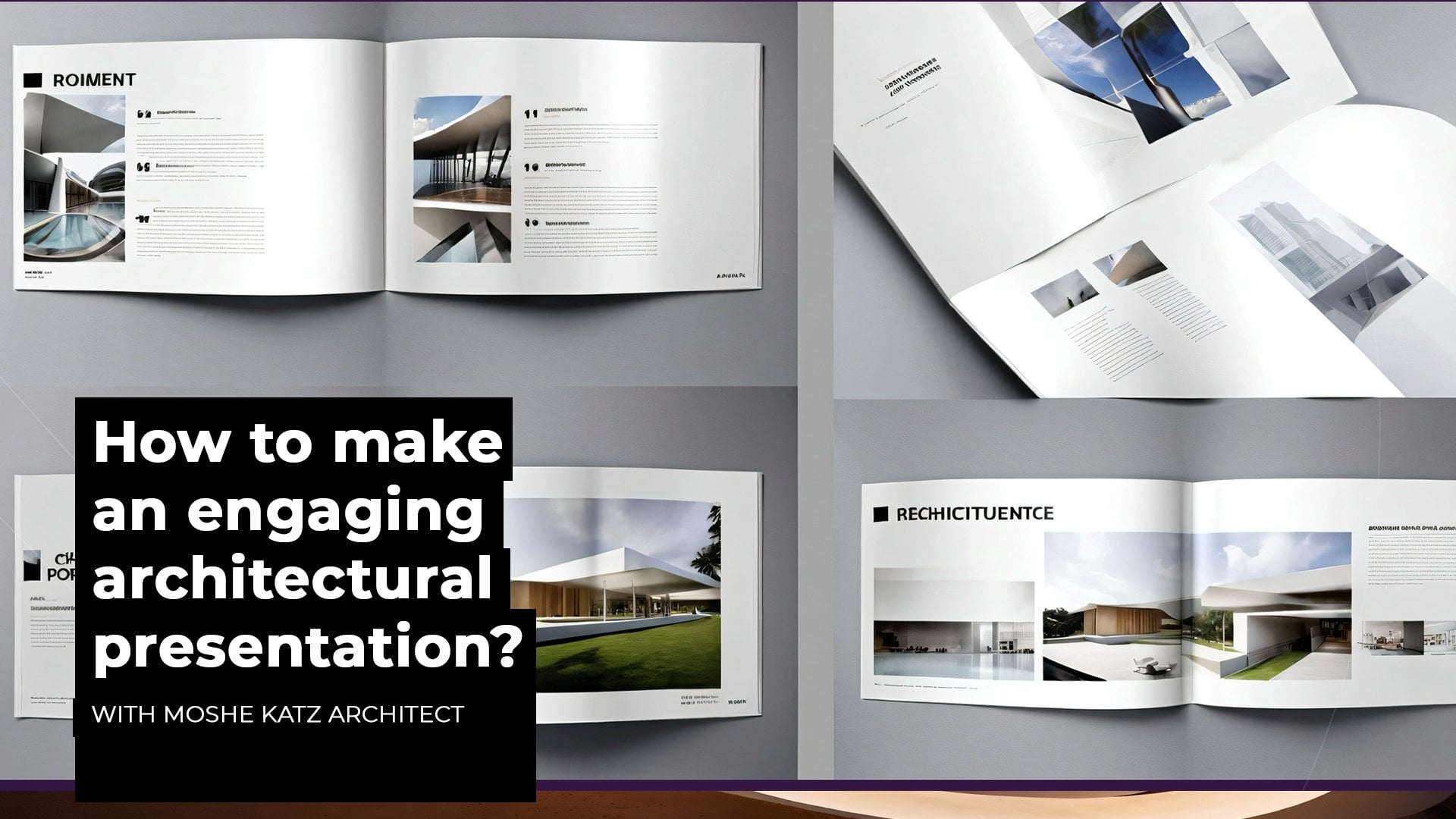
important presenting your sketches is
you learn how to use tools like Photoshop
and PowerPoint to create three D collages and professional
presentations that will impress your
professors or clients. By the end of this course, you'll sketch with
a great confidence and have a portfolio
you'll be proud to show. So if you're ready to have
some fun, let's get started.
2. Overview of digital sketching tools: Hi, everyone, and welcome to digital Sketch course
for Architects. I want to welcome you, and
thank you for joining me here. First lesson is the overview
to digital sketching tools. On a personal note, I
would like to start with the idea of
sketching for me personally is one of the
most beautiful expression of my mind and my soul and how I express my visions
and dreams to the world. It is one of the
most beautiful gifts for those who are translating the most intimate ideas and bridging between dimensions
into the real world. Try to imagine an
amazed client that sees your sketch or a mayor that is overwhelmed with the
potential of your sketch, wishing for your dreams
to be part of the city. I can tell you that
this feeling is rewarding and is one of the greatest
feelings as architects. The sketch is the first step towards making an
architectural dream come true. And this is where you
show how much you love people and want
their well being, how free and creative you are and express your dreams
for those who can't. So this is where
everything starts. So the digital sketch as a tool gives you a greater
freedom and saves you so much time and resources because it
incorporates all the brushes, all the colors, all the
tools in the same place, and it allows you to sketch everywhere in every condition. So the digital sketch
is our tablet, our iPhone, computer software, the iPad, or Pan tablets. You can choose freely the ones that are more
comfortable to you or just try all of them out
and see which ones are better for your performance. So how do we draw? Usually, we use the digital pen for all the brushes and methods. So the digital pen
serves as our main tool. To master that skill, we need to feel the
power of the pen and how it affects when we push it harder or softer on the screen, how does it change the lines? How does it make the
flow work on the sketch? So before you start,
just try to feel the different sensitivities of the pen until you get
really comfortable with it. The digital sketch
allows us to do different styles of sketching. It can naturally feel as
if sketched on paper, but you can also create
a very accurate drawing similar to those technical elaborations and a
technical style. So let's try to take your
tablet, see how it works, try to figure out the
sensitivity of the pen and do some examples just
to feel the digital tool. And don't forget the most
important thing is to have fun.
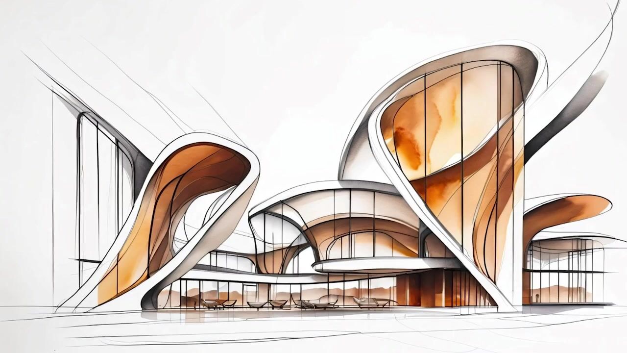
3. Examples - contemporary exterior buildings: Hi, everyone. This
is lesson number 17, contemporary
architectural sketching. In this lesson, we're
going to learn how to draw an exterior view of
an architectural design, a building, which is a
contemporary architecture. The exterior view of a sketch is a process
in development. It's an experimentation of
different approaches on top of the sketch until we reach the most inspiring
architectural expression. The sketch for us is
a playground where we just experiment with
different tools with different styles
until we feel that this is exactly the building
that we want to show. The exterior view of an
architectural sketch represents the volumes and the architectural
style of the building. It shows at least two
facades at the same time, and its main role is
to inspire and to elevate the creative feel
of the architecture. But it can also show the journey of experimentation and searching of the design. So you can see the
process in becoming. It's not a final
polished sketch. It can be a very experimental and very free formed sketch with all the lines and
the volumes and the searching for the
shape and the geometry. So let's have some fun and
start sketching together. Hi, everyone, now we're going to work on an exterior view. We'll make a nice
conceptual sketch of an architecture with a nice three D view
and some environment, but mainly focus on
the building itself. So we'll have at least
one full facade, and the second facade
of the building will be in three D. So let's look at it. We'll create a new layer
and work with the pen. As always, we're going to
start with the Horizon line. On top of that, we'll create our basic image of
the front facade. So try to do that with me. Start with the point on the
ground and just go with a continuous motion
almost as a hard shape, but don't close it
altogether in a point. Just open it up. So if this
was a heart, so like that. So we're going to cut it here. Well, let's enhance that. So next to that
shape on the sides, let's create another
round shape. So we go down with
that, continue and go up like that almost as a
drop shaped structure. Same thing on the other side, a bit bigger, and maybe
another one a bit longer. Just enhance the ground level. So we have those circular drop shaped next to the building. Let's work on the main
facade of the building and create two big openings. So they're going to be round, again, a drop shaped turned on its head and another big one on the
other side as well. Like that. Let's create the depth
of this building. So we're going to go from
this facade here and take a line into the back and
then into the front again. Okay? So we basically have
another facade, which is incomplete because
we have that front structure, and that will have also another
facade to show a depth. Same thing with this
drop shaped here. And you can also create hidden line here off the three D feel
for that drop, as well. Let's create a division
for those glasses. Let's create other openings
for those facades as well. So what I would do is
create another round shape, play with echoing
the same structure. Let's create a foreground, two lines going from the center, all the way to the front
and just parallel lines to enhance the three D feel of
that foreground structure. Let's add two basic trees. It's one that's two. So this is our building.
These are our facades. Let's add some small
openings as well. So one in the middle,
another one on top. Let's create some of
those here as well. Okay, let's create another
layer and work on top of that. So let's work with a bigger pen to enhance the lines that
are our final visions. So this is it. Again here. And the rest of the
shapes as well. The windows. Okay, the ground level needs to be more
stronger as a line. Always strong element. Now, let's create another
layer to work on the shades. So let's take a marker. It's a bit too
thin. Let's go up. Again, still too thin, we want to create a
substantial shade and understanding of the depth of same thing for
the other openings. So just in one side. Same thing for these
ones, for that. On the other side,
it's going to be on the contrary side. Okay. Now we have created the shades. Maybe let's do some shading just a general
feel on the ground. Okay, create another layer. Let's do just some figures a and stylize them
the way you want. On the other side,
a smaller one. And on the front right
next to the building, let's create a crowd of small, small dots which means that people over there
are really, really small. Okay. Let's go back to the layer of the structure and add some of the glass divisions
in the front, the frames the glass frames. So it makes it look more real. If you want to do that
with the small openings, you could do it as well. So it gives a sense of true
division of glass structure. You can always add
a double line, which is actually the real way to do that because in structure, there is no one liner. Always two lines to show that the material has
a certain weight. So do the same thing
for the main glasses. So double line it Okay. Next thing would be the
colors for the glasses, so we'll have a real feel of
that, create another layer. And let's work with
different colors. So let's start with the blue
for one window light blue. Let's take the wet brush
and take the layer and take it down to
70-80% of opacity. So it's not too dominant. I'm leaving just a
small part in white, just so the reflection
is more evident here. Let's take another color. Let's work with an orange. Stronger one. Same thing. I'm doing on the other
side with this glass here. Let's take the whole
layer back behind, so the lines of the
structure are more strong. Let's continue. Let's do maybe another color on the other side as
well. Maybe yellow. Yeah, that's not bad. Okay, now, let's work on the trees
as well with the same. Let's see how it looks. So
the more we add color on top, it becomes more dark and
creates a three D feel. It's okay if the colors go
beyond the limits of the line, gives us a nice,
natural abstract feel. Let's work a little
bit with the purple. You know, let's do purples. I can make the brush
much bigger to work on larger to work on
a larger scale. Now, let's make it smaller and go to the building itself to the facade
of the building. Don't worry about the
different stains. We're going to go
and create some nice texture out of that. Same thing for the
other facade. Go slow. Again, if you go on a
second round of coloring, you'll see the change
to a darker color, which is right for this
facade, it's in the depth, which means the light is not
as strong as in the front, and it's okay to see that. Okay. Same thing with the
structures next to it. I like to keep
those helping lines that we did at the
beginning, those black ones. They make it look like
a natural sketch and also give it a very
interesting personal feel. Again, here, if you go on a second and third
layer of coloring, you will have a nice
depth of shade. Okay, let's take the
eraser and create some nice feel off the ground. So I'm just working
with hatching. As you see, let's
make it smaller. So the lines are
thinner and it feels more of a clean texture. So just play with the
hatching until you feel that it's enough or the
intensity is enough for you. Let's try to see how it looks. If I hatch that also on
the building structure. So as I go and enhance
the feeling of the movement of the facade of the surface or the round one, I'm basically sketching still only with erasing the color. So I'm basically just creating a sense of
motion of the facade. So I'm creating as you see, parallel lines and some
hatching, crosshatching. Okay. Let's add some background just for the general field. So another layer will go to the pen tool
with purple lines. Okay. So as you see, we're just creating
some small arches to have a feel of nature
on the background. It really makes our
sketch jump out and since we have a
background, there is a depth. So it's a beautiful combination. I think the colors can be worked on a little bit more and the front
facade, as well. So let's add that and the
background, of course. So let's try to work on that. Let's change the color
to a darker purple. Let's continue the hatching just to give it another depth. Let's try Yeah,
let's take the pen again and work on the texture
of the main facade here. So again, as you see, I'm
just taking those lines and filling the spaces
with cross hatching. So it gives it a sort of
a material feel could be it's a very special way to put bricks on top of
the other in this way. So let's go on all the way
in between the openings. So I'm continuing with
the same direction. Not too intense and close
to each other because the cross hatching will create that intensity
as I fill it. You see here? Again, it's
not about being accurate. It's about creating a feel. So the more I am adding hatches and
creating that intensity, it will give us a sense of
shade and a sense of texture. There we go. Now we can see it slowly reaching
that intense place. Okay, let's add some
Let's make a bigger size. Let's take another layer
and another color. Let's work with a yellow
create some light reflections. So I'm just playing with the
lines in different places, especially where we have some
openings in the windows, but also on the different
surfaces of the ground, because the building would have certain light elements and
street lights and so on. So we'll have some
nice reflections. Let's add another layer
and a green color to balance the whole
picture with purples. No, it's too big. Let's
take a smaller brush. And underneath the trees, let's create a continuation. Of that green feel almost
like green spots on one side. So we see a certain
connection to nature. So it's a nice balance between
the very strong purple, which became very
dominant in this. So let's try to
balance everything. And let's strengthen the shades a little bit more, make
them more evident. So another layer, let's go to the marker and take
a black color. Let's try to do that
with the brush. Is a nicer stroke. We'll take that
back all the way. And let's do some
shading in some parts in front of the building also underneath the
people, the trees. Just a nice arch.
Let's take the pen and create some flock of birds, some small lines
next to each other. It gives us a sense of
depth and distance. Okay, let's work on the
background a little bit. We use the same purple
gradient or pink. You know, we have
here light pink. Let's create another layer and use the wet brush to fill
the background mountains. Can also a little bit here. Same thing on the other side. We'll take this layer back so it won't affect the front colors. Yeah. Here it is. And we can take the
opacity a little bit down, so it's more bright. Let's create some shading
of the background. So we're working just on
the top part of the hills. So it has a nice feel of shade. It's as if the building echoing the environment with
the same colors and the same round shapes, and we have that nice connection between the environment
and the front. Um, so let's add some
nice reflections. Let's take the layer of the coloring of the
foreground and the textures. Let's take the eraser and create just some short stains of white background
as we erase that, create some nice reflections. Put it on the trees as well. And in the facade,
some nice reflections. Okay, let's take a nice
purple color and work with a charcoal to add some nice strokes on
the top of the hills. Just to add a sort of nice texture or feel of
emphasis on the top. Now, as a last thing,
what I would do is try to play around
with the background. So let's go to the
background layer, and let's see what happens if I change the background
to a nice bright color. Since we have a lot of
strong colors in the front, if we go to the
strongest colors, you see, then it's a bit
distorted and unclear. So we should stay with the
brighter gradient colors. Let's go through the
different options and see which ones is
complementing the most. So I feel that the yellow gradients are complementing the
most to this image. As you see here, and
yeah, this is our sketch. I hope you enjoyed it. Play around, try to work
still on the facades, on the ground level. We can add some trees in different parts still just
for the sake of scale. So you can add different people, can work still on
the environment. If you don't want to
do these mountains, you want to see an
urban environment, feel free to add some cubes, some structures of buildings. Like that. Just some cubes
in different heights. So it shows it has some
sort of a depth into it, and then it feels differently because then the building is connecting to a built
environment instead of nature. So feel free to add
maybe some towers. This is our sketch. I
hope you enjoyed it. Let's see each other
in the next lesson. Hi. I hope you're not tired yet, because there are so many more interesting lessons coming up. Remember, architecture
is all about passion and inspiration and
finding the child within you. So grab a coffee and see
you just around the corner.
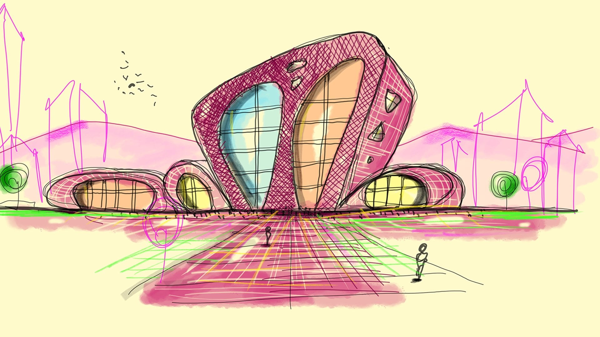
4. Examples - interior spaces: Hi, everyone. This
is lesson number 19, sketching interior spaces. So the sketching of
an interior space is the way to bring
the interior life of an architecture into a clear vision and inspire by showing the potential of
the life within a space. It gives out the sensations and the feelings we want to
transmit to others by telling them a
certain story of how the life within a building is actually and what are the potentials of
that interior space? For us as architects, the interior space is
a generator of dream. It is the manifestation of all the hidden secrets
of architectural spaces. After being watched
from the outside, you see a facade. You see a certain part of the
building from the street. But then you imagine
and you dream, what is the life that is
happening inside there? How will it feel if I
just get in and will look around and see the
different shapes and forms and windows that I
perceive from the outside? So the sketch of an
interior is the glimpse into that experience
that started from the outside and now
goes all the way in and completes the whole sensation
of the spatial experience. It gives us also the
understanding of the magic that exists
within all the components, if whatever we saw outside
is also represented inside. So let's see how it's done and sketch some interior
spaces together. Hi, everyone. So in this lesson, we're going to draw
an interior sketch. We'll do it step
after step gradually. And let's create some
inspiring interior. Let's start with a
new layer and choose the pen small with Yeah. So if you remember from
our previous lessons, the interior perspective starts usually with a frame and then all the lines go towards the same center, same
vanishing point. So we will usually have a certain frame of wall or
a surface in the distance, then we will have a horizon
line, a vanishing point. And from that point, we will start building
our room let me see here. And within that we're going
to design our interior. Let's start building that grid, that frame and work layer after layer as we
develop a nice idea. Okay, let's start
with a baseline of the ground level and try to divide it
into three parts. So we do that with a layer
of the helping lines, try to be as straight
as possible. And let's create some of the elements that we see
in the front surface. So let's imagine we
have a column that develops a column that develops into a roof,
something like that. So we go up, turn into a curve, make it almost an
elliptical shape, then go more or less
back to the same height. And down again
towards the bottom. It may seem a bit difficult
to try to do that maybe once or twice on different layers until you reach the right size. Once you have that, let's
go to our next step, which is creating the
depth of that shape. So let's start somewhere
in the beginning where the curve is starting to turn
and create reversed curve, almost an arch that goes from here all the way
to the other side. So now we're trying to create this arch, maybe more further. So a line that connects
these two points, you can create this line
to help you do that arch. So all that is left to understand the depth
of this space is to create a structure
of the curving surface. So we start really narrow
here very intense, then slowly move the lines
further away from each other. And as we go to the next corner, we go back into an
intense parallel lines. It gives us a sense
of curvature. Now we create a parallel
line to this arch. Let's create another
one, starting from another point
which is here, that and another
one. On the top. So as you see, by creating
this geometry and structure, we have the understanding
of almost a dome feeling, so the space is entering
inside that element. So next thing is the
walls on the sides. So we have one here and we have another one on the other side, but let's start with this one. So let's take a line
somewhere after the arch is starting to open
up towards the ellipse. Let's create a line to connect this wall with the corner and move from the corner
up in an angle. So we make you understand. Basically, this is the
vanishing point that we have. So all the lines all the horizontal lines
will reach this point here. If we want to have
a higher view, our horizontal line
will be somewhere here, and this is then our
vanishing point. And from that point,
all the corners extend towards the viewer. This is our wall.
Let me take back. It was just to show
you our wall geometry. And just so you understand
how it works on the top, let's take another line from the bottom here
from this column, go up and extend
towards the top. So it's almost parallel to the shape going up,
parallel parallel. Then when it reaches instead
of going on the side, we're continuing almost back following our
interior wall here. Now, let's divide the wall
into different glasses. So let's take these lines that
we have here from the top. Let's take them down. Same here. Continue also here,
more or less with the same intensity and
distance from one another. So this is already
structure of our wall. Well, let's create another
layer just so you see it. I'll pick a bigger size. Now, this is the lines of wall, the visible lines of our wall, final clear touch
round the ground line, we can also give it a strength, and this is how it looks. Let's divide the lines again. So we create three
parts, one, two, three, and continue
that structure from our vanishing point. We have one, two, three
parts here as well. So this is our glass facade. Let's create parallel lines. So it seems like a
real structure of the glass. Same here. In, now, let's create some continuation of that wall to the other side. Let's imagine it goes
all the way here. Maybe we'll have on this side, a nice window with a drop shaped structure with
a certain depth of the wall. So from that corner here to
the corner somewhere here, you will continue this line because this is
our front facade, and let's connect the vanishing
point with the frame. And this is our structure of
the second wall. Right here. Now, let's enhance some lines and work a little bit
on the walls as well. So this wall here will be
a wall that has no glass. It has a frame. So let's take again from the
vanishing point and connect these extreme points of the
line and build a frame. So this is it. A line
inside goes down. And again, from this
point to the vanishing Point will go up. So as you see, we have built a certain frame and we
can put a picture inside. So let's put another
line somewhere here. Again, all the way to
the vanishing point from the bottom and the top. And here inside, there will be an abstract image or picture. Just feel free to create a certain picture of
your imagination. Let's go to the layer of
the thicker lines and connect all these strong
lines that we have done here. This is the thickness
of the wall of the frame that we've created here for the
picture, like a niche. We can show some light
fixtures above the picture. We can also enhance the
shape of the window. And what I would do is enhance the structure of that column
right here, there you go. Also, the beam. Let's make it nicer. No. There you go. Okay, let's create
some nice divisions, small walls that
divide the space. So let's start with
the bottom here. Create a nice arch that goes
all the way to the front. Starts from the bottom
connecting the column, same thing, parallel line to it. Let's go up just a little bit
and create the same line, but a bit higher. So what you have is small division on the floor let's do the same thing from
the other corner from here. Create a nice big
arch, even bigger. Again, let's do a second
one, go a little bit up, create another parallel line, and connect it with the
straight parallel lines here. Same here on the bottom. So this is our division. Let's create a person in
the middle that gives us sort of that gives
us a sense of scale. Let's create another
layer, do the head, more or less in the height
of our horizontal line. Now, let's create the body and legs and some
arms and a small hat. Now let's create You know what? Let's do some corrections. I don't like that window. Seems very strange here. So let's take the eraser, go back to the structure. Let's erase that. Let's erase those and create a new window. Let's go back. Let's Let's do
a round window. Small one. Yeah, maybe like
that. Okay, let's go let's go back to the
visible lines are stronger. So here, we have
that round window. Let's create some of the
elements on our background. So let's start from this window. So basically, we will see just a slight sense of
mountain background. This line would go
all the way down. So let's imagine this line going down and it meets
this place here, so it will go a little
bit down then up Okay, so we have that background. You can see from
across the window. Now, let's add some of the furniture just so we have a feel and a sense of scale. So create another layer. Let's go back to
a small size pen, and we'll start working on that. Let's take one line coming from the vanishing point all the way to the front and find
the center of the space. So this is the center.
In that central place, let's do a round table
with some chairs. So let's go up with that line so we have
a reasonable height. And create an elliptic. So as you see, we already
have the tabletop. Let's create another parallel
line just for the plate, the feeling of a three
dimensional and a leg, which is made out of two
lines parallel to each other. Now, let's create
the different seats. So let's create the first one. It would be reversed
cone round shape, and then we have another
arch closing on that. And a triangle with a round circular elliptic
shape on the bottom. Let's do the same things
a little bit on the side. So we have one, then we have another
chair around here and maybe another
chair around there. So let's do that. Same
shape, reversed cone, see some structure, then a
triangle, and like that. Same thing on the other side. Here, we won't see anything
because of the tabletop, but we could see
the bottom part. Same thing here going down. So we won't see it
because of the table, but we will see
the round element. Here we could do another one. Before we strengthening
all these lines, let's look at the shape
and size of that. Let's create another layer and work with a bigger size pan. Let's start with the chairs. So as we do that, we can add the lines to enhance the shape of the
surface of the chair. So a small elliptical goes down, closes and has the chair seat and the round shape
on the bottom. So let's create the lines. Here we can do these lines that determine the direction
of the chair. So elliptical going down parallel cross hatch
and on the ground. Same thing here, parallel
cross hatch on. Parallel. And what's missing is the table. So let's make the
table line come more visible in between
the different chairs. So some of the
lines of the table are missing because the
chairs are in front. Small connecting line to another parallel
arch of the table, and also here small strokes to show the shape of the table. Same thing for the
table structure. Let's do the same thing
on the other side. Let's create another layer. Small size of the pen. So let's take from
the vanishing point a line that determines more or less the middle
part. Same thing here. So we feel the center
of that space. And let's put some
nice element here. Let's create some nice
element on the other side. On this element, let's
show the negative part. So let's do some
stairs on the floor. People can sit and watch
the background and mature. So let's create an
elliptic shape. We move from the
vanishing point, find the middle, more or less. And create an elliptical
shape around it. So this would be the
hole in the floor. And then let's create three or four steps
to take us down. So we start with the middle part and
create a parallel arch, a bit smaller than the
ellipse and go all the way to the front until it
vanishes in the front. Let's do another one, very
close hopes and another one. So this gives us
the feeling that we have some stairs
on the bottom. Let's create a person
sitting there. So we have the head a little
bit above the stairs. Then we have the body and a curving line all the way to the bottom as if
sitting and two hands. Maybe another one.
So this posture going down, take the feet down. Some hands. So these are the two people sitting
on this element. Let's create another layer and draw it a little
bit stronger. So now we see only this line, so the people are in front. Then we have the arch, second one, and the third one. Let's create a stronger pen and draw the lines
of the person again. Now let's work on
some shadows and the feel of depth in
this interior sketch. Let's add some nice elements
as lighting fixtures, maybe around the ceiling. So we'll create different
elliptical small elliptical. And as they come closer to us on the ceiling,
they become bigger. With some interior line
that shows a depth, usually those fixtures
have a small depth. Let's create another
layer and work on the shadows. We
can take a marker. So let's start with the main
element in front of us. Make the marker smaller. We'll start with
a nice gray color and follow the lines
of the structure. Yeah. So as you see, they're
expanding towards the front. Let's do the same thing with
a stronger line only inside. So let's choose pink or purple. And we do it with straight lines coming from the outside towards the inside,
all the way down. Parallel lines. It's okay if some white spaces
remain in between. It gives us a sense of movement. So wherever we can go fast, just do it. Let's add the glass. So let's take the
blue light blue. Let's try it with water brush. So this is a small one. Let's make it bigger. This is the glass facade
right here as well. So if we don't leave,
the pen from our screen, it continues the same
character and the same layer. If we do take it off our screen, it will create another
depth and darkness. Same thing for the top. So these are our glass surfaces. Let's work on them so
we have a nice feeling of reflections and depth. Let's take it back. To the
layer of the structure. So we see the lines.
There you go. Instead of the
colors. Let's create another layer and
work with the marker. Let's take it back and
draw with the grays. I can have a thicker marker. So this is the
frame of the glass. So as we go closer
to the viewer, you see that it becomes bigger. Okay. Now we have that frame. Let's take the eraser. We can create some nice
reflections on that. Let's go to the glass
layer and create some nice lines as
reflections on our glass. On the top, let's
do it with arches. Same on the round surface. Let's go back to the shadows, take the marker, and work
on those small divisions. Let's do some shadows. Of the stairs and a small
shadow of the people. So shadow on this window. We can also add a bigger
marker and create a shadow on the
wall. Top as well. And we can create a
small shadow underneath. Let's work on the floor textures
materials very quickly. Let's take another color. Let's see if we can
work with markers here. So just create some parallel
lines on the floor. So it continues all
the way to the front. This top part could
be purple as well. Same thing on the
other side, enhance. Twice or three times, has some stronger feeling. Bring it up and then
another layer of color. Okay. Let's take the furniture and use the same
color for the table. We can leave some lines. We can leave some spots
free with whites, so it gives us a
reflection feeling. Let's choose a complimentary
color for the seats. Could be a nice orange. Let's take it down under
the line structure. And we can take the
eraser and create some reflections and the
shadow underneath as well. Let's take the marker and a gray work on the ground. Okay, let's take another layer underneath all the other layers and work on the background. Let's take a green colour, see what we get from it. So we just fill that with color. Same thing on the other side. Enhance the color on the top part of those hills just so we have a nice shadow. Let's take it all the
way back and maybe change the opacity so it's
not so strong around 85. Let's find a nice color
for the floor and ceiling. Maybe the yellow tones. Let's try to take
this yellow color, another layer, bright yellow. Let's work with the water brush. So we'll do these
walls and ceiling. Okay. And let's do
some of the floor as well. The other side, too. And let's give it
some second layer of intensity and depth. In different parts and
corners, especially, so it has a sense of connection
and under the table, wherever there
could be a shadow. So let's do a second and
third layer of color. So we have some transitions. There you go. So we see a
very nice gradient like that. Let's create some image for the pictures.
Let's use the red one. Strong. Okay. So let's use another brush with a
black color on a new layer, just to enhance some parts. So I'm just going over
some lines as you see, just to give it an emphasis on the corners and some elements that need to be more
clear in their structure. Now, let's work
on some textures. So since the walls are yellow, let's take the pen, big size, yellow color
on a different layer. Some nice hatching and strokes to give you a
sense of some texture, you know, much bigger
on the bottom, as well. So just some hatching. As you see here, same
thing on the ceiling. So this is, like,
a little bit of a style to give it
more sense of texture. So you just don't
have these planes. So it seems a little
bit more freehand and elaborated than just plain
clean or too hesitant. So let's take the purple and do the same for
the middle part. Just parallel lines. Let's do the same thing
for the background. Another layer, work with the
green, but a bit darker. So just some hatching. Again, cross, take it back all the way back above the layer
of our background. Click on it, take
it down to 50%. So it doesn't take over the image and just
continue cross hatching until we
reach a texture. A very thin net. We can take a nice charcoal
and work with that as well. Make some lines more
more fluid and full. So let's create another
layer to work on the seats. And let's take the marker and the purple color and work
on those seats here. Filling it with some color. Let's do the people as well. Let's give them some
black or dark gray feel. So they have a
volume and a depth. Let's do that for all people in their hands, head, and body. Keep some parts white
just for the reflection. Let's do the same thing for
the background as well. Some shadow. Okay, let's
do some shadowing. Let's go to this charcoal
color builder and take a dark purple and work on the top part here
to create some nice shadow. Same thing from the other side, going with the same
direction of the lines parallel on the floor as well. Take the table, work on it. So we have more smoother
surfaces in some parts. Let's do some
additional shading, create a new layer, use the
same charcoal with the black. Let's take the layer
to 30% opacity. And work on the different
divisions of the glass. And you see it gives it a nice
sense of shadow and depth. So in some corners, some parts of the glass, the bottom floor, the wall, and the ceiling in some parts. So let's use the same charcoal
again. Another layer. Let's go to the yellow and
work in different parts of the ceiling free hand just going over the different
parts, ceiling wall. Some parts of the floor, some stains and spots. So as you see, we leave
some parts unfinished. Some parts we work
with some stains, and it gives us a nice sense
of mixture of techniques. So let's finish up with
some nice light effects. So let's create another
layer, put it on top. Take the marker and
use the white colour. Let's go wherever we have
some light fixtures. Let's do some vertical lines to create some nice
lighting effects. So we have them here on the top. Maybe we have some nice
lighting from the bottom here. Same from this side. So nice light effects. Maybe add some of them
some additional ones. On the windows to enhance the
reflectivity on the bottom, too, play around with
those reflective lines. It gives us a nice sense of light hitting the
different surfaces. And as last thing, let's
create another layer. Take it all the way back there to the green surfaces
of the background. Let's take the same charcoal, take a lighter green and work on top of
that a little bit more just to create
another contrast. Of the green in the back because it was too
dark, in my opinion. Let's give it a
nice bright green. So as you see, some parts
we can leave unfinished. Some parts have different
stains of green, which is a variety
of nice vegetation. So it jumps up out
of the glass facade. It looks much nicer
when it's brighter. Using these colors, I think
the green needs to be much nicer and visible, not so dark. Yeah, it. This is our interior. I hope you liked it
and managed to follow. We'll see each other
in the next lesson and we'll work on details. Hi. I hope you enjoyed
the course so far. As you take a break and maybe
drink some tea or coffee, I would like to
share a story from my book about my journey as a student and discovering the City of Florence through
the architect's eye. The story is titled Secrets
in Light and Water. There is a hidden
square in the city, the kind of place
most people overlook. It's small, almost secretive, with a single arch that seems to hold the
weight of centuries. It sits quietly at the meeting point between
the Uffizi and the River, a tucked away corner of beauty that feels like
stepping into another world. Few notice it, and fewer
still understand its magic. But if you stand there at
just the right moment, when the sun is high,
the day is at its peak. You'll see something
extraordinary. At noon, a single beam of
sunlight begins a journey. It reflects off
the river bending perfectly as if guided
by some cosmic hand. The light dances on gray
stones, crosses the water, and lands on small
dome above the arch, igniting in it a quiet
burst of brilliance. This square wasn't meant to
be just another landmark. It's more like a stage, a place where the ordinary can turn magical in an instant. It holds the power to transform the everyday rhythm of life
into something extraordinary, like a well rehearsed play
unfolding in real time, but its charm is subtle. It doesn't demand attention. It awaits for those who are
willing to pause to see. To stand at its center
is to feel the essence of the city compressed into
one small, perfect moment. It's the kind of place
where if you let yourself, might even have a quiet
conversation with God, or at least with your own heart. I first stumbled
across it by accident. I was running, dashed through
alleys and cutting corners, dodging the chaos of the
city past Santa Croce, the market, the courthouse, and the Turkish shawarma shop. I was moved like a
character in a painting, rushed, dramatic, propelled
by some unspoken urgency. And then I arrived. Just as the clock struck noon, I stood breathless at
the edge of the square. The sunlight touched the dome, the light unfolding in its
quiet, miraculous way. For a moment, time
seemed to stop. It's a reminder that even
in the chaos of life, there are moments waiting for us if we dare to
stop and notice.
 Moshe Katz, Architect, Book Author & Artist