Transcripts
1. Introduction: Whether it's for animation
or illustration, creating appealing
looking characters is one of the hardest
things to achieve. But when everything
comes together, the final result can be
extremely satisfied. In this class, I share my
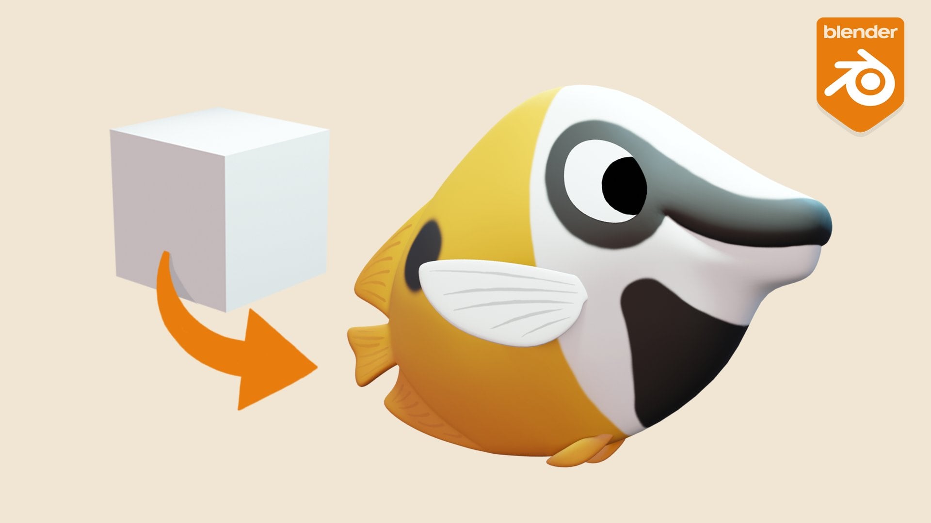
process for transforming a two D character design into a final three D character
illustration using Blender. Hello. My name is John owls. I've been lucky enough to
spend over 15 years working as a character animator and animation director for
children's television. But one of the things that
I enjoy doing the most is designing and creating some of my own characters and
bringing them to life. I've divided this class
up into two key sections. The first part of the class focuses on the character
sculpting process. Working from the design,
we'll start by building a base mesh which will form
the foundation of our sculpt. From there, we'll gradually
start adding detail and refining our character with a constant eye on creating
an appealing end result. In the second part of the class, we'll be focusing
on presentation. We'll build a simple
environment before moving on to shade our character with
blenders procedural shaders. If you're new to
procedural shading, the networks of nodes can
initially look daunting, but we'll start
out simply before gradually building towards
more complex shaders, incorporating techniques
such as subsurface scattering to give our character a more believable looking feel. With the shading complete, we'll turn our
attention to lighting. I'll demonstrate not only how to light your character
in an appealing way, but also how to use
lighting to add an element of storytelling
to the illustration. Okay. Finally, we'll bring the whole image together
within blender's composite. But we'll color
balance the image and add some final effects to transform our render
from something which looks like this into this. This class is designed for
those who already have some experience with blender and are ready to take their
work to the next level. If you new to
sculpting and blender, I'd highly recommend
starting out with my character sculpting
essentials class, which will teach you everything you need to know to get started. As always, while I'm walking
you through my process, I constantly take the time to not just explain how
I'm doing things, but why I'm making the
choices that I do. This means that by
the end of the class, you'll have a far
greater understanding of what it takes to make an appealing three D
character illustration and the skills to bring some
of your own designs to life. So if you're ready, let's get started. The
2. Class Overview: Hello, and welcome to the class. When creating characters
for animation, there are a number of key steps which we typically go through. Obviously, everything
starts out with a design. With a simple character, this may be modeled using a process known as box modeling. But for anything more complex, it's common to start out
with three D sculpting. Sculpting gives us
the flexibility to focus on the forms
of the character, pushing and pulling
things around without worrying about
the underlying geometry. Once we're happy
with the sculpt, we then go through a
process called topology. This involves rebuilding the
mesh in a way which reduces its complexity and enables it to deform smoothly
in animation. With the re topology complete, we can then define
the U V coordinates, which remap our three D
geometry into a two D space. This is an essential part of the process before we can
start texture painting. These textures can
then be combined with other shaders to create the final surface detail
of our characters. With the character complete, we would next add a rig or armature in order to be
able to pose the character, either for a single
illustration or for animation. Finally, we can
add an environment and some lighting to
bring the scene to life. All of these steps are typically
required for animation, we can greatly simplify the process when working on
a character illustration, and that's exactly what we're
going to do in this class. In this case, we'll
take the output of the sculpting stage and
directly add shaders to it in order to define the
look of the surface before adding an environment
and lighting our scene. By taking this class,
you'll be learning the process of
character illustration. But all of the skills
that you develop can be applied to creating animated
characters as well. When you're learning
or developing skills, there's a lot to be
gained by trying to replicate someone
else's work. But there's even more
to learn by trying to apply those skills and create something
unique of your own. For your class project,
I'd love to see either your version
of the illustration which I demonstrated in class, or if you're up
for the challenge, a unique character
illustration of your own. Once you're ready,
upload your work to the class project gallery to seek feedback and share it
with the other students. Also, if you'd like
feedback along the way, feel free to upload work in progress to the class
project gallery. Or alternatively, you can ask questions in the
class discussion section. Now, if you're ready
to get started, let's jump into
the first lesson.
3. Class Updates: In past versions of Blender, all of the sculpting
brushes were listed on the left hand side
of the interface alongside the other tools. Blender 4.3 made a
significant interface change with the introduction
of the asset shelf, which was designed to allow for the easy addition
of custom brushes. This asset shelf moves all of the sculpting brushes
to the bottom of the interface whilst leaving the other tools in their
original location. The size of the
asset shelf can be adjusted by dragging
on its boundary. And the size of the
thumbnails can be adjusted in the
display settings menu. Tool tips, providing the
name of the brushes, appear when you hover
over the thumbnails, and you can also
enable the display of names within the shelf, although this is only really useful with larger
thumbnail sizes. Tabs at the top of
the asset shelf enable the filtering of
the brush selection, and it's also possible to
search for specific brushes. Whilst these changes make
the interface appear different to that shown
in the following lessons, functionally, everything
remains the same, and all shortcuts continue
to work as usual.
4. Scene Setup: Before we get started, I want to make
some quick changes to the unit system
within Blender. The default cube within
any new blender seam file, as dimensions of
2 meters squared. If I change that instead
to 5 centimeters, which is roughly the size
of a turtle hatchling. You'll see that our cube
has become extremely small. While I could zoom in and
start working at that scale, it can introduce some issues
later on down the line. Instead, I'm going
to undo that and we're going to go into
the scene settings. Under this unit section here, we can make some changes. First of all, I'm going
to change the length here from meters
to 2 centimeters. You can see we're now showing our default cubers 200
centimeters in size. The other thing I'm going to
do is change this unit scale from one to 0.1. Doing that means that
our dimensions of the cube are now 20 centimeters, and nothing else has
changed here in the scene. If I now change this
down to 5 centimeters. You can see that
this is a far more manageable size to
start working with. The other thing
that I'm going to do is change the grid here, because in changing
the unit scale, we've now lost the smaller
subdivisions in the grid. We can do that if we go up to the overlays and
change the scale here of the grid to 0.1 as well. Now, when you're changing
this unit scale value, I'd recommend making changes
with a factor of ten. That way, if you're working on separate objects in
separate seam files, if you ever work with
different unit scales and have to bring those
objects together, you can simply scale an object
up or down by a factor of ten to make the scales match
within the new seam file. So with the unit scales setup, our next job is to import
our reference files. What I'll do to start
with is just press the three key on my numpad
to jump into the right view. Let's just frame this up
by hitting the period key. If you navigate to wherever
you've saved the resources, you should be able to drag and drop the design into Blender. Now I'm going to zoom out a little bit, so I can
see all of this, and what we want
to do is match up the size of this right
view with our cube, which has already
been scaled to size. I'm just going to scale this down and start
moving into place. We can see we've got a
problem here in that we can't properly see
our reference image. So I'm just going to hop over here into the property panel, and on the data tab, we can
change a couple of settings. First of all, I'm going to
change this depth to front, which brings the image
back in front of our cube. But in order to see
both at the same time, I also want to adjust
the opacity here. So I'm just going
to bring that down. To something around about 0.3. The other thing
I'm going to do is uncheck this perspective option. At the moment, if I move around
in the perspective view, I'll still see this reference. I'm going to check that
off so that we actually don't see it and it doesn't interfere with our
perspective view. But once I jump back into any
of the orthographic views, we'll still see the
reference there. Now I can go ahead and scale
this back down and position it to match up as closely
as possible with my cube. For now, I'm just centering
this up on the world axis. I think that should
do for the side view. Let's just rename this so I can just with the object
selected. Here I have two. And we'll call this rough side. And I'm going to create a
new instance of this by hitting D and just right
click to cancel the move. So we want to go into the
front view here and I'm going to rotate this object around
the Z axis by 90 degrees, and I'm just going to hit
the minus key as well. So it rotates -90
degrees and hit Enter. Then I can move this
in the x axis across it until I'm centered up
on this center line here. Let's rename that as well. So let's call that front. We need to do that
one more time. So I'm going to jump
into the top view, D, and cancel the move. And let's rotate this this time around the x
axis by 90 degrees. What I'm going to do is scale this negatively on the y axis. So just by rolling
over the y axis here, I can press the minus key, and that will flip it. Now again, I can move
this into place. Going to move this on the y axis until I'm lined
up with my cube again here. Let's rename this to rough top. Now I'm going to select all of these three reference
objects here. Mm, create a new collection. Let's call this reference. And under the filters here, I'm going to enable selection and just disable selection for the whole reference
collection here. That way, we can see it, but we can't select
it accidentally. If I jump into my three views, you can see that we're all
lined up and ready to go. The final thing that we
need to do is to save our file, save as. And if you navigate to wherever you want to save your seam file, I'm just going to
call this hatching. Okay. Zero one. Now
in the next lesson, we can start to work
on our base mesh.
5. Base Mesh: So the next thing that
we want to do is start roughing in the basic
shapes of our character. So I'm going to start by
selecting this cube here, and then I'm going to scale it down until it's roughly
the size of the head. And just move it on
the y axis here, again, until it's roughly
in the right place. What then want to do is add a subdivision
modified to this. So I can just hold down
control and hit the two key, and then we'll add two
levels of subdivision. Now, I want to make
sure that this is matched in all of my
different views here. And to help with that,
what we can actually do is hold down
control, t and Q. And that will give us
this quad view here. Once we've done that, I can
actually hit the GK to move this in any of the views and see the effect in all
three of them together. What I'm going to do is
just roughly scale this until it matches as best as possible with this
overall head shape. That will do. Now I'm going to just hit F two
and call that head. Let's duplicate this,
shift to duplicate and move it back for the torso. Again, let's just
scale this until it's the right sort
of shape and size. Again, this doesn't
have to be exact. That will do it for now. Let's
just rename that to Torso. Now, whilst the basic shape
of the head should be fine, I want to add a
little more detail to the shape of the shell here. For that, I'm just going to
hit tab to go into edit mode. Control R to add an edge loop, and I'm going to
position that at this high point
within the shell. I can now hit zed to
enable x ray mode, or just check it on
up at the top here. Select through and scale
these points down a bit. And I'm going to do the same at the front here.
Scale those down. I can move them back
a touch as well. Let's move this up a little bit. And just keep making tweaks
to the overall form here. I'm not going to
worry about these ridges up at the top here. I'm just trying to
get the basic shape of the shell initially. If you ever want to exit out
of this quad view, again, just a short cut control and Q, and then you can pick which
view you want to go into. Let's just scales points
out a little bit. So we're better
matching this shape. That will probably
do us for now on that base shape of the torso. I also want to rough
in the flippers. So let's go into the top view here and add in another cube. Initially, this is way too big, let's hit to scale and 0.1, scale it down a little bit, and I'm just going
to take that bit further and move that out to the start point
of these flippers, and I'm going to
rotate it as well so that it's roughly aligning
with this part of the flipper. So I'm going to go back
to my quad view and scale this on the Zod axis and
just move it down as well. So it's rough aligned
with this flipper here. And we can move into the perspective view
up at the top here. And I want to go into edit mode, face selection, select
this front face here, we're going to extrude that out. So to extrude. I'm going to rotate
and scale this up, and we're just roughly
trying to match the overall shape
of this flipper without having to be too
exact at the moment. And let's extrude
that out again, position around the middle here. And continue on
down the flipper. Okay. Before we go any
further with this, I'm just going to go back to object mode and add a
subdivision modifier. So again, hit Control two. And you can see, because of the limited resolution
in the mesh, we've lost a lot of
our volume here. I'm going to tab to go
back into edit mode. I'm actually going to add in
a couple of loop cuts here. Control to add one in here. Rotate that and
scale it up a bit. Let's add another in here. And then I'm going to slick that edge loop and scale it out. And now we're going
to want this to move up and into the
rest of the body here. So what I'm actually going to do is just going
to face selection. Grab this end face here. Let's just move that
up on the z axis. I can actually rotate
that a bit as well. So that we're getting
closer to the body there. I think what I'm
going to do is just extrude out one more time, and scale it up a bit as well. So I'll form a better connection with the rest of the body. Okay, looking back down here, I think we can afford to
add in one more edge loop there just to better
match that overall shape. And that will probably do
us back in object mode, I'm just going to rename
this to flip a front. Then we can add a mirror
modifier to this as well. So just add a modifier,
start typing mirror. And we need to select an object here to mirror this around, so just select the picker
and click on the torso. I still think that we
can afford to go into edit mode and adjust the
scale of the slightly more. So just holding down Alt and clicking to select
one of these loops, and I'm just going
to scale it out a bit more to better
match that reference. So I think that
should do. Things are quite thick though
at the side here. So that's going to
vertex selection, and I'm going to select. All of these vertices here. Let's check from this view. Select these ones as well. And let's just scale these on the Z axis until we've
got a better match. Okay. So that's
working a lot better? So, let's add one
more cub in here. Again, I scale 2.1
and scale it down, move it to the back and rotate it to roughly match with the orientation
of that flipper. So to do is just
my axes to local, so I can scale it out. It's local x axis scale
it and move it down. And to play here. And once
again, we can select. Then you face at the back
here and extrude it out. Scaling and rotating as we
go to form a basic shape. And as before, I'm going to
add a subdivision modifier. So we'll get a better
idea of our form there. I think I can just
scale this up slightly. Reposition attached to match. Again, let's go back into
edit mode and refine things. And as we did before as well, I want to make sure that
this joins into the body. So let's go to face selection. Select this face
on the end here. And say two extrude that one more time and
scale it up a bit. And I'm going to move
that up a little bit two for where it
attaches into the torso, which we're going to
adjust a little bit later. So tab to head back
into object mode, have two flip a rear. Again, let's add a
mirror modifier. Shift A over the
modified panel here, and start typing mirror, and we can drop that in. Once again, we'll need to pick a torso object
to mirror around. You can see that things
aren't aligning exactly here. That's fine since it is simply a drawn reference as long as we're getting roughly
in the right ballpark, then that's all we need
the reference for. Okay. So I'm just going to shift Alt Q to exit
out of my quad view, d to remove x ray. And you can see we have
our base mesh here, which should form a good
starting point to work from. And don't forget to
save your scene.
6. Defining the Forms: One thing that I like
to do as I'm working on a scene is to periodically save incremental versions of it. This means that I'll always
have an older version of the seam file to go back to
if anything ever goes wrong. Since we have our base
mesh defined here, we can go ahead and
save a new version, so we can go under the file
menu and we can hit save incremental or use the shortcut Control S. As you can see, our version number has now
increased to version two. We're now almost ready
to start sculpting. But before we do
that, we have to make sure that we've removed any scale values from our objects and also removed
this subdivision modifier. So I'm first going
to roll it over the subdivision modifier and
hit Control A to apply it. That means that we no longer, if I go into edit mode, have simply a cube to edit. We have all of these
points live as well. I'll do the same for
the torso back here. Control A to apply the modifier. Then with both of them selected, I can hit control A
and apply the scale. So you see we now have a scale of one for
both of the objects. For the time being, I'm going to leave the flippers as they are. With our head selected,
we can now jump over into the sculpting tab and let's
frame things up a bit. And we can start to work on the overall shape of this head. For that, I'm going to
use the grab brush, G for grab and F to
adjust the size of that. But I also want
to make sure that I've got symmetry enabled, which we can do up
at the top here. I'm going to x, and you can now see that we're going to start
editing both sides at once. Now, in the scalp mode here, I can jump into my front view
and we can start to adjust the overall shape of our head here to better
match the reference. Going to jump to the side and start to move things
around here as well. We're just looking at this overall silhouette
at the moment, and we'll better edit the
rest of the form in a while. So here, I'm just pushing back some of
these points where I know things are going to need
to pull back for this eye whilst keeping the
central points running along the
silhouette here. Just jump into the
top you as well. See how things are
looking there. Start to pull back a little bit for where we want
our neck to be. And again to make sure this
overall for I look correct. So let's pull things
back a bit there, but keep it forward there. If the reference is
interfering a bit too much, we can go ahead and adjust that. Hit control tab,
switch to object mode. We can go and select one of
our reference objects here. And go to the data properties. I'm going to take
this opacity down a little bit further so that we can still
see the reference, but it's not overpowering
the appearance of what we're sculpting here. Let's take that right down. You can see here that we also need to do the same
in the other views. I'm going to select each of
these Agis them as well. Now, if I orbit around my form, you can see that
we're starting to get a better shape for our head. I think I'm happy with that for now until we add in a
little bit more detail. I want to do the
same for my torso. When it comes to switching between objects that
we're sculpting on, we can obviously come back into object mode as we
are here and select an object and then control
tab and go into sculpt mode. If I wanted to switch
back to my head here, I can either go up
to the outliner, and I can click on these
little dots here to switch between the
object that I'm sculpting on or alternatively, within the viewport, I can
roll over an object and hit. You'll see that's
briefly highlighted to show that we've now
selected our torso. I Q for the head. O Q, and back to our torso once more. So again, I'm just going to
jump into the side view here. And I have to
remember to re enable symmetry because each of the objects has
its own settings. So if I select that head again, you'll see we have
our symmetry on, but the torso does not, so I need to enable that before we start to
make any edits. So back in the side view here, I'm going to start pulling this down to better define the shape. And what I'm going to do is ignore the shell at the moment, but just try to create this shape for the bottom
of the torso. Okay. And we'll come back
to the shell shortly. I'm going to pull those
points forward a little bit, where we're going to
join in with our neck. I'll go into the top view, and I'm actually
going to pull this in a bit inside the
shape of the shell. Because what we're
really defining here is the lower
part of the body. I leave the sticking out a
little bit at the back here, where we're going to
add in a bit of a tail, pull it in around the flippers. Again, I'm dipping
that down where there's this tail here. So I think that should
do for the torso shape. It going to pull that down a little bit in
the center there. I'm going to pull
those points out at the front. That looks all right. Then in the next lesson, we're going to define a
shape for the shell as well. Don't forget to save.
7. Adding the Shell: So what I now like
to do is create another object to
act as our shell, and I'm going to use this
torso as a starting point. I'll first jump back
into object mode, I hit in control tab, switch to object mode, and then I'm going to
duplicate this object. So shift D, I'm going to
cancel and move on it, but I'm going to scale
it up a little bit. Control A and apply that scale. And let's have two and
rename this to shell. And what I really want
is just the top part of this mesh with the shell
object selected here, that's a tab and
go into edit mode. I go to my side view. It's one select vertices and tzd so that we can see through the mesh by
enabling X ray mode. And I'm going to select
these lower points here. You can see we've selected all of these bottom
points here on the mesh. So I can now hit the x
key and delete vertices and tapto exit. I'm going to hit said to
get back out of x ray mode. So you can see, we now have just the top
part of the shell. So I'm going to hit control tab, I can go back into
scot mode and we can start forming the shape of the top part of the
shell and then we'll add some thickness
to it afterwards. So I'm going to go into
my top d to start with. And because we
duplicated our object, we already have our ymmetry on. So I can start pulling
these points back out. To match the overall
shape of that shell, and we'll pull these points on the end back a little
bit here as well. Let's check from the side. Again, I'm not
going to worry too much about the bumps on the top. Those ridges will
be added in later. But we'll get close to
the overall form of it. And I want to bring this
up at the back here, so it's matching as best
as possible this line. I bring these sides back down
a bit lower here as well. If you need to just go back
into perspective mode, move around, so
that we're creating a nice shape to the form here. Put those vertices up
around the flipper here. The end things come
a bit higher again. Okay. And you see as we orbit around that now we're starting to see
through our shell a bit. We can always switch back
to this torso heading Q, and we can then move down some of the points
here if we need to. We can always hide our shell to give us a better view
of what's underneath. Just push these vertices
down a little bit, so there's no risk of
them poking through. Q reselect our shell. I think we've got the basic
form looking okay there. So now what I'd like to do is
add some thickness to this. Okay. So to do that, I'm just going to go
back to the layout tab. So we're back in object mode, and we're going to add
a modifier to this. Under the modifiers, we
can search for solidify. You can see straightaway, that's given us some thickness
here to the shell. In fact, I'm fairly happy with what we've got there already. We can maybe that a little bit just by holding
down the Shift key, we can that in
smaller increments. Until it's a thickness
that we're happy with. And once we're done with that, we can actually
apply this modifier to turn it into geometry. Roll over the modifier and hit control A, we'll apply that. Now you can see that we have
vertices defining that mesh. Okay. Finally, just to help separate our
objects here visually, what I'm going to do is
add a couple of materials. So I'm going to
let my head here. We already have a
material defined here. So let's call that skin. I'm just going to change
the base color here. Let's jump into material preview so that we can actually
see what we're doing. I'm just going to create a
sort olive green color here. I'm going to increase the
roughness on this as well. So we've got more
of a map finish. You can see it's already
been applied to a couple of the other objects that we
duplicated from this head. What I want to do is apply that same material
here to the flippers. I'm just going to select
the material here from this dropdown on each
of these objects. But for our torso, we
want something new, so what I'm actually going
to do is click where it says number five here to
create a copy of this, and we're just going to
rename that to shell. Okay. And I'm going to change this
base color and move it round to more of a brown color.
Slightly lighter there. That should do. That makes it a lot easier to see
what we're doing when we're working in this region between the body and the shell. So when you're happy with
that, don't forget to save.
8. Defining the Face: With all of our main body
parts to define now, we can start to add some
detail to our head. So I'm just going to
select my head mesh here and head back into
your sculpting mode. Now, the resolution that we
have here is still quite low, so I want to add a
little bit of detail. To do that, we're going
to remesh the head. If you hit the ark, just
as we move left to right, that will define how much we're going to subdivide the mesh. So for now, I'll go
with something like 1.15 and hit Control R, and you can see that that's
subdivided mesh here. It's still very low resolution, but we can start to add in a bit more detail and we'll further refine
it as we go on. Initially, I'm just going to
jump to my side view here. You can see where
it's remeshed it. We've got a bit of a
rough finish there. So I'm going to smooth this off. But if I hold down
the Shift key, and start to smooth, we
lose volume very quickly. So I'm going to go up to my smooth tool here and
just change the strength. Let's bring it down like 0.3, and that's a bit
more manageable. So I'll just head back
to my grab brush again. Let's bring some
of these bits out, but also do some smoothing. Bring that brush
size down a bit. And again, just looking at
this silhouette at the moment. Start to bring things
in under the chin here. Bring that down a bit further. What you need to be careful
of is spending too long, working just on the
silhouette here and not looking at the form
from all angles. I'm just going to
bring these edges out a little bit, pull
this down at the back. To give us a starting point. And if I jump to the front view, I've got similar issues here, just do a bit of smoothing
and the large brushes. Pull the shape out again. We have these cheeks
down here to define. I'm just going to
pull that volume out a little bit on the side. Smoothing a little bit as I go. Now, let's look at it
in three dimensions. It's not looking too
bad. I'm going to push back these eye
sockets a little bit here, now we're going
to want to create some space for the eyeballs. Let's just recess them a bit. Bring that in. Let's bring
that out a little bit again. Cheek volume I want
to make sure that that is a nice rounded cheek. Come back a little bit. Forwards perhaps
push back there. Keep that pointed beak shape that Hawks bills are known for. Let's just jump into
our side views. Yeah, I'm using a bit
of volume again there. It's just a bit of
a constant back and forth between the reference and adjusting things and
the perspective view. So that's looking a lot better. They're already getting more of a sense of the main
forms of the head here. Pull down a little bit where we're going to need that
eye to show through. And again, here as well. I think we need that
to be a bit lower. I'm going to see where the
corners of the mouth are. So I'm going to
pull that up a bit. I start find that shape
there for the smile. Okay. I'm looking at the shape, of these eye sockets a bit more. Back again from the side. And on the top, it's like that's cheeks
pulled in a bit too far. Okay. There we can adjust our overall form
with a low resolution mesh, the smoother end
result is going to be. It's much easier to adjust the overall form when
it's got less detail. We'll add the
details as we go on. Okay, that's looking good. So I'm going to save that there, and then we can add some
eyeballs in the next lesson.
9. Eyes: So before we go too far
with the sculpting, I want to bring some eyeballs in so that we know what
we're sculpting around. To do that, I'm just going to head back into my layout tab, and hit Shift A, and we're going to
add in a UV spear. Then I'm going to hit S to scale 0.1 to bring it
down in size a bit. And I think that's
still too big. Let's try 1 centimeter. That looks a bit better.
So just going to go to my top view and move
this roughly into place. What I'm aiming for here is
to get this eyeball as large as it can be on the one half of the mesh without
poking out the sides. The bigger we can
get it, the flatter the front of the eyeball
is going to appear. If we went with a
much smaller size, we'd have a much
more bulging eye. We can actually reduce the bulge here by having as
large as possible. Let's have a look from front. Let's move this up into place. So go something
like that for now. And what I want to also do is rotate this around the x axis. So I'm going to hit R x 90, and that will ensure that our pole on the front
is pointing forwards. And the reason I'm
doing that is so that we can easily define a pupil. So I'm just going to in the
materials tab here, hit new? Type an eye white here. I'm going to increase
the roughness a bit. And then we're going to
add another material slot here with a new material,
which we'll call pupil. In this case, I want to take this right down to for Black. I'm going to increase
the roughness and we hit the tab key to
go into edit mode here. Deselect everything and
select this front vertice. Then by holding down
the control key and the plus on the numb pad, I can actually increase our
selection minus will decrease it till I've selected these
front sets of vertices. Now with the pupil
material selected, I can just hit
this a sign button and that has defined our pupil. And I'll tap back out. Now, I think this eyeball is probably
a bit too far forward. Let's jump into the
top of you here. And let's just move
this back a little bit. Sitting further back
within the head. That looks a bit
better. And then what I'm also going to do
is to mirror this eye. So under the modifiers, let's just add a modifier,
start typing mirror. Drop that, and we can use our
head as our mirror object. And already our
little turtle hatch starts to have a
little bit more life. Finally, I'm going to
select those eyes. Let's say F two and rename
that object to eyes. Let select our head again, and then we'll further refine our sculpt in the next
lesson. Don't forget to save. Okay.
10. Refining: Head: So with our heads
still selected, let's head into sculpting
mode once more. And we're going to
remesh this head once again to give us a little
more detail to work with. So let's hit the R key and pick a new
resolution to work with. For now, maybe we go
around 0.6 and hit Control R. It's given us a good bit
of extra detail to work with. We can smooth out some of
these rougher edges here, just by holding
down the Shift key. Just be aware as you do, you can start to lose a
little bit volume, we have to pull some shapes back out a little bit as we go. I'm just going to smooth out
some of these shapes here. I'll start refining
things a little bit more. Okay. So we now have a bit more geometry to work with so we can start to define this area around the
mouth a bit better. I'm just pulling back
these corners here, touch. So just going to quickly
jump into my side view. Let's define exactly
where that line should run into the corner here. I think we're going
to increase some volume up at the top here B. Let's jump to the front so
we can see what we're doing. Pull those corners in a
touch as well. That's good. And we can still make some oval tweaks to the volumes here. If we need to make sure those
cheeks are nice and full. Keep those corners.
To up nicely. And we can also start to better define that
shape around the eyes. Pulled in a little bit too far. So good. And I think we need to push back
some of this geometry here, which we can do a little
bit with the grab brush. But what can be easier is to actually switch to
the clay strips brush. So if we hit the sky, we'll switch to
play strips here. I'm going to reduce my size
down and hold down control. And that just less carve
away at the geometry here inside the eye, inside
the eye socket. Same around the side here a
bit. Smooth some of that out. Now I'm still wondering
if those eyes are a little bit far forwards. So I'm just going
to control tab, go back to object mode. Se my eyes. Let's just
bring them back a bit here. Okay. Okay. And let's head back
into scoped again. And we can use that clay strips brush if we want to add in a little bit of geometry
around the cheeks here. Just smooth that out again. I think I want to pull some of this geometry back
a bit as well. Smooth that out. And if we hit Shift C, we can get our crease brush. Take that down in size and just define this shape for the
mouth a little bit better. Jump to the side. Yeah. I think this has all got pulled back a
little bit too far. Let's bring that forward. To make sure we still got
that chin shape. Okay. If it's starting to
get hard to actually see that reference underneath, then we can always go in and adjust it
and we just need to change back to
object mode first, select our reference and we can adjust this capacity again. I can bring that up a bit. So we can better see
what we're doing. L at the sew here as well. Bring that up. I'm going to do the same at
the top as well. Let me go. So again, from the front view. Let's head again back
into scalp mode. Let see we pull those corners
in way too far. Okay. That's good. And I can also see now the
shape of this a lot better. So we're trying to as
best as possible match up to that oval shape that
we have in the reference. And we need to add in a bit
volume from the side here. Let's pull forward a
see this really back. What I'm going to do. Let's
make this a bit bigger. Let's around from the side. Okay. I need to do the same. Down at the bottom here,
put some of this volume up. That's better matching that line that we have there
in the reference. That out of touch. Let's make sure too much volume
from the front. A better defining that
shape for the eye now. That's looking pretty
good from the top. Pues corners in a bit. It's just a process of constant refinement
tweaks here and there, and as always, checking
from all angles. Smooth anything's bit too lumpy. Think again, I'm
going to just push that geometry back a little bit here just with the
clotrip brush, holding down control,
push some of that back. Difficult because resolution
here is not that great, we're losing some volume on
the outside here as well, which is something
that can happen a bit. I'm just going to
smooth that over. Then add back in. When things get a bit too thin, you can sometimes
get this issue. Sculpting on one side will
pull the other side th. So I'm just going
to my grab brush. Just pull it out a little bit. Let's read that. There we go. I'm just adding a touch
of volume back in there. If you need to, you can also hit the key to go to
the inflate tool, which can let you add a bit of volume in there
quickly and easily. Okay, that's now. I think at the
front here, though, I want to pull that down a little bit in
between the brows. It's hard to see when
you're in the side view because we're really seeing sort of top of the brows here, so I'm going to pull
that up from the side. And the front, you can
see we need to create this brow shape here.
Soften it out slightly. I don't want that
to be too harsh. Pull that down a bit at the top and better define
this brow shape. Here as well. Me was not going too bumpy.
Eve that out. I think we also need to
better define this chin. I'm pulling this
down in the middle. I pull back at the sides there, so we start and create
this chin shape. Let's pull that back in
at the sides as well. Let's some of that out. So these are the
things that you can only really do in the
perspective view. Try to identify how the
forms should wrap around, which you can't see once you're in the
orthographic views. They'll only show you
the overall silhouette. Let's check what
we've got here now. I'm sure I've not
pulled it too far away from the
silhouette as well. It's pretty good. And
same here from the front. Happy with that overall shape. But we have a better defined
chin at the front there now. And while we're here,
let's just pull that neck back a little
bit here as well. Let's start defining that shape. Where it needs to join
with the rest of the body. I shall I keep a
rounded form to it. And looking at how this skull
shape might be defined. I always can jump into the orthographic views just
to get that oval shape right. Smoothing that out a bit. Make sure that
we're pulling down the sides, not just the middle. Okay. I think that will do for now. I may add a bit. 40 minute a bit. There we go. As always, don't forget to save. Okay.
11. Refining: Torso: Now that our head sculpts
in a reasonable place, I think it's time to
start bringing up the rest of the body
to a similar level. So I'm just going to Q to
select the torso here, and we can increase
the resolution there, so we have some more
detail to work with. So let's let's go
to somewhere around 1.6 there and control R. So, I just want to define this tail a little bit
more at the back here. I just want a little
short stubby tail sticking out at the back
underneath the shell there. Make sure that we've got
enough volume around it. Let's pull back a
little bit. Yeah. And then where each of
the flippers attaches, we want to define an
area around them. So I'm going to start out
with the crease brush, take the size of
that down a bit. And I'm going to start
marking out this area around. Each of the flippers. And in fact, I'm
going to go back to the clay strips brush. Increase my size a bit and
just holding down control. Let's push this area back in. Just to touch sort of recess
around the flip of that. The same at the back.
Let's recess this area in. I think we're going
to need a bit more geometry to work with here, again, remesh this and let's
go something like 0.6 again. Control. So that gives us a bit more to
play with there. I think I'm going to
reduce the size of these flippers at the back here where they attach to the body. So I'm not going to worry about that wrapping
around exactly at the moment. Make sure there's some
volume underneath here. Again, we can go back to the crease brush and tighten up the edges
around here a bit. It's the same at the front here? All right, so I think I
should adjust these flippers. Now, so let's just go
back into object mode. Select that and tab
to enter edit mode. These boss are already selected, so I'm going to scale them down. And we can move them a bit more into the position
that we want them to be. Take them down a little bit. Okay. And I want to make sure that
these flippers are fully tucked inside that mesh. So going to go into X ray mode, slip that end face. Let's extrude that out slightly. Let's go up a touch. Let make sure it feels like
it's properly attaching. Let's just remove that
out a little bit as well. So the two flippers don't feel like they're bashing
into each other too much. There we are. It feels like they're joining with the body
a little bit better now. I'm going to select the torso again and head back
into scot mode. I just want to make sure
close strips brush again. Just adding a bit of that
volume back in under here. C bit away. So we have this
nice recess here. At the front, I think we can
pull all of this back a bit. So it's a bit closer to our flippers. Okay. I'm also going to pull the front of the torso
back a little bit here. I want to figure out where it's going to attach
into the neck here. But just recess that
back a little bit. And we'll refine exactly how these two parts join later on. Okay. Once you're happy
with that save your scene, and we'll move on to the
shell in the next lesson.
12. Refining: Shell: So we can roll over the shell here and hit Q to select it. And once again, we need to increase the resolution so we've got something
to work with. So I'm going to hit the R key, and let's go something like that and control
R. So initially, I'm just going to hold
down the Shift key and smooth out basic shape here. Some of those bumpy details. We're losing a bit of volume
around the edge here, but not to worry
about that too much. We'll pull that
back again later. Better starting point. So again, with the grab brushes, jump to the side and make
sure that we're defining that silhouette correctly still. Now, I'm going to start
bringing this up over the neck back there. From there. I see we need to bring
this up in the middle. Come up too high on the edges. You need to obviously wrap
around the neck there. Again, putting up
those edges too much to pull up in the
perspective view. Push things down a bit
more on the sides. A larger brush. I'm
just going to pull these sides in a bit
better shape to the shell. I'm not worrying
about the fact that we're poking through
the torso for now. It's in a minute. Okay So I'm just starting to create a bit of a
ridge around the side here. We can do that a bit better
with the crease brush. So first of all, I'm just
going to over the torso. And let's just push in
some of that volume a bit. So it's not sticking
out through the shell. Switch back to our shell, and I'm going to switch to the crease brush
size down a bit. And just define a bit of
a edge around the shell. She wants to cut through
at the top there. So I can actually put a
bit more volume in here. Let that out. Switch to grab
brush and pull that back up. Okay. I'm trying to make sure it wraps around that neck, correctly. It's a bit high
putting this bit down. There are so that gives us
our basic rim to the shell. I might hit the inflate brush, pull back some of the volume
there around those edges. And smooth some bits out. Okay. And because this is being pulled
around a little bit, getting a bit jagged
at the bottom here. I'm going to remesh this again and just take this down
a little bit further. Control. There we are. Now, so smooth this
out on the edge. Actually more able
to smooth it nicely. Again, I've got the torso's
again push back some of those points. Okay. And again, put that toss in. Just checking how the shell
wraps around. Fairly good. And we'll add all of the
details in a little bit later. So we can save that
there for now.
13. Eyelids: What I'd like to do next is to jump back over to the head. Let's let that with Q. And I want to start
creating the eyelid shape. So if I jump into
the front view here, we have this shape
around here that I want to define a
bit more clearly. So first of all, I'm
going to just pull things back a little
bit around the eye, give myself a little bit
more space to work with. Before we start to increase
the resolution of this mesh. So let's to re mesh, and let's go to something
like 0.25 control. Give us a good bit more
detail to work with. So now, I'm going to
switch to the clotps rush. Go with a smaller
brush size here. I'm going to start actually
adding in some geometry here where we want this to be. And just smoothing a
little bit as well. And Okay. Adding that geometry back in. And I want to create a flatter
surface from this angle. Let's just get a bit more
volume in there to start with. Now I'm going to switch
to the crease brush. Push that back in. I don't want to create
really sharp eyelids, but this will help define the
oval shape to start with. We can smooth things
out after. Okay. No, I think that's getting pulled in over the
eye a bit too much. So with my grab brush, I'm just going to pull back out. I think this needs to
come forward a bit. Just trying to create a shape that nicely wraps
around the eye, and some decent volume to it. So I think it's brows. Push it out a bit too much. I'm just going to squeeze
that in a little bit there as well. S that off. I want to check this now from the front view to
see where we're going. So we're losing a
bit of this shape. So back this up a bit. So you can see this
inner edge here, trying to keep inside that line. Now we're going to try and
define the outer edge. So just smooth that bit. The let's go back to our crease
brush and I'm just going to crease roughly
top line there. Okay. Okay. Okay. That's
a good starting point. This is obviously getting a little bit rough
to work with here. I smoother, I'm just going
to lose that volume again, so I'm going to remesh again. So I think I'm just
going to take this ever so slightly smaller control to remesh I think what I'm going to do is take
the scrape brush here. And with that we
can sort of flatten off this angle a little bit. Okay. Does it keep
rotating around. You can see that's creating
a nice sharp smooth finish. Check again from the
front, make sure we're not getting too far
away from our shape, which we are a
little bit, back to the grab brush to just
the overall shape. Again, I see part of it is the angle
that this lid sits at as well will help define
the shape of that eyelid. I want to put up the
top part of that. Ms we keep the inner edge of the same around the
white of the eye. Okay, so that's helping. And what I don't want is this
sharp edge in around here, so I want to smooth that
out a little bit as well. I'm just going to focus on
the overall form still. So when we look from
different angles, we don't want this sort of wavy line that
we're getting here. Make sure we've got
a nice smooth shape. Looking at the thickness of
the lid from all angles. This area is going to be
painted black on the inside which will give us a nice
graphic eye lid shape. So to go to the crease brush. Just by holding control, I can actually sharpen up
this edge a little bit. Yeah, no. Can do. Let's just smooth over
this area a little bit. It's not too harsh.
A plane there?
14. Detailing: Head: Smoothing some of this
out around the sides. We've got a lot more
resolution here in the mesh. I can get a far
more smooth result without really
losing any volume. I'll just do a quick
pass over everything. Just smoothing things out. Obviously, if we went to
this level too quickly, it would be hard
to remove any of the bigger lumps and bumps. This is really just polishing up the surface rather
than smoothing out big lumps and bumps. We do still have some lumps
and bumps in the mesh. So when you see them, just a little tweaks
with the grab brush, check in from all angles, but it's smoothing will help resolve those issues. Okay. Get back into the front view check that shape
of that top lip. There we are. Can start refining the shape
of the eye when necessary. I think that needs pulling
back across a bit. Yeah. And again, I don't want this really
harsh crease in here. Redefining that crease around the edge there. That's better. But this here, I think, to switch to the close
strips brush. Let's see if I can just carve
into there a little bit. Smooth that out. To give us a better transition
up into the brow? I'm just putting
a few straightes into the brow there
as well to again, better define that shape. Screw that up. Anyway, I'm seeing
little lumps and bumps working to make sure that
we've got a smooth silhouette. Let's see little eye bags under the eyes here,
which we don't want. Again, just carving into that a little bit and smoothing
over. That can help. A checking from all angles. Try and get as smooth
a result as we can. As we read it around. I might go back to my
scrape brush again. And just flatten out
this area once more. Okay. That I really want to create a really nice
smooth shape around here. Since this is going to be a very graphic shape
in the final piece. And I need to again,
case this up. This can take a little
bit of tweaking to get just right as you're
wrapping around the eye. Make sure nice smooth shapes, both around the eye
and the lid itself. Okay. What I'd like to do is to rotate view over so slightly
so you can see here, we've got a wider shape and narrower shape and
a wider shape, which you want to avoid. So you know, again, try to even that out by
adjusting that top edge. So we have a nice flowing edge there regardless of
how we look at this. Say, that's a look better now. Smoothing out another few lumps and bumps that I'm seeing. And I think we can afford to add a little volume in
here and take a out here. Smooth that out again to get
a nicer smoother transition. Around that eyelid. Okay. Fairly happy with how
that's looking now around the eyelids can help to
check from both sides. Sometimes you see things from one angle that you
don't from another. I think we can
probably leave that there and move on
to the shell and the next lesson. Don't forget safe.
15. Detailing: Shell: So the next thing
that I'd like to do is add small detail
into the shell. If we take a quick look
at our reference here, you'll see that we
have these ridges that run along the
length of the shell. So I'm going to add
those in before we get into any of
the smaller details. Okay. So first of all, I need to select my shell here, so I'm going to press Q to make sure that's
the active object, and then I'm going
to hit the V key to enable my draw tool. So make that bit
smaller to start with. And I'm going to just start roughing in a ridge
down the center here. And then we also want ridges at the side round about
here. Looks all right. So we can smooth things
out a little bit. Particularly towards the back
on this to taper off. Okay. Shove that center line a bit. And I'm going to
have a look from the side view so you can see here that we're starting to increase the height around
that ridge area there. So we can afford to put a bit
more in at the front here. Just but that. And we'll
refine this further as we go. Okay. So with the main ridges
defined there on the back, we can now start to add
in the extra detail. So there are five main plates or scoots that run down the
center of the back here. So what I'm going to do is
switch to the crease tool, so ships and start to define
where they should lie. So we want four main creases in here, relatively evenly spaced. And once those are defined, take those lines out
a little bit further. Once those are defined,
we're going to add in some cuts that run in
the center of these. So you can see we're splitting in between each of these lines. This way, we should end up with four sections running
down the side here. Once that's done, we can
then join these lines up. At the bottom here. We'll just run a line
down to the edge. And with the crease brush, I'm going to go around
the edge here as well, just to sharpen up. This line here. I want to bring these cuts
all the way down to the edge. B up and round and
at the top here. I'm going to bring this
line out to the edge. And then I'm going
to cut like that. There we are. And I'm
just going to start sharpening up the edge of this ridge a
little bit as well. We're going to do the
same in the center here. I'm sort of slightly favoring
the front edge of this, so we're getting a slightly
more triangular look. There we are. And now we have a lot more detail in our shell. But we're still working with quite a low
resolution mesh here. So I'm just going to remesh this and we can smooth things
out a little bit more. And take this down a
bit and control to me. I'm just going to increase
my brush size a little bit and just smooth things out. And then go back in again
with this crease brush and just redefine some of those
grooves, a little bit more. Again, holding down
the control key. I just can take a bit smaller
and just recuse grooves. And I think, in fact,
I'm going to take the resolution of the
remesh a bit lower still. So let's take down to
2.25, something like that. Get little bit of smoothing. Before we go in and refine
any of those edges. I'm going to use the
grab brush here and just tweak that edge of the shell was
looking a bit lumpy. Le bit better. I'm going to pull this
down a little bit as well, so I've got a more
even thickness to this edge that
runs around here. Okay. There we are. So again, let's go back
to the crease brush here and go to go in and redefine these creases
that to be too sharp. I'm just going to
work my way around. Some of those sides
a little bit. Obviously, it looks
like we've got the torso showing three
from underneath again. A few places we'll
fix that later on. Now, I'm just going around and getting these main
creases redefined. Not too worried about
being super sharp at this point because
we will be remeshing again before we're finished and we'll need to go through
and refine this. Once more before we're finished. But I want to hold onto as
much detail as possible. So adding these creases in
will help us to do that. Okay. Okay, I can see I've lost a bit of
volume on the top there, so I can see use my drawer brush to add
a little bit more. That's better. I the
same at the front here even the upper bet Okay. I think I'm going to use the
grab brush here as well. So where this is high
on the front edge, I'm going to pull it
down a little bit. So again, each of these,
it's like a little ridge. It's coming up. I'm going
to do the same back here. Just pull up the back a little
have it at the front edge. Let's do the same on the side. It's going to pull up the
back, push down the front. Okay. I don't want to be too high at the back there.
That should be right. I just want to even up
the edge here a bit. There we are. Those are the main
features defined. Then in the next lesson,
we'll c in some extra details around the edges and sort out those problems
with the torso. Don't forget safe. Okay.
16. Detailing: Shell Edges: All right, so we now want to
divide this edge up as well. So again, let's have a quick
look at our reference. So you can see we have these
divisions on the edges here, and we can actually
work in the top view here to just roughly define
where they're going to be. So I'm just going to go
back to my crease brush. Take the size of that down. And I can start just roughing in where each of
those divisions is. And I now rotate
around the mesh. We've got a good starting
point to go from. So I can now start to refine each of these
creases a bit more. And I want to make
sure that they obviously run underneath
the shell as well here. Just working my way around. I'm just going to add a bit more detail to that crease there. And this main crease that
runs around the edge. What I also want to
do now is just switch my grab brush with each
of these sections, I'm going to just push in the
front edge a little bit and maybe you pull
back the edge bit. Again, we're trying to
create these serrated teeth that run around the
edge of the shell. You can see we don't
have much geometry here, so we're getting a
bit of pinching. So we can always remesh
things to clean that up. So if I just hit control, you'll just make use of the previously
defined resolution. Obviously, we've lost some
of our sharper creases here, but we've gained resolution
in at the bottom here, which gives us
more to work with. Okay. I was going to work
my way around, doing the same thing
for each of these. Put at one edge,
push in the next. I can smooth things out a
little bit as we go as well. Okay. Now, the front, we
have less serration. It's more as we
get further back, so I'm not going to worry
too much at the front here, they should be a bit more even. We need to pull down a
bit more volume in there. So that basic shape is
looking pretty good. We have all of these
teeth coming back. So again, I'm just
going to switch to the crease brush and just sharpen up some of
those edges again to retain that shape
as best as possible. Quick pass around. And cut
back in to each of these. As I say, we will do a
smoothing, pass on everything, refine things a lot more
before we're finished. So don't worry about being
too precise just yet. Okay. I want to fix these issues as well here. So what I'm going to do is to switch to the
let's just switch to the grab brush
and again just push these parts inside
a little bit. Okay. Looks okay. Now, I'm just going to
check from my side view. So you can see here, we've lost a little bit of
volume over the top. So I think I'm going to just
again with the grab brush just switch back to my
shell, e the shell. Just if I'm going to
lift some of this up a little bit in the center here. Push it down a bit. You can see are not
quite aligned so well. Okay. That doesn't totally matter. I'm going to bring this
forward a bit here. We've lost some of this shape
at the front down a touch. Pull that back a bit there. Let's take that down. Let's look around
the rest of it. Again, just making
these global changes, I think we can pull that
forward a little bit, even up the size of these. And so going to pull the
parts in juste slightly. Gray more even shape. That's how I look
from the side again. And from the top, let's see. Quite matching the reference. So pose sides back out a bit. Okay. Okay, I'm happy where that is now. Again, it's just switch
back to our torso and push in those parts
that's sticking through. I think what I'm
actually going to do is just disable my
shell for a second. Just smooth over the surface. Just generally push it in a bit. It's less likely to
keep poking through. Enable our shell. Check how it's connecting
up at the bottom. We can pull that
out a little bit. You know, we've lost a bit
too much volume in there. Pull that tail up and out. Okay, I'm happy enough with
that shell for now until we start polishing it
up any further. So what we'll do in the next lesson is move back to the head, and we're going to start
working on the mouth. Okay.
17. Mouth: Up until now, we've
been sculpting the head with the mouth closed. But if we ever want
to animate it, we're going to need to
sculpt the interior. To do that, let's switch
back to our head. Q. The first thing
I'm going to do is mask out the area of the
jaw that we want to open. So I'm going to switch
to the mask tool. Let's make that a bit smaller, and I'm going to increase
the strength here up to one. The first thing I want
to do is just paint in along this line on
top of the jaw, where p will B. Make brush a little larger
and start to spread this out. Now, I want that to be
100% at the top there. As we get further down,
I want to fade this out. I'm going to take my
strength down a little bit. And just gently
start painting in a little more
influence underneath the jaw moving backwards. So this area at the
edge here as well. Okay. There are smooth that back a bit. We can go a bit further on the sites. There we
are something like that. Then we need to invert the
mask because at the moment, this is the area that
we can't effect. So we'll control to
invert that Okay. And then what we're
going to do is try to rotate this area down. I think that area looks
a little bit harsh. So mast to selected. We're just going to do soften that edge up at the top there into the
corner of the mouth. There we are. And just sort out that
edge a little bit. So we're not pulling down
anything that we don't want to. Strength back up to one. I'm sure we have a
nice crisp edge there. Okay. If you go a bit too far, you can just hold
down the control key and paint out an area. I'm happy with that. We can
actually under the tools, go down to this rotation tool. If I jump into the side view, you can see where we're
going to be pivoting around. I think I'm going to
move that a little bit, so just hold down the
Shift key and right click and we can move the
point of rotation around. Something like that
shod do. Let's just rotate that down a little bit. And move into perspective, I think I can afford to actually push that draw forwards
a touch as well. But the move tool to
move that on the y axis. Shovel it forward a little bit. It looks convincingly as
if it's rotated open here. Switch back to rotation.
I think we can afford to go a little bit. I think that should
do. That should give us a good starting point. Okay. Now you can see also this area here that we've pulled open just has the
stretched polygons, and we're not going
to be able to carve into that
area as it stands. The next thing that we need
to do is just remesh this. I'm just going to hit control. And that will give us more
detail to work with here. But it's also smoothed
out this mask and pulled it down into the area
that we want to carve into. Hitting to switch back to my mask tool here with
the strength of one, we can hold down
control and paint out this area here to make sure we're going to be able to
actually carve into it nicely. What you do? Then I'm going to
switch to my draw tool. The beak and holding
down control. I can start to carve
away at this area. We can smooth things out
a little bit as we go. Don't control. Push things back. I want to make sure I'm pushing down a little bit as well, so we're defining where
that lips going to sit. I'm pushing back in
under these corners. Brush and push it
underneath here as well. And obviously, we're getting
to a point now where again, these polygons are getting
quite stretched out. So it's probably worth
doing another remesh. So just control because there's a lot more
detail to work with. So I just smooth
that out initially, holding down the Shift key. And again with the draw
brush, down control. Start to carve away
at that again. Down shift. Make sure
it's nice and smooth. Okay, that's giving us
a good starting point. It's just push up a
bit in the middle. And I can smooth that out. So carve in Elizabeth
at the edge. I think that's in a pretty
good place for now. Under that lip. So now I want to
adjust the edges here. And I think we can get rid of
our mask at this point, so. I'm going to hit the ak
and just let clear mask. So that will allow us to just smooth off this edge
a little bit here. Clean that up. Smooth out some of these
other lumps and bumps. And also this area back here, we can smooth that out too. So we've got a
nice transition as the jaw moves backwards. Okay. All right. So this is
looking too wide to me now, so I'm just going to
go the grab tool. I want to do is just
push these edges in. I actually want this to tuck underneath the rest of
the beak a little bit. Okay. Smooth that out. And I also want a bit more
volume in here around the lip. So what I'm going to do is
switch the inflate tool with the key and just run
that along edge. Just to give me a bit
more volume in there. Smooth that out too. Okay. So I think let's pull down that corner of that
cheek a little bit, losing some volume in there. Wanted to be pinched in at the top and not lose
the volume lower down. So I think I'm going
to push this back up a little bit here by the cheek. So again, keep those
cheeks nicely defined. I think everything's been pulled down a bit too much here. I count for those lumps and
bumps that start to creep in. We don't want. Nudging them in
with the grab brush and smoothing the
areas out as well. Okay. That keeps our chin quite well defined as
well as our cheeks. For the lip itself, I'm going to shift t to go to
my scrape brush. Make it a bit smaller. I want to flatten out the front
of this lip a bit. It's not quite
surrounded more defined. Looks a bit er Do you
mean that slightly? Just making sure that we're doing that from the
right angle so that we're not flatting out too
much in the wrong plane. There we go. Again, just making some of these
smaller tweaks to the overall
silhouette of things. That mouth looking as nice
as possible from all angles. Obviously, we need to
smooth that area out there. I really want to
pull this up a bit, so it really feels like it's
pinched in under that cheek. Pull that mouth is
a little bit wide. Pull that in attach. And making sure. I've got a nice smooth
transition from that lip into the
rest of the face. And just switch back to
the draw brush finally, just going to push that a
little bit more in the middle. A bit more even inside. Particulate that corner there so that we can actually see into the mouth right up into the crease. Looks very good. It looks like Italy done
something on the front there, and it doesn't look
symmetrical either. So what I'm actually going to do is re similarze this head. So what we'll do is
take the negative x and switch it over to
the positive side. So we can do that under
the symmetry options here. So we want negative
x to positive x. If I hit symmetrized, you can see it's
evened everything up. Sometimes this happens
as you're remeshing, the mesh doesn't get created
evenly across both sides. Resymzing every now and
again can be helpful. And you saw quite a few elements of the mesh were
changed at that point. So I think that's
looking fairly good now. I really out the
odd extra lumps and bumps. I think
that's reasonable. And in the next lesson, we'll create a tongue so that we
can finish off our mouth. Don't forget to save. Okay.
18. Tongue: So to build the tongue, we're
going to head back into the layout tab here and we're going to create
a new mesh to work from. Shift A, and let's
add in a cube. Scale that 2.1. And just going to jump
into the top view here. Let's scale this
down a bit further. And move it roughly into place and jump to the
side here as well. Let's scale on the Z axis. That should give us a
reasonable starting point. Just going to hit
control A and apply that scale and tap
into edit mode. Let's just Z to enable x ray. I'm going to add some
subdivisions to this. I'm actually going to
add three subdivisions. So just control R and
scroll your mouse will I'll add three subdivisions in
there and I'm going to right click to leave
them in place. Just going to tap back
to object mode for a second and add a
subdivision modifier. I'm going to hit control two
s to head back to edit mode. Now to better see
what we're doing. What I'm also going to do is
hit the forward slash key, what that will do
is take us into local view where we can only see the one
object that's selected. So I'm going to go
to vertex selection, sect all of these front verses and just scale them
along the x axis. And I'm going to start
roughly defining the shape of the tongue here. The reason I added
those subdivisions in was so that we could slip. These points here,
just move them up to better create the
shape of a tongue here. You can move these points in the middle down a
little bit more. I think I'm actually
going to select those and scale them
inwards on the x axis. It's better to find that
crease down the middle here. Take all of these front points. I'm just going to
move them back a little bit as well just
round out that front. Pointed. Move that as well. Again I think another
edge leap in the middle, that we can then scale
out on the x axis. Move it forward
and that gives us a reasonable tongue shape here. Scale all of that on the axis. That gives us a good
starting point to work from. So what I'm going to do as well, is just quickly add
a shader to that. Pull that tongue and define a
rough color for it as well. Can I get up that
roughness a bit. Now if we hit the
forward slash key again, we'll jump back into
our normal view. So inside view here, let's just rotate that time
to roughly match up with the jaw and move it into place. It's already looking fury good. It's cutting into a little
bit there at the front, and it's just nudged
back a little bit. And I think that
will do us for now. I do feel this jaw is a
little bit thick though. I'm just going to
select the head and let's just refine that
sculpt a little bit further. Let's jump into sculpting
mode, grab tool. I just want to start pushing this up and down a little bit. Keeping the chin more
or as where it is. It's just this area behind it. I just want to lift up a
little bit. Smooth that out. Okay. I also want to thicken
up that lip still further. So let's try the inflate brush. I can get a bit more
volume in there. It's looking a little bit too thin. Smooth off this edge. The grab brush. Let's pull this back when it's been
pulled forward a bit too much. Okay. And let's go back to my scrape
brush that's try. Flatten out that top
edge again a little bit. And just moving up into
the corner of it hair. So again, always looking at that silhouete from
different angles. Make sure it's flowing icy. Regardless of where
we look from. That's pretty good. Just smooth out that little lump
in there. Okay. Still think that jaw is
a little bit too big. So pull the whole
thing up a little bit. And this is just
part of sculpting, you always moving around, checking things from
different angles. Gradually moving towards
pleasing end result. Okay. I'm a bit happier with that
jaw from the side. I sure about this corner here the tweak
that a little bit. I always want to keep
checking around and make sure everything looks
good from all angles. I think that should do for the mouth let's just check
that tongue position. I'm just going to again
switch back to layout. Let's maybe sitting a
little bit low now. Let's just remove that touch. I think that looks a bit better. So we can save that there. Then the next lesson, we'll start to join our
body parts together.
19. Merging the Body: What we're going to do
now is start joining our body parts together
into a single mesh. But before we do that,
there's a couple of things that we need
to sort out first. First of all, these
flippers have some modifiers on them,
which we need to apply. I'm just going to enter
the modifier tab and hit control A over the top of each of these to apply
them to the mesh. The same with the rear
flippers there as well. So these are ready to
be joined into a mesh. What we're not going to
join in is the shell here, so I'm just going to disable the visibility of that for now. And our flippers are nicely intersecting
this torso mesh here, but our head currently isn't. I'm just going to
select that head, jump into the sculpting tab. What I want to do is just
pull this edge back into the torso and it will give us a cleaner result when
we combine things. Just with my grab brush, I'm just going to start
pulling this neck back a bit, same at the bottom here. Just nicely intersects with
the mesh of the torso. That's a little bit
better. There we are. And what we can do now, and I can see these bumps, I'm just going to
switch to the torso, and just move that out slightly there before we cobine things. Right, so I'm just going
to head back to the tab here and I'm going to select my flippers and
holding down shift, select the others, s the head, and finally, select the torso. Now we can hit Control J to
join them into a single mesh. You'll notice at
the front here that one of our eyes has disappeared. That's because of the mirror
modify that we had on it. So because we've
joined these meshes, our head is no longer an object. Everything has been merged
into this single torso object. So we need to define that
as our mirror object. Once we do that, our eyes
are back to normal again. It's on going to reselect
my torso object here. And we can head over
into the sculpting tab. So at the moment, we have
very different resolutions on each of these
different parts. What we want to do is
remesh everything and bring it to a consistent
level of detail. So to do that, we want to use our remesh tool, but different parts have
these different voxle sizes. We can check what
voxal size things have with this iroper icon. If I select that and
click down here, you'll see that our size is 0.7. If I select on the
head, it's 0.013. We want to go with the
resolution of the head. That's where the most
details are defined. We don't want to lose
those details by remeshing with a
lower resolution. With that defined, I can
now just hit control R, and that has now remeshed
everything into a single mesh. So you can see here
around the joins. If I just smooth that, we are now neatly combining these different body
parts together. So I can go around smoothing
out all of these joints here because we have a lot more detailed than
we had originally, we're going to need
to do a pass on smoothing each of these
other body parts. So just going to hold
down my shift key, and just quickly smooth
over each of these. To get rid of those. Obviously faceted edges. I do the same over the body. Smooth out a bit and
at the back here. We might lose a little
bit of volume here. But because of the
extra resolution, we're not going to lose too much overall volume as we smooth. So that's looking a
lot better already? Now the parts are integrated
as one mesh here. I'm going to go in and clean up some of these areas
at the bottom here. So there's a little bit of dent in that clean
that up, smooth out. But what I want to do is switch my crease tool and working
round the edges here. So we keep a nice edge to
where that flipper attaches. I also want to define
the edge here as well. Okay. Push it back. Switch
my drawer brush just so I can push them
with that back in touch. Over the top there,
smooth that out. I just want to round
out the top of that flipper a little bit
where it touches as well. There we go, now, it's
a little bit better. I just pushing some of this
back in here over the top and smoothing out the result. That's looking a bit better. It's to do the same around
the back here as well. So again, take my crease brush. Shopping up those edges. I'm trying getting under
here a little bit as well. Just going to pull this edge back a little bit
closer to the flipper. Do you need it to be
quite so far away? Now we can always check by re enabling our shell that
everything's looking okay. We're not intersecting at all. And the different body
parts sit together nicely. I think we can define that tale a little bit more again
with the Chris brush. There we are. What's
that stand out nicely? Push those parts
in a little bit. Just tweak the shape
of that tail, too. It's not quite as boxy. I'm just going to check
from the side view and I want to pull that
neck down a little bit. The rest of that is
looking pretty good. Smooth that out.
And from the top, things will also
looking fairly good. Just tweak that syilau
again slightly. Shaped to our neck. I think we are starting to cut
into that shell, I think. I'll actually pull
that down a bit. Just putting that back to create a little crease in there. I think I might sharpen
that up a bit as well. There we go. All right. I think I'm happy
with how that's all come together now. So let's
save that there.
20. Polishing: Shell: So in this lesson, we're
going to work on the shell, and we're going to increase its resolution to match
the rest of the mesh, and then we can refine
the details on it. So first of all, we need to select our shell, Q, under the remesh options, we can select our eye dropper and click on the head there, just to set our
voxal size to match. And now we can control to increase the
resolution of that mesh. Okay, once again, we can just start out by smoothing
things out a little bit. Just give a general polish
over the surface to get rid of some of those
really faceted edges. So obvious lumps and bumps. We don't want to lose
too much detail, but we are going to
obviously tighten everything up as we go. Okay. To do. And obviously, as before any
lumps and bumps that we see, we can just as we go. Just create a nice
overall shape. So now what I'm going to do
start refining these edges, so I'm just going to
switch to my crease brush, and reduce that size. Start working into
these creases here. Let me see. Here's a smooth
option every now and again, where we end up bumpy edges. Just work our way
around the mesh now. Just tighten up all
of these creases. Don't forget to rotate around
carbon underneath as well. Do I polishing out any obvious
lamps and bumps as we go. And then I'm going to work my way these edges here as well. Just to nicely define
each of these ridges. The same on the sides here. We're going around to the back. Now, I think I'm also going
to switch the grab tool here. You can see if we look
at these from the side, we've got this slightly
wobbly line here. I'm just going to push
some of these points down, lift up a little. So that's a bit more
rounded as it moves. So some of that out. Just tweak the shapes of some of
the others as well. So from here, put it
down at the front, lift it up as we move back. It's just this attention to detail just going around looking at everything
from different angles, constantly refining that will create a more
polished end result. It takes time, but the
extra little bit of detail is worth it in the end. Okay. So that's looking
pretty good now? Just checking everything
from different angles. So if there's anything
we can just smooth out a bit sharpen up anymore? Okay. I think we're almost
there with the show now? Okay. Okay. There we are. I think
that will do us. Let's save that there
and then we'll do a polishing pass on the head.
21. Polishing: Head: I'm going to start up by just to reselect our head and torso. What I want to do here
is just go around, check for any little
lumps and bumps that we can remove, clean up. And then we're going
to sharpen up some of the edges just to help
polish up the end result. Having that contrast between
some sharper areas and softer areas starts to make everything look
a bit more finished. Okay. I really at this stage, want to move around
carefully around the sculpt. Looking for areas where
the shadowing is showing that bits are not as
smooth as they could be, making minor changes and
smoothing over the surface. We don't have to have a
super polished end result, but trying to get it
as smooth as I can. Out that neck a little bit more. So the heads, obviously, the area that people are
going to look at the most. So spending a bit
more time around. The face makes sense because that's where people's
eyes will be. Okay. So took a bit too much
volume in that raw, I'm just putting a
little bit back in. Trying to make sure it looks nice and smooth from all angles. Okay. Okay. Okay. I'm fairly happy with the overall
shape of the head now. So what I want to
do is just start to add in some sharp
lines here and there. I think to do that, I'm going
to switch the pinch to. So the key. And if I run over this
edge of this brow, see we start to define more
of a sharper edge there. I can smooth. The areas around
that a little bit. It starts to pull things
together a little bit. Bring that around. Just sharp at the top here, and then smoothing out as we move down into the
rest of the nose. Smoothing out the
rest of that brow. We can also try just heading a little bit over the top
of that brow as well. Okay. See how that looks. Smoothing
again over the surface. So we're not too sharp. But a bit more definition in
there than we had before. I do the same d around the
edges here around the mouth. Sharpen up this edge. Smoothing out the
areas around it. Adding a bit more
definition in there. Okay. I moved down to the mouth. That's same around here. It trying to find
that edge a bit more. Same on the inside. Okay. Okay. Do we can slightly if things like
a little bit too bumpy. Put that corner of
the mouth up and in. I feel the inside of this needs just push in a
little bit as well. Okay. Smooth thing it's okay. Let's get a little
too sharp at the top, so I'm smoothing out that edge. So we've got a sharp bit
here and let's smoother transition as it
comes up, looks at. P in a little bit. Okay. And then I want to sharpen up
just around the d as well. So again, let's use the
pinch brush size down a bit. Just redefine this crease here. So mixing these nice sharp edges here and here with a
softer transition. Check in that eyelid looks
good all the way around, g brush just pull back a bit. So again, we've got a nice
curve from all angles. So I'm not losing that shape. I'm going to just taper that crees off a little
bit again there. Since we want this to
be a younger character, we have to balance smoothness of the features with those slightly
sharper edges in places, but not get too sharp
all over the place. I think that's looking fairly good for the head there now. I just want that brow line to mirror the line of
the eye on the inside. It's nice shapes, regardless of which angle
we're looking at things. Okay. And one thing I think I'll also do just with
that pinch brush. I'm just going to create a
crease down the center here. Obviously, the Hawks Bill has
this sort of pointed beak. So that will help to find
that a bit more clearly. But I'm just smoothing out the transition as we
go away from that. I'm also going to crease the inside of this a
little bit more as well. I've got more of an obvious transition there
between the two sections, the inside and the lap. I think I'm happy
with the head there, and then we'll just polish up the rest of the body
in the next lesson. Okay. Okay.
22. Polishing: Torso: So now, just want to. Just sharpen up some
of these other creases that we have here on
the rest of the body. So again, I'm going to go to my crease brush and just further
define these edges here. But that up under the shell. Sharpen up this crease and the edge of the
flipper itself. I want to leave that
soft on the top, but sharp around
the bottom here. Then I'm going to use the
pinch brush again and just pinch together
that area there, so we're going a
nice sharp line. I can do the same a
little bit around here. Creating these little
areas of detail. Make things look a
bit more finished. It's all right for the front. Let's move to the back here. The same thing. Pinch brush. Find this top edge? In the crece brush
on the inside. Okay. It's going with the quire brush. Just make again slight
tweaks to the shape. Always refining.
We see something that can be improved. Okay. At that transition into the
tail? Looks a bit better. And it extra definition
around that tail as well. To on the top edge, softer transition at the bottom. So I got pulled up a
little bit too much. Push back. Grease to
find those edges. Okay. Okay, and I think that looks a lot better. Smooth that again there. What might do. It's just, again, a tiny bit
of extra detail, but with the pinch brush, can it quite a bit of
an edge in here. Smooth that out.
It feels like it's coming wrapping
around over here. Okay feels a bit more defined. I think I need to do the
same wrapping round. Here, since the
tail is peeking out from an area of shell. I'm going to with push
that are slightly. Okay. That out. I know. Okay. Perhaps. Smooth that and pinch this area too. So we're creating another edge. Yeah. That's a bit better
smooth that touch. Okay, I think I'm happy with that. And just around the front, I think I've gone a bit too far with that crease
around the nose. So I'm just smoothing that offer touch so it's not too pinched. We can still see it, but
it's not too h line. Okay. Okay. I think that is it
for our sculpt, if we switch over to
the layout tab here, right click and shade
smooth, both on the body. Shell tongue and the eyes. And I think we've got a
fairly good result there. So don't forget to
save your scene.
23. Scene Layout: Now that our character
sculpt is complete, we can start to create
a simple environment to present it nicely
in our final render. Before we get started
on that, though, I just want to do
a little bit of admin and tidy up our outliner. So first of all, we've got
an item named as cube here, so I want to rename that
F two. Type in tongue. This light isn't
required at all, so I'm just going
to delete that. I want to take all of
the different objects that make up our turtle, and I'm going to
add them underneath the object so that we can move everything around together. I'm just going to hit Shift A, and I'm going to
add in an empty. Now we can select all of these objects just by
holding down shift, and I'm going to drag
and drop them again, holding down shift
onto the empty, which will parent
them underneath it. So I'm just going to rename
this to turtle control. Then all of these objects,
I'm going to select. Let's add a new collection. That will allow us to keep
everything nicely organized and we can show or hide the
turtle whenever we choose. I'm going to re select this base collection
here so that anything new we add will
be placed within it. I want to make it look as
though a little hatching is crawling across a beach and heading for the sea at sunrise. The first thing
we're going to need is something to define the sand. So I'm just going to shift A, and let's add in a plane. We're going to need to
make this bit bigger. I'm just going to enter
in 100 centimeters there. That should do us. And then I'm going to control A
and apply that scale. That's two and re names to sand. Now, I want to adjust
this surface so it's not a perfectly
flat smooth surface. To do that, we're
going to need some extra geometry in here. First of all, I'm going
to tap into edit mode. And we're going to add
a few subdivisions. I'm just going to right
click, subdivide, and we'll just do that a few times until we've got a little bit more
geometry to work with. That should do for now.
So back to object mode. In the modified tab, we're going to add a
displacement modifier. I'm just going to
start typing in displace and add that in. Now, under this
texture input here, I'm just going to hit new. And then we need to go down to the texture tab at the bottom. In here where it says type, I'm going to change that from
image or movie to clouds. You can see we've already
got some displacement. But it's a bit extreme
at the moment. I think I'm going to
adjust the scale of this, where it says size here. I'm just going to
adjust this to one. So each of these
bumps is a little bit larger. It's still
quite extreme. So if we head back to the
actual modifies tab here, we can adjust this
strength value and something like that. Should to start with 0.7. Then what I also
want to do is add a subdivision modifier to
smooth all of this out. So with the plane selected,
it can hit control too. And that has given us a nice
bumpy surface to work with. So the next thing that we
need to do is to place our camera. So for that. I'm just going to hit zero to jump into my camera view here, and then we want to
lock it to our view. So we can use this icon up here, change that to the lock symbol, which now means that
as we orbit around, we can frame up our
camera as we want. So obviously, we're going
to move our turtle a bit. I'm just going to
roughly frame this up to start with
something like this. And now I'm going to jump
out of that camera view. I just want to move this
surface a little bit, see if we can find a better
place for our little turtle. I'm just going to
translate this a bit. And there's this mound here which looks good to have the turtle
climbing up over. So, move it somewhere like that. And I'm just going to move it
down a little bit as well. That looks good. Then if we select our turtle
control here, we can just start rotating and translating this into place. So if we can get
something that looks natural as if the turtle is climbing up this
little bank of sand here. You can always look
underneath to see how we're interacting with
the ground plane. And that looks
fairly good for now. I'm just going to jump back
into my camera view here and let's see if we can frame
this up a little bit better. Again, check that icon there so that we
can frame this up. And I think something like
that looks pretty good. So again, I'm going to
uncheck this so that we don't risk moving our
camera accidentally. We can always reframe this. Now in the next
lesson, I want to add some basic lighting to better
define our forms and give us a good starting point before we start
adding the shaders to our surfaces.
Don't forget to save.
24. Sky Texture: In order to get the maximum
quality in our final render, I'm going to make use of the
cycles rendering engine. First of all, we're going to head over to the property panel here and change our
render engine to cycles. If you have a GPU, also change that from
CPU to GPU compute, which should greatly
speed up your renders. Now, the default samples
are extremely high, so I'm going to take them down. So I'm just going to enter 100 for our viewport samples
and enable de noising. And we can drop our render
samples down to 200. We can always increase
these later if we need to, but it's a better
starting point. The higher the
number of samples, the longer our
renders will take. So it's better to
start low and only increase those
samples if required. All of the other settings can
be left at their defaults, but I just want to note that
under coolor management here are making use of
the AGX view transform, which gives a more natural
look to our final render. But that is now the default view transform within blender. So if we switch our
display to rendered, obviously, without any lights, we don't have a lot to look at. So I'm actually going to head over to the shading tab here. And up at the top, I'm going to hit zero to enter
my camera view, hold down d and switch that to rendered so that we can
see what's going on. I'm also going to
select my camera and under the camera settings
and viewport display. Let's just increase this to one so that we don't see anything outside
of our camera view. Now, the shader editor here and I'm going to
change to the world. And it shift and
start typing in sky. I'm going to add in
the sky texture. If I connect this
into the color here, we've instantly got some light. Now, the sky texture,
the way it works, we can control the sun
elevation and rotation, and it will change the color
of the lighting to more accurately represent the
different times of day. So as I drop this down
to a lower elevation, we've got a lot more yellow
in the sky and things get far more intense as we
increase our elevation. Since I want to create
more of a sunrise feel. I'm going to drop
this down a bit. So something like
that looks good. But also at the moment,
you can see the sun is coming in from the
left hand side here. I want to rotate it around so it's hitting this
far side of the face. So we have a rim light like this but over on the far side. So under the rotation, I'm just going to start
pulling this round until we've got
something that looks good. Something like that. So we actually have the light hitting this far side
of the face here. You pull that back a little bit. Something like that. I'm just going to select
this ground plane, right click, shade smooth. Now, the intensity is quite
strong at the moment. I'm going to drop that down and go with something
a bit lower. Maybe just 0.2 for now, and that looks like a better
starting point for us. Then in the next lesson, we can start to
find the shader for the sand here. Don't
forget to save.
25. Procedural Shaders: Sand: Grate our sand shader. We need to switch from world
back to object. With our sand selected here, let's add a new material. We can just call that sand. I want to have far
more map finished. I'm just going to pull this
roughness right the way up. We're going to make use of
a procedural noise texture to create the effect of
some sand on the surface. I'm just going to hit shift
A and search for noise. And drop that in.
And we want to take the output of this noise
texture into a color ramp. I'm also going to hit shift A. Stop typing in ramp
and drop that in. So we're going to take
our color output into the factor here and the
color into the base color. Now, at the moment, we're not seeing an awful
lot going on here. And that's because of
our scale factors here. So you want to increase
this scale quite a bit. So let's do that for now, and then we can also
increase this detail. And the roughness
setting as well. Once we do that I zoom in here, we start to get more of
a sandy looking finish. I want to change my color
here in the color ramp. So if I click on this
sort of white input here, we can go in and set a
new color for our sand. So something like that. Just bring this
down a bit as well. It's a darker color. And bring it a little
bit further around. Somewhere around
there should do. Now what we also want to
do is add in a bump node. So I'm just going to
search for a bump. Drop that in and
we're going to take our color ramp output into the height of this bump
and drop that into the normal on the
principal BSDF node. As soon as we do
that, obviously, we have the effect of that bump, which gives us a far more
believable look to the sand. I jump back into
the camera view, that's looking
already a lot better. I'm just going to save
that there and we're going to start working on shades for the turtle in
the next lesson.
26. Procedural Shaders: Shell: The next thing that I'd like
to work on is the shell of the turtle. I'm just
going to select that. What we're going
to do is make use of a feature within cycles, which allows us to look
at the geometry and use attributes from that
to define the shading. So what I'm going to
do is hit Shift A, and we're going to search for geometry. If we drop that in. Now we can actually
look at a number of different elements of
the geometry itself. But what I'm interested in
is this pointiness value. That looks at the
surface and how smooth or sharp the creases are, and we can use that to
define the shading. I'm also going to
create a color ramp. And drop that in, and we'll
take this pointinos value into the factor and take the
color into our base color. Now, at the moment,
it doesn't look like an awful lot
is happening here. But we can adjust
this color ramp. You see as I bring up the black
and pull this white back. We're actually able to put
some color into these creases here. So what I'm going to do. I'm just going to pull
that back a little bit. I'm going to leave some black here just subtly within
all of these cracks. I'm going to change the color for the rest of the shell here. I'll pull that back a bit. And we're going to go in and define a color for the shell. I want to bring my value
right the way down here. And that redder color? Something like that should be. I'll get a little bit darker. Okay. Now what I'm also going to do is so
I'm going to add in another color tab here. We'll just pull it
along a little bit. I'm going to use this to define some lighter
spots as well. So I'm going to take
my value up a bit. And you can see
we're starting to get some highlights in here. I think we can just pick
a slightly lighter color. Something like that, which we'll just pick out some of these
high spots on the meso. There we go. Now to finish this off, I want to also add some
subsurface scattering. That creates the effect that
light is actually coming in, passing through the surface of the shell and
bouncing out again. It can give us a much
more believable result. So we can enable
subsurface just down here and I'm just going to
increase the weight of that. You can see straightaway we're getting this light
passing through the shell. If we go too high, we
get a sort waxy finish. I'm just going to dial
that back a little bit. Then this radius
allows us to set the color that shows
up in the subsurface. So rather than trying to
adjust this with numbers here, I'm going to hit Shift A
and add in an RGB node, which we can just drop
into this radius here. This will allow us to set a color that shines
through the shell there. So just going to go with
this lighter color here, so we don't have too
intense an effect. Let's just jump around. But that just gives
us a subtle effect. So I'm happy with that as a
starting point for our shell. Then we can have a look at
the body in the next lesson. Don't forget to save. Okay.
27. Procedural Shaders: Skin - Part 1: Okay. So for the
body of the turtle, I want to make use of
procedural shading in order to create similar
variety to the skin. I want to have light
and dark regions and also create the effect
of scales on the surface. So I'm going to select
the body mesh here. And what we're going to do
initially is just start to define the main light and
dark regions of the mesh. To do that, I'm going
to add in a color up. And I'm going to leave this set to black and white for now. And I also want to add
in a gradient texture. We'll take our color
into the factor here and take this color
into the base color. Moment, you can see we
have a gradient running from left to right,
black to white. With the gradient
texture selected, I can control T to enable my texture coordinate
and mapping nodes. If that doesn't work for
you, just make sure that you have the node
wrangler add on enabled, which you can do under
the preferences. Just edit preferences, add ons and search here for node
wrangler and check that on. So what I want to make use of here is rather than the
generated coordinates. I'm going to make
use of the normal. I'm going to drag
that into the vector. If I rotate this 90 degrees, we've now adjusted our gradient, the upward facing surfaces
are now all in white, and any downward facing
surfaces are in black. You can see that
particularly here. Underneath the eyebrow is here, whereas below the eye is white, where the surfaces
are facing upwards. I want to make use
of this to darken the upper faces and to
lighten those underneath. So initially, I'm just going to adjust these
settings a little. I think what I want to do we
adjust this x value here, we can adjust exactly where that gradient sits on our mesh. What I'm trying to do is get a darker portion at the bottom here underneath the flipper
and a lighter patch on top. But I also want to make sure I'm nice and dark underneath. That is why I'm bringing
this value up here. And to get smoother
gradient here, I'm just going to switch this
from linear to best blind, and that will give us
a smoother fall off. I'm just adjusting my
scale factor here as well. That's allowed me to flip this, so we've got dark on the top
and light on the bottom. I'm just going to
tweet these values until I'm generally happy. So we have this nice
dark color here, dark on the top of the head. But we've got a lighter
color underneath. And you can see it's giving us a lot more interest in
around the body here. Something like that
looks fairly good. But I don't really want these dark areas underneath
the eyes here. I'd like a much lighter front to our character darker on
the top of the head. But I'm happy with what we've got on the rest of the body. What I'm going to do is
I'm going to combine this effect here with
another color ramp which will affect the
front of the face. Okay. So, I'm just going to add in another gradient and
another color ramp. And again, with my
gradient selected, I'm going to hit control T. Now, for now, we can drop this
color into our base color, so we can again see
the effect of that. I'm going to rotate this
-90 degrees on the z axis here because we're going
from white to black, this case, I'm going
to just my color ramp. So we have our white
over on the left here, and our black point
here on the right. And I'm going to change this to s which gives a
softer fall off here, but isn't as extreme as B blind. So let me pull this back a bit. Now what I really want to
do is rotate this as well. I'm going to rotate
it a bit so that we're just isolating the
front part of the face. Highlighting this region here. And if we pull
this too far back, you can see we're
introducing white onto the front of our flippers here. I'm just going to
pull that back until the flippers are
all still black, but we still got this white area on the front of the face. Okay. With that done, we're going to combine the effects of
these two together. I want to search for a mixed color and
drop black in here. I'm going to take
the two colors, connect them up together here. I'm going to change my mode
from mix here to add up, you can see now that we
have our black on the top, got a white on the front here and the white
on the underside. That's given us a good
mask for our basic colors, which we can now pass
into a color ramp. So I'm going to search for
another ramp and drop it in between the ad node
and our pnc node. Then we can start to
define the actual colors that we want to appear here. I want to increase
this value a bit. I'm going to try to create a nice dark olive greenish
color, something like that. Then for the lighter color, bring that value down a bit. But we want a saturated color here. Something around there. So you can see we have
this darker color blending through into the lighter color on the face and here
underneath the body. So I'm going to
save things there. And then next lesson,
we can start to add some more complexity
to this shader.
28. Procedural Shaders: Skin - Part 2: What I now want to do
is to create the effect of the scales on the
surface of the skin here. To do that, we're going to
make use of a node called the Voronoi texture.
Let's drop that in. And what can do
is just hold down Shift Control and click on that and that preview
what that looks like. I also want to do
is hit Control T to add in my mapping node
and texture coordinates. In this case, instead of
the generated coordinates, I'm going to switch that
to the object coordinates, and I want to adjust
the scale quite a bit. Something like that.
We see this is getting a more interesting
scale type pattern on it. Take the roughness back down. So I think just
adjusting that scale, and leaving the
detail on roughness, zero looks pretty good. What we're going to do is
put this into a color ramp. And that will give us a bit more control
over how this effects. So what I actually want are darker lines here and lighter
portions in the middle. So I'm actually going to
flip this ramp around. Okay. And we can also change this from a
linear ramp to let's try as. That gives us a
nicer softer feeling on the edge of each
of these cells. Now what I'm going to
do is I'm going to add this on top of our
existing color here. I'm just going to shift control click back on the
principled node here, so that reconnects that back
to the material output. And I'm going to add
in a mixed color node. Okay. So if we drop this
color into B slot there, what we want to do is change
this from mix to multiply. So that will now darken the
color that we had there before. Increase that factor. You can see that we have these
dark cells over the top. Now, I'm happy with
how that looks on the greener areas
of the skin here, but I don't want that effect at all on the front of the face. We're going to need
to mask that out. Obviously, we already have
a mask which defines that, so we can make use of that. To affect this factor here. If I take the factor all
the way down to zero, we have none of the effect
and all the way up to one, we'll bring those cells back in. So what I want to do is take the output from this node here, if I just go down to shift
control and click on it. That was our mask, our
black and white mask, and we're going to bring
that into the factor. So what I want is
another color ramp here. So I can actually
just duplicate this. If I hold down shift
control and D, it will stay connected
to the note before it. And I'm going to just change this to a black and
white ramp here. Okay. And we can drop
that into our factor, and shift control click back
on the principle B SDF. But you can see at the moment, this is just brought
in on the light parts, the underside, and we
want the opposite effect. So we want our ramp to
run from white to black. You can see just by
adjusting this value here, we can adjust where
that effect sits. We're going to change this
to a softer fall off. Let's Baseline. So we don't want a harsh
edge on this here. And there you can see
we now have this effect nicely on the dark portions, but not on any of
the light parts. Now, to add some extra
detail into the surface, what I'd also like to
do is add in some bump. So I'm just going to add
in a bump node here. And for this, what we want to
do is take the output from our Varanoi texture
into our bump. Okay. Initially, we'll take our color output here
from the color wrap into our height and the normal
into the normal here. As you can see this again, applies this to the
entire mesh and the effect is quite
harsh at the moment. I want to drop this strength
right the way down. We hold down shift to
control that effect. That we really go for
something quite subtle. Also, if we zoom in,
you'll see that the edges here are very sharp. We
want to get rid of that. What we can actually do is go back to our Voronoi
texture here, and I'm just going to hold
down shift control and D to duplicate that we can change this here from this one type
to a smooth f one. If I duplicate this color amp, the distance back
into the factor. If I just hold shift
control and click, you'll see this is a much softer version of the
effect that we had before. We now have the
smoothness slideer here. If I dual that all the way back, the effect should
actually be the same as the effect
from this color ramp. But now we have the ability
to blur that out a bit. I'm going to leave the
smoothness set up to one, what we're going to do is take that color and put
that into the height. That way, our bump
should be less severe. So if I hold down shift
control and click, here, you can see that now we still have our original color
effect there unchanged, but we've got rid of those
harsh sharp creases. Okay. But we still have to remove the effect from the lighter portions
of the face here. So to do that, I'm going to
use this strength value here. I dial that down to zero, that again gets rid of the bump. All the way up to one gives
us the extreme effect. So once again, we're
going to make use of our original mask that defined the
light and dark areas, and we're going to
use that to mask out where this bump
effect takes place. Obviously, if I shift control
click on this colorp here, That was masking out the
effect of a varni texture. So we can make use of that again and pipe that into
the bump here. What I want to do is
take the output of our color and drop that
into the strength. Again, that's got rid of that completely on the
front of the face, but we have a bump here
on the rest of the body. Now, I still think that
bump is quite extreme here. I'd like to really reduce
this strength value. To do that, what we
can actually do is add in another node
here to control the output of this color ramp
as it goes into the bump. That's called the
map range node. Shift A search for map, we can find our map range. Just drop that in there.
Now, this will take an input and output value and change them to new input
and output values. We have our black and white
values here are zero to one, but we don't want a
strength that goes 0-1. We want our strength to go
from zero to a lower number. I can change the maximum output here so that where we're at
one coming out the color amp, we can be at something more like 0.5 to reduce the effect. If I change that down to 0.5, then that will reduce
the effect of our bump. If I just slide
this up and down, you can see the
effect that's having. So I think 0.5 should
be fine there. So that's giving us a
bump on the surface here, wherever we've got
those scales defined. But as we go round
into the front of the face, that
all disappears. So now that we've
got that effect defined in the next lesson, we're going to go in and further refine this skin surface. So don't forget to save.
29. Procedural Shaders: Skin - Part 3: So I'm quite happy with
how the skin is looking at the moment on the main
part of the body here. On the face, I feel
this lighter color is getting a bit too far up over the top of the eyes here. I'd like to darken up the
top of the head a bit. Now, we can go back and have
a look at our masks here. And obviously, I
can adjust this a little bit here and
pull this back. But you can see it's
darkening up this region, but not this area
here under the eyes. If I were to adjust
this ramp here, this would darken up the
area under the eyes, but because it's pulling
back that lighter color, it spoils everything that's
going on at the bottom here. If I under that, what I'm
actually going to do is combine one more ramp to just darken the upper part
of the head here. Again, let's add a
gradient texture and a color ramp. Okay. Draw those together, and again, control T with the
gradient texture selected to add in our
coordinates and mapping node. Now I'm going to help
shift control and click on the color ramp so
we can see its effect. Again, we want to
rotate this around, so I'm going to go
-90 on our Z axis. Then going to rotate
this here on the x axis. I'm going to need to bring
this up a bit as well. So if I just my x value here. So you can see we're starting to define a darker patch
on the top of the head. So I think I'll
bring that up a bit, but we want to adjust
our color ramp. I want to make sure it's
fully white down below. Change that to ease so we
get a softer fall off here. And I want to rotate this a
little bit, so it's tilted. I don't want it to creep
in at the back there, but I just want to
have an angled effect on the front of the head here. Lift that up a
little bit higher. So that we can angle
it a little bit more. Then just adjust this fall off. Okay. I'll go with that for now. But what we want to
do is to combine this with these
other ramps here. I'm going to add in a
mixed color node here. What we actually want to
do is take the effect of this ad node here
and mix that in. Let see if I just go
with this mix option, that's not giving
us what we want. I increase the fact here. Here. Okay. That's better. I'm just
going to try multiply. There we are. That's given us a much darker fall off on
the top of the head here. We still got the white on the front and the rest of
our body is looking good. Now, I'm just going to slit all of these nodes and move
them across a little bit. So where this original ad node is going into these color ramps, we're going to take
instead this multiply node and drop that into
both of those instead. Now if I do to shift
and control and click on the
principal BSDF node. You can see we now have a much darker area over
the top of the eyes here. We don't have that light patch around the
top of the eyes. I think I'm happy
with that effect. And the rest of the
body is looking good. With that defined, I do
also want to add again, some subsurface
scattering to the skin. I'm going to roll out this
subsurface section here. Again, we'll
increase the weight, but not go too far because we don't want a really waxy effect. So somewhere around
0.5 should do. And again, I'm going
to use that RGB node. And drop that into the radius. That will affect the color. You can see a little bit of the color showing up
on the side here. We can increase the scale value, that really lets us boost how much color
is showing through. If we take that too
far, obviously, the effect again is very
waxy and artificial. I'm going to take that
down quite a bit. To we just have it
shown through at the sides here.
Something like that. Just gives us a bit more
of a glow to our skin. Go a bit more orange. And I'm going to take that down a bit further just so
it's a bit more subtle. Okay. So as you can see, we now have a fairly complex
shader defined here. I'm just going to
organize a little bit, so things are clearer. If we have to come back in here, it's easier to see the
different parts of the shader and break down
the effects that they have. Now in the next lesson,
I think we'll go ahead and start to work on
the lighting of our scene. Don't forget to save. Okay.
30. Lighting: We're now ready to
refine our lighting. The first thing that
I'm going to do is jump into my
camera view here. Now, if we go to
our world settings. Obviously, at the moment, all of our lighting is coming
from the sky texture. Having the sun at a low angle creates all of these shadows, which gives a good
sense of form, and also helps to tell the story that this is
an early morning scene. Now, before we fine
tune the lighting, I just want to check
exactly how my turtle here is sitting on the ground because I can see this
gap here at the back, and that's because
at the moment, our flippers are not sat
down into the sand properly. So I'm just going to rotate
things a little bit. Talk that down back is touching. Maybe rotate things around
a little bit this way. Make sure it feels solid. Obviously, we've got
this one back flipper, pretty much completely
under the stand at moment, but that shouldn't be
seen from the camera. Let's just check back in
our camera view here. I think I'm just going to rotate the camera round
again a little bit. Now that we've adjusted
Turtle's position. I think I'm happy with that. Then I'm just going to
have a look again at this rotation of the sun. I want to make sure
that we're getting this rim light on the side here. But you can see
also as I rotate, it changes the look of
these shadows here, so I want to create
an interesting look. But if I bring it too far, you can see we're
getting these little patches of light all over, which starts to
create a busy effect, which I don't really like. Okay. So I'm just pulling that back. I like the fact that we're
introducing a little bit of light on the side
of the lip here. It helps to define that edge. But I want to pull that back
a little bit up at the top. So I think we'll go with
that for now. Let's see. You got a little bit of light
spill on the side here, which is kind of interesting. I like the way the shadow
is curving around here. Now, while we're at
it, I can see that that subsurface effect is really quite harsh
there on the face. So let's just switch back to the object and have a
look at our subsurface. So I want to adjust that color
so it's not quite so red. So yellowy green. Okay. Let's just zoom in on that
a little so we can see. That's already a
little bit better. It blends in far better
with the face color. And we can adjust that scale. I got something that
we're happy with. I think, also, I'm going to
have a look at that shell because that subsurface really
isn't showing up there. I'm just going to hit home
key to frame that up. So I think in this
case, I'm going to increase subsurface effect. So you can see now that it's really glowing nicely
through the top of the shell there without affecting the rest
of it too much, that's an effect
that I quite like. So now we've got this strong
light from the side here, I want to smooth the transition as it goes into the
shadow side of the face. So I'm going to start introducing
some additional lights. For that, I'm going to
head back over into the layout tab and I'm going
to vertical split here. In this view, go back to our
nove hide those side panels, and let's hide the overlays as well, so they're
not distracting. Now over here, we
can exit our camera. And we can start
adding our lights. What I'm going to do is
add in an area light. Let's just move that up and
rotate it in initially. Because our light is
coming from the side here, what I want is a light to come a little bit more
three quarter angle. It's coming from the same
direction as the sun, which will make it
feel motivated. But I want to use it to help
soften out the face here. I open the light
settings. That bit. Somewhere around there,
it's good to start with. Now I want to change this from
a square shape to a disc, who give us hopefully a softer fall off on the
shadows, more natural. Look, and I'm going to
increase the power of this. I think I'm going
to go up to 200. So you can see that that's
brightening the face. We can turn that on and off. I'm going to change this
color here as well. I just want to make
this so slightly more saturated pinkish color. So you can see we're brightening
things up and softening the transition between the brighter and darker
parts of the face. So now what I'd also like to do is introduce more light from the top here as if it's
coming in from the sky. So I'm going to again
add another area light. Let's just move this up. In this case, again, we want to change it to a disc and make
this a bit bigger. Okay. And we want a bit more of a blue
tint to this one. So we're somewhere like that. If we turn that off, we can see the effect of it. I think let's just move
that down a little bit. So you can see it's
giving us quite a bit of spit on the back there as well
as on the top of the head. We can afford to rotate
that just slightly. And I'm just going to
change the name there. Sky file. And the original
one will be Keight. So both of these
lights are going to select Create new collection, which we call lights. And at the moment,
everything is a bit more flatly lit because we've
got the strong light. We've added in our key light, but I actually want to darken this side a little bit
to increase our shadows. Now at the moment, they're
being lit by the sky. So what we can do is introduce an object here
to block that light. So what I'm going to
do, create a new plane, and we'll rotate that 90
degrees on the y axis. And I'm just going to move
that back a little bit. So it's just outside
of our camera view. And I'm going to
add a new material. I'll make this dark. And we're going to
call this egg fell. So you can see now if I turn this on and off,
that when it's on, you've got far darker shadows on the side here
than we have here, which is a bit flatter
more even lighting. So it's giving us a bit
more contrast between the and lighter side of the
face and darker shadows here. Which just creates
a more interesting. I'm just going to rename that to neck and we'll drop that into our lights
collection as well, since it's related
to our lighting. I'm happy now with the general
lighting on the character, but I want to do something
about this background in order to set our character apart from it a
little bit better, and we'll deal with that
in the next lesson. I don't forget to save.
31. Depth of Field: I. We now want to start creating
more interesting background for our scene. Now one of the first
things that we can do to try and separate our character from
the background is to adjust the depth of
field of the camera. If I select my camera here underneath the
camera properties, we have this section
for depth of field. We can enable that and you can see already everything's
blurred out. That's because we have
this distance set here. And we can adjust this to a much lower number,
something like ten. You can see now a character's
face is in focus, but the background
is out of focus. And rather than
setting this manually, we can also pick an
object to focus on. So with this eye dropper
icon, we can click, for example, on the head, and the focus will be on the head. But because we have a fairly
shallow depth of field here, it can still end up looking
like the eyes are out of focus when we
select the head, because it's connected to
the rest of the torso, we're actually focusing on the center part
of the body here. Now, if I were instead
to pick the eyes, we still have a problem
here because the eyes, if I select them, because
of the mirror modifier, they're part of one mesh, and the center point is
here within the rear eye. So we're actually
focusing back there rather than on this eye
that's closest to us. So what I'm going to do
is under the modifiers. I'm actually going to remove
this mirror modifier. If we were to apply this, I just hit Control A, these two s would
become a single mesh, and we still have
the same problem. If I undo that, instead, I'm going to remove
the mirror modifier, and we're just going
to duplicate this. I press shift D, right
click to cancel the move. And then under the
location here, I'm just going to
roll over the x axis and hit the minus key. And that will move it the same distance across the
center of the face, which drops it into
the correct place. So we can rename this.
I'm going to call that right eye or the
other one to left eye. This point, we can go
back to our camera. Under the camera properties, we can make sure that we are actually selecting
the right eye. Here, and that means our focal
point will be just here. The F stop on the camera will
affect the depth of field. If I were to increase
this to a larger number, for example, both our background and our foreground
will be in focus. But if we drop this to
a much lower number, we get a shallower
depth of field, meaning only the point around our focal
point is in focus. Now this is obviously
a bit extreme here. I'm going to set this to 1.4, which should give
us a really nice, shallow depth of field, but we can still see
our character with just a bit of fall off in
the focus of the back there. This helps to give
the impression that our total hatching
here is quite small, because when you're
photographing small objects, you actually have a narrow
depth of field to work with. By blurring the background here, it also helps to separate our character from
whatever's behind it. Now, one thing I like
about the lighting here is that it introduces these
shadows across the ground. We can make use
of this to better separate our character
from the background. You can see here this
part of the face, which is quite light in color is sitting over a lightly
colored background. If we were to introduce
some shadow there, it would help give us
some more contrast. We can do that by introducing an object just out of frame. So what I'm going to
do is just create a UV can scale this down
a little bit for now, and let's just move
it off to the side. And now, I just play
over the scale of this. You can see we're
introducing a shadow here. So we can just where this is placed and drop in a
shadow at the back. Move that down because what
I really want is just to drop in some shadow
into this area here. I think I can scale it
out a little bit more. You can see we're getting
a nice bit of shadow here, which helps to separate the character from
that background. For now, I'm just going
to keep it in this region and not have it spill over
behind the character. You can see the difference
if I turn that sphere off. We have this light
background, turn it back on. Just gives us that bit
more separation there. It still appears
believable because it blends with everything else that's going on in
the background. Whilst our character is now separated nicely from
the background here, I think that we can do a
little bit more to create some more interest in
the background around the character and
improve the composition. So in the next lesson,
we'll go ahead and add some grass strands
here in the background. Don't forget to save. Okay.
32. Creating the Grass: So in order to create our grass, what I'm going to do is
start out with a cube. So just add in a cube, scale it down 2.1, and I need to go a bit further, so let's just scale
that until it's quite small, something like that. And then I'm just going to
go into the top view here. Move this off to one side. I think we can disable
our reference now. I'm just going to turn
off that collection. And I'm going to rename
this cube to gross Okay. Just frame that cube up again. And we can just drag that down until it's
inspecting the sand here. I'm going to scale this a
little bit on the x axis, and let's head into edit mode, and I'm going to
select the top face there and extrude that upwards. And I'm just going to move
it a little bit to one side, scale it down to touch. Let's have another extrusion. Again. Move and scale a bit. Let's go on time and scale that right down and
move that again. Let's just this edge loop here. And go to move that. We've got a very rough basic low poly blade of grass here. I go back into object mode and control two to add a
subdivision modifier to it. Right click and shade smooth. So next I'm going to jump
into the shading tab here. Add a new material,
which we'll call grass. I just change this base color. We want really quite
a dark green here. Something like that
to start with. Maybe a bit more. I'm going
to add in an RGB node. We'll go to the subsurface, and I'm going to plug
that into the radius. And we're going to make
this quite saturated green here, maybe
yellowish green. Increase the weight a bit and just the scale touch
as well. I just going to. Frame up this blade of
grass so I can see it more Let's see what we're doing. In fact, I need to do is make
sure I apply that scale. Let's select the object, control A and apply the scale as well. Now to reduce our subsurface, and you can see top
of the blade here. It's glowing a bit
more where it's. We can maybe even a t's
slightly on the y axis. So it's slightly
thinner. There we go. So I'm going to take this base color and drop
that down a bit more still. So we get a bit more contrast
between the darker areas and the lighter color that is showing through
with the subsurface. Okay, we'll do for now. Now that we've got that one
piece of grass defined. Let's just jump back
into our camera view, and I'm going to head
over to the layout tab. So here we can see both our camera view and we can place things
within the scene. I'm just going to
place that one bot of grass off to one
side for a moment. I'm going to instance it. We can just hit Opt to create an instance of it and
now start rotating. And we're going to
do this a few times. We can with each instance, just translate it,
rotate it a bit, scale it, and we're just
going to keep doing this until we create a more interesting looking
effect at the back here. Rotating in all angles. And then we can select
a few of them at once. D. Rotate them. Okay. Okay. And move them around to creating something that
looks interesting, make sure they don't
stick up out of the sand. These are coming out. Let's push them back
in a bit better. Again, all of these to remove them and rotate them around the other
way a little bit. I think we're going to
scale them down more. Do until we're creating a nice sort of believable
clump of grass here. Obviously, with the
depth of field, it's blurring that out nicely. Is that close, I'm going to move a little
bit further away. And even though we've got a
single strand of grass here, I think it's believable enough. Once we scale a number
of them around. You can always go in and model a few different plates
of grass if you want to. Okay. And just keep duplicating them, rotating them until you're
happy with the end result, something that looks believable. And you can see they're
getting a bit close to back of the turtle here. So those strands of grass that are overlapping
a little bit. Let's move them back. I grate this bit of separation between the character
and the background. Move those a bit further
away in space as well. And I think I'm happy
enough with that. Maybe. Put some of these
plates forwards letter. You can see as we
adjust each blade, they catch the
sunlight differently. So we can have some
highlights here and also some darker
blades as well. So where these are quite
saturated on the edge here and just taking some of them and
rotating them a little bit, and it helps to darken them up, which just compositionally
helps a little bit. I'd like to draw too much
attention to that area like the darker blades
without too much saturation. Okay. I can also just go in to the shading tab and we can just things a little
bit here as well. Pull back on that scale a
little bit on the subsurface. That's a little bit more
of a natural result. There we are. And now, with all of these
blades of grass here, we're going to do
select all of them, create a new collection. We'll call this grass. Okay. I haven't missed on that. So let's just move that and drop that on
the grass collection. So we can turn it on
and off if we want to. Then I'm going to select
all of these blades again. I'm going to the and
create another set, which we're going
to bring over to the other side of the character. And going to top you here. I'm going to rotate
these round a bit create another cluster of
grass that will look a little bit different to
the other, by rotating. But we'll help to frame up
the character nicely here with the grass growing
up to either side. Obviously, we can go in and further tweak these
blades as we like. Okay. Okay. And some of these that maybe a bit more out of shot move
them back across. And you can see by doing
this, I'm also introducing some extra shadows here behind the character is quite nice. So we now have this
large light patch here in front of the character
and the brighter face. We've got some more shadow
here behind so that draws our eye over here
to the character's face, and these darker areas
in the background here are helping to frame
everything up a bit. Few more little tweaks to the grass here in
the background. Let's go that down a bit, I think. Let's move it back. Again, I'm looking at these
shadows in the background here that are being created as I move these plates
of grass around. There we are. When you're
happy with how that's looking, save your scene and
we'll start to add some finishing touches
in the next lesson.
33. Final Adjustments: Lighting: While the writing that
we've set up is doing a fairly good job of
illuminating the image nicely. I do want to see if I can push things a
little bit further. The idea of this
image is that we have a newborn hatchling heading
out to see at sunrise. W the writing that we've set up already is giving a fairly
good impression of that. I want to see if I can push
things a little bit further. So what I'm going to do is first of all, select
my key light. Let's just frame that up, and I'm going to duplicate it. Now, what I want to do is
bring this round a little bit more to the side
and rotate it in. And we can lower
this down a bit. So we want to do is
really match this up with the direction that the main
sunlight is coming in from. And I'm going to make this
a bit smaller as well. So what I'm trying to do is just light up this area
at the front here. I'm going to really
push the saturation of this light so that we can push in some really strong
orange light here, which will help create this
warm patch at the front. If I just disable that,
we can see the original. Turning that on just
gives us a warmer glow at the front and it helps to draw our eye to the
front of the image. Experiment with moving
that a little bit closer. I think that's
looking fairly good, just that size a little bit. And that should do
us. The other thing I'd like to do is just increase the amount
of light that we're getting from the sky here on the back and
the top of the head. Again, what I'm
going to do is just duplicate this sky fill light, and I'm going to make this a lot smaller and bring it in
closer to the character. Okay. And you can see how much light we're getting on the top
here at the moment. That's too much, but help
with positioning things. So I want to have
some light spill onto the top of the head
and onto the back here, but I'm going to take
this right down. Maybe just down to ten. And what we can do positioning this
closer to the character. You can see we
have some light on the back here and on
the top of the head. I disable that Renable it. We can see the difference, particularly the amount of light that spelling on the back here and that bit on the
top of the head as well. Just adjust its
position slightly. We get something that
we're happy with. By keeping the light
nice and small, we're really focusing the
effect on the top of the turtle here rather than having it spill out into the environment. So just by adding
those two lights in, I think I'm happier with
how that's looking. The other thing I think
I'm going to try is just tweaking this camera
angle ever so slightly. So I love that to view. I want to see if we can look down on the turtle
slightly more. Just a subtle
adjustment to help give the impression that turtle
is a small character, so we're having to
look down on it, rather than being at
high level with it. I think I'm happy
enough with that. Then one other thing that I'm
noticing is this blade of grass at the back here
looks very vertical, which gives it an
unnatural feel. I just want to
rotate that a bit, push it backwards through these others and already
that's looking a lot better. So I'm happy with the lighting in the overall composition. But I think there
are also a couple of tweaks that we can make to the shaders before we're ready to move into the
compositing phase. So we'll start to tackle that in the next lesson.
Don't forget to save.
34. Final Adjustments: Shaders: One thing that's really
been standing out to me are the pupils
of the eyes here. They're catching a lot of light, which is giving them a
bit of a washed out feel. So I'm going to select the eyes and jump over into
the shading tab. So you can see that
we've got the roughness set all the way up to one here, but they're still catching a lot of this light and washing out, and we're going to
adjust the IOR value, the index of refraction in
order to help reduce that. So I'm just going
to take this value and just move it
down a little bit. I don't need to go all
the way down to one, which would be pure black. But I think maybe just dropping
to 1.3. Will be enough. We've got much darker eye here. We're still catching a little
bit of light on that side, but I'm happier with the deeper blacks
that we're getting. I also want to take a
look at this tongue because the saturation of that is quite strong
at the moment. So I'm going to dar
that back a little bit. Maybe. Bring it all the way back down to
something like 0.7. I think we can also just
tweak the roughness of it. So we're catching a little bit
more light on that tongue. And that better integrates it with the rest of the
image there, I think. Then looking at the
skin, it's like that. The texture that
we've added here, I feel it's getting
a bit too soft. So I want to try and sharpen
things up a little bit. So we want to go down to
the Voronoi texture here. And I think rather than
the texture itself, it's the bump that's
having the effect. So where we up the smoothing of the bump all the
way up to one here, I'm going to bring
that back down. See if I bring that
all the way down, these sharper creases really help to make that effect
stand out a lot better. I want to bring it up a bit. Maybe we'll go with 0.2. So that we have a little
bit of softness so that those creases aren't
really razor sharp, but we've got a little bit
more definition in there. So I'm happy with that. And I also think that we
could afford to add in a bit more detail to
the shell here too. So for that, just going to hit the home key down here to frame
everything up. Then I think we can add
in a noise texture. Start typing in noise
and bring that in. With that selected,
I'm going to hit Control T to add in my texture
coordinates and mapping, and I'm going to hold down
shift control and click on that node to see exactly
what it looks like. I want to increase this
scale quite a bit. Okay. So somewhere around
30. That's all right. That's giving these bumps, but I want to stretch these out so we have a little lines. So I'm going to make use
of the mapping node for that and we can adjust
this scale value. And so adjust that, you can see that we're
stretching things out. And you can see that
this is wrapping around the forms that we
have here quite nicely. So I want to take this
noise texture now. Let's put it into a ramp that
we have control over it? Okay. And then what I'm going to do is just multiply it with the color that
we've got here already. That way, these darker patches will darken down
the existing color. So I'm going to add in
a mixed color node. Change this to multiply, and we'll bring in the
output from that color ramp. Shift control, click on the principle BSDF we can
see the effect there. So that's giving us
a nice little bit of color variation
here on the back. I'm happy with. I think what we can also
do is a a bump node. And I'm going to take the output from this color ramp
into the height of the bump and put the
normal into the normal. Obviously, that's far too
extreme at the moment, it's bring strength down. Maybe something like that. From the camera view. So I
think that's just giving us some nice break up there on the surface and some
subtle color variation. Adding this multiply is darkening
everything down though. So I'll leave that
factor at 0.5. I think I'm going to go in and just adjust this color here. Let's increase the saturation a little bit on the brightness. There, I think it
works a bit better. Now with all of those
small adjustments done, I think we're in a good
place to move ahead into the compositing stage
in the next lesson. Don't forget to save.
35. Compositing: Compositing is a stage where
we can really start to add a lot of polish
to our final image. But before we can do that, we need to render out
what we've got. So you can head up to
render and render image, or simply hit F 12. Once your image is rendered out, you can head over into
the compositing tab. Now, the first thing
that we need to do is check this used nodes
checkbox up at the top here. You can see that's
brought in our render the image here under
the render layers, and we have this composite node, which is our output node. Everything we drop in
between will affect the image that we're ultimately
going to be outputting. First of all, what I want
to do is hit Shift A, and we're going to
search for viewer. By adding in this viewer node, we can instead take
our image output, drop it into the
viewer and we can see it here in the background
in order to work on it. I'm just going to move this don't shoot
down a little bit, just to give us a
bit more space here. And we can navigate around
within the viewport and you can see how it
moves our nodes around. If we want to move
this background, you can use the V key to zoom out Alt V will zoom
back in again. And we can also hold
down the t key with middle mouse to move
that image around. I'm just going to
move it up a bit, give us a bit of space and
we can work just beneath it. Here. The first thing that
I want to do is introduce a color balance node shift A. Start searching for
balance and bring that in. You can see we've got
these two different paths here, which is not ideal. For now, I'm just going to drop this on top of one of them. But you can see this effect
will come out to the viewer, but it wouldn't come
to our final output. Instead, what we
can do is hold down the Shift key and
the right button and drag through this
connection here. You can see added this
extra little node here that I can now drag from to
connect these nodes together. So with that done, we can start to work on
our color balance. So within this node here, we have three
sections, lift, gamma, and gain, and that broadly
relates to our shadows, mid tones, and highlights. We can make overall
adjustments to them here, and we can also adjust
the color of them. So the first thing
I want to do is start to make some
general adjustments. I want to lift up
here my highlights, and drop my shadows just
a little bit as well. Now within my shadows,
I'm just going to start to introduce
a bit of blue. You can see only subtle
adjustments are needed. If I go too far, we're going to make massive
changes to our image. But certainly dragging
this into the blues. We just give this a little bit of a shift in color
in that area. As we're going to warm
up my mid tones here, introducing a bit of red. I want to counter
that I'm going to put up my highlights
just a little bit. To try and make sure
that the overall image still feels natural. Just keep making
subtle adjustments. Again, just pulling in some
of this blue back here in the shadows to counterbalance what we're doing here with
the warmer mid tones. And you can always click on these little color
swatches here, and that will give you finer control over what you're doing. So if you want to compare
the effect of a node, we can enable and
disable it with the key. So this is the before
and the after. So the next thing that I'd
like to do is to bring the focus really over to
this part of the image. So we're seeing the
character's face and the foreground lit up
as much as possible, and yet we're darkening this
area behind the character. So in order to do that,
I'm first going to create a mask to mask out
this particular area. So I'm going to hit Shift A. And under the masks here, we have the ellipse mask. Drop that node in here for
a minute and hold down shift control and click and we can see the effect of that mask. So what I want to do is bring this over to the
side of the image. If we hold down shift
as we're dragging, we get far better
control over it. And I'll leave it. Roughly in the middle, I think for now, and I'm going to increase the size increase the width quite a bit and also the height. So the next thing I want
to do is blur the edge of this so I can add
in a blur node. Just drop that in
there. And I want to increase both the x
blur here and the y. We're getting some
nice soft edges. So this will be the
lighter part of the image and the
darker part over here. So I'm just going to
reposition these notes for a moment and reconnect
things here. What I want to do is to create two variants of this image. So I'm going to add in
a hue saturation node. Here I'm going to increase the saturation of
the image a bit. Don't have to go too far before we're having
quite an effect, but I also want to increase the value of this quite a bit. We're really brightening things up on the one side of the image. So that's looking pretty good. Now I can hold
down shift control and D to duplicate that,
keeping it connected. Then we're going to
create a darker version, so we'll save this as
our lighter version, and we want a darker
version here as well. So in this case,
I'm going to take the value right the way down. But I also want to drop this
saturation down as well. A little bit too dark,
something like that. The difference between these obviously looking quite extreme. We can toggle between them. But we're now going to
blend things together. For this, I'm going to
use an Alpha over node. And we can drop that in here. Refers to one side, and we're going to connect these
two images together. And we have a factor that allows us to blend
between the two, and we're going to make
use of our mask here, which we're going to drop
into this factor connection. Now at the moment, we're getting the opposite
effect to what we want, so we can just swap over
these two connections here. Now we have a lighter
side to the image here and a darker
side over there. Just reposition these. Okay. Now, if I select these three
nodes and Mm to mute them, you can see the effect of
just our color balance. And if I re enable them, you can see how much
we're brightening the one side and
darkening down the other. Before and the after. The aim is to make it feel as if we've got the
strong sunlight, picking out the front
of the character and motivating it
to head out to see. Just going to feather
that back just a little bit. Just to. Better balance the two sides of the image, but
I'm happy with that. The next thing that I'm going to do is to add in a glare node. If we drop that in. Just here, you can see
obviously at the moment, the effect is quite extreme. So we're going to
change this from the streaks to the fog glow, and we still have a
very extreme effect, but we can adjust our threshold. If we pull that up a bit. This will allow us to
get a little bit of extra glow around these areas
with strong highlights. So again, just mute
that for a second. You can see the effect
that it's having. And finally, I want to
add in one more effect. So I'm going to add
in a lens distortion. If we drop that after the glare. Okay. Now, this will help to replicate the effect of a real lens, and this allows us to do
two different things. We can distort the whole
image in very extreme ways, but that's not why I'm after, but we also have this
dispersion effect. Now, if I dial this
up to a large number, you'll be able to
see the effect. So towards the
edges of the image, things are getting blurrier, and we're having this
color separation, this chromatic
aberration effect. Now, this can get very
over used very quickly. So I don't want anything
like this sort of number. I want to take this
right the way down. Something like 0.1. And that will just give us a far more subtle
effect on the edges, and you start to see
the color fringing in these brightly lit areas
towards the edge of the image. If I mute that, you can see there's a difference
turning that on and off, but it's very subtle. But now, finally,
if I select all of these nodes here, and mute them. We can see the before
here and reenling it how much our image has changed through just this simple
collection of nodes here. It gives more focus to
our character here, defocusing the background,
where it's darker and just adds a little bit of extra polish over
the top as well. So once you're happy with that, we just head over to
the rendering tab, you can see here we have the effect of our
composite here. You can see the original
change it back to composite, we'll see the effects with those compositing nodes applied. If you're happy, just head
up to image, save us. Give you an image name and
save it out wherever you like. And as always, don't
forget to save your scene. Then if you join me
in the final lesson, we'll recap some key points, and I'll share my final
thoughts with you.
36. Final Thoughts: Creating appealing
characters for either animation or
illustration is hard. But there are a number
of things which, if we keep them in mind, can greatly improve our
chances of success. First of all, start simple, your initial focus should
always be on creating good balanced proportions first and then gradually
building complexity. It's far easier to
adjust proportions and control the overall form
with a low resolution mesh. Save the details for
later on in the process. Small changes can make a huge difference to the
overall appeal of a character. Again, taking the time to refine the overall forms before moving to details
will really help. But even when you're in
the detailing phase, it's important not to rush. Take the time to rotate
the model slowly checking the form from all angles and
tweaking things as required. Even in a simple image, lighting and cameraplacement
can help to tell a story. For the purpose of the class, we've intentionally
been working on an illustration where the focus is very tightly
on the character. But by keeping the
camera looking down on the character and using a
shallow depth of field, we can tell that they're small, by setting up our lighting
in a specific way, we can tell the time of day
and bring a clear focus to the character's face and their goal of reaching the sea. We can push this
story telling even further by simply
reframing our scene. Doing this makes the
character look far smaller and also implies the scale of the
journey ahead of them. This brings me to the
next point, experiment. Don't be afraid to either rejist the came replacement
or the lighting setup. If you will make
your story clearer or help you to create
more unique image. The ease with which
this can be done is one of the key benefits of
working within three D. You may need to adjust your background or lighting
a bit to match a new camera. But the effort will be worth it if you end up with
a stronger image. Sharing your work and
seeking feedback is really helpful when it comes
to improving your skills. A fresh pair of eyes can often spot things that we've
missed ourselves. If you've been following
along with the class, upload your work to
the project gallery. I love to see what
you've created. If you've enjoyed the class, then do also consider
leaving a review. Not only does it help other students to know what to expect, but each review also
helps me to know if the classes I'm making are
having a positive impact. Finally, you may want to
check out my profile page, where you'll be able to
find my other classes and learn a bit more about me. If you'd like to, you
can also follow me to be notified of every new
class that I publish. Thank you so much for
joining me in this class. I really hope that
you've enjoyed it, and I've also taken
away some new skills, which you can apply to
projects of your own. Thanks again, and I hope
to see you again soon.
 John Knowles, Animation Director